
CHAPTER 1
How humans (almost) universally perceive
PART 1: Perception principles
The first step in designing for your audience and its needs is to find out what makes people alike. How do most humans—those with normally functioning eyes and brains—perceive and comprehend information? Basic principles of cognitive psychology apply. Perhaps chief among them is our selective attention.
“The mind is not a camera,” writes Stephen Kosslyn in his book Graph Design for the Eye and Mind. Although the camera captures everything within its frame, the mind captures only what it chooses to, especially in a crowded “frame” or scene. So what any two minds choose to capture in a given scene will vary. But you can learn to predict and, to an extent, control what they view in the “scenes” you design if you create and arrange their elements in line with inherent human behavior:
We humans look for and recognize patterns, and we expect them to mean something. We also notice interruptions in pattern, and expect those to mean something different from the consistent elements. We see what's bigger, bolder, or brighter as more important than what's smaller, lighter, or duller. And we look for order and unity, even trying to impose them where they don't exist. Anything that lacks order in visual displays tends to make us uncomfortable. So we mentally group individual parts to form a whole. (You might say we seek relationships among visual elements in much the same way as we seek relationships with other people.)
For example, you can see that parts-as-a-whole principle in facing pages of a magazine or newsletter with two or more articles that begin with a drop cap. Readers notice when the caps spell out a word, as in the illustration on the next page. Readers especially notice when the caps spell out a swear word. It happens more than you'd expect, so make sure you check before you send off the pages.
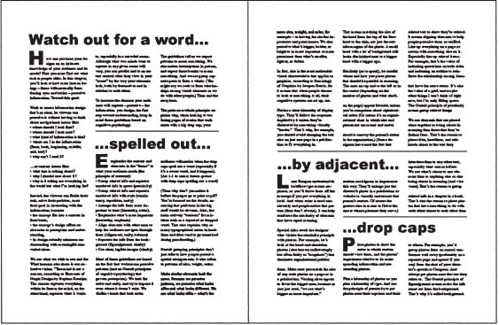
Our perceptual systems combine parts into a whole, which is why we combine drop caps into words when they let us.
You might wonder why the designer, editor, or proofreader didn't notice and remove the unintended word before the audience could see it. It's probably because each person focused more on the details than on the big picture. It's also why many typographical errors in headlines and titles go unnoticed during proofreading. The mind also tends to actively “correct” for mistakes such as a repeated or dropped word. So it's also hard to spot a small supporting word (such as the) at the end of one line that repeats at the start of the next line in the column.
Basic principles translate into guidelines for designing content your audience members can perceive, which they must do before they can comprehend it:
- Limit the content and elements in the design to what your audience needs; don't include everything you know (the principle of restraint).
- Group related information to show it is related, and separate unrelated info.
- Use space. Physically move the informational elements together or apart (the principle of proximity).
- Use style—the size, face, style, color, and shape of elements—to show their relationships with other elements. Match related elements and contrast unrelated ones (the principle of similarity; also consistency and repetition).
- Emphasize what's most important (the principles of hierarchy and emphasis).
- Arrange information from most important to least (the principle of hierarchy or sequence).
- Align elements with others to help the audience navigate through them (the principles of alignment, unity, and balance).
- Make the content stand out clearly from the background (the principles of figure/ground and clarity).
- Use clear and legible images (the principle of clarity).
Gestalt principles of perception
Some of the principles about how parts relate to the whole come from the movement of psychology known as Gestalt, which is German for “form.” Gestalt practitioners including Max Wertheimer, Wolfgang Köhler, and Kurt Koffka began applying the ideas to human visual perception in the early part of the last century. Here are some of their principles and how I've interpreted—even sometimes stretched—them into practical information-design guidelines.
THE GESTALT PRINCIPLE OF SIMILARITY: Make equal elements look equal
What Gestalt psychologists really meant by the similarity principle is that we humans tend to group similar elements into one perceptual unit. But in order to group similar elements, we must be able to recognize their similarity. Our ability to perceive patterns means we can discern obvious similarities and differences. We regard elements that look alike—such as article subheads that share a typeface, style, size, and color, for example—as being alike, having the same level of importance. So it only makes sense to emphasize similarities and differences with your design.
In much the same way, we regard elements that are obviously bigger as being more important, and those that are obviously smaller as being less important. In fact, size is the most noticeable graphic trait, writes Jacques Bertin in his book Semiology of Graphics. So people understand the different levels of importance implied by a size hierarchy of elements unless something visually “louder” distracts us. Defy those natural laws—by, say, reducing one section of type to fit the page—and you could confuse readers, who expect changes to mean more than a lack of space.
And when people see bold type, they tend to recognize its emphasis, an understanding you'll defeat by boldfacing everything. When they notice color that's used consistently, the pattern can help to reinforce the element's meaning.
The guideline also applies to photos, with risks to the designer who violates it. Consider the head-and-shoulders photos (also known as “mug shots”) that are so common in publications. Make the size of any such photos on a page or (two-page) spread identical. If you don't, the size difference could imply that the people in the photos have different levels of importance. Match the size of the head from the top of the forehead to the chin, not just the size of the frame. A small head in a big frame will look less significant than a bigger adjacent head even in a slightly smaller frame.
Also watch where you place photos of equal importance. Depending on the number of photos and what else is on the page, the photos at top left or center might look favored. Even arranging photos by alphabetical order of the people's names can't compete with the stronger nonverbal impression. But top-down placement does work for a photographic organizational chart in which position conveys each person's relative status. And, like it or not, some designers use the size-equals-importance code to enlarge just the director's photo, visually underscoring that person's status (and trying to flatter the one at whose pleasure they serve).
But do use size and placement to show the order in which readers should view photos. And use them to show how the photos rank with each other and relate to corresponding content. Plan a hierarchy of photos—from most to least important—as you do a hierarchy of type.
The similarity principle also extends to alignment. Align every element with something else in the frame to help viewers see the elements in the unified context of the whole. In particular, align related elements to emphasize their relationship and their contrast with other elements. Consider aligned contact info on a business card or an indented quotation within flush text. In both examples, grouped alignment reinforces the difference between two categories of type.
Similar alignment explains the value of a grid. That's a framework of invisible vertical and horizontal lines designed for placing type and images and reserving unfilled space similarly from page to page or project to project. A well-planned grid anticipates and accommodates the range of elements in the project while avoiding monotony. Adherence to a grid gives projects a sense of order and unity, and helps readers find things.
Pages designed without a grid tend to draw the eye from the content to the chaos. Think of the last slide show you saw in which the titles bounced with each new slide. Lack of alignment also annoys audiences of other forms of design, maybe most when they know something's wrong but not what it is.
THE GESTALT PRINCIPLE OF PROXIMITY: Group related things
The principle states that we group elements that are close in space as a single perceptual unit. Here again, let's stretch the idea: We expect elements that are close in space to be more related than those farther away in space. So, for example, place:
- titles, headlines, and subheads closer to the text they introduce than to any other text, especially what comes before. For example, reduced space under the subhead above shows its connection to this paragraph; extra space above the subhead shows its separation from the paragraph above it.
- related photos closer to each other than to unrelated ones. For example, you'd group photos from an annual conference well away from the shot of your director addressing Congress.
- photos near the text they relate to
- captions near the photos they describe (close without touching)
THE GESTALT PRINCIPLE OF FIGURE/GROUND: Make the content stand out from the background
We separate what we see into foreground (figure—for our purposes, the content) and background (ground). In information design, never ask the audience to work at telling them apart. Make the content prominently emerge from (contrast with) its background, and keep the background in the background, never intruding.

Now you see one thing, now you see another, but you can't focus on the vase and the faces in profile—or any foreground and background—at the same time. (Notice something else: the vase appears symmetrical despite inconsistent profiles. That's because we perceive the power of the whole over its parts before focusing on the details if we choose to. And here, perhaps the ambiguity of a focal point—the vase or the faces—further interferes with gathering details.) Adapted from Edgar Rubin's concept/drawing.
Low or no contrast, on the other hand, blurs the distinction between figure and ground. Edgar Rubin, a psychologist who studied figure/ground relationships, created the famous image of a vase within two human facial profiles. Looking at its re-creation, what do you see first, the faces or the vase? Notice that you can't focus on them both at once. To see the second one, you must shift your focus. So because it's impossible to focus on both figure and ground—or type and back-ground—at the same time, make it easy for the audience to focus on the type by playing down the background. (Escher's drawings, which also blur the divisions between figure and ground, are fascinating, but nothing to mimic in information design.)
EXERCISE: Make your own version of Rubin's vase using silhouettes of someone you know. Display the image near your work area to remind you to keep content clearly in the foreground and backgrounds clearly in the background.
You can achieve the essential design principle of contrast with:
- size. Make type big enough to stand out from the background. (What if you want to discourage people from reading the “fine print”? Reconsider using fine print whenever readers need the info buried in it; they're on to that trick.)
- “color. ” Black type on a white background gives the highest, most comfortable contrast for sustained text reading. On the other hand, in many cases the same combination reversed (white type on a black background) emphasizes the background over the type. For graphics, favor cool, deep colors as a background for warm, bright colors. On signs, black on yellow is the best-projecting combination. (If you live in the United States, you've probably noticed a fluorescent yellow-green gradually replacing nonfluorescent yellow-orange on Pedestrian Crossing and other signs.)
- weight. Make type heavy enough to be visible. Especially on low-visibility surfaces, typefaces with uniform stroke widths tend to achieve more contrast between figure and ground than those built from thick and thin strokes. (But avoid going so bold with type, especially in small sizes, that the enclosed space in the characters, such as the loop in the lowercase e, start to fill in.)
- quiet, solid backgrounds. Understate your design's background because a loud one competes with reading the way loud background music competes with conversation.
Also avoid the temptation to put text on a shifting background such as a photo or a gradient screen, which makes reading as tough as listening to an inconsistent cell-phone signal. An evenly screened background also lowers contrast, as does heavily textured or colorful paper.
AN EXAMPLE OF GOOD CONTRAST
Consider the environment in which you'll deliver your message. High-contrast colors and type weight help make the poster in Color Plate 1 stand out against other messages on a subway car's cluttered walls. Although most of the background reverses, text is big, limited, and visible enough to hold its own, especially with its powerful uniform strokes. You might see the green against the black first, but you're more likely to read the higher-contrast bold white main info.
In the green panel on the left side of the poster, the color's brightness still takes a backseat to the black-outlined white images. With more and weaker (reversed or serif) type, it also would pose more of a reading challenge. But despite its reversing, the white paragraph on the black panel transmits more easily than it might have because of its bigger point size and limited words. Still, if you squint, you can see the background intruding on the shape of each letter.
MORE FIGURE/GROUND RELATIVES
Other principles work with contrast to affect the perception of figure/ground. What's bigger or bolder appears to be more in the foreground than what's smaller or lighter (hierarchy). It also tends to appear closer to the viewer. Contrast's primary design partner is emphasis: making the most important elements in the foreground stand out from the rest. Every information design project, page, or view needs a focal point, an emphasis, an obvious place for the reader to start.
The principle of balance (see sidebar on pages 22–24) and the use of empty space also play into figure/ground. Extra space between elements tends to draw the reader's eye to where you don't want it—the background. So leave just enough space between elements to frame them, but not so much as to distract from them. And use more space to frame pages than individual elements. That way, the elements won't seem to be pulled off the page; the frame will look strong enough to enclose them.
 Instilling a sense of proportion and balance: ‘Golden’ layout tips
We can look much earlier than the Gestalt psychologists for another principle of perception, expressed as “we perceive most what pleases us.” Form follows function in information design, but that doesn't mean we should ignore form. Strive for pleasing form, which can enhance the information-gathering experience for the audience.
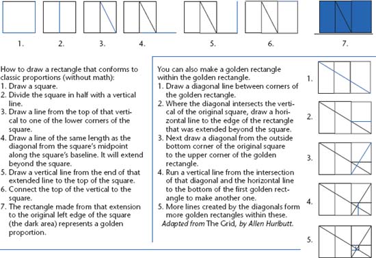
What's pleasing? According to early architects, it's the golden mean: about 0.618, not far from a 2:3 (about .667) ratio.* You can see it in such classic constructions as Egyptian pyramids, the Parthenon, and Stonehenge, and in nature. Le Corbusier, a Swiss architect, developed the “moduler,” a measurement system he applied to architecture and sometimes to graphic design based on the golden proportions found in the human body.
Here's an 11-pica line divided into classic proportions, about 6.8 and 4.2. The proportion of the smaller section to the bigger one equals the proportion of the bigger one to the whole line.
But we're talking about information design, not buildings. Here's how you might apply it.
In a line divided in two according to the golden mean, the proportion of the smaller part to the bigger part equals the proportion of the bigger part to the whole line. So, to divide an 11-inch line according to the golden ratio, multiply 11 by .618.
You'll get 6.798. Round it off to 6.8 to make it easier to work with, then mark off that point on the 11-inch line, leaving a shorter section of 4.2.
The golden ratio is reinforced by the Fibonacci sequence, a number series found by a thirteenth-century mathematician who sought to predict the reproductive patterns of rabbits.
Each number in the sequence comes from by adding the two numbers before it: 0, 1, 1, 2, 3, 5, 8, 13, 21, 34, 55. And dividing any two neighbors beyond 2 in the sequence, you get close to 1.618 or .618 (depending on which you divide into which).
The pattern is found throughout nature (in the number of leaves in a cluster or on a branch, in petals in a flower), in classical musical compositions, and in architecture.
Possibilities for a typical layout? Here's one based on an 8½-by-11-inch sheet. Although those dimensions don't correspond to the golden proportion, they still can inspire page layout.*
Another related, simpler way of dividing up space pleasingly is favored by photographers (see first diagram on page 24): The rule of thirds, based on the 2:3 (.667) proportion, divides a space, such as a page or a photo, equally into nine rectangles—three rows of three columns. Use one or more of the four intersection points as the focal point or points of the visual.
Or (more closely related to the golden ratio), divide the space into thirteen segments (each way, width and height) and put the focal point at the eighth segment (counting from the left or right, top or bottom).
Or draw a diagonal line from one corner to another, then draw a line perpendicular to the diagonal from each of the other corners. Use either of the intersection points for the focus.

How would you divide a letter-sized sheet into pleasing columns according to the golden ratio? Divide its width to find the amount of space for columns: 8.5 × .618 = about 5.25 inches.
So you can make two 2.5-inch columns and add that extra quarter inch to the space between them. (You also could make three columns of 1.6 inches each with .125 inch between them, but they would be too narrow for the space.) Divide the 3.25-inch remaining space in the same way, which the ratio turns into 2 inches on one side and 1.25 inches on the other.
How long should the columns be on the page? 11 inches × .618 = 6.8 inches, with the remaining 4.2 inches for top and bottom margin, divided into 3-inch and 1.2-inch portions. Figured this way, the basic page doesn't conform to the golden portion, but the relationship of the columns and the space does.
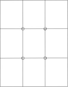
The rule of thirds, based on a 2:3 proportion, places the focal point at one of the intersection points.

A 13-square grid is another way of dividing up a page, with the focal point at the eighth square (counting from the left or right, top or bottom).

Still another way. Here again, the color marks the best options for the focal point.
* Also known as the “golden section,” “golden ratio,” or “golden proportion.” However, Japanese architects preferred the 1:2 proportion, designing buildings based on the ratio found in tatami mats.
* Universal Principles of Design pointed out that its own approximate 17-by-10-inch spreads (consisting of two facing pages of 8½-by-10 inches each) roughly correspond to the golden ratio.
THE GESTALT PRINCIPLE OF PRÄGNANZ: Simplify (appropriately) and give context
We look for the simplest possible explanation in any visual based on its—and our—surroundings. But that's too much work to ask of your audience members, so simplify for them, at least as much as it makes sense to do.
Adding principles of adult learning, we also look for context. When we see something new, we look for existing mental niches to file it in. Use that idea to choose and present content based on what's familiar to your audience. Content should begin where the audience's knowledge leaves off, and you should connect the two. And design should favor conventions, such as putting a Web site's logo in the upper right or changing the color of a visited link.
THE GESTALT PRINCIPLE OF COMMON FATE: Viewers notice direction
We group lines and shapes that seem to be heading in the same direction. For example, on a bar graph, bars above zero are seen as one group, those below zero as another.
THE GESTALT PRINCIPLES OF CLOSURE AND GOOD CONTINUATION: Viewers fill in visual gaps
Closure is when we mentally fill in any gaps in regular objects, such as circles, so we'll tend to complete a broken circle. Good continuation means that we group things that are on the same line or a curve. For example, we understand the graduated climb or decline of bars in a graph, and we expect the variation in graduated screens to mean something.
Let's go beyond the Gestalt meanings to show how continuation-like elements can help to unify projects. For example, a thick bar at the top of every page encourages horizontal movement—continuation, so to speak—through a print publication. In a Web site, a matching menu bar and logo in the same spots on every page form an implied connection and a path between pages. Those elements also impose continuity.

What comes first is often most important, but not always, as on this poster, where what's bigger and bolder—and closer to optically centered—gets the attention. Concept: Partner 2010. Design firm: Magma [Büro für Gestaltung]. Client: City of Karlsruhe. Art director: Ulrich Weiß. Designers: Sandra Augstein, Axel Brinkmann.
What's first and topmost, and why it matters
We also tend to see what comes first, such as what's at the top on a filled printed page as more important than what comes after. So on a manual or newsletter page, for example, put the headline or title and the most important story first, where readers expect to find it. (Size, weight, or format can trump this placement, as in the case of the illustration on page 25. Although the title comes after secondary info, its size and weight—but also its more central location in a sparse page—identifies it as the priority.)
Faced with a text-packed page, people whose native language reads left to right tend to start at the upper left. Then we make our way as quickly as we can to the lower right of the page or spread in a kind of backwards N-shape. So place text along that natural eye path, because text generally takes the most motivation and effort for readers to follow. Save the lesser-traveled paths of the upper right and lower left corners for artwork, for which readers are more likely to go out of their way.
The upper-left starting spot also seems to apply to news Web sites, according to the 2004 Eyetrack III study by the Poynter Institute, the Estlow Center for Journalism and New Media at the University of Denver, and Eyetools. Although eye flow varies by what's on the page, the researchers found, eyes tend to start at the upper left before venturing to the right, then down. Eyes go first to big headlines and favored text, not photos. (But on a printed newspaper page, eyes stop first on the photos, according to the first Eyetrack study fourteen years earlier, which looked only at printed newspapers.)
I hope eye flow problems explain how I missed prominent visual symbolism in an English-subtitled Czech film. While discussing the film, I realized I'd watched at a comparatively superficial level. I contend I missed the deeper meaning while reading long subtitles while my friends—native Czech-speakers—could focus fully on the scene. Even worse, say some opera fans, are that art form's surtitles.
But findings differ because tests do (more proof of the risks in trying to apply other people's tests to your situations). Janice Redish and others have found evidence of what's been called “banner blindness” in Web site viewers. She cites findings from eye-tracking studies and her own usability tests that show that people tend to enter toward the upper middle of a page, where they expect the content to begin. Why not left middle? There we expect to see “colored stuff (maybe ads or photos) that isn't content,” she says. The apparent contradiction might stem from different types of Web sites studied: news sites versus sites readers enter to do a task, such as download a passport application or register for a class.
SEQUENTIAL EXCEPTIONS
In listings (linear series of words or phrases), sometimes the obvious beginning isn't necessarily the most important. Let the needs or interest of the audience guide you. Take newspaper wedding anniversary announcements. A sequential numerical order would start with the first-year anniversaries. But you could argue that enduring marriages—or a celebrating couple's fame—are the biggest news, worthy of higher billing.
Also note that what comes earlier in a list isn't necessarily as memorable as what comes later. Hearing a list that's too long to recall entirely, we're more likely to recall the first items (the “primacy effect”) and the last items (the “recency effect”) in the series than those in the middle. We'll probably react the same way to a list we read, unless we stop to focus on portions out of sequence. Make long lists more memorable and meaningful by shortening or subdividing lists under logical subcategories and putting the most important stuff at the beginning or end.
The only ways to organize
In his books Information Anxiety and Information Anxiety 2, Richard Saul Wurman identified the only ways information can be organized, themselves organized into the acronym LATCH:
- Location
- Alphabet
- Time
- Category
- Hierarchy* (or “continuum,” as he called it in the first, pre-acronym edition)
What's most important—what will help the audience get what they need from the information—should drive how you choose to portray it. For example, you could list cities and towns of any country by:
- location, under their states, provinces, or regions (which also might be organized geographically—say, from north to south—or alphabetically). Order by location might be most useful to tourists, travel agents, politicians, marketers, and demographers.
- alphabetical order. Useful to people who know only the place's name.
- the date when each was founded or incorporated. Useful to historians.
- category: city or a town, predominant political or religious affiliation of its population, major industry, and the like. Each delineation helps people sort out areas relevant to their interests.
- hierarchy: comparative size of population, economic status, land mass, height above sea level, and so on. Useful to students, economists, and demographers.
Consider organization's role in this task: You need to find the name and address of a restaurant you've been to only once. The print phone book's alphabetical listings don't help because they are too long to scan through. The answer lies in either location or cuisine (category) listings.
Also consider city guidebooks, which traditionally list attractions by their category, such as monuments, museums, restaurants, clubs, and shops. Wurman questioned that form of organization, finding it more useful to organize by neighborhood (location), as he did in his “Access” city guide series.
The LATCH organization also applies to graphics, not just words, even though most of the categories can be expressed verbally or numerically. For example, a used-car advertiser might arrange the cars' photos by:
- country of origin or current home (location)
- manufacturer and model name (alphabetical)
- date of origin (time)
- type (sports car, sedan, sport utility vehicle, or truck; convertible or hardtop; two-or four-door) (category)
- size, mileage, condition (hierarchy)
EXERCISE: What's the organization method or methods in each of these examples? For each, also consider if an extra method might help the audience, and if so, how.
- Train schedule
- Course catalog
- Shoe catalog
- Web site map
- History museum floor plan
- Bike trail map
- Road signs
- Magazine's table of contents
- Book's index
- Ruler in a convenience store or bank to record a robber's height
- Bar chart to measure sales by store by month over six months
What we remember (all we recall)
We keep four chunks of information in short-term memory at a time.* Retention and accuracy decrease as the number of chunks increases. Test it yourself: See whether and for how long you can recall a new phone number without writing it down. And unless you commit that phone number to long-term memory, you'll quickly replace it with the next contender for the space. (A TV spot for a breath mint built its premise on the limits of short-term memory: A woman writes her phone number in her breath's mist on a subway car window for a man she likes, but he misses the message because he doesn't have a pen and paper, unlike men around him, who eagerly take notes.)
Content that's grouped into logical subdivisions aids both perception and retention. That's why an office equipment catalog would group all lamps under one heading and all chairs under another, maybe with subsets under each category (desk or floor lamps, chairs with arms or wheels).
Another possible aid to retention is color in or near emphasized items. Just realize that type in color might have less contrast—and thus less legibility—than black type. Putting color near the type adds the memory-enhancing benefit of color without sacrificing legibility.
Also use well-placed, adequate space and contrast to help readers recall the content. It follows that the same clutter in the frame or prominence of the background that keeps readers from focusing on something will also keep them from remembering it.
More about context and applying principles
We perceive and understand best what's individually familiar to us. Use that fact to choose formats you know are familiar to your audience, similar to familiar ones, or obvious enough to be clear. For example, it might help if the audience has seen pie charts before and understands the relationships inherent in them. But the image of a circle and its divisions is universal. And the idea that what's bigger means more is also universal. So it's also fair to expect the audience to understand that a bigger slice means a bigger percentage. Same with bar charts, in which taller bars mean more of something. And the principles of similarity and proximity contribute the understanding that there's a relationship among the bars or the pie slices. That's a lot of information conveyed without words.
We also universally perceive what looks clear and well organized, adhering to all the perception principles discussed above plus salience: People expect a change in style to signal a change in meaning.
EXERCISE (a variation on the Introduction's “Exercise for life”): As you notice designs around you throughout your day, consider what makes sense intuitively versus what relies on acquired knowledge. For example, you had to learn that the shortest hand on a watch or clock points to hours, the longer hand to minutes, and the longest to seconds, because it's not intuitive. Intuitive—but mechanically impractical—design would have matched hand length to time-period length. (More intuitively, hands for longer periods usually are thicker than those for shorter ones.)

Although this watch has long hands for minutes, in this case the longer hands and the prominence given to minutes over hours in the outer circle make sense. It's a recent Russian “Poljot” chronograph based on a design for Luftwaffe pilots in World War II. On watches such as this, minutes get the emphasis because pilots must calculate in seconds and minutes, not hours. Photographer/Watch's owner: Jeff Young.
PART 2: Body/mind basics: How the eye/brain sees, perceives, reads
What happens physiologically when we look at an image? In a nutshell, light delivers images and colors to the brain through nerve cells in the retina of the eye. To get to the retina, at the back of the eye, images and colors travel through various layers. They include substances (such as the cornea, iris, pupil, lens, and gel-like humors) that control the amount of entering light or aid focus.
We read, recognize faces, and see color with a spot on the retina called the fovea.* It's the place in the eye that provides the sharpest vision.
Two kinds of nerve cells live in the retina: rods and cones. Rods control our ability to see (and read and drive) in low light. Cones control our color and detail vision. Photosensitive chemicals in the rods and cones cause an electrical reaction that sends seen images through optic nerves to the brain's cerebral cortex (where we also think, learn, and remember).
How we perceive words: The eye/brain case for legible type
We don't read letter by letter, or even necessarily, word by word. Instead, the eye moves through text in a series of eye jumps (or saccades), stops (or fixations), and backtracking steps (regressions, which account for 10–15 percent of our reading time). Each saccade covers seven to nine letters of text, according to “The Science of Word Recognition,” by Kevin Larson of Microsoft. Reading happens when we fixate, which we do near the middle of a word. A typical fixation takes in three or four letters on either side of it, so it includes the word and maybe any small familiar words next to it. During a fixation, we also plan our next stopping point.
The implications: Support a consistent, comprehensible reading (jumping) pace with consistent, legible type, especially using appropriate contrast and word and line spacing.
How we perceive color
The retina contains three types of cones, each most sensitive to light in a different wavelength, according to Stephen Kosslyn, author of Graph Design for the Eye and Mind and other books about cognitive psychology and visual perception. As he and Robin Rosenberg write in Fundamentals of Psychology: The Brain, the Person, the World: “One type of cone is most responsive to light in the wavelength seen as [a yellow-orange], another to light in the wavelength seen as green, and another in the wavelength seen as violet.” The cone types combine to help us see the range of visible color (similar to the way only three colors produce many more colors on a computer monitor).
Wavelength, a color's position on the visible spectrum, relates to color temperature. Red (a warm color, along with orange and yellow) has the longest wavelength; blue (a cool color, along with green and violet) has one of the shortest wavelengths.
The different wavelengths focus on different points around the retina, actually changing the shape of the lens. Long-wavelength red focuses behind the retina, rounding the lens and making the red look closer and bigger, according to Color Perception in Art, by Faber Birren. (It's also known to raise blood pressure.) Blue's shorter wavelength makes it focus in front of the retina, flattening the lens and making the color look farther away and smaller. So, for reasons of perception, red tends to work best in foregrounds, and blue's best in backgrounds.
But although yellow is the most luminous and most reflective color, it won't stand out against white unless the yellow has plenty of red in it. Every design quality is relative, as the Gestalt psychologists also found. Changing one part of its environment causes everything to change, so watch the relationships among the elements in your design.
Look to colors' positions on the spectrum (translated into the color wheel you probably first saw in grade school), for clues to combining colors effectively in design. For example, use adjacent colors—such as red and orange—as adjacent colors in a design for harmony, or to show dimension. But don't use them when you want a strong contrast between elements. For contrast, you might pair red with yellow, but neither with their immediate neighbor, orange.
To avoid a distracting shimmering effect, also avoid pairing longest-wavelength red with shortest-wavelength blue in equal intensities. The eye can't focus on two such different wavelengths at once, Kosslyn writes. But you can pair the two without inducing shimmering if you put another color between them. (See Color Plate 2.)
A similar shimmering effect comes from pairing so-called complementary colors, those opposite each other on the color wheel: red/green, yellow/purple, orange/blue. (A student of mine wondered aloud whether so many reds with greens before Christmas is really what's behind the stress associated with the holiday.)
To avoid shimmering, put another color between potentially incompatible pairs. If you want to put them next to each other, use different intensities. In fact, it's best to avoid the same intensity between any two colors that meet, or it might be tough for the audience to distinguish the boundary between them. But if you're designing a cereal box, Kosslyn says, you might want that shimmering color interaction to call attention to it from a packed retail shelf.
Red/green pairs, in particular, pose another problem: To color-blind people (about 8 percent of males and about 0.4 percent of females), the two colors look the same, so the colors can't convey any information. Red/green is the most common color deficiency among color-blind people. Most can discern other colors, so a more accurate term for the deficiency might be “red/green-blind.” (See Color Plate 3.)
How we perceive symbols
Communicating nonverbally to avoid language or reading barriers is a worthy goal. Unfortunately, it's also an elusive one, as you know if you or your audience has ever misunderstood a Web icon, a garment's cleaning tag, pictogram assembly instructions, or any other attempt at a universal message.
Otto Neurath's utopian dream of a universal language is not much closer to reality than in 1936, when he offered his Isotypes system of symbols, or in 1972, when Henry Dreyfuss included that system and others in his book The Symbol Sourcebook. But Neurath's vision lives on as the inspiration for international symbols on signs and packaging.
The Dreyfuss book is engaging, even useful if you don't assume the symbols in it are universal. If you look up the book, see how many of them you can figure out without looking at the captions. Some of the symbols are so “totally unclear, even I don't understand them,” such as the ones “for full or empty things,” says Paul Mijksenaar, founder of Bureau Mijksenaar, a design firm that specializes in wayfinding systems and icons; a professor at Delft University of Technology; and the author of books on visual information.
Some symbols are used and understood almost universally. Those include curves or ramps that get larger to show a loudspeaker's increasing volume. Even more familiar to most people is the red diagonal to say that “something is closed or not available or shouldn't be done or is forbidden,” Mijksenaar says. (For the latter, by the way, the slash properly runs from upper left to lower right, like the diagonal stroke in “N,” as in “NO.” See below.)
But the very use of the word language—whether it refers to a verbal language or a pictorial one—suggests something that has to be learned, “because that's the characteristic of a language. It's a man-made thing. Even an arrow is a man-made thing” whose meaning must be learned, Mijksenaar says. Until people in some remote tribes were regularly exposed to arrows in graphic and product design, they understood the symbols only as representing things to shoot with bows.

Among the symbols proposed for a utopian nonverbal language in Henry Dreyfuss's book are these two. If you don't know what they mean, the symbols—and the language itself—don't work. The Symbol Sourcebook by Henry Dreyfuss.

These symbols, in wider use today than the ones above, might be clearer … or are they?
BORROWING VERSUS CREATING SYMBOLS
If your project will include symbols—whether to replace or supplement language—see what symbols are on hand before you plan something new. Bureau Mijksenaar looks for any applicable standards, including international (such as ISO), national (AIGA [American Institute of Graphic Artists] or DOT [Department of Transportation]), local, and industry. Standards have the advantages of familiarity and testing.
If the team members must start from scratch, they must develop a way to help the audience to learn the symbols. That might include putting the pictogram's meaning on every map, folder, or application that includes it.
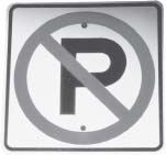
A circle and a slash, in red, warn drivers to leave their car someplace else.

Use the direction of the diagonal stroke in the “N” in “No” to remind you which way to draw the slash when you design warning signs.
But even using established symbols won't guarantee your audience will understand them. Test them while there's still time to change or label any symbols that aren't clear. Neither will using “associative” colors guarantee understanding, Mijksenaar says. For example, red connotes warning and fire, so it's often used on signs to signal danger. But it's used almost as often for other kinds of signs just because it's noticeable. And even when the message is danger, is it an escape route or a caution to keep out? The meaning then depends on the words.
Any symbol that needs explaining won't fit some cases, such as emergency or road signs whose meaning must project instantly. And for messages that do lend themselves to a nonverbal treatment, only a limited number of truly universal symbols apply. Those include human, animal, or environmental symbols such as water and the sun. One of the most familiar uses of human symbols is on restroom doors, but in fact those symbols might be confusing if they weren't so familiar. Because they use only an article of clothing to distinguish the genders, the symbols could give pause to a woman wearing pants or to a man in a kilt or caftan.

Symbols need to be instantly identifiable … are these pairs? They appear throughout a corporate identity system and a Web site to show synergy …
CLARITY'S A BIGGER CHALLENGE IN SMALL SIZES
A Web site and stationery for a consulting firm, shown on this page, use natural pairs to suggest the firm's synergy with viewers. Designed to run small, icons must be clear enough to be read small, so too much detail can defeat the purpose. These contain more detail than typical, but probably not so much that viewers can't identify them. (Can you identify the icon pairs?)

… and sometimes, as on this Web page, the opposite of synergy. Design firm: Design Army for Scott & Yandura. Creative director/Designer: Pum Lefebure. Illustrator/Account manager: Jake Lefebure. Programmer: Todd Lyda
Separate icons on the home page introduce the theme and relate—more or less—to the menu options (the least successful relationship being the robot to illustrate “who we are”). On other pages, the options move upward to a menu bar, with the current page name made appropriately bold.
SYMBOLS FIGHT CHAOS
The power of traffic lights as a universal symbol became clear in the aftermath of Hurricane Isabel in 2003. With the signals out, people turning left at the intersection and those going straight felt equally entitled to the right of way (judging from the yelling and honking). In the absence of a universally mutually understood governing code—red, yellow, and green lights—anarchy reigned.
MORE SYMBOLIC EXAMPLES
(See also Color Plates 4, 5, and 6.)
Speaking of symbols and arrows, here's a design that uses shape and color not just to inform, but to inform on. The plastic card is designed to stick to boxes that contain delicate items. The shipper activates it by pulling out a clear plastic “gate” and sends the package on its way. Manufacturer: Index Packaging.

Most of an accompanying warning label goes on the package to explain the system; the bottom part goes on the bill of lading to direct people to the package label. It all prints in red, to reinforce the warning message. Exercise: Legibility and clarity suffer on the type inside the arrow. Analyze the problems, and improve it.
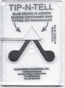
When the activated package label's arrowhead stays white, it shows the package was handled with care.
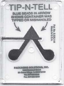
Mishandling turns the arrowhead blue.

This Canadian magazine ad, the best in a series, uses symbols to simply and humorously convey the product's purpose and new color. The symbols also contrast with typical ads for such products that show people who look in need or relieved. Are the Stop/Play symbols universal, or at least universal enough to be clear to constipated Canadians?
Although the agency didn't test them, it assumed “enough homogeneity in the audience that it could appreciate popular cultural symbols in Canada,” says Marc Stoiber, who conceived the ads. Agency: Grey WorldWide Toronto. Client: Novartis. Product: Ex-Lax. Creative director: Marc Stoiber. Writers: Matt Bielby, Sam Cerullo. Art directors: Sam Cerullo, Matt Bielby. Photographer: Shin Sugino. Agency print producer: Chris Penny. Agency account supervisors: Brad Cressman, Laurie Sloan.
EXERCISE: Collect at least six in-use symbols that are likely to communicate to people of almost any culture and language.
EXERCISE: Create one or two symbols to communicate something useful to people of almost any culture or language, then test them. Show them to a range of people to see how the viewers interpret the symbol. Make corrections, retest, and record your process.
EXERCISE: Design two sets of restroom symbols: one for a separate room for each gender, the other for a unisex room.
* also known as “order,” “sequence,” “structure,” or “rank.”
* Some researchers say as many as seven chunks, others as few as three.
* In fact, a scientist might use the phrase “foveate on” to mean “focus on,” because the part of the eye that close-focuses on details such as words is the fovea.