
CHAPTER 9
How to help people find their way clearly
To help your audience get from here to there, a worthy goal for every information-design project, you have to know where “here” is for the audience. That's as true for a Web site, manual, or proposal as it is for a traditional wayfinding format such as a map, floor plan, or sign. And “here” refers as much to audience members’ knowledge, background, and skills as it does to their physical location.
In this chapter, we'll look at some wayfinding case studies and apply their principles to other kinds of projects. The goal of each design is to help people navigate, whether on foot or wheel or by hand and eye alone. Notice how the designs demonstrate useful information-design principles … and when they don't.
In the traditional sense, navigating or “wayfinding is the science of organizing and defining a sequence of posted messages to make a building or space as self-navigable as possible,” according to “Basic Principles of Wayfinding” by Wayne Hunt in Designing and Planning Environmental Graphics Design.
Expanding the concept of “space” to include any information-design project, the key words in the definition are “as self-navigable as possible”—design that's so logical and intuitive that people can find their own way to their goal or destination, easily and without frustration.
To find the appropriate design, Hunt advises, look at:
- the number of first-time visitors
- how urgently they need the services they're seeking
- how many destination choices they have
- what the visitors’ emotional and mental conditions are
- how complex the route is
- what level of distraction the environment contains
Your task in each case begins with learning about your audience, so you can give the audience just what it needs, no more and no less, in a form they can easily understand. That involves finding out what the audience needs overall, and releasing it in digestible chunks. Show people where to start and how to navigate from there, using type and pictures that stand out clearly against their background and the design's environment.
Editing the viewer's experience
The audience's needs lead John Grimwade, graphic arts director at Condé Nast Traveler magazine, in creating informational graphics that “edit the experience for the viewer.” For example, he does tour maps to guide his readers through “formidable” places such as London's Victoria and Albert Museum (V&A): “You can stagger out of there several hours later feeling as if you've really had enough.” So for V&A and other museums, he did a pull-out pocket guide to a comfortable hour's worth of highlights. (See Color Plates 46 and 47.)
Tell just one thing, not everything
“One problem with the Information Age is that everybody wants to tell everybody everything they know,” Grimwade says, citing the “megagraphic” trend in newspapers. Such graphics aren't selective. Instead, he says, he wishes they'd “tell us the one thing we really want to know.” As an example, he cites a graphic of a new baseball stadium that includes even where and how the seat cushions were made, when all readers really want is the seating plan.
How can you design selectively? If you can't test, at least put yourself in the viewer's place. It might help if you've been there. Grimwade notes that after visiting, say, the Vatican, “the worst thing is … when someone says, ‘You went there and you didn't see the Raphael room?’ Or ‘You went to the V&A and you didn't go to the cast room?’ People are going to tell you you're mad; you feel like an idiot.” So he designs the guides to call attention to what the writer and he deem to be the best sights.
From his travels, Grimwade also knows to show people what to avoid, not just what to see. Instead of giving a comprehensive account, “you really wish [a guidebook] would say, ‘Don't bother with this; it's going to take you hours, and it's not one of the best things in Barcelona.’” A sight's very presence in a guidebook without a caution implies it's worth seeing, which could lure travelers away from more worthwhile stops.
Walk the walk: “You are there”
Take literally the idea of putting yourself in the viewer's place. Walk the site to record things such as doors that don't open and where the staircases lead. Take photos or videos and make notes or comments on them as you go.
Another thing you'll find out by walking the site is that aerial views of buildings don't do much for people who view them on the ground. You'll help to orient people if you make tall buildings seem to project vertically, as if they were three-dimensional and the viewer were facing them.
Vertical projections also work for non-wayfinding maps, such as the one Grimwade did for a feature story about the rebirth of lower Manhattan. To reinforce the 3-D look and to help anchor the buildings to the background, he used shadows, tinted light enough that they don't look like objects or hide the objects they shadow. (See Color Plate 48.)
Guiding graphics principles
Grimwade recommends more ways to improve all of your graphics, wayfinding or not:
- Show people where to start. Every graphic should include a way in; the more complex the graphic, the more explicit the starting point must be.
- Work within and around your medium's constraints. For example, on the Manhattan map, Grimwade drew the buildings at an angle to keep them out of the magazine's wide gutter.
- Standardize on what few universal signals exist, such as a red line. “Everybody understands that an arrow [or line]… that stands out from everything else must be the track you're supposed to be on.” He also includes numbered sequences and lines that lead from a graphic element to a piece of text on the short list of universal nonverbal signals.
- Use graphics techniques to show useful details. In “Designing Dubai,” an infographic for a feature story about a long-term development project (see Color Plate 49), Grimwade showed blown-up sections of the whole area with:
- a tinted-spotlight effect that connects one of the tree-shaped island groups to its smaller place on the map
- a box connected by a lead line that shows the layout of the exclusive end of the “palm frond”
- Use sans-serif type for graphics because it's “cleaner … more informational and business-like,” and more legible, especially at small sizes, Grimwade says. Another benefit of sans-serif on graphics: It looks different from the serif text, so there's less chance that readers will confuse them.
- Use graphics to do what photos can't, or can't do well. For example, illustrations with translucent layers that build in “X-ray vision” (such as the layer for the third level of the V&A museum, shown in Color Plate 46) can enhance the feeling of being there for the viewers by showing what's inside or behind something.
What's the question?
Think of questions the infographic should answer. To guide you toward the goal, also come up with a working headline if you haven't been given one.
Wayfinding systems exist to answer a question for the viewer that usually begins with: “How do I get to …?” Although it might seem obvious, often the question and its answer are smothered by too much information, which can result in a cluttered design.
Modify the question or add new questions based on the user's needs or preferences. For example, some Web sites that give driving directions also give users a choice of routes, such as the fastest or the most direct, or ones that avoid highways. So appropriate variations on that question might include “How long will it take to get there from here?” and “Which or how many landmarks will I pass on the way?”
The Dubai illustration mentioned above began with a list of Grimwade's and the writer's questions:
- Where are the islands in relation to the city and the airport?
- How big are they?
- What are they?
- What do they look like up close?
Favor accuracy and authority over flash
For Grimwade's drawing of the latest passenger aircraft developments, he says, “we went out of our way to get the exact cross-sections of all the aircraft and to make sure the air-craft were correct.” The “unspectacular” look of the drawing (“placid, potentially boring side views … and no tricky perspective”) reinforces that credibility, as opposed to “a lot of wild graphics,” whose very visual “language somehow implies they might be wrong,” he says. “As soon as the planes are all flying in formation from some vanishing point, you start to create a showbiz look that I think readers flag as, ‘Well, this is all very wonderful, but is it correct?’ [and] ‘what is it telling me?’”
Speak with a hierarchy of color and weight
Layer color strengths, type weights, and line weights in a hierarchy, with the strongest and boldest reflecting the highest priority, which people understand. Avoid “fruit salad,” a term coined by one of Grimwade's former art directors to mean throwing in too many colors.
More color advice: Grimwade likes pastel backgrounds for showing off details, type, and red accents. On those backgrounds, black type is legible even when it's small, and lines and labels can stand out. Black on white gives the best contrast, “but if you've got a graphic like a floor plan, you're going to need a color in there somewhere,” he says.
On the V&A plan Grimwade used sumptuous colors instead of pastels because they looked more like the museum, although he reconsidered that decision as he spoke. If the “plans were pastel-colored, those numbers would be standing way off of that background instead of being pulled into them.”
More about constraints … and compromise
In the words of MIT—A Framework for Campus Development: Wayfinding and Signage, a standards book by Joel Katz Design Associates (JKDA), effective redesign involves give-and-take: “Any comprehensive wayfinding program in a long-evolving environment represents, at best, the most appropriate compromise between the theoretically most effective wayfinding techniques and the limits and constraints imposed by bricks and mortar, planning, culture, departmental prerogatives, use habits, audience attitudes, and a multitude of cost-related factors.”
Designing from the viewer's perspective includes varying sign heights for all potential viewers, no matter how they get around. Design firm: Joel Katz Design Associates. Client: Massachusetts Institute of Technology.
For a MIT wayfinding-redesign project, studies and surveys identified three major audiences with different levels of navigational habits and needs:
- faculty members and graduate students, who typically learn to find only what they need
- staff members, who learn more about the campus overall
- undergrads, who learn the most
Each group also includes newcomers, who need at least basic wayfinding. And needs can change, as they probably will in this case: Planned construction of more grad housing is likely to expand grad students’ campus scope.
The designers’ proposed system of signs and maps accommodates wayseekers’ diverse needs and tendencies, including how they travel (car, subway, bus, bike, wheelchair, walking; see art on facing page), and whether they're entering or leaving campus versus crossing it.
Use “heads-up” orientation
Signage should show wayseekers which way they're facing, not just where they are. Heads-up rather than north-up orientation on stationary maps makes it easy to relate the map to the environment. (See Color Plates 50 and 51.)
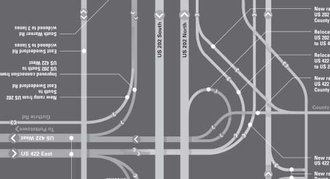
Heads-up orientation also can apply to a portable map. For example, look at Joel Katz Design Associates’ flippable 8-by-36-inch map at right that shows construction on Pennsylvania's north-south U.S. 202. It works whether drivers are traveling north or south, because it has two sets of type, one north-up, the other south-up. Drivers might only have to turn the map upside down to orient the map for their route and to read the changes that apply to them.
More lessons taught
The MIT system also demonstrates other orientation and information-design guidelines you can use in your projects, such as:
- point buildings up. Like Condé Nast Traveler's maps, MIT's maps help to orient viewers with a vertical projection of a landmark: the tower building. (See Color Plates 50 and 51.)
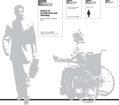
- include other landmarks. At MIT, river orientation also helps on wall signs that identify the building. (See Color Plate 52.) Signs give the building's name and number (beginning with the letter code related to compass direction on campus (plus M for “main”). The north-pointing arrow reinforces the compass-point meaning of the letters.

You can turn this map in whichever direction you're headed on this north-south highway because the type also runs both north and south. Here you see both an overview and a detail. Design firm: Joel Katz Design Associates. Client: Pennsylvania Department of Transportation.
 You can see the heads-up principle violated in the north-up maps to nearby attractions placed on kiosks near the Capitol in Washington, D.C. It's the same map in every kiosk, but the kiosks’ orientation is random. So although the icon of the Capitol is at the left on every map, the building is behind the viewers of some of the maps.
This disorienting map could be fixed by rotating the stationary kiosk to match the landscape. But it would be better to begin by drawing the Capitol, the neighbor-hood's major landmark, in the heads-up orientation, then placing the kiosks to reflect it.
Another time no one bothered to find out where the audience stood: The sponsor's Web page for an information-design meeting clearly directed attendees to the correct subway stop. After they left the train, though, things got trickier. “Look for the 7th St. exit,” read the directions. But at the time, the underground signs pointing toward the two exits offered no such option, only “Arena Chinatown” or “Galleries.” An incorrect choice would take visitors a block out of their way.
So whether you're creating sign-age or directions, there's no substitute for a visit to the site. And, for repeated-use directions, such as those on a Web site, visit periodically to check for any changes that need building into your design.
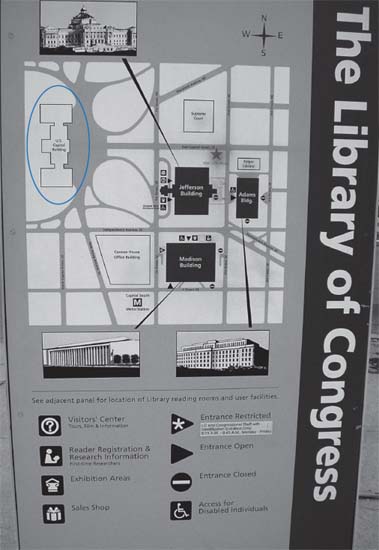
The problem with this map kiosk is that the Capitol—the landmark the map shows to your left as you face the map—is really behind you. Photographer: Ronnie Lipton.
- make it easy to know “you are here.” When a map includes a “you are here” notation with a symbol, make the symbol an arrow or a triangle, never a circle, Katz says. (See Color Plate 53.) As “the only nondirectional geometric form,” a circle “gives no clue as to which way you're facing or even if what you're facing is behind you.” (But with heads-up orientation, the shape choice becomes less important.)
- connect below with above. For underground transit systems, design signs that help orient riders to what they'll find above ground. In the MIT stations now, for example, subway riders come up without knowing which direction they're facing, Katz says.
- plan wayfinding components at “decision points,” the places where wayseekers need to decide which way to go next. To do that, you first have to find the decision points. The designers of the MIT system identified both primary and secondary ones by observing pedestrians and noting “forks in the road.”
- fill in any important gaps. “People can see only a little bit of geographic reality at one time, whether [it's] part of the body, a city, or a transit system,” Katz says. And yet they need to “make decisions on things that are part of those systems that they can't see.”
- eliminate unneeded detail. In some cases, extra detail doesn't help. For example, a passenger on a subway or a plane doesn't need the level of navigation details that the driver or pilot does. So it makes sense to leave them off of the navigation system you design for the passenger, Katz says.
- be consistent. As usual, a consistent design style sheet helps tie the system together and inform viewers nonverbally. That applies to elements such as:
- color. For example, at MIT, main campus info is white on purple; east campus info is white on green; wheelchair info is white on blue. Color, borrowed from the familiar traffic-light code, also helps to show drivers where to park: Green signs point to parking areas, and red ones (with the universal symbol of a diagonal slash through the word parking) imply “forget about it.”
- type. Numbers for buildings are bolder than the letters for campus sections so they stand out. And the wide bottom on the numeral “1” in ITC Franklin Gothic keeps viewers from mistaking that frequently used number for any other.

The building number (“28”) stands out from the “E” (for the East part of campus), and the wide bottom on the “1” in ITC Franklin Gothic (as in the street number) makes the number clear.
- hierarchy. The overall design plan also ensures consistent placement of similar information and a hierarchy of information (campus section, building number, room number and “contents”).
Must-haves for wayseekers on the Web
Finding one's way around a Web site shares a lot of challenges with finding one's way around a bigger space on foot. To demonstrate that, let's apply wayfinding-design essentials from the MIT standards book to Web sites. Essentials include:
- a sense of place: knowing you're in the defined environment (logos and consistent style)
- locating: finding on the map where you want to go (menus and links that include what you're looking for in the words you're looking for)
- directing: finding how to go where you want to (for example, clicking or mousing over, direct route or not)
- identifying: recognizing when you get there that you've found the place you were looking for (confirming and matching headings, consistent style)
- accessing: getting accommodation for your needs, as in type that's clear enough to read (or hear, for those who can't see). (The MIT system builds in accessibility with features such as directions placed at the right height for a person in a wheelchair and type that gets bigger as it gets higher up on the sign.)
The value of symbols in wayfinding
When their meaning is clear and their design simple, symbols have these advantages over words. They:
- speak to people of any language
- are compact, so they work in a much smaller space (as on a mobile phone)
- are recognizable over longer distance (as with traffic signs)
- can be read quickly
On floorplan maps reduced to small sizes for a museum guide (see Color Plate 54), Bureau Mijksenaar used legible icons of a clothes hanger, beribboned gift box, and coffee cup (along with the more common wheelchair-access and restroom symbols). The symbols look like the hanger, box, and coffee cup that they are. Now consider whether what they stand for is universally understandable.

On a banner and a sign, icons stand for the museum's main exhibition spaces. Look closely under the sign for the hanging icons. They're clear in person. Design firm: Bureau Mijksenaar by, Client: Teylers museum.
More symbols, as icons on banners and signs for the museum's shop, reinforce the museum's and the shop's five main collections: a book for books, a shell for fossils and minerals, a gauge for scientific instruments, a frame for paintings and drawings, and a coin for medals and coins. They nonverbally tell visitors that when they see the symbols again inside the museum, they'll know where they are.

Back up nonverbal symbols if the audience needs it. The designers of Dutch Airways’ signs added verbal meanings to the pictograms for new or infrequent passengers, who might not recognize or understand symbols for lockers or baggage claim, Paul Mijksenaar says. At Schiphol Airport in Amsterdam and at JFK, Newark, and LaGuardia Airports in New York and New Jersey, the use of fifty to sixty different symbols demands words even more, he says.
Numbers, color, and photos help to flag “here’“
Unlike outdoor maps you can see earlier in this chapter, the Teylers Museum guide doesn't use vertical projections to show visitors where they are on an aerial-view map. It relies instead on numbers, whitening, and photos. (See Color Plate 55.)
Each panel of the guide focuses on one or more exhibition spaces. The panel contains numbered illustrations of the objects contained in that space, along with its location on the floor plan. The numbers correspond to signs throughout the museum. What's more, a photo shows what the featured room on the floor plan looks like, so people entering the room have instant visual confirmation that they're in the right place.
Still another hint for museum visitors: The featured room in each panel is white on the floor plan; the other rooms are gray.
Each panel also contains a timeline of the objects in the space. That element would be appropriate for almost any museum, but especially for one so old; Teylers was founded in 1784. Time also factored into the signage, which uses different materials to distinguish between original and new parts of the museum: cherry signs and brass arrows for the old, silkscreens on wall and stainless-steel arrows for the new.
Show time, not just distance, when it counts
Schiphol Airport, which tests every three months to see whether people can find its gates, expects a success rate of 93 to 94 percent. But as important as finding the gate is getting there on time. At this “huge airport … it takes 20 minutes to walk from the entrance to the end of the concourse,” Mijksenaar says. So to the signs directing passengers to gates, the design firm added the number of minutes to walk there.
The walking times show up in white in the terminal letters. (See Color Plate 56.) “That's a big advantage [if you're a passenger] because you see the information where you expect to see it,” Mijksenaar says.
In addition to helping passengers make their flights, the walking times also help them spend more time—and potentially more money—in the shops and restaurants instead of at the gates; people can stay longer in the retail space if they know exactly how far they are from the gate.
In proposal at the time of writing, the designers also created a corresponding Personal Indoor Navigator, or PIN. The PIN would give travelers personalized information about their location at Schiphol Airport downloaded to their PDAs through the local Wi-Fi network. For example, one screen in Color Plate 57 shows bars and restaurants within a five-minute walk of the user; the one in Color Plate 58 shows the distance and routes to other airport services.
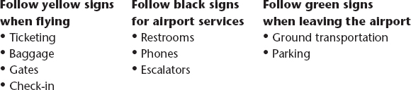
For signage the firm developed for JFK, Newark, and LaGuardia Airports, color coding reduces the number of signs that passengers have to read and makes the system self-selecting. The idea is that passengers can look for only the colors they need at any given time.
To make sure people notice and understand the codes, the designers also developed signs to help passengers recognize the existence and the meaning of the color system: black type on yellow (the highest-visibility combination) for flight info; yellow type on black for airport facilities; and white on green for exit, ground transportation and parking signs. The sign reads, “This airport has a color-coded signing system” (although just “signs” would be clearer), and gives a sample of each color and its corresponding location below it:
This airport has a color-coded signing system
Consider environmental context
Black on yellow makes a highly visible combination for signs and posters. High visibility is especially useful for an airport, a cluttered environment that needs a visual “shout” to compete with it. In fact, although white backgrounds tend to work well for text, on signs and posters, it takes a color or black background to stand out against common backdrops such as light or white walls, windows, or cloudy skies, Mijksenaar says.
If you can't design from scratch, you can add a border to set off a sign or poster from its environment. It's a quick method, but often less effective because a border that's strong enough to set off the content can distract from it.
Wayfinding or anatomy? Project combines them
How does a heart work? The task of “explaining how things work, how things move, and how you move is the same whether you're an individual on a bus or a platelet in a bloodstream,” Joel Katz says. Both demand “simplicity and clarity so people can understand” them.
Katz took the analogy steps further when a subway map actually inspired his first heart sketch (for Richard Saul Wurman's book Heart Disease and Cardiovascular Health). The heart, he says, is like “a subway network with part of the tracks above the heart, part below in a circle around the heart.” Trains travel from station to station, emptying or loading passengers (oxygen) depending on where they are in relation to the terminal. (See Color Plate 59.)
Although Katz liked the subway-inspired heart, he replaced it with a more conventional version (see Color Plate 60), because the original “so contradicted every picture that anyone had ever seen of the heart, I decided … it would destroy the credibility of the book.”
The final version jibes with “a universal principle that's very resonant with me,” Katz says: In maps and diagrams, “balance clarity and simplicity and logic” with what's familiar and expected. Readers try “to make sense of what they think they know, and what they've seen, and how they want to learn. That's just human factor stuff and you've got to respect that.”
What remained less conventional for a medical illustration is the valentine shape of the heart. The illustrator used the shape to tip off viewers that he took license with how things really look (to show more clearly how they work). That's a Katz tenet: Give viewers a clue that a diagram is deliberately not anatomically or geographically precise. He builds in clues by “regularizing.” For example, he might use pure geometric shapes that don't appear in the actual place or straighten naturally curvy lines whose curves don't inform.
In the final illustration (Color Plate 60 again), the subway analogy still kind of applies. The oxygen-spent blue blood travels from the upper and lower “tracks” through the blue side of the “terminal” to the lungs. There, oxygen replenishes the blood, turns it bright red, and sends it through the red side of the heart before it continues through the body.
Similar to the concept of regularizing, at times you might have to distort reality to make a legitimate point. For example, Color Plate 61 shows a street scene as it might look through an X-ray (assuming you could X-ray a street scene and see through metal). It illustrates an article about how security surveillance invades our daily life. To convey the information, it was more important for the illustration to look right than to be right, writes illustrator Mirko Ilić.
A place to park, but no place to start
In all environments, getting to a destination isn't the same as getting there without frustration. Consider the plight of drivers facing a self-service parking-fare machine (see Color Plate 62). They have to figure out how much money buys how much time (if they have to pay at all), where to put the money, how to get the ticket showing they've paid, and where to put that. That's a lot to ask of drivers, especially those facing poorly designed machines in Amsterdam.
The instructions on Color Plate 63 lack a clear hierarchy of weights and placement, so they also lack a clear path through the info, and enough relationship between the instructions and the coin and ticket areas. The instructions themselves aren't clear (or bilingual—English-speakers get only the basic instructions, not the fees for how much time, or the times when parking is free).
Is the paying driver meant to start reading from the upper left? That's customary in ambiguous data displays and the equal widths of the three columns weigh against any other plan. But the driver might pause to wonder whether the middle squared-cornered column has the edge over its rounded-cornered neighbors. Or do the color, extra space, and bold headings in the middle and right-hand columns demand first attention? The design doesn't make it clear.
In Bureau Mijksenaar's redesign of the instruction panel (see Color Plate 64), clarity prevails. Parking rates, times, and days are at the top because they apply to all three columns. The two wider outside columns now are parallel: Left is for payment in cash, right is for Dutch bank cards. The right column, unlike the rest of the redesign, is in Dutch only; Dutch bank card holders know Dutch, the designers assumed (or maybe just hoped: Having two extra steps in the bank card column leaves no room for a second language).
The yellow section connects the middle column's options—hourly or daily—to the first step in both payment options in the surrounding columns. And that column's vertical indent and smaller type shows its subordinance to the other columns.
The yellow also keys to the color of the button for the first step. Other steps start with circles in the color of the object used to perform them. Again, colors are intuitively chosen: a green button to get the ticket that shows you paid for parking, and red for the knob that you can turn to cancel the payment process.
Step numbers are now prominent; and all type is high-contrast and set in Meta because “it is a relatively tight typeface without being condensed,” writes project leader and designer Rijk Boerma. That means it fits more characters on a line without looking squeezed. The uppercase size of the main heading is 4.9 mm (about 20-point; the secondary heading is 3.19 mm (about 14-point), with body text at 2.45 mm (about 10-point).
Only the text-display area was redesigned, because that was the scope of the project. “The overall integration of operation, information, and display … could have improved the ease of use considerably,” Mijksenaar says.
Analyzing an information system
Here's a map convention used in a different form of graphic, a kind of photographic table (see Color Plate 65). (Take it as another example that it's useful to notice all forms of information design and when they can play a different role.) To show who's who among conference speakers in a brochure from the American Institute of Graphic Artists, the designer filled a grid with their tiny photos, each about a half-inch square. With no space for captions, he listed their names in three columns on the facing page. The “numeric-alpha” code in front of each name links to the corresponding speaker's map-like coordinates on the photo grid.
There, letters run in alphabetical order left to right across the top, and numbers run in sequential order down the left side. In the text columns, speakers are listed alphabetically by last name. Alphabetical order avoids the perception of favoritism, and in this case, it works for readers who are looking for a particular name. It would work better if it extended to the code, with the letter coming before the number. Viewers are likely to look first for guidance at the top of the photos, not on the left side. Not only are the side numbers a bit hidden near the spine of the thick brochure, but there's a reason we say “alphanumeric.” A1, A2, etc. seems more familiar than 1A, 1B, etc. Still, although the order isn't intuitive, it takes only a moment to figure out.
Readers who work backward from the photo grid to match a face with a name hit a longer learning curve. That's where organization by name instead of coordinates (AI, A2 …) gets in the way. Readers must scan the three columns until they spot the right coordinates.
The design could serve all readers, no matter where they start, by putting the names and the pictures in alphabetical order, so the coordinates also run in order.
The designer might argue the photos wouldn't look as interesting that way; presumably he arranged photos by color, contrast, size and direction to create a pleasing look. And especially when the audience is designers, that's a legitimate argument. The designer (and audience) also could justify the arrangement as kind of a connect-the-dots game, rather than as a quick-search feature.
One more informational feature worth keeping: Numbers that follow each name refer to the pages where readers will find that speaker's bio and session description.
Two actual maps in the same brochure minimize details to show how the conference hotel's location relates to the city's tourist attractions. One page marks the hotel by name, red dot, and street on a DC map with a mileage scale. A red rectangle and a reference to the brochure's next spread represent the tourist area. (See Color Plate 66.)
That next spread blows up the area detailed on the previous spread, but here the area's limits aren't clear. That suggests that the map is designed for planning a free afternoon rather than for wayfinding, especially on foot. (See Color Plate 67.)
Besides color and minimalist style, the presence and angle of Connecticut Avenue are the only elements shared by the two maps. (Can you find the street on both?) More minimalism: Only the placement of the street names show the location of the streets, without the traditional lines drawn. It looks good, and although you notice the lines’ absence, an experienced map reader can work around it.
But lines and their intersections can be useful for following along while moving. That's another clue the map wasn't designed for real-time navigating, as-is: no scale, which a visitor needs because the proportions of this map are different from those of the map on the previous page.
Watching the signs
You probably depend on signs more than you're aware in the course of a day. That might mean the signs are working, giving you the information you need without frustrating you. Start paying attention if you don't already. Look for information gaps, places that need signs and existing signs that need improvement, and think about what they need to say.
For example, if you lived in the Washington, D.C., area, and you needed to find out when to leave your place to reach an unfamiliar destination on time, you might go to the “trip planner” on the Washington Metro Area Transit Authority's Web site (see Color Plate 68). You'd plug in your starting point and destination to get the time, bus number, subway trains and stop, and arrival time. (Also see Color Plate 69.)
EXERCISE: Notice the signs on the shops when you walk in a commercial area, and whether you'd have to walk toward the street to see the shop's name. Signs should be visible to pedestrians, not just car and bus riders.
EXERCISE: The next time you travel or commute, photograph the directional and informational signs you'd need if you were a first-time visitor. Evaluate the signs’ usefulness based on placement (are they where you need them to be?), clarity of content (appropriate language and amount), legibility, and visibility (language, structure, colors, type size and style, sign size, symbols, etc.).
Navigating a Web site
Something has to be done when a Web site's biggest audience has trouble finding what it needs on the site. Beyond providing resources, the Web site for UN Habitat, an agency of the United Nations with a mission to improve cities, needed to raise the organization's profile and attract funding. Changes, driven by interviews with internal stakeholders and external partners (the biggest audience), along with information-design principles, include:
- rewriting to succinctly state what the organization does and to eliminate what's unclear. For example, in the menu bar, what's the difference between a “campaign” and a “programme,” and will all who enter the site know? More visitors are interested in what's going on in a specific place, it turned out, so “countries” replaces both in the menu bar (see Color Plates 70 and 71).
Whether you're a new info-design student, or a practitioner who continues to learn, you'll benefit from noticing, collecting and evaluating the work of others. One designer took the idea even further, turning his collection of ineffective images into a design project.
A photo of a sign that failed to signal its intention illustrates each week of an appointment calendar called “Distressed Messages.” A squashed stop sign leads the parade. It's a parade in which the spectator, not the spectacle, moves through time and space, as is true of wayfinding systems and publications, and not true of (traditional) movies or slide shows.
The stop sign represents one of the calendar's most obvious depictions of a communication failure. Images tend to get subtler as the year progresses. That's deliberate, based on how people use calendars, wrote Designer/Photographer George Tscherny of his work. “Considering that each image is literally ‘in your face’ for a full week, experience with designing calendars has taught me that the more subtle images may actually communicate more effectively and memorably in the long run.”
But because the book you're holding is unlikely to stay open at the same place for days, you're seeing the most obvious images. For example, in the photo that inspired the calendar's theme, contradictory road signs share a pole in Cambridge, Massachusetts. Like much info design, the contradiction probably goes unnoticed by people who don't need guidance, while it frustrates or delays people who do.
Other obviously distressed images include photos of shredded paper, a “pedestrian walk” sign hanging upside-down on an urban telephone pole, and plenty of signs with crumbling, rusting, or absent letters. But the distressed state and the position of at least one photo might seem to add to its intrinsic meaning: Part of a sign advertising “Marriages & Divorces” broke off, taking the D with it, while Marriages remains intact. And the photo faces the week beginning with April Fool's Day.
Speaking of signs, the “Do Not Enter” sign is so common that we soon learn to recognize it without reading. And it's a good thing, because the design could be misleading. The white bar (looking a little like an opening or slot) separates “do not” from “enter.” That's a bad place to break the phrase because if the sign is above eye level, someone who's not familiar with the sign might read it from the bottom up.

Disintegrating and misplaced signs and other obviously “distressed messages” illustrate an appointment calender with that title and theme. Photographer: George Tscherny. Creative director: Silas H. Rhodes. Designers: George Tscherny, Mathew Cocco.

Photographer: George Tscherny. Creative director: Silas H. Rhodes. Designers: George Tscherny, Matthew Cocco.

Photographer: George Tscherny. Creative director: Silas H. Rhodes. Designers: George Tscherny, Matthew Cocco.
- reorganizing to show what the organization does. Pictures organized by theme, such as health or transportation, represent the organization's activities, and headings emphasize case studies and publications. Those are what many people come to the Web site for, says Renee Anderson of Hot Studio, which redesigned the site. But on the old site, “case studies” didn't exist as a heading, and “publications” was much less prominent.
- strengthening the visual hierarchy and sense of place. Designer Linda Haertling adhered to a strict grid and meaningful type hierarchy. She also added color coding that matches buttons and their destination pages to nonverbally tell users they've arrived where they intended (see Color Plate 71).
- frequently updating a prominent section that gives news about the organization's projects and involvement in world situations, relegating the older information to “archives” on the new site. (Dummy type on the images here means the site hadn't gone live by the time this was written.)
State-of-the-art Web-design guidelines
If you want to base your Web site design on research, Research-Based Web Design Guidelines, by Sanjay Koyani and others, is an excellent free resource. Find it on the Usability.gov Web site, by clicking on the “Guidelines & Checklists” section. The Guidelines consolidate and rank Web-design research findings by importance and strength. The resource won't replace your own testing, but it can help your team make better pre-testing decisions on key areas, and make the case about designing for function.
“Although we think it's fine to be creative, we always go with functional,” Koyani says. So do users, typically. “When you ask users up front to label and organize things, they always go with function.” That's true of any kind of site, he adds. “You see from some studies and observing stuff that users get extremely frustrated” when they don't find the facts they want.
Like other forms of information design, Web site information demands a strong contrast between the foreground and background. Koyani mentions the problem of people coming in with “yellow text on a light yellow background, dark yellow text, light yellow background, or magenta on green, or blue and black on a wine background because it matches their branding.” Test participants might say they have no problem with it, but you might hear a different story if they have to scan for information across ten or eleven pages or print something, he says.
Other useful research-supported conventions
UPPER-LEFT LOGO TELLS USERS WHERE THEY ARE
Some usability research shows that “when people come to a Web site, the first thing they want to know is where they've landed. Where they look to find out is in the upper-left corner for the logo,” Koyani says.
TAGLINE TELLS WHY USERS ARE THERE
Research also endorses using a tagline or a goal statement, rather than only a “wall of words,” Koyani says. Web site visitors want to know right away what the site's about and whether anything's in it for them. A good tagline can help.
PUT THE MOST IMPORTANT STUFF FIRST
For the Department of Health and Human Services Web site, surveys and logs showed the links Web visitors search for the most. (See Color Plate 72.) So that's what determines links’ order, not “which department had the most information or which agency had the strongest lobbying power, or the alphabet, which the technicians wanted.” Audience-favored links also show up “above the fold.”
And because testing showed clicking links to be one of the top user behaviors, the design teams added a clickable bullet to each major category link, and non-clickable ones below each link. “We found [that] by adding these bullets and giving people something to get a bird's-eye view of what was behind that link, they could scan the page, understand its relationships, and drill into the one they wanted much faster.”
“How to use this book” instructions
Traditionally, how-to books tended simply to present their contents with no “serving suggestion,” beyond implicit navigational aids such as a table of contents and maybe an index. Those days are going, inspired by Web sites, and led by information-design-and other how-to-book designers who understand that practical books are more likely to be browsed than read. So they come with instructions for use (“How to Use this Book”) and designs that support browsing. Sometimes they also come with diagrams or maps of the contents.
Books might come with multiple or detailed table of contents, or friendly suggestions based on the users’ perceived varied needs, job titles, backgrounds, or tasks: “If you're a graphic designer, begin with chapters ___, ___, and ___. If you're a writer, you'll probably benefit the most from chapters ___, ___, ___, and ___.” Or “If you want to design stationery, focus on chapters ___ and ___. If you're doing slides, see chapter ___, ____, and ___.” Or “If you're new at ___, start at the beginning. If you're experienced, you can skip to chapter ___.”
Although readers always have been able to direct themselves by browsing, these suggestions make the book more interactive and customizable, and turn the author into a helpful adviser, seeming to know and understand readers and guide them through the book. Even authors who don't speak to readers that way are still likely to include more details in their tables of contents than those of years past.
But the customized book brings at least two potential risks: getting the user types wrong and being repetitive. Because each section is meant to be freestanding, it might have to repeat information that's meant for dual audiences. And repetition often becomes tedious for any front-to-back reader. But here's another way of looking at it: The repetition might train any remaining front-to-back reader to stop reading that way. (In information design, you'll almost always find at least one other way of looking at it. As always, let your knowledge of the audience—and their questions—lead you.)
Be curious; embrace the question
When Wurman conceived the health care book, his guiding questions were “how to freeze in print a conversation and what is the structure of a conversation.” The book, he said, would be like a conversation: “You're asking me a question, I ask some questions back, we amplify it with marginalia, so to speak, and then we take action.” And almost every spread in the book is a conversation based on a question.
Not that it's easy to find the question, Wurman says, because a typical education doesn't teach us how to how to analyze the structure of a conversation, organize information, ask questions, or understand the nature of failure. Instead, he says, “we're rewarded for answering a question, not asking one … and saying ‘I know’ (in meetings) rather than ‘I don't know.’” In school, we're rewarded for “memorizing things we're not interested in, bulimically put on a piece of paper called a test, and then forgotten. That does not create a body of people who realize that learning is remembering what they're interested in.” It doesn't make people curious.
To improve your curiosity and ability to find the questions in your projects:
- practice asking questions of clients and the audience
- boil down every project to its essential questions—the problems it needs to solve for the audience

Understanding Healthecare by Richard Saul Wurman. Designers/Art directors: Richard Saul Warman, Nigel Holmes. Production designer: Loren Barnett Appel.
- raise your awareness of how you read and comprehend. Develop a practice of noticing things you never did before. See how typography and layout contribute to your ease or difficulty in navigating the info you encounter every day. Notice public messages—such as posters, signs, packaging, and distributed materials—as you drive, park, shop, take public transportation, make and keep appointments, walk around your town, home, office or studio.
Notice what's around you now: An “exit” or “no smoking” sign? Traffic lights? A menu from your local lunch place? The information on your computer monitor? The keypad of your phone? The label on your water bottle, soda can, candy bar? Maybe a memo to the cleaners in your building?
Notice everything and watch the effects of your increased attention on your information design.