
CHAPTER 5
How to use color meaningfully
Color might be the least understood design element. So many producers of materials that are meant to inform use color just to decorate. That might be enough to get attention for the materials. We notice color; most sighted people, even color-blind ones, can see at least some color. And we tend to like it. So color decoration might cause us to look at something, but it won't fulfill its potential to send its message. What a waste.
Instead, if you can use color for a project, harness its attracting power. Make a color plan to help you nonverbally deliver information about the projects’ elements. Because we humans notice patterns, and especially differences within patterns, use color consistently. And break that color pattern only to signal a change in meaning. Color can:
- show differences
- show similarities
- help readers find things
- encourage readers to move through information
- help readers recall information
- emphasize something
- play something down
- convey meanings—inherent, assigned, or both
Color can show differences
A different color for each bar in a graph (or each heading on a Web page or manual) clearly shows that the bars (or headings) represent different categories. And a different color and headline for each brochure in a series clearly shows that the brochures are about different topics. At least those examples are clear as long as the colors look obviously different. Subtleties have little or no place in color choice in information design.
Colors owe their degree of visual differences to factors both stable and shifting. Those factors include:
- the distance between the colors on the color wheel—those that are at least a color or two apart tend to contrast more than direct neighbors (see more about the color wheel in Chapter 1)
- the colors’ background and viewing environment (what's within the page and outside of it, plus lighting, etc.)
Color can show similarities
For a graph that uses color as a code, readers can tell by the key (sometimes called a “legend”) what the graph bars stand for because the colors repeat next to the explanation. And within a Web site, manual, or other publication, the use of the same color for all the elements within a category show they belong together.
For example, a Web site's menu bar might include these categories: “About us” in blue, “Publications” in red, “Archives” in green. Clicking on “Publications” brings the viewer to a page in which all the subheads and accents also are red. That extended color serves to subtly reinforce the category and distinguish it from others.
To do the job effectively, the color should match exactly everywhere it appears; any obvious variations might cause the reader to wonder whether something has changed. And as in the guideline above, a color works best to connect elements in a category when it most clearly differs from colors used for other categories.
You can even use matching colors to link different kinds of elements, such as photos and type. In a magazine, ad, or brochure with a prominent photo, pick up a color from the photo to repeat near the accompanying text. For viewers who look at artwork first or only, connecting the colors is a subtle, nonverbal way to reinforce the connection between the two and to use the power of the photo to help lead the reader into the text. (See Color Plate 13.)
You can see the same philosophy at work in the Web site for the spread's photographer (www.jillwachter.com). On the home page, a photo against earth-tone horizontal bars dominates white labels that link to eight categories of photos. (See Color Plate 14.) Mouse over one name and the others fall away, obscured by a solid band of each file's signature color (usually the dominant color of that file's photos). (See Color Plate 15.) The technique's a simple and effective way to tie interest in a photo to what it accompanies: text, or in this case the Web site and the other photos.
Color can help readers find things
Extended use of a color also tells readers they're in the right place. For example, match the color of a chapter title in the table of contents to the title's appearance in the chapter to speed readers to their chosen chapter. Repeating the title's color on the chapter pages’ edges reinforces that destination; the color shows up even on a closed book to direct readers’ eyes and fingers.
Color can encourage readers to move through information
Use the same color for the same kind of information in a project to help lead readers through the information. Such color use creates a visual rhythm that readers can recognize and follow, and that helps to unify project parts. For example, you might use one color for the horizontal bar at the top of every page, category headings, thin lines between columns, bullets, and marks that end an article. Consistent color also gives clues about the kind of information, distinguishing, say, a category heading from a headline in another color.
Color can emphasize something
Bright colors do tend to emphasize best, but only when used sparingly and not drowned out by even brighter ones or the background. You'll interfere with emphasis if you use too much of one color or too many colors the way you will if you use too much bold, all-cap, or italic type. The same caveats apply to the emphasizing power of warm colors (red, orange, yellow). Those colors seem to advance toward the viewer, but only as effectively as they contrast with and dominate the background.
The amount of contrast depends on the colors, the environment in which the colors are viewed (for example, the lighting, production quality, medium, and competing images and colors), and the viewer's ability to perceive color. Picture the powerful effect of a photo that's all black-and-white except for the model's red lips. The emphasized element provides a strong nonverbal clue to the message.
Even all black-and-white or other monotonal schemes can draw attention away from colorful neighbors, such as in a magazine article, poster, ad, or especially a Web site. Color's free on the Web, so Web designers tend to overdo it. A black-and-white site can refresh weary Web travelers. Yet it also lacks the value of color as a tool to organize info.
But don't expect hues to show magnitude, says information designer Richard Saul Wurman: “Green is not more or less than red; blue is not more or less than purple.” To show magnitude, use degrees of hue, or intensity: “Dark blue is more than light blue; dark purple is more than light purple. And lighter blue can be colder … or a higher magnitude of cold than dark blue. Once you set up a pattern of light-to-dark color, you can show magnitude. But color itself has nothing that says cars are green and bigger cars are another color.” (Showing more of something and using a bigger image are other ways to visually communicate an increase in magnitude, he says.)
But a strong color such as red when it's used with weaker colors or black can emphasize something; it suggests a magnitude of importance, Paul Mijksenaar says. He describes a form on which red emphasizes the items people must fill out, compared with the rest of the information that prints in black. But, he adds, you'll lose the power of red by placing it among other bright colors.
Color can help readers recall information
Readers must notice elements before they can recall them. So color that calls viewers’ attention to them also encourages recall … if you limit the number of colors. We become familiar with a color that's used consistently, especially when it's appropriate. Consider what pink would do to the authority of the stop sign—an example that Spiekermann and Ginger use in their book Stop Stealing Sheep. The powerful red contributes a lot to the sign's impact; it would even if you could separate the color from its (inseparable) association with the shape and the word. And even a strong blue would carry less authority.
Color can play something down
Dark cool colors (blue, green, purple, blue-gray, and the non-color black) seem to recede into the background. So to keep from fighting nature, consider using them for the background.
But here again, color effects are relative. For example, when the background is white, it's usually better to put text in a dark high-contrast cool color than in a warm color. So darkening text isn't playing it down so much as giving it equally legible treatment.
Color can convey meaning
Choose colors that acknowledge any obvious meanings where not doing so would mix your message. For example, Color Plate 16 shows inherent meanings. Green logically represents replanted forests, and red represents fire-damaged land.
But when colors fight nature, as in Color Plate 17, something probably will look wrong even to readers who can't explain what it is.
Another example of inherent color is the use of red for hot-water taps and blue for cold. That's a natural choice because of the association of red with fire and the warm part of the spectrum and blue with ice and the cooler part. The fact that the red used to label taps tends to be stronger than the blue doesn't mean that the hot-water tap is more important than the cold-water tap, just different, Mijksenaar says. But the added strength might help to convey the greater risk of hot water over cold.
You can see assigned color meanings in the map that divided the United States into blue (Democrat) and red (Republican) states. You also can see assigned meaning in most of the colors that help to distinguish restaurants from shops, hotels, and parks in Wurman's early Access city guides. Only the use of green for parks adds inherent meaning. Readers who notice that meaning will find it easy to link that color to its category without memorizing the code.
Language also figures into assigned meanings, as you see in expressions such as “in the red,” which means “having a deficit.” So designers of materials for financial services traditionally have steered clear of the pure color. But when mixed with enough reliable blue, red turns into a fiscally acceptable burgundy. On the other hand, although “in the black” means “solvent,” black's rarely chosen for those materials (except when budget demands it), probably because of its more common association (in Western nations) to mourning and loss.
More about culture: Test to avoid negative associations of various colors in the cultures for which you're designing, then test again. An international bank designed a newspaper ad around cultural response to color as part of a campaign to show how well the bank understands its local community: “In Korea red is an unlucky colour,” the 48-point, full-width headline reads (in black). So the bank's logo and the ad's notched border ran in blue instead of its typical red (in modern defiance of the traditional ban on red for banks, mentioned in the paragraph above). (See Color Plate 18.)
Actually, red is considered unlucky in Korea primarily for names of living people (or entities), and the bank's name prints in black. It's also considered unlucky for personal letters (which are like ads, the advertiser might argue). But red is considered so lucky in other contexts that it's in the Korean flag and the national costume, according to media specialist Sammy Kim and her colleagues in the Korean Embassy's cultural office in Washington, D.C.
Such potential missteps are easy: Most colors have multiple, sometimes contradictory meanings, and those meanings can vary by the viewer's culture, sensitivity, and awareness level. For example, in addition to growth, green's psychological associations include the environment, the traffic light that signals “go,” money, and jealousy. So psychological associations “matter less than where you use the color, how you use it in relation to the meaning of the information, how much of it you use, and its noticeability (i.e., darkness/lightness contrast),” according to Color for Impact by Jan V. White.
EXERCISE: Discuss (on paper or in a group) what each of these colors reminds you of: red, orange, yellow, green, blue, violet, brown, tan, gray, black, white. What are the emotions, other traits (positive, negative, and contradictory), and even phrases you associate with each?
EXERCISE: Find at least three other examples of inherent color meanings and three other examples of assigned meanings.
How to treat that first or second color
More colors don't necessarily translate to more clarity in information design projects. Plenty of projects say everything they need to say by using just black ink or black with one high-contrast color. But although projects can live without color, few projects of any description can live without contrast. Elements such as bold type, screens, and line art help to balance visual tone.
To use color articulately, start planning your projects in black-and-white, adding only as many colors as the message demands. A corollary to the “don't decorate” rule: Limit the number of colors to those that mean something, while resisting the temptation to “paint” pages because it's fun. And when the message does demand color, one emphatic color added to black often is enough to do the job.
Take care in choosing that second color. A strong red often works if it contrasts well against the background—as it does on a white page or screen.* Use red's eye-attracting properties for accent elements—such as arrows, bullets, checkmarks—near black type, but not for text. Higher-contrast black against white works better than any text color.
Dark tones—of blue, green, brown—come close to black for legible text but don't match it. Although they contrast pretty well against white, they look so similar to black that they fail to draw the eye. What does draw the eye is a dynamic, bright color that's different enough from black that it registers as different, such as teal, green, cranberry or blue. (Dark tones can be useful as black alternatives in one-color printing, though, because they add color, especially in screens.)
But here's the trade-off: Although bright color calls attention to itself, it's usually not the right choice for type, and never the right choice for text type, because it gives less contrast against a white background than black or even dark tones. Compensate for that reduced contrast in display type by darkening the color, simplifying the type, or increasing the type size. Similarly, if you use color to emphasize some type within a section of black type, you'll probably need to enlarge the color type to make it look as big as what surrounds it.
EXERCISE: This very second-color dilemma came up in the design of this book. Because of its limited number of four-color pages and art examples that communicate best in a strong—bright—second color, the first choice was red. But the design includes screened boxes, and many reds screen to (undesirable) pinks. A red on the orange side would work better, went the discussion, or maybe a bright green. But a color that's bright enough to work for the accent won't hold enough contrast against white paper for legibility. You're looking at a compromise. Analyze the second color's benefits and drawbacks. Which color would you choose?
In any case, avoid most yellows against white for type, because they're almost invisible. A cookbook's creators learned the disappearing-yellow lesson the hard way—the color made every recipe title nearly disappear. But yellow worked as a clue in a Washington Post article about the cookbook's color blunder. The article's secondary headline reads, “The Gourmet Cookbook weighs 5½ pounds, has 1,200 recipes, cost millions to produce and took 3 years to compile. There's just one problem.” Art director and designer Kathy Legg told the story nonverbally by putting the word problem in yellow.
Color hazards also can challenge newsletters whose design style sheets call for a different second color for every issue without imposing some limitations. For example, a semimonthly 12-page government newsletter accidentally sacrificed its headlines to yellow ink. And a monthly newsletter for a technical lab eventually painted itself into a corner with pink as one issue's second color. Limiting the second ink to high-contrast (and professional) colors and limiting the number of issues before second colors could repeat would've prevented both unfortunate cases.
Another way to prevent the problem is to avoid changing the second color in every issue and just stick with one that works. But a changed second color helps readers distinguish between issues. That's useful for publications that have a high frequency (at least weekly) or that readers tend to keep beyond the following issue's arrival.
Good color codes go beyond color
Other projects’ messages need a bigger color vocabulary or code, a system of colors that represent categories in a project (for example, in the airport, red for Terminal A, green for Terminal B, and so on). Understandable color codes give readers nonverbal clues for quick entry into the content's meaning. They might even feel a welcome sense of insider connection with the content providers.
Let's look at how a poster/brochure milks color as an informative code. The piece looks like a map, folds like a map, and depicts a geographic area like a map (see Color Plates 19 and 20). But unlike a map, it doesn't show how to get from here to there; it never intended to. Instead, it shows the density and variety of UCLA's contributions to Los Angeles County. In doing so, it also replaces “thick reports that no one wants to read,” creative director Gregory Thomas says.
A visual code assigns a different color and geometric shape to each of six project categories. For example, purple triangles represent “Business & Economic Development Projects” scattered around the county; gold diamonds represent “Student Sponsored Projects.” The symbols define themselves nonverbally—one symbol in each category “explodes” into an outline of the same shape and color, but about seven times its size—so viewers don't need the tiny legend in the lower right-hand corner to find out what the symbols represent.
Communication doesn't end there. The outline frames a photo of that category in action, such as musicians to illustrate “Arts & Cultural Projects.” A caption labels each photo with the name of the project category and the number of projects—and icons—in the county and on the “map.” And a screened-back spotlight effect connects the exploded views with the icons. The spotlight is a typical design device for linking an exploded view, or detail, to its place in the big picture.
Two of the colored shapes add culturally assigned meaning, which is as memorable to people within the culture as inherent meaning is. Health services get a blue cross, which might remind you of a certain health insurance company if you live in the United States or Canada. And youth education and training programs get a five-sided red icon that resembles a little red schoolhouse.
The colorful icons crowd the map in the location of the projects, with some icons overlapping each other, like so much confetti. The effect shows viewers—even before they read—that the school's doing a lot, in a lot of places. Vibrant and visually arresting colors reinforce both the attraction and the meaning. “We try not to use any element unless it has a very specific meaning,” Thomas says.
The color and shape codes carry over to the poster's flip side. This lists projects’ names and contact info under their appropriate headings. Each heading (and project name) prints in its iconic color next to its coordinating colored icon.
One element's meaning doesn't come across without verbal aid: the dotty graphic “halos” around the geometric pictures. They're meant to enhance the shapes and reinforce the idea of data dissemination, Thomas explained. But that meaning isn't obvious, and they add clutter and distract a little.
What's more, the halos attach to and downplay the icons they surround, the way a low-res screen blurs the type printed on it. Of course that's more pronounced when the icon they surround is circular.
Although the dots’ drawbacks outweigh their benefits, those benefits are still worth noting: They reinforce the icons’ color, help anchor the icon (not that they especially need anchoring), link the panels, are smaller than the circular icons, and add some visual excitement.
(And a note about the need for consistent terminology: On one side of the sheet, the categories are called “programs”; on the other, they're called “projects.” If there's a reason for the dual terms, it's not clear to audience members, who—if they notice—might wonder about the difference.)
Other color-code guidelines
Use fewer colors to make them more memorable
Although color can help your readers to recall information, don't expect them to remember a code of more than three or four colors (or more than four of anything for that matter). “If you need more than four colors, you'll simply defeat the reader,” Burkey Belser says. “Let's say you take a dictionary and you put the a's in red and the b's in green, up to twenty-six different colors. The only thing you'll accomplish with that is make it more colorful.”
Baja Fresh, a fast-food restaurant, uses only three colors in its coding to track each order's progress and speed. The restaurant color-codes pending food orders on a computer screen that's visible to the cooks. The screen shows all undelivered orders as rectangular boxes framed in the thick diagonal black-and-white stripes of warning signs at construction sites. As an order approaches the maximum number of minutes from order-taking to delivery, the box's background color goes from white to yellow to pink.
At many restaurants and cafés, the use of only two colors clearly reminds servers which carafe holds decaf coffee—usually the one with the orange rim, as opposed to the brown-rimmed one for regular coffee. (Some servers also use a design system to remind them which customer takes which kind: The paper coaster under the coffee cup shows the printed side up for regular, down for decaf.)
Color coding can be an effective wayfinding tool, but only if it's easy to use. It isn't at the entrance to Washington Dulles Airport, where drivers pass four signs, one for each terminal. The signs, in two rows of two, give color-coded terminal numbers above a list of as many as eight airlines in each terminal. So passengers who don't know their terminal number (it's not on their tickets) face these daunting tasks: While driving at 40 or 50 miles an hour, they must scan each list quickly enough to find their airline name, then connect it with the terminal color and number above it. The color and number are all they see from then on, no names, so passengers who miss any of the steps are out of luck. Now they must guess (maybe having to drive all the way around and start over). Or they pull into the first terminal they come to and hope the traffic-directing officer will guide them before shooing them off.
Houston International Airport also uses a different color to identify each of its five terminals in signage, and the color code helps, says a security officer working there. When she directed traffic at the airport, motorists would ask her which terminal they needed. “I would say A or B; they would say, ‘Which color’? I realized it was easier for them to see the color than the letter because they were driving.” (But what color can't do is to imply an order, as letters can. Drivers would expect to come to A before B.)
Again, though, drivers had to ask, so that suggests a need to rethink at least the presentation of the color code. If they have to find the right terminal from a list of corresponding airlines, they're better off with a series of signs, one for each terminal and its contents. And they need more than one sign for any terminal that includes more than four or five airlines.
Nameable colors are more memorable
For code colors to be memorable, viewers also “must be able to name them.” So stick with the basic four or five easily named colors, advises Wayne Hunt in “Basic Principles of Wayfinding,” in Designing and Planning Environmental Graphics Design. He refers to colors in wayfinding systems, but the advice applies to other information-design projects.
Make code colors equally strong
Design systems of colors that have the “same difference”: different hues of equal strength and contrast show that the categories are different but of equal importance. Varying strengths, on the other hand, seem to put emphasis on the items with the strongest colors. Equivalent colors also impart equivalent legibility, especially at a distance. You can see color parallelism in use in the signage for the city's downtown area (see Color Plate 21).
… but not for the airport terminals (see Color Plate 22), where colors of different contrast level identify some terminals more powerfully, and at greater distances, than others. Notice which colors look strongest, which look weakest. And the weakest colors get even weaker when the sign's farther away, which could pose a problem in an airport.
Build in redundancy for viewers who don't get the code
In his book Don't Make Me Think, Web site usability consultant Steve Krug writes in praise of Amazon.com's color-coded tabs. A different color distinguishes each category from the rest consistently wherever it appears. He approves of color coding “as long as you don't count on everyone noticing it.”
Krug's observations of users over the years tell him that “as many as half of all users aren't very aware of color coding.” In fact, he reconsidered later, even that figure is “probably pretty liberal.” Whether people notice color coding has so much to do with “context and implementation … that a supposed ‘stat’ might be comforting, but it certainly wouldn't be useful.”
So because you know at least some members of your audience probably won't notice a color code, make it explicit by being redundant. Reinforce the code with labels or graphics. That's the case in the menu bar on United Nations Habitat's Web site (see Color Plates 23 and 24), where color plays only a supporting role. So viewers don't have to memorize a color for it to lead them into the link, reinforce the choice, and distinguish this choice from the last one.
Redundant color coding helps to organize Wurman's book Understanding Healthcare into three categories—“Understanding Yourself” (gold), “Understanding Them” (blue), and “Making It Happen” (green) (see Color Plate 25). Effective redundancy starts in the heading that introduces the code in the infographic table of contents: “This book is divided into three color-coded sections,” it states in 18-point (gray) type.

Labeling in Understanding Healthcare. Designer: John Sotirakis, Agnew Moyer Smith, Inc. Art director: Richard Saul Wurman. Production designer: Lorea Burnett Appel.
Instead of labeling the colors, the heading shows and immediately reinforces the colors in the topic lists. Throughout the book, the colors help identify each section. They're the background for the questions in the top right, and screened behind the “action items” at the bottom of most pages (see figure at right). Because the corner color “bleeds” (extends to the edge of the page), you can see it even when the book is closed. That's when it's most obvious that there's less distinction between the blue and the green (the smallest sections) than the gold (biggest) and the blue. (Also see Color Plate 26.)
Be redundant even without color
Color budgets aren't a given, so it's a good thing you can do a lot with just black and grays. One thing you can't do with black and grays alone, though, is to show off citrus fruit. The photo in the ad on the facing page, which ran in black-and-white in some newspapers, shows more than one type of fruit. Removing the fruits’ labels (just for this book) shows the power of color as well as other distinguishing design elements.
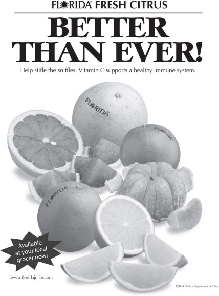
Guess which type of citrus fruit is which in this ad. Color—and labels—would help a lot, but in their absence, which other design elements give you clues to the fruits’ identity? The ad ran—with labels we took off to make the point—in black-and-white in some publications, and four-color in others. Photography: The Food Group for the Florida Department of Citrus.
EXERCISE: Before you turn the page, notice your first impression and analyze the ad. Also try to identify each fruit. What are the clues? (Turn the page to check your answers.)
EXERCISE: Now show the unlabeled ad to a dozen colleagues to get their reactions. Note the results, identifying the participants by gender, age, culture, and diet (citrus eater or not).

Check your answers on this actual, labeled ad and see Color Plate 27 for the ad that ran in color. Photography: The Food Group for the Florida Department of Citrus.
Confirming the need for labels or color, a few of the participants in my informal test misidentified at least one of the unlabeled fruits despite the information conveyed by size and shape. Labels plus color, as in the color version of the ad, let readers perceive at any level, although no test participant needed the labels on the color version. It's a tribute to the ad that it worked so well in black-and-white, but for pure informative as well as emotional impact, it can't hold a candle to the color version, which went to newspapers with color food sections. (See Color Plate 27.)
(A testing note: Many tests include at least one participant whose responses challenge the test, and this was no exception: One person identified a fruit in the unlabeled mix as a cantaloupe. But it's too easy—and flawed—to discount such findings, or to write off the participant. In fact, the cantaloupe finder is highly intelligent, just perhaps not fully attentive … common among busy or distracted audiences. You'll be wise to assume the same of your audiences. Assume it even if your test participants don't demonstrate it. In their desire to please, participants often behave more attentively and cooperatively than they would if they weren't being observed.)
* … and if the viewer can see the contrast: Most color-blind people—about 1 in 12 men and 1 in 200 women—see red (and green) as brown.