

Color Plate 1. High-contrast colors and type weights deliver an organization's message in a subway car. Creative firm: Fixation Marketing. Client: Bread for the City; Dan Hoffman. Creative director: Bruce E. Morgan. Designer/illustrator: Elizabeth Ellen. Copywriter: Kathryn Tidyman. (See page 21.)
Color Plate 2. Red and blue shown side by side in equally strong intensities seem to produce a shimmering effect on the eye, not conducive to comfortable reading. Graph Design for the Eye and Mind by Stephen M. Kosslyn. (See page 32.)
Color Plate 3. Caffeine-starved color-blind patients have to rely on legible type for direction to an eye hospital's coffee shop because they can't see the cup in the graphic on Paul Mijksenaar's signs. It's one sign in a series that spoofs a colorblindness test. Design firm: Bureau Mijksenaar bv. Client: Oogziekenhuis [Eye Hospital] Rotterdam. (See page 32.)
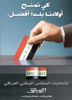
Color Plate 4. A poster to promote Iraq's interim-government election in January 2005 uses symbols that mean something to the audience. Even audience members who don't read Arabic only had to recognize the flag as Iraqi and the slot as a ballot box to get most of the point. Also note the poster's strong direction: The wrist, hand, and thumb lead the eye into the focal point, the flag “ballot.” The highest-contrast white stripe of the flag, bordered by red, reinforces the eye's destination. The flag's off-center placement adds interest to the poster's otherwise symmetrical balance and more contrast and attention to the flag. (See page 35.)
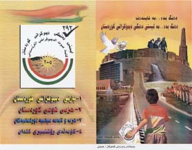
Color Plate 5. Symbols—and styles—clutter a poster created for the northern Iraqi city of Erbil, a Kurdish stronghold. Symbols compare and contrast the city's five-thousand-year history (represented by the city's founders in the hilltop citadel and other ancient people on the right) with the present and future (on the left, a boy wearing Kurdish-flag colors and holding a Kurdistan Democratic Party campaign poster, a modern hotel, and a dove, a symbol of peace among many cultures, with the poster in its beak). Like the Arabic language, the symbols also “read” from right to left, where the future lies. To tell a similar story to Western people, of course you'd put the past on the left. (See page 35.)
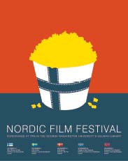
Color Plate 6. On this poster, symbols reinforce two of the words in the name of a festival. Filmstrips form the cross that's common to all Nordic flags; the cross is on a popcorn bucket. People who might've missed the flag-cross connection can see it at the bottom of the poster. The bucket colors come closest to the colors of the Finnish flag, which the designer could justify because that country's film is the first in the series. Design firm: Design Army. Client: Nordic Film Festival. Creative director/Designer: Pum Lefebure. Illustrator/Account manager: Jake Lefebure. (See page 35.)
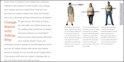
Color Plate 7. A book about energy and nutrition begins by introducing three typical audience members whose likely questions form the content. They're the result of internal work on personas. Design, Content development: Hot Studio, Inc. Creative director: Maria Giudice. Art director/Designer: Piper Murakami. Information architect/Designer: Renee Anderson. Producer: Hazel Sharpe. 848 Folsom Street, Suite 201, San Francisco, CA 94107, 415.284.7250, [email protected]. (See page 81.)
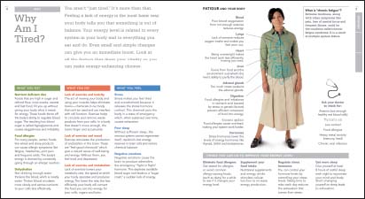
Color Plate 8. The following spreads of the nutrition book reveal solutions gained from looking into each persona's problems. Content development, information architecture and design: Hot Studio, Inc. Creative director: Maria Giudice. Art director/D designer: Piper Murakami. Information architect/Designer: Renee Anderson. Producer: Hazel Sharpe. Hot Studio, Inc., 848 Folsom Street, Suite 201, San Francisco, CA 94107, 415.284.7250, [email protected]. (See page 81.)
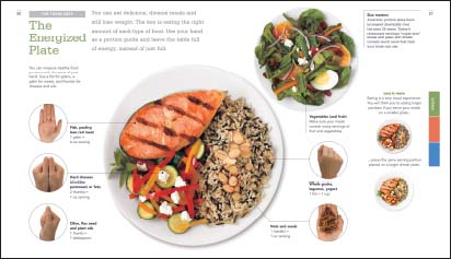
Color Plate 9. The book also contains general nutritional advice, including the answer to another question—“How much can I eat?”—that could have come directly from audience members if they'd been interviewed. (And “How can I measure it?” Use your hands, suggests the diagram-like illustrations.) Content development, information architecture and design: Hot Studio, Inc. Creative director: Maria Giudice. Art director/Designer: Piper Murakami. Information architect/Designer: Renee Anderson. Producer: Hazel Sharpe. Hot Studio, Inc., 848 Folsom Street, Suite 201, San Francisco, CA 94107, 415.284.7250, [email protected]. (See page 81.)
Color Plate 10. A wise editor prepared his audience for his publication's major reposition and redesign by flapping the old cover over the new one (with the car pointing and the wind blowing from old to new). Cover image: “Windy Day in Atchison,” by John Falter, © 1952 SEPS: Licensed by Curtis Publishing, Indianapolis, IN. All rights reserved. www.curtis-publishing.com. Sheldon Memorial Art Gallery; University of Nebraska. Journal: Trusteeship. Publisher: Association of Governing Boards of Universities and Colleges. Editor: Daniel J. Levin. (See page 84.)

Color Plate 11. Beneath the black-and-white replica of the old, the president's letter details the changes on the left, and reveals the whole new look on the right. Image on cover, “Windy Day in Atchison,” by John Falter, © 1952 SEPS: Licensed byCurtis Publishing, Indianapolis, IN. All rights reserved. www.curtispublishing.com. Sheldon Memorial Art Gallery; University of Nebraska. Journal: Trusteeship. Publisher: Association of Governing Boards of Universities and Colleges. Editor: Daniel J. Levin. (See page 84.)
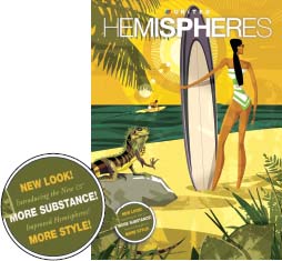
Color Plate 12. Found under an iguana and a beach rock: an announcement that a magazine for an airline's passengers has not just changed but improved. Inside, the CEO's letter, titled “Reinventing Ourselves,” gets a little more specific, mentioning that the revamped magazine is “easier to navigate.” Illustration by Dieter Braun, larkworthy. com. From Hemispheres, The Magazine of United Airlines; Pace Communication. (See page 85.)
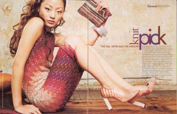
Color Plate 13. The headline links artwork through color (and through kerning—too-tight letter spacing subtly reflects the cloth's close-knit weave). © Element Media, LLC, 2000. Element magazine. Photographer: Jill Wachter, www.jillwachter.com. Art director: Daniel Chen. (See page 154.)

Color Plate 14. A photographer groups her portfolio by one-word descriptions established on her home page: “swank,” “jolt,” “groove,” “grit,” “exquisite,” “attract,” “amuse,” “origin,” or “wonderland,” as well as the dominant color of the photos in each group. Web site: www.jillwachter.com. Web designer: Deb Unger Design, www.debunger.com. (See page 154.)
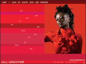
Color Plate 15. For example, here's a photo in the photographer's red-keyed “jolt” group. Web site: www.jillwachter.com. Web designer: Deb Unger Design, www.debunger.com. (See page 155.)
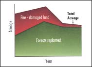
Color Plate 16. Green is for growth; red is for fire damage … (See page 157.)

Color Plate 17. … mix them up and you risk doing the same to your audience. Graph Design for the Eye and Mind by Stephen M. Kosslyn. (See page 157.)
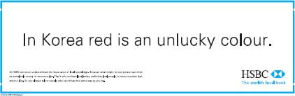
Color Plate 18. A global bank changes its logo color to show it understands its local audience, but red's unlucky there only in certain cases. (See page 158.)
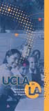
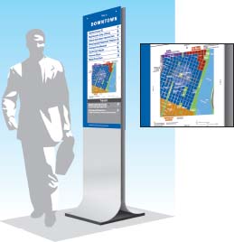
Color Plate 19. The front of a poster looks like a map. © The Regents of theUniversity of California. Design firm: Gregory Thomas Associates. Creative director/Principal: Gregory Thomas. Designer/Illustrator: Julie Chan. Additional design: David La Cava. (See page 160.)
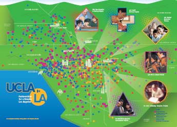
Color Plate 20. Unfolded, the map analogy continues to show the density of sponsored programs. A series of symbols, shapes, and colors identifies the various program categories. © The Regents of the University of California. Design firm: Gregory Thomas Associates. Creative director/Principal: Gregory Thomas. Designer/Illustrator: Julie Chan. Additional design: David La Cava. (See page 160.)
Color Plate 21. Portland signs use a code of different hues (blue, green, etc.), but the same chroma (brightness). That gives the colors equal prominence, and the backgrounds equal contrast against the white type. Design firm: Joel Katz Design Associates. Client: Portland Development Commission. (See page 163.)
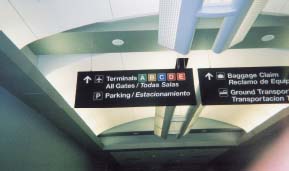
Color Plate 22. A color code distinguishes airport terminals … but not with equal power. The letters on higher-contrast blue and red, even green, “speak” across a greater distance than the one on lower-contrast gold. Photographer: Ronnie Lipton. (See page 163.)
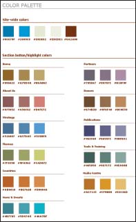
Color Plate 23. The color palette of the UN Habitat site is a design system within a design system, ensuring consistency that aids navigation throughout the site Design firm: Hot Studio, Inc. Project manager: Clancy Nolan. Information architect: Renee Anderson. Lead visual designer: Laura Haertling. Creative director: Henrik Olsen. (See page 164.)
Color Plate 24. Here are the color mixes in use and in comparison. Design firm: Hot Studio, Inc. Project manager: Clancy Nolan. Information architect: Renee Anderson. Lead visual designer: Laura Haertling. Creative director: Henrik Olsen. (See page 164.)
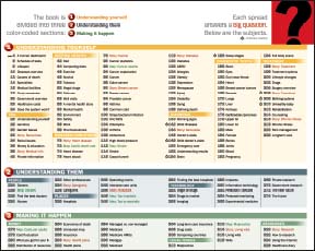
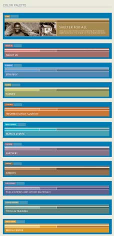
Color Plate 25. The color code that reinforces this book's organization is hard to miss because it's announced. (See page 164.)
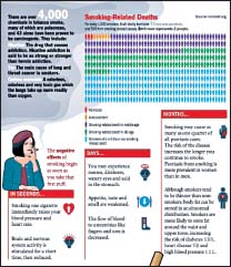
Color Plate 26. Color also distinguishes and identifies categories in graphs. In “Smoking-Related Deaths,” five colors might be too many to recall if the key weren't so close and the red so appropriate for “Homicide.” But the categories—“Homicide,” “Auto accident,” “Smokers who will die a non-smoking-related death,” “Smoking-related death in middle age,” and “Smoking-related death in old age”—don't fit the title or the book spread's apparent goal to discourage smoking. Exercise: Analyze the graph to explain why, and how you can improve it. Designer: John Sotirakis, Agnew Moyer Smith, Inc. Art director: Richard Saul Wurman. Production designer: Loren Barnett Appel. (See page 164.)
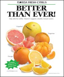
Color Plate 27. Four-color printing and labels remove challenges to naming the fruit types. Photography: The Food Group for the Florida Department of Citrus. (See page 166.)
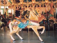
Color Plate 28. The background's as interesting as the foreground in this photo. So you'd keep it if it means something, such as setting the tone or telling the story of a carousel. Photographer: Ronnie Lipton. (See page 173.)
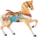
Color Plate 29. But use a silhouette to direct the viewer to one animal, maybe to show the results of its restoration (or how manes hang only on the audience side, as you saw in the Introduction). (See page 173.)
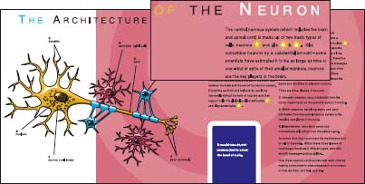
Color Plate 30. Numbered diagram labels correspond to numbers in the text, but not as clearly as they would if the numbers looked the same in both places. Those numbers interrupt the text, run distractingly out of sequence, and meaninglessly share a color with part of the diagram. Courtesy of the National Institute of Neurological Disorders and Stroke (NINDS), National Institutes of Health. (See page 176.)
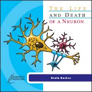
Color Plate 31. The brochure's cover title also violates the laws of consistency and meaning: The color of the words “The Life” matches the neuron, “of a Neuron” matches a secondary cell, and “and Death” matches only the illustration's outline. Courtesy of the National Institute of Neurological Disorders and Stroke (NINDS), National Institutes of Health. (See page 176.)

Color Plate 32. Readers don't find out what a bird's got to do with neurons until the third paragraph, not soon enough to keep the image from looking out of place. But nonscientific readers in particular might appreciate the natural touch. Also note the bird's direction—toward the text to help lead readers’ eyes that way. Courtesy of the National Institute of Neurological Disorders and Stroke (NINDS), National Institutes of Health. (See page 176.)
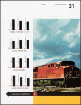
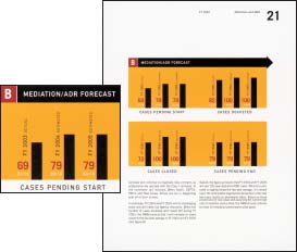
Color Plate 33. The train faces off the page, and so could send readers the same way. But the strong leftward arrow at the photo's base and the graphs’ contrast and colors (wisely picked up from the photo) counteract the photo's inherent direction. Project: National Mediation Board annual report. Design Firm: Design Army. Creative director/Designer: Pum Lefebure. Account manager: Jake Lefebure. (See page 177.)
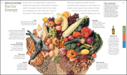
Color Plate 34. Call it a pie graph even if it serves other dishes. Here, a photographic background depicts each slice's category. Design, Content development: Hot Studio, Inc. Creative director: Maria Giudice. Art director/Designer: Piper Murakami. Information architect/Designer: Renee Anderson. Producer: Hazel Sharpe. 848 Folsom Street, Suite 201, San Francisco, CA 94107, 415.284.7250, [email protected]. (See page 181.)
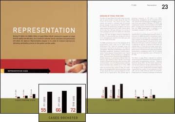
Color Plate 35. Numbers next to the bars are as prominent as they need to be because they quantify what's represented (mediation cases) more accurately than the bars do. There is also a blown-up detail of the “cases docketed” section on the spread. The graph is titled “Representation Cases.” Project: National Mediation Board annual report. Design Firm: Design Army. Creative director/Designer: Pum Lefebure. Account manager: Jake Lefebure. (See page 192.)
Color Plate 36. White numbers below the red ones look insignificant enough to miss, raising questions about whether the information itself is, too. (See page 192.)
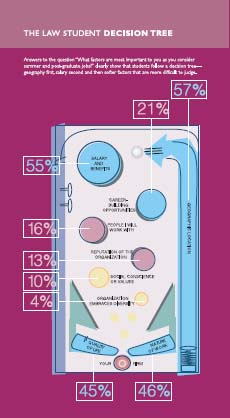
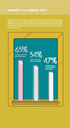
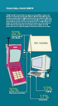
Color Plates 37, 38, and 39. A design firm's self-promotional booklet shows how to recruit law students, but not how to make informative diagrams. Its creators meant the icon-filled tables, maps, and bar (chalk) graphs only to demonstrate the design firm's creativity and knowledge of its audience's audience … typically college-age students. (The chalk bars in the middle, “Minority and Gender Views,” graph the degree of concern of “minorities,” “women,” and “non-minority men” about weak grades. The diagram on the right shows students’ preferred contact methods.) Design firm: Greenfield/Belser Ltd. Designer: Siobhan Davis. Creative director/Copywriter: Burkey Belser.. Production artist/Illustrator: Brett Mannes. Photographers: John Burwell, Jason Hendricks. (See page 192.)
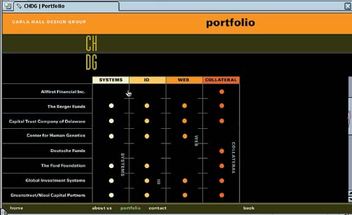
Color Plate 40. One screen on a design firm's Web site answers this question for potential clients “For whom have you designed what and how many projects?” Then they can click on the dots to answer the likely follow-up question: “What do the projects look like?” Design firm: Carla Hall Design Group. Art director: Carla Hall. (See page 194.)
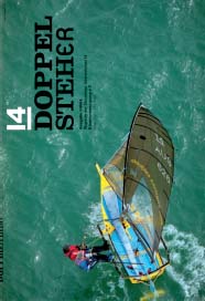
Color Plate 41. The cover of a sailing association's magazine introduces the theme of emotional connection with the sport. Design firm: Magma [Büro für Gestaltung]. Art direction: Lars Harmsen. (See page 199.)
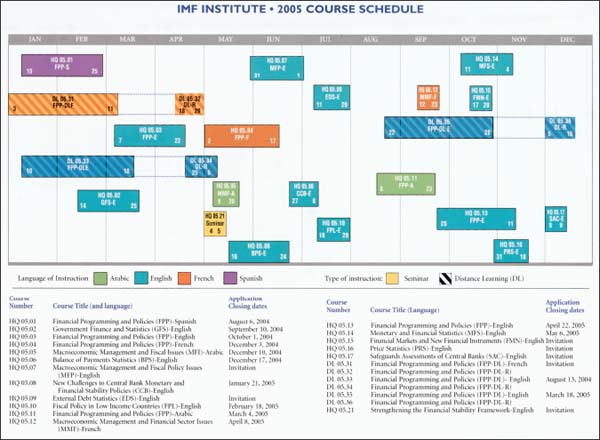
Color Plate 42. Here's the at-a-glance full page of a course schedule that runs horizontally (landscape) to fit everything in at the end of a vertical (portrait) booklet. See a detail on the next page. Reprinted by permission of the International Monetary Fund. 2005 IMF Institute Program booklet. (See page 202.)

Color Plate 43. And here's a detail from the course schedule. Reprinted by permission of the International Monetary Fund. 2005 IMF Institute Program booklet. (See page 202.)

Color Plate 44. All the categories are set in the same typographic style. Does that suit their meanings? 2004 Calendar of Events, Conference and Visitors Bureau of Montgomery County, MD., Inc. (See page 202.)
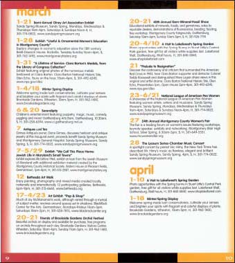
Color Plate 45. Gold type that was used for page numbers in the table of contents becomes dates in the calendar's body. Instead, the same style should convey the same meaning consistently throughout an information-design project. (See page 205.)
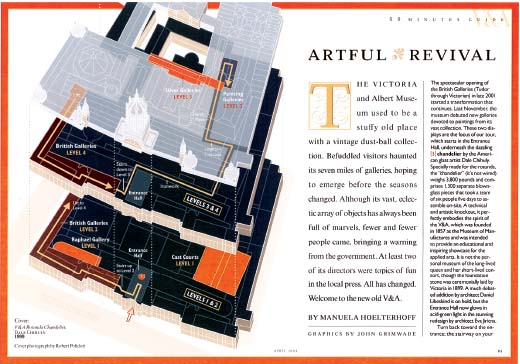
Color Plate 46. A tour map to London's Victoria and Albert Museum is designed to help visitors hit the highlights in an hour and see how floors correlate. This is the first spread of a booklet that inserted in a travel magazine. Design director: Robert Best. Graphics by: John Grimwade. Condé Nast Traveler © Condé Nast Publications, Inc. (See page 218.)
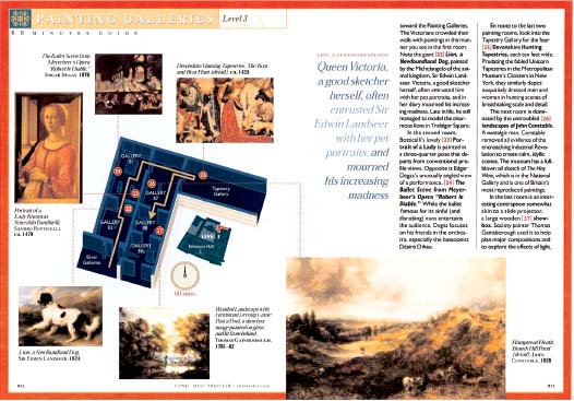
Color Plate 47. Other spreads in the booklet give previews of the featured floor's attractions. Design director: Robert Best. Graphics by: John Grimwade. Condé Nast Traveler © Condé Nast Publications, Inc. (See page 218.)
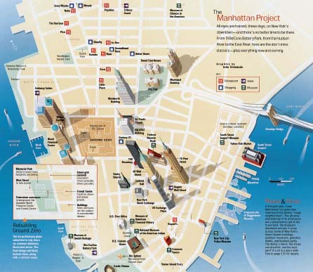
Color Plate 48. This spread's illustrator drew the buildings three-dimensional to aid identification, shadowed to connect them to the map, and tilted to avoid the magazine's binding. Design director: Robert Best. Illustrator: John Grimwade. Condé Nast Traveler © Condé Nast Publications, Inc. (See page 219.)
Color Plate 49. A legible sans-serif typeface works best against a busy or dark background. Design director: Robert Best. Graphics by: John Grimwade. Condé Nast Traveler © Condé Nast Publications, Inc. (See page 220.)
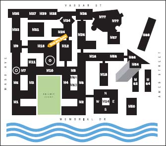
Color Plate 50. Heads up! The maps are designed and placed based on where the viewer is standing. For example, if you're on the main campus and looking at this map, the river's behind you and the map reflects it. The “you are here” banner (which prints in gold) does even more to nail down your viewing position: in Building M13 with Building M10 behind you. Design firm: Joel Katz Design Associates . Client: Massachusetts Institute of Technology. (See page 223.)
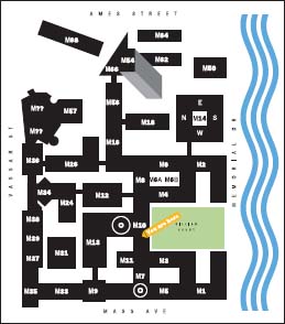
Color Plate 51. If you're on campus looking at this map (if the system's adopted), you also know where you stand: The river's to your right, and you're in Building M10 between Buildings M8 and M7, both accessible by corridor. Design firm: Joel Katz Design Associates. Client: Massachusetts Institute of Technology. (See page 223.)
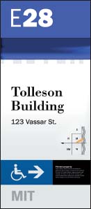
Color Plate 52. On a building sign, words and symbols combine clearly, and every element informs. The heads-up map's simplified almost into an icon. Design firm: Joel Katz Design Associates. Client: Massachusetts Institute of Technology. (See page 223.)

Color Plate 53. As always in this system, the maps come in north-up, east-up, west-up, and south-up to suit the viewer's standpoint. The golden banner reads “You are here.” Design firm: Joel Katz Design Associates. Client: Massachusetts Institute of Technology. (See page 225.)
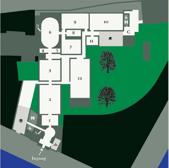
Color Plate 54. Symbols take up a fraction the space of words to show museum visitors where to find the coat room, the gift shop, and more. If only they were big enough to see on the brochure. There, the map measures ![]() inches square. It's enlarged here to clarify the symbols. Design firm: Bureau Mijksenaar bv. Client: Teylers museum. (See page 226.)
inches square. It's enlarged here to clarify the symbols. Design firm: Bureau Mijksenaar bv. Client: Teylers museum. (See page 226.)
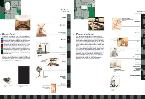
Color Plate 55. “Down-to-earth” features of this museum guide, such as photos, beat typical aerial-view floorplans alone for giving wayseekers signals that they've arrived. Design firm: Bureau Mijksenaar bv. Client: Teylers museum. (See page 228.)

Color Plate 56. This sign helps passengers at Schiphol Airport who want to know not just where their gate is but how long it will take to get there. Walking times are in white inside the big black gate letters. Design firm: Bureau Mijksenaar bv. Client: Schiphol Airport. (See page 228.)
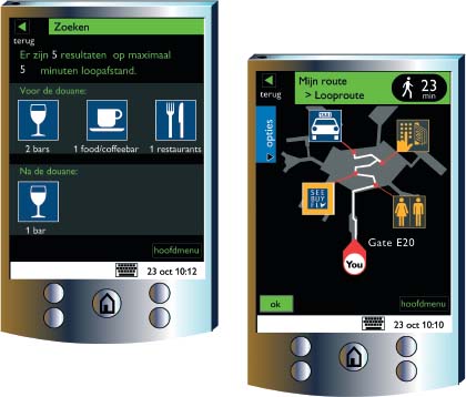
Color Plates 57 and 58. These handheld devices are in the works to direct passengers through an airport. What's more, links to databases can provide info such as gate changes and answers to passengers’ questions. Design firm: Bureau Mijksenaar bv. (See page 229.)
Color Plate 59. Katz re-created this sketch to show his first idea for explaining how the heart works. Inspired by Harry Beck's London Underground map, the subway analogy “made it so much easier to understand the pathways.” But what made it too radical to use, the illustrator decided, was “the stuff coming out of the bottom.” Design firm: Joel Katz Design Associates. Client: The Ovations Press. (See page 230.)

Color Plate 60. Blood that's lost its way through the body might do well to consult this “map,” drawn to explain how the heart works. This final version shows conventional pathways around a valentine-shaped heart. Designer: Joel Katz Design Associates. Client: The Ovations Press. (See page 230.)
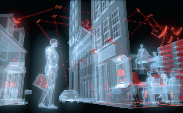
Color Plate 61. Art penetrates normally secure boundaries to illustrate an article about security surveillance. Illustrator: Mirko Ilić Corp. Client: National Geographic magazine. Illustrator: Mirko Ilić. (See page 231.)
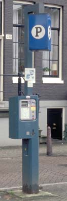
Color Plate 62. The light square text area on the face of this parking machine got a much-needed makeover. Design firm: Bureau Mijksenaar bv. Client: Amsterdam Stadstoezicht. (See page 231.)
Color Plate 63. The old text area suffered from lack of hierarchy, contrast, and clarity. Design firm: Bureau Mijksenaar bv. Client: Amsterdam Stadstoezicht. (See page 231.)
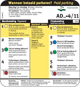
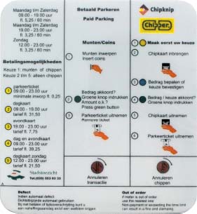
Color Plate 64. On the redesigned text area on the parking-fee machine, drivers navigate the left or right column depending on their method of payment; the time options in the center apply to each, say the common color and the “downdent,” the top indention of the column. Design firm: Bureau Mijksenaar bv. Client: Amsterdam Stadstoezicht. (See page 231.)
Color Plate 65. A conference brochure's designer borrowed map coordinates to help identify speakers. “AIGA Voice” brochure. © Cahan & Associates. Creative director/Art director: Bill Cahan. Art directors/Designers: Michael Braley, Bob Dinetz, Kevin Roberson, Sharrie Brooks. Designer: Gary Williams. (See page 232.)
Color Plate 66. In the same brochure, a drawing of a simplified map gives conference goers a general sense of how the hotel's location relates to nearby tourist areas (represented by the rectangle). “AIGA Voice” brochure. © Cahan & Associates. Creative director/Art director: Bill Cahan. Art directors/Designers: Michael Braley, Bob Dinetz, Kevin Roberson, Sharrie Brooks. Designer: Gary Williams. (See page 233.)
Color Plate 67. On the next page, the rectangle's blown up. “AIGA Voice” brochure © Cahan & Associates. Creative director/Art director: Bill Cahan. Art directors/Designers: Michael Braley, Bob Dinetz, Kevin Roberson, Sharrie Brooks. Designer: Gary Williams. (See page 233.)
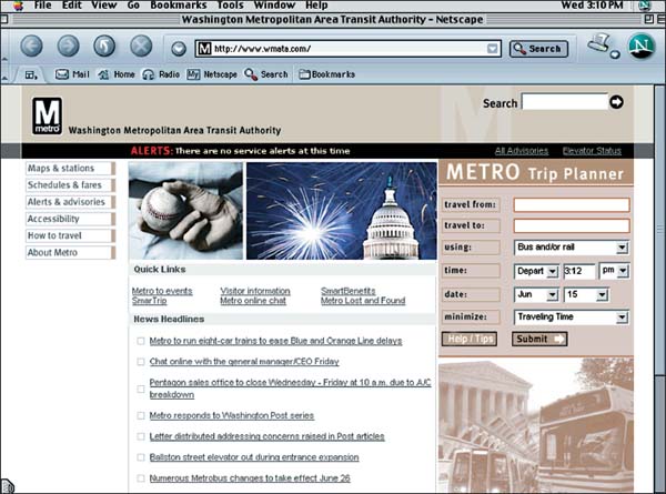
Color Plate 68. On the subway system's Web site you can plot your trip. Washington Metropolitan Area Transit Authority (WMATA). www.wmata.com. (See page 234.)
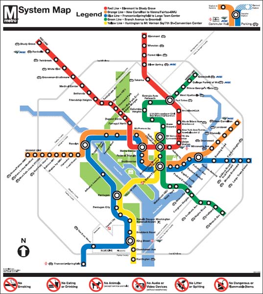
Color Plate 69. Here's the subway's map. Washington Metropolitan Area Transit Authority (WMATA). (See page 234.)
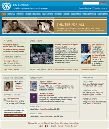
Color Plate 70. This Web site's redesigned to put the news front and center, with a plan for frequent updates. Design firm: Hot Studio, Inc. Client: UN Habitat. Project manager: Clancy Nolan. Information architect: Renee Anderson. Lead visual designer: Laura Haertling. Creative director: Henrik Olsen. (See page 234.)

Color Plate 71. Internal site links follow this style. Design firm: Hot Studio, Inc. Client: UN Habitat. Project manager: Clancy Nolan. Information architect: Renee Anderson. Lead visual designer: Laura Haertling. Creative director: Henrik Olsen. (See page 234.)
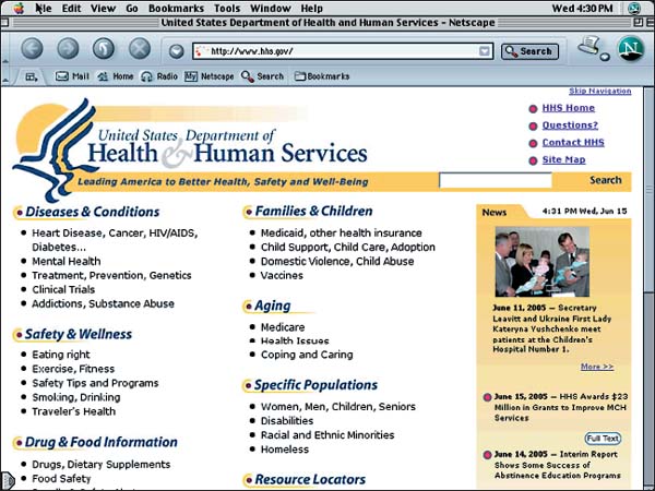
Color Plate 72. The category links you see “above the fold” on this government department's Web site are, as they should be, the ones the audience searches for the most. United States Department of Health and Human Services. Design team leader: Sanjay Koyani. (See page 239.)