
CHAPTER 2
Usability and how to achieve it
Usable information design certainly incorporates how most people perceive and comprehend. But it's best known for taking audience concern to a deeper level—examining how each particular audience varies from others and within itself—and designing accordingly.
An understanding of usability, and how you achieve it in your designs, begins with its multilayered definition. The word itself—dissected into use ability—provides a clue, but leaves out the essential parts: the people and their experience. Usability is the ability of an object or system to be used with satisfaction by the people in the environment and context the object or system is intended for.
Let's focus on satisfaction for a moment. Being able to fill out an insurance form or get an online boarding pass doesn't mean the experience was satisfying. By designing an experience for your audience members that's as satisfying as it is functional, you'll improve their day and probably earn their loyalty.
Usability combines useful content with a presentation and format that lets the audience easily, even intuitively, navigate and understand it. And although you might hear the term usability used most commonly with Web sites, it's hardly limited to them. Consider the audience's experience in every project you design.
To ensure your projects are usable, strive to design information that encompasses what Whitney Quesenbery of Whitney Interactive Design refers to as the “five E's of usability.” Make your design:
- effective. Can audience members—users—complete their task?
- efficient. Can they complete the task with a reasonable amount of time and effort?
- engaging. Is working on the task satisfying, maybe even pleasant?
- error tolerant. Does the design help users avoid and recover from mistakes?
- easy to learn. Is the design based on what users (see the sidebar to the left) already know? And are elements used consistently to reinforce what users learned when starting the task?
![]() Users is not a dirty word. Yet to some information designers and writers, using the word to describe the audience is proof that you don't know—or respect—the audience. As Edward Tufte and others have quipped, the only other industry that calls its customers “users” is illegal drugs. That's funny, but quite beside the point.
Users is not a dirty word. Yet to some information designers and writers, using the word to describe the audience is proof that you don't know—or respect—the audience. As Edward Tufte and others have quipped, the only other industry that calls its customers “users” is illegal drugs. That's funny, but quite beside the point.
Using the word users for Web site visitors (and any other information-design audience) helps to remind the people who develop, design, maintain, or approve the site why the audience tends to visit: to do some-thing, such as to get info or sign up for something, not just to casually observe. People who recognize that fact work to help their audience members with their tasks. By using a term to describe the audience that focuses on those tasks, they show the utmost respect for their audience. What's more, the term is the natural counterpart to usability.*
Of course you'll want to make your terminology more specific if and when you can. For example, you might call people who click one link applicants, and those who click another one shoppers. And, as you'll see later in this chapter, as you continue your research into audience members, you'll also need to add knowledge of the audience members that goes well beyond a label. Learning who they are and what drives them will help you enhance their experience when they engage with your content far more than arguing about labels will.
* Well, we could coin the term audienceability. (That idea should give information-design and usability bloggers hundreds of hours of debating enjoyment.)
Keep the list in mind when you encounter, design, or research any task-oriented visual information. Why research? Usability rarely happens on its own. To know what users will find effective, efficient, engaging, error tolerant, and easy to learn, it helps a lot to know the users, their environment, and their context (abilities, background, knowledge, habits, and preferences), then design with that knowledge.
Research basics: Getting to the heart of the audience
This chapter—and the book—includes case studies that used a wide range of techniques you might use to find out about your audience. They fall into these major categories:
- Find out all you can from your clients:
- Interview the people who give you the project.
- Talk to people who have regular direct contact with the audience in person, by phone, or online. That might include customer service or sales reps, clerks, registrars, bookkeepers, and so on. Ask your clients to arrange access to them.
- Look at the clients' logs of the audience's phone calls, e-mails, Web site paths, and search engine entries. (If the clients aren't keeping and using these logs, urge them to start. You might help them to design a system for capturing this valuable intelligence.)
- Do or commission your own research. For example:
- Interview audience members in person (one-on-one or in a focus group), by phone, or online.
- Conduct a survey (in print or online).
- Observe audience members working with your materials and those of other companies.
- Look at outside research about the audience.
Interview your clients and their colleagues
Whenever you get a design project, always ask your clients for a detailed description of the audience members and their needs. Here are some essential questions to start with:
- Why are these people in a position to interact with the design? What need, problem, or question brought them to it? What's their task? Even if the answers seem obvious to you before you ask for them, they might show you a flaw in your assumptions early on.
- What else do audience members see on the topic from other sources?
- What else do they see from the client? (Look at the proposed project in the context of other materials to see whether it would make sense to combine, redesign, or eliminate some.)
- What does the audience already know?
- What problems or challenges does the audience have?
Educate your clients
Clients who haven't looked at the audience might not be able to answer all of those questions. Or you might have to explain why you're even asking. If so, consider it worth the effort to train your clients in the value of research and serving the audience members' needs, not just the clients'. Consider it a long-term process; you can use this book and its case studies as support.
You also might need to educate your own team members, suggests Sanjay Koyani, a senior usability engineer at the U.S. Department of Health and Human Services. Teach them not just about the need for testing but also its goal: “making sure we have a deep understanding of the users, their priorities, and our measures of success,” rather than just that the site works on the servers.
When designer Paul Mijksenaar recommends that clients test their designs with the audience, “most of the clients say, ‘Well, you are the expert, you should know’” what's right without research, he says. “We can say if the details are too complex,” he notes, but not “how people behave or the meaning of the sign … we can't foresee how people will react to a new element.”
What to learn about your audience and why
Learning the audience starts with knowing their demographic categories, such as age, gender, education, income, and marital status—information that's relatively easy to get secondhand. But it also means delving deeper into the audience's psychographics, such as attitudes, ambitions, habits, preferences, skills, and details of daily life. Psychographic info is tougher to get at, but it's worth the effort.
Knowing how your audience members think, act, and feel will tell how they're alike and different from each other and from other audiences. It will:
- keep the focus on what the audience needs instead of on what the client wants to tell them. (And any utterance of “What do we want to tell them?” should always trigger the better question “Why should they care?”)
- serve as a benchmark for every content and design decision
- help to eliminate or minimize the effects of different agendas within the team that can derail a project
- help you and your colleagues think about and speak to the audience as individuals (instead of as “you guys,” as an insurance rep's voice-mail message addressed callers: “If you guys are calling for claims forms …,” which seems to reflect the rep's lack of concern for her audience)
But words alone won't convince the audience you care. No one's fooled by a utility company's assurance that “your call is important to us,” especially when it repeats during a long wait on hold. Although this example is not visual, it falls under information design because it's part of the audience's information-seeking experience. Consider the whole picture to give your audience a consistently positive one.
Research will also help you:
- anticipate what will work for the audience members
- avoid alienating them
- develop empathy for them
- connect with them
- do your part to make life easier for the people you serve
How to learn about your audience from your audience
Research techniques include:
- interviewing the audience
- one-on-one or in groups
- in person or on the phone
- print or online surveys
- testing the audience
For a step-by-step walk through testing for one project, see—and do—the swim schedule project on pages 42–60.
Testing tips … and limits
Tests don't have to be expensive or complicated. In fact, it's better to keep them low-cost and simple to encourage more testing, according to Don't Make Me Think by Steve Krug, who focuses on Web testing. Ask people to do typical tasks you set for them, or, he suggests, you might let them set their own tasks. You also can show people rough sketches and ask for reactions.
Krug notes that there's a limit to what testing will do for your project. It won't tell you what everyone wants, because there is no “average Web user.” Krug's observation of test participants over the years confirmed that individual Web use behavior is both unique and idiosyncratic. Good design allows for such diverse behavior.
According to Krug's commonsense approach to testing:
- Test early because it's harder to change things at the end. Before you design anything, test with sites of organizations that are similar to yours.
- Test often, even if it means using participants who don't represent the audience in some ways for some of the tests. For example, if you're designing a Web site for realtors, you could test navigation throughout the design process with nonrealtors who have Web skills that are similar to your audience's in between tests with the actual audience. (Janice Redish also believes in frequent tests, even with only a few people, but only with people who represent your key audiences. But, she says, “most Web sites are meant for the public, and it's not too hard to find the public.”)
- Test inexpensively. Testing can be informal; it doesn't need a lab or scientists.
- Test after making changes.
- Videotape tests.
![]() How a swim schedule became more usable
How a swim schedule became more usable
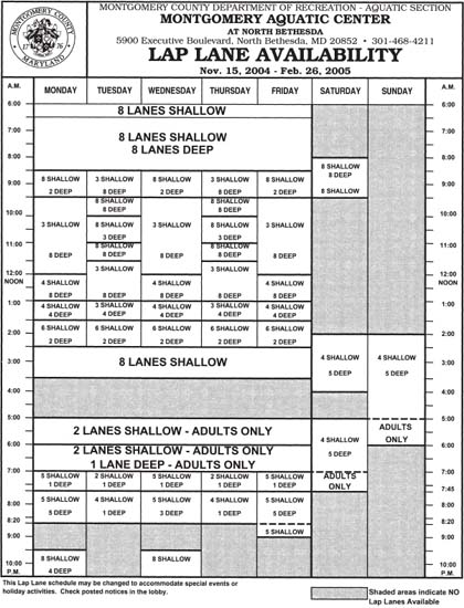
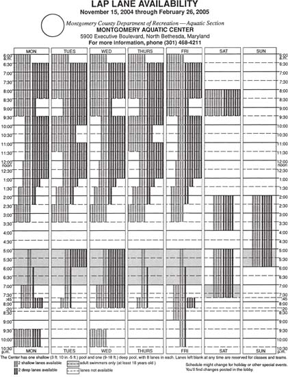
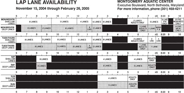
Let's analyze, test, and redesign a typical information-design project you might find in your neighborhood. It's a swim center's schedule, meant to answer a simple question for the audience: “When can I swim laps at this place?” But the answer isn't always so simple or quick to find.
- Scheduling is complicated. Swim teams and classes fill some or all of the sixteen lap lanes at various, inconsistent times every day.
- The pools are different. Eight of the lap lanes are in a shallow pool; the other eight are in a deeper one.
- The schedule design is hard to use.
Of these three issues, the only one we can change is the design. Let's test it.
To find out whether the schedule is effective and whether we can improve it, we'll use four techniques:
- Usability testing with the audience
- Analyzing the design
- Interviewing staff members who take swimmers' questions about the schedule
- Interviewing the audience (before you design)
You'll do an exercise that will include the first two techniques. Then we'll discuss the other two, which are where you'd start in an actual information-design project.
Usability testing: Get inside the experience of the test participant
In an actual test, the test participant would do a task, and the facilitator would observe it. But to give you a taste of the experience just for this exercise, you'll perform both roles. So while you do the task you're about to get, notice everywhere your eye falls and in what order: Where do you look first? What do you see first? What's next, and next after that? How much time did you spend getting oriented? And how many times does your eye glance at the schedule without finding what you're looking for?
If you met any obstacles, however brief, on the way to your answer, identify them and take notes. Avoid judging your comprehension pace; just observe it. (And if you still think the answer took too long to find, blame the design, not yourself. Also avoid assuming that if you got the answer quickly, everyone else will … and avoid questioning the intelligence of those who don't.)
Here's the task: Find the current time and day on the schedule. See whether you could swim laps now at the swim center.
Usability testing: Test others
Now give yourself the essential “other” perspective, because you can't assume other people's experiences will match yours. In an actual project you get from a client, you'll test only other people. For this part of the test exercise, follow these steps:
- Enlarge the schedule to 8½ by 11 inches on a photocopier or scanner. (That's its original size; we've had to reduce it to fit the page.) Make six copies.
- Find six test participants from your town, neighborhood, office, or classes. To represent the swim center's diverse audience, choose a range of ages, genders, cultures, and educational levels.
- Test one participant at a time, alone, so you can focus on each participant as he or she does the task. Ask each person to assume the same posture (for example, standing or sitting, holding swimming equipment or not. (If this were not an exercise, you could have looked to your preliminary research to tell you how most people use the schedule). Then give each person the schedule and ask the same question: “Can you swim now?”
- Sit where you can observe both the person and the schedule.
- Observe each participant's process in finding the answer. Capture the process with written notes, or with audio-or videotape if you have the equipment and if participants sign a permission form. To help you cover each participant consistently, you might draw up a form with spaces for the various categories you'll look at, such as:
- comments, questions, and answers. Ask the participant to talk you through his or her process. If the participant grows silent, ask “What are you doing (or looking at) now?” or “What's going on now?”
- sounds, such as grunts, groans, cheers, sighs
- eye flow
Test this lap-swimming schedule's usability. Could you swim laps now? How could you improve the schedule? Designer: Aquatics—Montgomery County Recreation Department.
- facial expressions and body language (for example, whether the participant uses a finger to scan the sheet)
- How much time it takes each participant to find the answer
- If participants have trouble finding the answer, continue to just observe and probe for what's getting in their way; resist any temptation you might have to help them. (Ultimately you'll help at least their fellow humans by improving the design.)
- Interview participants after the task about their experience. Get at any problems or delays they had. Ask open-ended questions such as “What did you think of it?” and “how was that for you?” Stay neutral in both your questions and facial expressions to avoid showing your hand or leading the participant. Test participants often try to “get it right” or please the interviewer, so keep your opinions (“Wasn't this a mess?”) to yourself. For that reason, also make clear that any problems were with the design, not the participants' intelligence.
Analyze:
Solve participants' problems on paper
8. Take the test results to the drawing board and sketch versions that solve the participants' problems.* Also apply the information-design principles and guidelines in this book.
9. Choose the two sketches that seem clearest, and lay them out in digital format. Make them look as finished as you can for participants who find it tough to judge a rough sketch.
Test some more
10. Show the redesigns to the same participants, then six more. Divide your participants into two groups (even though you'll test them individually), with each group starting with a different version. After they finish the task, ask what they thought of the design. Then show the other version and ask what they think of that one. Use a neutral voice and facial expression, and use the same words to ask about each one to avoid showing any bias.
11. Make changes; test again.
Interview staff members
For any actual information design project, you'll get essential info by talking to staff members. For example, as at the swim center:
- the people who work the reception desk and phone could tell you about swimmers' problems and questions about the schedule. They could also give you a general sense of the type of people who use the schedule.
- the people who update the schedule could tell you how they produce, reproduce, and distribute it.
- the people who schedule teams and classes could tell you how much the schedule changes every season.
The schedule redesign in this book included interviews with fewer staff members than a commissioned project would need. They included a clerk (who greets patrons, collects fees, answers questions), three lifeguards, and a recreational supervisor. “I think (the schedule) works as well as it could work …. It reflects a very complicated schedule,” said the supervisor, Peter Haack. And despite its complications, “the staff has it memorized.” (But memorized with gaps, it turns out. When asked how long the lanes would stay open, one of three interviewed lifeguards didn't know; a second lifeguard was off by a half hour.)
As the designer or redesigner, you also might ask whether the schedule needs to be so complicated. But for our purposes, the complications add useful challenge to the exercise, so we'll work with it as is.
Staff interviews also would tell you that the center uses Excel to produce and easily update the schedule. So it makes sense to at least strongly consider using that program for the redesign. Possible reasons for not using Excel might also come out in the interviews. For example, maybe the center plans to move the updating to your studio, buy new software, or keep the new programming schedule permanently. Or maybe Excel just won't support a clearer schedule. That's not the case, but if it were, you could suggest new software or a permanent schedule. (Because this redesign is only an exercise, I used a page layout program just because I know it better.)
You'd also need to consult the staff on the internal feasibility of your ideas. For example, a design analysis—and turning the lanes into graphics in one redesign—revealed useful patterns: Tuesday's and Thursday's schedules match, and Monday's, Wednesday's, and Friday's schedules are identical to each other until 7:45 p.m. Those patterns aren't clear on the original, so later redesigns highlight them, and test participants approved. But if the staff tells you that those day patterns change or even disappear from season to season, you're back to showing all seven days.
Tests also showed that the audience members didn't need the seal or other county references here. They already knew the center is a county facility. So because the project is just an exercise, the seal came out in later versions. If this were for real, the staff might tell you the seal must stay, for reasons ranging from identity to legal. Accept the answer if you can't fight it or shouldn't try to, and move on. (You might get permission to reduce its size, but avoid reducing it below legibility, as it might distract readers who think they have to decipher it.)
Interview the audience before you design
Whom to ask: the “right” test participants
In the case of the schedule, even a nonswimmer or someone who's not familiar with the facility can shed light on a more functional design. Of course, also test those who represent the audience. In this case, the audience is a diverse public community, including all ages and a big share of people for whom English is a second or unknown language. That fact inspired design versions that relied on graphics, which, if they're clear, speak equally well to people of all native languages.
Whom not to ask … much: you
The first part of the previous exercise aside, you're not the audience, as you'll see throughout this chapter. At the very least, you're different because, as the designer with an inside track to the organization, you know jargon and other things the audience doesn't know. Or you might represent only one segment of the audience, which could blind you to other segments.
What to ask and why
As you'll see throughout this book, every project should answer one big question for the audience. For the schedule, the big question—the one chosen for the test task—is “Can I swim now?” Other questions include “When can I swim?” and “How long can I swim?” But the clarity and value of your design also depend on knowing more about the audience members' diverse needs and preferences. So before you design an actual project, ask other questions to get at them.
Choose questions that seek to get to the heart of the audience members and their ideal experience, in relation to what you're designing. For example, if you were designing a swim center's schedule, you might ask audience members about:
their swimming times
- What times and days do you swim? (This will tell you high and lower traffic times; also ask staff members to keep track, if they don't already. It will also give you a sense of which audience members don't swim at regular times and so refer to the schedule more often than other users; these are the most valuable people to interview.)
the printed schedule
- Do you use the “lap lane availability” schedule?
- If you do, how does it help you?
- What has been your experience getting information about the swim center?
- Have you ever shown up at the swim center at the wrong time to swim?
- If not, how do you know when to show up?
- Do you use the Web site?
pool depths
- Will you swim in either of the two pools?
- What do you see as the difference between the pools?
- Do you have a preference?
- What do you prefer about it?
- With an equal number of swimmers in each lane, which pool would you prefer to swim in?
Why ask about depths?
Do swimmers care about the water depth? Won't they swim in either pool? Responses divided into three major categories:
- those who will swim in either pool but want to avoid heavy traffic. These swimmers want to know only the total number of open lanes.
- those who have a preference or will swim in only one of the pools. (Some people need deep water for doing underwater turns; others need shallow water they can stand up in.) They want to know the number of open lanes in their chosen pool.
- those who ignore the open-lane totals, the pools' depth, and the printed schedule. Said one: “There's swimming every day till three-thirty. If I'm lucky, there aren't too many people in my lane.” (That swimmer expressed relief she didn't depend on the printed schedule: She said that without her reading glasses, she found the (7-point) numbers too small. For her and others like her, the redesign made the numbers one size bigger than the words.)
If you're not sure what to ask for any given project, it might help to borrow the journalists’ formula “5 w's and an h”: who (Who are the audience members?), what (What do they do there? What, if any, problems have they faced?), when (When do they swim?), where (In which pool do they swim?), why (Why do they swim there?), and how (How do they know when to swim? How do they get there?). Then try them out on audience members to see which questions work best.
At the end of the interview or test, ask a “what else” kind of question. In this case, that might be “What other information would you like this schedule to contain?” or, better and more neutral, “Is there anything you'd like to add?” The question might give you useful information you didn't think to ask about.
Collecting test results
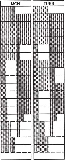
Here's the process of a typical participant who was trying to answer the question, “Can you swim now?” while looking at the original schedule on page 43. After being briefly stalled by the clutter at the top of the page, he found the days of the week, then Tuesday, his goal. But before he could find the hours, he got distracted and momentarily confused by the big 8's below it (showing the number of shallow and deep lanes). He wondered whether and how the big type might be different from the smaller type. (The big type does show that the schedule is the same for all five weekdays. But the absence of vertical lines to separate the days there is indication enough.)
Testing redesigns also showed a preference for putting the hours at the top of the schedule and the days down the side, instead of the opposite, as they are now. (When you test just one element, conduct a controlled experiment by creating versions that differ only in the element you're testing.)
Capture audience members’ words to show you what terms they use and understand. Also test the audience's understanding of terms the staff uses. For example, you might explore how users understand the terms shallow (here it means 3 feet 10 inches to 5 feet) and deep (9 to 18 feet), and determine whether swimmers need to know how the staff are using them (yes, as it turned out).
Or let's say you found in your research that depths didn't matter to swimmers. So you might think of identifying the two pools as, say, “left” and “right,” based on swimmers’ perspective when they leave the locker room. You also would have to test the clarity of those terms with swimmers of all ages, native languages, and cultures. As another example, because there are adults-only swim times, how old is “adult”? Parents might wonder if their teenager can swim during those times.
If you can't change the terms to be clearer, define or explain them in a glossary placed where the audience members who need it can find it. (How do you know where the audience would look? Test, ask, observe.)
Analyze what's wrong
Testing swimmers showed that what confused people the most was the schedule's inconsistency:
- Type is enlarged or shrunk to fit available space (different sizes of type usually mean different things, but that wasn't the case here).
- The amount of space varies between lines of type that go together.
- The amount of space varies for time periods of the same length (for example, the size of the 9:30–10 a.m. block is smaller than the size of the 10–10:30 block).*
The inconsistency starts at the top, in the page's competing titles. The eye easily can get lost in the elements, sizes, weights (bold with medium), and cases (some lines are in all caps, others in upper-and lowercase).
Analyze what works
Also look for any features worth saving, and test them with the audience to confirm it. Because the features are already in place, the audience might find them clear because they're familiar. And if they're compatible with any needed revisions, you'll also save yourself time. For example, on the original schedule:
- the shaded areas without type represent times when no lanes are available (this is clear even if you don't look at the key).
Look for and remove inconsistencies and clutter. Designer: Aquatics—Montgomery County Recreation Department.
- the columns for the days of the week are all the same width.
- times are listed on both sides of the schedule, so people don't have to scan across the page to find them.
- most of the labels are set in a consistent size and face.
- the title is appropriately bigger and bolder than anything else on the page.
- there are no 7:30 and 8:30 labels, because no swim period begins or ends then.
What's the least you can do to improve clarity?
Although it's worth doing everything you can to make things clear for the audience, it can be useful to first consider how you might limit changes to what's essential. The more elements you can keep from the original, the easier it will be for viewers to learn how to use the new schedule.
In this case, these changes were most needed:
- Make type sizes consistent for the same kind of information.
- Make leading (space between type within the boxes) consistent.
- Define terms (shallow, deep, adult, etc.).
- Separate the days more, using space or heavier rules.
- Match the amount of space given to equal time increments.
- Clarify the title section. The clutter of many squeezed elements makes it hard to find a place for the eye to land. The title is bigger than anything else, but it still tends to get lost in the crowd.
Guidelines to redesign by
Testing and analyzing this project inspired these guidelines for its redesign:
- Use equal visual increments to represent equal quantities, unless your reason for unequal ones helps to clarify the information.
- Use space to separate the title from the rest of the schedule, in this case the days of the week.
- Every heading needs a clear focal point, and every information design needs an entry point for the audience.
- Always ask how materials will be displayed or distributed, and design accordingly.
- When you design seals or logos, simplify them enough that you can reduce and reproduce them on rough or textured surfaces without losing clarity.
- Start with less detail, adding more only as needed (or logos and information design, in general). For example, that might mean just removing unavailable lanes, as in the redesign on page 50.
- Question everything, including terminology. Always find out if audience members understand terms the organization takes for granted; if not, find out and substitute what the audience does understand.
- Look at all of the materials the organization provides to its audience. See how the pieces relate to each other. See whether any of them need redesigning as part of a system to show how they interact and differ, or eliminating because they duplicate each other. If patrons don't find what they need on one sheet, how will they know whether it's on a companion sheet?
- Connect all related materials clearly. For example, distribute them at the same place, give them similar design features, and, on each piece, refer to related pieces. Refer more specifically than saying just “Also see [“Public Use Times”] if the title doesn't describe what the audience will see there. One pool visitor admitted to searching the schedule for the hours of the center's third pool, which is not for lap swimming so the schedule doesn't include it.*
- Choose words carefully, and test to determine whether headlines that describe what the information does for the audience (such as “When can I swim laps?” or “When you can swim laps”) work better than label titles that tell only what the piece of information is (such as “Lap Lane Availability”). To either, you might add a subhead: “Hours when lap lanes are open to the public.”
Improvements start at the top: focal point, hierarchy, chunking
The title needs space around it, without anything competing with it. In fact, the whole title section needs to be set off from the schedule itself. Here, typographic separation (serif titling compared with sans serif labels) isn't enough to do the job. Type can help, with a clear hierarchy of weights, sizes, and position to show the relative importance of various elements.
A redesigned title section features a stronger focal point, hierarchy, and chunking.
The section also cries out for “chunking” (grouping related elements and separating unrelated ones).
Always put the title at the top of any sheet (such as this one) that the audience picks up from a display stand in which only the title shows. And question what needs to be in the heading.
In the first redesign of the title section, “Lap Lane Availability” groups with the date, which is what most audience members (who already know how to get to the place) consider the second most important piece of information.
The phone number is bolder than the other contact info. But it's still below the address, close to the schedule that might raise questions (but, one hopes, fewer than before the whole schedule's redesign).
Another approach to the title section is similar to the original (and it works unless the display stand would cut off the title): Get the place info out of the way first, but play it down, with fewer caps and styles, and more space to separate it from the title.
Different takes: The final
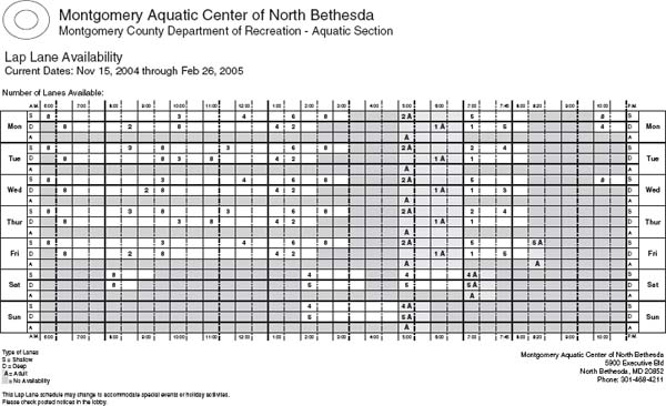
Interviews, analysis, and design experiments resulted in more than nine versions of the schedule. More interviews would have limited the range of possibilities. (For example, the best versions turn the schedule on its side, which might not work with the center's display stands.) The final version is on the following page. Analyze it and see whether you can improve upon it. Major features include:
- a title section with the main info in the more prominent upper left corner, and contact info in the upper right. The county references came out (but only for this exercise).
- a landscape orientation, with days at the side and hours at the top, because it seemed more logical to the audience to swim across hours than days.
- grouped days that have the same or similar schedules.
- but separate Saturday and Sunday listings, because they differ too much to share space.
- only open lanes displayed, to keep closed lanes from distracting.
- shading that distinguishes shallow from deep lanes, adds contrast that helps the viewer track along the day.
- hours that are close to the lane blocks.
- plenty of space between the day groups.
(The redesigner considered breaking the timeline between lap periods because it would look cleaner [for example, between 3:30 and 5:00 during the week]. But she rejected it because it would make the floating evening periods look as close to other days’ evening swims as to the rest of their own day.)
Intermediate versions
The sketches starting on page 51 represent the redesigner's thought process. Let's take a look and analyze them.
For the first few, the lanes turn into graphics. The first one relies too much on the key. As a general rule, use a key or legend only if you can design the diagram to explain itself without clutter and confusion.
And any key should be simple enough that the audience gets it in one glance—having to keep looking back and forth can hinder recall and add frustration. Avoid more than four or five key entries, and where possible, use intuitive codes (such as lighter screens for shallower lanes).
Also in the key, the two shallow lanes are stacked above the two deep ones instead of side by side, as they are in the main diagram, and the unshaded lines represent closed lanes (the opposite of the original, in which shaded areas are closed—a deliberate violation of the “what's familiar” guideline). Testing's needed for these elements.
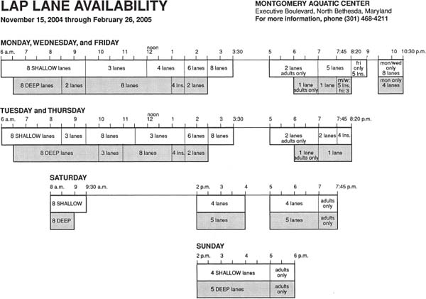
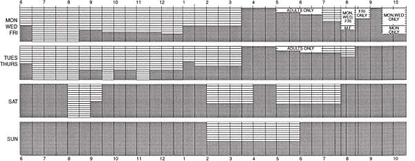
This final, total redesign gets closer to clearly answering the question “When can I swim?” Explain why, and how you'd improve it even more. Series redesigner: Ronnie Lipton.
This project demonstrates the often evolutionary processes of design and redesign. The version that started the evolution keeps the vertical orientation, but replaces words with graphics. It also adds space between days and shading behind the adults-only swim periods.
If shading won't survive the production process, change shallow lanes so they “read” open to closed from left to right. That way, the empty space between shallow and deep lanes reinforces their difference, as in this detail.
In the version on page 51, too, the half-hour scale increments get messy, especially at the “exception” times: 7:45 and 8:20.
That design and others assume viewers care about only the total available lanes, not their depths (before research proved the assumption wrong). At a glance, viewers can see the number of open lanes.
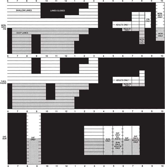
The final redesign and some of the other sketches (bottom of page 53, pages 54–56) assume staff approval for grouping. The overall drawback is messy variations on Monday, Wednesday, and Friday evenings.
Research dictated the return of depth distinctions, with shading (on the final and all sketches except page 53). Fortunately, the grouped days let lanes get taller, which helps them look more like lanes. But, on page 54, the closed lanes’ high-contrast black, commands more attention than the open lanes do.
On page 55, along with too-strong verticals, notice two tries—one graphic, the other verbal—to show the meager weekend hours without taking up sixteen or thirty-two lanes’ worth of diagram space. But using two different designs for the same type of information is confusing.
On page 56, the graphic weekend experiment in the previous sketch might also work for the weekdays, but not in this cluttered attempt. What other changes do you notice?
Information design student Ann Firth was inspired by the original to do her own version (on page 57). She didn't have the opportunity to do testing, so she focused on analysis. To make the schedule easy for the staff to update, she worked in Excel. She listed each day instead of grouping common ones, and put a single number in each time slot.
Firth added an adult lane to each day, but later thought that her shaded lanes and the letter A for “adult” were enough. Next, she says, she would add space between the days. (In fact, she says she kept the extra adult row to help separate them.) Her design also shows you at a glance which lanes are open, and it groups contact info at the bottom.
Firth agrees with putting days on the side. With the original, she says, “The inability to track lanes across one day bothered me the most. Jumping from time box to time box was very annoying, especially when some lanes remained the same.” And, “It seemed more natural to visualize the day left to right, not up and down.”
Building context into a series of materials
Few information design projects exist in a vacuum. When you take on a project, look at everything the organization provides to its audience. See whether the pieces relate to, supplement, or duplicate each other. If they supplement each other, how do they communicate that? If audience members don't find what they need on one sheet, does the sheet make clear where else to look?
Connect all related material clearly: Distribute them at the same place, give them similar design features, and, on each piece, refer specifically to related pieces. “Specifically” means more than “Also see [title]” if the title doesn't describe what the audience will see there.

There went the swimming-lane depths. This version also rotated to horizontal.
Patterns and their variations in daily schedules emerge.
Depths return by popular demand. The version sees a virtue in only the essential vertical lines. But does that high-contrast black stay in the background?

Do more verticals help? If so, make them heavier than the lane lines for easier navigation, or the grid will distract from the info. At the bottom, you see two experiments in weekend schedule display.
What happened here, and what you think of it?
Exercise: supplemental schedules
Now analyze both sides of a related information sheet from the same center on pages 58 and 59.
Context can take different forms
In the tests, most newcomers understood the terms shallow and deep, but not which pool was which without jumping in or asking someone. At this facility, the only clues are the depths painted in feet and inches along the upper walls of both pools (and the water color: In the deeper pool, it looks darker blue than in the shallower one). It's tough to see the labels across the large room.
So context in this case would mean posting a sign above each pool to identify it by name. In fact, any sheet label should correspond to big, clear, nonfogging pool signs that are visible and legible from a distance.
Also, displaying an enlarged copy of the schedule in the pool area would be helpful to tell people how much longer they can swim. Now the only poolside reference is the letter-sized sheet on a bulletin board. Because the schedule changes with the season, the sign would have to be changeable, too, maybe in electronic form.
More context: “Visit us online”? Tell why
The back of the sheet (on page 58) offers an invitation to patrons: “Visit us online: www.montgomerycountymd.gov/rec.” How will the audience know how this sheet relates to the Web site? Like so many organizations, this one needs to tell people why they should visit online. The schedule there (at this writing) is almost the same noninteractive table on one side of another sheet provided by the facility. That's a missed opportunity to exploit the Web's capabilities, which could've let patrons click on or type in a day and time for the current swimming schedule.
Work with the staff's systems, as shown by this version done in Excel, the program the staff uses to make the schedules. Redesigner: Ann Firth.

Another sheet for swimmers kind of looks like a graph, but note the problems with the box heights, which represent the time periods in them just closely enough to be dangerous. And what do those terms mean? Designer: Aquatics—Montgomery County Recreation Department.

The terms are defined on the sheet's other side. With only words and numbers but no depths, see how compact the “Lap Swim” box in the lower right is. Designer: Aquatics—Montgomery County Recreation Department.

Shallow and deep pools (the deep one is closer in the photo) are divided by the white walkway in the middle. Photographer: Ronnie Lipton.
* Brainstorming toolbox: Experiment with both pencil and pen to find your preference. The look and sound of pencil on paper inspire some designers. Others prefer felt-tip pens for their speed in getting down ideas. If you use pencil, avoid erasing, which can plunge a brainstormer into idea-squelching perfectionist mode; just move on to the next sketch when you've finished exploring the previous one.
* An acceptable exception: See 7:45 and 8:20 among the otherwise half-hour increments. Those are the times when classes start or stop.
* By the way, that visitor felt stupid when he finally noticed the title of the schedule, because it referred only to lap lanes. But the schedule's clutter was really at fault. You'll commonly witness a similar emotion in test participants who can't figure out the materials they're testing. Always diplomatically remind the participants to blame the problem on the design, not on themselves.
Highly motivated readers are likely to tolerate less-than-ideal design (not that they should have to). But uncommitted readers decide to read or not based on their first impression of the content. To prove this to yourself, pay attention to how you decide to read something, and why you don't.
High motivation: You're probably highly motivated to read if you're alone at a bus stop in a strange city with only a sign to tell you when to expect your bus. At least you're highly motivated to get your bearings, which requires interacting with the sign. Motivation isn't the same as attraction; you might be highly motivated to fill out your tax form to avoid a penalty or get a refund, but you probably won't like it.
Medium motivation: Your mailbox gets crammed with mailings you'll never get to the bottom of. You might mean to read some of them, so you save them (in a pile that author Jan V. White calls the “mountain of good intentions”). But after a while, you toss them to make room for the next pile.
Low or no motivation: Comprehensible info design won't cause people to read what they don't want or have to. But it will help them tell the difference quickly. Design as if your audience's motivation to read your project is low or nonexistent. Save people time by helping them instantly identify what they want to keep and what they can toss or pass along.
Interviewing Guidelines: What to Ask and How
The typical survey question is a variation on “What content [articles, sections, answers] do you want?” Although you might get a few useful answers from such a direct question, don't be surprised if you don't get more. In fact, such a question at the start of a survey could suppress overall responses. That's because audiences often don't know what they want until they see it. They expect you to know what they want; if you don't provide it, expect them to look somewhere else.
Find out what the audience wants by reaching their heart: Ask psychographic, less-direct questions and observe the audience. The most valuable questions are oriented to emotional experience, such as “What frustrates you most?” or “What is your greatest challenge?” Compare that with the less effective wording of a similar question that engages the logical mind first, ‘Tell me the five tasks you most would like to replace with a robot,’” says Nathan Shedroff, information designer and author of Experience Design.
For one subscription newsletter, responses to the challenge question painted a vivid picture of the audience that pervaded every design and editorial decision. Although subscribers were busy, they were so pleased to be asked that they responded in unprecedented numbers. They also responded from the heart and in depth, exceeding the provided space to write pages of their own stationery. Those letters translated into dozens of articles that targeted and solved subscribers’ expressed problems.
Ask other questions to delve into audience members’ motivations (see sidebar to the right), goals, and reward systems. But tailor the questions’ choice and wording to the audience's tolerance level. Depending on the audience and the situation (as always), someone might be more likely to answer personal questions one on one than in a focus group or on the Web. Or not. Find out.
Find out what (else) audience members read, what Web sites they visit, where they shop, and how they spend spare time. But asking questions isn't the only way of getting at psychographic information. Shedroff likes to create a game and watch how people play it, so he can gauge “their problem-solving skills … or their emotional state through the process.”
Observing the audience: What else to find out
Burkey Belser, partner of Greenfield Belser, Ltd., a design firm., combines university-based observational research with his firm's own research to find out how people interact with information. He looks at such essentials as:
- How does a consumer read a brochure?
- How does a consumer read an ad?
- How much time do you have before the reader loses interest?
- What part does the reader look at first?
- What can you learn from tracking eye movement?
- How do the human body and mind react to stimuli?
- How do psychographics and demographics influence consumer behavior?
How does a consumer read a brochure? From back to front is the typical pattern, Belser says. That means “if you anticipate telling your story in some strictly linear way,” you might lose the readers before you can engage them. He cites magazines such as the New Yorker, Life, and Playboy (“… the skin magazines are actually pioneers in many ways in information design”) that engage readers with full-page pictures in the back. By contrast, most newsletters put “the best stuff in the front and the worst stuff in the back. You really need to create a rhythm and a movement for the reader throughout the piece.” (See the sidebar on the facing page.)
![]() How does your audience “address the ball”?
How does your audience “address the ball”?
When golf or tennis instructors show students how to “address the ball,” they mean how to approach it. Similarly, think about how your audience will approach your design. First become aware of your own behavior when you approach, say, a magazine. Do you start with the front cover and read to the back? Or might you start with the back and thumb toward the front? Or does your path depend on your level of interest or the amount of time you have to spend?
If you ask a roomful of people, many will admit to back-to-front browsing—often sheepishly, as if it's perverse behavior. Actually, it's typical behavior. In fact, you're even more likely to start from the back if the publication came by mail and your name's on the back. You probably look at nothing else before your name on the address label. This fact should tell you something about any publication you design—consider that back panel valuable real estate. Start a good story there, or include a special offer, a formal table of contents, or just the big highlights. The lesson extends even beyond publications: Observe how the audience interacts with anything you design as a physical product, and see how your design can support that interaction.
Now notice this: As you continue from back to front of a magazine, one hand (probably the left) holds the spine while the other hand flips through. That should tell you to put the most attractive features in a publication—such as artwork and pull quotes—toward the trim side and away from what the clutching hand is holding closed.
How much time do you have before readers disappear? You have “maybe five seconds to capture readers and encourage them to … stop or slow down or do anything but go back to the scanning mode,” Belser says. Every page must have a goal and “something for (the readers) to grab hold of.” To help clients understand the concept, show them, he says: Hold up a page for five to ten seconds, then ask, “What was your take-away message?”
For example, the intended take-away message of the brochure to the right is that the advertiser can help law firms with an important goal: recruiting recent law school graduates. The brochure demonstrates research that found how students really choose their employers (nearby location and a salary high enough to let them repay student loans quickly), versus how law firms might think they do (impressive clients and a quick partner track).
Some researchers go even further than observing the audience, to try to see through the eyes of the audience. They give audience members disposable cameras to record their surroundings without directing their process.

The cover of a design firm's brochure passes the five-second take-away message test. Design firm: Greenfield/Belser Ltd. Designer: Siobhan Davis. Creative director/Copywriter: Burkey Belser. Production artist/Illustrator: Brett Mannes. Photographers: John Burwell, Jason Hendricks.
 CASE STUDY: Drug label design relied on research at the mall
Confusing information design can frustrate people. Confusing labels on drug packages risk much more. Such labels have to be clear to the broadest possible audience, including people who have low literacy levels and/or poor vision. So it's good that the design of the “Drug Facts” label came after that of “Nutrition Facts.” For both Food and Drug Administration projects, research included “mall intercepts” (interviewing people at shopping malls about their reaction to presented designs). But the nutrition label test participants saw only a binder of big printed-out designs, Belser says. “An 8½-by-11-inch label in a binder that you stop me for is going to get a very different read than a tuna can that I'm running down the aisle for.” So for the drug label research, he put actual-size labels on typical products such as allergy medicine. The more realistic format made a huge difference in the quality of response, he says.
Adding to the project's challenge: Unlike nutrition labels, which need little more than calorie, fat, and vitamin counts, drug labels have to include “indications, contraindications, warnings, contents … probably three times as much to say in half the space,” Belser says. So the type had to reduce accordingly. “The best we could do was 6-point,” compared with 8-point for the nutrition labels. Even with 6-point type, he says, on some products the designers had to extend the available space with hang tags.
Although the research for the first labeling project informed that of the second one, the agency required a different look for the two projects, despite the success and familiarity of the first one. Half of the process “of getting people to understand labeling is when they see it again and again,” Belser says. “That learning had already occurred in America [with nutrition labeling], so why not just copy it down to the last detail?” He believes the consumer “would benefit from a nationwide labeling standard” on everything, including “mattress tags.”
According to FDA's Office of Nonprescription Products, FDA developed and tested different labeling formats through industry and consumer groups. To adhere to the requirement, Belser focused on the features of an informative label: strong typographical hierarchy, legibility, and contrast, which is especially important without color to help distinguish the information. He paired a 14-point black with a 6-point medium. Lines that separate sections also add contrast, but not too much: A thicker line would steal space from essential type. The lines around the drug info are essential to “prevent the [drug's] manufacturer from invading that territory” with marketing copy. The designers planned drug information labels to fit all possible package sizes and shapes.
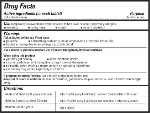
Six-point type is enough to give you a headache on labels for U.S. drug packaging, but it's bigger and clearer than on earlier labels. Required legal and scientific language along with the contents limit the size. Bigger, bolder, and italicized headings provide contrast—the title's in 14-point type, subtitles are in 8-point. The 2½-point dividing lines separate sections from each other and the label from the package, without stealing text space. Design firm: Greenfield/Belser Ltd. Client: Food and Drug Administration. Creative director, Designer: Burkey Belser.
EXERCISE: At the drugstore or in your medicine chest, look at six to ten products and notice what had to change in the “Drug Facts” section to accommodate the package size and shape, as well as what's common to all. This exercise should begin to give you a sense of the constraints of an information design project. Within those constraints, what, if anything, can you change to improve the label from a usability standpoint?
CASE STUDY: Finding the tasks in a Web site
Web sites used by both an organization's insiders and an external audience tend to grow well beyond their value. That can happen because every department wants a prominent Web “presence.”* Or a department wants to show everything it does. And maybe employees want to store everything there so they can easily find materials. So they add sections and pages without a structural plan to govern those additions.
The result is a site whose structure can't support all of its content and whose useful content hides from frustrated audience members. In fact, even a site of a reasonable size might contain “hundreds of different tasks people can do,” says Sanjay Koyani, a senior usability engineer at the U.S. Department of Health and Human Services.
To find out which tasks and needs to emphasize in the redesign of his agency's Web site, Koyani's team created a process that involves users “through market research, interviews, and discussions, by looking at terms they enter into our search engines, through Web analysis” (what they click on during actual Web visits), and usability tests. The team strives for “a continued understanding of how these folks are interacting with the information, what's important to them,” and whether the site continues to work for them.

The audience's searches and survey responses determined the order of the topic categories on this home page. The designers put what's most important to the audience on top. United States Department of Health and Human Services. Design team leader: Sanjay Koyani.
One of the specific insights that testing generated was the value of templates. So the team used pages that tested well as models for new pages. That way, users “don't have to relearn all the navigational stuff on each new page.”
Nor did testing end with the design. Koyani advises developing a long-term plan for checking how people are doing with the site, and identifying new needs. To accommodate those new needs, his team designed a features section. “What you never want to do is just sit there and say, ‘We've got a good site—people will find it if they want to.’” Instead, he says, make sure people are having a great experience.
CASE STUDY: Task-based focus groups help to redesign car manuals
A senior official at Ford couldn't figure out the clock-setting instructions in his car's owner's guide. He decided that if he couldn't understand them, at least part of the audience couldn't either. That led to testing, rewriting, and redesigning the manual and other customer materials at the former Document Design Center (DDC) in Washington, D.C.
Before and after the redesign, users were asked to use the manual to answer questions and do tasks. The tests pointed out problems that needed correcting in the redesign. The tests also showed that people aren't alike in how we look for information. Some begin with the index, some look at the table of contents, and others plunge right in, says Carolyn Boccella Bagin, who worked on the project at the DDC. The third group would appreciate tabs.
Other research-inspired improvements included:
- changing the format from horizontal (wider than tall) to vertical to make it easier to hold
- rewriting the information in plain language
- reorganizing it into digestible chunks
- adding categories to the table of contents based on users’ needs
- adding white space
- indenting warnings and adding a vertical line to make them obvious
CASE STUDY: Surveys and recipe tests lead to a usable cookbook
“How do you cook? How do you choose a cookbook? What do you think of this recipe?” Before they designed a cookbook, Maria Giudice and Lynne Stile surveyed home cooks and asked them to test recipes. The answers, plus looking at outside research and other cookbooks and recipes, guided the designers to:
- list ingredients in the order of use
- group steps the way cooks would
- put ingredients in a different color than the steps
- group recipes by the amount of time they take
- put substitutions in the margins
Researching the audience “not only tests … or validates your assumptions, it allows you to come up with new things,” Giudice says. For example, when the designers asked audience members to test recipes, feedback split regionally. The East Coast wanted “more butter, more cream,” the West Coast wanted less of each, and the Midwest wanted more meat. Home cooks who live on the East Coast (where the cookbook author's restaurant was located) were the book's primary audience, so their preferences took priority. The substitutions listed in the margin were for everyone else. But the designers didn't label the substitutions by the region of the people who needed them. Instead of saying, “If you're from the West Coast, this is for you,” they'd say “Instead of cream, you can use yogurt.” That's a deliberate distinction, Giudice says. In information design, you shouldn't “tell people who they are” or make potentially insulting or inaccurate assumptions.
CASE STUDY: Universal how-to graphics, minimum of type
A company needed clear, keepable, accessible instructions for operating its products—handheld or wearable scanning devices that ring up purchases, check prices, or take inventory. The goals for the instructions were to keep:
- users from injury, including back or repetitive-stress problems
- users’ employers and the manufacturer from liability and added costs resulting from unsafe usage
- the products working properly
The main audience—the people who use the devices—vary widely in native language and in education, economic, and occupational levels. They range from inexperienced seasonal employees to “power users who … have figured out the shortcuts,” says Sudhir Bhatia, senior manager of design research in the Industrial Design and Human Interface group at Symbol Technologies, Inc., which makes the devices.
The client's research looked at the “entire experience when someone gets a product.” It found that a previous attempt to promote safety—instruction books that shipped with the devices—didn't work. The order departments often threw out the books with the box. Even books that survived failed to do their job, because they hid the essentials in too much information.
So the problem became, in Bhatia's words, “How can diverse and frequently changing populations of operators learn to use these devices effectively and safely?” Asking the question, the solution seemed obvious: “Use clear, accessible, and keepable instructions that work for every level of user.” It also triggered another set of questions to address with research and design.
The company commissioned a poster for each device to display in a facility's break room. One side of each poster shows the best angles and body postures for safe scanning. On the other side, a “Quick Start Guide” answers another worthy question: “What does the user need to get off the ground?” It contains the most relevant content from the book, such as instructions for changing or charging a battery.
A pair of posters shipped with the device lets the recipient display both sides if they want to (see page 70). But it's the safety side that's most important (page 71). Most users sign scanners out from an IT (information technology) office each shift, so they don't have to deal with the set-up or maintenance, Sylvester says. And “the processes are simple and easy to remember—batteries only fit one way and are easily removed; scanners are set up once for their task and software type, not reprogrammed daily.”
The value of nonverbal communication
The posters emphasize graphics over words, for at least three reasons. Graphics:
- project more clearly than words in break rooms with dim lighting or too much distance between chairs and walls.
- communicate across languages. In the posters, type is limited to the bare essentials to make instructions perform nonverbally as much as possible.
- can precisely describe objects. They show where to put the battery, while words can merely tell.
Depicting the products
The designer chose illustrations over photos for:
- clarity. Some of the emphasized details don't show up as well in a photo as they do in a black-and-white illustration, says art director/designer Mark D. Sylvester, Interrobang Design Collaborative. In part, this is because the products tend to be “on the dark side … to keep them from showing dirt, scuffs and scratches.”
- emphasis. Although you can emphasize a feature on a photo with an arrow or a circle, in an illustration you add even more emphasis by increasing the feature's size or by simplifying its surroundings. (With a program such as Photoshop you can do that in photos as well, but ethical issues come up, such as “Has the retoucher misled the viewer?” Users might wonder why their device looks different from the one in the photo.)
- time. “The product often is still being designed while we're getting these projects done,” Sylvester says, so prototypes might not be available in time to incorporate photos of them.
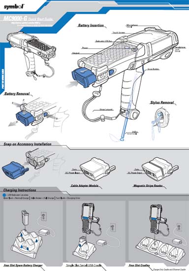
A manufacturer found out that its instructions on how to quickly and safely use its portable scanners weren't getting to the scanner operators. So a series of instructional posters, designed to function across languages and to be displayed in work and break areas, replaced bulky instruction books. On one side of one product's poster, the “Quick Start Guide” shows how to insert and charge a battery and install accessories. (On these posters, the second color is actually red, not blue.) Design firm: Interrobang Design Collaborative. Client: Symbol Technologies. Art director/Designer: Mark D. Sylvester. Illustrator: Richard L. LaRocco, Graymatter Illustration

The other side, the “Recommended Usage Guide,” demonstrates the body postures that will prevent repetitive-use injuries. Design firm: Interrobang Design Collaborative. Client: Symbol Technologies. Art director/Designer: Mark D. Sylvester. Illustrator: Richard L. LaRocco, Graymatter Illustration.
Depicting the user
When materials show a person using a product, what should the person look like? Art directors often struggle with decisions about the look, gender, race, and age of both live and illustrated models used to convey a message. This device's instructions use an illustrated man who looks racially ambiguous, which might help to avoid a racial stereotype about the products’ users, and to connect with a range of users.
Of course, this might be true of only male users—the absence of a female demonstrator might suggest to some that the manufacturer thinks women aren't qualified to do the job. The designer could avoid that suggestion by using a woman in some illustrations. But that decision opens up more cans of worms: Which pictures? Who would demonstrate the do's versus the don'ts? And who would be shown bigger, who smaller? You also can argue that, like nonparallel construction, a different demonstrator might draw the user's attention away from the action (where you want it) to the person (where you don't).
Designing to enhance the user's experience
The poster arrives folded, and even when it's flattened for hanging, those fold marks remain to imply a grid, Sylvester says. He designed within that grid in case people refolded the paper “if they need to, and a lot of times they do.”
Gray backgrounds help to separate different categories of information on the page. They also help to minimize contrast on secondary information. As a background, they create contrast from which black-outlined white objects “pop.” That's another concession to the dimly lighted break rooms Bhatia and his colleagues saw in client visits. “Some of these back rooms … have one bare lightbulb hanging over the work area. It's not optimum lighting,” Sylvester says they told him. So they're wisely “conservative about how dark a gray can be behind a field of copy. A 50-percent gray background with black 14-point text is not contrasty enough.”
The designers didn't worry about matching the gray tones from product poster to product poster. “If somebody says, ‘Gee, they went light to dark on this poster and dark to light on this one,’” Sylvester says, “it doesn't compromise the information.” But red is a consistent element throughout the poster series as an emphasis and warning color, as well as a reinforcement of the brand identity. The backgrounds of bar codes also match on every poster. They have to be white for scanners, which demand higher contrast than even human eyes do.
Sylvester chose Univers type for its versatility. He underlined some headings, but no more than four words at a time because underlining poses a a legibility challenge. “The g's do get closed off a little bit, but I think you tend to read through it.”
What the people in the break room think
The lighting detail wasn't the only intelligence gleaned during research visits to the field. Answers to the industrial designers’ questions informed the poster's content and design—“things like ‘What kind of drop rate do you want when you're on the forklift and you're up on the third level of the storage area, restocking the bottom area?’ ‘What's working for you?’ ‘What's not working for you?’ ‘What would be more comfortable?’” Sylvester says.
Model numbers versus words
Why use letters and numbers instead of words to name products? It's tough to recall and distinguish model names such as LS/VS 3408 and MC9000-S. Indeed, Bhatia says, “we've gone back and forth on names,” but the company standardized on numbers because “you can create a hierarchy” with them.
CASE STUDY: Dealing with conflicting audiences’ needs
You can't please everyone, you've seen in this chapter, so make sure you're pleasing your primary audience. But when audiences’ needs conflict, sometimes those of a secondary audience take over. That's what happened in this case:
Tests by Discovery Channel TV showed viewers clicking away when programs’ closing credits rolled, a company rep says. So the network tested removing the credits. That worked for the viewers, but not for another important constituency—the network's outside program producers. For them, the network proposed alternatives, such as a brief closing screen that directed any interested viewers to the Web site. There the network would post each program's credits for six months after the program's airing.
But producers and industry groups still complained, so on-air credits remain. The network continues to experiment with alternatives that work for everyone, including opening instead of closing credits.
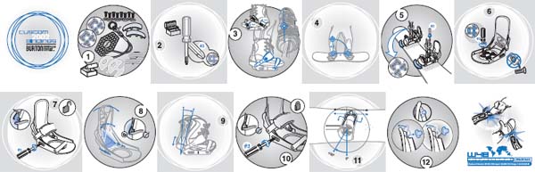
This project from the same design firm as the previous image relies even more on pictures and numbers to cross cultures without translation. In twelve steps, a folded manual shows how to adjust the snowboard bindings it comes attached to. Red (where the blue is here) stands out on the otherwise black-and-white piece to show action and direction, and to emphasize various steps and parts. Design firm: Interrobang Design Collaborative. Client: Burton Snowboard Company. Art director/Designer: Lisa Sylvester. Illustrator: Richard L. LaRocco, Graymatter Illustration.
CASE STUDY: Keeping the audience in touch
When recycled paper became popular in the 1990s, the editor of a newsletter for graphic designers knew from research that the audience needed to know the paper's pros and cons. So the editor not only wrote about the paper but also let the audience test it. She printed five consecutive issues of the publication on a different variety of recycled paper each time. (See the images on the following two pages.)
Getting inside your audience through personas
Use your psychographic research to group audience members into categories. Then you might find it useful to create what usability people call “personas” to represent your primary and secondary audiences. A persona is an imaginary person, with a name and a life story, whose traits represent a typical audience. It's used to help everyone on a design or development team speak to the audience's needs.
Build personas from individuals’ words, attitudes, even appearances to give audience members a real voice in the project and its development. Use them to form a picture of your audience members that's so accurate and convincing you think and speak of them as one person. You refer not to “them” but to “he” or “she,” or, better, by the name you've given him or her. When you talk to them, you use “you.” You might even find a picture (maybe from a newspaper or magazine) of the person who represents your primary audience. Display it where you work, and distribute copies to your colleagues.
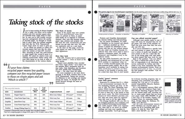
Buyers of printing paper got to sample five makes of paper in as many issues of a trade publication. In the issue following the experiment, an article, including a pictorial guide and a table helped readers compare the five. (See details on the following page.)
The process of identifying and building personas, shared by everyone in the project team, can:
- add dimension, reality, and familiarity to major audience types; add recognizable human face and characters
- solidify the shift in focus from the client's needs to the audience's needs
- redirect the source of design and content decisions to the audience
If you use personas, go beyond the surface, information designer and author Nathan Shedroff advises. Personas are no more valuable than the research that goes into them. He cites typical—and useless—personas in Web site development as “‘Mark is twenty-eight years old and he's a software programmer. He's young and energetic and curious. He loves computers and he plays a video game.’ We create this whole fictional story about him, and move on to Heather, ‘thirty-six and a writer who works out of her house.’”
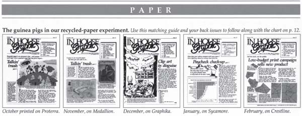
Here's a closer look at the pictorial guide.
The problem is, Shedroff says, although the demographics might shift in the stories created, the psychographics don't. “They all end up being the same person,” the minority who are in love with technology, “curious, not afraid of the computer, and who love their job and their work.” What's lacking in these cases are realistic, insightful profiles, such as people who are mean or who just don't understand. For them, realistic scenarios will “take people through the help system, or have people call up customer service” because they can't figure something out.
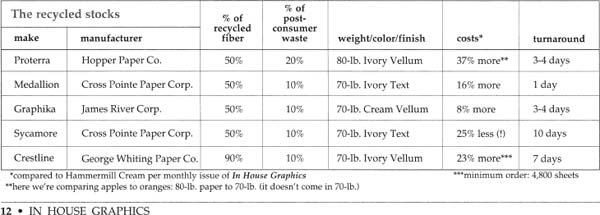
And here's a closer look at the table. How would you improve the table? (Hint: Eliminate unneeded repetition.) Publisher: United Communications Group. Newsletter: In House Graphics. Designer: Ronnie Lipton.
And although even made-up personas help a development team talk about Web site navigation, Shedroff says, authentic ones “highlight potential problems” and go beyond “Where do I click?” to “Would I do it this way?” The personas you develop “should be the synthesis of similar people and their problems and attributes … that come from real interviews that included psychographic questions.”
You begin to see audience members you might not have considered before, Shedroff says, such as those who have trouble using computers. “They don't hunt around the screen, and when they can't find the next thing to do, they go into panic mode … or they turn off the computer.” When you understand how they approach a problem, you can create a meaningful test scenario, he says.
Personas personified: an example
Let's take a look at how personas work. Meet Frances, a single twenty-two-year-old woman about to buy her first new car. You're doing a Web site for a car dealership that finds her typical of the audience it wants to pursue. So you'll want to find out as much as you can about Frances. And you'll want to see how she's like and different from others who seem to be in the same audience.
To create the persona, you'll interview and observe Frances and other audience members, and interview management and staff members. But before you begin your research, notice and eliminate any assumptions you might have about Frances, so you'll be open to hearing the real story. For example, maybe you assumed she wants a car that's:
- cute. (Uh-uh. When asked, she describes a homely and reliable car that won't attract carjackers in the city or police attention on the highway.)
- compact. (No again. Her car should be big enough to take along three friends, but small enough to save on gas. Here she starts getting passionate about the world's energy problems and briefly considers getting a bike instead. Now you're getting at attitude; this might be the time to probe gently for any contradictions. Maybe being seen as environmentally conscious is more important to her than actually being that way if it means giving up what she wants more.)
- affordable. (Most people want that, but what's considered affordable varies from low-range to expensive. And not only will she haggle, but she also enjoys haggling.)
- low-maintenance. (Reasonably; she'll do oil changes.)
Other questions and observations will help you get deeper inside Frances's head and heart:
- What else does she like?
- What does she value?
- What are her goals?
- What does she read?
- How does she dress?
- Where does she live?
- What are her image and expectations of the car-buying process?
- What does a car represent to her?
- What's her history/experience with cars, and car shopping and buying?
- What have been her biggest challenges with cars, and car shopping and buying?
- How often and when will she use the car, and to go where and how far?
- What are her information-seeking habits and skills?
More: Does Frances have a specific car make and model in mind? If so, find out where she first noticed it and what she likes about it. And how does she shop? If she says she does at least part of her shopping on the Web, how does she search? And what questions does she want answered, in what order?
Part of avoiding assumptions is favoring open-ended questions over multiple-choice ones. For example, ask, “How do you shop?” not “When you shop, do you drive to dealerships, talk to friends, look in the newspaper, go on the Web, use more than one method?” That's because multiple-choice questions limit the range of possible responses; the real answer might be something you never thought of. Also, hearing respondents’ own words will give you greater insight into their thought patterns.
And observe, rather than just interview. Observing Frances's and others’ search process will tell you even more than asking about it. That's because we're not always aware enough of our behavior to describe it accurately. Both methods will help you develop a clear picture of your typical audience members that will help you design well for them.
 CASE STUDY: More about how to use personas
To create a health and nutrition book that would attract and serve its audiences, its information designers developed three personas. In any project, there might be as many as five, because most products, including publications, have more than one audience. After you identify those audiences, also identify—and focus on—the primary audience.
“I think people make a real mistake trying to be all things for all people, because you're going to be half-assed for everybody,” says Maria Giudice, principal of HotStudio, the design firm that worked on the nutrition book. “If you satisfy this person who represents the majority of the audience 100 percent of the time, the others might be satisfied 50 percent of the time. You have to allow them to be successful as well, but you're not dividing it up equally.”
Typically and optimally, those personas would come from direct qualitative audience research (interviews with the audience, one-on-one or in small groups).* This sort of research defines values and opinions and helps with identifying personas. For Web sites in particular, “we'll interview six to ten people the client identifies, we collect information from these interviews, and we turn them into personas,” Giudice says.
This project's budget didn't permit such research. So the designers could only interview the two authors (who are doctors) and marketing staff to identify the audience, product attributes, and business needs. They looked at competitive health books, magazines, and weight-loss programs. And they had to fall back on their own health and diet experience, and personal identification with the audience. That's better than no audience focus at all, but it risks false assumptions.
Testing the book with the audience would come only toward the end of the project, another budgetary effect Giudice would rather avoid: “When you test later, you don't get to make that many changes, so you better feel confident that your assumptions [were] right.”
Internal research guided development of the three personas:
- Shelley, age thirty-four, married to Bert, two young children, lives in Minnesota. “She's fifteen pounds overweight … doesn't know why. She thinks she's got a slow metabolism. And it's hard for her to follow a diet because she's got kids. Shelley's husband, Bert, “is thirty-five and overweight, too, but doesn't seem to care about it.” (That's useful because the content can address the challenges and solutions when her family members don't share her concern.) Her activities: Tupperware parties, children's play groups (she might discuss the book with other Shelleys), Sunday school, reading (Family Circle and Parenting magazines), and TV (Trading Spaces and This Old House).
- 2. Connie, a twenty-four-year-old single teacher, wants to lose five or ten pounds to wear a bikini without embarrassment. “Usually when people are a little overweight, there's a goal to weight loss: ‘I want to look better in a bikini or I have a wedding I have to go to.’” She drinks Coke and coffee for energy, but she feels too tired to exercise, which she feels guilty about.
- Michael, a fifty-year-old book sales rep, will sell this book. He's well connected, overweight, and quietly concerned about his health. He's interested in the book, but he wants sound bites instead of having to read it. He wants to sell the book, but he also wants to know whether the book can help him.
Each persona has three or four quotes identified with it. Ideally, these would come from the words of interviewed potential audience members. But in this case, the designers had to make up the quotes (see the sidebar on this page).
For Shelley:
- “I've tried all kinds of diets and I can't lose weight.”
- “I exercise, but my metabolism is so slow.”
- “I want to see results.”
For Connie:
- “Why am I so tired?”
- “Is there something wrong with me?”
- “I'm hungry—what should I eat to bring my energy up?”
- “I'm stressed out.”
![]() Incorporate actual audience quotes gathered from research in your projects. For example, a capabilities brochure for Allfirst Investment Advisors used the very words of investment clients. The quotes, which came from phone interviews conducted by the brochure's creator, Carla Hall Design Group, suggest the company understands what its clients want and don't want.
Incorporate actual audience quotes gathered from research in your projects. For example, a capabilities brochure for Allfirst Investment Advisors used the very words of investment clients. The quotes, which came from phone interviews conducted by the brochure's creator, Carla Hall Design Group, suggest the company understands what its clients want and don't want.
Michael has dual motivations:
- “I know which pills to take, but I'm not sure why I'm taking them.”
- “My joints always hurt.”
- “I want a source of information that speaks my language.”
- “The book helps me sell.”
- “Now I know what I'm talking about.”
- “Who wouldn't want to do this?”
Shelley's and Connie's needs proved so different from Michael's that the designers kept him out of the book. Instead they designed a separate sales and info piece for him.
Clear personas help the team evaluate content ideas through the eyes of the audience. They “help everybody focus,” Giudice says. Here, the team only had to ask, “What would Shelley want?” when proposed content went off track. For example, the designers knew she wouldn't care about such things as “glutamine … so there was a constant back-and-forth between what the users want versus what the doctors think the users want.” But that dialogue is useful for everyone. The designers listened carefully, because the clients “are the content experts, we're not.”
What also helped to keep the team on track was a diagram designers drew and taped to the studio wall. It read: “I feel tired, overweight, stressed out. Help me lose weight, gain energy, and relax. I'll need to pay attention to how I eat, exercise, sleep, breathe and relax. But … I'm busy, so I want something that's easy to understand, that's easy to follow, that (shows me) results …. So give me choices or a specific plan to follow.”
The two main personas inspired a list of questions whose answers turned into content for the book. Every spread had to answer one big question, such as “What is [the topic of the spread]?” or “How is it important?” The questions and conversations with the authors guided the content. For example, Giudice would say: “‘We're going to design a spread on ‘Why am I tired?’… Well, why am I tired? What's happening in my body?” The authors’ answers “became part of the book.”
What stayed out of the book were questions the personas would never ask. “It's more important to take out than to include,” Giudice says. “People tend to put so much stuff in that readers can't digest it.” (See Color Plates 7, 8, and 9.)
Burkey Belser uses research to avoid putting in too much stuff. When he finds out how much the audience already knows, he can see what to leave out. For example, in the law firm brochure, he avoided repeating info students will get from law firms’ Web sites. The printed materials only have to “communicate the spirit, the charm, and the working style of the firm.”
Keeping the audience in mind … literally
Some designers strive to put themselves in the audiences’ shoes even if or when they don't do research. Mental modeling and audience intuition are valuable skills to develop as supplements to, rather than substitutes for, actual audience research. For example:
- Joel Katz is guided by “modeling myself as different people, and different kinds of people.” He tries to “think of all the people who will see it and what their life experience has been.”
- Richard Saul Wurman tests clarity against two internalized audience models: his mother, “who wasn't really interested in everything,” and a “literate twelve-year-old boy” with a short attention span. Wurman also uses himself as the audience model because his projects come out of his interests. For example, he wanted to do a book about raising a dog because he couldn't find what he needed to raise his. “All the information was given out absolutely without the person—the owner of the dog—in mind … and nothing made any sense to me. Wow … what an interesting problem to solve: how to do a book on raising a puppy for the various me's in the world.” So his questions and their answers formed the content.
- Carolyn Bagin says she always begins by putting herself “in the place of a user, which I usually am.” Then she adds research, such as interviews, focus groups, and cognitive testing.
- Nathan Shedroff says a designer should have a “somewhat universal appreciation for people,” which isn't the same as liking all people or hanging out with average people. But he advises you to cultivate “at least a general understanding of what ‘average’ is in the culture you're designing for.” Designers are trained to do this in a visual way, Shedroff says. “They scan text and say, ‘This would make a great photograph or this would be a great cover.’ But they're sort of trained against saying ‘That doesn't make any sense’ or ‘This could be much clearer if I just did a diagram here.’” Understanding the audience often inspires going those extra steps.
- John Grimwade of Condé Nast Traveler magazine illustrates “for myself in many ways … it's not as if I know our readers personally. I'm doing what I think people want. It's hard otherwise to know where to begin.” But he also pays close attention to research, observing focus group participants’ reactions to magazine pages. He reads letters from readers who've used his guides to cities and museums. He also looks at how his audience members are different from him.
Caution: The audience is different, and you're not it
Avoid stopping at your own assumptions, especially the idea that you represent the audience. That's because as soon as you start to work on a project or for an organization, you start to know more about it and its language than its audience does. It's also because audiences are complicated: You might be similar in some ways, but never alike enough. And keeping the focus on yourself prevents you from looking at and responding to changes in the audiences and their needs.
Sanjay Koyani describes the risk when content and technology people make decisions that “match their internal perspective” instead of the audience's. These people tend to assume that if a design is intuitive to them, it'll be intuitive to the audience, he says. They also tend to assume that the audience has more skill and better equipment than it has. But if you test by bringing in “outside folks who have none of this institutional knowledge … they don't know what the devil we did.”
So for every information-design project, aspire to the Buddhist goal of “beginner's mind,” working to erase preconceived notions so you can experience a situation as if for the first time. Do so by talking to first-timers and current audience members, and being open to what you hear. That doesn't mean you need to ignore your instincts or any experience you might have as an adjunct audience member. They can be valuable at least as a starting point, but avoid letting them replace listening to the “unaffiliated” audience.
Expect resistance to change … inside and out
Often, listening to the audience in any form suggests the need for a redesign. Go ahead, but present the redesign only after you let the audience in on what you're doing and why. Here's why. (It'll be easier to understand if this has happened to you.)
As a subscriber, you feel possessive of your favorite magazine, so you're not happy when it shows up with a new look. “They say ‘new and improved’ on the cover and then you find everything you liked is gone,” says art director Ellie Barber about redesigned magazines she has subscribed to. Think of it as another usability issue: The magazine is no longer familiar, so you can't get around by habit anymore. It's as if someone redecorated your bedroom while you slept, so you trip over a chair on the way to the bathroom. Oh, you'll get used to it eventually, but only after the bruise goes away. It's also a perception issue—kind of insult added to injury—because readers often assume the change is not for their benefit (for example, that it's for cost savings that won't get passed on to them).
So avoid redesigning just because you're bored. When you work on a periodical, you see it every day, so it's no wonder you tire of it. But your readers probably see it much less often, and (again) find comfort and convenience in its sameness. Redesign only if the current design fails in some way:
- It bores or hinders your readers.
- It interferes with the content.
- It looks old-fashioned, suggesting out-of-date content.
- Its content category has changed.
You'll limit or even eliminate readers’ resistance to the change if you prepare them for it. If you can, even involve them in the change.
CASE STUDIES: Three ways to prepare the audience for a redesign
Build a bridge
Talk about change: A publication changed size, color, paper, frequency, editorial features, and even title in one issue. The journal of the Association of Governing Boards of Universities and Colleges went from 6 by 11 inches to 8½ by 11, from black-and-white uncoated cover stock to four-color coated stock, and from the title AGB Reports to Trusteeship, among other things. And it did all that without ticking off the readers. “Nary a soul complained about the switch,” says editor Dan Levin. (See Color Plates 10 and 11.)
The editor wrapped the new publication in a full-sized replica of the old one. Because of the old one's narrower width, it became a bound flap to show off one of the few common features of the old and new: the illustration. Under the flap, a letter from the president introduces and explains the new publication, its new editorial features, and its relationship to the previous, familiar publication. It's a verbal follow-up to an expressive nonverbal presentation.
Prepare the audience at every step
Here are other ways to introduce readers to a stranger in the mailbox. On the first redesigned issue, you might prominently show a picture of the old cover with a letter that details and explains the changes. Say that the publication changed to respond to readers’ requests, maybe to give them more of what they want in less time. You might back up your statements with results from your readership research.
Or put a notice on the cover of the new issue, as did Hemispheres, a magazine published for United Airlines passengers. (See Color Plate 12.) A circle in the lower left that color-coordinates with the cover art announces, “New Look! More Substance! More Style!” The president's letter inside gives details.
A still better way to link the old with the new: If you finish the new cover layout far enough in advance, show it with explanatory text in the final issue before the change.
Involve the audience at every step
The Bureau of Business Practice (BBP) took on the redesign of its thirty-three business-to-business newsletters in one year. The move was overdue; some of the designs hadn't changed in decades, and it showed. Before the redesign, each editor mailed a survey to each newsletter's readers. Beyond typical content questions, the survey asked readers what they thought of the newsletter's design and what they'd like to see.
You might not expect nondesigners to be able to answer such questions. But readers came through with useful results. Readers said they wanted:
- updated designs
- more charts and graphs to explain and break up text
- articles that are continuous rather than jumping multiple pages
- hole punching*
- less clutter
- shorter articles
Each newsletter's editor and designer incorporated the survey results into the redesign. And they prepared the audience for the change by sending two announcements with the redesigned issues: a “Welcome to [newsletter's name]’s New Look!” box on the front page and a letter.
The letter explains changes that sometimes involved a new name and focus, not just a new look, Barber says. It also gives this reassurance: “The information you've come to rely on is all here—but in a more attractive, easy-to-read format,” along with a list of features and their locations.
Survey 'em again
After you go to the effort of a massive redesign, you might be tempted to take a break. But it's time to check reactions, as BBP did. After readers got the redesigned newsletter, they also got a postcard with these questions, most about design:
- What do you think of the redesign of our publication?
- What do you like the most about our new appearance?
- What do you like the least about our new appearance?
- What additional information would you like to see in upcoming issues?
Responses to the first questions ranged from “eye-catching” to “you went too far,” with the majority mostly pleased with the redesigns. But complaints about distracting “fancy” effects caused the design team to scale back. They yanked screened photo backgrounds behind text, and anything that got in the way of finding story beginnings. Nor did the editors stop there in their efforts to show concern for the readers: after a few months, they checked in again.
More advice: For faster and easier-to-tabulate responses, do online surveys if you communicate with your audience on the Web. And make sure the survey device you send includes a photo of the new look.
The case against “art” versus content
You might wonder why the designers in the BBP example above needed to hear the scale-back message. When the previously restrained designers got a mandate to update designs, they sometimes tried out all their Photoshop tricks in one publication. That's easy to under-stand—but not to condone, as the audience reminded them.
Information design is graphic design combined with usability. It's the victory of:
- substance over sizzle
- function combined with form, not sacrificed to it
- how well information connects with the audience and delivers the content, over just how it looks
- building the layout from the content up, over just pouring in type
- respect for content and white space, over contempt for the first
- meaningful elements, over gratuitous decoration.
So work for the audience members on every project. Learn all you can about them, become an advocate for them, and encourage your clients or supervisor to do the same. Also read what you design. (Well, if it's a seven-hundred-page book on an unfamiliar technical topic, at least ask for a summary of the content and the audience.)
* You might point out to these people what the word presence means: just being there, not doing anything for the audience.
* Quantitative research, on the other hand, refers to info collected en masse, as in online or written surveys.
* When your readers ask for hole punching (known to offset printers as “drilling”) for a print publication, assume you're doing something right. The request says readers value your publication enough to save it in three-ring binders. By the same token, if you take it upon yourself to hole-punch your publication before you distribute it, the holes might send a subtle message that the publication's worth saving. (And send a free binder with the publication's name on it to store them.) On the other hand, you'll waste the touch and send a mixed message by punching holes in a publication whose info goes out of date the day after it arrives.