
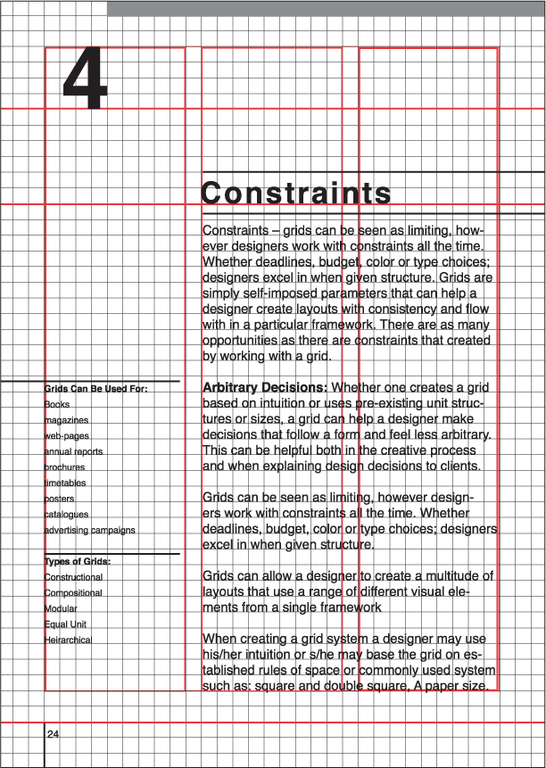
Chapter 6: Grid Design Basics
Grids use vertical and horizontal thresholds to indicate divisions of space and to provide a way for designers to determine how the interior proportions of a page should be used. They provide a structure within which to organize both text and image and allow diverse compositional elements to exist in a layout with a degree of order and visual harmony.
TYPES OF GRIDS
Grids come in many different forms. When creating a grid system, designers may use their intuition, or they may base the grid on established rules of space or commonly used sizing systems such as square or double square, and the European proportion of A paper sizes. Grids can be created with specific content in mind or as part of a system that is designed to give unity to diverse content. They are expandable and can be made up of equal unit sections, or can be composed from a combination of units of varying proportion. In some cases, two or more grid systems can be used together for one document or several rela-ted grids may be used for deliverables that are part of a series.
Defining Variables
Grids systems can be used to define the following variables: margin width, proportion of areas on a page, number and size of columns, position of images, headings, body text, and the placement of folios and footnotes.
Uses for Grids
Books, magazines, Web pages, annual reports, brochures, timetables, posters, catalogs, advertising campaigns, and signage systems all benefit from the use of a grid system.
Why use a Grid?
One benefit of using grids is that they can create a sense of continuity across a sequence of pages or a range of deliverables in the same campaign or series. Another is speed; grids are a powerful tool for organizing information and laying out pages quickly. Finally, in the case of single-page compositions, they can help a designer create visual harmony and aesthetically connect diverse compositional elements.
Grids are not only a valuable tool for designers, they are also useful to readers/viewers. In sequential documents, the use of an organizational system allows viewers to move through content easily. This is especially true of layouts that contain a combination of complex visual elements.
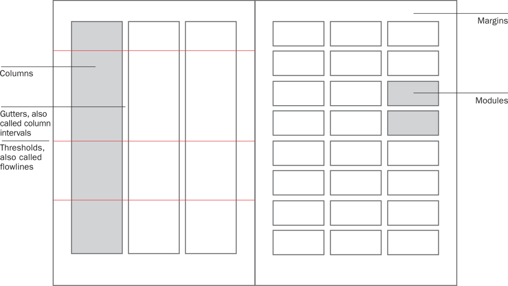
ANATOMY OF A GRID
WORKING WITH GRIDS
One of the most common misconceptions about grids is that they produce highly structured layouts and stifle intuition and originality. By working with grids, it is possible for designers to create aesthetically pleasing and visually arresting work. Grids can be as flexible as you want them to be. If the project demands it, they can help a designer produce an ordered conservative layout, but they also can provide a starting point to create exciting and experimental design work. To avoid feeling stifled by a grid, it is important to remember that a designer may re-create, alter, and at times even break the rules of the grid that he or she has designed.
One of the first questions to ask when developing a grid system is whether a symmetrical or asymmetrical grid is more appropriate. There are advantages to both, and the determination should be made based on the content and visual tone required for a particular project.
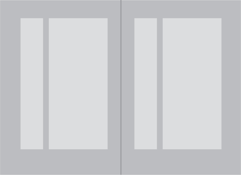
A symmetrical grid is most often used for text-heavy books or publications. It is an ideal format to choose when one wants the most uniformity in a page layout.

An example of a symmetrical spread with margins set.
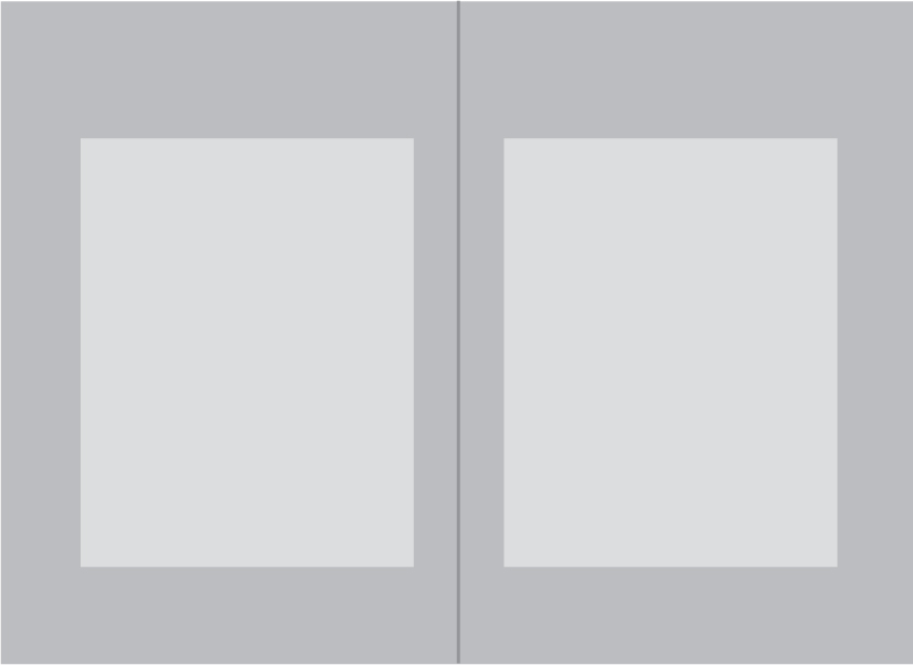
Asymmetrical grids are most useful when one wants layouts to vary across pages and when there is a range of elements (images, footnotes, sidebar text, etc) that must be included in a layout.
An example of an asymmetrical page layout with margins set.
The size and placement of margins is one of the first variables that affect the way viewers experience content. Generous margins give pages an open feel and accommodate a large amount of white space. Tighter margins allow for inclusion of more content but can lead to pages that appear to be packed with text and imagery. For novels and text-heavy books, smaller margins are often appropriate. Annual reports, photography books, and brochures are usually better served by wider margins.
In either case, it is important to give sufficient space both for the outside margins (so that a reader’s thumbs don’t cover content as they hold a book or brochure) and for the gutter and spine.

This is an example of a page layout with tighter margins. In such a system, a large amount of content can be placed on pages and effective use of white space will be determined by the designer’s placement of elements within the composition.
Here is an example of a spread with larger margins. This layout system will accommodate less content but is likely to result in a visually open design.
Things to Consider Before Constructing a Grid
Does the grid need to accommodate headers or footers?
Will sidebars be needed?
How many columns will be appropriate?
Would content be best served by a more rigid or a looser grid system?
Does it make sense to base the grid on the content or some element of the content?
Are you most comfortable working with a mathematically or intuitively constructed grid?
Creating a Grid Using Graphic Software
Grids are most easily created in page layout programs (such as Adobe InDesign and QuarkXPress) by dragging guides to appropriate positions in the Master Page layout view. Page margins, the number of columns, and gutter width should be determined in the Document Setup window. In other graphics programs, such as Adobe Photoshop and Illustrator, one may want to create the grid on a new layer so that it can be edited separately from the content. Some designers find that using guides for proportions of the grid is sufficient; others like to actually draw out lines on a different layer or on the master page.
Steps to Making a Grid
1. Identify the type of grid that will be most appropriate for the content
a. Symmetrical or Asymmetrical
b. Constructional, Typographic, Hierarchical, or Modular
2. Choose type size, leading, font etc, so that the grid does not conflict with the other design decisions that you make.
3. Determine page size based on the content or the client brief (create new page in Document Setup).
4. Decide how many columns or units should be included in the grid and the size of the gutter between columns.
5. Define the margins of the page and the proportion of columns on the page (in Document Setup).
6. Position primary alignment points (using guides).
7. Add and position additional thresholds (using guides).
8. Test grid by laying out several pages with sample of content.
9. Make necessary revisions based on how grids work with given content.
A constructional grid refers to a loose structural system that is based on placement of compositional elements and their relation to each other. Unlike other types of grids, constructional grids are not created before one begins to layout content. Instead, the designer starts by positioning elements on a page in order of importance. Thresholds and alignment points are created as each item is placed and repositioned on the page. It may be possible for a viewer to recognize that common thresholds have been used in a layout that was made with a constructional grid, however sometimes only the designer will be able to identify how relational placement helped to create the resulting composition.
Since this system is so loose, some designers may not recognize constructional grids as grids at all. They may prefer to see their decisions as derived from intuition rather than structure. Whether one uses the term constructional grid or not is largely irrelevant, however understanding that this technique is a way to organize content can be helpful when one starts working with complex combinations of type and image.
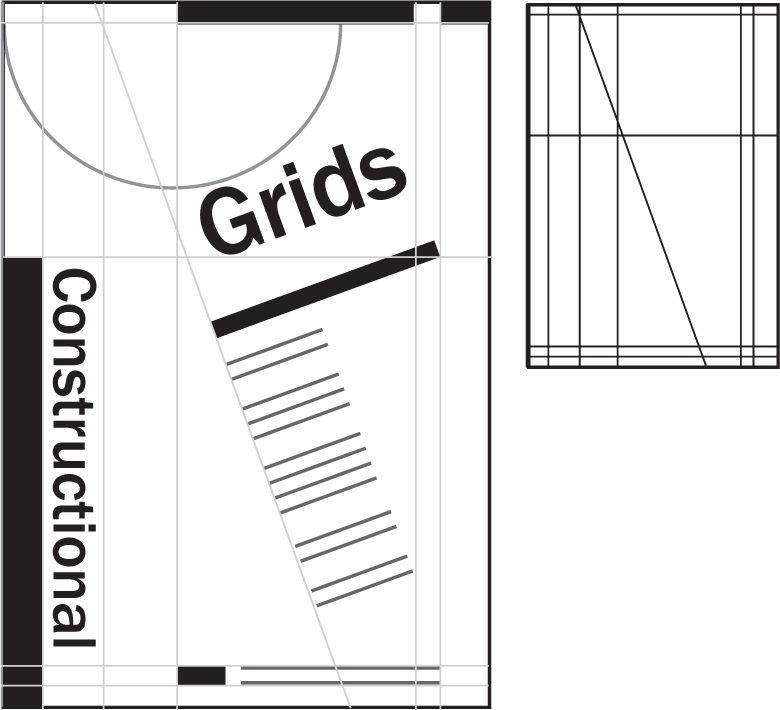
Constructional grids are a good option for designers who feel constrained or uncomfortable using a static grid system as well as for compositions that are not part of a sequential document. They allow for variety across pages or within a single composition and almost always result in an asymmetrical layout.
TYPOGRAPHIC UNIT GRIDS
These grids are based on the unit of text type and space between lines (also called linespacing or leading). Units are made functional by placing elements in the framework that has been created using typographic proportions.
Before constructing a typographic unit grid, the designer should choose page size, margin widths, typeface, point size, linespacing, and line length.
Typographic unit grids are most useful when working on documents that need to include a large amount of text. They allow the designer to use baselines to easily align body text with sidebars or caption text.
One problem with typographic unit grids is that the individual modules are so small that often they give very little indication as to where to place larger or repeating elements. They are often more effective when combined with a composite grid (see facing page).
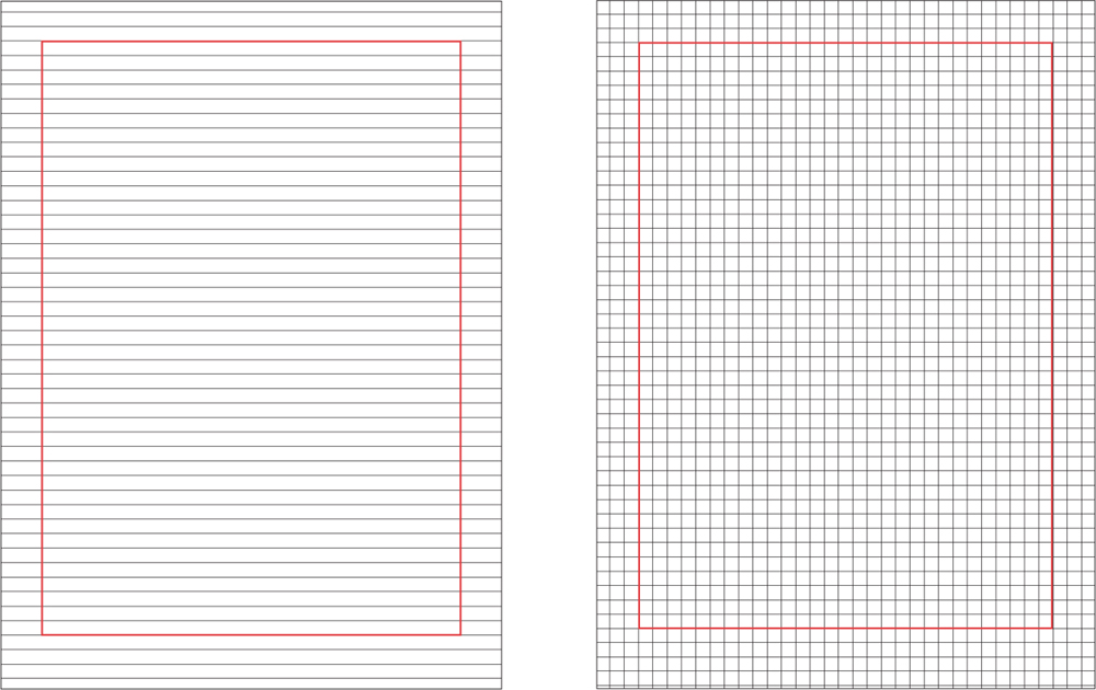
This typographic unit grid was made using the linespacing created by 10 point Helvetica with 2 points of leading. To make a typographic unit grid in a page layout program like QuarkXPress or Adobe InDesign, one should turn on the baseline grid and make sure that the page margins will correctly accommodate the linespacing that has been chosen. Then guides can be placed vertically at the same intervals as the space between baselines.
COMPOSITE GRIDS
Composite grids primarily define structural thresholds and alignment points and can be applied to an existing typographic unit grid to give a designer additional indication of where to place content within a sequential document. A composite grid may indicate the placement of columns, page headers, folios, notes etc.
The benefit of adding a composite grid to the typographic unit grid is that it includes primary flow lines and can make laying out pages easier. The combination of a composite grid with a typographic unit grid easily accommodates both text and other visual elements.

This example shows what the typographic unit grid on the opposite page would look like with flow lines (or thresholds) added.
In these examples, it is possible to see what the combined typographic unit and composite grid would look like with content added.
MODULAR GRIDS
Originally developed in the 1950s and 1960s by Swiss designers Karl Gerstner, Emil Ruder, and Josef Müller-Brockmann, modular grids are still used by contemporary designers who are looking for flexible systems in which to order content.
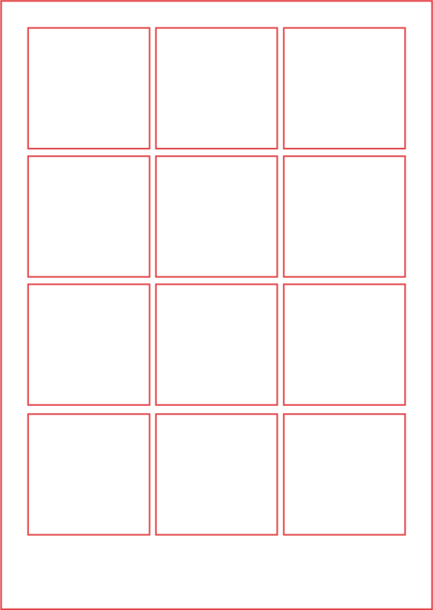
Modular grids are made of units of equal size with the proportions decided on by the designer. Units can be squares or rectangles.
Modular grids divide a page into equally proportioned horizontal and vertical units. These modules help indicate where text and images should be placed on a page. Room is left between modules so that there is space for gutters if several units are combined into a single column. Working with a modular grid gives a designer added flexibility because there are numerous flow lines on which visual elements can be aligned. Modular grids are well suited for multipage documents such as magazines, books, catalogs, and annual reports.

Here, content has been applied to the modular grid. An odd number of horizontal units makes it easier to accommodate body text with captions and images in a composition.
HIERARCHICAL GRIDS
Hierarchical grids are used when a specific division of space is needed across multiple pages. Hierarchical grids are ideal for use on websites and may replace or be used in addition to wireframes (see page 195) for some jobs.
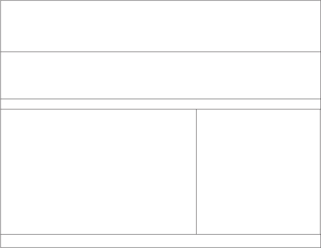
Hierarchical grid showing the division of space on a proposed webpage

Hierarchical grid with shading added to denote areas of importance on the page. Shading is most helpful to the designer or design team. It is unlikely that this type of grid will be shown to clients.
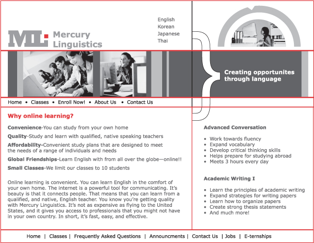
This image shows what a hierarchical grid would look like with content added.
Hierarchical grids can be made by dividing a page into fields or content areas (usually shown as rectangles) based on the relative importance of content. It is often helpful to use several shades of color or gray to visually denote the importance of content fields. Hierarchical grids can be made in any graphics program by positioning rectangles of color over the proportions of an intended page. Hierarchical grids are most useful when a high degree of consistency is required across a sequence of pages. This includes navigation and header areas that usually appear in the same place on each page on a website. When constructing a hierarchical grid, shading and tone may be used to indicate areas where content varies from page to page.