Chapter 5: Type
TYPE BASICS AND TERMINOLOGY
Because type is measured and described in a language that is unique to the printed word, it is important to recognize and understand basic typographic terms.
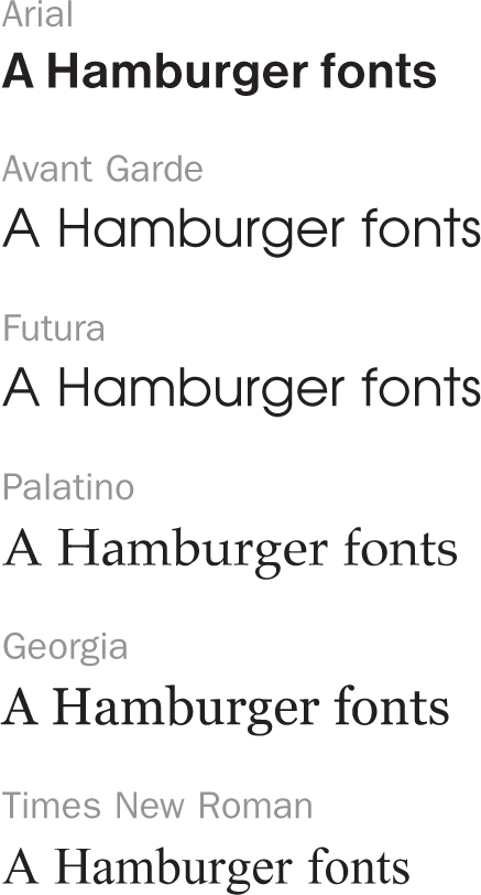
Typeface: The design of a single set of letterforms, numerals, and punctuation marks unified by consistent visual properties. Typeface designs are identified by name, such as Arial or Palantino.
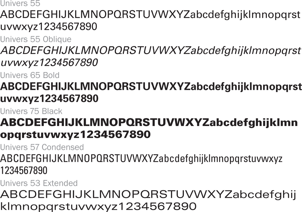
Type style: Modifications in a typeface that create design variety while maintaining the visual character of the typeface. These include variations in weight (light, medium, book, bold, heavy, and black), width (condensed or extended) or angle (italic or oblique vs. roman or upright).
Type family: A range of style variations based on a single typeface. Style attributes of type families can contain a number of modifications but will always retain a distinct visual continuity.
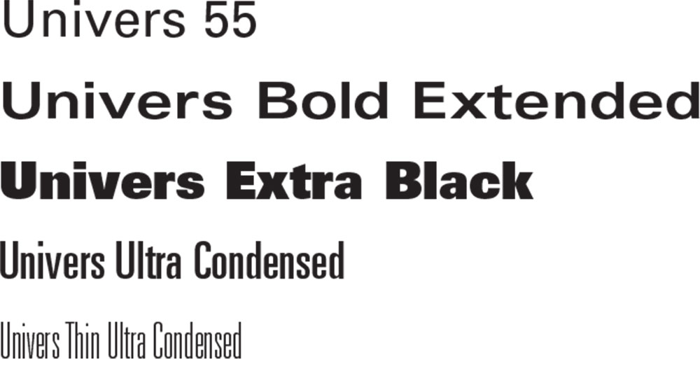
The type family of Univers is composed of style variations on the Univers design that include a variety of weights.
Type font: A complete set of letterforms (uppercase and lowercase), numerals, and punctuation marks in a particular typeface that allows for typesetting by keystroke on a computer or other means of typographic composition.
Letterform: The particular style and form of each individual letter in an alphabet.
Character: Individual letterforms, numerals, punctuation marks, or other units that are part of a font.
Uppercase: The capital or larger letters of a type font (A, B, C, etc).
Lowercase: Smaller letters, as opposed to capital letters (a, b, c, etc).
CATEGORIZING TYPEFACES
There are many ways of classifying typefaces, however, one of the most obvious is to separate typefaces into one of two categories based on their legibility. Because those who manufacture and work with type make this distinction, typefaces are generally broken down into text and display classifications.
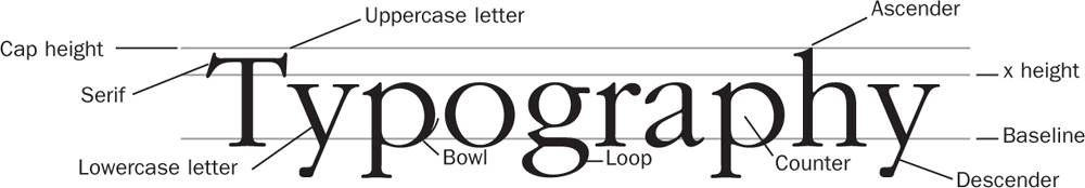
A knowledge of letterform anatomy is essential to understanding how typefaces differ and distinguishing one typeface from another.
Text typefaces are highly legible and used mostly for large areas of text.

Text typefaces such as Times, Arial, and Garamond have a more traditional look and are easy on the eye. They work well for long passages of text.
Display typefaces are more decorative and not as legible. They tend to catch attention and/or convey a mood or attitude. They are mostly used for single or grouped words such as logotypes, headlines, or phrases.
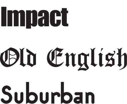
Display typefaces such as Impact, Old English, and Suburban are more expressive than text typefaces but are not suitable for large bodies of text.
SERIF AND SANS SERIF
Graphic arts professionals have devised other ways of organizing typefaces. A major distinction is the difference between serif and sans serif typefaces.

Serif typefaces originated with the Romans who identified their stone shrines and public buildings with chisel-cut letterforms. To hide the ragged ends of these letterforms, the Romans would cut a short, extra stroke on the ends of their letters. This extra cut was called a serif.

Sans serif typefaces were born out of the Industrial Revolution to reflect a more modern aesthetic. They are characterized by no serifs and a smooth, streamlined look.
Serif typefaces can be further broken down into subcategories that make distinctions between the types of serifs they display and their letter stroke style.
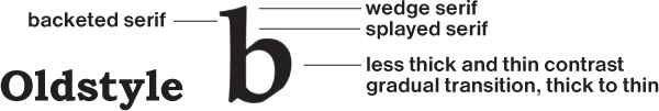
Old Style Roman typefaces are styled after classic Roman inscriptions. They have splayed stems, wedge-shaped serifs, and bracketed serifs.
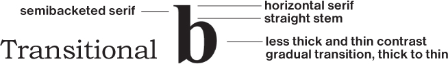
Transitional Roman typefaces fall in between Old Style and Modern serif typefaces and exhibit characteristics of both.
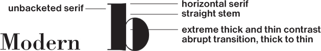
Modern Roman typefaces show an extreme contrast between thick and thin strokes, with sharp, thin serifs.
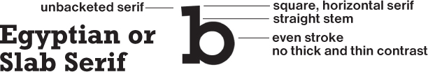
Egyptian or Slab Serif typefaces have square serifs and even strokes with no thick and thin contrast. (Alternative term: Square Serif.)
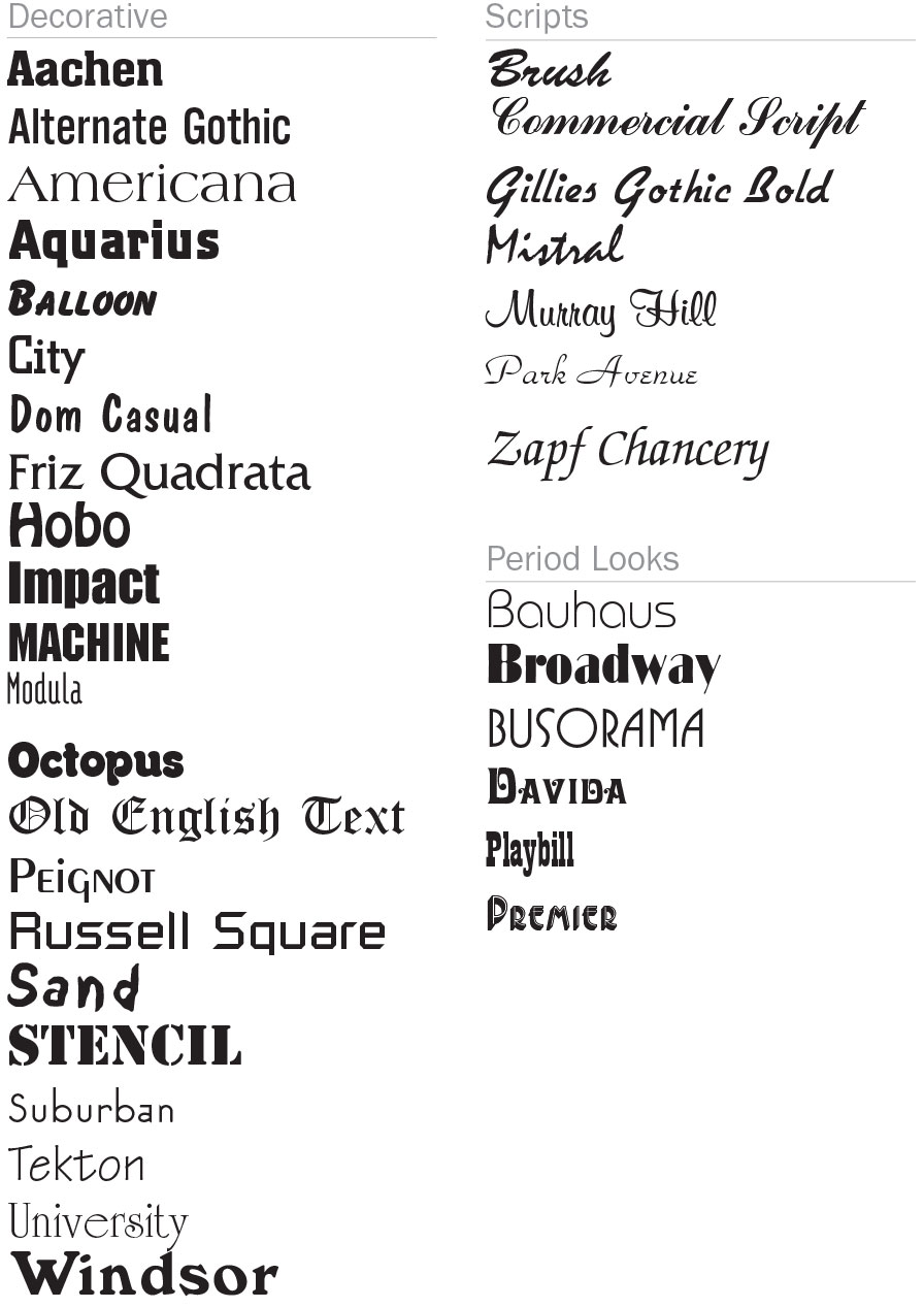
Typefaces that resemble handwriting or hand lettering fall into a category called script. All other typefaces fall into a category called decorative. These typefaces are highly stylized and suitable only for display purposes.
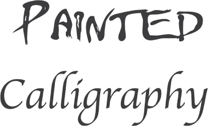
The script category of typefaces includes a variety of looks ranging from typefaces that resemble crude brush-painted signage to those that mimic the calligraphic look of pen and ink.

Decorative typefaces, such as the ones shown here, include period and novelty looks. They are most often used to attract attention and convey a mood.
MEASURING TYPE
Type is measured by points, a unit for measuring the height of type and vertical distance between lines of type. A point measures .0138 of an inch or 3.515 mm. There are 72.27 points in an inch and 28.453 points in a millimeter.
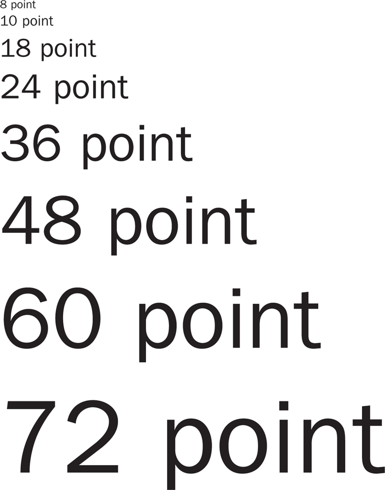
The point system of measuring type goes back to the days of metal type when sizes were classified according to the metal slug that held each character.
The amount of space between lines of type, called leading, is also measured in points. The term is derived from metal type where strips of lead were inserted between lines of type. (Alternative terms: line spacing, interline spacing.)
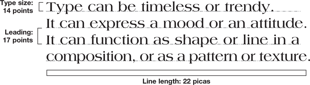
Leading is typically one to two points more than the point size of a typeface. This allowance between lines provides enough space to accommodate the height of uppercase characters and ascenders as well as characters with descenders that fall below the baseline.
The horizontal length of a line of type, or its line length, is traditionally measured in picas, but can also be measured in inches or millimeters. There are 6.0230 picas in 1 inch and 2.371 millimeters in a pica.
The distance between characters in a word or number and between words and punctuation in a line of type is called letterspacing. (Alternative terms: tracking or kerning.)

Adding letterspacing to a word gives it a different aesthetic that may add design value in single or limited word applications. However, lack of legibility makes this technique inappropriate for lengthy amounts of text.
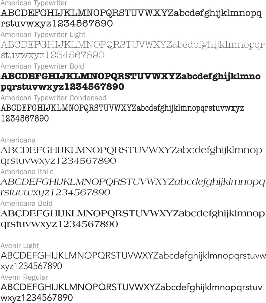
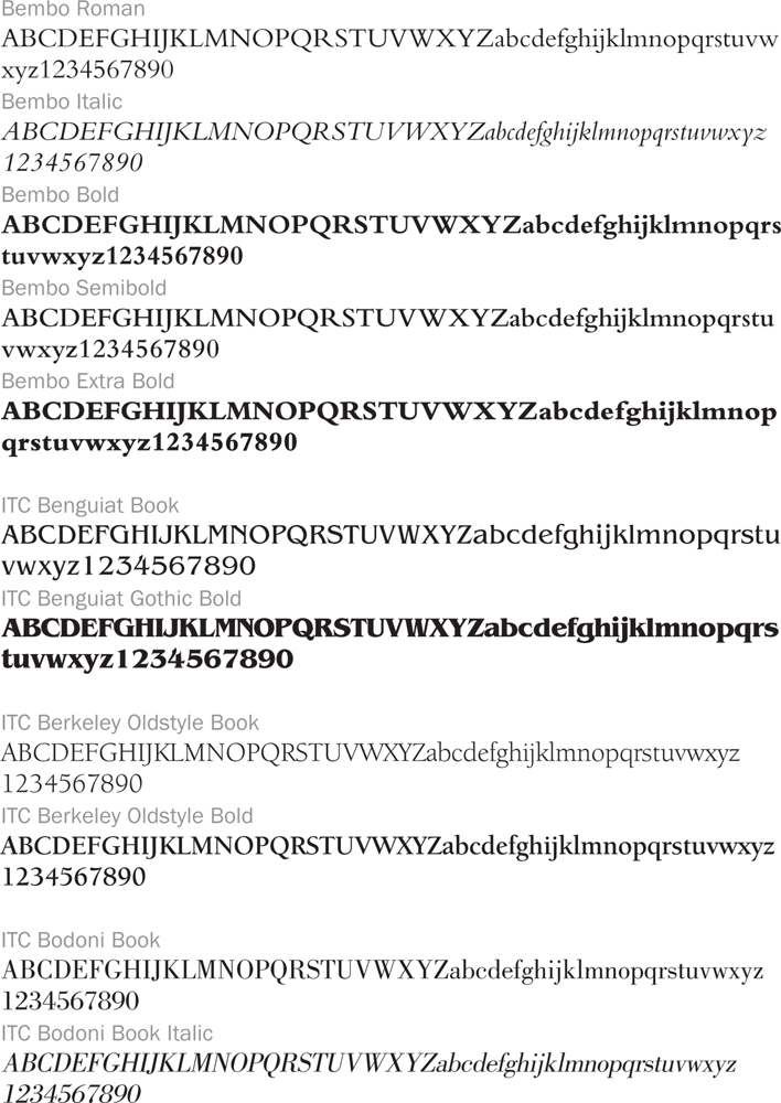
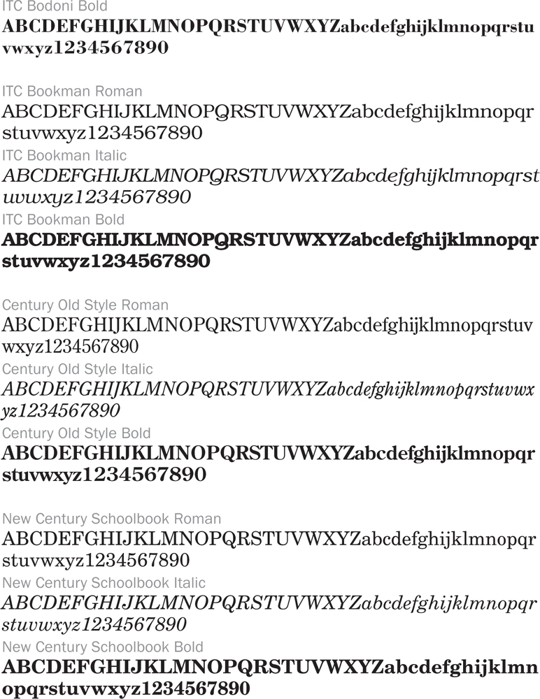
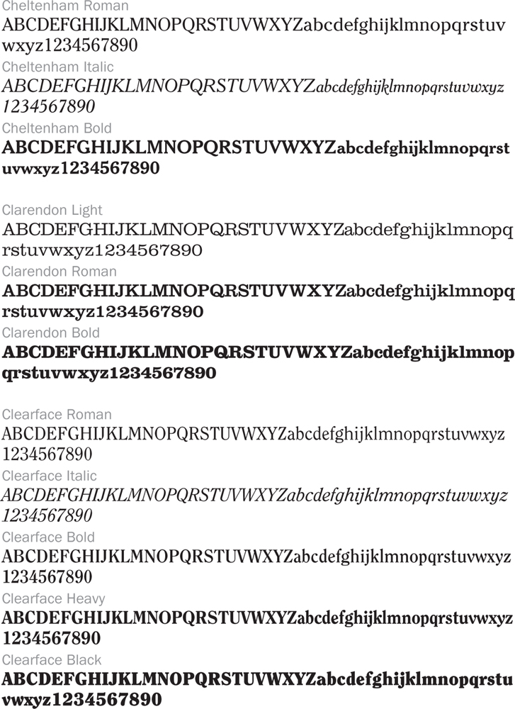
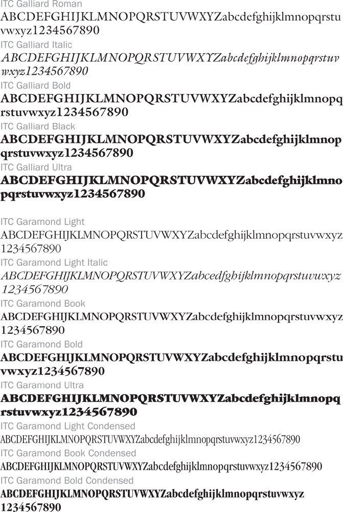
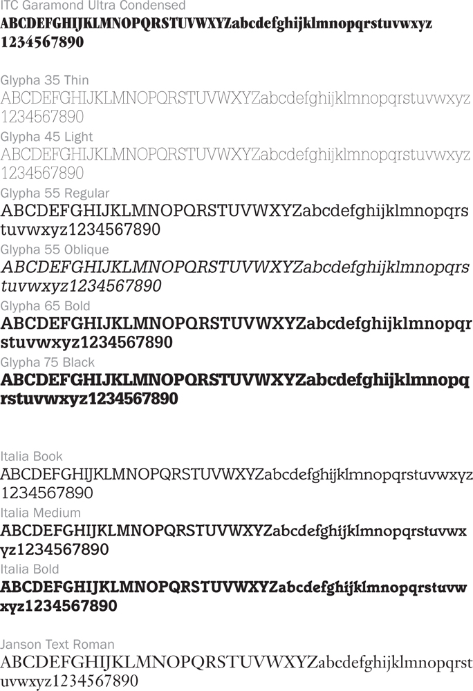
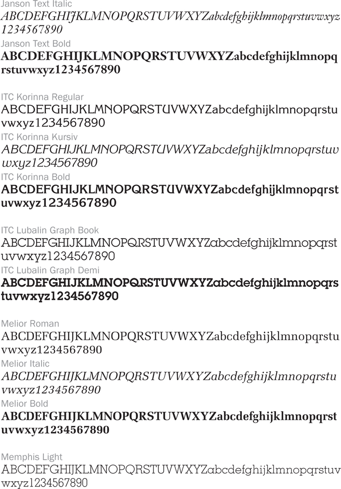
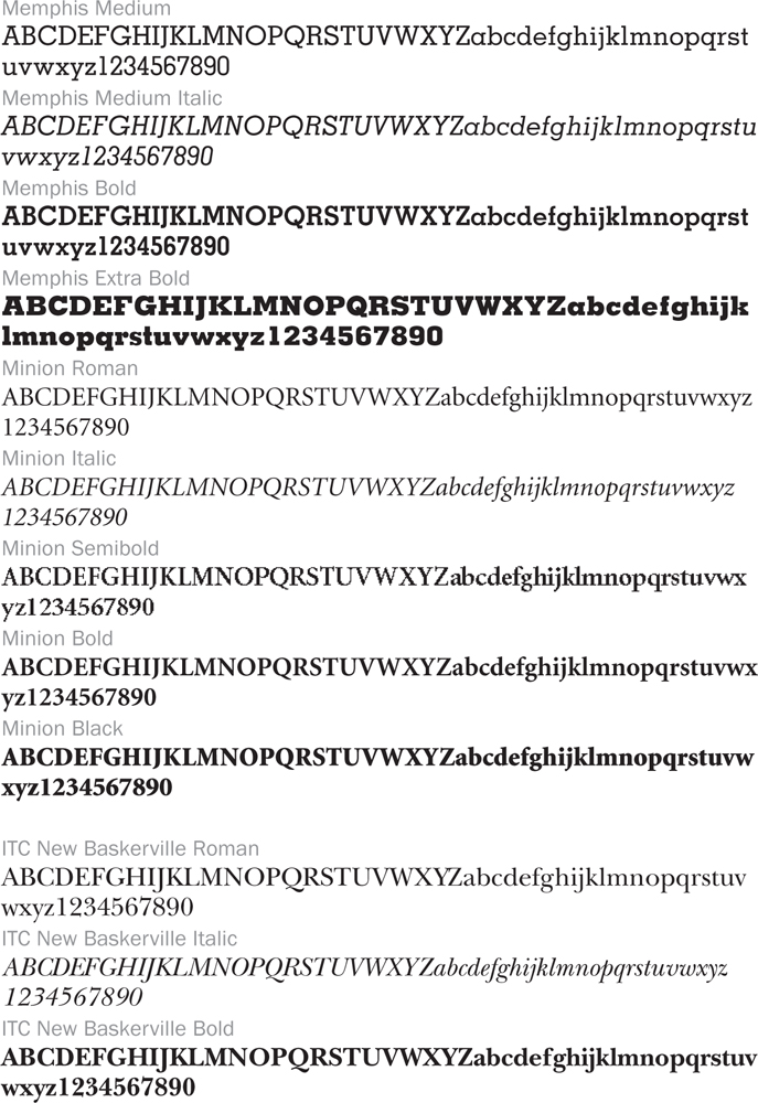
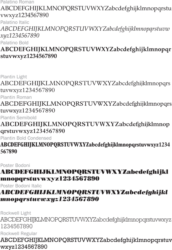
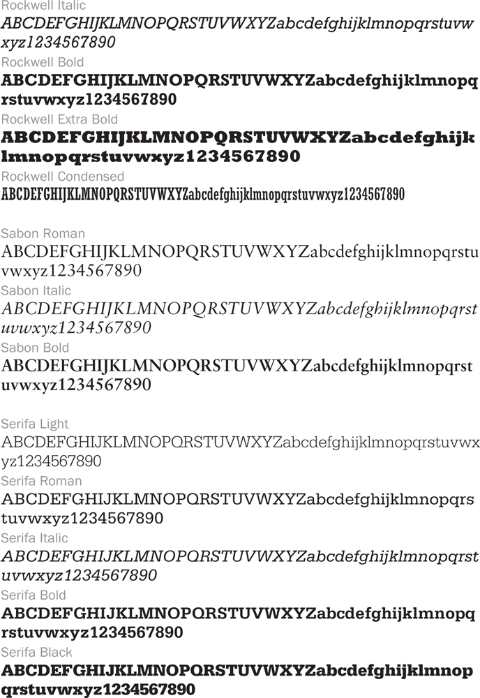
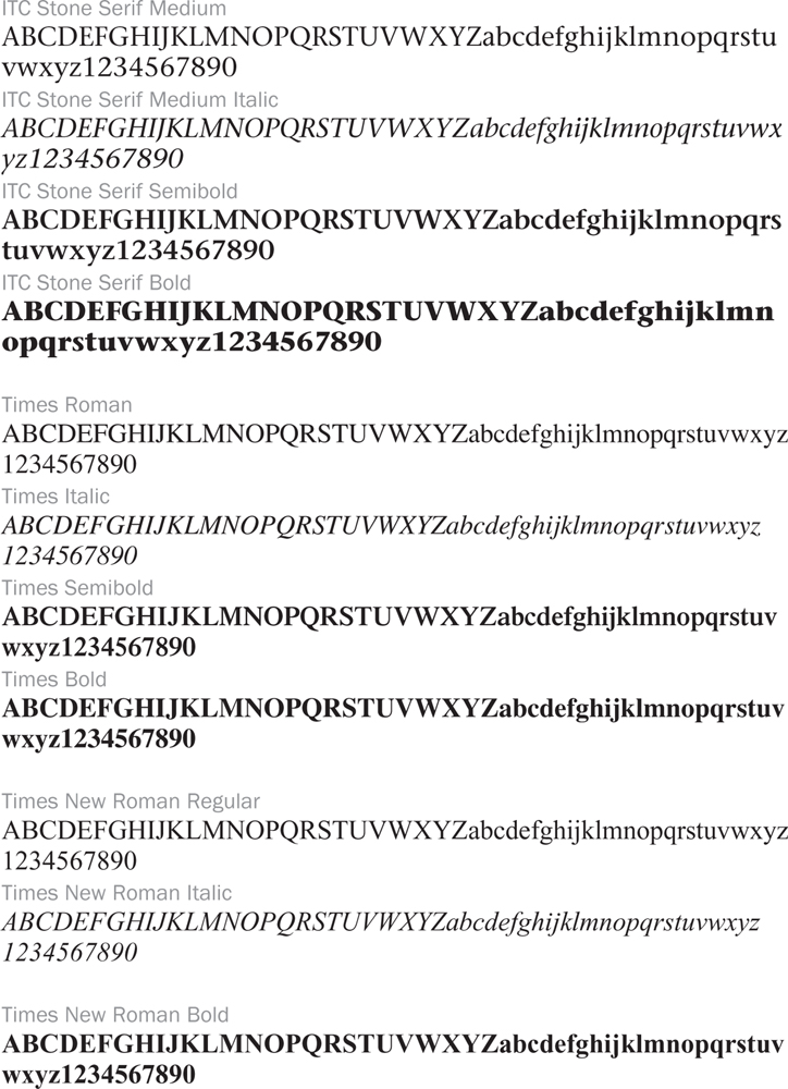
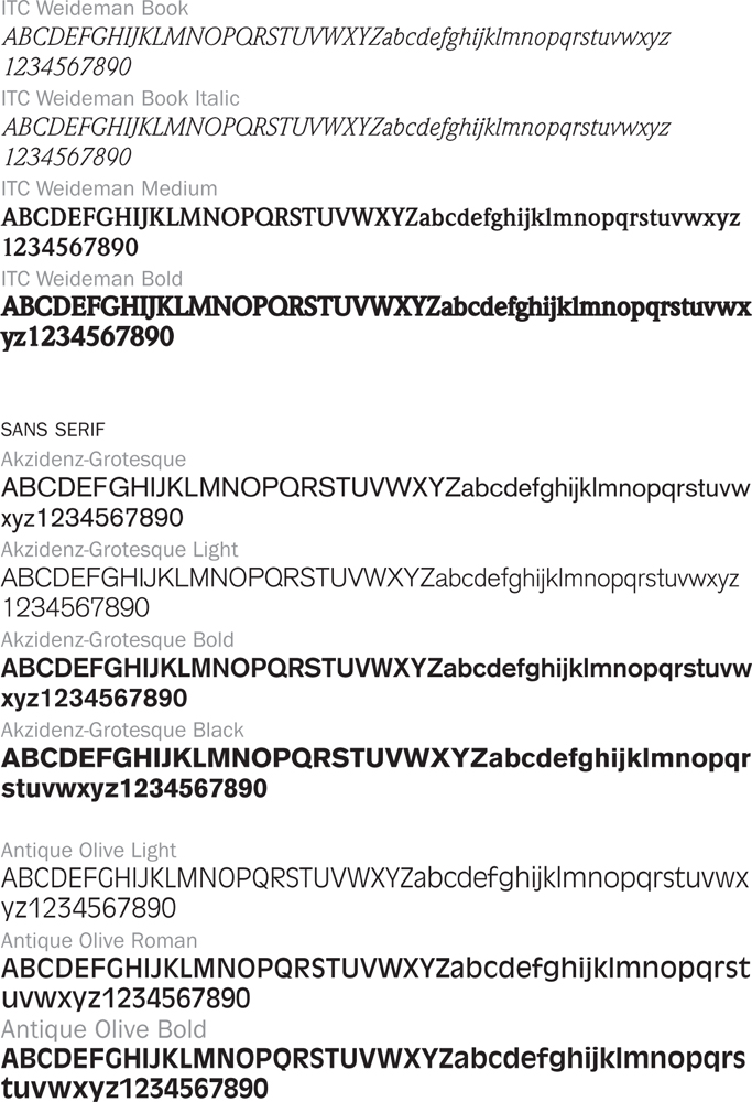
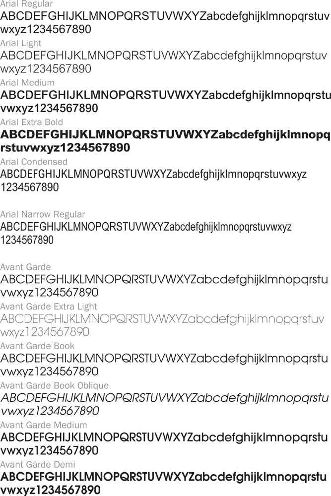
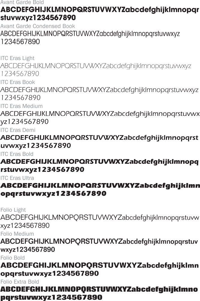
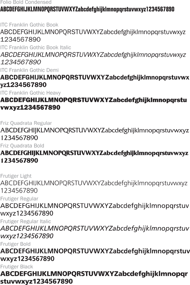
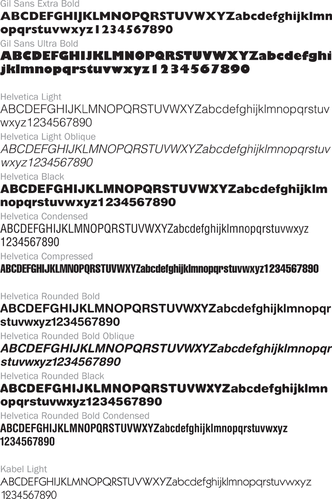
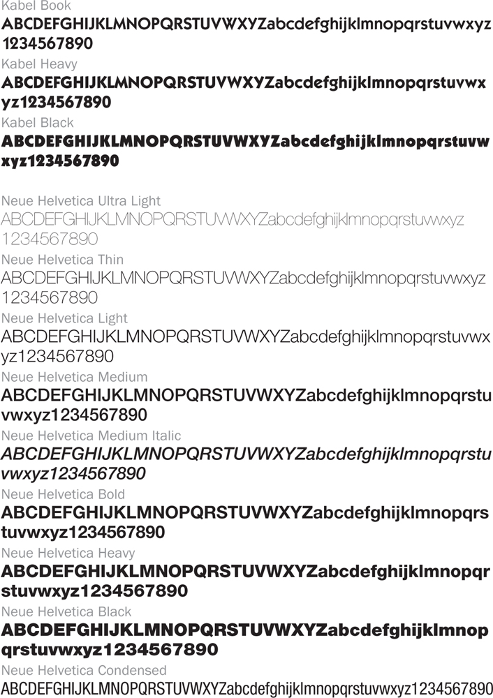
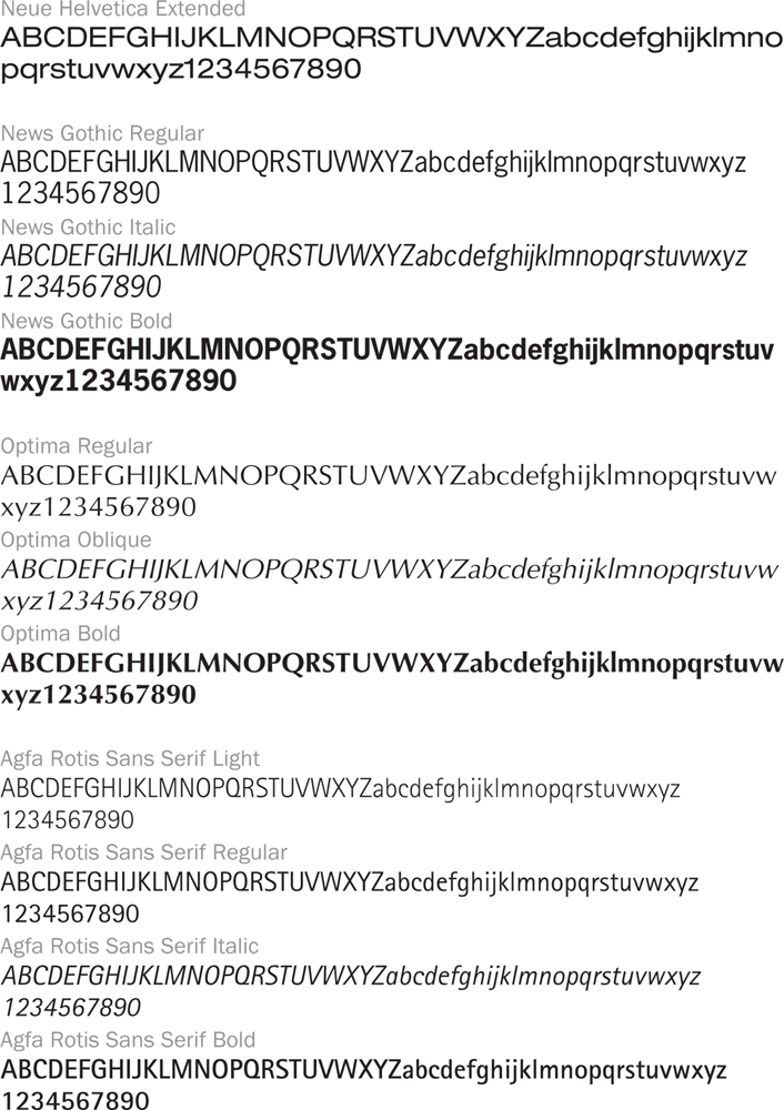
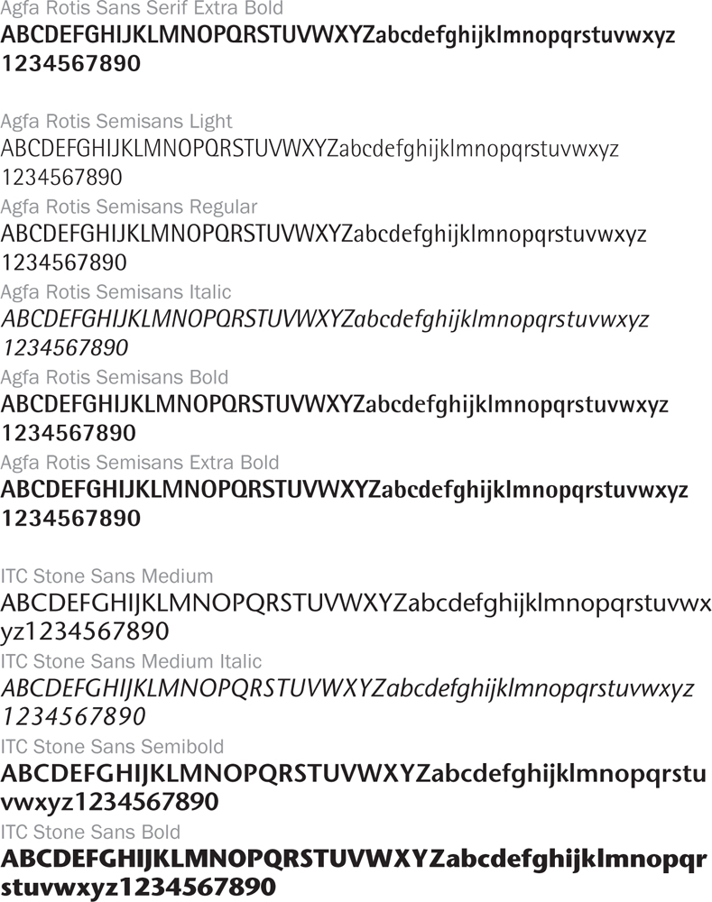
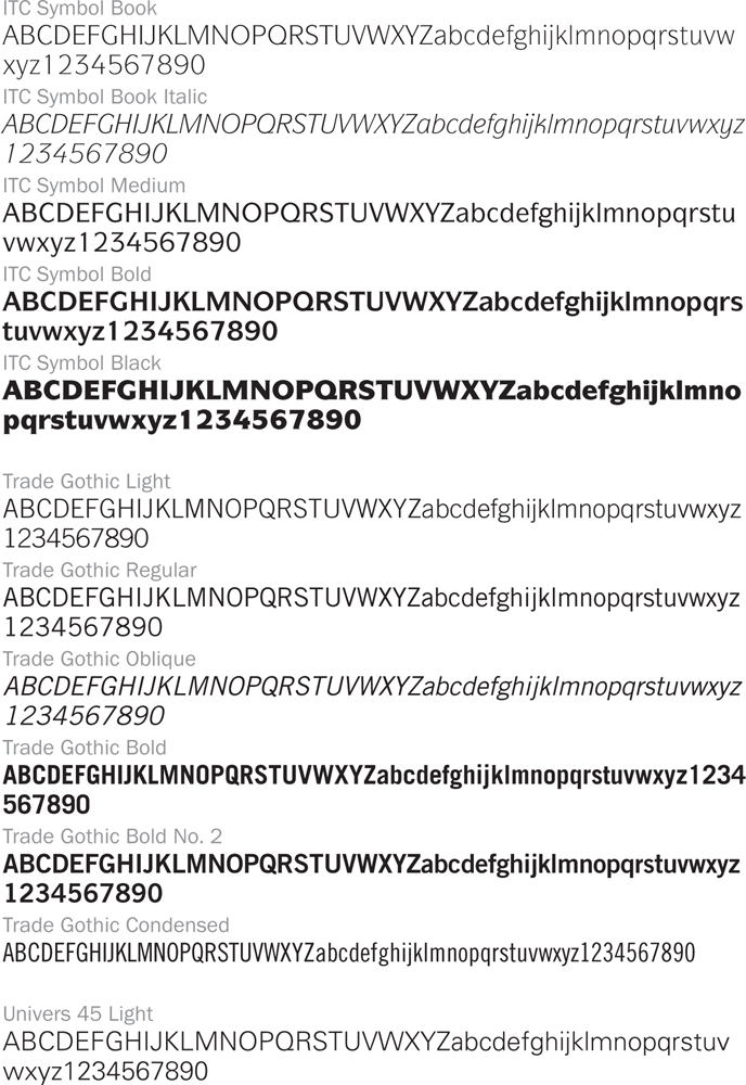
TYPE GUIDE
This guide includes alphabetical listings of typefaces and specimens. It is divided into two sections. The first section is limited to single-word representations, by name of display typefaces. The typefaces are organized according to whether they are decorative, scripts, or period looks. The text typeface section includes alphabets and numbers for many of the style variations that are available for each typeface.
Note: This guide is intended as a reference source and not as a font catalog. Check with your font supplier for additional information on style variations and font availability.
Type Specimens: Display Typefaces
Use this guide to identify typefaces that you’re trying to match or when considering typefaces for possible use.
TEXT TYPEFACES
The typefaces in this section include many of the style variations that are part of each typeface family. However, due to space limitations, condensed, extended, italic, and oblique versions have been limited to the Roman, book, or medium weight of each typeface. Condensed and extended versions of each typeface have also been restricted to one sample.