
Chapter 32
Beware the Dead-End Dashboard
You've considered the purpose of your dashboard. You've worked with colleagues to ensure the questions being answered are the correct ones. You've considered layout and design and made something beautifully functional. In fact, you've made a successful dashboard that helps people answer the questions they are asking.
Congratulations! Building an effective dashboard is a difficult thing to do, and you've done it.
But if you think your work is done, think again; you're just getting started.
Dashboard projects do not have endings. Your business evolves over time, and your dashboards should do the same. If not, they run the risk of becoming dead-end dashboards.
A couple of years ago, I (Andy) purchased a Fitbit. The wearable device tracks your daily activity, focusing on how many steps you walk each day, with a default 10,000-step target. For the first few months, this device and its online dashboard were hugely motivating. (See Figure 32.1.)
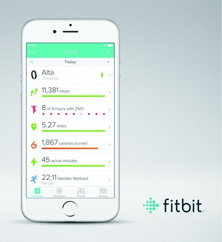
Figure 32.1 Fitbit dashboard.
Fitbit took something that was difficult to record, step count, and made it easy to track. The dashboard didn't just reveal my daily walking patterns; it motivated me to change my behavior and walk more. The dashboard showed me which days I was failing (mostly on workdays) and allowed me to make strategies to walk more by, for example, taking morning strolls before my commute. The dashboard answered my questions and allowed me to take action.
After a while, I came to know everything the dashboard was going to tell me. I no longer needed to look at the dashboard to know how many steps I'd taken. The dashboard had educated me to make a good estimate without needing to look at it. Step count had, in other words, become a commodity fact. I'd changed my lifestyle, and the dashboard became redundant.
Now my questions were changing: What were my best and worst days ever? How did my daily activity change according to weather, mood, work commitments, and so on? Fitbit's dashboard didn't answer those questions. It was telling the same story it had been telling on the first day I used it, instead of offering new insights. My goals and related questions were changing, but Fitbit's dashboard didn't.
After a year, my Fitbit strap broke, and I decided not to buy a replacement. Why? Because the dashboard had become a dead end. It hadn't changed in line with my needs.
This happens in business scenarios too. Dashboards that don't evolve at the same pace as your questions don't get used. They become zombie dashboards, updating daily, shuffling along like the living dead. How many organizations have dashboards that perhaps were useful once upon a time but outlived their usefulness and were never replaced or updated?
How exactly do you avoid a Fitbit fate for the dashboards in your business or organization and ensure you have an evolving, thriving dashboard culture? We recommend taking four steps, discussed next.
1. Review Your KPIs
Every dashboard you build answers questions that are current at the time of the design. Consider the key performance indicator (KPI) dashboard featured in Chapter 8, shown again in Figure 32.2.

Figure 32.2 KPI dashboard.
Look at the reliability rate. It's been hitting target for a considerable time. There might come a time when the business should ensure it is still measuring the right thing. If that KPI never fails, why measure it? In this case, there is only one year of data so it is probably too early to be sure this KPI is fixed, but after another year?
2. Track Usage with Data
Do people use the dashboards you've designed for them? If a dashboard was intended to be looked at by, say, 20 senior managers once a week, are you achieving that? Maybe the dashboard's never been used, or maybe its usage is waning.
Identifying a dashboard that's becoming less popular is a great way to identify a potential dead-end dashboard. Maybe the business question it asked is now solved. In that case, it might be time to remove the dashboard from your servers.
“Low dashboard usage typically signals a need for change,” says Matt Francis, who is responsible for analytics at the Wellcome Trust Sanger Institute. “Sometimes they are for projects that are wound up. Other times requirements have changed so we work with people to refresh them. This way we ensure dashboards on our systems are giving users answers they need.”
Here are a few specific questions to begin your review:
- Which dashboards are most and least popular?
- Which dashboards were popular but aren't anymore? These dashboards might cover a problem that the business has now solved.
- Which dashboards are used by only a small section of the intended audience? Low usage might indicate that some users haven't been trained properly in using the dashboard. It could mean that some users have different questions that the dashboard does not answer.
These questions can be answered by using data. Get the metrics on the number of times a dashboard has been looked at, over time.
Mark Jackson, the author of the Tableau Server dashboard in Chapter 18, also has multiple dashboards looking at how people use analytics across the organization.
In Figure 32.3, you can see how Mark looks out for dashboards that aren't reaching the right size of audience. Look at two workbooks around the center: User Audit and Core Staffing (labeled 1 and 2).
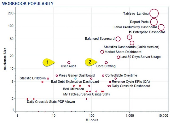
Figure 32.3 View of all dashboards on a server, showing number of views (Looks) and size of audience.
Source: Mark Jackson (http://ugamarkj.blogspot.com), Piedmont Healthcare
User Audit has around 30 views with an audience of approximately 15 people. Core Staffing has well over 100 views for the same audience size. Mark should investigate why the User Audit workbook is not receiving as many views as it should be by consulting the users. It might be that these particular dashboards need to be looked at only a few times a year. The data helps Mark, but he needs to talk with his audience to get the complete picture.
Another innovative way Mark tracks dashboards is to look specifically at his organization's executives and how often they look at the dashboards. How many business endeavors fail because they don't have committed executive support? If the people at the top don't support use of your organization's dashboards, there's a high chance adoption will fail. As shown in Figure 32.4, Mark specifically tracks executive usage with their consent. If executive use dwindles, he knows he has to address the issue.

Figure 32.4 Mark tracks how often his executives look at the dashboards.
Source: Mark Jackson (http://ugamarkj.blogspot.com), Piedmont Healthcare
Find out more about Mark's administrator dashboards here: http://ugamarkj.blogspot.co.uk/2014/08/custom-tableau-server-admin-views.html.
3. Speak to Your Users
If you're designing dashboards for other people in your organization, when was the last time you asked them what they think of the dashboards? In fact, have you ever actually sat down, in a room, in front of the dashboard, and talked through how it is used? My hunch is that many people don't speak to the intended audience enough.
Why do I have that hunch? I was guilty of this in my early days as an analyst. I would publish what I thought were beautiful, insightful dashboards, then proudly send an email to everyone proclaiming something as grand as “It's here! The dashboard you've all been waiting for. Click this link and insight will follow!” In the following weeks, I would become frustrated as I looked at the data on who was using the dashboards, wondering why my work was being ignored.
What I hadn't done was enough consultation with the users at the end stages of the project. I hadn't sat down and watched them use the dashboard I'd created. As you build and fine-tune a dashboard, you are acutely aware of what every pixel means. You know where the color legend is because you put it on the dashboard. You know what to click to make the interaction work because you coded those interactions. You know what the scatterplot means because you chose the variables.
Sitting down behind someone and asking them to use your dashboard can be a very humbling experience. (“Oh no, they can't answer their questions and I thought I'd made it easy.”) It can also be frustrating. (“How can you not see that there's a filter on the lower right? All you have to do is click it!”) However, it's the best way to spot the mistakes in your dashboard and fix them before sending something to your organization that people won't be able to use.
4. Build Starter Dashboards
We like to personalize our possessions. We all buy the same smartphone but then accessorize it with a case in order to make it our own. What if you gave all users a basic dashboard and allowed them to personalize it for their own needs? Doing this acknowledges that fact that everybody wants to tailor data in their own way.
I work at Tableau. We do have core sales dashboards, but when we hire new salespeople, instead of pointing them to a set of dashboards that they need, we point them to a very basic dashboard, showing very basic sales information: sales over time and by geography.
They tailor the dashboard over time, as they get used to their part of the sales organization, so that it answers the questions they need for their jobs. Not only do they build something relevant to their needs, they also have a better sense of pride and ownership because it's their own toy.
What does become critical in this situation is that there is consensus around the goal. Not only must everybody be using a well-governed data source, it's also important that each employee is well aware of the strategic goal.
Although we have many, many dashboards in our organization, they all use the same governed data sources. We can be confident that we have a sales team proud of their own individual dashboards, making conclusions from the same single source of the data.
Summary
The real world is not a static place. To avoid dead-end tools, you should regularly review your dashboards using data and conversation. As you remove old ones, publish new ones, and adapt existing ones, you need to work closely with all stakeholders to make sure they are supportive and aware of the changes.