
Chapter 20
Complaints Dashboard
Complaints dashboard.
Dashboard Designer: Jeffrey Shaffer
Organization: Unifund

Scenario
Big Picture
You work for a bank or credit card company. You receive complaints on a regular basis. These complaints must be handled appropriately and swiftly. Complaints can come directly from consumers, or they can be channeled through regulators, such as federal or state agencies. Once the complaints are handled appropriately, they are then marked as closed.
Specifics
- You need to see the number of consumer complaints for a specific time period.
- You need to see how many complaints are open and closed.
- You need to see the volume of complaints by reason.
- You need to see the volume of complaints by the party making the complaint.
- You need to see the number of complaints by state, and you need to be able to filter the dashboard by state.
- You need to be able to change the date range to see the complaints for different periods of time.
Related Scenarios
- You need to monitor consumer complaints for financial products. Examples include:
- •Banks and credit unions
- •Credit card issuers
- •Collection agencies
- •Attorneys
- •Account receivable management companies
- •Student loan issuers or servicers
- •Auto loan companies
- •Credit counseling companies
- •Payday loan companies
- Online financial service companies
- You need to monitor customer complaints for any product or service. Examples include:
- •Online retailers
- Food service providers
- You need to monitor complaints in the workplace. Examples include:
- •Harassment
- •Working conditions
- •Diversity
- •Protected classes
- •Injuries
- Misconduct
How People Use the Dashboard
Compliance is a key issue in many industries. In financial services, any company that is regulated by the Consumer Financial Protection Bureau (CFPB) is expected to handle consumer complaints appropriately and timely. Companies are also expected to have a complaint management system, along with policies and procedures to handle complaints, regardless of their nature or origin.
Complaints are received though a number of channels. Some complaints are received directly from the consumer, while others come directly from the CFPB, state agencies, or other entities. Each complaint is logged with the reason for the complaint and the channel through which the complaint was received.
The chief compliance officer or members of the compliance team use this dashboard on a regular basis to help monitor the compliance with the complaint management system. Actions can be taken as needed—for example, following up on or investigating a complaint that has been open for a long period of time. Figure 20.1 shows the total complaints over time.

Figure 20.1 Totals are displayed at the top and a stacked bar chart shows the open and closed complaints over the selected time period.
The default time range is the past 12 months, but the user can adjust the slider control to change the time period. (See Figure 20.2.)
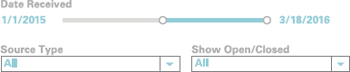
Figure 20.2 Slider control to adjust the time period and to select the source type or open/closed status.
A state map using hexagons displays the open complaints by state. Open complaints, indicated by darker coloring, are especially important to monitor to make sure the necessary action is taken and response is timely. Clicking on a state filters the rest of the dashboard by state. (See Figure 20.3.)

Figure 20.3 Hex map showing the open complaints by state. The user clicks any state to filter the dashboard.
The reason for the complaint is logged when it is received. These reasons are shown on the dashboard for both closed and open complaints. (See Figure 20.4.)

Figure 20.4 Closed and open complaints are shown by reason.
The party filing the complaint is shown in the bar charts in Figure 20.5. Selecting a party from this chart will filter the rest of the dashboard by that party.

Figure 20.5 Closed and open complaints are shown by the party sending the complaint.
Combining filters allows the user to narrow the focus quickly. For example, the user can click California on the hex map and then click State Attorney General in the Complaints by Party bar chart. This will cause the entire dashboard to update immediately to show the complaint history for the California Attorney General's office.
Why This Works
Simple Use of Color
Two categorical colors are used in this dashboard, medium sky blue for closed complaints and a reddish peach color for open complaints. Color is consistent throughout the dashboard. For the map, the color for open complaints is used as a sequential color scheme, shading from white to the reddish peach color. Some states may not have any complaints for the selected period. Rather than filtering them out of the view, the states with zero complaints are shown in white with the hexagonal border. This shows a complete hex map with all of the states regardless of the time period or other filters that may be applied.
Good Chart Types for the Various Comparisons
Most of this dashboard is made up of bar charts, which are great for making accurate quantitative comparisons. A stacked bar is used to show the total number of complaints over time and displays the number of open complaints versus the closed complaints. (See Figure 20.6.)

Figure 20.6 Stacked bar charts showing open and closed complaints.
Notice in Figure 20.6 that the open complaints are on the bottom of the stacked bar. The open complaints are the most important because they represent work that needs to be done and monitored on this dashboard. By putting them on the bottom of the stacked bar, the user is able to make a very accurate comparison of the bar heights. For example, even without providing data labels, it's very easy to see in this figure that there is one more open complaint in January than in February. This is because the bars are fixed to a common baseline, the x-axis, allowing an accurate comparison of bar heights. It's also really easy to spot the oldest open complaint, the one open complaint from November 2015.
Using Figure 20.6, try comparing the closed complaints (the blue bars) for November and December. Which one has more complaints, and how many more?
This determination is much more difficult because there isn't a common baseline. The difference between open and closed complaints is actually the same as in Figure 20.7. There is exactly one more closed complaint in November than in December. Thankfully, the user doesn't need this level of precision for the closed complaints, although they have the option from the drop-down box to filter for them should the need arise.

Figure 20.7 Unstacked bar chart comparing the same number of closed and open complaints as Figure 20.6 for November and December.
Be very careful when using stacked bars. They are helpful for two reasons: (1) for showing a part-to-whole relationship where the whole is important and (2) for comparing one segment to the whole. In this case, the user wants to see the total complaints over time. Since open complaints are also very important, we can see them compared to each other. This is because they are the bottom segment of the stacked bar. We can also see the open complaints in relation to all of the complaints, the part-to-whole comparison. Stacked bar charts are not useful to accurately compare one segment to another segment within the same bar.
The other bar charts on the dashboard are divided up between open and closed. This allows for a quick and easy comparison of open and closed complaints both by Reason and by Party (the channel through which the complaint came in).
Dashboard Designed to a Grid
The dashboard is separated into four quadrants. There is clear horizontal and vertical alignment between all four sections, and there is space between each section of the dashboard. This reduces clutter on the dashboard so that it doesn't look busy. Good organization of your dashboards can help users see the information clearly and quickly.
A Hex Map Where All States Are Equal
Complaints are considered equally important, regardless of channel or volume. The hex map allows the user to see every state equally. When using a traditional choropleth (or filled) map, it can be hard to see very small states. For example, Delaware, Maryland, Rhode Island, and Vermont can be hard to see, and especially hard to click, compared to larger states, such as California and Texas. Also, Alaska and Hawaii often require special handling and sometimes are placed on the map out of position. The hex map solves these problem. It visualizes the states equally regardless of their land size.
Figure 20.8 demonstrates the difficulty seeing smaller states in the Northeast. Rhode Island, Connecticut, Vermont, New Hampshire, Delaware, and Maryland all are very difficult to see on a full map of the United States. If the map is used as a filter, which it is in this dashboard, then it would be very difficult for the user to select the small areas on the map to filter.

Figure 20.8 A comparison of the northeastern states demonstrating how difficult it is to see smaller states on a choropleth map.
Notice the equal treatment of the states with the hex map in Figure 20.8. Data analysts can also benefit from the straightforward presentation of a hex map. On a related dashboard, there was a coding problem behind the scenes, and Connecticut was not appearing in the data. It was immediately apparent on the hex map, but it would not have been caught so quickly on a choropleth map.
Hex maps have their disadvantages, though. Most important, the position of the states isn't exact because compromises have to be made for their placement. Figure 20.9 shows the locations of states in the southeast on a common choropleth map versus a hex map. Examine the placement of the states on the hex map. Georgia isn't south of Alabama and South Carolina. Because states are not in their usual location, it is essential to provide a two-letter state code so that the user can quickly find the states.

Figure 20.9 A comparison of a choropleth map versus a hex map showing the position of the states.
Another issue with using a hex map is that it may not work well for different countries or regions. There are a number of different templates for the United States, but creating a hex map of the countries in the United Kingdom would be more difficult. In the United Kingdom, where the countries are closer in size, a choropleth map would likely be a better approach.
Other Approaches
Visualizing data on a map can be challenging. Many compromises have to be made. On the hex map, the decision was made to show only the open complaints. In this case, the data could be shown on a choropleth map, as described earlier. (See Figure 20.10.)

Figure 20.10 A choropleth map showing the open complaints by state.
However, Figure 20.10 demonstrates again the difficulty of seeing the smaller states, especially when the map is a full U.S., map and it is placed in a small area of a dashboard.
Showing part-to-whole relationships on a map can be especially challenging. In this case, a filled map won't work. Although pie charts generally are not the best choice for visualizing data, they can be useful in this case to show a part-to-whole relationship on a map. (See Figure 20.11.)

Figure 20.11 Open and closed complaints shown on a map using pie charts.
This solution suffers from some of the same issues that a filled map does. Smaller volumes have smaller pie chart sizes, which makes the comparisons very hard to see and difficult for a user to hover over or select.
Another alternative is to avoid a map altogether. Just because data is geographic in nature does not mean that it has to be plotted on a map. Figure 20.12 shows a treemap. The treemap was designed to visualize hierarchical data, but it can also be used when there are many categories to show—in this case, 50 states.

Figure 20.12 A treemap showing open and closed complaints by state.
The advantage to this solution is the data is now ordered by the most complaints. It's easy to see that Florida has the second highest number of total complaints and Michigan the third, something that can't be easily discerned from the other maps. The treemap also shows us the part-to-whole relationship between open and closed complaints in each state.
The problem with this solution is that it can be hard to find states if the user needs to select them to drill down into the data. The smallest states aren't visible either, as some are missing the state labels. These issues could be solved with a drop-down menu and tool tips, but that still would require a user to find very small areas of the treemap to select, much like the choropleth map, but without the aid of a known geographical location.
Another option would be using ranked bar charts, but when dealing with 50 states or 196 countries, bar charts will quickly become impractical. If you don't need to list all of the categories, then a bar chart of the top 10 could be a great solution. However, in this dashboard, it was important to see every state, treat them with equal importance, and allow the user to filter them easily.
In the end, the designer felt that the hex map was the best compromise to show the open complaints on the dashboard.
Author Commentary
Steve: There are three things that I thought were particularly clever in this dashboard.
1. The key performance indicators are also a color legend. (See Figure 20.13.) Notice that there isn't a color legend. Instead, the summary numbers at the top of the dashboard are color coded. Not only do I know that there are 288 closed cases and 39 open cases; I also know that blue means closed and red means open.

Figure 20.13 The key performance indicators also serve as the color legend.
2. The hex map is a value-added filter. Whenever I see a hex map or tile map, I get suspicious and think that the dashboard designer may be succumbing to the temptation to add something cool at the expense of something that is analytically sound. That is not the case here. The hex map is in fact a filter that also provides additional insight into the data. The dashboard designer knows that users need to be able to filter by state and could have deployed a simple multiselect list box from which the user could select a state or states. The hex map provides that same functionality and adds really useful insights into the data.
3. Perfect use of a stacked bar chart. The stacked bar chart in this dashboard (shown in Figure 20.1) is a great choice as we can easily compare both the overall number of complaints per month and the number of open complaints per month.