
Chapter 5
Executive Sales Dashboard
Executive software license sales dashboard.
Dashboard Designer: The dashboard designer wishes to remain anonymous.
Note that product names and company names have been changed.
Scenario
Big Picture
You are a sales manager and want to know how you and the sales team have been performing this quarter. You want to be able to see, at any time during the quarter, exactly how total sales for that quarter compare to any previous quarter. You need to be able to see the overview for the whole business and also filter down to individual product lines or regions.
Specifics
- How are we doing this quarter?
- How is this quarter compared to last quarter and the same quarter last year?
- Are we on track to beat the previous quarter? Are we on track to beat the same quarter last year?
- What are the most recent transactions?
Related Scenarios
- Product managers would want to compare cumulative sales of different products launched at different times. Even though you launched Product X last year, did it sell quicker than Product Y, which you released this year?
- Social managers might want to measure how viral their campaigns were. Which campaigns got the most hits the most quickly? Which ones had the most longevity?
- Event organizers tracking registrations to recurring events would use a dashboard like this to see if their ticket sales are above or below target compared to previous events.
How People Use the Dashboard
This dashboard is designed to provide a complete overview of sales for two products. The company executives receive a copy of this email weekly. If they need more details, they can click on a link to go to the live, interactive version viewable in their browser.
Why This Works
Focus on Year-over-Year and Quarter-over-Quarter Growth Comparisons
In this organization, the most important things to know are: what's happening now, what happened last quarter, and what happened in this quarter last year. This is vital in a sales organization focusing on growth.
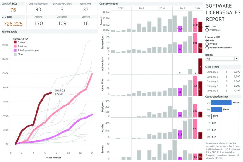
The index chart on this dashboard makes comparison to previous periods very easy. (See Figure 5.1.) The x-axis shows “Week of Quarter.” Each quarter's sales begin in the same place: at zero on the x-axis. The line shows cumulative sales for each week of the quarter. There is a line for each quarter. The result, the index chart, allows you to see, at a glance, how progress in this quarter compares to previous ones.
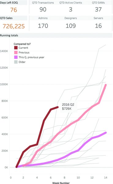
Figure 5.1 The index chart lets the executives see how sales this quarter are growing compared to other quarters. The previous quarter and same quarter last year are highlighted.
Color and size help identify the most relevant quarters for comparison. Three lines are thicker than the others: current quarter, previous quarter, and same quarter last year. The current quarter is red, which stands out most clearly. The other two comparison quarters are different colors, making identification easy. All other quarters are shown as thin gray lines; they are there for context, but the gray allows them to sit in the background unless needed.
In the interactive version of the dashboard, the detail for any quarter can be seen quickly by hovering the mouse over the line: A tool tip reveals detail, and the relevant quarter is highlighted in the bar chart to the right.
In Figure 5.1, we can see that when this screen shot was taken (Q2 2016), sales are tracking very well. It is significantly better than the previous quarter and the same quarter last year. In fact, sales growth in this quarter has been exceptional.
As discussed in Chapter 31: Visualizing Time, index charts are superb ways to track measures and compare them against different periods. This same company also has a simpler dashboard comparing only annual company growth. (See Figure 5.2.)

Figure 5.2 Year-over-year performance for a software company. As you can see, 2016 is tracking ahead of the previous year.
Although the index chart shows the growth rate comparison, the bar chart in Figure 5.3 shows the actual values for each quarter's sales. Each row of bars represents one of the seven metrics this business focuses on. Only the labels for the three important bars (this quarter, last quarter, same quarter last year) are shown. This reduces clutter on the dashboard while users retain the ability to look up the most important numbers without relying on interactivity.

Figure 5.3 Growth over time is shown in detail in this bar chart. The labels allow the viewer to see the exact information in the most relevant quarters.
Key Metrics as Text
The top left of the dashboard is devoted to the table shown in Figure 5.4. At a glance, executives can look to the most prominent part of the dashboard and find exactly the numbers they need to see.

Figure 5.4 It can be important to distill the information down to just a few key numbers. If that's the case, just show the numbers. You can show detailed charts elsewhere.
When looking at the dashboard at the start of a week or ahead of a meeting with a sales team, you can check just these numbers for the main takeaway.
Small Details Where Needed
This dashboard is dominated by the key metrics, the index chart and the detail bar chart. But the space below the filters is just enough to add extra information needed for a full business snapshot. In Figure 5.5, the last five orders are highlighted, as is a geographic snapshot of the countries this company sells to.

Figure 5.5 Small charts fit perfectly into small places.
Color
As with so many dashboards in this book, it's the subtle use of color that makes this dashboard work, as shown in Figure 5.3. Red? Boom! That's this quarter, the most important thing to look at. Pink or salmon pink? That's important: this time last year and last quarter. Gray? Not as important. These small but significant color choices have a large impact on how easily people can identify the numbers they need the most.
Author Commentary
ANDY: Where do you look first when you open a web page or dashboard? It's probably the left-hand side. That's where the most important information should go. Should that be where the filters are? Filters need to be discoverable for new users. Therefore, you could argue that they should be on the left. However, they also need to blend out of the way once you're familiar with the dashboard. Therefore, they could go on the right-hand side.
This dashboard is used by a team who know the data and the dashboard intimately. They don't need to discover the filters each time they use the dashboard; they already know they are there. For that reason, the filters are on the right.
If the dashboard is used by viewers who visit it only occasionally, it might be more important to put the filters on the left, as shown in Figure 5.6.
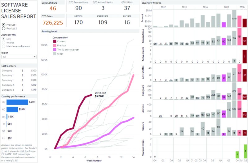
Figure 5.6 The dashboard would work as well with filters on the left-hand side. This approach would be better for people who use the dashboard infrequently.
I always used to prefer putting filters on the right-hand side of a dashboard. As a dashboard designer, I knew the filters were on the right because I put them there. However, when user-testing these dashboards, I'd be in despair as I watched people use them: They'd click around, seemingly randomly, and most wouldn't use the filters.
“Why didn't you click on the filters?” I'd ask after the usability test. “What filters?” was a common answer. Much as you may love your dashboard, others will view it as new, and many won't cast their eyes to the right-hand side. Since they didn't put the filters on the dashboard, they don't think to look over on the right-hand side.
What's the solution? The dashboard in this chapter does put the filters to the right, because the company trains all users in how to use the dashboard. They are shown the filters and trained how they work.
JEFF: I like the chart types that were chosen for this dashboard: the key indicators at the top of the dashboard, the index chart, and the bar charts. The index really shows the trend against the prior period very well. This dashboard is packed with information. I think a few changes to the overall design would help its overall flow. I might compromise the placement of the filters to allow for things to be moved around a bit and give the components of the dashboard some breathing room.
Figure 5.7 shows an example redesign where I moved a few things around. I created a bit more space for things to fit. I also removed the data labels on the bars, since tool tips are available to get more detailed data. I avoided rotating text on the y-axis on the bar charts by moving the labels into the chart. Rotated text takes longer for users to read and can be difficult to read. As an example, there was a spelling mistake in this dashboard on “Active Clients.” This dashboard had already gone through several reviews by a number of people, but until I rotated, the error was not caught.

Figure 5.7 Sample redesign of the dashboard.