
Formatting Charts
As you’ve seen, Numbers offers enough chart choices to potentially confuse you. It also offers enough chart formatting choices to let you either make your point or totally obscure it. This chapter will help you come down on the right side of those possibilities.
Once you’ve learned how to select individual chart elements, you can take a tour of Formatting Panes and Tabs, where you set all the basic formatting for a chart. Then I’ll cover working in the Series Pane and the Style Pane to do such things as swap the positions of bars in a chart, format and reposition value labels, and even change the style of the lines used in line charts. Pies aren’t left out of the formatting fun: they get a Wedges Pane.
But that’s not all, folks! I’ll also talk about Manipulating Images for Fills to put pictures in bars, columns, and pie wedges, and Tweaking Text Elements so that your titles and labels are as clear as your data presentation.
Selecting Chart Elements
While some chart formats affect the entire chart, others can be applied to elements separately. So, for instance, you can: put values in the bars or columns of a chart, but call out one series by having the values outside the graphic; highlight the columns that represent the current year by outlining them with a dotted line; or pull out one slice of a pie chart.
In order to format any individual element, you must select it—and here’s how:
- Select a chart: Click on any part of it: the chart, legend, or labels. A selected chart is framed in blue with white selection handles around its perimeter.
- Select one or more series: First select the chart, and then click on any part of a series: one of the lines, or a single bar or column to select it and others of its color. Once a series is selected, you can add another to the selection by Command-clicking on it, or select all series by pressing Command-A (Figure 136).
You can also select a series after you’ve clicked a chart’s Edit Chart Data button, by clicking the row or column in the source table.
Selecting text elements is covered in Tweaking Text Elements.
Formatting Panes and Tabs
When it comes to charts, the Format Inspector provides formatting options for both the overall chart (such as background color, legend, and gridlines) and its separate elements (bar/line color, data labels, and so on). Which panes are available depends on what you’ve selected: a whole chart, and what kind, or chart elements, and which ones. The tabs within each pane also vary with your selection.
Here’s a roundup of the chart-related panes in the Format Inspector:
- Chart Pane: This is where you set overall chart options; there are so many for some chart types that if you’re working in a small window and expand some of the sections in the pane, you’ll have to scroll the pane to see everything.
- Axis Pane: For everything but pie charts, there’s an Axis pane that has at least two tabs, one each for the X and Y axes; dual-axis charts get a third pane, since a Y(1) and a Y(2) are necessary.
- Series Pane: This pane lets you set options such as labels for either the chart as a whole, or for individually selected elements.
- Wedges Pane: For pie charts, the Axis and Series panes are replaced by the Wedges pane, where you can define the positioning and labeling for individual or all wedges.
- Style Pane: The Style pane appears when you select a data series (or a wedge in pie chart). It lets you change the color, stroke (outline), and shadow properties of a selected item. (This is not the same as chart styles, covered in About Chart Styles.)
- Arrange pane: The Arrange pane is available only when the entire chart is selected, and is the same as for any element on the sheet. It lets you precisely position the chart, resize or lock it, group it with other elements, and define its “layer” in relation to other elements. See Manipulating Objects for more about the Arrange pane.
Chart Pane
The Chart pane provides a myriad of options for the overall look of a chart (Figure 137).

Most options are obvious or take a simple tryout to see what they do—and if there’s something that you need a clue about, you can hover your pointer over it to get a help tag. But here are a few less-than-obvious issues (if you read nothing else in this list, make sure you read the last item):
- Chart Styles: Styles are stored (and therefore applied) separately for each type of chart—bar charts, line charts, area charts, and so on; this is necessary because their elements are so different. Read About Chart Styles.
- Chart Options: Hidden table data—whether from specifically hidden rows or columns, or from filtered data—is not included when you create a chart, but you can force it to show by checking Hidden Data.
- Chart Font: This affects all the text in a chart. To assign different font formatting to separate elements, such as the legend or chart title, select the element and click the Style tab that appears in the Inspector.
- Chart Colors: The color well popover has three category tabs—Colors, Images, and Textures—with multiple pages for each. Unlike other color popovers, this one shows entire chart palettes—clusters of six colors—instead of single-color samples; these reflect the combos defined in the document’s chart styles. See Color Controls for information about using color wells.
- Gaps: Use this option. Always. The default settings for gaps between columns or bars in a category, and the gap between the sets, is not at-a-glance friendly. The gap between items in a set is nowhere near as important as the gap between the sets, as you can see in Figure 138.
- Background & Border Style: The “background” is only the area behind the lines or bars, not the entire chart with its axes and labels; the border is simply the line for the category axis.
- Shadow: These controls let you shadow the elements of a series or a category group; it’s hard to see the difference between the choices unless you’re using something like stacked bars.
- Chart Type: This little gem, almost hidden at the bottom of the pane, lets you change the type of the selected chart.
Axis Pane
The Axis pane provides a tab each for axis in a chart; its tabs change to accommodate the currently selected chart.
The Y axis is generally referred to as the value axis, since it’s normally the one that has the numeric information; the X axis is usually the Category axis since it typically identifies groups. The Format Inspector uses both referents—Value (Y) and Category (X)—to help you keep track. So, a line or bar chart has Value (Y) and Category (X) tabs; a scatter chart has Value (Y) and Value (X) tabs; and a dual-axis chart has Value (Y1), Value (Y2), and Category (X) tabs (Figure 139).

The Value tab has a full complement of options; the Category tab offers a small subset. Most are quite straightforward, and offer familiar controls—the pattern, color, and stroke size for major and minor gridlines, for instance. If you’re not sure what some of the tab’s sections refer to (value/category labels, major/minor gridlines, and tick marks), refer back to the labeled figure at the beginning of Chart Parts and Terminology—or poke at the controls and see what happens.
But I’m not leaving you on your own when it comes to the most important part of the Axis pane’s Value tab: the Axis Scale. Numbers automatically creates a chart that encompasses the table’s lowest and highest values with default intervals set along the value axes, but you can adjust the scale:
- Choose linear or logarithmic: A linear scale is what you see on most charts: an even progression of numbers on the axis. A logarithmic scale is used for large value ranges, and its divisions are based on orders of magnitude: each interval on the scale is calculated by multiplying the previous mark by some established factor (think Richter scale for earthquake intensity, where each number represents a 10-fold increase over the previous one).
- Set the high (Max) and low (Min) values: Numbers 3.5 seems to have changed regarding the defaults it uses for these settings; instead of choosing your lowest value as the bottom (even if it’s a 4, or a 27), it starts with a zero. But it’s zero even if your lowest value is 500 and the range goes to 1000. Luckily, it’s easy to define your desired low and high axis values here.
-
Set the major steps: Prior to Numbers 3.5, I saw a lot of weird intervals automatically set for the value axis, such as from zero to 18 with alternating 5- and 4- unit steps; now, the default steps on value axes are much more reasonable.
Still, it’s a little tricky to set the steps when the defaults won’t do. It would be nice to simply define the size of the interval: your Y axis goes from zero to 20, you want them marked at 5-unit intervals, so you should type a 5 someplace. But, noooo. You have to enter the number of intervals, or steps, along the axis: that’s a 4 for the steps from zero to 20 if you want multiples of 5 on the axis. To jump from zero to 100 in 25-unit increments, you must specify 4 as the number of steps (Figure 140). That may not sound too bad, since it seems like simple division to figure the number of intervals—but that’s only if the scale starts at zero. If your scale is 500 to 2,000 and you want intervals of 250, that’s 6 steps.

-
Set the minor steps: This can be pretty aggravating. First, in order to activate the Minor field for steps, you must turn on Minor Gridlines, in the lower part of the pane, by selecting one of the patterns from the menu there. Easy to do, but so the opposite of obvious. And subsequently, you can’t set the minor steps back to zero to turn them off; you must instead turn off the minor gridlines.
The real annoyance, however, is that the minor gridline steps are calculated differently from the major gridlines. The number you enter is not the number of steps from one major interval to the next, but the number of dividing gridlines between the major steps. If your major steps are at increments of 100 and you want the minor ones to mark the quarters in between, you must enter a 3 in the Minor field because that’s how many gridlines you need to make the four steps you need. (See the previous figure for another example.)
Series Pane
A series is a group of values represented by a line, or bars of the same color, or that provide the x or the y set of coordinates in a scatter plot. A series’ values come from a single column (or sometimes a row) in the table. The options in the Format Inspector’s Series pane vary significantly depending on the type of chart you’re formatting, and whether you’ve selected a whole chart (in which case the formats apply to all the series) or one or more series within it. (Reminder: To select a series, you must first select the chart, and then click on any part of the series.)
Changing the Series Order
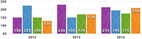
The order of the data in your table initially defines its order in a chart, but you can alter the chart order without changing the table data:
- Select the chart and then click on the series you want moved.
- In the Data section of the Series pane, choose from the Order pop-up menu to reassign the selected series’ position in the chart group. Figure 141 shows the Frobs series, in the third position, selected and then reassigned to the first position.
Note that the color order doesn’t change (in the figure, it’s blue-green-yellow), so all the series in the chart are reassigned colors, and the legend reflects the changes.

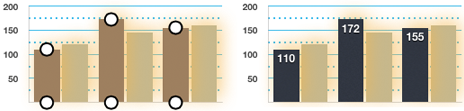
Formatting and Repositioning Value Labels
Value labels put the actual numbers on each element of a series so the reader doesn’t have to guess at the values based on the gridlines and their labels. You can display the values for all the series in a chart, or for only specific series (the best- and worst-performing products, for instance); or, label all the items and then format one series to stand out from the rest.
Start by selecting the chart to apply the options to all series, or select one or more series individually to format them separately. Working in the Series pane, turn on the display of the values by selecting a format from the Value Labels pop-up menu. (To turn off the value display, choose None from the Value Labels menu.) The Same as Source Data choice means the format in the source table will be used for the labels, and your only further decision is the label position. With any other choice, you get three sections of the Series pane to work in:
- Value formatting: This is an expansion of the section that contains the Value Labels pop-up menu. The options are the same as when you’re working with number formatting in a cell (described in Standard Data Formats). Choosing the basic format provides more options immediately beneath the menu; choosing Currency, for instance, adds a Currency pop-up menu where from which you choose a world currency.
-
Prefix and Suffix: This section lets you append a prefix or suffix to the value label, either for all series (if the chart is selected) or specific series (if the series is selected). You might want to prefix a set of values with
~orapprox, or add an asterisk after each value in a specific series to refer to, say, a note that December’s data is incomplete for the last quarter. -
Location: The pop-up menu choices depend on the type of chart. So, for a column chart, you get Top, Middle, Bottom, and Outside, while for a bar chart Numbers offers Right, Middle, Left, and Outside. A line chart places its values in relation to the data point on the chart, so you get choices such as Above, Above Left, and Below Right; there are similar choices when you work with a bubble chart.
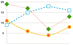
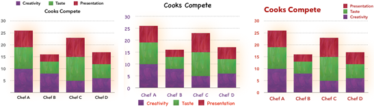
You can use the value label location to call attention to a specific series. For instance, select the chart and position the labels rather discretely for all the series, and then select a single series and change its position to something more prominent (Figure 142).
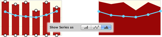
Changing a Mixed Chart’s Elements
A Mixed Chart represents its series in two different ways—columns and lines, for instance, or lines and areas. Change a series from one type to another by selecting it, to display a Show Series As section in the Series pane, and then click a Show Series As button (Figure 144).
Style Pane
The Format Inspector’s Style pane lets you apply basic formatting to a selected series to override the formats the chart starts with (even if they came from a style you designed). You can also apply some very special formatting to a series, as you’ll see at the end of this section.
Reassigning Colors
Whether you’ve changed the order of your data as described in Changing the Series Order and don’t like the color reassignments, or your three-series chart is stuck using the first three colors of the six available in the current chart palette and their contrast isn’t enough for you, you can easily change the color of a selected series:
- Select the series whose color you want to change.
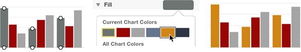
- Go to the Style pane, and choose a color from:
- The current chart palette: Click the color sample across from the Fill label (it’s called a color well), and choose from the Current Chart Colors area of the popover (Figure 145).
- Other chart palettes: Click the color well, and choose a color from any palette in the All Chart Colors section of the popover.
- The spreadsheet’s palette: Choose Color Fill from the Fill pop-up menu, and then choose from the color well that appears beneath it.
- The entire spectrum: Choose Color Fill from the Fill pop-up menu to see its color well, and then click the Colors button in the well. (See Color Controls for lots more about that.)
Changing Line Elements
Lines in a chart consist of symbols that mark the data points and the lines that connect them. You can format a few basics of a line in the Chart pane when the chart is selected, but the real choices are in the Style pane when you’ve selected the lines themselves.
For a data point, you can specify shape, size, fill color, and its outline’s color, thickness, and stroke pattern. For the connecting lines, you can choose a color, thickness, and stroke pattern, and opt for straight or curved connections (Figure 146).
What more could you ask for in the way of formatting? Shadows? They’re available, too.
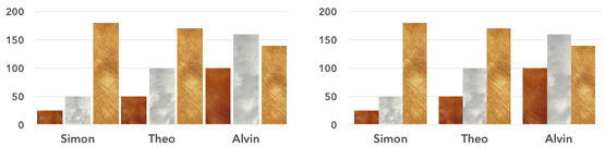
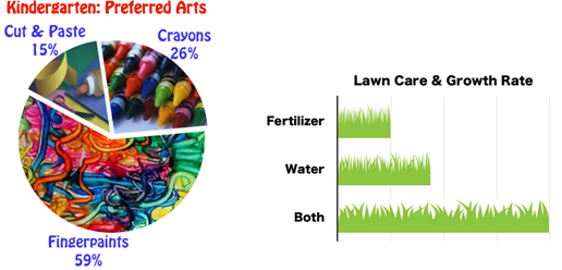
Manipulating Images for Fills
Since there’s not enough room in this book to deal with images added to sheets, I can’t send you to that section and let you apply it to charts. But you’ll find the procedure for using an image to represent a chart series quite straightforward and effective, although demanding in terms of artistic approach and restraint. I’d like to show you two examples of what can be done with images and chart series (despite artistic and restraint challenges). Let’s start with the end results, shown in Figure 147.
Here’s how to add an image to a chart:
- Select a single series or multiple series (see Selecting Chart Elements).
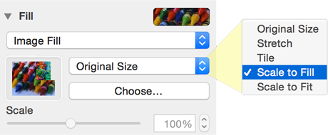
- In the Fill section of the Format Inspector’s Style pane, choose Image Fill from the pop-up menu, click the Choose button, and select your image file in the Open dialog.
- With the image in place, find the right “fit” with the second pop-up menu (Figure 148); you’ll probably want to stretch or scale the image. (Scale to Fit stretches or, more often, shrinks the graphic so the entire image shows, usually leaving white edges.) For the grass chart in the previous figure, I used Scale to Fit, which is why the grass blades are fatter on the bottom bar; it was still the best of the fit options.
For a pie chart, rotating the chart (the control is in the Wedges pane) displays different areas of a large image in a wedge.
Wedges Pane
The options in the Wedges pane—unique to pie charts—let you tweak the appearance of your pie with a wide array of options. Many are similar to what you can do with other charts—value labels, for instance—while others are unique to pie charts (the famous exploded version, of course). Here’s your quick tour:
-
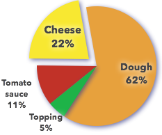
Display values and data point names: Turn on the values and names for the slices in the Labels section of the Wedges pane; the names come from the header row or column in the table. When you check Values, you’ll get a new section in the pane that lets you format the numbers and add a prefix or suffix to them.
With either values or data point names turned on, the Distance from Center control appears in the Labels section. Use it to move the values and names inward or outward; if both are turned on, they move together. (Don’t confuse this with the Distance from Center control farther down in the pane, which controls the position of the slices.)
-
Order the slices: Want the slices arranged by size instead of by their order in the table? Select the smallest slice (select the chart itself first, and avoid clicking the text in the slice, or you’ll select the label), and then choose 1 from the Order pop-up menu in the Data section of the pane. (It’s easy to select a wedge label by mistake, so avoid clicking on the text.) Select the next biggest slice, and choose 2 from Order menu—and so on around the circle. As noted in Changing the Series Orderfor other chart types, this reassigns colors, which you might have to fix manually if the colors have inherent meaning—as with the pizza ingredients in Figure 149.
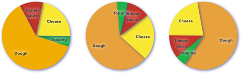
Figure 149: Left: The original orientation of the slices. Center: The slices reordered according to size, with their colors manually reassigned after the reordering changed them. Right: The reordered pie, rotated to put the large segment on the left. - Rotate the chart: Whether you order your slices or not, you may want the largest wedge at the bottom, or at the top of the chart; or, if you’ve pulled out a slice, you might want it coming out the side to make its label work better in your layout. With the chart selected, use the Rotation Angle controls at the bottom of the pane to set the desired angle. The last pie in the previous figure was rotated in preparation for a slice being pulled.
- Position the slices: Yes, finally, you get to explode your pie with the Distance from Center control in the Position section of the pane. Move all the slices apart by selecting the whole chart first; to pull out one or more individual slices, select it (or them) instead of the chart (Figure 150).
Tweaking Text Elements
A chart can have a lot of explanatory text: a chart title, axes names and labels, value names and labels, and a legend. Here’s how to select text items so you can format them:
- Select the chart to format all its text elements identically; clicking the chart itself or any text element selects the chart. To select separate text elements, as described in the next bullets, you must first select the chart.
- Select a non-text chart element to format its related text. Click a series, for instance to format the series’ value labels.
- Select a text element directly to format only that element. In most cases, you must click directly on the text itself and not between an element’s multiple words.
- Select text within an element to edit it—although not all text can be edited, and if you format any part of it, the format is applied to the entire text box.
A selected text element is framed, with circles at its endpoints (see Figure 151)—just to let you know you’ve selected it, because with the exception of the legend, the text frames can’t be moved or resized.

Some of these text elements have individual quirks:
- Legend: This is the only selection with square handles at its ends, signifying that you can move and resize the text area, even stacking its contents.
- Axes names: If you select either one and press Command-A, the other is added to the selection so that you can easily format them identically.
- Chart value labels and category labels: Select either of these axes labels and then press Command-A to also select the other.
- Series value labels: Clicking any label selects all the labels for that series (all columns of the same color, for instance). With one series selected: Command-click on another to add it to the selection; Shift-click on another to select all the series from the original one to the Shift-clicked one; or press Command-A to select all the series.
- Series names and category labels: Although they share a text frame, they are turned on separately, in the Category (X) tab of the Format Inspector’s Axis pane. Note that the series names repeat the legend information; you’d use one or the other for your chart.
Attention to text details can make a big difference to the overall look of your chart (Figure 152).
Text-formatting options are available from several of the Format Inspector’s panes, such as Chart, Style, Category Axis, and Value Axis; when you select text (or the chart), the pane you need is automatically displayed. The Text Pane topic covers general text formatting options.