
CHAPTER
4
Phase II: Analyzing the Process
You can’t know how to get there unless you know where you are coming from.
—H. James Harrington
Introduction
Before you start wildly making changes, it is wise to understand what the current processes (good and bad points) are. Usually by this time, PIT members already have a number of changes they would like to make, but they need to be held back until they gain an understanding of the total process and the effects their ideas will have on the total process. Their ideas are important and may play an important part in the final process design, so you don’t want to lose them. As a result, we recommend that the PIT establish a parking board where everyone and anyone’s improvement ideas can be placed, if they can’t be implemented or taken advantage of at the present time.
The best way we have found to develop this process understanding in the minds of the PIT members is by creating a flow diagram of the process.
Unfortunately most business processes are not documented, and often when they are documented, the processes are not followed. During this phase the PIT will draw a picture of the present process (as-is process), analyze compliance to present procedures, and collect cost, quality, processing time, and cycle time data.
There are eight activities in this phase. (See Figure 4.1.) They are:
• Activity 1: Flowchart the Process
• Activity 2: Conduct a Benchmark Study
• Activity 3: Conduct a Process Walk-Through
• Activity 4: Perform a Process Cost, Cycle Time, and Output Analysis
• Activity 5: Prepare the Simulation Model
• Activity 6: Implement Quick Fixes
• Activity 7: Develop a Current Culture Model
• Activity 8: Conduct Phase II Tollgate
The purpose of Phase II is for the PIT to gain detailed knowledge of the process and its matrixes (cost cycle time, processing time, error rates, etc.). The flowchart and simulation model of the present process (the as-is model of the process) will be used to improve the process during Phase III: Streamlining the Process. Without understanding the current process, it is impossible to project cost benefits and risks related to future-state solutions. All too often, organizations implement major changes that improve organizational performance, and as an afterthought, they try to measure the impact the change has on performance without a firm original database against which to compare the existing performance.
Analyze Phase
During this phase the PIT needs to establish a realistic, documented picture of the as-is process. This includes not only understanding the activities that take place within the process, but also determining the resources that are used at each activity and the problems encountered. During this phase every member of the PIT should gain a detailed understanding of the process and be able to identify opportunities for improvement.
Activity 1: Flowchart the Process
Many different types of flowcharting can be used to draw pictures of the business process. Some of the most common are:
• Block diagrams
• ANSI standards

Figure 4.1 Phase II: Analyzing the Process
• Functional
• Data flow
• Communication flow
• Knowledge flow
• Value flow
• Value stream
Each of them can be broken down into more and more detail. (See Figure 4.2.)
It is not our intent to teach you how to flowchart at this time; that would take a book unto itself, and there are many approaches and many different configurations depending upon the type of process you are flowcharting. What we will do is provide you with some key thoughts that may help you during your flowcharting process.
Standard Flowchart Symbols
The most effective flowcharts use only widely known standard symbols. Think about how much easier it is to read a road map when you are familiar with the meaning of each symbol and what a nuisance it is to have some strange, unfamiliar shape in the area of the map you are using to make a decision about your travel plans.
The flowchart is one of the oldest of all the design aids available. For simplicity we will review only 10 of the most common symbols, most of which are published by ANSI. (See Figure 4.3.)
The 10 symbols listed are not meant to be a complete list of flowchart symbols, but they are the minimum you will need to adequately flowchart your business process. As you learn more about flowcharting, you can expand the number of symbols you use to cover your specific field and needs.
Table 4.1 compares seven types of flowcharts. Figures 4.4 to 4.7 show examples of some of the different types.
Let’s suppose the PIT chooses to use a typical block diagram like the one shown in Figure 4.5. The PIT members will now block-diagram the total process following the process flow. Once a block diagram of the process has been completed, the block diagram can be expanded into a detailed flowchart. The block diagram should start with the input into the process and develop the flowchart so that all activities within the process under study are being charted. Normally flowcharts go down to the activity level only, but often some important activities are flowcharted down to the task level. Once you have completed the flowchart, look at each block on the flowchart and estimate the following:

Figure 4.2 Flowchart structure
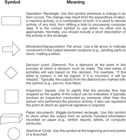

Figure 4.3 Standard flowchart symbols
Table 4.1 Comparison of Flowcharts

• Processing time
• Cycle time
• Cost per activity
• Percentage of items that go through that activity
• Errors per activity
If you have any large cost or long processing time, it is often advisable to drill down to the next level so you can see how the costs and time are being spent.
Figure 4.8 is a form that the PIT can use to draw a simple flowchart, and Figure 4.9 is a sample flowchart using the simple flowchart form.
At this point, the processing time, cycle time, and cost are based upon best judgment of the PIT. Later on in this phase, actual data will be collected. (See Figure 4.10.)
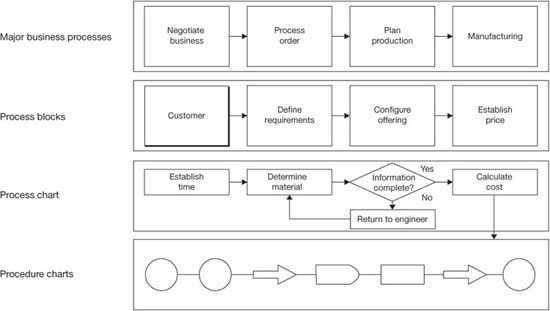
Figure 4.4 Relationships among flowcharting techniques
Figure 4.5 Typical block diagram
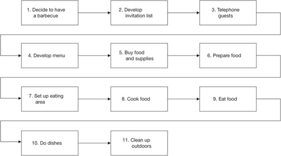
Figure 4.6 Block diagram example—conducting a barbeque
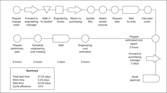
Figure 4.7 Procedure flowchart example—flowcharting a purchasing process
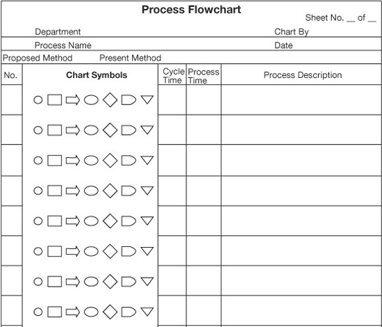

Figure 4.8 Sample form to use to draw a simple flowchart

Figure 4.9 Flowchart of internal job research process
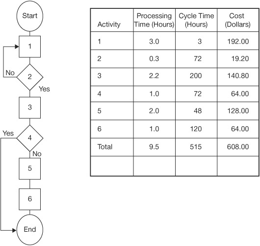
Figure 4.10 Part of the internal job research process flowchart
Functional Timeline Flowchart
A functional timeline flowchart adds processing and cycle time to the standard functional flowchart. This flowchart offers some valuable insights when you are doing a poor-quality cost analysis to determine how much money the organization is losing because the process is not efficient and effective. Adding a time value to the already defined functions interacting within the process makes it easier to identify areas of waste and delay.
Time is monitored in two ways. First, as you can see in Figure 4.10, the time required to perform the activity is recorded in the column entitled “Processing Time (Hours).” The column beside it is labeled “Cycle Time (Hours)” (i.e., the time between when the last activity was completed and when this activity was completed). Usually there is a major difference between the sum of the individual processing hours and the cycle time for the total process. This difference is due to waiting and transportation time.
In Figure 4.11, while the total processing time is only 16.5 hours, the total cycle time is 923.0 hours. Performing all the activities required only 1.8 percent of the total time that it took to fill one job. The cycle time analysis shows why it takes so much time to get even the simplest job done.
One common error is to focus on reducing processing time and to ignore cycle time. The result is focusing our activities on reducing costs without considering the business from our customer’s viewpoint. Customers do not see processing time—they see only cycle time (response time). To meet our needs, we must work on reducing processing time. To have happy customers, we must reduce cycle time.

Figure 4.11 Functional flowchart of the internal job research process
In one sales process, IBM was able to reduce processing time by 30 percent, thereby reducing costs by 25 percent. At the same time, the company reduced cycle time by 75 percent. An unplanned-for side effect was a more than 300 percent increase in sales (65 percent sales closure). There is no doubt that there is a direct correlation between cycle time, customer satisfaction, and increased profits.
The timeline flow concept can be applied to all types of flowcharts. Often, elapsed time is recorded using the time that has elapsed from the time the first activity in the process started. If this method had been used in Figure 4.11, the elapsed time recorded adjacent to the first three activities would be the sum of the cycle time recorded for Activities 1, 2, and 3, or 275 hours.
Figure 4.11 is a functional flowchart; it is sometimes also called a swim-lane flowchart. You’ll notice that instead of recording the activity information within the activity block, it is recorded on the side, thereby allowing the flowchart to be collapsed into a smaller area. Table 4.2 presents the details related to each item on the functional flowchart.
Graphic Flowcharts
A graphic or physical layout flowchart analyzes the physical flow of activities. It helps to minimize the time wasted while work outputs are moved between activities.
Graphics flowcharting is a useful tool for evaluating department layout related to things like paperwork flow and for analyzing product flow by identifying excessive travel and storage delays. In SPI, geographic flowcharting helps in analyzing traffic patterns around busy areas like file cabinets, computers, and copiers. Figure 4.12 is a graphic flowchart of a new employee’s first day at XYZ Company.
Value Stream Mapping
One of the ways to diagram a process is called value stream mapping, which became popular in the 1990s. Its main advantage over standard flowcharting is the additional information that is recorded on the diagram and its focus more on movement and inventory reduction. It also includes a sawtooth that depicts process and lead times.
Table 4.2 Functional Flowchart
Fat arrows are used to show flow of product, and triangles between process boxes are used to define inventory levels before each process activity. Recorded under the activity box is information related to that activity. (See Figure 4.13.)
Value stream mapping leaves a lot of latitude to the PIT. Many different symbols can be used, and the team is allowed to add additional symbols to meet its particular needs. (See Figure 4.14.) Some of the more common symbols are:
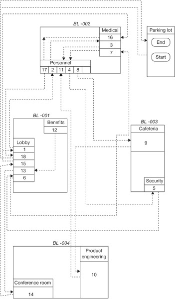
Figure 4.12 Graphic flowchart of a new employee at XYZ Company

Figure 4.13 First two activities in internal job research process
• A truck. To show that the movement is by truck
• A train. To show that the movement is by train
• An airplane. To show that the movement is by airplane
• A stick figure. To show that the movement is by people carrying the product from one spot to another
• A triangle with a q inside. To show that the product is in queue or waiting
• A triangle with a capital I inside. To show that the product is in inventory
• A starburst. To show that an activity has some improvement activities assigned to it
• An elongated rectangle with FIFO inside. To show that first in, first out is being practiced
• A pair of eyeglasses. To indicate that the team should look at this particular area
• A thin line with an arrow. To show it is a hard copy that is being transmitted
• An irregular thin line with an arrow. To show that the information is being sent electronically

Figure 4.14 Value stream mapping symbols (icons)
Source: Strategy Associates
Figure 4.15 is a current-state value stream map of a process to get your driver’s license.
The steps to create a value stream map are:
1. Form a PIT and prepare a charter.
2. Train the PIT on how to make and use value stream maps.
3. Collect data by doing a process walk-through.
4. Construct the value stream map for the current process.
5. Check the value stream map for the current process (80 percent accuracy is good enough).
6. Set targets for improvement for activity and area.
7. Draw a future-state map that defines what the process should look like based upon the defined improvements.
8. Get management’s approval to make the changes.
Figure 4.16 is a current-state value stream map of a product’s process, which consists of four major activities.
Figure 4.17 is the future-state value stream map of the same process prepared by the PIT as shown in Figure 4.16. You will note that the cycle time is reduced from 40 days to 7 days and processing time from 105 seconds to 91 seconds.
Value stream mapping is a good technique if it is made simple. Often the PIT members get so involved in making the value stream map that they lose sight of what the real objective is and it becomes cluttered and useless. We like to use it for simple processes that have few activities (less than 10). We find it works best when it is used as part of a Fast-Action Solution Technique (FAST) project.
Figure 4.15 Driver’s license current-state map
Source: Quality Digest Magazine, March 2006, p. 41

Figure 4.16 Current-state value stream map of a product process
Source: Strategy Associates

Figure 4.17 Future-state value stream map of the process in Figure 4.16
Source: Strategy Associates
Y = f(X) Process Charts
Processes are often analyzed as having X inputs that create Y outputs. To put it another way, Y (process outputs) is a function of X (inputs). This concept applies at the process activity or tasks levels. The X inputs include:
• Machines
• Manpower
• Materials
• Measurements
• Methods
• Mother Nature
Each of the process inputs can be classified into one of four subcategories based upon their variables designation. They are:
• C (controllable). The process owner has control over these variables regardless of what other controls are exercised.
• N (noise). Noise variables cannot be controlled or might be too expensive to control.
• SOPs (standard operating procedures). Standard operating procedures define the way the process is performed.
• X (critical). Critical input variables are other subsets of controlled variables; they are variables that have been determined to have significant impact upon one or more of the output variables.
Figure 4.18 shows three activities where the output from each activity is above the line and the inputs are below the line. You’ll note that the inputs and outputs are numbers, and the variables designation for each input immediately follows the input. For example, 1.N stands for “input 1 is a noise input.”
Information Process Flowcharting
In addition to the basic flowcharting we have discussed, there is also information diagramming, often with its own set of symbols. In general, these are more interesting to computer programmers and automated systems analysts than to managers and employees charting business activities, but they are very important in designing an organizational structure. You make a set of these types of flowcharts that follow information through the process. As you prepare flowcharts, think of your organization’s activities in terms of information processing, beginning with your organization’s files. They are valuable because they contain information that is created or used by your business processes.
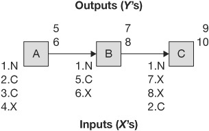
Figure 4.18 Typical value stream map
Figure 4.19 is a block diagram with its information-communication support system added to it with broken lines.
Next consider your employees. You and your coworkers have skills of various levels and types. Obviously even a single worker’s knowledge is substantially more sophisticated than the information in the file, but the principle still holds. The employee’s value to an organization depends upon his or her contribution of information. Whether it is how to load a pallet, introduce a new product, or resolve conflict, information is a resource. This is particularly true in the service industry, which in the twenty-first century employs over 80 percent of the U.S. labor force; all these people can be considered information processors and providers.
If you take an information processing view when preparing your flowcharts, it will create a common focus on getting and using quality inputs in order to produce quality outputs. At the same time, this type of view helps people determine who their interfaces are.
Process Knowledge Mapping
There will be an increased emphasis over the next few years on taxonomies, ontologies and knowledge.
—French Caldwell, Vice President, Information and
Knowledge Management, Gartner Group
Figure 4.19 Typical information-communication flowchart
A process-based knowledge map is a map or diagram that visually displays knowledge within the context of the business process. It shows both the way knowledge should be used within the process and the source of this knowledge. Any type of knowledge that drives the process or results from execution of this process can be and should be met. This includes tacit (soft) knowledge or explicit (hard) knowledge. Tacit knowledge is defined as undocumented, intangible factors embedded in the individual’s experience. Explicit knowledge, on the other hand, is documented and quantified knowledge that is recorded and can be easily distributed.
As you look at your process-based knowledge map, ask the following questions:
• What knowledge is missing?
• What knowledge is most valuable?
• What knowledge can be used in other processes?
• What knowledge is generated but not shared?
Knowledge management is often abstract, overly strategized, and weak in implementation. Process-based knowledge maps are concrete and tactical; they allow the business to really focus in on its key knowledge assets. Figure 4.20 is a typical knowledge map.

Figure 4.20 Typical knowledge map
Other Process Mapping Tools
We have only highlighted the major process mapping tools that we like to use. Some of the other major process mapping tools include:
• Organizational structure diagrams
• Hierarchical overview diagrams
• Global overview of processes and divisions diagrams
• Global process diagrams
• Detailed process diagrams
• Form management diagrams
• Form circulation diagrams
• Accounting system diagrams
For information on these diagrams and others, see Business Process Improvement Workbook (Harrington, Esseling, and Van Nimwegen, 1997).
Activity 2: Conduct a Benchmark Study
There is a big difference between a benchmark and doing benchmarking.
—H. James Harrington
At this point some of the PITs may question if the goals they set are realistic. Are they aggressive enough, or are they too aggressive? One way to answer this question is to benchmark similar processes in other organizations. This activity is usually done in parallel with Activities 1 to 4 in Phase II. It is important to note that benchmark studies are usually done if there is a question related to the goals set by the PIT.
By the end of Activity 4 in Phase II, the PIT members have an excellent understanding of the process they are studying and have it completely characterized. This puts the PIT in an excellent position to compare the process with other similar processes.
To start the benchmark process, the PIT needs to determine if the process is being conducted at any other place within its organization. We know of one organization (Organization X) that contacted an outside organization (Organization Y) asking for information about Organization Y’s design review process. Organization Y responded that it had done a benchmarking study the previous year on the same process where it looked at 12 different organizations. Organization Y reported that it learned that Organization X had the best practice. Unfortunately these best practices were going on at another one of Organization X’s locations, and there had been a lack of information exchange between X’s locations.
It is usually easier to obtain data from other parts of your organization than from an outside source. The following are the benchmark tasks that should be performed:
• Develop a benchmark plan.
• Collect benchmark data from internal sources.
• Collect and analyze public-domain information.
• Collect data from:
■ External and internal experts
■ Professional associations
■ Consultants
■ Independent test firms
■ Universities
■ Company watches (brokerage firms)
■ Research organizations
■ Benchmarking clearinghouses
Many benchmarking clearinghouses are located around the world, such as the Quality and Productivity Center in Houston, Texas. The one I personally prefer is Business Performance Improvement Research (www.new.bpir.com) located in New Zealand. These organizations spend their time defining best practices based upon benchmarking studies and published literature throughout the world. They can save the PIT a lot of time and effort if they have relevant information. I personally don’t like to rely on published data or on input from the experts, as usually it is more than two years out of date, making it obsolete or at least near obsolete. The major input that I get from these sources is the name and contact information for people working to improve the process that is being studied, but for many projects the information from the external and internal experts may be enough to determine if the goals set by the PIT are in line with world-class standards or at least in line with the level at which the organization needs the process to perform. Remember, all our processes do not need to be world class, just the ones that are customer-related or part of the organization’s core capabilities and competencies. These are the processes that need to be better than 6 sigma. For the other processes, 3 sigma is often good enough unless there are financial benefits from improving them. We have seen processes that had improved from 3 sigma to 6 sigma in the support areas, but the cost to make the improvement was 300 percent more than what was saved by the improvement.
How do you go about obtaining detailed data from other organizations? The first step is to define organizations that will be benchmarked:
• Exchange benchmarking information with external benchmark organizations. Often the benchmark study performed in Phase II not only will identify an organization with which the PIT will want to exchange process information, but also will identify a contact person at that organization. If this is the case, one way you can get the contact information is to contact the organization’s quality or sales department and explain what you want to do and ask for a contact person that you can work with. Another good way to get in contact with the organization is by looking it up on the Internet.
• Make a phone call to specific individuals at the potential benchmark sites to explain the project and get their agreement to participate.
• Send copies of the performance data from the process under study along with a survey to the external benchmark contact.
• Analyze the data that are returned from the external benchmark site and prepare a list of additional questions that it would like to raise. The PIT should also perform a gap analysis at this time.
• Conduct a conference call with the external benchmark coordinator to clarify any misunderstood data and to discuss negative gaps in the process being studied. The purpose of this phone call is to clarify any questionable data, define root causes for all negative gaps, and identify potential corrective action. This will usually give the members of the PIT the benchmark data they need and in some cases will be good enough to do benchmarking without visiting the benchmark partner location.
The second step in obtaining detailed data from other organizations is to prepare a benchmark comparison report and send copies to all the organizations that input data. Be very careful not to identify how the individual organization is performing unless you have the organization’s approval.
For a comprehensive understanding of the benchmarking process, see The Complete Benchmarking Implementation Guide (Harrington, 1996).
Activity 3: Conduct a Process Walk-Through
The more you know about a process, the more you can improve it.
—H. James Harrington
The more we understand business processes, the more we can improve them. To do that, we must clearly understand several characteristics of business processes:
• Flow. The methods for transforming input into output
• Effectiveness. How well customer expectations are met
• Efficiency. How well resources are used to produce an output
• Cycle time. The time taken for the transformation from input to final output
• Cost. The expense of the entire process
• Culture. The beliefs and practices that drive the way the employees react to the process
Understanding these process characteristics is essential for three reasons. First, understanding them helps us identify key problem areas within the process. This information will provide the basis for streamlining the process. Second, the process characteristics provide the database needed for us to make informed decisions about improvements. We need to see the impact of changes not only on individual activities, but also on the process as a whole and on the departments involved. And third, understanding the process characteristics is the basis for setting improvement targets and for evaluating results.
In Activity 1 of Phase II, we reviewed how to flowchart a process based on documentation and the PIT’s understanding of the process. A flowchart is the first step in changing a process. However, process documentation may not always reflect real life because of errors or misunderstandings. Therefore, you should verify the accuracy of the process documentation. You also should understand and gather information about other process characteristics (i.e., quality, cycle time, and cost). This provides valuable information about the location of existing problems.
The Employee and the Process
We have talked about the process as a “cold” thing—procedures, equipment, flowcharts, and techniques. The process is brought to life by people. Our people make the process work; without them, we have nothing. We need to understand how the people who bring life to the process feel about the process. What gets in their way? What are the parts of the process that they like? What bores them? The end process has to be a homogeneous marriage of people and methodologies, in which the equipment is the slave to the people, not the other way around.
In the long run, the success of the SPI activities will depend on the degree to which our people embrace the changes made to the process. Without considering the human side of the process, the PIT cannot be successful. There is only one way to gain the required understanding of the human side of the process—and the talents and the limitations our employees have—and that is to get out into the work environment. Talk to them. Ask for their opinions and ideas. Then implement their suggestions. If the people are involved, the end results will be much better and far easier to implement.
Process Walk-Through
The only way that you can really understand what is happening in the business processes is to personally follow the work flow, discussing and observing what is going on. This is called a process walk-through. In a process walk-through, the PIT physically observes each step in the process and discusses these steps with the people who are performing the activities.
Employees deviate from the process for a number of reasons; for example:
• They misunderstand the procedures.
• They don’t know about the procedures.
• They find a better way of doing things.
• The documented method is too hard to do.
• They are not trained.
• They were trained to do the activity in a different way.
• They do not have the necessary tools.
• They do not have adequate time.
• Someone told them to do it differently.
• They don’t understand why they should follow the procedures.
To conduct a walk-through, the PIT should physically follow the process as documented in the flowchart from the end to the beginning. Yes, I said “from the end to the beginning.” If we start at the end and go backward, we have talked to the customer of the person we are interviewing. This provides the PIT with a very different view of the task being studied than if we didn’t understand the customer’s needs first.
To prepare for the process walk-through, the PIT should assign team members (usually groups of two or three people) to different parts of the process. Typically, one member of the walk-through team (WTT) will be from the department in which the activity is being performed. The people who are assigned to the WTT should have some understanding of the activity they will be evaluating. This facilitates review and verification of the process flow. Each WTT should:
• Become very familiar with all relevant, existing process documentation.
• Arrange with the department manager to interview his or her people.
• Interview a sample of the people performing the task to fully understand what is occurring in the process.
• Compare the way different people do the same job to determine what the best standard operation should be.
Preparation is the key to a successful walk-through. The WTT really must understand what should be happening in the process and be able to talk in terms that are relevant to the person performing the activity. This requires a lot of work prior to the interview process.
During the process walk-through, the WTT will have an opportunity to develop a list of the tasks required to support each activity. For example, let’s look at the tasks required to support the activity of typing a letter:
• Read hand written memo.
• Check punctuation.
• Check spelling and proper names and obtain mailing address.
• Assign file reference number to document.
• Ensure that proper letterhead paper is inserted in printer.
• Turn on word processor; load program.
• Type letter.
• Use spell-check.
• Proofread letter.
• Print letter.
• Review printed letter to ensure that it is positioned correctly on the paper.
• Place in manager’s incoming mail.
Doing the task analysis and documentation often reveals new suppliers to the process. It also provides keys to how to improve the process. The task analysis should be prepared in conjunction with the person performing the activity because that is the only way to know how the activity is being performed; the person performing the activity has the best understanding of what is involved.
The PIT should prepare a process walk-through questionnaire to collect needed information about the process. (See Appendix B.) Typical questions might be:
• What are the required inputs?
• How were you trained?
• How long does it take on average to do your assignment? What is the maximum and minimum time?
• How do you know your output is good?
• What feedback do you receive?
• Who are your customers?
• How do you know what your customers’ requirements are?
• What keeps you from doing error-free work?
• What can be done to make your job easier?
• How do you let your suppliers know how well they are performing?
• How is your output used?
• What would happen if you didn’t do the job?
• Have you reviewed your job description?
• What would happen if each of your suppliers stopped providing you with input?
• What is the culture like in your department?
• What would you change if you were the manager?
The WTT should collect data related to the average, maximum, and minimum data for cycle times, processing times, and cost for each activity and for the total process.
Another element of success is the way the interview is conducted. Many employees feel threatened and intimidated being interviewed by the PIT. The small size of the WTT helps to make the employees feel more comfortable, but that is not enough. Dress to fit the environment. A black suit, white shirt, and tie are totally inappropriate for interviews conducted in a warehouse or service center. Take time to put the interviewee at ease. Before you ask questions, explain why you are talking to him or her. Show the interviewee the flowchart and explain how he or she fits into the big picture. Interviewing is an art. You should have interview training to get satisfactory results. A four-hour class on interviewing methods is very helpful.
Also during the process walk-through, the PIT will collect information that will be used to develop the current culture model. This model often differs from process to process and function to function. This analysis includes thing like:
• Organization structure and system analysis
• Diagnostic analysis
• Organization design effectiveness assessment
• Organization design impact assessment
• Organization fitness assessment
Immediately following each interview, the team should schedule a short meeting to review the interview and agree on:
• Task flow
• Required inputs
• Measurements
• Feedback systems
• Conformance to procedure and to other employees
• Major problems
• Cycle time estimates
• Value-added content
• Culture enablers and drivers
• Training requirement
It is often helpful to flowchart the tasks so that the team will gain a better understanding of the activity being evaluated and be in a better position to report its findings to the PIT.
The outcomes from the process walk-through should include:
• Differences between the documented process and present practice
• Differences between the way employees are performing the activity
• Identification of employees needing retraining
• Suggested improvements to the process (generated by the people performing the process)
• Process measurement points and measurements
• Activities that need to be documented
• Process problems
• Roadblocks to process improvement
• Suppliers that have input into the process
• Internal process requirements
• Elapsed cycle time and activity cycle time
• New training programs required to support the present process
• The way suppliers should receive feedback data
• A number of task flowcharts
We find that it is good practice to review the findings with the interviewees to be sure the team did not misinterpret their comments. A summary of the interviews of all members in a department should be reviewed with the department manager before they are reviewed with the PIT. The department manager and the WTT should agree on what action will be taken to eliminate differences among employees and between practice and procedure.
When the walk-through is complete, each WTT should present its findings to the PIT. This provides the total PIT with a better understanding of the process. Based on our experience, we find that the best way to present the data to the PIT is to follow the flowchart, starting at the beginning and working your way through to the end, marking up the flowchart as you go along.
The PIT will then redo the flow diagram (Figure 4.21) and prepare an Activity Analysis Form. (See Table 4.3.) This can vary based upon the process. Table 4.3 includes the typical columns that would be used in an Activity Analysis Form.

Figure 4.21 Functional flowchart of internal job research process updated after a process walk-through has been conducted
Table 4.3 Completed Activity Analysis Form
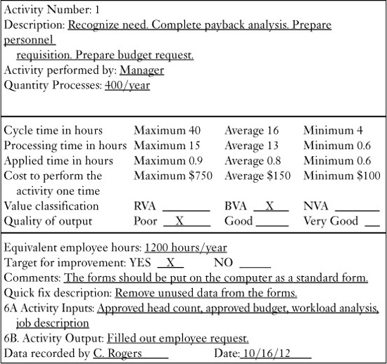
The columns on the Activity Analysis Form are defined as follows:
• Activity no. The same number that is assigned to the activity in the flowchart.
• Description. A description of the activity.
• Activity performed by. The title or name of the individual doing the activity.
• Cycle time in hours. The time it takes from when the last activity was completed until this activity is completed. It includes the processing time plus transportation and wait time. You should record maximum, average, and minimum.
• Quantity processed. The number of times this activity is repeated per a specific time period.
• Processing time in hours. The actual time the individual spends to do the activity.
• Applied time in hours. The time it takes to perform the required tasks. It is usually less than the processing time by a considerable amount. For example, if you need some information and have to call someone to get it, the processing time would include the time it takes to look up the phone number, the time it takes to place the call, and all the conversation time. The applied time would be only the time during the conversation when the question was asked and answered.
• Cost to perform the activity one time. The cost to do the activity. It includes all the costs related to the cycle time. As a result, the cost of moving the output from one activity to the next is included here.
• Value classification
RVA = real value-added
BVA = business value-added
NVA = no value-added
• Quality level of output. The view of the output from the next person receiving the output from the activity. It is typically rated as poor, OK, good, or very good. In some cases it is rated by the number of errors per hundred items processed.
• Equivalent employee hours. The number of equivalent full-time hours that are required to perform the activity. This is sometimes calculated by multiplying the average process time by the quantity process per year to obtain hours per year expended on this activity.
• Target for improvement. A PIT improvement objective as a result of the project.
• Comments. Anything related to the activity that will help in directing or documenting the improvement process.
• Quick-fix description. A description of things that should be fixed right away because they are easy to implement and save a lot of money or because they are causing a problem for the external customer.
• Activity inputs. This is the input to the activity that is required to perform the activity.
• Activity outputs. This is the product/output that the activity produces and delivers to the next activity in the process (customer of the activity).
• Data recorded by. The people who perform the audit of the activity
Usually, even at the end of the process walk-through, the PIT has not collected all the information that is required to fill out all the columns in the flowchart backup data worksheet. For example, the PIT members may not be able to define whether the activity is a value-added, business-value-added, or no-value-added activity. And in most cases they will not have defined improvement activities, as they are defined during Phase IV. However, in some cases, the people that the WTT are interviewing during the process walk-through may have defined corrective action that is needed, and so this part of the worksheet can start to be filled in. The worksheet approach turns out to be a very valuable and effective way of analyzing and improving the process. But you need to be careful—it is tempting to add up all the activity averages for processing time to calculate the total processing time. This can be misleading if there are process loops within the flow diagram. It is also tempting to add up all the minimum and maximum processing times to determine the minimum and maximum processing time for the process. Again, this often gives you a false indication because the maximum processing time at one activity does not mean that it would be the maximum processing time at all the other activities.
Some other headings we have used on worksheets are difficulty, priority, reliability, change over time, first-pass yield, throughput yield, distance, on-time delivery, expediting costs, and inventory quantities.
Action plans should be established for all the hot problems. These action plans should include:
• What action will be taken
• When the action will be taken
• Who will take the action
• How the PIT will know that the action was taken and that it is effective at eliminating the problem
The PIT members should go back to each person interviewed who described a problem or an idea to explain what action will be taken. If no action will be taken, the employee needs to be told why. This quick feedback will do a great deal to establish the credibility of the PIT and gain future cooperation.
We find that the team will perform better if a problem-tracking list is computerized. This computerized list should include:
• The statement of the problem
• The person who identified it and the date it was identified
• The person who will correct the problem and the date assigned
• The corrective action to be taken and the implementation target date
• Key checkpoints
• The date the corrective action was implemented
• The effectiveness of the corrective action
Reminders should be sent out to each individual one week before the due date for the action. The computerized list will also be used as an agenda item at the PIT meeting. This same type of computerized list is a good way to manage the PIT project plan.
Now that the PIT is familiar with all elements of the process, it should look at the whole process to determine the following:
• Are the boundaries appropriate? If not, has the process owner reported the recommended changes to the EIT?
• Does the process lend itself to being divided into subprocesses to increase the efficiency of the PIT? If so, the process owner should assign “sub-PITs” to concentrate on these smaller processes. The PIT still should meet to review the total activity to ensure that sub-optimization does not occur.
Start your process walk-through from the end of the process so that you have first talked to the customer of the person you are interviewing.
—H. James Harrington
Activity 4: Perform a Process Cost, Cycle Time, and Output Analysis
It is very important that the PIT works with and makes decisions on real, factual data, not data that is the best estimate of the PIT members. This means that the PIT will need to develop a measurement plan for the effectiveness and efficiency measurements for the process they are assigned to improve. Much of the basic data should have been collected during the walk-through activity.
Historical Research
Although some processes are repeated only infrequently (i.e., new product introduction), cycle time is very important. In such cases, some historical research may be necessary to obtain dates documenting the beginning and end of these major processes. A good place to look is the old annual strategic operating plans. You may be shocked at some of these cycle times. Incidentally, this is one area in which Asian countries are far ahead of the United States. (The new product development process for Japanese cars is a good example. It is about 60 percent of the U.S. cycle time and about 50 percent of the cost.)
Scientific Analysis
Scientific analysis involves breaking down the process into smaller components and then estimating each component’s cycle time. To help with this analysis, use the flow diagram to determine whether there are any subprocesses (or a series of activities) for which information can be gathered using either end-point measurements or controlled experiments. For other operations, use the knowledge of the people performing the work to estimate cycle time. These data should be collected during the walk-through. Combining all the resulting data will allow you to estimate total cycle time. Correctly done, this type of approach has an amazingly small error rate—frequently less than 5 percent.
Designed Experiment
Sometimes the only way to get the kind of data needed is to run a sample experiment in which a sample of the output is tracked through the process. It is important that the sample size be large enough to be able to have a high confidence that the result you get is correct. We like not only to run a sample that is big enough, but to run it over a long enough time cycle so that histograms can be constructed and sigma values can be calculated. This will give you a good understanding of the process variation. Be aware that samples tend to be handled with extra care which can result in better results than the process would deliver normally; you need to take this into consideration when you evaluate the data.
Processing Time versus Cycle Time
Consider the cycle time of a letter-writing process. (See Table 4.4.)
Table 4.4 Cycle Time of a Letter-Writing Process


While the process cycle time is 170.4 hours (over 7 working days, or 9 calendar days), only 2.2 hours were spent in actual work effort. The rest was wasted time. It is easy to see why we need to measure cycle time.
Cost
Cost is another important aspect of the process. Most organizations divide their financial information by department—because that is tradition. However, as we noted earlier, work flows across departments. Consequently, it is often impossible to determine the cost of the whole process.
The cost of the process, like cycle time, provides tremendous insights into process problems and inefficiencies. It is acceptable to use approximate costs, estimated by using current financial information. Obtaining accurate costs may require an enormous amount of work, without much additional benefit.
Typically, you will also need to understand the costs at a detailed level. What do the major subprocesses cost? What do the key activities cost? What is the cost of each output? Make additional estimates, and complete the form shown in Table 4.5.
• Identify the major subprocesses or activities, using the flowchart. For example, Table 4.5 shows nine activities (“Recognize needs,” “Write requisition,” “Review requisition,” “Identify suppliers,” and so on).
Table 4.5 Cost–Cycle Time Worksheet
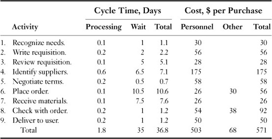
• Calculate the cycle time for each subprocess or activity, using the techniques discussed earlier. In this case, we estimated that the total processing time is 1.8 days per purchase and total cycle time is 36.8 days per purchase.
• Estimate the cost for each activity. This has two components: cost of personnel (including variable overhead) for the 1.8 days per purchase and other costs (e.g., computer systems), if they are significant. These are estimated at $571 for a single purchase, which may be for a $25 item.
We now have a good idea of what the cycle time and costs of the process are. You can depict this information on cost–cycle time charts to determine problem areas on which to work. The cost–cycle time chart in Figure 4.22 displays how a typical purchase of office supplies builds up costs over the 36.8 days that it takes from one end of the process to the other—from “Recognize needs” to “Deliver to user.”
In the chart, the horizontal axis represents total cycle time, and the vertical axis represents cost for a single purchase. Upward lines indicate processing time for the activities, while horizontal lines indicate wait time when no direct cost is incurred. If you follow the chart, you can see that:
• The highest cost is incurred to “identify suppliers.” Therefore, you should focus on the methods and processes used to identify suppliers.
• There are long wait times, when no activity is being performed, at the “Identify suppliers” and “Receive materials” stages. Expand these flowcharts to the task level to better understand why they take so much time and to determine how to improve the process.
Lew Springer, former senior vice president of Campbell Soup, points out that the storage cost for a can of soup is 43 cents on the dollar.
The objective of reviewing cost–cycle time charts is to analyze both the cost and the time components and to find ways to reduce them. This ensures that the effectiveness and efficiency of the process are improved. The next chapter discusses how to streamline the process.

Figure 4.22 Cost–cycle time chart
Variation
Up to this point in the activity, we have been talking about average values. But you usually don’t lose a customer based upon average values unless your competitor can produce the same product or service much faster and with better quality than you can. As you conduct the process walk-through, data about the worst- and best-case cycle times, processing times, cost, and error rates as well as averages should be collected. This will allow you to address the things in the process that give your customers major headaches. We are often surprised how good averages look and how bad 5 percent of the output is. It is this 5 percent of the output effectiveness and efficiency that is often the real cause of the organization’s problems.
Table 4.6 uses the information presented in Table 4.5 and adds to it the cycle time minimum and maximum numbers. You can easily see how the process would be almost useless if an order were processed at the maximum cycle time for all the activities. In reality, some of the activities are always processed in less than the maximum time, and so the total is less than the sum of the maximum cycle time. For the type of analysis we are doing, we suggest you use the two sigma values, not the maximum value.
Cycle time is equal to processing time plus wait time, which includes transportation time. You will note that the cycle time varies from 6.43 (0.83 + 5.60) to 162.40 (16.40 + 146.00) hours, with an average of 38.80 (1.80 + 37.00). It is easy to see that if you told a customer that he or she would get something in 40 hours and it took 160 hours (4 times longer), the customer would be very unhappy and would be looking for another supplier.
Statistical Approach to Measuring Process Variation
The best way to understand process variation is by building a simulation model, and that is what we will discuss in the next part of this process. But often an organization does not have the required expertise in simulation modeling nor the software that is required to do it. It is also a very time-consuming activity. In spite of this, it is essential that you understand how the process is varying over time for the three key measurements—cost, cycle time, and quality. In this case the best approach is doing a statistical analysis to define process variability. For purposes of this book, we will keep it simple, using no high-level mathematics, but you may need to learn some new terminology. Through the use of statistics, you can project how the process will vary over time using a small sample of the process data. This is accomplished by developing a histogram and calculating its standard deviation.
Table 4.6 Minimum, Average, and Maximum Cycle Time Analysis

Let’s start by providing some definitions:
• Histogram. A visual representation of the spread or distribution. It is represented by a series of rectangles or “bars” of equal-class size or width. The height of the bars indicates the relative number of data points in each class.
• Mode. The single number that occurs most frequently in the data you have collected.
• Process capability index (Cp). A measure of the ability of a process to produce consistent results. It is the ratio between the allowable process spread (the width of the specified limits) and the actual process spread at the plus or minus 3-sigma level. For example, if the specification was plus or minus 6 and the 1-sigma calculated level was 1, the formula would be 6 divided into 12 equals a Cp of 2.
• Process capability study. A statistical comparison of a measurement pattern or distribution to specification limits to determine if a process can consistently deliver products within those limits
• Range. The measurement of the spread of the numbers or data you have collected. You find it by subtracting the lowest number from the highest number in your data.
• Sigma (σ). The Greek letter that statisticians use to refer to the standard deviation of a population. Sigma and standard deviation are interchangeable. They are used as a scaling factor to convert upper and lower specified limits to Z.
• Standard deviation. An estimate of the spread (dispersion) of the total population based upon a sample of the population. As noted above, sigma (σ) is used to designate the estimated standard deviation.
Mean
Process mean is the most familiar and used statistical measure. The mean typifies the expected or most likely value of a parameter. Thus, it is also very important to understand that most of the measurements cluster around the mean. The mean is calculated by adding all the data points and dividing the sum by the number of data points.
The mean for data from a sample is denoted by ![]() , and the data from a population is denoted by the Greek letter μ. Each data point is represented by Xi.
, and the data from a population is denoted by the Greek letter μ. Each data point is represented by Xi.
![]()
where ΣXi = x1 + x2 + x3 + x4 + … + xn
n sample size
Greek letter Σ = “sum of”
Population mean: μ = ΣXi/N, for i = 1 to N
where ΣXi = x1 + x2 + x3 + x4 + … + xN
N = population size
Consider the data for an airline for the time to issue a ticket. The mean can be calculated using Excel or any statistical software. For an MS Excel worksheet, one uses the formula as ‘=AVERAGE (data cell range for variable x),’ for example: ‘=AVERAGE (A2:A52)’.
In the case of our ticketing process example, the mean value would be 177.6 seconds.
Median
Median, similar to mean, is another measure of centrality. While the mean sums the data points and divides them by the number of observations, the median counts data points and determines the middle point in the data set. For an odd number of observations, the median is the middle value obtained by sorting observations in an ascending or descending order. For an even number of observations, the median is the average of the two middle values. Median is used when data are less variable in nature or contain extreme values; it provides an indication of the distribution of data points. The command in MS Excel is ‘=MEDIAN (data cell range for variable x)’.
In the case of our ticketing process example, the median value would be 177.5 seconds.
Mode
The mode is the value that occurs with greatest frequency. You may encounter situations with two or more different values with the greatest frequency. In these instances, more than one mode can exist. If the data have exactly two modes, we say that the data are bimodal. The Excel command using MS Excel is ‘=MODE (data cell range for variable x)’.
In the case of our ticketing process example, the mode value would be 178 seconds.
Range
The range is the simplest measure of variability. It is the difference of the largest and the smallest value in the data set. It has limitations because it is calculated using two values irrespective of the size of data. The range can be calculated by finding the maximum value (=MAX (data cell range for variable x)) and the minimum value (=MIN (data cell range for variable x)) and then subtracting the two.
In the case of our ticketing process example, the range would be 63 seconds.
Variance
Variance is a measure of inconsistency in a set of values (or in the process performance), using all data values instead of just the two values used in calculating range. It is a measure of variability that utilizes all the data. The variation is the average of the squared deviations, where deviations are the difference between the value of each observation (xi) and the mean.
Population (all data points) variance is denoted by σ2:
σ2 = Σ(xi − μ)2/N
Sample (subset of larger data set, or the population) variance is denoted by s2:
![]()
Note: If the sample mean is divided by n − 1, and not n, the resulting sample variance provides an unbiased estimate of the population variance. Variance (using MS Excel): is determined with the command ‘=VAR (data cell range for variable x)’.
In the case of our ticketing process example, the variance would be 178.6.
Standard Deviation
Standard deviation is the square root of the variance.
For the sample standard deviation:
![]()
For the population standard deviation:
![]()
The command for calculating standard deviation using MS Excel is ‘=STDEV (data cell range for variable x)’.
In the case of our ticketing process example, the standard deviation would be 13.4 seconds.
Correlation Coefficient
A scatter plot represents the relationship between two variables such as between the experience of the employees and the passenger time spent at the ticket counter, as shown in Figure 4.23. The correlation coefficient is a statistical measure of the relationship between two variables. Depending upon the relationship of the data for two variables, the correlation and the correlation coefficient both can be negative or positive. The value of the correlation coefficient lies between 0 and ±1. A correlation coefficient of +1 indicates a direct positive relationship, and a value of −1 indicates a direct negative relationship. A zero value of the correlation coefficient implies no correlation, thus two independent variables.

Figure 4.23 Scatter plot of the time at the airline ticket counters versus employee experience
Source: Minitab Inc. (2003). MINITAB Statistical Software, Release 14 for Windows, State College, Pennsylvania. MINITAB is a registered trademark of Minitab Inc.
The command for calculating correlation coefficient using MS Excel is ‘=CORREL (data cell range for variable x, data cell range for variable y)’.
In the case of our ticketing process example, the correlation coefficient would be −.75, which is expected because more experienced employees would be able to help the passengers faster.
Histogram
A histogram is a graphical representation of the frequency distribution of data. In a histogram, the horizontal axis (X) represents the measurement range, and the vertical axis (Y) represents the frequency of occurrence. The histogram is one of the most frequently used graphical tools for analyzing variable data. A histogram is like a bar chart except that it has a continuous X scale versus the separate and unrelated bars.
Histograms display central tendency and dispersion of the data set. If someone plots the limits around the process mean, one can tell what percentage of the data is beyond the limits. In business, this relates to being able to determine acceptable and reject rates of a process. One can also fit some known distributions visually or using software to estimate the probability of producing good product or bad product. By being able to determine the expected process performance, one can initiate a preventive action if necessary, rather than wait for it to happen and then correct it.
Figure 4.24 shows a histogram with central tendency and the dispersion for the time spent by the passengers at the airline ticket counters.
How to Use Histograms
Data gathered about any set of events, series of occurrences, or any problem will show variation. If the data are measurable, the numbers will be found to vary. The reason for this is that no two or more of the same item are identical. Absentee rates, sales figures, number of letters mailed, items or units produced, or any set of numbers will show variation. These fluctuations are caused by any number of differences, both large and small, in the item or process being observed.
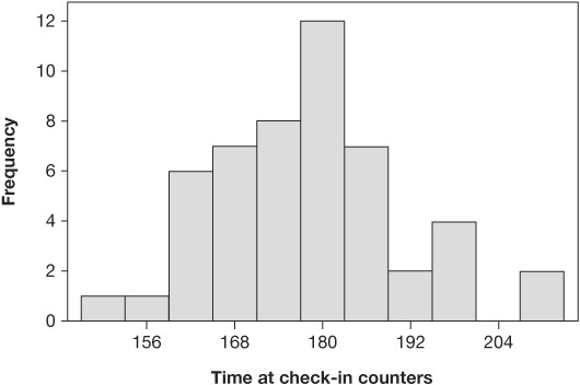
Figure 4.24 Histogram of time spent by passengers at ticket counters
Source: Minitab Inc. (2003). MINITAB Statistical Software, Release 14 for Windows, State College, Pennsylvania. MINITAB is a registered trademark of Minitab Inc.
If these data are tabulated and arranged according to size, the result is called a frequency distribution. The frequency distribution will indicate where most of the data are grouped and will show how much variation there is. The frequency distribution is a statistical tool for presenting numerous facts in a form that makes clear the dispersion of the data along a scale of measurement.
Description of a Histogram
A histogram is a column graph depicting the frequency distribution of data collected on a given variable. It visualizes for us how the actual measurements vary around an average value. The frequency of occurrence of each given measurement is portrayed by the height of the columns on a graph.
The shape or curve formed by the tops of the columns has a special meaning. This curve can be associated with statistical distributions that, in turn, can be analyzed with mathematical tools. The various shapes that can occur are given names such as normal, bimodal (or multipeaked), or skewed. A special significance can sometimes be attached to the causes of these shapes. A normal distribution causes the distribution to have a bell shape and is often referred to as a bell-shaped curve. It looks like Figure 4.25.
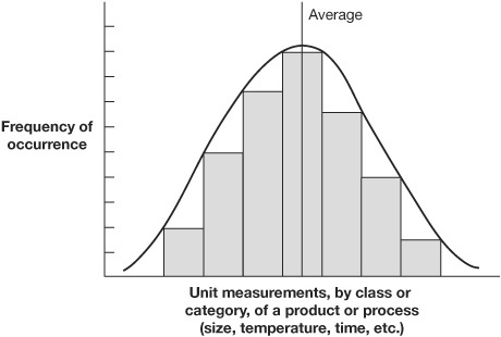
Figure 4.25 Bell-shaped histogram
Normal distribution means that the frequency distribution is symmetrical about its mean or average. To be technically correct, the bell-shaped curve would pass through the center point at the top of each of the bars. We have plotted it at the outside corner to make the histogram look less complicated.
Uses of Histograms
Histograms are effective tools because they show the presence or absence of normal distribution. Absence of normal distribution is an indication of some abnormality about the variable being measured. Something other than “chance” causes are affecting the variable, and thus the population being measured is not under statistical control. When any process is not under statistical control, its conformance to any desired standard is not predictable, and action needs to be taken. A histogram is also useful in comparing actual measurements of a population against the desired standard or specification. These standards can be indicated by dotted, vertical lines imposed over the histogram. (See Figure 4.26.)
Figure 4.26 indicates that even though all the parts that were sampled met the specification requirements, all the parts will need to be screened or a high percentage of defective products will be accepted. Consequently, histograms enable us to do three things:
• Spot abnormalities in a product or process.

Figure 4.26 Histogram with specification limits added
• Compare actual measurements with required standards.
• Identify sources of variation.
Abnormalities are indicated when the data do not result in a bell-shaped curve, i.e., when there is not a normal distribution. (See Figure 4.27.)
Even when all the samples fall within the specifications, a skewed histogram (as in Figure 4.27) serves as a warning that the process is being affected by other than normal variations and is susceptible to drifting outside the standards. This has happened in Figure 4.27.
The second way to use histograms is to determine whether the process is producing units that fall within the established specifications or desired standards and, if not, to detect clues about what is needed to fix the situation.
In Figure 4.28, Histogram A shows an excessive spread, with both lower and upper limits being exceeded. This would indicate that, although the process is under control, action needs to be taken that will tighten up its range of variability. Histogram B shows a process also under control but the average value of which is too far to the right-hand side of the specifications. Action is needed to cause a leftward shift of the population. Histogram C has two problems. The spread is too wide, as is the spread in Histogram A, and it is biased to the right, as is the spread in Histogram B. Both kinds of corrective actions are required to tighten up and shift the spread.
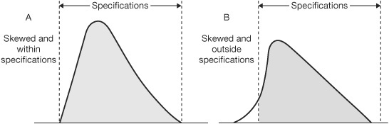
Figure 4.27 Abnormal distributions—skewed

Figure 4.28 Outside established specifications
The third use of histograms is to reveal the presence of more than one source of variation in the population of the histogram. This is shown when the measurements of the data form a multipeaked curve. Figure 4.29 illustrates the bimodal curve that contains data measurements from two varying sources.
A histogram can be very distorted. (See Figure 4.30.) This type of distribution usually occurs when there is a natural barrier at one end of the measurement. A good example would be the following data from a phone call center:
• 34 percent of calls are answered on the first ring.
• 47 percent of calls are answered on the second ring.
• 8 percent of calls are answered on the third ring.
• 5 percent of calls are answered on the fourth ring or later.
• 6 percent of calls end in hang-ups.
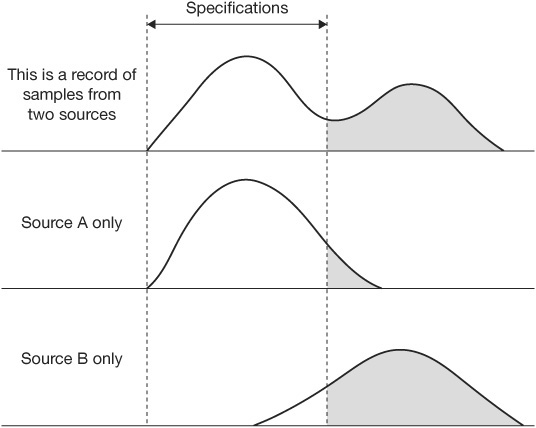
Figure 4.29 Bimodal curve modeled from data from two different sources

Figure 4.30 Distorted histogram
The natural barrier in this case is the expectation that the call center staff will answer the phone as soon as it rings. There could be a natural barrier at the other end as well, if the company installed a system that would transfer to voice mail all calls that remained unanswered after a certain number of rings.
Constructing a Histogram
The foregoing examples of histograms illustrate most of the different types. The following example is used to demonstrate the steps to be taken in constructing a histogram, using for our data the variations in the time required to complete a single method, Method A.
Step 1. Collect and Organize Data
To construct a histogram, you need data. The more data you have, the more accurate your histogram will be. A minimum acceptable number of data is from 30 to 50 measurements; there is no maximum number.
You need a certain type of data to properly construct a histogram. All the measures must be of the same item or process, and measurements should be taken in the same way. The measure could be how much time it takes to do a certain thing, measured each of the 50 times it is done on a certain day. Another measure could be how many units were processed in an hour, with a simple count being taken for each hour in a 40-hour week. The measurements are of items or processes that should be about the same.
Construct a data table to collect and record data. We can use Table 4.7 as an example. Find the range by subtracting the smallest measurement (15) from the largest measurement (37). In Table 4.7, the range is 22. Divide the range by 10. This tells you the width of the intervals (columns) to be plotted on the X (horizontal) axis of the histogram.
Step 2. Set Histogram Interval Limits
Put 11 marks along the X axis at equal intervals. Take the largest measurement on the data table (37) and record it on the right end of the horizontal axis. (See Figure 4.31.) Put the smallest measurement (15) on the left end of the horizontal axis. Then add to the smallest measurement the figure you got when you divided the range by 10 (2.2) to the smallest measurement and place this new figure (17.2) by the first interval on the horizontal scale. Continue moving to the right so that each interval point is increased by the same amount over the adjacent interval on the left.
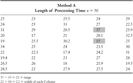
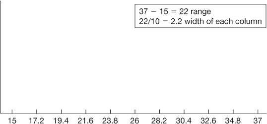
Figure 4.31 Setting histogram interval limits
The more data you have, the larger the number by which you should divide to determine the interval. Use the following as a guide:

Step 3. Set the Scale for the Y Axis
Count the total number of measurements and divide this number by 3. You may round off the answer. The number 3 is used as a general practice, related to the probability that the highest frequency for any one interval is not likely to be more than 30 percent of the total measurements you have taken. This number—in our example, 50 (50 ÷ 3 = 16.67, rounded off to 17)—is plotted at the top of the Y (vertical) axis of the histogram. (See Figure 4.32.)
Step 4. Plot the Data
Count the number of measurements that fall between the first two numbers on the horizontal axis. Make a mark at the appropriate height. Do this for the remaining intervals along the horizontal line. In counting the number of measurements for each interval, a number that falls on the line between intervals is included in the column that begins with that number. For example, if you were plotting data on Figure 4.32 and the value of a specific measurement was 17.2, it would be plotted in the interval that is marked as 17.2 to 19.4. Then draw and fill in the columns.

Figure 4.32 Setting the scale for the vertical (Y) axis
Step 5. Label the Histogram
Add a legend telling what the data represent and where, when, and by whom they were collected. (See Figure 4.33.)
Histograms are extremely valuable in presenting a picture of how well a product is being made or how well a process is working. This is not something that can be readily detected by a mere tabulation of data. The simplicity of their construction and interpretation makes histograms effective tools for the analysis of data. Perhaps most importantly, histograms speak a language all can understand. They tell whether a process is under statistical control and whether the process is designed to meet its expected standard or specification.
The width of the histogram total population can be defined by calculating the standard deviation of the data. Standard deviation is an estimate of the spread of the total population based upon a sample of the population. As noted earlier, lowercase sigma (σ) is the Greek letter used to designate the estimated standard deviation. (Note: Standard deviation is presented later in this chapter.)
Process Capability Study
When the as-is process data is inadequate to determine how the process has been performing over time, it may be necessary to do a process capability study to define its variation in some of the key measurements.

Figure 4.33 A completed histogram
This is an approach that is often used during Phase IV pilot run to predict the performance of the proposed process changes.
You have three options:
Design the process so that it produces good output.
Try to inspect quality into the output.
Go out of business.
I like option #1.
—H. James Harrington
How to Use a Process Capability Study
You will find that different statisticians, companies, and quality control texts vary in their notation of the formulas used to derive the process capability indices. This is not important as long as you understand what is being conveyed. All these formulas have as their basis the conventional statistical theory about probability distributions (frequency distributions); that is, with a process under statistical control, exhibiting a normal distribution pattern, 99.73 percent of the output will fall within plus or minus 3 standard deviations of the mean of the distribution. The common base for computing the various indices is this 6 standard deviation (6-sigma) width. (See Figure 4.34.)
Cp—Inherent Capability of the Process
The baseline index (Cp) is the ratio of the tolerance width to the calculated plus or minus 3 standard deviation width. The formula is
![]()
Therefore, if the tolerance width is exactly the same as the plus or minus 3 standard deviation width, the Cp index is equal to 1.0. (See Figure 4.35.)
Since the plus or minus 3 standard deviation limit only encompasses 99.73 percent of the output, even if the process is operated at the midpoint of the tolerance, most companies establish a requirement that Cp = 1.33 (±4σ) before the process is considered capable. (See Table 4.8.) Note: Today many organizations are using a program called Six Sigma that has a Cp target of 2.0.
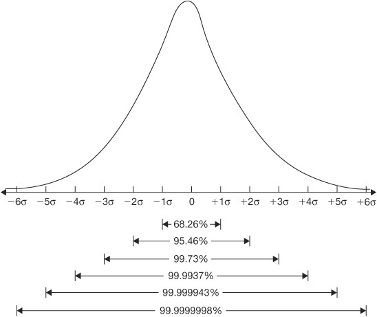
Figure 4.34 Standard deviation width of a normal distribution


Relating Cp Location to Specification Limit
As stated above, the Cp index is useful only to compare the spread of the process with the spread of the specification limits (tolerance). It does not address the comparison of the locations of these two spreads. Therefore, while a process may be inherently capable (Cp = 1.0 or higher), it might be operating off-center from the specification midpoint. (See Figure 4.36.)
Another index (Cpk) has been designed to accomplish a combined comparison of both the width and the location of the distribution to the specification limits. Two methods are used to derive a Cpk index. One makes a comparison between the process mean and the specification midpoint as a ratio of one-half the tolerance (called the K factor and used by the Japanese). (See Figure 4.37.) The other (used by Ford Motors) makes a measurement between the process mean and the nearest specification limit using a standard deviation as the unit of measurement (called Zmin). (See Figure 4.38.)
As can be seen, one uses the centers for comparison, and the other uses the distance to the nearest specification limit. We prefer the Zmin method because it depicts both the location and the spread of a process in a single index that can be used directly with a Z table to estimate the proportion of output that will be beyond the specification limit and therefore be defective. (See Table 4.9.) However, for those wishing to use the K-factor method, it, too, will be explained.
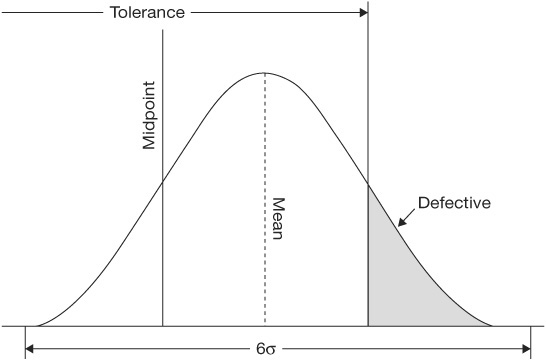
Figure 4.36 Inherently capable process operated off-center

Figure 4.37 Deviation of a Cpk index using the K-factor method
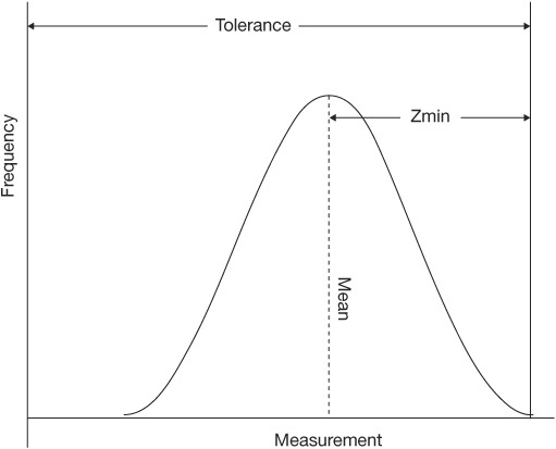
Figure 4.38 Deviation of a Cpk index based on Zmin
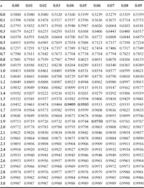
Table 4.9 Z Table
Entries in the body of the table represent areas under the curve between −∞ and z
Zmin
Zmin is the standard deviation from process mean to nearest spec limit. In other words, Zmin is the distance between the process mean and the nearest spec limit (upper or lower) measured in standard deviation (sigma) units. The effect is to provide an index value in Z units that readily conveys the capability of the process if one keeps in mind that plus or minus 3 standard deviations encompasses 99.73 percent of the output of a process in a state of statistical control. Its calculation can be stated as
Z = σ(standard deviation)
Zmin = minimum of ZU or ZL
where U and L equal the upper and lower specification limits, respectively. It is graphically portrayed in Figures 4.39 and 4.40, where USL and LSL stand for upper and lower specification limits, respectively.
Cpk—Operational (Long-Term) Process Capability
As stated earlier, the Cpk index combines a measure of the inherent capability of the process with where it is operating in relation to its specifications(s). It converts the Zmin into units of 3 standard deviations. Zmin is in Z units, equaling standard deviation units, and so to convert Zmin to Cpk, the formula is
![]()
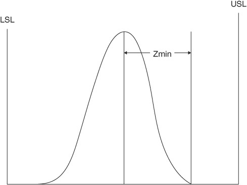
Figure 4.39 Example where Zmin = ZU

Figure 4.40 Example where Zmin = ZL

Figure 4.41 Example demonstrating comparison between Cp and Cpk with a process that is off-center
If Zmin = 3, by the formula Cpk = Zmin/3 we obtain a Cpk index of 1.0 when the minimum capability is 3 standard deviations. Since the Cp index of 1.0 also connotes a plus or minus 3 standard deviation capability when a process is centered, then Cpk = Cp. However, Figure 4.41 shows a condition where Cpk = 1.0 even when Cp = 1.2. This is caused by the process being off-center. Thus a Cpk that is lower than Cp indicates a process that is off-center.
CPU and CPL—Upper and Lower Process Capability Indices
In a normal histogram it is not unusual to have the measurements drift between the upper and lower three sigma levels. Control charts use the upper and lower three sigma values as control points to indicate that an unusual reading has been recorded.

As was shown above, a process that is off-center will have different Z values (standard deviation units) for the upper and lower specification limits and thus a different capability index value. In addition, there are times when only one tolerance applies. The CPU and CPL indices are designed to provide for these situations. The formulas are the same as for Cpk but for one specification limit only:
![]()
The computation of CPU and CPL is illustrated in the example below where
![]()
σ = 0.33
USL = 5.68
LSL = 3.0
![]() .
.
This process is marginally capable with 0.135 percent of the output expected to be outside the upper specification limit. (See Figure 4.42.)

Figure 4.42 Example of off-center process showing CPL and CPU indices. For centered processes, CPU and CPL are equal to Cp.
It should be noted that Ford and its suppliers use a notation of ZU and ZL for this purpose. Since a Z unit is 1 standard deviation (not in 3 standard deviation units as are CPL and CPU), ZU and ZL will be 3 times the number of the CPL and CPU index.
One of the most valuable uses for a capability index is the determination of the proportion of the output that will be beyond either spec limit. In using the standard normal distribution (Z table) in Table 4.9, both sides of the distribution need to be considered in estimating the proportion of defectives from the process.
Cpk—Using the K-Factor Method
To determine Cp using the K factor method, first find K, which is the proportion of one-half the tolerance that the process mean varies from the spec mean.
The formula is

The best value is zero, because that means that the process is being operated exactly at the midpoint of the tolerance. If K is positive (Figure 4.43), the process mean is off-center toward the upper spec limit. Conversely, if K is negative (Figure 4.44), it is off-center toward the lower spec limit.
While the K factor is very helpful in portraying the centering of the process relative to the spec, it tells nothing about the relationship between the process spread and the tolerance spread. To overcome this deficiency, the K factor is combined with the Cp index and converted to 3 standard deviation values by the following formula:
Cpk = Cp(1 − K)
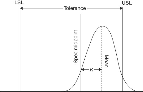
Figure 4.43 Example of a positive K factor

Figure 4.44 Example of a negative K factor
To illustrate, Figure 4.38, shown earlier to portray Cpk based on, Zmin, is repeated below and used to calculate Cpk using the K-factor method:

It is noted that both methods produce the same Cpk result.
Using Process Capability Indices
The purpose of knowing about the capability of a process to meet its requirements is pretty obvious. It provides answers to two questions. Can a process as currently designed, equipped, and operated meet its requirements? If not, what proportion of the output is expected to be defective? The indices are just one of the tools for management to use to facilitate the investigation, analysis, and corrective actions necessary to bring the process capability up to the point of filling all its requirements.
There is a variety of conditions or stages of a process as it moves from design to full production, and there are a variety of depths of analysis that may be applied depending on many factors. A number of different terms are used to identify a given analysis in a given stage of the process. They might be called process capability studies, process performance evaluations, process improvement programs, process optimization, etc. What they are called is not too important; what is important is to realize that nothing is constant. Even if a process is capable today, it may not be tomorrow. Thus a never-ending effort is needed to maintain whatever level of proficiency has been achieved and to continuously strive to reduce the natural variation of all processes so that the levels of performance to requirements are improved and the goal of zero defects is sought.
It is necessary to understand that “process capability” as expressed by some index is not an absolute but rather an attempt to quantify and compare the degree to which the various processes can be expected to meet their requirements. For instance, the numerical value of a process capability index can differ for a number of reasons. If the index was derived from control chart samples of past history, it might not be the same as one derived from samples taken today. If the sample sizes and frequency of samples were to be changed, one might get a different value of the standard deviation of the process, thus changing the process capability index. To be more specific, if samples within a subgroup are taken very close together, the the variation between the high and low reading (R) will tend to be smaller than if the samples in the subgroup are taken over a longer period. The latter will increase the value of R, thus increasing the size of the estimated standard deviation. In turn, that broadens the control limits and decreases the process capability index. The point of this discourse is to help you realize the fallibility of process capability indices. They are very valuable tools, but they must be used with judgment and an understanding of the conditions under which they were derived.
Process Capability Analysis
As stated earlier, a number of different conditions will require process capability analysis. Typically a process will undergo several stages of development before it is ready for “full implementation.” There exists a need to determine the capability of the various processes during these development stages. Unfortunately, the earlier the stage, the less hard data available.
During the design stage, any attempt to assure process capability will need to be done using estimates only. Because of the use of estimates, there is a need to provide for a greater margin of error; thus the use of a Cp = 1.67 (±5σ) as a target is desirable. As development proceeds and the process moves into pilot process, it will be necessary to consider the effect on process capability of such elements as the tools, cost, cycle time, and quality. While capability analysis during this stage can be computed from hard data, it is still difficult to predict what the full-blown process capability will be when the process is fully implemented.
Things like variation in cycle time and quality have a direct impact on the customer, while variation in cost has a direct impact on the organization’s profits. It is therefore important that you can determine what percentage of the output will exceed the customer’s requirements for quality and for cycle time.
Processes may be meeting all their requirements. However, through process optimization, better-quality products and reduced costs can be achieved.
Process Capability Study—Steps
Set forth below are typical steps that can be used when undertaking a process capability study.
Step 1. Preparation
Become familiar with the process to be studied. What physical conditions exist? At what point will the customer be dissatisfied with the output? What variables are to be studied? What historical data exist? What data need to be collected?
Step 2. Data Collection
The success of the study will be no better than the data that is collected. All too often we make bad decisions because we base them on bad data. It is absolutely essential that the PIT makes sure that the collected data is meaningful and accurate. This requires that the people who are collecting the data understand what they are required to do and that they have the right equipment.
• Select the size and sequence of the subgroups to be measured. Typically a rational subgroup of four or five process cycles is sufficient. These need to be taken from a single stream of output over a short interval of time (normally sequentially produced). They should represent, as nearly as possible, output under one set of conditions.
• Decide the frequency of subgroups to be chosen. Subgroups taken very frequently will reflect variations that occur with little external influence, while those taken less frequently will reflect the effect that changes in process and inputs to the process have on output from the process. The objective is to detect all the changes that the process will normally undergo.
Summing Up Activity 4
A key benefit of understanding an existing process is to facilitate the communication between the PIT and the stakeholders of the process. Having excellent communication with customers, management, process owners, process managers, and the employees involved in the process is crucial to getting buy-in to the future-state solution. You must understand the variation that is in the current process that causes you to have dissatisfied customers. If on an average you are able to fill a customer’s order in 10 days and you tell your customer that is what he or she will get 50 percent of the time, you will not meet your customer’s requirements. If only 1 percent of the orders are filled in 20 days, that 1 percent of customers will be very unhappy, and many of them will start looking for a new supplier.
(Note: This statistical approach to measuring process variation may look difficult to do if you are not mathematically inclined, but there are a number of software packages that will do all the statistical work for you. Three good software packages are QI Macros, Minitab, and JMP.)
You lose customers not on averages but when the process performs worse than the customer thought it would.
—H. James Harrington
Activity 5: Prepare the Simulation Model
Simulation modeling is the best answer to reducing variation in a process and to predict the impact changes will have on the process.
—H. James Harrington
It has been said, and I agree, that a picture is worth a thousand words. Well, if this is true, a picture that logically simulates tasks and collects data has to be worth a million words. Simulation models provide a picture that gives the appearance that it can think for itself. This modeling technique has the capability of considering complex interrelated tasks and structurally projected outcomes by exercising the many alternative combinations in a matter of seconds that would normally take months to do in the real process, and it can provide its user with validated results that can be very reliable. Simulation models can take on many different forms. Figure 4.45 is typical of one form.
It is not my intent to make process simulation modeling experts out of the PIT members as a result of reading this book. Simulation modeling is a complex process that requires training before it is undertaken.

Figure 4.45 Typical simulation model form

Figure 4.46 Typical simulation objects
I recommend that you read the book Simulation Modeling Methods to Reduce Risks and Increase Performance (Harrington and Tumay, 1999) to get a detailed understanding of simulation modeling. However, there are a number of new objects that a person creating and using the models will need to become familiar with. Figure 4.46 shows some of them.
What Is Simulation?
Simulation is a means of experimenting with a detailed model of a real system to determine how the system will respond to changes in its structure, environment, or underlying assumptions.
—H. James Harrington
Simulation, by definition, allows for experimenting with a “model” of the system to better understand processes, with the goal of improving performance. Simulation modeling incorporates various inputs to a system and provides a means to evaluate, redesign, and measure or quantify customer satisfaction, resource utilization, process streamlining, and minimizing of time spent.
Process Simulation in SPI
SPI is a means by which organizations attempt to almost reinvent themselves. This effort involves redesigning processes—finding new and innovative and therefore more effective, efficient, and productive ways of doing business.
One of the many tools used to assist SPI is process simulation. Simulation is a powerful means by which “now processes or existing processes” may be understood, streamlined, evaluated, and visualized without running the risks associated with conducting tests on a real system. Dynamic process simulation allows organizations to study their processes from a systems perspective, providing a better understanding of cause and effect in addition to allowing better prediction of outcomes. This strength of simulation allows for evaluating the overall process performance under different conditions very rapidly to:
• Define the problem and variation in the current process.
• Address customer satisfaction and quantify it for the new process or system.
• Utilize resources in the new streamlined process or system.
• Minimize time to produce an output
All these capabilities make simulation an ideal tool in a SPI effort. (See Figure 4.47.)
Ernst & Young uses process simulation to help clients redesign their businesses. Simulation plays a powerful role in the analysis of the current state as well as the future-state vision for the redesigned processes.
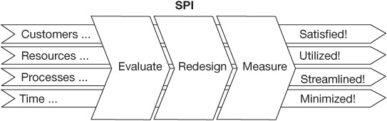
Figure 4.47 Inputs and outputs from a simulation model
Simulation could assist in the following areas in a SPI effort:
• Feasibility analysis. Examining the viability of the new processes in the light of various constraints
• Cost-benefit analysis. Conducting a cost-benefit analysis or process evaluation
• Visioning. Exploring the possibilities for the system in the future state
• Performance characteristics. Examining the performance metrics of a system in either the current state or future state, thus providing an understanding of performance
• Prototyping. Once a vision for the future state for the reengineered processes is generated, implementing planning and risk assessment and also helping to begin detailed process design
• Communication. Disseminating the workings of the newly redesigned process to the organization
Why Simulate?
This is a fair question to which there are a number of good answers:
• Simulation can assist in creative problem solving. Fear of failure prevents people from coming up with ideas. Simulation will allow creative experimentation and testing and then selling the idea to management, thus encouraging an optimistic “let’s try it” attitude. Simulation provides a means for creative problem solving.
• Simulation can predict outcomes. Management in all organizations needs to be able to predict. Simulation educates people on how a system might respond to changes. For example, simulation could help in predicting response to market demands placed on the business system. This allows for analyzing whether the existing infrastructure can handle the new demand placed on it. Simulation can thus help in determining how resources may be efficiently utilized and in predicting outcomes for various changes to process inputs.
• Simulation can account for system variances. Conventional analytical methods, such as static mathematical models, do not effectively address variance, as calculations are derived from constant values. Simulation allows the PIT to look at variance in a system incorporating interdependence, interaction among components, and time. This approach allows for examining variation in a broader perspective. It is very important to understand the variation in the current process because you don’t lose customers over average performance. It is the “extremes” that are not normal which upset your customer, i.e., when you tell him or her the order will be delivered in three days and it actually takes three weeks.
• Simulation promotes total solutions. Simulation allows modeling entire systems and therefore promoting total solutions. Simulation models provide insight into the impact that process changes will have on input to and output of the system as well as system capabilities. Simulation models can be designed to provide an understanding of the systemwide impact of various process changes. Thus simulation provides a means of examining total systemwide solutions.
• Simulation can be cost effective. As organizations try to respond quickly to changes in their markets, a validated simulation model can be an excellent tool for evaluating rapid responses. For example, a sudden change in market demand for a product can be modeled using a validated system model to determine whether the existing system can cater to this need. Additionally, simulation modeling allows for experimenting with system parameters without having to tamper with the real system. Simulation provides more alternatives, lowers risks, increases the probability of success, and provides information for decision support without the cost of experimenting with the real system. Simulation thus provides a cost-effective way to rapidly test and evaluate various solutions to respond to market demands.
• Simulation can help quantify performance metrics. Simulation can help quantify performance measures for a system. For example, the aim of a system may be to satisfy the customer. Using a simulation model, this requirement could be translated to time to respond to a customer’s request, which can then be designated as the performance measure for customer satisfaction. Simulation can help measure trade-offs associated with process designs and allow for further analysis on parameters such as time to market, service levels, market requirements, carrying costs, and SKU levels. Simulation thus provides a quantitative approach to measuring performance.
• Simulation is an effective communication tool. A simulation model can be used to communicate the new redesigned process in a dynamic and animated fashion. This provides a powerful means of communicating the function of various components to those who will use the new system, helping them understand how it works.
Why Do You Need Process Simulation?
Let’s take a look at a very simple order fulfillment process and see the reasons why process simulation is needed. The process map in Figure 4.48 shows three activities: orders are received, they are processed, and they are shipped.
Let’s define some parameters about how the process works:
• On the average, 10 orders are received every day.
• There are two types of orders, standard and high priority. Forty percent of the orders are standard, and 60 percent of the orders are high priority.
• On the average, standard orders take two hours per order to process, while high-priority orders take four hours per order.
• Four workers process orders working eight-hour shifts each day.

Figure 4.48 Order processing example
Based on simple calculations shown in Table 4.10, one can quickly conclude that the customers will always receive their orders on time and that the order fulfillment process is optimized with its resources at 100 percent utilization!
Let’s look at a typical day’s activities where the order arrival rate is rather random; i.e., customers place their orders at random times throughout the day. A manual simulation of the process for 10 orders is shown in Table 4.11. The table includes the event times (receipt and shipment) of each order, the order number and type, and the event type.
Table 4.10 Simple Order Fulfillment Process Calculations
Standard orders = 4 orders/day × 2 hours/order = 8 hours/day
High-priority orders = 6 orders/day × 4 hours/order = 24 hours/day
Total capacity required = 32 hours/day
Total capacity available = 4 workers/day × 8 hours/day = 32 worker hours/day
Percent utilization = capacity required/capacity available = 32/32 = 100%
Table 4.11 Manual Simulation of the Order Processing Example

The first two orders arrive at 9:00 a.m. The third order arrives an hour later at 10:00 a.m. The first three orders are standard orders. At 11:00 a.m., the first two orders are shipped. Also at 11:00 a.m., a high-priority order is received. At noon, the third standard order is shipped, while two new orders arrive. Of the two orders that are received at noon, one is standard and the other is high priority. At 12:30, another high-priority order arrives. At 1:00 p.m., three more high-priority orders are received. By 4:30 p.m., the workers have shipped seven orders. Three workers stay on and complete the remaining three orders by 8:00 p.m.
The last four columns of Table 4.11 contain the vital statistics that are recorded each time an event takes place in the simulation. For example, the number of orders in queue reaches its peak of three at 1:00 p.m. At the same time, the total number of orders in process peaks at seven. The last three orders spend 1.5 hours, 2 hours, and 3 hours in queue, respectively. Table 4.12 summarizes the performance measures of the manual simulation.
Although the process appeared to be designed perfectly, randomness associated with the arrival rate of customer orders caused queuing and subsequent delays in processing time.
Now let’s take a look at three other possible scenarios:
• Scenario #1. What if the daily demand varies in a way such that the business receives anywhere from 8 to 12 orders a day (most likely daily demand remains at 10)?
• Scenario #2. What if the order processing time for high-priority orders takes anywhere from three to five hours (most likely processing time remains at four)?
• Scenario 3. What if the order mix is random?
Table 4.12 Performance Measures of the Manual Simulation
Average cycle time for standard orders = 8 hours/4 orders = 2 hours/order
Average cycle time for high-priority orders = 30.5 hours/6 orders = 5.08 hours/order
Average queue time = 6.5 hours/10 orders = 0.65 hour/order
Maximum queue time = 3 hours
Average service level = 7 orders on time/10 orders = 70%
3 workers had to work a total of 6.5 hours of overtime to complete orders
Total queue time = 6.5 hours
How long will it take to fulfill an order (cycle time) given the new demand, process times, and product mix? The answer is even more difficult to compute by hand. Why? More variability in the process means more variability in performance. Possible results for the cycle time statistics for three scenarios may look like the outcomes in Table 4.13. The table shows the average values as well as the values for the mathematical variance (σ) in terms of the 2-sigma variance.
Mathematical variance is a very important consideration when analyzing the performance of a process. Figure 4.49 shows a normal distribution curve with 1-sigma, 2-sigma, and 3-sigma variances. (See Harrington’s Statistical Analysis Simplified, 1998, for calculating sigma.) Assuming that the observations are from a normally distributed population, the 2-sigma band contains 95.46 percent of the observations and the 3-sigma band contains 99.73 percent of the observations.
Table 4.13 Outcomes of Cycle Time Measures

Figure 4.49 Standard deviation width of a normal distribution
Organizations lose customers most often because of exceptionally bad performance, not because of average performance. In the potential scenarios described above, the maximum cycle time values are outside the 2-sigma band representing exceptionally bad performances. That is, the likelihood of a high-priority order taking 7.13 hours (in Scenario #1) is less than 5 percent. Even though this seems like a small percentage, that is all it may take for a major customer to consider doing business with a competitor.
Of course, when such a rare event as an exceptionally bad performance occurs, management begins asking questions like, How many customers were lost? What additional costs, such as overtime, were incurred to recover from the situation? How much will be spent in marketing to lure back customers that were lost? Based upon our research, the following are typical cost ratios:
• Cost to keep a present customer: 1×
• Cost to get a new customer: 10×
• Cost to win back a lost customer: 100×
Your priority should always be placed upon keeping your present customers because you cannot afford to try to win them back.
Although the exercise is an overly simplistic view of an order fulfillment process, it clearly demonstrates the effect of process dynamics on cycle time, service level, and process costs. It also demonstrates clearly why complex processes cannot be adequately analyzed without the use of process simulation modeling. In other words, as random behavior and interdependencies of resources increase in a process, it becomes impossible to predict performance without process simulation. (See Figure 4.50.)
Process Simulation at Ernst & Young
Ernst & Young uses process simulation as part of its methodological approach to business process innovation and performance improvement. Simulation is used to understand and analyze the current state of a system as well as visioning the future state of the redesigned system. Simulation offers a powerful means by which management consultants are able to provide clients with better suggestions for improving or innovating their systems.

Figure 4.50 When do you need process simulation?
Ernst & Young has used simulation to assist clients in improving just parts of their systems or their entire systems. Examples of processes in which simulation was used include:
• Order processing and management with the purpose of improving service levels and shortening time to respond to customer requests
• Inventory management to help evaluate various options so as to select a cost-effective system and layout
• Customer support and service to help redesign processes so as to shorten response times and improve service levels
• Service delivery with the goal of improving quality of service delivered with efficient utilization of resources using streamlined processes
• Claims processing with a view to minimizing cycle time through streamlined processes so as to improve customer satisfaction
• Critical-path evolution to help improve system response to external market requirements
In each situation, process simulation provided a means to analyze the system and allowed for an innovative approach to arriving at better solutions.
Simulation Tool Suppliers
Process simulation is not something that the PIT can do by hand. It requires a good software support package and skill in using it. Many software packages are available today. Appendix C lists some of them.
Introduction to ProModel
ProModel is a typical simulation software that I used when I worked at Ernst & Young. ProModel is a Windows-based simulation system. The package facilitates rapid modeling in a specific environment. It provides built-in restrictions for specific applications, thereby allowing the user to select specific constraints that are relevant to the process being studied without having to use programming statements. Additionally, the package comes in three versions—ProModel for the manufacturing environment, ServiceModel for the service industry, and MedModel for the health-care industry. Each package uses icons representative of the industry, thereby providing for environment-specific modeling.
ProModel provides detailed statistical reports of model outputs. In addition to these reports, ProModel offers graphical means to display model results and outputs.
Here are some commonly used graphical outputs produced by ProModel:
• Content history graphs. Illustrate variation of customers in a queue over time, providing an understanding of service levels in critical areas.
• Resource utilization pie charts. Break down utilization. For example, the chart could show how much time a manager spends in moving from his or her office to the sales desk to answer a subordinate’s queries compared with the time spent doing managerial work such as sales calls.
• Resource-state graphs. Reveal bottlenecks caused by staff or equipment. This kind of graph shows the utilization of all resources in a comparative fashion, allowing staff to analyze areas for redeploying resources to utilize them more efficiently.
• Plot of variables. Graphical depiction of variables such as time spent in the system, allowing staff to examine system performance metrics. This type of comparison of system parameters in the current and future states can be accomplished with relative ease using a simulation model. This feature of the software allows for a quantitative comparison of benefits in the future and current states of the system.
• Graphical layout. High-resolution printout of the graphical layout of a model developed in ProModel. The layout shows various locations and on-screen performance metrics and is animated. This feature is ideal to communicate a process.
Process Variation Analysis
During Phase II a simulation model is primarily used to do process variation analysis. As people began to understand the true complexity of processes, it became apparent that customers were lost, not over average values of the process measurements, but as a result of the extreme negative part of the population. For example, the repair cycle for the average TV is 1.5 hours, but 5 percent of the time it takes 2 weeks or more. Well, few are going to be really unhappy about not having a television for 1.5 hours, but if you have to wait for 2 weeks to get your TV repaired, you will probably look for a new repair shop the next time.
Many things can cause variation in the process. Some of them are:
• Uneven work flow
• Differences in complexity of the individual work item
• Changes in the input drivers
• Workload buildup because people are out
• Equipment downtime
• Seasonal variation
Variation is occurring simultaneously in each activity, and the variation is occurring in random patterns. It is unrealistic to calculate the total process performance by using the 2-sigma limits of the process measurements because of the low probability of that combination occurring. Process variation analysis uses random number generation tables to calculate a realistic total process performance distribution for each of the key measurements. This is the only way an effective Monte Carlo analysis can be performed. Monte Carlo methods (or Monte Carlo experiments) are a class of computational algorithms that rely on repeated random sampling to compute their results. Monte Carlo methods are often used in simulating physical systems. Monte Carlo methods are especially useful for simulating systems with many coupled degrees of freedom. They are used to model phenomena with significant uncertainty in inputs, such as the calculation of risk in business. When Monte Carlo simulations have been applied, their predictions of failures, cost overruns and schedule overruns are routinely better than human intuition or alternative “soft” methods. The PIT can use it to predict projected extremes of variation in the output from the current and future state process.
Process Flow Animation
Up to the development of process flow animation, the process designer was limited to a static picture of the process. But with process flow animation, the flowchart on the computer screen comes to life. (See Figure 4.51.) It is able to show how transactions through the process and how bottlenecks affect the process performance. For example, animation can show waiting customers in a queue while the service agents are busy serving other customers. Or animation can show idle resources with unused capacity due to transportation delays. (See Figure 4.52.)
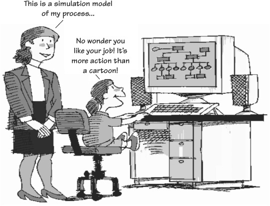

Figure 4.52 An example of process flow animation
Work Flow Monitoring
This is an online model that is used to track transactions through the process. Each time a transaction enters an activity, it is logged in; and when it leaves the activity, it is logged out. The information is computer-analyzed so that the exact status of each transaction is known at all times. Typically, the maximum time that a transaction should be in each specific activity is preset in the computer program so that exceptions are highlighted and priorities reestablished. (See Figure 4.53.)
How Is Simulation Used in SPI Projects?
Each time that a proposed change to the process is considered, the simulation model should be changed and exercised so that the impact of the change can be evaluated. The new future-state solution that is developed supposedly represents the new process after the suggested changes are installed. The problem is that with the methodology, the PIT that develops the future-state solution has to make a number of assumptions that may or may not be correct in designing the new process. These important assumptions are then used to estimate the benefits that the organization will receive as a result of implementing the new process.
It is important to realize that the processes to which these breakthrough methodologies were applied are the critical processes within most organizations and, as a result, make or break the organization’s performance. Because of this, no organization can afford to implement the future-state solutions that are developed by the PIT without some way of verifying the correctness of the PIT’s assumptions before the organization commits the resources required to implement the recommended changes. Often management is literally betting the organization’s future on the results of these changes.
Due to the critical nature of these changes, simulation models of the future-state solution are critical to each part of the SPI methodology. They allow the PIT members to evaluate the correctness of the assumptions they made. These simulation models put the complex paper model into a virtual operating mode that verifies work flow and identifies bottlenecks. The simulations also allow the PIT to adjust the proposed process to correct for weaknesses in the design and to quickly collect data that measure the effectiveness of any change that is made to the process.

Figure 4.53 Example of work flow monitoring
Simulation modeling by itself is not adequate to evaluate the correctness of the new process design because it is created using estimates generated by the PIT. It turns out to be only the first step in the piloting process. A typical piloting process for a new complex process could be:
• Simulation modeling
• Conference room pilot
• In-process pilot
You can simulate many things. For example, a child watches a Western on TV and wants to ride a horse just like John Wayne. Her mother, as Figure 4.54 shows, resolves the situation by providing the child with a rocking horse to play on—a poor simulation, but it is better than the alternative.

Figure 4.54 You can simulate many things.
Preparing a Process Simulation Model
The following are the six steps required to prepare a process simulation model.
Step 1. Plan the simulation project.
Step 2. Collect and analyze data.
Step 3. Build the model.
Step 4. Verify and validate the model.
Step 5. Conduct experiments.
Step 6. Analyze, document, and present results.
Benefits of Process Simulation
Significant value-added process simulation and analysis occurs because it has the ability to do dynamic analysis of costs based on the event-driven simulation. Because the simulation model keeps track of resource interdependencies and captures the random nature of processes, the process performance statistics are far more accurate than results obtained from static analysis. The primary benefits of process simulation are:
• Focus on cycle time
• Strategic pricing
• Process variation
• Evaluation of capital investments
• Evaluation of organizational changes
These are detailed below.
Focus on Cycle Time
Successful companies understand that minimizing waste can make real process improvement. Non-value-added activities include such things as doing rework, putting things in stock, moving things from one place to another, and checking other people’s outputs; these activities are all wasted time that can sometimes constitute 95 percent of the total cycle time. Process simulation facilitates the focus on cycle time by modeling non-value-added activities and showing their impact on total process time.
Strategic Pricing
Life cycles of products and services are becoming shorter and shorter. The up-front costs of developing, testing, and marketing are not recouped until revenue is generated. Understanding the cost trade-off between life-cycle stages is critical to strategically pricing the products. That is, understanding when the total investment in product development can be recouped is valuable information for strategic pricing. Process simulation allows simulation of the process changes during the life cycle of a product or service for strategic or time-based pricing.
Process Variation
Process simulation allows organizations to study the performance variation and reduce its magnitude by defining the activities that have the greatest impact upon the total process variation. Understanding the impact of variability in customer demand or activity times on cycle time can help managers minimize waste.
Evaluation of Capital Investments
SPI applied to business processes requires a trade-off between the benefits and costs of making process improvement changes. Without the trade-off, executives and managers are faced with making large investment decisions based on gut feel. Process simulation provides an analytical tool for accurate evaluation of capital investments.
Evaluation of Organizational Changes
Decisions about centralizing, decentralizing, or even eliminating an organizational function are difficult management decisions that impact customers, employees, and stakeholders of a business. Mergers and acquisitions require corporations to constantly evaluate these alternatives and make quick decisions. Powerful resource and hierarchical process modeling functions of process simulation allow visualization and evaluation of alternatives before making these risky organizational change decisions.
Limitations of Process Simulation
Like any other technique, process simulation has its limitations:
• Process simulation is a process management technique, not a project management technique.
• Process simulation is a planning and analysis technique, not a scheduling technique.
• Process simulation is primarily a technique for measuring process efficiency; it does not measure effectiveness or adaptability.
These limitations are usually overcome with the application of other techniques, such as project management, scheduling, or optimization.
Don’t simulate life. Live every day to its fullest.
—H. James Harrington
Summing Up Activity 5
It may not be necessary to develop a simulation model for every process, but it is really helpful when one is prepared. Figure 4.55 presents a Siemens example.
Process simulation helps organizations predict, compare, or optimize the performance of a process without the cost and risk of disrupting existing operations or building a new process. The interactions of people with processes and technology over time result in a large number of scenarios and outcomes that are impossible to comprehend and evaluate without the help of a computer simulation model. The ability to visualize how a process would behave, measure its performance, and try “what-ifs” in a computer model makes process simulation an invaluable technique for decision making.

Successful implementation of process simulation involves a three-phase approach:
• Assessment and planning
• Implementation
• Measurement and continuous improvement
Simulation modeling is the best way to optimize performance.
—H. James Harrington
Activity 6: Implement Quick Fixes
SPI is a relatively long-term commitment. Future-state solutions require as much as three months to identify and another three months to implement. By analyzing the current process, a number of quick wins can be identified that will bring about positive change in the process—change that often more than pays for the entire cost of the streamlining methodology.
As the members of the PIT conduct Activities 1 through 3 in Phase II, they often identify things that can be changed within a short period of time that improve quality, reduce cycle time, or reduce cost. These are usually very simple things to correct. These changes are ones that cost little or nothing to implement but have a measurable impact upon the process. We call them “quick fixes,” or as I like to put it, “Stop doing dumb things.”
As a general ground rule, quick fixes should be implemented within 30 days, and the savings from the change should outweigh the cost of making the change. The reason that all the identified improvements are not implemented at this time is that the redesign process may not include the activity being addressed, and as such, making the change would be a waste of effort. All the identified improvement opportunities will be considered during the next phase, Phase III: Streamlining the Process.
Implementing the quick fixes is an important activity because very often the savings from this activity early in the SPI cycle will save more money than the cost of the total project. This makes quick believers out of top managers who may have been skeptical when the project started.
Example of a Quick Fix
We were conducting a process walk-through when one employee pointed out that she had to work every Saturday and often on Sunday to generate a very complex report for the manager of production control. She was told that the report had to be on his desk on Monday morning when he arrived. She pointed out that she had never seen him use the report and that if he could wait until Tuesday for the report, she wouldn’t have to work so much overtime. We contacted the manager and asked him if it could be put off until Tuesday. His answer was, “Sure, as far as I am concerned. I don’t even use it.” When we pointed out that she prepared the report only for him, he stated: “I will stop the report. It is just a waste of paper.” (Note: The next Saturday she went to a friend’s wedding instead of preparing this report.)
Let’s stop doing dumb things.
—H. James Harrington
We have seen processes that are well documented, but the process design was not being followed. In some of these cases, if the employee follows the documented process, the process problems would be eliminated.
In other cases, one or more employees have identified much better ways to operate and the process procedures were obsolete. Most of the problems and costs were caused by people who were trying to follow the documentation that management supplied to them even though they knew there was a better way to perform the related activities.
In both these cases it is important to align the process and procedures. This simple act has on occasion corrected the problems so that the PIT could skip Phases III and IV and go directly to Phase V: Continuous Improvement.
Activity 7: Develop a Current Culture Model
One of the primary causes for the breakthrough methodologies’ high failure rate is the lack of good organizational change management structure to support the change activities. During Phase II the PIT should develop a cultural model of the current process and its related environment. The model should be based upon the following cultural enablers:
• Management style
• Organizational structure
• Performance management
• Compensation benefits and rewards
• Education and development
• Communication
• Behavioral models
• Environmental factors
Typical behavior changes that will need to be considered are:
• Trust in management
• Team orientation
• Communications
• Constraints
• Commitment
• Flexibility
• Respect
• Proactivity
• Responsibility
• Pride
In addition to these formal analyses, management interviews and personal observation will be conducted and documented in order to develop the current-state culture model. In Phase III the PIT will compare the new culture model for each solution with the present-state model to define the gap between plus and minus. The greater the gap between the proposed change and the present process, the greater the risk of failure.
Activity 8: Conduct Phase II Tollgate
The end of Phase II is an excellent time to do a complete review of the Phase II deliverables. The tollgate should be chaired by the project sponsor, and the total EIT should be invited to attend. During this toll-gate, the following questions should be addressed:
• Has the PIT developed all the necessary flow diagrams needed to streamline the process?
• Have the key measurement data been collected? Has the variation in the key measurement been defined?
• Are all the PIT members participating as they should?
• Is the project on schedule and within the cost defined in the budget?
• Has the project progressed to the point that the PIT should start Phase III?
When these questions are answered in the affirmative, the project is ready to move into the streamlining phase.
Summary
Phase II is an important phase in the SPI methodology, but the PIT needs to be careful not to make it a “career.” We find that often PITs will spend far too much time analyzing and collecting data on the current process. The objective of SPI is to improve the current process, not to document it. The purpose of Phase II is to understand the current process in order to determine where the problems and improvement opportunities are within the current process. The data collected is also used to determine what impact the proposed changes will have on the processes’ key measurements. Keeping this in mind, spend enough time and effort to understand the magnitude of the improvement opportunities so that the PIT can determine which, or even if, the opportunities are worthy of expending the effort to include them.
Make your improvements based upon facts, not guesswork, to get the best results.
—H. James Harrington