
10
Setting Up Our Angular Project and Architecture
In the previous chapter, you learned about the concepts of JUnit, which is a testing framework that offers features such as fixtures, test suites, and classes to test the methods in our application. You also learned the application of AssertJ with JUnit, which gives a more flexible way of asserting objects in our unit tests, and lastly, you also understood the importance of Mockito, which provides us with the ability to mock objects and services, omitting the use of the database in unit tests.
In this chapter, we will start building our frontend application using Angular; we will be tackling the main fundamentals of Angular, such as components, modules, directives, and routes. We will also point out some of the best practices for organizing our Angular project.
In this chapter, we will cover the following topics:
- Organizing features and modules
- Structuring components
- Adding Angular material
Technical requirements
The link to the finished version of this chapter is here: https://github.com/PacktPublishing/Spring-Boot-and-Angular/tree/main/Chapter-10/superheroes.
Organizing features and modules
In this section, we will be discussing how we can organize and structure our Angular project to make it optimized and maintainable. Since Angular is considered a Model View Whatever (MVW) framework, Angular developers have the freedom to implement their choice of pattern in developing the project. This could be confusing, as you will experience different structures and standards switching from one project to another. To solve this dilemma, we will present a commonly used structure in the industry or some kind of baseline structure that you will typically find in Angular projects.
However, before we proceed to our main topic, let us first discuss how to create our Angular project and what the basic concepts that we need to know before coding Angular are. You can skip this part if you are already knowledgeable about Angular and proceed to the Organizing the folder structure section.
Generating an Angular project
We can create or set up the dependencies of our Angular project using a tool known as the Angular CLI. We can scaffold the project by using a single command responsible for downloading the dependencies and generating the required files for our Angular project to run. The Angular CLI is a handy tool in that it also provides several commands that will help us generate boilerplate codes in Angular.
To install the Angular CLI, we should make sure that we have Node.js installed on our machine, and we will execute the npm install -g @angular/cli command. After executing the command, we can verify whether our Angular CLI has been successfully installed – we will have a new global ng command that we can use to check the version of the installed CLI.
To check the version, we will execute the ng --version command, and we will get the following output:

Figure 10.1 – Installed version of the Angular CLI
In the preceding output, we can see that the version of the Angular CLI and Node.js installed on your machine is displayed after executing the ng -- version command. Currently, we have Angular CLI Version 13 installed, which means that once we scaffold an Angular project, it will be on Version 13.
After successfully installing the Angular CLI, we can now execute several commands for our project. Here are some of the commands that we can use in the Angular CLI:
- ng new <project name> [options]: Creates or scaffolds a new Angular project
- ng serve <project> [options]: Builds and serves your Angular application
- ng generate <schematic> [options]: Generates and modifies files with a specific schematic
Some schematics we can generate are as follows:
- Component
- Module
- Directive
- Guard
- ng build<project> [options]: Compiles the Angular application into an output directory named dist, which will be used for production
- ng test <project> [options]: Runs the unit test in the Angular project
These are just some of the most commonly used commands of the Angular CLI. For the complete commands, you can visit the documentation for Angular at https://angular.io/cli.
We know the commands we can use in the Angular CLI. Now, let’s generate our Angular project by executing the ng new superheroes command on our desired path. This will ask several questions, such as “would you like to add Angular routing?” and “which stylesheet format would you like to use?” We can select Yes and Syntactically Awesome Style Sheet (SASS) for these questions, as we need routes and SASS to build our application later.
After this step, this will now scaffold a new Angular project named superheroes and will be responsible for configuring the web pack, creating the required settings, and downloading the project’s dependencies. After the scaffold is accomplished, open the superheroes project in Visual Studio Code or any IDE you prefer. We will see that the Angular application is configured and ready to run on our local server.

Figure 10.2 – Folder structure and dependencies installed after scaffolding
To run our project, we can open the VS Code terminal with the Ctrl + ` shortcut and execute the ng serve command. We can also use the defined scripts in our package.json file. In this case, we can perform npm run start to run our application. We will see in the terminal whether Angular is running successfully on our local server in the following screenshot:
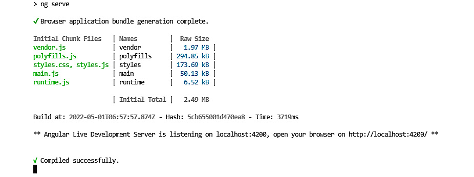
Figure 10.3 – Folder structure and dependencies installed after scaffolding
After successfully running our Angular application, we can now open the app using the default URL (http://localhost:4200) in our browser, and we will see the default page of our Angular project:

Figure 10.4 – Angular default page
We have successfully configured and started our Angular application locally. Now, let’s discuss the concepts we will use to build our application.
Angular features
The Angular framework is a component-based framework that allows us to develop reusable components to promote the reusability and maintainability of code. It offers many features that will make our frontend development more powerful. In this section, we will discuss the basic features and fundamentals of Angular that serve as its building blocks; take note that we will not discuss all of the features here, as we will focus more on the organization of the project.
To learn more about the features, you can visit the official documentation for Angular: https://angular.io/start.
Components
Components are the main building blocks in Angular. They are responsible for defining what the behavior and the look of the view will be. Components are annotated with the @Component decorator, which assigns several types of metadata that describe the component’s HTML, CSS, and selector.
The following are the commands to generate a component:
ng generate component <component-name>
ng g c <component-name>
The following is a code example for a component:
import { Component } from '@angular/core';
@Component({
  selector: 'app-root',
  templateUrl: './app.component.html',
  styleUrls: ['./app.component.scss']
})
export class AppComponent {
  title = 'superheroes';
}
Components have a feature called data binding, which allows us to pass data into the view. Data binding can be used to display values to the user, respond to user events, and modify the styles. Angular binding is classified into two groups:
- One-way binding
- Two-way binding
One-way binding
As can be inferred from the name, data only flows in one direction here. It can be from a component to the view or vice versa.
There are several ways to achieve one-way binding in Angular, and the two most common ways are using interpolation and property binding.
Interpolation
Interpolation is a one-way binding technique that allows us to display expressions to a string literal in HTML. Interpolation uses {{}} (double curly braces) for expressions inside HTML code.
Let’s have a look at the following example code:
// app.component.ts
export class AppComponent {
  title = 'superheroes';
}
<!—app.component.html ->
<!-- INTERPOLATE TITLE -->
<span> Title:  {{title}} </span>
In the preceding example, we have used interpolation to display the value of the title variable in the view. Using interpolation, we can also use operators in the template expression.
Property binding
Property binding allows us to bind HTML element properties in the component. Since we bind the HTML element properties, when the bound value changes, the view also changes. We can bind to HTML element properties such as class, href, disabled, and src.
Let’s have a look at the following example code on how to use property binding:
// app.component.ts
export class AppComponent {
  isDisabled = true;
}
<!—app.component.html ->
<button [disabled]="isDisabled">Can't be clicked</button>
In the preceding example, we have bound the isDisabled variable to the disabled property of the button. The button will be disabled, as we have set the value of the isDisabled to true.
Two-way binding
Two-way binding is a two-way data flow. Any changes applied to the model will be reflected in the view simultaneously and any modifications involved in the view are updated in the component. Two-way data binding helps handle forms, as we want our model to be updated once the values of the form are also updated and vice versa.
To achieve two-way binding, the ngModel directive is used.
ngModel
ngModel is a directive used to achieve two-way binding in Angular. This is under the Forms module in @angular/forms. ngModel, once it is bound to an input field or other form element, gives that element a property binding and an event binding. Let’s have a look at the following example code:
// app.component.ts
export class AppComponent {
  model = 'seiji';
}
<!—app.component.html ->
<input [(ngModel)]="model"/>
In the preceding example code, we have bound the model value to an input element using the ngModel directive. This syntax is also known as the banana in a box, which encloses ngModel with a square bracket and parenthesis. The directive will bind the model’s value with the input field using property binding and listen to the input value changes by utilizing ngModelChange.
Directives
Directives are an Angular feature that helps us manipulate the Document Object Model (DOM). We can modify a DOM element’s layout, behavior, and view. Directives are classified into three parts: components are one of the classifications, and the other two are attribute and structural directives.
Structural directives
Structural directives are directives that can modify the layout of the DOM by adding, updating, or removing elements, listed below are some of the structural directives in Angular:
- *ngIf: A directive that is used to add or remove elements in the DOM based on a condition:
<div *ngIf="condition">Will show if the condition is true</div>
- *ngFor: A directive that is used to repeat HTML elements from the items iterated in a specific list:
// this will display all the users for each row
<tr *ngFor="let user of users;">
<td>{{user.firstName }}</td><td>{{user.lastName}}</td></tr>
- *ngSwitch: A directive that allows us to add or remove HTML elements using a switch case mechanism. The HTML elements will be displayed if the provided expression is matched:
//evaluates the hero variable and displays the name of the hero base on its value
<div [ngSwitch]="hero">
<div *ngSwitchCase="'Dr. Strange'">
Stephen Strange</div>
<div *ngSwitchCase="'Hawkeye'">Clint Barton</div>
<div *ngSwitchCase="'Hulk'">Bruce Banner</div>
</div>
Attribute directives
Attribute directives are directives used for changing or modifying the appearance or behavior of the element. Compared to structural directives, attribute directives cannot add or remove elements in the DOM.
Listed here are some of the attribute directives in Angular:
- ngClass: A directive used to add CSS classes to or remove them from an HTML element; this allows us to change the appearance of elements dynamically:
//adds an error class on the input element if the
//control value is invalid
<input type="text" [ngClass]="control.isInvalid ? 'error': ''" />
- ngStyle: A directive that allows us to change the styles of HTML elements:
// the color of the element will base on the value of
// the color variable
<div [ngStyle]="{'color': color}"> Angular Framework </div>
Modules
Modules are one of the essential features of the Angular framework. As our application gets more complex, it will consist of large blocks of components, directives, and services. This will affect the maintainability of the application’s code base. The Angular framework provides a way of organizing and grouping blocks, known as modules.
Modules in the Angular framework help us develop our application promoting the separation of concerns. They allow us to classify and organize blocks based on their functionality. Angular is also built using modules; the @angular/core framework is the primary Angular module, which provides Angular’s core functionalities and services.
Creating a module
We will use the @NgModule decorator to create a module. It consists of several types of metadata that allow us to define the component, services, pipes, and other modules included in the created module.
The following example code shows the properties available for a module:
@NgModule({
  declarations:[],
  imports:[],
  providers:[],
  exports: [],
  bootstrap:[],
  entrycomponents:[]
})
Let’s now discuss the functionality of each property:
- Declarations: This is where we place the components, directives, and pipes of our applications. Remember that components, directives, and pipes must be declared in only one module.
- Providers: This is where we place services to allow them to be available for dependency injection.
- Imports: This is where we place one or more other modules in our application. Once we import a specific module, all components, pipes, and directives in the imported module can be used.
- Exports: This is where we place the components, directives, and pipes to be available to other modules once imported.
- Bootstrap: This is where we place the main component of the module. The Bootstrap property is used mainly for the root module of the Angular application (AppModule), as the root module’s responsibility is to load the first view as our application starts.
- Entry components: This is where we place components that should be dynamically loaded in our application.
The following diagram shows how NgModule works in an Angular application:
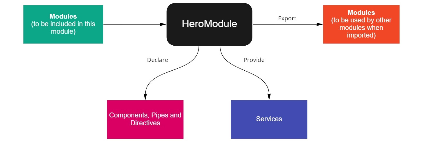
Figure 10.5 – Diagram for the flow of an Angular module
Services and dependency injection
Services are also one of the valuable features of Angular. It is code that can be reused in different components of your application.
The primary responsibility of services is the following:
- Reusing logic on different components
- Implementing API communication and data access
- Promoting single responsibility, as it separates the independent features of components
To create a service in the application, we will create a class and annotate it with the @Injectable decorator. To register the service at the root level of your application, we will add the following to our @Injectable decorator:
@Injectable({
  providedIn: 'root',
 })
Once we have set the value of the providedIn metadata in the root, this will create a single, shared instance of the service throughout the application. On the other hand, if we want to provide the service in a specific module, we will place the service in the provider metadata of @NgModule:
@NgModule({
    providers: [Service1]
})
Now that we have discussed some of the essential features of Angular, we will focus on how to structure your Angular application.
Creating the Angular folder structure
The Angular framework is considered an MVW framework, which means that there are many possible ways of structuring our application. In this case, we would discuss one of the best practices or most commonly used structures that can help your Angular application be scalable and maintainable.
In the previous part, we learned that Angular blocks could be grouped and organized into modules; modules are a good starting point for structuring our Angular application. The first step we can implement is to group and classify modules based on their functionality. Listed here is the classification of our modules.
Root module
The root module is the application’s main module. This is the first module loaded as the Angular application starts. The root module is automatically generated when we scaffold an Angular application called AppModule and is found under the src/app folder.
Feature module
The feature module is where we place modules that apply a specific feature of our application. This means that most of what our code uses is inside this module. We will create the components, pipes, and directives under the module where they should be included and we can also separate components by placing the components that have a route in a page folder.
Let’s have a look at an example folder structure of a feature module called AntiHeroModule:
├── src
│   ├── app
│   │   ├── anti-hero
│   │   │   ├── components
│   │   │   │   ├── shared.component.ts
│   │   │   ├── directives
│   │   │   │   ├── first.directive.ts
│   │   │   │   ├── another.directive.ts
│   │   │   ├── pages
│   │   │   │   ├── form
│   │   │   │   │   ├── form.component.ts
│   │   │   │   ├── list
│   │   │   │   │   ├── list.component.ts
│   │   │   │   ├── anti-hero.component.ts
│   │   │   │   ├── anti-hero.component.html
│   │   │   │   ├── anti-hero.component.css
│   │   │   │   ├── index.ts
│   │   │   ├── pipes
│   │   │   │   ├── first.pipe.ts
│   │   │   ├── anti-hero.module.ts
│   │   │   ├── anti-hero.routing.module.ts
│   │   │   ├── index.ts
In the folder structure here, we have divided our anti-hero module into several parts. The first folder is the components folder, which contains all of the components shared throughout this module. These can also be called dumb components, which we will discuss in the next section.
The next two are the directives and pipes folders, which contain the directives and pipes used in AntiHeroModule. Lastly, the pages folder includes the components in AntiHeroModule that have a direct route. These can also be called smart components. We have also included the index.ts file, known as a barrel file, which will provide a centralized place for exporting components, directives, and pipes.
Shared module
The shared module is a module that is used and shared throughout the application; this is composed of the components, pipes, and directives that we are required to use in different parts of the application. Remember that a shared module should not have a dependency on other modules in the application.
Shared modules are created under the src/app/shared folder.
Let’s have a look at the example folder structure of a shared module in our application:
├── src
│   ├── app
│   │   ├── shared
│   │   │   ├── layout
│   │   │   │   ├── footer
│   │   │   │   │   ├── footer.component.ts
│   │   │   │   │   ├── footer.component.html
│   │   │   │   ├── header
│   │   │   │   │   ├── header.component.ts
│   │   │   │   │   ├── header.component.html
│   │   │   │   ├── layout.module.ts
│   │   │   ├── index.ts
In the preceding folder structure, we can see that we have created two components named footer and navbar; these are some of the most commonly shared components in applications.
Core module
The core module is a module for services shared throughout the applications. These are singleton services, having only one instance in the application. The services that are included in the core module are usually authentication services.
Since it should only have one instance, the core module must only be imported into the application’s root module.
We can add the following code to our core module to prevent it from being imported into other modules:
@NgModule({})
export class CoreModule {
  constructor(@Optional() @SkipSelf() core:CoreModule ){
    if (core) {
        throw new Error("Core module should only be
                         imported to the Root Module")
    }
  }
}
In the preceding code example, we have added a CoreModule parameter to our constructor with @Optional and @SkipSelf decorators – this will throw an error if the core returns a value indicating that CoreModule has already been imported into the root module.
Let’s now proceed to learn how to implement the structure on an Angular application.
Implementing the structure
Now that we have learned the different module categories for our Angular application, let’s apply the folder structure to our superheroes project.
Our goal here is to create a frontend application with a simple Create, Read, Update, and Delete (CRUD) functionality for heroes and anti-heroes.
First, we will create the shared features and the core folder under the app directory, and after completing the three main categories, we will make the blocks needed for each module.
Blocks under the features module
We want to create the blocks under our features module; the first thing we need to scaffold is AntiHeroModule. Execute the ng g m anti-hero command to generate the module under the src/app folder.
Now, under the anti-hero folder, we will create the following folders:
- components: This will contain components that will be shared in this module.
- pipes: This will contain all the pipes used by the anti-hero module.
- directives: This will contain all the directives that the anti-hero module will use.
- pages: This will contain components that have a direct route.
After creating the folders, we will now make the page components for our anti-hero module. We will add two pages where the first one will be the page for displaying the list of anti-heroes and the second one will be a form that allows us to view, create, or modify the selected hero in the list. We can execute the ng g c anti-hero/pages/pages/form and ng g c anti-hero/pages/list commands to make the two pages. This will create two new components, form and list, under the pages folder.
After successfully creating the page components, we will also add a routing module for our anti-hero module. We will execute the ng g m anti-hero/anti-hero-routing --flat command and we will place the following code in our routing module:
import {NgModule} from "@angular/core";
import {RouterModule, Routes} from "@angular/router";
import {ListComponent} from "./pages/list/list.component";
import {FormComponent} from "./pages/form/form.component";
const routes: Routes = [
  {
    path: "",
    component: ListComponent,
  },
  {
    path: "form",
    component: FormComponent,
  },
];
@NgModule({
  declarations: [ListComponent, FormComponent],
  imports: [RouterModule.forChild(routes)],
  exports:[RouterModule]
})
export class AntiHeroRoutingModule {}
In the preceding example code, we have defined routes for our form and list pages. This means that the page components will have direct routes in our application, and we have also defined ListComponent as the base route for this module.
After successfully creating the page components and defining routes, we want our root module (AppModule) to have a route for AntiHeroModule.
To implement this, we will place the following code in app-routing.module.ts:
import { NgModule } from '@angular/core';
import { RouterModule, Routes } from '@angular/router';
const routes: Routes = [
  {
    path: "",
    redirectTo: "anti-heroes",
    pathMatch: "full",
  },
  {
    path: "anti-heroes",
    loadChildren: () =>
      import("./anti-hero/anti-hero.module").then((m) =>
             m.AntiHeroModule),
  }
];
@NgModule({
  imports: [RouterModule.forRoot(routes)],
})
export class AppRoutingModule { }
In the preceding example code, we have used lazy loading to create a route for AntiHeroModule. Once we visit the {baseUrl}/anti-heroes URL, this will load AntiHeroModule and redirect to the base route, which is ListComponent. We have also used RouterModule.forRoot() to import the routes, as this is the root module.
After successfully defining the routes for our AppModule, we can now see the current structure of our application:
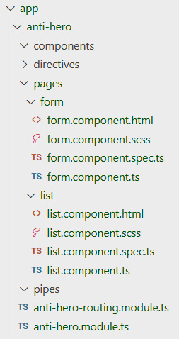
Figure 10.6 – Folder structure after creating the anti-hero feature
Now that we have completed our feature module in Angular, we have only the pages folder. We will add other blocks such as the components and directives later as we develop the application. The next step is to make the shared module.
Blocks under the shared module
Now, our next goal is to create the blocks under the shared module. We defined the shared module as components, directives, and pipes that are shared throughout the application and must not have a dependency on other modules. To create our shared module, we will execute the ng g m shared command. This will create a new shared folder and a module file inside the new shared folder.
Now after completing the shared module, we can generate the blocks that will be categorized in this module. In our application, we can include navbar and footer as shared components, as they will be used in every part of our application.
We will execute the ng g c shared/layout/navbar and ng g c shared/layout/footer commands to scaffold navbar and footer. We can see that FooterComponent and NavbarComponent are automatically added to the shared.module.ts file as Angular detects the module closest to the components:
@NgModule({
  declarations: [
    NavbarComponent,
    FooterComponent
  ],
  imports: [CommonModule]
})
export class SharedModule { }
Remember to add the navbar and footer components in the exports metadata of NgModule and we will import the shared module in different modules:
@NgModule({
  declarations: [
    NavbarComponent,
    FooterComponent
  ],
  exports: [NavbarComponent, FooterComponent]
  imports: [CommonModule]
})
We can also add shared directives and pipes under the shared folder by executing the ng g c shared/directive/directive-name and ng g c shared/pipes/pipe-name commands depending on the needs of our application. After successfully creating the blocks, we will have the following folder structure:

Figure 10.7 – Folder structure after creating the shared module
We must also remember that a shared module does not need a routing module since it does not have components that require routes in our application.
Blocks under the core module
The last module that we need to create is the core module. Core modules are services that we share throughout the application and they have only one instance. One service that always goes into the core module is the authentication service.
To create our shared module, we will execute the ng g m core; command after completing the core module. We will scaffold the authenticate service by running the ng g s core/services/authenticate command.
After successfully creating the authenticate service, we will provide it under the core.module.ts file to include the service in the module. We can also add shared models under the core module by adding a models folder depending on the need of our application. Now, we have the following folder structure:

Figure 10.8 – Folder structure after creating the shared module
We will make the contents of the authenticate service as we go through the development of the application but now that we have created the base structure of our Angular application, we will use this structure to build other parts of the project. Now, we will discuss how we can structure our components in Angular.
Structuring components
We have already structured our Angular application by categorizing our modules based on their use and functionality, which will benefit code reusability and maintainability. However, there is still the possibility that a large number of components could be created under a specific module, which would further improve the maintainability of an application. In this section, we will discuss another strategy for building your Angular architecture at the component level.
Smart and dumb or presentation components
The most common and recommended component-level architecture for building Angular applications is the smart and dumb component architecture. In the previous section, we split the modules into different categories based on how we were using them in the application.
This architecture also offers the same concept. We will divide the components into two different types – namely, smart components and dumb or presentation components.
Let’s discuss the characteristics of each component type.
Smart components
Smart components are also known as application-level components or container components. The primary responsibility of these components is to communicate with services and consume data from a request. Since they are smart, they contain all the dependencies and subscriptions required to get the data for the application.
Smart components can be considered page components that have direct routes in our application and they are the parent components holding the dumb components. Let’s have a look at the following example code for creating smart components:
@Component({
  selector: 'app-home',
  template: `
    <h2>User List</h2>
    <div>
        <table class="table">
            <tbody>
            <tr (click)="selectUser(user)" *ngFor="let user
             of users">
                <td> {{user.firstName}} </td>
                <td>
                    <span>{{user.lastName}}</span>
                </td>
            </tr>
            </tbody>
        </table>
    </div>
`,
  styleUrls: ['./home.component.css']
})
export class HomeComponent implements OnInit {
  users: User[] = [];
  constructor(private userService: UserService) {
  }
  ngOnInit() {
      this. userService.getUsers()
          .subscribe(users => this.users = users);
  }
  selectUser(user: User) {
     // action
  }
}
In the preceding example code, we have created a component named HomeComponent that will display a list of users in the table. We have also injected UserService to get the users from an HTTP request. We know that this component will successfully display the users, but we can see that our template is extensive and might get too complicated as we add more features to this component.
What we would want to do is omit elements that are only for presentation purposes. In this scenario, we would like to remove the table in our HomeComponent, and we would have the following code:
@Component({
  selector: 'app-home',
  template: `
    <h2>User List</h2>
    <div>
       <!—we will place that dumb component here later-->
    </div>
`,
  styleUrls: ['./home.component.css']
})
export class HomeComponent implements OnInit {
  users: User[] = [];
  constructor(private userService: UserService) {
  }
  ngOnInit() {
      this. userService.getUsers()
          .subscribe(users => this.users = users);
  }
  selectUser(user: User) {
     // action
  }
}
In the preceding refactored code, we have removed the table displaying the list of users. We only want smart components to handle dependency injections, subscriptions, and actions. We have now successfully created our smart components and the next step is to make the presentation components.
Dumb or presentation components
Dumb components, also known as presentation components, are responsible for displaying data in the application. They should not have dependencies and subscriptions, as their only purpose is to present the data in the view.
Let’s create the table we omitted a while ago as a dumb component:
@Component({
  selector: 'users-list',
  template: `
        <table class="table">
            <tbody>
            <tr (click)="selectUser(user)" *ngFor="let user
             of users">
                <td> {{user.firstName}} </td>
                <td>
                    <span>{{user.lastName}}</span>
                </td>
            </tr>
            </tbody>
        </table>
  `,
  styleUrls: ['./users-list.component.css']
})
export class UsersListComponent {
  @Input()
  users: User[];
  @Output('user')
  userEmitter = new EventEmitter<User>();
   selectUser(user:User) {
        this.userEmitter.emit(user);
    }
}
In the preceding example code, we have created a separate component for the table that displays the list of users. Since dumb components have no dependencies injected, the component will need to receive the data from the smart components. To achieve this, we have added an @Input binding property to accept the list of users from HomeComponent; on the other hand, we have also added an @Output binding property to bubble actions to the parent or smart component.
Remember that dumb components must not have any logic or actions; in this case, we will pass the event in the parent component with the use of EventEmitter and the parent component will be responsible for the steps needed to be accomplished. In the example code, once a row is clicked, we are passing the user to the userEmitter that HomeComponent will retrieve.
After successfully creating UserListComponent, we can now use this in our HomeComponent, and we will have the following code:
@Component({
  selector: 'app-home',
  template: `
    <h2>User List</h2>
    <div>
       <users-list users="users"
        (user)="selectUser($event)"/>
    </div>
`,
  styleUrls: ['./home.component.css']
})
export class HomeComponent implements OnInit {
  users: User[] = [];
  constructor(private userService: UserService) {
  }
  ngOnInit() {
      this. userService.getUsers()
          .subscribe(users => this.users = users);
  }
  selectUser(user: User) {
     // action
  }
}
In the preceding example code, we can see that we have used UsersListComponent as a child component of HomeComponent. It accepts the list of the users retrieved by HomeComponent and emits an event once a specific row is clicked. With that, we have now finished discussing the concepts of smart and dumb components.
Let’s apply the architecture to our application now.
Implementing smart and dumb components in the project
Let’s now implement the smart and dumb component architecture in our Angular project. We will create our components under AntiHeroModule. We have already made our smart components and these are the form and list components in the pages folder.
We will always place our smart components in the pages folder, as these will be our container components throughout the application. The next step is to create our dumb components. We will create two dumb components, namely the anti-hero-form and anti-hero-list components. To make the components, execute the ng g c anti-hero/components/anti-hero-form anti-hero/components anti-hero-list command. After successfully generating the two dumb components, let’s place the following code.
For AntiHeroListComponent, we will place the following code into the anti-hero-list.component.html file:
<table>
    <thead>
        <th *ngFor="let item of headers">{{item.headerName}}</th>
    </thead>
    <tbody>
        <tr (click)="selectAntiHero(item)"
 *ngFor ="let item of antiHeroes">
           <ng-container *ngFor="let header of headers">
               <td>{{item[header.fieldName]}}</td>
           </ng-container>
        </tr>
    </tbody>
</table>
In the preceding HTML code, we have created a table where the headers and the items are bound to the antiHeroes variable. We have also bound the headers and the key values of the anti-hero to display the values dynamically.
Now, let’s add the properties for receiving and emitting data into our AntiHeroList component:
anti-hero-list.component.ts
export class AntiHeroListComponent implements OnInit {
  @Input() headers: Array<{headerName: string, fieldName:
    keyof AntiHero}> = [];
  @Input() antiHeroes: Array<AntiHero> = [];
  @Output() antiHero = new EventEmitter();
  constructor() { }
  ngOnInit(): void {
  }
  selectAntiHero(antiHero: AntiHero) {
    this.antiHero.emit(antiHero);
  }
}
Now, in the TypeScript file of the anti-hero component, we have defined three properties that we need for the dumb component to accept data from and emit events to the smart component.
The first property is the headers property, which has the @Input annotation. This will get an array of the {headerName: string, fieldName: keyof AntiHero} type, which will be iterated to display the column headers and display the values of each field of an anti-hero item. The second property is antiHeroes, which also has an @Input annotation. This will accept the list of anti-heroes to be displayed in each row, and lastly, the antiHero property, which is annotated with @Output. This emits the selected anti-hero to the parent component once a user clicks a single row.
We have also added an interface named AntiHero in anti-hero/models/anti-hero.interface.ts that will be used to cast object types.
We will have the following code for interface:
export interface AntiHero {
    firstName: string;
    lastName: string;
    house: string;
    kownAs: string;
}
In the preceding code example, we have created an AntiHero interface that will be used as the blueprint of our object. The properties of the anti-hero object are the same as the properties we defined in our Spring application.
After creating the interface for our object, we will now declare and import our components and modules into AntiHeroModule.
Let’s have a look at the following code:
anti-hero.module.ts
@NgModule({
  declarations: [
    AntiHeroListComponent,
    AntiHeroFormComponent,
    ListComponent,
    FormComponent
  ],
  imports: [
    CommonModule,
    AntiHeroRoutingModule,
  ]
})
export class AntiHeroModule { }
In our anti-hero.module.ts file, we want to make sure that our smart components and dumb components are declared; otherwise, we will have errors at compilation. We also want to check whether our AntiHeroRoutingModule is imported for use of the routes.
Let’s now add additional styling to improve the user interface of our application. Let’s have a look at the following code:
anti-hero-list.component.scss
table, th, td {
    border: 1px solid;
    border-collapse: collapse;
    border: 1px solid;
}
We have also added a simple CSS code to style our table in the component. Now, we have successfully created our AntiHeroListComponent. The next step is to use this presentation component on the ListComponent page. Let’s have a look at the following code example:
export class ListComponent implements OnInit {
  // sample data of anti-hero
  antiHeroes: AntiHero[] = [
    {
      firstName: "Eddie",
      lastName: "Brock",
      house: "New York",
      kownAs: "Venom"
    }
  ]
  headers: {headerName: string, fieldName: keyof
            AntiHero}[] = [
    {headerName: "First Name", fieldName: "firstName"},
    {headerName: "Last Name", fieldName: "lastName"},
    {headerName: "House", fieldName: "house"},
    {headerName: "Known As", fieldName: "kownAs"},
  ]
  constructor() { }
  ngOnInit(): void {
  }
  selectAntiHero(antiHero: AntiHero) {}
}
In the TypeScript file of ListComponent, we have created the definition of the headers and an example list of antiHeroes for the anti-hero list to display. This will only be temporary, as we just want to test whether our presentation component displays the list of anti-heroes successfully. We have also created the selectAntiHero() function for future implementation once a specific anti-hero is selected.
Let’s now define the input and output properties for AntiHeroList. Let’s have a look at the following code:
list.component.html
<!-- Dumb component anti hero list -->
<app-anti-hero-list [antiHeroes]="antiHeroes" [headers]="headers" (antiHero)="selectAntiHero($event)"></app-anti-hero-list>
Now, in the HTML file of ListComponent, we have bound headers and antiHeroes to the properties of app-anti-hero-list. We have also used the selectAntiHero() function to catch the event once antiHero has emitted an action.
After successfully implementing our presentation component, we can run the application and open the application in the browser. We should see the following results:

Figure 10.9 – AntiHeroList presentation component
We can see in the results that our presentation component has successfully displayed the data coming from the parent component. For the form component, we will implement its functionalities in the next chapter, as creating forms will be another different topic.
Now, we have learned about the concepts, structure, and implementation of smart and dumb components. In the next section, we will now use a UI framework that will help us improve the interface of our Angular application.
Adding Angular Material
We have already organized our Angular application using the core, feature, and shared architecture at the module level and the smart and dumb architecture at the component level. Now, we are ready to customize and improve the look and UI by styling our components. We all know that writing CSS code from scratch and developing a base style is another challenge for us developers. It creates additional effort for us beyond just worrying about the logical side of the code. This is where Angular Material saves the day!
Angular Material is a library created by Google that provides a wide range of UI components for use in Angular applications, such as tables, cards, inputs, and date pickers. This means that we don’t have to style components from scratch, as a list of components from the material library is ready to use.
Angular Material has a wide range of growing components under the hood. It provides modules containing the components that can be used in Angular applications which can be imported into a specific application module; components are reusable and easy to customize in terms of their look and feel, as they have built-in properties that we can use.
Let’s configure Angular Material in our Angular project.
Configuring Angular Material
Angular Material is easy to configure in Angular projects, as it provides a schematic to install all the dependencies of Angular Material in just one command. To install Angular Material, we will execute the following command:
ng add @angular/material
After executing the command, it will ask some questions before installing the resources:
- Choose a prebuilt theme name or “custom” for a custom theme: Angular Material provides prebuilt themes or you can configure your custom theme.
- Set up global Angular Material typography styles: Choosing yes will apply the global typography of Angular Material.
- Set up browser animations for Angular Material: Choosing yes will install BrowserAnimationsModule in our root module. This is important when we want to use animations from Angular Material.
After completing all the questions, it will now install Angular Material. This will execute the following actions for our project:
- Adding dependencies to package.json (@angular/material and @angular/cdk).
- Adding the Roboto font to the index.html file:
<link href="https://fonts.googleapis.com/css2?family=Roboto:wght@300;400;500&display=swap" rel="stylesheet">
- Adding the Material Design icon font to the index.html file:
<link href="https://fonts.googleapis.com/icon?family=Material+Icons" rel="stylesheet">
- Adding the following CSS styles:
- Setting height to 100% for html and body
- Setting Roboto as the default font
- Removing margins from the body:
html, body { height: 100%; }body { margin: 0; font-family: Roboto, "Helvetica Neue", sans-serif; }
After successfully installing Angular Material in our application, we are now ready to use the components in our application.
Implementing Angular Material
We will now implement Angular Material components in our Angular project. As we mentioned a while ago, Angular Material offers a wide range of components that we can use for building our application. In this example project, we will only define the components that we will use in our application. Let’s list the components that we will implement.
Button component
The native <button> or <a> elements that are enhanced with Material Design styling.
We can import the button component using the following code:
import {MatButtonModule} from '@angular/material/button';Here’s an example of the button component:
<div class="example-button-row">
    <button mat-raised-button>Basic</button>
    <button mat-raised-button
      color="primary">Primary</button>
    <button mat-raised-button
      color="accent">Accent</button>
    <button mat-raised-button color="warn">Warn</button>
    <button mat-raised-button disabled>Disabled</button>
    <a mat-raised-button href="
      https://material.angular.io/target=" _blank>Link</a>
 </div>
In the preceding code example for the Material button, we can see that we are using built-in directives from Material Design to change the style and look of the button. The example code will have the following output:
Figure 10.10 – Example output for the Material button
Icon component
This component allows us to add vector-based icons to the application and supports both icon fonts and SVG icons.
We can import the icon component using the following code:
import {MatIconModule} from '@angular/material/icon';Here’s an example of the icon component:
<mat-icon color="primary">delete</mat-icon>
<mat-icon color="accent">fiber_new</mat-icon>
<mat-icon color="warn">pageview</mat-icon>
In the preceding code example, we can create icons by using the mat-icon component. This has several input properties such as color that allow us to customize the color of the icon. The example code will have the following output:
Figure 10.11 – Example output for the Material icon
Table component
This component allows us to add a data table with Material Design styling. The Material table is based on the foundation of the CDK data table. For more information on how to implement a CDK data table, see the documentation at https://material.angular.io/cdk/table/overview.
We can import the table component using the following code:
import {MatTableModule} from '@angular/material/table';Here’s an example of the table component:
<table mat-table [dataSource]="data" class="mat-elevation-z8">
  <!-- Position Column -->
  <ng-container matColumnDef="id">
    <th mat-header-cell *matHeaderCellDef> ID </th>
    <td mat-cell *matCellDef="let element">
     {{element.position}} </td>
  </ng-container>
  <!-- Name Column -->
  <ng-container matColumnDef="name">
    <th mat-header-cell *matHeaderCellDef> Name </th>
    <td mat-cell *matCellDef="let element">
      {{element.name}} </td>
  </ng-container>
  <tr mat-header-row *matHeaderRowDef="columns"></tr>
  <tr mat-row *matRowDef="let row; columns: columns;"></tr>
</table>c
In the preceding example, we can see the table uses several properties. The first property is the dataSource property, which will be the one accepting the list of data to be displayed. The next property is matColumnDef, which defines the field name of each column that should be included in the columns variable that is bound to the matHeaderRowDef property. Lastly, the matHeaderCellDef and mattCelDef properties display the actual column name and the associated values, as shown in the following screenshot:

Figure 10.12 – Example output for the Material table
Toolbar component
This component allows us to add a toolbar with Material Design styling. This is commonly used as a container for headers, titles, and navigation buttons.
We can import the toolbar component using the following code:
import {MatToolbarModule} from '@angular/material/toolbar';Here’s an example of the toolbar component:
  <p>
    <mat-toolbar color="primary">
      <button mat-icon-button class="example-icon"
        aria-label="Example icon-button with menu icon">
        <mat-icon>menu</mat-icon>
      </button>
      <span>Angular CRUD</span>
    </mat-toolbar>
  </p>
In the preceding code example, we have created a toolbar element using the mat-toolbar component. The mat-toolbar component uses content projection that allows us to customize its contents. The example code will have the following output:

Figure 10.13 – Example output for the Material toolbar
Form field component
This component allows us to wrap Material components to apply text field styles such as underlining, hint messages, and floating labels. The following components can be used inside <mat-form-field>:
- input matNativeControl> and <textarea matNativeControl>: Can be used by adding import {MatInputModule} from '@angular/material/input';
- <mat-select>: Can be used by adding import {MatSelectModule} from '@angular/material/select';
- <mat-chip-list>: Can be used by adding import {MatChipsModule} from '@angular/material/chips';
Here’s an example of the form field component:
<p>
  <mat-form-field appearance="legacy">
    <mat-label>Legacy form field</mat-label>
    <input matInput placeholder="Placeholder">
  </mat-form-field>
</p>
<p>
  <mat-form-field appearance="standard">
    <mat-label>Standard form field</mat-label>
    <input matInput placeholder="Placeholder">
  </mat-form-field>
</p>
<p>
  <mat-form-field appearance="fill">
    <mat-label>Fill form field</mat-label>
    <input matInput placeholder="Placeholder">
  </mat-form-field>
</p>
<p>
  <mat-form-field appearance="outline">
    <mat-label>Outline form field</mat-label>
    <input matInput placeholder="Placeholder">
  </mat-form-field>
</p>
In the preceding code example, we have created a toolbar element using the mat-form-field component. The mat-form-field component should have the mat-label component and an input element with the matInput directive as its contents. The example code will have the following output:

Figure 10.14 – Example output for the Material form field
For more information on the list of components from Angular Material, see the documentation at https://material.angular.io/components.
Now that we have listed the Material components we will use in our application, let’s apply Material Design to our components.
The first step we need to do is to create our Material module. The Material modules will be included in the shared module so that we can use Material design components throughout the application. To generate our Material module in our Angular application, we will execute the following command: ng g m material. After successfully generating the Material module, we will add the necessary modules from Angular Material:
@NgModule({
  imports: [
    CommonModule,
    MatToolbarModule,
    MatIconModule,
    MatButtonModule,
    MatTableModule,
    MatFormFieldModule,
    MatSelectModule,
    MatInputModule,
  ],
  exports: [
    MatToolbarModule,
    MatIconModule,
    MatButtonModule,
    MatTableModule,
    MatFormFieldModule,
    MatSelectModule,
    MatInputModule,
  ]
})
export class MaterialModule { }
We can see in the preceding example that we have also exported the Material modules, as we will use them on different modules in the application.
Now that we have imported the needed modules for our application, let’s convert the components.
Navbar component
The navbar component is found under the shared module. We will use the toolbar material to create our navbar component. To implement this, we will place the following code:
<p>
    <mat-toolbar color="primary">
      </button>
      <span>Angular CRUD</span>
    </mat-toolbar>
  </p>
In the preceding example, we have used the mat-toolbar element to use the toolbar material. We can also add a color property to style the toolbar and add additional elements inside.
We also need to import MaterialModule under SharedModule for this to recognize MatToolbarModule and it will output the following:

Figure 10.15 – The look of the navbar component after implementing Material
Anti-hero list component
This component is found under the anti-hero module. We will use the table material to create our list component. To implement this, we will place the following code for anti-hero-list.component.html:
<table mat-table [dataSource]="antiHeroes" class="mat-elevation-z8">
<!-- Data for columns -->
<ng-container *ngFor="let item of headers"
[matColumnDef]="item.fieldName">
<th mat-header-cell *matHeaderCellDef>
{{item.headerName}} </th>
<td mat-cell *matCellDef="let element">
{{element[item.fieldName]}} </td>
</ng-container>
<!-- Actions for specific item -->
<ng-container matColumnDef="actions">
<th mat-header-cell *matHeaderCellDef>
Actions </th>
<td mat-cell *matCellDef="let element">
<button (click)="selectAntiHero(element, 0)"
mat-raised-button color="primary">
<mat-icon>pageview</mat-icon> View
</button>
<button (click)="selectAntiHero(element, 1)"
mat-raised-button color="warn">
<mat-icon>delete</mat-icon> Delete
</button>
</td>
</ng-container>
<tr mat-header-row *matHeaderRowDef="headerFields">
</tr>
<tr mat-row *matRowDef="let row; columns:
headerFields"></tr>
</table>We will place this for anti-hero-list.component.ts:
export class AntiHeroListComponent implements OnInit {
  @Input() headers: Array<{headerName: string, fieldName:
    keyof AntiHero}> = [];
  @Input() antiHeroes: Array<AntiHero> = [];
  @Output() antiHero = new EventEmitter<{antiHero:
    AntiHero, action :TableActions}>();
  headerFields: string[] = [];
  ngOnInit(): void {
    this.getHeaderFields();
  }
  getHeaderFields() {
    this.headerFields = this.headers.map((data) =>
      data.fieldName);
    this.headerFields.push("actions");
  }
  selectAntiHero(antiHero: AntiHero, action: TableActions) {
    this.antiHero.emit({antiHero, action});
  }
}
In the preceding example code, we have still used the same variables in our application; the antiHeroes variable that holds the list of anti-heroes is now bound to the dataSource property and we have also iterated the headers property to display the column name and its associated values. Lastly, we have created a new variable named headerFields that contains the fieldName to display the values of an anti-hero item.
We also need to import MaterialModule under AntiHeroModule for this to recognize MatTableModule and it will have the following output:

Figure 10.16 – The look of the table component after implementing Material
Command bar component
We will create a new dumb component under the anti-hero module. We will execute the ng g c anti-hero/components/anti-hero-command-bar command and we will place the following code for anti-hero-command-bar.html:
<p> <mat-toolbar> <button mat-raised-button color="primary" (click)="emitAction(0)"> <mat-icon>fiber_new</mat-icon> Create </button> <button mat-raised-button color="warn" (click)="emitAction(0)"> <mat-icon>delete</mat-icon> Delete All </button> </mat-toolbar> </p>
We will place this for anti-hero-command-bar.ts:
export class AntiHeroCommandBarComponent implements OnInit {
  @Output() action = new EventEmitter<CommandBarActions>()
  constructor() { }
  ngOnInit(): void {
  }
  emitAction(action: CommandBarActions) {
    this.action.emit(action);
  }
}
In the preceding example code, we have also used the toolbar module to create our command bar component. Since this is a dumb component, we should only emit the actions to its parent component and not hold any dependencies. After successfully creating the command bar, we will get the following output:

Figure 10.17 – The look of the command bar component after implementing Material
Now, we will finalize the application layout by placing the components on the following page:
- app.component.html:
<app-navbar></app-navbar>
<div class="container">
<router-outlet></router-outlet>
</div>
- list.component.html:
<!—Dumb component command bar
<app-anti-hero-command-bar>
</app-anti-hero-command-bar>—-- Dumb component anti hero list -->
<app-anti-hero-list [antiHeroe"]="antiHer"es" [header"]="head"rs"></app-anti-hero-list>
After successfully implementing the preceding code, we will now have the following layout:

Figure 10.18 – Layout for the list component page
We have now created our anti-heroes page component with Material Design. As we go through the following chapters, we will implement the features for the action buttons and the form component.
Summary
With this, we have reached the end of this chapter. Let’s have a recap of the valuable things you have learned; you have learned about the concepts and fundamentals of Angular and, at the same time, how to scaffold an Angular project and create components, directives, and modules using the Angular CLI. You have also learned some of the best practices for organizing our Angular components, modules, and other parts of our Angular project. This will be very useful for the maintainability of the project, especially for enterprise applications.
In the next chapter, we will learn how to build Reactive forms, essential form control, and grouping form controls in Angular. We will also implement FormBuilder and validate form input.