
Chapter 5. Drawing
You can use InDesign’s drawing tools to draw almost anything—from straight lines and boxes to incredibly complex freeform shapes.
The drawing tools can be divided into three types: the Rectangle, Polygon, Oval, and Line tools are for drawing basic shapes; the Pencil, Smooth, Eraser, Pen, Add Point, Delete Point, and Convert Point tools draw or edit more complex paths (see Figure 5-1). The Scissors tool gives you a way of cutting paths.
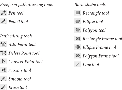
Figure 5-1. Drawing Tools
Some of the path drawing tools (the Rectangle, Oval, and Polygon tools) have counterparts that draw frames (the Rectangular Frame, Oval Frame, and Polygonal Frame tools). The only thing different about these tools is that the “frame” versions draw paths whose content type has been set to “Graphic.” That’s it.
In this book, we’ll use the default variant of the tool to refer to both tools—when we say “the Rectangle tool,” we’re referring to both the Rectangle tool and the Rectangular Frame tool.
Which path drawing tools should you use? Don’t worry too much about it—the basic shapes can be converted into freeform paths, and the freeform drawing tools can be used to draw basic shapes.
The paths you draw in InDesign are made up of points, and the points are joined to each other by line segments (see Figure 5-2). A path is just like a connect-the-dots puzzle. Connect all the dots together in the right order, and you’ve made a picture. Because points along a path have an order, or winding, you can think of each point as a milepost along the path. Or as a sign saying, “Now go this way.”
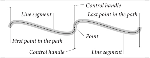
Figure 5-2. Parts of a Path
Drawing Basic Shapes
Using the basic shapes tools (the Rectangle, Polygon, Ellipse, and Line tools, and their frame-drawing counterparts) is straightforward: drag the tool and get a path of the corresponding shape. If you want to draw a frame, you can either use the frame-drawing variant of the tool, or draw the path and then convert it to a frame.
To draw a rectangle, oval, polygon, or line, follow the steps below.
1. Select the appropriate tool from the Tools panel.
To specify the type of polygon you’ll be drawing, double-click the Polygon tool and choose the shape you want in the Polygon Settings dialog box before you start drawing.
2. Position the cursor where you want one corner of the shape, then drag. InDesign draws a path, starting where you first held down the mouse button.
To draw squares or circles, hold down Shift as you drag the Rectangle tool or Ellipse tool. When you hold down Shift as you drag, the Polygon tool produces equilateral polygons. Holding down Shift as you drag the Line tool constrains the angle of the line to 45-degree tangents from the point at which you started dragging.
Hold down Option to draw a basic shape from its center. Press the arrow keys while dragging to create a grid of shapes. For details, see “Grid Mode” in Chapter 9, “Transforming.”
3. When the basic shape is the size and shape you want it to be, stop dragging and release the mouse button.
You can also create rectangles, ellipses, and polygons by specifying their width and height (see Figure 5-3).
1. Select the Rectangle, Ellipse, or Polygon tool.
2. Position the cursor where you want to place one corner of the basic shape, or hold down Option/Alt and position the cursor where you want to place the center point of the shape, or select a point on the proxy in the Control panel or Transform panel.
3. Click. InDesign displays a dialog box.
4. Enter values in the Width and Height fields, then click the OK button.
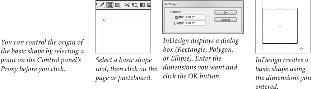
Figure 5-3. Adding a Basic Shape “by the Numbers”
Points and Paths
Why is it that the most important things in life are often the most difficult to learn? Drawing by manipulating Bezier paths—the geometric construct used to represent path shapes in most of today’s vector drawing programs—is one of those difficult things. When we first encountered Bezier curves, the process of drawing by placing points and manipulating control handles struck us as alien, as nothing like drawing at all. Then we started to catch on.
In many ways, we had been drawing lines from the point of view of everything but the line; in a Bezier-path-drawing program such as InDesign, we draw lines from the point of view of the line itself. This is neither better nor worse; it’s just different and takes time to get used to. If you’ve just glanced at the Pen tool and are feeling confused, we urge you to stick with it. Start thinking like a line.
Thinking Like a Line
Imagine that, through the action of some mysterious potion or errant cosmic ray, you’ve been reduced in size so that you’re a little smaller than one of the dots in a connect-the-dots puzzle. For added detail and color, imagine that the puzzle appears in a Highlights for Children magazine in a dentist’s office.
The only way out is to complete the puzzle. As you walk, a line extends behind you. As you reach each dot in the puzzle, a sign tells you where you are in the puzzle and the route you must take to get to the next dot in the path.
Get the idea? The dots in the puzzle are points. The route you walk from one point to another, as instructed by the signs at each point, is a line segment. Each series of connected dots is a path. As you walk from one dot to another, you’re thinking like a line.
Each point—from the first point in the path to the last—carries with it some information about the line segments that attach it to the previous and next points along the path.
Paths and their formatting (fill and stroke) attributes are different things. Even if the fill and stroke applied to the path is “None” or the stroke weight is 0 there’s still a path there.
When you select a point, the point “fills in,” becoming a solid square. Unselected points on the path are shown as hollow squares.
Winding
Paths have a direction, also known as “winding” (as in “winding a clock”). Path direction generally corresponds to the order in which you placed the points on the path (see Figure 5-4). In our connect-the-dots puzzle, path direction tells us the order in which we should connect the dots.

Figure 5-4. Path Direction, or “Winding”
To reverse the direction of a path, select the path and choose Reverse Path from the Paths submenu of the Object menu. InDesign reverses the direction of the path. You can also reverse the direction of a selected path using the Reverse Path path operation, as discussed in “Path Operations,” later in this chapter.
Point Types
Points on an InDesign path are either corner points or curve points. Each type of point has its own special properties.
• A curve point adds a curved line segment between the current point and the preceding and following points. Curve points have two control handles extended from them, and moving one control handle affects the position of the other control handle. One control handle affects the curve of the line segment following the curve point on the path; the other affects the curve of the line segment preceding the curve point. Curve points are typically used to add smooth curves to a path (see Figure 5-5).
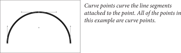
Figure 5-5. Curve Points
• A corner point adds a straight line segment between the current point and the preceding point on the path (see Figure 5-6). Corner points are typically used to create paths containing straight line segments.

Figure 5-6. Corner Points
Which point type should you use? Any type of point can be turned into any other type of point, and anything you can do with one kind of point can be done with the other kind of point. Given these two points (so to speak), you can use the kinds of points and drawing tools you’re happiest with and achieve exactly the results you want. There is no “best way” to draw with InDesign’s Pen tool, but it helps to understand how the method you choose works.
Control Handles
You control the curvature of the line segments before and after each point using the point’s control handles. Points can have up to two control handles attached to them. By default, new corner points have none and curve points have two. Note that each line segment has up to two control handles defining its curve—the “outgoing” control handle attached to the point defining the start of the line segment and the “incoming” control handle attached to the next point.
If you retract the control handle (by dragging it inside the point), the control handle has no effect on the curvature of the path. This doesn’t necessarily mean that the line segment is a straight line, however—a control handle on the point at the other end of the line segment might also have an effect on the curve of the line segment.
The control handles attached to a corner point can be adjusted independently, while changing the angle of one control handle of a curve point changes the angle of the other control handle (see Figure 5-7). This difference, in our opinion, makes corner points more useful than curve points—you can do anything with a corner point you could do with a curve point.
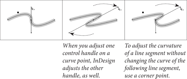
Figure 5-7. Curve Points vs. Corner Points
To convert a point from one point type to another, click the point using the Convert Point tool. If you click a curve point, this retracts both control handles. To convert a curve point to a corner point while leaving one of its control handles in place, drag the other control handle using the Convert Point tool (see Figure 5-8).
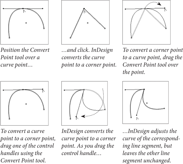
Figure 5-8. Converting from One Point Type to Another
Drawing Paths with the Pencil Tool
The quickest way to create a freeform path on an InDesign page is to use the Pencil tool. Click the Pencil tool in the Tools panel (or press N), then drag the Pencil tool on the page. As you drag, InDesign creates a path that follows the cursor, automatically placing corner and curve points as it does so (see Figure 5-9).

Figure 5-9. Drawing with the Pencil Tool
Drawing Paths with the Pen Tool
You use the Pen tool and its variants (the Remove Point, Add Point, and Convert Point tools)—to create and edit paths.
When you click the Pen tool on a page, InDesign places a corner point. Drag the Pen tool, and InDesign places a curve point where you started dragging—you determine the length of the control handles (and, therefore, the shape of the curve) by dragging as you place the curve point (see Figure 5-10).
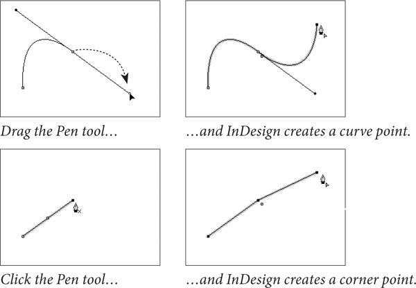
Figure 5-10. Placing Curve and Corner Points
To curve the line segment following a corner point, place the corner point, position the Pen tool above the point (this switches to the Convert Point tool), and then drag. As you drag, InDesign extends a control handle from the point (see Figure 5-11).
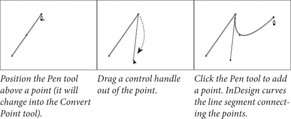
Figure 5-11. Dragging a Control Handle Out of a Corner Point
The odd thing about using the Pen tool this way is that you don’t see the effect of the curve manipulation until you’ve placed the next point. This makes sense in that you don’t need a control handle for a line segment that doesn’t yet exist, but it can be quite a brain-twister.
To convert a curve point you’ve just placed to a corner point, position the Pen tool above the point (to switch to the Convert Point tool) and then click the point. InDesign converts the point to a corner point and retracts the point’s control handles.
You can change the position of points: select the point with the Direct Selection tool, then drag the point to a new location.
Drawing Techniques
Now that you know all about the elements that make up paths, let’s talk about how you actually use them.
Path Drawing Tips
When you’re drawing paths, don’t forget that you can change the path after you’ve drawn it. We’ve often seen people delete entire paths and start over because they misplaced the last point on the path. Go ahead and place points in the wrong places; you can always change the position of any point. Also, keep these facts in mind:
• You can always add points to or subtract points from the path.
• You can change tools while drawing a path.
• You can split the path using the Scissors tool.
It’s also best to create paths using as few points as you can—but it’s not required. We’ve noticed that people who have just started working with Bezier drawing tools often use more points than are needed to create their paths. Over time, they learn one of the basic rules of vector drawing: Any curve can be described by two points and their associated control handles. No more, no less.
Manipulating Control Handles
The aspect of drawing in InDesign that’s toughest to understand and master is the care, feeding, and manipulation of control handles. These handles are fundamental to drawing curved lines, so you’d better learn how to work with them.
To adjust the curve of a line segment, use the Direct Selection tool to select a point attached to the line segment. The control handles attached to that point—and to the points that come before and after the selected point on the path—appear. If you don’t see control handles attached to the point you selected, the curvature of the line segment is controlled by the points at the other end of the line segments. Position the cursor over one of the control handles and drag. The curve of the line segment changes as you drag. When the curve looks the way you want it to, stop dragging (see Figure 5-12).

Figure 5-12. Adjusting Curve Points
To retract (delete) a control handle, drag the handle inside the point it’s attached to.
You can also adjust the curve of a curved line segment by dragging the segment itself. To do this, select the line segment (click the line segment with the Direct Selection tool, or drag a selection rectangle over part of the line segment) and then drag. As you drag, InDesign adjusts the curve of the line segment (see Figure 5-13).

Figure 5-13. Another Way to Adjust the Curve of a Line Segment
Adding Points to a Path
To add a point to an existing line segment, select the path, switch to the Pen tool, and then click the Pen tool on the line segment. InDesign adds a point to the path. You don’t need to select the Add Point tool—InDesign will switch to it when you move the Pen tool above a line segment.
Removing Points from a Path
To remove a point from a path, select the path, switch to the Pen tool, and then click the Pen tool on the point. InDesign removes the point.
Selecting and Moving Points
If you’ve gotten this far, you probably know how to select points, but here are a few rules to keep in mind.
• To select a point, click it with the Direct Selection tool, or drag a selection rectangle around it (using the same tool).
• You can select more than one point at a time. To do this, hold down Shift as you click the Direct Selection tool on each point, or use the Direct Selection tool to drag a selection rectangle around the points you want to select.
• To select all of the points on a path, hold down Option/Alt as you click the Direct Selection tool on the path.
• You can select points on paths inside groups or compound paths by using the Direct Selection tool.
• When you move a point, the control handles associated with that point also move, maintaining their positions relative to the point. This means that the curves of the line segments attached to the point change, unless you’re also moving the points on the other end of the incoming and outgoing line segments.
• To move a straight line segment and its associated points, select the line segment with the Direct Selection tool and drag.
Opening and Closing Paths
Paths can be open or closed (see Figure 5-14). An open path has no line segment between the beginning and ending points on the path. You don’t have to close a path to add contents (text or a graphic) or apply a fill to the path.
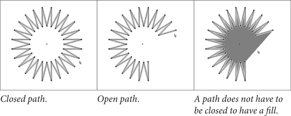
Figure 5-14. Open and Closed Paths
To close an open path, select the path, select the Pen tool, and then click the Pen tool on the first or last point on the path (it doesn’t matter which). Click the Pen tool again on the other end point. InDesign closes the path (see Figure 5-15).
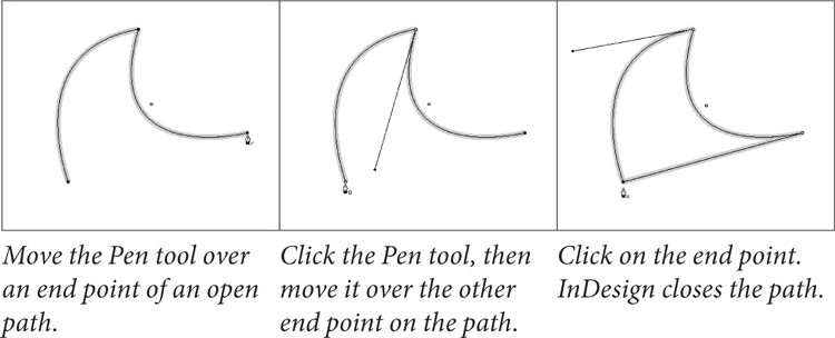
Figure 5-15. Closing an Open Path
Another way to close an open path is to use the Close Path path operation, as discussed in “Path Operations,” later in this chapter.
To open a closed path, select the Direct Selection tool and click the line segment between two points on the path (you can also drag a selection rectangle over the line segment). Press Delete, and InDesign removes the line segment, opening the path between the points on either side of the line segment (see Figure 5-16).
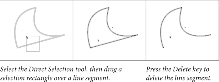
Figure 5-16. Opening a Closed Path by Deleting a Line Segment
To open a path without removing a line segment, select the Scissors tool and click the path. Click on a point to split the path at that point, or click a line segment to split the path (see Figure 5-17).
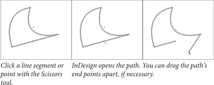
Figure 5-17. Opening a Closed Path
The point closest to the start of the path (following the path’s winding) becomes the point farther to the back, and the point farthest from the start of the path is on top of it.
Another way to open a closed path is to use the Close Path path operation, as discussed in “Path Operations,” later in this chapter.
Joining Open Paths
To join two open paths, follow these steps (see Figure 5-18).
1. Position the Pen tool above the start or end point of one of the open paths (you don’t need to select a path). InDesign changes the cursor to show that it’s ready to add a point to the path.
2. Click the Pen tool, then position the cursor over the start or end point of the second path. InDesign changes the cursor to show that it’s ready to connect the current path to the point.
3. Click the Pen tool. InDesign joins the two paths.
4. Repeat this process for the other two end points to close the path.
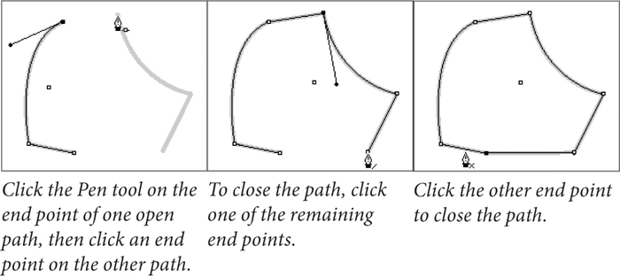
Figure 5-18. Joining Two Open Paths
Alternatively, you can select two paths and choose Join from the Paths submenu of the Object menu. InDesign will join the nearest points of the two paths (with straight line segments).
Compound Paths
In the old days, not only did Ole have to walk miles to school in freezing cold weather, but he also had to work his way through an impossibly difficult series of steps to create holes inside closed paths. This did nothing to improve his already gloomy outlook on life.
These days, creating holes in paths is easier—just make them into compound paths. Compound paths are made of two or more paths (which must be unlocked, ungrouped, and closed) that have been joined using the Make Compound Paths option on the Paths submenu of the Object menu. Areas between the two paths, or areas where the paths overlap, are transparent. The following steps show you how to make a torus, or “doughnut” shape (see Figure 5-19).
1. Select the Ellipse tool from the Tools panel.
2. Draw two ovals, one on top of the other.
3. Fill the ovals with a basic fill.
4. Select both ovals.
5. Press Command-8/Ctrl-8 to join the two ovals.

Figure 5-19. Creating a Compound Path
If you decide you don’t want the paths to be compound paths, you can change them back into individual paths. To do this, select the compound path and then choose Release Compound Path from the Paths submenu of the Object menu.
When you join paths with different lines and fills, the compound path takes on the stroke and fill attributes of the path that’s the farthest to the back.
Editing Compound Paths
You can subselect the individual points that make up a compound path in the same way that you subselect objects inside a group—select the Direct Selection tool and click on the point. Once a point is selected, you can alter its position (see Figure 5-20).
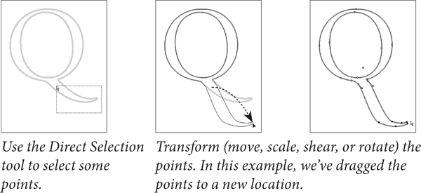
Figure 5-20. Editing a Compound Path
Splitting Compound Paths
To convert a compound path back into two or more normal paths, select the compound path and choose Release Compound Path from the Paths submenu of the Object menu (or press Command-Option-8/Ctrl-Alt-8). InDesign converts the compound path into its component paths. Note that the paths do not return to their original formatting when you do this.
Compound Paths and Even-Odd Fill
If you’re familiar with Illustrator or other drawing programs, you’re probably used to having two options for filling paths. These options go by different names in different applications, but they’re usually known as the “Even Odd Fill Rule” and the “Zero Winding Fill Rule.” These rules control the way the application fills a path that intersects itself, or the way the interior areas of a compound path are filled.
If you’ve pasted paths from these applications into InDesign, or if you’ve drawn a self-intersecting path in InDesign, you’ve probably discovered that InDesign supports the Zero Winding Fill Rule, but not the Even Odd Fill Rule.
What the heck are we talking about? It’s much easier to show than it is to describe (see Figure 5-21).

Figure 5-21. Fill Rules
What can you do when you want the even/odd fill? Do you have to leave InDesign, create the path in a drawing program, and then import the path as a graphic?
This question drove Ole to the brink of madness before he discovered that you can simulate the effect of the Even Odd Fill Rule using compound paths and the Add path operation (we’ll discuss path operations later in this chapter). See Figure 5-22.
1. Select the self-intersecting path.
2. Copy the path, then use Paste In Place (Command-Option-Shift-V/Ctrl-Alt-Shift-V) to create a duplicate of the object.
3. Select both items and click the Add button on the Pathfinder panel (Intersect will also work). InDesign creates a compound path and fills it exactly as the original path would look if it had been filled using the Even Odd Fill Rule.
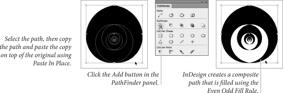
Figure 5-22. Simulating the Effect of the Even Odd Fill Rule
Smoothing Paths
You like using the Pencil tool. But your mouse hand isn’t perfectly steady. Or your “friends” can’t resist the urge to bump your arm while you’re drawing. Either way, you need a way to smooth the path you’ve drawn in InDesign. Are you doomed to an after-hours workout with the Pen tool? Not with the Smooth tool—a handy gadget that can smooth out the rough patches in your InDesign paths.
To use the Smooth tool, select the tool from the Tools panel (it’s usually hiding under the Pencil tool). Or select the Pencil tool and hold down Option/Alt to change the Pencil tool to the Smooth tool. Drag the tool along the path you want to smooth (see Figure 5-23). As you drag, InDesign adjusts the control handles and point positions on the path (sometimes deleting points as you drag).
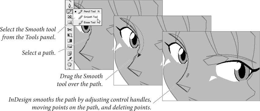
Figure 5-23. Smoothing a Path
To control the operation of the Smooth tool, double-click the Smooth tool in the Tools panel. InDesign displays the Smooth Tool Preferences dialog box (see Figure 5-24). The Fidelity slider controls the distance, in screen pixels, that the “smoothed” path can vary from the path of the Smooth tool (higher values equal more adjustment and greater variation from the existing path). The Smoothness slider controls the amount of change applied to the path (higher values equal greater smoothing).

Figure 5-24. Smooth Tool Preferences
Erasing Paths
Imagine that you want to remove an arbitrary section of a path, and that the beginning and end of the section do not correspond to existing points on the path. To do this, select the Erase tool from the Tools panel, then drag the tool over the area of the path you want to delete (see Figure 5-25).

Figure 5-25. Erasing Part of a Path
Path Operations
Path operations—which is what we call the commands represented by buttons on the Pathfinder panel—create paths from other paths, or change the shape of paths in some predefined way. The first row of buttons in the Pathfinder panel make it easy to create complex shapes by combining simple geometric shapes, and to create shapes that would be very difficult to draw using the Pen tool.
The Convert Shape operations provide a number of “utility” functions for working with paths. Why did they end up in the same panel with the Pathfinder path operations they have little or nothing in common with? Think carefully before you answer. Do you really want another panel?
The Pathfinder path operations work with the area(s) of intersection between objects. Path operations can merge objects, or create new objects, or remove the area of one object from another object.
Many people have gotten the impression that the path operations are “advanced” drawing techniques. “I can’t draw,” they say, “so I have no use for them. It’s hard enough just using the Pen tool.”
Nothing could be farther from the truth—if you can draw, the path operations are a nice addition to your toolbox, but if you can’t draw, or can’t draw with the Pen tool, InDesign’s path operations can quickly become your best friend. Think about it—even David can draw just about anything using rectangles, ellipses, and the occasional polygon. By using path operations, you can do the same, without ending up with stacks of overlapping shapes on your pages.
Applying Pathfinder Path Operations
To apply any of the Pathfinder path operations, select two or more paths, display the Pathfinder panel, and click the button corresponding to the path operation you want to apply (see Figure 5-26).

Figure 5-26. Applying a Path Operation
We’ll cover what each of the path operations does, but first, a few ground rules:
• Original shapes are deleted. Path operations often consume the selected shapes and create a new shape. This shape is often a compound path. To retain the original shapes, you’ll need to duplicate them before applying the path effect.
• Stacking order matters. Most of the path operations affect either the foreground or background object in some predefined way. If you try a path operation and don’t get the result you expect, undo, then shuffle the order of the objects (using Bring to Front, Send to Back, Bring Forward, and Send Backward from the Arrange submenu of the Object menu) and try again.
• Formatting changes. In general, the fill, stroke, and other attributes of the foreground object define the formatting of the resulting object. The exception is the Subtract path operation, where the background object defines the formatting of the result.
• Path operations and text frames. When you apply a path operation to a text frame, the shape of the frame is affected—not the text in the frame.
• Alternatives to clipping paths. You can sometimes use path operations to avoid clipping paths and nested objects, which can result in faster printing.
• Watch out for path contents. Performing path operations on objects that contain other objects—such as imported graphics—sometimes deletes the path content.
Add
The Add path operation creates a new path that has the outline of the selected objects, removing the area of intersection and any interior paths from the new object. If the original paths are composite paths, any interior paths will be retained unless they intersect each other or fall within the area of intersection of the shapes.
Subtract
When you want to use one path to cut a hole in another, use the Subtract path operation. It’s like a cookie cutter—the foreground object cuts a hole in the background object. The resulting object takes on the fill and stroke of the background object.
Intersect
The Intersect path operation creates a new object that is the shape of the area of intersection of the objects in the selection. Intersect will display an error message if the objects do not share a common area of intersection.
As we’ve noted, path operations consume the selected objects. There are various ways to retain the original objects, but the quickest by far is to apply the path effect, copy the resulting path, undo (which restores the original paths), and then press Command-Option-Shift-V/Ctrl-Alt-Shift-V to paste in place. This trick is particularly useful when used with Intersect.
Exclude Overlap
The Exclude Overlap path operation creates a compound path from the selected objects, leaving any areas of intersection unfilled.
Minus Back
The Minus Back path operation is the opposite of the Subtract path operation. When you click the Minus Back button in the Pathfinder panel, InDesign uses the background object to cut a hole in the foreground object. The resulting object takes on the formatting attributes of the foreground object.
Applying Convert Shape Operations
To apply any of the Convert Shape operations, select an object and click one of the buttons in the Pathfinder panel.
• Convert to Rectangle. Converts the object to a rectangle.
• Convert to Rounded-Corner Rectangle. Converts the object to a rectangle and applies the Rounded corner option.
• Convert to Beveled-Corner Rectangle. Converts the object to a rectangle and applies the Bevel corner option.
• Convert to Inverse-Rounded-Corner Rectangle. Converts the object to a rectangle and applies the Inverse Rounded corner option (using the current corner radius setting).
• Convert to Ellipse. Converts the object to an ellipse. If you have a square selected, the resulting ellipse will be a circle.
• Convert to Triangle. Converts the object to a triangle.
• Convert to Polygon. Converts the object to a polygon, using the current settings in the Polygon Settings dialog box. This means that you can easily change one polygon into another.
• Convert to Line. Converts the object to a line.
• Convert to Vertical or Horizontal Line. Converts the object to a vertical or horizontal line.
• Open Path. Opens a closed path. Note that this operation simply opens the path at the first/last point in the path.
• Close Path. Closes an open path.
• Reverse Path. Reverses the selected path.
Applying Convert Point Operations
To apply any of the Convert Path operations, direct-select one or more points, and click one of the buttons in the Pathfinder panel.
• Plain. Removes direction lines from the selected points and makes a V shape.
• Corner. Changes points to have direction lines that can move independently of each other.
• Smooth. Changes the selected points to a continuous curve that can have direction lines of unequal lengths.
• Symmetrical. Changes the selected points to a continuous curve with direction lines of equal length.
Corner Options
Corner options can change that way corner points are drawn. Use this feature to add rounded corners to rectangles and squares.
You can curve one or more corners of a frame just by dragging the corner itself. Select a rectangular frame and click the yellow box. Four yellow diamonds appear on the selected frame, indicating Live Corners mode (see Figure 5-27).
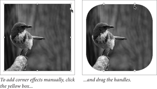
Figure 5-27. Live Corners
Drag any diamond to adjust all four corners together.
Shift-drag a diamond to adjust a single corner. Option/Alt-click a diamond to cycle through the various corner effects. Drag a diamond towards the middle of the frame to change the effect’s radius. To stop editing corners, click anywhere outside the selected frame.
If you don’t want the yellow box to appear when you select a frame, choose Hide Live Corners from the Extras submenu on the View menu.
You can also apply corner effects by choosing a shape and size from the Corner Options widgets in the Control panel or using the Corner Options dialog box, which lets you apply different effects to each corner (see Figure 5-28).
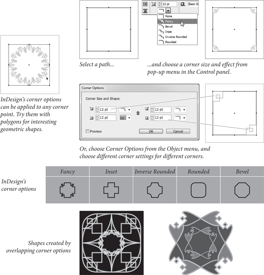
Figure 5-28. Corner Options
To apply a corner option using a dialog box, select the page item and choose Corner Options from the Object menu. InDesign displays the Corner Options dialog box. To apply a different corner to each corner of a rectangle, click the chain icon in the middle of the dialog box so that it becomes a broken link icon. Choose the size and effect you want for each corner. InDesign changes the corners of the path based on the corner options you selected.
To remove corner effects, select the object and choose None from the Corner Options pop-up menu in the Control panel.
Strokes
Once you’ve created a path, you’ll probably want to give the path some specific stroke weight, color, or other property. The process of applying formatting to a path is often called “stroking a path,” and we refer to a path’s appearance as its “stroke.” Strokes specify what the outline of the path looks like.
To define a stroke for a path, select the path, then display the Stroke panel by pressing Command-F10/F10 (see Figure 5-29). Use the Type pop-up menu to choose the type of stroke you want to use—solid, dashed, or any of the “scotch” (i.e., multi-stroke) types.
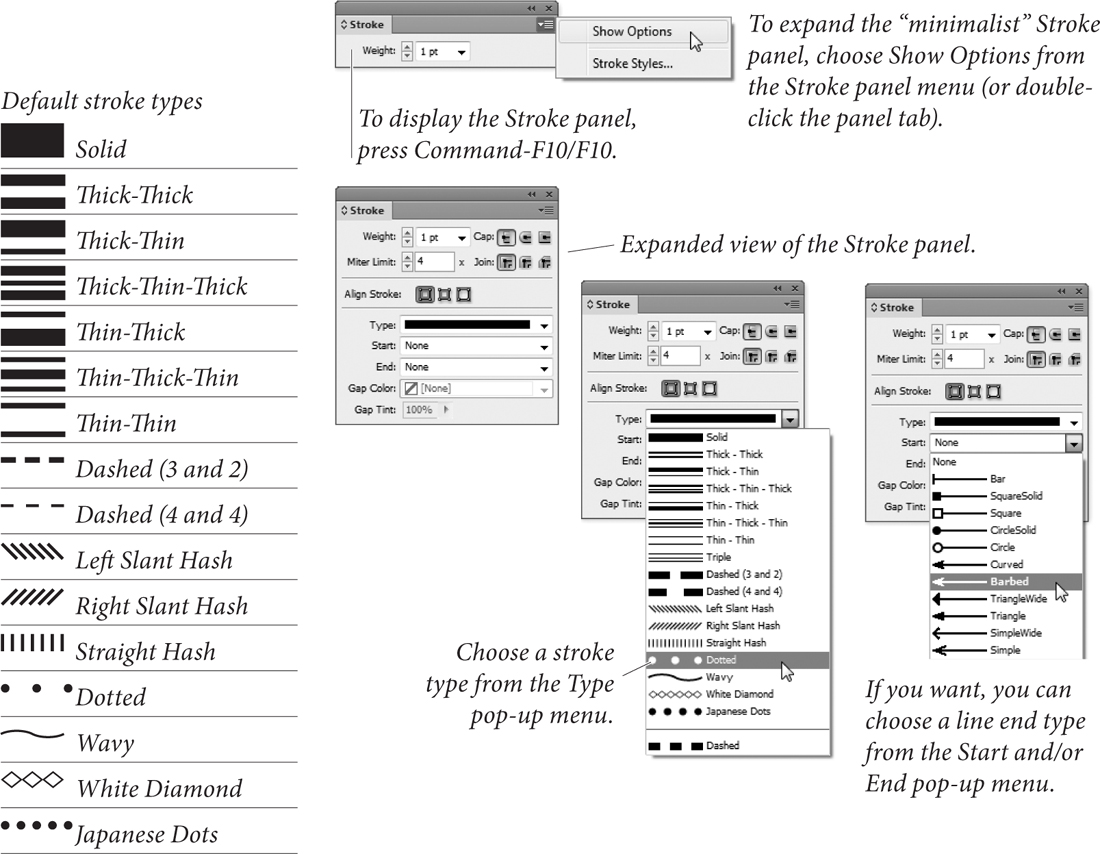
Figure 5-29. Stroke Panel
You can define custom dashed, striped, or dotted stroke styles. We’ll talk more about stroke styles later in the chapter.
Weight
You can enter a line weight for the stroke of the selected path using the Weight field, or you can choose a predefined line weight from the pop-up menu associated with the field. To remove a stroke from a path, enter zero in the Weight field.
Historical Note: In the old days of desktop publishing, some programs created hairlines using the PostScript statement “0 setline-width,” which generates a one-pixel wide stroke on a 300-dpi laser printer. This worked pretty well—you’d get a stroke that was approximately the width of a hairline (between .2 and .25 points). When imagesetters appeared, however, this approach led to strokes that were ![]() of an inch wide or even smaller—stroke weights too fine to be printed on most presses. So, we grizzled graybeards advised all of our younger cohorts to avoid entering zero for the weight of a stroke. In InDesign, at least, it doesn’t matter—entering zero won’t result in a “0 setlinewidth” stroke.
of an inch wide or even smaller—stroke weights too fine to be printed on most presses. So, we grizzled graybeards advised all of our younger cohorts to avoid entering zero for the weight of a stroke. In InDesign, at least, it doesn’t matter—entering zero won’t result in a “0 setlinewidth” stroke.
Stroke Alignment
The three buttons in the Align Stroke section of the Stroke panel control the way that the stroke is positioned relative to the path. The options are Align Stroke to Center, Align Stroke to Inside, and Align Stroke to Outside, and they do just what they say (see Figure 5-30).

Figure 5-30. Stroke Alignment Options
If you’re using the Align Stroke to Inside option and increase the stroke weight of the border of an ad in a magazine layout, InDesign keeps the stroke inside the area the advertiser is actually paying for.
When you use Align Stroke to Outside, InDesign will add the stroke to the outside of the path; Align Stroke to Center adds the stroke evenly around the path.
Cap
Select one of the Cap options to determine the shape of the end of the stroke (see Figure 5-31). The Cap option you choose has no visible effect on a closed path.
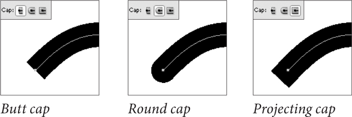
Figure 5-31. Cap Options
Join
The Join option sets the appearance of corners—the place where two line segments in a path meet in a corner point (see Figure 5-32).

Figure 5-32. Join Options
Miter Limit
When paths go around corners, weird things can happen. Asked to corner too sharply, the stroke skids out of control, creating spiky elbows that increase the effective stroke weight of a path’s corners. The value you enter in the Miter Limit field sets the distance, as a multiple of the stroke weight, that you’ll allow the corner to extend before InDesign applies a beveled join to the corner (see Figure 5-33). If, for example, you enter “2” in the Miter Limit field, InDesign will flatten corners when the stroke weight of the corner is equal to or greater than two times the weight of the stroke.
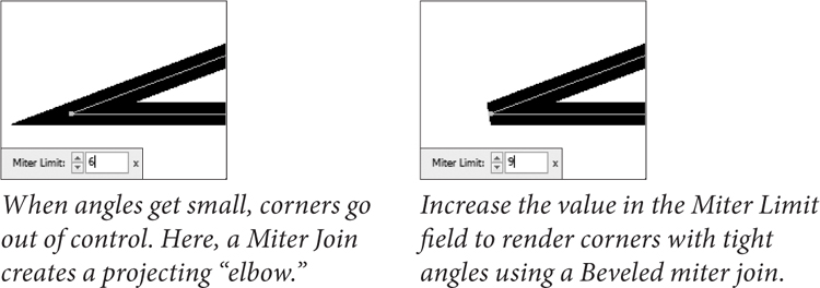
Figure 5-33. Miter Limit
The Miter Limit field is only available when you’re using the Miter Join option, and applies only to corner points.
Dash
For a dashed line, choose Dashed from the Type pop-up menu, and use the Dash and Gap fields that appear at the bottom of the Stroke panel to set the appearance of the dashed stroke (see Figure 5-34).
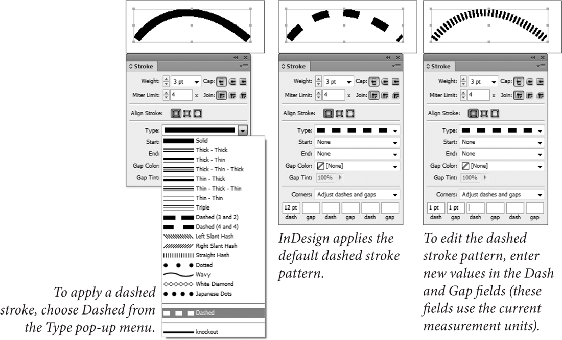
Figure 5-34. Applying a Dashed Stroke
Creating Layered Strokes
We’ve heard a number of people complain that InDesign doesn’t include their favorite “fancy” rules—if you can’t find what you’re looking for on the Type menu in the Stroke panel, and you can’t create the stroke you want using stroke styles (discussed later in this chapter), you can make your own. To create a simple multi-stroke effect, follow these steps (see Figure 5-35).
1. Select a path.
2. Clone the path (press Command-C/Ctrl-C to copy the path, then press Command-Option-Shift-V/Ctrl-Alt-Shift-V. InDesign creates a copy of the selected path on top of the original path).
3. Change the attributes of the clone of the path.
4. Select the original path and the clone and group them.

Figure 5-35. Creating a Complex Stroke by Stacking Paths
Arrowheads
You can add arrowheads or tailfeathers to any open path you want by choosing an arrowhead from the Start and End pop-up menus at the bottom of the Stroke panel. The Start pop-up menu applies to the first point in the path (according to the direction of the path); the End pop-up menu applies to the last point in the path. You don’t have to make choices from both of the pop-up menus (see Figure 5-36).
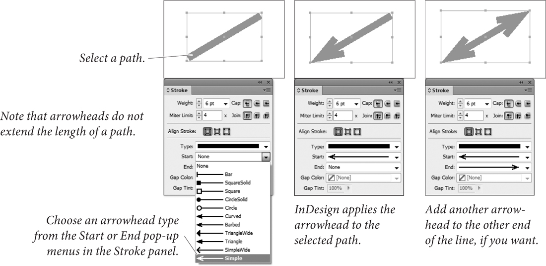
Figure 5-36. Applying an Arrowhead
To swap the arrowheads on the beginning and end of a path, select the path using the Direct Selection tool and choose Reverse Path from the Paths submenu of the Object menu (see Figure 5-37).
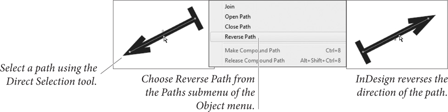
Figure 5-37. Reversing the Direction of a Path
Overprint
You won’t find this basic stroke option in the Stroke panel, so stop looking. Instead, it’s in the Attributes panel (choose Attributes from the Window menu). Checking the Overprint Stroke option makes the stroke overprint (rather than knock out of) whatever’s behind it. If you’re creating color publications, you’ll find it’s one of the most important features in InDesign (see Chapter 10, “Color”).
Gap Color and Gap Tint
When you choose a dotted, dashed, or striped stroke, InDesign displays the Gap Color and the Gap Tint pop-up menus at the bottom of the Stroke panel (see Figure 5-38). Use these controls to specify the color and tint of the “blank” areas in the stroke.
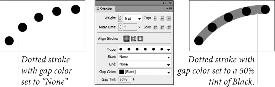
Figure 5-38. Setting the Gap Color of a Stroke
Corner Adjustment
When you apply a dotted or dashed stroke to a page item, InDesign displays the Corners pop-up menu at the bottom of the Stroke panel. The options on this menu control the way that InDesign draws the stroke as it crosses points on the path (see Figure 5-39).
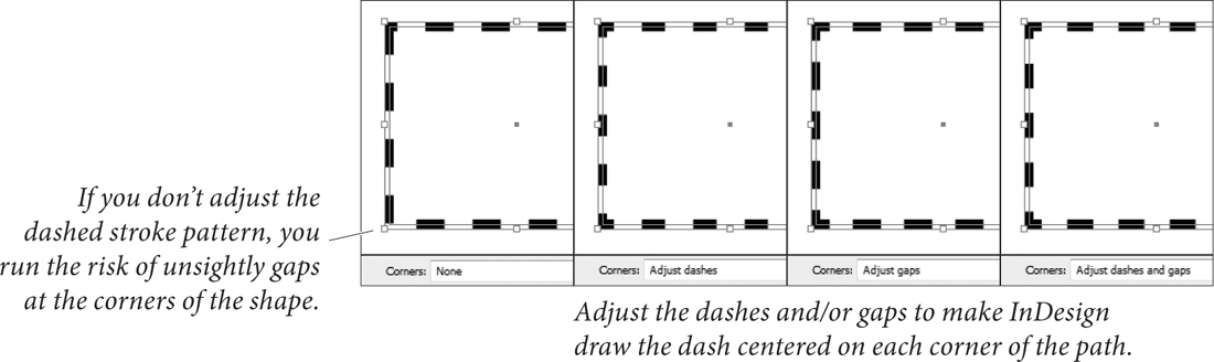
Figure 5-39. Corner Adjustment for Dashed Strokes
When you choose Adjust Dashes, InDesign will change the length of the dashes in the path so that a dash appears centered on each point in the path. Choose Adjust Gaps, and InDesign will change the length of the dashes in the path to accomplish the same effect. As you’d expect, choosing Adjust Dashes and Gaps changes the length of both dashes and gaps in the dash pattern, and choosing None does not adjust the position of dashes in the pattern at all.
Why adjust the dashes and/or gaps in a dash pattern? If you don’t, you can easily end up with gaps at the corners of paths. It’s particularly noticeable when you apply dashed strokes to rectangles.
Editing Strokes
Once you’ve applied a stroke to a particular path, you can change the stroke using any of the following methods. Again, there’s no “right” way to edit a stroke—which method is best and quickest depends on how you work and which panels you have open at the time you want to change the stroke.
• Display the Stroke panel, then make changes in the panel.
• Click the Stroke selector in the Color panel, then click a color in the panel (see Chapter 10, “Color,” for more on applying colors using the Color panel).
• Use the Stroke button at the bottom of the Toolbox to apply or remove colors and gradients from the path.
• Select the path, then choose a new stroke weight from the Stroke Weight submenu of the Context menu.
• Use the Eyedropper tool to pick up the stroke of a path and apply that formatting to another path.
Removing Strokes
To quickly remove a stroke from a path, do one of the following.
• Select the path, click the Stroke selector, then click None.
• Select the path, display the Swatches panel, click the Stroke selector at the top of the panel, and then click the None swatch.
• Enter 0 in the Weight field of the Stroke panel.
Stroke Styles
If you’ve looked through the default strokes and haven’t seen the stroke pattern you’re looking for, you can probably create it using InDesign’s stroke styles. This is provided that the stroke you’re looking for is dashed, dotted, or striped—InDesign does not yet support strokes made up of arbitrary shapes. If you need a special skull and crossbones stroke for your pirate/goth/metal newsletter, you’ll have to create it from scratch (using text paths, as shown in Chapter 6, “Where Text Meets Graphics”).
To create a stroke style, follow these steps (see Figure 5-40).
1. Choose Stroke Styles from the Stroke panel menu. InDesign displays the Stroke Styles dialog box.
2. Click the New button to create a new stroke style. If you want to base your new stroke style on an existing style, select the style from the list of stroke styles before you click the button. InDesign displays the New Stroke Style dialog box.
3. Enter a name for the stroke style. Choose a stroke style type (Dash, Dotted, or Stripe) from the Type pop-up menu.
4. Set the options for the stroke style. The available options vary depending on the type of stroke style you selected.
InDesign displays a preview of the stroke style with an associated Preview Weight field. As you would expect, changing the stroke weight using this field affects only the preview image of the stroke—the stroke style does not include the stroke weight.
In each of the stroke style types, the Pattern Length field controls the length of the pattern in the stroke style.
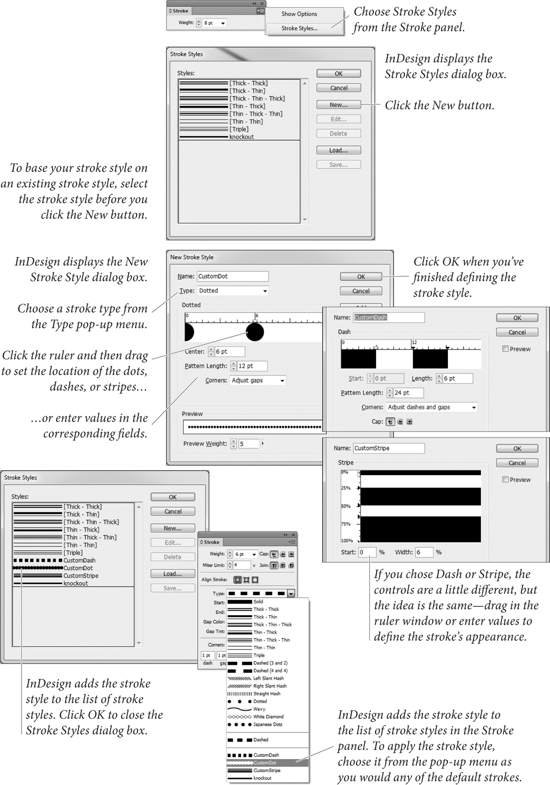
Figure 5-40. Defining a Stroke Style
Dash. Drag the cursor in the area below the ruler to set the length of the dashes in the stroke style, or enter values in the Start or Length fields. To add a dash, drag in the white area. To remove a dash, point at the dash and drag it away from the ruler.
You can also set the line cap and the way that InDesign handles the dash pattern around corners. These options work in exactly the same way as their counterparts in the Stroke panel, as discussed previously in this chapter.
Dotted. When you choose Dotted from the Type pop-up menu, you can add dots to the pattern by clicking below the ruler, or by entering a value in the Center field. Either way, you’re controlling the location of the center of the dot relative to the pattern length. You cannot scale the width or height of the dot—it’s always a circle whose width is determined by the stroke weight. (If you’re looking for an oval dot, use a dashed stroke with a rounded line cap.)
The options on the Corners pop-up menu control the way that dots are adjusted around corners in paths you’ve applied the dotted stroke style to. Choose None for no adjustment, or choose Adjust Gaps to have InDesign increase or decrease the gap between dots to make dots appear at each point on the path. Note that adjusting the gaps results in uneven spacing between dots on a path, but is probably less distracting than having dots “miss” the corners of a path (particularly on a rectangle).
To remove a dot, drag the dot out of the ruler window.
Stripe. Specify the way that the stripes fill the width of the path by dragging the cursor to the right of the ruler or by entering values in the Start and Width fields. To add a new stripe, drag the cursor in a white area. To remove a stripe, drag the stripe out of the ruler window.
Stroke styles exist inside a document; creating a stroke style in a specific document does not add that stroke style to any other documents. You can copy stroke styles from one document to another. You can save and load stroke styles, and you can add stroke styles to all new documents. To add a stroke style to all new documents, create or load the stroke style when no documents are open.
Applying Stroke Styles
You apply stroke styles just as you would apply any of the default stroke types: select an object, then choose the stroke style from the Type pop-up menu in the Stroke panel.
Editing Stroke Styles
To edit a stroke style, choose Stroke Styles from the Stroke panel pop-up menu, select the style from the list of styles in the Stroke Styles dialog box, and click the Edit button. InDesign displays the Edit Stroke Style dialog box.
Make changes to the stroke style definition and close the dialog box, and InDesign will change the appearance of all of the objects you’ve applied the stroke style to.
Deleting Stroke Styles
To delete a stroke style, choose Stroke Styles from the Stroke panel pop-up menu, select the style from the list of styles in the Stroke Styles dialog box, and click the Delete button.
When you delete a stroke style, InDesign will display a dialog box asking which stroke style you want to use to replace the stroke style you’re deleting. Choose a stroke style from the pop-up menu and click the OK button, and InDesign will replace all occurrences of the deleted style with the stroke style you’ve selected.
Saving Stroke Styles
To save the stroke styles in your document to a stroke styles file, choose Stroke Styles from the Stroke panel pop-up menu, select the styles you want to save from the list of styles in the Stroke Styles dialog box, and click the Save button. InDesign displays a standard file dialog box where you can choose a location and enter a file name for the saved stroke styles file. Saved InDesign stroke style documents have the file extension “.inst”.
Loading Stroke Styles
To load stroke styles, choose Stroke Styles from the Stroke panel menu to display the Stroke Styles dialog box, then click the Load button. InDesign displays a standard file dialog box. Locate and select the file you want to load stroke styles from and click OK.
To copy a single stroke style from one document to another, select an object formatted with the stroke style, copy it, and then paste it into another document. InDesign will bring the stroke style along with the object, and you can then delete the object.
Fills
Just as strokes determine what the outside of a path looks like, fills specify the appearance of the inside of a path. Fills can make the inside of a path a solid color, or a linear or radial gradient. Any path you create can be filled, including open paths.
To apply a fill, select a path and do one of the following:
• Click the Fill button on the Control panel, and then click the color swatch.
• Click the Fill selector at the top of the Swatches panel, then click a color swatch (see Figure 5-41).
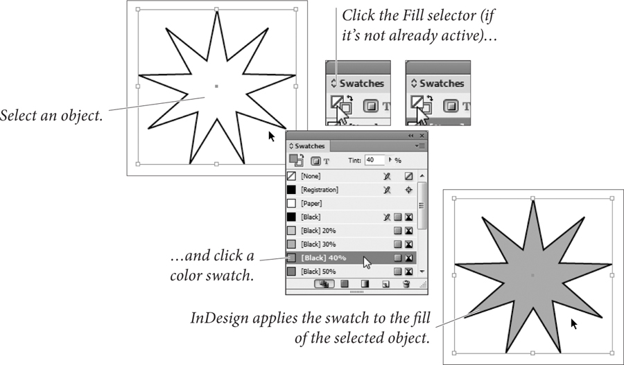
Figure 5-41. Applying a Fill (Swatches Panel Method)
• Click the Fill selector at the bottom of the Tools panel, then click the Apply Color button (or press comma). This applies the most recently selected color or swatch (see Figure 5-42).
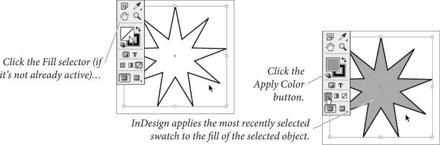
Figure 5-42. Applying a Fill (Tools Panel Method)
• Drag a swatch out of the Swatches panel or Color panel and drop it on a path, either selected or unselected.
• Click the Fill selector in the Color panel, then define a color.
• Select the Eyedropper tool. Click an object formatted with the fill you want, then click object to apply the fill.
Removing Fills
To quickly remove a fill from a path, do one of the following:
• Click the None swatch in the Fill pop-up menu on the Control panel.
• Click the Fill selector in the Tools panel, then click the None button (or, better yet, press /).
• Click the Fill button in the Color panel and then click the None swatch.
• Click the Fill button at the bottom of the Toolbox, then click the None swatch in the Swatches panel.
Gradients
A “gradient” is a type of fill or stroke that creates a graduation from one color to another—an effect also known as a “fountain,” “blend,” or “vignette.” InDesign offers two types of gradients: “Linear” and “Radial.” For either type of gradient fill, you can set the colors used in the gradient, the rate at which one color blends into another, and the colors used in the gradient (gradients can contain two or more colors). For Linear gradients, you can set the angle that the graduation is to follow.
Linear gradients create a color transition (or series of transitions) from one end of a path to another; Radial gradients create a graduation from the center of a path to its edges. Gradients applied to paths are calculated relative to the geometric bounds of the path; gradients applied to text characters use the bounding box of the text frame containing the text (not the characters themselves).
Applying Gradients
To apply a gradient to a path, follow these steps (see Figure 5-43).
1. Select the path using the Selection tool or the Direct Selection tool, or select text using the Text tool or Path Text tool.
2. Do one of the following.
• Click the Fill or Stroke selector in the Tools panel (to specify which part of the path you want to apply the gradient to). Click the Apply Gradient button at the bottom of the Tools panel.
• Display the Gradient panel (choose Gradient from the Window menu), and then click the gradient ramp.
• Click an existing gradient swatch in the Swatches panel (press F5 to display the Swatches panel). You can also drag the gradient swatch out of the Swatches panel and drop it on a path (the path doesn’t have to be selected).
• Select the Eyedropper tool and click an object formatted with a gradient, then click the tool again on the selected path.
• Select the Gradient tool and drag the tool inside the path.
Figure 5-43. Applying a Gradient
Gradient Controls
When you create or edit a gradient, you work with InDesign’s gradient controls: the gradient ramp, gradient stop icons, and center point icons. What the heck are we talking about? See Figure 5-44.
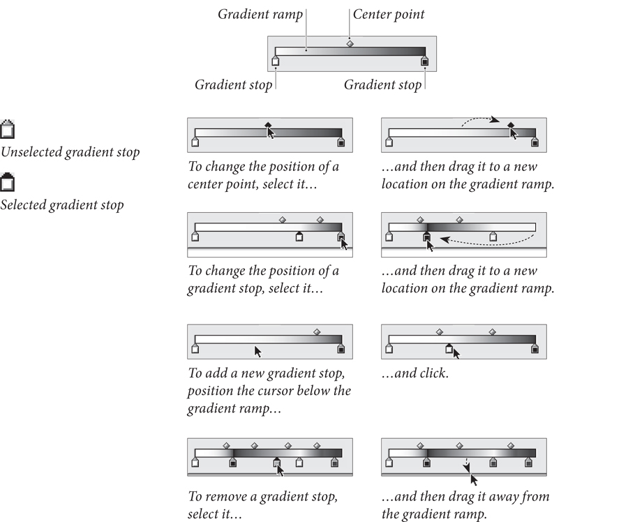
Figure 5-44. Gradient Controls
Creating a Gradient Swatch
In our opinion, the best way to apply gradients is to use the Swatches panel. Just as applying a color from the Swatches panel establishes a link between the color swatch and the object you’ve applied it to, so applying a gradient swatch links the swatch and the objects you’ve formatted with it. This means that you can edit the definition of the gradient swatch and update the formatting of all of the objects you’ve applied the swatch to.
To create a gradient swatch, follow these steps (see Figure 5-45).
1. Select an object that has the gradient you want (optional).
2. Display the Swatches panel, if it’s not already visible, then choose New Gradient Swatch from the Swatches panel menu. If you selected an object in Step 1, InDesign picks up the attributes of the gradient applied to the object and displays them in this dialog box. If you did not select an object, the controls in the dialog box reflect the document’s current default gradient.
3. Specify the colors and gradient stop positions for the gradient, if necessary.
4. Enter a name for the gradient swatch.
5. Click the OK button to save the gradient swatch. InDesign adds the gradient swatch to the list of swatches in the Swatches panel.

Figure 5-45. Creating a Gradient Swatch
Using the Gradient Panel
You can also apply and edit gradients using the Gradient panel (see Figure 5-46). Like the New Gradient Swatch and Gradient Options dialog boxes, the Gradient panel contains a gradient ramp, with center points above the ramp and gradient stops below.
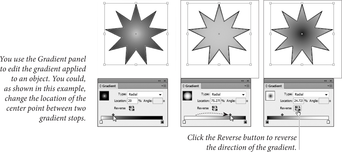
Figure 5-46. Using the Gradient Panel
To apply a gradient, select a path, display the Gradient panel, then click the gradient ramp. InDesign applies the gradient object.
To edit a gradient applied to a path, select the path, then display the Gradient panel (if it’s not already visible). InDesign loads the gradient applied to the path into the Gradient panel. Adjust the gradient stop positions, add gradient stops, or change the position of center points or colors, and InDesign applies the changes to the path.
Editing Gradients
To edit the color, gradient type, or angle of a gradient you’ve applied to an object, select the object and then display the Gradient panel. You can use any of the following techniques to change the gradient.
• Drag a gradient stop to a new position on the gradient ramp.
• Select the stop and enter a new value in the Location field.
• Add a new gradient stop by clicking below the gradient ramp.
• Change the position of the center point by dragging it above the gradient ramp. Or you can select the center point and enter a new value in the Location field.
• Remove a stop by dragging it away from the gradient ramp.
• Reverse the gradient ramp by clicking the Reverse button.
• Change the angle of a linear gradient by entering a new value in the Angle field.
• Change the color of a gradient stop using the Swatches panel. To do this, select the stop, hold down Option/Alt, and click a color swatch in the Swatches panel (see Figure 5-47). Alternatively, you can drag a swatch from the panel and drop it on the stop.
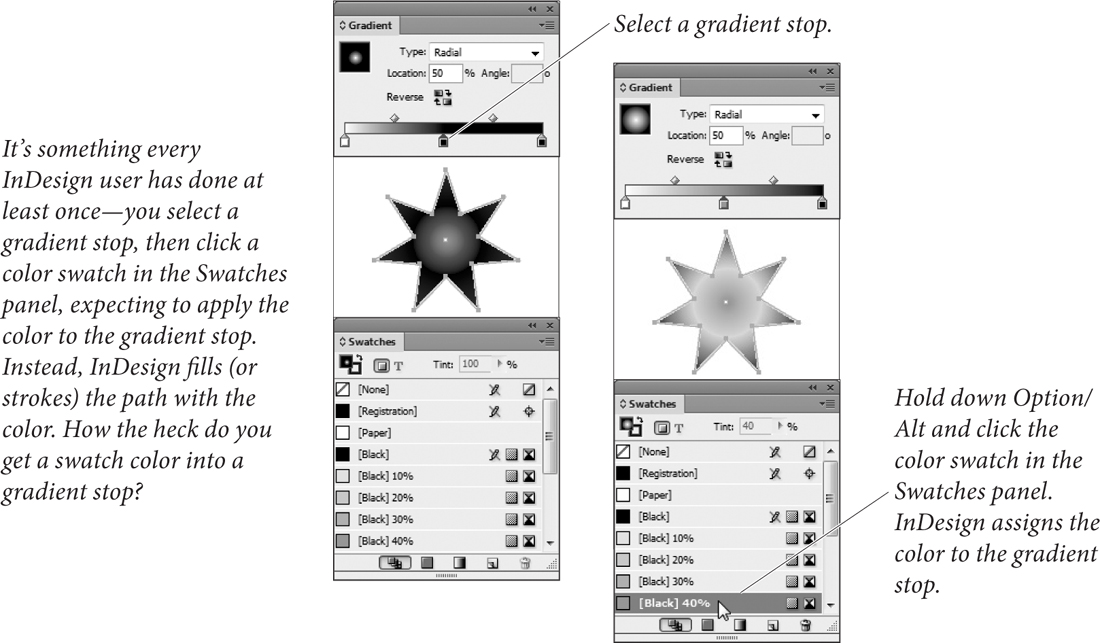
Figure 5-47. Getting a Swatch Color into a Gradient Stop
• Change the color of a gradient stop to an unnamed color. To do this, select the gradient stop, then display the Color panel. Specify a color. As you change color values in the Color panel, InDesign changes the color applied to the gradient stop.
• Change the gradient type using the Type pop-up menu.
Applying a Gradient to Multiple Paths
To apply a gradient to more than one path, select the paths (which need not already have gradients applied to their fills or strokes), then drag the Gradient tool. The point at which you start dragging defines the starting point of the gradient (see Figure 5-48).
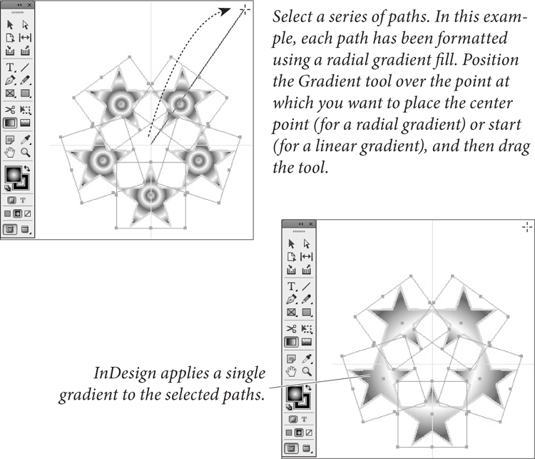
Figure 5-48. Applying a Gradient to Multiple Objects
Transparency
Hands down, InDesign’s sexiest feature is its transparency effects. These include drop shadows, feathering, support for transparency inside Photoshop and Illustrator graphics, changing an object’s opacity or blending mode… the list goes on. But before we go any further with this wild transparency talk, we just need to be clear about something: PostScript’s basic drawing model does not allow for transparency. Period.
So how does InDesign print transparent objects to a PostScript printer? Simple: it cheats. When the time comes to print, InDesign uses clipping paths to create the illusion of transparency and/or rasterizes the transparent objects and sends the printer separated image data. All of this takes place in the background—InDesign does not change the objects in your document. Instead, it changes the way that the objects are sent to the printer.
The way that InDesign sends the transparent objects to the printer is defined by the Transparency Flattener settings for the spread containing the objects. Flattener settings are described in Chapter 11, “Printing.” As a rule of thumb, however, transparent objects make documents somewhat harder to print.
This brings us to our patented “With Power Comes Responsibility” speech. It’s very easy to come up with combinations of transparent objects and flattener settings that create a document that can slow a printer to a crawl, or to produce files that take up enormous amounts of space on your hard drive.
This doesn’t mean that you should avoid using transparency. That would be silly, given that there’s sometimes no other way to create a specific creative effect. It’s just that you must bear in mind that using the feature comes at a cost, and that you need to weigh the potential risks (slower printing, no printing) against the benefit (a cool layout).
If you’re familiar with Photoshop’s approach to transparency, you’ll find InDesign’s a bit different: In Photoshop, transparency is an attribute of layers; in InDesign, transparency is an attribute of individual page items—or elements of a page item. For example, you can set the opacity of the fill separately from its stroke, or give the text inside a frame an effect separate from the frame itself.
Adobe PDF Print Engine. PDF (since Acrobat 5) supports transparency. So if you’re printing to a device that can understand transparency in a PDF file, then you don’t have to worry about transparency flattening. For example, RIPs based on Adobe’s PDF Print Engine can print native PDF files with transparency without first converting them to PostScript. No PostScript, no problem!
However, if you export an EPS or Acrobat 4 PDF file, or print or create a PDF file from the Print dialog box, then flattening kicks in.
Applying Transparency
To apply transparency to a page item, work your way through the following steps (see Figure 5-49).
1. Select a page item with the Selection or Direct Selection tool.
2. Display the Effects panel, if it’s not already visible (choose Effects from the Window menu).
3. Click on the aspect of the page item you want to affect: Stroke, Fill, Text (which applies to the text inside a text frame), or Object (which affects all these facets at once).
4. Choose an option from the Blending Mode pop-up menu, if necessary.
5. Enter a value in the Opacity field (or drag the associated slider).

Figure 5-49. Applying Transparency to an Object
Blending Modes
The transparency blending modes define the way that the colors in the transparent objects interact with objects that fall behind them.
When you apply transparency, InDesign calculates the resulting color based on each color component of the foreground and background colors. For two overlapping process colors, for example, the effect of the blending mode will almost certainly differ for each of the four inks. When we say that a blending mode behaves in a particular way for a specific gray percentage value, we mean the percentage of a color component.
The effect of a blending mode is dependent on the current color management settings and the Transparency Blend Space (in the Edit menu). The ink values of the colors in a stack of transparent objects, for example, will never exceed the maximum ink coverage for the current color management profile. (For the sake of your press operator’s sanity, don’t try to prove us wrong.)
The following notes provide a quick description of the most useful of the blending modes. In these descriptions, the term “foreground color” refers to the color applied to the front-most object; “background color” refers to the color of the background object, and “resulting color” is the color you see where the two objects intersect.
Normal. The Normal blending mode adds the foreground color to the background color. If the foreground color is black, and the opacity percentage is 10%, then 10% black is added to the background color to produce the resulting color. The Normal blending mode at 100% opacity turns transparency off.
Multiply. The Multiply blending mode always results in a darker color. The one exception is when the foreground color is white or Paper color, in which case this blending mode has no effect at all. Multiply is very similar to overprinting one object over another (see Chapter 10, “Color,” for more on overprinting), or overlapping lines when drawing with felt pens. We think the Multiply blend mode is the best choice for drop shadows (see below).
Screen. This blending mode almost always produces a resulting color that is lighter than the background color (unless the foreground color is black, which has no effect in this mode). The best real-world definition of this blending mode comes from Adobe’s Russell Brown: Screen is like projecting two slides on the same screen. The result is always lighter than either of the two sources. If the background color is black or white, the background color remains unchanged.
Overlay. The Overlay blending mode compares the foreground and background colors, accentuating highlights and shadows in each by lightening light colors and darkening dark colors. If either the foreground or background color is 50-percent gray, then this mode has no effect. Overlay increases color contrast and can get out of hand quickly; we usually reduce the Opacity slider to temper the effect.
Soft Light. While most people see the Soft Light blending mode as shining a soft spotlight on the background color, we like to think of this mode in terms of playing with semi-translucent acetate. Soft Light has no effect if the background color is black or white, but it subtly enhances any other color, making darker colors (in the foreground or background) a little darker and lighter colors a little lighter.
Hard Light. The Hard Light mode is something like two blending modes in one: If the foreground color is lighter than 50-percent gray, the Hard Light mode lightens the background color similar to the Screen mode; if the foreground color is darker than 50-percent gray, it darkens it using a method similar to the Multiply mode.
Color Dodge and Color Burn. Color Dodge both lightens and slightly colorizes with the foreground color. Color Burn colorizes while darkening the background. We find it’s hard to predict the result with either of these, especially because you’ll see radically different effects depending on whether your Transparency Blend Space is set to RGB or CMYK.
Darken. The resulting color is equal to the darker of the foreground and background colors.
Lighten. The resulting color is equal to the lighter of the foreground and background colors.
Hue. The Hue blending mode creates a new color by blending the color of the foreground object with the luminance (brightness) and saturation of the background. Putting a black object set to Hue over a colored object simply desaturates the background colors.
Saturation. The Saturation mode creates a new color by blending the foreground color’s saturation and the hue (color) with luminance values of the background color.
Color. The Color mode is slightly different from the Hue mode; it combines the color and the saturation of the foreground color with the luminance of the background color. Placing a solid color set to Color over an image colorizes the image, like a fake duotone.
Luminosity. Luminosity creates a new color by blending the brightness of the foreground color with the hue and saturation of the background color.
Transparency Options
So what about those options at the bottom of the Effects panel? The meaning of the terms “Isolate Blending” and “Knockout Group” is hardly self evident. Both options apply only to groups.
Isolate Blending. When you turn on the Isolate Blending option, and objects in the group you’ve selected use blending modes other than the Normal blending mode, InDesign changes the way that the object in the group interacts with objects behind the group. Regardless of the blending mode you’ve assigned to the group objects, InDesign treats them as if the Normal blending mode were assigned. Inside the group, blending modes behave as you specified (see Figure 5-50).

Figure 5-50. Isolate Blending
Knockout Group. When you select a group containing transparent objects and turn on the Knockout Group option, InDesign makes the objects in the group opaque to each other (see Figure 5-51). In other words, the option should really be named “Knockout Objects Inside the Group,” but there’s not room in the panel. Objects outside the group are treated according to the state of the Isolate Blending option (see above). And yes, it is possible to have both Isolate Blending and Knockout Group turned on.

Figure 5-51. Knockout Group
Groups and Transparency
There’s a difference between applying transparency to a group and applying transparency to the objects inside a group (see Figure 5-52). When you apply transparency to a group, InDesign will override the transparency settings for any objects in the group that have no transparency applied to them, but leaves transparent objects unchanged.
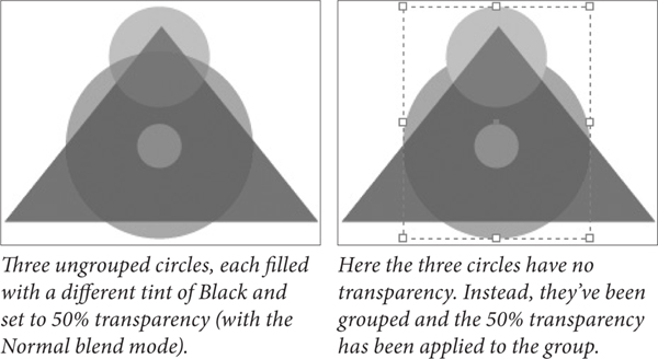
Figure 5-52. Applying Transparency to a Group
Unfortunately, any transparency settings applied to a group are lost if or when you ungroup the objects.
Transparency Effects
What is it about drop shadows, bevels, and glows? Does everyone want their page items to appear as if they are the highly mobile space battleship Nadesico, floating defiantly above the page? We’re not sure, but we do know that these ubiquitous two-dimensional impersonations of three-dimensional space are something no graphic designer will leave home without—at least until clients stop asking for them.
Fortunately, InDesign lets you apply all of these effects to page items (text, frames, imported images, and so on), plus a half-dozen more, including Satin, Inner Shadow, and three different kinds of feathering. You can find them hiding in the Effects panel, the Effects submenu (under the Context menu or the Object menu), or the Effects pop-up menu in the Control panel.
Moreover, you can apply each of InDesign’s effects to an entire object or just its stroke, fill, or—in the case of a text frame—text. For example, you could apply a Bevel and Emboss effect to a frame’s fill color and a drop shadow to the text inside that frame.
Once again, we find ourselves wanting to shout out, “with power comes responsibility.” Just because you can apply effects to everything in sight doesn’t mean you should. Remember that overuse of effects can cause blindness and itchy palms.
Here’s how to apply an effect to an object (see Figure 5-53):
1. Select an object with the Selection or Direct Selection tool. (To apply an effect to an image separate from its frame, click on the image itself with the Direct Selection tool.)
2. In either the Effects panel or the Control panel, choose what aspect of the object you want to affect: Stroke, Fill, Text, or Object (to apply the effect to the whole enchilada).
3. Choose the effect you want from either the Effects (“fx”) pop-up menu in the Effects panel or Control panel, or from the Effects submenu (in the Object or Context menu). Alternately, you can simply double-click on the Object, Stroke, Fill, or Text section of the Effect panel that you chose in Step 2.
4. You can adjust the settings for that effect in the Effects dialog box. You can also add more than one effect to the object’s stroke, fill, or text by clicking on the checkboxes and panes along the left edge of the dialog box, and by choosing from the “Settings for” pop-up menu.
5. Turn on the Preview checkbox to see the effect while the dialog box is still open, or click OK to accept the changes.

Figure 5-53. Transparency Effects
Note that if you apply an effect to the whole object, and it’s a text frame with a fill of None, InDesign applies the effect to the text inside the frame. Give the frame an opaque fill to affect the frame itself.
Drop Shadows
The most popular (by far) transparency effect in InDesign’s arsenal is the drop shadow. It’s so common that Adobe even added a Drop Shadow button in the Control panel. Just select an object and click the button and a default drop shadow is applied (see “Setting Defaults,” later in this section).
Alternately, you can use the Effects dialog box to control the shadow’s position, color, transparency, noise, and size (see Figure 5-54). Most of the controls are self-explanatory, but here are some things to keep in mind.
• The Mode pop-up menu sets the transparency blending mode for the drop shadow. We’ve described all of the useful blending modes in the section on Transparency, above. The Multiply blending mode works well with drop shadows.
• You can define the color of the drop shadow by clicking on the small color swatch to the right of the Mode pop-up menu. The Opacity field defines the darkest part of the shadow.
• You can control the position of the shadow in two ways: Either by adjusting the Angle and Distance fields or by changing the X Offset and Y Offset fields. If you want all your drop shadows to have the same angle, turn on the Use Global Light checkbox. Later, to change the global light setting, just change it anywhere in the Effects dialog box, or choose Global Light from the Effect panel menu.
• A hard-edged shadow is probably not what you were looking for—what you need is a way to soften the edges of the shadow so that it looks more realistic. That’s exactly what the Size field does (see Figure 5-55).

Figure 5-54. Applying a Drop Shadow
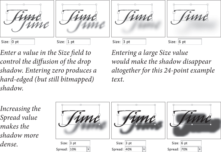
Figure 5-55. Size and Spread
• The Spread field controls the intensity of the shadow. Technically, it controls how far out from the center of the shadow the darkest portion of the shadow will sit. Choosing 50 percent means the darkest area of the shadow takes up half the size of the shadow.
• If you want a more realistic shadow (instead of a mathematically pure one), bump up the Noise field a little bit—just 4 or 5 percent noise makes a huge difference (see Figure 5-56). Noise values above 30 or 40 percent are mostly good for special grunge effects.
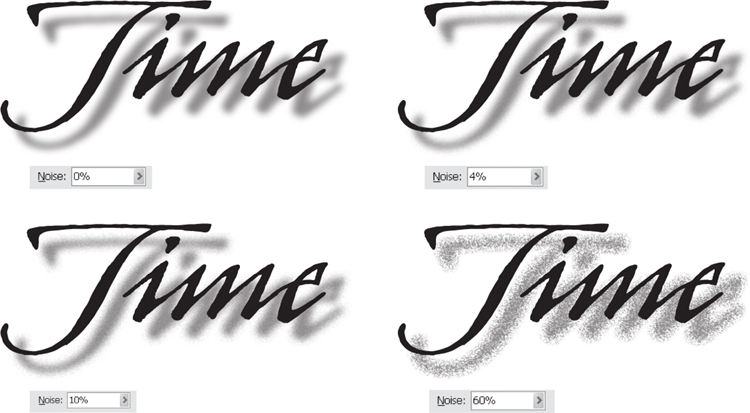
Figure 5-56. Shadow Noise
• If your object is partially transparent, you’ll be able to see your drop shadow underneath it. If that doesn’t appeal to you, turn on the Object Knocks Out Shadow checkbox—this ensures that the drop shadow is removed from behind the object itself.
• If you’ve used other effects on your object—such as a Directional Feather that blurs out one side of the shape—you can control whether or not the drop shadow will apply to the object itself (as though there were no other effects applied) or the object plus the effect. If you want the latter, turn on the Shadow Honors Other Effects checkbox.
Inner Shadow
The Inner Shadow effect is identical to the Drop Shadow effect except that the shadow is drawn inside the object rather than outside of it. The result looks like the object is set behind the rest of the page. Note that the Effects dialog box settings contains a field labeled Choke; it does essentially the same thing as Spread: It controls the position of the darkest part of the shadow (see Figure 5-57).

Figure 5-57. Inner Shadow
Outer and Inner Glow
In early versions of InDesign, we used to make glows around objects by making a drop shadow with the horizontal and vertical offset set to zero. It’s easier to just use the Outer Glow feature (see Figure 5-58). InDesign also offers an Inner Glow effect which sets the glow inside the object rather than around it, while retaining a sharp vector edge.
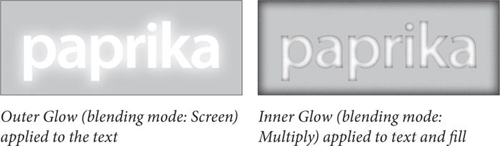
Figure 5-58. Outer and Inner Glow
Bevel and Emboss
InDesign offers four types of effect in the Style pop-up menu: Inner Bevel, Outer Bevel, Emboss, and Pillow Emboss (see Figure 5-59). The last three in this list affect the area around the object, and in fact look pretty dumb unless your object is sitting on top of some other object or image. Inner Bevel can stand on its own if need be.
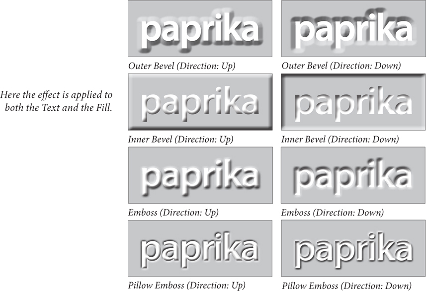
Figure 5-59. Bevel and Emboss
Satin
The Satin effect is supposed to make your objects look as though wrapped in satin. While the equivalent feature in Photoshop can result in a cool look, the implementation in InDesign leaves much to be desired. The one time it creates interesting effects is when applied to colored text.
Feathering
The usual definition of feathering goes something like this: “feathering softens the edges of page items.” This isn’t really quite true. A better description is that feathering blends an object to transparency. Since you cannot currently include transparency in a normal gradient swatch, feathering is extremely useful.
InDesign has three types of feathering: Basic Feather, Directional Feather, and Gradient Feather.
Basic Feather. The Basic Feather effect is identical to the feature called “Feathering” in earlier versions of InDesign. It applies the same feather (fade to transparency) on all sides of an object. Basic Feather offers four basic settings:
• Width sets the distance from the edges of the object at which the feathering will take effect (see Figure 5-60).
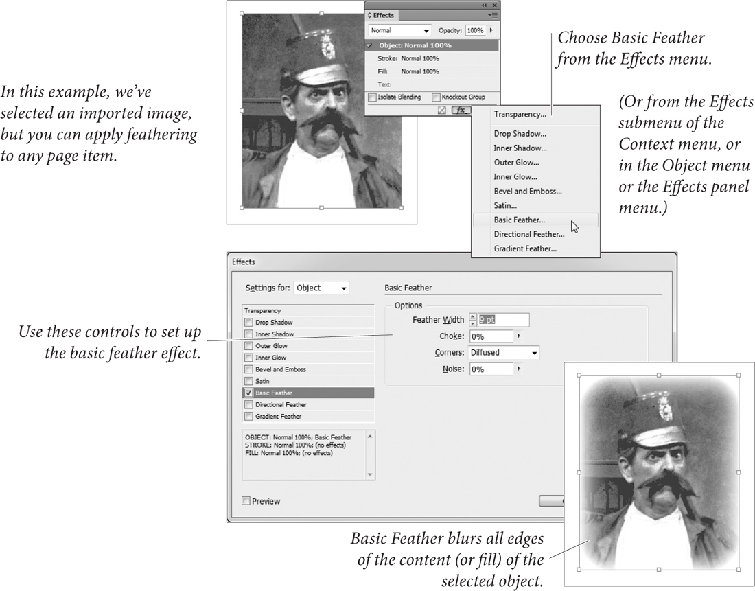
Figure 5-60. Basic Feather
• Choke controls how far in the fully transparent portion of the feather area will sit. Choosing 50 percent means the transparent area takes up half the size of the feather (based on Width).
• The options on the Corners pop-up menu control the appearance of the feathering effect as it approaches sharp corners at the edges of the object (see Figure 5-61). When you choose Sharp, the feathering effect follows the outline of the path as closely as possible. When you choose Rounded, InDesign rounds the edges of the feather effect as it nears sharp corners. The Diffused option provides a general fade from opaque to transparent, based on the geometric center of the object, rather than on the shape of the path (as is the case for the Sharp and Rounded options). This is similar to the feathering effect in Illustrator.
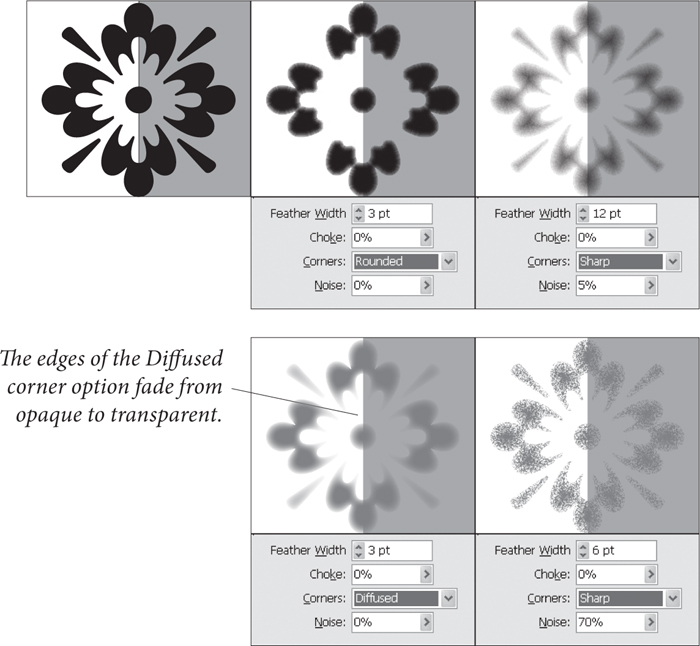
Figure 5-61. Feather Corner Options
• Adding a little Noise to your feather (such as four or five percent) makes the effect significantly more realistic, especially if you’re blending an object into a photographic background.
Directional Feather. What if you want a feather to appear on one side of a shape—such as an image that fades out to transparency along its bottom edge? That’s when the Directional Feather effect comes in handy, letting you adjust how much feathering you want on each side of your object. It offers some of the same settings as Basic Feather—such as Noise and Choke—but has three of its own options:
• Feather widths. To adjust the size of the feathering along the Top, Bottom, Left, and Right edges of your object independently, make sure you turn off the little chain button.
• Shape. The Shape pop-up menu lets you control what portion of your object gets feathered: First Edge Only, Leading Edges, or All Edges (see Figure 5-62).

Figure 5-62. Directional Feather
• Angle. The Angle determines what InDesign considers to be “top,” “right,” and so on. Set this to 45 degrees and the feather is rotated so that the Top Feather width is actually referring to the object’s upper-left corner. Rotate it 180 degrees and “top” becomes “bottom,” and so on.
Gradient Feather. The Gradient Feather effect is like using a linear or radial gradient as a transparency mask—you can set a start point, end point, and transparency “stop points” anywhere else along the gradient. To set the opacity at a point along the gradient, click the stop point and choose an Opacity value (see Figure 5-63).
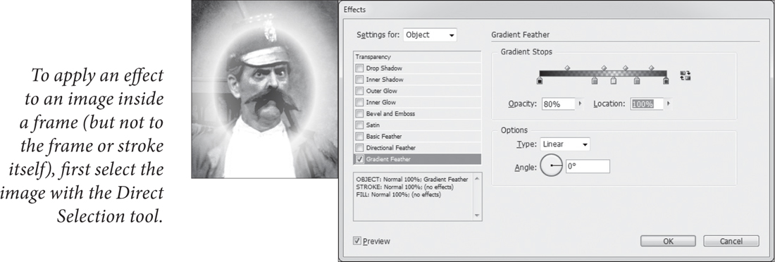
Figure 5-63. Gradient Feather
You can create a new stop point by clicking under the gradient bar; you can adjust the midpoint between two stops by dragging the diamond shaped icon along the top of the bar. You can specify a Linear or Radial gradient from the Type pop-up menu. And of course if it’s a Linear gradient, you can rotate it in the Angle field.
Curiously, Adobe forgot to add a Noise field in this type of feather, so these blends are often too squeaky clean.
Making Blurry Text
If you try applying a feather to some text or any other object on your page in order to make it “ghostly” or “blurry” you’ll be sorely disappointed. Instead, try this trick that our friend Matt Phillips taught us: Fill your object (or text) with the Paper color, set the blending mode to Multiply (which makes the Paper color disappear), and apply a drop shadow effect. Make sure that you turn off the Object Knocks Out Shadow checkbox (see Figure 5-64).
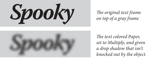
Figure 5-64. Blurry Objects
Copying Effects
You’ve spent 20 minutes getting your effects to look just right, but now you need to apply the same effects to another object. Here’s a cool way to copy effects from one object to another on the same spread: Select the object that has the effects you want, then drag the little “fx” icon from the Effects panel and drop it on another object.
You can also drag the “fx” icon from one item in the Effects panel to another. If you applied a drop shadow to Object but intended to only apply it to Text, you can drag the icon down to Text.
If you’re going to be using the same effects throughout your document, use object styles (see Chapter 6, “Where Text Meets Graphics”).
Editing or Removing Effects
To remove an effect, open the Effects dialog box and turn off the checkbox next to the effect. To remove all the effects quickly, choose Clear Effects from the Effects panel menu. To remove all the effects and any opacity or blending modes applied to your selected object, choose Clear Transparency from the same menu.
Drawing Conclusions
Earlier in this chapter, we noted that we found the process of creating a path using Bezier drawing tools confusing, at first. After extensive research involving a tabloid newspaper and far too much coffee, we discovered that drawing itself is nothing less than an extraterrestrial plot, forced on us in classical antiquity by evil space gods, to some cosmic purpose which we cannot—as yet—reveal.