Chapter 24
Using SmartArt Diagrams, Clip Art, and Pictures
IN THIS CHAPTER
Understanding SmartArt types and their uses
Inserting, editing, and modifying a SmartArt graphic
Modifying an organization chart structure
Resizing, restructuring, and formatting a SmartArt graphic
Choosing and inserting appropriate clip art
Modifying clip art
Inserting, sizing, and cropping photos
Adjusting and correcting photos
Compressing images
Just as charts and graphs can enliven a boring table of numbers, a SmartArt graphic can enliven a conceptual discussion. SmartArt helps the audience understand the interdependencies of objects or processes in a visual way, so they don’t have to juggle that information mentally as you speak. Some potential uses include organizational charts, hierarchy diagrams, and flow charts. Similarly, the right clip, image, or photo can highlight a concept or present a product with clarity that words cannot deliver.
In this chapter you will learn how to create and fine-tune SmartArt diagrams, and how to select and insert clip art into your presentations. You’ll also learn how to integrate and work with photos in a PowerPoint presentation.
Understanding SmartArt Types and Their Uses
SmartArt is a special class of vector graphic object that combines shapes, lines, and text placeholders. SmartArt is most often used to illustrate relationships between bits of text.
The SmartArt interface is similar regardless of the type of graphic you are creating. You can type directly into the placeholders on the SmartArt graphic, or you can display a Text pane to the side of the graphic and type into that, much as you would type into an Outline pane, to have text appear in a slide’s text placeholder boxes. See Figure 24.1. You can also select some text, right-click it, and choose Convert to SmartArt.
FIGURE 24.1 A typical SmartArt graphic being constructed

There are eight types of SmartArt graphics in PowerPoint 2013, and each is uniquely suited for a certain type of data delivery.
List
A List graphic presents information in a fairly straightforward, text-based way, somewhat like a fancy outline. List graphics are useful when information is not in any particular order or when the process or progression between items is not important. The list can have multiple levels, and you can enclose each level in a shape or not. Figure 24.2 shows an example.
FIGURE 24.2 A List graphic de-emphasizes any progression between items.

Process
A Process graphic is similar to a list, but it has directional arrows or other connectors that represent the flow of one item to another. This adds an extra aspect of meaning to the graphic. For example, in Figure 24.3, the way the boxes are staggered and connected with arrows implies that the next step begins before the previous one ends.
FIGURE 24.3 A Process graphic shows a flow from point A to point B.

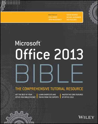
Cycle
A Cycle graphic also illustrates a process, but a repeating or recursive one — usually a process in which there is no fixed beginning point or endpoint. You can jump into the cycle at any point. In Figure 24.4, for example, the ongoing process of product development and improvement is illustrated.
FIGURE 24.4 A Cycle graphic traces the steps of a repeating process.
Hierarchy
A Hierarchy chart is an organization chart. It shows structure and relationships between people or things in standardized levels. For example, it can show who reports to whom in a company’s employment system. It is useful when describing how the organization functions and who is responsible for what. In Figure 24.5, for example, three organization levels are represented, with lines of reporting drawn between each level. Hierarchy graphics can also run horizontally, for use in tournament rosters.
FIGURE 24.5 A Hierarchy graphic, also called an organization chart, explains the structure of an organization.

Relationship
Relationship graphics graphically illustrate how parts relate to a whole. One common type of Relationship graphic is a Venn diagram, as in Figure 24.6, showing how categories of people or things overlap. Relationship graphics can also break things into categories or show how parts contribute to a whole, as with a pie chart.
FIGURE 24.6 A Relationship graphic shows how parts relate to a whole.

Matrix
A Matrix also shows the relationship of parts to a whole, but it does so with the parts in orderly looking quadrants. You can use Matrix graphics when you do not need to show any particular relationship between items but you want to make it clear that they make up a single unit. See Figure 24.7.
FIGURE 24.7 A Matrix graphic uses a grid to represent the contributions of parts to a whole.

Pyramid
A Pyramid graphic is just what the name sounds like — it’s a striated triangle with text at various levels, representing not only the relationship between the items but also that the items at the smaller part of the triangle are less numerous or more important. For example, the graphic in Figure 24.8 shows that there are many more workers than there are executives.
FIGURE 24.8 A Pyramid graphic represents the progression between less and more of something.

Picture
The Picture category is a collection of SmartArt graphic types from the other categories that include picture placeholders in them. You’ll find List, Process, and other types of graphics here; the Picture category simply summarizes them.
Inserting a SmartArt Graphic
All SmartArt graphics start out the same way — you insert them on the slide as you can any other slide object. That means you can either use a SmartArt placeholder on a slide layout or insert the SmartArt graphic manually.
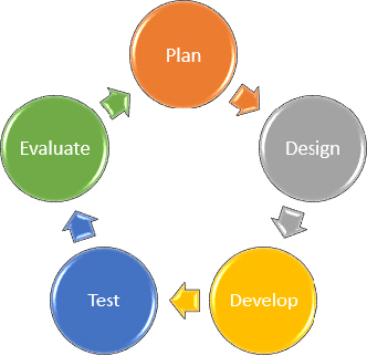
To use a placeholder, start with a slide that contains a layout with a SmartArt placeholder in it, or change the current slide’s layout to one that does. Then click the Insert a SmartArt Graphic button in the placeholder, as shown in Figure 24.9. To insert from scratch, click the SmartArt button in the Illustrations group of the Insert tab.
FIGURE 24.9 Click the Insert a SmartArt Graphic button in the placeholder on a slide.
Another way to start a new SmartArt graphic is to select some text and then right-click the selection and choose Convert to SmartArt.
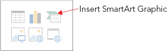
Any way you start it, the Choose a SmartArt Graphic dialog box opens (Figure 24.10). Select one of the SmartArt categories, click the desired SmartArt object, and click OK, and the graphic appears. From there it’s just a matter of customizing.
FIGURE 24.10 Select the graphic type you want to insert.
When you select a graphic, SmartArt Tools contextual tabs become available (Design and Format). You will learn what each of the buttons on them does as this chapter progresses. The buttons change depending on the type of graphic.
Editing SmartArt Text
All SmartArt has text placeholders, which are basically text boxes. You simply click in one of them and type. Then use the normal text-formatting controls (Font, Font Size, Bold, Italic, and so on) on the Home tab to change the appearance of the text, or use the WordArt Styles group on the Format tab to apply WordArt formatting.
You can also display a Text pane, as shown in Figure 24.1, and type or edit the graphic’s text there. The Text pane serves the same purpose for a graphic that the Outline pane in Outline view serves for the slide as a whole.
Here are some tips for working with SmartArt text:
- To leave a text box empty, just don’t type anything in it. The [Text] placeholders do not show up in a printout or in Slide Show view.
- To promote a line of text, press Shift+Tab; to demote it, press Tab in the Text pane.
- Text wraps automatically, but you can press Shift+Enter to insert a line break if necessary.
- In most cases, the text size shrinks to fit the graphic in which it is located. There are some exceptions to that, though; for example, at the top of a pyramid, the text can overflow the tip of the pyramid.
- All of the text is the same size, so if you enter a really long string of text in one box, the text size in all of the related boxes shrinks too. You can manually format parts of the SmartArt graphic to change this behavior, as you will learn later in the chapter.
- If you resize the SmartArt graphic, its text resizes automatically.
Modifying SmartArt Structure
The structure of the SmartArt graphic includes how many boxes it has and where they are placed. Even though the graphic types are all very different, the way you add, remove, and reposition shapes in them is surprisingly similar across all types.
Inserting and deleting shapes
To insert a shape in a SmartArt graphic, follow these steps:
You can click the top part of the Add Shape button to add a shape of the same level and type as the selected one, or you can click the bottom part of the button to open a menu from which you can choose other variants. The choices on the menu depend on the graphic type and the type of shape selected. For example, in Figure 24.11, you can insert a shape into a SmartArt graphic either before or after the current one (same outline level), or you can insert a shape that is subordinate (below) or superior to (above) the current one.
FIGURE 24.11 Add a shape to the SmartArt graphic.
To delete a shape, click it to select it in the SmartArt graphic, and then press the Delete key on the keyboard. You might need to delete subordinate shapes before you can delete the main shape.
Adding bullets
In addition to adding shapes to the SmartArt graphic, you can add bullets — that is, subordinate text to a shape. To do so, click the Add Bullet button. Bullets appear indented under the shape’s text in the Text pane, as shown in Figure 24.12.
FIGURE 24.12 Create subordinate bullet points under a shape.

Promoting and demoting text
The difference between a shape and a bullet is primarily a matter of promotion and demotion in the Text pane’s outline. The Text pane works just as the regular Outline pane does in this regard; you can promote with Shift+Tab or demote with Tab. You can also use the Promote and Demote buttons on the SmartArt Tools ⇒ Design tab.
Changing the flow direction
Each SmartArt graphic flows in a certain direction. A cycle graphic flows either clockwise or counterclockwise. A pyramid flows either up or down.
If you realize after typing all of the text that you should have made the SmartArt graphic flow in the other direction, you can change it by clicking the Right to Left button on the SmartArt Tools ⇒ Design tab. It is a toggle; you can switch back and forth freely.
Reordering shapes
Not only can you reverse the overall flow of the SmartArt graphic, you can also move around individual shapes. For example, suppose you have a graphic that illustrates five steps in a process and you realize that steps 3 and 4 are out of order. You can move one of them without having to retype all of the labels.
The easiest way to reorder the shapes is to select one and then click the Reorder Down or Reorder Up button on the SmartArt Tools ⇒ Design tab.
If you have more complex reordering to do, you might prefer to work in the Text pane instead, cutting and pasting text like this:
Repositioning shapes
You can individually select and drag each shape to reposition it on the SmartArt graphic. Any connectors between it and the other shapes are automatically resized and extended as needed. For example, in Figure 24.13, notice how the arrows that connect the circles in the cycle graphic have elongated as one of the circles has moved out.
FIGURE 24.13 When you move pieces of a SmartArt graphic, connectors move and stretch as needed.

Resetting a SmartArt graphic
After making changes to a SmartArt graphic, you can return it to its default settings with the Reset Graphic button on the SmartArt Tools ⇒ Design tab. This strips off everything, including any SmartArt styles and manual positioning, and makes it exactly as it was when you inserted it except it keeps the text that you’ve typed.
Changing to a different SmartArt layout
The layouts are the graphic types. When you insert a SmartArt graphic you choose a type, and you can change that type at any time later.
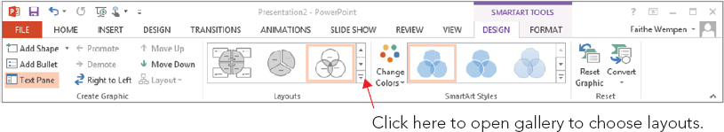
To change the layout type, use the Layouts gallery on the Design tab, as shown in Figure 24.14. You can open the gallery and click the desired type, or click More Layouts at the bottom of its menu to redisplay the same dialog box as in Figure 24.10, the Choose a SmartArt Graphic dialog box, from which you can choose any layout.
FIGURE 24.14 Switch to a different graphic layout.
Modifying a Hierarchy Graphic Structure
Hierarchy graphics (organization charts) show the structure of an organization. They have some different controls for changing their structure compared to other graphics, so the following sections look at them separately.
Inserting and deleting shapes
The main difference when inserting an organization chart shape (that is, a box into which you will type a name) is that you must specify which existing box the new one is related to and how it is related.
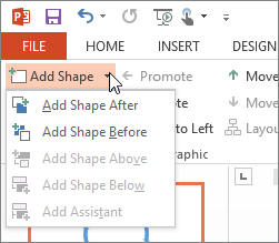
For example, suppose you have a supervisor already in the chart and you want to add some people to the chart who report to him. You would first select his box on the chart and then insert the new shapes with the Add Shape button. For a box of the same level, or of the previously inserted level, click the top part of the button; for a subordinate or other relationship, open the button’s menu. See Figure 24.15. The chart can have only one box at the top level, however, just as a company can have only one CEO.
FIGURE 24.15 Add more shapes to a hierarchy graphic.

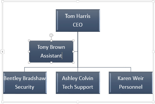
When you insert a new shape in a hierarchy graphic, four of the options are the same as with any other SmartArt graphic, and one is new: Add Shape After and Add Shape Before insert shapes of the same level as the selected one, and Add Shape Above and Add Shape Below insert a superior and subordinate level, respectively. The new option, Add Assistant, adds a box that is neither subordinate nor superior but a separate line of reporting, as shown in Figure 24.16.
FIGURE 24.16 An Assistant box in a hierarchy chart.
To delete a shape, select it and press the Delete key, as with all of the other graphic types.
Changing a person’s level in the organization
As the organization changes, you might need to change your chart to show that people report to different supervisors. The easiest way to do that is to move the text in the Text pane, the same way as you learned in the section “Reordering shapes” earlier in this chapter. To promote someone, select their box and press Shift+Tab.
To change who someone reports to, select their box and press Ctrl+X to cut it to the Clipboard. Then select the box of the person they now report to, and press Ctrl+V to paste.
Controlling subordinate layout options
When subordinates report to a supervisor, you can list the subordinates beneath that supervisor in a variety of ways. In Standard layout, each subordinate appears horizontally beneath the supervisor, as shown in Figure 24.17.
FIGURE 24.17 This is the standard layout for a branch of an organization chart.

However, in a large or complex organization chart, the graphic can quickly become too wide with the Standard layout. Therefore, there are “hanging” alternatives that make the chart more vertically oriented. The alternatives are Both, Left Hanging, and Right Hanging. They are just what their names sound like. Figure 24.18 shows examples of Right.
FIGURE 24.18 Hanging layouts make the chart more vertically oriented.

The layout is chosen for individual branches of the organization chart, so before selecting an alternative layout, you must click on the supervisor box whose subordinates you want to change. To change a layout, follow these steps:
Formatting a SmartArt Graphic
You can format a SmartArt graphic either automatically or manually. Automatic formatting is the default, and many PowerPoint users don’t even realize that manual formatting is a possibility. The following sections cover both.
Applying a SmartArt style
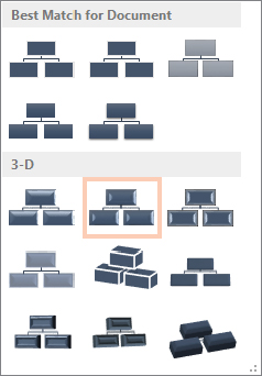
SmartArt Styles are preset formatting specs (border, fill, effects, shadows, and so on) that you can apply to an entire SmartArt graphic. They make it easy to apply surface texture effects that make the shapes look reflective or appear to have 3-D depth or perspective.
To apply a SmartArt style, follow these steps:
FIGURE 24.19 Select a SmartArt Style.

FIGURE 24.20 Open the SmartArt Style gallery for more choices.
Changing SmartArt colors
After you apply a SmartArt style, as in the preceding section, you might want to change the colors used in the graphic.
The easiest way to apply colors is to use the Change Colors button’s menu in the SmartArt Styles group of the Design tab. You can select from a gallery of color schemes. As shown in Figure 24.21, you can choose a Colorful scheme (one in which each shape has its own color, or the shapes at each level have their own colors), or you can choose a monochrome color scheme based on any of the current presentation color theme’s color swatches.
FIGURE 24.21 Select a color scheme from the Change Colors button’s menu.

Notice the command at the bottom of the menu in Figure 24.21: Recolor Pictures in SmartArt Graphic. You can toggle this button on or off. When the button is toggled on, it applies a color tint to any pictures that are part of the graphic.
Manually applying colors and effects to individual shapes
In addition to formatting the entire graphic with a SmartArt Style, you can format individual shapes using Shape Styles, just as you did in Chapter 9 objects in Word. Here’s a quick review:
Manually formatting SmartArt text
WordArt formatting works the same in a SmartArt graphic as it does everywhere else in PowerPoint. Use the WordArt Styles gallery and controls on the SmartArt Tools ⇒ Format tab to apply text formatting to individual shapes, or select the entire graphic to apply the changes to all shapes at once.
Making a shape larger or smaller
In some SmartArt types, it is advantageous to make certain shapes larger or smaller than the others. For example, if you want to emphasize a certain step in a process, you can create a SmartArt graphic where that step’s shape is larger. Then you can repeat that same graphic on a series of slides, but with a different step in the process enlarged on each copy, to step through the process. There are several options for this:
- You can manually resize a shape by dragging its selection handles, the same as with any other object. However, this is imprecise, and can be a problem if you want multiple shapes to be enlarged because they won’t be consistently so.
- You can set a precise size for the entire SmartArt graphic by adjusting the height and width measurements in the Size group on the SmartArt Tools ⇒ Format tab, as shown in Figure 24.22. However, if different shapes are already different sizes and you want to resize them in proportion, this won’t help.
FIGURE 24.22 Change the size of the entire SmartArt graphic or an individual shape.

- You can use the Larger or Smaller buttons in the Shapes group of the Format tab to bump up or down the sizes of one or more shapes slightly with each successive click.
Resizing the entire SmartArt graphic object
When you resize the entire SmartArt object as a whole, everything within its frame changes size proportionally. There are several ways to do this:
- Drag a corner selection handle on the SmartArt graphic’s outer frame.
- Use the Size controls on the SmartArt Tools ⇒ Format tab to enter a precise height and width.
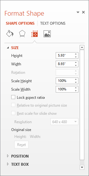
- Right-click the outer frame of the SmartArt object and choose Size and Position. The Format Shape pane opens (Figure 24.23). Under the Size heading, enter a height and width in inches, or scale it by a percentage in the Scale Height and Scale Width boxes. Select the Lock Aspect Ratio check box if you want to maintain the proportions.
FIGURE 24.23 Right-click the graphic and choose Size and Position to open this task pane.
Editing in 2-D
If you choose one of the 3-D selections from the SmartArt Style gallery, the text might become a bit hard to read and edit when you are working with the graphic at a small zoom percentage. There are a couple of ways around this:
- Right-click a shape and choose Edit Text. The face of the shape appears in 2-D temporarily, making it easier to edit the text.
- Click the Edit in 2-D button in the Shapes group of the SmartArt Tools ⇒ Format tab. The entire graphic appears in 2-D temporarily.
Changing the shapes used
Each SmartArt layout has its own defaults that it uses for the shapes, but you can change these manually. On the SmartArt Tools ⇒ Format tab, click Change Shape to open a palette of shapes. Then click the desired shape to apply to the selected shape. You can also access this from the right-click menu.
Each shape is individually configurable. If you simply select the entire graphic, the Change Shape button is not available; you must select each shape you want to change. Hold down the Shift key as you click on each one to be selected. Figure 24.24 shows a SmartArt graphic that uses some different shapes.
FIGURE 24.24 You can apply different shapes within a SmartArt graphic.

Saving a SmartArt Graphic as a Picture
SmartArt graphics work only within Office applications, but you can easily export one for use in any other application. It is exported as a picture (by default a PNG file), which you can then import into any application that accepts pictures. To save a SmartArt graphic as a picture, follow these steps:
Choosing Appropriate Artwork
Before we get started with the “how” of images in PowerPoint, take a moment to think about the “why.” Don’t just use any old image! You must never use artwork simply because you can; it must be a well-thought-out decision. Here are some tips for using artwork appropriately:
- Use for fun: Use cartoonish images only if you specifically want to impart a lighthearted, fun feel to your presentation.
- Use one style: The clip art available from Office.com includes many styles of drawings, ranging from simple black-and-white shapes to very complex, shaded color drawings and photographs. Try to stick with one type of image rather than bouncing among several drawing styles.
- Use only one piece per slide: Also, do not use artwork on every slide, or it becomes overpowering.
- Avoid repetition: Don’t repeat the same artwork on more than one slide in the presentation unless you have a specific reason to do so.
- Avoid with bad news: If your message is very serious, or you are conveying bad news, don’t use artwork . It looks frivolous in these situations.
- Better none than bad: If you can’t find artwork that is exactly right for the slide, then don’t use any. It is better to have none than to have an inappropriate image.
- Buy appropriate art: If artwork is important, and Office.com doesn’t have what you want, you can buy more. Don’t try to struggle along with the clips and images that come with Office if they aren’t meeting your needs; impressive artwork collections are available at reasonable prices at your local computer store as well as online.
Inserting Clip Art
Clip art is pre-drawn art available online for use with the Office applications. There are thousands of images that you can use royalty free in your work, without having to draw your own. For example, suppose you are creating a presentation about snow skiing equipment. Rather than hiring an artist to draw a picture of a skier, you can use one of PowerPoint’s stock drawings of skiers and save yourself a bundle.
Being an owner of a Microsoft Office product entitles you to use the huge royalty free clip-art collection that Microsoft maintains at Office.com, and if you are connected to the Internet while you are using PowerPoint, PowerPoint can automatically pull clips from that collection as easily as it can from your own hard drive.
Earlier versions of PowerPoint included robust search and management capabilities for clip art and an application called the Clip Organizer. In contrast, PowerPoint 2013 provides only a very basic search box for searching for clip art by keyword at Office.com.
You can insert clip art on a slide either with or without a content placeholder. If you use a content placeholder, PowerPoint inserts the clip art wherever the placeholder is; if you don’t, PowerPoint inserts the clip art at the center of the slide. (You can move it afterward, of course.) To insert clip art into a content placeholder, click the Online Pictures button on the placeholder (see Figure 24.25). To insert clip art without a content placeholder, choose Insert ⇒ Images ⇒ Online Pictures.
FIGURE 24.25 Click the Online Pictures icon in a content placeholder to insert clip art into the placeholder.

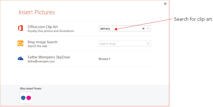
Whichever method you use, the Insert Pictures dialog box opens (see Figure 24.26). In it are three options:
- Office.com Clip Art: You can use the Search box on this line to search Microsoft’s clip art collection by keyword.
- Bing Image Search: You can use the Search box on this line to use the Bing search engine to look for pictures on the Internet by keyword. These are mostly photographic images, which you’ll learn more about later in this chapter.
- (Your Name) SkyDrive: You can click Browse to browse the content of your own SkyDrive and insert pictures from there. (See Chapter 39 for more information about using your SkyDrive.)
FIGURE 24.26 Type a keyword in the Office.com Clip Art search box.
Type a keyword into the Search box next to Office.com Clip Art and then press Enter to perform the search. Search results appear in that same dialog box, as shown in Figure 24.27.
FIGURE 24.27 Search results appear showing thumbnails of available images.
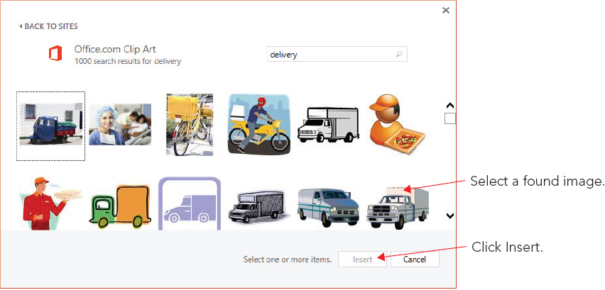
Click the image you want to insert (or click multiple images to insert several at once) and then click the Insert button. If the Insert button doesn’t appear, make sure an image is selected; Insert doesn’t appear until you do that.
Browsing clips at Office.com
When you search for clip art while connected to the Internet, as you learned to do in the preceding section, the Office.com clip art automatically appears. However, you can also visit the Office.com website to browse the clip art directly. There are some advantages to browsing clip art this way. For example, you can narrow down your search to only certain media types (such as only line-art illustrations or only photos), and you can filter the search results by image size.
To browse the Office.com clip art on the web, open a web browser window, navigate to http://office.microsoft.com and click the Images link. From there, type a keyword in the Search All Images box at the top of the page and press Enter to initiate a search. See Figure 24.28. This page is constantly changing, so it may look different when you visit it.
FIGURE 24.28 Visit the Office.com clip art web page for more information and more clip art.

In the search results window, a bar appears along the left side with filters for media types and image size. To limit the results to a certain category, click one of these filters. For example, in Figure 24.29, the list has been filtered to show only illustrations.
FIGURE 24.29 Search results from Office.com are filtered to show only illustrations.

Another advantage of using the web interface for clip art is that you can copy the clip art to your hard disk for later use.
In the list of clips that the site finds, point to a clip that you want. A pop-up for it appears, as shown in Figure 24.30.
FIGURE 24.30 Point at a found clip to display a pop-up.
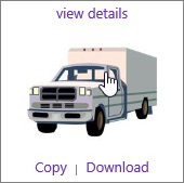
The following options are available in the pop-up:
- View Details: Opens a web page specifically for this clip, where you can see information about the clip including its dimensions, resolution, and file size.
- Copy: Copies the clip to your Windows Clipboard, from which you can paste it into PowerPoint or any other application that accepts input from the Clipboard. After clicking Copy, switch to PowerPoint or whatever program you like, position the insertion point or select the placeholder, and press Ctrl+V or choose Home ⇒ Clipboard ⇒ Paste.
- Download: Downloads the clip-art image’s file to your hard drive so you can use it later when you don’t have an Internet connection. A Message Bar appears at the bottom of the browser window asking whether you want to save or open the file. See Figure 24.31. Click Save, and the file is saved to the Downloads folder for your user account (C:Usersuser nameDownloads). You can then insert it in PowerPoint using the procedure outlined in “Inserting Photos” later in this chapter. If you instead choose Open, the file is opened in Paint (or your default editor for the file type), where you can modify it if you like before inserting it into PowerPoint. However, the next section of this chapter covers modifying clip art from within PowerPoint, so you may want to investigate that method instead if you want to make some changes to the clip.
FIGURE 24.31 Respond to the information bar message by choosing to open or save the file.

Modifying clip art
Most of the modifications that you will learn about later in this chapter apply to both photographs and clip art. For example, you can increase or decrease brightness and contrast, apply color washes, crop, rotate, and so on. However, there are also some special modifications that apply only to clip art and other vector images. They are covered in the following sections.
Recoloring a clip
One of the top complaints about clip art is that the colors are wrong. For example, you may have the perfect drawing, but its colors clash with your presentation design. You can recolor individual parts of a clip by changing it to a Microsoft drawing object and then selecting and coloring individual lines or shapes. For more information, see the section “Deconstructing and editing a clip” later in this chapter.
On a more basic level, PowerPoint 2013 provides a Recolor option that enables you to apply a single-color wash to an image based on any of the theme’s colors or any fixed color. To apply a color wash to a clip, follow these steps:
FIGURE 24.32 Select a color wash to apply to the clip.

Setting a transparent color
Some clips enable you to redefine one of the colors as see-through so that anything behind it shows through. This doesn’t work on all clips because most clips already have a color defined as transparent: the background. This is why a clip art image appears to float directly on a colored background rather than being locked into a rectangle. However, for clips that do not have a transparent color already defined, you can define one.
To set a transparent color, open the Color menu, as in the preceding section (Figure 24.32). Then choose Set Transparent Color, and click a color in the image.
Deconstructing and editing a clip
Have you ever wished that you could open a clip-art image in an image-editing program and make some small change to it? Well, you can. And what’s more, you can do it without leaving PowerPoint.
Because clip art is composed of vector-graphic lines and fills, you can literally take it apart piece by piece. Not only can you apply certain colors (as in the preceding section), but you can also choose individual lines and shapes from it to recolor, move, and otherwise modify.
To recolor an individual line or shape, follow these steps:
FIGURE 24.33 Change the fill color of an individual shape within the clip.

To move the pieces of the clip around, just drag the selected piece where you want it. If a particular piece doesn’t move separately from the rest, right-click the image and choose Group ⇒ Ungroup to break up the image into individual shapes, and then the shape you want to move will be individually movable.
Understanding Raster Graphics
As explained earlier in this chapter, there are two kinds of graphics in the computer world: vector and raster. Vector graphics (clip art, drawn lines and shapes, and so on) are created with mathematical formulas. Some of the advantages of vector graphics are their small file size and the fact that they can be resized without losing any quality. The main disadvantage of a vector graphic is that it doesn’t look “real.” Even when an expert artist draws a vector graphic, you can still tell that it’s a drawing, not a photograph. For example, perhaps you’ve seen the game The Sims. Those characters and objects are 3-D vector graphics. They look pretty good but there’s no way you would mistake them for real people and objects.
In the rest of this chapter, we’ll be working mostly with raster graphics — in other words, digital photos, like the ones you might take with your own digital camera or phone. A raster graphic is made up of a very fine grid of individual colored pixels (dots). The grid is sometimes called a bitmap. Each pixel has a unique numeric value representing its color. Figure 24.34 shows a close-up of a raster image. You can create raster graphics from scratch with a “paint” program on a computer, but a more common way to acquire a raster graphic is by using a scanner or digital camera as an input device.
FIGURE 24.34 A raster graphic, normal size (right) and zoomed in to show individual pixels (left)

Because there are so many individual pixels and each one must be represented numerically, raster graphics are much larger than vector graphics. They take longer to load into the PC’s memory, take up more space when you store them as separate files on disk, and make your PowerPoint presentation file much larger. You can compress a raster graphic so that it takes up less space on disk, but the quality may suffer. Therefore, it’s best to use vector graphics when you want simple lines, shapes, or cartoons and reserve raster graphics for situations where you need photographic quality.
The following sections explain some of the technical specifications behind raster graphics; you’ll need this information to make the right decisions about the way you capture the images with your scanner or digital camera and the way you use them in PowerPoint.
Resolution
The term resolution has two subtly different meanings. One is the size of an image, expressed in the number of pixels of width and height, such as 800 × 600. The other meaning is the number of pixels per inch when the image is printed, such as 100 dots per inch (dpi). The former meaning is used mostly when referring to images of fixed physical size, such as the display resolution of a monitor. In this book, the latter meaning is mostly used.
If you know the resolution of the picture (that is, the number of pixels in it) and the resolution of the printer on which you will print it (for example, 300 dpi), you can figure out how large the picture will be in inches when you print it at its native size. Suppose you have a picture that is 900 pixels square and you print it on a 300 dpi printer. This makes it 3″ square on the printout.
Resolution on preexisting graphics files
When you acquire an image file from an outside source, such as downloading it from a website or getting it from a CD of artwork, its resolution has already been determined. Whoever created the file originally made that decision. For example, if the image was originally scanned on a scanner, whoever scanned it chose the scan resolution — that is, the dpi setting. That determined how many individual pixels each inch of the original picture would be divided into. At a 100 dpi scan, each inch of the picture is represented by 100 pixels vertically and horizontally. At 300 dpi, each inch of the picture is broken down into three times that many.
If you want to make a graphic take up less disk space, you can use an image-editing program to change the image size, and/or you can crop off one or more sides of the image.
Resolution on graphics you scan yourself
When you create an image file yourself by using a scanner, you choose the resolution, expressed in dpi, through the scanner software. For example, suppose you scan a 4″ × 6″ photo at 100 dpi. The scanner will break down each 1″ section of the photo horizontally and vertically into 100 separate pieces and decide on a numeric value that best represents the color of each piece. The result is a total number of pixels of 4 × 100 × 6 × 100, or 240,000 pixels. Assuming each pixel requires 3 bytes of storage, the fill becomes approximately 720KB in size. The actual size varies slightly depending on the file format.
Now, suppose you scan the same photo at 200 dpi. The scanner breaks down each 1″ section of the photo into 200 pieces so that the result is 4 × 200 × 6 × 200, or 960,000 pixels. Assuming again that 1 pixel required 3 bytes for storage (24 bits), the file will be approximately 2.9MB in size. That’s a big difference.
The higher the resolution in which you scan, the larger the file becomes, but the details of the scan also become finer. However, unless you are zooming in on the photo, you cannot tell a difference between subtle dpi and resolution differences. That’s because most computer monitors display at 96 dpi, so any resolution higher than that does not improve the output.
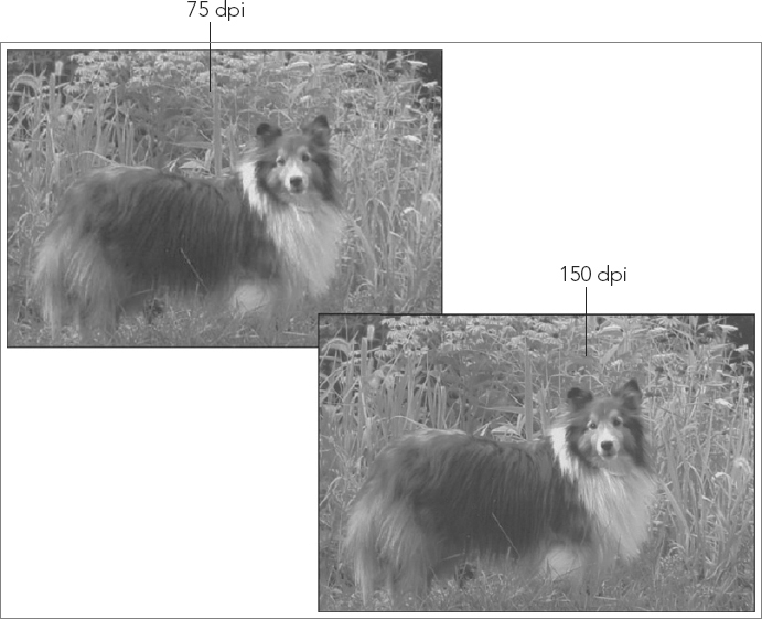
Let’s look at an example. In Figure 24.35 you can see two copies of an image open in a graphics program. The same photo was scanned at 75 dpi (left) and 150 dpi (right). However, the difference between them is not significant when the two images are placed on a PowerPoint slide, as shown in Figure 24.36. The lower-resolution image is at the top left, but there is no observable difference in the size at which they are being used.
FIGURE 24.35 At high magnification, the difference in dpi for a scan is apparent.

FIGURE 24.36 When the image is used at a normal size, there is virtually no difference between a high-dpi and low-dpi scan.
Resolution on digital camera photos
Top-quality digital cameras today take very high-resolution pictures, much higher than you will need for an on-screen PowerPoint presentation. At a typical size and magnification, a high-resolution graphic file is overkill; it wastes disk space needlessly. Therefore, you may want to adjust the camera’s image size so that it takes lower-resolution pictures for your PowerPoint show.
However, if you think you might want to use those same pictures for some other purpose in the future, such as printing them in a magazine or newsletter, then go ahead and take them with the camera’s highest setting, but then compress them in PowerPoint or resize copies of them in a third-party image-editing program. See the section “Compressing Images” later in this chapter to learn how.
Color depth
Color depth is the number of bits required to describe the color of a single pixel in the image. For example, in 1-bit color, a single binary digit represents each pixel. Each pixel is either black (1) or white (0). In 4-bit color, there are 16 possible colors because there are 16 combinations of 1s and 0s in a four-digit binary number. In 8-bit color there are 256 combinations.
For most file formats, the highest number of colors you can have in an image is 16.7 million colors, which is 24-bit color (also called true color). It uses 8 bits each for red, green, and blue.
There is also 32-bit color, which has the same number of colors as 24-bit but adds 8 more bits for an alpha channel. The alpha channel describes the amount of transparency for each pixel. This is not so much an issue for single-layer graphics, but in multilayer graphics, such as the ones you can create in high-end graphics programs like Photoshop, the extent to which a lower layer shows through an upper one is important.
A color depth of 48-bit is fairly new, and it’s just like 24-bit color except it uses 16 rather than 8 bits to define each of the three channels: red, green, and blue. It does not have an alpha channel bit. Because the human eye cannot detect the small differences it introduces, 48-bit color depth is not really necessary. Of the graphics formats that PowerPoint supports, only PNG and TIFF support 48-bit color depth.
Normally, you should not decrease the color depth of a photo to less than 24-bit unless there is a major issue with lack of disk space that you cannot resolve any other way. To decrease the color depth, you would need to open the graphic file in a third-party image-editing program and use the command in that program for decreasing the number of colors. Before going through that, try compressing the images in the presentation (see the section “Compressing Images” later in the chapter) to see if that solves the problem.
File format
Many scanners scan in JPEG format by default, but most also support TIF, and some also support other formats. Images you acquire from a digital camera are almost always JPEG. Images from other sources may be any of dozens of graphics formats, including PCX, BMP, GIF, or PNG.
Different graphic formats can vary tremendously in the size and quality of the image they produce. The main differentiators between formats are the color depth they support and the type of compression they use (which determines the file size).
Remember that each pixel in a 24-bit image requires 3 bytes. (That’s derived by dividing 24 by 8 because there are 8 bits in a byte.) Then you multiply that by the height and then by the width to determine the image size. Well, that formula was not completely accurate because it does not include compression. Compression is an algorithm (basically a math formula) that decreases the amount of space that the file takes up on the disk by storing the data about the pixels more compactly. A file format will have one of these three states in regard to compression:
- No compression: The image is not compressed.
- Lossless compression: The image is compressed, but the algorithm for doing so does not throw out any pixels so there is no loss of image quality when you resize the image.
- Lossy compression: The image is compressed by recording less data about the pixels, so when you resize the image, there may be a loss of image quality.
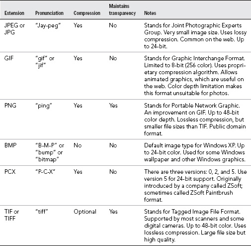
Table 24.1 provides a brief guide to some of the key features for the most common graphic formats. Generally speaking, for most on-screen presentations JPEG should be your preferred choice for graphics because it is compact and web accessible (although PNG is also a good choice and uses lossless compression and allows for transparency where needed).
TABLE 24.1 Popular Graphics Formats
Inserting Photos
Now that you know all about the factors that go into creating and selecting raster images, it’s time to get down to the business of inserting the images on your PowerPoint slides. In the following sections you will learn to do just that. You’ll find out how to acquire photos via a Bing search for situations in which you don’t already have what you need and how to insert images from your own computer that you have already acquired. (An Office.com clip art search also might return photos in addition to clip art illustrations.)
Searching for photos with Bing
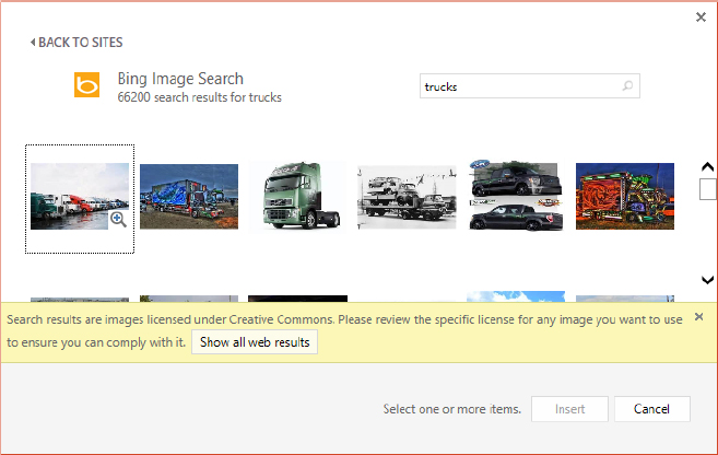
Bing is Microsoft’s search engine on the web, and PowerPoint has a built-in interface for using Bing’s image search capabilities to find photos you can use in your presentations. It’s something like the clip art search you learned about earlier in this chapter, but the search results are not confined to just Microsoft’s own servers, and only photos (raster based images) are shown.
To search for a photo with Bing and place it in your presentation, follow these steps:
FIGURE 24.37 Search results appear showing thumbnails of available images.
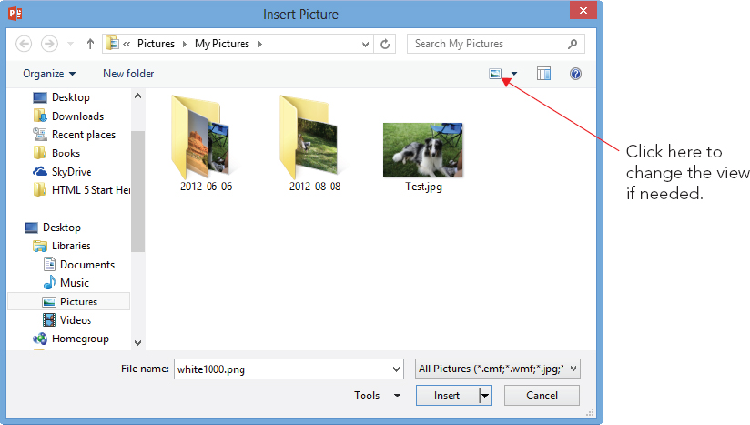
Inserting pictures from files
If you already have the picture(s) you want to use, you can insert them from your own computer’s drive using the Pictures button on the Insert tab. Assuming you have already acquired the images you need, use the following steps to insert one into PowerPoint:
FIGURE 24.38 You can insert a picture by using the Pictures content placeholder button.
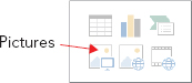
FIGURE 24.39 Select the picture to be inserted.
Linking to a graphic file
If you have a sharp eye, you may have noticed that the Insert button in Figure 24.39 has a drop-down list associated with it. That list has these choices:
- Insert: The default, inserts the graphic but maintains no connection.
- Link to File: Creates a link to the file, but does not maintain a local copy of it in PowerPoint
- Insert and Link: Creates a link to the file, and also inserts a local copy of its current state, so if the linked copy is not available in the future, the local copy will still appear
Use Link to File whenever you want to insert a pointer rather than the original. When the presentation opens, it pulls in the graphic from the disk. If the graphic is not available, it displays an empty frame with a red X in the corner in the graphic’s place. Using Link to File keeps the size of the original PowerPoint file very small because it doesn’t actually contain the graphic — it only links to it. However, if you move or delete the graphic, PowerPoint won’t be able to find it anymore.
The important thing to know about this link in the Link to File feature is that it is not the same thing as an OLE link. This is not a dynamic link that you can manage. It is a much simpler link and much less flexible. You can’t change the file location to which it is linked, for example; if the location of the graphic changes, you must delete it from PowerPoint and reinsert it.
Capturing and inserting screenshots
A screenshot is a picture that you take of your computer screen using Windows itself (or a screen capture utility). Most of the images in this book are screenshots. You might want to take screenshots to illustrate the steps in a computer-based procedure and then create a PowerPoint presentation that teaches others to perform that procedure. You can also take screen shots on some mobile devices.
Windows has always had a basic screenshot capability built into it: the Print Screen key. You can press Print Screen at any time to copy an image of the screen to the Clipboard. Then you can paste directly onto your slide, or you can open a graphics-editing program such as Paint and paste from the Clipboard to save the file.
In PowerPoint 2013, you can also capture and insert screenshots directly, bypassing the Clipboard and an outside graphics program. The Screenshot command in PowerPoint also enables you to capture individual windows rather than the entire screen.
To capture a screenshot of an open window, follow these steps:
FIGURE 24.40 Capture a window using the Screenshot command.

If the window you want does not appear on the thumbnails list, or if you want different cropping, use the Screen Clipping command instead. Follow these steps:
Sizing and Cropping Photos
After placing a picture on a slide, you will probably need to adjust its size, and/or crop it, to make it fit in the allotted space the way you want it. The following sections explain these techniques.
Sizing a photo
Sizing a photo is just like sizing any other object. Drag its selection handles. Drag a corner to maintain the aspect ratio, or drag a side to distort it. (Distorting a photo is seldom a good idea, though, unless you’re after some weird funhouse effect.)
You can also specify an exact size for a photo the same as for drawn objects. Right-click the photo and choose Size and Position to set a size in the Format Picture task pane (see Figure 24.41). Alternatively, you can display the Picture Tools ⇒ Format tab and then use the Height and Width boxes in the Size group, also shown in Figure 24.41.
FIGURE 24.41 Size a photo via either the dialog box or the Format tab.

The most straightforward way to specify the size is in inches in the Height and Width boxes, either in the dialog box or on the tab. These measurements correspond to the markers on the on-screen ruler in Normal view. The size of a slide varies depending on how you have it set up (by using the Page Setup tab), but an average slide size is 10 inches wide by 7.5 inches tall. You can also size the photo using the Scale controls in the Format Picture pane, in which you adjust the size based on a percentage of the original size.
Note that the scale is based on the original size, not the current size. So, for example, if you set Height and Width to 50%, close the dialog box, and then reopen it and set them each to 75%; the net result will be 75% of the original, not 75% of the 50%. However, you can override this by deselecting the Relative to original picture size check box (see Figure 24.41).
If you are setting up a presentation for the primary purpose of showing full-screen graphics, you can use the Best scale for slide show check box (see Figure 24.41). This enables you to choose a screen resolution, such as 640 × 480 or 800 × 600, and size the pictures so that they will show to the best advantage in that resolution. Choose the resolution that corresponds to the display setting on the PC on which you will show the presentation. To determine what the resolution is on the PC, right-click the Windows Desktop and choose Screen Resolution.
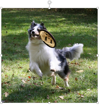
Cropping a photo
Cropping is for those times you want only a part of the image. For example, you might have a great photo of a person or animal, but there is extraneous detail around it, as shown in Figure 24.42. You can crop away all but the important object in the image with a cropping tool.
FIGURE 24.42 This picture can benefit from cropping.

You can crop two sides at once by cropping at the corner of the image, or you can crop each side individually by cropping at the sides. To crop an image, do the following:
Figure 24.43 shows the result of cropping and resizing the image from Figure 24.42.
FIGURE 24.43 The picture has been improved by cropping and resizing it.
To undo a crop, reenter cropping mode by clicking the Crop button again, and then drag the side(s) back outward again. Or you can simply reset the photo, as described in the following section.
You can also crop to a shape or crop to a particular aspect ratio (that is, ratio of height to width).
Cropping to a shape crops the picture so that it fits inside one of the drawing shapes that PowerPoint provides, such as a star, triangle, or arrow.
To crop to a shape, follow these steps:
FIGURE 24.44 You can crop a picture to a shape.

After cropping to a shape, you’ll notice the central part of the image might not be exactly centered within the shape. To adjust the centering of the picture within the crop area, right-click the picture and choose Format Picture to open the Format Picture pane. Click the Picture icon (rightmost icon), and then adjust the values in the Crop section, as shown in Figure 24.45.
FIGURE 24.45 Set a precise amount of cropping in the Format Picture pane.

You can also crop to an aspect ratio. PowerPoint offers several preset ratios to choose from that correspond to common picture sizes, such as 2:3, 3:4, and 3:5. Here’s how to apply an aspect ratio crop:
You can also crop “by the numbers” with the Crop settings in the Format Picture dialog box. Here’s how to do that:
Resetting a photo
Once the picture is in PowerPoint, any manipulations you do to it are strictly on the surface. It changes how the picture appears on the slide, but it doesn’t change how the picture is stored in PowerPoint. Consequently, you can reset the picture back to its original settings at any time (provided you have not compressed the picture). This resetting also clears any changes you make to the image’s size, contrast, and brightness (contrast and brightness changes are discussed in the next section).
To reset the picture, right-click it and choose Format Picture to display the Format Picture pane. Click the Size & Properties icon (third from left), and in the Size section, click the Reset button.
Adjusting and Correcting Photos
PowerPoint has some powerful features for adjusting, correcting, and applying artistic effects to photos. Not only can you adjust the brightness and contrast, but you can sharpen or soften an image, tint it, make it black and white, and apply several types of artistic effects to it that make it look like it was created in some other medium, such as charcoal pencil or collage.
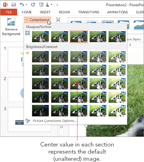
Applying brightness and contrast corrections
You can adjust the brightness and contrast for any photo in PowerPoint, and you can adjust the sharpness or softness of the image.
Brightness refers to the overall level of light in a picture. The brighter the setting, the lighter each pixel of the image is. Brightness does not affect the color hues. You might increase the brightness on a photo that was taken in a dimly lit room, for example.
Contrast refers to the difference between the lighter areas and the darker areas of the photo. Adjusting contrast makes the lights lighter and the darks darker. Increasing the contrast of a picture makes its image more distinct; this can be good for an older, washed-out picture, for example.
Sharpness/softness is controlled with a slider, with the default being right in the middle between them. When you sharpen an image, the edges of the objects in the picture appear more distinct; when you soften an image, the edges are blurred. PowerPoint finds the edges of objects by looking for areas where the color changes dramatically from one spot to the adjacent one.
The easiest way to access those controls is through the Corrections button in the Adjust group of the Picture Tools ⇒ Format tab. Click the button and then click one of the preset thumbnails, as shown in Figure 24.46. Brightness and contrast are two separately adjustable settings, but the presets on the menu shown in Figure 24.46 combine them. In the Brightness/Contrast section, the sample in the upper-left corner decreases both, and the sample in the lower right increases both. In between, the samples combine settings in various ways. Point at a sample to see a pop-up ScreenTip listing its specifics.
FIGURE 24.46 Choose sharpen/soften, brightness, and contrast presets.
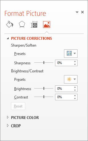
To choose a value other than the ones listed, click Picture Corrections Options to open the Format Picture pane to the Picture Corrections controls. From here you can choose presets, or you can drag sliders or enter exact percentages for each setting individually. See Figure 24.47.
FIGURE 24.47 Drag sliders to adjust brightness, contrast, and sharpen or soften settings individually.
Recoloring a picture
Several color options are available from the Color button’s drop-down list in the Adjust group of the Picture Tools ⇒ Format tab. You can apply color washes to the image, make it black and white or grayscale, make it look washed out, and more. You can point at a sample to see a preview of it on the selected image.
The Color menu has three sections (see Figure 24.48):
- Color Saturation: This refers to the vibrancy of the colors. At the low end is grayscale — no colors at all, or 0% saturation. The center point is 100% saturation, the default. At the high end is a very vividly colored version of the image at 400% saturation.
- Color Tone: The presets in this section enable you to adjust the “temperature” of the image, from very cool (increased blue and green) to very warm (increased red and yellow). Color tones are measured numerically; the higher the number, the warmer the tone. 4700 K is very cool; 11200 kelvin (K) is very warm.
FIGURE 24.48 Choose color presets to apply to the image.
 NoteColor temperature is measured by something called the Kruithof curve. It is named after Dutch physicist Arie Andries Kruithof, and it describes and assigns numeric values to colors like blue and green as cooler than colors like red and yellow. The temperatures are expressed on the Kelvin temperature scale (K).
 - Recolor: These presets enable you to radically adjust the colors of the image by choosing a grayscale, sepia, black-and-white, washout, or other preset or by applying a colored wash over the picture. Here’s where you’ll find the equivalent settings to the Recolor presets from earlier versions of PowerPoint, but also many more options. For more colors to choose from, point to More Variations and choose from the fly-out palette of colors. The last two rows of colors (darks and lights) are based on the theme colors.
You can also choose Picture Color Options from the menu in Figure 24.48 to open the Format Picture pane and display the Picture Color settings. Here you’ll find buttons that open menus with the same presets as on the menu and also sliders for fine-tuning the Saturation and Temperature.
Setting a transparent color and removing a background
The Transparent Color feature, which you also learned about earlier in this chapter, can be used to remove one of the colors from the photo, making the areas transparent that were previously occupied by that color. For example, suppose you have a scanned photo of your CEO and you want to make the background transparent so it looks like his head is sitting right on the slide. This feature could help you out with that.
To set a transparent color, select the image and then choose Picture Tools ⇒ Format ⇒ Adjust ⇒ Color ⇒ Set Transparent Color. Then, on the image, click an area that contains the color you want to make transparent.
Setting a transparent color sounds like a great idea, but in reality it does not work as well with photos as it does with clip art. For one thing, it replaces all instances of that color, not just in the background. So, for example, if you have a picture of a man with a white shirt on a white background and choose to make white the transparent color (because you want to drop out the background), the man’s shirt becomes transparent too.
Another reason it doesn’t work that well on photos is that what looks like one color in a photo is not usually just one color. Think of a blue sky, for example. It probably consists of at least two dozen different shades of blue. If you try to make one of those shades of blue transparent using PowerPoint’s transparency tool, you’ll probably just end up with splotches of transparent areas.
So what’s the solution? One workaround is to use alpha channels in a third-party image-editing program to create true transparency and save the image as TIF or PNG. (JPEG format does not support alpha channels.) An easier way, however, is to use PowerPoint’s Remove Background command. It can do the trick in many cases and is easier to use than most photo-editing programs.
To remove the background, select the picture and then choose Picture Tools ⇒ Format ⇒ Adjust ⇒ Remove Background. The Background Removal tab becomes available, and the areas of the image that PowerPoint plans to remove appear with a purple wash over them (shown in Figure 24.49).
FIGURE 24.49 The Background Removal tab provides tools for helping you separate a picture’s subject from its background.

If PowerPoint has correctly guessed at the edges of the image subject, click Keep Changes to accept the background removal as is.
If it has not gotten it quite right, do any of the following to make corrections:
- PowerPoint-generated border: A dotted border appears around what PowerPoint thinks is the central part of the image. Drag the selection handles along this border to expand it to allow additional parts of the image to be preserved if needed.
- To include more image sections: Click Mark Areas to Keep in the Refine group and then drag on the image, in the purple shaded areas, to delineate additional parts of the image that should not be removed.
- To exclude image sections: Click Mark Areas to Remove in the Refine group and then drag on the image, in the areas that are not purple shaded, to mark additional parts of the image that should be removed.
- For mistakes: If you make a mistake and mark an area you shouldn’t have, click Delete Mark in the Refine group and then click on that mark.
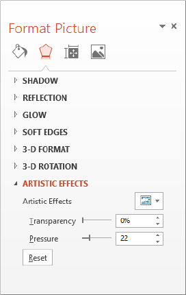
Applying artistic effects
Artistic effects are special types of transformations you can apply to images to make them appear as if they were created in some medium other than photography. For example, you can make a photo look like a pencil sketch or a painting.
To apply artistic effects, select the picture and then choose Picture Tools ⇒ Format ⇒ Adjust ⇒ Artistic Effects and choose from the menu that appears, as shown in Figure 24.50. Each effect is mutually exclusive with the others; when you select a different effect, the previously applied effect is removed.
FIGURE 24.50 Apply artistic effects from the Format tab.

For more control over the artistic effects, choose Artistic Effects Options. This opens the Format Picture pane with the Artistic Effects settings displayed. From here, after selecting one of the effects, you can make fine adjustments with the sliders and other controls that appear. There are different controls for different effects; Figure 24.51 shows the ones for the Pencil Sketch effect.
FIGURE 24.51 Fine-tune the chosen effect in the Format Picture pane.
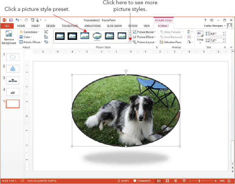
Applying picture styles and effects
You can format pictures using the same effects you learned about in Chapter 9. Click the Picture Effects button on the Format tab, and then choose one of the categories there, such as Shadow, Reflection, Glow, or Bevel.
You can also choose a preset Picture Style from the Picture Styles group on the Picture Tools ⇒ Format tab. Click one of the samples displayed in that group, or open the gallery of picture styles for even more choices. See Figure 24.52.
FIGURE 24.52 Choose a picture style as a shortcut to applying combinations of effects.
Compressing Images
Having an image that is too large (that is, too high a dpi) is not a problem quality wise. You can resize it in PowerPoint to make it as small as you like; just drag its selection handles. There will be no loss of quality as it gets smaller.
However, as mentioned earlier in the chapter, inserting a picture file that is much larger than necessary can increase the overall size of the PowerPoint file, which can become problematic if you plan to distribute the presentation in a form where space or bandwidth is an issue.
To avoid problems with overly large graphic files, you can compress the images to reduce their resolution and remove any cropped portions. You can do this from within PowerPoint or with a third-party utility.
Reducing resolution and compressing images in PowerPoint
PowerPoint offers an image compression utility that compresses all of the pictures in the presentation in a single step and reduces their resolution to the amount needed for the type of output you specify (e-mail, Screen, or Print).
Picture resolution is measured in PowerPoint in pixels per inch, or ppi. This roughly translates to dots per inch (dpi) on a printout. A computer screen shows 96 pixels per inch, so you do not need higher resolution than that if you are only showing your presentation on-screen. However, if you are distributing the presentation in other forms, a higher resolution might be appropriate.
To reduce resolution and compress images, do the following:
FIGURE 24.53 Click OK to compress with the default settings.
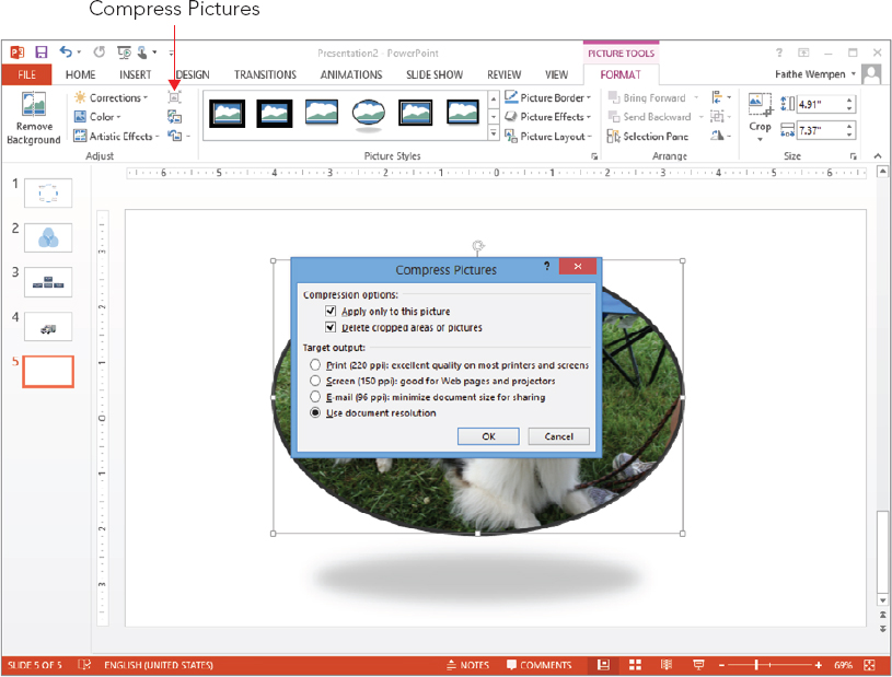
- Print (220 ppi): Choose this if you are printing the presentation on paper; it keeps the photos at a resolution where they will look crisp on a printout.
- Screen (150 ppi): Choose this if you are displaying the presentation using a projector or distributing via the Internet. Some projectors have a higher resolution than a monitor.
- E-mail (96 ppi): Choose this if you are e-mailing the presentation to others because this lower setting results in a smaller file that will transmit more easily via e-mail.
- Use Document Resolution: Use this to match the resolution of the pictures to the resolution defined in PowerPoint Options (File ⇒ Options ⇒ Advanced).
Reducing resolution with a third-party utility
Working with resolution reduction from an image-editing program is somewhat of a trial-and-error process, and you must do each image separately.
You can approximate the correct resolution by simply “doing the math.” For example, suppose you have a 10″ × 7.5″ slide. Your desktop display is set to 800 × 600. So your image needs to be 800 pixels wide to fill the slide. Your image is a 5″ × 3″ image, so if you set it to 200 dpi, that gives you 1,000 pixels, which is a little larger than you need but in the ballpark.
Summary
In this chapter, you learned how to create SmartArt graphics and work with clip art and pictures in a presentation. You should now be comfortable with tasks including:
- Selecting a SmartArt graphic type and creating the graphic.
- Adding and working with the graphic text.
- Rearranging and formatting shapes.
- Inserting online clip art or pictures on a slide.
- Recoloring or working with parts of clip art.
- Formatting a photo, including changing color, cropping, and special effects.