
Visualization in Revit—or with any tool (even a pencil)—isn't an exact science. It still requires a patient, aesthetic eye. The computer just does what you tell it to do, so many times users become frustrated because they don't know what they're trying to accomplish. But inexperienced users are often doubly frustrated because they don't know how to accomplish something. And so they set about trying to learn how to do a particular task.
Learning how to do a particular thing with a rendering tool is fine; it's part of a successful process. But we often find that people believe that the key to creating successful visualizations is the ability to make something seem "real"—or even "hyper-real"—and this is the goal of their learning process. Unfortunately, this is the first mistake (of many). If your goal is to make your renderings more realistic and believable, you'll quickly come to a dead end.
The most important thing you can do to successfully visualize your work starts first with one thing: listen. That's right—it's your ears that make you a great artist! You need to be able to understand what your client is trying to accomplish. Because you're not really trying to visualize something; you're trying to communicate something for someone else. First learn to listen, and you'll understand what your client needs to communicate. And you'll be far more successful!
In this chapter, you'll learn to:
Create real-time and rendered analytic visualizations
Render emotive photorealistic visualizations
Understand the importance of sequencing your visualization workflow
We believe that anyone can use Revit to create compelling, emotive visualizations. And what's really great is that your visualizations are based on the same coordinated design information that you're depending on to document to complete your project. But there are a few challenges:
Creating emotive visualization is usually such a small part of your project's overall workflow that it's hard to spend the time necessary to hone your rendering skills. This is the reason that photorealistic renderings, both still and moving image, are often the realm of a specialist who deeply understands the techniques and workflow needed to create compelling imagery.
The reality is that visualization is both art and science, but especially art. You'll never be able to just push a button and get a beautiful image. There's a world of difference between something that's photorealistic and something that emotive and compelling. In other words, the button says Render, not Beautiful.
Most importantly, visualization is about communication, something that many people forget to take into account. Don't ever create a rendering until you know what you're trying to accomplish. You must know your audience and understand what needs to be communicated (keeping in mind that the person requesting the rendering isn't always the intended audience). Otherwise, you'll likely spend hours of time doing something that is perfectly and exactly wrong.
We've learned this the hard way. Imagine the disappointment after spending hours creating what we thought was an amazing rendering, only to find out that the client wanted something more gestural and sketchy. Or imagine our frustration after we created something unresolved and fuzzy, only to find out that the client needed images that are polished and resolved, something more suitable for finished marketing materials. Rendering is about more than visualization. It's about communication. What you may need to communicate may be completely opposed to emotively well-lit, photorealistic material and entourage.
This brings up two important points about where you'll likely struggle with rendering in Revit, and why unfortunately there's very little that you can do about it:
Although engineers often analyze in order to design, architects often visualize in order to design. But if your intent is to put all of this visual iteration into Revit just to render it, you'll probably get frustrated over all the chaff you're putting into a database that you want to keep light and flexible (particularly during early design). The reality is that Revit is most useful during early design to communicate analytic rather than photorealistic information. But this isn't going to help create highly polished, wouldn't-it-be-great-if kind of renderings when Revit is best suited during early design to answer massing, relationships, adjacencies, and other analytic questions.
You'll never be able to render out of Revit more than you put into it. The level of detail required to create deeply emotive and detailed visualizations is not very likely the level of detail required to create accurate documentation. As a matter of fact, creating, changing, and resolving that level of detail may bring your project documentation to a grinding halt!
For example, the next time you're in your favorite coffee shop, take a moment and look at the espresso machine. Examine the detail of materials, hardware, and parts—the knobs, switches, and valves. Is this the level of detail that you want to have in your Revit project? Probably not! In fact, it's more likely that the documentation of a coffee shop simply requires a believable placeholder for an espresso machine; it needs to properly schedule and only be generally believable across all your project views.
But deeply emotive renderings often require specific detail and design resolution. In other words, not just "any" espresso machine will do! It needs to be a particular make, model, and manufacturer. Yet, if you're resolving this level of detail for visualization, it's likely that you're too deep into the weeds if you're spending valuable project time carefully modeling the valves on espresso machines.
So even though Revit has the ability to help you create great renderings, the level of detail required at the beginning of a project (when analytical relationships are still being resolved) is too much detail for that particular stage of design. Even when the project is well resolved and established, the level of detail required for a highly finished and photorealistic visualization is far beyond what's required to complete your project documentation. So, what is the point of this chapter?
Our focus is to get you somewhere in the middle. You need to deeply understand how Revit works, but you also need to understand that although something may be technically feasible, it may not be practicable from a workflow standpoint. Overall, our goal is to help you focus on communication, not just visualization. So if you're happy with visualizing your project at its current level of development (not too far ahead and not overly detailed), you're going to have a lot of success rendering inside Revit.
There are two key models of communication: analytic and photorealistic. Think for a moment about Google Maps: there's an option to view both Map and Satellite modes. Think of the Map mode as your analytic view and the Satellite mode as your photorealistic view. Both views are important depending on what you're trying to communicate. If you're simply trying to understand directional information, the Maps view is better. But if you're trying to show someone what something looks like with regard to trees and other real-world features, the Satellite view has obvious advantages.
It's also interesting to note that real-time information is easier to maintain in analytic views. For example, Google Maps has the option to show live traffic data. But this doesn't mean that they're showing actual cars moving on actual streets in photorealistic mode. Rather, they're color-coding the streets based on overall traffic patterns and movement.
The same is going to be true when you're visualizing your project in Revit. More often than not, you'll have the ability to show analytic information in real time. But showing photorealistic renderings of your project will require additional time (perhaps even days) in order to render your views.
Therefore, analytic visualization abstracts your model to communicate information that is not available by viewing the project literally. For example, massing studies are analytic representations of the building's overall form during the earliest design stages. Massing is useful in order to visualize geometric proportion and site context, and also for creating sun and shadow studies as well as preliminary energy analysis.
Even as you get into more of the project development and detail, materials may be a distraction whereas textures may not. Keeping your materials abstract and analytic allows you to help keep your focus on communicating the big ideas of your project. For example, does the spatial arrangement elegantly fulfill the design requirements? How is the vertical/horizontal stacking? We'll show you how to communicate these ideas in the following sections.
Traditionally, architects built monochromatic, physical models that communicated the essence of the design without being too literal too soon. You can accomplish this same technique in Revit.
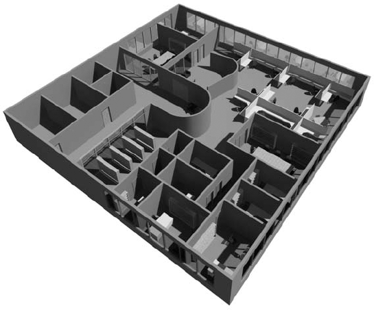
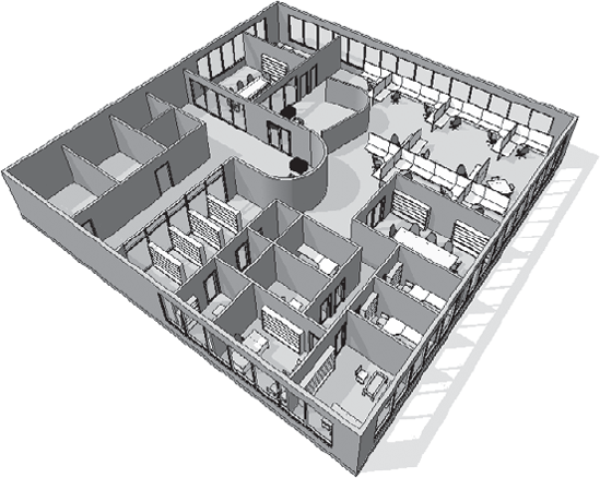
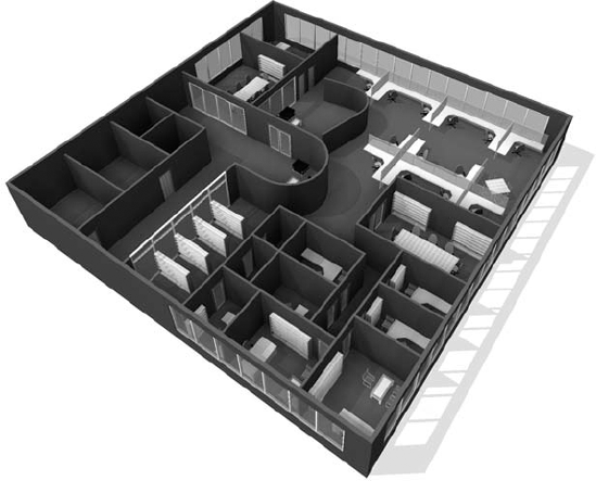
For example, take a look at the rendering in Figure 12.1, which has been created by rendering the view with all the default materials active.
The challenge is that in order to get the materials correct, you'll have to commit a significant amount of time to select, test, edit, and refine many material selections for an otherwise simple view that's quite early in the design stage. You don't have time for resolving all this specificity when doing so might result in something having the right material but in the wrong location.
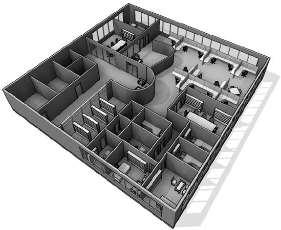
Figure 12.2 shows the same view rendered analytically, with all the materials set to an abstract matte white setting.

By selecting a matte material for everything in the view, you're able to focus on form–space and light–shadow relationships. Using the graphic overrides that are available with the Phasing tool can create a rendering like this quickly and easily. This is much faster than trying to select neutral materials for everything in your view. Here are the steps to create a matte rendering using the material overrides in Phasing:
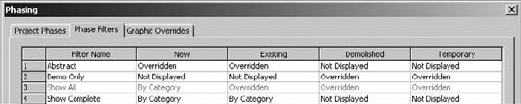
Open the Phasing settings and select the Phase Filters tab (Figure 12.3).
Create a new phase filter called Abstract. Set the New and Existing material assignments to Overridden.
Note
Go to the Graphic Overrides tab and create a new material assignment called Abstract (Figure 12.4). We've used a matte white material.
Now assign this material to your New and Existing objects (Figure 12.5).


That's it! When you want to render a project view with this abstract material assignment, simply assign the phase filter and phase, and you'll get an abstract, matte rendering as a result (Figure 12.6).
The previous example was an analytic rendering of a 3D view. But you can also see analytic information in a number of view types, not just 3D but also in 2D views. For example, color-filled room and area plans illustrate information about your project's spaces that are a representation of the space type.
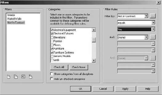
Viewing information about your project is easy and it has to do with view filters. In this section, first you'll create a view filter based on a project parameter, and then you'll create one to illustrate a user-defined project parameter. A filter can be used to alter the default display properties of elements on a per-view basis. As you can see from the Filters dialog box in Figure 12.7, you can apply up to three filters to a single view to override the graphic values of 2D and 3D content as well as spaces.

Figure 12.8 shows a simple example of how this works. In the view, there are walls that are two-hour rated. You'd be able to see this in a schedule, but how would you see this in a project view (2D or 3D)?

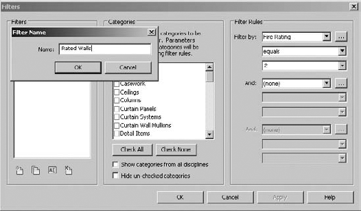
First, open the Filters tab in the Visibility/Graphic Overrides dialog box (Figure 12.9). Click Add to begin the process of creating and applying a new filter.
Create a new filter called Rated Walls, as shown in Figure 12.10. Click OK and be sure to select Walls in the Categories option and then Filter Rules, so that the graphic override will only be applied to walls when the rating equals a value of 2.
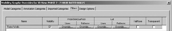
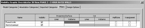
When you return to the Visibility/Graphic Overrides dialog box, you'll see the filter is ready to be applied (Figure 12.11).
Override the Projection, Surface, and Cut patterns, as shown in Figure 12.12.
When you're finished, click OK twice to return to the view of the project. You'll see that the filter is overriding the project-defined graphics of the two-hour rated walls (Figure 12.13).


What's wonderful about this is that you're able to visually coordinate and verify your project schedules with project views that confirm what is being described in the schedules. This even works in Hidden Line view, as shown in Figure 12.14. Changing elements in the schedule or from the project environment will immediately update in all views of your project.

Figure 12.14. Applied filter in Hidden Line view
Now let's look at another example where a particular parameter is not in the default project environment. In this example, we need to show the space as functionally complete, but a lot of the content that is shown isn't actually in the scope of work or contract. There are two particular challenges.
First, this kind of parameter might need to be applied across many categories of elements—not just furniture, equipment, and so on. Second, it may apply to one element, but not apply to another element in the very same category, name, and type. So, you'll want to make sure we're using an instance parameter (not a type parameter). Here are the steps:
Return to your Filters dialog box as before and create a new filter named Not In Contract.
Make sure that you select numerous categories of elements that you want to be able to distinguish as Not In Contract, as shown in Figure 12.15. When you're done, select More Parameters from the Filter Rules pull-down list.
Now select the same categories as shown in Figure 12.16. This user-defined project parameter will allow you to distinguish elements across a number of categories.
Apply your parameter to the filter. In this case, you're instructing Revit to override the graphics when the value of Not In Contract equals Yes (Figure 12.17).
Returning to the Filter tab in the Visibility/Graphic Overrides dialog box, you'll define how the graphics will be overridden. Once again, you're overriding the surface pattern with a solid color, this time yellow (Figure 12.18).
Select elements from the categories that you've just created a filter for. You'll notice that as you select the object in your file, the instance parameter is highlighted (Figure 12.19).
Select this value. As you do, the components will have the solid color applied, as shown in Figure 12.20, because the filter that you created now applies to the elements that you've selected, even in Hidden Line views!


Finally, this process can be valuable for identifying "generic" host design elements as you move between design iteration and design resolution. Figure 12.21 shows a filter that has been applied to a view to highlight any walls, floors, ceilings, or roofs that have the term Generic in their family name.

Now you can quickly identify what needs more detail from within your project. Revit's default template already uses the term Generic to describe basic design host elements, which makes them easy to filter, as shown in Figure 12.22.

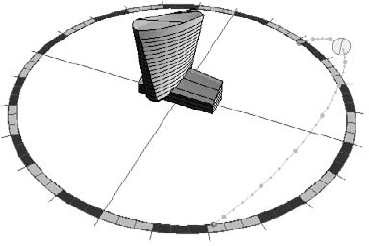
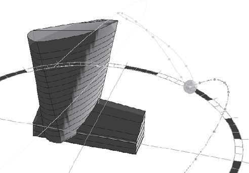
Sun and shadow studies are another analytic visual style that allows you to communicate natural lighting based on your project's location, orientation, and time of year. The sun's path is also displayed (Figure 12.23), and you can edit the path of the sun both directly and indirectly.
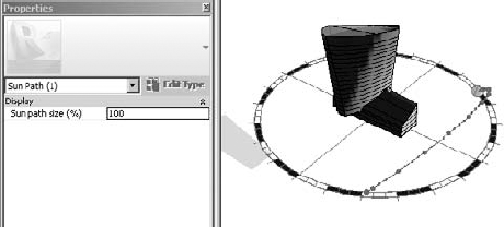
The size of the sun's path may need to be relatively larger or smaller depending on the size of your project or project context. To modify the size of the path, select the sun path and then select the Properties menu. Figure 12.24 shows the path at 100 percent.
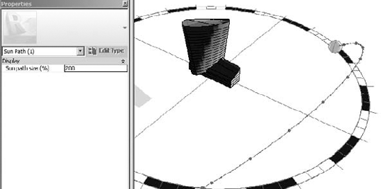
This would be fine for a sun and shadow study of the massing study with no context. But if you need to show additional context, you'll want to increase the size of the sun path. This is shown in Figure 12.25. The path has increased to 200 percent. The building seems relatively smaller, but the size of the sun path has increased.
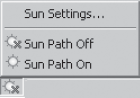
The sun path can be activated from the View Control bar (Figure 12.26) as well as the Lighting menu in the Rendering window.
Selecting the sun path directly in the view will allow you to edit the path by dragging to change the date (Figure 12.27).
The other option for editing the sun path is to open the sun settings. Opening the sun settings (Figure 12.28) allows you to more specifically select the settings for your particular view and solar study type.
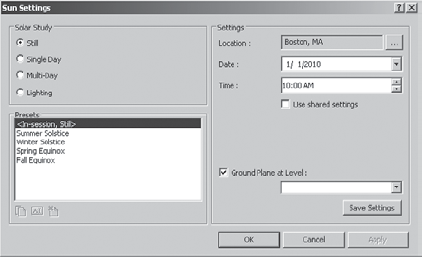
There are four different types of solar studies that can be created within Revit:
The Still setting allows you to create a study of a particular time, date, and location.
Single Day allows you to create a study over an entire day at intervals of 15, 30, 45, and 60 minutes.
Multi-Day allows you to create a sun study over a range of dates at intervals of an hour, a day, a week, and a month.
A Lighting study is not related to a particular time, date, or place. It's more useful for adding graphic depth and texture with "Sunlight" from an analytic top right or top left.
Single images are created using the Rendering dialog box. However, animations of single and multi-day solar studies are created by clicking the Application button and selecting Export

You'll then be given an option to export the animated solar study using a number of graphic styles (Figure 12.30). Selecting the Rendering option will sequentially render all the frames. This will take considerably longer than any of the other options, which are effectively taking sequential screen captures.

The difference in time needed to render a view compared to exporting screen captures can be quite considerable. For example, exporting a single day consisting of 36 frames (15-minute intervals) as screen captures can take as little as 1 minute (at a rate of 1 frame every 2 seconds). Yet rendering the same number of frames could easily take 3 hours (at a rate of 5 minutes per frame and a total time of 180 minutes)!
Analytic visualization is incredibly useful for quickly communicating information about your project in a way that isn't literally associated with the actual real-world material assignments of your project elements. While photorealistic visualization would render wood as "wood," an analytic visualization could be used to identify which wood materials were sustainably harvested, recycled, or LEED certified. Analytic visualization is concerned about what something means, not just what it looks like. Because analytic visualizations can often be viewed in real time, your project information remains visually concurrent and up-to-date.
When compared to analytic visualization, photorealistic visualization is more concerned with the emotive, experiential qualities of your space and content. Materials are carefully selected for accuracy and real-world simulation. But quite often, real-world isn't enough. Put another way, if analytic visualization is about what something means, photorealistic visualization is about how something feels or is experienced.
In many cases you'll find yourself tweaking materials and lighting in order to "theatrically" increase the nature of the space. Embellishing your project with nonproject entourage is probably essential, and we'll cover important techniques to keep that content from cluttering up the views that are necessary for documentation. In addition, lighting is key, which means you'll have to contend with considerably longer rendering times.
In this section, we'll describe the various visual styles that are available in the View Control bar with regard to rendering. Even though these settings create photorealistic renderings, their settings affect the outcome of renderings. Figure 12.31 shows the View Control bar of an orthographic view. Figure 12.32 shows the View Control bar of a perspective view. The major difference is that orthographic views are set to a scale.
Note that 2D project views can't be rendered. But you can orient an orthographic view to a 2D orientation and render.
The first option controls the level of detail in the view (Figure 12.33).

What is visible by default in a view is initially determined by the scale of the view, as shown by selecting Manage

But this level of detail setting can be overridden after the view is created. This is important for two reasons. First, changing the scale after the view is created will not automatically reset the level of detail, and second, rendering a view with a more granular detail level will (generally speaking) take more time. Even though the results will not be visible to the naked eye, the calculations required to render what you won't be able to discern (because the objects are so small) will still be computed.
So, it's very important that you render at the appropriate level of detail.
To illustrate this, look at the two perspectives in Figure 12.35. Although these two views look identical, one will rotate, refresh, and render faster than the other. This is because they're also set to different levels of detail.

The reason is not discernable at this scale because the differences are barely a pixel in size. The view on the left is set to a Coarse level of detail. But the view on the right is set to a Fine level of detail. While this different detail level doesn't have much of an effect on the content in either view, there is a critical difference.
The Executive Chair family has been modified so that the casters at the base of the chair only display at a Fine level of detail. The results are shown in Figure 12.36.

And although this difference may not have a large effect on a small project, it can have a significant effect on your project when you render (not to mention the additional time it will take when you export and print). So, be sure that before you render a view, the level of detail is appropriately set. If you're far away from the building or your view is quite broad, a Coarse detail level is quite sufficient. But if you're zoomed in on a particular detail or part of the building (or just a single office or room), then a Fine detail level might be more appropriate.
The visual style of your view can be one of six settings (Figure 12.37).
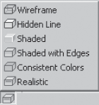
The Wireframe view (Figure 12.38) maintains only the edges of objects. Faces are hidden.

Hidden Line keeps both the edges and faces visible (Figure 12.39).
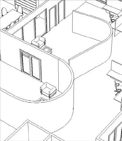
Figure 12.39. Hidden Line view
The Shaded view shows faces in their shaded value without accentuated edges (Figure 12.40). Note the change in color depending on an object's orientation. This is particularly pronounced on curved surfaces.

Shaded With Edges is simply the Shaded view but with edges shown (Figure 12.41). Again, the color of the object is the shaded value but relative to the orientation of the object to the viewer.

Consistent Colors view removes the color variation based on an object's orientation to the viewer. Colors are strict interpolations of the shaded value (Figure 12.42) and therefore have a flatter yet more consistent appearance.
The Realistic setting provides real-time overlays of geometry with the material that will be used during a photorealistic rendering, as shown in Figure 12.43.

We've already discussed the sun settings, so in this section we'll move ahead to the Shadows On/Off settings (Figure 12.44).

The ability to turn shadows on in real time is a terrific feature that helps you add an improved sense of depth to your view (Figure 12.45).

There are a couple of things to keep in mind when turning on shadows. For example, screen refreshing takes a bit longer when shadows are turned on. So, you'll probably want to keep shadows off in your working views as you zoom in, zoom out, and rotate.
In addition, the default settings could use some adjusting. To do this, open the Graphic Display Options dialog box, as shown in Figure 12.46.

Unless you're doing a solar study, the default sun setting should probably be set to Sunlight From Top Right or Sunlight From Top Left (Figure 12.47).

The more that you increase the Sun Intensity setting (Figure 12.48), the more washed out your view's appearance.

Turning the shadows off can have an appealing effect that softens the shaded materials in your view considerably (Figure 12.49).

If you're going to turn shadows on, experiment by decreasing the default Cast Shadows value (Figure 12.50).

This will keep the shadows on in your view but not overwhelm it with dramatic changes in lit and nonlit areas (Figure 12.51).
The Silhouette Style option allows you to override the edges of objects when that edge is defined by space (Figure 12.52).
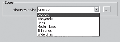
In Figure 12.53, the image on the left illustrates the view without silhouettes, and the image on the right shows the view with Wide Lines enabled.
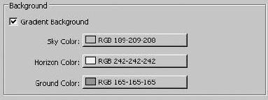
Selecting the Background option will allow you to simulate a horizon without rendering. Figure 12.54 shows the default settings.

The ambient lighting option is new in Revit 2011, and combined with other graphic options such as real-time shadows, edge enhancements, and real-time materials, it allows you to create emotive, real-time views of your project that do not require renderings.
To activate ambient lighting, open the Graphic Display Options dialog box and select the Ambient Lighting check box, as shown in Figure 12.55. The results are subtle but noticeable, particularly around the intersections of like objects. Shaded elements are embellished by highlights in the center of objects and deeper shading at the edges, as shown in Figure 12.56. The result is almost a water-colored effect that considerably softens the shaded view.

The effect can be accentuated when combined with the option to enhance the silhouette of edges for even more real-time effects (Figure 12.57). We expect this feature to be one of the most used communication and visualization tools in Revit 2011.
Before we get into the rendering process, let's discuss the section box. By selecting the Section Box option, as shown in Figure 12.58, you create a rectilinear matrix around your project that may be pushed and pulled to isolate a portion of your project.
In Figure 12.59, the section box has been pulled to isolate a portion of the project. This technique is helpful for isolating a smaller portion of a larger project. But a word of warning: be careful turning the section box off and on. The extents of the section box will reset and you'll have to pull them back into place. Very frustrating!
If you select the Type Properties of the view, you'll notice that there's a setting to determine the color of the poche (Figure 12.60).

The poche can be seen in all display types (Wireframe through Realistic), but it is only displayed in a view that is set to the Coarse level of detail. We recommend that you set the default color to black.
Here's why. As shown in Figure 12.61, the regions between host elements (like the walls and floors) are shown as discrete geometries. Yet it's often more desirable to show the poche as solid across these boundaries.
On the one hand, you can use the Join Geometry option to clean up the lines between elements. But this is very time-consuming and often leads to other problems in your file when a lot of things get "joined" just to create graphic impression.
Ideally, we'd like to have the option to "graphically" join the regions between these elements so that they appear monolithic without using the Join Geometry tool. That way, we could select a nice color that would stand out from the rest of the model and communicate the cut plane. Maybe in the next release!
In the meantime, one simple way to clean this up graphically is to select a poche color that is the same as the color of the lines between elements: black. Again, it's not the most desirable result, but it's very fast, doesn't require manual joining of geometry, and reads well (Figure 12.62).

Note
You can access the Rendering dialog box by clicking the teapot icon on the View tab or at the base of the view in the Visual Styles bar. Figure 12.63 shows the Rendering dialog box.
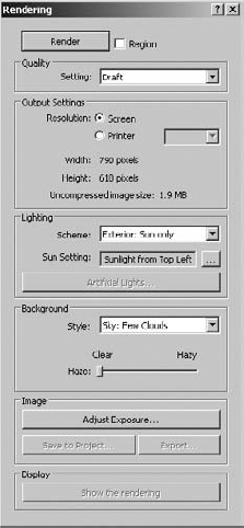
An important setting in this dialog box is the resolution. It's easy to spend far too much time creating a rendered view, because rendering times increase exponentially when the resolution doubles. Think of it this way. If you're rendering a view at 150 dots per inch (dpi) and then you render the same view at 300dpi, the image is now four times larger, not twice as large (1 x 1 = 1 and 2 x 2 = 4). If you were to render the view at 600dpi, it would be 16 times larger (4 x 4 = 16) and you could reasonably expect the 150dpi image that rendered in a few minutes to take considerably longer at 600dpi.
How large you need to render something depends on what you're going to use it for: screen or print. Don't expect a rendering the size of a 3" x 5" postcard to work for a 3' x 5' banner.
So, what resolution is big enough? Well, it's probably better to render things a bit larger, which will give you some flexibility if you need to increase the size of your image later.
Revit provides five present quality settings (Figure 12.64).
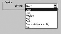
Figure 12.65 and Figure 12.66 illustrate the range between the Draft and the Best settings.

The output settings (Figure 12.67) help you determine the level of resolution that your image can be saved at when rendered. The screen resolution is simply the resolution of the view on your monitor.

You should be much more interested in the printer settings because of the likelihood that you'll need to print your views. Again, the resolution is important, because you're printing for something that will be viewed at some distance (arm's length or a few feet away) with the naked eye. Rendering beyond what can reasonably be seen will add a lot of time to your renderings. While the default printer resolutions are shown in Figure 12.68, you can input other values by typing them in the dialog box.
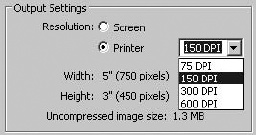
Estimating your image resolution is easy. If the image is going to be viewed on a screen, 150dpi is likely sufficient and even gives you some flexibility if the image has to be slightly larger. If you need to print the image, 300dpi will work the vast majority of the time. Now take the longest dimension of your image (height or width) and multiply the dimension by the needed resolution. That's it!
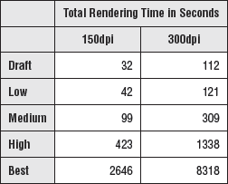
Here's a test. Figure 12.69 was rendered at each default setting of the screen resolution. The image size was only 3" x 2"—very small to be practical, but it was sufficient to chart render times rendering at 150dpi and 300dpi.

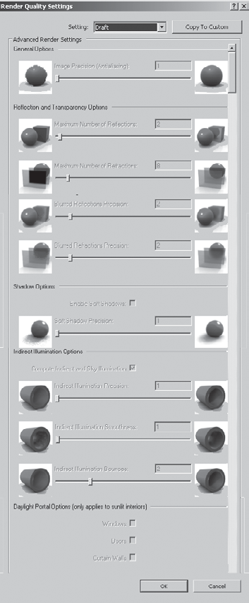
We kept the image small so the renderings could compute faster, and we left the lighting scheme to Exterior: Sun only and set the background color to solid white. As you can see in Figure 12.70, the time to complete each setting does not increase linearly. This is important to keep in mind as you change your quality settings and resolution, especially between High and Best, as there is a greater than six times increase in rendering time! Make sure the increase in time is worth the effort.
Creating and modifying your camera controls is almost as important as what you're creating. If you're not careful, you can easily under-impress the viewer by selecting the wrong view and aspect ratio of camera and controls.
Perspective views communicate far more depth than orthographic views (Figure 12.71). Unless the view needs to be at dimensioned scales, we prefer to use perspective views of the project.

When you create your camera view, the first point to select is your eye elevation, and the second point is the target elevation. Keep in mind that when you rotate your view, the rotation is centered on the target elevation (Figure 12.72).
Also, realize is that there is effectively a boundary box, which defines the extents of your camera view. This can be seen by going to another view, like a plan, and then selecting the camera from your Project Browser, as shown in Figure 12.73.

Once you can see your camera, you can select and move your camera around your project. This will allow you to move your camera closer and farther. It will also allow you to select the clipping planes of your camera and edit the front and back planes of your camera's view.
The aspect ratio of your camera is also very important. For example, a television ratio of 4:3 seems far less expansive and dramatic than a 16:9 wide screen ratio. Figure 12.74 illustrates this; the image on the left is 4:3 and the image on the right is 16:9. The result is that the view on the left seems too tight and constrained, whereas the view on the right is far more natural.

To change the aspect ratio, select the view boundary and then select the Size Crop option on the Modify Camera tab. In the resulting dialog box, you can change the aspect proportionally or nonproportionally (Figure 12.75). Keep in mind this doesn't zoom your camera forward and backward; it simply changes the relative height and width of the view.

To dolly your camera, simply activate the Navigational Wheel (Figure 12.76). You'll be able to zoom, pan, and orbit as well as control other view features.
Creating an animation path is much like creating a series of cameras. To create a camera path, select the Walkthrough option from the View tab (Figure 12.77).

From your plan view, start placing a series of cameras. Note that each time you pick a location, these cameras will become the key frames in your animation. When you have placed the last camera, press the Esc key, and your finished path will appear (Figure 12.78).
Right-clicking the path will allow you to go the series of views that you just created (Figure 12.79).

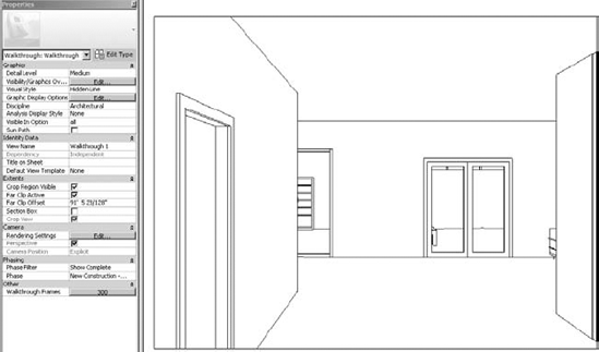
We'll be the first to admit that the walkthrough tools are not very intuitive. Figure 12.80 shows the first view in the path that we've just created along with the Walkthrough View Properties.
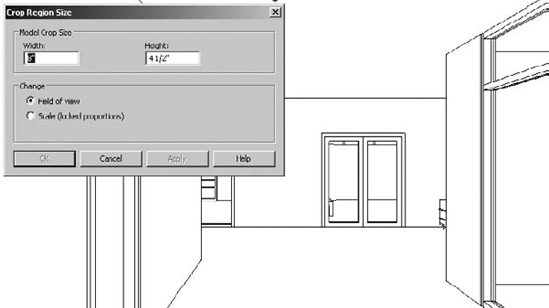
Let's modify the aspect ratio to 16:9. Select the view boundary and select Size Crop. By default, the view is 6" x 4½". An 8" x 4½" ratio is proportionally 16:9 (Figure 12.81). The view is now wider and less constrained.
We're going to export a Hidden Line view for testing (especially before rendering), but we want to give the walkthrough more depth. So change the silhouette edge style to wide lines (Figure 12.82).

It's not desirable to simply walk with the camera facing the same direction that you're walking. So we're going to modify the camera. But this will require that you open a couple of views, as shown in Figure 12.83. This way, you'll be able to see the results of your work in one view in other views.

A couple of important points should be noted. First of all, we're showing the plan and the camera view at the same time. This allows us to see both the graphic and analytic camera, which is important for modifying views. As you can see, when you select the boundary of the view on the right, the camera path highlights in the view on the left.
Since the view is selected, you have the option of editing the crop size just like any other camera. But you also have the option of editing the walkthrough, as shown in Figure 12.84.
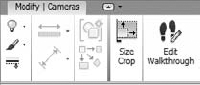
Click the Edit Walkthrough option, and you'll be given the contextual toolbar shown in Figure 12.85.
After you open the Key Frame Editor, the camera path now shows important controls (Figure 12.86).

The red dots along the path represent key frame locations (when you placed your camera, remember?) and the red dot directly in front of the camera will allow you to control the rotational direction. By default all the cameras face ahead relative to their location on the path. But you can edit this so that the camera can follow one direction but face another direction.
Since the default path is 300 frames in length, it would take a long time to go to each frame and edit what you see. It's better to jump ahead from key frame to key frame, editing fewer locations. When you do this, Revit will interpolate the frames between the key frames for you. As you jump ahead key frame to key frame, try to experiment rotating the camera to the left and right as well as glancing up and down. This can be done from the plan view on the left, or from the camera view on the right.
Once you've edited your key frames, you can export the animation from the Export menu, as shown in Figure 12.87.

You'll be given options to export an AVI with all the rendering options that you're given for still images (Figure 12.88).
A 15 frame-per-second (fps) frame rate is minimal to keep the animation smooth. But if you increased the frame rate, the animation length would shorten and it would seem like you were running (rather than walking) through the scene. What can you do? Simply add more frames to your animation.
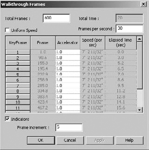
At the bottom of the camera properties, open the Walkthrough Frames dialog box (Figure 12.89). By increasing the total frames, you can also adjust the relative fps in order to maintain the desired speed.
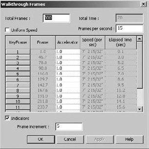
So for example, if you wanted to increase the fps to 30 but maintain the same travel speed, you would also increase the Total Frames setting to 600 (see Figure 12.90). Simple!
Finally, where a lot of people struggle is with the speed of their animation. Unless you're breaking up your animation into separate paths (which will be combined later into a single sequence), it's necessary to be able to speed up or slow down your camera's movement. In Revit, you can uncheck the Uniform Speed option in order to speed up or slow down the camera during a single animation study.
Although there's no exact rule for this, you can imagine the results. Think about how a plane seems to speed up relative to the ground as it approaches to land. In fact, it's slowing down. Yet your relative distance to the ground influences the perception of how fast you're moving. So even though you're slowing down, as you get closer to the ground, it seems like you're moving faster. And when you're at 30,000 feet it seemed like you were barely moving at all. Just imagine how the astronauts feel in space. While it might seem like they're barely moving at all and the earth slowly spins below, in fact they're orbiting at over 17,000 miles per hour. Don't hit any space junk!
The same visual effect plays a part in your renderings. The farther you are from something, the faster your camera can move as you fly by and still seem smooth and fluid. But you will need to slow down considerably if you're walking through the building, where a comfortable pace is 6–8 feet a second.
We've exported the animation from this portion of the chapter. If you want to investigate the file or animation, you can download the c12_Visualization.rvt file or the c12_Visualization_Animation.avi from the Chapter 12 folder.
You'd be surprised, but many people actually render in the wrong sequence. The workflow for creating compelling renderings is not the same workflow that you use to resolve your design process. If you try to do one like the other, the result is a lot of wasted time and frustration. Trial and error takes too long, and you won't get the desired results (and may even conclude that Revit "can't render").
Consider a reasonable design process to create a building that moves from intent to content:
Host components (walls, floors, stair, railings, and so on)
Family components (doors, windows, and so on)
Furniture, fixtures, and equipment
Assembly details and documentation
But if you're rendering in the order of the previous process, your results will be skewed. That's because in order to create photorealistic renderings, you're probably modifying your views in the following order:
Geometry (host and family components)
Materials (host and family components)
Cameras (setting up your views)
Lighting (lots of errors and rendering, adjusting, rendering, and so on)
Render (final renderings)
The challenge is that this is not the workflow for creating great renderings. If you're focused on the design process of visualization, the intent to content workflow is more along the lines of the following:
Yes, this is this is as simple as it gets: cameras, then lights, and then materials. But in Revit, lights don't usually show up until the building is well resolved, because you're placing lights meant to be the lights in the building, not just for "rendering." So, the design process is simply out of sequence with the visualization process.
Furthermore, you need to evaluate the lighting neutrally, not with materials to distract you. But as you're placing your content, a lot of stuff already has material assignments. You need to find a way to neutralize the material settings while you figure out lighting. The great thing is that we've already got all the parts to do this from earlier in the chapter. Now we just need to put it all together!
Geometry and cameras are the first step. You don't want to wait to see your project in perspective until after you've designed it. Unfortunately, you still can't design in perspective views in Revit, but ideally this will change. The point is that you need to be able to experience the space as you're designing, so go ahead and create perspective views of your project so that as you design you can see the results in real time.
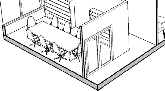
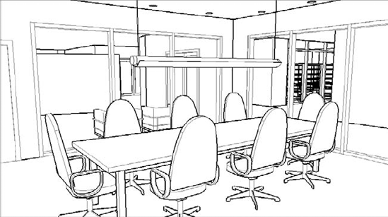
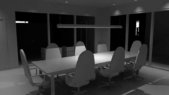
You can either use the project c12_Rendering Workflow.rvt in the Chapter 12 folder or your own file. The workflow is what's important. If you're using the file that we've created, you'll want to start in the RENDER - CONFERENCE ROOM 3D view. As you can see in Figure 12.91, we've already adjusted the shadows and sunlight as well as applied silhouette edges to the view.

Figure 12.91. Viewing our project in Hidden Line view
Right away, this isn't a bad view to have in your document set. The linework, subtle shadows, transparency of the glazing, and 16:9 aspect ratio help create a balanced view that doesn't require rendering. So don't be afraid to put these live views into your document set for quick reference.
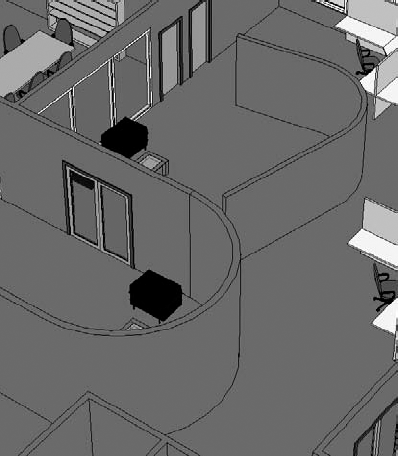
Another option that you have is to use the graphic overrides that we created using phasing. By setting the view phase to Abstract and increasing the transparency of the Shaded value (Figure 12.92), you'll be able to see through solid objects and beyond the immediate space.

This is helpful when you're visualizing a space yet want to give context to the other adjacent spaces (Figure 12.93).

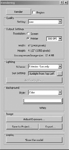
Now let's render the view. Keep in mind that the rendered material applied to the Abstract phase override is solid white, so you'll want to turn off the visibility of your curtain panels if you want see through the glazing. The rendering settings for this view are shown in Figure 12.94.
The reason that we're using Printer as the Output setting is because 300dpi is sufficient for the printing of this page. And an 8" wide image will suffice for the anticipated width of this book. Low quality is also sufficient based on our experience, because it's not worth the extra jump in time to render much higher than this first pass.
Figure 12.95 shows the results of the rendering. The scene can be viewed beyond the immediate space of the conference room. Take particular note of the shadows and how the lighting drops off from the edge of a shadow.

Of course this image is being rendered with the sun, which doesn't count for interior renderings; it's just a benchmark. So let's turn off the sun and start placing some artificial lights.
Since we're rendering abstractly using a phase override, everything is going to be solid white. But if your "light" source is behind a solid lens, it's not going to render very well.
The best way we've found to handle this (until Revit allows for more analytic rendering) is to create an Object subcategory for the lens that surrounds the light source. This will allow you to control the visibility of the lens of lighting fixture and allow the light to seemingly pass through the object. Unfortunately, this will not give the most realistic effect since many lighting effects result from light passing through translucent objects (like lenses or shades). But it's the best you'll be able to do for now to resolve lighting before you resolve materials.
You need to add a ceiling to the spaces. To keep things generic, we've added a compound ceiling to all the spaces (Figure 12.96). It's just a placeholder for your ceiling that will change later. But the important thing is that you don't get hung up centering ceiling tiles during your design process. Rooms will change dimensions, and all that time spent centering will go to waste.
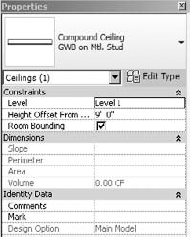
Figure 12.97 shows a Hidden Line view of the space with the materials set to 0 percent transparency. We've also turned the shadows off since it'll just distract us from not having the sunlight influence the view.

Now go ahead and render the view with the settings shown in Figure 12.98. Notice that we've set the Lighting to Interior: Artificial Only. We haven't placed any lights yet, but the reason that you want to render is to make sure that you don't have any light leaks and to benchmark your rendering. It should be completely black when the rendering completes.

Now load the family Downlight - Recessed Can.rfa and place it in the ceiling and along the two walls, as shown in the reflected ceiling plan (Figure 12.99). The exact dimensions aren't important—just get the idea right.

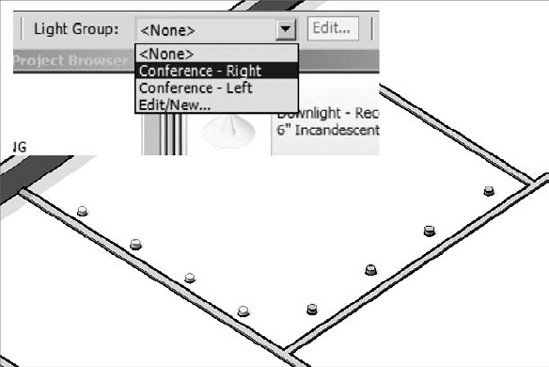
This light family doesn't have a lens, so you don't have to create an Object subcategory for the lens. But before you start to render these artificial lights, we need to explain the process and technique of using light groups.
Note
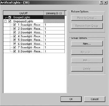
Sometimes you'll want to isolate the lights that are being calculated and rendered in a particular view. You might want to test the lighting that will result from having certain lights on and others off, just like in a real space. Revit allows you to create light groups for this purpose. This saves you a lot of time compared to turning individual lights off and on manually.
By default, whenever you place a light in your project, they're not in any group. They're "unassigned" just like the lights shown in Figure 12.100.
Besides the assignment for the light group, you also have the option of turning down the Dimming value. This is great for giving your space a half-lit effect.
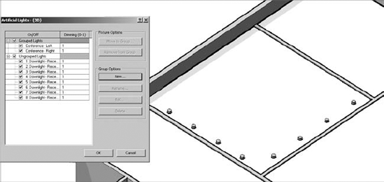
Now let's create two light groups for this space. Simply select New and then create the two groups as shown in Figure 12.101. We're also working from a 3D axonometric view, which will allow you to see the ceiling plan from above. This will be helpful for selecting lights from above if necessary.
Now let's assign the lights to the groups. Just select the lights and then assign to the light group from the contextual pull-down menu, as shown in Figure 12.102. Then do the same thing for the lights along the other wall.
Now return to the interior perspective. Before you start to render the view, let's test the light groups by only rendering the lights in the right group. Figure 12.103 shows the results.
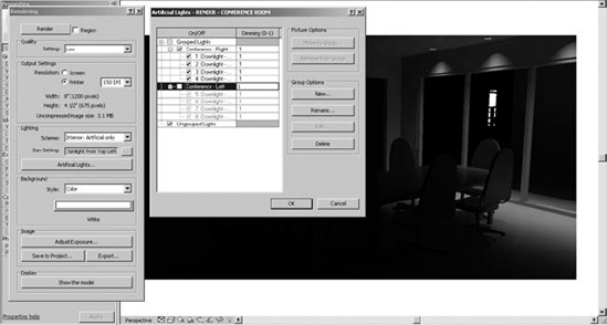
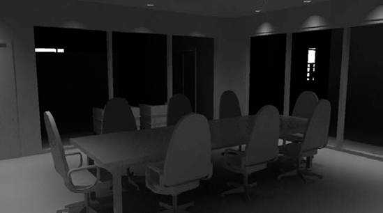
With that successful, let's complete the rendering of the space with the other light group turned on. Keep in mind that the more lights you have turned on in your view, the longer the calculations will take, and therefore the longer it'll take to render your view. Figure 12.104 shows the results of this second rendering. This figure also illustrates the ability to adjust the exposure in a completed rendering.

By default, the image will have a rather sepia tone. But removing the sepia tone can be controlled by adjusting the White Point value.
Keep in mind that what you're looking for is how the lighting affects the space. Are the lights too close or too far apart? Go ahead and add more lights, as shown in Figure 12.105.

After rendering the space with all the lights, it's becoming apparent is that the lights aren't illuminating the conference table (Figure 12.106). You need to add a nice linear lighting source above the table in order to understand the effect that light will have on the space. Again, it's important that you do this without the distraction of materials.
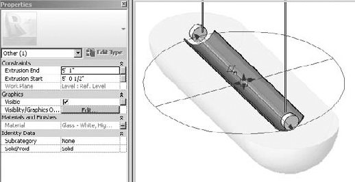
Use the Revit family Pendant Light - Linear - 1 Lamp and place it as shown in Figure 12.107. A great technique is to use a 3D view that's oriented to the top and then set the view to Wireframe.

This will allow you to place elements in the ceiling but also see their context and center the light properly with regard to the conference table and chairs. This time we'll have to put the lens on an Object subcategory. Figure 12.108 shows the light in 3D. The Type Properties of the light have also been adjusted to allow the light to hang down from the ceiling as shown.

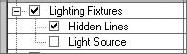
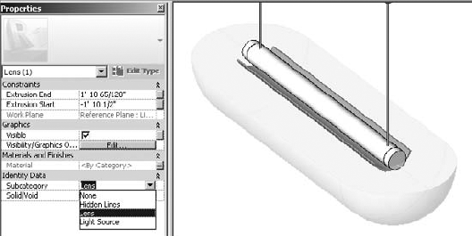
The light doesn't have a lens, but you'll go ahead and make one and then assign it to a subcategory in order to test a rendering with the lens turned off and on. First, go ahead and check the visibility settings of Lighting Fixtures as shown in Figure 12.109. Notice the Object subcategories are only Hidden Lines and Light Source. This will change in a moment when you add Lens to the list.
Open the linear light family and go the Right elevation. Then create an extrusion as shown in Figure 12.110.
You'll be prompted to select a work plane. Select the work plane shown in Figure 12.111.

Don't forget to align and lock the finished extrusion as shown in the front elevation (Figure 12.112).

Also, it is important to note that there's a lens of sorts in the light fixture (Figure 12.113). Go ahead and delete this geometry from your light, since we've already created a new lens.
Now reload the light into your project. It will update as shown in Figure 12.114.
If you render the view, you'll notice that light can't make it past the lens, as shown in Figure 12.115.
Eventually the lens will have a translucent material that will allow the light to shine through. But for rendering matte images, we may not want the light blocked so severely. We'll control this by assigning a subcategory to the lens geometry that will allow us to turn off all the lenses in the view at one time, particularly if you use the same naming convention for all the lenses that you put in your lighting fixtures.

Now return to the light family and create a parameter to control the material of the lens. We'll also create and assign the lens to an Object subcategory.
First, select Object Styles from the Modify tab. Then create the Object subcategory as shown in Figure 12.116.

Close the dialog box and then select the lens. Now you can assign this geometry to the subcategory that you just created (Figure 12.117).
Now that you've created and assigned the subcategory, let's assign the material parameter. You already have the material parameter Diffuser Material from the geometry that you deleted in Figure 12.116. So just assign this as shown in Figure 12.118 to the new lens.

Don't worry about assigning an actual material for now. In practice, it'll only change in the project. So you'll wait to assign it in the project environment rather in the Family Editor.
Now reload the light into the project and go to the visibility settings of the view. There's a subcategory for the Lens part of the lighting fixture. Uncheck this value, as shown in Figure 12.119. The lens is turned off, which is perfect!

Now re-render the view. The results will look like Figure 12.120. Note that the lens for the linear light isn't showing, but this is fine. You're after the lighting effect of the lighting fixture. The lens will come back on when you render with all the materials showing. But before rendering with materials, you need to add some entourage.
If you want your rendering to seem more complete than just a rendering of the building elements, you'll have to add entourage. But you don't want to clutter all your views with the kinds of things that you want to add that will not be part of your document set.
Worksets are great for controlling this part of your project. By creating a workset called Entourage, you'll be able to place your project content on a workset where all of its visibility can be quickly and easily controlled. But before creating and assigning elements to this workset, make sure the workset is turned off by default in other views (Figure 12.121).

This means that the entourage will not show up in existing or new views until you turn them on, rather than having to turn this workset off in all present and future views. This will save you a lot of time as you add entourage to your project.
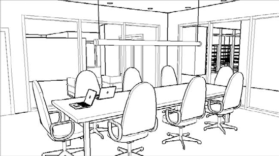
In this case, we're going to add some laptops to the conference table; we'll be sure to place them on the Entourage workset (Figure 12.122).
Now that you have determined the right lighting effects using matte materials, you can set the phase back to Show Complete (Figure 12.123). You'll also want to turn on the visibility for the curtain wall panels as well as the lens in the linear lighting fixture and render the view. Keep in mind that with all the new materials, transparency, and reflectivity, it will take quite a bit longer to re-render the view.

Once you render the view and you can start to see the transparency and reflectivity in the curtain panels, the rendering takes on a much more realistic effect. You can also see the materials in the table and chairs, as well as the lens for the linear light above the conference table.
- Create real-time and rendered analytic visualizations.
Analytic visualization is about communicating information about your project in a nonliteral way, and it's very important! It's not about showing real materials in the project but using filters to visualize important metadata.
- Master It
During the renovation of a space, you want to reuse the doors rather than throw them away. How would you illustrate this?
- Render emotive photorealistic visualizations.
Photorealistic visualization is also about communicating design ideas but in emotive ways that are much closer to how the space will be experienced, including real lighting, materials, and entourage. Just remember that the time it takes to calculate and render your views will change dramatically based on the quality and resolution of your views.
- Master It
Would the rendering for a PowerPoint presentation differ from a rendering being printed for a marketing brochure?
- Understand the importance of sequencing your visualization workflow.
The sequence of design—building, content, materials, and cameras—is not the same as the sequence for visualization (geometry/cameras, lighting, materials). Lighting is far more important than materials of actual objects. Get the lighting right, and the materials will look great, but not the other way around.
- Master It
How do you create a rendering environment that replaces the actual materials with matte materials in order to study the effects of lighting on your design?