
Spatial Thinking and Geo-Literacy
Abstract
Spatial thinking is a type of reasoning or literacy that can be used for navigating the world. In this context, it is referred to as geospatial thinking or geo-literacy. Maps are the graphical tools that convey this location-based information and geo-literacy, an essential concept for interpreting and using maps. Being geo-literate goes beyond traversing points A to B, and cartographers create many different map types that broadly fall into two categories of reference or thematic maps. Reference maps show where things are and thematic maps communicate a specific message about the world. Some of the mapping techniques and map types that librarians will encounter are defined and illustrated in this chapter.
Keywords
Spatial thinking; Geo-literacy; Geospatial; Thematic maps; Reference maps; Choropleth; Cartogram; Terrain; Mapping data; Aeronautical charts; Cartogram; Raised relief model; Atlas; Gazetteer; Geologic maps; Historic maps; Physiographic maps; Topographic map; Planimetric; Globe.
2.1 Geo-Literacy: Location-Based Spatial Thinking
What does it mean to think spatially? Our days are filled with thoughts in a variety of domains, some focused on using numbers, some with words, and others with music or the visual arts. But we also think spatially every day. The National Research Council (2006) describes spatial thinking as a way that “…uses representations to help us remember, understand, reason, and communicate about the properties of and relationships between objects represented in space, whether or not those objects themselves are inherently spatial.” [Emphasis preserved] (p. 27). These skills include “concepts of space, tools of representation, and processes of reasoning” (p. 12). Concepts of space are the components that separate spatial thinking from other domains such as mathematic or language-focused reasoning skills. Obviously, spatial thinking plays a role in our navigational activities, but in reality it goes much further as many of our other modes of thinking are influenced by spatial elements. For example, driving to work is clearly related to thinking spatially, but so is interpreting a spreadsheet on a computer. Working on mechanical problems, organizing your desk, and moving through the menu of a computer program are all tasks that require the ability to think spatially. It is an important skill in our lives, and one that directly concerns the field of geography.
What about geo-literacy then? We know what literacy is in the context of the written or spoken word, but what does it mean in the context of spatial thinking? Certainly there is an element of knowing where things are, but geography involves so much more than memorizing state capitals. The term geo-literacy is used by the National Geographic Society to “describe the level of geo-education that we believe all members of 21st-century society will need to live well and behave responsibly in our interconnected world” (Edelson, 2014). It is broken down into three separate components, starting with interaction or “how our world works.” This component relates to modern science’s descriptions of the functioning of natural and human systems. Secondly, implications or “how our world is connected” deals with the myriad links between these systems and how they affect one another. Finally, “how to make well-reasoned decisions” describes a process of decision-making that factors in these systems and their connections to make intelligent choices that benefit humanity while minimizing the potential negative impacts of the decision.
In today’s world, being geo-literate and having the ability to think geospatially has become more crucial than ever before. The level of understanding regarding our impact on the natural world is much greater than in decades past, and leveraging geo-literacy is essential to effective decision-making. This will help to improve the quality of lives around the world while reducing waste and protecting environmental conditions. Fortunately, geography is well-suited to help in this regard. With geography’s holistic approach to study, it projects a big-picture view of the interconnected nature of the world. Tools such as GIS, remote sensing, and maps are core components of how librarians can instruct and empower geo-literacy to these ends.
2.2 What Is a Map?
Maps are graphical tools for conveying spatial knowledge. They are a cartographer’s attempt to communicate information about the geographic milieu to an audience (Robinson & Petchenik, 1975). In this way maps provide consistency to our world view, attempting to unify our vision of the spatial configuration of features. A broad definition of the map is that they are graphical scale models of spatial concepts (Merriam, 1996). These concepts might represent physical or cultural features, or they might be abstractions that have no physical presence (Dent, Hodler, & Torguson, 2009). The format may be physical or virtual such as a paper road map vs. a digital GPS unit. Regardless, by connecting data to locations, we can communicate information about spatial patterns, track changes on the landscape, and even predict the outcomes of our decisions.
Colloquially, the term map can be used to describe many different objects, but traditional maps are required to include a few elements to differentiate them from figures, diagrams, or drawings. Different sources discussing cartography will disagree as to what specifically is required to make a complete map, but the most essential are a notation of scale, an indication of the direction of north, a legend, and citation information. If someone were to draw a map of their neighborhood, it would probably lack these elements, but it would still be acceptable to refer to it as a mental map, or just a map. Other map-like information lacking these essential components might be better described as figures or diagrams, but keep in mind that not all maps will fit the popular conception of what a map looks like.
2.3 Reference and Thematic Maps
Some maps, such as atlases or road maps, can be described as reference maps. These are general maps concerned with describing a broad overview of the location of features on Earth. While all maps are concerned with the spatial layout of phenomena, many maps fall into a different category, known as thematic maps. These maps explore specific topics or themes of data. Reference maps exist to tell us where things are, while thematic maps exist to communicate a specific message about the world. Thematic maps use general reference information to frame their messages, but only inasmuch as it is useful for putting thematic information in its appropriate context. For example, a map showing population density per county in the state of Tennessee will include county boundaries, but likely will not show every city, waterway, and road in the state. An overload of information can make things visually confusing, potentially to the point of obscuring the intended message. Therefore, on a thematic map, information not directly related to the message is generally not included.
One of the most famous examples of a thematic map is the cholera map based on John Snow’s research during an 1854 outbreak in London, see Fig. 2.1. Snow was convinced that contaminated water was the vector by which the disease was being spread, and his geographic analysis is credited with helping to end the outbreak, as well as giving rise to the field of epidemiology (Vinten-Johansen, 2003). While the map in Fig. 2.1 uses general reference information in the form of London streets, the primary purpose is to present medical data in support of the contaminated water theory. Many thematic maps follow this approach, and can be considered tools for answering questions about the nature of the world. A more modern example could be a thematic map exploring poverty rates at the county level in the United States. This map would not only answer questions such as “where does poverty exist?,” but would also act as a tool for confronting the issue. Just as Snow’s cholera map indicated a public well to be the source of the outbreak, analyzing patterns of poverty could help to better understand how spatial factors may play into poverty and how we might confront the issue in an effective manner.

2.4 Mapping Data—Map Symbology Techniques
Cartography has developed many approaches to visually representing spatial information over the past few thousand years. Both reference and thematic maps use various techniques for presenting spatial information, although thematic maps often use visualization techniques that deviate from a typical reference map. Some of the more commonly used thematic mapping techniques are described here. In order to explore these visualization approaches, the 2010 U.S. Census Bureau’s county population figures for the state of Kansas are employed. By using the same data in each map, the different symbology techniques can be more easily compared to one another. Fig. 2.2 shows a reference presentation of the state, with counties and major cities represented, but without any population data included. While visualization techniques are discussed here, a more detailed look at cartography and map conventions can be found in Chapter 3.

2.5 The Choropleth Map
The name “choropleth” may sound intimidating, but it is a commonly used approach to representing spatial data that is intuitive for map readers. Other names for choropleth include shaded maps or enumeration maps. A choropleth symbology is a two-dimensional (2D) representation of a three-dimensional (3D) histogram, or statistical surface, of data. Imagine that our county boundaries are represented in two dimensions, while the height of each feature represents the number of people found in each county. Fig. 2.3 shows an example of this 3D data visualization. Note that while this may be a visually interesting image, it is somewhat difficult to interpret, as county boundaries are not always visible and high value counties obscure information behind them.

Fig. 2.4 shows a traditional choropleth symbology, with county populations broken down into five classes. In this case, a natural breaks approach has been used to generate the class breaks. While the classes still obscure some variability in the data, the patterns in population distribution are easier to read in this view. Choropleth symbology is popular for many thematic maps, as it is easy to interpret, can quickly expose spatial patterns in data, and is visually appealing. One word of note regarding choropleth symbology though, the data represented must always be a derived value, such as the people per square mile ratio in Fig. 2.4. Using an absolute values approach can give outlier values much more influence on the visual result and therefore a faulty impression of the actual data. For a longer description of the many ways in which data and map symbology can be manipulated, accidentally or intentionally, see Mark Monmonier’s excellent How to lie with maps (1996).

2.6 The Dot Density Map
Another common map symbology approach is the dot density map. Instead of using colors to represent different classes of data, the dot density map simply puts a dot on the page for each unit of value. This has the benefit of not obscuring data points quite as much as the classes in a choropleth symbology, but it can also be misleading. The visual size of the dots is a major concern, as overlapping dots can coalesce into unreadable blobs. This is oftentimes unavoidable, but does decrease the map’s readability. Dot placement is also important. In an ideal dot density map, each dot would be positioned directly over the location of the feature represented, but this is typically not possible. In the example found in Fig. 2.5, U.S. Census blocks were used to give a relatively accurate approximate dot location, but the dots may not accurately represent the location of populations, especially in some of the more sparsely populated counties.

2.7 The Proportional Symbol Map
The proportional symbol map takes our population data and instead of changing colors, creates symbols with sizes that vary based on their values. These maps are relatively simple to interpret, but symbol overlap can be confusing at times. Fig. 2.6 shows an example of a proportional symbol map.

2.8 The Cartogram
The cartogram is unique as a symbology approach, as it actually distorts the geometry of the underlying features in its representation of data. Cartograms can be visually dramatic, but they can also be difficult to interpret. For example, in Fig. 2.7 some of the smallest Kansas counties also have the largest population densities, so they dominate the layout. Other counties in the west with smaller populations become so tiny that they are difficult to read. Obviously, this approach to visualizing data renders the map useless as a source of navigational information, but at the same time it can also be a powerful method of presenting information. This technique is particularly good at showing disparities in values between areas.

2.9 Mapping Terrain
Many maps represent geographic surfaces, often the physical elevation above sea level. This can also be a virtual elevation representing data values. Map surface information can be quite valuable, from topographic maps representing physical elevation to weather maps showing the distribution of barometric pressure in the atmosphere. Since maps are two-dimensional and elevation is three-dimensional by nature, multiple approaches to symbolizing elevation have been created over the years. Perhaps the most common is the use of isolines, referred to as contour lines in the context of surface elevation. Each line represents an elevation that is consistent across every point on the line. It is common to only label some of the contour lines and to have a declaration of the contour interval described in the legend; elevation can be found by counting the contours. Actual surface elevation at any point on the map exists somewhere within a range defined by the values of the two surrounding contour lines. The closer contour lines are to each other on the page, the steeper the slope of the terrain represented; anyone who has used a topographic map for hiking can attest to this valuable map information. An example of contour lines can be seen in Fig. 2.8A.

The use of color can also be applied in what is called a hypsometric tint. The elevation of the surface is broken down into ranges, and a unique color is applied to each range, as seen in Fig. 2.8B. A shaded-relief approach can be used to generate a sense of dimensionality to a flat surface. For this technique, a virtual light source is used to generate shadows based on the elevation of the surface, an example of which can be seen in Fig. 2.8C. Finally, multiple approaches are often combined to give a better sense of the terrain. This can be quite effective, as the reader will get the specificity of the contour line technique in addition to the more visually appealing and “three dimensional” approaches of the hypsometric tint and the shaded relief. An example of this combined approach can be seen in Fig. 2.8D.
2.10 Mapping Data—Map Types
While most maps inherently have a location-based component, there are many different types of maps to serve specific industries and messages or themes. Snow’s cholera map was both a location-based reference and thematic map that served a specific public health message and purpose. Some explorations within a particular field employ thematic maps combined with change over time; for example, comparing topographic maps over the decades could show the growth of an urban area. These maps may also use various symbology techniques to further emphasize their message. In any case, different map type examples are discussed below. While this is in no way an exhaustive list, it will describe some of the more common map applications in the natural, political, and social sciences. Knowing about these types of maps will help in managing collections and pointing patrons to resources that fulfill their needs.
2.11 Aeronautical Charts
An aeronautical chart focuses on the information necessary for the navigation of aircraft. In the United States, the Federal Aviation Administration (FAA) produces multiple maps showing information such as terminal procedures and airport diagrams. These charts are used for flying both under Instrument Flight Rules (IFR) and Visual Flight Rules (VFR), an example of which can be seen in Fig. 2.9. FAA charts can be freely downloaded in a digital format from their website (Federal Aviation Administration, 2016a).

2.12 Atlas and Gazetteers
An atlas is a collection of maps, and countless atlases have been produced over the years. Library collections are likely to have an atlas or two on hand, and in the United States, that atlas may well be one or more of the editions of the National Atlas of the United States. This atlas series was first published as a print edition in 1874 covering the 1870 census (Internet Archive, 2014; U.S. Geological Survey, 2015a). Later editions covered the census through 1920. After a fifty year gap, it was again printed in 1970, this time as a 400 page edition with maps covering all manner of topics. In 1997, the National Atlas was re-envisioned as a digital edition overseen by the U.S. Geological Survey (USGS), with all maps available through a web interface. This version was retired in 2014, but digital maps from this collection are still available on The National Map Small-Scale Collection website (U.S. Geological Survey, 2015b). At this time, the National Atlas has merged with The National Map (Newell, Donnelly, & Burke, 2014). As such, The National Atlas data can be accessed and downloaded from The National Map (U.S. Geological Survey, 2015c) and Earth Explorer (U.S. Geological Survey, 2016a).
The gazetteer is the counterpart to the atlas, providing an index to the features included in an atlas, cross-referenced so that the reader can find which map contains a specific feature. Gazetteers often include information regarding features such as location and relevant demographic information. An essential service in a print era, the gazetteer has become less prominent in today’s paradigm of digital searching. With a printed atlas, finding a geographic feature was often impossible without prior knowledge or the use of a gazetteer; now locations are a quick Google search away. Despite this, the gazetteer survives in multiple forms, both print and digital. Modern printed atlases still contain gazetteer information, and online versions exist as a source of authoritative place names. Examples of online gazetteers include digital files describing features in the United States available for download via websites at the U.S. Census Bureau (2015) and the U.S. Board of Geographic Names (U.S. Geological Survey, 2015d). One worldwide gazetteer is the U. S. National Geospatial-Intelligence Agency’s GEOnet Names Server (GNS), which provides both text and map search options (National Geospatial-Intelligence Agency, 2016). Other national gazetteers include the Canadian Geographical Names (Natural Resources Canada, 2014), Gazetteer of British Place Names (The Association of British Counties, n.d.), the Gazetteer for Scotland (University of Edinburgh & Royal Scottish Geographical Society, 2016), The National Gazetteer of Wales (2001), Gazetteer of Ireland (Haug, 2007), as well as an Antarctic gazetteer (U.S. Geological Survey, 2013).
2.13 Bird’s-Eye View
A bird’s-eye view map represents the land as if viewed from the panoramic vantage point of a bird mid-flight. This map style was quite common in the United States and Canada during the 1800s for representing cities of all sizes (Short, 2003). Traditionally, these maps were produced by an artist working from street plans. Road layouts would be drawn in perspective then filled in with details of the buildings and features found in the city. Because this map style was so popular, many of these maps exist today as records of what cities and towns were like at the time. Fig. 2.10 shows an example of this style of bird’s-eye view map of Chicago, circa 1857. Today, the bird’s-eye view survives in digital form. Platforms such as Google Earth, Google Maps, Bing Maps, and others provide perspectives similar to the traditional bird’s-eye view map, albeit interactive ones. These services typically combine aerial imagery and three-dimensional models of buildings and other structures to allow users to explore urban areas from the bird’s-eye perspective.

2.14 Coal, Oil, and Natural Gas Investigation Maps
The USGS has long mapped fossil fuel resources and reserves in the U.S., with oil and gas map series beginning in the 1940s, and coal maps in 1950 (U.S. Geological Survey, 2016b). Today the USGS Energy Resources Program is responsible for tracking the state of energy resources in the U.S., including coal, oil, and natural gas quantities and quality. Current information can be downloaded in report or digital GIS formats via the USGS Energy Data Finder (U.S. Geological Survey, 2016c). However, older paper map data can still be found digitally online and in some collections as hard copy including a folder and supplementary information (U.S. Geological Survey, 2016b). An example of one of these older paper maps showing a coal investigation in Colorado can be seen in Fig. 2.11.

2.15 Geologic and Mining
Geologic maps show the distribution of different types of rock and surface materials. They often include the structural relationships between the different materials in the ground such as strata, faults, and folds. The first modern geologic map was created by William Smith in 1815, which can be seen in Fig. 2.12 (Winchester, 2001). Today’s geologic maps are not much different from Smith’s work. Many kinds of geologic maps exist including surficial bedrock and sediment, subsurface rocks, fluids, and structures, and geophysical phenomena such as magnetism, heat flow, and gravity. In most environments vegetation, soils, water bodies, and human structures cover the surface, so that underlying rocks and sediments are not directly visible or exposed. Typically for geologic mapping purposes, the materials directly beneath the soil are depicted. This means the rocks or sediments that exist at shallow depth, usually 1 m in Europe or 5 ft in North America. An example of a generalized geologic map showing the state of Colorado can be seen in Fig. 2.13.


The USGS has standardized colors and geologic time symbols for maps of surficial geology according to age of strata so that a given geologic layer will have the same color and pattern across the map, keeping interpretation consistent. However, this scheme is not always followed at state and local levels for various reasons. The geologic maps available through USGS mapView are a patchwork of quadrangles, counties, and larger regions, with some portions missing (U.S. Geological Survey, 2016d). Maps of different vintages are juxtaposed, which leads to visual clutter and confusion, see Fig. 2.14. Component maps were created by various geologists using different working methods; in some cases they use different stratigraphic classification and terminology, which have changed through time. Cartographic style and graphic design also display conspicuous differences.

Coverage in mapView includes all western and central states, as well as Hawaii, but not Alaska. A few east-coast states, such as Florida and Virginia are included, but many other eastern states remain to be added. It is apparent that standardization of geologic mapping at the national level is a long-term goal that will take considerable additional effort to accomplish. Nonetheless, the current version is invaluable for public access to and display of surficial geology for many states using mapView from The National Geologic Map Database (NGMD) portal (U.S. Geological Survey, 2016e).
In the past, mining was largely unregulated and little attention was paid to long-term hazards or environmental consequences. Among the most highly polluted places in the United States is the Tri-State lead-and-zinc mining district, including Kansas, Missouri, and Oklahoma, which began operating in the 1850s, see Fig. 2.15. The last mines closed in 1970, leaving a legacy of serious soil and water pollution, poor economic conditions, and scarred landscapes (Manders & Aber, 2014). Such contamination led to the establishment of Environmental Protection Agency (EPA) Superfund sites, and many federal and state agencies along with several universities and private foundations have cooperated for environmental investigations and remediation efforts.

Public interest in such sites is extremely high in many cases. As there is no one single repository of mining-related map information, map librarians should be prepared to conduct considerable research among diverse public, commercial, and private sources to locate relevant GIS databases and historical maps. A good example of this approach is the Tri-State Mining Map Collection at Missouri Southern State University, which is available in digital format at the Missouri Digital Heritage (2007–2014). The collection includes more than 5000 maps of all types related to past mining activities in the region, such as the mineral resource map shown in Fig. 2.15.
2.16 Historic
The phrase “historic map” brings to mind ancient maps of the world, or perhaps European maps describing explorations into unknown regions of the Americas. Despite this conception, we can consider any map that is not current to be an historic map. While they may or may not be old chronologically speaking, if they are not the most currently available version of the map information, they can be considered historic. This is a broad definition, but it avoids the subjectivity of individuals’ conceptions of the word historic. For example, USGS topographic maps were produced until 2006, but these maps are now considered to be a part of the Historic Topographic Map Collection. Even though these topographic maps are not particularly old when compared to the larger history of cartography, they do not reflect the most current knowledge, which is available today in the digitally updated US Topo Quadrangle series.
This is not to say that historic maps’ dated information makes them valueless. Given that maps typically represent knowledge of place at a specific time, historic maps can be an incredible record of the world. Library collections often include historic maps produced over many decades or even centuries. Whether they are months or centuries old, historic maps may contain knowledge not found in any other format, and are a valuable part of a collection. This is especially true of maps produced locally to describe the region or city where the collection resides. Unfortunately, maps that may not be considered old enough to be historic by the colloquial definition of the word are often discarded to free up space, destroying information that is quite possibly unique and found in no other collection.
2.17 National Parks
Maps representing U.S. National Park Service (NPS) lands exist in multiple formats, but the most prominent is the topographic map created by the USGS. These maps are similar to the standard USGS topographic maps, but they have a special focus on the features related to national parks. Since there are large size differences from one park to the next park, the corresponding maps range in scale from large to small, 1:960–1:250,000. The largest scale map represents the Franklin D. Roosevelt National Historic Site in New York and the smallest, Denali National Park in Alaska (U.S. Geological Survey, 2005). Fig. 2.16 shows an example of one of these maps representing Rocky Mountain National Park in Colorado. USGS topo maps of National Parks can be purchased or downloaded through the USGS online store (U.S. Geological Survey, 2012a).

The NPS also produces service maps for each park, monument, and trail in the system. Rather than terrain, these maps are designed primarily to aid in navigation and general reference for visitors. The NPS recommends using USGS topo maps for outdoor activities such as hiking and mountaineering. Service maps are produced using a variety of data sources and cartographic techniques, although more recent maps are produced using GIS data sources and digital cartography techniques (National Park Service, 2016a). Since each park has different attractions, these maps cater to site-specific needs, including features such as parking and visitor’s center locations. An example of one of these service maps showing Great Sand Dunes National Park and Preserve in Colorado can be seen in Fig. 2.17. Service maps for individual National Parks, National Historic Sites, and the National Trails system can be found at the NPS’s website (National Park Service, 2016b).

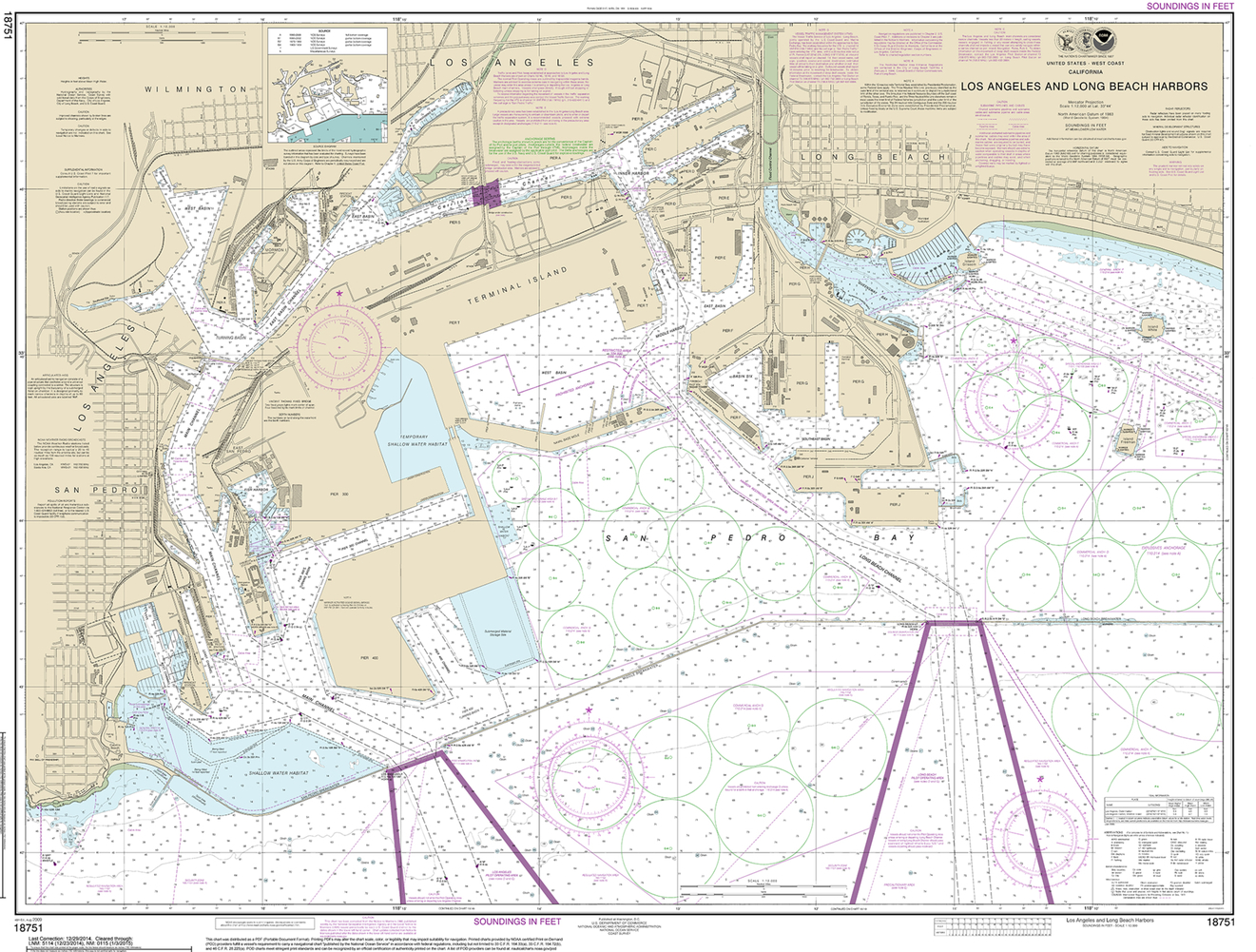
2.18 Nautical Charts
Nautical charts have been used for centuries to assist sailors in maritime navigation. Modern charts often include water depth, local magnetic declination, paths for entering and exiting harbors, and structures such as piers and relevant buildings. In the United States, the National Oceanic and Atmospheric Administration (NOAA) produces both digital charts as free downloads or paper editions for purchase (National Oceanic and Atmospheric Administration, n.d.). The agency has its origins in the United States Survey of the Coast, founded in 1807, and although today’s NOAA has changed quite a bit, the Coast Survey continues to produce weekly updated nautical charts for maritime use (National Oceanic and Atmospheric Administration, 2012). Types of maps produced include sailing charts for navigation in open coastal water, general charts for visual and radar navigation by landmarks, coastal charts for nearshore navigation, harbor charts, and other specialized chart types for various sailing uses (Thompson, 1988). An example of a modern nautical harbor chart showing the Los Angeles and Long Beach harbors can be seen in Fig. 2.18.
2.19 Physiographic
Physiographic maps show generalized regions based on shared land forms rather than vegetation or other factors. Many physiographic boundaries are therefore based largely on the underlying geology of a region. The general system in use today for classifying these regions was laid out in “Physiographic Subdivision of the United States” and has three orders referred to as major divisions, provinces, and sections (Fenneman, 1916). A modern example of a physiographic map showing generalized regions of Kansas can be seen in Fig. 2.19.

2.20 Planimetric
Planimetric maps are any maps that show the horizontal positioning of ground features without representing elevation information. These maps are used for a variety of purposes, including base or outline maps, cadastral maps, and line-route maps (Thompson, 1988). Base maps include features such as roads, waterways, or political boundaries that are used as a base, or background, for the presentation of other data. Outline maps are similar, but are generally limited to features such as political or physical boundaries. For example, many thematic maps include base map information, such as county boundaries or highways in addition to their thematic map content. See Fig. 2.4 for an example of a thematic map that involves county boundaries as a base. Cadastral maps represent the division of land for the purposes of ownership. These maps, including plats, are commonly used for legal descriptions of land ownership, as well as taxation purposes. Line-route maps are similar to base maps, but they are specific to utilities, representing the locations of all manner of pipes and cables, along with the facilities that support these vectors of transmission. A good example that can be used to map anything to do with energy, from electric transmission lines to hydrocarbon gas liquids pipelines, is the U.S. Energy Mapping System (U.S. Energy Information Administration, n.d.).
2.21 Political
Political maps focus on the administrative boundaries defining nation-states and other political regions, internal political divisions, and the locations of cities. They may contain other information, such as natural features like rivers and mountains, but the primary focus is on political borders. An example of a simple political map showing national borders can be seen in Fig. 2.20. Political maps often act as base maps, giving context to natural and cultural phenomena that overlay the political information. In an educational context, they may take the form of traditional classroom pull-down wall maps.

2.22 Soil
Soil maps are one component of a general soil survey, and they show the location and nature of different types of sediments on the ground. Soil surveys began in 1899 under the title of the National Cooperative Soil Survey; today the Soil Survey is under the USDA’s Natural Resources Conservation Service division. Paper maps included soil regions marked on top of aerial photographs, an example of which can be seen in Fig. 2.21. These maps were just one component of a regions’ soil survey, which could be more than 100 pages of detailed information about the soil, its composition, and what this meant for various agricultural practices. Today, these historic documents can still be accessed through the NRCS website, but more up to date information is downloaded through the Online Web Soil Survey (Natural Resources Conservation Service, 2013). This interactive map interface allows users to generate custom soil maps for their specific needs.

2.23 Topographic
A topographic map is any map that represents horizontal planimetric data in combination with a representation of vertical elevation data. There are multiple approaches to representing elevation in maps, but contours are the most commonly used technique today. See Fig. 2.8 for examples. Topographic maps are generally considered reference maps, as opposed to thematic maps, and are distinct from planimetric maps, which do not include relief information (Jones et al., 1942). These maps are used for many purposes related to the natural world, including recreation activities such as hiking, hunting, and fishing, but they are also used for activities like highway and utility development, construction planning, and flood management.
While many nations have mapping programs that create topographic maps, the most well-known series in the United States are produced by the USGS in a program stretching back to 1884 (Usery, Varanka, & Finn, 2013). While the technologies used to produce and distribute the maps have changed over the years, the basic map content remains more or less the same as it was in the late 1800s. After decades of labor, the original series of 7.5-minute topographic maps was declared complete in 1992 (Moore, 2011). Following the 1992 completion of the series, digital GIS approaches to mapping have been the focus of the program. Topo maps were produced with print as the target medium until 2006, and today these older paper maps are now referred to as the Historic Topographic Map Collection (HTMC). Since 2006, all new maps have been produced in a native digital form in what is known as the US Topo Quadrangle series (U.S. Geological Survey, 2016f). Hardcopy prints of this newer series can still be purchased through the USGS store, but the emphasis rests on distributing the maps digitally. Both digitized copies of the HTMC and US Topo Quadrangles are freely available for download through the Map Products at the USGS Store (U.S. Geological Survey, 2012b), The National Map Viewer (U.S. Geological Survey, n.d.), and The USGS topoView interface for current and historic maps (U.S. Geological Survey, 2016g).
There are differences between the two USGS topo series beyond their medium of distribution. Maps in the newer Topo Quadrangle series lack some of the information that was routinely presented in the HTMC maps, including features such as “recreational trails, pipelines, power lines, survey markers, many types of boundaries, and many types of buildings” (U.S. Geological Survey, 2015e). The reasoning behind these omissions is that USGS no longer verifies these features in the field, and as of 2016 no other current GIS data source exists to fill the gap. As data for these types of features becomes included in The National Map, it will be added to the Topo Quads. Two topo maps can be seen in Fig. 2.22, one showing an older HTMC version of the information, the other the modern Topo Quad version.

2.24 Globes and Raised-Relief Models
Globes have been made for thousands of years, as evidenced by the fact that the ancient Greek geographer Strabo discussed the use of globes some 2000 years ago in his Geographica (Strabo, 1903). Most globes have not survived the years in physical form though, and our oldest surviving globe was created by Martin Behaim in 1492 (Menna, Rizzi, Nocerino, Remondino, & Gruen, 2012). Early globes were used for aiding calculations and astronomy, while later the lack of conformal distortion in shapes was appealing for its accurate representation of land masses (Dahl & Gauvin, 2000). Globes have acted as status symbols, with a globe bestowing an air of wisdom and wealth to the owner. Early globes were one-offs, made of engraved metal or wood, and were expensive, but later printing technology allowed for globes to be mass produced through the use of paper globe gores. These gores were a flat print of the world that could be cut out and glued to the globe surface in order to cover the whole earth, an example of which can be seen in Fig. 2.23.

Unlike two-dimensional projected maps, globes do not suffer from geometric distortions; however, their lack of portability makes them poor candidates for replacing maps. Nevertheless, the globe lives on today in the digital realm, with free software packages such as Google Earth (n.d.), Esri ArcGlobe (Esri, 2003), and NASA World Wind (National Aeronautics and Space Administration, 2011) all allowing for visualization and manipulation of spatial data on a digital globe.
Raised-relief models are somewhat of a hybrid of flat maps and three-dimensional globes. They are based on flat, projected maps, but are extruded to show elevation in the third dimension. These maps are typically pressed or vacuum formed into shape on a mold in a rubber or plastic medium. There is no one single source of these relief maps, but they are usually based on USGS geospatial data and topographic maps. Today these models are generally intended for public display, but in the past relief models served a more functional purpose.
Before easy access to accurate maps and detailed aerial photography, creating a scale-relief model of landscapes with major geographic landmarks and transportation infrastructure helped in civil engineering plans and in some cases, war efforts (Kelly, 2013). In the Second World War, military leaders used relief models in strategic, defense preparation and troop training for unfamiliar terrains (University of Edinburgh & Royal Scottish Geographical Society, 2016). After Germany invaded and annexed Poland, the Polish military continued to fight as they moved west. Some reconvened in Scotland where they were tasked with creating a defense for the east Scottish coast, which was aided by creating a large terrain map (Mapa Scotland, 2013a).
Thirty years later, the Great Polish Map of Scotland, a large cartographic sculpture, was built on the same grounds of Barony Castle, now hotel, to commemorate Polish peoples’ contributions to the war effort and can be seen in Fig. 2.24 (Barony Castle LLP, 2015). The concrete terrain model is an accurate raised relief map of Scotland, designed by Polish cartographer Dr. Kazimierz Trafas and created by Jan Tomasik in the mid-1970s at the Hotel Barony, near Pebbles, Scotland (Mapa Scotland, 2013a). The 1979 map model measures approximately 50 × 40 m (160 ft × 130 ft) (University of Edinburgh & Royal Scottish Geographical Society, 2015). Funding was obtained and most of the needed restoration was completed from 2013 to 2015 (Mapa Scotland, 2013b). When finished, rivers will flow into the ocean and concrete will be tinted to mimic rock to vegetation cover (Little, 2014).

2.25 Aerial Photography
While aerial images are described in more detail in the remote sensing discussion in Chapter 4, it is worth mentioning aerial photos and images in this section as well. Given that aerial photographs have been collected regularly for more than a hundred years, physical paper copies of local imagery are likely to be found in library collections. In some cases, this is a necessity, as images like stereo pairs used for image interpretation may be more effective as paper copies than digital versions. Historical imagery has been collected over the years by multiple public agencies at the city, county, and state government levels. Because of the volume of these images, it is likely that some of them may not have been digitized yet, and only exist as paper copies. Local imagery such as this can be quite valuable as an historic record of land cover. Additionally, the federal government has an enormous collection of aerial imagery covering the U.S. that is available for digital download. An example of one of these images can be seen in Fig. 2.25.

2.26 Conclusions
It should be clear by now that maps can take many different forms and serve a wide variety of purposes. Library collections are quite likely to have many different maps serving disparate populations. This chapter should provide a sense of how maps function, and how they can be used in many different ways. Chapter 7 will look more specifically at map and data resources, but the map examples here should give some idea of the types of map data that are available to serve library patrons’ needs.