
Chapter 19
Ten More JavaFX Controls
In This Chapter
 Using the TitledPane class to create a pane with a border and title
Combining two or more titled panes in an Accordion
Choosing wisely with the DatePicker and ColorPicker controls
Creating buttons that look like hyperlinks
Indicating your progress with the ProgressIndicator and ProgressBar controls
Selecting from a range of values with a Slider control
Using a ScrollBar for other than its intended purpose
Entering secret stuff with a PasswordField control
In all, JavaFX has about 75 different controls you can choose from to build your user interfaces. So far in this book, you’ve read about how to work with about 30 of them. In this chapter, you find out about ten more.
So, without further ado, direct from my home office in sunny California, here are ten more JavaFX controls to put in your toolbox.
TitledPane
A titled pane is a pane that contains a single content node and draws a title bar and a border around the content to distinguish the content from other content in the scene. In addition, title panes are collapsible, which means that the user can collapse the titled pane so that just the title bar is visible. However, you can make the titled pane non-collapsible if you wish.
In spite of its name, TitledPane is a control, not a layout pane. In other words, it is a subclass of Control, not of Pane.
The TitledPane class has a simple constructor that accepts a string that will be displayed in the title bar and a node that will be displayed as the content. The node can, of course, be a layout pane that contains child nodes. Thus, a titled pane can contain multiple nodes. Here’s an example that creates three radio buttons, adds them to a toggle group and a VBox, and then creates a titled pane class to display the group of buttons:
RadioButton rbSmall = new RadioButton("Small");
RadioButton rbMedium = new RadioButton("Medium");
RadioButton rbLarge = new RadioButton("Large");
ToggleGroup sizeGroup = new ToggleGroup();
sizeGroup.getToggles().addAll(rbSmall, rbMedium, rbLarge);
rbMedium.setSelected(true);
VBox box = new VBox(10);
box.setPadding(new Insets(10));
box.getChildren().addAll(rbSmall, rbMedium, rbLarge);
TitledPane tpane = new TitledPane("Size", box);
If you want to make the titled pane non-collapsible, add the following line:
tpane.setCollapsible(false);
Then, the user can’t collapse the pane. In this case, the main purpose of the titled pane becomes visual: The border creates a visual grouping of the radio buttons, and the title bar lets the user know why these radio buttons are grouped (they let the user choose a size option). Figure 19-1 shows two titled panes: one collapsible, the other non-collapsible.
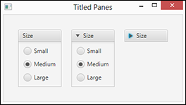
Figure 19-1: Titled panes.
Accordion
An accordion is a stack of titled panes. Only one of the titled panes in the accordion can be opened at any given moment. So if one of the titled panes in the accordion is open and you open a different one, the one that was open automatically closes. Figure 19-2 shows an accordion pane that contains three title panes; the same accordion pane is shown three times in the figure, each time with a different one of the titled panes opened.

Figure 19-2: An accordion.
To create an accordion control, you first create the separate titled panes that will make up the accordion. Then, you create the accordion using the default constructor and add the titled panes using the getPanes().addAll method. The following code sample shows how I created the accordion shown in Figure 19-2:
// Create the size toggle pane
RadioButton rbSmall = new RadioButton("Small");
RadioButton rbMedium = new RadioButton("Medium");
RadioButton rbLarge = new RadioButton("Large");
ToggleGroup sizeGroup = new ToggleGroup();
sizeGroup.getToggles().addAll(rbSmall, rbMedium, rbLarge);
rbMedium.setSelected(true);
VBox sizeBox = new VBox(10);
sizeBox.setPadding(new Insets(10));
sizeBox.getChildren().addAll(rbSmall, rbMedium, rbLarge);
TitledPane sizeTpane = new TitledPane("Size", sizeBox);
// Create the style toggle pane
RadioButton rbThin = new RadioButton("Thin crust");
RadioButton rbThick = new RadioButton("Thick crust");
ToggleGroup styleGroup = new ToggleGroup();
styleGroup.getToggles().addAll(rbThin, rbThick);
rbThin.setSelected(true);
VBox styleBox = new VBox(10);
styleBox.setPadding(new Insets(10));
styleBox.getChildren().addAll(rbThin, rbThick);
TitledPane styleTpane = new TitledPane("Style", styleBox);
// Create the toppings toggle pane
CheckBox cbPepperoni = new CheckBox("Pepperoni");
CheckBox cbSausage = new CheckBox("Sausage");
CheckBox cbOlives = new CheckBox("Olives");
CheckBox cbMushrooms = new CheckBox("Mushrooms");
CheckBox cbAnchovies = new CheckBox("Anchovies");
VBox toppingsBox = new VBox(10);
toppingsBox.setPadding(new Insets(10));
toppingsBox.getChildren().addAll(cbPepperoni, cbSausage,
cbOlives, cbMushrooms, cbAnchovies);
TitledPane toppingsTpane = new TitledPane("Toppings", toppingsBox);
// Create the accordion control
Accordion acc = new Accordion();
acc.getPanes().addAll(sizeTpane, styleTpane, toppingsTpane);
ColorPicker
A color picker is a special type of combo box that lets the user choose a color. When the color picker is initially displayed, it looks like a button. When the user clicks it, a palette of colors appears from which the user may choose, as shown in Figure 19-3.
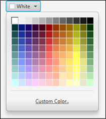
Figure 19-3: A color picker.
If the user doesn’t like the choices that are displayed in the color picker palette, the user can click the Custom Colors link at the bottom of the picker. This brings up a dialog box that lets the user craft a custom color, as shown in Figure 19-4.

Figure 19-4: Creating a custom color.
To create a color picker, just use the default constructor:
ColorPicker cp = new ColorPicker();
You can read the color selected by the user via the getValue method:
Color c = cp.getValue();
The following example shows how you can add a listener for a color picker’s OnAction event to set the fill color of a rectangle named rect to the selected color:
cp.setOnAction(e ->
r1.setFill(cp.getValue()) );
DatePicker
Like a color picker, a date picker is a special type of combo box that lets the user choose a date from a calendar-like display. Initially, the date picker looks like a text field. But when the user clicks it, a calendar display appears, as shown in Figure 19-5. The user can then choose a date, which the program can retrieve via the getValue method, which returns the date as a LocalDate.

Figure 19-5: A date picker.
The following example creates a date picker control and an OnAction event handler that sets the text value of a Label control named lbl to the date selected by the user:
DatePicker dp = new DatePicker();
dp.setOnAction(e ->
{
LocalDate date = dp.getValue();
lbl.setText(date.toString());
});
Hyperlink
A hyperlink control is a button that resembles an HTML hyperlink. It is rendered as simple text that changes format when the mouse rolls over it and when it has been clicked. When clicked, the hyperlink control acts just like a button; you can handle the click by creating a listener for the OnAction event.
Here’s a bit of code that creates a hyperlink and responds when the hyperlink is clicked:
Hyperlink h1 = new Hyperlink("Show details");
h1.setOnAction(e ->
{
// Code goes here
});
ProgressIndicator and ProgressBar
Both the ProgressIndicator and ProgressBar controls are designed to let your users know that some process which takes a long time (such as updating a database or downloading a file) hasn’t stalled, but is indeed chugging along toward completion. The difference between the two is the way progress is visualized: The ProgressIndicator is a circular control in which more of the circle fills in as progress is made, whereas the ProgressBar is a horizontal bar that fills in from left to right as progress is made.
To create a progress indicator or progress bar, just call the default constructor:
ProgressIndicator pi = new ProgressIndicator();
ProgressBar pb = new ProgressBar();
To set the amount of progress indicated by the progress indicator, you call the setProgress method, passing it a double value between 0.0 and 1.0. For example, to set the progress to 45 percent:
pb.setProgress(0.45);
Until you call the setProgress method, the progress indicator is considered to be indeterminate, which means that the user can’t tell how much progress has been made. An indeterminate ProgressIndicator is indicated by a circular pattern of spinning dots; an indeterminate ProgressBar is a bar that sweeps back and forth. After you call the setProgress method, the indicator will change to show the amount of progress that has been made.
Figure 19-6 shows both indeterminate and determinate examples of a progress indicator and a progress bar.

Figure 19-6: Progress indicators and progress bars.
Slider
A slider is a control that’s used to indicate a continuous range of values between a given minimum and maximum. A slider is rendered as a vertical or horizontal bar with a knob that the user can slide to indicate the desired value. A slider can also have tick marks and labels to indicate the intervals along the bar. Figure 19-7 shows a scene that resembles an audio equalizer with eight slider controls, each showing tick marks allowing values from 0 to 100. The labels beneath the sliders are not a part of the slider control; they are separate labels whose values are set by the OnAction event generated whenever the user moves one of the sliders.

Figure 19-7: Slider controls.
To create the slider controls shown in Figure 19-7, I created a helper method named makeSlider, which returns a VBox object that contains the slider control along with the text that displays its value. The method accepts an int value that indicates the starting value for the slider. The slider itself uses the default minimum and maximum values of 0 and 100, although you can easily change those values by calling the setMin and setMax methods.
Here’s the code for the makeSlider method:
private VBox makeSlider(int value)
{
Text text = new Text();
text.setFont(new Font("sans-serif", 10));
Slider s = new Slider();
s.setOrientation(Orientation.VERTICAL);
s.setPrefHeight(150);
s.setShowTickMarks(true);
s.setMajorTickUnit(10);
s.setMinorTickCount(0);
s.setShowTickLabels(false);
s.valueProperty().addListener(
(observable, oldvalue, newvalue) ->
{
int i = newvalue.intValue();
text.setText(Integer.toString(i));
} );
s.setValue(value);
VBox box = new VBox(10, s, text);
box.setPadding(new Insets(10));
box.setAlignment(Pos.CENTER);
box.setMinWidth(30);
box.setPrefWidth(30);
box.setMaxWidth(30);
return box;
}
ScrollBar
The ScrollBar control is not usually used by itself; instead, it is used by other controls such as ScrollPane or ListView to display the scroll bar that lets the user scroll the contents of a panel or other region.
However, there are occasions when you might want to use a scroll bar for some purpose other than scrolling a region. In fact, you can actually use a scroll bar in much the same way as you use a slider, as the two are very similar. One difference is that unlike a slider, a scroll bar does not allow tick marks. But on the other hand, a scroll bar has increment and decrement buttons on either end of the bar, which allows the user to set the scroll bar’s value up or down in fixed increments.
Figure 19-8 shows a version of the audio mixer that was shown in Figure 19-7, only implemented with scroll bars. As in the slider version, each scroll bar is paired with a Text object that displays the scroll bar’s value whenever the user manipulates the control.
I used the following helper method to create each combined scroll bar and Text object:
private Node makeScrollBar(int value)
{
Text text = new Text();
text.setFont(new Font("sans-serif", 10));
ScrollBar sb = new ScrollBar();
sb.setOrientation(Orientation.VERTICAL);
sb.setPrefHeight(150);
sb.valueProperty().addListener(
(observable, oldvalue, newvalue) ->
{
int i = newvalue.intValue();
text.setText(Integer.toString(100-i));
}
);
sb.setValue(value);
VBox box = new VBox(10, sb, text);
box.setPadding(new Insets(10));
box.setAlignment(Pos.CENTER);
box.setMinWidth(30);
box.setPrefWidth(30);
box.setMaxWidth(30);
return box;
}

Figure 19-8: Using scroll bars to create a mixer board.
PasswordField
A password field is a special type of text field that hides the characters entered by the user; it’s useful whenever the information being entered is sensitive. Figure 19-9 shows a password field in action.
The PasswordField class is a direct subclass of TextField, and it adds no additional methods or constructors. Thus, you can use it exactly the way you use a text field. Here’s how you can create a password field:
PasswordField pw = new PasswordField();
To retrieve the value entered by the user, use the getText method:
String pwtext = pw.getText();
 In addition to hiding the input entered by the user, a password field has one additional difference from a text field: Its contents cannot be copied or pasted.

Figure 19-9: Using a password field.