Chapter Contents
First Session
This first section just gets you started learning JMP. In most of the chapters of this book, you can follow along in a hands-on fashion. Watch for the mouse symbol (⌘) and perform the action it describes. Try it now:
The active JMP application displays several items by default. You can use general JMP preferences to show only what you want to see when starting JMP.
Tip of the Day
Both the Macintosh and Windows environments begin by showing ‘The Tip of the Day’. There are many of these handy tips, but as a rule they are useful only if you are an experienced user. If you are just starting or not interested in the tips, uncheck the ‘Show tips at startup’ box in the lower left corner of the tip. Use Help > Tip of the Day to see the tips at any time.
The JMP Starter (Macintosh)
When the application begins, the Macintosh environment shows the JMP menu bar and the JMP Starter window. Appropriate Macintosh toolbars are also attached to analysis windows, and therefore vary. When a JMP data table or analysis is open, use View > Show Toolbar to see the appropriate toolbar.
Figure 2.1 The JMP Main Menu, Tool bar, and the JMP Starter (Macintosh)

The JMP Starter Window displays most of the commands found in the main menu and toolbars. You might find the JMP Starter helpful if you are not familiar with JMP or data analysis because the Starter briefly describes each option and report. On Windows you can see the JMP Starter using View > JMP Starter.
The JMP Home Window (Windows)
On Windows, opening JMP displays the JMP Home Window (Figure 2.2). It might show behind the Tip of the Day − close the Tip window or click the JMP Home Window to bring it to the front.
Figure 2.2 JMP Home Window (Windows only)

The JMP Home window is completely customizable. You can resize any of its panes or choose which panes to keep open. Once you begin using JMP, importing, opening, or creating tables, and doing analyses, the JMP Home Window becomes an invaluable desk organizer. However closing the Home Window when nothing else is open automatically closes the JMP session after asking you if you are ready to exit JMP.
You can always close JMP by using File > Exit JMP on Windows or JMP > Quit JMP on the Macintosh.
So, lets get your toes wet by opening a JMP data table and doing a simple analysis.
Open a JMP Data Table
Begin by starting JMP, if you haven’t already. Instead of starting with a blank file or importing data from text files, open a JMP data table from the collection of sample data tables that comes with JMP.
The JMP sample data is most easily accessed from the Help menu on the main menu bar.
Figure 2.3 Top Portion of the Sample Data Index from the JMP Help Menu

The data tables are organized in outlines by subject matter and appropriate type of analysis, but you can also choose a table from a complete alphabetical list of tables or see the open file dialog for the JMP sample library.
Figure 2.4 Open File Dialog (Windows)

You should now see the JMP table in Figure 2.5 with columns titled name, age, sex, height, and weight.
Figure 2.5 Partial Listing of the Big Class Data Table

Chapter 3, Data Tables, Reports, and Scripts, describes details of the data table, but for now let’s try an analysis.
Launch an Analysis Platform
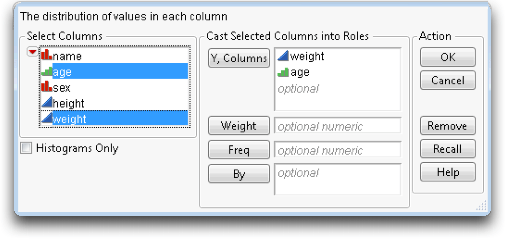
What are the distributions of the weight and age columns in the table? That is, how many of each weight value and how many of each age value are there in the Big Class table?
This is called launching the Distribution platform. The launch dialog appears, and prompts you to choose variables to analyze.
The term variable is often used to designate a column in the data table. Picking variables to fill roles is sometimes called role assignment.
You should now see the completed launch dialog shown in Figure 2.6.
Figure 2.6 Distribution Platform Launch Dialog
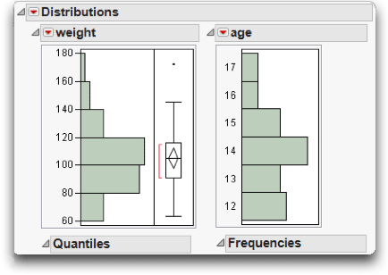
The resulting analysis window shows the distribution of the two variables, weight and age (graphs are shown in Figure 2.7).
Figure 2.7 Histograms for Weight and Age from the Distribution Platform
Interact with the Report Surface
All JMP reports start with a basic analysis that you can then work with interactively. This lets you to dig into a more detailed analysis or customize the presentation. The report is a live object, not a dead transcript of calculations.
Highlight Rows
The bar is highlighted, along with portions of the bars in the other histogram and rows in the data table corresponding to the highlighted histogram bar, as shown in Figure 2.8. This is the dynamic linking of rows in the data tables to plots. Later, you will see other ways of selecting and working with row attributes in a table.
Note: You might need to resize and move windows around to see both data tables and analyses at the same time.
On the right of the weight histogram is a box plot with a single point near the top.
The point for Lawrence is away from the other weight points and is sometimes referred to as an ‘outlier.’
Figure 2.8 Highlighted Bars and Data Table Rows

Disclosure Icons
Each report title is part of an analysis presentation outline. Click on the diamond on the side of each report title to alternately open and close the contents of that outline level.
Figure 2.9 Disclosure Icons for Windows and Macintosh (right)

Contextual Menus
When there are presentation options, there is a small red triangle (a hot spot) to the left of the title on a title bar that accesses menu commands and options for that part of the analysis report. This red triangle menu has commands specific to the platform. Hot spots on the title bars of each histogram contain commands that only influence that histogram. For example, you can change the orientation of the graphs in the Distribution platform by checking or unchecking Display Options > Horizontal Layout (Figure 2.10).
Figure 2.10 Display Options Menus
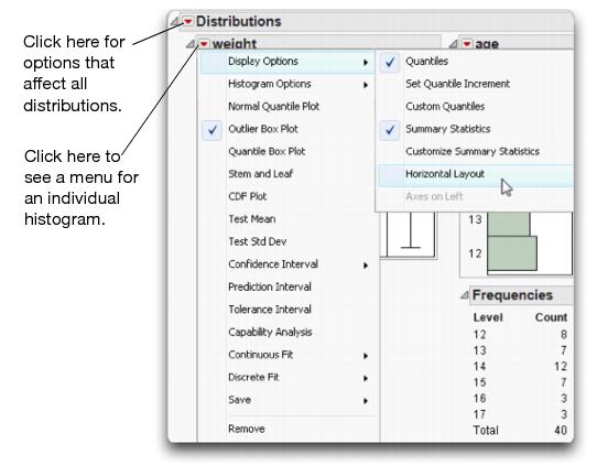
In this same menu there are options for performing further analyses or saving parts of the analysis. Whenever you see a red triangle hot spot, there are options available. The options are specific to the context of the outline level where they are located. Many options are explained in later sections of this book.
Menus and Toolbars (Windows)
Important: In Windows environments, all windows have a JMP menu and tool bar. These may be hidden depending on the size of the window. To view a hidden menu, click Alt, or move your mouse above the gray space over window’s title bar.
Resizing Graphs
If you want to resize the graph windows in an analysis, move your mouse over the side or corner of the graph. The cursor changes to a double arrow that then lets you to drag the borders of the graph to the position you want.
Special Tools
When you need to do something special, pick a tool in the tools menu or tool palette and click or drag inside the analysis (see the hint above for displaying hidden menus).
The grabber ( ) is for grabbing objects.
The brush ( ) is for highlighting all the data in an rectangular area.
The lasso ( ) is for selecting points by roping them in. We use this later in scatterplots.
The crosshairs ( ) are for sighting along lines in a graph.
The magnifier ( ) is for zooming in to certain areas in a plot. Hold down the command key (⌘) on the Macintosh or Alt key on Windows and click to restore the original scaling.
The drawing tools(  ) let you draw circles, squares, lines and shapes to annotate your report. The annotate tool (
 ) is for adding text annotations anywhere on the report.
The question mark ( ) is for getting help on the analysis platform surface.
The selection tool ( )is for picking out an area to copy so that you can paste its contents into another application. Hold down the Shift key to select multiple report sections. Refer to the chapter Data Tables, Reports, and Scripts for details.
In JMP, the surface of an analysis platform bristles with interactivity. Launching an analysis is just the starting point. You then explore, evaluate, follow clues, dig deeper, get more details, and fine-tune the presentation.
Customize JMP
Want to have larger markers, different colors, or other graphs or statistical output each time you use JMP? You can customize your JMP experience using the Preferences command on the File menu (on the JMP menu on Macintosh).
You can set general preferences (shown in Figure 2.11) to change what you see when you open JMP each time. When you become more familiar with JMP operations, you may want to change other preferences, which are grouped under Preference Group.
Figure 2.11 Default JMP Preferences
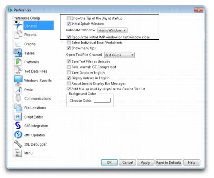
Hint: In a Windows environment, use Windows Specific > Auto-hide menu and toolbars and change the setting to “Never” to automatically display the main JMP menu on every window.
Modeling Type
Notice in the previous example that there are different kinds of graphs and reports for weight and age. This is because the variables are assigned different modeling types. The weight column has a continuous modeling type, so JMP treats the weight values as numbers from a continuous scale. The age column has an ordinal modeling type, so JMP treats its values as labels of discrete categories.
Here is a brief description of the three modeling types:
• Continuous ( ) are numeric values used directly in an analysis.
• Ordinal ( ) values are category labels, but their order is meaningful.
• Nominal ( ) values are treated as unordered, categorical names of levels.
The ordinal and nominal modeling types are treated the same in most analyses, and are often referred to collectively as categorical.
You can change the modeling type using the Columns panel at the left of the data grid. Notice the beside the column heading for age. This icon is a popup menu.

The different modeling types tell JMP ahead of time how you want the column treated so that you don’t have to say it again every time you do another analysis. Modeling types also help reduce the number of JMP commands you need to learn. Instead of two distribution platforms, one for continuous variables and a different one for categorical variables, a single command performs the anticipated analysis based on the modeling type you assigned.
You can change the modeling type whenever you want the variable treated differently. For example, if you wanted to find the mean of age instead of categorical frequency counts of each age, simply change the modeling type from ordinal to continuous and repeat the analysis. You can change the modeling type in data table as illustrated above, or in the launch dialog of the platform you are using.
The following sections demonstrate how the modeling type affects the kind of analysis from several platforms.
Analyze and Graph
Commands in the Analyze and Graph menus launch interactive platforms to analyze data. The Analyze menu is for statistics and data analysis. The Graph menu is for specialized plots. That distinction, however, doesn’t prevent analysis platforms from being full of graphs, nor the graph platforms from computing statistics. Each platform provides a context for sets of related statistical methods and graphs. It won’t take long to learn which platforms you want to use for your data.
The previous example used the Distribution platform to illustrate some of the features in JMP.
See Appendix A for a brief description of each menu command and the book Using JMP under Help > Books for detailed documentation and examples.
Navigating Platforms and Building Context
The first few times you use JMP, you might have navigational questions: How do I get a particular graph? How do I produce a histogram? How do I get a t-test?
The strategy for approaching JMP analyses is to build an analysis context. Once you build that context, the graphs and statistics become easily available—often they happen automatically, without having to ask for them specifically.
There are three keys for establishing the context:
• Designating the Modeling Type of the variables in the analysis as either continuous, ordinal, or nominal.
• Assigning X or Y Roles to identify whether the variable is a response (Y) or a factor (X).
• Selecting an analysis platform for the general approach and character of the analysis.
Once you settle on a context, commands appear in logical places.
Contexts for a Histogram
Suppose you want to display a histogram. In other software, you might find a histogram command in a graph menu, but in JMP you need to think of the context. You want a histogram so that you can see a distribution of values. So, launch the Distribution platform in the Analyze menu. Once launched, there are many graphs and reports available for focusing on the distribution of values.
Occasionally, you may want the histogram as a presentation graph. Then, instead of using the Distribution platform, use the Chart or the Graph Builder platforms in the Graph menu.
Contexts for the t-Test
Suppose you want a t-test. Other software might have a t-test command on a main menu. JMP has many t-test commands, because there are many contexts in which this test is used. So first, you have to build the context of your situation.
If you want the t-test to test a single variable’s mean against a hypothesized value, you are focusing on a univariate distribution, and therefore launch the Distribution platform (Analyze > Distribution). On the title bar of the distribution report is a red triangle menu with the command Test Mean. This command gives you a t-test, as well as the option to conduct a nonparametric test.
If you want the t-test to compare the means of two independent groups, then you have two variables in the context—perhaps a continuous Y response and a categorical X factor. Since the analysis deals with two variables, use the Fit Y By X platform. If you launch the Fit Y by X platform, you’ll see the side-by-side comparison of the two distributions, and you can use the t Test or Means/Anova/Pooled t command from the menu on the analysis title bar.
If you want to compare the means of two continuous responses that form matched pairs, there are several ways to build the appropriate context. You can make a third data column to form the difference of the responses, and use the Distribution platform to do a t-test that the mean of the differences is zero. Alternatively, you can use the Matched Pairs command to launch the Matched Pairs platform for the two variables. In Chapter 8, “The Difference between Two Means,” shows and explains more ways to do a t-test.
Contexts for a Scatterplot
Suppose you want a scatterplot of two variables. The general context is a bivariate analysis, which suggests using the Fit Y by X platform. With two continuous variables, the Fit Y By X platform produces a scatterplot. You can then fit regression lines or other appropriate items with this scatterplot from the same report.
You might also consider the Graph Builder command in the Graph menu when you want a presentation graph. As a Graph menu platform, it provides only a handful of statistical options, but is wildly interactive and flexible. For example, it can overlay multiple Y’s in the same graph and support two y-axes.
If you have a whole series of scatterplots for many variables in mind, your context is many bivariate associations, which is part of either the Multivariate or Scatterplot 3D platforms. A matrix of scatterplots appears automatically for Multivariate platform analyses.
Contexts for Nonparametric Statistics
There is not a separate platform for nonparametric statistics. However, there are many standard nonparametric statistics in JMP, positioned by context. When you test a mean in the Distribution platform, there is an option to do a (nonparametric) Wilcoxon signed-rank test. When you do a t-test or one-way anova in the Fit Y by X platform, you also have three optional nonparametric tests, including the Wilcoxon rank sum (which is equivalent to the Mann-Whitney U-test). If you want a nonparametric measure of association, like Kendall’s τ or Spearman’s correlation, look in the Multivariate platform.
The Personality of JMP
Here are some reasons why JMP is different from other statistical software:
Graphs are in the service of statistics (and vice versa). The goal of JMP is to provide a graph for every statistic, presented with the statistic. The graphs shouldn’t appear in separate windows, but rather should work together. In the analysis platforms, the graphs tend to follow the statistical context. In the graph platforms, the statistics tend to follow the graphical context.
JMP encourages good data analysis. In the example presented in this chapter, you didn’t have to ask for a histogram because it appeared when you launched the Distribution platform. The Distribution platform was designed that way, because in good data analysis you always examine a graph of a distribution before you start doing statistical tests on it. This encourages responsible data analysis.
JMP allows you to make discoveries. JMP was developed with the charter to be “Statistical Discovery Software.” After all, you want to find out what you didn’t know, as well as try to prove what you already know. Graphs attract your attention to an outlier or other unusual feature of the data that might prove valuable to discovery. Imagine Marie Curie using a computer for her pitchblende experiment. If software had given her only the end results, rather than showing her the data and the graphs, she might not have noticed the discrepancy that led to the discovery of radium.
JMP bristles with interactivity. In some products, you have to specify exactly what you want ahead of time because often that is your only chance while doing the analysis. JMP is interactive, so everything is open to change and customization at any point in the analysis. It is easier to remove a histogram when you don’t want it than decide ahead of time that you want one.
You can see your data from multiple perspectives. Did you know that a t-test for two groups is a special case of an F-test for several groups? With JMP, you tend to get general methods that are good for many situations, rather than specialty methods for special cases. You also tend to get several ways to test the same thing. For two groups, there is a t-test and its equivalent F-test. When you are ready for more, there are three nonparametric tests to use in the same situation. You also can test for different variances across the groups and get appropriate results. And there are two graphs to show you the separation of the means. Even after you perform statistical tests, there are multiple ways of looking at the results, in terms of the p-value, the confidence intervals, least significant differences, the sample size, and least significant number. With this much statistical breadth, it is good that commands appear as you qualify the context, rather than having to select multiple commands from a single menu bar. JMP unfolds the details progressively, as they become relevant.
..................Content has been hidden....................
You can't read the all page of ebook, please click here login for view all page.