Chapter Contents
What Is a One-Way Layout?
A one-way layout is the organization of data when a response is measured across a number of groups, and the distribution of the response may be different across the groups. The groups are labeled by a classification variable, which is a column in the JMP data table with the nominal or ordinal modeling type.
Usually, one-way layouts are used to compare group means. Figure 9.1 shows a schematic that compares two models. The model on the left fits a different mean for each group, and the model on the right indicates a single grand mean (a single-mean model).
Figure 9.1 Different Mean for Each Group Versus a Single Overall Mean

The previous chapter showed how to use the t-test and the F-test to compare two means. When there are more than two means, the t-test is no longer applicable; the F-test must be used.
An F-test has the following features:
• An F-test compares two models, one constrained and the other unconstrained. The constrained model fits one grand mean. The unconstrained model for the one-way layout fits a mean for each group.
• The measurement of fit is done by accumulating and comparing sum of the squares for the constrained and unconstrained models. Note that there can be several kinds of sums of squares. In this discussion of a one-way layout:
- The total sum of squares, or Total SS, is found by accumulating the squared differences between each point and the grand mean.
- The model sum of squares, or Model SS, is found by accumulating the squared differences between the group means and the grand mean.
- The difference between the Total SS and the Mean SS is the error sum of squares, or Error SS. The Error SS is also called the Residual SS, where a residual is the difference between the actual response and the fitted response (its group mean).
• Degrees of Freedom (DF) are numbers, based on the number of parameters and number of data points in the model, that you divide by to get an unbiased estimate of the variance (see the chapter What Are Statistics? for a definition of bias). As with sums of squares there are different degrees of freedom:
- the total degrees of freedom (DF) is the total number of data points minus one (Total DF).
- the Model DF is the number of groups minus one.
- the Error DF is the total DF minus the model DF.
• A Mean Square is calculated by dividing a sum of squares by its associated degrees of freedom (DF). Mean Squares are estimates of variance, sometimes under the assumption that certain hypotheses are true. As with sums of squares, there are different mean squares, two of which are very important:
- the model sum of squares divided by its degrees of freedom is called the model mean square or Model MS.
- the error sum of squares divided by its DF is called the Error MS.
• An F-statistic is a ratio of Mean Squares (MS) that are independent and have the same expected value. In our discussion, this ratio is
• If the null hypothesis that there is no difference between the means is true, this F-statistic has an F distribution. The Model MS doesn’t reflect much more variation than the Error MS. That is, fitting a model doesn’t explain any more variation than just fitting the grand mean model.
• If the hypothesis is not true (if there is a difference between the means), the mean square for the model in the numerator of the F-ratio includes some effect besides the error variance. This numerator produces a large (and significant) F if there is enough data.
• When there is only one comparison (only two groups), the F-test is equivalent to the pooled (equal-variance) t-test. In fact, when there is only one comparison, the F-statistic is the square of the pooled t-statistic. This is true despite the fact that the t-statistic is derived from the distribution of the estimates, whereas the F-test is thought of in terms of the comparison of variances of residuals from two different models.
Comparing and Testing Means
The file Drug.jmp contains the results of a study that measured the response of 30 subjects to treatment by one of three drugs (Snedecor and Cochran, 1967). To begin,

The three drug types are called “a”, “d”, and “f.” The y column is the response measurement. (The x column is used in a more complex model, covered in Chapter 14, “Fitting Linear Models.”)
Note in the histogram on the left in Figure 9.2 that the number of observations is the same in each of the three drug groups; that is what is meant by a balanced design.
Figure 9.2 Distributions of Model Variables

Notice that the launch dialog displays the message above the analysis type legend that you are requesting a one-way analysis.
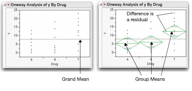
The results window on the left in Figure 9.3 appears. The initial plot on the left shows the distribution of the response in each drug group. The line across the middle is the grand mean. We want to test the null hypothesis that there is no difference in the response among the groups.
Figure 9.3 Distributions of Drug Groups
Means Diamonds: A Graphical Description of Group Means
This adds means diamonds to the plot and also adds a set of reports. The plot on the right in Figure 9.3 shows means diamonds:
• The middle line in the diamond is the response group mean for the group.
• The vertical endpoints form the 95% confidence interval for the mean.
• The x-axis is divided proportionally by group sample size. If we have the same number of observations per group, the x-axis will be evenly divided.

If the means are not much different, they are close to the grand mean. If the confidence intervals (the points of the diamonds) of groups don't overlap, the means are significantly different.
Later sections in this chapter show details and interpretation rules for means diamonds.
Statistical Tests to Compare Means
The Means/Anova command produces a report composed of the three tables shown in Figure 9.4:
• The Summary of Fit table gives an overall summary of how well the model fits.
• The Analysis of Variance table gives sums of squares and an F-test on the means.
• The Means for Oneway Anova table shows the group means, standard error, and upper and lower 95% confidence limits on each mean.
Figure 9.4 One-Way anova Report

The Summary of Fit and the Analysis of Variance tables may look like a hodgepodge of numbers, but they are all derived by a few simple rules. Figure 9.5 illustrates how the statistics relate.
Figure 9.5 Summary of Fit and anova Tables

The Analysis of Variance table (Figure 9.4 and Figure 9.5) describes three source components:
C. Total
The C. Total Sum of Squares (SS) is the sum of the squares of residuals around the grand mean. C. Total stands for corrected total because it is corrected for the mean. The C. Total degrees of freedom is the total number of observations in the sample minus 1.
Error
After you fit the group means, the remaining variation is described in the Error line. The Sum of Squares is the sum of squared residuals from the individual means. The remaining unexplained variation is C. Total minus Model (labeled Drug in this example) and is called the Error sum of squares. The Error Mean Square estimates the variance.
Model
The Sum of Squares for the Model line is the difference between C. Total and Error. It is a measure of how much the residuals' sum of squares is accounted for by fitting the model rather than fitting only the grand mean. The degrees of freedom in the drug example is the number of parameters in the model (the number of groups, 3) minus 1.
Everything else in the Analysis of Variance table and the Summary of Fit table is derived from these quantities.
Mean Square
Mean Squares are the sum of squares divided by their respective degrees of freedom.
F-ratio
The F-ratio is the model mean square divided by the error mean square. The p-value for this F-ratio comes from the F-distribution.
RSquare
The Rsquare (R2) is the proportion of variation explained by the model. In other words, it is the model sum of squares divided by the total sum of squares.
Adjusted RSquare
The Adjusted Rsquare is more comparable over models with different numbers of parameters (degrees of freedom). It is the error mean square divided by the total mean square, subtracted from 1. :
Root Mean Square Error
The Root Mean Square Error is the square root of the Mean Square for Error in the Analysis of Variance table. It estimates the standard deviation of the error.
So what's the verdict for the null hypothesis that the group means are the same? The F-ratio of 3.98 is significant with a p-value of 0.03, which leads us to reject the null hypothesis and confirms that there is a significant statistical difference in the means. The F-test does not give any specifics about which means are different, only that there is at least one pair of means that is statistically different.
Recall that the F-test shows whether the variance of residuals from the model is smaller than the variance of the residuals from only fitting a grand mean. In this case, the answer is yes, but just barely. The histograms shown here compare the residuals from the grand means (left) with the group mean residuals (right).
Means Comparisons for Balanced Data
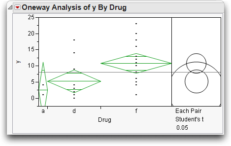
At this point, we know there is at least one pair of means that are different. Which means are significantly different from which other means? It looks like the mean for the drug “f” (the placebo) is separate from the other two (see Figure 9.3). However, since all the confidence intervals for the means intersect, it takes further digging to see significance.
If two means were from samples with the same number of observations, then you could use the overlap marks to get a more precise graphical measure of which means are significantly different. Two means are significantly different when their overlap marks don't overlap. The overlap marks are placed into the confidence interval at a distance of 1/sqrt(2), a distance given by the Student's t-test of separation. 
Hint: Use the crosshairs tool from the toolbar or the Tools menu to get a better view of the potential overlap between means diamonds.
When two means do not have the same number of observations, the design is unbalanced and the overlap marks no longer apply. For these cases, JMP provides another technique using comparison circles to compare means. The next section describes comparison circles and shows you how to interpret them.
Means Comparisons for Unbalanced Data
Suppose, for the sake of this example, that the drug data are unbalanced. That is, there is not the same number of observations in each group. The following steps unbalance the Drug.jmp data in an extreme way to illustrate an apparent paradox, as well as introduce a new graphical technique.
Change Drug in rows 2 and 3 to “d”.
Change y in row 10 to “4.” (Be careful not to save this modified table over the original copy in your sample data.)
Now drug “a” has only two observations, whereas “d” has 12 and “placebo” has 16. The mean for “a” will have a very high standard error because it is supported by so few observations compared with the other two levels.
Again, use the Fit Y by X command to look at the data:
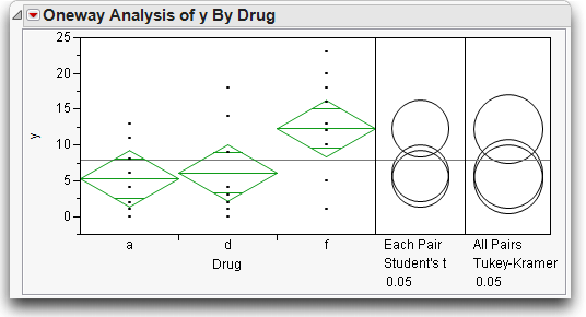
The modified data should give results like those illustrated in Figure 9.6. The x-axis divisions are proportional to the group sample size, which causes drug “a” to be very thin, because it has fewer observations. The confidence interval on its mean is large compared with the others. Comparison circles for Student's t-tests appear to the right of the means diamonds.
Figure 9.6 Comparison Circles to Compare Group Means
Comparison circles are a graphical technique that let you see significant separation among means in terms of how the circles intersect. This is the only graphical technique that works in general with both equal and unequal sample sizes. The plot displays a circle for each group, with the centers lined up vertically. The center of each circle is aligned with its corresponding group mean. The radius of a circle is the 95% confidence interval for its group mean, as you can see by comparing a circle with its corresponding means diamond. The non-overlapping confidence intervals shown by the diamonds for groups that are significantly different correspond directly to the case of non-intersecting comparison circles.
When the circles intersect, the angle of intersection is the key to seeing if the means are significantly different. If the angle of intersection is exactly a right angle (90°) then the means are on the borderline of being significantly different. See the JMP Basic Analysis and Graphing guide under Help > Books for more information on the geometry of comparison circles.
If the circles are farther apart than the right angle case, then the outside angle is more acute and the means are significantly different. If the circles are closer together, the angle is larger than a right angle, and the means are not significantly different. Figure 9.7 illustrates these angles of intersection.
Figure 9.7 Diagram of How to Interpret Comparison Circles

So what are the conclusions for the drug example shown in Figure 9.6?
You don't need to hunt down a protractor to figure out the size of the angles of intersection. Click on a circle and see what happens (see Figure 9.8). The circle highlights and becomes red. Groups that are not different from it also show in red. All groups that are significantly different are gray.
Figure 9.8 Click on Comparison Circles to See Group Differences

• The “f” and “d” means are represented by the smaller circles, since they are baed on more observations. The circles are farther separated than would occur with a right angle. The angle is acute, so these two means are significantly different. This is shown by their differing color.
• The circle for the “d” mean is completely nested in the circle for “a”, so they are not significantly different.
• The “a” mean is well below the “d” mean, which is significantly below “f.” By transitivity, one might expect “a” to be significantly different than “f.” The problem with this logic is that the standard error around the “a” mean is so large that it is not significantly different from “f”, even though it is farther away than “d.”
The group differences found with the comparison circles can be verified statistically with the Means Comparisons tables shown in Figure 9.9.
The Means Comparisons table uses the concept of Least Significant Difference (LSD). In the balanced case, this is the separation that any two means must have from each other to be significantly different. In the unbalanced case, there is a different LSD for each pair of means.
The Means Comparison report shows all of the comparisons of means ordered from high to low. The elements of the table LSD Threshold Matrix show the absolute value of the difference in two means minus the LSD. If the means are farther apart than the LSD, the element is positive and they are significantly different. For example, the element that compares “f” and “d” is +0.88, which says the means are 0.88 more separate than needed to be significantly different. If the means are not significantly different, the LSD is greater than the difference. Therefore the element in the table is negative. The elements for the other two comparisons are negative, showing no significant difference.
In addition, a table shows the classic SAS-style means comparison with letters in the Connecting Letters report. Levels that share a letter are not significantly different from each other. For example, both levels “d” and “a” share the letter B, so “d” and “a” are not significantly different from each other.
Figure 9.9 Statistical Text Reports to Compare Groups

The Ordered Differences report in Figure 9.9 lists the differences between groups in decreasing order, with confidence limits of the difference. A bar chart displays the differences with blue lines representing the confidence limits. The p-value tests the H0 that there is no difference in the means.
The last thing to do in this example is to restore your copy of the Drug.jmp table to its original state so it can be used in other examples. To do this,
Adjusting for Multiple Comparisons
Making multiple comparisons, such as comparing many pairs of means, increases the possibility of committing a Type I error. Remember, a Type I error is the error of declaring a difference significant (based on statistical test results) that is actually not significant. We are satisfied with a 1 in 20 (5%) chance of committing a Type I error. However, the more tests you do, the more likely you are to happen upon a significant difference occurring by chance alone. If you compare all possible pairs of means in a large one-way layout with many different levels, there are many possible tests, and a Type I error becomes very likely.
There are many methods that modify tests to control for an overall error rate. This section covers one of the most basic, the Tukey-Kramer Honestly Significant Difference (HSD). The Tukey-Kramer HSD uses the distribution of the maximum range among a set of random variables to attempt to control for the multiple comparison problem.
Select the following three commands from the red triangle menu on the title bar:
These commands should give you the results shown in Figure 9.10.
Figure 9.10 t-tests and Tukey-Kramer Adjusted t-tests for One-Way anova
The comparison circles work as before, but have different kinds of error rates.
The Tukey-Kramer comparison circles are larger than the Student's t circles. This protects more tests from falsely declaring significance, but this protection makes it harder to declare two means significantly different.
If you click on the top circle, you see that the conclusion is different between the Student's t and Tukey-Kramer's HSD for the comparison of “f” and “d.” This comparison is significant for Student's t-test but not for Tukey's test.
The difference in significance occurs because the quantile that is multiplied into the standard errors to create a Least Significant Difference has grown from 2.05 to 2.48 between Student's t-test and the Tukey-Kramer test (see the Confidence Quantiles in Figure 9.11).
The only positive element in the Tukey table is the one for the “a” versus “f” comparison (Figure 9.11).
Figure 9.11 Means Comparisons Table for One-Way anova

Are the Variances Equal Across the Groups?
The one-way anova assumes that each group has the same variance. The Analysis of Variance table shows the note “Std Error uses a pooled estimate of error variance.” When testing the difference between two means, as in the previous chapter, JMP provides separate reports for both equal and unequal variance assumptions. This is why, when there are only two groups, the command is Means/Anova/Pooled t. anova pools the variances like the pooled t-test does.
Before you get too concerned about the equal-variance issue, be aware that there is always a list of issues to worry about; it is not usually useful to be overly concerned about this one.
This command displays quantile box plots for each group as shown in Figure 9.12. Note that the interquartile range (the height of the boxes) is not much different for drugs a and d, but is somewhat different for the placebo (f). The placebo group seems to have a slightly larger interquartile range.
Figure 9.12 Quantile Box Plots

A more effective graphical tool to check the variance assumption is the Normal Quantile plot.
This option displays a plot next to the Means Diamonds as shown in Figure 9.13. The Normal Quantile plot compares mean, variance, and shape of the group distributions.
There is a line on the Normal Quantile plot for each group. The height of the line shows the location of the group. The slope of the line shows the group’s standard deviation. So, lines that appear to be parallel have similar standard deviations. The straightness of the line segments connecting the points shows how close the shape of the distribution is to the Normal distribution. Note that the “f” group is both higher and has a greater slope, which indicates a higher mean and a higher variance, respectively.
Figure 9.13 Normal Quantile Plot

It’s easy to get estimates of the standard deviation within each group:
Figure 9.14 Mean and Standard Deviation Report

You can conduct a statistical test of the equality of the variances as follows:
Figure 9.15 Tests that the Variances are Equal Report

To interpret these reports, note that the Std Dev column lists the estimates you are testing to be the same. The null hypothesis is that the standard deviations are equal. Then note the results listed under Prob>F. As expected, there is no evidence that the variances are unequal. None of the p-values are small.
Each of the four tests in Figure 9.15 (O’Brien, Brown-Forsythe, Levene, and Bartlett) test the null hypothesis that the variances are equal, but each uses a different method for measuring variability.
One way to evaluate dispersion is to take the absolute value of the difference of each response from its group mean. Mathematically, we look at  for each response.
• Levene’s Test estimates the mean of these absolute differences for each group (shown in the table as MeanAbsDif to Mean), and then does a t-test (or equivalently, an F-test) on these estimates.
• The Brown-Forsythe Test measures the differences from the median instead of the mean and then tests these differences.
• O’Brien’s Test tricks the t-test by telling it that the means were really variances.
• Bartlett’s Test derives the test mathematically, using an assumption that the data are Normal. Though powerful, Bartlett’s test is sensitive to departures from the Normal distribution.
Statisticians have no apologies for offering different tests with different results. Each test has its advantages and disadvantages.
Testing Means with Unequal Variances
If you think the variances are different, you should consider avoiding the standard t-and F-tests that assume the variances are equal. Instead, use the Welch anova F-test that appears with the unequal variance tests (Figure 9.15). The test can be interpreted as an F-test in which the observations are weighted by an amount inversely proportional to the variance estimates. This has the effect of making the variances comparable.
The p-values may disagree slightly with those obtained from other software providing similar unequal-variance tests. These differences arise because some methods round or truncate the denominator degrees of freedom for computational convenience. JMP uses the more accurate fractional degrees of freedom.
In practice, the hope is that there are not conflicting results from different tests of the same hypothesis. However, conflicting results do occasionally occur, and there is an obligation to report the results from all reasonable perspectives.
Nonparametric Methods
JMP also offers nonparametric methods in the Fit Y by X platform. Nonparametric methods, introduced in the previous chapter, use only the rank order of the data and ignore the spacing information between data points. Nonparametric tests do not assume the data have a Normal distribution. This section first reviews the rank-based methods, then generalizes the Wilcoxon rank-sum method to the k groups of the one-way layout.
Review of Rank-Based Nonparametric Methods
Nonparametric tests are useful to test whether means or medians are the same across groups. However, the usual assumption of Normality is not made. Nonparametric tests use functions of the response ranks, called rank scores (Hajek 1969).
JMP offers the following nonparametric tests for testing the null hypothesis that distributions across factor levels are centered at the same location. Each is the most powerful rank test for a certain distribution, as indicated in Table 9.1.
• Wilcoxon rank scores are the ranks of the data.
• Median rank scores are either 1 or 0 depending on whether a rank is above or below the median rank.
• Van der Waerden rank scores are the quantiles of the standard Normal distribution for the probability argument formed by the rank divided by n–1. This is the same score that is used in the Normal quantile plots.
In addition to the rank-based nonparametric methods, the Kolmogorov-Smirnov Test is available when the X factor has two levels. It uses the empirical distribution function to test whether the distribution of the response is the same across groups.
Note: Exact versions of the rank-based methods and the Kolmogorov-Smirnov test are available in JMP Pro when the factor has two levels.
Table 9.1. Guide for Using Rank-Based Nonparametric Tests
|
Fit Y By X Nonparametric Option
|
Two Levels
|
Two or More Levels
|
Most Powerful for Errors Distributed as
|
|
Wilcoxon Test
|
Wilcoxon rank-sum (Mann-Whitney U)
|
Kruskal-Wallis
|
Logistic
|
|
Median Test
|
Two-Sample Median
|
k-Sample Median (Brown-Mood)
|
Double Exponential
|
|
van der Waerden Test
|
Van der Waerden
|
k-sample van der Waerden
|
Normal
|
The Three Rank Tests in JMP
As an example, use the Drug.jmp example and request nonparametric tests to compare the Drug group means of y, the response:
The one-way analysis of variance platform appears showing the distributions of the three groups, as seen previously in Figure 9.3.
• Means/Anova, producing the F-test from the standard parametric approach
• Nonparametric > Wilcoxon Test, also known as the Kruskal-Wallis test when there are more than two groups
• Nonparametric > Median Test for the median test
• Nonparametric > van der Waerden Test for the Van der Waerden test
Figure 9.16 shows the results of the four tests that compare groups. In this example, the Wilcoxon and the Van der Waerden agree with the parametric F-test in the anova and show borderline significance for a 0.05 α-level, despite a fairly small sample and the possibility that the data are not Normal. These tests reject the null and detect a difference in the groups.
The median test is much less powerful than the others and does not detect a difference in this example.
Note: Several nonparametric multiple comparison procedures are available. See the Basic Analysis and Graphing guide under Help > Books for details.
Figure 9.16 Parametric and Non-Parametric Tests for Drug Example

Exercises
1. This exercise uses the Movies.jmp data set. You are interested in discovering if there is a difference in earnings between the different classifications of movies.
(a) Use the Distribution platform to examine the variable Type. How many levels are there? Are there roughly equal numbers of movies of each type?
(b) Use the Fit Y by X platform to perform an anova, with Type as X and Worldwide $ as Y. State the null hypothesis you are testing. Does the test show differences among the different types?
(c) Use comparison circles to explore the differences. Does it appear that Action and Drama are significantly different than all other types?
(d) Examine a Normal Quantile Plot of this data and comment on the equality of the variances of the groups. Are they different enough to require a Welch anova? If so, conduct one and comment on its results.
2. The National Institute of Standards and Technology (NIST) references research involving the doping of silicon wafers with phosphorus. Twenty-five wafers were doped with phosphorus by neutron transmutation doping in order to have nominal resistivities of 200 ohm/cm. Each data point is the average of six measurements at the center of each wafer. Measurements of bulk resistivity of silicon wafers were made at NIST with five probing instruments on each of five days, with the data stored in the table Doped Wafers.jmp (see Ehrstein and Croarkin). The experimenters are interested in testing differences among the probing instruments.
(a) Examine a histogram of the resistances. Do the data appear to be Normal? Test for Normality by stating the null hypothesis, and then conduct a statistical test.
(b) State the null hypothesis and conduct an anova to determine if there is a difference between the probes in measuring resistance.
(c) Comment on the sample sizes involved in this investigation. Do you feel confident with your results?
(d) A retrospective analysis of the power of the test is available under the red triangle for the title bar (under Power). Select this option, check the”solve for power” box and click Done. What is the power of the test conducted in part b?
Note: The command DOE > Sample Size and Power > k Sample Means can also be used to explore the power of the test or to determine how many data points would be needed to detect a difference between any two of the means.
3. The data table Michelson.jmp contains data (as reported by Stigler, 1977) collected to determine the speed of light in air. Five separate collections of data were made in 1879 by Michelson and the speed of light was recorded in km/sec. The values for velocity in this table have had 299,000 subtracted from them.
(a) The true value (accepted today) for the speed of light is 299,792.5 km/sec. What is the mean of Michelson's responses?
(b) Is there a significant statistical difference between the trials? Use an anova or a Welch anova (whichever is appropriate) to justify your answer.
(c) Using Student's t comparison circles, find the group of observations that is statistically different from all the other groups.
(d) Does excluding the result in part (c) improve Michelson's prediction?
4. Run-Up is a term used in textile manufacturing to denote waste. Manufacturers often use computers to lay out designs on cloth in order to minimize waste, and the percentage difference between human layouts and computer-modeled layouts is the run-up. There are some cases where humans get better results than the computers, so don't be surprised if there are a few negative values for run-up in the table Levi Strauss Run-Up.jmp (Koopmans, 1987). The data was gathered from five different supplier plants to determine if there were differences among the plants.
(a) Produce histograms for the values of Run Up for each of the five plants.
(b) State a null hypothesis, and then test for differences between supplier plants by using the three non-parametric tests provided by JMP. Do they have similar results? Hint: Click the Alt key (or Option on a Macintosh) before clicking on the red triangle to select all tests at once.
(c) Compare these results to results given by an anova and comment on the differences. Would you trust the parametric or nonparametric tests more?
(d) There are two extreme values (see the histogram in part a). Hide and exclude these observations, and re-run the analyses in parts b and c. Do your results, and your ultimate conclusions, change? What does this say about how sensitive ANOVA and the nonparametric tests are to outliers?
5. The data table Scores.jmp contains a subset of results from the Third International Mathematics and Science Study, conducted in 1995. The data contain information on scores for Calculus and Physics, divided into four regions of the country.
(a) Is there a difference among regions in Calculus scores?
(b) Is there a difference among regions for Physics scores?
(c) Do the data fall into easily definable groups? Use comparison circles to explore their groupings.
6. To judge the efficacy of a three pain relievers, a consumer group conducted a study of the amount of relief each patient received. The amount of relief is measured by each participant rating the amount of relief on a scale of 0 (no relief) to 20 (complete relief). Results of the study are stored in the file Analgesics.jmp.
(a) Is there a difference in relief between the males and females in the study? State a null hypothesis, a test statistic, and a conclusion.
(b) Conduct an analysis of variance comparing the three types of drug. Is there a significantly significant difference among the three types of drug?
(c) Find the mean amount of pain relief for each of the three types of pain reliever.
(d) Does the amount of relief differ for males and females? To investigate this question, conduct an analysis of variance on relief vs. treatment for each of the two genders. (Conduct a separate analysis for males and females. Assign gender as a By-variable.) Is there a significant difference in relief for the female subset? For the male subset?
..................Content has been hidden....................
You can't read the all page of ebook, please click here login for view all page.