
Chapter Contents
Parts of a Regression Model
Linear regression models are the sum of the products of coefficient parameters and factors. In addition, linear models for continuous responses are usually specified with a Normally-distributed error term. The parameters are chosen such that their values minimize the sum of squared residuals. This technique is called estimation by least squares.
Figure 13.1 Parts of a Linear Model

Note in Figure 13.1 the differences in notation between the assumed true model with unknown parameters and the estimated model.
Regression Definitions
response, Y
The response (or dependent) variable is the one you want to predict. Its estimates are the dependent variable,  , in the regression model.
regressors, X’s
The regressors (x’s) in the regression model are also called independent variables, predictors, factors, explanatory variables, and other discipline-specific terms. The regression model uses a linear combination of these effects to fit the response value.
coefficients, parameters
The fitting technique produces estimates of the parameters, which are the coefficients for the linear combination that defines the regression model.
intercept term
Most models have intercept terms to fit a constant in a linear equation. This is equivalent to having an x-variable that always has the value 1. The intercept is meaningful by itself only if it is meaningful to know the predicted value where all the regressors are zero. However, the intercept plays a strong role in testing the rest of the model, because it represents the mean if all the other parameters are zero.
error, residual
If the fit isn’t perfect, then there is error left over. Error is the difference between an actual value and its predicted value. When speaking of true parameters, this difference is called error. When using estimated parameters, this difference is called a residual.
A Multiple Regression Example
Aerobic fitness can be evaluated using a special test that measures the oxygen uptake of a person running on a treadmill for a prescribed distance. However, it would be more economical to evaluate fitness with a formula that predicts oxygen uptake using simple measurements, such as running time and pulse measurements.
To develop such a formula, run time and pulse measurements were taken for 31 participants who each ran 1.5 miles. Their oxygen uptake, pulses, times, and other descriptive information was recorded. (Rawlings 1988, data courtesy of A.C. Linnerud). Figure 13.2 shows a partial listing of the data, with variables Age, Weight, O2 Uptake (the response measure), Run Time, Rest Pulse, Run Pulse, and Max Pulse.
Figure 13.2 The Oxygen Uptake Data Table

Investigate Run Time and Run Pulse as predictors of oxygen uptake (O2 Uptake).
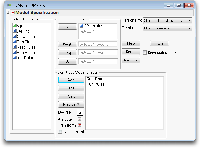
Your dialog should look like the one in Figure 13.3.
Figure 13.3 Model Specification Dialog for Multiple Regression
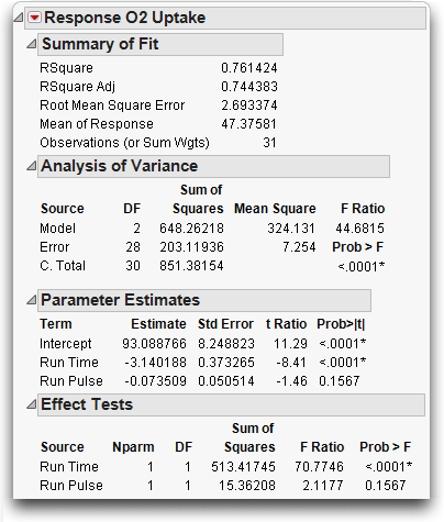
Now you have tables, shown in Figure 13.4, which report on the regression fit.
• The Summary of Fit table shows that the model accounted for 76% of the variation around the mean (R2, reported as RSquare). The remaining residual error is estimated to have a standard deviation of 2.69 (Root Mean Square Error).
• The Parameter Estimates table shows Run Time to be highly significant (p < 0.0001), but Run Pulse is not significant (p = 0.1567). Using these parameter estimates, the prediction equation is
O2 Uptake = 93.089 – 3.14 Run Time – 0.0735 Run Pulse
• The Effect Test table shows details of how each regressor contributes to the fit.
Figure 13.4 Statistical Tables for Multiple Regression Example
Residuals and Predicted Values
The residual is the difference between the actual response and the response predicted by the model. The residuals represent the error in the model. Points that don’t fit the model have large residuals. It is helpful to look at a plot of the residuals and the predicted values, so JMP automatically appends a residual plot to the bottom of the Whole Model report, as shown in Figure 13.5.
Note: The points in Figure 13.5 show as a medium-sized circle marker instead of the default dot. To change the marker or marker size,
Figure 13.5 Residual Plot for Multiple Regression Example

You can save these residuals as a column in the data table.
The result is a new column in the data table called Residual O2 Uptake, which lists the residual for each response point. To examine the residuals in more detail,

Many researchers do this routinely to verify that the residuals are not so non-Normal as to warrant concern about violating Normality assumptions.
You might also want to store the prediction formula from the multiple regression.
 displays the formula shown here.
This formula defines a plane for O2 Uptake as a function of Run Time and Run Pulse. The formula stays in the column and is evaluated whenever new rows are added, or when values are changed for variables used in the expression. You can cut-and-paste or drag this formula into other JMP data tables columns.
To visualize the fitted plane, return to the fit least squares report for O2 Uptake.
You should see the results in Figure 13.6. Click and drag in the plot to change its orientation and explore the position of the points relative to the plane.
Figure 13.6 Fitted Plane for O2 Uptake Multiple Regression Model

The Analysis of Variance Table
The Whole-Model report consists of several tables that compare the full model fit to the simple mean model fit.
The Analysis of Variance table (shown below) lists the sums of squares and degrees of freedom used to form the whole model test:
• The Error Sum of Squares (SSE) is 203.1. It is the sum of squared residuals after fitting the full model.
• The C. Total Sum of Squares is 851.4. It is the sum of squared residuals if you removed all the regression effects except for the intercept and, therefore, fit only the mean.
• The Model Sum of Squares is 648.3. It is the sum of squares caused by the regression effects, which measures how much variation is accounted for by the regressors. It is the difference between the Total Sum of Squares and the Error Sum of Squares.
The Error, C. Total, and Model sums of squares are the ingredients needed to test the whole-model null hypothesis that all the parameters in the model are zero except for the intercept (the simple mean model).
The Whole Model F-Test
To form the whole model F-test,
1. Divide the Model Sum of Squares (648.3 in this example) by the number of parameters in the model excluding the intercept. That divisor (2 in this case) is found in the column labeled DF (Degrees of Freedom). The result is displayed as the Model Mean Square in the ANOVA table.
2. Divide the Error Sum of Squares (203.12 in this example) by the its associated degrees of freedom, 28, giving the Error Mean Square.
3. Compute the F-ratio as the Model Mean Square divided by the Error Mean Square.
The significance level, or p-value, for this ratio is then calculated for the proper degrees of freedom (2 used in the numerator and 28 used in the denominator). The F-ratio, 44.6815, in the analysis of variance table shown above, is highly significant (p < 0.0001), which lets us reject the null hypothesis and indicates that the model does fit better than a simple mean fit.
Whole-Model Leverage Plot
There is a good way to view this whole-model hypothesis graphically using a scatterplot of actual response values against the predicted values. The plot below shows the actual values versus predicted values for this aerobic exercise example.
Figure 13.7 Leverage Plot for the Whole Model Fit

A 45º line of fit from the origin shows where the actual response and predicted response are equal. The vertical distance from a point to the 45º line of fit is the difference of the actual and the predicted values—the residual error. The mean is shown by the horizontal dashed line. The distance from a point to the horizontal line at the mean is what the residual would be if you removed all the effects from the model.
A plot that compares residuals from the two models in this way is called a leverage plot. The idea is to get a feel for how much better the sloped line fits than the horizontal line.
Superimposed on the plot are the confidence curves representing the 0.05-level whole-model hypothesis. If the confidence curves do not contain the horizontal line, the whole-model F-test is significant, which means the model predicts better than the mean alone.
The leverage plot shown in Figure 13.7 is for the whole model, which includes both Run Time and Run Pulse.
Details on Effect Tests
You can explore the significance of an effect in a model by looking at the distribution of the estimate, or by looking at the contribution of the effect to the model.
• To look at the distribution of the estimate, first compute its standard error. The standard error can be used either to construct confidence intervals for the parameter or to perform a t-test that the parameter is equal to some value (usually zero). The t-tests are given in the Parameter Estimates table.
Note: To request confidence intervals, right-click anywhere on the Parameter Estimates Table and select Columns > Lower 95% and Upper 95%.
• If you take an effect out of the model, then the error sum of squared increases. That difference in sums of squares (with the effect included and excluded) can be used to construct an F-test on whether the contribution of the effect to the model is significant. The F-tests are given in the Effect Tests table.
As we have seen, F-tests and t-tests are equivalent. The square of the t-value in the Parameter Estimates table is the same as the F-statistic in the Effect Test table. For example, the square of the t-ratio (-8.41) for Run Time is 70.77, which is the F-ratio for Run Time.
Effect Leverage Plots
Scroll to the right on the regression report to see plots detailing how each effect contributes to the model fit. The plots for the effect tests are also called leverage plots, although they are not the same as the leverage plots encountered in the whole-model test. The effect leverage plots (see Figure 13.8) show how each effect contributes to the fit after all the other effects have been included in the model. A leverage plot for a hypothesis test (an effect) is any plot with horizontal and sloped reference lines and points laid out having the following two properties:
• The distance from each point to the sloped line measures the residual for the full model. The sums of the squares of these residuals form the error sum of squares (SSE).
• The distance from each point to the horizontal line measures the residual for the restricted model without the effect. The sums of the squares of these residuals form the SSE for the constrained model (the model without the effect).
In this way, it is easy to see point by point how the sum of squares for the effect is formed. The difference in sums of squares of the two residual distances forms the numerator for the F-test for the effect.
Figure 13.8 Leverage Plots for Significant Effect and Nonsignificant Effect

The leverage plot for an effect is interpreted in the same way as a simple regression plot. In fact, JMP superimposes a kind of 95% confidence curve on the sloped line that represents the full model. If the line is sloped significantly away from horizontal, then the confidence curves don’t surround the horizontal line that represents the constrained model, and the effect is significant. Alternatively, when the confidence curves enclose the horizontal line, the effect is not significant at the 0.05 level.
The leverage plots in Figure 13.8 show that Run Time is significant and Run Pulse is not. You can see the significance by how the points support (or don’t support) the line of fit in the plot and by whether the confidence curves for the line cross the horizontal line.
There is a leverage plot for any kind of effect or set of effects in a model, or for any linear hypothesis. Leverage plots in the special case of single regressors are also known by the terms partial plot, partial regression leverage plot, and added variable plot.
Collinearity
Sometimes with a regression analysis, there is a close linear relationship between two or more effects. These two regressors are said to have a collinearity problem. It is a problem because the regression points do not occupy all the directions of the regression space very well; the fitting plane is not well supported in certain directions. The fit is weak in those directions, and the estimates become unstable, which means they are sensitive to small changes in the data.
In plot on the left in Figure 13.9, there is little collinearity and the points are distributed throughout the region. In the plot on the right, the two regressors are collinear, and the points are constrained to a narrow band.
Figure 13.9 Illustration of Noncollinearity (Left) and Collinearity (Right)

In the statistical results, this phenomenon translates into large standard errors for the parameter estimates and potentially large values for the parameter estimates themselves. This occurs because a small random change in the more extreme values can have a huge effect on the slope of the corresponding fitting plane. An indication of collinearity in leverage plots is when the points tend to collapse horizontally toward the center of the plot.
To see an example of collinearity, consider the aerobic exercise example with the correlated effects Max Pulse and Run Pulse:
In the new analysis report, scroll to the Run Pulse and Max Pulse leverage plots. Note in Figure 13.10 that Run Pulse is very near the boundary of 0.05 significance, and thus the confidence curves almost line up along the horizontal line, without actually crossing it.
Figure 13.10 Leverage Plots for Effects in Model

Now, as an example, let’s change the relationship between these two effects by changing a few values to cause collinearity.
This produces a scatterplot showing the bivariate relationship.
You should now see the scatterplot with ellipse shown below. The Density Ellipse command also generates the Correlation table beneath the plot, which shows the current correlation to be 0.558 (click on the gray disclosure icon to display.)
The variables don’t appear overly collinear, since there is some scatter in the points. However, it appears that if four points are excluded, the correlation would increase dramatically. To increase the correlation we will exclude the two points outside the ellipse and the two points just inside the ellipse, in the upper left corner of the plot.
To see the result, exclude these points and rerun the analysis.
Notice in the spreadsheet that these points are now marked with a label tag ( ) and the not symbol(
 ).
).

Now the ellipse and the Correlation table shows the relationship without the excluded points. The new correlation is 0.95, and the ellipse is much narrower, as shown in the plot to the right.
Now, run the regression model again to see the effect of excluding these points that created collinearity:
Examine both the Parameter Estimates table and the leverage plots for Run Pulse and Max Pulse, comparing them with the previous report (see Figure 13.11).
The parameter estimates and standard errors for the last two regressors have nearly tripled in size.
The leverage plots now have confidence curves that flare out because the points themselves collapse towards the middle. When a regressor suffers collinearity, the other variables have already absorbed much of that variable’s variation, and there is less left to help predict the response. Another way of thinking about this is that the points have less leverage on the hypothesis. Points that are far out horizontally are said to have high leverage on the hypothesis test; points in the center have little leverage.
Figure 13.11 Comparison of Model Fits

Exact Collinearity, Singularity, Linear Dependency
Here we construct a variable to show what happens when there is an exact linear relationship, the extreme of collinearity, among the effects.
The report in Figure 13.12 shows the signs of trouble. In the parameter estimates table, there are notations on Rest Pulse and Run Pulse that the estimates are biased, and on Run-Rest that it is zeroed. With exact linear dependency, the least squares solution is no longer unique, so JMP chooses the solution that zeroes out the parameter estimate for variables that are linearly dependent on other variables.
Figure 13.12 Report When There is a Linear Dependency

The Singularity Details report at the top shows what the exact relationship is, in this case expressed in terms of Rest Pulse. The t-tests for the parameter estimates must now be interpreted in a conditional sense. JMP refuses to conduct F-tests for the non-estimable hypotheses for Rest Pulse, Run Pulse, and Run-Rest, and shows them with no degrees of freedom in the Effect Tests table.
You can see in the leverage plots for the three variables involved in the exact dependency, Rest Pulse, Run Pulse, and Run-Rest, that the points have completely collapsed horizontally—there are no points that have any leverage for these effects (see Figure 13.13). However, you can still test the unaffected regressors, like Max Pulse, and make good predictions.
Figure 13.13 Leverage Plots When There is a Linear Dependency

The Longley Data: An Example of Collinearity
The Longley data set is famous, and is run routinely on most statistical packages to test accuracy of calculations. Why is it a challenge? Look at the data:
Figure 13.14 shows the whole-model regression analysis. If you only looked at this overall picture you would not see information on which (if any) of the six regressors are affected by collinearity. The data appears to fit well in the Actual by Predicted plot, the model has a significant F test, and there appear to be several significant factors. There is nothing in these reports to lead you to believe there might be a problem with collinearity.
Figure 13.14 Analysis of Variance Report for the longley Data
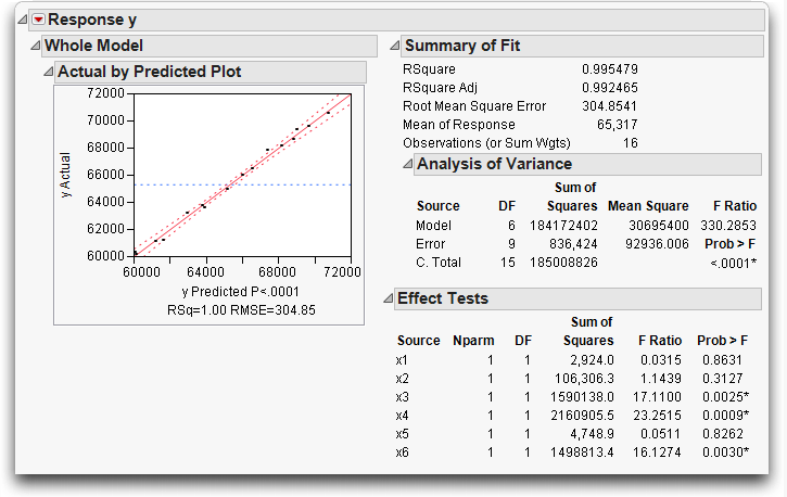
Now look at the leverage plots for the factors in Figure 13.15. The leverage plots show that x1, x2, x5, and x6 have collinearity problems. Their leverage plots appear very unstable with the points clustered at the center of the plot and the confidence lines showing no confidence at all.
If you had only looked at the overall ANOVA picture you would not have seen information on which (if any) of the six regressors were affected by collinearity.
Figure 13.15 Leverage plots for the Six Factors in the Longley Data

The Case of the Hidden Leverage Point
Data were collected in a production setting where the yield of a process was related to three variables called Aperture, Ranging, and Cadence. Suppose you want to find out which of these effects are important, and in what direction:
Everything looks fine in the tables shown in Figure 13.16. The Summary of Fit table shows an R2 of 99.7%, which makes the regression model look like a great fit. All t-statistics are highly significant—but don’t stop there.
Figure 13.16 Tables and Plots for Model with Collinearity

JMP produces all the standard regression results, and many more graphics, including the residual plot on the lower right in Figure 13.16.
For each regression effect, there is a leverage plot showing what the residuals would be without that effect in the model. Note in Figure 13.17 that row 20, which appeared unremarkable in the whole-model leverage and residual plots, is far out into the extremes of the effect leverage plots.
It turns out that row 20 has monopolistic control of the estimates on all the parameters. All the other points appear wimpy because they track the same part of the shrunken regression space.
Figure 13.17 Leverage Plots That Detect Unusual Points

In a real analysis, row 20 would warrant special attention. Suppose, for example, that row 20 had an error, and its value was really 32 instead of 65.
The Parameter Estimates for both the modified table and original table are shown in Figure 13.18. The top table shows the parameter estimates computed from the data with an incorrect point. The bottom table has the corrected estimates. In high response ranges, the first prediction equation would give very different results than the second equation. The R2 is again high and the parameter estimates are all significant—but every estimate is completely different even though only one point changed!
Figure 13.18 Comparison of Analysis for Data with Outlier and Correct Data

Mining Data with Stepwise Regression
Let’s try a regression analysis on the O2Uptake variable with a set of 30 randomly-generated columns as regressors. It seems like all results should be nonsignificant with random regressors, but that’s not always the case.
The data table has 30 columns named X1 to X30, each of which has a uniform random number generator stored as a column formula. In other words, the data table is filled with random variables.
Figure 13.19 Model Specification Dialog for Stepwise Regression

This stepwise approach launches a different regression platform, geared to playing around with different combinations of effects. To run a stepwise regression, use the control panel that appears after you run the model (see Figure 13.20).
The recommended (default) stopping rule is Minimum BIC, which uses the minimum Baysian Information Criterion to choose the best model. Minimum BIC is defined as -2loglikelihood + k ln(n) where k is the number of parameters and n is the sample size.
By default, stepwise runs a Forward selection process. You can also select Backward or Mixed as the selection process from the Direction menu. The Forward selection process adds the variable to the regression model that is most significant and computes the BIC. The process continues to add variables, one at time, until the BIC is minimized.
Note: You could choose the more familiar P-value Threshold stopping rule, and choose your own probability to enter and probability to remove a factor during the fitting process.
Figure 13.20 Stepwise Regression Control Panel

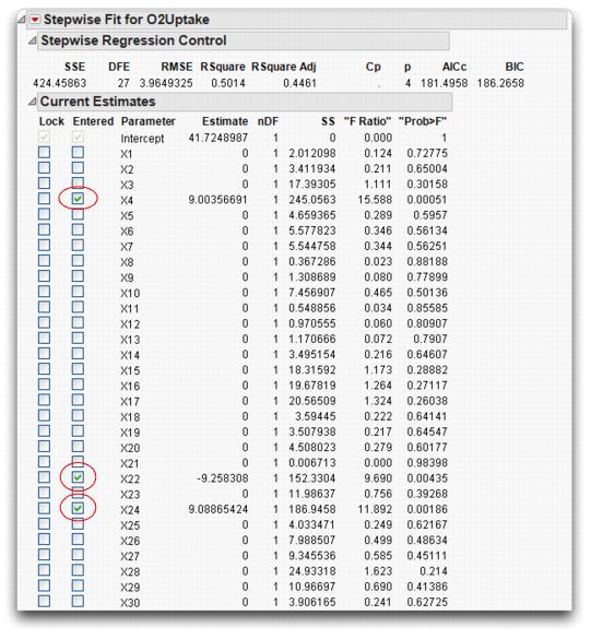
The Current Estimates table shows the selected terms and resulting p-values (see Figure 13.21). You also see a Step History table (not shown here) that lists the order in which the variables entered the model.
The example in Figure 13.21 was run with Forward direction to enter variables with the Minimum BIC stopping rule.
Note: If you run this problem, the results may differ because the values for the X’s are generated by random number functions.
Figure 13.21 Current Estimates Table Showing Selected Variables
The Model Specification dialog shown in Figure 13.22 then appears, and you can run a standard least squares regression with the effects that were selected by the stepwise process as most active.
Figure 13.22 Model Specification Dialog Created by Make Model Option

When you run the model, you get the standard regression reports, partially belowt. The Parameter Estimates table shows all effects significant at the 0.05 level.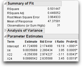
However, what has just happened is that we created enough data to generate a number of coincidences, and then gathered those coincidences into one analysis and ignored the rest of the variables. This is like gambling all night in a casino, but exchanging money only for those hands where you win. When you mine data to the extreme, you get results that are too good to be true.
Exercises
1. The file Grandfather Clocks.jmp (Smyth, 2000) contains data on grandfather clocks sold at open auction. Included are the selling price, age of the clock, and number of bidders on the clock. You are interested in predicting price based on the other two variables.
(a) Use the Fit Model platform to construct a model using age as the only predictor of price. What is the R2 for this single predictor model?
(b) Add the number of bidders to the model. Does the R2 increase markedly?
2. In Gulliver’s Travels, the Lilliputians make an entire set of clothes for the (giant) Gulliver by only taking a few measurements from his body:
“The seamstresses took my measure as I lay on the ground, one standing at my neck, and another at my mid-leg, with a strong cord extended, that each held by the end, while a third measured the length of the cord with a rule of an inch long. Then they measured my right thumb, and desired no more; for by a mathematical computation, that twice round the thumb is once round the wrist, and so on to the neck and the waist, and by the help of my old shirt, which I displayed on the ground before them for a pattern, they fitted me exactly.” (Swift, 1735)
3. Is there a relationship among the different parts of the body? Body Measurements.jmp (Larner, 1996) contains measurements collected as part of a statistics project in Australia from 22 male subjects. In this exercise, you will construct a model to predict the mass of a person based on other characteristics.
(a) Using the Fit Model platform with personality Standard Least Squares, construct a model with mass as Y, and all other variables as effects in the model.
(b) Examine the resulting report and determine the effect that has the least significance to the model. In other words, find the effect with the largest Prob >F. Remove this effect from the model and re-run the analysis.
(c) Repeat part (b) until all effects have significance at the 0.05 level.
(d) Now, use the Fit Model platform with personality Stepwise to produce a similar model. Enter all effects into a Backward stepwise model with Prob to Leave set at 0.05. Compare this model to the one you generated in part (c).
4. Biologists are interested in determining factors that will predict the amount of time an animal will sleep during the day. To investigate the possibilities, Allison and Ciccetti (1976) gathered information on 62 different mammals. Their data is presented in the file Sleeping Animals.jmp.The variables describe body weight, brain weight, total time spent sleeping in two different states (“dreaming” and “non-dreaming”), life span, and gestation time. The researchers also calculated indices to represent predation (1 meaning unlikely to be preyed upon, 5 meaning likely to be preyed upon), exposure (1 meaning the animal sleeps in a well-protected den, 5 meaning most exposure), and an overall danger index, based upon predation, exposure, and other factors (1 meaning least danger from other animals, 5 meaning most danger).
(a) Use the Fit Y By X platform to examine the single-variable relationships between TotalSleep and the other variables. Which two variables look like they have the highest correlation with TotalSleep?
(b) If you remove NonDreaming from consideration, which two variables appear to be most correlated with TotalSleep?
(c) Construct a model using the two explanatory variables you found in part (b) and note its effectiveness.
(d) Construct a model using P-Value Threshold as the Stopping Rule and forward stepwise regression (still omitting Non-Dreaming), with 0.10 as the probability to enter and leave the model. Compare this model to the one you constructed in part (c).
(e) Construct a new model using mixed stepwise regression, with 0.10 as the probability to enter and leave the model. Compare this model to the other models you have found. Which is the most effective at predicting total amount of sleep?
(f) Comment on the generalizability of this model. Would it be safe to use it to predict sleep times for a llama? Or a gecko? Explain your reasoning.
(g) Explore models that predict sleep in the dreaming and non-dreaming stages. Do the same predictors appear to be valid?
5. The file Cities.jmp contains a collection of pollution data for 52 cities around the country.
(a) Use the techniques of this chapter to build a model predicting Ozone for the cities listed. Use any of the continuous variables as effects.
(b) After you are satisfied with your model, determine whether there is an additional effect caused by the region of the country the city is in.
(c) In your model, interpret the coefficients of the significant effects.
(d) Comment on the generalizability of your model to other cities.
..................Content has been hidden....................
You can't read the all page of ebook, please click here login for view all page.