
Chapter Contents
Introduction
Experimentation is the fundamental tool of the scientific method. In an experiment, a response of interest is measured as some factors are changed systematically through a series of runs, also known as trials. Those factors that are not involved in the experiment are held (as much as is practical) at a constant level, so that any variation or effect produced by the experiment can be attributed to the changes in the design factors and natural variability. The goal is to determine if and how the factors affect the response.
Experimental design addresses this goal—it allows us to learn the most about the relationship between the response and factors for a given number of runs. Compared to ad hoc trial and error, experimental design saves money and resources by reducing the number of necessary trials.
Key Concepts
DOE, and statistics in general, allow us to make decisions and develop product and process knowledge in light of random variation. Experimentation is a true journey of discovery.
Experimentation Is Learning
The word experiment has the same root as the words expert and experience. They all derive from the Latin verb experior, which means to try, to test, to experience, or to prove.
Typical experimentation is a familiar process of trial and error. Try something and see what happens. Learn from experience. Learn from changing factors and observing the results. This is the inductive method that encompasses most learning. Designed experiments, on the other hand, add to this method by giving us a framework to direct our experiences in a meaningful way.
Controlling Experimental Conditions Is Essential
We are easily fooled unless we take care to control the experimental conditions and environment. This control is the critical first step in doing scientific experiments. This is the step that distinguishes experimental results from observational, happenstance data. You may obtain clues of how the world works from non-experimental data, but you cannot put full trust into learning from observational phenomena because you are never completely sure why the response changed. Were the response differences were due to changes in the factor of interest, or some change in uncontrolled variables? The goal is to attain knowledge of cause and effect.
Experiments Manage Random Variation within A Statistical Framework
Experiments are never exactly repeatable because of the inevitable uncontrollable, random component of the response. Understanding how to model this random variation was one of the first triumphs of the new ‘statistical science’ of the 1920’s. Important techniques like randomization and blocking, standard statistical distributions, and tests that were developed are still in use today.
JMP DOE
JMP has tools that allow you to produce almost any kind of experimental design. Several commonly used “classical” designs are
• Screening Designs for scouting many factors: Screening designs examine many factors to see which have the greatest effect on the results of a process. To economize on the number of runs needed, each factor is usually set at only two levels, and response measurements are not taken for all possible combinations of levels. Screening designs are generally a prelude to further experiments.
• Response Surface Designs for optimization: Response surface experiments try to focus on the optimal values for a set of continuous factors. They are modeled with a curved surface so that the maximum point of the surface (optimal response) can be found mathematically.
• Factorial Designs: A complete factorial experiment includes a run for all possible combinations of factor levels.
Note: The designs in this chapter are commonly used in industrial settings, but there are many other designs used in other settings. The DOE facility can produce additional designs such as Mixture, Choice (for market research), Space Filling (computer simulation), Nonlinear, and more, as shown on the next page. JMP can also produce and analyze other designs, such as split plots, repeated measures, crossovers, complete and incomplete blocks, and Latin squares.
The DOE platform in JMP is an environment for describing the factors, responses, and other specifications, creating a designed experiment, and saving it in a JMP table. When you select the DOE menu, you see the list of designs shown below.
The JMP Custom Designer builds a design for your specific problem that is consistent with your resource budget. It can be used for routine factor screening, response optimization, and mixture problems. In many situations, the Custom Designer produces designs that require fewer runs than the corresponding classical design. Also, the Custom Designer can find designs for special conditions not covered in the lists of predefined classical and specialized designs.
A Simple Design
The following example helps to acquaint you with the design and analysis capabilities of JMP.
The Experiment
Acme Piñata Corporation discovered that its piñatas were too easily broken. The company wants to perform experiments to discover what factors might be important for the peeling strength of flour paste.
In this design, we explore nine factors in an attempt to discover
• which factors actually affect the peel strength, and
• what settings should those factors take in order to optimize the peel strength?
The Response
Strength refers to how well two pieces of paper that are glued together resist being peeled apart.
The Factors
Batches of flour paste were prepared to determine the effect of the following nine factors on peeling strength:
• Liquid: 4 teaspoons of liquid or 5 teaspoons of liquid (4 or 5)
• Sugar: formula contained no sugar or 1/4 teaspoon of sugar (0 or 0.25)
• Flour: 1/8 cup of white unbleached flour or 1/8 cup of whole wheat flour (White or Wheat)
• Sifted: flour was not sifted or was sifted (No or Yes)
• Type: water-based paste or milk-based paste (Water or Milk)
• Temp: mixed when liquid was cool or when liquid was warm (Cool or Warm)
• Salt: formula had no salt or a dash of salt (No or Yes)
• Clamp: pasted pieces were loosely clamped or tightly clamped together during drying (Loose or Tight)
• Coat: whether the amount of paste applied was thin or thick (Thin or Thick)
The Budget
There are many constraints that can be put on a design, arising from many different causes. In this case, we are only allotted enough time to complete 16 runs.
Enter the Response and Factors
Use the Custom Design platform to define and name the response and the factors of the experiment.
You see one default response called Y in the Responses panel.
Your Responses panel should look like the one showing at the top in Figure 15.1.
Figure 15.1 Dialog for a Designating Responses and Factors

Now, complete the following steps to add the nine factors:
Your Factors panel should look like the one in Figure 15.2.
Figure 15.2 Factors Panel

Define the Model
After you click Continue, you will see new panels, including Define Factor Constraints and Model as shown in Figure 15.3. There are no mathematical constraints on allowable factor level combinations, so there is no need to use the Define Factor Constraints panel (it is minimized by default).
Look at the Model panel. By default, the model contains the intercept and all the main effects. Other model terms, like interactions and powers, could be entered at this point. We only examine main effects in this first example (typical of screening designs), so there is no need to modify the Model panel.
The Design Generation panel allows us to specify the number of experimental runs (or trials). JMP has several suggestions to choose from.
• Minimum is the smallest number of runs that allow estimation of the main effects. The minimum is always the number of effects plus one.
• Default is a suggestion that is larger than minimum but smaller than a full factorial design, often giving balanced designs using an economical number of runs.
• Depending on your budget, you may be able to afford a different number of runs than those suggested. The Number of Runs box accepts any number of runs. You are in no way limited to the suggestions that JMP makes.
Figure 15.3 Model Definition Panel
JMP now searches for an optimal design. Once completed, the design shows in the Design outline node (Figure 15.4).
Note: Your design might not look like the one below because JMP optimizes the design based on a mathematical criterion. There are often several equivalent designs. For example, in this case there are 87 different equivalent designs.
Figure 15.4 An Optimal Main Effects Design
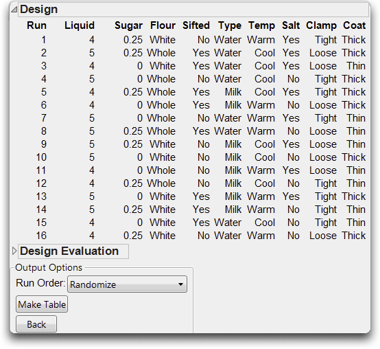
JMP is ready to create the data table. In most designs, it is desirable to randomize the order of the trials. For this illustration, we will sort the run order to better see the design. Choose Sort Left to Right from the Run Order menu, as shown here. Then, click Make Table.
JMP generates a data table with several convenient features.
• All the factors have an equal number of trials at each setting.
• The response column is present, waiting for the results of your experiment.
• A note is present (upper left corner) that shows the type of design.
• Limits and coding information are stored as column properties for each variable.
• A Model script holds all the information about the requested model. The Fit Model dialog looks for this script and completes itself automatically based on the script’s contents.
Figure 15.5 Flour Data Table

Is the Design Balanced?
It is easy to show that the Custom designer produces balanced designs when possible. To check that this design is balanced,
Figure 15.6 Histograms Verify that the Design Is Balanced

Perform Experiment and Enter Data
At this point, you run the 16 trials of the experiment, noting the strength readings for each trial, and then entering these results into the Strength column.
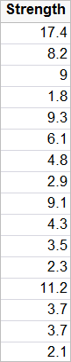
Note: The values for Strength, shown above, correspond to the order of the data in the Flrpaste.jmp sample data table, which could be different than the table you generated with the Custom Designer.
Examine the Response Data
As usual, a good place to start is by examining the distribution of the response, which in our example is the peel strength.
 You should see the plots shown here.
 The box plot and the Normal quantile plot are useful for identifying runs that have extreme values. In this case, run 2 has a peel strength that appears higher than the others.
Analyze the Model
Of the nine factors in the flour paste experiment, there may be only a few that stand out in comparison with the others. The goal of this experiment is to find out which of the factors are most important, and to identify the factor combinations that optimize the predicted response (peel strength). This kind of experimental situation lends itself to an effect screening analysis.
When an experimentis designed in JMP, a Model script is automatically saved in the Tables panel of the design data table.
Figure 15.7 shows the completed dialog.
Figure 15.7 Model Specification Dialog for Flour Paste Main Effects Analysis

The Analysis of Variance table in Figure 15.8 shows that the model as a whole is borderline significant (p = 0.0592). The most significant factors are Flour and Type (of liquid).
Note in the Summary of Fit table that the standard deviation of the error (Root Mean Square Error) is estimated as 2.58, a high value relative to the scale of the response. The R2 of 0.85 tells us that our model explains a decent amount of the variation in peel strength values.
Note: You can double-click columns in any report to specify the number of decimals to display.
Figure 15.8 Flour Paste Main Effects Analysis Output

Continuing the Analysis with the Normal Plot
Commands in the red triangle menu on the Response Strength title bar give you many analysis and display options. The Normal Plot of parameter estimates is commonly used in screening experiments to understand which effects are most important. The Normal Plot is a about the only way to evaluate the results of a saturated design with no degrees of freedom for estimating the error, which is common in screening experiments.

The Normal Plot is a Normal quantile plot (Daniel 1959), which shows the parameter estimates on the vertical axis and the Normal quantiles on the horizontal axis. In a screening experiment, you expect most of the effects to be inactive, to have little or no effect on the response. If that is true, then the estimates for those effects are a realization of random noise centered at zero. Normal plots give a sense of the magnitude of an effect you should expect when it is truly active, rather than just noise. The active effects appear as labeled outliers.
Figure 15.9 Normal Plot Shows Most Influential Effects

The Normal Plot shows a straight line with slope equal to the Lenth’s PSE (pseudo standard error) estimate (Lenth 1989). Lenth’s PSE is formed as follows:
Lenth’s PSE is computed using the Normalized estimates and disregards the intercept. Effects that deviate substantially from this Normal line are automatically labeled on the plot.
Usually, most effects in a screening analysis have small values; a few have larger values. In the flour paste example, Type and Flour separate from the Normal lines more than would be expected from a Normal distribution of the estimates. Liquid falls close to the Normal lines, but is also labeled as a potentially important factor.
Visualizing the Results with the Prediction Profiler
To better visualize the most important factors, and how they effect Strength, we look at the Prediction Profiler. First, we remove the other effects from the model and rerun the analysis.
The Prediction Profiler shows the predicted response for different factor settings. Figure 15.10 shows three manipulations of the Prediction Profiler for the flour experiment.
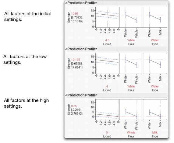
Figure 15.10 Screening Model Prediction Profiler for Flour Paste Experiment
The settings of each factor are connected by a line, called the prediction trace or effect trace. You can grab and move each vertical dotted line in the Prediction Profile plots to change the factor settings. The predicted response automatically recomputes and shows on the vertical axis, and the prediction traces are redrawn. The Prediction Profiler lets you look at the effect on the predicted response of changing one factor setting while holding the other factor settings constant. It can be useful for judging the importance of the factors.
The effect traces in the plot at the top of Figure 15.10 show higher predicted strength when there is
• four teaspoons of liquid rather than five
• white flour instead of whole wheat flour
• water rather than milk
This indicates that changing the three effects to these values increases peel strength.
The second plot in Figure 15.10 shows what happens if you click and move the effect trace to the settings listed above; four teaspoons of water and white flour. The predicted response changes from 10.95 to 12.175.
If you had the opposite settings for these factors (bottom plot in Figure 15.10), then the linear model would predict a surface strength of 0.25.
Flour Paste Conclusions
We designed and conducted a 16-run screening experiment to explore the effect of nine factors on peel strength. Although the initial Whole-Model F-Test was marginally significant (p = 0.0592), we found three important factors: Liquid, Flour and Type. We then used the prediction profiler to explore the optimal settings for these three factors.
Since the unexplained variation was relatively high, the experiment might bear repeating with better control of variability, a better experimental procedure, and an improved measurement system.
Details of the Design - Confounding Structure
There are a few details of this design that we did not discuss during the analysis. For example, how the nine factors plus an intercept can be investigated with only 16 runs. Since this experiment needs to look at many factors in a very few runs, many main effects are confounded with two-way interactions.
Confounding, or aliasing, means that the estimate of one effect includes the influence of one or more other effects. We don’t have enough runs (information) to uniquely estimate these effects. In main effects screening experiments, we assume that there are no interactions, and we do not include interactions in the model. However, it is informative to look at the alias structure of the design, which tells which effects are aliased or partially aliased with other effects. To do this:
Figure 15.11 Alias Matrix

In Figure 15.11 you can see that the Clamp effect is aliased with at least two second-order interactions. See the JMP DOE Guide for more information about interpreting the Alias Matrix.
Luckily, you do not have to understand the details of aliasing in order to use the Custom Designer.
Using the Custom Designer
There is a Back button at several stages in the design dialog that allows you to go back to a previous step and modify the design. For example, you can modify a design by adding or removing quadratic terms, center points, or replicated runs.
How the Custom Designer Works
The Custom Designer starts with a random design where each point is inside the range of each factor. The computational method is an iterative algorithm called coordinate exchange. Each iteration of the algorithm involves testing every value of each factor in the design to determine if replacing that value increases the optimality criterion. If so, the new value replaces the old. This process continues until no replacement occurs in an entire iteration.
To avoid converging to a local optimum, the whole process is repeated several times using a different random start. The Custom Designer displays the best of these designs.
Sometimes a design problem can have several equivalent solutions. Equivalent solutions are designs having equal precision for estimating the model coefficients as a group. When this is true, the design algorithm will generate different (but equivalent) designs if you press the Back and Make Design buttons repeatedly.
Choices in the Custom Designer
Custom designs give the most flexibility of all design choices. The Custom Designer gives you the following options:
• continuous factors
• discrete numeric factors with arbitrary numbers of levels
• categorical factors with arbitrary numbers of levels
• blocking with arbitrary numbers of runs per block
• covariates (factors that already have unchangeable values and design around them)
• mixture ingredients
• inequality constraints on the factors
• interaction terms
• polynomial terms for continuous factors
• selecting factors (or combinations of factors) whose parameters are only estimated if possible
• choice of number of center points and replicated runs
• choice of number of experimental runs to do, which can be any number greater than or equal to the number of terms in the model
After specifying all of your requirements, the Custom Designer generates an appropriate optimal design for those requirements. In cases where a classical design (such as a factorial) is optimal, the Custom Designer finds them. Therefore, the Custom Designer can serve any number or combination of factors. For a complete discussion of optimal designs, optimality criteria, and design evaluation, refer to the JMP DOE Guide.
An Interaction Model: The Reactor Data
Now that you’ve seen the basic flow of experimental design and analysis in JMP, we illustrate a more complicated design that involves both main effects and second order interactions.
Box, Hunter, and Hunter (2005, p. 259) discuss a study of chemical reactors that has five two-level continuous factors, Feed Rate, Catalyst, Stir Rate, Temperature, and Concentration. The purpose of the study is to find the best combination of settings for optimal reactor output, measured as percent reacted. It is also known that there may be interactions among the factors.
A full factorial for five factors requires 25 = 32 runs. Since we’re only interested in main effects and second order interactions, a smaller screening design can be used. The Screening Design option on the DOE menu provides a selection of fractional factorial and Plackett-Burman designs. The 16 run fractional factorial design allows us to estimate all 5 main effects and 10 two-factor interactions, but, unfortunately, this leaves no runs for the estimation of the error variance.
So, we’ll design this experiment using the Custom Designer, which provides more flexibility in choosing the number of runs than traditional screening designs. For fitting the model with all the two-factor interactions, by default the Custom Designer produces a design with 20 runs. This gives us four runs to estimate the error variance, which allows us to perform more rigorous significance tests of the various effects.
Figure 15.12 Add Response and Factors for Reactor Experiment

Figure 15.13 Designing the Reactor Experiment

The design generated by JMP and the results of this experiment are in the sample data table called Reactor 20 Custom.jmp. Note that the design you generated may be different.
Figure 15.14 Design Table and Data for Reactor Example

Analyzing the Reactor Data
We begin the analysis with a quick look at the response data.
There do not appear to be any unusual observations, although some trials resulted in high Percent Reacted (this is good!).
To analyze this experiment, we use the Fit Model platform. Since the design was generated using JMP, a Model script for the analysis is saved in the Tables panel. (Note that a “Screening” script, for analyzing the results using the Screening Analysis platform, has also been saved. See Screening Designs in the JMP DOE Guide for details on using the Screening platform to analyze experimental results.)
We designed this experiment to estimate all main effects and two-factor interactions. So, the Model Specification dialog window is set up to estimate theses effects.
As we saw with the Flour Paste example, JMP produces an Actual by Predicted Plot and a variety of statistical tables.
The Actual by Predicted Plot and the Analysis of Variance table indicate that the model is significant, with a p-value of 0.0104. The Root Mean Square Error in the Summary of Fit table is 4.239, which is relatively low given the scale of the response, and the R2 is a healthy 98.12%.
Figure 15.15 Reactor Analysis Output

As expected from the whole model results, there are several significant terms. The parameter estimates are sorted in depending order of significance in the Sorted Parameter Estimates Table (Figure 15.16). Catalyst (p-value = 0.0006), and the Catalyst*Temperature interaction (p-value = 0.0037) are both highly significant. Temperature, the Temperature*Concentration interaction, and Concentration are also significant (at the 0.05 level).
Figure 15.16 Reactor Sorted Parameter Estimates

Let’s look more closely at the interaction of Catalyst and Temperature using the Prediction Profiler, which displays at the bottom of the report (select Factor Profiling > Profiler from the top red triangle if it isn’t displayed.)
Now watch the slope of the profile for Temperature. The slope changes dramatically as catalyst is changed, which indicates an interaction. When there is no interaction, only the heights of the profile should change, not the slope. For example, watch the profile for Stir Rate, which does not interact with Catalyst. The profile height changes as the level of Catalyst is changed, but the slope stays relatively constant.
The Prediction Profiler at the top of Figure 15.17 shows the response when catalyst is at its low setting. The lower set of plots show what happens when catalyst is at its higher setting.
Figure 15.17 Effect of Changing Temperature Levels

This slope change can be seen for all interactions in one picture as follows:
Figure 15.18 Interaction Plots for Five-Factor Reactor Experiment

These profile plots show the interactions involving all pairs of variables in the reactor experiment.
In an interaction plot, the y-axes are the response. Each small plot shows the effect of two factors on the response. One factor (labeled in the matrix of plots) is on the x-axis. This factor’s effect is displayed as the slope of the lines in the plot. The other factor, labeled on the right y-axis, becomes multiple prediction profiles (lines) as it varies from low to high. This factor shows its effect on the response as the vertical separation of the profile lines. If there is an interaction, then the slopes are different for different profile lines, like those in the Temperature by Concentration plot (the lines are non-parallel).
Recall that Temperature also interacted with Catalyst. This is evident by the differing slopes showing in the Temperature by Catalyst interaction plots. On the other hand, Feed Rate did not show in any significant interactions (see the p-values in the Parameter Estimates table). The lines for all of the interactions involving Feed Rate are nearly parallel.
Note: The lines of a cell in the interaction plot are dotted when there is no corresponding interaction term in the model (since we’ve included all interactions, all of the lines are solid).
Where Do We Go From Here?
Recall that the purpose of the study was to find the best combination of settings for optimal reactor output, measured as percent reacted. We’ve built a linear model for percent reacted, as a function of all five main effects and all two-factor interactions. We’ve found many significant effects, including important two-factor interactions.
Finding the Best Settings
As we saw earlier, we can change factor settings in the Prediction Profiler to see corresponding changes in the predicted response. Changing all of the factors to their high levels results in a predicted Percent Reacted of 81.34 (see Figure 15.19). Hopefully, we can do much better than this!
The bracketed numbers, 69.76 and 92.93, provide a confidence interval for the predicted response.
Figure 15.19 Percent Reacted when Factors are at High Levels

We could change factor settings, one at a time, to see if we can get a better predicted response. But, the presence of two-factor interactions makes it difficult to determine the optimal settings manually. Fortunately, JMP has a built-in optimizer that will facilitate this process for us.

Recall that, when we designed the experiment, we set the response goal to maximize Percent Reacted. By selecting Maximize Desirability, JMP finds factor settings that maximize the response goal.
Note: To change the response goal double-click in the last box in the top row of Prediction Profiler. This opens the Response Goal panel (shown below).
The factor settings that produce the maximum predicted response are displayed at the bottom of the Profiler. These settings are:
• Feed Rate - 10
• Catalyst - 2
• Stir Rate - 120
• Temperature - 180
• Concentration - 3
The predicted Percent Reacted, at these settings, is 96.59.
Figure 15.20 Optimal Settings for the Reactor Factors

Validate the Results
Can we really see nearly 97% yields if we implement these factor settings? Can we do better? Before making any process changes, its always a good idea to validate your experimental findings. One strategy is to use ‘check points’, trials which were not included in the analysis, to see how well the model predicts those points. Another strategy to use a small number of confirmation runs to test the factor settings on a small scale. In either case, if our validation produces results inconsistent with our model, we’ve got more work to do.
Reduce the Model First?
We found optimal settings using the full model. However, many of the terms in the model are not significant. Instead of optimizing on the full model, we might first reduce the model by eliminating nonsignificant terms. Model reduction involves returning to the Model Specification Dialog window, eliminating interactions with the highest p-values, re-running the analysis, and repeating until only significant effects remain.
If you’re curious about this experiment, try reducing the model to see if the prediction results change.
Note: The Reactor 20 Custom.jmp experiment is a subset of the Reactor 32 Runs.jmp 25 full factorial experiment. As we will see in an exercise, the efficient 20 run design generated from the Custom Designer produces results similar to the much larger 32 run full factorial experiment.
Some Routine Screening Examples
The Flour Paste and Reactor experiments were examples of screening designs. In one case (Flour Paste) we were interested screening for main effects. In the other (Reactor), we estimated only main effects and second-order interactions. This section gives short examples showing how to use the Custom Designer to generate specific types of screening designs.
Main Effects Only (a Review)
Because there are no higher order terms in the model, no further action is needed in the Model panel. The default number of runs is (12) allows us to estimate the intercept and the six main effects, with five degrees of freedom for error.
The result is a resolution-3 screening design. All main effects are estimable but are confounded with two-factor interactions (see the Alias Matrix on the bottom of Figure 15.21).
Figure 15.21 A Main Effects Only Screening Design

All Two-Factor Interactions Involving A Single Factor
Sometimes there is reason to believe that some, but not all, two-factor interactions may be important. The following example illustrates adding all two-factor interactions involving a single factor. The example has five continuous factors.
To get a specific set of crossed factors (rather than all interaction terms),
Figure 15.22 Crossing Terms with One Factor

This design is a resolution-4 design equivalent to folding over on the factor for which all two-factor interactions are estimable.
Figure 15.23 Two-Factor Interactions for Only One Factor

Alias Optimal Designs
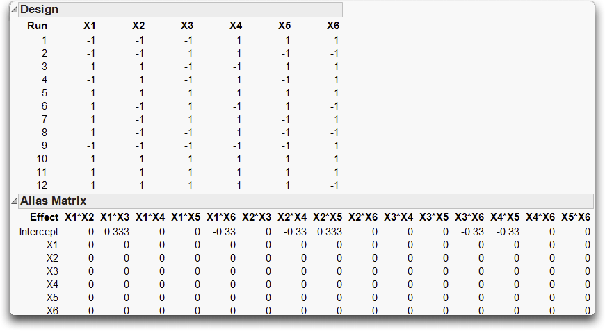
Suppose we are interested in estimating main effects, but are concerned that there may be aliasing between main effects and two-factor interactions. In the Alias Matrix for the main effects only design Figure 15.21, we see that main effects and two-factor interactions are aliased. For such screening design scenarios, an alias optimal design allows for the estimation of main effects while minimizing (and sometimes eliminating) the aliasing of main effects and two-factor interactions.
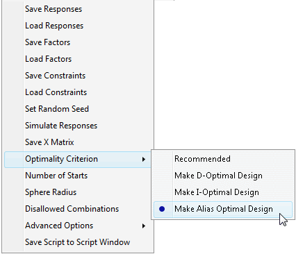
The resulting 12 run design (see Figure 15.24) looks similar to the main effects design shown in Figure 15.21. But, look at the Alias Matrix at the bottom of Figure 15.24. Main effects are not aliased with any of the two factor interactions. As a result, any of the two-way interactions can be uniquely estimated.
Figure 15.24 Alias Optimal Design
Note: For a complete discussion of screening designs and design evaluation, see the JMP DOE Guide (search for Screening Designs).
Response Surface Designs
Response surface designs are useful for modeling a curved (quadratic) surface to continuous factors. If a minimum or maximum response exists inside the factor region, a response surface model can pinpoint it. The standard two-level designs cannot fit curved surfaces; a minimum of three distinct values for each factor are necessary to fit a quadratic function.
The Odor Experiment
Suppose the objective of an industrial experiment is to minimize the unpleasant odor of a chemical. It is known that the odor varies with temperature (temp), gas-liquid ratio (gl ratio), and packing height (ht). The experimenter wants to collect data over a wide range of values for these variables to see if a response surface can identify values that give a minimum odor (adapted from John, 1971).
Response Surface Designs in JMP
To generate a standard response surface design the Response Surface Design option from the DOE menu can be used. However, the Custom Designer can also produce standard response surface designs, and provides much more flexibility in design selection.
Figure 15.25 Design Dialog to Specify Factors

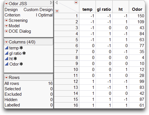
The resulting design table and experimental results are in the JMP sample data table called Odor JSS.jmp (Figure 15.26). JMP has produced a 16 run Central Composite design.
Figure 15.26 Odor JSS Response Surface Design and Values
Analyzing the Odor Response Surface Design
Like all JMP tables generated by the Custom Designer, the Tables Panel contains a Model script that generates the completed Fit Model dialog for the design.
Figure 15.27 Odor Fit Model Dialog

The effects appear in the model effects list as shown in Figure 15.27, with the &RS notation on the main effects (temp, gl ratio, and ht). This notation indicates that these terms are to be subjected to a curvature analysis.
The standard plots and least squares analysis tables appear, with an additional report outline level called Response Surface.
• The first table is a summary of the parameter estimates.
• The Solution table lists the critical values of the surface and tells the kind of solution (maximum, minimum, or saddle point). The critical values are where the surface has a slope of zero, which could be an optimum depending on the curvature.
• The Canonical Curvature table shows eigenvalues and eigenvectors of the effects. The eigenvectors are the directions of the principal curvatures. The eigenvalue associated with each direction tells whether it is decreasing slope, like a maximum (negative eigenvalue), or increasing slope, like a minimum (positive eigenvalue).
The Solution table in this example shows the solution to be a minimum.
Figure 15.28 Response Surface Model and Analysis Results

The Prediction Profiler allows us to visualize the response surface model, and confirms the optimum results in Figure 15.28.
Since we specified Minimize as the response goal when we designed the experiment, the Prediction Profiler finds settings of the factors that minimize the predicted response (Figure 15.29).
Figure 15.29 Prediction Profiler

Plotting Surface Effects
If there are more than two factors, you can see a contour plot of any two factors at intervals of a third factor by using the Contour Profiler. This profiler is useful for graphically optimizing response surfaces.

The Contour Profiler displays a panel that lets you use interactive sliders to vary one factor’s values and observe the effect on the other two factors. You can also vary one factor and see the effect on a mesh plot of the other two factors. Figure 15.30 shows contours of ht as a function of temp and gl ratio.
Entering a value defines and shades the region of acceptable values for the three predictor variables.
Optionally, use the Contour Grid option to add grid lines with specified values to the contour plot, as shown in Figure 15.30
Figure 15.30 Contour Profiler with Contours and Mesh Plot

Specifying Response Surface Effects Manually
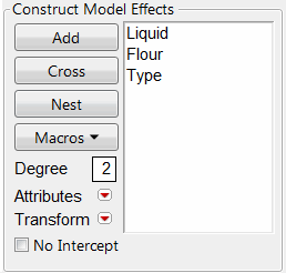
JMP completes the Fit Model dialog automatically when you build the design using one of the JMP DOE design options. If you’re working with experimental results and the data table does not have a saved model script, you can generate a response surface analysis manually. In the Model Specification dialog window, select effects in the column selection list and choose Response Surface from the effect Macros, as illustrated in Figure 15.31.
Figure 15.31 Fit Model Dialog for Response Surface Design

The Custom Designer vs. the Response Surface Design Platform
We designed the Odor experiment using the Custom Designer. The resulting design was a 16 run Central Composite Design (CCD). Why didn’t we just use the Response Surface Design Platform? In three-factor response surface designs the default is, indeed, a CCD. However, classical response surface designs involving four or more factors tend to be unwieldy, growing rapidly as the number of factors increases. The Custom Designer generally produces smaller designs by default. For example, compare four-factor response surface designs generated from the Custom Designer and the Response Surface platform (Figure 15.32).
While the smallest classical design is 27 runs (a Box-Behnken), the Custom Designer defaults to 21 runs. In addition, the Custom Designer allows the user to design the experiment to support the proposed model; the size of the design can be minimized by specifying only those cross products and quadratic effects that need to be estimated.
Figure 15.32 Four Factor Response Surface Designs

Split Plot Designs
In the experimental designs presented so far, all of the trials were run in random order (although we sorted the trials for illustration). Randomization is an experimental strategy for averaging out the influences of uncontrolled variables. For example, changes in weather or equipment conditions during an experiment can easily impact results and cloud findings.
In a completely randomized design, all of the factor settings can change from one run to the next. However, in many design situations, some factors are hard to change, and it is difficult or impossible to run the trials in a completely random order. It can be more convenient, and even necessary, to conduct the experiment using a split-plot design structure. Split plot experiments are structured with groups of runs called whole plots, where one or more factors stay constant within each run group. In JMP these factors are designated as Hard to change factors, and factors that can be fully randomized within the experiment are designated as Easy to change.
Split plot experiments occur often in industrial settings, as illustrated by the next example.
The Box Corrosion Split-Plot Experiment
Box et. al. (2005) discuss an experiment to improve the corrosion resistance of steel bars in an industrial setting. A coating was applied to the bars, which are then heated in a furnace for a fixed amount of time. The factors of interest are furnace temperature and coating type. Three temperatures and four coatings were tested:
• Furnace Temp: 360, 370, and 380 degrees C
• Coating: C1, C2, C3, and C4
Since it is difficult and time-consuming to change the furnace temperature, a split plot design was used. The experiment was run in temperature groups, or ‘heats’. For each heat, the furnace is held constant at one of the three temperatures. Within each heat, four bars treated with one of the four coatings are placed randomly in the furnace and heated to the designated temperature.
The experiment consists of two different types of factors:
• Furnace Temp is a whole plot, or hard to change factor. It is held constant within each heat.
• Coating is a split plot, or easy to change factor. It is fully randomized within each heat.
Each of the temperature settings is run twice, resulting in six heats and a total of 24 treated bars.
Designing the Experiment
To generate the design, we again use the Custom Design platform.
By default, both factors show as Easy to change in the Factors panel under Changes. To identify Furnace Temp as a hard to change factor:
The Model panel now contains two main effects and the interaction (Figure 15.33).
Finally, specify the number of heats, which are the whole plots, and the total number of runs.
Figure 15.33 Split Plot Design

The design table and permanently results are in the JMP sample data table Box Corrosion Split-Plot Design.jmp (Figure 15.34).
Figure 15.34 Box Corrosion Split-Plot Data Table

Analysis of Split Plot Designs
The completely randomized designs seen earlier in this chapter have one level of experimental units to which treatments are applied. As such, there is one error source, the residual error, to test for significance of model effects.
In split plot experiments there are two levels of experimental units; whole plots and split plots. Each of these levels contributes a unique source of variation.
The replication of the whole plot factor, furnace temperature, provides an estimate of whole plot random error due to resetting the furnace temperature. At the split plot level, there is residual variation due to differences in temperature at different positions in the furnace, differences in coating thickness from bar to bar, and so on.
Each term in the model must be tested against the appropriate error term (whole plot or split plot). As a result, analysis of split plot experiments is more complicated than that for completely randomized experiments (Jones and Nachtsheim, 2009). Fortunately, the correct analysis has been saved in the Tables panel of the data table.
Figure 15.35 Split Plot Model Dialog

The model effects include Furnace Temp, Coating and the two-way interaction, along with the random effect Whole Plots&Random. This extra term triggers the REML variance components analysis, and ensures that the model effects are tested against the correct error term.
Note: See the section Optional Topic: Random Effects and Nested Effects in Chapter 14, Fitting Linear Models for a discussion of the REML (Restricted Maximum Likelihood) Method.
The Fixed Effect Tests panel shows that Coating and the Furnace Temp*Coating interaction are significant (with p-values of 0.0020 and 0.0241 respectively). Furnace Temp is not significant independent of the coating used.
The variance components estimates are given in the REML report. Furnace Temp is tested against the Whole Plot variance, but Coating and the interaction are tested against the Residual variance. Note that the whole plot variance is 9.41 times larger than the residual variance.
Figure 15.36 Box Corrosion Split Plot Results

But, what if we had ignored the split plot structure and analyzed this example as a completely randomized experiment as seen in Figure 15.37?
Table 15.1 summarizes some of the key differences.
|
|
Correct Analysis (Split Plot)
|
Incorrect Analysis (Fully Randomized)
|
|
RMSE
|
11.16
|
36.01
|
|
Furnace Temp
|
0.2093
|
0.0026
|
|
Coating
|
0.0020
|
0.3860
|
|
Furnace Temp*Coating
|
0.0241
|
0.8518
|
By ignoring the split plot structure, we would have determined that only Furnace Temp is significant. Further, we would have concluded there is no difference in coatings, and that the effect of temperature on corrosion resistance is independent of the coating applied. The incorrect analysis would have led to the opposite (and incorrect) conclusions!
Figure 15.37 Box Corrosion Incorrect Analysis

Design Strategies
So far, our discussion on generating designs has focused on the particulars of how to get certain types of designs. But why are these designs good? Here is some general advice.
Multifactor designs yield information faster and better.
Experiments that examine only one factor, and therefore only ask one question at a time, are inefficient.
For example, suppose that you have one factor with two levels, and you need 16 runs to see a difference that meets your requirements. Increasing to seven factors (and running each as a separate experiment) would take  runs. However, with a multifactor experimental design, all seven factors can be estimated in those 16 runs, and have the same standard error of the difference, saving you 7/8's of your runs.
But that is not all. With only 16 runs you can still check for two-way interactions among the seven factors. The effect of one factor may depend on the settings of another factor. This cannot be discovered with experiments that vary only one factor at a time.
Experimentation allows you to build a comprehensive model and understand more of the dynamics of the response’s behavior.
Do as many runs as you can afford
The more information you have, the more you know. You should always try to perform an experiment with as many runs as possible. Since experimental runs are costly, you have to balance the limiting factor of the cost of trial runs with the amount of information you expect to get from the experiment.
The literature of experimental design emphasizes orthogonal designs. They are great designs, but come only in certain sizes (e.g. multiples of 4). Suppose you have a perfectly designed (orthogonal) experiment with 16 runs. Given the opportunity to do another virtually free run, therefore using 17 runs, but making the design unbalanced and non-orthogonal, should you accept the run?
Yes. Definitely. Adding runs never subtracts information.
Take values at the extremes of the factor range
This has two advantages and one disadvantage:
• It maximizes the power. By separating the values, you are increasing the parameter for the difference, making it easy to distinguish it from zero.
• It keeps the applicable range of the experiment wide. When you use the prediction formula outside the range of the data, its variance is high, and it is unreliable for other reasons.
• The disadvantage is that the true response might not be approximated as well by a simple model over a larger range.
Add some replicates
Entering a ‘1’ into the Number of Replicate Runs field in the DesignGeneration panel adds one additional run at the optimal design point. Replicating runs provides an estimate of pure error, and improves the estimates of terms in the model.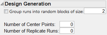
You can also add center points to the design in the Number of Center Points field. Center points are runs set at the mid-points of continuous factors, and are commonly used to test for lack-of-fit (i.e. potential curvature). However, the center of the design space is not the optimal location for replicates, and curvature can be modeled directly by adding quadratic terms.
Randomize the assignment of runs.
Although we’ve presented designs that have been sorted (for illustration), randomization is critical to neutralize any inadvertent effects that may be present in a given sequence.
Design of Experiments Glossary
Augmentation
If you want to estimate more effects, or learn more about the effects you have already examined, adding runs to the experiment in an optimal way assures that you learn the most from the added runs.
Balanced
A design is balanced when there are the same number of runs for each level of a factor, and for various combinations of levels of factors.
Coding
For continuous factors, coding transforms the data from the natural scale to a -1 to 1 scale, so that effect sizes are relative to the range. For categorical factors, coding creates design columns that are numeric indicator columns for the categories.
Effect Precision
Effect precision is the difference in the expected response attributed to a change in a factor. This precision is the factor’s coefficient, or the estimated parameter in the prediction expression.
Effect Size
The standard error of the effect size measures how well the experimental design estimates the response. This involves the experimental error variance, but it can be determined relative to this variance before the experiment is performed.
Folding
If an effect is confounded with another, you can add runs to the experiment and flip certain high/low values of one or more factors to remove their confounding.
Formulation
Sometimes there is a model constraint. For example, factors that are mixture proportions must to sum to 1.
Fractional Factorial
A fraction of a factorial design, where some factors are formed by interactions of other factors. They are frequently used for screening designs. A fractional factorial design also has a sample size that is a power of two. If k is the number of factors, the number of runs is 2k-p where p < k. Fractional factorial designs are orthogonal.
Full Factorial
All combinations of levels are run. If there are k factors and each has two levels, the number of factorial runs is 2k.
Minimum-Aberration
A minimum-aberration design has a minimum number of confoundings for a given resolution.
Mixture Design
Any design where some of the factors are mixture factors. Mixture factors express percentages of a compound and must therefore sum to one. Classical mixture designs include the simplex centroid, simplex lattice, and ABCD.
D-Optimality
Designs that are D-Optimal maximize a criterion so that you learn the most about the parameters (they minimize the generalized variance of the estimates). This is an excellent all-purpose criterion, especially in screening design situations.
I-Optimality
Designs that are I-Optimal maximize a criterion so that the model predicts best over the region of interest (they minimize the average variance of prediction over the experimental region). This is a very good criterion for response surface optimization situations.
Optimization
You want to find the factor settings that optimize a criterion. For example, you may want factor values that optimize quality, yield, or cost while minimizing bad side effects.
Orthogonal
The estimates of the effects are uncorrelated. If you remove an effect from the analysis, the values of the other estimates remain the same.
Plackett-Burman
Plackett-Burman designs are an alternative to fractional factorials for screening. Since there are no two-level fractional factorial designs with sample sizes between 16 and 32 runs. A useful characteristic of these designs is that the sample size is a multiple of four rather than a power of two. However, there are 20-run, 24-run, and 28-run Plackett-Burman designs.
The main effects are orthogonal and two-factor interactions are only partially confounded with main effects. This is different from resolution-3 fractional factorial where two-factor interactions are indistinguishable from main effects.
In cases of effect sparsity (where most effects are assumed to have no measurable effect on the response), a stepwise regression approach can allow for removing some insignificant main effects while adding highly significant and only somewhat correlated two-factor interactions.
Prediction Designs
Rather than looking at how factors contribute to a response, you instead want to develop the most accurate prediction.
Robustness
You want to determine operational settings that are least affected by variation in uncontrollable factors.
Resolution
The resolution number is a way to describe the degree of confounding, usually focusing on main effects and two-way interactions. Higher-order interactions are assumed to be zero.
In resolution-3 designs, main effects are not confounded with other main effects, but two-factor interactions are confounded with main effects. Only main effects are included in the model. For the main effects to be meaningful, two-factor interactions are assumed to be zero or negligible.
In resolution-4 designs, main effects are not confounded with each other or with two-factor interactions, but some two-factor interactions can be confounded with each other. Some two-factor interactions can be modeled without being confounded. Other two-factor interactions can be modeled with the understanding that they are confounded with two-factor interactions included in the model. Three-factor interactions are assumed to be negligible.
In resolution-5 designs, there is no confounding between main effects, between two-factor interactions, or between main effects and two-factor interactions. That is, all two-factor interactions are estimable.
Response Surface
Response Surface Methodology (RSM) is a technique invented that finds the optimal response within specified ranges of the factors. These designs can fit a second-order prediction equation for the response. The quadratic terms in these equations model the curvature in the true response function. If a maximum or minimum exists inside the factor region, RSM can find it.
In industrial applications, RSM designs usually involve a small number of factors, because the required number of runs increases dramatically with the number of factors.
Screening Designs
These designs sort through many factors to find those that are most important, i.e. those that the response is most sensitive to. Such factors are the vital few that account for most of the variation in the response.
Significance
You want a statistical hypothesis test to show significance at meaningful levels. For example, you want to show statistically that a new drug is safe and effective as a regulatory agency. Perhaps you want to show a significant result to publish in a scientific journal. The p-value shows the significance. The p-value is a function of both the estimated effect size and the estimated variance of the experimental error. It shows how unlikely so extreme a statistic would be due only to random error.
Space-Filling
A design that seeks to distribute points evenly throughout a factor space.
Split Plot
In many design situations, some factors may be easy to change, while others may be harder to change. While it is possible to fully randomize designs involving only easy to change factors, randomization is limited with experiments involving factors which are hard to change. To accommodate the restrictions on randomization, split plot designs should be used.
In a split plot experiment, one or more hard-to-change ‘whole plot’ factors are held constant while the easy-to-change ‘split plot’ factors are randomized within the whole plot. This is repeated for the different settings of the whole plot factor(s).
Taguchi
The goal of the Taguchi Method is to find control factor settings that generate acceptable responses despite natural environmental and process variability. In each experiment, Taguchi's design approach employs two designs called the inner and outer array. The Taguchi experiment is the cross product of these two arrays. The control factors, used to tweak the process, form the inner array. The noise factors, associated with process or environmental variability, form the outer array. Taguchi's signal-to-noise ratios are functions of the observed responses over an outer array. The Taguchi designer in JMP supports all these features of the Taguchi method. The inner and outer array design lists use the traditional Taguchi orthogonal arrays such as L4, L8, L16, and so forth.
Exercises
1. The file Reactor 32 Runs.jmp in the Sample Data directory contains the factor settings and results for a 32 run 25 full factorial experiment. The response and factors are described in An Interaction Model: The Reactor Data.
(a) Go to Analyze > Fit Model. Add Percent Reacted as the Y and the five factors and all possible interactions as model effects. Hint: Select the factors, then under Macros select Full Factorial. This will fit a model with all main effects, two-way, three-way, four-way interactions, along with one five-way interaction. Click Run.
(b) Look at the Sorted Parameter Estimates table. Are any of the higher order interactions significant? Which terms are significant? Compare these results to those found when we analyzed the more efficient Reactor 20 Custom.jmp experiment.
(c) Now, fit a model with only main effects and two-way interactions. Hint: Return to Analyze > Fit Model. Select the factors, then under Macros select Factorial to Degree. Add Percent Reacted as the Y, and click Run.
(d) Use the Prediction Profiler to determine factor settings that maximize the predicted Percent Reacted. What are the optimal settings? What is the predicted response at these settings? Compare your findings to the prediction results from the Reactor 20 Custom.jmp experiment.
2. An industrial engineer would like to design an experiment to study the breaking strength of metal parts. Five two-level factors are under consideration, two continuous (X1 and X2) and three categorical (X3, X4, and X5). Due to resource limitations and time constraints, only 15 trials can be conducted. It is known that factor X1 does not interact with the other factors. Use the custom designer to design a 15 trial screening experiment to estimate main effects and two-way interactions.
3. The file TireTread.jmp, in the Sample Data directory, contains the results of a three-factor response surface experiment. The factors are Silica, Silane, and Sulfur. The experiment was conducted to optimize four responses: Abrasion, Modulus, Elongation, and Hardness. The goals for the four responses have been added as column properties. (Hint: click on the asterisk next to each response in the Columns panel, and select Response Limits to view the goals).
(a) Use the Distribution platform to explore the factor settings. How many settings were used for each factor?
(b) Use Graph > Graph Builder to explore the relationship between the factors and the responses. Hint: Drag a factor to the X zone and a response to the Y zone. To explore more than one factor at a time, drag a second factor to the X zone next to the first, and release. To explore more than one response at a time, drag a second response to the Y zone above the first, and release. The smooth lines (splines) describe the general relationship between the factors and each response.
(c) Run the RSM for 4 Responses script in the Tables panel to fit a response surface model for all four responses. Scroll to the bottom of the Fit Least Squares window to see the Prediction Profiler. Note the prediction traces for each factor for the four responses. For example, the prediction traces for Sulfur are different for the four responses. An increase in sulfur will result in an increase abrasion, but will cause a decrease elongation. Also note the response goals in the last column of the profiler. The goals are maximize for the first two responses, and match target for the last two.
(d) Select Maximize Desirability from the red triangle menu for the Prediction Profiler to simultaneously optimize all four responses. What are the optimal settings for the three factors? Were the response goals met (and met equally well) for all four responses?
(e) Return to the data table. This experiment was a 20 run Central Composite response surface design. Use the Custom Designer to create a response surface design for the four responses and three factors. What is the minimum number of runs required? What is the default number of runs?
..................Content has been hidden....................
You can't read the all page of ebook, please click here login for view all page.