
CHAPTER 11
Data Visualization and Geographic Information Systems
Introduction
The concept of using pictures or graphics to understand data has been around for centuries—from seventeenth century maps and graphs to the invention of the pie chart in the early 1800s. In recent years, technology has brought the art and science of data visualization to forefront, and it is changing the corporate landscape.
Historically, data analytics was performed by statisticians, programmers, and data scientists who rarely interact directly with the business. However, easier-to-use data visualization, dashboard, and mashup technologies have changed this “experts-only” approach to data analysis and presentation. Data analytics are being pushed out into the business by advances that make it possible for employees at most levels of the organization to analyze data in a meaningful way. Vendors of enterprise-level analytics are also upgrading their visualization and reporting platforms previously designed for use by the statistical experts.
In Chapter 3, you learned about big data analytics, data mining, and business intelligence (BI) and how they are being used to enhance performance, productivity, and competitive advantage in organizations around the globe. In this chapter, we expand on these topics to introduce you to the latest in data visualization, visual discovery, dashboards, mashups, and geographic information systems (GISs). We also introduce you to another important concept—geospatial data and how companies are incorporating geospatial data and GISs into their customer relationship management (CRM), supply chain management (SCM), BI, and other related enterprise activities
Several tools discussed in this chapter enable you to be self-sufficient. Drag-and-drop, automation, “show me” wizards, and easy-to-use dashboards enable you to develop your own interactive data visualization apps and dashboards. Reducing dependency on IT staff has a long history. For example, at one time, managers did not analyze data with spreadsheets, but now Excel expertise is expected. Vendors offer academic alliances to enable universities to teach their software in MBA and undergraduate business courses. Tableau Desktop, QlikView, TIBCO Spotfire, and IBM’s SPSS Analytic Catalyst enable business users to perform the kind of advanced analysis that could only have been performed by expert users of statistical software a few years ago.
11.1 Data Visualization and Learning
Data visualization harnesses the power of data analytics and adds a visual display to capitalize on the way our brains work. You’ve probably heard the saying “A picture is worth a thousand words”—interactive displays, charts with drill down capability, and geospatial data analysis do just that and are some of the many ways companies can present data to enhance decision-making. For example, maps can tell a much more compelling story than words or numbers, as shown in Figure 11.2, by effective use of visual cues. Organizational decision-makers rely on visual cues to grasp and process huge amounts of information.

FIGURE 11.2 U.S. Census Bureau map shows easily identifiable changes in county population density. Different colors are used to indicate areas that gained and lost population. Intensity of color indicates extent of gain/loss.
Visualizing data can save a business money, help communicate important points, and hold customer attention. Data visualization is important because of the way the human brain processes information. Using pie charts, histograms, or bar graphs to visualize large amounts of complex data is much easier than poring over spreadsheets or reports. Data visualization is a quick, easy way to convey concepts in a universal manner—and you can experiment with different scenarios by making slight adjustments.
Data visualization software can be extremely powerful and complex, similarly to Deloitte’s HIVE platform. At the other continuum are tools with simple, point-and-click interfaces that do not require any particular coding knowledge or significant training. Most non-data-scientist-friendly tools have interactive elements and can pull data from Google Docs, Excel spreadsheets, Access databases, and other sources that most business people work with already. Some useful business applications for data visualization include the following:
- Identifying areas that need attention or improvement
- Clarifying which factors influence customer behavior
- Helping understand which products to place where
- Predicting sales volumes
First, we’ll explore different technologies that fall into the data analytics category, as shown in Figure 11.3. Vendor packages usually offer tools in more than one category. In general, reporting tools generate BI that shows what has already happened in a business. Analytical tools show what might or could happen in the future. Later sections discuss information delivery and data integration.

FIGURE 11.3 Tools and technologies in this chapter fall into three related categories.
Learning, Exploration, and Discovery with Visualization
Data visualization enables learning that is the basis for continuous improvement. When companies, political parties, sports teams, or fund-raising agencies invest in marketing programs, campaigns, promotions, special events, or other projects, they use visualization to learn something from them. Visualization is also used as a data explorer and data discovery tool. Companies, such as Safeway and PepsiCo, are discovering new relationships and learning how to improve performance using data visualization in all types of industries and governmental agencies. Enterprise visualization apps for Androids, Apple iPads, and Surface tablets are replacing static business reports with real-time data, analytics, and interactive reporting tools.
Examples of Visuals
Examples of visualizations include dials, charts, graphs, timelines, geospatial maps, and heat maps. The tricolor heat map in Figure 11.4 instantly alerts the viewer to critical areas most in need of attention. Visual displays make it easier for individuals to understand data and identify patterns that offer answers to business questions such as “Which product lines have the highest and lowest profit margins in each region?” Interactivity and drill-down capabilities are standard features that make visualization even more valuable. Two other types of heat maps, created in Tableau Desktop, are shown in Figure 11.5; both heat maps are based on the same data set. Notice that the way in which the data are visually displayed depends on what you want to learn or convey.

FIGURE 11.4 This heat map uses three colors to convey information at a glance. The heat map is like a spreadsheet whose cells are formatted with colors instead of numbers.

FIGURE 11.5 These heat maps represent the same data set using different colors (usually red and green) and color intensity to show the profitability of three product categories and their subcategories. In (a), data labels show detailed profit, while in (b), the area of each segment is used to make comparisons.
Human expertise is an essential component of data visualization (see Figure 11.6). A common mistake organizations make is to invest in the analytics foundation—tools, quality data, data integration, touch screens—but overlook the most crucial component, which is the users’ ability to interpret the visual reports and analyze them correctly.

FIGURE 11.6 Data visualization, human expertise, and high-quality data are needed to obtain actionable information.
Data Discovery Market Separates from the BI Market
According to Gartner Research, the data analytics market has split into two segments: the traditional BI market and the newer data discovery market. Data discovery software had previously been viewed as a supplement to traditional BI platforms. Now it is a stand-alone alternative to BI. This split occurred because today’s data discovery technologies provide greater data exploration and ease of use to help users find answers to “why” and “what if” questions through self-service analytic apps. The split is another example of pushing analytics onto the computers of business workers. IT at Work 11.1 describes the trend at IBM.
Analytics/Visualization Vendors Respond to Demand
Smaller data visualization vendors are competing head-on with BI megavendors IBM, Oracle, and SAS. For example, vendors DOMO, QlikView, Birst, Tableau, Sisense, and others are adding enterprise features with each new release. SAS is one of the leaders in the data visualization space. SAS® Visual Analytics uses intelligent autocharting to help business analysts and nontechnical users create the best possible visual based on the data that is selected. The visualizations make it easy to see patterns and trends and identify opportunities for further analysis. The SAS® LASR™ Analytic Server feature executes and accelerates analytic computations through in-memory processing. The combination of high-performance analytics and an easy-to-use data exploration interface enables different types of users to create and interact with graphs and charts to better understand and derive more value from their data faster than ever.
Others, such as Qlik, are integrating inference engines to replace the query-based approach, which divorces data from its context. Using an inference engine, users can input as much information as they have, and the software not only will search for the information provided but also will make associations with all other data that is related to the information provided.
These vendors continue to focus on business users of all levels and backgrounds. For example, Jeff Strauss, BI architect at Allstate Insurance Company, explained that Allstate invested in Tableau data discovery tools, so users throughout the organization could do their own analysis rather than rely on the IT department. Tableau has built a large following with its easy-to-access dashboards.
Data Discovery Offers Speed and Flexibility
Data discovery is expected to take on a greater role in corporate decision making. Companies are investing in the latest data discovery solutions largely because of their speed and flexibility. Experts and novices can collect data quickly from disparate sources and then explore the data set with easy-to-use interactive visualizations and search interfaces (Figure 11.7). Drill-down paths are not predefined, which gives users more flexibility in how they view detailed data.

FIGURE 11.7 Data discovery tools allow users to interact with multiple corporate data sources.
A powerful feature of data discovery systems is their ability to integrate data from multiple data stores and identify data types and roles. See Tech Note 11.1. While data are being loaded into the program, the software automatically extracts and organizes them by data type. Software may also extract and organize terms from unstructured content, such as texts, e-mail, and PDFs, and create tag clouds. Figure 11.8 shows an example of a Word cloud that give users a quick way to evaluate the most aspects of SCM and start to make discoveries.

FIGURE 11.8 Word clouds represent the relative frequency of words and terms by their sizes.
Big Data Visualization Challenges
The speed, size, and diversity of big data brings new challenges to visualization. One challenge is how to display the results of data discovery in a meaningful way that is not overwhelming. For example, you may need to collapse and condense the results to display graphs and charts in a way that decision makers are accustomed to viewing. Results may also need to be available quickly on mobile devices, and users may want to be able to easily explore the data on their own in real time.
Another issue associated with big data is the speed within which traditional architectures and software can process the data. If the data are not processed in a timely manner, the data may not be accurate or useful, for example, stock market data. For example, IBM SPSS integrates three visualization tools to handle big data—Netezza, InfoSphere BigInsights, and InfoSphere Streams—to provide comprehensive analytics capabilities in the big data platform. Netezza is a high-performance data warehouse whose data can be used for model building, scoring, and model refresh; InfoSphere BigInsights is an enterprise-ready distribution of Hadoop.
How Is Data Visualization Used in Business?
The ultimate goal of data analytics is to drive profits, and often that depends on learning how to manage assets, such as inventory, or engage customers in a smarter way. Collecting data is relatively easy. Making sense of that data is not. Here are examples of how companies and/or entire industries are using data visualization and interactivity to improve decision speed and performance often with mobile displays.
The latest data visualization software addresses issues associated with processing big data by speeding up data discovery and returns the visualization within an appropriate timeframe, in an easy-to-understand format. BI and data visualization vendors are working to assist business analysts and nontechnical users in determining how best to display these massive amounts of data.
Quick Detection and Decisions in Stock Markets
Wall Street firms, traders, wealth managers, risk analysts, and regulators rely on their ability to process and capitalize on market anomalies in real time. Because of the demanding pace of their decisions, capital market professionals use visualization for risk analysis, pretrade and posttrade checks, compliance monitoring, fraud detection, client profitability analysis, research and sales, and portfolio performance. Vendor Aqumin provides real-time visual interpretation solutions for the financial services industry. Aqumin’s OptionVision enables traders, risk managers, and market participants to spot opportunities, risk, and market changes. AlphaVision for Excel enables visual interpretation capabilities directly within the Microsoft Excel platform, and AlphaVision for Bloomberg is developed for professional portfolio managers, traders, and risk analysts and is connected directly to the Bloomberg Terminal to leverage data provided by Bloomberg.
The Chicago Board Options Exchange (CBOE), Gain Capital, JP Morgan, hedge funds, and other asset management firms not only need data visualization but their executives and investors expect the quality and excitement of visuals to make sense of dry financial data.
Improving the HR Function
ADP Corporation is one of the largest payroll service providers in the world, with data on 33 million workers. When payroll processing company ADP rolled out data visualizations with predictive analytics to improve its human resource (HR) function, it was surprised by what it found. After organizing the information and funneling it through an analysis program, the HR department found that ADP would soon face a serious retirement problem. To mitigate its foreseeable future talent gaps, ADP constructed new training programs to prepare the next generation of workers.
Prompt Disaster Response by the Insurance Industry
The effectiveness of an insurer’s response to a devastating hurricane or other catastrophic event depends on its ability to combine large amounts of data to fully understand the impact. Leading insurers are using Web-based data visualization and analysis technologies to better manage their responses to major disasters. In the days and weeks after a disaster, insurers face analysis and reporting bottlenecks. Analysts capable of creating maps and reports work frantically to respond to requests for information. Because new data continue being generated even after the event, the data have a short life span and reports need to be regenerated and redistributed.
For example, when an earthquake occurs, workers throughout an insurance company access a Web-based (cloud) data app to visualize and analyze the impact. Users quickly determine which properties were subject to specific shake intensities and can visually build analyses on their own, rather than waiting for a report.
Data Visualization Tools
A number of vendors offer data visualization software. The following list describes a few of these. Many of these vendors offer a free trial of their software on the websites.
- SAS Visual Catalyst has an intelligent autocharting feature that automatically presents the most appropriate visualization of a specified data set based on the amount and type of data being analyzed. By building hierarchies “on the fly,” interactively exploring data, and displaying data in different ways to answer specific questions or solve new problems, these new data visualization products relieve the user of constantly having to rely on assistance from the IT department when they want to change the ways in which the data is displayed. For example, if you have a billion rows of data, it would be impossible to see so many data points on a scatter plot. However, a box plot would convey the information that you need.
- Birst combines capability, scale, and data governance that IT needs with the agility, speed, and usability of consumer-grade desktop tools. Birst’s adaptive user experience offers users a wide range of self-service, data analysis, and presentation options, and its cloud architecture allows users to instantly share findings and data across its supply chain.
- QlikView distinguishes itself from other BI tools through its unique inference engine that automatically maintains data associations. The inference engine works much the same as the human brain, in that when it “thinks” of a data set, it is reminded of all things related to it. Qlikview also offers a simple, Google-like search that works in an associative manner, producing results for the phrase and also for things commonly related to the phrase. For example, if a user wants contact information for a salesperson in an organization, and only knows the product that the salesperson specializes in but didn’t know the person’s name or the company, Qlikview could produce the desired results.
- IBM SPSS Analytic Catalyst has made sophisticated analytics accessible. Analytic Catalyst enables business users to conduct the kind of advanced analysis that had been designed for experts in statistical software. The software fast tracks analytics by identifying key drivers, selecting an appropriate model, testing it, and then explaining the results in plain English. See the YouTube video titled “IBM SPSS Analytic Catalyst” for an overview. The tool condenses the analytic process into three steps: data upload, selection of the target variable (the dependent variable or outcome variable), and data exploration. Once the data are uploaded, the system selects target variables and automatically correlates and associates the data. Based on characteristics of the data, Analytic Catalyst chooses the appropriate method and returns summary data rather than statistical data. On the initial screen, it communicates the so-called top insights in plain text and presents visuals, such as a decision tree in a churn analysis. Once the user has absorbed the top-level information, he or she can drill down into top key drivers. This enables users to see interactivity between attributes.
- IBM Watson Analytics is a cloud-based data visualization tool that guides data exploration, automates predictive analytics, and enables effortless creation of dashboards and infographics.
- Tableau is one of the easier data discovery tools to implement, requiring just basic database information to connect it to the target data sources. With a new in-memory database engine, such tools are developing the power to perform big data analytics. Despite data visualization advancements, data integration between data sources can still be very challenging.
- Roambi Analytics is a leading mobile reporting and data visualization app designed for iPads and iPhones. The app can take data from most sources, including Box, Google Docs, spreadsheets, BI systems, databases, and Salesforce.com, and transform them into interactive data visualizations. Roambi has a worldwide customer base of Global 500 companies and small and medium businesses across industries, including telecommunications, biotechnology, pharmaceuticals, consumer technology, and packaged goods.
Concept Check 11.1
- _______________________ harnesses the power of data analytics and adds a visual display to capitalize on the way our brains work.
- Some useful business applications for data visualization include:
- Data discovery is expected to take on a greater role in _____________________.
11.2 Enterprise Data Mashups
Enterprise data mashups combine business data and applications from multiple sources—typically a mix of internal data and applications with externally sourced data, SaaS (software as a service) and Web content—to create an integrated experience. Mashups, in general, became popular because of social and mobile technology. The ability of enterprise mashups to quickly and easily consolidate data and functionality that is normally spread across several applications, onto a single Web page or mobile device screen, offers real business opportunities for companies of all shapes and sizes around the world.
Enterprises use mashups as quick, cost-effective solutions to a range of issues. Because mashups use preexisting technology, they do not require a huge investment and can be developed in hours rather than days or weeks.
Data mashups are becoming an increasingly important tool for businesses of all sizes by allowing users to gain new insights and spot trends within data. While combining disparate data sources is common for a data mashup, even if there is only a single data source, a mashup can be made by combining data in a way that is not anticipated. End users and analysts who rely on dashboards and drill-down capabilities benefit from greater access to data, but the mashups remain behind the scene and invisible. Interactive dashboards and drillable reports can be rapidly built based on mashed-up data. Tech Note 11.2 discusses dashboard software. Heat maps and tree maps can be created as data visualizations in mashups.
For organizations, mashup apps decrease IT implementation costs over traditional, custom software development (discussed in Chapter 12) and significantly simplify business workflows—both increase the ROI (return on investment) of mashup implementations.
Point-and-click dashboard building is a common feature in data mashups. These mashup technologies provide visually rich and secure enterprise apps created from live data. They provide the flexibility to combine data from any enterprise app and the cloud regardless of its location. Users can build apps and dashboards that can be displayed on the Web and mobile devices.
Mashup Architecture
Technically, a data mashup is a technique for building applications that combine data from multiple sources to create an integrated experience. As techniques for creating mashups became easier, companies started using them to build enterprise mashups that supported their business models. Tech-savvy managers realize that they can use mashup apps with their existing data and external services to provide new and interesting views on the data.
Figure 11.9 shows the general architecture of an enterprise mashup app. Data from operational data stores, business systems, external data (economic data, suppliers; information, competitors’ activities), and real-time news feeds are integrated to generate an enterprise mashup.
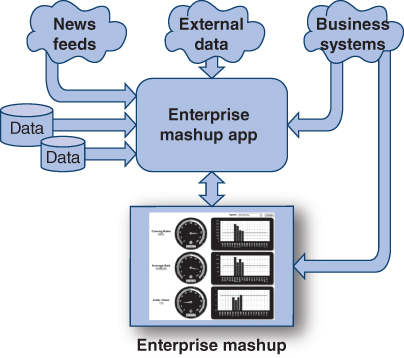
FIGURE 11.9 Architecture of enterprise mashup application.
Why Do Business Users Need Data Mashup Technology?
Business users have a hard enough time identifying their current data needs. It is not realistic to expect them also to consider all the new sources of data that might be made available to them and the analyses they might do if they had access to that data. With traditional BI and data warehousing systems, data sources have to be identified, and some understanding of data requirements and data models is needed.
Realizing that there will always be data needs that cannot be anticipated, the question is whether IT should be in the middle of supporting those requests? Providing business users with self-service enables them to meet their needs more quickly. They also have the opportunity to explore and experiment.
Enterprise mashups improve operational efficiency, optimize the sales pipeline, enhance customer satisfaction, and drive profitability. Within government, mashups have positively impacted strategic areas such as citizen engagement and satisfaction, financial transparency, project oversight, regulatory compliance, and legislated reporting. A summary of enterprise mashup benefits is given in Table 11.2.
TABLE 11.2 Enterprise Mashup Benefits
|
Enterprise Mashup Technology
Mashup technology leverages investments in both BI tools and interactive technologies. BI systems are very good at filtering and aggregating huge data volumes into information. With mashup technology, for example, users can filter down the data based on their needs so that only the information needed is provided by the available data services. Tech Note 11.3 describes mashup self-service.
Concept Check 11.2
- Data mashups allows users to:
- Data mashups use:
- Point‐and‐click dashboard building is a _______________ feature in data mashups.
- Enterprise mashups:
11.3 Digital Dashboards
A digital dashboard provides in-depth business analysis while providing a real-time snapshot of productivity. The digital dashboard emerged in the 1970s from the different report formats produced by decision support systems. As more and more companies moved to the Web some 20 years later, digital dashboard systems were developed to combine data reporting and facilitate smooth business operations and decisions. When done well, a digital dashboard is a tool that helps an organization efficiently develop analytical goals and strategies.
Digital dashboards pull data from disparate data sources and feeds to report KPIs and operational or strategic information on intuitive dashboards and interactive displays (Figure 11.10).
FIGURE 11.10 Dashboards pull data from disparate data sources and feeds, manipulate the data, and display the metrics.
Table 11.3 lists typical metrics displayed on dashboards by function. An executive dashboard displays a company’s performance metrics, which are automatically updated in real time (every 15 minutes) based on custom programming and connectivity with existing business systems. Dashboards improve the information synthesis process by bringing in multiple, disparate data feeds and sources, extracting features of interest, and manipulating the data, so the information is in a more accessible format. Users no longer need to log into multiple applications to see how the business is performing.
TABLE 11.3 Metrics Displayed on Dashboards by Function
| Dashboard Type | Metrics |
| Financial performance |
|
| E-commerce |
|
| Revenue |
|
| Sales team |
|
| Advertising |
|
| Order fulfillment |
|
Components of dashboards are as follows:
- Design The visualization techniques and descriptive captions to convey information so that they are correctly understood. Infographics are widely used because they convey information in interesting and informative designs.
- Performance metrics KPIs and other real-time content displayed on the dashboard. All dashboard data should reflect the current value of each metric.
- API APIs connect disparate data sources and feeds to display on the dashboard. The alternative is for users or IT to manually enter data to the dashboard. Dashboards created in this manner tend to fail because of the risk of incomplete, outdated, or wrong data, which users learn not to trust.
- Access Preferred access is via a secure Web browser from a mobile device.
Dashboards are Real Time
Dashboards are often mistakenly thought of as reports consisting of various gauges, charts, and dials, but the purpose of business dashboards is much more specific and directed. The purpose of dashboards is to give users a clear view of the current state of KPIs, real-time alerts, and other metrics about operations. Dashboard design is a critical factor because business users need to be able to understand the significance of the dashboard information at a glance and have the capability to drill down to one or more levels of detail. Having real time, or near real time, data is essential to keep users aware of any meaningful changes in the metrics as they occur and to provide information for making decisions in real time. Users can take corrective actions promptly.
It’s easy to see in Figure 11.11 how color-coded displays can quickly inform the user of the status of KPIs.

FIGURE 11.11 Dashboards are designed to meet the information needs of their users.
How Operational and Strategic Dashboards Work
Dashboards are custom programmed to automatically and securely pull, analyze, and display data from enterprise systems, cloud apps, data feeds, and external sources. They work by connecting to business systems, such as accounting software, ERP, CRM, SCM, e-mail systems, website analytics programs, and project management software via APIs. IT at Work 11.2 describes dashboards in action at Hartford Hospital. Tech Note 11.4 lists vendors that offer free trials of dashboard software.
Benefits of Digital Dashboards
The interrelated benefits of business dashboards are as follows:
- Visibility Blind spots are minimized or eliminated. Threats and opportunities are detected as soon as possible.
- Continuous improvement A famous warning from Peter Drucker was “if you can’t measure it, you can’t improve it.” Executive dashboards are custom designed to display the user’s critical metrics and measures.
- Single sign-on Managers can spend a lot of time logging into various business systems and running reports. Single-sign-on dashboards save time and effort.
- Deviations from what was budgeted or planned Any metrics, such as those listed in Table 11.3, can be programmed to display deviations from targets, such as comparisons of actual and planned or budgeted.
- Accountability When employees know that their performance is tracked in near real time and can see their results, they tend to be motivated to improve their performance.
Concept Check 11.3
- Digital dashboards are a style of reporting that combine KPIS and operational or strategic information with ______ dashboards and ______________ displays.
- Components of dashboards are:
- The purpose of dashboards is to give users a clear view of the _____________ state of KPIs, real-time alerts and other metrics about operations.
- All of the following are benefits of digital dashboards EXCEPT:
11.4 Geographic Information Systems and Geospatial Data
Every day millions of decisions are made using geographic information systems (GISs). A GIS connects data with geography to understand what belongs where. For example, it’s really difficult to visualize the locations of towns by their latitude and longitude coordinates listed in a spreadsheet, but it’s easy to know where they are when you show these positions on a map (Figure 11.12).

FIGURE 11.12 Longitude and Latitude Coordinates on a spreadsheet are much more difficult to visualize than when they are displayed on a map.
GIS is not just about mapping data, government, businesses, and individuals find GIS useful in solving everyday problems using geospatial data. For example, GIS can connect to location-tracking devices and apps. GIS software can link geospatial data—where things or people are and where they are going—with descriptive data—what things are like or what customers are doing. GIS’s ability to track customers’ movement and behavior in real space enables new strategies for marketing, retail, and entrepreneurship. Their ability to track products along the supply chain also offers opportunities in logistics and order fulfillment.
Collecting home and work addresses only paints a static picture of consumer locations. Their movements over time are not tracked. Data that are organized by zip code only cannot reveal customers’ habits. By integrating GISs, businesses can more effectively solve problems such as organizing sales territories, pinpointing optimal locations, finding customers, managing campaigns, and delivering services. Geospatial data can also map competitors’ actions.
Geocoding
In many cases, locations are already in existing data stores, but not in a format suitable for analytics. A simple process called geocoding can convert postal addresses to geospatial data that can then be measured and analyzed. By tapping into this resource, decision-makers can use the geographic or spatial context to detect and respond to opportunities.
Case in Point: GM
General Motors (GM) spends a staggering $2 billion a year on marketing. In the past, it shotgunned its ads at the general public. Now, it maps out which types of households will buy new cars, more accurately determines locations where people buy certain models, and channels its ads specifically to those areas. As a result, GM spends less money to generate higher sales.
GM managers use ESRI’s ArcGIS software to view local demographics, location characteristics, regional differences, and the competitive brand environment to determine how a given dealership should be performing compared to actual results. The GIS makes it possible for GM to isolate demand, target its marketing efforts to local preferences, and position its dealerships to improve sales. With the intelligence provided by the GIS, GM has increased sales despite cutting the advertising budget.
GIS Is Not Your Grandfather’s Map
Unlike a traditional flat map, a GIS-generated map is made up of many layers of information that provides users different ways to view a geographic space (Figure 11.13).

FIGURE 11.13 An example of a GIS-generated map. By hovering over a state, such as Texas, another layer of sales and financial data appears.
Imagine for a moment that you are a regional sales manager who needs to view sales data for one of your 75 stores distributed throughout the State of South Carolina. On a flat map of South Carolina, if you looked at retail store #50, you would see the name of the store and a dot showing where it is located on the map. However, if you view a GIS map of the United States on your computer, smartphone, or tablet, you can hover over South Carolina and when you click on retail store #50, up pops the store’s location, store manager’s name and phone number, weekly and monthly revenue, product categories, a photo of the storefront, and a virtual tour. As a highly paid, busy regional sales manager, this saves you time and your company money, increasing organizational effectiveness and efficiency.
Infrastructure and Location-Aware Collection of Geospatial Data
The infrastructure needed to collect geospatial data continues to expand. Cellular and Internet service providers, sensors, Google Earth, GPS, and RFID systems know the location of each connected user or object. Foursquare, Google Maps, and other mobile apps rely on GPS locations. With the Shopkick app, Macy’s can track a shopper’s every move within one of its stores and send the shopper notifications about deals and items of interest. iBeacon is a feature available in iOS 7 devices that uses a low-power Bluetooth transmission to broadcast a user’s location. iBeacon allows Apple, or app developers leveraging Apple technology, to track users inside buildings where satellite transmissions may not reach.
Similarly to Macy’s, businesses can motivate customers to download a location-tracking app. Using GIS can help businesses target their customer markets more effectively and dynamically by engaging with them in real time.
Applying GIS in Business
GIS tools have made significant contributions to decision making in finance, accounting, marketing, and BI. Business applications include the following:
- Analysts can pinpoint the average income in areas where the highest performing stores are established.
- Retailers can learn how store sales are impacted by population or the proximity to competitors’ stores.
- A retail chain with plans to open a hundred new stores can use GIS to identify relevant demographics, proximity to highways, public transportation, and competitors’ stores to select the best location options.
- Food and consumer products companies can chart locations of complaint calls, enabling product traceability in the event of a crisis or recall.
- Sales reps might better target their customer visits by analyzing the geography of sales targets.
With current GIS, geospatial, and geocoding technologies and platforms, GISs can be easily incorporated and managed within data analytics and visualization software.
With the GIS moving into the cloud, developers of enterprise applications based on SAP, Microsoft Office, SharePoint, MicroStrategy, IBM Cognos, and Microsoft Dynamics CRM are using it to create a wide range of mobile applications.
Concept Check 11.4
- The ability of a GIS to track customer movement and behavior in real space:
- Retailers can learn how store sales are impacted by population or the proximity to competitors’ stores using:
- Data that tells you where things or people are and where they are going are referred to as:
Key Terms
aggregation
analytical tools
data discovery
data visualization
digital dashboard
drill down
enterprise data mashup
geocoding
geographic information system (GIS)
geospatial data
reporting tools
Assuring Your Learning
References
- Curtis, K. “Deloitte Hosts PepsiCo and Safeway at the HIVE (Highly Immersive Visual Environment).” GMAOnline.Org. 2013. gmaonline.org
- Deloitte CIO Journal. “Data Visualization Helps Safeway Keep Shelves Stocked.” The Wall Street Journal. December 3, 2013.
- Deloitte. “Deloitte Analytics Labs.” 2016. Retrieved December 22, 2016 from https://www2.deloitte.com/us/en/pages/deloitte-analytics/solutions/deloitte-analytics-labs.html.
- Forrest, C. “IBM launches Watson Discovery Service for big data analytics at scale.” TechRepublic, December 16, 2016.
- Lohr, S. “For Big-Data Scientists, ‘Janitor Work’ Is Key Hurdle to Insights.” New York Times, August 17, 2014.
- Pathak, S. “How PepsiCo sweetens up consumer insights.” Digiday, June 8, 2015.
- pepsi.com. 2017.
- safeway.com/ShopStores/Our-Story.page. 2017.
- Slabodkin, G. “VA lays out plans for cloud-based Digital Health Platform.” HealthData Management, December 16, 2016.
- U.S. Department of Veterans Affairs. “Digital Health Platform.” 2016. Retrieved December 27, 2016 from http://www.oit.va.gov/library/dhp/DHP_factsheet.pdf.
- Verton, D. “VA Launches New Site for Digital Health Platform.” MeriTalk, December 8, 2016.