
In Chapter 6, we learned a few ways to add decorative styling features—like shadows and rounded corners—to our pages without the use of additional markup or images. The next most common feature frequently added to websites that used to require images is gradients. CSS3 provides us with the ability to create native radial and linear gradients, as well as include multiple background images on any element. With CSS3, there’s no need to create the multitudes of JPEGs of years past, or add nonsemantic hooks to our markup.
Browser support for gradients and multiple backgrounds is still evolving, but as you’ll see in this chapter, it’s possible to develop in a way that supports the latest versions of all major browsers—including IE9.
We’ll start by looking at CSS3 gradients—but first, what
are
gradients? Gradients are smooth
transitions between two or more specified colors. In creating gradients, you
can specify multiple in-between color values, called color
stops. Each color stop is made up of a color and a position; the
browser fades the color from each stop to the next to create a smooth
gradient. Gradients can be utilized anywhere a background image can be used.
This means that in your CSS, a gradient can be theoretically employed
anywhere a url() value can be used, such as
background-image, border-image,
and even list-style-type, though for now the most
consistent support is for background images.
By using CSS gradients to replace images, you avoid forcing your users to download extra images, support for flexible layouts is improved, and zooming is no longer pixelated the way it can be with images.
There are two types of gradients currently available in CSS3: linear and radial. Let’s go over them in turn.
Linear gradients are those where colors transition across a straight line: from top to bottom, left to right, or along any arbitrary axis. If you’ve spent any time with image-editing tools like Photoshop and Fireworks, you should be familiar with linear gradients—but as a refresher, Figure 7.1 shows some examples.

Similar to image-editing programs, to create a linear gradient you specify a direction, the starting color, the end color, and any color stops you want to add along that line. The browser takes care of the rest, filling the entire element by painting lines of color perpendicular to the line of the gradient. It produces a smooth fade from one color to the next, progressing in the direction you specify.
When it comes to browsers and linear gradients, things get a little
messy. WebKit first introduced gradients several years ago using a
particular and, many argued, convoluted syntax. After that, Mozilla
implemented gradients using a simpler and more straightforward syntax.
Then, in January of 2011, the W3C included a proposed syntax in CSS3. The
new syntax is very similar to Firefox’s existing implementation—in fact,
it’s close enough that any gradient written with the new syntax will work
just fine in Firefox. The W3C syntax has also been adopted by WebKit,
though, at the time of writing it’s only in the nightly builds, and yet to
make its way into Chrome and Safari; they are still using the old-style
syntax. For backwards compatibility reasons, those browsers will continue
to support the old syntax even once the standard form is implemented. And
Opera, with the release of version 11.10, supports the new W3C standard
for linear gradients. All the current implementations use vendor prefixes
(-webkit-, -moz-, and
-o-).
Note: WebKit Nightly Builds
The WebKit engine that sits at the heart of Chrome and Safari exists independently as an open source project at http://www.webkit.org/. However, new features implemented in WebKit take some time to be released in Chrome or Safari. In the meantime, it’s still possible to test these features by installing one of the nightly builds, so-called because they’re built and released on a daily basis, incorporating new features or code changes from a day’s work by the community. Because they’re frequently released while in development, they can contain incomplete features or bugs, and will often be unstable. Still, they’re great if you want to test new features (like the W3C gradient syntax) that are yet to make it into Chrome or Safari. Visit http://nightly.webkit.org/ to obtain nightly builds of WebKit for Mac or Windows.
That still leaves us with the question of how to handle gradients in IE and older versions of Opera. Fortunately, IE9 and Opera 11.01 and earlier support SVG backgrounds—and it’s fairly simple to create gradients in SVG. (We’ll be covering SVG in more detail in Chapter 11.) And finally, all versions of IE support a proprietary filter that enables the creation of basic linear gradients.
Confused? Don’t be. While gradients are important to understand, it’s unnecessary to memorize all the browser syntaxes. We’ll cover the new syntax, as well as the soon-to-be-forgotten old-style WebKit syntax, and then we’ll let you in on a little secret: there are tools that will create all the required styles for you, so there’s no need to remember all the specifics of each syntax. Let’s get started.
There’s one linear gradient in The HTML5 Herald, in the second advertisement block shown in Figure 7.2 (which happens to be advertising this very book!). You’ll note that the gradient starts off dark at the top, lightens, then darkens again as if to create a road under the cyclist, before lightening again.

To create a cross-browser gradient for our ad, we’ll start with the new standard syntax. It’s the simplest and easiest to understand, and likely to be the only one you’ll need to use in a few years’ time. After that, we’ll look at how the older WebKit and Firefox syntaxes differ from it.
Here’s the basic syntax for linear gradients:
background-image: linear-gradient( … );
Inside those parentheses, you specify the direction of the gradient, and then provide some color
stops. For the direction, you can provide either the angle along which
the gradient should proceed, or the side or corner from which it should
start—in which case it will proceed towards the opposite side or corner.
For angles, you use values in degrees (deg). 0deg
points to the right, 90deg is up, and so on
counter-clockwise. For a side or corner, use the top,
bottom, left, and
right keywords. After specifying the direction,
provide your color stops; these are made up of a color and a percentage
or length specifying how far along the gradient that stop is
located.
That’s a lot to take in, so let’s look at some gradient examples.
For the sake of illustration we’ll use a gradient with just two color
stops: #FFF (white) to #000
(black).
To have the gradient go from top to bottom of an element, as shown
in Figure 7.3, you could specify any of the
following (our examples are using the -moz- prefix,
but remember that -webkit- and -o-
support the same syntax):
background-image: -moz-linear-gradient(270deg, #FFF 0%, #000 100%);
background-image: -moz-linear-gradient(top, #FFF 0%, #000 100%);
background-image: -moz-linear-gradient(#FFF 0%, #000 100%);
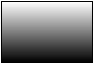
The last declaration works because top is the
default in the absence of a specified direction.
Because the first color stop is assumed to be at 0%, and the last color stop is assumed to be at 100%, you could also omit the percentages from that example and achieve the same result:
background-image: -moz-linear-gradient(#FFF, #000);
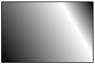
Now, let’s put our gradient on an angle, and place an additional color stop. Let’s say we want to go from black to white, and then back to black again:
background-image: -moz-linear-gradient(30deg, #000, #FFF 75%, #000);
We’ve placed the color stop 75% along the way, so the white band is closer to the gradient’s end point than its starting point, as shown in Figure 7.4.
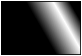
You can place your first color stop somewhere other than 0%, and your last color stop at a place other than 100%. All the space between 0% and the first stop will be the same color as the first stop, and all the space between the last stop and 100% will be the color of the last stop. Here’s an example:
background-image: -moz-linear-gradient(30deg, #000 50%, #FFF 75%,
↵#000 90%);
The resulting gradient is shown in Figure 7.5.
You don’t actually need to specify positions for any of the color stops. If you omit them, the stops will be evenly distributed. Here’s an example:
background-image:
  -moz-linear-gradient(45deg,
    #FF0000 0%,
    #FF6633 20%,
    #FFFF00 40%,
    #00FF00 60%,
    #0000FF 80%,
    #AA00AA 100%);

background-image:
  -moz-linear-gradient(45deg,
    #FF0000,
    #FF6633,
    #FFFF00,
    #00FF00,
    #0000FF,
    #AA00AA);
Either of the previous declarations makes for a fairly unattractive angled rainbow. Note that we’ve added line breaks and indenting for ease of legibility—they are not essential.
Colors transition smoothly from one color stop to the next. However, if two color stops are placed at the same position along the gradient, the colors won’t fade, but will stop and start on a hard line. This is a way to create a striped background effect, like the one shown in Figure 7.6.
Here are the styles used to construct that example:
background-image:
  -moz-linear-gradient(45deg,
    #000000 30%,
    #666666 30%,
    #666666 60%,
    #CCCCCC 60%,
    #CCCCCC 90%);
At some point in the reasonably near future, you can expect this updated version of the syntax to be the only one you’ll need to write—but we’re not quite there yet.
As we’ve mentioned, the latest development version of WebKit has adopted the W3C syntax; however, most current releases of WebKit-based browsers still use an older syntax, which is a little more complicated. Because those browsers still need to be supported, let’s quickly take a look at the old syntax, using our first white-to-black gradient example again:
background-image:
  -webkit-gradient(linear, 0% 0%, 0% 100%, from(#FFFFFF),
↵to(#000000));
Rather than use a specific linear-gradient
property, there’s a general-purpose
-webkit-gradient property, where you
specify the type of gradient (linear in this case) as the first
parameter. The linear gradient then needs both a start and end point to
determine the direction of the gradient. The start and end points can be
specified using percentages, numeric values, or the keywords top,
bottom, left, right, or center.
The next step is to declare color stops of the gradients.
You can include the originating color with the from
keyword, and the end color with the to keyword. Then,
you can include any number of intermediate colors using the
color-stop() function to create a color
stop. The first parameter of the color-stop()
function is the position of the stop, expressed as a percentage, and the
second parameter is the color at that location.
Here’s an example:
background-image:
  -webkit-gradient(linear, left top, right bottom,
    from(red),
    to(purple),
    color-stop(20%, orange),
    color-stop(40%, yellow),
    color-stop(60%, green),
    color-stop(80%, blue));
With that, we’ve recreated our angled rainbow, reminiscent of GeoCities circa 1996.
It’s actually unnecessary to specify the start and end colors
using from and to. As
from(red) is the equivalent to color-stop(0,
red), we could also have written:
background-image:
-webkit-gradient(linear, left top, right bottom,
color-stop(0,
      red)
,
color-stop(20%, orange),
color-stop(40%, yellow),
color-stop(60%, green),
color-stop(80%, blue),
color-stop(100%, purple));
If you don’t declare a from or a 0% color stop,
the color of the first color stop is used for all the area up to that
first stop. The element will have a solid area of the color declared
from the edge of the container to the first specified color stop, at
which point it becomes a gradient morphing into the color of the next
color stop. At and after the last stop, the color of the last color stop
is used. In other words, if the first color stop is at 40% and the last
color stop is at 60%, the first color will be used from 0% to 40%, and
the last color will be displayed from 60% to 100%, with the area from
40% to 60% a gradient morphing between the two colors.
As you can see, this is more complicated than the Mozilla syntax.
Fortunately, tools exist to generate all the required code for a given
gradient automatically. We’ll be looking at some of them at the end of
this section, but first, we’ll see how to use both syntaxes to create a
cross-browser gradient for The HTML5 Herald. The
good news is that since the old WebKit syntax uses a different property
name (-webkit-gradient instead of
-webkit-linear-gradient), you can use both syntaxes
side-by-side without conflict. In fact, the old syntax is still
supported in the newer WebKit, so the browser will just use whichever
one was declared last.
Now that we have a fairly good understanding of how to declare linear gradients, let’s declare ours.
If your designer included a gradient in the design, it’s likely to have been created in Photoshop or another image-editing program. You can use this to your advantage; if you have the original files, it’s fairly easy to replicate exactly what your designer intended.
If we pop open Photoshop and inspect the gradient we want to use for the ad (shown in Figure 7.7), our gradient is linear, with five color stops that simply change the opacity of a single color (black).
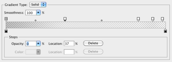
You’ll note via the Photoshop screengrab that the color starts from 40% opacity, and that the first color stop’s location is at 37%, with an opacity of 0%. We can use this tool to grab the data for our CSS declaration, beginning with the W3C syntax declaration for Firefox, Opera 11.10, and newer WebKit browsers:
#ad2 {
  …
  background-image:
    -moz-linear-gradient(
      270deg,
      rgba(0,0,0,0.4) 0,
      rgba(0,0,0,0) 37%,
      rgba(0,0,0,0) 83%,
      rgba(0,0,0,0.06) 92%,
      rgba(0,0,0,0) 98%
    );
  background-image:
    -webkit-linear-gradient(
      270deg,
      rgba(0,0,0,0.4) 0,
      rgba(0,0,0,0) 37%,
      rgba(0,0,0,0) 83%,
      rgba(0,0,0,0.06) 92%,
      rgba(0,0,0,0) 98%
    );
  background-image:
    -o-linear-gradient(
      270deg,
      rgba(0,0,0,0.4) 0,
      rgba(0,0,0,0) 37%,
      rgba(0,0,0,0) 83%,
      rgba(0,0,0,0.06) 92%,
      rgba(0,0,0,0) 98%
    );
}
We want the gradient to run from the very top of the ad to the
bottom, so we set the angle to 270deg (towards the
bottom). We’ve then added all the color stops from the Photoshop
gradient. Note that we’ve omitted the end point of the gradient, because
the last color stop is at 98%—everything after that stop will be the
same color as the stop in question (in this case, black at 0% opacity,
or full transparency).
Now let’s add in the old WebKit syntax, with the unprefixed version last to future-proof the declaration:
#ad2 {
  …
  background-image:
    -webkit-gradient(linear,
      from(rgba(0,0,0,0.4)),
      color-stop(37%, rgba(0,0,0,0)),
      color-stop(83%, rgba(0,0,0,0)),
      color-stop(92%, rgba(0,0,0,0.16)),
      color-stop(98%, rgba(0,0,0,0)));
  background-image:
    -webkit-linear-gradient(
      270deg,
      rgba(0,0,0,0.4) 0,
      rgba(0,0,0,0) 37%,
      rgba(0,0,0,0) 83%,
      rgba(0,0,0,0.06) 92%,
      rgba(0,0,0,0) 98%
    );
  background-image:
    linear-gradient(
      270deg,
      rgba(0,0,0,0.4) 0,
      rgba(0,0,0,0) 37%,
      rgba(0,0,0,0) 83%,
      rgba(0,0,0,0.06) 92%,
      rgba(0,0,0,0) 98%
    );
}
We now have our gradient looking just right in Mozilla, Opera, and WebKit-based browsers.
We still have a few more browsers to add our linear gradient to. In Opera 11.01 and earlier—and more importantly, IE9—we can declare SVG files as background images. By creating a gradient in an SVG file, and declaring that SVG as the background image of an element, we can recreate the same effect we achieved with CSS3 gradients.
Note: SV what?
SVG stands for Scalable Vector Graphics. It’s an XML-based language for defining vector graphics using a set of elements—like what you use in HTML to define the structure of a document. We’ll be covering SVG in much more depth in Chapter 11, but for now we’ll just skim over the basics, since all we’re creating is a simple gradient.
An SVG file sounds scary, but for creating gradients it’s quite straightforward. Here’s our gradient again, in SVG form:
<?xml version="1.0" standalone="no"?>
<!DOCTYPE svg PUBLIC "-//W3C//DTD SVG 1.0//EN"
  "http://www.w3.org/TR/2001/REC-SVG-20050904/DTD/svg10.dtd">
<svg xmlns="http://www.w3.org/2000/svg"
     xmlns:xlink="http://www.w3.org/1999/xlink" version="1.1">
<title>Module Gradient</title>
 <defs>
  <linearGradient id="grad"  x1="0" y1="0" x2="0" y2="100%">
    <stop offset="0" stop-opacity="0.3" color-stop="#000000" />
    <stop offset="0.37" stop-opacity="0" stop-color="#000000" />
    <stop offset="0.83" stop-opacity="0" stop-color="#000000" />
    <stop offset="0.92" stop-opacity="0.06" stop-color="#000000" />
    <stop offset="0.98" stop-opacity="0" stop-color="#000000" />
  </linearGradient>
</defs>
<rect x="0" y="0" width="100%" height="100%"
↵style="fill:url(#grad)" />
</svg>
Looking at the SVG file, you should notice that it’s quite similar
to the syntax for linear gradients in CSS3. We declare the gradient type
and the orientation in the
linearGradient element;
then add
color stops. The orientation is set with start and end
coordinates, from x1, y1 to x2,
y2. The color stops are fairly self-explanatory, having an
offset between 0 and 1 determining their position and a stop-color for
their color. After declaring the gradient, we then have to create a
rectangle (the rect element) and fill
it with our gradient using the style attribute.
So, we’ve created a nifty little gradient, but how do we use it on our site? Save the SVG file with the .svg extension. Then, in your CSS, simply declare the SVG as your background image with the same syntax, as if it were a JPEG, GIF, or PNG:
The SVG background should be declared before the CSS3 gradients,
so browsers that understand both will use the latter. Many browsers are
even smart enough not to download the SVG if it’s overwritten by another
background-image property later on in your
CSS.
The major difference between our CSS linear gradients and the SVG
version is that the SVG background image won’t default to 100% of the
height and width of the container the way that CSS gradients do. To make
the SVG fill the container, declare the height and width of your SVG rectangle as 100%.
For Internet Explorer prior to version 9, we can use the proprietary IE filter syntax to create simple gradients. The IE gradient filter doesn’t support color stops, gradient angle, or, as we’ll see later, radial gradients. All you have is the ability to specify whether the gradient is horizontal or vertical, as well as the “to” and “from” colors. It’s fairly basic, but if you need a gradient on these older browsers, it can provide the solution.
The filter syntax for IE is:
filter:progid:DXImageTransform.Microsoft.gradient(GradientType=0,
↵startColorstr='#COLOR', endColorstr='#COLOR); /* IE6 & IE7 */
-ms-filter:"progid:DXImageTransform.Microsoft.gradient(GradientType=
↵0,startColorstr='#COLOR', endColorstr='#COLOR')"; /* IE8 */
The GradientType parameter should be set to
1 for a horizontal gradient, or 0 for a vertical gradient.
Since the gradient we’re using for our ad block requires color stops, we’ll skip using the IE filters. The ad still looks fine without the gradient, so it’s all good.
Warning: Filters Kinda Suck
As we’ve mentioned before, IE’s filters can have a significant impact on performance, so use them sparingly, if at all. Calculating the display of filter effects takes processing time, with some effects being slower than others. SVGs can have a similar—albeit lesser—effect, so be sure to test your site in a number of browsers if you’re using these fallbacks.
Now that you understand how to create linear gradients and have mastered the intricacies of their convoluted syntax, you can forget almost everything you’ve learned. There are some very cool tools to help you create linear gradients without having to recreate your code four times for each different browser syntax.
John Allsop’s http://www.westciv.com/tools/gradients/ is a tool that enables you to create gradients with color stops for both Firefox and WebKit. Note that there are separate tabs for Firefox and WebKit, and for radial and linear gradients. The tool only creates gradients with hexadecimal color notation, but it does provide you with copy-and-paste code, so you can copy it, and then switch the hexadecimal color values to RGBA or HSLA if you prefer.
Damian Galarza’s http://gradients.glrzad.com/ provides for both color stops and RGB. It even lets you set colors with an HSL color picker, but converts it to RGB in the code. It does not provide for alpha transparency, but since the code generated is in RGB, it’s easy to update. This gradient generator is more powerful than the Westciv one, but may be a bit overwhelming for a newbie.
Finally, Paul Irish’s http://css3please.com/ allows you to create linear gradients, though it has no support for color stops. You may wonder why it’s even worth mentioning—but it is, because it’s the only one of the tools mentioned that provides the filter syntax for IE alongside the other gradient syntaxes. Plus, as well as gradients, it can give you cross-browser syntax for lots of other features as well, like shadows and rounded corners.
Radial gradients are circular or elliptical gradients. Rather than proceeding along a straight axis, colors blend out from a starting point in all directions. Radial gradients are supported in WebKit and Mozilla (beginning with Firefox 3.6). While Opera 11.10 has begun supporting linear gradients, it does not provide support for radial gradients; however, as with linear gradients, radial gradients can be created in SVG, so support can be provided to Opera and IE9. Radial gradients are entirely unsupported in IE8 and earlier—not even with filters.
Let’s start with a simple circular gradient to illustrate the standard syntax:
background-image: -moz-radial-gradient(#FFF, #000);
background-image: -moz-radial-gradient(center, #FFF, #000);
background-image: -moz-radial-gradient(center, ellipse cover,
↵#FFF, #000);
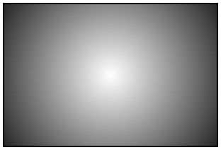
The above three declarations are functionally identical, and will all result in the gradient shown in Figure 7.8. At the minimum, you need to provide a start color and an end color. Alternatively, you can also provide a position for the center of the gradient as the first parameter, and a shape and size as the second parameter.
Let’s start by playing with the position:
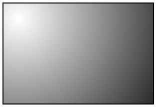
background-image: -moz-radial-gradient(30px 30px, #FFF, #000);
This will place the center of the gradient 30 pixels from the top
and 30 pixels from the left of the element, as you can see in Figure 7.9. As with
background-position, you can use values,
percentages, or keywords to set the gradient’s position.
Now let’s look at the shape and size parameter. The shape can take
one of two values, circle or
ellipse, with the latter being the default.
For the size, you can use one of the following values:
-
closest-side -
The gradient’s shape meets the side of the box closest to its center (for circles), or meets both the vertical and horizontal sides closest to the center (for ellipses).
-
closest-corner -
The gradient’s shape is sized so it meets exactly the closest corner of the box from its center.
-
farthest-side -
Similar to
closest-side, except that the shape is sized to meet the side of the box farthest from its center (or the farthest vertical and horizontal sides in the case of ellipses). -
farthest-corner -
The gradient’s shape is sized so that it meets exactly the farthest corner of the box from its center.
-
contain -
A synonym for
closest-side. -
cover -
A synonym for
farthest-corner.
According to the spec, you can also provide a second set of values to explicitly define the horizontal and vertical size of the radial gradient. This is currently only supported in WebKit, though support should be added to Firefox in the near future. For now, though, you should probably stick to the above constraints if you want to create the same gradient in all supporting browsers.
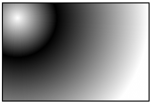
The color stop syntax is the same as for linear gradients: a color value followed by an optional stop position. Let’s look at one last example:
background-image: -moz-radial-gradient(30px 30px, circle
↵farthest-side, #FFF, #000 30%, #FFF);
This will create a gradient like the one in Figure 7.10.
To create the example in Figure 7.10 using the old-style WebKit syntax currently supported in Safari and Chrome, you’d need to write it as follows:
background-image: -webkit-gradient(radial, 30 30, 0, 30 30, 100%,
↵from(#FFFFFF), to(#FFFFFF), color-stop(.3,#000000))
The same -webkit-gradient property used
earlier for linear gradients is used for radial gradients; the
difference is that we pass radial as the first
parameter. The next four parameters are the respective position and
radius of two circles, with the gradient proceeding from the inner
circle to the outer circle. Just to make it more confusing, these values
are defined in pixels, but without the px unit. You
can also specify the values as percentages, in which case you
do need to include the % symbol. You should be
starting to see why the W3C opted for a version of the Mozilla syntax
rather than this one.
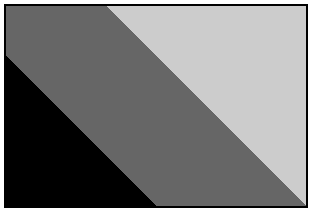
Furthermore, your inner circle doesn’t need to be centered in your outer circle. If the first point is equal to the second point, the gradient will be symmetrical like the one in Figure 7.10. If they differ, however, your inner circle will be off-center, so the gradient will be asymmetrical. If your inner circle’s center is outside the boundary of your outer circle, instead of having a circle off-center inside another circle, you’ll have a very odd triangle gradient effect, as Figure 7.11 illustrates.
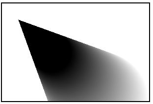
Here’s the code used to create that gradient:
background-image:-webkit-gradient(radial, 200 200, 100, 100 100, 40,
from(#FFFFFF), to(#000000));
As with the linear gradients, you can insert more colors with the
color-stop function. The syntax for color stops is
the same for both linear and radial gradients.
You’ll generally want to create gradients that look the same in older versions of Chrome and Safari as they do in newer versions of those browsers and Firefox, so you should limit yourself to the kinds of gradients that can be replicated using the W3C syntax. However, if you do find yourself building specifically for WebKit browsers (for mobile platforms, for example), it can be useful to know that these additional options exist. As mentioned earlier, the old syntax will continue to be supported in WebKit browsers for the foreseeable future.
Let’s take all we’ve learned and implement a radial gradient for The HTML5 Herald. You may yet to have noticed, but the form submit button has a radial gradient in the background. The center of the radial gradient is outside the button area, towards the left and a little below the bottom, as Figure 7.12 shows.

We’ll want to declare at least three background images: an SVG
file for Opera and IE9, the older WebKit syntax for Chrome and Safari,
and the -moz- vendor prefixed version for Firefox.
You can also declare the newer WebKit vendor prefixed version (currently
only in the WebKit nightly builds), as well as the non-prefixed
version:
input[type=submit] {
  …
  background-color: #333;
  /* SVG for IE9 and Opera */
  background-image: url(../images/button-gradient.svg);
  /* Old WebKit */
  background-image: -webkit-gradient(radial,
    30% 120%, 0, 30% 120%, 100,
    color-stop(0,rgba(144,144,144,1)),
    color-stop(1,rgba(72,72,72,1)));
  /* W3C for Mozilla */
  background-image: -moz-radial-gradient(30% 120%, circle,
    rgba(144,144,144,1) 0%,
    rgba(72,72,72,1) 50%);
  /* W3C for new WebKit */
  background-image: -webkit-radial-gradient(30% 120%, circle,
    rgba(144,144,144,1) 0%,
    rgba(72,72,72,1) 50%);
  /* W3C unprefixed */
  background-image: radial-gradient(30% 120%, circle,
    rgba(144,144,144,1) 0%,
    rgba(72,72,72,1) 50%);
}
The center of the circle is 30% from the left, and 120% from the
top, so it’s actually below the bottom edge of the
container. We’ve included two color stops for the color
#484848 (or rgb(72,72,72)) and
#909090 (or
rbg(144,144,144)).
And here’s the SVG file used as a fallback, though we’ll stop short of explaining it here, as the syntax is fairly explanatory and we’ll be covering SVG in Chapter 11:
<?xml version="1.0" standalone="no"?>
<!DOCTYPE svg PUBLIC "-//W3C//DTD SVG 1.0//EN"
↵"http://www.w3.org/TR/2001/REC-SVG-20050904/DTD/svg10.dtd">
<svg xmlns="http://www.w3.org/2000/svg" xmlns:xlink="
↵http://www.w3.org/1999/xlink" version="1.1">
<title>Button Gradient</title>
 <defs>
  <radialGradient id="grad"  cx="30%" cy="120%" fx="30%" fy="120%"
↵r="50%" gradientUnits="userSpaceOnUse">
    <stop offset="0" stop-color="#909090" />
    <stop offset="1" stop-color="#484848" />
  </radialGradient>
</defs>
<rect x="0" y="0" width="100%" height="100%"
↵style="fill:url(#grad)" />
</svg>
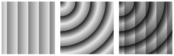
Sometimes you’ll find yourself wanting to create a gradient
“pattern” that repeats over the background of an element. While
linear-repeating gradients can be created by repeating the background
image (with background-repeat), there’s no equivalent
way to easily create repeating radial gradients. Fortunately, CSS3 comes
to the rescue with both a repeating-linear-gradient
and a repeating-radial-gradient syntax. The
vendor-prefixed repeating-linear-gradient syntax is
supported in Firefox 3.6+, Safari 5.0.3+, Chrome 10+, and Opera
11.10+.
Gradients with repeating-linear-gradient and
repeating-radial-gradient have the same syntax as the
nonrepeating versions.
Supported in Firefox 3.6, Chrome 10, and the WebKit nightly build
(hence, Safari 6), here are examples of what can be created with just a
few lines of CSS (again using only the -webkit-
prefixed syntax for brevity):
.repeat_linear_1 {
  background-image:
    -webkit-repeating-linear-gradient(left,
      rgba(0,0,0,0.5) 10%,
      rgba(0,0,0,0.1) 30%);
}
.repeat_radial_2 {
  background-image:
    -webkit-repeating-radial-gradient(top left, circle,
      rgba(0,0,0,0.9),
      rgba(0,0,0,0.1) 10%,
      rgba(0,0,0,0.5) 20%);
}
.multiple_gradients_3 {
  background-image:
    -webkit-repeating-linear-gradient(left,
      rgba(0,0,0,0.5) 10%,
      rgba(0,0,0,0.1) 30%),
    -webkit-repeating-radial-gradient(top left, circle,
      rgba(0,0,0,0.9),
      rgba(0,0,0,0.1) 10%,
      rgba(0,0,0,0.5) 20%);
}
The resulting gradients are shown in Figure 7.13.
You probably noticed that our advertisement with the linear gradient is incomplete: we’re missing the bicycle. Prior to CSS3, adding the bicycle would have required placing an additional element in the markup to contain the new background image. In CSS3, there’s no need to include an element for every background image; it provides us with the ability to add more than one background image to any element, even to pseudo-elements.
To understand multiple background images, you need to understand the
syntax and values of the various background properties. The syntax for the
values of all the background properties, including
background-image and the shorthand
background property, are the same whether you have
one background image or many. To make a declaration for multiple
background images, simply separate the values for each individual image
with a comma. For example:
background-image:
  url(firstImage.jpg),
  url(secondImage.gif),
  url(thirdImage.png);
This works just as well if you’re using the shorthand
background property:
background:
  url(firstImage.jpg) no-repeat 0 0,
  url(secondImage.gif) no-repeat 100% 0,
  url(thirdImage.png) no-repeat 50% 0;
The background images are layered one on top of the other with the
first declaration on top, as if it had a high
z-index. The final image is drawn under all the
images preceding it in the declaration, as if it had a low
z-index. Basically, think of the images as being
stacked in reverse order: first on top, last on the bottom.
If you want to declare a background color—which you should,
especially if it’s light-colored text on a dark-colored background
image—declare it last. It’s often simpler and more readable to declare it
separately using the
background-color property.
As a reminder, the shorthand
background property is short for eight
longhand background properties. If you use the shorthand, any longhand
background property value that’s omitted from the declaration will default
to the longhand property’s default (or initial) value. The default values
for the various background properties are listed below:
-
background-color: transparent; -
background-image: none; -
background-position: 0 0; -
background-size: auto; -
background-repeat: repeat; -
background-clip: border-box; -
background-origin: padding-box; -
background-attachment: scroll;
Just like for a declaration of a single background image, you can
include a gradient as one of several background images. Here’s how we do
it for our advertisement. For brevity, only the unprefixed version is
shown. The bicycle image would be included similarly in each
background-image declaration:
#ad2 {
  …
  background-image:
    url(../images/bg-bike.png),
    linear-gradient(top,
    rgba(0,0,0,0.4) 0,
    rgba(0,0,0,0) 37%,
    rgba(0,0,0,0) 83%,
    rgba(0,0,0,0.06) 92%,
    rgba(0,0,0,0) 98%);
  background-position: 50% 88%, 0 0;
}
Note that we’ve put the bicycle picture first in the series of
background images, since we want the bicycle to sit on top of the
gradient, instead of the other way around. We’ve also declared the
background position for each image by putting them in the same order as
the images were declared in the background-image
property. If only one set of values was declared—for example,
background-position: 50% 88%;—all images would have the
same background position as if you’d declared
background-position: 50% 88%, 50% 88%;. In this case,
the 50% 80% positions the bicycle, which was declared
first, and the 0 0 (or left top)
positions the gradient.
Because a browser will only respect one
background-image property declaration
(whether it has one or many images declared), the bicycle image must be
included in each background-image declaration, since
they’re all targeting different browsers. Remember, browsers ignore CSS
that they fail to understand. So if Safari doesn’t understand
-moz-linear-gradient (which it doesn’t), it will ignore
the entire property/value pair.
The heading on our sign-up form also has two background images. While we could attach a single extra-wide image in this case, spanning across the entire form, there’s no need! With multiple background images, CSS3 allows us to attach two separate small images, or a single image sprite twice with different background positions. This saves on bandwidth, of course, but it could also be beneficial if the heading needed to stretch; a single image would be unable to accommodate differently sized elements. This time, we’ll use the background shorthand:
background:
  url(../images/bg-formtitle-left.png) left 13px no-repeat,
  url(../images/bg-formtitle-right.png) right 13px no-repeat;
Note: The background Shorthand
When all the available background properties are fully supported, the following two statements will be equivalent:
div {
  background: url("tile.png") no-repeat scroll center
↵bottom / cover rgba(0, 0, 0, 0.2);
}

div {
  background-color: rgba(0,0,0,0.2);
  background-position: 50% 100%;
  background-size: cover;
  background-repeat: no-repeat;
  background-clip: border-box;
  background-origin: padding-box;
  background-attachment: scroll;
  background-image: url(form.png);
}
Currently, though, since only some browsers support all the values
available, we recommend including color,
position, repeat,
attachment, and image in your
shorthand declaration, with clip,
origin, and size following, or
avoiding the shorthand altogether. You must declare the shorthand
before the longhand properties, as any value not
explicitly declared in the shorthand will be treated as though you’d
declared the default value.
The background-size property allows you to
specify the size you want your background images to have. In theory, you
can include background-size within the shorthand
background declaration by adding it after the
background’s position, separated with a slash (/). As it stands, no
browser understands this shorthand; in fact, it will cause them to ignore
the entire background declaration, since they see it
as incorrectly formatted. As a result, you’ll want to use the
background-size property as a separate declaration
instead.
Support for background-size is as
follows:
As you can see, adoption of the unprefixed version of this syntax was very quick; it’s a simple property with a straightforward implementation that was unlikely to change. This is a great example of why you should always include the unprefixed version in your CSS.
If declaring the background image size in pixels, be careful to
avoid the image distorting; define either the width or the height, not
both, and set the other value to auto. This will
preserve the aspect ratio of your image. If you only include one value,
the second value is assumed to be auto. In other words,
both these lines have the same meaning:
background-size: 100px auto, auto auto;
background-size: 100px, auto auto;
As with all background properties, use commas to separate values for each image declared. If we wanted our bicycle to be really big, we could declare:
-webkit-background-size: 100px, cover;
-moz-background-size: 100px, cover;
-o-background-size: 100px, cover;
background-size: 100px auto, cover;
By declaring just the width of the image, the second value will
default to auto, and the browser will determine the
correct height of the image based on the aspect ratio.
The default size of a background image is the actual size of the
image. Sometimes the image is just a bit smaller or larger than its
container. You can define the size of your background image in pixels (as
shown above) or percentages, or you can use the contain
or cover key terms.
The contain value scales the image while
preserving its aspect ratio; this may leave uncovered space. The
cover value scales the image so that it completely
covers the element. This can result in clipping the image if the element
and its background image have different aspect ratios.
Tip: Screen Pixel Density, or DPI
The background-size property comes in handy
for devices that have different pixel densities, such as the newest
generation of smartphones. For example, the iPhone 4 has a pixel density
four times higher than previous iPhones; however, to prevent pages
designed for older phones from looking tiny, the browser on the iPhone 4
behaves as though it only has a 320×480px display.
In essence, every pixel in your CSS corresponds to four screen pixels.
Images are scaled up to compensate, but this means they can sometimes
look a little rough compared to the smoothness of the text
displayed.
To deal with this, you can provide higher-resolution images to the
iPhone 4. For example, if we were providing a high-resolution image of a
bicycle for the iPhone, it would measure 74×90px instead of 37×45px.
However, we don’t actually want it to be twice as big! We only want it
to take up 37×45px worth of space. We can use
background-size to ensure that our high-resolution
image still takes up the right amount of space:
-webkit-background-size: 37px 45px, cover;
-moz-background-size: 37px 45px, cover;
-o-background-size: 37px 45px, cover;
background-size: 37px 45px, cover;