CHAPTER 4
Basic Tools for Process Design
Modeling business processes with the goal of creating effective designs requires more than word processors and spreadsheets. Electronic spreadsheets are useful for mathematical models, but they are less practical in the context of modeling business processes. The tools that are introduced in this chapter help designers check for feasibility, completeness, and effectiveness of a proposed design. These tools facilitate a better understanding of the processes under consideration and the design issues associated with them. The tools are associated with specific design principles, as shown in Table 4.1.
Section 4.2 discusses additional design principles not shown in Table 4.1, such as the elimination of buffers, the establishment of a product orientation, one-at-a-time processing, and the elimination of multiple paths through operations. The specific tools for these design principles are not identified, but they are discussed because it is important to keep them in mind when designing business processes.
Most of the tools presented here assume the availability of key data, such as processing times and the steps required to complete a process. Therefore, we will first address the issue of collecting relevant data that are needed for the application of the basic tools described here. In manufacturing, tagging of parts is a method that often is used to collect data associated with a process. Tagging is the process of documenting every activity that occurs during a process. The main data collected by tagging methods are processing times. Tagging is done with two data collection instruments, known in the context of business processes as a job tagging sheet and a workstation log sheet.
A job tagging sheet is a document that is used to gather activity information. If performed correctly, tagging gives an accurate snapshot of how a process is completed within an organization. The information that is gathered can give the company many insights to what is happening in a process, including the steps necessary to complete a job as well as the processing and delay times associated with each activity. The data collected in the job tagging sheets can be used as the input to several design tools that are discussed in this and subsequent chapters. An example of a job tagging sheet is shown in Figure 4.1. The job tagging sheet accompanies a job from the beginning to the end.
Workstation log sheets are used to document the activities that occur at each workstation. This information can be used to determine the utilization and potential capacity of a workstation. However, management must assure employees that the information collected is part of a continuous improvement or process design effort and not a “witch hunt.” A commitment must be made to improving processes and not individual efficiencies. Figure 4.2 shows an example of a workstation log sheet.

Appendix L of Reorganizing the Factory: Competing Through Cellular Manufacturing by Nancy Hyer and Urban Wemmerlov (2002) contains a detailed discussion on tagging in the context of manufacturing processes.
4.1 Process Flow Analysis
Four charts typically used for process flow analysis are the general process chart, the process flow diagram, the process activity chart, and the flowchart (Melnyk and Swink, 2002). In general, these charts divide activities into five different categories: operation, transportation (physical and information), inspection, storage, and delay. Figure 4.3 shows a common set of symbols used to represent activities in charts for process flow analysis. The list of symbols is not exhaustive or universal. Special symbols are sometimes used to document or design a process in specific application areas. For instance, Ryerson Polytechnic University’s School of Radio and Television Arts has developed a flowcharting system along with a set of specialized symbols for interactive multimedia. The system offers flowcharting functionality to multimedia writers, developers, and designers (www.rcc.ryerson.ca/rta/flowchart). Flowcharting is discussed further in Section 4.1.3.
In a variety of settings, operations are the only activities that truly add value to the process. Transportation generally is viewed as a handoff activity, and inspection is a control activity. Note, however, that in some situations transportation might be considered the main value-adding activity (or operation) in the process. Think, for example, about airlines, freight companies, postal services, and cab and bus companies.
The difference between storage and delay is that storage is a scheduled (or planned) delay. This occurs, for example, when jobs are processed in batches. If a process uses a batch size of two jobs, then the first job that arrives must wait for a second job before processing can continue. The time that the first job has to wait for the second to complete a batch is not a planned delay (or storage).
A delay, on the other hand, is unplanned waiting time. Delays normally occur when a job (or batch of jobs) must wait for resources to be freed before processing can continue. A delay is always a non-value-added activity, but under certain circumstances, storage might add value to the customer. For example, consider an order-fulfillment process that carries an inventory of finished goods to shorten the time it takes to fulfill an order. If customers are interested in rapid delivery of their orders, then the storage activity might be valuable to them.


4.1.1 GENERAL PROCESS CHARTS
The general process chart summarizes the current process, the redesigned process, and the expected improvements from the proposed changes (Table 4.2). This chart characterizes the process by describing the number of activities by category, the amount of time activities in each category take overall, and the corresponding percentage of the process total.
The information that is summarized in the general process chart indicates with a single glance major problems with the existing process, and how the proposed (redesigned) process will remedy some (or all) of these problems. These problems are measured by the time (and corresponding percentage of time) spent on value-added and non-value-added activities. A redesigned process should increase the percentage of time spent on value-added activities by reducing the number of non-value-added activities or the time spent on such activities. Note that the summary focuses on the time to perform the activities (labeled Time) and the frequency of occurrence (labeled No.) in each category.
The example in Table 4.2 shows that although the number of value-added activities (i.e., the operations) did not change in the redesigned process, the percentage of time that the process performs operations increases from 10 percent to 37.5 percent. This is achieved by reducing the amount of time spent on non-value-added and control activities. The negative numbers in the columns labeled Difference indicate the reduction in the frequency of occurrence (No. column) and total time (Time column) corresponding to each category.
4.1.2 PROCESS FLOW DIAGRAMS
The most typical application of process flow diagrams has been the development of layouts for production facilities. These diagrams provide a view of the spatial relationships in a process. This is important, because most processes move something from activity to activity, so physical layouts determine the distance traveled and the handling requirements.
TABLE 4.2 An Example of a General Process Chart

The process flow diagram is a tool that allows the analyst to draw movements of items from one activity or area to another on a picture of the facility. The resulting diagram measures process performance in units of time and distance. This fairly straightforward analysis must include all distances over which activities move work, including horizontal and vertical distance when the process occupies different floors or levels of a facility. The diagram assumes that moving items requires time in proportion to the distance and that this time affects overall performance. This is why accurate process flow diagrams are particularly helpful in the design of the order-picking process described at the end of the chapter.
The analyst can add labels to the different areas in the process flow diagrams. These labels are then used to indicate the area in which an activity is performed by adding a column in the process activity chart. Alternatively, the process flow diagram may include labels corresponding to an activity number in the process activity chart. This labeling system creates a strong, complementary relationship between the two tools. The process activity chart details the nature of process activities, and the process flow diagram maps out their physical flows. Together, they help the operations analyst better understand how a process operates.
A process flow diagram is a valuable tool for process design. Consider, for example, a process with six work teams, labeled A to F, and physically organized as depicted in Figure 4.4.
Clearly, unnecessary transportation occurs due to the current organization of the work groups within the facility. The sequence of activities is such that work is performed in the following order: C, D, F, A, B, and E. Rearranging the work groups to modify the flow of work through the facility, as depicted in Figure 4.5, results in a more efficient layout.

FIGURE 4.4 Example of a Process Flow Diagram
The focus of an analysis of a process flow diagram is on excessive and unnecessary movements. These may be evident by long moves between activities, crisscrosses in paths, repeated movements between two activities, or other illogical or convoluted flows. An effective design eliminates crisscrosses and locates sequential, high-volume activities close together to minimize move times.
The physical arrangement of people, equipment, and space in a process raises four important questions.
- What centers should the layout include?
- How much space does each workstation (or center) need?
- How should each center’s space be configured?
- Where should each center be located?
The process flow diagram is most helpful in answering question 4 regarding the location of each center. The diagram also can be complemented with a simple quantitative method to compare alternative designs. The method is based on calculating a load-distance score for each pair of work centers. The load-distance score (LD score) between work centers i and j is found as follows.
The load value is a measure of “attraction” between two work centers. For example, the load can represent the volume of items flowing between the two work centers during a workday. Hence, the larger the volume of traffic is, the more attraction there is between the two centers. The goal is to find a design that will minimize the total load-distance score (that is, the sum over all pairs of work centers). Consider the load matrix in Table 4.3 associated with two alternative designs depicted in Figure 4.6.

FIGURE 4.5 Resigned process Flow Diagram


FIGURE 4.6 Location of Work Centers in Alternative Designs
The calculations in Table 4.4 compare the two designs in Figure 4.6. The comparison is in terms of the load-distance score, The distances in Table 4.4 are rectilinear. This means that the number of line segments (in the grid) between two centers determines the distance. For example, one needs to go through three lines in the grid to connect work centers A and F in both designs in Figure 4.6.
The total load-distance score for the proposed design is clearly better than the current design (570 vs. 790). However, the savings in operational costs derived from the new design must be compared with the corresponding relocation costs. It might be possible to find a solution where only a few work centers need to be moved and still achieve a significant improvement from the current design.
Distances typically are measured either as rectilinear or Euclidian for the purpose of calculating a load-distance score. In general, if center 1 is located in position (x1, y1) and center 2 is in position (x2, y2), the distance between the centers can be calculated as follows.
TABLE 4.4 Load-Distance Calculation for Two Designs
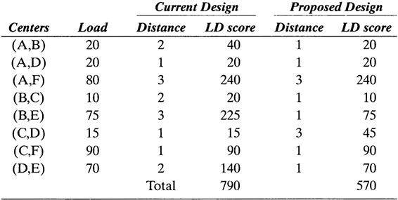
For instance, the rectilinear distance between a center located in position (3, 7) and a center located in position (4, 2) is |3 ‒ 4| + |7 ‒ 2| = 1 + 5 = 6. The corresponding Euclidian distance is ![]() The Euclidian distance is the length of a straight line between the two points.
The Euclidian distance is the length of a straight line between the two points.
4.1.3 PROCESS ACTIVITY CHARTS
The general process chart does not place activities in sequence, which is important and necessary to gain a high-level understanding of the differences between two alternative processes. For example, two alternative processes with the same mix of activities would have identical summarized information in the general process chart, although one may place most of the control activities at the beginning of the process and the other one at the end.
The process activity chart complements the general process chart by providing details to gain an understanding of the sequence of activities in the process. (See Figure 4.7.) The analyst fills in the required information and identifies the appropriate symbol for each activity in one line of the chart and then connects the symbols to show the flow of the process. The completed chart describes the exact sequence of activities along with the related information. The arrow (→) in Figure 4.7 is used to represent the transportation of physical items or information.

FIGURE 4.7 Example of a Process Activity Chart
Although a basic chart can be built with the activity category, the time requirement, and the activity description, more elaborate charts can be developed to include other pieces of information by adding more columns to the chart. For example, information about the number of people involved in each activity can give an indication of staffing needs and overall cost.
Note that the process activity chart considers average activity times only. An estimate of the total time to process a job can then be obtained by adding the activity times. However, this estimate ignores the variation associated with the time to perform each activity. Also note that the chart is not useful when the process includes several variants, because each variant needs its own chart. For example, a process where some requests might need the work of a group of specialists would require two charts: one with the flow of requests without the specialists and one with the flow of requests through the specialists. Finally, the process activity chart cannot show two or more simultaneous activities like those in processes organized in parallel. Flowcharts, described in the following subsection, overcome this limitation. Unlike the process activity chart, flowcharts are capable of depicting processes with multiple paths and parallel activities.
4.1.4 FLOWCHARTS
Flowcharts are a fundamental tool for designing and redesigning processes. They graphically depict activities, typically in a sidelong arrangement such that they follow the movement of a job from left to right through the process. A flowchart can help identify loops in a process (i.e., a series of activities that must be repeated because of problems such as lack of information or errors). A flowchart also can be used to show alternative paths in the process, decision points, and parallel activities. In addition to the symbols in Figure 4.3, a symbol for a decision point is required when creating flowcharts. The decision symbol is a diamond (♦), as illustrated in Figure 4.8.
To illustrate the use of flowcharts, consider the ordering process in Figure 4.8, which begins with a telephone operator taking information over the phone. The operator then passes order information once a day to a supervisor who reviews it for accuracy and completeness. Accurate orders are fulfilled by customer service, and incomplete orders are set aside for a sales representative, who will contact the customer.

FIGURE 4.8 Example of a Flowchart
Due to the decision point after the inspection activity, the process in Figure 4.8 has two possible paths. Therefore, this process would generate two activity charts (one for each path) but only one flowchart.
Flowcharts can be used to convey additional information, going beyond the sequence of activities and the logical steps in the process. For instance, flowcharts also might include a time estimate associated with the execution of each activity. An estimate of the activity time can be obtained by using the following equation.

Unit processing time = the time to process a single job.
Batch size = the number of jobs in a batch.
Setup time = the time necessary to get ready to process the next batch of jobs.
Efficiency = a measure that indicates the speed of processing with respect to a specified standard time.
This relationship assumes that the standard time to process one unit is known (or can be estimated). It also assumes that the standard time to set up the processing of an entire batch is known. Because the standard times correspond to a worker with 100 percent efficiency, the activity time will increase if the efficiency of the worker decreases.
Suppose it takes 2 minutes to inspect one order for completeness in an order-fulfillment process. Also suppose that the supervisor inspects orders in batches of 20 and that it takes 10 minutes to prepare the inspection of the batch. If the supervisor was recently hired and therefore her efficiency is currently 80 percent, the inspection time for 20 orders is given by the following equation.
If orders are not processed in batches and no preparation time (setup) is needed before the actual inspection, then the inspection time per order is:
Therefore, 20 orders could be processed in 50 minutes. These calculations assume that the mean or average values associated with unit processing and setup times are accurate estimates of the actual values. However, this assumption is not always valid. In many situations, the time values vary significantly, so a more accurate representation is a frequency (or probability) distribution. When probability distributions govern the activity times as well as the arrival time of the items to the process, a simple flowchart might not be sufficient to fully understand the process dynamics. Chapters 7 through 10 explore the use of an advanced tool for process design known as discrete event simulation, which follows the principles of a flowchart to create a dynamic representation of the process.
Other information that can be included in a flowchart includes frequency values for paths originating from a decision point. For example, in the processes shown in Figure 4.8, frequency information associated with the probability of a complete order could be displayed. If an order is complete approximately 90 percent of the time, then 90 percent would be placed next to the Yes path and 10 percent would be placed next to the No path. Chapter 5 will examine how to use a flowchart with activity times and frequency information in the context of managing process flows.
Flowcharting is often done with the aid of specialized software. For instance, Figure 4.9 shows a flowchart for a telephone order process created with a flowcharting software tool called SmartDraw. The symbols used in the flowchart in Figure 4.9 are specific to SmartDraw and vary from those depicted in Figure 4.3.
4.1.5 SERVICE SYSTEM MAPPING
Service system mapping (SSM) is an extension of traditional flowcharting. It documents how a business process interacts with its customers and the role they play in the delivery of service. The technique was created by Gray-Judson-Howard in Cambridge, Massachusetts, with the purpose of viewing activities in the context of how they add value to the customers. SSM has the following goals.
- To build shared and consistent perceptions of customers’ experience with the entire core process.
- To identify all points of contact between the business process and its customers.
- To provide the basis for developing an economic model of the business.
- To identify opportunities for improving the effectiveness of the business process.
- To provide a framework for designing business processes.
- To aid in pinpointing control points and strategic performance measures.
According to Cross et al. (1994), benefits of using service system mapping for process design include the following.
- Improved Communication: By providing a graphic representation of the day-to-day processing, a map is usually a significant improvement over written descriptions (one picture is worth a thousand words). A map reduces the risk of varied and inaccurate representations of current operations and establishes a foundation for effective companywide collaboration on business process improvements. In other words, SSM helps employees move from the current to the desired state of operations.
- Market Research Focus: By providing an accurate, step-by-step portrayal of points of customer contact from the customer’s perspective, a map enhances management’s ability to target and focus on areas critical to customer satisfaction. The need to improve understanding of certain aspects of customer contact may suggest further targeted market research.
- Operations Design and Process Management: Upstream and downstream effects are easier to identify when additions, deletions, or alterations are made up on a map. A map also allows operations or back-room activity to be viewed in a broader context in relation to the customer.
- Application of Information Technology: Information systems can be designed from a more strategic perspective using SSM. Not only are the customer contact points, materials flows, and specific activities depicted, but the information flows required to perform key activities also are included. New information systems (or enhancements to existing systems) can be designed to link value-added activities in the core process.
- Critical Performance Measures Focus: Mapping facilitates the collection of key measures necessary in process redesign. SSM also fosters the development of effective policies, procedures, guidelines, and training programs that help set the context for performance management systems. With a map, a design team can pinpoint the critical measurement points. A broad pictorial perspective facilitates the design of measures to meet the best strategic balance between service quality, product quality, and profitability. Performance measures are most effective when controlling the horizontal flow of work as depicted by the map and when unconstrained by the vertical structure of the organization. The map provides this perspective by depicting all activities in a continuous flow rather than compartmentalizing them by their organizational function.

Although the particular characteristics of a map, including the level of detail, are specific to each application, a general template for service system mapping exists. This template consists of two main elements: horizontal bands and process segments.
The purpose of horizontal bands is to organize activities in terms of the different “players” in a process. (See Figure 4.10.) An SSM typically contains the following five bands.
- End-user or customer band.
- Frontline or distribution channel band.
- Backroom activity band.
- Centralized support or information systems (IS) band.
- Vendor or supplier band.
In Figure 4.10, the customer triggers the beginning of the process by performing activity A. For instance, activity A could be a phone call. A frontline employee performs activity B (e.g., answering the phone call and checking the status of an order). The backroom activity band could include warehouse activities in an order-fulfilment process or underwriting activities in a policy-issuing process of an insurance company. Activities E, F, and I are assigned to the information systems band, which could mean, for example, database queries. Activity H is performed 30 percent of the time; the other 70 percent of the time this activity is bypassed. The process finishes with a frontline employee (e.g., a customer or sales representative) contacting the customer (see activities J and K). The bands in an SSM can be customized to each situation; however, it is generally recommended not to have more than seven bands in one map.
Process segments are sets of activities that represent a subprocess; that is, a segment produces a well-defined output given some input. For example, an order-fulfillment process can be divided into receiving, filling, shipping, and billing. (See Figure 4.11.) Note that these segments (or subprocesses) are chronologically ordered from left to right in the map.

FIGURE 4.10 Example of an SSM with Horizontal Bands

The process segments do not have to be similar in size as measured by the number of activities. It is more important that the process is partitioned into segments that produce meaningful output.
As originally proposed, service system maps use additional icons and conventions to convey information. For example, a computer icon can be placed next to an arrow to indicate that the communication occurs via e-mail or a file transfer. Similarly, a telephone icon indicates a phone call, or a fax machine icon indicates that a fax is sent. In addition to these icons, software companies have developed flowcharting packages with increased flexibility and functionality. The following software products are examples of flowcharting tools with service system map features.
Micrografx (www.igrafx.com)
PaceStar (www.pacestar.com/links/edgwin.htm)
RFFlow (www.rff.com/)
SmartDraw (www.smartdraw.com/drawing/flowcharts/coolex.htm )
TeamFlow (http://teamflow.com/)
Tension Software (www.tensionsoftware.com/flowchartmaker/index.html)
Visio 2000 (www.microsoft.com/office/visio/ )
Visual Thought (www.bombshellstudios.com/samples/co/vt.html)
Most of these software tools follow the traditional flowchart notation represented by activity symbols similar to those depicted in Figure 4.3. An example of an SSM developed with SmartDraw is shown in Figure 4.12. The SSM depicted in Figure 4.12 is rotated 90 degrees with respect to Figure 4.10. In other words, instead of representing process participants as horizontal bands, they are represented as vertical bands. Because the process is small enough, no process segments are shown.
4.2 Workflow Design Principles and Tools
A set of workflow design principles was briefly introduced in Chapter 3. This section will expand the discussion of these principles and present appropriate tools for their implementation.

4.2.1 ESTABLISH A PRODUCT ORIENTATION IN THE PROCESS
A set of activities can be organized in two basic ways: by function or by product or service. In a functional (or process) orientation, workstations or departments are grouped according to their function. For example, all drilling equipment is located in one area of a machine shop, or all technical support personnel are located in one area of a computer software company. The functional (or process) orientation is most common when the same activity must serve many different customers. Because demand levels for these activities are generally low or unpredictable, management does not like to set aside human and capital resources exclusively for a particular product, service, or customer type. In a process orientation, utilization of equipment and labor tends to be high because the requirements for all products and services can be pooled. Also, employee supervision can be more specialized.
With a product orientation, all necessary activities required to complete a finished product or service are organized into an integrated sequence of work modules. This means that resources are dedicated to individual products or services. Consequently, activities are organized around the product’s or service’s route, rather than being shared among many products. The advantages of a product orientation are as follows.
- Faster processing rates.
- Lower work-in-process inventories.
- Less unproductive time lost to changeovers.
- Less transportation time.
- Fewer handoffs.
To understand the difference between functional and product orientation, consider a process with five activities and two types of customers, A and B. The routing for customer A (i.e., the sequence of activities necessary to complete the service associated with this type of customer) is 1, 2, 4, 5, and 3. The routing for customer B is 3, 1, 4, 2, and 5. In a function-oriented system, each resource that performs the corresponding activity is located in one area (as illustrated in Figure 4.13a), and customers must travel to each area to be served. A product-oriented system, on the other hand, has dedicated servers for each activity and customer type in order to streamline the processing of each customer (Figure 4.13b).
Note that a product orientation is a capital-intensive way of organizing activities, because the resources are not pooled. Therefore, the volume of customers A and B must be sufficient to justify a product-oriented organization and keep resource utilization at an acceptable level. Unfortunately, volumes are not always high enough to justify dedicating resources to a single product or service. In such situations, it might be possible to create a hybrid orientation in the process. One popular hybrid orientation in manufacturing is known as group technology. This technique groups parts or products with similar characteristics into families and sets aside groups of machines for their production. The equivalent in a business process is to group jobs (e.g., requests or customers) into families. Families may be based on demand or routing requirements. The next step is to organize the resources (e.g., equipment and people) needed to perform the basic activities into separate areas called cells. Each cell must be able, with minor adjustments, to deal with all the jobs in the same family.
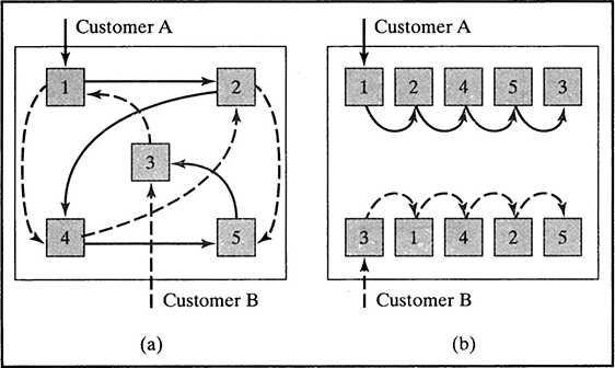
FIGURE 4.13 Process Versus Product or Orientation
Suppose two more customers are added to the previous example: customer C with routing 3, 2, 4, 5, and 1, and customer D with routing 1, 3, 4, 2, and 5. Because customer C shares the sequence of activities 2, 4, and 5 with customer A, the family AC can be formed within a group technology orientation. Similarly, a family BD can be created with customers B and D because they share the sequence of activities 4, 2, and 5. A cell AC would handle customers A and C, and a cell BD would handle customers B and D. (See Figure 4.14.)
The hybrid orientation based on group technology simplifies customer routings and reduces the time a job is in the process.
4.2.2 ELIMINATE BUFFERS
In the context of business processes, a buffer consists of jobs that are part of the work-inprocess (WIP) inventory. The term work-in-process was coined in manufacturing environments to denote the inventory within the production system that is no longer raw material, but not a finished product either. In more general terms, WIP consists of all the jobs that are in queues, moving from one operation to the next, being delayed for any reason, being processed, or residing in buffers. Whether intentional or not, buffers cause logistical nightmares and create unnecessary work and communication problems. When buffers exist, tracking systems are needed to identify the jobs that are in each buffer. Effort is spent in finding orders, expediting work, and communicating status to customers.
Consider the following example from Cross et al. (1994).
At a computer company, the processing of changes to maintenance contracts was taking 42 days as a result of a series of paperwork buffers between functional areas in the process. Some areas were hiding many of the errors that appeared on customer bills. After establishing a product orientation and reorganizing into teams, the buffers disappeared. Processing errors were caught immediately and eliminated. The impact was an 80 percent reduction in backlog and a 60 percent reduction in cycle time. Cash flow also improved, reducing the need to borrow capital to finance operations.

FIGURE 4.14 Hybrid Orientation
Note that in this example, changing the system from a process to a product orientation eliminated buffers. However, a product orientation does not always guarantee a buffer-free operation. A product-oriented process must be well balanced in order to minimize buffers.
4.2.3 ESTABLISH ONE-AT-A-TIME PROCESSING
The goal of this principle is to eliminate batch processing, or in other words, to make the batch size equal to one. By doing so, the time that a job has to wait for other jobs in the same batch is minimized, before or after any given activity. Every process has two kinds of batches: process batches and transfer batches. The process batch consists of all the jobs of the same kind that a resource will process until the resource changes to process jobs of a different kind. For example, a scanner in a bank could be used to scan checks to create electronic files of the checks written by each customer and also to scan other documents. Then the process batch associated with the job of scanning checks is the number of checks processed until the scanner is configured to scan other documents.
Transfer batches refer to the movement of jobs between activities or workstations. Rather than waiting for the entire process batch to be finished, work that has been completed can be transferred to the next workstation. Consequently, transfer batches are typically equal to or smaller than process batches. The advantage of using transfer batches that are smaller than the process batch is that the total processing time is reduced; as a result, the amount of work in process in the system is decreased.
Figure 4.15 compares the total processing time of a process with three activities in sequence when the batch sizes are changed. In this example, it is assumed that each item requires one unit of processing time in activities 1 and 3 and 0.5 of a time unit in activity 2.
When the transfer batch is the same as the process batch, the total processing time for 100 items is 250 units of time. When the transfer batch is changed to a size of 20 items, then the total processing time for 100 items is 130 units of time. In this case, the first 20 units are transferred from activity 1 to 2 at time 20. Then at time 30, this batch is transferred from activity 2 to 3. Note that between time 30 and time 40, the resources associated with activity 2 are idle (or working on activities of a different process).
From the point of view of the utilization of resources, two values are important: setup time and processing run time. Larger batch sizes require fewer setups and, therefore, can generate more processing time and more output. This is why larger batch sizes are desirable for bottleneck resources1 (i.e., those with the largest utilization). For nonbottleneck resources, smaller process batch sizes are desirable, because the use of existing idle times reduces work-in-process inventory.

4.2.4 BALANCE THE FLOW TO THE BOTTLENECK
The principle of balancing the flow to the bottleneck is linked to an operation management philosophy known as Theory of Constraints (TOC). Eliyahu M. Goldratt coined this term and popularized the associated concepts in his book The Goal (Goldrattand Cox, 1992). This book uses the Socratic method to challenge a number of assumptions that organizations make to manage operations. The novel narrates Alex Rogo’s struggle to keep schedules, reduce inventory, improve quality, and cut costs in the manufacturing facility that he manages. Jonah, a physicist with a background that is“coincidentally” similar to Goldratt’s, guides Alex through a successful turnaround of his plant by applying simple rules to the plant’s operations. Jonah reveals the first rule in the following exchange (page 139 of The Goal).
“There has to be some relationship between demand and capacity.” Jonah says, “Yes, but as you already know, you should not balance capacity with demand. What you need to do instead is balance the flow of product through the plant with demand from the market. This, in fact, is the first of nine rules that express the relationships between bottlenecks and non-bottlenecks and how you should manage your plant. So let me repeat it for you: Balance flow, not capacity.”
Balancing the flow and not the capacity challenges a long-standing assumption. Historically, manufacturers have tried to balance capacity across a sequence of processes in an attempt to match capacity with market demand. However, making all capacities the same might not have the desired effect. Such a balance would be possible (and desirable) only if the processing times of all stations were constant or had a small variance. Variation in processing times causes downstream workstations to have idle times when upstream workstations take longer to complete their assigned activities. Conversely, when upstream workstations’ processing time is shorter, inventory builds up between stations. The effect of statistical variation is cumulative. The only way that this variation can be smoothed is by increasing work in process to absorb the variation (a bad choice because process managers should be trying to reduce WIP as explained in Section 4.2.2), or increasing capacities downstream to be able to compensate for the longer upstream times. The rule here is that capacities within the process sequence do not need to be balanced to the same levels. Rather, attempts should be made to balance the flow of product through the system (Chase et al., 1998).
When processing times do not show significant variability, the line balancing approach of manufacturing can be applied to create workstations in a process. The goal of line balancing is to balance capacity (instead of flow, as proposed by Goldratt); therefore, it should not be used when processing times vary significantly. The line balancing method is straightforward, as indicated in the following steps.
- Specify the sequential relationships among activities using a precedence diagram. The diagram is a simplified flowchart with circles representing activities and arrows indicating immediate precedence requirements.
- Use the market demand (in terms of an output rate) to determine the line’s cycle time (C) (i.e., the maximum time allowed for work on a unit at each station).

- Determine the theoretical minimum number of stations (TM) required to satisfy the line’s cycle time constraint using the following formula.

- Select a primary rule by which activities are to be assigned to workstations and a secondary rule to break ties.
- Assign activities, one at a time, to the first workstation until the sum of the activity times is equal to the line’s cycle time or until no other activity is feasible because of time or sequence restrictions. Repeat the process for the rest of the workstations until all the activities are assigned.
- Evaluate the efficiency of the line as follows.

- If efficiency is unsatisfactory, rebalance using a different rule.
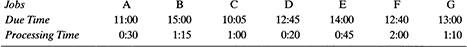
Example 4.1
Consider the activities in Table 4.5, a market demand of 25 requests per day, and a 420-minute working day. Find the balance that minimizes the number of workstations.
Solution
- Draw a precedence diagram. Figure 4.16 illustrates the sequential relationships in Table 4.5.
- The next step is to determine the cycle time (i.e., the value of C). Because the activity times and the working day are both given in minutes, no time conversion is necessary.

- Calculate the theoretical minimum number of stations required (i.e., the value of TM).

- Select a rule to assign activities to stations. Research has demonstrated that some rules are better than others for certain problem structures (Chase et al., 1998). In general, the strategy is to use a rule that gives priority to activities that either have many followers or are of long duration, because they effectively constrain the final balance. In this example, our primary rule assigns activities in order of the largest number of followers, as shown in Table 4.6.
The secondary rule, used for tie-breaking purposes, will be to assign activities in order of longest activity time. If two or more activities have the same activity time, then one is chosen arbitrarily.
- The assignment process starts with activity A, which is assigned to workstation 1. Because activity A has a time of 2 minutes, there are 16.8 ‒ 2 = 14.8 minutes of idle time remaining in workstation 1. We also know that after the assignment of activity A, the set of feasible activities consists of activities B and D. Because either one of these activities could be assigned to workstation 1 and both have the same number of followers, activity B is chosen, because it has the longer time of the two. Workstation 1 now consists of activities A and B with an idle time of 14.8 – 11 = 3.8 minutes. Because activities C and D cannot feasibly be assigned to workstation 1, a new workstation must be created. The process continues until all activities are assigned to a workstation, as illustrated in Table 4.7.

FIGURE 4.16 Precedence Diagram
- Calculate the efficiency of the line.

- Evaluate the solution. An efficiency of 75 percent indicates an imbalance or idle time of 25 percent across the entire process. Is a better balance possible? The answer is yes. The balance depicted in Figure 4.17 is the result of using the longest activity time rule as the primary rule and the largest number of followers as the secondary rule.
Note that it is possible for the longest activity time to be greater than the cycle time required for meeting the market demand. If activity H in the previous example had required 20 minutes instead of 10 minutes, then the maximum possible process output would have been 420/20 = 21 requests per day. However, there are a few ways in which the cycle time can be reduced to satisfy the market demand.


- Split the activity. Is there a way of splitting activity H so that the work can be shared by two workstations?
TABLE 4.7 Results of Balancing with Largest Number of Followers Rule

- Use parallel workstations. The workstations are identical and requests would be sent to either one, depending on the current load.
- Train the worker. Is it possible to train a worker so that activity H can be performed faster? Note that in this case the effect of the training should be such that the worker can become at least 19 percent faster (because the time for activity H exceeds the required cycle time by ([1 – 20/16.8] × 100 percent, or approximately 19 percent).
- Work overtime. The output of activity H is 420/20 = 21 requests per day, 4 short of the required 25. Therefore, 80 minutes of overtime is needed per day.
- Redesign. It might be possible to redesign the process in order to reduce the activity time and meet market demand.

4.2.5 MINIMIZE SEQUENTIAL PROCESSING AND HANDOFFS
Sequential processing can create two problems that lengthen total process time: (1) Operations are dependent on one another and therefore constrained or gated by the slowest step, and (2) no one person is responsible for the whole service encounter (Cross et al. 1994).
Example 4.2
This example illustrates the benefits of the design principle of minimizing sequential processing. Assume that a service requires 30 minutes to complete. Suppose that four activities of 10, 7, 8, and 5 minutes are assigned each to one of four individuals. In other words, the process is a line with four stations, as depicted in Figure 4.18a. According to the concepts in the previous section, the process has an output rate of six jobs per hour and an efficiency of 30/(10 × 4) = 75 percent.
Significant improvements can be achieved by replacing sequential processing with parallel processing (Figure 4.18b). For example, if each of the four workers performs the entire process (i.e., each performs the four steps in the process), output per hour theoretically could be increased by 33.3 percent to an output of eight jobs per hour. However, it might not be possible to achieve the theoretical output of the parallel process due to the differences in performance of each individual. Nevertheless, the parallel process will always produce more output than its sequential counterpart, as long as the total parallel time (in this case, 30 × 4 = 120) is less than the slowest station time multiplied by the square of the number of stations (in this case, 10 × 42 = 160).
If each worker in this example were to take 40 minutes to complete each job in the parallel process, then the total time in the parallel system would be 160 minutes and the output would be the same as in the sequential process. On the other hand, suppose that four workers require 30, 36, 40, and 32 minutes to complete a single job. Then the output of the parallel process would be as follows.

which represents a 17.4 percent improvement over the sequential process. Creating parallel servers capable of completing a set of activities that represent either an entire transaction or a segment of a larger process is related to the concept of case management introduced in Chapter 3. In Example 4.2, the process is transformed from employing specialized workers to employing case workers.
4.2.6 ESTABLISH AN EFFICIENT SYSTEM FOR PROCESSING WORK
Jobs typically are processed in the order in which they arrive at a workstation. This mode of operation is known as the first-in-first-out (FIFO) or first-come-first-served (FCFS) processing policy. As part of the design of a process, the analyst may consider alternative ways in which work is processed. The development and implementation of alternative processing policies belong to the general area of scheduling. Scheduling involves determining a processing order and assigning starting times to a number of jobs that tie up various resources for a period of time. Typically, the resources are in limited supply. Jobs are comprised of activities, and each activity requires a certain amount of specified resources for a given amount of time.
The importance of considering alternative scheduling schemes increases with the diversity of the jobs in the process. Consider, for example, a process that provides technical support for a popular software package. In such a process, e-mail, faxes, and telephone calls are received and tie up resources (i.e., support personnel). Some requests for technical assistance might take longer to complete due to their complexity. As a result, requests that can be processed faster might be delayed unnecessarily if the requests are simply answered in the order they are received and routed to the next available support person.
A simple scheduling approach is to classify work into “fast” and “slow” tracks, based on an estimation of the required processing time. At a major university, approximately 80 percent of the applications for admission to undergraduate programs are considered for a fast-track process, because the applicants are either an “easy accept”or an “easy reject.” The remaining 20 percent are applicants whose files must be examined more thoroughly before a decision can be made. The same principle applies to supermarkets, where customers are routed (and implicitly scheduled for service) to regular and express cashiers.
Other characteristics that can be used to schedule jobs through a process include the following.
- Arrival time.
- Estimated processing time.
- Due date (i.e., when the customer expects the job to be completed).
- Importance (e.g., as given by monetary value).
A key element of a scheduling system is its ability to identify “good” schedules. Ideally, a numerical measure could be used to differentiate the good schedules from the bad ones. This numerical measure is generally known as the objective function, and its value is either minimized or maximized. Finding the “right” objective function for a scheduling situation, however, can be difficult. First, such important objectives as customer satisfaction with quality or promptness are difficult to quantify and are not immediately available from accounting information. Second, a process is likely to deal with three different objectives.
- Maximize the process output over some period of time.
- Satisfy customer desires for quality and promptness.
- Minimize current out-of-pocket costs.
In practice, surrogate objectives are used to quantify the merit of a proposed schedule. For example, if the objective is to maximize utilization of resources, a surrogate objective might be to minimize the time it takes to complete the last job in a given set of jobs. (This time is also known as the makespan.) On the other hand, if customers tolerate some tardiness (i.e., the time elapsed after a promised delivery time) but become rapidly and progressively more upset when the tardiness time increases, minimizing maximum tardiness might be a good objective function. Some of the most common surrogate objective functions are:
- Minimize the makespan.
- Minimize the total (or average) tardiness.
- Minimize the total (or average) weighted tardiness.
- Minimize the maximum tardiness.
- Minimize the number of tardy jobs.
- Minimize the amount of time spent in the system (i.e., the processing plus the waiting time).
As mentioned previously, the makespan is the total time required to complete a set of jobs. The total tardiness is the sum of the tardiness associated with each job. Tardiness is when the completion time lasts beyond the due date. The weighted tardiness is calculated as the product of the tardiness value and the importance (or weight) of a job.
Example 4.3
In order to understand the effect that scheduling decisions have on these objective functions, consider a set of five jobs, characterized by the values given in Table 4.8, to be processed by a single server.

In this example, assume that the single server is allowed to process the jobs in any order he or she wishes. Note that if the objective is to minimize the makespan, all processing orderings give the same solutions —170 minutes (the sum of all the processing times). In other words, the server can process the jobs in any order and the makespan will remain the same. Also note that this is not the case when the service facility consists of more than one server.
Now suppose the server decides to process the jobs in the order they arrived; that is, the server uses the first-in-first-out (FIFO) scheduling rule. In this case, the processing order is A, B, C, D, and finally E. If no idle times between jobs are considered, then the starting and finishing times for this sequence are as shown in Table 4.9. (In this table, it is assumed that the server starts processing after the arrival of the last job; that is, at time 35.)
The calculations in Table 4.9 show that a large weighted tardiness penalty is incurred when the jobs are processed using the FIFO rule.
A rule that is particularly useful when jobs have specified due dates is known as earliest-due-date-first (EDD). Using EDD, the jobs are sequenced in increasing order of their due date values. The schedule that results from applying this rule to the example is A, D, C, E, and B. The corresponding calculations are shown in Table 4.10.
The EDD schedule is better than the FIFO schedule in terms of tardiness and weighted tardiness. However, the number of tardy jobs is the same for both schedules. Although the EDD schedule is better than the FIFO rule in terms of the tardiness measures that have been considered, the EDD schedule is not optimal. In other words, it is possible to find schedules that are better than the one produced by the EDD rule in terms of tardiness and weighted tardiness.
TABLE 4.9 FIFO Schedule

TABLE 4.10 EDD Schedule

An important characteristic of the EDD schedule is that it gives the optimal solution to the problem of minimizing the maximum tardiness. The maximum tardiness in the FIFO schedule is 75, due to job D. The maximum tardiness in the EDD schedule is 50, due to job C. Therefore, it can be stated with certainty that no other job sequence will result in a maximum tardiness of less than 50.
In addition to FIFO and EDD, researchers and practitioners have developed many other rules and algorithms (sets of steps) for sequencing and scheduling problems. For example, consider two related rules known as: (1) shortest-processing-time-first (SPT) and (2) weighted SPT (WSPT).
The SPT rule simply orders the jobs by their processing time, whereby the job with the shortest time is processed first, followed by the job with the next shortest time, and so on. The result of applying this rule to the example is given in Table 4.11. In terms of weighted tardiness, the SPT sequence is better than FIFO and EDD in this example.
The WSPT schedule can be obtained by first calculating the weight to processing time (WP) ratio for each job. The value of this ratio for job A is 10/30 = 0.333; that is, the weight of 10 is divided by the processing time of 30. After calculating all the ratio values, the WSPT sequence is obtained by ordering the jobs from the largest WP ratio to the smallest. It is easy to verify that the WSPT sequence for this example is E, A, B, C, and D. As a matter of coincidence, this sequence results in the same tardiness and weighted tardiness values as the ones corresponding to the SPT sequence. This, however, is not necessarily always the case.
Finally, an algorithm is described that will minimize the number of tardy jobs when the importance (or weight) of all the jobs is considered equal. The procedure is known as Moore’s Algorithm and can be summarized by the following sequence of steps.
- Order the jobs using the EDD rule.
- If there are no tardy jobs, stop. The optimal solution has been found.
- Find the first tardy job.
- Suppose that the tardy job is the kth job in the sequence. Remove the job with the longest processing time in the set of jobs from the first one to the kth one. (The jobs that are removed in this step are inserted at the end of the sequence after the algorithm stops.)
- Revise the completion times and return to step 2.
Example 4.4
Next, this algorithm is applied to the data in Example 4.3.
Step 1: See Table 4.12.
Step 2: There are three tardy jobs in the sequence.
Step 3: Job D is the first tardy job.
Step 4: Job D must be removed from the sequence, because its processing time of 60 is larger than the processing time of 30 corresponding to job A.
Step 5: See Table 4.13.
Step 6: No more tardy jobs remain in the sequence. The optimal solution has been found.
TABLE 4.11 SPT Schedule


TABLE 4.13 Step 5 of Moore’s Algorithm to Minimize Number of Tardy Jobs

The optimal schedule, therefore, is A, C, E, B, and D. Job D is the only tardy job with a tardiness of 205 ‒ 110 = 95 and a weighted tardiness of 760. This schedule turns out to be superior to all the other ones examined so far in terms of multiple measures of performance (i.e., average tardiness, weighted tardiness, and number of tardy jobs). However, the application of Moore’s Algorithm guarantees an optimal sequence only with respect to the number of tardy jobs when all the jobs have the same weight. In other words, Moore’s Algorithm does not minimize values based on tardiness (such as total tardiness or weighted tardiness), so it is possible to find a different sequence with better tardiness measures.
4.2.7 MINIMIZE MULTIPLE PATHS THROUGH OPERATIONS
A process with multiple paths is confusing and, most likely, unnecessarily complex. Also, multiple paths result in a process in which resources are hard to manage and work is difficult to schedule. Paths originate from decision points that route jobs to departments or individuals. For example, a telephone call to a software company could be routed to customer service, sales, or technical support. If the call is classified correctly, then the agent in the appropriate department is able to assist the customer and complete the transaction. In this case, there are multiple paths for a job, but the paths are clearly defined and do not intersect.
Suppose now that a customer would like to order one of the software packages that the company offers, but before placing the order she would like to ask some technical questions. Her call is initially routed to a sales agent, who is not able to answer technical questions. The customer is then sent to a technical support agent and back to sales to complete the transaction.
These multiple paths can be avoided in a couple of ways. The obvious solution is to have sales personnel who also understand the technical aspects of the software they are selling. Because this might not be feasible, information technology (such as a database of frequently asked questions) can be made available to sales agents. If the question is not in the database, the sales agent could contact a technical specialist to obtain an answer and remain as the single point of contact with the customer.
Alternatively, the process can be organized in case teams (see Section 3.6.2 about design principles) that are capable of handling the three aspects of the operation: sales, customer service, and technical support. In this way, calls are simply sent to the next available team. A team can consist of one (a case manager) or more people (case team) capable of completing the entire transaction.
4.3 Additional Diagramming Tools
An important aspect of designing a business process is the supporting information infrastructure. The tools reviewed so far in this chapter focus on the flow of work in a business process. In addition to the flow of work (e.g., customers, requests, or applications) the process designer must address the issues associated with the flow of data. Although this book does not address topics related to the design and management of information systems, it is important to mention that data flow diagrams are one of the main tools used for the representation of information systems. Specifically, data flow diagramming is a means of representing an information system at any level of detail with a graphic network of symbols showing data flows, data stores, data processes, and data sources/destinations. The purpose of data flow diagrams is to provide a semantic bridge between users and information systems developers. The diagrams are graphical and logical representations of what a system does, rather than physical models showing how it does it. They are hierarchical, showing systems at any level of detail, and they are jargonless, allowing user understanding and reviewing. The goal of data flow diagramming is to have a commonly understood model of an information system. The diagrams are the basis of structured systems analysis. Figure 4.19 shows a data flow diagram for insurance claim software developed with SmartDraw.
Another flowcharting tool that was not mentioned in the previous section is the so-called integrated definition (IDEF) methodology. IDEF is a structured approach to enterprise modeling and analysis. The IDEF methodology consists of a family of methods that serve different purposes within the framework of enterprise modeling. For instance, IDEF0 is a standard for function modeling, IDEF1 is a method of information modeling, and IDEFlx is a data-modeling method.
IDEF0 is a method designed to model the decisions, actions, and activities of an organization or system; therefore, it is the most directly applicable in business process design. IDEF0 was derived from a well-established graphical language, the structured analysis and design technique (SADT). The U.S. Air Force commissioned the developers of SADT to develop a function-modeling method for analyzing and communicating the functional perspective of a system. Effective IDEF0 models help organize the analysis of a system and promote good communication between the analyst and the customer. IDEF0 is useful in establishing the scope of an analysis, especially for a functional analysis. As a communication tool, IDEF0 enhances domain expert involvement and consensus decision making through simplified graphical devices. As an analysis tool, IDEF0 assists the modeler in identifying what functions are performed, what is needed to perform those functions, what the current system does right, and what the current system does wrong. Thus, IDEF0 models are often created as one of the first tasks of a system development effort.
The “box and arrow” graphics of an IDEFO diagram show the function as a box and the interfaces to or from the function as arrows entering or leaving the box. To express functions, boxes operate simultaneously with other boxes, with the interface arrows “constraining” when and how operations are triggered and controlled. The basic syntax for an IDEF0 model is shown in Figure 4.20.
A complete description of the family of IDEF methods can be found in www.idef.com.


FIGURE 4.20 Basic Syntax for an IDEF0 Model
4.4 From Theory to Practice: Designing an Order-Picking Process
This chapter will conclude with a discussion of the use of some of the basic process design tools in the context of the operations at a warehouse (Saenz, 2000). The goal is to point out where some basic tools may be applied in the design of a real-world process. The situation deals with the redesign of the order-picking process at a warehouse of a company that has been affected by the advent of e-commerce and increased customer demands. It is assumed that this change in the environment has affected all functions of a traditional warehouse.
To keep the company competitive, management decided to improve the performance of their warehouse operations, starting with the order-picking process. Traditional warehouse functions include receiving products, storing products, replenishing products, order picking, packing, and shipping. Order picking is the heart of most warehouse operations and impacts inbound and outbound processes. Designing an effective picking process can lead to the overall success of a warehouse operation and business. Several key issues need to be considered when designing a picking process: order profiling, picking equipment, slotting strategy, replenishing, layout, and picking methods.
Customers are tending toward making smaller, more frequent orders, which makes order profiling for each product an essential ingredient in the design of a picking process. Order profiling refers to defining the product activity in terms of the number of “lines” ordered per product over some period of time—in other words, the number of times one travels to a location to pick an item. Based on this criterion, products are classified as fast-moving, medium-moving, slow-moving, or dead items. The cubic velocity of a product plays an equally important role in classifying activity. It helps determine if a product requires broken-case (each), case, or pallet-picking equipment. The cubic velocity is calculated by multiplying the quantity picked per item by the product’s cubic dimensions. A product classified as slow moving might have a large cubic velocity. Similarly, a product classified as a fast mover might have a small cubic velocity. These two factors play a critical role when defining the picking equipment and potential product slotting.
Note that order profiling can be done by using simple calculations based on data collected for each product in the warehouse. Order profiling is an important input to the facility layout tool discussed in Section 4.1.2.
To select the most efficient picking equipment, the product activity, cubic velocity, and variety of products must be considered. The three basic types of picking are broken case, case, and pallet. The emergence of e-commerce has triggered the use of new technology in the picking process. Advanced picking technologies include radio frequency terminals, wireless speech technology, and pick- or put-to-light systems. In a radio frequency terminal system, the terminal is used to initiate and complete orders. The location and quantity of each product is displayed on the terminal screen. Wireless speech recognition terminals convert electronic text into voice commands that guide the operator during picking. The operator uses a laser or pen scanner to initiate and close orders. The information is received using the radio frequency terminal, which usually is secured around the operator’s waist. In a pick- or put-to-light system, the operator uses a tethered scanner or a radio frequency scanner to initiate orders. Bay and location displays are illuminated to guide the operator through the picking process. The operator follows the lights and displays to complete orders. Typically, the right balance of technology and manual methods results in effective picking operations. Process flow diagrams (Section 4.1.2) and data flow diagrams (Section 4.3) are useful in this phase of the design.
Regardless of the picking equipment used, an effective slotting strategy is critical to an efficient picking process. The basic definition of slotting is “the assignment of a product to a location.” The benefits of an effective slotting strategy include increased throughput, improved labor utilization, reduced injuries, better cube utilization, and reduced product damage. The art of effective slotting is assigning the fast-moving items to the most ergonomic levels, while balancing the volume across many aisles to reduce order and labor congestion. The most active items (top 20 percent) are placed on the middle picking level to improve picker productivity and reduce the risk of injury. The slotting assignment must be reviewed for its effectiveness monthly or as the activity of products fluctuates with seasonality. The general process chart (Section 4.1.1) can be used to compare the effectiveness of the assignment policies, because this chart shows a summary of the percentage of time that is spent in activities such as transportation and storage.
Replenishing the forward picking area is essential to the flow and effectiveness of the picking process. Picking locations are replenished when the pick location inventory reaches some defined inventory level. Replenishments usually are triggered visually or are generated by the system. Visually triggered replenishments involve an operator viewing the inventory level of each location to determine whether replenishments are required. System-generated replenishments are handled by defining a minimum inventory level in the system for each location. When the minimum inventory level is reached, the system triggers the replenishment task. Scheduling (Section 4.2.6) of the replenishment activities results in an improved overall performance of the process.
The picking area layout should be integrated with the inbound and outbound flow. An efficient layout minimizes handling, maximizes space utilization, and reduces backtracking. The distance to other areas in the warehouse, such as reserve storage, must be considered in the layout design. Two layout alternatives include U-shaped and straight-through flow. Facility layout tools typically are used in practice to address the issues associated with the physical configuration of the warehouse.
Finally, picking methods must be established to determine material flow and standard operating procedures. Picking methods are defined in terms of pickers per order (the number of pickers that work on a single order at one time), lines per pick (the number of orders a single item is picked for at one time), and periods per shift (the frequency of order scheduling during one shift). An accurate order profile is required to determine the most appropriate picking method. Flowcharting (Section 4.1.4) is the main tool used to design effective picking methods.
The design of a picking process illustrates where some of the tools that were introduced in this chapter can be used to design a fairly complex process associated with the operation of a warehouse.
4.5 Summary
The knowledge and understanding of basic analysis tools for business process design is fundamental. Before one is able to employ more powerful tools to deal with the complexities of real business processes, it is essential to understand and apply the basic tools presented in this chapter. In some cases, these basic tools may be all that are needed to design a process. For instance, a process may be studied and viable designs may be developed using only flowcharts. Even in the cases when basic tools are not enough and analysts must escalate the level of sophistication, the concepts reviewed in this chapter are always needed as the foundation for the analysis.
4.6 References
Chase, R. B., N. J. Aquilano, and F. J. Jacobs. 1998. Production and operations management—Manufacturing and services, 8th edition. New York: McGraw-Hill/Irwin.
Cross, K. F., J. J. Feather, and R. L. Lynch. 1994. Corporate renaissance: T1he art of reengineering. Cambridge, MA: Blackwell Business.
Goldratt, E. M., and J. Cox. 1992. The goal , 2d revised edition. Great Barrington, MA: North River Press, Inc.
Hyer, N., and U. Wemmerlöv. 2002. Reorganizing the factory: Competing through cellular manufacturing. Portland, OR: Productivity Press.
Melnyk, S. and M. Swink. 2002. Value-driven operations management: An integrated modular approach. New York: McGrawHill/Irwin.
Saenz, N. 2000. It’s in the pick. IIE Solutions 32(7): 36 ‒ 38.
4.7 Discussion Questions and Exercises
- Develop a general process chart for the requisition process in Exercise 1 of Chapter 1.
- Develop a general process chart for the receiving and delivering process in Exercise 2 of Chapter 1.
- Develop a process activity chart for the IBM Credit example in Section 1.1.2 of Chapter 1.
- Develop a flowchart for the claims-handling process in Section 1.2.2 of Chapter 1.
- A department within an insurance company is considering the layout for a redesigned process. A computer simulation was built to estimate the traffic from each pair of offices. The load matrix in Table 4.14 summarizes the daily traffic.
TABLE 4.14 Load Matrix for Problem 5

- If other factors are equal, which two offices should be located closest to one another?
- Figure 4.21 shows one possible layout for the department. What is the total load-distance score for this plan using rectilinear distance? (Hint: The rectilinear distance between offices A and B is 3.)

FIGURE 4.21 Possible Layout for Exercise 5
- Switching which two departments will most improve the total load-distance score?
- A firm with four departments has the load matrix shown in Table 4.15 and the current layout shown in Figure 4.22.
TABLE 4.15 Load Matrix for Problem 6

- What is the load-distance score for the current layout? (Assume rectilinear distance.)
- Find a better layout. What is its total load-distance score?
- A scientific journal uses the following process to handle submissions for publication.
- The authors send the manuscript to the Journal Editorial Office (JEO).
- The JEO sends a letter to the authors to acknowledge receipt of the manuscript. The JEO also sends a copy of the manuscript to the editor-in-chief (EIC).
- The EIC selects an associate editor (AE) to be responsible for handling the manuscript and notifies the JEO.
- The JEO sends a copy of the manuscript to the AE.
- After reading the manuscript, the AE selects two referees who have agreed to review the paper. The AE then notifies the JEO.
- The JEO sends copies of the manuscript to the referees.
- The referees review the manuscript and send their reports to the JEO.
- The JEO forwards the referee reports to the appropriate AE.
- After reading the referee reviews, the AE decides whether the manuscript should be rejected, accepted, or revised. The decision is communicated to the JEO.
- If the manuscript is rejected, the JEO sends a letter to the authors thanking them for the submission (and wishing them good luck getting the manuscript published somewhere else!).
- If the manuscript is accepted, the JEO forwards the manuscript to production. The JEO also notifies the authors and the EIC.
- If the manuscript needs revisions, the JEO forwards the referee reviews to the authors.
- The authors revise the manuscript following the recommendations outlined in the referee reports. The authors then resubmit the manuscript to the JEO.
- The JEO sends a resubmission directly to the responsible AE.
- After reading a resubmitted manuscript, the AE decides whether the revised version can now be accepted or needs to be sent to the referees for further reviewing.
- Construct a service system map for this process.
- Identify opportunities for reengineering.
- Calculate the efficiency of the line-balancing solution depicted in Figure 4.17.
- Sola Communications has redesigned one of its core business processes. Processing times are not expected to vary significantly, so management wants to use the line-balancing approach to assign activities to workstations. The process has 11 activities, and the market demand is to process 4 jobs per 400-minute working day. Table 4.16 shows the standard time and immediate predecessors for each activity in the process.
- Construct a precedence diagram.
- Calculate the cycle time corresponding to a market demand of 4 jobs per day.
- What is the theoretical minimum number of workstations?
- Use the longest activity time rule as the primary rule to balance the line.
- What is the efficiency of the line? How does it compare with the theoretical maximum efficiency?
- Is it possible to improve the line’s efficiency? Can you find a way of improving it?
- A process consists of eight activities. The activity times and precedence relationships are given in Table 4.17. The process must be capable of satisfying a market demand of 50 jobs per day in a 400-minute working day. Use the longest activity time rule to design a process line. Does the line achieve maximum efficiency?
TABLE 4.17 Data for Exercise 10

- A process manager wants to assign activities to workstations as efficiently as possible and achieve an hourly output rate of four jobs. The department uses a working time of 56 minutes per hour. Assign the activities shown in Table 4.18 (times are in minutes) to workstations using the “most followers” rule. Does the line of workstations achieve maximum efficiency?
TABLE 4.18 Data for Exercise 11

- A business process has a market demand of 35 jobs per day. A working day consists of 490 minutes, and the process activity times do not exhibit significant amounts of variation. Are engineering team would like to apply the line-balancing technique to assign activities to workstations. The activity times and the immediate predecessors of each activity are given in Table 4.19.
- Use the longest activity rule as the primary rule to assign activities to stations.
- Compare the efficiency of the line with the theoretical maximum efficiency. Is it possible to improve the line efficiency?
TABLE 4.19 Data for Exercise 12

- Longform Credit receives an average of 1,200 credit applications per day. Longform’s advertising touts its efficiency in responding to all applications within hours. Daily application-processing activities, average times, and required preceding activities (activities that must be completed before the next activity) are listed in Table 4.20. Assuming an 8-hour day, find the best assignment of activities to workstations using the longest activity time rule. Calculate the efficiency of your design. Has your design achieved maximum efficiency?
TABLE 4.20 Data for Exercise 13

- Suppose the jobs in Table 4.21 must be processed at a single facility. (All times are given in minutes.) Assume that processing starts after the last job arrives, that is at time 20. Compare the performance of each of the following scheduling rules according to the average weighted tardiness, maximum tardiness, and number of tardy jobs.
- FIFO
- EDD
- SPT
- Consider the jobs in Table 4.22. Use Moore’s Algorithm to find the sequence that minimizes the number of tardy jobs. Assume that processing can start at time zero.
TABLE 4.22 Data for Exercise 15

- Time commitments have been made to process seven jobs on a given day, starting at 9:00 A.M. The manager of the process would like to find a processing sequence that minimizes the number of tardy jobs. The processing times and due dates are given in Table 4.23.
TABLE 4.23 Data for Exercise 16
- A telecommunications company needs to schedule five repair jobs on a particular day in five locations. The repair times (including processing, transportation, and breaks) for these jobs have been estimated as shown in Table 4.24. Also, the customer service representatives have made due date commitments as shown in the table. If a due date is missed, the repair needs to be rescheduled, so the company would like to minimize the number of missed due dates. Find the optimal sequence, assuming that the first repair starts at 8:00 A.M.
TABLE 4.24 Data for Exercise 17


