12
Workforce Insights
While it is important to create an automation solution, it is also important to understand how well the automation works. Cloud Pak for Business Automation provides the ability to use AI to give recommendations and use business data to create dashboards for business managers to observe and manage the workforce.
In this chapter, we’ll cover the following topics:
- Business problem
- Using the built-in dashboards
- Understanding intelligent task prioritization and decision recommendations
- Contributing and reacting to business events
- Customizing your dashboard
Business problem
Whether your automation technology is a workflow, decision management, or case management, the fact that there is end-to-end automation enables the business to make observations about how well the business is doing, how well the processes we have automated are solving their intended business problems, and how productive our colleagues in our organization are being. Cloud Pak for Business Automation gives us the tools to visualize the average time between activities in a process and the most common paths taken over a period, as well as to view the Key Performance Indicators (KPIs) that are derived from events, which can be emitted steps in the automation.
Business Automation Insights (BAI) delivers a Business Performance Center or cockpit populated with a set of dashboards that can be easily customized to perform this visualization. The workflow, case, content, and decision runtimes can be optionally configured with event emitters that are then reprocessed, summarized, and delivered to specific open source technologies – Elasticsearch, Kibana, and Kafka (IBM Event Streams) – for fit-for-purpose processing, as we’ll see later in this chapter.
Using the built-in dashboards
IBM BAI delivers a set of built-in template dashboards as part of the operational cockpit, which is the Business Performance Center. (Alternatively, Kibana can be used when advanced or complex correlation is required.) The Business Performance Center includes the concept of a template dashboard, which is intended to be used as a starting point for building custom dashboards. This is something we’ll look at later in this chapter.
Important note
Cloud Pak for Business Automation is designed such that various pieces can be leveraged as you need them, and BAI is an optional component. Once the BAI component is installed, BAI event emission is enabled in workflows, decisions, and case management. There is clear product documentation that describes the installation and configuration process: https://www.ibm.com/docs/en/cloud-paks/cp-biz-automation/19.0.x?topic=insights-cloud-private.
In our example, the BAI emitters have been installed in the CP4BA components – for example, Workflow, Decisions, and Case Management. The Business Performance Center contains template dashboards for each automation style or type; let’s take a look at the Workflow - Hiring Sample dashboard. The following screenshot shows the cockpit dashboard list positioned over the hiring sample:

Figure 12.1 – Business Performance Center dashboard
As we can see, a workflow automation called Workflow - Hiring Sample has been deployed in the Workflow component. The workflow sends events to an event stream, and the BAI component processes and summarizes them before forwarding the processed events to Elasticsearch. The dashboards in the Business Performance Center have access to this raw and processed data to generate visual diagrams of the flows and KPIs.
The dashboard includes specific details for answering specific questions related to the hiring samples, such as in which city positions were filled, what kinds of positions were filled, and for which departments.
Workflow dashboard
Let’s open the dashboard by clicking on the Workflow - Hiring Sample link:

Figure 12.2 – Workflow - Hiring Sample dashboard
We can see that some key service data and performance indicators have been captured in the first row of widgets:

Figure 12.3 – The Hiring Sample Position Location widget
The bar chart widget is interactive; we can hover over it to show specific values that have been observed in the event data. The dashboard user can interact with the widget and change its view to a table view by clicking on the vertical ellipses:
Figure 12.4 – The Position Location widget’s vertical ellipses
Paging down the dashboard, we can see bar, pie, and histogram widget types. One helpful feature for data-rich widgets is to expand them to fullscreen with the ![]() button at the top left of the widget. Once expanded to fullscreen, we can see the full names of the tasks and make sense of the percentages that are represented:
button at the top left of the widget. Once expanded to fullscreen, we can see the full names of the tasks and make sense of the percentages that are represented:

Figure 12.5 – Task Record Percentage – fullscreen
This specific widget shows the distribution of the number of specific tasks to the user executed in the Hiring Sample workflow.
The following workflow widgets are also shown in this example:
- General Manager Approval Percentage
- Complete Hiring Task Average Waiting Times
- Complete Hiring Task Average Execution Times
- Complete Hiring Task Average Duration
- Completed Hiring Tasks (last 7 days)
- Hiring Manager Percentage
- Task Potential Performer
- Task Record Status (count)
- Task Record Priority
- Task Record Distribution
The set of widgets gives specific insight into the hiring process that can be used by team members of various roles to get the views they need into how efficiently they are hiring, which centers are in need, and how often a GM had to sign off on the process.
You will learn how to configure these widgets later in this chapter; however, each automation, whether it be a workflow, decision, or case management, is identified by BAI as a monitoring source, and as such specific time series, task parameters, and KPIs can be selected, as observed by the events arriving at the BAI Event Stream. Although this section details the workflow, decision, or case management-specific workflows, dashboards are flexible enough for you to select data from more than one monitoring source and are not limited to specific automation technology.
Decisions Dashboard
BAI provides a template dashboard for reviewing decision usage. The Decisions Dashboard area allows you to explore the operational details of observed decisions. You can quickly find the most executed decisions and see how many decisions per minute are flowing through your ODM systems. Let’s select Decisions Dashboard:
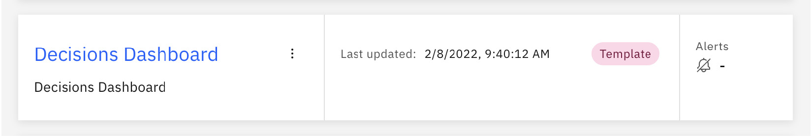
Figure 12.6 – Decisions Dashboard (Template)
Now that it’s open, let’s look at the number of executions per minute:
Figure 12.7 – Decisions – Number of executions by minute
We can see some of the performance metrics of our decisions runtime in this dashboard. For example, we can see that the timespan of the graph has compressed the details for our data. This can be adjusted by clicking on the slider shown in the following screenshot:

Figure 12.8 – Timestamp range slider
Now that we’ve adjusted the range, we can see the activity period data in more detail:

Figure 12.9 – Number of executions by minute widget with an adjusted timestamp range
Another useful widget in the Decisions Dashboard area lets decision managers explore decision execution averages:

Figure 12.10 – Ruleset execution duration widget
With that, we’ve explored the Hiring Sample and Decisions Dashboard areas. BAI comes with additional dashboards for exploring details regarding the workflows, cases, and case activities automations that are deployed in Cloud Pack for Business Automation.
Understanding intelligent task prioritization and decision recommendations
In this section, we’ll examine how Cloud Pak for Business Automation can be used to apply business intelligence to your business processes. Two patterns will be described: intelligent task prioritization and decision recommendations. These combine business event data with AI algorithms to increase workforce productivity and improve process throughput.
Intelligent task prioritization
Intelligent task prioritization focuses on the task list that is presented to each of your human task workers and allows you to optimize work orders in a highly individualized way.
Often, multiple task workers can perform the same task, but their performance on each will vary, depending on individual skill and experience. With intelligent task prioritization, you can take advantage of historical data and machine learning to predict who will most likely perform each particular task in the best way, with the best performance.
When a task worker completes tasks, data on their performance is sent to BAI as business events, where it is stored. AI models and machine learning algorithms are then applied to this historical data and used to calculate a skill score and performance score for each task and each task worker.
Note that if BAI is not present, the data that is natively in the Workflow system is used instead of historical data stored in BAI, but that data is less rich and the results will not be quite as effective:

Figure 12.11 – Intelligent task list
Cloud Pak for Business Automation provides a Process Portal with a Task List that leverages these scores to intelligently order the tasks presented to each task worker. The tasks that the worker scored best at will appear toward the top, while the tasks that the worker scored lower at will appear toward the bottom. Each task worker receives a different personalized order. By working from top to bottom, each worker is then able to focus on the tasks that they are most efficient at. The result is an optimized workforce that maximizes individual strengths.
This can be achieved via several elements, as shown in Figure 12.11:
- As your Task Worker interacts with processes and tasks, Business Events are emitted from the Workflow engine and are sent to Kafka. These events carry information on task execution, including which users performed which tasks.
- The BAI engine consumes the Business Events information from Kafka, then processes, filters, and indexes it. The Contributing and reacting to business events section covers this phase in more depth.
- Later, when a Task Worker opens their Task List, the Task Filter Service portion that populates the Task List area makes use of an AI Agent to calculate the score of each task for this user, leveraging the data stored within BAI. The result is an ordered list that is then presented to the Task Worker entity.
If you are not using the Process Portal area provided with Cloud Pak for Business Automation, you can still benefit from this capability by calling the provided Task Filter Service. Alternatively, you can copy and create a customized task filter service of your own. A Task Filter Service template can be found in the Responsive Portal Components toolkit:

Figure 12.12 – Responsive Portal Components toolkit
Open the provided Task Filter Service Template and view its implementation by selecting the Filter Tasks script:
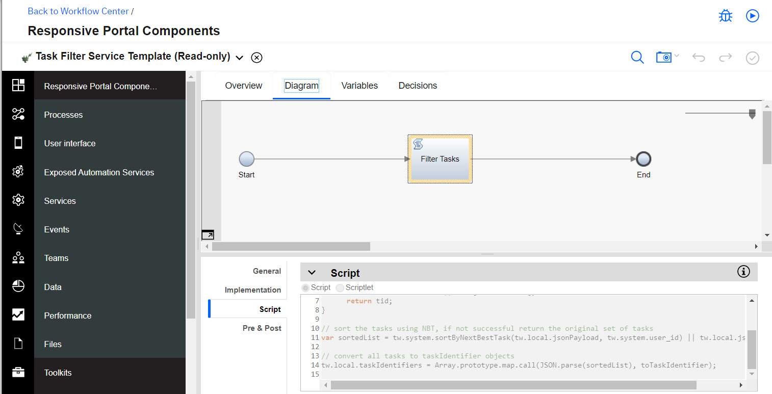
Figure 12.13 – Task Filter Service Template
Finally, your admin may need to enable the Intelligent Task Prioritization feature for you. This can be done by following the configuration steps documented here: https://www.ibm.com/docs/en/cloud-paks/cp-biz-automation/22.0.1?topic=services-optional-enabling-intelligent-task-prioritization.
Decision recommendations
In large systems, it’s often the case that human knowledge workers are required to make complex decisions based on the data at hand. Those decisions can be critical, dictating the next steps taken within a process. But decision-making can be a time-consuming step, often requiring highly skilled individuals based on knowledge acquired over an extended period.
What if you could leverage AI and machine learning algorithms to learn from their historical decisions, and then apply that to predict or recommend future choices? A decision recommendation service does exactly that:

Figure 12.14 – Decision recommendation service
Figure 12.14 shows the components that make such a recommendation service. It leverages historical data stored in BAI, collected over time via business events emitted from a Workflow. It uses Watson AI to build machine learning models and calculate a score for each choice. These scores can then be used to recommend a decision to the next Task Worker.
With this, you can reduce the time spent by your experienced task workers. They can quickly accept decisions where the score provides a clear choice, and then focus their time on those cases where the score leaves room for doubt. This also has the effect of unblocking less experienced task workers, resulting in overall productivity gains.
Detailed instructions on how to build and deploy a sample decision recommendation service can be found here: https://github.com/IBM-DBA/bai-ai-samples/blob/master/notebooks/BPM%20recommendation%20service%20with%20BAI.ipynb. This sample is a good basis for custom implementations that leverage BAI events to feed or inform your own AI or ML-infused services.
Now that you have context on how business events and AI can be combined to improve your workforce efficiency, let’s take a closer look at how business events are processed and consumed.
Contributing and reacting to business events
Workforce Insights leverages an event-based architecture to capture and communicate data. So far, you’ve been introduced to using business events to populate dashboards and improve your automation. In this section, we’ll dive a little deeper into this event-based architecture. Here is a diagram of it:

Figure 12.15 – Event-based architecture
The key components of interest in this architecture are as follows:
- The event emitters
- The event processing jobs
- The event consumers
Event emitters
Event emitters produce raw events in .json format. These raw events tend to be rich, highly complex, and deeply nested. Typically, they are not indexable and are not appropriate for immediate use. The emitters publish the raw events to a Kafka topic.
Several components within Cloud Pak for Business Automation contribute event emitters, as seen in Figure 12.15. In addition, if you have custom business events that you wish to contribute to, you can plug a Custom Event Emitter into this solution.
Event processing jobs
Apache Flink jobs consume the events from the Kafka ingress topic and convert them into a consumable form by performing a series of processing steps:
- First, they filter out events that are not of interest, based on some defined criteria. So, for example, you could choose to filter out events against canceled process instances.
- Then, they convert the events into the more serviceable time series format. The time series format is a flattened format that lends itself to indexing and data analysis.
- Finally, the time series events are aggregated into summary events that reflect meaningful time-based characteristics. For example, the events for a given process instance will be aggregated into a single summary event that reflects the most recent state of the process instance. Summary events are further subcategorized into active versus completed summary events, corresponding to active versus completed stateful entities, such as process instances.
- Once processed, the time series and summary events are sent to Elasticsearch, where they are mapped, indexed, and stored. The mapping stage ensures that the events can be consumed in the way you intend. For example, you can leverage mappings to define a format for your date values, or provide instructions for field indexing.
Event consumers
Once the data has been stored and indexed in Elasticsearch, it is then available to be queried. This data is used to populate the dashboards and charts described in the previous sections.
Optionally, you could also contribute a custom consumer to your solution. It can get data in one of two ways:
- By querying Elasticsearch
- By enabling and subscribing to a Kafka egress topic
You now have a view of how events are contributed to, how they are processed, and how they are consumed. Now that you have this fundamental understanding, in the next section, you’ll learn how to customize dashboards so that you can better leverage and understand the data in your events.
Customizing your dashboard
IBM BAI dashboarding is a flexible experience for customizing existing dashboards or adding new dashboards, either through copying existing dashboards or creating new ones.
Although the examples of dashboards presented earlier in this chapter had details related to each specific automation type delivered in Cloud Pak for Business Automation, your custom dashboards can blend information for any type configured for business insights.
Creating a new dashboard
You can add custom events of any type that can be observed by BAI. Data visualization can be rendered in various ways to achieve the desired insight:
- Metric: A simple display of a data item with a label, value, and unit of measurement.
- Period Metric: Metric values over time.
- KPI: KPIs typically have a threshold value. Bar charts, radial diagrams, or linear gauges may be employed.
- Data Table: A columnal list of data.
- Flow: Steps in a Workforce Insights process.
To duplicate an existing dashboard or template, simply select the desired dashboard and click on duplicate the icon, ![]() , as shown in the following screenshot:
, as shown in the following screenshot:

Figure 12.16 – Duplicate dashboard
To create a new dashboard, on the main dashboards display, we can click on the Create + button, which will present us with the following dialog:

Figure 12.17 – The Create dashboard dialog
Here, we can add a name and description and specify who can see the dashboard. A shortcut is provided to narrow the date range where we want to view events. Perhaps the most important aspect of this dialog is adding custom monitoring resources. BAI makes this very easy as the dialog lists all of the observed source and event data in easy-to-use dropdowns. Let’s create a Decisions over time dashboard widget. Take a look at the following screenshot:

Figure 12.18 – Selecting custom monitoring sources
The monitoring source can be selected from the list of registered source types (decisions, workflows, cases, and so on), as displayed for the monitoring source previously. We’ll go ahead and add this source. Let’s call our dashboard Example Decisions Dashboard and save it.
We now have a blank dashboard with no visualization widgets:

Figure 12.19 – Empty dashboard example
We need to add a chart to the dashboard, so let’s click on the Chart + button. In the dialog that is presented, let’s call the chart Decisions Over Time and click on the type of metric we’d like to capture:

Figure 12.20 – Select measurement
And voila:

Figure 12.21 – Decisions Over Time
BAI automatically populates the widget with observed data to show the editor what the actual widget will display. The type of chart (line, bar, or table) can easily be changed. The data can be filtered and the actual data items from the events are presented in dropdowns to make filtering easy:

Figure 12.22 – Chart filters
After labeling the x and y axes, our widget now shows the decisions over time, with the x and y axes labeled Time and Decisions, respectively:

Figure 12.23 – Custom Decisions over time widget
BAI dashboard customizations can provide you and your organization with specifically tuned details and visualizations so that you can optimally run your business.
Adding predictive analytics
One of the very cool things that the Business Performance Center allows you to do is have the AI integration predict the future. It is very simple to configure prediction. Let’s edit the chart again by clicking on the Filters and predictions tab and turning on the Prediction toggle, as shown in the following screenshot:

Figure 12.24 – Turning on predictive analytics
We’ll switch the graph type to Line in the Period metric widget, which will help us visualize the trends in the predictions a little easier than with a bar chart:

Figure 12.25 – A line area graph
Now that we’ve made our changes, let’s click Done and activate the predictions in our widget by clicking on the Show prediction row:

Figure 12.26 – Show prediction
As we can see, the prediction is for decision rate usage, which the business can proactively make plans to address if change is necessary for accommodating those predictions, instead of resorting to reactive behavior:
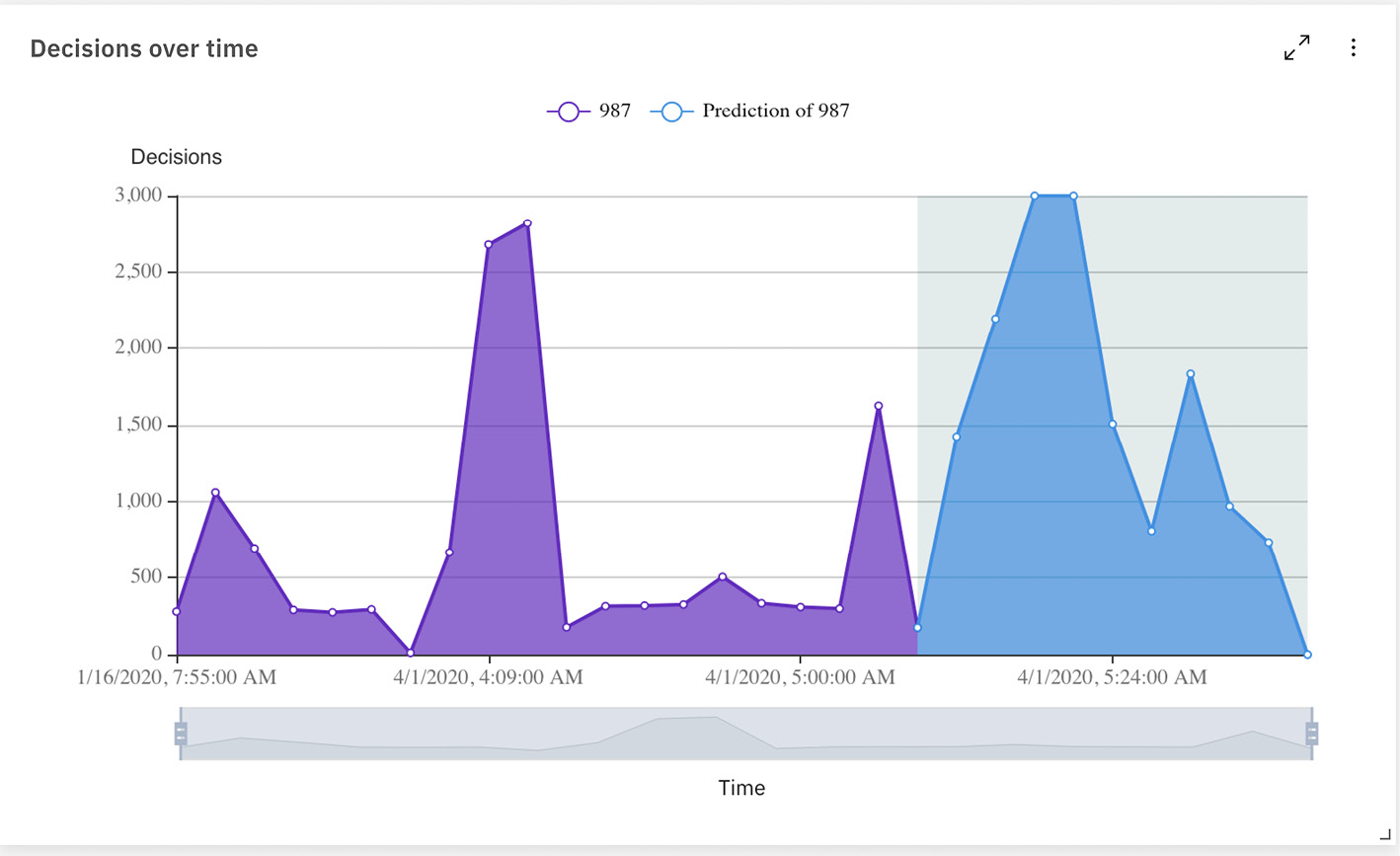
Figure 12.27 – Predictions in action
Summary
In this chapter, we learned how the Business Automation Insights component of Cloud Pak for Business Automation can be leveraged to visualize data observed from the events flowing through our Business Automation processes, decision management, and case management systems. We can even add predictive analytics to our visualizations to help us see how well we can expect to do in the future. Finally, we learned how to create flexible, dynamic dashboards, tailored to our organization’s specific goals and business objectives.
In the next chapter, we’ll leave the specific technologies of the Cloud Pak for Business Automation topics behind and transition to specific deployment options: the cloud, on-premises, and topologies for high availability and disaster recovery. We’ll conclude our journey by learning how to automate the operations of our automation infrastructure.