
If you click on any of the cards it will display the entry view again with the comments and a preview of the picture that we took previously.
We do not just want to move from the list view to the detail view. Material design also takes care of great natural transitions. This recipe is going to apply just that.
To go through this recipe, you will need to have the previous recipes up and running. This recipe is going to add some animations to it.
The following steps will help us to add the animations to our app:
- Add a
mDrinkmember toViewHolderin theMainAdapterclass:public Drink mDrink;
- In the same file in the
onBindViewHoldermethod inform theview holderabout the actual drink, just after the initialization ofcurrentDrink:Drink currentDrink = mDrinks.get(position); holder.mDrink = currentDrink;
- In the
onCreateViewHoldermethod, add anOnClickListenerto the end:v.setTag(viewHolder); v.setOnClickListener(new View.OnClickListener() { @Override public void onClick(View view) { ViewHolder holder = (ViewHolder) view.getTag(); if (view.getId() == holder.itemView.getId()) { } } }); - If the view is being clicked on, we want the
EntryActivityclass to display the selected drink entry. In order to be able to inform the entry about the selection, we need to make theDrinkmodel aparcelableclass:public class Drink implements Parcelable
- We need to implement a couple of methods for that:
@Override public int describeContents() { return 0; } @Override public void writeToParcel(Parcel out, int flags) { out.writeLong(dateAndTime.getTime()); out.writeString(comments); out.writeString(imageUri); } public static final Parcelable.Creator<Drink> CREATOR = new Parcelable.Creator<Drink>() { public Drink createFromParcel(Parcel in) { return new Drink(in); } public Drink[] newArray(int size) { return new Drink[size]; } }; - Add two constructors for the
Drinkclass—a default one and one that takes a parcel—so we can recreate the object and populate it with the appropriate values:public Drink(){ } public Drink(Parcel in) { dateAndTime = new Date(in.readLong()); comments = in.readString(); imageUri = in.readString(); } - In the
MainAdapterclass, add a private variable for the request. This approach makes your code more readable:private int REQUEST_EDIT_ENTRY = 2;
Tip
The so-called magical numbers are easy to misunderstand and should be avoided as much as possible. This and other recipes are just for demo purposes but in the real world, you should use self-explaining constants where possible. Here,
REQUEST_EDIT_ENTRYmakes much more sense than just putting the number2in your code somewhere. - Now within the
onClickmethod that we created previously in theonCreateViewHoldermethod of theMainAdapter, we can start a new entry activity and pass the selected drink as a parameter. The implementation of theonClickmethod will now look like this:v.setOnClickListener(new View.OnClickListener() { @Override public void onClick(View view) { ViewHolder holder = (ViewHolder) view.getTag(); if (view.getId() == holder.itemView.getId()) { Intent intent = new Intent(mContext, EntryActivity.class); intent.putExtra("edit_drink", holder.mDrink); ((Activity)mContext).startActivityForResult(intent, REQUEST_EDIT_ENTRY); } } }); - In the
onCreatemethod of theEntryActivityclass, we will retrieve and display the properties of the selected drink. Add this implementation to the end of the method:Intent intent = getIntent(); if (intent.hasExtra("edit_drink")) { Drink editableDrink = intent.getParcelableExtra("edit_drink"); EditText editComment = (EditText)findViewById(R.id.entry_edit_text_comment); editComment.setText(editableDrink.comments); if (editableDrink.imageUri != null) { mUri = Uri.parse(editableDrink.imageUri); Bitmap bitmap = getBitmapFromUri(); ImageView preview = (ImageView) findViewById(R.id.entry_image_view_preview); preview.setImageBitmap(bitmap); } }
The EditText for the comments will be filled with the comments so that the user can edit them. If an image is attached to the drink entry, it will be shown in the preview image view. Now if only we had an easy and cool way of animating the thumbnail of the image into the preview:
- Surprise! There is. Add a new string resource in the
strings.xml(in theres/valuesfolder) file:<string name="transition_preview">transition_preview </string>
- In the
onCreateViewHoldermethod in theMainAdapterclass, within theonClickimplementation, and right before thestartActivityForResultmethod, we will use theActivityOptionsCompatclass to create a transition from the thumbnail (the holder'smImageViewmember) to the preview image in the layout for the entry activity:ActivityOptionsCompat options = ActivityOptionsCompat.makeSceneTransitionAnimation( ((Activity)mContext), holder.mImageView, mContext.getString (R.string.transition_preview));
- Supply these options by replacing the
startActivityForResultcall on the next line with this implementation:ActivityCompat.startActivityForResult(((Activity) mContext), intent, REQUEST_EDIT_ENTRY, options.toBundle());
- Open the
adapter_main_card_view.xmllayout file and add this line to the image view (the one with themain_image_viewID):android:transitionName="@string/transition_preview"
- In the
activity_entry.xmllayout, add this line as well to theImageViewwidget (the one with theentry_image_view_previewID). This way Android knows where the transition of the thumbnail into the larger preview image has to go).
Now if you run your app and click on any of the cards in the MainActivity class, you will see that the thumbnail is enlarged and fits into the place holder for the preview image in the layout of the EntryActivity class. The reversed transition is shown if you choose the back button. In previous versions we could not do this with only a few lines of code!
As a bonus, let's do some theming using the following steps:
- Visit http://www.materialpalette.com and pick two colors. Theming comes up with a color set that we can use for a theme as shown in the following screenshot:
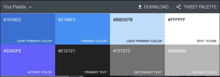
- Create a
color.xmlfile in theres/valuesfolder and add the suggested color names and values. I have chosen blue and indigo on the website so my color resource file looks like this:<?xml version="1.0" encoding="utf-8"?> <resources> <color name="primary_dark">#1976d2</color><color name="primary">#2193f3</color> <color name="light_primary">#bbdefb</color> <color name="text">#ffffff</color> <color name="accent">#536dfe</color> <color name="primary_text">#212121</color> <color name="secondary_text">#727272</color> <color name="divider_color">#b6b6b6</color> </resources> - Edit the
styles.xmlfile in theres/valuesfolder and make it look like this:<resources><style name="AppTheme" parent="Theme.AppCompat.Light"> <item name="android:colorPrimary">@color/primary</item> <item name="android:colorPrimaryDark">@color/primary_dark /item> <item name="android:colorAccent">@color/accent</item> <item name="android:textColor">@color/text</item> <item name="android:textColorPrimary">@color/primary_text </item> <item name="android:textColorSecondary"> @color/secondary_text </item> </style></resources>The output of the preceding code is as shown in the following screenshot:

- Modify your layout files and change text views and other elements so that it can reflect the color scheme. Run the app.
Android's activity transitions will take care of everything. We just need to tell what, where, and how. With just a few lines of code the API allows you to create meaningful transitions between activities, which will heavily improve the User Experience (UX) of your application.
With each new step, the looks of your app become better and better! Unfortunately, this is where this introduction to material design ends. Make improvements wherever you want. Play with it and have fun! Animations, UX, and layouts are important elements of high-quality apps.
For wearable apps, this may be even more important as we will see in the next chapter. But how can we enable a great user experience on such as small screen?
We have seen only a few aspects of Material Design. There is so much more to discover.
Improve the looks and UX of the app further, add the implementation in the MainActivity class to handle the data of drink entries that you have added, and make enhancements wherever you want them. Or, you can have a look at your existing apps and see how you can materialize them.