
![]()
An Interactive Gantt Chart Dashboard, Data Visualization
In the previous chapter, you investigated the Gantt chart dashboard shown in Figure 14-1. In that chapter, you took a look at the underlying mechanics, tracing how data starts from the back end and how it ultimately comes to inform the dashboard presentation. This chapter builds on the previous by digging deeper into the interactive and data visualization elements. Therefore, if you skipped the previous chapter hoping to get to this meaty bit, I strongly suggest you go back and read it, just so you’ll have some clarity moving forward.

Figure 14-1. The Gantt chart dashboard
For this chapter, you’ll be using Chapter14GanttChart.xlsm. By default, I’ve disabled the pop-up feature following the instructions I presented in the previous chapter. You’re free to reenable it if you’d like, but I’ve found it distracting while working with parts of the spreadsheet. Typically I disable it while making modifications. I’ll reenable it when complete.
As discussed in the preceding chapter, the front end of the dashboard is really made up of three distinct elements. First, a banded region chart at the top shows the total sum of the hours required (in black), and several graded bands let you know if far too many hours have been allocated. Next, a data region shows the actual Gantt chart project information, with an associated pop-up that provides data on demand. Finally, a dynamic legend at the bottom helps the user understand the actual ranges presented. Each item by itself represents reusable components. In this chapter, you’ll reverse engineer them to discover how they work.
The Banded Region Chart
In this section, I’ll discuss how to build the banded region chart. If you click into any of the bands on the banded region chart, you’ll see it’s actually a modified column chart (Figure 14-2).

Figure 14-2. The banded region chart is a modified column chart
In fact, upon closer inspection, you can decipher how the chart is made. The banded regions are actually stacked columns. The black, current value is another column chart, but it resides on the chart’s secondary axis—the stacked columns reside on the primary axis. Take a look at Figure 14-3 to see this laid out.

Figure 14-3. A visual description of how the banded region chart is built
The information that feeds into this chart can be found on the Calculation tab under the tabular configuration of the back-end data (Figure 14-4).

Figure 14-4. The data that informs the banded region chart can be found on the Calculation tab
The total row, at the top of Figure 14-4, contains the total number of hours required to work. This is the black column chart that will appear on the second axis. Below it, the next three rows define the banded regions. According to this dynamic, days with hour requirements of 60 or fewer (assume multiple people are working on projects, so these are aggregate counts among all available staff) are considered good; between 60 and 80 hours (in other words, the next 20 hours) are now in the warning territory. Anything greater than that is considered too high. That I chose 40 means the chart can show at most 120 hours. This setup is largely arbitrary. It seemed unlikely based on the data that a project count could go up that high. But for simplicity, it helps to define the legend in this way—and even picking arbitrarily high numbers forces you to think about your project and its underlying data.
Creating the Chart
To create a similar chart, you would lay out the data as I’ve done in Figure 14-4. Again, the numbers picked were arbitrary for this example. But for your own work, you should define what categories such as Good, Warning, and High (or any others you might think up) mean to you and your organization. In my setup, the numbers for each row are constants. But you could easily link these numbers to another input section in your own work, should you want to change the size of each region later.
To make the banded region chart, begin by selecting the banded region rows as I’ve done in Figure 14-5.

Figure 14-5. Selecting the banded region rows
Next, go to the Insert tab and insert a stacked column chart (from in the Charts group), as shown in Figure 14-6.

Figure 14-6. With the rows selected, insert a stacked column chart from the Charts group on the Insert tab
Once selected, your chart should look like the one shown in Figure 14-7.

Figure 14-7. A stacked bar chart based on the banded regions
Right-click any chart series and then select Format Data Series (Figure 14-8) to present the Format Data Series context pane (Figure 14-9). For Excel 2010 and earlier users, a dialog box similar to the context pane will appear.

Figure 14-8. The context menu that appears upon right-clicking a series in the chart

Figure 14-9. The Format Data Series context pane
Within the context pane (or dialog box for 2010 and earlier users), set the chart’s Gap Width to zero. Once complete, the columns of the chart will touch, giving the appearance of a fluid band (Figure 14-10).

Figure 14-10. Setting the gap width to zero
At this point, you’ll do some cleanup. If the chart title appeared on yours as it did on mine (Figure 14-10), go ahead and delete it by selecting the chart title and pressing Delete on your keyboard. (Chart titles won’t appear by default in version 2010 or earlier.) Do the same with the horizontal axis and chart legend so it looks like Figure 14-11.

Figure 14-11. A cleaned-up banded region chart
Next, right-click the vertical axis on the left and select Format Axis. A context pane will appear on the right (Figure 14-12). Under the Axis Options, set the bounds to be a minimum of 0 and a maximum of 120.

Figure 14-12. The format axis context pane
At this point, you’re ready to add the total hours required to the chart. The easiest way to do this is to select cells B22:AF22 on the Calculation tab and then press Ctrl+C to copy (Figure 14-13).
![]()
Figure 14-13. Cells B22:AF22 selected. Press Ctrl+C to copy
Next, select anywhere in the chart and press Ctrl+V to paste. Once you’ve pasted this data, the chart won’t look any different. That’s because you set its range to 120, and as a stacked column chart, this data is not above the defined range for the chart. Though you can’t see this new series, you can still modify it. With the chart still selected, go to the Format tab (that’s the menu tab that pops up to the right of all the other tabs when a chart has been selected). On the left of the Format tab, there is a Chart Elements drop-down in the Current Selection group. If Series “Total” is not showing the drop-down, click the down arrow and select it (Figure 14-14).

Figure 14-14. Selecting Series “Total” from the drop-down
Once selected, click the Format Selection button below the drop-down (Figure 14-15).

Figure 14-15. The Format Selection button
This will bring up the Format Data Series context pane (Figure 14-16).

Figure 14-16. The Format Data Series context pane
Under Series Options, select Secondary Axis to change the selected data series to the secondary axis. Your chart should now look similar to the one displayed in Figure 14-17.

Figure 14-17. A banded region chart not yet complete
In Figure 14-17, you’ll see you have several different series plot on different axes. However, you’ll want everything to be even-steven. It wouldn’t make sense to understand the total against a backdrop of a banded region plotted on a different scale. So, following the improvements you made earlier, you’ll right-click the secondary axis and change the minimum and maximum to 0 and 140, respectively, as shown in Figure 14-12.
Having now set the axis, you’ll need to clean everything up that you no longer need. In Figure 14-18, I’ve gone through and deleted both axes and the chart title.

Figure 14-18. The banded region chart without any extraneous information
Before putting this chart on your dashboard, you’ll have to set the color scale. Following the work of Stephen Few, I will always tend to prefer banded regions that follow a color scale. This is because I want to demonstrate degrees of things getting worse (or getting better). The color-fill drop-down in Excel provides several different palettes to choose from. The choice of color itself is less important than following a systematic palette that evokes the underlying nature of your data. In Figure 14-19, I chose some colors from the gray palette for the backdrop and a heavy black for the total bars.

Figure 14-19. Banded region chart with a graded region and dark black total bars
Placing the Chart onto the Dashboard
Finally, you’ll place this chart on your dashboard, as shown in Figure 14-20. You’ll need to take a few more steps, however, to get it looking exactly as it does in Figure 14-20. In this section, I’ll discuss what’s needed.
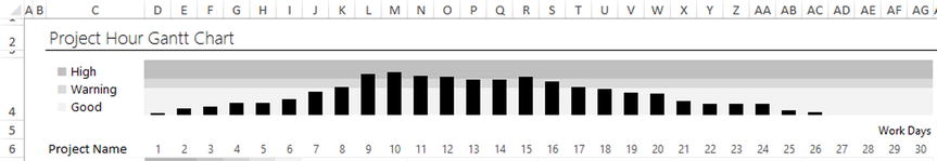
Figure 14-20. The banded region chart placed on the dashboard
Lining up the chart so that the bars align themselves with the dates below may seem like a hard task. However, you can make it easier on yourself by using the Snap to Grid feature. First, you place the chart on the dashboard and attempt to line it up as much as possible. Next, you select the plot area of the chart. If you’re having trouble selecting the plot area (as you attempt to select it, you accidentally select a series instead), you can go to the Format context menu and select Plot Area from the Chart Elements drop-down menu (refer to Figure 14-14). Once it’s selected, you can select the Snap to Grid feature from the Align drop-down menu on the Format tab (Figure 14-21).

Figure 14-21. Select Snap to Grid in the Align drop-down from the Format context tab
The Snap to Grid feature allows you to line up any shape (in this case, the plot area) with the cell grid. You can use this feature to line up the chart with the numbers below (refer to Figure 14-19). For aesthetic reasons, I added some space between each total bar. To do this, right-click the total series on the chart and go to Format Data Series. In pop-up context pane, you’ll decrease the Gap Width setting to the desired level. Figure 14-22 shows I’ve chosen a Gap Width setting of 91%.
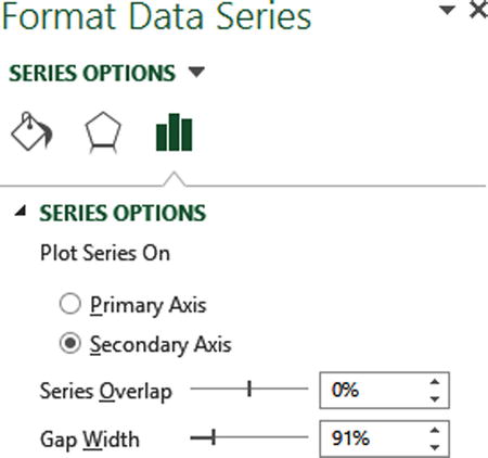
Figure 14-22. The Format Data Series context pane showing a Gap Width setting of 91%
Creating the Banded Chart Legend
In this section, I’ll discuss creating the chart legend shown in Figure 14-23. As the figure demonstrates, this is not a chart legend that was part of the chart but rather one I created myself. Sometimes Excel’s chart legends don’t give you the adequate layout control needed for your dashboard, so you can make your own.
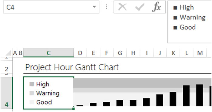
Figure 14-23. A homemade chart legend
Notice in Figure 14-23 that I have blocklike characters next to each text item. I inserted these block characters using the Symbol option from the Insert tab’s Symbol group. When you select the Symbol option, the Symbol dialog box appears. The Symbol dialog box allows you to insert other characters available to the selected font. Notice in Figure 14-24 that the font I’m using is Segoe UI. This is the font I use across the entire dashboard. However, sometimes Excel might show Calibri in this drop-down since Calibri is the default font (unless you’ve changed it). Make sure the font drop-down contains the desired font since certain characters and symbols are available only to certain fonts. In the subset drop-down, notice I’ve selected Geometric Shapes. Many other types of symbols are available to this font, but I’m interested in that big box symbol that is part of the Geometric Shapes category. Once it’s selected, I can click the Insert button to insert it into the spreadsheet.
You may have noticed in Figure 14-22. I use the block symbol three times. You can either insert it three times now and then insert the legend labels where they need to go or, once the first one is inserted, highlight the block and press Ctrl+C to copy. Then as you need those two more times, you can press Ctrl+V to paste it.
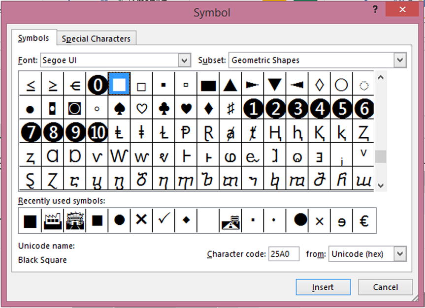
Figure 14-24. The Symbols dialog box
However you choose to build the legend, you’ll have to take a few more steps to make it look like the one shown in Figure 14-23. By default the squares will be black, and all the items will be on a single wrapped line. Figure 14-25 demonstrates what I’m describing.
ALT + ENTER

Figure 14-25. By default the squares will be black, and the labels will all be on the same wrapped line
To tell Excel to push something to another line, you can use the Alt+Enter keyboard combination. You can either insert a new line by going to the spot where you would like to begin the next line and press the Alt+Enter keyboard combination or create it while typing by using the combination when you want to start a new line. This will work even if you don’t have word wrap enabled for the particular cell (Figure 14-26).

Figure 14-26. Use Alt+Enter to start a new line in the formula bar
ALTERNATIVE ALT+ENTER USES
Alt+Enter is also really useful for splitting up complex formulas. Figure 14-27 shows an IF function I’ve added some white space to, to make it more readable. You can use Alt+Enter to go to the next line and then use the spacebar to create indentations (note: you can’t use the Tab key).

Figure 14-27. You can use Alt+Enter plus spaces to create indentation in formulas
To color each block individually, select the cell to put it into edit mode where your cursor is blinking in the cell. Next, select an individual block and change its font color (Figure 14-28). While this will not change the font color selected in the formula bar, it will change the color as it appears in a cell.

Figure 14-28. You edit the font color within a cell by selecting the desired text and picking a new color
So far, you’ve learned how to create a banded region chart that helps you understand whether you have too many hours allocated to a specific day. In the next section, I’ll discuss how to create the dynamic legend.
The Dynamic Legend
This section deals with the dynamic legend shown in Figure 14-29, which appears at the bottom of the dashboard. What makes this legend dynamic is that it will adjust its range depending upon the data presented in the Gantt chart window. While the lowest value shown in Figure 14-29 is 1 and the greatest value is 15, the range will always automatically adjust to any range that exists in the underlying data. The dynamic legend is another item to have in your tool set of reusable components.

Figure 14-29. A dynamically adjusting legend
To understand how the dynamic legend works, you need to understand the shaded region below the numbers. In fact, the shaded region comes about through the application of conditional formatting. But take away the conditional formatting, and it’s just numbers (Figure 14-30).

Figure 14-30. The dynamic legend uses conditional formatting applied to numbers
There are several important features to this dynamic legend. The top row contains the minimum and maximum values displayed to the user. Below, a series of numbers help the conditional formatting create the visual legend. And below that a series of numbers (1 through 8) help create that range.
Creating the Endpoints of the Legend
First, you’ll need to create the endpoints (1 and 15 from Figures 14-29 and 14-30) of this legend. I’ll talk about how to do that in this section.
Let’s start with the maximum first. Figure 14-31 shows the formula used to find the maximum of all values presented in the Gantt chart. Notice, for convenience, I’ve named this region Dashboard.GanttChartArea. This formula gives the maximum value shown in the Gantt chart plot. Easy enough, right?

Figure 14-31. The maximum endpoint is derived by using the Max formula on the entire Gantt chart area region
Getting the minimum however is a bit trickier. The problem is that the minimum for this plot will always be zero. This is because all that white space where nothing has been plotted will be treated as a zero by Excel. So, you can’t simply take the minimum of the entire region because there are so many zeros. You’ll need to find out what the minimum is excluding zeros. The formula in Figure 14-32 shows how you can do this.

Figure 14-32. The minimum endpoint uses a more complicated formula
Let’s take a look at how this formula works by breaking it down.
=SMALL(Dashboard.GanttChartArea,SUMPRODUCT(--(Dashboard.GanttChartArea=0))+1)
Recall from previous chapters how SUMPRODUCT works. (Dashboard.GanttChartArea=0) is the condition you want to count. By default Boolean expressions like this will not be counted in the way you want unless another mathematical application is applied to them. For instance, (Dashboard.GanttChartArea=0)*(Dashboard.GanttChartArea=0) will be counted (although it won’t give you the answer you want, I’m just presenting it here for example), as will (Dashboard.GanttChartArea)*1 (this will give you the correct answer). In any event, the -– is the commonly accepted shorthand to tell Excel you want it to count how many cells in Dashboard.GanttChartArea equal zero. (*1 will work too but is somewhat less common than --. You should choose whichever is easier to read for you.)
![]() Note You could use COUNTIF here instead, but COUNTIF is generally slower. Plus, I wanted to show you how you can use SUMPRODUCT in practice. Sometimes people are scared to use SUMPRODUCT, but it won’t bite. As always, you should choose the function that more naturally reflects the underlying nature of the problem. A reasonable argument to use COUNTIF could be made here.
Note You could use COUNTIF here instead, but COUNTIF is generally slower. Plus, I wanted to show you how you can use SUMPRODUCT in practice. Sometimes people are scared to use SUMPRODUCT, but it won’t bite. As always, you should choose the function that more naturally reflects the underlying nature of the problem. A reasonable argument to use COUNTIF could be made here.
Now let’s take a look at the left side of this formula. Recall how SMALL works (Figure 14-33). The first parameter of SMALL is looking for an array of data. The second parameter allows you to return the smallest item at that particular point. If you supplied a 2 into the second parameter, you’d get the second smallest item available. Since you know there are a lot of zeros in the mix, you need to find out the smallest point after compensating for all those zeros. This is what SUMPRODUCT does for you—it counts the zeros. You then add 1 to it to get the next smallest item after those zeros.

Figure 14-33. The SMALL function, in its natural habitat
Finally, you present these endpoint values to the user. The values of the first row (Figure 14-33) simply reference the endpoints found below. Figure 14-34 shows this for the maximum value.
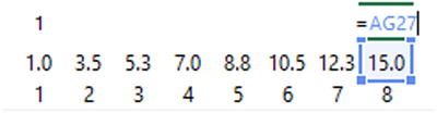
Figure 14-34. The endpoints presented to the user are simply references to the endpoints calculated in the line below
Interpolating Between the Endpoints
In this next section, I’ll discuss how to get those values between the endpoints. Notice in Figure 14-34 that they appear to grow from the minimum endpoint to the maximum endpoint. This is called interpolation. Interpolation will help you create a visual scale between the endpoints.
Notice that you have eight points in total including the endpoints for the entire range. Figure 14-35 shows the formula that begins after the minimum endpoints.

Figure 14-35. You use the formula presented here to interpolate the values between your two endpoints
Let’s break this formula down. Look at the first half of this formula, ($AG$27-$Z$27). This piece of the formula is the maximum endpoint less the minimum endpoint: it finds the range. The second part of this formula is the number under the second endpoint (it’s a 2, as you might imagine) divided by the total number of endpoints—8. This part of the formula is a proportion. When you multiply the entire range (15, in this case) by the proportion you want to show (2/8 = .25), the result is 3.5, in other words, at the second endpoint, 2/8ths of the entire range. At the third endpoint, you’ll find 3/8ths of the entire range. You’ll do this up to the seventh endpoint where you find 7/8ths of the entire range.
You can abstract this interpolation formula into the following form:
=[Range] * [Current point/Total Points]
where the Range is equal to [Maximum Endpoint – Minimum Endpoint].
Applying the Visual Effects
Once you have the numbers you need, you can apply conditional formatting to get the desired shaded effect. I’ll talk about how to do that in this section.
First you highlight the interpolated region and then you apply conditional formatting (Home tab ![]() Conditional Formatting
Conditional Formatting ![]() New Rule). Figure 14-35 shows the conditional formatting New Formatting Rule dialog box. In Figure 14-36 I’ve applied rules similar to what was done to the Gantt chart from the previous chapter. I’ll be using a 2-Color Scale rule. The minimum number is .1 (which is an arbitrarily low number to create a starting point that isn’t zero). I’ve also set the minimum to use the softest gray available in Excel’s color scheme. The maximum value is derived from the data (though I could specify it if I wanted). For that you use black.
New Rule). Figure 14-35 shows the conditional formatting New Formatting Rule dialog box. In Figure 14-36 I’ve applied rules similar to what was done to the Gantt chart from the previous chapter. I’ll be using a 2-Color Scale rule. The minimum number is .1 (which is an arbitrarily low number to create a starting point that isn’t zero). I’ve also set the minimum to use the softest gray available in Excel’s color scheme. The maximum value is derived from the data (though I could specify it if I wanted). For that you use black.

Figure 14-36. The New Formatting Rules dialog box
Once these rules are specified, you can return to the spreadsheet. Notice in Figure 14-37 the numeric values appear in the cells. However, you don’t really want numeric values either in the colored cells or in the row below. To remove these numbers, you use the custom formatting trick from the previous chapter (see “The Dashboard Worksheet Tab” subsection in Chapter 13).

Figure 14-37. The numbers still appear once conditional formatting is applied
Once those numbers are removed, you can simply resize the row to get the slimmer effect shown at the beginning of this chapter (see Figure 14-38).

Figure 14-38. Resizing the legend to create a slimmer effect
The Last Word
In this chapter, you worked on a lot of the visual elements of your Gantt chart dashboard. While some of the steps may have appeared complicated at first, they become easier upon successive implementations. In your work, you can consider how you can reuse many of these components. You saw that sometimes you must make certain charts and legends yourself instead of relying on Excel’s defaults. Again, once you know how to make these items, their implementation becomes straightforward.
In the next chapter, I’ll discuss how to implement the dashboard pop-up feature that appears when your mouse rolls over a specific cell.