![]()
Perfecting the Presentation
In the previous chapter, you built the intermediate table, which deals largely with transforming the raw data from the backend database. The presentation or visual layer, on the other hand, deals largely with what the user sees.
In this chapter, you’ll focus on the visual layer as well as its interaction with the intermediate table. Just as before, the focus here is to create a lightweight infrastructure that isn’t heavily steeped in code. You’ll be using the file Chapter20Wizard.xlsm for this chapter. I recommend having it open as you follow along.
Implementation and Design of the Weight Adjustment System
In this section, I’ll talk about implementing the weight adjustment system, shown in Figure 20-1. You’ll find this across the top of your Analysis screen.

Figure 20-1. The weight adjustment system
Each box is simply connected to the associated weight on the Helper tab. Figure 20-2 shows the connection to Health Level. Note that each metric follows suit.

Figure 20-2. Each weight box is connected directly to the associated weights from on the Helper tab
Likewise, the scroll bars here are exactly like the ones on the Helper tab you built in the previous chapter (Figure 20-3). However, I don’t recommend copying and pasting those scroll bars from the Helper tab and placing them on this tab. Scroll bars are usually set to relative references. If you copy and paste the scroll bars from the Helper tab, Excel will try to change the same cell address on the Analysis tab. That’s not what you want.

Figure 20-3. Properties for the scroll bar. Notice the cell link is the same as that of the scroll bars on the Helper tab
Your best bet is to insert each of these scroll bars manually. In Figure 20-4, you can see that I’ve left some space in Column F between each weight box to provide a place for a scroll bar. I used a similar space between all the weight boxes. This is similar to the process of anchoring described in Chapter 18.

Figure 20-4. I’ve moved the scroll bar to the side to show the column spacer
Next, enable the Snap to Grid feature by right-clicking or Ctrl+clicking the scroll bar. From the Format context tab, pick Align and select Snap To Grid (see Figure 20-5).

Figure 20-5. The Snap To Grid feature
The Snap to Grid feature will force you to align Excel’s cell grid. So if you size a spacer column as I did in Figure 20-4 in Column F, ensuring consistent alignment and size for each scroll bar is easy peasy. Of course, the “correct” size is more art than science. To make my life easier, I like to design the first scroll bar spacer. Once I like the size, I right-click the column and select column width to find out its size (Figure 20-6).

Figure 20-6. Column width for column F
Then I right-click every other similar column and set its size to be the same. As you can see in Figure 20-7, 1.71 is what I liked best, but you may differ. As you may have guessed, I did the same for the weight boxes.

Figure 20-7. Selecting similar columns and setting their size all at once to ensure consistency
Displaying Data from the Intermediate Table
Now let’s talk about how to display data from the intermediate table. For the most part, it’s a one-to-one mapping. That is, if you look at Health Level in the visual presentation, you can scroll down to see the data it is visualizing directly underneath. They share the same column.
The are a few exceptions to this. Ideally, it would be great if all data items shared the same columns but sometimes the way your data is laid out constraints this ideal. (Of course, as you can see from this, I always try to align them as much as possible.) So let’s go through each item.
This section talks about building the results information formula. Figure 20-8 shows the results of this formula. The “7-26 of 39” means the results ranked from 7 to 26 are currently in view, out of 39 total possible items available. The formula updates as the scroll bar changes (Figure 20-9).

Figure 20-8. The results information label shows the ranked items currently in view as well as the final total of items

Figure 20-9. The results information label formula
The formula uses the first ranked item in the list and the last ranked item in the list to define the range of numbers in view. Database.RecordCount is used to show the total amount of records available for view (Figure 20-9).
The Current Rank of Each Country
The first item on the left is the current rank of each country shown. This value is pulled directly from the index created in the intermediate table. Figure 20-10 shows how the rank and index connect.

Figure 20-10. The rank from the data visualization layer directly connects to the intermediate table
Country Name
In this section, you’re interested in the country name. Unlike the index, country name isn’t directly in the column below. Again, when creating your own dashboards, remember that the intermediate table might not always be in the same columns below. Figure 20-11 shows how each country is connected to the intermediate table below.

Figure 20-11. Each country name directly links to the intermediate table below, but it’s not in the same column
Total Scores for Each Country
This section will show you how to display the total scores for each country. Recall that the column representing total scores is actually the last column on the right in the intermediate table. Note how this is different for your visual layer. Figure 20-12 shows the connection.

Figure 20-12. The Total score is one of the first columns in the visual layer and one of the last columns in the intermediate table
Let’s take a moment to look at the formula. I place parentheses around the total value as a means to downplay its importance somewhat. (I’ll go over why near the end of the chapter.) Since I’m using the values in the Total cell in a formula, I risk showing more decimal precision than required. Using the TEXT function, I’ve supplied a formatting rule to ensure you also see everything to the right of the decimal and always one number to the right.
In-cell Bar Charts for All Metrics
The rest of the data items in your visual layer are in-cell bar charts. As you might remember from previous chapters, you can re-create small bar charts using the REPT function and the pipe symbol. Figure 20-13 shows the formula as well as the best font selection for this type of chart. As Figure 20-13 shows, Playbill size 10 is fairly reliable. Notice the cell it refers to is O34. This is the same cell referenced to get the Total value in Figure 20-9.

Figure 20-13. In-cell bar chart for Total
Figure 20-14 shows the connection for Health Level. It’s virtually the same function setup as that used for Total. In this case, it refers to the Health Level metric from the intermediate table.

Figure 20-14. Formula for in-cell bar charts for metric data
The in-cell bar charts for the rest of the metrics follow suit. Responsiveness, Financial Fairness, Health Distribution, and Responsiveness Distribution all use the REPT function and link to their corresponding column from the intermediate table.
You may be wondering what’s going on with that IFERROR. Why does it appear in the function? The answer is because you need it. For one, you won’t always have at least 20 entries. If there are less than 20 entries, then you need these cells to appear blank.
More importantly, however, is that you simply don’t know what lies ahead. You are using a rather simple example here, so you’re unlikely to see any other types of errors. But that’s also shortsighted thinking. For example, in my original formulation of this spreadsheet, when you reduced a weight to zero, the result was a #DIV/0 in that metric’s column. I didn’t want the #DIV/0 error to show when the result should show nothing. Therefore, I used the IFERROR function as shown above. While subsequent changes to the model make such an error unlikely, I’ve kept it in just in case. However, I’m unconvinced that daring folks out there can’t figure out a way to create errors I couldn’t foresee. Moreover, since the proliferation of errors in cells can seriously slow down a spreadsheet, preventing them is important.
Best Possible Comparisons
At the bottom of the of the visual layer I’ve included the best possible scores for each metric. This allows the user to compare instantly the results against the best result. Since 100 is the best possible score, the formula for each of these cells is always =REPT("|", 100) (see Figure 20-15).

Figure 20-15. The formula for best possible comparisons
Weight Box Progress Meters
Under each weight box is a progress meter that shows works exactly like the in-cell bar charts. In the Figure 20-16, you can see each small bar chart within a weight box.
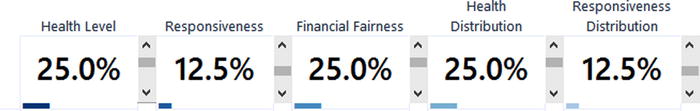
Figure 20-16. The small lines under each weight box are progress meters
Figure 20-17 shows the formula used for these bar charts. Notice the theme here. It’s essentially the same formula. However, to make it appear smaller, I’ve just resized the row. This gives it the mini-field effect.

Figure 20-17. The progress bars under each weight value are minified versions of the same bar chart formula used previously
“Sort By” Dropdown and Sort Labels
In the last chapter, you built the infrastructure for sorting. In this section, I’ll talk about the visual elements that go along with that sorting mechanic. One of the cool features of your sorting system is that you can use the Sort By dropdown to select which metric you’d like to sort by. Once the user has made their selection, the corresponding column label becomes bold and the down arrow appears next to it (see Figure 20-18).

Figure 20-18. The Financial Fairness label becomes bold and a down arrow appears next to it
Following the no-code theme, this mechanism requires no VBA. However, it is a mixture of several different elements, which I’ll go through in the next few sections.
In this section, I’ll talk about the Sort By dropdown. It’s nothing more than a data validation list (Figure 20-19), which you can insert into the spreadsheet from the Data tab. Generally, I don’t like to type the list source in directly. However, the areas in which these selections appear on the spreadsheet do not appear in one contiguous region. If you look at your current sheet, you’ll see that you don’t have one list of data where Total, Health Level, etc. appear without any cells in between. If you were to link directly to these sources, there would be space in your dropdowns. So typing the text in directly here works best even if it’s not preferred.

Figure 20-19. The Data Validation dialog box showing the dropdown list you’ve created
Using Boolean Formulas to Define Which Metric Has Been Selected
Recall from the previous section that changes in the dropdown change the Sort Column Id. Since you selected Financial Fairness in Figure 20-19, the Sort Column Id is a 3, as expected (Figure 20-20).
Figure 20-20. Sort Column Id is equal to 3
At the bottom of Figure 20-20 is a line item that reads, “Is Sorted On?” This row highlights the row currently being sorted on. Notice for all columns except for Financial Fairness, the value reads FALSE. For Financial Fairness, the value reads TRUE. This is because you’re sorting on this metric. Figure 20-21 shows the formula you’re using in this row.

Figure 20-21. The Boolean formula used to test whether you’re sorting on a specific column
You’ll use this Boolean formula to perform conditional formatting and add the down arrow to each header.
Connecting Everything with Conditional Format Highlighting
In this section, you’ll put the finishing touches on each header by conditionally formatting the selected column header as bold. This should hopefully feel somewhat familiar to you as it’s a reapplication of the Highlight mechanism described in Chapter 10. (Remember, if you think of it as a reusable component, you can apply it to many different spreadsheet applications.) Figure 20-22 shows the Conditional Formatting Rules Manager for cells E3:M3. Notice I’ve applied conditional formatting rules to these column headers. You can see it for yourself by selecting cells E3:M3, clicking on the Conditional Formatting dropdown box from the Home tab, and selecting Manage Rules.

Figure 20-22. The Conditional Formatting Rules Manager dialog box
Let’s take a look at the conditional formatting rules behind the scenes. If you click on Edit Rule, you will see the Edit Formatting Rule dialog box (Figure 20-23).

Figure 20-23. The Edit Formatting Rule dialog box
Note that I’ve selected “Use a formula to determine which cells to format.” In the “Format values where this formula is true” rule type, I’m using the formula =(E54=TRUE). This formula is what allows you to change the style of font of the sort column that’s been selected. In addition, notice that I’m not using the absolute cell reference $E$54. That absolute cell reference is what appears by default. However, if you kept the absolute reference, it would only test cell E54. Instead, you want the test for conditional formatting to happen across every cell in the range. You might recall you built a similar dynamic in Chapter 10 in the “Conditional Highlight Using Formulas” section.
A QUICK NOTE ON ABSOLUTE REFERENCES AND CREATING CONDITIONAL FORMAT RULES
If you select “Use a formula to determine which cells to format” as I have in Figure 20-23, you won’t start with relative references by default. What that means is, if you were to set up this formula for the first time, and you selected cell E54 from on the spreadsheet, it would look something like Figure 20-24.

Figure 20-24. The Edit Formatting Rule dialog box uses an absolute reference by default
By default, all cells selected to populate the formula begin as absolute references. So the E54 in Figure 20-23 actually began as E$54$. You can change the absolute references manually by placing your cursor next to the dollar signs and deleting them. Or, you can cycle through the references types by pressing F4 repeatedly. This is similar to pressing F4 repeatedly in the formula box when writing a formula. In this case, if you press F4 three times, you’ll arrive at the relative cell reference.
When you first set the cell, it’s sometimes easy to forget the step of removing the absolute reference when it’s necessary.
If you click the Format button (see Figure 20-24), you’ll be taken to the Format Cells dialog box. Here, you can change the format of the cells whose sort column has been selected. For my formatting choices, I’ve selected a Bold font style (Figure 20-25). I’ve stayed away from doing any other embellishments. You don’t want the selected header to take away from the data visualization portion. Nor do you want it to overwhelm the visual field. If you’re not careful, you can go crazy with the formatting options. Here I am being subtle and tasteful.

Figure 20-25. Bold is selected in the Format Cells dialog box
This conditional formatting rule simply takes care of the metrics across the top. It doesn’t take care of Total, which is not part of the same row. So you’ll need to make an additional rule just for the total. Remember, however, what the Total row refers to is in a different column on the intermediate table. Take note in Figure 20-26: the rule is set to test the cell in O45, which, unlike the other columns in the visual layer, is not directly below the Total on the intermediate table.

Figure 20-26. An individual rule is required for the Total header
The mechanism to display the down arrow in the weight box headings uses the same row as the conditional formatting. Let’s take a look at the formulas (Figure 20-27).

Figure 20-27. The formula used for the weight box heading
The left-side of the formula, E33, simply refers to the column header from the intermediate table. But turn your attention to the right side. In a previous chapter I talked about using Unicode characters to extend what characters we can display. The down arrow is given by the Unicode index number 9660. And we can display the character with the UNICHAR function. REPT, as you might recall, lets you specify a character in the first argument and the amount of times to repeat that character in the second argument. Here, you’ve specified that you want to repeat the down arrow. E54 in the formula (the value of how many times you want to repeat the formula) points to TRUE and FALSE. And, if you remember how Boolean functions work, TRUE = 1 and FALSE = 0. So each header uses this formula. When the Is Sorted On row returns TRUE for the corresponding column, it displays the down arrow (it’s being repeated 1 time).
The Presentation Display Buttons
In this section, I’ll talk about the display buttons available to the user. The first takes the user back to the menu, and the other resets the weights back to the original schema. Figure 20-28 shows these buttons placed adjacent to one another. Your buttons in this case are nothing more than TextBox shapes with macros assigned to execute when the user clicks one.

Figure 20-28. The two buttons on your dashboard
Going Back to the Menu
The Back To Menu button is simple. It simply takes the user back to the Menu screen. It can be found in the sheet object of the Analysis worksheet tab. Listing 20-1 shows all the code that’s required.
Resetting the Weights
Because you’re performing sensitivity analysis, you expect the weights to change from their original scheme. Once you’ve changed the weights, you might find you want to reset them back to the original scheme. Remember what dictates the weights are the ratios of the values of the scroll bars. So, one way to create this weight scheme is with the scroll bar linked value ratios shown in Figure 20-29 from the Helper tab.
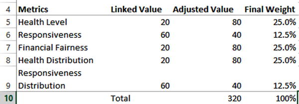
Figure 20-29. The Linked Value column shows the required scroll bar values to get to the original weights
Below this table on the Helper tab is a column of data that says Saved Weights (Figure 20-30). Notice the values match the exact values in the Linked Value column in Figure 20-29. I’ve named this column of data as Helper.SavedWeights. Likewise, I’ve named the column of linked values in Figure 20-29 as Helper.LinkedValues.

Figure 20-30. The scroll bar values that help you get to the correct weights
The Reset Button simply copies these saved values onto the linked values. Listing 20-2 shows the code, which can be found in your file in the Analysis worksheet tab.
Think about this dynamic for a moment. Here you’ve saved only schema of weights. But you could save as many weight scenarios as you’d like. It wouldn’t be hard to extend this model to have the user save a weight scheme they like. Then later they could load the schema. All you would need is the simple code above to start.
Data Display and Aesthetics
In this section, I’ll focus a little bit on the nature of the data you’re displaying. In addition, I’ll talk about some of the aesthetic choices, including color and spacing. You may have noticed that the nature of the Total data (column O in Figure 20-31) is different than that of the metrics (columns E, G, I, K, and M in Figure 20-31). Specifically, the metric data is all whole multiples of ten from 0 to 100, while the Total data can be any number from 0 to 100.

Figure 20-31. The intermediate table shows that the nature of the metric data differs from the total column
Weighted vs. Not-Weighted Metrics
The reason the nature of the Total data is different from the metrics data is that the Total data is weighted whereas the metric data is not (Figure 20-32). Responsiveness Distribution, for example, simply uses the formula =INDEX(Database[Health Distribution],C34)*10 in its first row cell, where C34 is the Match Index. Note Database[Health Distribution] isn’t a weighted column. You might be wondering why you display the weighted Total but do not display the weighted metrics (note, however, you do use the weighted metrics for your sort even if you don’t display the results). I’ll talk about that in this section.

Figure 20-32. You display the weighted Total but not weighted metrics
The answer is that displaying the weighted metrics wouldn’t do well to highlight the variances between metrics for a single country nor within one metric across several countries. Figure 20-33 shows how the data visualization changes when you use weighted values for the metrics.

Figure 20-33. Using weighted values instead of raw scores
Your ability to compare values is much harder now. This is because each metric now has a different base against which to compare a best possible score. Consider country Efros, which is ranked in the third position in Figure 20-32. It’s performance in Responsiveness and Financial Fairness is, in fact, the same. But you wouldn’t glean this immediately since the representation in Responsiveness is half that of Financial Fairness. Switching back to raw values shows they are the same (Figure 20-34).

Figure 20-34. Responsivness and Financial Fairness result in the same score for Efros
Generally, we intuitively understand the concept of weighted models, especially when presented visually, as is the case here. In fact, this type of data visualization helps you mitigate your own bias. One common phenomenon, which I’ve experienced in my professional career, is the assumption that high performance in one (or two) metrics will strongly compensate for shortcomings in the rest.
In my past, I delivered a similar tool to an organization that wanted to gain insight into the performance of its different projects. Management’s assumption was that because two metrics had performed well, the project should have ranked in the first or second spot. However, when presented with the tool above, they realized these two metrics were not given high weights. Indeed, you can see an example of this in Figure 20-35.

Figure 20-35. The top four performing countries by weight
Heiestan, for instance, ranks very well in Responsiveness Distribution. But that only makes up 12.5% of the overall score. Similarly, the top performer, Foujan, doesn’t do well in Responsiveness Distribution, but that deficiency is easily offset by a strong performance in more heavily weighted metrics.
Color Choices
I chose blue as my predominant color. That choice isn’t so important; I happen to like blue as color. (And it seems to go well with Excel’s standard grey.) Whatever color choice you go with, it should be consistent, simple, and not overwhelming. Here, your metrics make up the total score. Varying the hue of the original blue color gives the sense of this part-to-whole relationship while similarly establishing that these metrics exist as their own measures.
Excel’s color choices have gotten significantly better in terms of varying hue. But I’ve found for more than three metrics, the difference in color sometimes feels too strong. So for this decision support tool, I deferred my color choices to the ColorBrewer tool (www.colorbrewer2.org) shown in Figure 20-36. With this tool, you can define what type of data you’re looking at and how many data classes you have. In my case, I chose to use a sequential hue with given data classes (based on my five metrics). ColorBrewer is a great tool to help you decide on a color palette for your work. It can even suggest color-safe alternatives that will not cause issues for those with color blindness.

Figure 20-36. The ColorBrewer tool (www.colorbrewer2.org)
Notice in Figure 20-36, there is a dropdown box displaying RGB. By default, this dropdown box will display the Hex code color values often used for web development. However, to insert a custom color into Excel, you need to get the Red, Green, and Blue (RGB) code values. So you’ll need to adjust that dropdown to say RGB.
Once you have the colors you like, you can simply type each color directly into Excel’s color picker. Excel will remember these colors for later. An easy way to add these colors is to select an empty cell and then click the dropdown button next to the Fill Color icon in the Font group on the Home tab. From there, select More Colors and then click the Custom tab in the Colors dialog box that appears. You can now use those RGB code values to type in the custom color, as I have in Figure 20-37.

Figure 20-37. The Colors dialog box where you can add custom colors to the spreadsheet
Once complete, the color will be accessible from the recent colors section in the dropdown next to the Fill Color icon (Figure 20-38).

Figure 20-38. The Fill Color dropdown shows the custom colors that have been recently added to the spreadsheet
I’ve similarly kept the table borders to a minimum. Here, however, I still want to channel the notion of separation. Sometimes when there’s too much data bunched together, it’s hard to focus on any one data point.
Most folks, when faced with this problem, will create very strong, black borders. But a bold table border isn’t needed here, and it would surely overwhelm more than it helps. Sometimes all that’s required is some added white space. In Figure 20-39, I inserted a new row every five rows, and then, using the row sizing trick from above, I set them all to be a consistent size. (The project file Chapter20Final.xlsm includes these extra rows as my “final” touch.) There is one unfortunate drawback to this method: if you had to make a slight change to any of these columns, when you drag down from the top, the extra rows would fill in with data. The intermediate table would also be misaligned, having no spaces in it. One way around this problem is to simply add those rows to the intermediate table.

Figure 20-39. Added white space every five rows creates some seperation in our minds as we compare data across the spreadsheet
But I’m also not entirely against using borders. Another equally effective alternative is to add a light border every five metrics or so. Figure 20-40 shows an example of this.
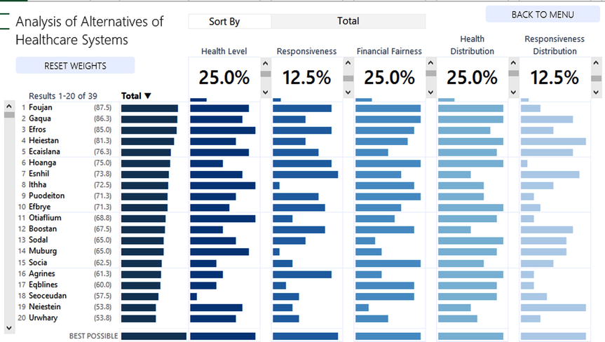
Figure 20-40. Adding a slight border every five rows makes everything feel slightly less scrunched together
Ultimately, the decision is up to you. There are many good ways (and innumerable terrible ways) you can help the user better interpret and contextualize visualized data. Here you’re trying to optimize understanding of metric performance and importance: performance in terms of individual scores and importance in terms of weight. You should create your spreadsheet in a way that helps everyone understand both.
The Last Word
In this chapter, you perfected the link between your intermediate table and the visual layer. This included making properly sized scroll bars and developing in-cell bar charts. You saw that many of the items used in this spreadsheet application were not all that new. Instead, they were natural extensions of components built previously in this book. Finally, you saw there’s a lot you can do with both code and formulas. Just as you attempt to achieve visual balance in your data displays, so too should you attempt to find the correct balance of formulas and VBA. Pursuing this balance is part of the journey.