
![]()
Building for Sensitivity Analysis
In the previous chapters, you created a wizard that could take in and store user input. In this chapter, you’re going to create a dashboard that allows you to perform sensitivity analysis based on the metrics described in the previous chapter. Figure 19-1 provides a preview of what’s to come.

Figure 19-1. Analysis of alternatives decision support system
The tool shown in Figure 19-1 allows you to do many things quickly and efficiently, much of it with only a small amount of VBA code. As you’ll see, many of the mechanics are driven by Excel’s built-in functions, like conditional formatting and formulas. The correct combination between formulas and code here is key. It’s what allows you to make instantaneous updates to the data without the need of a “recalculate” button.
But before you do anything, let’s return to the metrics described in the previous chapter. See Table 19-1.
Table 19-1. Metrics Used by the World Health Organization’s Study
|
Metric |
Description |
Weight |
|---|---|---|
|
Health Level |
Measures life expectancy for a given country. |
25.0% |
|
Responsiveness |
Measures factors such as speed to health service, access to doctors, et al. |
12.5% |
|
Financial Fairness |
Measures the fairness of who shoulders the burden of financial costs in a country. |
25% |
|
Health Distribution |
Measures the level of equitable distribution of healthcare in a country. |
25% |
|
Responsiveness Distribution |
Measures the level of equitable distribution of responsiveness defined above. |
12% |
|
100% |
Source: The World Health Report 2000 - Health Systems: Improving Performance (www.who.int/whr/2000/en/)
The weights described herein are in fact the same weights the World Health Organization used in its original study. However, as mentioned in the previous chapter, the data you have is notional and the countries are fakes (I mean, they don’t even sound like real county names!).
The metrics and weights form the basis of what’s called a weighted average model, which I’ll talk about in this section. It’s called a weighted average because the metrics are not all of equal weight (otherwise, they’d all be 20%). To see how the whole thing works, let’s take a look at the following two countries, Acoaslesh and Afon, shown in Table 19-2.
Table 19-2. The Results for Two Countries, Acoaslesh and Afon

As you will recall, each of these countries is scored out of 10. So, for Acoaslesh, 2 is a considerably low score given that 10 is the highest. On the other hand, a 10 for Responsiveness Distribution is the best possible score. To find the total health level (that is, the weighted average score) for Acoaslesh, you would compute as follows:
=  [(Health Level Score/10 * Health Level Weight) +
    (Responsiveness Score/10 * Responsiveness Weight) +
    (Financial Fairness Score/10 * Financial Fairness Weight) +
    (Health Distribution Score/10 * Health Distribution Weight) +
    (Responsiveness Distribution Score/10 * Responsiveness Distribution Weight) ] * 100
=  [(.20 * 12.5%) +
    (.20 * 25.0%) +
    (.10 * 25.0%) +
    (.80 * 25.0%) +
    (1.00 * 12.5%)  ] * 100
= .425 * 100 = 42.5.So for Acoaslesh, the overall health score is .425, where 1 is now the best score. That process of taking the scores and making them proportionate to the scale of 0 to 1 is called normalization.
Sometimes it’s easier to understand these final scores as being out of 100 instead. So let’s scale .425 to be 42.5 by multiplying the result by 100. Whether you choose .425 or 42.5, both answers are correct. It’s up to you how you want to present the numbers to your audience.
Likewise, you can perform the same calculations for Afon.
=  [(.40 * 12.5%) +
    (.20 * 25.0%) +
    (.40 * 25.0%) +
    (.20 * 25.0%) +
    (.30 * 12.5%)  ] * 100
= 28.8By scaling to 100, you make the perfect score any country could get 100 (again, if you don’t scale, the perfect score is 1). You can see this yourself by assuming perfect 10s across the board and doing the calculations. When you do this for each country, you’ll come up with a list like the one below. This allows you to say the countries ranking higher are better performers according to your model than the ones below (Figure 19-2).

Figure 19-2. A rank of country performance based on the weighted average model
![]() Note The statistician George E. P. Box once remarked, “All models are wrong, some are useful.” You should always remember models are simplifications (sometimes even gross over-simplifications) of reality. By their nature, they cannot capture everything. Indeed, this was a criticism of the World Health Organization regarding the these metrics; some argued that other factors were not correctly captured or weighted. Therefore, it’s important to be specific when discussing model results. Rather than assert the validity of the results as being unequivocal truth, remember they are the product of a series of assumptions.
Note The statistician George E. P. Box once remarked, “All models are wrong, some are useful.” You should always remember models are simplifications (sometimes even gross over-simplifications) of reality. By their nature, they cannot capture everything. Indeed, this was a criticism of the World Health Organization regarding the these metrics; some argued that other factors were not correctly captured or weighted. Therefore, it’s important to be specific when discussing model results. Rather than assert the validity of the results as being unequivocal truth, remember they are the product of a series of assumptions.
Sensitivity Analysis on a Weighted Average Model
In this section, I’ll talk about sensitivity analysis with respect to the weights for a given country. The weighted sum model above is used to evaluate many different countries. Broadly, you’re simply investigating a resultant list of countries whose scores follow directly from the importance of each metric (given by its weight) in your model. As such, you may want to investigate how changing the importance of inputs impacts overall scores. This is called sensitivity analysis.
One simple, if powerful, sensitivity analysis method is to vary only one weight at a time while maintaining the proportional importance of the other weights. This is called one-way sensitivity analysis and it works like this. Let’s say you want to see what happens if you increase Health Level by 4%. First, let’s divide the weight into two theoretical groups (Figure 19-3).

Figure 19-3. The weights split into two groups based upon which weights you want to change and which you want to maintain
The rule here is that each group must always sum to 100%. So, if you add 4% to Health Level, you have to subtract it from the other group (see Figure 19-4).

Figure 19-4. If you add 4% to one group, you must remove it from the other
Now that the overall sum of the “other group” has changed, the weights that make up that group are adjusted while maintaining the same proportion to the group’s sum as they did before. In this next stage, you find the new proportions for the group you want to maintain (Figure 19-5).

Figure 19-5. Finding the new proportions for the group you want to maintain
In the next step, you multiply each calculated proportion by the new group weight (Figure 19-6).
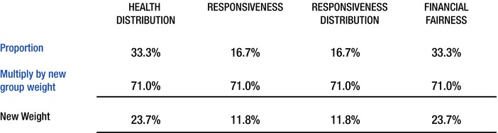
Figure 19-6. Multiply the new proportions by the new group weight
Finally, you reassign the new weights to their metrics (Figure 19-7). If you add all the weights together, they now once again sum to 100%.

Figure 19-7. New metrics weights
In this chapter, I’ll talk about how to build this mechanism into your spreadsheet. I’ve devised a method that I call Easy One-Way Sensitivity Analysis. You’ll be surprised how easy it is to implement into your application. Indeed, you can take advantage of Excel’s form controls to help you do much of the heavy lifting. That said, there are a few limitations with this method, and I’ll go over them in this chapter.
Creating a Linked Values Table
In this section, I’ll describe how to create the Easy One-Way Sensitivity Analysis mechanism and implement it in the spreadsheet application from the previous chapter. If you upload Chapter19Wizard.xlsm, we’re starting on the Helper tab.
In Figure 19-8, I’ve placed five scroll bar form controls onto the spreadsheet, one for each metric. I’ve then linked each scroll bar to a cell on the right of each metric under the column Linked Value. Just for clarification, the left-most scroll bar links to cell B5, and the right-most links to cell B9. As you can see in Figure 19-3, the middle scroll bar is linked to Financial Fairness, B7.

Figure 19-8. Setting the scrollbars to the their linked cells
For each scroll bar, I’ve set its minimum value to 1 and its maximum value to 100. Figure 19-9 shows an example.

Figure 19-9. Each scroll bar has a minimum of 1 and a maximum of 0. Right-click the scroll bar and select format control to see this property window
Recall from previous chapters how form control scroll bars work. The more you scroll down, the greater the number in the linked cell. While there’s nothing wrong with that per se, it’s counterintuitive for some users. For your purposes, you’d like the action of scrolling up to actually increase the resulting value and scrolling down to decrease. So you need to adjust the values on the spreadsheet to reflect this preference.
Insert another column next to Linked Values and call it Adjusted Values. In each cell next to the linked values, you’ll take the scroll bar’s value and subtract it from 100 (the max value of the scroll bar). Figure 19-10 shows this formula.

Figure 19-10. Now, as you scroll down, the Adjusted Value decreases. As you scroll up, the Adjusted Value increases
Next, you need to add to find the grand total of all the adjusted values. You can do that by adding a SUM cell at the bottom of the Adjusted Value column (see Figure 19-11).

Figure 19-11. Use the SUM function to the find the total of adjusted values
Now you want to come up with the proportion each metric’s adjusted value has to the overall total. To do that, you simply need to divide each adjusted value by the total adjusted value sum, as shown in Figure 19-12.

Figure 19-12. Find the final weight by dividing each adjusted value by the total adjusted value
And that’s it! If you play around with the scroll bars, you can change the weights as much as you want. The final weight will always equal 100%! Figure 19-13 shows an adjustment to the scroll bar assigned to Health Level.

Figure 19-13. No matter what values are assigned to the scroll bar, the final weights will always add up to 100%
Linking to the Database
You’re now interested in how you can link the one-way sensitivity analysis mechanism back into the database. The first thing you want to do is give each of these weights a name. Figure 19-14 shows them named following my usual conventions.

Figure 19-14. Each final weight is named in the Linked Values table
In the Database tab, I’ve added a few extra columns that reflect the operations you must do for each metric for each country in your list (see Figure 19-15). Across the top of the new columns, I’ve included a reference to the actual weight values for each metric. This isn’t technically necessary, as you’ll see. However, I think it provides a good reference into understanding the calculations. Anything you can do to make your work easier to understand when you come back to it is, in my opinion, always worthwhile.

Figure 19-15. The weights across the top correspond to the weights you developed on the Helper tab
![]() Tip You should develop with the future in mind. Ask yourself, will you understand what’s going on when you come back to your spreadsheet having not seen it in three months?
Tip You should develop with the future in mind. Ask yourself, will you understand what’s going on when you come back to your spreadsheet having not seen it in three months?
Note that each of the new columns corresponding to the metrics now has “(weighted)” added to the name. This is because these columns represent the individual scores divided by 10 and multiplied by their corresponding weight on the Helper tab. Figure 19-16 shows the formula used for Health Level (weighted).

Figure 19-16. Each weighted column takes the original scored value, divides it by ten, and then multiplies it by its respective weight from the Helper tab
Finally, the Total column is simply the sum of all weights (see Figure 19-17).

Figure 19-17. The Total column is simply the sum of all the weighted scores
You may not have realized it, but you’ve just built the infrastructure for one-way sensitivity analysis! If you go back to the descriptions of weighted average models and one-way sensitivity analysis from the beginning of this chapter, you’ll see that you’ve re-created the algebra step-by-step.
Building the Tool
In this section, I’ll talk about what the new tool does and how to build the functionality. I’ll be going piece by piece, so let’s get started.
Getting to the Backend, the Intermediate Table
As you know, I’m a huge fan of intermediate tables. We almost always need to transform (that is, do something to) the data before presenting it to the user. Obviously, where you place your intermediate tables is up to you. For many projects, I prefer placing them on a new tab. But sometimes when dealing with something that’s complicated, I like to place the table in the same worksheet tab as the decision support system or dashboard. That’s what I’ve done here.
If you look at the Analysis tab in your file, you’ll see that the rows beyond 31 are hidden. That’s because your intermediate table is somewhere in the hidden rows. So the first thing you’ll want to do is unhide all rows to get a peek at the intermediate table. The easiest way to do that, in my opinion, is to click the grey triangle at the upper left of your worksheet to select everything (of course, there’s always CTRL+A). Then from on the Home tab, go to Format ![]() Hide & Unhide
Hide & Unhide ![]() Unhide rows. Figure 19-18 shows these steps.
Unhide rows. Figure 19-18 shows these steps.

Figure 19-18. Steps to unhide rows
The intermediate table is shown in Figure 19-19.

Figure 19-19. The intermediate table
What each element of this table does may not be immediately clear. In the next few sections, I’ll go through the functionality of the dashboard. You will see where those functionalities tie in directly to the items on the intermediate table.
In this section, I’ll talk about how you achieve this scrolling capability. Recall the dynamic tables built in previous chapters. They all bring the same functionality: you scroll through large amounts of data by using the scroll bar and its ability to directly link to a cell on a spreadsheet. Hopefully, by now you’re very familiar with the scroll bar (maybe even be sick of it!). In this current example decision tool, you will again use this dynamic.
As Figure 19-20 shows, you’ve simply inserted a new scroll bar into the sheet and linked it to the cell adjacent to Scroll Bar Value. This cell contains the current value of the scroll bar.

Figure 19-20. The scroll bar for the table presented to the user is linked to a cell on your intermediate table
As is typically the case for a scrolling table, the first cell in the table is always equal to the scroll bar value. Each cell below it is then equal to one plus the cell above. Therefore, as the scroll bar changes, each cell below changes in tandem. Figure 19-21 shows this conceptually. Figure 19-22 shows the actual formulas.

Figure 19-21. The scrolling table dynamic shown conceptually

Figure 19-22. Cells A34:A50 from above with only their formulas showing
Notice that the index numbers from the visual presentation section of your tool are directly linked to the index numbers from below the sheet (see Figure 19-23).

Figure 19-23. The intermediate table links directly to the visual presentation section
Adjusting the Scroll Bar
In this section, I’ll talk about making adjustments to the scroll bar. By default, all form control scroll bars start with a minimum value of zero and go to 100. In your case, you’ll never use the zero, so you need to adjust the min to always be 1. Another issue is that you expect the size of the list to change. The current example database has about 30 data items in it. But you need to accommodate an ever-changing range of data. The only instances in which you expect the amount of entries to change is when you either add or delete a new item.
At the end of both the InsertNewRecord and DeleteSelectedRecord procedures I’ve added a call to SetScrollbarMax. Listing 19-1 shows the code for this procedure.
The code works like this: you have 20 entries you can display on the visual layer (that’s just the number I’ve picked, but it may be different in your own work). When the record count is greater than 20, you always want the scroll bar max to be 19 (one less than the total amount you’re showing) less than that total (the chapter on form controls talks about why this is). On the other hand, if the RecordCount is less than 20, you won’t need the scrollbar at all so you can just disable it. Finally, it’s always a good idea to reset the scroll position whenever there’s a change.
Formula-based Sorting Data for Analysis
In Figure 19-1, your decision support tool is sorting on total scores. (Recall that total refers to the values returned for each country from your weighted model calculations). In the previous chapter, you sent a command to your backend database table to sort each country by name. Considering the trouble you had in building the formula for the list box that was required to connect to the table, sending a command to sort the table made sense. It was an easy one-line operation.
However, in this case, you want to have the ability to sort on of any of the metrics, not just the total. But it wouldn’t make sense to use VBA to sort the table directly as you did with the country names. Every time you change the sort order of the table, you lose the alphabetical order required for the list box on the menu screen. You could develop the capability to automatically sort the list box every time a user activates the menu screen, but why bother? Because you’d then have to do the same for the analysis screen (re-sort by the last option selected by the user). Clearly you need a way to sort on the data references in the backend table without changing its inherent sort order.
![]() Tip It might help to think about the different sort types conceptually. The backend database is only sorted when you’ve added or deleted a record. As such, its inherent state is always that of an alphabetical sort order—and you only re-sort when changes to the underlying data are made to the table. On the other hand, here you’re doing work on top of the data from that database to answer questions and investigate. Therefore, because you’re not changing any underlying data, you want to leave the database sort order intact. In fact, it’s important you do as little to the underlying data as possible lest you accidentally corrupt it.
Tip It might help to think about the different sort types conceptually. The backend database is only sorted when you’ve added or deleted a record. As such, its inherent state is always that of an alphabetical sort order—and you only re-sort when changes to the underlying data are made to the table. On the other hand, here you’re doing work on top of the data from that database to answer questions and investigate. Therefore, because you’re not changing any underlying data, you want to leave the database sort order intact. In fact, it’s important you do as little to the underlying data as possible lest you accidentally corrupt it.
Let’s take a look at Figure 19-24. The Sort Column Id input cell tells you which column you’re sorting. The numbers to the right of the cell are the IDs. For instance, if you’re sorting by the total, the number in Sort Column Id is 6, consistent with what’s shown in Figure 19-24. If you want to sort on Health Level, Sort Column Id would be 1. The dynamic is fairly intuitive.

Figure 19-24. The Sort Column Id input cell and ids corresponding to each metric
You automatically find the Sort Column Id you’re interested in by using the Sort By dropdown box from the visual portion of the tool. Figure 19-25 shows the dropdown from the Analysis of Alternatives table.

Figure 19-25. The Sort By dropdown box
The user response from the Sort By dropdown is used to lookup the correct Column Id, as shown in Figure 19-26.
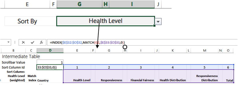
Figure 19-26. Health Level from the dropdown is matched to the column names below
You use the INDEX/MATCH dynamic to help you ultimately find the ID you’re interested in. Health Level is matched to its location in the range E33:O33. Because it’s in the first cell, Excel returns a 1. You then supply the index that matches its location (in this case, a 1) to the range above and pull out the number given by that matched location. It’s like an HLOOKUP, but in reverse.
So let’s now jump back to your database. You have this new column that’s been added called the Analysis Sort Column.
The Sort Column, Your New Best Friend
In this section, I’ll talk about using a sort column to help you sort data from multiple columns. Sort columns are necessary for whenever you want the ability to sort different fields or metrics through the use of a single mechanism. So let’s take a look at the formula from the first cell in the Analysis Sort Column in Figure 19-27.

Figure 19-27. The first cell in the Analysis Sort Column in the database
The table expressions inside the INDEX may look confusing at first, so let’s only deal with the left-hand side of it for now. The referent Database[@[Health Level (weighted)]:[Total]] is simply a row reference. Figure 19-28 shows the row reference for the first cell. I talked about the Sort Column Id in the previous section, but here you get to see it work its magic.

Figure 19-28. A selected row from within the database
Based on the formula above, when Analysis.SortColumnId = 1, then the values from within Health Level (weighted) are returned and placed into the Analysis Sort Column. When Analysis.SortColumnId = 2, the values from within Responsiveness (weighted) are returned into the Analysis Sort Column. And so forth up to Total, which is Analysis.SortColumnId = 6. If you take a look at Figure 19-21, you’ll see your Column IDs line up perfectly.
For the sake of this example, let’s assume Total has been selected from the dropdown on the visual layer of the Analysis tab. This would mean Analysis.ScoreColumnId = 6. So then you should expect the Analysis Sort Column to have the same values as those of Total. But if you look at Figure 19-29, you’ll see the values in the Analysis Sort Column are really similar but not exactly alike.

Figure 19-29. Analysis Sort Column is set to sort on Total values, but notice that they are slightly different than the values in the Total column
I’ll go into why they’re slightly off in a moment—and why you need them to be slightly off. (Hint, hint: it has to do with the second half of the formula shown in Figure 19-27). But for now, you’re going to execute a method called formula-based sorting. With formula-based sorting, you usually use either the LARGE or SMALL functions. Both of these functions work similarly. The prototypes for the LARGE and SMALL functions are
LARGE(array, k) and SMALL(array, k)
In either function, you supply a series of numbers in the first argument. The second argument instructs Excel to return the largest or smallest number in the list. For instance, LARGE(A1:A10, 2) returns the second largest number in the list of numbers stored in cells A1:A10; SMALL(C1:C10, 4) returns the fifth smallest number in the list of numbers stored in cells C1:C10. If you want to use these formulas to return a sorted a list of numbers from greatest to least, you use LARGE and make the K=1 in the first cell; then use LARGE again and make K=2 for the next cell. For each cell, you increment K until it equals the total size of the list.
Let’s jump back to the intermediate table. You’re now interested in the column with the heading starting with Sort Column:. Figure 19-30 shows the formula for the heading. Note that it’s similar to the formula shown in Figure 19-27. However, in that formula, you were interested each row of data. Here, you’re instead only in the headers. This formula will always bring up the header of the current row you’re interested in. You won’t really use the column header for anything in the visualization layer, but when you have dynamic elements, it always helps to keep track of what you’re looking at!

Figure 19-30. The Sort Column always reflects the current header from within the database of the current column you’re interested in sorting on
Now you use the index list on the left of the Sort Column to return the greatest numbers in the list. Figure 19-31 shows the first cell in the Sort Column. As you can probably guess, when used supply the 1 to the LARGE function, you’re returning back the first largest number in the entire column range Database[Analysis Sort Column]. In the second row, you’re pulling back the second largest item; in the third row, you’re pulling back the third largest item; and so forth. Figure 19-32 shows the formulas for the list.

Figure 19-31. You use LARGE to create a sorted list from the data stored in the Analysis Sort Column from the database

Figure 19-32. The formulas return a sorted list
The Match Index Column, the Sort Column’s Buddy
You now have a sorted list of data. But the obvious question is to which country do these data points belong? Having a list of sorted data tells you little if anything by itself. So now you’ll need to build a Match Index (again, this follows the simple example from Chapter 17). The Match Index simply tells you the index location of where your sorted data points are located back in your database.
Figure 19-33 shows the formula you use in the Match Index column. You simply match the adjacent value back into the Analysis Sort Column. It’s important to remember the Analysis Sort Column isn’t sorted. Therefore, the largest values are likely to be all over the place. As you see from Figure 19-33, the second largest value is in the 15th row, the third in the 9th row, etc.

Figure 19-33. The Match Index shows the index location each sorted value can be found back in its original column
And once you know the row location of where the total value has been matched, you can use that information to look up the country name. Figure 19-34 shows the formula you use to look up the country name.

Figure 19-34. You simply use the Match Index to find the row location of the data you’re interested in
And you can do the same with Health Level (Figure 19-35), Responsiveness, Financial Fairness, Health Distribution, Responsiveness Distribution, and the Total. Everything displayed on the intermediate table uses the Match Index column.

Figure 19-35. Using the Match Index to find the current Health Level
You Have a “Unique” Problem
Using MATCH to look through the Analysis Sort Column works terrifically, assuming you have no duplicate values. Remember, MATCH will always return the index of only the first instance of the matched item in a list. (MATCH does not really care if there are other items in the list once it’s found the value it’s searching for.)
In Figure 19-36, notice that some total values do indeed repeat. In your ranking, they essentially form a tie. However, unless you do something, MATCH will always find that first 41.3 and return that row location. So you need some way to differentiate the first instance of 41.3 from all the instances that follow. And you do that by creating some noise in the data.

Figure 19-36. Pocor and Sauolia have the same score
Remember the second half of the formula in Figure 19-37? Let’s see it action (Figure 19-37).

Figure 19-37. Focus on the second half of the Analysis Sort Column formula
The second half of that formula, [@[County Id]]/10000, simply adds an incredibly small amount to data returned by the INDEX function in the left-hand side of the formula. In Figure 19-37, you’re adding the amount 30/10000. Since Country Id is always unique, you can be assured that even when you have totals that aren’t unique, once you add this small amount the results will always be unique.
And remember, you only use the Analysis Sort Column from the database to help you find the locations of certain rows. That is, it helps you find the Match Index. From there, you use the Match Index to find the location of the information you’re interested in. The noisy data never makes its way onto your visual layer.
Seeing It Work Altogether
The scrolling and sorting mechanisms are now complete. In fact, you can see them working together. If you adjust the scroll bar from in the visual layer, you’ll see the intermediate table change. Figure 19-38 shows the scrollbar at value 19.

Figure 19-38. Notice that the index now starts with 19
Notice your table now shows the country ranked in the 19th place in terms of its overall total score. Figure 19-39 shows what happens when you change the Sort By to Responsiveness.

Figure 19-39. Responsivness is now the sort factor
Notice that the Sort Column Id now shows the number 2, reflecting the column you’re interested in sorting on. And the Sort Column shows that you are sorting on Responsiveness (weighted). Your intermediate table now has a different sort order than you had previously when you were sorting on the Total; however, you’ve made no changes to the underlying data.
The Last Word
In this chapter, I talked about the type of analysis you will be performing on your data. You created the infrastructure to easily apply one-way sensitivity analysis. Further, you used formulas to create a robust sorting mechanism that can sort more than one type of metric. Finally, you used the form control scroll bar so you don’t have to show all the data all at once. This work builds on what’s been completed in previous chapters.
In the next chapter, you’ll build the visual layer in full.