![]()
The Elements of Good Excel Dashboards and Decision Support Systems
In this chapter, I’ll discuss what makes for a good dashboard and what I even mean by the term. As you go through the chapter, you should pay particular attention to the many examples presented by Microsoft and others. I will critique this work and explain why you might choose something different. At times, it might feel I’m challenging common wisdom. But I’ll do that for good purpose: many misconceptions of creating applications in Excel have led to poor design.
Before moving forward, let’s talk about the dashboards commonly found in the business community. You should use these categories to help you shape what you would like to build. But don’t feel as if you should have to hold fast to them. What you choose to build often depends on your functional needs. The categories themselves help aid you in understanding how your work ought to be used. And, according to the experts, there are three main types of dashboards commonly used in business.
- Strategic
- Operational
- Analytical
Strategic
In this section, I’ll discuss tactical or strategic dashboards. These dashboards provide information to managers and decision makers about the underlying health of the business or organization. Because these dashboards are strategic in nature, they do not typically contain complicated metrics or key performance indicators. Instead, they offer simple information at a high level and at an aggregate level. Often the information provides insight into a problem that would require further analysis.
Operational
Operational dashboards provide insight into specific company operations. They are often more complex than strategic dashboards. The information presented often requires a timely response, so they are more likely to highlight problems and alert their core audience to take action. Operational dashboards often contain drill-down capabilities that allow users to gain insight both from a high level and from a lower level. This allows users to understand how factors at the lowest levels affect metrics at the higher levels.
Analytical
Analytical dashboards are often more dense than the former two presented. They allow for comparison of multiple factors and trends. They offer the greatest amount of detail compared to the former two. Where tactical dashboards are often concerned with a reporting period (for instance, they are updated each month) and operational dashboards monitor processes often in real time, analytical dashboards allow for multiple comparison across varying dimensions.
These descriptions should help you think about what you want to get out of your dashboards. Many, like Stephen Few, would argue that little interactivity should exist on dashboards, except to the extent the interactivity enhances understanding. I don’t disagree with this idea at all, but I do wonder if Stephen Few might disagree with some of the additions that follow. Indeed, I used to be a hardliner on this, but as time goes on, I find that dashboards in Excel go great with Excel’s interactivity, which is why I would like to bring up a fourth type of dashboard-type product that is common in Excel but doesn’t technically qualify as a dashboard—the decision support system.
Decision Support Systems
At their core, interactive reports provide for decision support. They are sometimes referred to as spreadsheet decision support systems when built in Excel. In this book, I refer to them as either interactive reports or decision support systems. For these spreadsheets reporting is often dynamic, changing to reflect user input and interactivity. I do believe that there is significant overlap between decision support systems and dashboards.
In any event, decision support systems differ from dashboards in that they go beyond monitoring and help support organizational-level decision making. They generally employ different elements than dashboards (more on this from a data perspective in Chapter 11); for instance, they use charts for data sensemaking, and both require proper execution of design to deliver. As well, they may be model driven. That means they are presenting information in the abstract.
In their purest form, dashboards help you monitor a process. But if you extend the idea behind analytical dashboards, you can easily incorporate what-if analysis. Excel allows you to do this easily. Figure 8-1 shows a hybrid that allows for both monitoring and investigation. The two charts on the left help you to monitor what’s going on, while the selection capability on the right allows the user to drill down to understand what’s going on behind the scenes.

Figure 8-1. A dashboard that also allows you to perform decision analysis
In the report in Figure 8-1, the user is able to change certain properties of each project to see how these changes affect the needs in the aggregate. Often these interactive capabilities are coupled with extra areas for user input. The buttons in the Edit Selection and drop-down boxes are types of input blocks. For the most part, your work will provide some level of monitoring or some level of decision support—or both. You’ll take some liberties here and refer to this work as a dashboard, Excel application, or decision support system. Luckily in terms of developing for Excel, the differences between the two aren’t all that important. What’s important are the underlying principles. Let’s go through them.
The backbone of a good dashboard in Excel is good layout and back-end design. In this section, I’ll go through the tenets of good layout, which I’ve coined simplified layout.
Both dashboards and interactive reports ought to employ what I like to call a simplified layout, by which I mean that they both make efficient and optimal use of the screen. However, most work you might run into today do not follow a simplified layout. For instance, it’s not uncommon for developers to break up the pieces of their analysis across many different worksheet tabs. But simplified layout would dictate you should always show relevant data together and not make the process of ascertaining the story from the data more complex by needlessly separating it. Simplified layouts make use of the principles of visualization outlined in Chapters 3 and 4: space is devoted to content, and meaningful data isn’t separated.
To wit, Microsoft’s built-in features do not always encourage simplified layout. In the example dashboard in Figure 8-2, otherwise available screen space is devoted to slicers. (You can download this file, Chapter8ContosoDashboard.xlsx, from the chapter files folder.) This example shows a complex layout.

Figure 8-2. A dashboard created with Power Pivot that is big on controls and low on information
This result is an overly complicated screen that makes it hard to connect what’s in view and what has been filtered. While the slicers do allow for drill-down capability, with the available screen space, you might have been better off creating several smaller charts that you already know you’re interested in. Moreover, you could redesign this report to present alerts to show you which areas require attention. You could click those alerts to find out more about them, as needed. As it stands, this spreadsheet allows you to slice and dice the data but at the expense of conveying good information.
Figure 8-3 shows an example of an application with a common design theme. It sections off certain areas to help organize the information you’d like to present. However, a good portion of this information lies beyond the viewpoint of the screen. The effect is to globally disconnect the information being presented.

Figure 8-3. An example decision support system
Both of these examples demonstrate a common problem in Excel development and information presentation. Often developers build more interactivity or provide more information than the project requires. You should make it a goal in your work to never present information in such a way that it requires the user to scroll all over the spreadsheet to see the information. Furthermore, you should not segment results and reports into different tabs. In other words, everything you want to present should be clearly visible in one view. Therefore, the tenets of simplified layout are as follows:
- Present all information in one view, without scrolling.
- Use only one tab to present information.
Perhaps you now see the challenges that lay ahead. If you want to increase your information density—that is, the amount of information presented onscreen—you can’t fill it with copious controls or separate it across spreadsheets and tabs.
Information-Transformation-Presentation
Good dashboards and decision support systems use a concept I call information-transformation-presentation (ITP). (Hey! That rhymes!) This is a common design type similar to n-tier design in the field of business intelligence. As part of ITP, you separate the back-end data from the calculations you do to it (transformation) and its presentation (that’s where you show the information). Figure 8-4 shows this idea conceptually.

Figure 8-4. A conceptual description of information-transformation-presentation
The basic idea behind ITP is to separate the various elements of your work. In the information section, you store the back-end data that is usually in its raw form. As new information is added to the dashboard, this is where the information is stored. You never change this data on the spreadsheet. However, you will perform calculations on this information to transform it into something you want to present. The transformation section is where these calculations take place. Finally, once you are happy with your transformations, this information is presented in the visual layer, which is the presentation section. Figure 8-5 shows this process in detail using graphics from a spreadsheet application you’ll create in Chapters 17 to 20.

Figure 8-5. The healthcare analysis decision support system you’ll create later in the book uses ITP
The most important feature of this design pattern is that the information is always connected. For instance, the layout shown in Figure 8-5 is entirely connected by way of formulas. When data on the back end is changed, it automatically changes this information on the presentation layer. In other words, changes are ramified through the entire construction. This is what helps you keep the data consistent across each layer. This terrific dynamic doesn’t work if the data is disconnected.
Here’s what I mean by disconnected: It is common practice in many Excel applications to create a report on the fly based on the back end. This information is often disconnected from the underlying data. Often this report is initiated by a RUN button similar to the one shown in Figure 8-6.

Figure 8-6. The RUN button—a common dashboard mistake
This dynamic violates ITP because the information doesn’t flow from the information layer on its own to the presentation layer. In Figure 8-6, each layer is part of the spreadsheet. However, you should try as best as possible to avoid using code that does the transformation work when it can be done on the spreadsheet. Doing this work in VBA prevents you from being able to understand the calculations throughout the entire process. As updates are made to the back-end data, the resultant information isn’t automatically updated on the chart. The different layers are easily disconnected at each turn.
In fact, it’s this underlying connectivity that proves the robustness of ITP. As the introduction to this book lays out, spreadsheet errors are ubiquitous and unavoidable. If you accept that you live in a world where errors are unavoidable, then you should construct your work in a way that will help errors rise to the surface immediately. In the RUN button dynamic, it’s much harder to understand where errors take place. (Is it an error in the code? Is it in error in how the code interacts with the spreadsheet? Is the data incorrect because the user forgot to hit the RUN button before preceding?)
In some instances (and I have seen more than enough instances of this during my years), the RUN button setup might not even let users know that errors exist. This is because complex calculations have been incorporated into complex VBA code. For many developers, going back through the code is a tedious task that they would prefer and more often than not avoid. In going through their work, it becomes enough for the developer that the model can generate output as expected. The test for error-free work shifts from evaluating whether the results make sense to ensuring the VBA code can run without generating annoying runtime errors. Indeed, this overuse of code has conditioned us to believe that model errors can take the form only of runtime errors, and we often forget the calculations themselves might be incorrect.
And incorrect calculations must break the model. By keeping everything connected through ITP, you can immediately evaluate whether your model is presenting data correctly. Because as you change data on the front end, the changes are quickly ramified through to the resulting presentation. Therefore, you don’t have to go through the calculations looking for the potential of miscalculation because you can judge miscalculation in real time. Simply consider the common process of looking up the location of an item with VBA. You could write code to iterate through a list, but the code might never make the match, and yet it appears to work as expected because you forgot to compensate for a situation when no match was found.
You could use the Application.Match() function in your code. But if no match is found, a Type Mismatch error will result. The problem is Type Mismatch is also the same error that would result if a match was found but the variable it assigns the result to is of the incorrect type. It’s the same error that results if you place the wrong arguments into the Match function. In other words, you’re going to have to dig a little bit to figure out exactly what caused the runtime error.
In ITP, however, you don’t have these issues. If you use a MATCH worksheet function—and no match is found—an #NA error will result. Everything that relies on that data field will result in an #NA. If a chart relies on the data point, no data will be shown. You immediately see there is an issue. And ITP helps you understand where the error takes place.
That’s because errors are propagated up through to the presentation layer. So, when you encounter an error on the presentation layer, your first step is to check whether the error exists on the transformation layer. If the transformation layer calculates correctly, then you can reasonably conclude the error is originating in the presentation layer. Similarly, if the error appears on the transformation layer, it might indicate an underlying problem with your information. You can check the information section and determine from there whether it’s where the error originates.
For brevity, let’s summarize the benefits of ITP.
- Separation of concerns: By separating each area, you better organize your work.
- Auditing transparency: You can better audit your models by following a consistent logical pattern of development.
- Error propagation: Because of this design, you can easily start from the presentation and work backward to find errors.
- Integrity of back-end data: The back-end data stays “raw” with minimal changes to it.
Common Dashboard Problems
As you did in the previous chapter, you’ll place some focus on common problems in Excel dashboards. You can summarize them as follows:
- Using too much formatting and embellishments
- Employing far too many tabs than is necessary
- Bad layout
- Needless protection
- Unnecessary instructions and documentation
Let’s go through each item.
Too Much Formatting and Embellishment
In this section, I’ll talk about formatting and embellishment. I don’t really need to hammer this point too much anymore, but it’s worth demonstrating the differences here. Figure 8-7 shows a dashboard with lots of color, clip art, name attribution, and three-dimensional charts.

Figure 8-7. A dashboard crowded by nonsense
Again, if you are to achieve your goal, you must be more judicious with what you present. There is no reason for the clip art; it certainly doesn’t make the work more interesting to read. Worse, it’s distracting. Figure 8-8 presents a much needed revision.

Figure 8-8. A cleaner, more elegant presentation of information
To make things look spiffy, it’s also not a bad idea to remove the gridlines wherever you present information. You can hide gridlines by deselecting the Gridlines option in the Show group on the View ribbon tab (see Figure 8-9).

Figure 8-9. You can remove gridlines by deselecting Gridlines on the View tab
Too Many Tabs
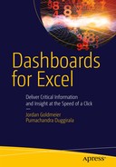
Another common development structure I’ve seen concerns separating information across different tabs. Each tab then usually has one chart on it. Figure 8-10 shows the welcome screen of such a dashboard. The user would click a link on this spreadsheet and be taken to one of corresponding charts. In Figure 8-10, if the user were to click “Go to” next to Quarter 1 Sales, the user would arrive at the Quarter 1 tab, as shown in Figure 8-11.
Figure 8-10. A welcome screen that separates information

Figure 8-11. Results for Quarter 1 sales
However, there’s no reason to show only one chart per page. Following the tenets of simplified layout, all information should be shown together if possible.
Another common reason for tabs filling up a dashboard or decision support system is that the tabs represent historical versions. For instance, Figure 8-12 shows several tabs with the names of months. Each month has a new report created for it.
![]()
Figure 8-12. A series of tabs reflecting reports created for each month
The only reason someone might use this setup is if they aren’t following the information-transformation-presentation construct. If they are using a RUN button, they have to generate a new report. And the only way to keep the report is by archiving it as a copy of a new tab. However, if you employ ITP, then everything is connected.
Figure 8-13 shows a simplified version of ITP compensating for new reports. As a user changes the month of interest, that information is used by the transformation layer to look up the month of interest. Then, the presentation layer uses these results to update the chart. It all happens instantaneously. And previous information is archived (and retrievable) by virtue of its storage in the information section.

Figure 8-13. A simplified presentation of ITP
Bad Layout
In this subsection, I’ll discuss how layout affects the usefulness of a dashboard. Some examples of bad layout were presented in Figures 8-2 and 8-3, in the “Simplified Layout” section.
In particular, Figure 8-2 places the most important information in the center of the screen. However, research performed by data visualization gurus like Stephen Few and others have argued the most important information should be placed highest up and leftmost. This is the true focal point of where your eyes expect to see information. Figure 8-14 presents a shaded guide to help understand how to distribute information across the screen. The darkest shade is where you should expect the most important pieces of information. The lighter shades—at the bottom and to the far right—are where controls and filters should go.

Figure 8-14. A heatmap showing where your eyes should expect to find the most important information
Compare this layout to that of the example dashboard in Figure 8-2 and the results page in Figure 8-3. In the former, the data is shown in the center of the screen, leaving the other real estate for less important things, like slicers. In Figure 8-3, the important charts are relegated to the lower portions of the spreadsheet. Figure 8-15, on the other hand, immediately presents a chart that helps the user quickly identify which dates are problematic (you’ll be investigating this dashboard in Chapters 13 to 15). And it presents this information without requiring the user to scroll.

Figure 8-15. An example dashboard that presents the most important information immediately
As I’ve stated already, you should not expect the user to have to scroll off the screen to find the most important information. Where information might spill off the screen, I’ve found it common practice to zoom out the spreadsheet beyond Excel’s standard 100 percent. For instance, a spreadsheet at 90 percent might provide more screen real estate.
To the extent possible, I would strongly urge you not to change Excel’s regular zoom settings. How your work appears on other monitors is a function of DPI, font size, and those zoom settings. In the past, spreadsheets appearing differently on different screens and environments was a much more significant problem than today. However, many desktop users have standard monitor sizes. As of this writing, you should expect most of your work to be on a wide-screen monitor with a resolution of 1900×600—or similar. Most screens today are of similar resolutions and aspect ratios. If you will be working on a screen that deviates from the usual standard, you should plan for that ahead of time if possible.
ACCOMMODATING DIFFERENT SCREENS
Sometimes you can’t get around the fact that everyone at the office has different screen settings. In these instances, you should still aim to keep your zoom level to 100 percent if you can. However, you might find you must zoom out or in slightly on different monitors.
I have a solution that works about 80 percent of the time, assuming the variation across these different machines isn’t significant (and giving common standards for monitors, it shouldn’t be).
Figure 8-16 shows a hypothetical example of a dashboard where the content fills most of the area in view. Above the box representing the content, I’ve selected the region A1:U1.

Figure 8-16. A hypothetical dashboard with content that fills the viewing area
In Figure 8-17, I’ve named the region A1:U1 Dashboard.ContentWidth.

Figure 8-17. The selected region has been named Dashboard.ContentWidth
Now, you can use this information in the Workbook_Open event to automatically size the spreadsheet to fit everything within the width specified by Dashboard.ContentWidth.
Check out Listing 8-1. When the worksheet is opened, Excel is told to zoom to fit the region given by Dashboard.ContentWidth. So, regardless of the monitor or resolutions used, Excel will always zoom to fit the width specified by the region. If there are only slight differences in resolution between monitors, this solution does a pretty good job.
Be forewarned, however, there is a small quirk with this code. If Excel is improperly shut down in a previous use, the Document Recovery pane will appear when you next open an Excel file. This will shrink the viewing area available to see the spreadsheet. Because of this, this zoom feature doesn’t always work (Figure 8-18). Luckily, there are two easy workarounds: (1) instruct users to deal with the recovered documents and then exit the file and return once again or (2) include a button on the spreadsheet that says “zoom to fit” and that calls the same Worksheet_Open event.

Figure 8-18. An example of the Document Recovery pane preventing this functionality to work as intended
Lastly, I want to point out a design consideration not mentioned earlier. In Figures 8-16 and 8-18, the rightmost portion of the content region ends partway through column T. However, I set the content width to include column U. I did this because I want there to be a small buffer between the end of the content region and the end of what you can see on the spreadsheet. In fact, I’ve tried to size column U accordingly to fit the distance between Column T and the scroll bars. This assures there is always a buffer between the content and the end of the viewing area when using this technique.
In general, I use the additional space created when the ribbon is hidden. Figure 8-18 in the preceding sidebar provides an example of the ribbon being hidden with extra space provided. I generally hide the ribbon manually and instruct users in my included instructions to do the same. Code exists to automatically hide the ribbon when the worksheet is opened, but I’m not a fan of it. Such code often creates problems when other spreadsheets are open at the same because it affects all instances of the same Excel window.
In addition, I would avoid all commands that completely remove functionality from Excel. For instance, it’s somewhat common for developers to hide everything in the Excel windows, including worksheet tabs, the ribbon, the formula bar, and the headings. With respect to the formula bar and headings, you can hide these items as they appear on the worksheet using the View tab (refer to Figure 8-9). But you should avoid hiding these items automatically via code when the workbook is opened. Again, if the workbook is opened after another workbook has already been opened, this code will remove the formula bar across all spreadsheets sharing the same instance of Excel. It’s an easy way to have your client call you up asking why they no longer see their formula bar.
Needless Protection
This section deals with protecting the spreadsheet through Microsoft Excel’s built-in mechanism. What I’ve found is that people are perhaps a bit too overzealous in their desire to protect everything.
Indeed, what I’m about to say is sacrilegious, but you shouldn’t develop with the assumption that your client is a complete idiot who will undoubtedly break everything in your spreadsheet. Using worksheet protection, hiding worksheet tabs, removing menus—these almost always cause other issues. For instance, if a dashboard instructs Excel to remove the ribbon tab menu and worksheet tabs, this change will happen across other open instances of Excel. The same clients who insisted that such protection was needed will scratch their heads when the ribbon menu tab has unexpectedly disappeared from their other opened Excel instance. And worksheet protection often causes other unforeseen issues. For instance, protecting certain areas of the spreadsheet might require you to unprotect it momentarily in the code to make changes (remember, protection can cut both ways). Turning protection on and off constantly to debug and figuring out which of Excel’s protection features cover which spreadsheet elements is an incredible hassle. I don’t believe it’s worth it, and I think it causes many more problems than it truly solves.
The fact is you will never prevent the user from every error imaginable. Indeed, it’s not even worth your time attempting to prevent such hypothetical scenarios. Every time you lock something up from the client, you make it that much harder for you to fix any underlying issues. If you work with the mutual trust of your client in mind, you won’t need to invest so much time in preventative maintenance.
I’m not saying you should completely avoid any level of protection in your work. I am saying, however, that common methods, such as hiding the worksheet tabs, will make a larger headache for you while providing almost no value to your stakeholders. You can get by with the following methods, which I would call “good enough protection.”
Hiding Unused Rows and Columns
You can prevent users from scrolling off into the great unknown by hiding the unused portion of your spreadsheet. In Figure 8-19, I’ve selected all the columns to the right of the unused portion of my work. You can easily do this in your work by selecting the first unused column after your content area. Then, with that column selected, use the keyboard combination Ctrl+Shift+Right Arrow.

Figure 8-19. All columns to the right of my content region have been selected
Then, on the Home tab, select Format ![]() Hide & Unhide
Hide & Unhide ![]() Hide Columns (Figure 8-20).
Hide Columns (Figure 8-20).
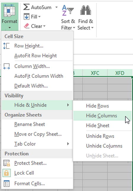
Figure 8-20. You can hide selected columns by selecting these options
You can do the same by selecting the unused row portions (select the first row and press Ctrl+Shift+Down Arrow) and selecting Hide Rows from the menu shown in Figure 8-20. This will create a compact spreadsheet similar to the one shown in Figure 8-21.

Figure 8-21. The unwanted regions are now removed from view.
Controlling the Scroll Area
Another alternative is to control the worksheet property called the scroll area
. In Figure 8-22, I’ve set the scroll area to C3:F9 (Excel automatically adds the $) in the Properties windows for the worksheet (Developer ![]() Controls Groups
Controls Groups ![]() Properties). If you try this on your own spreadsheet, you’ll see that the worksheet scroll bar no longer works. It won’t let you scroll beyond the scroll area! Additionally, you won’t be able to select any cell outside the region given by the scroll area! This is a great way to prevent users from selecting cells they shouldn’t—and keeping them from scrolling beyond the designated viewing area.
Properties). If you try this on your own spreadsheet, you’ll see that the worksheet scroll bar no longer works. It won’t let you scroll beyond the scroll area! Additionally, you won’t be able to select any cell outside the region given by the scroll area! This is a great way to prevent users from selecting cells they shouldn’t—and keeping them from scrolling beyond the designated viewing area.

Figure 8-22. Once the scroll area is set to the region C3:F9, the user will not be able to click outside that region
Alas, changing the scroll area from the Properties window isn’t permanent. Your settings won’t be saved the next time you open the spreadsheet. However, you can get around this with a little code. Take a look at Listing 8-2.
Ultimately, neither of these methods can fully protect your worksheet. But full protection is a pipe dream that cannot be achieved. Instead, both of these methods provide good enough protection for most users. Indeed, they present the added advantage of being easily set and reversed. So when you need to make changes to update your work, you can access these protected areas quickly.
Instructions and Documentation
You should not place full instructions on how to use the dashboard inside the Excel file. If you build work that is intuitive, complete instructions are not required. You should include enough instructions to let the users know where to input information. But a complete reference manual does not belong in the spreadsheet at all.
Save such work for Microsoft Word. Excel is not a word processor. Attempts at including full instructions on spreadsheets often require cramming an incredible amount of information into Excel text boxes. But this is now how text boxes were meant to be used. More often than not, instructions do not fit fully in these text boxes and information is cut off. In addition, many of these instructions are filled with screen grabs of the tool and associated shapes to show users where to click. All of these extra shapes, images, and text boxes add up. They can increase the file size of your work by several megabytes. I’m not against large Excel files per se—but you should devote additional storage to presenting information, not storing instructions.
Furthermore, Microsoft Word is just a better tool for this. With Word, you can create a table of contents. You can organize your screenshots and labels figures. There’s a reason I used Word to write this book and not Excel! There’s absolutely zero reason to believe or academic research to support including copious instructions within your tool has any effect on how people use it.
I don’t want to make any accountants or auditors reading this book too anxious with what I’m about to say. From within these worlds, I’ve seen directives that suggest every spreadsheet—including dashboards—should have a living record of every update, when the updates were made, and who the intended audience of the work is for. The Spreadsheet Standards Review Board (www.ssrb.org/), for instance, recommends a number of items to include within the spreadsheet itself. I’ve read documents from financial consulting agencies that argue the spreadsheet should include a living record of who used the work last, what changes were made, and so on. While I believe these requirements are well intentioned, my experience suggests they don’t help. Indeed, they take attention away from the true goal of the dashboard or decision support system. They become a burden over time as users become tired of filling in the required information.
I will be the first to argue that you should do things according to convention. But I don’t think every sheet in your workbook requires a section with stated assumptions and purpose. If you design intuitively, these items aren’t needed. I realize these standards have been developed to combat spreadsheet errors that have historically caused problems for many in the financial industry. But little research has justified their existence on the spreadsheet itself. If you feel compelled to record this information—or if company policy dictates that it be recorded—then open a separate Word document or Excel spreadsheet and record updates there.
The Last Word
In this chapter, I described what I mean by an Excel dashboard and decision support systems. While the goal of these tools differs, from a development perspective in Excel, the underlying concepts are the same. In particular, I discussed simplified layout and the ultimate goal to display on the relevant information in one view. Finally, I challenged common dashboard requirements and discussed why many don’t use Excel correctly.
You may disagree with some of the advice presented in this chapter. Or, you may agree but might be constrained in your ability to follow through because of organizational policy. In either case, this should have you thinking about why you do what you do. I don’t believe it’s enough to follow certain guidelines that have not proven themselves useful. You should look to your own work to consider how certain layout choices, design, or processes you’ve taken for granted might actually go against your ultimate goal.
You goal is to make the most of Excel by dedicating as much real estate, storage, and processing to delivering critical data to the user.