![]()
The Excel Data Presentation Library
As you can imagine, there are many ways to present your data to the world. However, some ways are better than others. Excel gives you the flexibility and choice of how to present your data, but not every default chart or recommendation by Excel is worth heeding. In this chapter, you’ll move through the list of data presentation and chart types that I particularly like…and the ones that I don’t like. This list is by no means comprehensive, but you should get an idea of what kind of data visualization technologies are worth presenting in your work.
The most basic of these types of representations is the table. We’re all pretty familiar with tables, I’m sure—like the one shown in Figure 4-1.

Figure 4-1. A typical Excel table
There is a tendency today to create zebra lines on a table. The visualization guru Edward Tufte does not like zebra lines. In the message board for his web site, he has summed them up.
Strips are merely bureaucratic or designer chartjunk; good typography can always organize a table, no stripes needed.
Edward Tufte
I bring this up because there is some disagreement on this, especially among designers. In my own work, I don’t often employ zebra lines. But I haven’t found them distracting, either—especially when paired with a light color. You should stay away from harsh, contrasting colors both for the table rows and for the table’s header. The chart shown in Figure 4-2 uses zebra lines to the extreme.
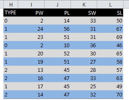
Figure 4-2. Extreme and unnecessary zebra lines
Tables are an important part of data representation. Often, they are overlooked by designers who try to create a chart out of information that would better be placed in a table.
However, sometimes tables aren’t good enough. For example, if you wanted to understand how sales have changed over time, a table might give you specific points, but it won’t give you the entire story. This is where data visualization comes in. In this section, I’ll discuss data visualization in the context of line and bar charts.
Let’s begin with the table shown in Figure 4-3.

Figure 4-3. A table showing widget revenues
If you wanted to understand the direction of the data, the numbers presented by themselves won’t do a lot for you. Perhaps you could try to see the direction in your head, but this isn’t an easy feat. By plotting these numbers on a chart, a much clearer picture is illuminated. Figure 4-4 shows how charts present a much broader picture.

Figure 4-4. The widget revenue line chart shows a much richer story than the numbers do by themselves in a table
From Figure 4-4, the full story becomes clear. You can see immediately the following:
- The lowest point happened in April.
- The highest point happened at the end of the series, but there was a peak in June.
- There appears to be some seasonality about every fourth month, starting in January.
Line charts are great for showing the trend of data, especially through time. However, they should not be used for categorical data. The chart shown in Figure 4-5, for example, is categorically incorrect. This is because line charts are used to show trends. There is no inherent underlying trending relationship between independent categories of fruit. Indeed, the order of fruits in the x-axis is truly arbitrary. Compare this to a time-series chart where the order of data points in the x-axis increases in time from left to right.
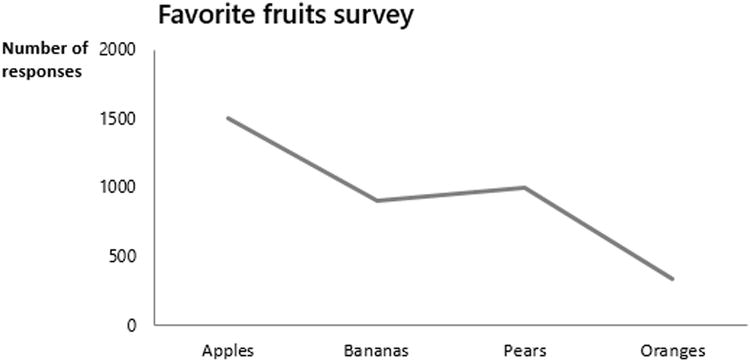
Figure 4-5. Lines that show trends should be used to imply categorical variables have an inherent trend
When no underlying connection exists between independent data points, you should not contrive such a connection with a line chart. Figure 4-6 shows the correct way to display this type of data with a column chart.

Figure 4-6. A column chart is the more appropriate choice to show this type of data
Bar and column charts are essentially the same thing but with different orientations. Where there exists a lot of information to display, using a bar often allows for better scanning of the data. Take a look at the bar chart shown in Figure 4-7.

Figure 4-7. Using bar charts allows for scanning of differences in data
Though technically the same as bar charts, just flipped, column charts do well (and perhaps better than bar charts) when comparing different groupings of common categories. Figure 4-8 shows an example of this.

Figure 4-8. Column charts do well when presenting different groupings of common categories
When you are plotting distinct categories, using either bars or columns, it’s a usually a good idea to list the categories in either ascending or descending order, depending upon what you want to emphasize. Listing each category in ascending or descending order allows you to immediately show which values are greatest and least and which categories are smaller or larger among similar values. This is demonstrated in Figure 4-9.

Figure 4-9. Results shown in descending order
Scatter charts are useful to visualize relationships between variables. The process of analyzing this relationships is called correlation analysis. I’ll go into that in a moment.
Scatter Charts vs. Line Charts
But before moving on to discussing the process of correlation, I will take a moment to identify the differences and similarities between scatter charts and line charts. I will do this because scatter charts and line charts can produce similar output, and it might be unclear when to use one over the other. Figure 4-10 shows two similar charts, one a line chart (on top) and the other a scatter chart (on the bottom).

Figure 4-10. A line chart and a scatter chart showing the same data
To understand the difference, you must investigate how each chart treats spreadsheet data. Line charts plot data with respect to the order in which the data appears. For instance, Figure 4-11 shows a chart plotting data from the spreadsheet. The spreadsheet lists numbers 1 to 7 in ascending order.

Figure 4-11. The line chart plots data points that the spreadsheet has listed in ascending order
If you change the order of these values, the chart changes in parallel (Figure 4-12). In Figure 4-12, I’ve swapped the locations for numbers 3 and 4.

Figure 4-12. The numbers 3 and 4 have swapped positions, and the chart updates accordingly
This happens with line charts because you are plotting only one set of variables. On the other hand, scatter charts plot two sets of variables (x- and y-coordinates) to define where they are placed on a chart. Figure 4-13 now shows a scatterplot. Notice that the chart relies on two series of data points representing respective x- and y-coordinate values. Changing the order of this series (Figure 4-14) does not change the data as it’s presented on the chart. This is because data points are plotted with respect to one another.

Figure 4-13. A scatterplot requires two series of data points representing x- and y-coordinate values

Figure 4-14. Switching the data points does not change what’s plotted on the chart
The difference between these two is not arbitrary. Scatterplots require two sets of variables because they are particularly useful for understanding what relationship, if any, exists between two variables. While line charts and scatter charts can create similar, often identical, charts, you should pick the one that best reflects (or is perhaps a natural extension of) what you are trying to model. And indeed, scatter charts are best used for correlation analysis. Trying to use them for simple time-series analysis may add more complication than necessary.
Correlation analysis seeks to understand a cause-and-effect relationship between two variables, if the relationship exists. Correlations are particularly useful to understand effects or outcomes. Businesses and organizations can take advantage of these items by understanding the inputs that drive them. Through correlation analysis, businesses can understand what inputs affect certain outputs, such as the likelihood a shopper is to buy a certain product given their other preferences.
The two moving parts to correlation analysis are as follows:
- The independent variable: This is the cause or input.
- The dependent variable: This is the effect or output.
The most common type of correlation analysis measures the linear relationship between two variables. For example, Figure 4-15 shows a positive linear relationship between two variables: years of work experience and annual salary. This relationship is a positive correlation because an increase in work experience leads to a positive increase in salary. For Figure 4-15, a survey asked several professionals how much they make per year and how many years of work experience they had acquired.

Figure 4-15. An example of a hypothetical correlative relationship
On the other hand, you might find that there are some negative correlation relationships. For example, Figure 4-16 shows one such relationship. For Figure 4-16, a group of students were asked how many hours they spent reading each week and how many hours they spent watching television.

Figure 4-16. An example of a possible negative correlation relationship
Correlation Fit and Coefficient
A common measurement of the “strength” of the positive or negative linear relationship between two variables is the called the coefficient of determination. The first step to using this measurement is to impose a line of best fit onto the data, like that in Figure 4-17. Excel allows you to apply such a line. The best way to understand the line of best fit is to consider the relationship you are looking for. In Figures 4-15 and 4-16, you are looking to see whether an increase or decrease in one variable leads to a proportional increase or decrease in the other.

Figure 4-17. Using Excel’s trendline feature to create a line of best fit
In a world where an increase of two years of work experience always leads to adding a fixed amount to one’s salary, you could expect two points below to form a perfect line. However, our world is much noisier. Work experience doesn’t always lead to making exactly a certain amount of money; in addition, there are no guarantees that you will make more than someone else with the same amount of work experience. However, what you can do to understand the general relationship between these two variables is to try to impose their relationship onto a simple trend. This is what the line of best fit does in the previous example.
A quality line of best fit would allow you a good, predictive approximation of the relationship. For example, you don’t have a point in the previous example to represent 19 years of work experience and the salary a person with that much experience might receive. But, based on the data, you can still draw an estimate of what someone with 19 years of experience might make a year. To do this, you could find the place on the black line that intersects with the 19 years of experience and match that point to the yearly salaries. As you can see, according to the data, someone who has worked for 19 years might expect to make about $100,000.
The R2 in Figure 4-17 is the coefficient of determination. It’s a measurement of how well the data fit onto the line of best fit in Figure 4-17. The closer R2 is to 1.0, the better the line of best fit can be said to approximate the linear underlying relationship of the data, if it exists. An R2 closer to zero is not likely to be accurately approximated with a line of best fit. Alternatively, allowing R2 might suggest a faint relationship between two variables with other unknown factors contributing more strongly to the relationship. Knowing what the R2 suggests is more art than science. However, so long as you interpret this coefficient correctly, you’ll be on your way to making good decisions.
Linear Relationship and Using R2 Correctly
The coefficient of determination is useful for understanding how well the data can be modeled as a linear correlation, but it’s not without its pitfalls. The existence of outliers—data points that significantly deviate away from the trend of the rest of the data points—can skew the R2 to look better or worse than it should. The four datasets in Figure 4-18, known as Anscombe’s quartet, all have the same R2 value, but each demonstrates a different distribution of data.

Figure 4-18. Anscombe’s quartet: despite the scatter of the data, each line of best fit has the same R2 value
This is why visualizing the data is so important. You could find the R2 value independent of any visualization by just applying some statistical analysis to the data, but then you might accidently think you are capturing a relationship that doesn’t necessarily exist.
The coefficient of determination also has another area of concern. A strong R2, a value close to 1.0, should not be used to confirm the existence of a statistical relationship, if it can be said to exist. In other words, correlation doesn’t mean causation. You could find random albeit independent variables and present them visually such that they appear to form a linear relationship. A common example is to plot ice cream sales and frequencies of drownings in a small town during a summer. As time goes on and the summer months become hotter, you might see that both appear to increase in tandem. In reality, the two variables have virtually no cause-and-effect relationship between each other. That they increase respectively has more to do with the weather: people like to eat ice cream and go swimming when it’s really hot outside.
![]() Caution R2 can be misleading if not used correctly.
Caution R2 can be misleading if not used correctly.
Stephen Few first developed bullet charts as a replacement to the radial gauge charts that he and I despise. He writes the following:
The bullet graph was developed to replace the meters and gauges that are often used on dashboards. Its linear and no-frills design provides a rich display of data in a small space, which is essential on a dashboard. Like most meters and gauges, bullet graphs feature a single quantitative measure (for example, year-to-date revenue) along with complementary measures to enrich the meaning of the featured measure. Specifically, bullet graphs support the comparison of the featured measure to one or more related measures (for example, a target or the same measure at some point in the past, such as a year ago) and relate the featured measure to defined quantitative ranges that declare its qualitative state (for example, good, satisfactory, and poor). Its linear design not only gives it a small footprint, but also supports more efficient reading than radial meters.
—Stephen Few, Bullet Graph Design Specification, March 2010
Take a look at the bullet graph in Figure 4-19 and its specification by Stephen Few.

Figure 4-19. The specification of bullet graphs
Bullet graphs can be displayed horizontally, vertically, and in a series. Stephen Few particularly likes bullet graphs because they can be packed together with other charts in a small space. For instance, in Figure 4-20, bullet charts display a significant amount of information despite their small size.

Figure 4-20. Compact bullet charts in a small space
Bullet graphs are not part of the default chart package in Excel. The chart like the one in Figure 4-20 requires some cleverness to build in Excel, as you will see in Chapter 12. However, pushing Excel beyond its limitations is what “thinking outside the cell” is all about.
Bullet graphs allow for a lot more advanced visualization than is displayed in Figure 4-20. You can have multiple targets and several qualitative scales. It’s unfortunate they are not included in Excel’s default charting package because they bring a significant amount of visual information in such a contained space. Consider how much information is displayed in a single bullet graph. Do radial gauge charts from Chapter 2 provide for the same amount of visual analysis?
Small multiples go by several names. You may hear them called trellis charts or panel graphs. Each of these different names, I believe, accurately describes small multiples, and I will use these names interchangeably throughout the book. Indeed, small multiple charts are powerful. They employ the same chart design many times but across different variables. For example, take a look at the small multiple charts in Figure 4-21.

Figure 4-21. An example of small multiple charts
In Figure 4-21, the intersection of the region and product can be thought of as a panel. Consider how much information is displayed. Two variables effectively make up the x- and y-axes. Additionally, each panel displays one dimension of information. Therefore, you’ve displayed three dimensions but without resorting to visualizing in three dimensions. This is one of the great advantages to small multiples. In The Visual Display of Quantitative Information, Eduard Tufte says the following about them:
Small Multiples are economical: once viewers understand the design of one slice, they have immediate access to the data in all the other slices. Thus, as the eye moves from one slice to the next, the constancy of the design allows the viewer to focus on changes in the data rather than on changes in graphical design.
Charts Never to Use
I have reviewed the best charts for relaying visual perception and data sensemaking. Compared to the charts available in Excel and perhaps to other chart packages, the list may seem small. However, what makes these charts different from the others is that they are based on research. They have proven their worth repeatedly.
In this section, I will review charts that you should really never use.
Cylinders, Cones, and Pyramid Charts
These charts are similar to bar charts, except they are much harder to read. Cylinders appear to offer your data a gradient color from a hidden light source, but this is not the way to make your data shine. Take a look at the three-dimensional cylinder chart in Figure 4-22.

Figure 4-22. A three-dimensional cylinder chart
Cones and pyramids, despite their spikes, are bad at getting to the point. Figures 4-23 and 4-24 show these other offender charts.

Figure 4-23. Pointy cone charts don’t aid in understanding

Figure 4-24. More pointy, pyramid charts that show the same data while not aiding in visual understanding
Having viewed far too many of these types of graphs, I’ve come up with the following guiding principle:
There are very few, if any, good reasons data should take the form of stalagmites.
Pie charts are among the most used charts on dashboards, in reports, and in presentations. However, if you look to the data visualization principles presented in Chapter 3, you can see why they fail. Our ability to judge precision among areas (the wedges of the chart) is not as strong as our ability to judge differences in height. That is, the data shown in pie chart is often better suited for a column or bar chart. Furthermore, the extent to which you understand the data being conveyed in a pie chart is often because other information (like labels or a table) is presented in conjunction with the chart (as, perhaps, a tacit admission that such charts by themselves are largely ineffective). For a more detailed explanation, refer to the “The Problem with Pie Charts” sidebar in Chapter 1.
I’ve been asked when they’re ever OK to use, so I created Figure 4-25 to help answer the question.

Figure 4-25. One of the few pie charts allowed in this book
Doughnut charts are glorified pie charts (see Figure 4-26). Unlike real doughnuts, which often feature delicious filling, doughnut charts are filled with nothing of the sort. For some reason, doughnut charts have become popular on the Web and in magazines. The publication The Economist even used one to show countries with increasing weight problems in their populations using doughnut charts complete with frosting and sprinkles, taking the doughnut chart metaphor quite literally (see www.youtube.com/watch?v=yGHC8dRYrlM).

Figure 4-26. Doughnut charts are simply glorified (or, arguably, unglorified) pie charts
Charts that employ the third dimension often suffer from data occlusion, as discussed in Chapter 2. Consider what Figure 4-27 might look like when plotted into the third dimension. Figure 4-22 shows this three-dimensional plot.

Figure 4-27. The data from Figure 4-21 now in the third dimension
Looking at Figure 4-27, how easy do you find it to view the values for product C? How easy is it to compare the different product values? Not easy at all, I imagine.
This is because our eyes are not good at comparing anything in the third dimension. Consider the pie charts shown in Figure 4-28. Depending upon your perspective, you might think there are more yes than no answers. When you pull away from the third dimension, though, you see that they are equal, as shown in Figure 4-29.


Figure 4-29. When you look with no three-dimensional perspective, the data is no longer distorted
What you learn from this is that perspective does in fact change how you interpret data. You should be keen to use data visualization methods that help transmit and not confuse the underlying message.
Surface charts are glorified line charts in the third dimension. They look like rough terrain when viewed. Perhaps if you want to show management how much your data looks like the world’s most impossible golf course (see Figure 4-30), surface charts could be useful. Otherwise, they should be avoided. I have yet to find a reasonable use for them in the regular business world.

Figure 4-30. Surface charts are not easily interpreted
Stacked Columns and Area Charts
Stacked columns and area charts may seem like a good idea at first glance, but they run into a similar problem as pie charts: they suffer from inconsistent baselines. Continuing with the theme, Figures 4-31 and 4-32 plot the same data, in a stacked area chart and bar chart separated by region, respectively.
Looking at Figure 4-31, you can evaluate the values for product A without much difficulty. However, when you attempt to evaluate the other products—especially as your eyes move up to product C—the differences in values become less perceptible. Figure 4-32 does a much better job of persisting these differences across all product lines.

Figure 4-31. An example of a stacked column chart

Figure 4-32. The same data used in Figure 4-26 but separated by category
Additionally, surface charts, stacked or otherwise, don’t provide much relief to the problem of obfuscation or inconsistent baselines for the same dataset. Figure 4-33 shows an example of data obfuscation by using an area chart.

Figure 4-33. Overlapping areas obfuscate the data behind them
You could stack the data as you did for the previous stacked column chart, but you still run into the same problem of changing baselines (Figure 4-34). In particular, imagine you changed the order of the regions shown in Figure 4-34. This would actually change the shape of how they are shown in the chart. In other words, while the underlying data would stay the same, their presentation and how you would interpret the results would be affected.

Figure 4-34. Changing baselines with area charts has the similar problem of changing baselines
Radar charts are line charts that connect data around in a circle rather than from left to right as you might expect. Except to make one’s data appear like a spider web or bird’s nest, they offer little advantage. Often it’s argued they highlight certain extremes in the values they are measuring. However, they don’t do this any better than a typical bar or column chart might. In addition, they violate the rule of connecting categorical data via lines. Figure 4-35 shows an example radar chart. Again, you should compare this chart to that of Figure 4-21—which does a better communicating data?

Figure 4-35. An example of a radar chart using the same data from Figure 4-21
The charts you should avoid all suffer from the same problems. Specifically, they either obfuscate data or rely on imprecise visual perception, predominantly that of evaluating an area. The charts you should use, on the other hand, rely on a proven understanding of how our minds perceive the world. Armed with this information, you’re ready to use techniques that work. When your audience is not caught up in trying to understand a complex or less than useful data visualization, they are spending more time and energy on understanding the presentation of the problem and not the underlying problem. Whether it’s with data visualizations or anything else, how you present your data should be a natural extension of the underlying thing being modeled.
The Last Word
I realize some of my recommendations of charts to avoid might come as a shock to you. You’ve likely used these charts before and thought, what’s the harm? In truth, the harm is hard to quantify by itself. But if you place the directive to use proper data visualizations in context, you find the wrong choice does more than communicate poorly; it takes the reader’s attention from the underlying message and goal of your work. If you can’t bring yourself to stop using some of these charts, I understand. But it’s worth asking yourself, in your own work, whether you are presenting information in the best way possible.