
| Chapter 6 |  |
MANAGING AND ORGANIZING STYLE SHEETS |
|
It is usual and customary for web authors to combine multiple style sheets that work together to style a web page. We have several reasons for doing so. One style sheet might be for typography, another for layout, and yet another for color. There may be one style sheet specifically designed to handle print output, and one or more possibly to deal with the explosion of mobile devices hitting the Web lately. Some of these may be architected to work so that there are various forms of failover for user agents that support this or that part of the CSS specifications. Applying multiple style sheets to a web site is quite common, and in fact encouraged, and in this chapter we will discuss various methodologies and techniques for putting your style sheets together.
Our primary goal is to support the widest range of browsers as possible—every one of the browsers would be perfect. A close second might be the maintainability of our site's CSS. Both of these goals can be served by an organized and functional set of style sheets and organization practices that follow a plan.
The need for organization
Sure, you could go and write that style sheet from scratch and dump everything all into one large file. You know what you are doing, and the tendency is to write one style after another as you construct your CSS from a design comp. But then what? How are you going to organize and manage your code over the life cycle of your web site? Who will work on it in the future? How will your code grow over time? How will your style sheets be handled by older browsers? By newer ones? By alternative media such as cell phones and printers? Will your users have any preferential control over the style sheets themselves?
If you've done any code development of any sort, then you know it is almost inevitable the code will tend to expand in size over time. Putting aside code optimization techniques (which we will discuss later), we know that we'll find new features to add, new bugs to fix, and new (or old) browsers to code around.
What organization looks like
Before we can be successful, we have to know what success is. An organized style sheet model is going to have the following characteristics:
- It is going to have a logical, hierarchical structure. Things will tend to be organized in a certain way: from large-scale layout to minute detail, or from broad selections such as redefinitions of HTML elements to nested descendant selectors for specific IDs, or ordered from low specificity to high according to the rules of specificity and the cascade.
- It is going to be a standardized pattern for organization and naming conventions that your shop, and dare we say the greater community, is following or able to follow.
- It allows for flexibility and is customized to make sense for the project you are working on. Trying to shoehorn everything into a rigid framework is going to be more work than it is worth. The best strategies are the ones that allow the greatest and easiest levels of customization.
- The code itself is organized: line breaks, braces, whitespace, and indentations are consistent throughout the entire set of style sheets. The code is easy to read. Helpful, concise comments are placed throughout the style sheet outlining major areas of concern, and are not overly detailed or verbose.
- One document is being served by multiple style sheets. Instead of forking your site for mobile, print, and IE, you have one site and one set of style sheets to handle the differences and serve progressive enhancement depending on the client capabilities.
Like good markup, good style sheets are self-documenting. The selectors should use the semantic structure of the markup it represents, without being too verbose or overly specific. Rules should be organized in a way that makes sense, with like rules grouped together and ordered in a way that makes sense for readability as well as for supporting the cascade and inheritance. It should be obvious to any developer coming across your code to see how this style sheet is being applied to the given site. This can be achieved through organization, good commenting, and good attention to the formatting of your code. Let's look at a few things inherent in CSS such as specificity that will help you get organized right away.
Using CSS features as architecture
Although it's not often talked about explicitly, CSS code has two very different functions. On the one hand, parts of style sheets are intended to be generic, while on the other hand, other parts define extremely specific things about various design components. One of the most powerful organizational techniques is to be able to extract the generic from the specific. This enables you to architect your CSS code in ways that are more modular and more easily understood.
Understanding specificity
In our experience, CSS works best if code is organized generally from low specificity to high. This makes it easier to override the more general selectors with more specific ones later on in our style sheets. Placing high specificity rules before low ones will result in those later and lower rules just not working if there's any kind of conflict, and putting things in the proper order from low to high makes it easier to add progressive fine-tuned enhancements to rules as they get more specific. Understand how specificity works, and use specificity and the cascade to your advantage in organizing and optimizing your CSS. See the upcoming section “Organizing from broad to specific” to dive further into how specificity can work in the scheme of how your code is organized.
Applying multiple style sheets to a page
When you apply multiple style sheets to a page, think about how these style sheets work together. You are likely going to want to start with a style sheet that covers any rules that would be common throughout the various media types and conditions. Then you will want to add style sheets for specific media types, and alternate style sheets below that. Finally, you will want to remember that any styles in style sheets linked or imported below another style sheet with the same selectors or basic specificity instructions will override earlier ones.
The grand order of at-rules
Use @charset rules at the very top of your style sheets to define what character set your style sheet is defined as. This will usually be ISO-8859-1 (Western European) or UTF-8 (Unicode), but might also be some other character set such as the likes of Big-5 (Traditional Chinese), ISO-8859-2 (Central European), or Windows-1252. It is especially important to indicate the character set being used in your style sheet if there is a mismatch between it and the master HTML or XML file—if they're different, the style sheet may fail by having the style sheet be unrecognized by the browser and ignored. An @charset rule denoting the use of Unicode would look this at the top of your linked or imported style sheet:
@charset "UTF-8";
As we mentioned in Chapter 2 and discussed further in Chapter 4, @import rules allow you to attach multiple style sheets from within a style sheet itself. These rules may appear in embedded or linked style sheets, and they must appear before any other rule in a style sheet, except for @charset rules.
Imported style sheets may be assigned media types. Usually you will want to import style sheets in the same way that you want to write CSS rules—from broad to specific. A style sheet with a media type of all or no media type specified will probably be best placed at the top of your import listing before any styles appearing later on.
The @namespace rules are used in XML contexts to handle selecting namespaced elements that might have a prefix, such as <dc:title>. The @namespace rules must appear after any @charset and @import rules. We discuss how to use @namespace in detail in Chapter 10.
The @media rules that we discussed in Chapter 2 are used to target sections of a style sheet to a set of given media types and may appear anywhere within the content of a style sheet, after any of the items that might appear above. Again, position these the same way you would treat linked and imported style sheets, with general rules appearing before the more specific ones.
The @font-face construct is a new recommendation in CSS3. This lets you add your own font resources to a page. Any @font-face declarations must appear before any rules that use the imported font. Other than that condition, @font-face may appear anywhere within a style sheet.
The @page construct handles styling for the page box in printed media. The @page constructs will contain rules for page margins and page breaks, and may appear anywhere in a style sheet after the required at-rules. Since they are more specific in affecting only paged media, they will likely be best presented further down in your rule hierarchy.
Classical inheritance schemes for style sheets
If you're familiar with object-oriented programming, you'll recognize the term “classical inheritance” as a technique by which subclasses inherit methods and members from their parent classes. Thanks to CSS's natural cascade, CSS authors can learn a lot from the principles of object-oriented programming. Managing multiple style sheets in a project is one such example.
One style sheet, let's call it base.css, is like the base class, which defines generic properties for generic elements. Then, a second style sheet, let's call it theme.css (which is still pretty generic), extends the design with additional properties specific to the current theme. In this example, theme.css is like a subclass of base.css.
Defining design relationships using selector groups
One of the most pressing issues in CSS-based development is how to write your declarations with the lowest edit-per-change ratio. Design is entirely about relationships that one element has to other elements. Your CSS should encode these relationships as best as possible, such as by using selector groups.
For example, absolute positioning is a great opportunity to use selector groups to encode visual relationships. If all three of your columns in your three-column layout begin at exactly 150 pixels from the top of their containing block, you should use a grouped CSS rule like this:
#MainColumn,

#ArticleSideBar,

#SiteSideBar { position: absolute; top: 150px; }
instead of three separate CSS rules like this:
#MainColumn, #ArticleSideBar, #SiteSideBar { position: absolute; }

#MainColumn { top: 150px; }

#ArticleSideBar { top: 150px; }

#SiteSideBar { top: 150px; }
Why? Beyond the fact that the first is less redundant, it also encodes the visual relationship of the position between the three elements in the selector group. This is the real reason to group the elements in this example.
Good coding principles
Neatness counts. Seriously. You should get in the habit of keeping a clean house when it comes to code. Have you ever tried to find a pen on your desk that you haven't tidied up in the past six months? What about that car registration renewal that you thought was due next week? Yes, you know who you are out there . . . Well, think of that pen as a class in CSS, and think of that DMV renewal form as an ID, and imagine you fresh on the job as the web designer for a major web operation. Your boss just stormed in and said we need to change all pen classes to have red borders, and the DMV renewal box needs to be moved to the right side of the page instead of the left. The style sheet is six printed pages long and is such a mess that you have no idea where to begin because you took this job only a month ago and haven't looked at the site style sheet much since then.
Organized code to the rescue. Let's look at some methods for improving our own lives and the lives of others through cleaner and more organized CSS.
Taking advantage of inheritance
At this point it would be a good idea to point out the issue of inheritance. If you return to Chapter 2 and look at Figure 2-4 and its accompanying code example, you'll see that the <body> element was set to reduce the font size to 80 percent of the default and to use a sans-serif font family. The styles font-family and font-size were assigned to the <body> element and yet the entire document seems to take on these values. This is extremely important because, along with the cascade, CSS inheritance is equally effective at transferring errors and discrepancies “downstream” (to child nodes) as it is at transferring correct CSS declarations.
In Figure 6-1, we can see how this has been rendered using a web browser. Interestingly, all of the elements have this sans-serif font treatment, and while you may have to take our word for it regarding the image rendering, the font sizes overall have been shrunk by the specified amount relative to their user agent defaults. This is made more obvious by the following code example as rendered in Figure 6-1:
<!DOCTYPE html PUBLIC "-//W3C//DTD XHTML 1.0 Strict//EN"

    "http://www.w3.org/TR/xhtml1/DTD/xhtml1-strict.dtd">

<html xmlns="http://www.w3.org/1999/xhtml" xml:lang="en" lang="en">

    <head>

        <title>Inheritance</title>

        <style type="text/css" media="screen">

            div {

                border:1px solid #777;

                font-style:italic;

                padding:12px;

            }

            p {

                border:inherit;
            }

        </style>

    </head>

    <body>

        <div>

             This is text inside the div. The div has a border.

             <p>This paragraph inherited a border.</p>

             <p>As did this one.</p>

             <p>This is because we specified p { border:inherit; }</p>

        </div>

    </body>

</html>
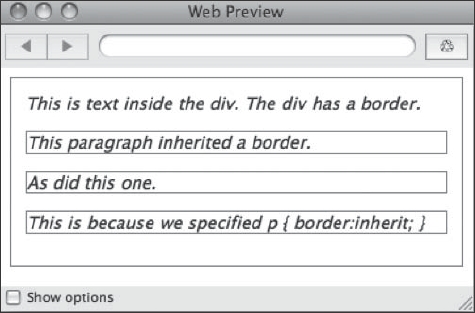
Figure 6-1. Preview of the code example showing how inheritance is propagated through the display of the page
Let's look at what happened here. The most obvious thing we can see is that all the paragraphs have inherited the border value from the <div> rule, and they should because that is exactly what we had told them to do. Normally, the border value is not inherited, so to get this to happen we had to write p { border:inherit; }. In addition to that, we can see that the italic typeface was inherited. Some properties are inherited from parent elements by default, while others are not. We did not specify font-style:italic in our paragraph rule, and yet italics appear here. The font-style property is one of those items inherited by default. Finally, we can see that the parent element was instructed to have 12 pixels of padding. Since padding is not inherited by default, the paragraphs do not render the parent's padding.
Organizing from broad to specific
As we just discussed, a selector can override another rule if the specificity of the first rule's selector is higher. The more specific a selector is, the more difficult it is to override it. Furthermore, a rule appearing later (further down) in a style sheet will override an earlier rule if both have the same specificity value. Therefore, it is a good idea to put your more general rules toward the top of your style sheets, and the more specific ones toward the bottom. This will make it easier to maintain your style sheets by reducing the number of things that can override specificity unexpectedly—low specificity will tend to be at the top and high specificity at the bottom, making it less likely that a high-specificity rule will be causing you lots of confusion and trouble throughout later parts of your style sheet.
Organizing from low specificity to high specificity means, in the broadest terms, placing your simple selector rules toward the top, class selectors toward the middle, and ID selectors toward the end of your style sheets. However, it is also highly likely that one of the first things you will do in your style sheet is to establish sections based on the structural, semantic ID elements that define the major sections of the markup, so within each section there might be its own hierarchical order of rules as well. As usual, an example will help illustrate the concept:
/* Basic rules */


body {

    margin:0;

    padding:0;

    font-family:Helvetica, Arial, sans-serif;

}

p, li, td {

    font-size:12px;

    color:#8567ae;

}


/* General class declarations */

.warning {

    border:1px solid #b73500;

    color:#f00;

    padding:2px;

    background-color:#ffdcde;

    font-weight:bold;

}


/* layout sections */

#header {

    height:180px;

    border-bottom:1px solid black;

}

#header h1 {

    text-indent: −9000px;

    background: url(coolbackground.png);

}

#header .search {

    width:200px;

    height:50px;

    float:right;

}

#content {

    width:400px;

    background-color:#e6e6e6;
}

#footer {

    border-top:1px solid black;

    padding-top:0.5em;

    font-size:80%;

}
In this example, we started broad and moved toward specific. The broadest selector is the <body> element rule. <p>, <li>, and <td> elements follow as they are descendants of the <body> element. These simple selectors are followed by a section defining broad classes that could exist anywhere in the document. Following that, we have the selectors that define our document structure following the IDs laid out in our HTML. Even these follow a broad to specific pattern, and are organized in the order that the elements would appear in the HTML.
Avoid overusing arbitrary <div> elements, IDs, or classes
“Classitis” and “divitis” are terms that are commonly used to describe a chronic inflammatory condition whereby your markup contains an overgrowth of unnecessary <div> elements and class attributes. Your document structure should be defined using some elegantly placed elements with a sparse but effective use of IDs and a minimum of classes that will enable rich styling based on the semantics of the document itself. Resist the urge to add extra <div> elements or classes just because you think it will make your style sheets work. Use descendant selectors whenever possible. This will typically reduce the overall size of your code base, improve load times through reduced file sizes and cached style sheets, make your markup far easier to read and manage, and turn you into a magician in the eyes of your peers.
In fact, avoiding adding extra <div> elements and classes completely can be very educational. If your markup is well structured, then you can likely complete all of your design needs using the humble descendant combinator. As support for CSS selectors that use structural context improves (such as :last-child, and :only-child), the need for arbitrary styling hooks will become that much simpler.
Dividing style sheets into logical sections
Just as well-structured markup is considered easy to read and maintain, the same may be regarded for well-structured style sheets. Different sections of a page can be organized into different sections of a CSS file: page navigation rules go in one section, content rules go into another, the footer goes into a third, and so forth. If it's a blog or any kind of news site, there is likely a comments feature, and CSS rules for the comments section will probably have their own styles. Your style sheets will be best structured if the organization more or less follows the semantics, structure, and flow of your markup.
There are of course some pros and cons to such a practice. In the “pro” corner, it is easy to find and change properties that are within these sections on the page. If you're trying to make a change in the footer section of your web site, you would likely find the correct styles in the CSS file's “footer” section.
On the other hand, it is harder to see and manage all styles that apply to a specific element that happens to fall into more than one category. For example, <p> elements may be styled differently in the footer than they are in the content area or a section that might function as sidebar content. Fortunately with some tools such as the Firebug extension for Firefox, Adobe's Dreamweaver CS4, dedicated CSS editing software such as TopStyle or CSSEdit, or a good code-oriented text editor such as TextMate, such organizational issues can be simplified.
Dividing design principles into files
Dividing your CSS into separate files is where you organize your design methodology into distinct CSS files or sections within one or more style sheet files as discussed in the previous section. For instance, you have all your CSS positioning and layout declarations defined in a layout.css style sheet. Your typography declarations, such as text color and size and font choices and so forth, go into typography.css.
What are the pros and cons of this technique?
Placing styles into organized, hierarchical style sheets can be made to borrow from the classical inheritance model of object-oriented programming, such that each style sheet is easy to extend or replace. You create a plug-and-play architecture of style sheets that are each smaller chunks of a bigger design, leading to greater modularity and theoretically less coupling between CSS rules.
On the other hand, this is a somewhat heavier-weight technique since each new style sheet brings with it an additional HTTP request, causing optimization problems for large-scale sites. Additionally, a single element's properties are often scattered in multiple places, causing potential headaches for the CSS's maintainers, who sometimes need to hunt through many files to change an element's many properties. But is this really that bad? Once style sheets are downloaded, they are likely going to exist in the browser's cache, making subsequent page loads only responsible for downloading the markup, not the shared style sheet assets; and again with using tools such as the Inspect Element feature in the Firebug plug-in for Firefox, TextMate's CSS Preview feature (Bundles 
CSS Preview), or the Dreamweaver CSS Styles panel, it is easy to find out what styles might be affecting a given element.
Use the shortest URL that works
As we discussed in the earlier chapter about CSS values, URL references in style sheets are always relative to the style sheet itself, not the document that the style sheets reference. This means that you can create more modular style sheets by using the shortest possible URL you can get away with.
Quoting from Douglas Bowman's blog post at http://stopdesign.com/archive/2002/09/04/relative-uris-within-css.html: “By changing the image and CSS file references to relative URIs—url(“../images/logo.gif”)—and ensuring that all images always live on the same server in the same relative location to the CSS files, we can avoid changing those references every time the Akamai image and CSS paths change.”
Whenever you use a URL to point to another resource, should you use a relative URL (a path relative to the source file, such as ../images/tuba.gif), an absolute one (relative to the server root, such as /images/tuba.gif), or a fully qualified URL (such as http://example.com/images.gif)? Variations of URLs schemes are wildly inconsistent, and it is common to wonder which one is best to use. Here are some examples to take into consideration:
background-image: url("http://www.example.com/omg/img/ponies.jpg");

background-image: url("/omg/img/ponies.jpg");

background-image: url("../img/ponies.jpg");

background-image: url(../img/ponies.jpg);
Take a look at these examples and think about which one is shortest and most portable. The answer might be the most obvious one. Probably the last example with the relative path, right? Shorter URLs are likely to be more versatile and they have the obvious optimization benefits, too. Every byte counts when you're compressing and optimizing files. There's little reason to write a URL such as http://www.example.com/violas/ when /violas/ will do. Ultimately in most cases, a relative path will be the most versatile and briefest version of a path to use. If your domain name changes in the future and you've used a fully qualified URL, you'll end up with a broken link. If you're linking to a remote domain, then unless your own content will be published over multiple protocols (like HTTPS in addition to HTTP), you can even safely omit the scheme portion of a URL. Often server-side code can be made to handle these complexities for you, but even in these contexts it may be worthwhile to program the automated generation of a path to be relative.
Good code formatting conventions
Code formatting is important. Code authors should be careful to keep curly braces aligned and indentations consistent, and use whitespace and line breaks consistently. This makes code far easier for you and others to read, will make it easier to make batch changes across multiple properties or rules, and provides a certain pleasing sense of aesthetic that your inner geek will learn to appreciate.
As they say on the WordPress project, “Code is Poetry.” And with that note in mind, go and look at a few poems yourself. Try some e. e. cummings, a little William Butler Yeats, and maybe some Charles Bukowski. Then look at a work or two by Shel Silverstein, or maybe some haiku. Look at the typography—the way the words are spaced and laid out. Each poet has his or her style, whether they follow convention or not, and this makes the poem more interesting and more readable. Each space is as important as each letter. Treat your code with a similar level of reverence and you'll be going in the right direction.
So what does CSS convention look like? One of the most common formatting patterns is as follows:
selector decendantSelector {

    property:value;

    property2:value;

}
The first line lists selectors on a single line, followed by a curly brace. The subsequent property/value pairs are each on their own line and indented. The rule closes with a final curly brace on the last line, with no indentation. This pattern is considered readable and is very common among developers in the CSS community. Using this convention, it is common to see rules with only one property displayed on a single line:
selector decendantSelector { property:value; }
These two basic formatting rules can serve the majority of your code formatting needs. Each property is on its own line, making it easy to pick out what things might have been changed using diff tools and source code management systems. Figure 6-2 shows an example of a program called FileMerge, illustrating the differences between two files. Note the visual advantage of having new properties appear each on their own line.

Figure 6-2. Keeping declarations on individual lines makes it easier for programs like FileMerge to show the differences between two CSS files visually.
For many cases, leaving your code in a readable format will be a good strategy. However, in high-traffic or mobile sites where bandwidth is an issue, you may wish to optimize your code to keep files as compact as possible. We discuss optimizing CSS in Chapter 10.
Alphabetize your declarations
In many cases it may be helpful to alphabetize the list of CSS declarations within a given rule. Of course, you would need to be careful not to mess up any cascade or inheritance issues with this practice, so use it as a guideline rather than a rule. At any rate, if you have a long list of declarations, it will be easier to scan through the list if they are more or less ordered alphabetically. For instance, examine the following rule:
#footer {

    text-align: center;

    border:0;

    color: #B6CCED;

    width: 760px;

    font-variant: small-caps;

    letter-spacing: 0.1em;

    border-top: 1px solid #999;

    font-size: .80em;

    clear: both;

    background-attachment: url(footer.jpg);

    text-shadow: none;

    word-spacing: normal;

    font-weight: normal;

    margin: 13px auto;
    font-family: Helvetica, sans-serif;

    font-style: italic;

    padding: 0;

    background-color: #e9eaea;

}
Compare this rule with the following one, which has been alphabetized:
#footer {

    background-attachment: url(footer.jpg);

    background-color: #e9eaea;

    border:0;

    border-top: 1px solid #999;

    clear: both;

    color: #B6CCED;

    font-family: Helvetica, sans-serif;

    font-size: .80em;

    font-style: italic;

    font-variant: small-caps;

    font-weight: normal;

    letter-spacing: 0.1em;

    margin: 13px auto;

    padding: 0;

    text-align: center;

    text-shadow: none;

    width: 760px;

    word-spacing: normal;

}
Because the second rule has been alphabetized, it should be easier to pick out, say, the font-variant rule, or any other choice, with a quick scan down the list in alphabetical order. One thing to notice is that the border-top: 1px solid #999; declaration must appear lower than the border:0; declaration; otherwise, you will probably come up with unexpected results.
Consistency is your ally
One of the most important things for organization is consistency. This is true when you author markup and it is also true when you author CSS. Consistency in how you write rules and what patterns you use to name and group elements gives you the ability to build on your own work.
For example, you can write CSS declarations one per line or all in one line. You can do the same thing with selectors in a selector group. Here are two ways to write the same thing:
h1, h2, h3, h4, h5, h6 { font-weight: bold; }

h1,

h2,

h3,

h4,

h5,

h6 { font-weight: bold; }
Is one rule (on the first line) better than the other (on the lines after it)? Not necessarily, but what is important is that you use one pattern and stick with it. This not only makes it much more readable, but it also gives you the ability to easily search through style sheets automatically.
Another example is in how you name classes and IDs. You can use these hooks to provide signposts to yourself or other readers of your code about the purpose of the element. In our work, we typically use CamelCase names for generic elements that are not project or site-specific. These include things like Header and Footer, GlobalNavigation or MainMenu. All sites tend to have these elements, and even if they don't, they are clearly not site-specific.
In contrast, we use dashed-names for elements that are site specific. So, for instance, bargain-basement might be the name of a particular sale of a particular store or newhaven-branch might be the ID for the list item that marks up the company's New Haven office.
Since computers were designed for it, the most reliable way to ensure consistency is to use a tool to aid you. This can come in many forms, such as writing macros in your favorite text editor, but one of the easiest is available at the Styleneat.com web site, which encodes some of these best practices into an automated style sheet organizer that can safely reformat your CSS code.
These stylistic choices make little technical difference beyond the issues of keeping things in order with inheritance and the cascade, but they can greatly improve the readability of your code when used consistently and communicated to the rest of your team. Perhaps the most obvious way of communicating these things to others is to keep your code well commented, which we discuss next.
Techniques for intra-team communication
It's extremely rare for a web project to be implemented by a single developer. This means you'll have to routinely communicate with other developers on your team. More often than people would like to admit, communication or the lack thereof between developers working together will make or break a project. And even if it doesn't make or break the project's launch, it will absolutely make a huge impact—for better or worse—on the organization of a code base.
These tips, while not technical, are nevertheless extremely important when you're working with others. Although you're not required to use specifically these tips in your project, we encourage you to come up with some method for communicating about code across team members.
CSS comments
CSS commenting is simple enough, but what to write? Good code should be self-documenting—easy to read, organized, and semantically structured. And using CSS comments should fill in the blanks. Adding a few succinct comments in key places where it might not be entirely obvious to the next person working on your code will help extend the value of your CSS while making life easier for others. Having a documentation strategy that includes structured and consistent use of comments in your code will set up your project for success.
Comments begin with a slash/asterisk and end with an asterisk/slash—the same as is found in multiline C++:
/* Here is a comment */
The comment can appear on multiple lines as well. The line breaks and whitespace are ignored:
/*

   "In the Land of The Dark,

   The Ship of The Sun

   is pulled by The Grateful Dead."


   --Egyptian Book of The Dead

*/
But clearly neither of those comment examples are of much use. Let's look at some methods for creating useful comments in our CSS files.
Comment headers
Comment headers are a common documentation feature throughout all forms of code, and CSS is no exception. Use comment headers at the top of CSS files to identify the author of a style sheet, a summary of intent, source repository URLs, or whatever is relevant to the file or project. Here is an example of an expanded comment header, to illustrate some of the possibilities. It should be noted that using intelligent build systems and proper development tools, it's possible to automate much of this in larger projects:
/*

Project:

    Title: Natasha O'Reilly's Cello Website

    URL: http://natasha.example.com/

    Created: 2008-10-21

    Repo: git://natasha.example.com/dev/site.git


File:

    Filename: main.css

    Location: /assets/css/

    Created: 2008-10-21


Developers:

  - Name: Joseph R. Lewis

    Last_Edit: 2009-01-31

  - Name: Meitar Moscovitz

    Last_Edit: 2009-01-22


Contents:

  - Section: branding

    Comments: Sets masthead image & typography.

  - Section: sidebars

    Comments: Set right column, convert links to buttons.

  - Section: content

    Comments: Styles for content type, images, & tables.

  - Section: footer

    Comments: Legal mumbo-jumbo.
Palette:

  - Color: #220000

    Uses: borders

  - Color: #770000

    Uses: shadows, table borders

  - Color: #cc2200

    Uses: visited links

  - Color: #ff9900

    Uses: type

  - Color: #ffff88

    Uses: headings, highlghts

*/
This example covers several areas of interest for the project and makes it obvious up front at the top of the file what it is for, where it should go, who has worked on it, and what sorts of things will be expressed in the contents. Coming up with a consistent pattern for CSS comments is a good plan for any development shop, be it a large group of in-house developers, an open source project, or just you alone. This particular example leveraged the YAML (http://yaml.org/) format to organize the comment data, which works great because it is a structured and descriptive text pattern that is easy for humans as well as machines to read. You don't have to use YAML, but you will definitely benefit from choosing some sort of structured pattern.
In the previous example, we outlined several important bits of information. The first section outlines the project metadata—what project this is for, where the source code repository is, when it was created, and of course the title of the project. It then goes on to describe the basics of the file—the file name and where it goes in the project. These bits of information so far will be very helpful if something gets misplaced, or if you're working and have a lot of files open at the same time and need to keep track of which is which.
Next up we added some information about the developers—in this case your authors—and showed when each of us last edited this file. Although it's certainly possible for each developer to keep these sorts of things up to date manually, it makes much more sense to let an automated tool handle this. Such a tool could be a homegrown shell script, part of a build system, or even your version control system. The takeaway is that such information can be added to your project automatically and could be useful as part of reporting systems or in a pipeline for other kinds of postprocessing tools.
Finally, the file wraps up with some information about the contents of the file and a color scheme. Having this basic information about the intent of the design and an overview of the file structure helps other developers get oriented, and it also helps you up front establish an organization structure for your code in this file. Describing how colors are used can save future developers (or yourself) the trouble of having to sift through a lot of code just to find out what the proper color is that should be used in some future CSS rule.
How you structure your CSS comment headers is up to you. You might choose a bit of basic information, or you might be verbose about it and use a structured format such as found in the previous example. Get into the habit of keeping comment headers present and up-to-date in your code, and see if it helps you down the road.
Comment signposts
In a long style sheet, it can be hard to find a particular point. Is the declaration you wanted at line 300 or line 600? It takes ages to search through the document manually. Moreover, if you're new to a project, you don't even necessarily know what you're searching for. This is where comment signposts (also referred to as “flags” or “milestones”) can come in very useful.
A CSS comment signpost is simply a unique and easily searchable string of characters inside a CSS comment that the team uses to demarcate the important sections of a style sheet. These sections are arbitrary, of course. A developer can then use their text editor's search feature to locate the signpost comment, and then jump to each additional signpost after that. This way, becoming familiar with a long style sheet becomes far less of a chore.
One common example of a signpost is a comment such as this:
/*= Signpost name here */
In this example, the sequence /*= can be searched for. If you know what point in the style sheet you want to jump to, you can search for the sequence /*= Signpost name here.
Some programs interpret specially formatted comment patterns as section signposts and allow the developer to quickly find the given section through some feature of the software user interface. Let's look at some examples.
CSSEdit
CSSEdit (http://www.macrabbit.com/cssedit/) will create sections in between comments starting with a @group comment and closing with an @end comment. The section will appear as a folder in the left column, which can be expanded to show the styles contained within. The name of the section is taken from the text that appears to the right of @group, as shown in Figure 6-3.
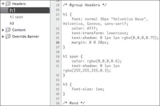
Figure 6-3. CSSEdit groups CSS rules in the left column between an @group and an @end comment.
TextMate
In TextMate, if you add a second asterisk to the comment opening (/**), the Symbol pop-up menu will be populated with the text of your comments. Select Navigation Go to Symbol to bring up the Symbol palette (Figure 6-4), or use the menu at the bottom right of a TextMate window status bar (Figure 6-5). The comment text will appear with two asterisks on either side, as shown in the following CSS code:
/** Header */

#header { background-color:blue; }

/** Body */

#body { background-color:green; }

/** Footer */

#footer { background-color:purple; }
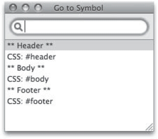
Figure 6-4. The TextMate symbol palette showing how comments appear in the list

Figure 6-5. The TextMate status bar's Symbol menu on the far right indicating the highlighted Body comment
Using comment techniques such as these will help show exactly how your CSS files should be structured and organized, helping both you and your collaborators find what you need and keep things tidy. Next, we discuss how linking style sheets affects code organization and functionality.
Persistent, preferred, and alternate style sheets
Using the <link> element to point to external CSS files, we can define style sheets as being persistent, preferred, or alternate.
A persistent style sheet is one that holds common styles for a given media type. Some styles might be persistent throughout your site in any given media type. Let's say for every media type, we want the legal disclaimer to be in italics. So you could write
div.legal { font-style:italic; }
This would be placed in an external style sheet; let's call it common.css, and link to that style sheet like so:
<link rel="stylesheet" type="text/css" href="common.css" />
By simply omitting the title attribute, this style sheet is said to be persistent. If we add the title attribute, the style sheet becomes preferred:
<link rel="stylesheet" type="text/css" href="common.css"

    title="Common Styles" />
The differences between persistent and preferred style sheets are subtle, but can be important from an organizational standpoint. There is some impact with regard to how the style sheets are interpreted. A persistent style sheet is intended to be interpreted throughout a site regardless of preference or grouping. Preferred style sheets, on the other hand, will be interpreted together if they share a common title attribute:
<link rel="stylesheet" type="text/css" href="common.css" />

<link rel="stylesheet" type="text/css" href="viola-layout.css"

    title="Viola Theme" />

<link rel="stylesheet" type="text/css" href="viola-color.css"

    title="Viola Theme" />

<link rel="stylesheet" type="text/css" href="bass-layout.css"

    title="Bass Theme" />

<link rel="stylesheet" type="text/css" href="bass-color.css"

    title="Bass Theme" />
For this example, common.css is interpreted throughout the site. The viola-layout.css and viola-color.css style sheets are processed together when the Viola theme is selected. The bass-layout.css and bass-color.css style sheets are processed together if the Bass theme is selected. Style sheet switching is supported in Firefox and Opera browsers.1 In Firefox, you can select a style sheet by using View Page Style, and in Opera the command is View Style.
__________
1. Style sheet switching can be accomplished in other browsers by providing your own code to manage the functions of switching the groups of active CSS files. A number of easily deployable JavaScript solutions already exist for this purpose; perhaps the most well-known is published by A List Apart at http://www.alistapart.com/articles/alternate/.
Styling for media
You have already seen media types in action in Chapters 4 and 5. Let's dig a bit deeper into media types and learn how CSS3 media queries come into play.
Using media types, you can further refine how styles are applied based on the type of expected output. For instance, we will probably have a style sheet that defines how the page appears on a computer screen. We might then have another style sheet to handle our printed pages and another for handheld devices. Finally, we might want one style sheet to set some global precedents—containing rules such as how the <strong> element should be rendered with an italic and slightly larger typeface than the surrounding text for all media that can handle this case. Commonly we might see a suite of linked style sheets that look somewhat like the following:
<link rel="stylesheet" type="text/css" media="all" href="global.css" />

<link rel="stylesheet" type="text/css" media="screen"

    href="screen.css" />

<link rel="stylesheet" type="text/css" media="handheld"

    href="mobile.css" />

<link rel="stylesheet" type="text/css" media="print"

    href="print.css" />
In this case, each media type will be affected by the first linked style—global.css—because the media type here is set to all. In other words, printers will use styles from the global style sheet as well as the print style sheet. Handheld devices (well, most of them anyway) will also check with the global style sheet before adding handheld-specific styles from mobile.css. The same pattern follows for rendering on full-sized computer displays using the screen styles.
CSS3 media queries
We touched on the use of media queries in the last chapter on mobile web development. The good news is that media queries are not limited in application simply to styling for mobile devices—there's a whole range of neat ways we can apply media queries to get around some of the sticky issues that are involved with targeted media platforms.
Targeting a media type gives you some say as to how style might be applied based on the media in question, but that's it. It does not give you any say as to what additional environmental parameters might be involved. If the styled content is going to be printed, is the printer capable of color, or is it black and white? How are styles applied if the screen width is only 480 pixels wide? How about 640 pixels? Is the output orientation in landscape or portrait mode? With media queries, we can drill down even deeper into these conditions and produce more finely tailored output.
A media query builds on the media type construction by adding some conditional statements. If the statement is true, then the style sheet is evaluated; otherwise the style sheet is ignored. Media queries may be added to a media attribute of an HTML link element, or as part of a @media or an @import statement.
The W3C defines a media query as consisting of “a media type and zero or more expressions involving media features.”2 Essentially we are building on the existing media type construction, so this should look familiar. For example:
<link rel="stylesheet" media="print and (color)"

    href="colorprint.css" />
This example expands the traditional media type of print and asks whether or not color is supported. If it is, the style sheet colorprint.css is interpreted. If not, the style sheet is ignored. The and keyword is used to join the media type to a media query argument. Multiple arguments may be strung together via the and keyword:
<link rel="stylesheet" media="print and (color) and

    (device-width:12in)" href="color-letter.css" />
Here the example targets color-leter.css for media output that supports color and is 12 inches wide—your typical US Letter page. This example also introduces a new yet familiar construction: a property type (device-width) and a property value (12in). Several media features can be defined in this way:
width: The width of the targeted display. Includes variantsmin-widthandmax-width.height: The height of the targeted display. Includes variantsmin-heightandmax-height.device-width: The width of the rendering surface, such as the screen or the paper. Includes variantsmin-device-widthandmax-device-width.device-height: The height of the rendering surface, such as the screen or the sheet of paper. Includes variantsmin-device-widthandmax-device-width.orientation: If the width of the viewport is wider than the height, the orientation value islandscape. Otherwise, the value isportrait.aspect-ratio: A pair of numbers that together divide a viewport's horizontal length by its vertical length, such as16/9or4/3. Includes variantsmin-aspect-ratioandmax-aspect-ratio.device-aspect-ratio: Same asaspect-ratio, but applied to the output device instead of the viewport. Includes variantsmin-device-aspect-ratioandmax-device-aspect-ratio.color: The number of bits supported in the output's color component. Includes the variantsmin-colorandmax-color. Simply statingcolorimplies all color devices, and this is likely to be your most commonly used value. Usingmedia="handheld and (min-color: 2)"would target any handheld device that supported a minimum of two bits in the red, green, or blue components.color-index: The number of colors supported. A property ofmedia="screen and (max-color-index: 256)"would target a screen that supported 256 colors or less.monochrome: Works similar to thecolorfeature, but in a grayscale space. Use(monochrome)alone to specify any target relegated to black and white output. Includesmin-monochromeandmax-monochromevariants similar tocolor, but applied to the singular grayscale space.
__________
2. As of this writing, this description is sourced from the abstract in the CSS Media Queries Candidate Recommendation, available at http://www.w3.org/TR/2009/CR-css3-mediaqueries-20090423/.
resolution: Describes pixel density. For instance,media="print and (min-resolution: 150dpi)"would target print output with a minimum resolution capability of 150 dots per inch. Includes variantsmin-resolutionandmax-resolution.scan: Used to describe scanning output of televisions. For instance,media="tv and (scan: progressive)"would select TVs supporting progressive scanning.interlacedis another option.grid: Used to determine between grid and bitmap output systems. Examples include teletype devices for the deaf, or phones with a single line of fixed-width LED display (like we had in the old days...).
Developing a mobile strategy
In the previous chapter, we went into some detail about developing CSS for the mobile Web, and we mentioned how this was still new frontier for the web design world. There are many browsers, many screen sizes, many platforms, and little consistency. How can we target the mobile world and still keep our sanity as web professionals? What flavors of XHTML do we use? What CSS will work? What won't work? As Apple cofounder Steve Wozniak once said, “Never trust a computer you can't throw out a window.” If nothing else, at least mobile devices are easily pitched...
In most cases there should be an opportunity to construct lean and semantic XHTML that can be repurposed with a variety of CSS techniques, so traditional XHTML is a fine choice for an all-purpose web page targeting multiple media. More advanced and usable devices and browsers will get significantly more use, and most all of these should support XHTML. All you really need to do is consider your rendering strategy and then test markup compatibility to the best of your abilities.
Our strategy for developing CSS on the mobile Web can be broken down into two main parts: design one style sheet for the handheld media type, and design another for media queries. This should cover most of the medium- to high-capability handsets fairly well. The handheld style sheet will cover all your traditional browsers on mobile handsets such as Opera and NetFront. You then design a style sheet that covers the media query–enabled user agents, such as those based on WebKit. To go any further, you'd need to use a script to sense which user agent and device is showing up at the door of your web server and serve trimmed markup such as Wireless Markup Language (WML). Our goal is to stick with our original markup and have it work on as many mobile devices as possible, and deliver style sheets by the handheld media type method and the media query method.
Now we have a bit of a dilemma. Mobile WebKit browsers will ignore the media type handheld and instead look for media queries to add style sheets. Newer versions of Opera understand both but default to screen and won't show handheld unless the user chooses the preference. The good news is, if you have implemented a strategy of using a handheld style sheet and a media query style sheet for the more advanced mobile devices, the Opera users will get one or the other. The user has made their preference and as a standards-savvy developer it is a fine option to respect that decision, but if you really wanted to alert the user that a more optimized view was available you might have something like this in the HTML:
<p class="operausers">Opera users may wish to try this page using

    screen rendering instead of handheld rendering.</p>
And then add a bit of style in your handheld style sheet to hide this information from users viewing the superior screen CSS:
p.operausers { display:none; }
But this sort of thing can be regarded as unnecessary cruft (see the discussion of “classitis” earlier) and is arguably best left out of your code.
In short, as mobile devices continue to gain in popularity for the purpose of using the Web, you should consider developing some kind of mobile strategy to start improving the availability of your site's content to the handheld device set. Put a stake in the ground, as these users are only going to increase in number over time.
Summary
In this chapter you learned several strategies for organizing your code for maintainability and efficient development. Keeping things organized will make life easier for you and for anyone else who comes across your code. In fact, you should assume that someone else is going to work on your code or examine it in some way, even if you are the only person you think is working on the given site. This is because it is trivial for anyone viewing a web site to use the browser's View Source command and look at your code, download your style sheets, and pick them apart. To make it even more trivial, installing things like the Web Developer Toolbar or Firebug on Firefox make picking apart your code a matter of choosing a menu command. More important, in a professional situation, it is highly likely and probably expected that you as a CSS developer will hand off your work to someone else at some point. You may have already inherited code yourself—clean it up if you can. As we say at the beach: leave it cleaner than when you arrived.
Good organization is greatly enhanced by good comment strategies. Keep your comments succinct—use a comment header at the top of your code to set some basic bits of information regarding where your CSS fits into your project. Use comments to indicate any CSS hacks you may left in there, as those may become issues later on as new browsers appear on the market. Use comment signposts to make your code more searchable and to work better with your code editors if they support such a feature.
This chapter covered the important issues of persistent, preferred, and alternate style sheets, and described the mechanisms for how media types and CSS3's media queries come into play, both from a functionality standpoint as well as for organization's sake. Using these constructs in tandem can serve your organization strategy well.
In summary, a little planning will go a long way. Think of it as writing an essay, where you stub out the major headings first and then fill in the content. Take some time up front to sketch out your CSS sections and files at the beginning of your project, and use that outline to develop your organized and well-formed code. Treat the formatting of your code like poetry, and strive for the most organized and clear way to express your intentions in how you organize your rules and your selectors, and how you write your comments.