
| Chapter 5 |  |
DEVELOPING FOR SMALL SCREENS AND THE MOBILE WEB |
|
As we've discussed earlier, the evolution of the World Wide Web has been extremely chaotic when compared to other technologies. This Darwinian model has arguably had both positive and negative effects. Developing for the desktop web browsing experience was tumultuous at best for a long time, with user agent capabilities varying wildly. However, if you thought that was wild, then you'd better buckle your seat belt because we're about to take you on the rollercoaster ride that is mobile web development, which has been described by experts as “the most hostile programming environment ever devised.”1
Despite the countless limitations and challenges of mobile web development, we remain excited and even optimistic about the possibilities. The best news of all is that, thanks to the web standards we'll discuss in this chapter, it's possible to achieve a decent baseline of functionality and appearance for your site on the vast majority of current and future mobile devices. Moreover, if you embrace the same best practices we advocate throughout this book for the desktop's platforms, your view of the mobile market space will look like “one extra mile” rather than another marathon effort.
__________
1. This is a famous statement by Douglas Crockford, a world-renowned JavaScript expert and senior front-end web development specialist at Yahoo!. He used to be well known for stating that the desktop web browser was the most hostile programming environment on the planet—that is, until the mobile browser was conceived.
In this chapter we'll explore styling CSS for the rapidly growing mobile web medium. We'll study some of the possibilities and advantages of mobile web design, such as the growth opportunity and ubiquity of the mobile web platform. You'll learn about the limitations that you'll be confronted with when targeting mobile devices, such as issues with screen size, bandwidth, usability, and limited capabilities. We'll then look at how to build mobile style sheets, and we'll get into some specifics with styling for the highly popular Opera browser and WebKit-based browsers such as Safari for the iPhone.
The arrival of the mobile Web
Mobile devices are becoming more and more prevalent in the hands of consumers, and the capability and usability of the mobile browser platform is making handheld web surfing increasingly commonplace. Leveraging the use of an embedded browser in stand-alone software and appliances is also becoming a common practice among traditional application developers. In other words, your web page might not be viewed from a classic web browser at all, but from any number of programs that wrap themselves around a web browser, even—perhaps especially—a mobile one. Quite simply, all web development does not exist for the desktop computer screen alone.
Despite being practiced for many years, support for mobile web browsing has arguably been little more than a line item on the feature sets of many mobile handset vendors and content providers. There really wasn't significant attention paid to the overall user experience of browsing traditional web content on the move from either content producers or hardware vendors. Naturally, lacking a good user experience limited user adoption, and without customer demand, why bother improving the situation?
All of this began to change with the development of more capable and usable web browsers specifically designed for mobile use, which was rightfully seen as a huge market opportunity. Two early examples are Opera Mobile and the Blazer browser, commonly found on Handspring (now Palm) Treo devices to this day. These browsers were the first to offer a more usable and functional experience, but were still bound by limitations in the hardware they were installed on and therefore rely on relatively painful workarounds to transform content originally intended for desktop viewing to a mobile aspect.
It was unmistakably the release of Apple's iPhone in summer 2007, with its innovative and refined touch screen interface and its Mobile Safari browser, that proved to be the game-changing event. Rather than invasively transform content to a mobile aspect, Mobile Safari offers an intuitive zoom-able interface to provide a full implementation of the web browsing experience on a handheld device. This new interface greatly reduced the barriers for mobile web use and access on Apple's product.
In February 2008 Google reported to the Financial Times that they were seeing 50 times more search queries coming from iPhone than from any other mobile handset at that time. While this snapshot statistic is not necessarily representative of the entire mobile Web, it is an auspicious metric considering the iPhone had been out for only seven or eight months and constituted a tiny fraction of the mobile handset hardware market at the time. Nevertheless, despite its limited market share, the iPhone's Mobile Safari browser was clearly already on its way to becoming the dominant player in the mobile web market space.
What was the key to the mobile Web's adoption on the iPhone? The answer is usability. So much attention to detail was placed on the iPhone and its Mobile Safari web browser that users and developers alike were suddenly able to create and consume traditional web content with very little additional effort.
While this groundbreaking advancement is undoubtedly the direction mobile web browsing will take, developers are still required to take some special measures to ensure their sites function and appear appropriately on a mobile device. With the iPhone, Apple proved that a focus on optimizing for usability in a mobile context was the critical factor in successfully bringing the mobile web to mainstream adoption. Now it's up to you, the web developer, to optimize your sites for that same mobile context if you want to succeed in the mobile space.
The limitations and challenges of mobile web development
Constraints can be seen as a limitation and a barrier, or they may be viewed as challenges and even opportunities. Sometimes working within strict restrictions can inspire us to more creative, more effective, and more efficient solutions than we would have otherwise settled for. Often, the major challenge of mobile web development is related to the reduction in available screen real estate. You have to creatively pack a lot of information into a tiny space, but there are also many other variables you must consider and challenges you must overcome.
The reduced screen size on handheld devices has immense usability implications as well. The heterogeneous ecosystem of mobile hardware and software also implies varying levels of support for various different technologies. You can no longer rely on the same assumptions you might have for desktop web development. Even the very human-computer interaction models we are used to developing for are sometimes completely different, since users rarely have access to input devices such as mice and keyboards while on the go.
Therefore, let's begin our exploration of the practicalities of mobile web development by acquainting ourselves with the various aspects of the medium, and their similarities and differences to web development on the desktop. Get ready to throw all your ideas about “minimum screen sizes” out the window right now, because they're about to get a whole lot smaller.
Reduced and unpredictable screen sizes
The most obvious thing we must consider in developing CSS for mobile devices is that their screen sizes are not only going to be much smaller than their desktop counterparts but will also vary wildly. The resolutions available to you will probably be anywhere from less than 100 pixels square on some mobile phones, to the 480×320 pixel resolution on an Apple iPhone or iPod touch, to an ASUS Eee PC 700 with an 800×480 display and beyond. Only one thing is certain: all of these are going to be significantly smaller than what is often considered common computer screen resolutions.
When dealing with these constraints at either end of the spectrum, you have to be very creative and very concise in displaying information. This means you not only have to be choosy with regard to how you display something, but also to what you display in the first place. In many cases, choosing to display one thing may mean that you no longer have space for something else without requiring some kind of user interaction to switch between the two.
Since there's so much less space “above the fold,” displaying the most important content first is critical. Some browsers will actively transform your content, so your markup's source order may take even more precedence than your style sheets. Moreover, since bandwidth and CPU speed is also often severely limited, this could mean that “above the fold” might simply be “the HTML that gets downloaded first.”
Also due to the relative lack of screen real estate as compared with our large screen or even print mediums, images and text will have different proportional considerations to the viewport and to each other. You need to ensure that these elements remain accessible, legible, and attractive. In some cases, elements will literally be cropped or resized in undesirable ways unless you explicitly give them an altered appearance. Stretching and warping is not uncommon, nor is inaccurate zooming that forces users to scroll back and forth horizontally to read paragraphs.
These guidelines also apply to entire layouts, not just individual elements. Since you may not be able to accurately determine user agent capabilities ahead of time, it's even more important to adopt defensive programming techniques in a mobile project than a desktop one. Although we'll examine these specifics in more detail later, briefly this means you should be relying on capability detection mechanisms like CSS3 media queries, flexibly specified dimensions such as liquid layouts, and other similar dynamically adjustable techniques as much as possible.
Varied interaction paradigms and usability implications
Another major consideration for mobile web development is the hardware itself and the human-computer interaction paradigms that it enables (or disables, as the case may be). When using desktop web browsers, we can be fairly confident that most users will have a mouse and a keyboard, and so our web sites and web applications make use of the continuous input provided by a cursor for things like :hover (rollover) effects. However, the same may not be true of mobile devices, since a finger or stylus can often only send incremental inputs that emulate “clicks,” causing some elements like navigation menus to fail to expand. These can be absolutely critical usability or accessibility problems!
In many ways, mobile device usability for the Web is still uncharted territory. Users may be navigating selections with a trackwheel, trackball, joystick, arrow keys, or a toggle. They may be using a stylus as is found on many Palm- and Windows-based devices. Alternatively, they may be using their finger (or fingers) such as when using gestures on the iPhone and iPod touch. They may have a physical keyboard, a virtual on-screen keyboard, or simply a numeric keypad.
Whatever they have on the device, that's what they are stuck with. You must take into account the size, position, and order of page controls to allow the widest range of users effective access to the page, since many of these interaction paradigms are extremely limited or even completely linear (i.e., serial). You must also consider that for some devices part of the control apparatus, be it a stylus or a user's finger, may be obscuring part of the screen or require a different-sized parcel of screen real estate to be useful, and again you must balance that requirement with the limited screen size you have available in the first place.
Similar challenges exist for kiosks and embedded browser interfaces as well. Remember our fictional Frigerator2000 example from Chapter 1: do you know whether it will have a virtual keyboard or even come equipped with a touch screen? It might have these things, but low-end models may only have arrow keys or a track ball to navigate with. Again, merely the unpredictability proves to be one of the major challenges.
Kiosks are typically in public areas where the user has no interest in spending a significant amount of time standing in front of the unit. In fact, simply standing can be a difficult ergonomic position to deal with for some users, so anything you can do to make the experience less painful will be appreciated. Buttons and text will need to be larger, higher contrast, and the user interface must be all that much more intuitive to operate since you'll be lucky to get someone's attention for more than a minute in the best of circumstances.
Reduced technology options and limited technical capabilities
Since mobile devices are by definition smaller and more portable than stationary ones, it's more difficult for manufacturers to build comparably powerful hardware. Not only are the CPUs inside mobile devices slower (and cooler), but entire technologies may simply be unsupported for any number of reasons. For you as a web developer, this means that, for example, you can kiss all your Flash content goodbye if you're developing for Mobile Safari, since the Flash Player can't be installed on the iPhone OS.
However, as we know, not all devices are created equal, so Flash Lite can be found on some devices. A similarly mixed story can be told of Java. Sun's J2ME runs on some systems but not on others. Several mobile web browsers give you rich JavaScript support, but JavaScript implementations also vary between mobile browsers and have different levels of support for the ECMAScript standards.2
Even beyond all of that is the fact that scripts running reasonably well on a desktop computer might grind to a halt when confronted by the limited CPU or memory resources on a mobile browser. Optimizing the performance of your code therefore also becomes increasingly important in order to deliver the same speedy experience to mobile users as you want desktop users to have. Many of the performance optimizations you can get away with ignoring for desktop browsers are critical aspects of mobile web development. This is doubly true for front-end performance optimizations, including CSS.
Ultimately, when developing web pages to work on the widest variety of mobile devices, you really need to think in terms of the basics and use a progressive enhancement approach. You'll have the most success if you stick with standard XHTML, CSS, the fundamentals of the HTTP protocol (that is, basic GET and POST form behaviors), and images—and that's it. Things like Flash, Java, and to a large extent even JavaScript should be considered extras, nice-to-haves, and if you intend to insert such things into your pages you should plan for a graceful failover mechanism where the content or functionality remains accessible.
Again, the good news here is that you can take just about the entire arsenal of desktop web development best practices and apply them to a mobile context with few modifications to dramatically improve your results. To put it another way, if you develop a good standards-based desktop web site, then you'll already have the foundations of a good mobile web site for free. That way, all you'll need to do is build on that solid foundation with an eye on handheld devices.
Limited bandwidth and higher latency
Another challenge of mobile web development is worthy of a mention even though it doesn't relate to web development specifically: limited network bandwidth and higher latency.3 While high-speed wireless network availability continues to grow across the globe, it's still far from ubiquitous worldwide. The more advanced 3G cellular networks are normally found in more densely populated urban areas and along the major traffic corridors that connect them, but slower networks fill up the rest of the globe and they deliver data at speeds that are comparable to a mediocre dial-up connection.
__________
2. JavaScript is more formally known as ECMAScript, and the different versions of JavaScript actually correspond (more or less) to different levels of the ECMAScript standards, which is not unlike the situation with CSS. JavaScript is just one implementation of ECMAScript, as is ActionScript (the scripting language used within Flash movies).
3. Latency refers to the amount of time it takes a single network packet to travel across a single hop. On some cellular networks, typical latency can be as bad as 5 seconds and a bloated web page can contain hundreds of packets, if not more. We'll let you do the math.
To put it bluntly, it would be entirely appropriate for you to treat all of your mobile sites as though every single visitor is stuck with a dial-up connection. Couple that with the limited technical capabilities such as less CPU power and memory that we just discussed, and you can clearly see why mobile web pages should be lean and free of complex markup or bloated images. This holds true even though there is an ever-increasing number of mobile requests being made by handheld devices from Wi-Fi networks, since for some kinds of content on some devices the limiting factor for performance may not be network speeds.
With that said, in the majority of contexts, bandwidth may be one of your top considerations—perhaps even the top consideration. Ruthless compression of your content is warranted: crunch your graphics to the smallest size you can live with; code the leanest, presentation-free markup you can muster; and optimize your front-end code by reducing the amount of extra line breaks and blank spaces it has to further reduce download costs. We'll also discuss numerous additional optimization techniques in later chapters of this book.
Competing, overlapping, and incompatible technologies
One additional challenge that compounds the difficulty in dealing with having reduced technology options is the fact that there are overlapping and incompatible technologies in use today. As the so-called mobile Web is still in its infancy, both the technologies that it uses as well as the standards that define these technologies are still undergoing major development efforts. Different makes and models of smartphones, PDAs, and other handheld devices may support one underlying technology but not another, or they may support multiple technologies to varying degrees.
Of course, there's only so much you as a web developer can do about this. Nevertheless, it's still useful to understand what the overlaps and incompatibilities are, if only to limit the scope of your efforts to the ones that make the most sense for you and your user base. To that end, we'll take the opportunity to briefly familiarize you with the thick and hearty soup of three-, four-, and five-letter (or more!) acronyms that exist in the mobile browser market space that each compete for the attention of web developers in the next section.
A brief history of mobile web technology
Recall that one of the challenges in developing for the mobile web is the overlapping and sometimes incompatible technology in use. To a large extent, the disjunct nature of the mobile web technologies up until this point has been due to the fact that mobile web browsing was often limited to the proprietary walled gardens controlled by a subscriber's mobile service provider. The user experience was decent if you stuck with the default set of bookmarks shipped with your particular phone, but quickly turned very poor if you ventured any further out into the Web. Therefore, most users were almost guaranteed to be making minimal use of their mobile device's web browser, there wasn't a strong community of independent web developers or content producers, and ultimately there weren't accessible or standardized technologies.
For a long time, the only feasible way to access web content on a mobile device required either browser makers or content producers to do all the heavy lifting. Either web browsers had to make invasive changes to desktop-oriented content (as some browsers such as Opera Software's mobile offerings still do), or content producers had to set up alternate, heavyweight, mobile-specific delivery methods for their content. To date, neither of these solutions has proved widely successful.
In the late 1990s, the mobile phone industry formed a standards organization called the WAP Forum and introduced the Wireless Application Protocol (WAP) standards, which included a full technology stack. It was hyped as a web-like application protocol designed specifically for handheld devices. Unfortunately, the nature of this technology severely limited access to the World Wide Web's native HTML content, requiring “the real Web” to be passed to the device via a sort of proxy server, known as a WAP gateway. Instead of creating Web “pages,” developers wrote “card decks” in a distinct XML dialect, the Wireless Markup Language (WML).
Around the same time, in 1998, the W3C published a note4 that described a subset of HTML for use in “small information appliances” called Compact HTML (cHTML). Since cHTML's primary developer, NTT DOCOMO, was a Japanese handset manufacturer and service provider, its implementations also borrowed some of WML's internationalization features. Thanks to its compatibility with HTML, cHTML was easier for developers to author but saw limited adoption in comparison with the WAP technologies because mobile web browser software had not matured at that point.
However, in 2000, Opera Software released Opera Mobile, a variant of their desktop web browser that originally ran on the Psion Series 7 and the NetBook “mini-laptops,” and whose superior technology support later helped it become the dominant mobile web browser to this day. In 2003, Opera Mobile was ported to the Windows Mobile platform, and following that, the browser saw major advancement very quickly. By November 2005 Opera Mobile was already at version 8.5 and supported additional platforms, including the Symbian OS, as well as more features such as JavaScript and even the WAP standards, with SVG support coming only six months later in April 2006.
Meanwhile, the W3C had recast HTML as XHTML, and in much the same way as cHTML had been intended, they defined XHTML Basic as a subset of XHTML intended for resource-constrained web browsers. Advances in mobile hardware had also been occurring and now many more mobile phones had graphical displays. When the creators of cHTML and the WAP Forum wanted to build the next generation of their mobile platforms, they were attracted to XHTML Basic because its implementation also gave them CSS “for free.”
In June 2002, NTT DOCOMO (cHTML's pioneer) and the WAP Forum led by Nokia merged and became the Open Mobile Alliance. Together, they decided to build on XHTML Basic to improve interoperability and resolve some of the criticisms of WAP and WML, which included frustrations with rendering inconsistencies. They added some of the features that were available in cHTML and WML but were lacking in XHTML Basic. The result was a new language that is a superset of XHTML Basic but a subset of XHTML called XHTML-MP, or the XHTML Mobile Profile.
With the creation of XHTML-MP, the Open Mobile Alliance declared that WML was to be intended for backward compatibility only. They deprecated WML 1.x and created a new XML namespace called WML 2.0, which merely combines XHTML-MP with WML 1.x. Thankfully, this chaotic state of affairs is finally set to transform into a more standardized model as the usability and popularity of mobile devices increases while the capabilities of mobile browsers advance simultaneously. In the end, the successful arrival of the mobile Web is a result of its “all of it, all together, all at once”5convergence toward web standards.
__________
4. The W3C note, titled “Compact HTML for Small Information Appliances,” is available online at http://wwww3.org/TR/1998/NOTE-compactHTML-19980209/.
A brief overview of mobile browsers
There is a large cast of players in the mobile web browsing market. Versions of Opera are by far the most commonly installed browser on mobile devices as of this writing, but it's the WebKit engine that's getting the most press recently for setting the industry's technology trends. Together, these two players paint an overview of what mobile user agents look like, but there are plenty of additional ones in this space that a developer should consider. Moreover, the distribution of market share is wildly different in the mobile space than it is in the desktop world.
Opera Mobile and Opera Mini (Presto)
Opera Software, Inc., the company named after its suite of Opera web browsers and signature products, produced one of the earliest mobile web browsers still used today, Opera Mobile, released in the first half 2000. Opera browsers are based on a proprietary rendering engine called Presto, which solidly dominates the mobile browser market. Its two handheld variants, Opera Mobile and Opera Mini, are collectively installed on millions of smartphones and PDAs worldwide, and one of these is likely to be the default web browser on most popular devices sold today.
There is an important distinction for developers between Opera's two handheld versions, Opera Mobile and Opera Mini. Opera Mobile is a more fully featured browser suited for more capable smartphones often running Windows Mobile or Symbian. It delivers richer web content than the Mini version in an attempt to be more comparable to its desktop-based cousin in a stand-alone product.
Opera Mini, on the other hand, compresses data from requested sites by passing them through Opera's servers before downloading onto the phone.6Additionally, one of Opera Mini's two rendering modes actively reformats CSS page layouts so that they fit into a single column. This is called CSSR (Color Small Screen Rendering) and is always in effect, unless you specify a style sheet that applies to the handheld media type (so we recommend that you do).
Opera on the desktop has one of the best levels of CSS support among all the mainstream web browsers, and it includes excellent web development tools, such as the Small Screen feature that we'll look at in just a second. Versions of Opera are compatible with Mac, Windows, Linux, FreeBSD, and a number of other operating systems as well. Somewhat ironically, this makes Opera on the desktop a great choice for getting started with mobile web design on a wide variety of platforms.
__________
5. “All of it, all together, all at once” is a well-known quote by Mike Cohn, a recognized expert in agile software development methodologies. This description, as well as its context, happens to suit the state of the mobile Web very nicely.
6. It should perhaps be noted that this is true for SSL/TLS-secured pages as well as unencrypted pages. Therefore, Opera Mini is considered an insecure user agent from the vantage point of many privacy- and security-conscious users, who strongly prefer to install an alternative browser for the majority of their web surfing activities.
The Opera Mini web site provides a free and very handy simulator of the browser that you can use to test your web sites, shown in Figure 5-1. Browse to http://www.opera.com/mini/demo/ with your desktop browser to load and run the simulator. It is delivered as a Java applet, so be certain you have enabled Java in your browser when you use it.
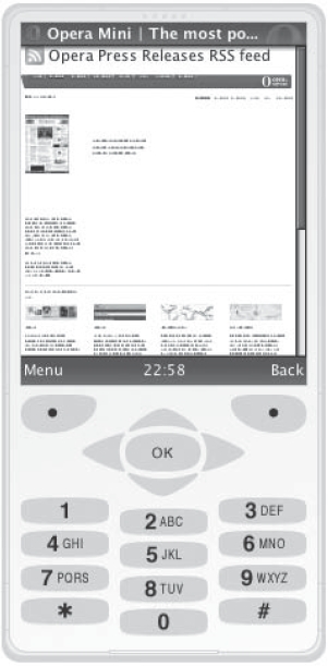
Figure 5-1. The Opera Mini simulator displaying the Opera Mini home page with default settings
Internet Explorer Mobile
The mobile version of Internet Explorer Mobile, originally called Pocket Internet Explorer (or PIE), is Microsoft's mobile equivalent of their Internet Explorer browser, which actually was written from the ground up and is not based on the Trident code base like its desktop version. Unsurprisingly, Internet Explorer Mobile is found exclusively on Microsoft's mobile operating systems, Windows Mobile and Windows CE. All of these devices will have IE Mobile installed by default, although many vendors will install a mobile version of Opera as well.
Like Opera Mini, IE Mobile will actively reformat most web content so that it renders more linearly. Version 6 of IE Mobile includes a feature that allows users to toggle viewing sites as a mobile user or as a desktop user. The latter option displays web pages as if a mobile style sheet were not detected. IE Mobile is surprisingly versatile and even supports user style sheets, which you install via the Windows Registry.7
Blazer (NetFront)
On many PDAs such as the Palm Treo family, the Sony PlayStation Portable, and the Amazon Kindle to name a few, you're likely to find embedded browsers based on the NetFront engine. Blazer, the default browser on PalmOS devices, is one of the most well-known NetFront-based browsers. NetFront is technically an exceptionally capable engine that supports WAP and WML, cHTML, and XHTML Mobile, as well as SVG and JavaScript.
Far from going extinct, newer versions of NetFront-based browsers are finding homes in networked appliances and consumer electronics devices of many shapes and sizes. Recent releases of NetFront have added support for RSS viewing and Ajax, among other features. It is especially popular in Japan, where NTT DOCOMO uses it on smartphones sold as part of their i-mode service.
__________
7. The IE Mobile blog is possibly the best place to get information about Internet Explorer Mobile. Their entry on “Customizing IE Mobile with User Stylesheets” can be found at http://blogs.msdn.com/iemobile/archive/2006/03/15/552029.aspx.
Openwave Mobile Browser
Although much less pervasive today, the Openwave Mobile Browser once claimed over 60 percent of the mobile web browser market share. It is also significant from a historical perspective because Openwave, Inc., the company that created this browser, was heavily involved in the earliest mobile web browsing initiatives. Among other things, the company was a founding member of the WAP Forum, and was instrumental in pioneering both the Wireless Markup Language (WML) and its precursor, the Handheld Device Markup Language (HDML).
Modern versions of the Openwave Mobile Browser support XHTML-MP, CSS, and cHTML in addition to WML. You can get a full simulation environment for Windows that emulates the browser running on a smartphone at http://developer.openwave.com/dvl/tools_and_sdk/phone_simulator/.
Fennec (Gecko)
Gecko, the rendering engine underlying all variants of Mozilla's web browser (including Firefox), has the distinction of being the second most widely deployed desktop rendering engine behind Internet Explorer's Trident. Nevertheless, there is no competitive equivalent for mobile devices. To address this, in 2008 the Mozilla Foundation launched Fennec,8a project to port Firefox to a mobile aspect.
There are desktop versions of Fennec available for development and testing for Windows, Linux, and Mac OS X systems.9 The UI of the browser is notably Spartan, as the screenshot of an alpha build for Mac OS X shows in Figure 5-2. As of this writing, Fennec only ships on the Nokia N800 and N810, devices that run Maemo, a Linux distribution purpose-built for Internet Tablets.10

Figure 5-2. Upon first launching Fennec, its welcome screen indicates that most controls are to the left or right of the viewport. Also noteworthy is that the address bar serves double duty, displaying the page's title.
__________
8. You can get more details from the Fennec project page at https://wiki.mozilla.org/Fennec.
9. Fennec is in the very early Alpha stages of development as of this writing. Nevertheless, if you're curious, we encourage you to download a copy for your platform at http://ftp.mozilla.org/pub/mozilla.org/mobile/.
10. Internet Tablets are devices that can be described as halfway between an iPhone and a laptop. Nokia backs the Maemo project itself and information about the project can be found at http://maemo.org.
Firefox add-ons such as the Web Developer Toolbar by Chris Pederick can provide you with useful mobile web development tools. Using Chris's extension, you can select CSS  Display
 CSS by Media Type Handheld to view a site as styled with handheld CSS rules, and you can use the Resize menu to preset many popular mobile display widths. You can also access these commands after installing the extension from Firefox's Tools Web Developer menu.
Mobile Safari and Android (WebKit)11
Although Opera dominates the mobile web browsing space in terms of raw install base, Mobile Safari, the web browser found on iPhone and iPod touch devices, is the mobile user agent that most web sites are seeing the greatest amount of traffic from. The core of the Mobile Safari browser is WebKit, which has been garnering a growing amount of press and developer attention for some years now. WebKit originated as a fork of KHTML, an HTML rendering library intended for use in Linux's K Desktop Environment (KDE), and which was used for some time in its Konquerer browser.
Among WebKit's key benefits are its relatively small footprint and the ease with which it can be embedded in other applications. This makes it easy to customize, and—as an open source project12—its license is relatively unencumbered. WebKit is used in the default web browser on Nokia's S60 as well as Google's Android mobile platforms.
WebKit is also finding its way into an increasing number of desktop browsers, which can provide approximations of the WebKit experience for development purposes. Among these are Safari for Mac OS X and Windows,13 Google Chrome,14 and Konqueror.15 However, desktop browsers can't always provide an adequate emulation of a mobile device, so for a more exacting experience, Mac OS X users are encouraged to download the full iPhone SDK,16 which includes an iPhone Simulator, and the Android SDK,17 which similarly provides an emulator, shown in Figure 5-3.
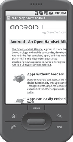
Figure 5-3. A screenshot of the Google Android emulator displaying the Google Android homepage
__________
11. The Web Developer Toolbar by Chris Pederick can be downloaded from Chris's web site at http://chrispederick.com/work/web-developer/.
12. You can get daily builds of the latest development versions that the WebKit community produces by downloading nightly builds at http://nightly.webkit.org.
13. If you don't already have Safari on your machine, you can download it at http://www.apple.com/safari/.
14. As of this writing, Google Chrome only runs on Windows. It is also available for free at http://www.google.com/chrome.
15. The Konquerer home page is at http://www.konqueror.org/.
16. The iPhone SDK can be downloaded from http://developer.apple.com/iphone/.
17. The Android SDK can be downloaded from http://code.google.com/android/download.html.
Developers and analysts alike are describing Mobile Safari as the future of the mobile Web, so it and its engine are both software to pay close attention to. It's very likely that WebKit-based mobile browsers will continue to enjoy increases in market share over the coming months and years. Later in this chapter, we'll discuss Mobile Safari and some of its WebKit-specific features in greater detail.
Comparing browsers and displays
A mobile web browsing experience is affected by both hardware and software components. Although what software will ship with what hardware is often well known, in many cases users have the ability to install different browsers after making their purchase, or service providers selling these devices may choose to install a different web browser themselves, creating many additional possible combinations of user agents and devices. In Table 5-1, we compare screen resolutions and default browsers across a sampling of mobile devices.
Table 5-1. Screen Resolutions and Default Browsers
As you can see from the sampling in Table 5-1, screen sizes for mobile devices range from as small as 128 pixels square to as high as 600×800 pixels, with a great variety in between. Even if you consider that most users rarely (if ever) upgrade their default web browser or install a new one after they've acquired their device, this showcases relatively rough terrain for a developer to navigate. Nevertheless, as we'll discuss next, it can be done.
Delivering mobile style
Earlier in this chapter we touched on the constraints we are faced with when developing for mobile devices. These issues can make or break a mobile design, so be sure you've considered and tested for them in your designs.
Bandwidth and processing capability is probably going to be an issue for mobile devices, so be sure your code is as lean as possible. Use good markup practices: remove any presentational data from your HTML, use descendant selectors and classes in the broadest terms, optimize your code, and be ruthless about avoiding redundant rules and keeping your style sheets as succinct as possible.
Images may not always be available. When they are, they may be a huge bandwidth drain as well. Keep them small and optimized, and use scalable methods (such as percentage widths) to insert your graphics. Setting height and width values will help pre-arrange your slow-loading layout before all the images have been downloaded as well. An image that is too wide will push your content out and create those unsightly horizontal scroll bars. Be absolutely sure that your images have alt attributes with concise and meaningful text in case the client does not support images, or use display: none for images that you'd like to hide from the mobile browsers. (Note: Even though we have set the image to display: none, the browser may still download the image a linked asset, incurring a bandwidth hit. If you're ruthlessly optimizing pages, you may wish to consider alternate schemes, such as programmatic style sheet switching or sending mobile users to a separate URL. But for lightweight page designs with well-crafted code and optimized images, this may not be as much of a concern.) You might even intentionally decide to show alt attribute text instead of the image itself using CSS3's capability to replace real content with pseudo-content:
img { content: attr(alt); }
Things like frames and pop-up windows will not always work well on mobile. Avoid these constructs if you can. JavaScript may not work as well, so be sure you have a graceful failover mechanism installed for those fancy Ajax calls that you had baked into your site.
Color is likely to be less rich on the low-end and midrange phone devices, and the same is likely true for older smartphones. Early smartphones such as the Handspring Treo 180 and the BlackBerry 6750 had monochrome screens. Be sure that you plan on high-contrast color choices to ensure readability on the widest range of devices.
If designing specifically for handhelds, you will undoubtedly want to go for a single-column layout. Most of the time the user is going to have the wider part of the screen in a vertical aspect when holding a mobile device, and of course the screen width is far narrower than what you'd encounter on the desktop.
Forms are always going to be a bit tricky to handle on the user end. Entering text is more of a challenge on mobile devices than on desktop systems due to the limited text input and navigation capability, so do your form users a favor and make your forms simple. Use as few form fields as you can. Preload data into select menus, check boxes, or radio buttons whenever possible. Make the form elements fit the mobile interface, usually by increasing the height a bit and making text fields fit the width of the device screen. Also, textarea elements need to be conscious of height as well; too large and it may be difficult to enter text into the interface if the page scrolls above or below the element.
Finally, readability is the main thing your users are after in most cases. Make sure your fonts are set to be at a readable size and style for smaller screens. Many mobile browsers lack a lot of font resizing options, so don't make your type too small.
The handheld media type
The handheld media type is the simplest way to target a style sheet for mobile (i.e., “handheld”) devices. This can be done either via a <link> element or via an @media rule. Recently Opera and WebKit have led the charge for mobile browsers to default to screen instead of handheld style sheets, with Opera providing an option to choose handheld for the media type over screen and WebKit going so far as to ignore support for handheld completely. But using the handheld media type is still great for targeting many of those other browsers out there and this will be our first working example for this chapter. Here are some examples of the various ways to invoke the handheld media type:
The link method:
<link rel="stylesheet" href="mobile.css" type="text/css"

    media="handheld">
Applying handheld to an embedded style sheet:
<style type="text/css" media="handheld">

    div.foo { color: red; }

</style>
Using @media handheld to target handheld styles:
<style type="text/css">

    @media handheld {

        div.foo { color: red; }

    }

</style>
Using @media handheld to import a mobile style sheet:
<style type="text/css">

    @import url(mobile.css) handheld;

</style>
Of these various methods, the handheld media type applied to the link element or to an embedded style sheet tends to have the widest support.
Formatting a page for handheld media
To practice some of these concepts, let's work with our résumé example from the previous chapter. As a reminder, Figure 5-4 shows what the page looks like on a desktop browser:
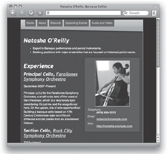
Figure 5-4. Our résumé page in its original state as shown in a desktop web browser
Our goal is to reformat the résumé so that it looks reminiscent of our desktop design on mobile screens, and so that the content is clear and accessible.
Let's pick up from where we left off in the last chapter by adding an embedded style sheet, this time with a media type of handheld:
<!DOCTYPE html PUBLIC "-//W3C//DTD XHTML 1.0 Strict//EN"

    "http://www.w3.org/TR/xhtml1/DTD/xhtml1-strict.dtd">

<html lang="en-us" xmlns="http://www.w3.org/1999/xhtml"

    xml:lang="en-us">

<head>

<title>Natasha O'Reilly, Baroque Cellist</title>
<meta http-equiv="Content-type" content="text/html; charset=utf-8" />

<link rel="stylesheet" href="screen.css" type="text/css"

    media="screen" />

<link rel="stylesheet" href="print.css" type="text/css"

   media="print" />

<style type="text/css" media="handheld">

   /* Our mobile CSS rules will, for the most part, go here. */

</style>

</head>

<body>

<div class="hresume layout" id="natasha-oreilly-orchestra-resume">

   [...]

</div>

</body>

</html>
For our initial testing purposes, we'll use the Opera desktop browser. This will allow us to write code and quickly preview our mobile styles from our computer, and it should work mostly the same on the operating system you are likely using. Before adding a handheld-specific style sheet, Opera will attempt to do something interesting to a website: it will attempt to reformat the page into a single-column and with a narrower aspect. Adding a blank handheld media style sheet will disable that feature in Opera and instead render an unstyled HTML document. In desktop version of Opera set to Small Screen mode, this would appear as shown in Figure 5-5.
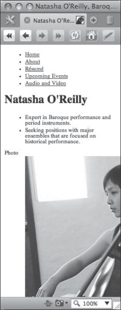
Figure 5-5. Initial rendering of our (empty) handheld style sheet
Admittedly, not a huge improvement, but it's a start. The first thing we notice is that our image is too large, so let's fix that right away:
<style type="text/css" media="handheld">

    img {

        max-width: 100%;

    }

    dt {

        font-style: italic;

   }

    dd {

        margin: 0;

        padding: 0;

        font-weight: bold;

    }

</style>
With this set of rules, we've made sure that our image fits within the space of our device's window by using the max-width property set to 100%. This attempts to keep our image within the space of the viewport, but there's a problem. The <dd> element is pushing it out to the right, clipping our image and generating a vertical scroll bar. This is easily resolved by setting the margin and padding of the <dd> element to zero, and we set it to both the margin and the padding to be on the safe side because we're really not sure how various user agents will handle this. Finally, we added a little italic style to the <dt> and bold to the <dd> to give them definition. And now we can say that this layout adequately fits our screen and should work in a variety of mobile browsers as is, and we can proceed with adding more cosmetic and functional elements to our style sheet. Figure 5-6 shows how it looks now in Opera's Small Screen mode.
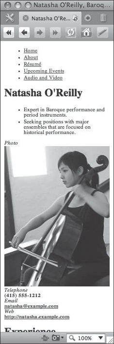
Figure 5-6. A preview of our initial mobile styles, with an image that fits and some styling on the definition list
Right here it is important to note a concern about the image in our web page. The image weighs in at 26 kilobytes, which may be considered kind of large by wireless network standards, and the native size of the image is 300×400 pixels, which is definitely overkill for all but the top end smartphones. Images should be reduced to a realistic size on dedicated mobile web sites and compressed as far as makes sense for your design requirements. Since we are going to only repurpose our page for mobile through CSS, let's not worry about this now.
Establishing color and typography
Now that we have our boxes established, let's fill in a few stylish items on our page and start to make it look somewhat reminiscent of our desktop browser version. First, the basics: we will apply some background and font colors and see the result in Figure 5-7:
<style type="text/css" media="handheld">

    body {

        background-color:#333;

        color:#FFFED1;

        font-family: Helvetica, Arial, sans-serif;

        margin:0;

        padding:0;

    }

    div.layout {

        padding:0 0.5em 1em 0.5em;

    }

    img {

        max-width:100%;

    }

    dt {

       font-style:italic;

    }

    dd {

       margin:0;

       padding:0;

       font-weight:bold;

    }

</style>
Now we're getting somewhere. With these few additions, this mobile view is recognizable as being related to our desktop design. The background and font colors have been set to match the desktop version using background-color:#333; and color:#FFFED1; A little padding has been applied to our existing <div id="layout"> element—this single column layout doesn't have much need for a layout <div> container on the surface, but it does give us a consistent place to apply padding. The next obvious things that need fixing are the hyperlinks to match the desktop view, which is easily done with a few anchor rules:

Figure 5-7. Initial color styles
a:link {

    color:#FFC300;

}

a:visited {

    color:#FC6;

}

a:hover, a:active {

    color:#F00;

 }
Now that the links are taken care of, we need to work on the navigation toolbar. For this, we're going to go for a similar effect to our desktop style sheet but make it work for mobile as best we can. To start with, zero out any margin or padding that might be applied to the <ul> and <li> elements, and set the list-style-type to none:
#sitenav ul {

    list-style-type:none;

    margin:0;

    padding:0;

}

#sitenav li {

    margin:0;

    padding:0;

}
Then we'll work on the #sitenav a rules to make nav buttons:
#sitenav a {

    display:block;

    float:left;

    padding:0.3em 0.4em 0.1em 0.4em;

    margin-bottom:0.2em;

    margin-right:0.2em;

    border:1px outset #999;

    border-top:0;

    background-color:#555;

    text-decoration:none;

}
Here we've set the anchor element display to block and floated the buttons to the left. The margin and padding values are set to make the buttons appear proportional to the screen view, with the same border and background styles and of course the removal of the default anchor underline by using text-decoration:none.
If you preview our page now, you'll see that the nav bar elements that are floated now wrap to the left of the heading that represents the name of the musician. This is an easy remedy:
.vcard {

    clear:both;

}
The result of clearing the .vcard is shown in Figure 5-8.

Figure 5-8. Establishing the mobile nav buttons
The nav button text causes the last two buttons to definitely appear a bit wide, and it would be nice if we could use “CV” instead of “Résumé” as a conveniently short abbreviation. We can fix that by using some replaced content techniques (see the results in Figure 5-9):
#sitenav a[href="http://natasha.example.com/cv/"] {

    content: "CV";

}

#sitenav a[href="http://natasha.example.com/cal/"] {

    content: "Events";

}

#sitenav a[href="http://natasha.example.com/av/"] {

    content: "A/V";

}
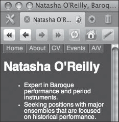
Figure 5-9. Condensed buttons using content replacement
Not bad—we have the buttons fitting all on one line now in our arbitrarily sized window (230 pixels in this screen capture). The next step is to add the banner background graphic. Let's add it to the <body> element since we have some background color already applied there; Figure 5-10 shows the results:
body {

    background: #333 url(bak.tif) 0 −13px no-repeat;

    color:#FFFED1;

    font-family: Helvetica, Arial, sans-serif;

    margin:0;

    padding:0;

}

Figure 5-10. Background applied to the nav bar
Here we've replaced background-color with the background shorthand rule, applied the bak.tif image to give us that nice and warm-colored background, and moved the image up by using a value of −13 pixels, which serves to make the bottom edge of the buttons line up with the background image's gradient effect.
Since we are for the most part limited to designing single-column layouts for mobile web sites, we can add some separation of the sections by implementing a border:
.vcard, .vevent {

    border-bottom:1px dotted orange;

}
Here we've conveniently used the microformat classes for two existing semantic constructs, hCard (vcard) and hCalendar (vevent), and placed an orange dotted border beneath them. It is nice that we can target these specific classes, which give us good placement for the borders rather than trying to find the right combination of descendant selectors to get a similar effect. Leveraging the microformats structure can be useful to CSS authors due to the added number of semantic hooks that exist in the markup.
Now the rest is just nudging and tweaking things for polish. The headings can be styled to be slightly more fancy. Since we don't know what browsers will have in terms of fonts—it can be a complete free-for-all—let's just go with a keyword on the font family for <h1> elements, italicize <h2>, and make sure that first <h1> (with the #bw-name ID) isn't too close to the nav bar:
h1 {

    font-family:cursive;

}

h2 {

    font-style:italic;

}

h1#bw-name {

    margin-top:1.2em;

}
This gets us almost to the finish line. Now let's complete our design by styling the two summary list items, and add a little increase in the line height for some of the text to make it more readable. First, the summary, which is indented a little too far on the left side, and which looks too pronounced in normal font style:
ul.summary {

    padding-left:1.5em;

    font-style:italic;

}
Better. And finally, some line height for readability:
p, dd, .summary li, [rel="tag"] {

    line-height:1.4;

}
This could also be applied to the <h2> since those look a little tight:
h2 {

    font-style:italic;

    line-height:1.2;

}
And for the final touch, you will notice the default dotted underlines that Opera places on our <abbr> elements. Let's get rid of that—it is not much help in this example (the help text is a machine-formatted date):
abbr {

    border:0;

}
And that does it. Here's our final style sheet and a view of our page in Opera in Small Screen mode (see Figure 5-11 for the results):

Figure 5-11. Final handheld styles
<style type="text/css" media="handheld">

    body {

        background: #333 url(bak.tif) 0 −13px no-repeat;

        color:#FFFED1;

        font-family: Helvetica, Arial, sans-serif;

        margin:0;

        padding:0;

    }

    div.layout {

        padding:0 0.5em 1em 0.5em;

    }

    h1 {

        font-family:cursive;

    }

    h2 {

        font-style:italic;

        line-height:1.2;

    }

    h1#bw-name {

        margin-top:1.2em;

    }

    p, dd, .summary li, [rel="tag"] {

        line-height:1.4;

    }

    abbr {

        border:0;

    }

    a:link {

        color:#FFC300;

    }

    a:visited {

        color:#FC6;

    }

    a:hover, a:active {

        color:#F00;

    }

    img {

        max-width:100%;

    }
    dt {

        font-style:italic;

    }

    dd {

        margin:0;

        padding:0;

        font-weight:bold;

    }

    #sitenav ul {

        list-style-type:none;

        margin:0;

        padding:0;

    }

    #sitenav li {

        margin:0;

        padding:0;

    }

    #sitenav a {

        display:block;

        float:left;

        padding:0.3em 0.4em 0.1em 0.4em;

        margin-bottom:0.2em;

        margin-right:0.2em;

        border:1px outset #999;

        border-top:0;

        background-color:#555;

        text-decoration:none;

    }

    #sitenav a[href="http://natasha.example.com/cv/"] {

        content: "CV";

    }

    #sitenav a[href="http://natasha.example.com/cal/"] {

        content: "Events";

    }

    #sitenav a[href="http://natasha.example.com/av/"] {

        content: "A/V";

    }

    .vcard {

        clear:both;

    }

    .vcard, .vevent {

        border-bottom:1px dotted orange;

    }

    ul.summary {

        padding-left:1.5em;

        font-style:italic;

    }

</style>
To finish our operation, we need to extract our style sheet into an external file. Copy all the CSS code in-between the <style> elements to an external file named handheld.css, delete the old <style> element and its content, and link to the new external style sheet:
<link rel="stylesheet" href="handheld.css" type="text/css"

media="handheld" />
There was a time in the past when detecting the user agent at the onset of a page request and redirecting things as appropriate was considered a good idea (if it was considered at all). This technique fell out of fashion with the onset of the web standards movement, and developers began to insist on serving one page to all devices. However, with the diversification of so many devices, capabilities, and sizes in the handset market, user agent detection may be a solution for certain situations.
Such a situation might be where you want to deliver truly optimized content to a specific handset category. It is a fact that when any browser hits a web page, they are going to have to download all of the linked assets on that page whether or not they are set to display, and this can be a drag on bandwidth. Additionally, you may want to deliver custom content to a specific type of handset, such as touch-screen controls to an iPhone or BlackBerry Storm, which might not be necessary on other devices that use keypad controls or a stylus pointer.
While this technique is useful for redirecting traffic to an optimized version of the site, there is a major drawback. User agent detection is tricky. The user agent strings have little consistency between them and tend to change over time, meaning a developer will continually have to return to the script to ensure that something isn't getting left out as the browsers and user agent strings evolve over time.
Designing for Mobile WebKit
WebKit is the basic rendering engine for a number of excellent web browser implementations in the smartphone market, the most prominent of which is the Safari browser on iPhone and iPod Touch. Google's Android platform is another prominent WebKit browser implementation, and Nokia's S60 browser also uses WebKit port for the Symbian platform on their handsets.
Why optimize for WebKit?
WebKit-enabled handsets do constitute a fraction of the current total mobile browser market share, but this market share growth is outpacing the rest of the industry. According to AdMob's Mobile Metrics Report for November 2008, Apple's iPhone had both the highest percentage of requests for any single handset as well as the highest percentage of increased worldwide market share. The second-fastest growing device was the iPod Touch, and the just-launched HTC G1, which runs Google's Android platform and a WebKit-based browser, has already garnered 7 percent of T-Mobile's web traffic and 2 percent of the global web traffic market. This is only the first phone to market on the Android platform. Android is the OS component of the Open Handset Alliance, a consortium of industry heavyweights banded together to pool their resources and create a next-generation open mobile handset platform. These industry heavyweights include such companies as China Mobile, NTT DOCOMO, Sprint, T-Mobile, Vodaphone, Motorola, Samsung, Sony Ericsson, HTC, Toshiba, and of course Google, just to name a few. These are no minor players—these are some of the biggest names in the mobile market. Expect more and more providers and manufacturers over the coming years to be producing Android-based phones, equipped with the accompanying WebKit-enabled browser.
In many respects, you could simply choose to ignore WebKit-enabled handsets. WebKit intentionally is set to ignore the handheld media type and deliver the screen media type by default. The idea behind this is that WebKit is delivering “the whole, unfiltered Web,” without any compromises to the layout, and that you would be able to leverage the zooming capabilities of their web browser to view columns of text and images up close, and then zoom back out when they need to navigate to other parts of the page. It is an ingenious little feat of usability in the way Safari works on the iPhone—you simply need to double-tap on a block-level element to zoom in on exactly that element, or you can use the two-finger pinch maneuver to zoom in and out of pages as desired. While other implementations of WebKit may vary, this basic principle of being able to zoom in and out of content quickly is what makes WebKit so useful for viewing full-scale web layouts.
But for the purposes of this discussion, let's assume that your project requires an optimized view for the iPhone and related WebKit-enabled handsets. You want your content to be readable and accessible, and are willing to trade off a few features normally found on the full-scale version of your web site.
Previewing WebKit pages
When testing on mobile devices, nothing beats having the real device in your hands to test things with. However, owning one of each of the multitude of WebKit-enabled devices is not fiscally practical, save for the most high-end production teams doing sophisticated web application development. For the rest of us, some simulation of the mobile WebKit environment is going to be just fine.
To get started, the simplest way to preview your work may be to simply use the desktop version of Safari. Safari is available for the Mac OS X and Windows operating systems, and checking your code here will give you a decent approximation of how your site design will appear in the mobile version of the browser. What is even better is that Safari has a built-in developer feature. In Safari preferences, click the Advanced tab and select the Show Develop Menu in Menu Bar check box, as shown in Figure 5-12.
However, Safari isn't going to be much help if you are going to be doing any kind of specialized mobile style sheet delivery, and we will certainly be using media queries to accomplish this goal in this example. To use Safari for previewing your work, you must set the style sheet you are working on to use a media type of screen or all, and then reduce the width of your browser accordingly as you preview pages.
There are some iPhone simulators out there that will allow you to see what dedicated WebKit-optimized sites will look like. However, as of this writing none of them are capable of either detecting user agent strings or handling media queries, the latter of which will be required for our examples later on. They won't be much better than just using Safari itself, outside of the fact that at least they'll represent the screen size correctly.

Figure 5-12. Check the Show Develop Menu in Menu Bar option to enable developer features in Safari.
A better way is to install a software developer kit that contains a desktop device simulator. If you're running Mac OS X, the recommended one to start with is the iPhone Developer SDK. This is going to be a large download, which includes the entire Xcode Developer Tools suite plus all the iPhone utilities, but the tools that are included with the SDK are quite useful. What is particularly useful is the iPhone Simulator application, which includes a full version of Mobile Safari. This is the closest you are going to get to running an iPhone without actually having one. There are more goodies in the iPhone SDK for mobile web development, but the iPhone Simulator will be a great place to start. After installing the iPhone SDK on your Mac, look in /Developer/Platforms/iPhoneSimulator.platform/Developer/Applications for the iPhone Simulator application. Figure 5-13 shows how the résumé example looks in the simulator.

Figure 5-13. The résumé page as it renders in the iPhone Simulator prior to WebKit CSS treatment
If you are not using Mac OS X, there are alternatives. The Google Android SDK runs on Windows, Mac, and Linux, and is available at http://code.google.com/android/. This SDK includes an Android simulator, including the Android version of WebKit. Another advantage to running the Android SDK is that it is an approximately 90MB download, which is compelling considering the iPhone SDK is a hefty 1.56GB. Both the iPhone SDK and Android SDK will work fine for these examples.
Basic layout properties
The screen of WebKit-enabled devices such as an iPhone or iPod touch is going to be much smaller than desktop browsers, but for the most part WebKit on these devices will be comparable in terms of capability. Mobile Safari on the iPhone and iPod Touch assumes by default a width of 980 pixels for the web sites it visits. It then automatically converts this width to a scaled-down level that fits on the devices' actual 320-pixel-wide display. It does the same thing for the height, shrinking the assumed 1091-pixel-high web site into the physical 480-pixel-high rendering.
Setting the viewport
The iPhone and iPod Touch assume a 980-pixel-wide page and then try to crunch the view of the resulting page into the 320-pixel-wide viewport of said device. This can result in some pretty tiny text. It is resizable a bit if you tilt the unit 90 degrees, but this can be considered another user inconvenience and it doesn't always do the trick.
This behavior is controllable via a special <meta> element that you can place into iPhone-optimized pages. For instance, if your web site is not 980 pixels wide but is instead 640 pixels wide, use <meta name="viewport" content="width=640" />. <meta name="viewport" content="device-width"> is the default that's assumed if a <meta name="viewport" ... /> element is not found.
On the iPhone and iPod Touch, and likely on most other WebKit-enabled devices, the user can scale the screen view to zoom in on particular elements. This is a useful feature for sites that aren't already optimized for mobile, but perhaps you've done the legwork to make your site as friendly as possible to the WebKit users and zooming would just throw the layout off. In these cases, use user-scalable=false: <meta name="viewport" content="width=640; user-scalable=false" />.
“But wait,” the inner Standardista in you says, “this isn't CSS! Isn't this just presentational cruft being added to our markup?” True; establishing a viewport value via a metatag is not very flexible and this would probably be cleaner in a style sheet, but regardless this is an important aspect of mobile WebKit design and we have to leverage it if we want to benefit from this effect.
For our example, let's fix the width of the viewport to our screen layout <div>. The layout <div> was set to 60% in our screen style sheet, and we know that the iPhone assumes pages to be 980 pixels wide. So let's shoot for setting the viewport to 60% of the 980 pixels, which comes out to 588, reset the layout <div> to 100%, and see where that gets us (check out Figure 5-14):
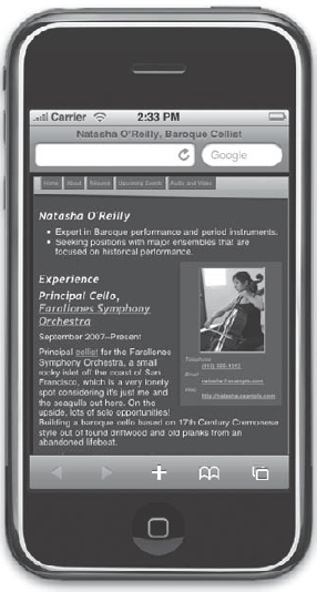
Figure 5-14. Setting the viewport width
<meta name="viewport" content="width=588; user-scalable=false" />

<style type="text/css" media="only screen and

(max-device-width: 480px)">

    div.layout {

        width:100%;

    }

</style>
This by itself doesn't look too bad. But by resetting the width of our layout <div> using the screen media type, we've broken our layout in the desktop browsers. We need to style the WebKit view separately, and this will be accomplished using a CSS3 media query.
Using media queries
Media queries are part of the CSS3 specification, and are gaining wider support in the modern mobile web browser scene. They provide more fine-grained control over what style sheets are served to what types of browsers and devices, and the scope goes way beyond the mobile web browser world. Media queries are recommended by Apple to apply style to Mobile Safari.
As mentioned earlier, WebKit and the latest versions of the Opera browser on mobile devices default to show the screen media type. On Opera there is an option to switch the default back to mobile, but on WebKit it is locked down and handheld is completely ignored. Using media queries is the recommended CSS mechanism to direct style sheets toward WebKit, and it will get picked up by Opera in the process.
So far, our small little change has yielded a layout that isn't too bad as viewed in the iPhone Simulator, but as mentioned earlier, we've broken the desktop view. Let's fix that by introducing a media query:
<meta name="viewport" content="width=588; user-scalable=false" />

<style type="text/css"

media="only screen and (max-device-width: 480px)">

    div.layout {

        width:100%;

    }

</style>
This change adds some conditions to our media value, and may be read as “these styles are only for screen media where the maximum device width is 480 pixels.” If you preview the page now in a desktop browser, you should see the same original design. And in a mobile version of WebKit, you should see the optimized width of the page.
Styling links to be touch-friendly
WebKit is prevalent on the iPhone OS and Android OS devices, both of which feature touch screen capability. But the finger, while far more convenient than toting a stylus or reaching for a mouse, is not a very precise pointing device. We need to make our page controls friendly to our fingertips, and this invariably means increasing the surface area of what is clickable.
For navigation buttons, it works well to make buttons approximately 1 centimeter wide and at least half a centimeter high. This creates a finger-selectable area that is pretty easy to target for most people. However, don't stop there if you feel like going larger. It is quite common to make navigation buttons and similar controls 100 percent of the width of the viewport. Let's see what we can do with our page to make it more usable on WebKit for finger selection (see Figure 5-15):
Figure 5-15. Styling buttons to be more touch-friendly
<style type="text/css"

media="only screen and (max-device-width: 480px)">

    body {

        margin:0;

        padding:0;

    }

    div.layout {

        width:100%;

        margin:0;

        border:0;

    }

    #sitenav {

        margin-left:-12px;

    }

    div#sitenav a {

        width:97.7%;

        font-size:2em;

        margin:0;

        border:1px solid #333;

        text-align:center;

    }

</style>
We have enlarged the text size and made our buttons wide enough to fill the width of the viewport. We had to zero out margin and padding on the body element to get rid of the browser defaults and make our interface fit more neatly on the screen. Now our buttons are easier to use with a fingertip, but we are missing our nice banner background image and the page looks a little plain now. As Figure 5-16 shows, we can bring that back, and solve a usability issue at the same time, by adding the following code beneath the div#sitenav a rule:
div#sitenav a[href="http://natasha.example.com/"] {

    background-image:url(bak.tif);

    background-position:top right;

    color:#000;

    font-family:"Trebuchet MS", sans-serif;

    font-style:italic;

    font-weight:bold;

}

div#sitenav a[href="http://natasha.example.com/"]:before {

    content: "Natasha O'Reilly, Baroque Cellist (";

}
div#sitenav a[href="http://natasha.example.com/"]:after {

    content: ")";

}
This nifty bit of code reuses some of our existing assets such as the background nav bar image and repurposes the home button to be a bit more descriptive. The attribute selector a[href=“http://www.natasha.example.com/”] specifically selects our home link so we can treat it with special care. Then rather than making some new background image, we simply reuse the old banner bak.tif image, but this time we position it to the right. The reason we're using it right here is because the banner image had a bit of an angle along the bottom edge, turning the shape into more of a trapezoid than a rectangle. Using the wide part of the image, we hide most of the taper, except for a tiny bit remaining on the left side of our button. To remove that extra taper, reduce the font size on div#sitenav a from 2em down to 1.9em and it should look perfect. (When more of the CSS3 spec is supported by WebKit in the future, background-size may also become useful for attaining an optimal placement in conjunction with background-position for this background image without having to compromise on button size.)
The original button name of “Home” wasn't terribly flattering to this page. Now that the home button is the top visual element in our layout, it doesn't really help the site user orient them as to where they are. Using the :before and :after pseudo-selectors, we have placed a bit of extra content to the left and right of the word “Home” to make the full string read “Natasha O'Reilly, Baroque Cellist (Home).” The button now serves as a sort of masthead as well, and it remains a helpful beacon if the user wishes to tap back to the home page.

Figure 5-16. Styling the home button to also function as the site banner
The next item to tackle is the definition list that contains the photo, email, and web address. The resolution of this section looks a little small in this layout, although it might still work as a floated element. Let's improve the size of the image and the text in this box:
dl {

    padding: 0;

    width: 48%;

}

dt, dd {

    margin: 0;

    text-align: center;

    font-size: 1.5em;

}

dd a {

    height: 2em;
    display: block;

    padding-bottom: 0.5em;

}

.photo {

    width: 234px;

    height: 312px;

    margin: 1em auto;

    display: block;

    border: 1px solid #111;

}
The <dl> element could be a bit wider, so the width here has been increased to 48%. Padding was applied on the other screen style sheet, and we've zeroed that out here. The <dt> and <dd> elements have also had their margins reset, which really only applies to WebKit's default left margin placed on the <dd> element. The text has been centered, and the font sized increased to 1.5em. The <a> elements that are <dd> children have been given some extra height to make them more tappable and to provide some distinction, and an extra 0.5em of padding has been added to the bottom of these elements to further improve the usability and visual separation.
For the image, we set the width to 234px and the height to 312px, which is a proportional reduction from the photo's native 300×400 size. The image is set to display:block, the top and bottom margins are set to be 1em, and the auto keyword is used on the left and right margins to center the image. The border is set to a medium gray value of #111 to finish the trimming, and we're done with this floated section.
If you look at the space after the navigation button where the body of the page begins, you'll see the heading is a little too close in proportion to the rest of the headings. Also, the hyperlinks embedded within the copy look like they might be a little hard to execute with a finger tap and might be better if there were more surface area. Let's fix both of those problems:
p a, #interests a {

    padding-top:0.5em;

    padding-bottom:0.5em;

}

#interests li {

    line-height:2;

}

h1#bw-name {

    padding-top:1em;

}
The first rule selects all <a> elements that are children of either paragraph elements or the element with the ID of #interests, and it sets half an em of padding above and below the link. This makes the item a bit easier to hit with a fingertip. The next rule selects all <li> children of the #interests <div> and increases the line height to 2. This again will make our links easier to access with the finger, and we've already provided a slightly larger surface area for tapping. Finally, we fixed the spacing problem at the top of the page by giving it 1 em of padding on the <h1> element with the ID of #bw-name.
Another Mobile Safari–specific optimization is to ensure that, when you zoom by double-tapping onto an element (which Mobile Safari interprets as “find the nearest replaced element as defined by CSS and zoom so that this element's entire width is displayed in the viewport”) is to use the vendor extension called -webkit-text-size-adjust. This property takes any value you can give line-height and adjusts the line height by that scale factor accordingly. This ensures that when you double-click to zoom onto a paragraph that stretches pretty wide, for example, the text itself is scaled up an appropriate amount so that it becomes readable. Therefore, you definitely want to ensure that you give this property a relative unit value!
Two more ways to customize tap behavior on Mobile Safari on the iPhone and iPod touch are to use -webkit-touch-callout and -webkit-tap-highlight-color. The -webkit-touch-callout property can use a value of none to disable the bubble that appears when you tap and hold a link on iPhone OS. The only allowable values are none or inherit (which is the default, and basically means “on”). The -webkit-tap-highlight-color property takes a CSS3-style rgba() value and customizes the color and transparency values of the highlight box that appears behind a link when you tap it (similar to the :active pseudo-class, which applies to the anchor text itself rather than this iPhone-added background box). To disable the background box entirely, use an Alpha value of 0, such as rgba(0, 0, 0, 0).
In this example, there is no reason to disable the callout bubble, but perhaps we might try styling that highlight color a bit. Let's make that background highlight a subdued shade of orange to match the site design:
a {

    -webkit-tap-highlight-color:rgba(255,128,0,0.2);

}
Now if you tap and hold on a link using WebKit on the iPhone OS, you will get an orange background with an opacity of 0.2 (or 20 percent if that helps).
The iPhone and iPod touch browsers allow users to “bookmark” a web site by adding it as an icon to the device's home screen. Normally a simple “screenshot” of the web page in the state it is in when this bookmark is added is used as the graphical icon to represent that web application. However, you can specify a custom icon to use by placing a Tif image file called apple-touch-icon.tif at the root of your site. If found, this icon works much like a favicon.ico image in that it automatically becomes the icon used for the device's home screen when it is “added to home screen” by a user. You can customize where this file is searched for by Mobile Safari with a <link> element:
<link rel="apple-touch-icon" href="http://example.com/iphone-icon.tif" />
If you use the custom <link> element, your Tif icon needs to be precomposed, that is, look exactly like the finished product that will appear on the iPhone's home screen, rounded corners and all. On the other hand, if you use the canonical file location that Apple will check automatically, make sure that the Tif icon you use does not include the rounded corners or the shine—these effects are added by the iPhone OS itself for consistency. For a nice, crisp image, use one that is 60×60 pixels.
Using CSS selectors in JavaScript
It is worth mentioning here that Mobile Safari allows a couple of interesting selectors that will be very useful to experienced CSS developers: querySelector() and querySelectorAll(). These are both part of the emerging CSS3 specification and allow us to intuitively use CSS selectors in JavaScript calls.
querySelector() will return the first match:
var cellosOrBasses = document.querySelector("#cellos, #basses");
In this example, the first element containing an ID of either cellos or basses will be returned. If <div id="cellos"> comes before <div id="basses"> in the HTML document, then the returned value from the call would be just the <div id="cellos"> part.
querySelectorAll() will return all matching elements as an array:
var strings = document.querySelectorAll("div.strings");
This would gather all the <div class="strings"> elements into an array variable called strings.
WebKit CSS transforms and transitions
The WebKit team has come up with a set of DHTML-like functions to allow developers to manipulate objects on a page using transformations as the elements are rendered (such as skewing or rotating an object), or even transitioning or animating the element over time, purely in CSS alone. These are currently vendor additions, but Apple has pitched these extensions to the W3C as additional CSS3 modules and they became W3C Working Drafts as of March 2009. These functions are available to use today in Mobile Safari, and are hardware-accelerated on the iPhone and iPod Touch, making such transitions appear very fast and smooth on these devices.
To gain a little exposure to these new tools and get a flavor for the possibilities, let's experiment with some of these new constructs in our style sheet:
    /* Webkit-specific rules */

    a {

        -webkit-tap-highlight-color:rgba(255,128,0,0.2);

    }

    dl {

        opacity:0.25;

        -webkit-transform:skew(-30deg) rotate(-8deg)

translate(-5em,-10em) scale(1.5);

        -webkit-box-shadow:2px 10px 13px rgba(0,0,0,0.5);

        -webkit-transition-duration:2s;

        -webkit-transition-timing-function:ease-in;

    }

    dl:hover {

        -webkit-transform: skew(0deg) rotate(0deg) translate(0,0)

scale(1);

        opacity:1;

        -webkit-border-radius: 20px;

    }
One of the easiest ways to develop iPhone-specific web sites is to use the Apple-provided Dashcode.app IDE as your development environment. Its preview pane is useful for testing how web applications built for Mobile Safari will look and function. Typically, when using Dashcode, you're better off getting your user interface laid out first, since many UI changes that you make via the drag-and-drop interface change code values underneath. If you make changes to the code itself in source view mode and then make additional changes with the drag-and-drop interface, your manual code changes will likely be overridden by the IDE.
You can make web applications run in full-screen mode! That's right; you can completely remove the Mobile Safari browser chrome from appearing when you launch a web app from the iPhone's home screen button. To do this, simply provide another special <meta> element like so:
<meta name="apple-mobile-web-app-capable" content="yes" />
If your users launch your application from the device home screen (instead of navigating to it directly from the Safari application's address bar), adding this line of HTML code will cause the application to launch in “full screen mode”—that is, sans browser chrome! It should be noted that this “full screen” behavior is only supported while the iPhone is in portrait (not landscape) orientation. You can also query full-screen state with a JavaScript one-liner:
window.navigator.standalone
This code returns true if the web app is in “full screen” mode (i.e., if it was launched via the home screen). Doing this does not remove the iPhone's “status bar” however. However, you can customize the coloring and style of the status bar with some built-in styles. Again, this is performed via a special <meta> element. The default style that you see on the home screen is the equivalent of this HTML command:
<meta name="apple-mobile-web-app-status-bar-style" content="black" />
Your other option for the status bar style is gray or black translucent.
You will notice that these are metatags with design elements baked in to the attributes. It is unfortunate that these elements are implemented as presentational markup instead of CSS, but they still could prove to be useful design tools in some instances. Use with caution.
Why is all this Mobile Safari stuff cool? Because you can use web-based content in native iPhone apps, too. Therefore, if you only know HTML/CSS but you want to build a native iPhone app, the only thing you need to do is create one large UIWebView window and the rest of your app can be embedded in it. You can even go so far as executing JavaScript from Cocoa applications as well as calling native Cocoa code from JavaScript.
Mobile Safari adds an entire JavaScript-based gesture API called DOM Touch so that your web applications can detect one- and two-finger gestures like pinch and zoom. This topic is beyond the scope of this book, but it's useful to note and we encourage you to learn more about it.
18. To call native Cocoa code from your HTML, CSS, and JavaScript code, register a custom URI scheme and construct a URI that the Cocoa code will catch, parse, and then execute. For example, calling a URI such as myapp://somefunction/parameter1/parameter2 inside your UIWebView will pass parameter1 and parameter2 to somefunction, assuming that the application that has been registered to handle the myapp scheme reacts appropriately, perhaps using the native NSURL class methods available to all Cocoa applications.
You can see the result of these code changes in Figure 5-17 and Figure 5-18.
Take a look at the <dl> rule first. The -webkit-transform property has four values after it: skew, rotate, translate, and scale. Skew and rotate are almost self-explanatory; they each perform skew and rotate operations based on the degrees (deg) value that you input. In this case, the −30deg will skew the top edge to the right and the bottom edge to the left, and a positive 30 would have the exact opposite effect. For rotate, we chose a value of −8deg because it looked nice for the effect we were going for, but try a value of 180deg and see what happens! The image will be upside down in the initial state.
The translate value is similar to relative positioning. The first number is the horizontal axis offset, and the second number is the vertical offset. A negative vertical offset will move the object higher, while a positive number will move it lower. For the horizontal plane, positive numbers will move the object to the right, and negative numbers to the left. Our example moves the object to the left 5 ems and up 10 ems.
It's also fairly simple to guess what scale does. The scale value can effectively be any number greater than or equal to 0. Here we've set the scale value to 1.5, or about 50 percent larger than the original.
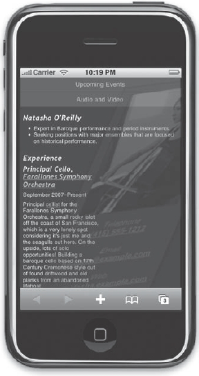
Figure 5-17. The initial state of the iPhone page with the info box and portrait faded, skewed, and enlarged. Tap on the image to activate the animation sequence.
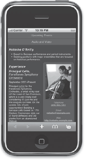
Figure 5-18. After tapping on the area where the picture appears, the objects animate and settle into the position shown.
The -webkit-box-shadow property gives us the ability to control shadows (such as the ubiquitous drop shadow) on any box object. The first value of 2px is the horizontal offset. In this case, the shadow is being shifted 2 pixels to the right (a negative value would shift it the other direction.) The second value is the vertical offset, and this value drops our shadow 10 pixels below the affected object. The third value is the critical blur radius value. A value of 0 would yield a crisp line. In this case, we've set it to 13 pixels, giving it a nice, soft blur. Finally, the last value is the color of our blur. We are able to use the CSS3-style RGBA value, set it to black with all zeroes for the R, G, and B spots, and take advantage of 0.5 for the alpha transparency spot to allow the shadow effect to blend in with the background color better.
Up to now we've described the transformations in CSS that affect our object's initial state. Now let's talk animation.
The -webkit-transition-duration value establishes timing for the transition effect. In this case, we've set it to 2s, or 2 seconds. This works in conjunction with the -webkit-transition-timing-function property to describe how this animation will flow. We have some default keyword values to play with such as linear, ease-in, and ease-out. Or we could define a custom value using the format cubic-bezier(x1, y1, x2, y2), and the four values represented would be used to compute a cubic Bezier curve. We're going to take the easy route and use the keyword ease-in, which gives a nice acceleration and snap at the end of the animation.
To trigger this animation, we are using dl:hover. On the iPhone and most other mobile devices that wield WebKit, there is no hover. However, the tap event works to execute this control and that's how we'll use it here. Within this rule we've simply reset the skew, rotate, translate, and scale values to their initial state. You could choose to tweak it the other direction or any which way you please, and we encourage you to experiment with these values to see what happens. We also have set opacity back to 1, and when the animation is triggered by a tap event, the whole box will snap back into place after 2 seconds. Try it by tapping on the image or anywhere within the border of the info box.
Speaking of borders, what would Web 2.0 be without rounded corners? We've added them here using the -webkit-border-radius property. You can get even more specific than that. Try -webkit-border-top-left-radius:20px; instead. Then add different border values to the other three corners. You can even add a 20 pixel rounded border to the bottom-left and bottom-right corners of the Audio and Video button to finish off the design (see Figure 5-19):
div#sitenav a[href="http://natasha.example.com/av/"] {

    -webkit-border-bottom-left-radius:55px;

    -webkit-border-bottom-right-radius:55px;

 }
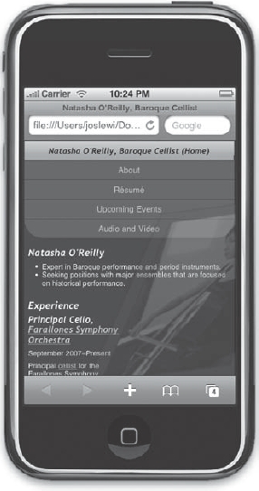
Figure 5-19. Rounding the bottom corners of the Audio and Video button
The final step of course is to extract our embedded styles and place them properly into an external style sheet. Copy everything in between the <style> tags into a new file titled webkit.css, add the highlighted line shown in the next code example to your HTML, and delete the old style tags. Here's how the <head> element should look now:
<head>

<title>Natasha O'Reilly, Baroque Cellist</title>

<meta http-equiv="Content-type" content="text/html; charset=utf-8" />

<link rel="stylesheet" href="screen.css" type="text/css"

media="screen" />

<link rel="stylesheet" href="print.css" type="text/css"

media="print" />

<link rel="stylesheet" href="handheld.css" type="text/css"

media="handheld" />

<link rel="stylesheet" href="webkit.css" type="text/css" media="only

screen and (max-device-width: 480px)" />

<meta name="viewport" content="width=588; user-scalable=false" />

</head>
And there you have it. We've styled our site to be very friendly to the WebKit browsers, and we've explored the future of CSS3. The WebKit platform is a growing market and worth paying attention to as other browsers will surely follow over time.
Summary
Earlier in this chapter we touched on the constraints we are faced with when developing for mobile devices. These issues can make or break a mobile design, so be sure you've considered and tested for them in your designs.
Bandwidth and processing capability are perpetual limitations for mobile devices, so you must follow good coding practices with the mobile set in mind. Use good markup practices: remove any presentational data from your HTML, use descendant selectors and classes in the broadest terms, and keep your code lightweight and optimized.
The mobile web is the fastest-growing area for web development. Since the release of the iPhone in summer 2007, mobile web use has exploded across all platforms, as have the number of pages that have begun to be optimized for handheld screens. Major web sites including Digg.com, Wikipedia, and the New York Times have all launched major efforts to make their web content more accessible to the handheld screen. As more and more people start to use mobile browsers to access your web content, don't miss the opportunity to make the adjustments to your site that may be necessary for keeping your pages attractive and accessible on the small screen. A small amount of effort in the mobile department can return large numbers of mobile users hungry for handheld-accessible web content.