
Part 1
INTRODUCTION: DIGESTING THE WEB'S ALPHABET SOUP
Today's Web is quickly evolving from a collection of linked documents to a collection of things with relationships. Where we once only had the simplistic Hypertext Markup Language (HTML) to distribute web content, today we have a plethora of formats that include two different varieties of traditional web pages; HTML and XHTML; multiple syndication formats such as RSS and Atom; and many others. Even the content of web pages themselves—text, images, tables, charts and graphs, and movies—have multiple different de facto standard formats like Flash, SVG, and various other dialects of proprietary XML.
Modern browsers use JavaScript techniques such as Ajax to transform themselves into full-fledged application platforms. Thanks to the networked nature of web content, the browser-as-application-platform model is pushing the boundaries of technological innovation at an ever-increasing rate. Web developers have so many different technologies at their disposal that it's often difficult to discern the appropriate path you should take.
To get from today's web of linked documents to tomorrow's web of things with relationships, web developers need a way to describe these things flexibly, and they need a way to make each thing available in all the different ways it's going to be accessed. Now that's a tall order.
| Chapter 1 |  |
MARKUP UNDERPINS CSS |
|
They say that every journey begins with a single step. The journey we're on began in 1965 at Brown University, where the idea of hypertext was born.1 Hypertext, or text in documents that enables nonlinear navigation (called hypertextual navigation), was eventually encoded as a markup language named the Hypertext Markup Language (HTML).
As the Web evolved, HTML was stretched and strained as it tried to be everything to everyone. Inside HTML documents there existed a mishmash of information, sometimes called “tag soup” by developers, which included display logic and code for user interaction. Somewhere in the middle of all of that metadata you could also find some content.
It didn't take very long for people to realize that this approach wasn't going to work in the future because it was fundamentally limiting. Rather than try to deliver one monolithic document to web browsers, it made a lot more sense to give browsers the building blocks of the content itself and then let the browser handle putting it all together. This principle is known as the separation of concerns.
__________
1. More precisely, the idea of hypertext is generally credited to Vannevar Bush in 1945, when he wrote about an electronic desk he called the “Memex.” For the most part, our personal computers are modern-day manifestations of this device. It was in 1965 that Ted Nelson first coined the term hypertext to describe this idea.
This simple idea is so fundamental to understanding how the Web works that it behooves us to take a closer look at the markup in documents upon which Cascading Style Sheets (CSS) acts. So let's first briefly examine the linguistics and semantics of markup languages.
The linguistics of markup languages
When you read the code of a markup language, you're reading a real language in much the same way as you are reading English when you read the words in this book.
As you know, when you view a web page you're asking your web browser to fetch a document. This document is just a text file that happens to be constructed in a special way. It's constructed according to the syntax and grammar of a particular markup language so that all the content it contains is represented in a structured format.
It turns out that this structure has some remarkable similarities to human languages. Put simply, when we construct sentences in human languages we often use a grammatical structure that begins with a subject, followed by a verb, and that then ends with an object. For instance, in the sentence, “The cow jumped over the moon,” the cow is the subject, jumped is the verb, and the moon is the object.
Markup languages also have rules of grammar. There are elements, each a building block or component of the larger whole. An element can have certain properties that further specify its details. These properties are often attributes, but they can also be the element's own contents.2 Finally, an element has a certain position within the document relative to all the other elements, giving it a hierarchical context.
In the following HTML code, we can see an example of these three concepts:
<blockquote cite="http://example.com/">

    <p>Welcome to example.com!</p>

</blockquote>
You can think of the <blockquote> element as our subject. It has an attribute, cite, which describes where the quoted paragraph came from, and you can think of it as our verb. The <p> element, which is the quote itself, can be considered our object. In English, this snippet of code might translate to something like, “This quote cites the page at http://example.com/.”
There are already some noteworthy points to make about this simplistic example. For one thing, the document is all about semantics, or the code's meaning. (The important role that semantic markup plays on the Web is discussed in more detail in Chapter 7.) For another, only semantic information and actual content (in this case, text) are present in the example code. Nowhere do you see any information about the way this content is to be displayed to the user, or what options the user has for interacting with it.
__________
2. Figuring out when to use which syntactical structures is a common question XML language developers have. In his article on the Principles of XML Design, Uche Ogbuji clearly articulates when and why to use one structure, such as elements, over another, such as attributes. The article can be found at http://www.ibm.com/developerworks/xml/library/x-eleatt.html.
This lack of presentational and behavioral information is an example of the separation of concerns principle at work. By delivering only the semantic content itself to the browser, you now have the flexibility to mix this same content with whatever other presentation or behavior you wish to give it. Lastly, of course, this example is written in XHTML, the markup language used to create traditional web pages.
HTML's semantics come from its history as a markup language originally intended to describe academic papers. It was derived from a subset of IBM's Standard Generalized Markup Language (SGML), which was used by large corporations and government organizations to encode complex industry papers.3 This is why HTML has a relatively rich vocabulary for describing different kinds of textual structures often found in written resources, such as lists (<ul>, <ol>, and <dl>) and computer output (<code>, <samp>, <kbd>), but has such a dearth of other kinds of vocabularies.
Thankfully, a modern variation of generic SGML exists today that allows anyone, including individual developers like us, to create their own markup language with their own vocabulary. This technology is known as XML, and it is arguably the technology on top of which tomorrow's Web will be built.
XML dialects: the many different flavors of content
One of the Web's challenges is describing many different sorts of content. With HTML's limited semantics, describing all the different kinds of content available online is clumsy at best, impossible at worst. So, how is it done?
Early on, the World Wide Web Consortium (W3C), an organization that governs the publication of industry-wide web technology standards, realized that in order to thrive, the Web needed the capability to describe all kinds of content, both existing and yet to be created, in a way that could be easily interoperable. In other words, if Joe invented something new and made it available online, it would be ideal if he would do so in a way that Jane can access.
The solution the W3C developed is the Extensible Markup Language (XML). XML has two primary characteristics that make it exceptionally well suited for the Web. First, it's a generic document format that is designed to be both human and machine readable. This is accomplished by using a strict subset of the familiar syntax and grammar that HTML uses, so it's very easy for humans to learn and for machines to parse. Second, the marked-up documents double as a data serialization mechanism, allowing autonomous systems to easily exchange the data they contain among themselves.
What sets XML apart from the other standard document formats is that, much like SGML, it's not really any specific language at all, but rather a metalanguage. If someone or some system were to tell us that they “can speak XML,” our first question would be, “What XML dialect do you speak?” This is because every XML document is some distinct kind of XML, which may or may not be a widely known standard, with its own vocabulary (set of valid elements) and semantics (things those elements mean).
As more disparate content emerged on the Web, various XML-based markup languages were developed to describe that content. The most famous of these is undoubtedly the Extensible Hypertext Markup Language (XHTML), which is simply an application (XML jargon for “specific instance”) of XML that copies all the semantics from the SGML-derived version of plain-old HTML and defines them using XML's syntax. There isn't any meaningful distinction between HTML and XHTML beyond those restrictions imposed by the stricter XML syntax.
__________
3. Perhaps the most famous document marked up in SGML is the Oxford English Dictionary, which remains encoded in SGML to this day.
One of the other fundamental advantages of XML is its support for namespaces. An XML namespace is simply a formalization of this “multiple dialects” idea. Specifically, a namespace, defined using the xmlns attribute on the root element of an XML document, identifies each XML dialect with a unique string, thus enabling any XML-based markup language to mix and match the semantics of multiple XML applications inside a single document. This is important because it provides a means for application developers (including, theoretically, browser manufacturers) to design markup languages in a modular fashion, according to the principles and ideals of the age-old “software tools” approach that early UNIX systems took. Conceptually, this is not unlike a computerized version of the notion of multi-lingual humans.
Each application of XML can itself be described with another form of XML document called a Document Type Definition (DTD). DTD files are like dictionaries for markup languages; they define what elements are valid, what properties those elements have, and rules for where those elements can appear in the document. These documents are written by XML application developers, and most of their utility for typical web developers is simply as the authoritative (if sometimes cryptic) reference for the particular syntax of an XML application. Each XML document begins with a couple of lines of code that define the version of XML it uses, called an XML prologue, and what DTD the file uses, called a document type (or DOCTYPE) declaration.
Although CSS can be used in conjunction with a number of these user-facing technologies, the rest of this book focuses on a few specific XML applications that are in widespread use today. Let's now take a whirlwind tour of some of the ones we'll be styling with CSS in the remainder of this book.
RSS and Atom: content syndication formats
Possibly the most common XML-derived document format on the Web today that isn't a traditional XHTML web page are those formats used for syndicating content as “web feeds” or “news feeds.” The two (reasonably equivalent) standards for this technology are RSS and Atom. These standards specify an XML-based format for documents that summarize the content and freshness of other resources, such as news articles, podcasts, or blog posts, on the Web.
Although there are several different versions of RSS, since they all have the same aim we will feature the use of RSS 2.0 throughout this book. Atom is really a term that refers to both an XML document format, called the Atom Syndication Format, and a lightweight HTTP protocol. When we use the term Atom in this book, we mean the Atom Syndication Format unless mentioned otherwise.
Since both RSS and Atom were designed for describing other content, their vocabularies consist almost entirely of element sets that describe document metadata. For example, each format has an element for encoding the URI (web address) of a given resource. In RSS this is the <link> element, and in Atom it is the <guid> element. Likewise, both formats have an element to encode the title, description, and other information about resources.
Both RSS and Atom feeds can appear as unstyled source code in browsers, though some browsers feature native feed reading capabilities. When these features are made active, these browsers apply some baked-in styles to the feed you load. For example, Figure 1-1 shows what Firefox makes of an RSS feed when viewed over HTTP. In contrast, Figure 1-2 shows the same feed in the same browser when accessed through the local filesystem.
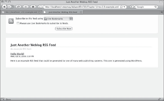
Figure 1-1. Firefox 3 uses a combination of XSLT and CSS to give web feeds some style.

Figure 1-2. Firefox doesn't apply its baked-in styling to RSS feeds accessed by way of the file: scheme.
As you can see, the two screenshots look almost nothing alike. In Figure 1-1, Firefox displays the feed data using a friendly user interface, whereas in Figure 1-2 the (mostly) raw source code is shown. What's most interesting for our purposes in Figure 1-2 is Firefox's admission that, “This XML file does not appear to have any style information associated with it.”
The style information Firefox is referring to is any <?xml-stylesheet ... ?> XML prologue. Like the XHTML <link> element, an xml-stylesheet can be given a type attribute whose value can be text/css. When this is so, Firefox will use the style information provided in the CSS file to change the presentation of the feed. Although the specific linking mechanism differs, adding a style sheet to a non-XHTML XML document is conceptually no different than doing so to a regular web page. Using the xml-stylesheet prologue to add style sheets to XML documents like this is covered in more detail in Chapter 9.
Intrepid explorers may have noticed that Firefox's style sheet used to style the feed in Figure 1-1 has selectors that target HTML and not RSS elements. Indeed, if you use Firebug4 to inspect the source of most RSS feeds on the Internet in Firefox 3, you'll see HTML and no RSS in sight. How can this be? Where did the HTML come from?
It turns out that in XML parlance a “style sheet” can actually mean two things. It can mean a CSS file in the way we already know and love, but it can also mean an Extensible Stylesheet Language Transformations (XSLT) file. These files are yet another form of XML document that, given an original XML-formatted file, are used to convert the markup from one kind of XML to another. Firefox uses an XSLT file to turn RSS and Atom feeds into an XHTML file on-the-fly, so the CSS file used to style this feed is linked to the result of the XSLT transformation (which is XHTML) instead of to the original feed.
XSLT is beyond the scope of this book, but we heartily recommend that you take a closer look at it if you suspect you'll be doing any significant amount of XML document processing.
SVG: vector-based graphics in XML
Vector graphics and 2D animation on the Web was popularized by Flash, a compiled binary format acquired by Macromedia (which since has merged with Adobe) and marketed under the name “ShockWave Flash.” However, since 2001 (well before Flash made it big), there has been an XML-based open standard for defining these kinds of graphics. This standard is known as Scalable Vector Graphics (SVG).
SVG's history is an interesting one. Invented by Sun Microsystems and Adobe (which, ironically, now owns Macromedia), SVG was (and still is) used extensively in the Adobe Illustrator graphics editing application as a format to easily export and import vector graphics. In fact, the easiest way to make an SVG document these days is to simply draw something in Adobe Illustrator and choose to save it in SVG format from the Save As menu option.
__________
4. Firebug is an excellent add-on for the Firefox web browser that gives users the ability to inspect and change the document loaded by the browser. We think it is a must-have tool for any serious web developer.
Unfortunately for Adobe, Microsoft created a competing markup language for vector graphics called the Vector Markup Language (VML) and implemented it in its Internet Explorer web browser. During the years of the browser wars due to rise of Flash and no cross-browser implementation of a vector graphics markup language, SVG fell by the wayside. SVG remained an unknown and untouched standard for a very long time.
Recently, however, thanks to renewed interest in web standards, there has been resurgence in native SVG implementations among browsers. Mainstream browsers, including Firefox, Safari, and Opera, all natively support a subset of the SVG specification to varying degrees today. In some cases, Adobe's own SVG plug-in adds even more support. Moreover, with the help of scripting and the hard work of JavaScript library developers,5 it's now possible to reliably use vector graphics in a cross-browser fashion.
Thanks to its extremely visual nature, SVG provides an ideal environment for examining CSS more closely. Like all forms of XML, SVG documents begin with an XML prologue, followed by a DTD, followed by a root element containing the entirety of the document's content. This is the same pattern used by XHTML documents,6 so it should be quite familiar. The only distinction is that in the case of SVG the root element is <svg> instead of <html>.
Therefore, an SVG document shell might look like the following code snippet:
<?xml version="1.0"?>

<!DOCTYPE svg PUBLIC "-//W3C//DTD SVG 1.1//EN"

    "http://www.w3.org/Graphics/SVG/1.1/DTD/svg11.dtd">

<svg xmlns="http://www.w3.org/2000/svg" version="1.1">

    <!-- Here is where the SVG elements will go. -->

</svg>
Since SVG was designed to describe visual objects as opposed to textual objects, the vocabulary available to SVG developers differs quite radically from the one that is available in XHTML. For example, in SVG, there are no <p> or <div> elements. Instead, to create text on the screen you use the <text> element, and to group elements together, the <g> element.
Here's an extremely basic example of what an SVG image that contains the text “Hello world!” in red lettering would look like. All that is needed is to insert our <text> element into the document markup with the appropriate attributes, like this:
<?xml version="1.0"?>

<!DOCTYPE svg PUBLIC "-//W3C//DTD SVG 1.1//EN"

    "http://www.w3.org/Graphics/SVG/1.1/DTD/svg11.dtd">

<svg xmlns="http://www.w3.org/2000/svg" version="1.1">

    <text x="50" y="50" style="fill: red">Hello world!</text>

</svg>
__________
5. One such noteworthy developer is Dmitry Baranovskiy, whose hard work on the Raphaël JavaScript library enables an SVG file to be translated to Microsoft's VML on the fly, so that SVG-based imagery works in both standards-compliant browsers and Internet Explorer.
6. In practice, most documents that use an XHTML DTD don't include an XML prologue. This is because including the prologue erroneously switches Internet Explorer into quirksmode (a standards-noncompliant mode). Further, despite the presence of an XML prologue, all browsers will still treat XHTML files as though they were plain-old HTML unless the web server that delivered it does so along with the appropriate HTTP Content-Type header of application/xhtml+xml instead of the default text/html. See http://hixie.ch/advocacy/xhtml.
This results in the image shown in Figure 1-3. The x and y attributes of the <text> element define the initial position of the text in the image. The style attribute uses CSS to make the element contents red.
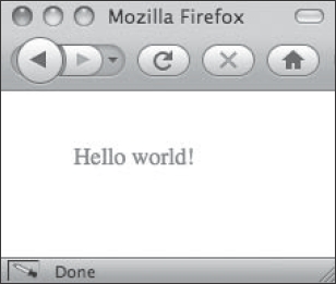
Figure 1-3. A simple and minimally styled SVG “Hello world!” example
Yes, you in the back with your hand raised. “Element attributes that define visual positioning? I thought that's what CSS is for,” I hear you asking. Yes, that is what CSS is for, but remember that SVG is a language to describe graphics. It could therefore be argued that the positioning of the text is its metadata, and thus it makes sense to use the markup language's own semantics to define this. Moreover, as you'll see in the next chapter, CSS isn't merely or necessarily a visual styling language anyway. In fact, the style attribute that defines the fill property in this example could be entirely replaced by using the fill attribute as well.
So far, this is pretty straightforward. The interesting takeaway is in the way that CSS was used to color the text red. Instead of using the color property, we use the fill property. This is because SVG is graphical, and so our semantics have changed radically from those used to develop in XHTML.
Here is another illustrative example. To make the text seem as though it is a sort of pill-shaped button, you might use the following code:
<?xml version="1.0"?>

<!DOCTYPE svg PUBLIC "-//W3C//DTD SVG 1.1//EN"

    "http://www.w3.org/Graphics/SVG/1.1/DTD/svg11.dtd">

<svg xmlns="http://www.w3.org/2000/svg" version="1.1">

    <rect width="150" height="50" x="20" y="20" rx="15" ry="25"

        style="fill: teal; stroke: #000; stroke-width: 3;" />

    <text x="50" y="50" style="fill: red">Hello world!</text>

</svg>
The effect of this code is shown in Figure 1-4.
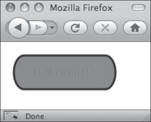
Figure 1-4. A rectangular shape, defined with the <rect> element, is all that's needed to create a background.
However, even with these visual semantics, structure is still important. If this were an actual button on a real interactive SVG chart, then both the text and the background could conceptually be treated as one logical object. It's for this reason that SVG defines the <g> element for specifying groups of elements to be treated as a single object.
Like XHTML, all elements can have class and id attributes to identify them, so we can use such an attribute to identify our example button. The grouped example looks no different on the screen, but now looks like this in code:
<?xml version="1.0"?>

<!DOCTYPE svg PUBLIC "-//W3C//DTD SVG 1.1//EN"

    "http://www.w3.org/Graphics/SVG/1.1/DTD/svg11.dtd">

<svg xmlns="http://www.w3.org/2000/svg" version="1.1">

   <g id="example">

        <rect width="150" height="50" x="20" y="20" rx="15" ry="25"

            style="fill: teal; stroke: #000; stroke-width: 3;" />

        <text x="50" y="50" style="fill: red">Hello world!</text>

    </g>

</svg>
As you can see, there are myriad formats of XML in common use today. Each XML application defines semantics that relate to its purpose. By using XML namespaces, developers can import the semantics of a XML application and use them within their own documents, creating endless possibilities for describing content in incredibly rich ways.
All these possibilities will remain mere potential, however, if we can't get these structured, semantic documents into the hands of users. To do that, we need to understand how the software tools users use to access our content work. These tools are called user agents, and for better or worse, they are the gatekeepers between our users and our content.
User agents: our eyes and ears in cyberspace
A user agent is nothing more than some entity that acts on behalf of users themselves.7 What this means is that it's important to understand these users as well as their user agents. User agents are the tools we use to interact with the wealth of possibilities that exists on the Internet. They are like extensions of ourselves. Indeed, they are (increasingly literally) our eyes and ears in cyberspace.
Understanding users and their agents
Web developers are already familiar with many common user agents: web browsers! We're even notorious for sometimes bemoaning the sheer number of them that already exist. Maybe we need to reexamine why we do that.
There are many different kinds of users out there, each with potentially radically different needs. Therefore, to understand why there are so many user agents in existence we need to understand what the needs of all these different users are. This isn't merely a theoretical exercise, either. The fact is that figuring out a user's needs helps us to present our content to that user in the best possible way.
Presenting content to users and, by extension, their user agents appropriately goes beyond the typical accessibility argument that asserts the importance of making your content available to everyone (though we'll certainly be making that argument, too). The principles behind understanding a user's needs are much more important than that.
You'll recall that the Web poses two fundamental challenges. One challenge is that any given piece of content, a single document, needs to be presented in multiple ways. This is the problem that CSS was designed to solve. The other challenge is the inverse: many different kinds of content need to be made available, each kind requiring a similar presentation. This is what XML (and its own accompanying “style sheet” language, XSLT) was designed to solve. Therefore, combining the powerful capabilities of CSS and XML is the path we should take to understanding, technically, how to solve this problem and present content to users and their user agents.
Since a specific user agent is just a tool for a specific user, the form the user agent takes depends on what the needs of the user are. In formal use case semantics, these users are called actors, and we can describe their needs by determining the steps they must take to accomplish some goal. Similarly, in each use case, a certain tool or tools used to accomplish these goals defines what the user agent is in that particular scenario8.
A simple example of this is that when Joe goes online to read the latest technology news from Slashdot, he uses a web browser to do this. Joe (our actor) is the user, his web browser (whichever one he chooses to use) is the user agent, and reading the latest technology news is the goal. That's a very traditional interaction, and in such a scenario we can make some pretty safe assumptions about how Joe, being a human and all, reads news.
__________
7. This is purposefully a broad definition because we're not just talking about web pages here, but rather all kinds of technology. The principles are universal. There are, however, more exacting definitions available. For instance, the W3C begins the HTML 4 specification with some formal definitions, including what a “user agent” is. See http://www.w3.org/TR/REC-html40/conform.html.
8. In real use cases, technical jargon and specific tools like a web browser are omitted because such use cases are used to define a system's requirements, not its implementation. Nevertheless, the notion of an actor and an actor's goals are helpful in understanding the mysterious “user” and this user's software.
Now let's envision a more outlandish scenario to challenge our understanding of the principle. Joe needs to go shopping to refill his refrigerator and he prefers to buy the items he needs with the least amount of required driving due to rising gas prices. This is why he owns the (fictional) Frigerator2000, a network-capable refrigerator that keeps tabs on the inventory levels of nearby grocery stores and supermarkets and helps Joe plan his route. This helps him avoid driving to a store where he won't be able to purchase the items he needs.
If this sounds too much like science fiction to you, think again. This is a different application of the same principle used by feed readers, only instead of aggregating news articles from web sites we're aggregating inventory levels from grocery stores. All that would be required to make this a reality is an XML format for describing a store's inventory levels, a bit of embedded software, a network interface card on a refrigerator, and some tech-savvy grocery stores to publish such content on the Internet.
In this scenario, however, our user agent is radically different from the traditional web browser. It's a refrigerator! Of course, there aren't (yet) any such user agents out crawling the Web today, but there are a lot of user agents that aren't web browsers doing exactly that.
Search engines like Google, Yahoo!, and Ask.com are probably the most famous examples of users that aren't people. These companies all have automated programs, called spiders, which “crawl” the Web indexing all the content they can find. Unlike humans and very much like our hypothetical refrigerator-based user agent, these spiders can't look at content with their eyes or listen to audio with their ears, so their needs are very different from someone like Joe's.
There are still other systems of various sorts that exist to let us interact with web sites and these, too, can be considered user agents. For example, many web sites provide an API that exposes some functionality as web services. Microsoft Word 2008 is an example of a desktop application that you can use to create blog posts in blogging software such as WordPress and MovableType because both of these blogging tools support the MetaWeblog API, an XML-RPC9 specification. In this case, Microsoft Word can be considered a user agent.
As mentioned earlier, the many incarnations of news readers that exist are another form of user agent. Many web browsers and email applications, such as Mozilla Thunderbird and Apple Mail, do this, too.10 Feed readers provide a particularly interesting way to examine the concept of user agents because there are many popular feed reading web sites today, such as Bloglines.com and Google Reader. If Joe opens his web browser and logs into his account at Bloglines, then Joe's web browser is the user agent and Joe is the user. However, when Joe reads the news feeds he's subscribed to in Bloglines, the Bloglines server goes to fetch the RSS- or Atom-formatted feed from the sourced site. What this means is that from the point of view of the sourced site, Bloglines.com is the user, and the Bloglines server process is the user agent.
Coming to this realization means that, as developers, we can understand user agents as an abstraction for a particular actor's goals as well as their capabilities. This is, of course, an intentionally vague definition because it's technically impossible for you, as the developer, to predict the features or capabilities present in any particular user agent. This is a challenge we'll be talking about a lot in the remainder of this book because it is one of the defining characteristics of the Web as a publishing medium.
__________
9. XML-RPC is a term referring to the use of XML files describing method calls and data transmitted over HTTP, typically used by automated systems. It is thus a great example of a technology that takes advantage of XML's data serialization capabilities, and is often thought of as a precursor to today's Ajax techniques.
10. It was in fact the much older email technology from which the term user agent originated; an email client program is more technically called a mail user agent (MUA).
Rather than this lack of clairvoyance being a problem, however, the constraint of not knowing who or what will be accessing our published content is actually a good thing. It turns out that well-designed markup is also markup that is blissfully ignorant of its user, because it is solely focused on describing itself. You might even call it narcissistic.
Why giving the user control is not giving up
Talking about self-describing markup is just another way of talking about semantic markup. In this paradigm, the content in the fetched document is strictly segregated from its ultimate presentation. Nevertheless, the content must eventually be presented to the user somehow. If information for how to do this isn't provided by the markup, then where is it, and who decides what it is?
At first you'll no doubt be tempted to say that this information is in the document's style sheet and that it is the document's developer who decides what that is. As you'll examine in detail in the next chapter, this answer is only mostly correct. In every case, it is ultimately the user agent that determines what styles (in which style sheets) get applied to the markup it fetches. Furthermore, many user agents (especially modern web browsers) allow the users themselves to further modify the style rules that get applied to content. In the end, you can only influence—not control—the final presentation.
Though surprising to some, this model actually makes perfect sense. Allowing the users ultimate control of the content's presentation helps to ensure that you meet every possible need of each user. By using CSS, content authors, publishers, and developers—that is, you—can provide author style sheets that easily accommodate, say, 80 percent of the needs of 90 percent of the users. Even in the most optimistic scenario, edge cases that you may not ever be aware of will still escape you no matter how hard you try to accommodate everyone's every need.11 Moreover, even if you had those kinds of unlimited resources, you may not know how best to improve the situation for that user. Given this, who better to determine the presentation of a given XML document that needs to be presented in some very specific way than the users with that very specific need themselves?
A common real-life example of this situation might occur if Joe were colorblind. If he were and he wanted to visit some news site where the links in the article pullouts were too similar a color to the pullout's background, he might not realize that those elements are actually links. Thankfully, because Joe's browser allows him to set up a web site with his own user style sheet, he can change the color of these links to something that he can see more easily. If CSS were not designed with this in mind, it would be impossible for Joe to personalize the presentation of this news site so that it would be optimal for him.
To many designers coming from traditional industries such as print design, the fact that users can change the presentation of their content is an alarming concept. Nevertheless, this isn't just the way the Web was made to work; this is the only way it could have worked. Philosophically, the Web is a technology that puts control into the hands of users. Therefore, our charge as web designers is to judge different people's needs to be of equal importance, and we can't do this if we treat every user exactly the same way.12
__________
11. As it happens, this is the same argument open source software proponents make about why such open source software often succeeds in meeting the needs of more users than closed source, proprietary systems controlled solely by a single company with (by definition) relatively limited resources.
12. This philosophy is embodied in the formal study of ethics, which is a compelling topic for us as CSS developers, considering the vastness of the implications we describe here.
Abstracting content's presentation with CSS
Up to this point, we've talked a lot about content, markup, and user agents. So how does CSS fit in? CSS is the presentation layer for your content.
CSS leverages existing markup to create a presentation. It can also reuse the same elements to present content in specialized ways depending on the type of user agent consuming it. CSS is not limited to presenting content visually. Separating the presentation of content from the content itself opens many doors. One of these is being able to restyle the same content later. Another is to simultaneously create different presentations of the same content.
This is important because different user agents will interpret your CSS to render your content in whatever way is appropriate for them. Since content may be conveyed by user agents to people or other machines in a variety of ways, CSS abstracts the specific mechanisms, or “media,” by which this occurs. This is how one piece of content, with the same underlying markup, can be rendered on media, including the screen connected to your computer, the printer on your desk, your cell phone, a text-to-speech screen reader, or in some other way.
CSS defines this abstraction based on the media being used, and provides a way to detect this. The way to do so is with the CSS media type construct, so let's start there. After that, we'll briefly describe an extension to this construct called CSS media queries.
The nature of output: grouping output with CSS media types
How a user agent renders content depends on the target media the content is destined for. CSS's purpose has always been to provide a way to describe the presentation of some content in a standard way. Despite its goal of remaining implementation agnostic, however, CSS still needs to have some notion of what the physical properties of the presentation medium are going to be.
To implement this, the CSS2.1 specification identifies ten characteristics of different interaction paradigms that together form four media groups. These characteristics are things like whether a document's content must be broken up into discrete chunks (such as printed pages) or whether it can be presented all at once, with no theoretical limit (such as inside a web browser's viewport with scroll bars). These two opposite characteristics are one of the media groups.
Each of the media types simply defines specific characteristics for each of the four media groups. Various CSS properties are therefore coupled to a particular media type since not all properties can be applied to all media types. For example, monochrome displays don't always make full use of the color property (although many try anyway). Similarly, purely visual user agents can't make use of the volume property, which is intended for aural presentation and is thus bound to the media types that incorporate audio capabilities.
The nine media types defined by CSS2.1 are braille, embossed, handheld, print, projection, screen, speech, tty, and tv. Table 1-1, taken from the CSS2.1 specification, shows the relationships between media groups and media types.
Table 1-1. Relationships between Media Groups and Media Types
In addition to the continuous/paged interaction paradigm, we have
- A visual/audio/speech/tactile paradigm that broadly specifies which human senses are used to consume content
- A grid/bitmap paradigm that specifies two broad categories of display technology
- An interactive/static paradigm that defines whether or not the output media is capable of dynamically updating
It's up to individual user agents to implement support for the capabilities assumed to be present by a particular media group. Further, it's up to individual implementations to recognize a particular media type and apply its styles.
Briefly, the intent of each of the media types is as follows:
screenis intended for your garden-variety computer screen, but certain newer web browsers found in mobile devices such as the Apple iPhone use this media type as well. Most of the time, it's this media type people are referring to when they talk about web design.printis intended for printers, or for print-to-file (that is, PDF, PostScript) output, and also shows up in the print preview dialogs of most browsers. We discuss the print media type in much greater detail in Chapter 4.handheldis intended for cell phones, PDAs, smartphones, and other devices that would normally fit in your hand or pocket. These devices generally share a set of characteristics, such as limited CPU and memory resources, constrained bandwidth, and reduced screen size, that make targeting them with their own media type handy. Notable exceptions come in the form of mobile versions of WebKit and more recent versions of Opera, which have elected to use thescreenmedia type instead.auralis intended for style sheets that describe text-to-speech output, and is most often implemented by assistive technology such as screen reading software. In the current working draft of the CSS3 specifications, this media type is being deprecated in favor of a new media type calledspeech.brailleis intended for Braille readers, currently the only form of tactile-feedback device CSS has been developed for use with.embossedis similar tobrailleas it's intended for paged (as opposed to continuous) Braille printers. This media type could theoretically be used to target Braille printers, although we know of no user agents that implement this capability.projectionis intended for overhead projection systems, usually considered for things like presentations with slides. Like mobile devices, projection displays share a set of characteristics that make them unique, such as a lower screen resolution and limited color depth. If styles applying to this media type are specified, Opera switches fromscreenstyles toprojectionstyles when entering its full-screen or kiosk mode.tvis intended for television displays. We have yet to see this actually implemented in a user agent, although likehandheldandprojection, television hardware is another kind of device with unique display properties and it would be extremely useful if devices such as gaming consoles or smart TVs would adopt this.ttyis intended for displays that use a fixed-pitch character grid, such as terminals and teletypes. Likeembossed, we know of no user agents that support this media type, and its use is growing increasingly anachronistic.allis the default media type used when a media type is not specified, and any styles applied for this media type also apply for every other media type.
Media types are specified using the media attribute on a <link> or <style> element, or they may be applied using @media CSS rules within style sheets themselves. Here's an example using the <link> element to target a style sheet to all media types:
<link rel="stylesheet" href="default.css" type="text/css" media="all">
Here's one targeting an embedded style sheet to the handheld media type:
<style type="text/css" media="handheld">

    div.foo { color: red; }

</style>
Using @media screen applies styles to many traditional visual displays:
<style type="text/css">

    @media screen {

        div.foo { color: red; }

    }

</style>
The @import CSS rule also takes an optional media type parameter to import a style sheet for specific target media, print in this case:
<style type="text/css">

    @import url(print.css) print;

</style>
Considerations for targeting media types
When composing style sheets, most CSS developers still tend to think in terms of a few user agents used within one medium: web browsers on a traditional computer desktop. However, as we've just seen, CSS can be used in a much wider arena than is implied by this limited scope. Why limit yourself at the outset of a project? With a little planning and attention, you can make a far more usable, far-reaching, and successful web presence by considering possibilities for all media types from the very start.
With the increasing influx of user agents in the market, it makes more sense to discuss the rendering engines user agents use rather than discuss the end-user products specifically, since each engine's ability to render markup and CSS are similar between the products that use it. The four mainstream rendering engines in the wild today are
- Trident, which is used in all versions of Internet Explorer
- Gecko, used in products based on Mozilla's code base (such as Firefox, Flock, Camino, and other derivatives)
- WebKit, which was originally developed as KHTML for the Konquerer web browser on Linux and is now used in Safari and many Nokia smartphones, among other products
- Presto, developed and used by the Opera family of products
Therefore, in the remainder of this book, when we discuss a particular rendering engine you can safely assume we're talking about most of the user agents that use it. Conversely, when we discuss a particular user agent you can safely assume that the rendering behavior of the other browsers that use its rendering engine will be similar.
Targeting screens
The screen, handheld, and projection media types are somewhat similar in that they are intended to be presented visually using display technologies that emit light. The handheld media type is typically a smaller form factor of the screen version of a design, while the projection media type is usually—but not necessarily—intended for slideshow-style formatting. Though similar, there are still distinct differences among these media types, and examining them closely illustrates how the different media groups that a media type refers to influence design decisions and possibilities.
The screen media type
One characteristic of the screen media type is that it is continuous, meaning that the content will flow in an ongoing manner past the bottom of a given viewport. As a result of this behavior, it's the width of a layout that becomes the primary concern, and decisions as to how the site will be laid out in scenarios with different widths must be made. In contrast, you don't have to pay as much attention to the layout's height, since the page can be as long as is required for the contents to fit vertically within it.
The widths of screens can vary greatly from one user to the next. Moreover, a web browser's window can typically be resized to whatever width the user wishes, so it's best for your design to be as flexible as possible with regard to the resolutions and browser widths that it can accommodate. One way to accomplish this is with a variable-width, or “liquid,” layout that expands and contracts to fill whatever space is made available. However, even if your design can be made flexible like this, it's often necessary for some elements (such as images) to maintain fixed-width dimensions, so certain judgments must eventually be finalized.
As display resolutions evolve, different widths have been used as the basis for layout grids. Recently, there's been a tendency toward using base widths of 960 pixels, which works well considering that most monitors out there today have display resolutions that are 1024 pixels wide and greater. This width not only accommodates browser chrome such as scroll bars but also is divisible by 3, 4, 5, 6, 8, 10, 12, 15, and 16, allowing for a number of possibilities for implementing various narrower grid-based layouts if needed.13
The projection media type
The projection media type is interesting in comparison to the screen media type because despite being intended for similar display technologies, it is considered paged as opposed to continuous. In other words, rather than having content continue to scroll endlessly past the bottom of the viewport, you can specify that content be chopped up into discrete chunks that are each, ostensibly, as tall as the projector's resolution allows them to be. Then, to navigate through the document contents, you page forward and backward between each chunk separately.
Of all the screen-related media types, projection is the least supported and least used. Opera is the one browser that has some support for this media type with a feature called Opera Show. When invoked by pressing Alt+F11, or by choosing View from the menu, Opera Show will expand the browser's viewport to the full width of the display it's running in. This is more than just a “full screen” viewing mode, however, since with a simple CSS rule you can transform the continuous blocks of your existing document into paged items, resulting in presentation-style slides similar to what you'd see when using Microsoft PowerPoint or Apple Keynote: Full Screen
.slide {

    page-break-after: always;

 }
With this CSS rule applied, every block element with the .slide class will be rendered as a discrete chunk (a “slide”) when viewed in Opera Show mode. Use your Page Down key to move forward in the resulting slide deck, and use Page Up to move back a slide. This creates the opportunity to give you an open, nonproprietary presentation tool that is easily portable and won't lock up your data—a nice feature we wish more browsers supported!14
__________
13. Cameron Moll made the case for 960 pixels in a blog post titled “Optimal width for 1024px resolution?” published at http://www.cameronmoll.com/archives/001220.html. Both the post itself and its comments are an interesting read for anyone wondering how the community standardizes these seemingly arbitrary numbers.
14. Thankfully, Eric Meyer has created the Simple Standards-Based Slide Show System (S5), which reproduces and even expands on the features of Opera Show for the rest of the standards-conscious browsers out there. S5 makes a great foundation for building platform-independent presentations using the XHTML and CSS that you already know. It can be found at http://meyerweb.com/eric/tools/s5/.
There are other possibilities in addition to presentation slides, too. Anything that works better on screen when presented in separate parts that you incrementally expose as opposed to all at once that you scroll through could make use of the projection media type. For instance, small form factor displays such as ebook readers could simulate the experience of “turning pages” with this media type while still taking advantage of interactive content and styling, which would not be possible if they used the print media type, which is considered static.
The handheld media type
In many ways the handheld media type is the most amorphous of the screen-related media types. It can be either continuous or paged; supports visual, audio, and speech interactions; can be based on either grid or bitmap display technology; and can present either static or interactive content. In reality, the handheld media type is mostly used to design for the small screens that are found on mobile devices, so its typical application to date has been to linearize and simplify a design's screen styles.
The handheld media type is also at the center of some heated arguments regarding media types in general, since Safari on the Apple iPhone and the latest versions of Opera Mobile have begun to ignore it in favor of the screen media type. Among other criticisms, Apple and Opera Software claim that most handheld style sheets don't provide an adequate user experience for the capabilities of their devices when compared to screen style sheets, and so they have introduced media queries as an extension to media types, discussed later in this chapter. Nevertheless, using the handheld media type is still prevalent and useful on many other cell phones and PDAs.
In previous years, designing for mobile devices was considered a nice-to-have, an optional add-on if time and expense permitted. This is no longer the case. Since mobile web use has begun to increase rapidly in recent years, we devote an entire chapter of this book to CSS development in a mobile context (see Chapter 5).
In his book Mobile as 7th of the Mass Media (2008, futuretext Ltd.), Tomi T. Ahonen makes the case that mobile media is nothing to be ignored: 31 percent of consumer spending in the music industry is spent on mobile purchases, while in the gaming industry the number is 20 percent. It has been deduced that—as of this writing—approximately one and a half billion Internet connections being generated from cell phones and 63 percent of the global population have a potentially Internet-capable cell phone. Over 60 countries around the world have cell phone penetration exceeding 100 percent of the population—which means many people own not one but two mobile devices. And finally, Nielsen in May 2008 reported that leading Internet sites increased their usage by 13 percent over desktop-based traffic alone, and in certain cases, such as for weather and entertainment, up to 20 percent. These are significant trend indicators for mobile web growth, which will undoubtedly continue to increase in the coming years.
The print media type
The print media type is another familiar category of CSS work for most developers. This media type is implemented by user agents that are capable of physically printing to paper or of outputting electronic equivalents in formats such as PDF or PostScript.
Printing documents presents a set of significantly different issues from the screen output we are most commonly used to, since the paradigm of designing within a dynamic viewport is replaced by the notion of a static page box representing the physical printable area of the paper. Due to the static nature of printed media, designers lose many dynamic capabilities of CSS, such as the :hover pseudo-class, and need to consider alternative ways of displaying information to readers.
The reasons for printing web pages are usually readability (printing a long document to ease eyestrain), portability (taking print copies to read during a commute), or utility (such as when printing online forms that require physical signatures). Users rarely need portions of pages such as navigation since you obviously can't click a hyperlink on paper, so these should be excised. Additionally, supplemental information such as that commonly found in sidebars should also be removed. Much of these transformation concerns can be solved with CSS declarations like display: none and setting the main content's width to better fill the available space on the paper.
All the major modern web browsers support the print media type, so it's not only useful but also easy to implement and test. We discuss print media in detail in Chapter 4.
Aural media
When you read the text on a web site, do you hear a masculine voice or a feminine voice in your mind? Unbeknownst to many designers, the voice with which content is read aloud by text-to-speech-capable user agents, specified by the voice-family property, is one of the many aural properties that CSS offers you.
In fact, CSS offers a relatively rich set of auditory properties for a designer to use, including spatial audio properties to specify the direction where sound is coming from using the azimuth and elevation properties, aural emphasis with the stress and pitch properties, and even the reading speed using the speech-rate property. Moreover, different elements can be given audio cues using the cue-before or cue-after properties so that particular chimes or other sounds can precede links, licensing information, or an image's alternative text. This is an audio equivalent of the way certain icons depict an element's meaning in visual presentations.
The most common aural user agents are screen readers, but these are merely one class of potential implementations. As the name implies, screen readers literally need a screen from which to read aloud and it doesn't take a rocket scientist to figure out that requiring visually impaired people to use a visual interface is not an optimal solution for them. People who cannot see have no real use for a display that emits light, so devices that focus on other media such as sound make much more sense. Here is where aural style sheets could theoretically shine.
Of course, it's entirely feasible that aural web browsers will find use in other markets as well, such as in network-capable cars, home entertainment systems, and even in multimodal presentations of traditional web content.15 We frequently use the text-to-speech features of our operating systems to listen to long blog posts and news articles while we do household chores, so it would be extremely useful to gain more control over this presentational transformation. For example, longer pauses between a headline and the subsequent text could be inserted to improve comprehension, since many headlines lack completing punctuation (like a period) and therefore run together too quickly when interpreted by most text-to-speech programs.
Browsers with aural CSS support are scarce. Opera with Voice (available only for Windows 2000 and XP) has the fullest support for the specification. However, we can envision a day not too far into the future when support will improve, opening up completely new possibilities that were once unimagined. For instance, perhaps whole blogs could be automatically turned into audio netcasts with the simple application of an RSS feed and an aural style sheet. Wouldn't that be something?
Feature detection via CSS media queries
Although CSS's notion of media types gives CSS developers some amount of control over which of their styles are applied in which rendering contexts, they are still very broad. Believe it or not, today's web-capable devices are even more heterogeneous than those of yesteryear. New form factors and new technologies have challenged some of the assumptions that the current CSS specifications have made about media types, particularly the handheld media type. CSS developers needed more precise ways to determine a user agent's capabilities.
This is precisely what media queries, introduced as part of the evolving CSS3 specification,16 addresses. Media queries extend the notion of media types by defining a set of media features that user agents can purport to have. The CSS developer provides a set of conditions as an expression, of which a media type and one or more media features are a part. Here is an example of a media query you can use today that pulls in an external style sheet only if the user agent supports the screen media type and its physical screen is less than 481 pixels wide:
<link type="text/css" rel="stylesheet" media="only screen and (max-device-width:

480px)" href="webkit.css" />
Conveniently enough, this describes the width of an Apple iPhone in landscape orientation, as well as many of the other WebKit-based mobile devices on the market today. In the previous example, the media feature being queried is device-width. Other queries might be directed at color depth or capability, aspect ratio, and similar attributes. Here is another example, which links two style sheets for print. One is specifically for color printers while the other handles black and white printers:
<link rel="stylesheet" media="print and (color)" href="print-color.css" />

<link rel="stylesheet" media="print and (monochrome)" href="print-bw.css" />
__________
15. These uses for aural web browsers were recognized by the W3C as early as 1999 and published as a technical note that suggested additions to the CSS1 specification to support aural style properties for such browsers to implement. See http://www.w3.org/Style/CSS/Speech/NOTE-ACSS.
16. The media queries specification is a W3C Working Draft as of this writing, and can be found at http://www.w3.org/TR/css3-mediaqueries.
Since color values sometimes look the same in black and white output, we now have a way to specifically set a higher contrast value on the black and white printers than the color ones. This way, the printed text will be easier to read for users printing in grayscale, but we can still retain the desired color range for users printing in full color.
As of this writing, the only major browsers supporting media queries are Safari 3, Konqueror 4, and versions of Opera greater than 7. The widest use of media queries is in targeting styles for mobile devices running Opera or WebKit-based browsers. As the CSS3 specification evolves and more implementations appear over time, we expect to see much wider adoption of media queries across the gamut of media types.
One document, multiple faces
In the past, it was very common for web sites to redirect their users to one version of a document or style sheet if they used certain web browsers and another way if they used others. This not only proved difficult to accomplish, but extremely expensive to maintain as well. Growing frustration on the part of web developers eventually led to the abandonment of these efforts in favor of advocating for web standards, where a single version of the code could be used across all user agents that conformed to those standards.
Ironically, today it's not uncommon for web sites to provide one version of their pages for online viewing with a desktop-based web browser, a different page for printing, and yet another version altogether for mobile device access. Once again, many use user agent detection schemes to try to route traffic accordingly—an exercise in futility considering the transient nature of user agent strings in HTTP headers. Many also place links and buttons on their pages that read “Print this page” or “View using mobile access.”
As you would expect, all of this effort is largely unnecessary, redundant, and very costly to maintain. This functionality can be replaced simply by using the constructs that already exist in CSS in order to deliver the same underlying document to all the user agents. Moreover, doing so often increases the usability of the site because the transformation from one format to the next is seamless and automatic. There's no longer any reason to force your users to painfully navigate through a desktop-based design to find that “mobile access” link.
By leveraging the capabilities that CSS media types and media queries provide, content authors can design style sheets that are used by user agents based on the user agent's own environment. As we'll discuss in upcoming chapters, media queries are the recommended way to target styles for the Apple iPhone and iPod Touch, and they work wonderfully for the wide variances in mobile devices for the browsers that support them. For those that don't, JavaScript can sometimes be used to approximate these behaviors without resorting to user agent detection.17
__________
17. A striking example of this can be found at Cameron Adams's site; Adams, who wrote about resolution-dependent layouts as early as 2004. His writings on the topic are available at http://themaninblue.com/writing/perspective/2004/09/21/.
Complementing semantics with CSS
CSS describes how elements are styled, but the semantics are defined in the markup itself. Nevertheless, CSS is a great way to highlight the semantic meaning, to explore semantic nuances, and to provide presentational confirmation of what an element is supposed to represent. For illustrative purposes, let's pretend to describe “Sarah” as a human being using CSS:
#Sarah {

    /* Sarah stands 166 centimeters tall. */

    height: 166cm;

    /* She has white skin and freckles. */

    background: white url(freckles.png);

}

#Sarah #hair {

    /* She has red hair */

    color: red;

    /* that's 150 centimeters long. */

    height: 150cm;

}

#Sarah .eye {

    /* Her eyes are blue */

    color: blue;

    /* and are each 2.2 centimeters across. */

    width: 2.2cm;

}
Of course, you cannot describe any concept, much less our friend Sarah, completely in CSS. Is her hair color an integral part of her being, of her identity? Perhaps. In part, it's up to the content author to determine which pieces of their publication are content and which are presentation. The totality of the experience is the structure and presentation. It's sometimes tough to distinguish between what should be one and what should be the other.
What we can do is use CSS to work in tandem with semantic markup to further enhance and illustrate the meaning of our content. As much as possible, our CSS should strive to be self-documenting, clear, meaningful, and supportive of the markup it is designed to represent.
Summary
In this chapter, we reviewed some of the basic principles and philosophies on which the World Wide Web was built, so at first we talked about markup languages. You learned why the idea of document semantics, popularized through hypertext, is at the core of most web technologies today. We showed examples of RSS and SVG, markup languages that highlight two very different document formats that are both based on Extensible Markup Language (XML).
The modularization that XML provides gives developers some important advantages over SGML-derived HTML for writing markup semantically. Creating entire special-purpose markup languages (XML applications) to describe things like news feeds, vector graphics, and other kinds of content makes it possible for the Web to house an entire information ecosystem that contains many different sorts of things. XML namespaces allow multiple XML applications to use differing semantics within a single XML document. When “multilingual” software tools see these additional XML dialects being used, they can do more for users.
Since different users have different needs, how software tools (user agents) actually behave may vary from one to the next, so developers need to recognize that they are limited to influencing—not controlling—their content's presentation. Thankfully, keeping ultimate control in the hands of users is a constraint that actually helps keep published markup semantic, encouraging an appropriate separation of concerns between content and presentation.
In this chapter, you learned why adding CSS as a presentational layer atop the underlying markup is valuable from a technical and semantic point of view. We discussed how CSS does this using its notion of media types, taking a single piece of content and presenting it in many different ways. Finally, you learned how this approach could increase the accessibility and the reusability (that is, repurposing) of the content itself.
With these conceptual fundamentals firmly in mind, let's next explore CSS itself in further detail. Just how much influence do you have over a document's presentation using CSS? As we'll see in the next chapters, you have much, much more than you might have previously thought.