
| Chapter 8 |  |
USING A STYLE SHEET LIBRARY |
|
In any journey where you go from novice to master, there comes a point where you've amassed enough knowledge and experience with the craft that you reach your own limitations. This is when you need to look beyond what you can do yourself and take stock of tools that can help you be more effective. If you were a carpenter, this is when you'd pick up an electric drill instead of using a manual screwdriver.
Throughout this book, you've thoroughly explored much of what can be accomplished using CSS you've written from scratch. In this chapter, we'll introduce you to the utility of using style sheet libraries and CSS frameworks built by others. You'll learn why style sheet libraries and frameworks are useful, and how they make solving particular tasks easier. You'll also learn how to compile your own style sheet library.
At first, libraries may sometimes appear as though they are silver bullets. Reality is, of course, far murkier, so we'll also discuss some of the drawbacks of using predeveloped frameworks since using such frameworks necessarily places constraints on your flexibility as a developer. Different frameworks are more useful for different tasks, so we'll also provide an overview of several of the most popular CSS frameworks, as well as highlighting their strengths and weaknesses.
Before we dive too deeply into the popular libraries used in development today, it's important to remind ourselves of why these frameworks came into being in the first place. For that, let's briefly refocus our attention on the challenges at hand rather than the potential solution libraries and frameworks aim to provide. We'll begin with the importance of leveling the playing field.
Leveling the playing field: “resetting CSS”
You'll recall from earlier in this book that the initial presentation given to documents in a web browser is actually sourced from the user agent's own baked-in style sheet. This default style sheet is what typically gives unordered list items a bullet, makes the sizes of headlines different, and changes the boldness or italicization of emphasized text. These initial CSS rules can be useful, but can also prove to be complications if you're unaware of them and how they interact with the CSS rules that you write yourself.
One nuisance is that these baked-in CSS rules are also subtly and frustratingly inconsistent across browsers. Since these initial CSS rules are inherited via the CSS cascade to your own style sheets, the inconsistencies present across various user agents means that your own style sheets need to deal with all the different default cases. As you can imagine, that's a lot of work. Thankfully, once a particular case is made consistent, the rules needed to accomplish that can be encoded in a style sheet and reused again on other pages or web sites, which is precisely what reset CSS style sheets do.
Resetting CSS nullifies the complications default browser styles bring with them by explicitly overriding all possible values to the same known defaults for every browser. As you know, the nature of CSS is such that the resultant output is an amalgamation of many input sources; declarations in a browser style sheet, a user style sheet, and your own multiple style sheets are all weighted against one another to produce a final result. Furthermore, thanks to inheritance, the effects of more general rules will trickle down into the deepest parts of your design, which means that if browser-level inconsistencies exist, they are propagated through much of your design. By adding your own style sheet that overrode the user agent's style sheet, you are assured a level playing field for your own, subsequent work.
Almost every CSS framework comes with a “CSS reset,” and indeed, the earliest frameworks in widespread use were composed of only CSS reset libraries, since this was the most obvious shared task all designers faced on all projects. Generic selectors are used so that future styles may override these resetting rules. But why go through all the effort to “undress” your default presentation when you're just going to dress it up differently again?
One reason is because removing default styles makes you think more critically about the author styles you'll add later on. If you can avoid becoming accustomed to seeing boldfaced font when you add a <strong> element, you'll more likely remember that there needs to be a good reason why you're marking up a particular chunk of text using a <strong> element in the first place. Put another way, removing these initial visual cues can help you separate presentation from structure in your own mind as you work.
Although CSS resets can be used independently of a full-fledged framework, it can quickly become tedious to consistently reapply many of the more ubiquitous rules. Thankfully, again these rules can also be encoded in style sheets and reused many times over. Even better, not only can ubiquitous presentational styles be encoded in CSS, but so too can best practices regarding every aspect of visual presentation. In this sense, a style sheet library becomes much more like an actual brick-and-mortar library, housing the accumulated knowledge of thousands upon thousands of developers who have already previously struggled with and overcome the challenges you might face in your day-to-day development work.
Taking advantage of this awesome resource is another major reason to use CSS frameworks. For the inexperienced developer, they can serve as a useful guide for how to accomplish tasks in both technical and design challenges more effectively. It therefore comes as little surprise to us that the resurgence of grid-based design, which is a century-old typographical and layout concept, occurred simultaneously with the rise and development of CSS frameworks.
Before we dive too deeply into the technical aspects of CSS frameworks, let's first examine one of the best practice methodologies that such frameworks help enforce.
Designing to the grid
Grid-based design has its roots in twentieth-century graphic design. The primary concept behind the practice, “the grid,” is to define page layout based on the size and ratios of the destination medium. In the 1900s, this medium was most commonly a piece of paper, and so early schools of thought applied grid-based design largely through typographic works.
Today, applying grid-based design concepts to web page layout has become popular and numerous frameworks have appeared to help implement the possibilities of grid-based web design. The frameworks are all tools that help simplify the mathematics behind finding the ratios of available space and how to divvy it up proportionally based on its surrounding dimensions. For instance, a page with a length-to-width ratio of 3:4 would be divided into a series of sections that are each based on the same 3:4 ratios. For a sheet of US Letter paper, the ratio would be 17:22 (or approximately 1:1.2941), so each of the grid divisions would be in some way based on this 17:22 ratio.
A grid is constructed by creating a sort of frame pattern for a given layout space, such as a sheet of paper or a computer screen. It doesn't matter so much how the grid is laid out for now, as long as there is some concept around the algorithm of ratios defined. Let's walk through an example of how we might construct a grid, just so that we can explore the concepts behind grid design. Using our earlier math with a 3:4 sheet of paper, we can create an initial grid with four rectangles of equal proportions to the page itself (Figure 8-1).
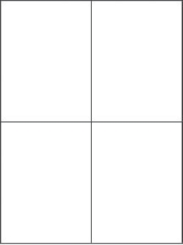
Figure 8-1. Adding rectangles to a 3:4 sheet of paper
These four rectangles are of equal size, and they share four corners that meet at the exact center of the page. This is the beginning of a symmetric treatment for our grid. Now we should be aware that there are two lines we might use to connect the diagonals on our sheet of paper (Figure 8-2).

Figure 8-2. Diagonal lines on the paper also meet in the exact center of the page.
The next thing we might do is to add a rectangle, again in a 3:4 ratio, that connects with our diagonals (Figure 8-3).
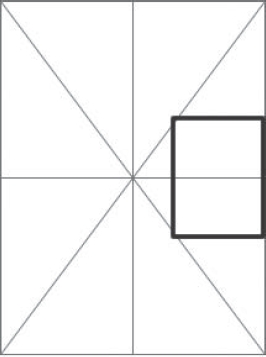
Figure 8-3. Inserting a rectangle that is dependent on the diagonals
Now just fill in the other three similar sections with similar rectangles (Figure 8-4).
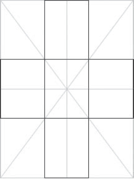
Figure 8-4. Filling out rectangles dependent on the diagonals
Next, we can add a rectangle in the center of the page, using a little artistic license (Figure 8-5).
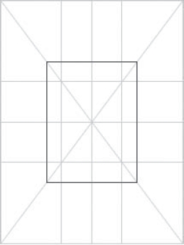
Figure 8-5. Adding a central rectangle
We can now fill out the space created by this rectangle by inserting proportional rectangles off the corners and extending them to the edge of the page (Figure 8-6).
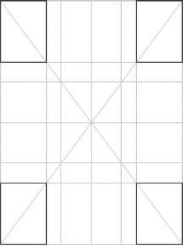
Figure 8-6. Filling out rectangles to the corners
We can now add more rectangles to create space for a margin and a central gutter (Figure 8-7). Keep in mind every one of these rectangles is using a 3:4 size ratio.
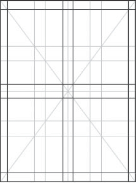
Figure 8-7. Adding margins and gutter to the grid layout
We can then add these graphic elements in arbitrary ways to our grid, snapping the elements to our lines we've created. The framework keeps things looking proportional and organized, even balanced, even though you won't see the grid in the final iteration (Figure 8-8).
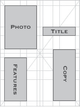
Figure 8-8. Adding content to our grid
This is of course a simplistic and watered-down idea of grid design, and we don't get into the finer nuances of the grid such as golden ratios or what constitutes a balanced page layout, but this discussion should give you a flavor for what grid design is all about.
The rigidity of attempting to fit design elements into some predefined grid system may seem constrictive and uncreative, but such grid design isn't actually arbitrary at all. Grid frameworks provide a subconscious sense of symmetry, and might be thought of as being analogous to the notes of a scale in music. The 12 notes in western harmonic theory provide an effective framework for the vast majority of music that we listen to, and for good reason: they tend to sound pleasant to our ears—at least more so than pitches with completely random frequencies would. This is because they themselves are based on the same proportional ratios. Two notes of an octave may be expressed as having a frequency ratio of 2:1 while a fifth has a ratio of 3:2.
Proportional values like these, whether auditory such as in the case of music or visual such as in the case of grid-based design, provide a certain aesthetic pleasure to the human brain. Our brains are built to sense the harmonies implied by these constructions, recognizing proportional values like balanced visual design and the fundamentals of music as aesthetically pleasing. Incorporating grid-based design into your work lets you align, manipulate, and stress those harmonic balances to greatly appreciative effects and simply result in better work.
Naturally, screen-based media is completely different from media in printed form, mostly because it's difficult to predetermine the conditions of the screen environment. You have many possibilities of screen resolutions, dot pitches, browser viewport sizes, color depths, available fonts, user preferences, and so on, to deal with in web design. As the screen environment is different, so too are the rules for grid layouts different here. As you may have guessed by now, you're going to be better off making use of relative units when dealing with the variables and unpredictability associated with screen-based media, and indeed, this is exactly what most frameworks are built to do.
Tools for grid diagnostics
There are plenty of tools that you can use to in your work that help with understanding and visualizing the grid. These tools can be used stand-alone, without the use of a framework, and they range from low-tech background images you can easily make yourself to high-tech widgets that provide JavaScript-powered overlays on your web pages.
Perhaps the simplest and most natural tool for a CSS developer to use is a background image with visible lines at the points of your grid. This can be a single, large background image attached to the body element during development, or it can be a smaller repeatable chunk of the grid that you can tile using the repeat-x and repeat-y properties, such as Andy Budd's Layout Grid Bookmarklet tool.1 Either way, the result is that you'll be able to see actual grid lines on your page, much like Photoshop's “show grid” display.
Another grid visualizing tool is the TypoGridder,2 which also works by overlaying a grid background image using the repeat-y property. Instead of visualizing a layout grid, however, its intent is to show you the typographic grid, as shown in Figure 8-9. It displays where the text of your page should align to the typographic grid's baseline, mean line, and other points. Other tools include online grid calculators to help you determine appropriate grid ratios, such as Grid Designer3 and the CSS Grid Calculator.4
There are even grid-based design tools built to complement specific frameworks. Naturally, those tools require you to be familiar with the framework they supplement. Let's take the opportunity to begin our examination of some of CSS frameworks available to you today.
__________
1. The Layout Grid Bookmarklet tool can be found at http://www.andybudd.com/archives/2006/07/layout_grid_bookmarklet/.
2. TypoGridder can be found at http://milianw.de/projects/typogridder/.
3. The second version of the Grid Designer tool can be found at http://grid.mindplay.dk/.
4. The CSS Grid Calculator can be found at http://www.gwhite.us/downloads/css_grid_calc.html.

Figure 8-9. The TypoGridder web site eating its own dog food; the red lines are a tiled background image that reveals the typographic grid.
CSS frameworks
Like other computing frameworks, CSS frameworks aim to ease the development of web pages by providing reusable functionality in a modular way and with a flexible baseline. Some frameworks contain multiple library files, each with a specific purpose. For example, typographic CSS declarations might be in one style sheet while reset rules might be in another. This modularity lets you as the developer pick and choose the parts of a framework you want to use.
Although each CSS framework works slightly differently, they all guide you to a certain set of best practices and, because the CSS needed to implement these best practices are encoded in the library file itself, all a developer needs to do is understand how to interface with the library. This abstraction can reduce the amount of development time you might need to spend to overcome a particular hurdle, but it can also make you feel like you're working with the library instead of working with CSS. Indeed, much of the time when you work with CSS frameworks you rarely need to edit CSS code, focusing instead on HTML patterns that the pre-coded CSS will just pick up all on its own.
Nevertheless, many developers like to use CSS frameworks because they can be used to simplify your own efforts to manage and organize your CSS code. They can “hide” chunks of code, such as layout declarations, in their own library files. This allows the CSS you write to focus purely on “skinning” the content (adding colors, backgrounds, and so forth).
Another argument in favor of frameworks is that the very nature of a framework means a certain kind of reusability—as long as you play along with the rules of the framework, of course. Whether this comes in the form of microformat-like patterns of HTML, class attribute names, or other styling hooks, the framework's conventions create a well-known baseline that can make it easier to work in development teams. Other people familiar with the framework you're using will be more likely to grok your code than if you used your own code with your own unique class names or other conventions.
Perhaps the biggest benefit to using a framework isn't that your resulting production code will use the framework itself, but rather that the development effort you put into the design will be faster. Remember that you can always swap out a framework's own, potentially nonsemantic class names and other hooks with your own code later on. This is especially true if you've been building your own library of CSS code along the way. That said, CSS frameworks are fully functional, reliable, and production-ready libraries that many sites use on production servers every day.
CSS frameworks also place certain constraints upon developers, and different frameworks impose different sets of constraints. There isn't a silver bullet in the form of a CSS framework for every problem. Moreover, many problems can be solved in many different ways. The result is a kaleidoscope of problem-and-solution, cat-and-mouse situations; you can use one library to solve more than one problem, and some libraries may be better at solving problems than others will be.
Although there are some general principles that we'll cover here, the best way to know whether a certain framework will work for your design is to try it and see. Creating prototypes like this are not only extremely fast to construct with frameworks, they are often extremely useful for many additional reasons anyway. As long as you don't marry yourself to prototype code and don't worry about spending too much time correcting trivial details at the early stages of prototype development, you can often produce multiple prototypes for a single project and approach the project's challenges from multiple angles.
When you are working with CSS frameworks written by others, do not edit their code directly but rather import it and then use selector specificity to override aspects you don't like. This is like dealing with vendor code in a programming context; you don't want to be modifying a vendor library because if the library ever changes it becomes painful to make sure all of your modifications are applied in the same way.
YUI CSS Foundation
The YUI CSS Foundation, created and provided to CSS developers for free by Yahoo!, is a modular library composed of four different style sheets that build on one another. The complete library includes the following components:
- Reset CSS (
http://developer.yahoo.com/yui/reset/): This component provides a clean foundation for “leveling the playing field” by overriding the built-in browser styles. - Fonts CSS (
http://developer.yahoo.com/yui/fonts/): This component provides typographical control and consistency. Lots of research went into em-based typographic sizing. It's recommend that you use percentages that map to eventual pixel renderings. These are very precise sizes that evaluate to specific pixel sizes:123.1%evaluates to 16 pixels. The YUI CSS Cheatsheet5 is almost a necessity here. - Grids CSS (
http://developer.yahoo.com/yui/grids/): This is the primary layout component of the framework. It allows you to build structures and define a layout for the overall design using markup patterns. The layouts are all based onemunits internally, while the inner grid divisions are based on percentage lengths. - Base CSS (
http://developer.yahoo.com/yui/base/; optional): This is a standard helper file for consistency across elements. It puts back what Reset CSS takes away, but this isn't recommended for use in production code because you'd be removing the browser default only to add it again. Not only is this somewhat wasteful, but you may also need to then override these Base CSS rules yet again in your own code. For instance,<li>elements can be tabs and bullets, so why not provide the CSS you want? Say what you mean, and be explicit—it's good coding style!
__________
5. A printable YUI CSS Foundation Cheatsheet is available at http://yuiblog.com/assets/pdf/cheatsheets/css.pdf.
Most of the functionality in the YUI CSS Foundation that you often interact with is in the Grids component because it provides page-level width and centering easily, as well as letting you create nested grids that allow you to arbitrarily create multicolumn layouts. You interact with the file by writing microformat-like HTML patterns, not by writing your own overriding CSS.6
YUI Grids CSS offers four common templates out of the box, selectable by assigning a particular ID value on the outermost <div> element of your page: 750px centered (doc), 950px centered (doc2), 974px centered (doc4), or 100 percent fluid (doc3). It is also possible to customize them, although that's not often required. Yahoo! strongly recommends sticking with these standards.
<body>

    <div id="doc"><!-- This is a 750px centered layout. --></div>

</body>
Page widths are actually defined behind-the-scenes using em units, which lets the page scale when users scale their text sizes. If for some reason you don't want this behavior, YUI CSS makes it easy to lock the layout's width using a CSS override in your own style sheets:
#doc2 { width: 950px; } /* lock to this width, without text resizing */
Grids CSS provides six basic templates that accommodate specific IAB advertising sizes. You set the template at the root node, the div#doc; this gives YUI source-order independence so that the narrower column can be either first or second without changing the layout—it'll still work.
Grids CSS templates make use of a “block” in the sense that each region of the page is grouped with a particular YUI class: yui-b (b for block). If you want to create two main regions, a sidebar and a main column perhaps, you need two such YUI blocks:
<body>

    <div id="doc">

        <div class="yui-b"></div>

        <div class="yui-b"></div>

    </div>

</body>
__________
6. As it happens, this is a common interaction paradigm CSS frameworks use and is one of the most frequently cited criticisms for using CSS frameworks in the first place.
Then you identify which block is the block for the “main column” with a wrapper <div>:
<body>

    <div id="doc">

        <div id="yui-main">

            <div class="yui-b"></div>

        </div>

        <div class="yui-b"></div>

    </div>

</body>
Finally, you choose which Grids CSS template you want to use:
<body>

    <div id="doc" class="yui-t3">

        <div id="yui-main">

            <div class="yui-b"></div>

        </div>

        <div class="yui-b"></div>

    </div>

</body>
You can then subdivide these YUI block regions by using another microformat-like markup pattern. To do this, you use “grid holders” (yui-g) and “grid units” (yui-u), which equally divide a block region in half:
<body>

    <div id="doc" class="yui-t3">

        <div id="yui-main">

            <div class="yui-b"></div>

        </div>

        <div class="yui-b">

            <div class="yui-g">

                <div class="yui-u first">

                    <!-- The left ('first') sub-column. -->

                </div>

                <div class="yui-u ">

                    <!-- The right sub-column. -->

                </div>

            </div>

        </div>

    </div>

</body>
If you want to have uneven distributions of space within a grid holder or if you want an uneven number of columns within a single grid holder, different grid holders are available to you. These are applied using the same microformat-like pattern as ordinary grid holders, but with a different class name. Grid holders with a class of yui-gb give you three columns that equally share the available space, while yui-gc through yui-gf give you alternate distributions of space using a two-unit grid. The former gives you ⅔ and ⅓, while the latter gives you ¼ and ¾.
All grids are based on percentages, so they subdivide the available space. This lets you stack and nest grid units and grid holders pretty much to your heart's content—but there are limits. Deeply nested and odd distributions of space are atypical in the vast majority of designs, but if you run into them you may need to provide your own CSS overrides to adjust some of the deeply nested YUI CSS.
There's also a handy tool called the YUI Grid Builder7 that can help you get started using YUI Grids CSS. Using the YUI Grid Builder, you can graphically design a grid-based page layout and then retrieve the necessary HTML via copy-and-paste. The YUI Grid Builder exposes most of the functionality from Grids CSS, including setting a custom page width and choosing different-sized rows, as shown in Figure 8-10, but it won't let you graphically nest grids within grids.

Figure 8-10. The YUI Grids Builder is a graphical tool that lets you easily create a page layout using the YUI Grids CSS framework. Once you create it, you can click the Show Code button to copy and paste the resulting HTML and CSS code into your editor.
__________
7. The YUI Grid Builder can be found at http://developer.yahoo.com/yui/grids/builder/.
Criticisms of YUI are that it's very “divitis”-heavy, that is, it uses wrapping <div> elements relatively frequently that may feel “bloated” to some developers. On the other hand, the YUI CSS Foundation has been praised for the way it keeps itself self-contained; its CSS hooks (class and ID names) use a “pseudo-namespace” (a prefix) of yui- so as to avoid conflicts. For more information on the YUI CSS Foundation, Nate Koechley's YUI Theatre talk is very helpful.8
960 Grid System
The 960 Grid System CSS framework9 is based entirely on grid layouts and as long as your design is intended to be laid onto a grid may prove to be another helpful tool. However, one of the potential drawbacks to using the 960 Grid System is that the resulting page design will be very rigid. Due to the limited nature of the framework—which gives you only a certain number of columns and a set of specific widths for each of these columns—changing these defined sizes can cause problems for designs that need to be wider than the allowed size.
Although 960-pixel-wide designs are considered standard for many web sites today, the future is still undetermined and wider sizes may prove more useful. Our hope is that the community of 960 Grid System users will update the framework to accommodate these changes in the future, but even beyond that there are still plenty of circumstances today when a strict 960-pixel width is suboptimal.
A great example of sites that may not want to use a 960-pixel-wide design are web applications that require dynamic resizing (think GMail). Interaction-heavy designs, compared to content-heavy designs, may not be happy with the strict widths imposed by the 960.gs framework. Another example is the many new devices that require a lower screen resolution, such as handheld and other mobile devices. Even desktop browsers that make use of much wider designs may not actually want to do so. The notion of keeping several browser windows open to do multitasking with may not be quite as passé as many people seem to think.
Once you write code that uses a framework, it can become very difficult to break free of the constraints imposed by the framework. Such is the case for the 960 Grid System, which creates page layouts that are a maximum of 960 pixels wide (hence the name). If you want to make a page design that's wider than this but that still uses the 960 Grid System, you'll find that you'll put a lot of extra work into changing your code to accommodate this, and the extra effort can become tiresome when a framework is ostensibly intended to reduce the amount of up-front work you need to do.
Furthermore, in reality design changes can come in from a variety of sources at a variety of times. Although we like to believe that a design is conceived, coded, and then launched, this is rarely the case in reality. In fact, a design is much like a code—it comes out in versions and sweeping changes are rarely self-contained within one or two versions. Design, much like code, changes iteratively, and so you may find yourself in a situation where your design utilizes only “half” of a framework. This is tricky, because it's the point at which your code is the most susceptible to breakage on two fronts: your customizations and interference from the framework.
__________
8. Nate Koechley's YUI Theatre talk can be seen at http://video.yahoo.com/watch/1373808/4732784.
9. The home page for the 960 Grid System CSS framework is at http://960.gs/.
Another issue specifically with the 960 Grid System is that since it relies heavily on exactingly sized elements, adding your own padding or margins to the layout elements themselves breaks your pixel-perfect grid. The tempting solution to this is to explicitly override the width of the grid element, but this turns out to be dreadful for maintainability; now you have to deal with maintaining the width of a single element in two places in your code, which is precarious at best. Instead, you're much better off thinking about how you can restructure your markup to give yourself an extra box and give the padding or margins, leaving the elements that the 960 Grid System relies on alone.
Blueprint CSS
The Blueprint CSS framework10 takes a similar approach to the YUI CSS Foundation framework. Blueprint CSS is composed of a set of style sheets that work together to provide a foundational layer for a grid-based design. The framework provides 24 columns to use, which is more than most (more than 960.gs's 12 at least).
The Blueprint CSS framework is a little different from some other frameworks in that it bills itself not merely as a prototyping or rapid application development (RAD) tool, but also as a foundation or “blueprint” (hence the name) for building production-quality releases and other tools to work with CSS on top of. The Blueprint CSS wiki lists a number of these tools,11 which include code generators, WYSIWYG layout editors, and more.
Another distinction is that the Blueprint CSS framework comes equipped with a style sheet intended for print, which saves you some work on that front, too. All of these distinctions combined make Blueprint CSS feel a lot more like a design methodology suite whereas many of the other systems feel more like tools in a toolset. Each model has their pros and cons and which you choose can be largely a matter of style.
Like other frameworks, the Blueprint CSS framework offers a quick way to create grid-based layouts using certain markup patterns. In this case, we use an outermost <div> element with a class (not an ID) of container to hold the grid regions:
<body>

    <div class="container">

        <!-- Blueprint CSS markup patterns will go here. -->

    </div>

    <div>

        <!--

            You can still use custom HTML/CSS code

            outside of a Blueprint Container.

        -->

    </div>

</body>
__________
10. The Blueprint CSS framework's home page is at http://blueprintcss.org.
11. The Blueprint CSS wiki page at http://wiki.github.com/joshuaclayton/blueprint-css/tools-and-resources links to tools built on top of the framework.
By default, this will provide an invisible grid within the container element that spans 950 pixels wide, equally divided among those 24 columns. The grid's “columns” can be thought of as “snap-to” guides, since they are not real columns themselves but behave more like rows. Each invisible grid column spans 30 pixels wide with a 10-pixel margin between columns, giving you an easy way to create real columns of particular widths by declaring how many grid columns wide the real column should be.
For instance, in the following example we create a two-column page where each column's width is equally divided within the available 950-pixel total container width. To do this, we give each <div> element to a class of span-12 (12 is half of the available 24 columns), and then add an additional class value of last to the final column:
<div class="container">

    <div class="span-12">

        <!-- Left column. -->

    </div>

    <div class="span-12 last">

        <!-- Right column. Note added 'last' class value. -->

    </div>

</div>
Columns can be nested, further subdividing the available space within each one. This is accomplished in exactly the same way as before. Let's further subdivide the left column into three narrower columns:
<div class="container">

    <div class="span-12">

        <!-- Left column. -->

        <div class="span-4">

            <!-- A left sidebar. -->

        </div>

        <div class="span-8 last">

            <!-- The left main column. -->

        </div>

    </div>

    <div class="span-12 last">

        <!-- Right column. Note added 'last' class value. -->

    </div>

</div>
Note that the new columns are given .span-x classes so that they add up to the available space in the larger column. In this way, you can quickly create consistent, cross-browser layouts that always snap to a grid dimensions.
Summary
We began this chapter by discussing the challenge of a browser's default style sheet and how to level the playing field when writing cross-browser compatible code. As this was a common challenge for web developers, libraries called “CSS resets” were developed that encoded the knowledge of how to do this inside a single reusable style sheet. This practice of creating modular, pluggable style sheets should sound familiar to you by now because it applies the knowledge you gained from previous chapters on an ever-widening scale.
Next, we looked at some of the other benefits of CSS frameworks, and you saw how they could be used to more quickly get up to speed with a project. You learned about grid-based design and the fundamental mathematics behind the proportions and spatial ratios embedded into the most popular CSS libraries. You also learned about grid-based design in terms of typography and saw a number of tools that could help you while developing.
CSS frameworks provide a lot of bang for your buck, so to speak, because they let you take advantage of the work of other developers. You saw how some of the more popular CSS frameworks actually worked. Most of them come with a CSS reset file, and then progressively build on the consistent foundation they provide to enable more complex functionality. The YUI CSS Foundation framework is an example of a modular framework from which you can elect to use one, some, or all of its parts. Blueprint CSS is another popular framework that comes with several components, including a print style sheet. The jQuery UI CSS Framework takes modularity to the component level, providing a CSS library with which you can easily style widgets and other individual blocks of content.
So far, we've been exploring CSS in the context of HTML pages. However, as you'll recall from the first chapter, CSS can be used in many more places than simple web pages. In the next chapter, we'll break free from the constraints of HTML and learn how to use CSS effectively in conjunction with true XML documents.