
| Chapter 10 |  |
OPTIMIZING CSS FOR PERFORMANCE |
|
There are many aspects to consider in appraising how well a tool accomplished the goal it was designed for. A web site is, in its base form, just such a tool. In previous chapters, we've discussed how web sites perform in accomplishing their goals in terms of technical capability (what CSS can do). In this chapter, we'll switch gears and discuss performance in terms of how efficiently and speedily CSS can do the things you want to do with it.
Indeed, performance is an important part of every web site and CSS developers are not excluded. There are many things to consider with regard to optimizing CSS for performance, including the number of style sheets you use, how you include them in your code, and even the specific rules they contain. To master CSS optimization, you need to think about your code from a web browser's point of view, not a human's.
Thankfully, optimization is one aspect of CSS development that is relatively browser-agnostic, since most CSS-capable user agents function in basically the same way. From a performance standpoint, each user agent has the same basic resources to consider: CPU speed and network connection speed.
Why optimize?
To be usable, web sites must be fast—very fast. Although optimizations are not typically considered part of the initial development process, optimizing your code and tuning it for performance is a big part of what defines professional-quality work. To separate the wheat from the chaff, so to speak, optimizations are a requirement because it is the optimization process that propels an implementation to the next level.
Optimize to increase speed
Visitors like pages that load quickly and work well. Studies have shown that web site users most often prefer sites that are (or at least appear to be) faster over sites that allow them to customize their experience.1 In essence, a web site that doesn't respond quickly to your input is sometimes worse than not having a web site at all. Therefore, it behooves you as a professional developer to ensure that every aspect of your code is as optimized as can be, and CSS code is no exception to this rule.
An increase in web site response speed has also been shown to increase sales for e-commerce sites. Speed is so important because the maximum amount of time users can wait in order to remain focused on steps between a task is 10 seconds.2 Despite broadband connections becoming more common, other factors such as low-power mobile devices and ever more demanding technical challenges are always pushing the envelope of what we can accomplish, and how quickly we can do so.
Even today, many web users have limited connections to the Internet, and a typical 500KB page can take up to a minute and 10 seconds to download for these users. If this lag time happens in the middle of multipage form purchase, then you have a serious usability problem. Moreover, Jens Meiert estimates that the typical web page increases in size by 20KB per year,3 so producing code optimized for speed actually provides cumulative gains to performance over time.
A snappier user experience is a more usable and a higher-quality experience. A faster user experience has some pretty obvious benefits, but they all amount to an improvement in the way your quality is perceived by users. Speeding up your web site will make you look better to your visitors because the speed at which your pages display affects the perceived quality, reliability, and credibility of your product or service. In fact, a lack of speed is the most common complaint among web surfers because user satisfaction is directly proportionate to web site response time.
__________
1. Articles about web site optimization as a broader topic than purely CSS are plentiful, and one of the best resources is WebSiteOptimization.com, which publishes their results of a study researching the relative importance of interface design features at http://www.websiteoptimization.com/speed/tweak/design-factors/. In this study, speed was shown to be the most important factor of an interface's design.
2. This human-computer interaction principle has remained the same for about 30 years, as Jakob Nielsen reports in the findings of one of his many usability studies. You can check out this one at http://www.useit.com/papers/responsetime.html.
3. Jens Meiert's blog post discussing interface load times discusses increasing page bloat over the years: http://meiert.com/en/blog/20070621/load-time-the-ux-factor-facts-and-measures/.
Optimize to lower bandwidth usage and costs
Each CSS rule needs to be transferred over the wire to the browser before it can be used, unless it is already cached locally.4 There is some cost both in terms of speed and in terms of physical resources such as electricity when this happens. How many actual bytes of data are sent over the wire can be reduced without degrading the final result in a number of ways.
One obvious way to do this is to make use of shorthand CSS properties when they make sense (for example, when they consist of fewer characters to type). Another is to compress the style sheet with GZip and decompress it on the client side. Both of these techniques shrink the physical payload that needs to be communicated from server to client. Not only does this use less bandwidth, it can speed up the transfer itself, which in turn contributes to an overall speed boost.
Moreover, reducing bandwidth usage can also save money for both content producer and consumer. In many parts of the world, bandwidth is still capped or throttled to avoid overuse, and despite claims of “unlimited” bandwidth by major Internet service providers, bandwidth is still a limited resource. Further, the increase of mobile use puts additional importance on bandwidth optimization as cellular networks charge a per-megabyte fee for bandwidth use. Users who visit a bloated site may receive not only a poor experience, but also a frighteningly high telephone bill.
Optimization vs. organization
Some of the optimization tips in this chapter go against the grain of the organization tips in Chapter 6. Sometimes, organization for humans, such as code formatting conventions and whitespace indentation, is less than ideally optimized code. It's important to strike a balance between broad-scale organization in an architectural sense so that the code is something you and your fellow humans can work with, and targeted optimizations in a technical sense so the code is optimally performant.
Indeed, even some features of CSS itself are not beneficial from a technical optimization standpoint. In particular, the @import statement is a notorious culprit, as the more imports you have, the more HTTP requests you're making, which can slow things down. However, as discussed previously, the @import rule is useful for creating modular sets of style sheet files that are easier for people to work with, or more logically organized in a file system on disk. To get the best of both worlds, many sites use specific, possibly automated build steps that take a collection of source files (of which CSS is just one kind in a web site) and put them together in a particular, distributable way, akin to a compilation step in traditional software development. The details of how to create such build systems are beyond the scope of this book, but there are a number of useful tools, regardless of whether you create a build system, that should become a familiar part of your optimization repertoire.
__________
4. Actually, caching is one of the best things you can do to mitigate download costs, and is sadly underutilized. To learn more about caching, which is beyond the scope of this book, be sure to read Mark Nottingham's Caching Tutorial at http://www.mnot.net/cache_docs/.
There's also been some great research into CSS selector optimization and performance done by Steve Souders5 and others. Largely, the conclusion this research has reached is that optimizing CSS selectors gives you only a very small performance boost, and that the effort required to do so is not a good place to spend your time. This brings up what is perhaps the most important point regarding optimization: there is always more that can be done, but many things that can be done often shouldn't be.
When you think of optimizing code, there are a number of factors you need to consider beyond simple performance tests. These factors include many of the things we've already discussed, such as code readability, maintainability, organization, effectiveness, and reusability. Micro-optimizations like CSS selectors can easily slip into doing more harm than good for your web site when such work is taken out of the context of a sterile speed test. In other words, know what's vital, know what's trivial, and measure whether a change of your code is “good” or not by factoring in all aspects of the change, not just performance. Such optimizations are only "good" if the net benefit is positive—something you need to decide for yourself.
Optimization techniques
In this section, we'll look at a number of web site optimization techniques. Some of these are ways to make your CSS more performant, and others are ways to use CSS to improve other potential optimization bottlenecks.
There are a number of things that you can do to quickly and easily make the CSS you write speedier in web browsers today. In any optimization effort, these are the things you want to tackle first because they will give you the most reward for the least amount of effort. They are also good things to keep in mind for new projects; if you write new code with these fruits already harvested, you'll find optimization concerns are further down the road.
When optimizing CSS code for performance, you have two main challenges. First is getting the CSS to load in the browser as quickly as possible by reducing download times and style sheet size. Second is ensuring that the CSS itself helps efficient rendering. The second concern is one that screen-based media is especially susceptible to, as browser windows on the desktop are highly dynamic objects; changing the size of the browser viewport causes something called a reflow and possibly also a repaint. Reflows and repaints are costly from a performance standpoint because they require that certain elements be rendered again.6 A reflow is triggered whenever the browser needs to reevaluate the layout of an element,7 while a repaint is triggered whenever the browser needs to reevaluate the visual appearance of an element (but not its layout).
When appraising CSS optimizations, consider which of these optimization goals you are working toward. If you are trying to achieve faster download times, it is not unwise to be willing to rework a block of code that renders quickly but is larger than it might otherwise need to be.
__________
5. Steve wrote a very interesting blog post on the subject available at http://www.stevesouders.com/blog/2009/03/10/performance-impact-of-css-selectors/.
6. Nicole Sullivan has a fantastic blog post discussing reflows and repaints specifically in the context of CSS at http://www.stubbornella.org/content/2009/03/27/reflows-repaints-css-performance-making-your-javascript-slow/.
7. Mozilla documentation about reflows is particularly explanatory, and can be found at http://www.mozilla.org/newlayout/doc/reflow.html.
Optimizing with CSS shorthand, selector groups, and inheritance
Perhaps the most obvious optimization technique is simply to write less CSS code. The CSS language offers a number of ways to declare rules that are operationally equivalent but syntactically different. Taking full advantage of these turns out to be a good thing not only for organizing your CSS in logical chunks, but also for optimizing it since it also often results in physically shorter, and thus often also simpler, style sheets.
The simplest example is the use of CSS shorthand, which can be used to define a number of distinct properties using just one. The border property is an excellent example of this, as it expands to 12 related properties: border-top-width, border-top-style, border-top-color, border-right-width, border-right-style, border-right-color, and so on. Some graphical CSS editors will produce code like this:
#example {

    border-top-width: 5px;

    border-top-style: solid;

    border-top-color: black;

    border-right-width: 5px;

    border-right-style: solid;

    border-right-color: black;

    /* and so on... */

}
This is a dramatic situation, but many similar examples are prevalent in style sheets that haven't been optimized or have not been written by hand. In this case, the multiple repetitive declarations in the previous declaration block can be shortened to simply one declaration using the border shorthand property:
#example { border: 5px solid black; }
CSS shorthand can be exceptionally useful for shortening style sheets, but it shouldn't be thought of solely as an optimization technique. Using CSS shorthand properties can sometimes be operationally different than using the precise property. It's also not the only tool in the drawer of its type.
Another common and very simple optimization is to eliminate repetitive declarations by combining them into a single new block with a selector group. For example, many style sheets declare fonts explicitly for many different portions of a web page along with other declarations, like this:
#example-meta-content {

    font-family: Helvetica;

    width: 70%;

}

#example-sidebar {

    font-family: Helvetica;

    width: 50%;

}

#example-navbar {

    font-family: Helvetica;

    width: 85%;

}
We can collate all the font-family declarations into a new single block, like this:
#example-sidebar,

#example-meta-content,

#example-navbar { font-family: Helvetica; }
Like shorthand, this isn't solely an optimization technique but it can be used that way. Organizationally speaking, it groups related design choices by encoding them in a single place. Creating logical groupings in this way helps maintain organizational consistency because it reduces the number of different edits required to make a single logical change.
A third best practice that keeps the size of CSS code down is making the most of inheritance. Given the earlier example with font choices, we can presume that the majority of the web page is to be typeset using Helvetica. In such a case, it makes more sense to allow inheritance to define the general case because that results in a shorter style sheet:
body { font-family: Helvetica; }
Then, defining the exceptions adds negligible weight to your code:
#footer { font-family: "Times New Roman"; }
Avoid universal selectors or lengthy descendant selectors
When crafting CSS selectors, use brevity whenever possible. However, don't sacrifice precision in order to do so, because being precise is just as important to the browser as being brief is.
Using the universal or “star” selector (*) can slow down some browsers' performance. While the effect may not be noticeable to all users, be mindful that such a selector will apply the same declarations to every single element in your markup. The more markup you have, the longer it'll take the CPU to process all that information and style it. Ultimately, some or all of this effort may even be for naught if other declarations override major portions of these styles later on. This is yet another reason why taking advantage of inheritance for more generally applicable rules saves time both for you as the developer and for the user.
A similar issue exists when using lengthy descendant selectors. For instance, a selector such as body div#content div#post div.metadata p#author { ... } degrades performance and increases download times unnecessarily if a simpler selector like #author { ... } would have sufficed. In situations where more precision is necessary—perhaps because there are many author elements on the page as opposed to just one and so you're using a class selector (.author) instead of an ID selector (#author)—it's still important to keep the selector brief. Use only the parts of the document hierarchy that are relevant:
/* Too verbose. */

div#content div#post div.metadata .author { color: red; }


/* Usually suffices, is faster and clearer. */

#content .author { color: red; }
Lengthy descendant selectors usually appear because each additional simple selector added to the chain of simple selectors gives the rule more specificity in the cascade. To override the red text in the previous example code, you might write a new rule such as
#content #post .author { color: blue; }
Although it's not a common technique today primarily due to a lack of support by Internet Explorer 6, the child combinator (>) can also be used to keep descendant selectors short. Instead of adding to the growing chain of simple selectors, consider replacing the descendant combinator with a child combinator instead:
#content > .author { color: blue; }
Using the child combinator not only reduces selector length, but also limits the scope of the selector's subjects, which reduces processing time. That is, rather than asking the browser to find all elements descended from another element, you're only asking the browser to find that element's children, thus avoiding the need to access or address quite as many elements.
Put CSS at the top
As we noted earlier, sometimes performance is as much about perception as it is about technical measurement. One of the best ways to improve the perception of performance is to place your style sheets early in the <head> element of your HTML document. This enables browsers to display whatever content they get as early as possible, complete with visual styling.
Providing this quick, early visual feedback to a user effectively transforms the HTML page itself into a load progress indicator. This also follows the principle of progressive enhancement by applying it to how the page renders. Progressive rendering may not reduce the total render time of the entire page, but it can significantly improve the user experience by creating a situation in which discrete chunks of the page, such as the header and other content above the fold, are rendered earlier in comparison to how they might have rendered otherwise.
Putting CSS at the top of your page also helps reduce the occurrence of a flash of unstyled content or, worse, simply a blank white screen upon first page load. The former may appear if the HTML content of your pages completes loading significantly ahead of the styles. The latter may appear if some part of the page load causes the rendering thread in the browser to block, such as downloading scripts might.
Prefer <link> elements over @import rules
Using <link> elements to reference style sheets almost always results in a faster page load time than using @import statements will. This happens because CSS referenced using <link> elements are more reliably downloaded in parallel by web browsers today, whereas style sheets that are imported using @import are requested by the browser sequentially. Using @import requires an additional round-trip to the server because the browser has to first fetch the CSS, then parse it and fetch the rest. Further, Internet Explorer behaves undesirably when style sheets are included using @import and JavaScripts are also present; it fetches the scripts before completing to fetch the style sheets, regardless of the order <script> or style sheet references are placed in the document's <head>.8
__________
8. This is demonstrated in one of Steve Souders' blog posts on the topic at http://www.stevesouders.com/blog/2009/04/09/dont-use-import/.
Since @import rules can cause such performance headaches, a common solution to this is to merge all imported style sheets into one file that gets delivered to the browser in one go. There are a number of ways to do this, but in all cases, doing so dynamically allows you to remain architecturally modular with CSS files without adversely affecting performance. Often, concatenating multiple CSS files can be easily automated, so you might even consider merging every one of your style sheets, not just your imported ones, as we discuss in the next section.
Compressing, combining, and minifying style sheets
Another way to optimize CSS is to compress it in a number of ways. The objective here is to reduce a style sheet's file size so that the user downloads the CSS as quickly as possible and so that the file can be read by software quicker. Unfortunately, in this context the term compressing is ambiguous because it can refer both to the raw CSS code as well as to the HTTP transfer that needs to occur. The former is more precisely referred to as minimizing and the latter as “GZipping.”
CSS minimizers are like strainers that remove extraneous whitespace, comments, and other unnecessary data bytes (such as a trailing semicolon at the end of a declaration block from a style sheet file). An automated build system is a great place for a CSS minimizer. Yahoo! created a minification tool called YUI Compressor for this purpose.9 Using Compressor, you can quickly and easily minify your CSS code one style sheet at a time, or you can use it as part of an automation pipeline that can create a single, minimized CSS file out of any CSS files you give it. Here is a simple shell loop to do just that:
find . -name '*.css' -print | while read file; do

    java -jar

        /path/to/yuicompressor-2.4.2/build/yuicompressor-2.4.2.jar

            "$file" >> all-min.css

done;
This loop first searches for all the files in the current directory that end in .css and sends the resulting list of file names through to the YUI Compressor. The output from the compressor is then concatenated into a single file—in this case, all-min.css. Combining multiple style sheets is a further optimization in the same vein. However, note that minification tools like the YUI Compressor don't actually parse CSS, so if you do combine all your style sheets into a single file you should strip out any @import declarations before you do the minification. Also, if the CSS files are scattered in multiple directories and reference resources such as background images in relative paths, concatenation may result in 404 errors. To work around this, simply use server-relative URIs to reference other resources from your CSS code.
An array of other, similar minification tools exist as well. The CSS Formatter and Optimiser10 is a web-based tool that does for individual style sheets a lot of what the YUI Compressor does. Minification of CSS code can turn readable code into an extreme eyesore. The good news is that just as minification can be automated, so too can expansion.11
__________
9. Actually, the YUI Compressor was originally created to minify JavaScript. However, recent versions do a great job of minifying CSS as well.
10. The CSS Formatter and Optimiser also has options for organizing CSS code, such as sorting properties alphabetically within declaration blocks. You can find it at http://floele.flyspray.org/csstidy/css_optimiser.php.
11. An online tool called Styleneat, accessible at http://styleneat.com/, can un-minify CSS and return it to a readable state.
Another area where you can get some transfer savings is in the case where CSS rules are targeted for a particular media. Rather than using an entirely separate style sheet, you may consider using a @media block. This is especially useful in situations where few other media CSS rules are needed, or on sites where you expect the user to switch from one media to another often, such as in the case of cooking blogs where recipes are very often printed. Since it's just another CSS rule, the @media block itself can also be minimized and concatenated with the rest of the style sheets.
However, for each addition to the CSS code itself, you require that these additional bytes be downloaded. At some point, you need to balance the size of a single file with how likely it is to be used. In the case of alternate style sheets for a mobile version of a web site, you probably want to avoid using a @media block or combining the mobile rules with the rest of the styles because only one set of rules are likely to be used. This is why we recommend that you use the <link> element and create multiple style sheets to modularize the CSS itself.
By using HTTP compression—a capability built into both web servers and web browsers that uses a compression algorithm such as GZip for transferring resources transparently—you can also mitigate the amount of code users need to download. GZipping style sheets usually involves configuring the web server you use to automatically compress CSS files on the fly, although you can also create server-side scripts in languages such as PHP to do this for you if other options aren't available. Since CSS is plain text, it compresses in this fashion very effectively (typically anywhere from 60 percent to 80 percent), although since well-written CSS is often very short, the optimization benefits of using HTTP compression on style sheets are not often pursued except by extremely large-scale installations.
For the Apache web server, two modules can be used to accomplish HTTP compression: mod_gzip12 and mod_deflate.13 Both modules function by examining the HTTP headers sent to the server by the user agent. If these headers include the Accept-Encoding header and specify an encoding that the server knows how to provide (most commonly, gzip), then Apache will invoke one of these modules to work its magic.
Both options require that the server be precompiled with the module's presence. If it's not, and you have access to your own web server, you can compile the source code yourself as either a dynamic or static module. Once available, setting up the module merely involves editing a few configuration lines. For mod_gzip, here's a sample configuration that will handle CSS files:
mod_gzip_item_include file    .css$

mod_gzip_item_include mime    ^text/css$
If you're using mod_deflate, then here's a simple minimum configuration you can use:
AddOutputFilterByType DEFLATE text/html text/plain text/xml text/css
Another option for taking advantage of HTTP compression is using a server-side scripting language.14 These options are typically a bit messier because they require more code and create additional indirection. However, they may be more portable or even required in your particular hosting environment.
__________
12. mod_gzip is an open source project hosted by SourceForge at http://sourceforge.net/projects/mod-gzip/.
13. Ample documentation on mod_deflate exists on the Apache web site at http://httpd.apache.org/docs/2.0/mod/mod_deflate.html.
14. Mike Papageorge maintains a fantastic overview of HTTP compression methods specifically for CSS on his blog post at http://www.fiftyfoureleven.com/weblog/web-development/css/the-definitive-css-gzip-method.
Avoid CSS expressions and filters
CSS expressions offer developers a way to dynamically script style rules within style sheets and are a feature of Internet Explorer. As they are nonstandard, other browsers will ignore their declarations, so they are usually harmless (although they will prevent your style sheet from validating). Sometimes they are useful for working around limitations or bugs in Internet Explorer's support for CSS. However, they are a double-edged sword because they are also incredibly resource intensive.
Much of the time, it is better to avoid CSS expressions altogether. When you can't, it's important to keep in mind that the expressions you write may get evaluated by Internet Explorer many more times than expected. This is because every UI change, including moving the mouse around the page, causes Internet Explorer to reevaluate the expression, eating up processor cycles. It's far better to use JavaScript as part of a script than to use a CSS expression in this case.
Filters create a similar situation. They are useful for providing interface enhancements such as opacity in Internet Explorer, but block rendering and should ultimately simply be avoided in favor of gracefully degrading fallbacks.
As Internet Explorer improves, another issue is that future versions offer support for both the standard and nonstandard methods of using CSS. In IE7, in particular, the alpha channel that provides PNG images with a measure of opacity can be used much like it can in other browsers, making obsolete some uses of its proprietary opacity filters. However, the filters are still there and so you may need to find yourself using a CSS hack to hide the filter rule from IE7 and IE8 while still showing it to earlier versions of the browser.
Reference external CSS instead of inline styles
To avoid reflows and repaints, you should write CSS for the resultant design and then reference it all at once when changing dynamically, rather than adding it all at once. Encapsulating the design in a single class name also brings you closer to “object-oriented” CSS.
Use absolute or fixed positioning on animated elements
Since absolute and fixed positioning create new document flows, CSS boxes positioned using those schemes do not affect the layout of nearby elements. Animations, which often change layout dimensions of elements, are guaranteed to cause both reflows and repaints, so isolating their effects within an absolute or fixed position document flow limits the scope of the DOM to which the reflow applies.
Diagnostic tools for CSS performance
Performance optimizations require exact measurements and lots of testing. Optimizations like these are much more of a science than an art. To effectively optimize CSS code, you need to measure the before and after states of the changes you make. To this end, you'll find it incredibly helpful to use some if not all of the tools we'll discuss in this section. Also, we recommend using a version control system to maintain multiple different versions of your code and compare the variations between them.15
__________
15. If you've never used a version control system before, we recommend that you give git a try. Its simple and offline administration makes it ideally suited for front-end developers and web designers, since it requires no special server or system administration skills to use. A good beginning tutorial is Git for Designers, available at http://hoth.entp.com/output/git_for_designers.html.
The Firebug Net panel
Among the most useful tools for web developers is, of course, Firebug. This Firefox extension includes a Net panel that draws waterfall speed graphs of how quickly resources are requested and downloaded by the browser. As you can see in Figure 10-1, the Firebug Net panel shows you the amount of time each resource took to download in milliseconds as well as a waterfall chart of when it began. This can let you see blocks and help you to parallelize the downloading of resources referenced on your page.

Figure 10-1. The Firebug Net panel provides copious information relating to the downloading and rendering time, parellelism, and other details of web pages.
YSlow Firebug plug-in
YSlow (see Figure 10-2) is specifically a speed testing plug-in for Firebug. It uses Yahoo!'s front-end engineering guidelines16 as a means to evaluate a page's performance. It also shows you download time estimates with both primed and empty caches.

Figure 10-2. The YSlow plug-in for Firebug analyzes page performance across a number of facets and provides an in-browser interface for viewing and printing the results of its tests.
__________
16. Yahoo!'s front-end engineering guidelines are published on the Yahoo! Developer Network at http://developer.yahoo.com/performance/rules.html.
WebKit Web Inspector network timeline
Safari 3 and later provides an option called Show the Develop Menu. Enabling this option also provides access to the WebKit Web Inspector, a window that exposes the HTML, CSS, and JavaScript code behind a web page. One of the visible panes in the Web Inspector is the network timeline (see Figure 10-3), which provides a waterfall chart of load times of all the resources on a page, broken down by type (HTML page, images, style sheets, scripts, and so on).
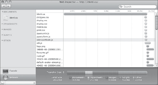
Figure 10-3. WebKit's Web Inspector (available as part of the Safari web browser) offers a network timeline that lets you examine all the resources from a page and view when and how quickly they were downloaded.
Reflow and repaint timers and visualizers
As reflows and repaints are so important to optimizing the efficiency of CSS, a number of timers and visualizers have been created very recently that can help you measure the effects of changes to your style sheets. As of this writing, some of these tools only function in the latest nightly builds of browsers.
One such tool is a cross-browser bookmarklet that times reflows on pages called Reflowr.17 Run interactively as shown in Figure 10-4, this tool gives you a number of buttons that time changes in a particular area of rendering.

Figure 10-4. Reflowr's interactive mode gives you buttons to run its individual tests, times them, and then displays a result measured in milliseconds (ms).
Another similar tool is John Resig's repaint tracker for Mozilla Firefox.18 It uses a new developer feature of Mozilla's most recent Firefox 3.1 nightly build19 that allows JavaScript to detect paint events triggered by the browser itself.
__________
17. You can download the Reflowr bookmarklet from http://reflowr.appspot.com/.
18. You can learn more about and download John Resig's repaint tracker at http://ejohn.org/blog/browser-paint-events/.
19. The Firefox nightly builds can be downloaded from http://ftp.mozilla.org/pub/mozilla.org/firefox/nightly/latest-trunk/.
Summary
Web site optimization is a big topic and optimizing CSS code is only one aspect of it. Nevertheless, optimizing CSS code itself is an important aspect of implementing projects. Moreover, CSS techniques can be useful in optimizing other areas of a web site's performance because the capabilities that style sheets offer often streamline the process of getting something done.
Optimized CSS code is fundamentally well-architected code. Do not try to optimize CSS that isn't first written in a logical, consistent, and well-organized manner. Doing the initial legwork of ensuring your style sheets make sense is a prerequisite to creating highly optimized style sheets, and techniques such as CSS shorthand properties, selector groups, and inheritance are all built-in features of the language that provide both power and eloquence—the goals of optimization in the first place.
Next, be certain to target as much low-hanging fruit as you can, because these easy-to-do things will net you the majority of the performance gains that will result from your efforts. They include things like simply putting CSS code near the top of the <head> element, using <link> elements over @import statements when possible, and avoiding CSS expressions and filters.
With Ajax becoming an ever more commonplace occurrence, CSS is also being used dynamically after the initial page load. This brings new optimization challenges because reflows and repaints become an increasing concern, which can be costly in terms of CPU cycles with complicated page layouts. Some ways to mitigate the effects of reflows is to position elements that will be animated in their own document flow using absolute or fixed positioning. Similarly, repaints should be handled in an all-at-once fashion by encapsulating the desired visual result with CSS that is already written in an external style sheet and switching a class name once, rather than writing out individual CSS rule changes one at a time in your JavaScript.
There are also a number of tools, some still very new as of this writing, that are available to you to measure CSS performance. They include tools for measuring download speed as well as reflow and repaint events. These are areas where CSS is still developing quickly and in which we expect advancements from CSS3 will begin to play a major role. As we'll see in the next chapter, capabilities like animations and simple transformations, once the sole domain of JavaScript or SVG, are now being integrated directly into CSS, and some browsers, notably Apple's Safari, show promise of making such effects hardware accelerated for even faster performance.