
| Chapter 2 |  |
CSS FUNDAMENTALS FOR ADVANCED USE |
|
In the previous chapter, we discussed many of the foundational concepts on which the Web as we know it today is built. Although some of that material is not directly involved with the minutia of day-to-day web development, all of it contributes to your awareness and skill when you are writing code. Similarly, it's important to have a strong understanding of certain foundations of CSS before you can build much on them.
We will therefore spend this chapter thoroughly exploring critically important aspects of how CSS works, such as the influence of user and user agent style sheets, and some of the more esoteric capabilities provided by CSS selectors and values. We will also discuss the foundations of CSS's visual rendering model, including the oft-overlooked concept of document flow and how it relates to the CSS box model. Readers with significant CSS development experience may find some of the material in this chapter familiar, but should still come away with an enhanced understanding of the intricacies of CSS-based design.
Origins of a style sheet and the CSS cascade
Like an army general, your success or failure as a CSS developer will depend on your ability to consider many variables at once. Perhaps the most underappreciated variable in professional front-end web development is the presence of other style sheets in addition to your own. These additional style sheets are applied to your markup before your style sheet has a chance to affect it, so it behooves you to be aware of how these other style sheets can help or hinder your own work.

Know your enemy and know yourself, and you cannot lose. —Sun Tzu, Art of War
User agent style sheets (default browser styles)
A user agent style sheet is a style sheet that is “baked into” the web browser your visitor is using. Every user agent has such a default style sheet, and this style sheet is the very first one applied to your markup. Being aware of it and how your own style sheets inherit from it means you'll be able to much more confidently create consistent-looking designs in a cross-browser fashion.
All CSS-capable user agents, such as web browsers, are actually required by the CSS specification to assign initial values to the elements in a document that they render. In many cases these default styles are literally coded as—you guessed it—a user agent's own style sheet. However, whether or not an actual CSS file exists, from the point of view of a CSS developer all conforming user agents behave as though such a style sheet were in effect.
It turns out that this initial styling is extremely beneficial, since it's the result of these default browser styles you are seeing when you load a document that doesn't have any CSS styling applied to it (a so-called “unstyled page”). However, if you are unaware of a user agent's style sheet or blatantly disregard it, it can because a source of confusion or, worse, a source of bugs. To illustrate this point, let's look at the following basic markup example and how it would be rendered in a couple of web browsers:
<!DOCTYPE html PUBLIC "-//W3C//DTD XHTML 1.0 Strict//EN"

    "http://www.w3.org/TR/xhtml1/DTD/xhtml1-strict.dtd">

<html xmlns="http://www.w3.org/1999/xhtml">

<head>

<title>Every Good Boy Deserves Fudge</title>

</head>

<body>

<h1>Every Good Boy Deserves Fudge</h1>

<p>The phrase <em>"Every Good Boy Deserves Fudge"</em> is

a <strong>mnemonic</strong> to help new music students

remember the names of the lines on the

<a href="http://en.wikipedia.org/wiki/Clef#The_treble_clef"

title="Clef - Wikipedia, the free encyclopedia">treble

clef</a> staff. The first line on the bottom is the note "E,"
and moving up from there we have G, B, D, and F at the top

position. The following illustration shows the note name that

each line represents:</p>

<a href="egbdf.png" title="View this image"><img

src="egbdf.png" alt="Lines on the treble clef staff from

bottom to top: E, G, B, D, F" /></a>

<p>The lines will change depending on the clef in question.

Here are a few examples:</p>

<table summary="A table of musical clef line names and their

mnemonics">

<caption>Clef Mnemonics</caption>

<thead>

<tr>

<th scope="col">Clef</th>

<th scope="col">Lines</th>

<th scope="col"> Mnemonic</th>

</tr>

</thead>

<tbody>

<tr>

<td>Treble Clef</td>

<td>EGBDF</td>

<td>Every Good Boy Deserves Fudge.</td>

</tr>

<tr>

<td>Bass Clef</td>

<td>GBDFA</td>

<td>Good Burritos Don't Fall Apart.</td>

</tr>

<tr>

<td>Alto Clef</td>

<td>FACEG</td>

<td>Felix After Christmas Eats Grapes</td>

</tr>

<tr>

<td>Tenor Clef</td>

<td>DFACE</td>

<td>Don't Fear Alligators Cruising East.</td>

</tr>

</tbody>

</table>

<p>See if you can come up with some mnemonics for some of the

other clefs:</p>

<ul>

<li>Baritone Clef: <abbr title="Big Dogs Find Acting

Comfortable">BDFAC</abbr></li>

<li>Mezzo-Soprano Clef: <abbr title="Anger Causes Eggs Great

Breakage">ACEGB</abbr></li>

<li>Soprano Clef: <abbr title="Charlie Ellis Gets Big
Dollars">CEGBD</abbr></li>

</ul>

</body>

</html>
This basic example covers a few of the elements that would commonly be encountered in a standard web page. It begins with an <h1> element surrounding the title of the page, followed by a paragraph of content that contains some <a>, <em>, and <strong> elements, providing links and emphasis to a paragraph describing our subject. Following that, we see an <img> element supporting an illustration of our subject, a table, and an unordered list. A style sheet is conspicuously absent. Figure 2-1 shows how this appears in Firefox, and Figure 2-2 shows the result in Safari.

Figure 2-1. The Firefox web browser contains a user agent style sheet that defines its default browser styles, so even otherwise unstyled pages contain a modicum of basic styling.
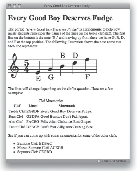
Figure 2-2. The Safari web browser contains its own, different user agent style sheet, again resulting in a plain but somewhat-styled and readable page. Note the differences between the Firefox default styles and the Safari version.
It is actually Firefox itself that's applying the 14-pixel whitespace (padding in this case) around the edge of the document (technically, the <body>), that larger and bolder font size on the <h1> element, that blue color to the hyperlink's anchor text and the blue border around the hyperlinked image, the underlines appearing on the hyperlink's anchor text and <abbr> elements, as well as the various whitespace sprinkled about the rest of the page. As you can see, there are a number of styles already applied to these pages, and we have yet to write a single CSS rule.1
__________
1. The default style sheet for many user agents is typically not hard to find. Using current versions of the Firebug add-on for Firefox, you can actually distinguish a user agent's styling from other styles by enabling the Show User Agent CSS option in the Style pane of the HTML tab.
Unfortunately, not all user agent style sheets are the same, as a comparison of these Firefox and Safari screenshots reveal. Vive la différence! Unlike in Firefox, there are no underlines for our <abbr> elements in Safari, nor is there a blue outline border on the hyperlinked image.
Thankfully, a user agent's style sheet is not magical; it is just a regular style sheet that happens to be first in line to be applied. That is, user agent style sheets always come first in the CSS cascade. This means that, somewhere in Firefox's user agent style sheet exists a CSS rule similar to the following one that is responsible for creating that blue border around the hyperlinked image:
a img {

    border: 5px solid blue;

}
Of course, since this is just ordinary CSS, we can do a lot to remove all this inconsistency by adding a little CSS of our own that would override what the browser's default styles specify. Here's an example of one such style sheet that overrides the styles we saw applied in the earlier screenshots:
<head>

<title>Every Good Boy Deserves Fudge</title>

<style type="text/css" media="screen">

    body * {

        margin: 0;

        padding: 0;

        list-style-type: none;

        text-align: left;

        text-decoration:none;

        border-bottom:none;

        display:inline;

        font-size:14px;

        font-weight:normal;

        font-style:normal;

        border:none;

        color:#000;

    }

</style>

</head>
This single CSS rule overrides most of the default styles that the browser provides, by selecting all elements (the * in the selector, described later) inside the <body> element. The result is shown in Figure 2-3.
By “zeroing out” the user agent's default style sheet with one of your own, you give yourself a known, more consistent point from which to begin styling elements.2 Although you may not often need to completely zero out the default browser styles as this example does, you should always pay attention to what styles you have applied to a finished design and what styles the user agent itself has applied. One of the more common mistakes caused by a failure to do this is forgetting to specify the <body> element's color or background-color because these are often initialized to black and white, respectively.
__________
2. This is a technique popularized by Eric Meyer, who called it “resetting CSS,” and on which many CSS frameworks later built. We'll discuss resetting CSS in more detail when we discuss CSS frameworks later in this book.
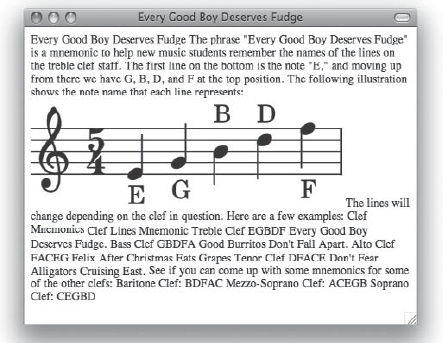
Figure 2-3. Our page with Firefox's and Safari's default browser styles “zeroed out”
One more example, less dramatic but more common in everyday development, is the discrepancy in list rendering. The whitespace used on <ul>, <ol>, and <dl> elements to indent them can be achieved either through the element's margin or padding properties. In order to ensure that list styling is consistent, it thus behooves us to zero out, or “reset,” either margins or paddings and use the other for indentation to achieve more consistent rendering, which can be accomplished with CSS as simple as the following rule:
ul, ol, dl {

    padding-left:2em; /* We'll use paddings */

    margin-left:0;    /* not margins. */

}
Additionally, with this in mind, one of the first rules we tend to write in a style sheet is
html, body {

    margin: 0;

    padding: 0;

    background-color: #fff;

    color: #000;

}
This rule ensures that no matter what element in the viewport (that is, the part of the browser window that renders content) is being given the default margin and/or padding in a user agent, it will always be zeroed out for consistency. A background-color and default text color is specified for consistency as well. It's good practice to set both background and foreground colors in the same place, just so you know you're not going to end up with, say, unreadable white text on a white background by mistake.
What we learn from all this is that the CSS developer must take into account default browser styles and be aware that there are a number of issues like these that could be potential challenges. Making discrepancies consistent such as in the previous examples will not only ensure a more consistent look, but can also ease debugging later on.
User style sheets
As we alluded to earlier, CSS fundamentally gives control of a document's presentation to the users of the document, or the consumers of its information. One of the most powerful mechanisms it has for doing this is the user style sheet. If you think of your markup as an API, then you can think of a user style sheet as a theme or template file.
Like user agent style sheets, user style sheets are not magic. Essentially, a user style sheet is a set of CSS rules created by a human visitor (a “user”) of your site. Users compose style sheets themselves for a number of reasons, including usability and accessibility reasons as well as aesthetic preference. An individual with vision impairment issues might want to set text in a particular way, and may therefore specify a CSS rule that enlarges all the text on a page or prevents certain fonts from being used. Other individuals may simply want to give their favorite web application a face-lift, and using user style sheets, they can do that.3
A user style sheet will be applied immediately after the user agent style sheet is applied and immediately before any of your style sheets are. Once rules from these two sources are applied, the rules in your style sheets are applied to the markup. Then, after that, one last round of processing applies any so-called “important” declarations specified in user style sheets, overriding your rules.
Therefore, five stages of the CSS cascade exist that relate to the origin of a style sheet. In order of precedence from least to greatest, they are
- CSS declarations in the user agent style sheet
- CSS declarations in user style sheets of normal importance
- CSS declarations in author style sheets of normal importance
- CSS declarations in author style sheets that are
!important - CSS declarations in user style sheets that are
!important
__________
3. For a dramatic example of a user style sheet face-lift to Google Reader, be sure to check out Jon Hicks's impressive gReader Theme, which gives the web-based application the look and feel of a Mac OS X desktop application. Jon's gReader theme can be found at http://hicksdesign.co.uk/tag/googlereader/.
User style sheet support in web browsers
Support for user style sheets was dismal for a long time, but today most browsers support user style sheets, including Firefox, Internet Explorer 7, Safari, and Opera.
Opera has far and away the best native support for user style sheets, with an extensive feature set for selecting, managing, and even combining user styles. To have a look at what is in Opera, pull down the latest copy from http://www.opera.com/ and fire it up. Direct your attention to the View menu and then the Styles submenu. You should see selections for switching between Author mode and User mode—basically allowing the user to fully dispense with any author styles and work the site from their own style sheet. You'll also see a Manage Modes command, which brings up a rich dialog box for managing many of the ways Opera will behave when using custom style sheets, and even how author styles would be applied. This dialog box is also where you can set a file path to your own user style sheet.
Firefox disappoints here by not having a built-in interface to choose a user style sheet from its GUI. Instead, you have to go in to your Firefox profile directory (wherever that might be on your system) and look inside the chrome directory (that is, the directory that contains the Firefox browser chrome source files, not to be confused with the new Chrome browser from Google) where you'll find a file called userContent-example.css. Rename it to userContent.css and you can then use it as your user style sheet.
This is a real chore, so thankfully there is a better solution by way of an extension called Stylish (http://userstyles.org/stylish/). This extension does a wonderful job of letting the user create and manage user style sheets on a per-site basis. Stylish puts an icon in the lower-right corner of the browser's status bar, which provides a menu to create global or site-specific styles right from the browser GUI. The extension's companion web site at http://userstyles.org/ has an extensive repository of user-contributed user style sheets to explore, all of which import directly into the Stylish extension.
Both Internet Explorer 7 and Safari contain simple built-in style sheet selectors in their preferences windows. In IE7, this option can be found in Tools . Then in the resulting dialog box, select the check box to format pages using your own style sheet and click the Browse button to locate a user style sheet CSS file. Internet Options General Accessibility
In Safari, similar functionality can be found by navigating to Safari and then using the Preferences AdvancedStyle sheet drop-down menu to select or browse for a user style sheet. There is also a plug-in for Safari called SafariStand (http://hetima.com/safari/) that provides capability similar to the Stylish extension for Firefox.
What are the !important declarations?
CSS declarations can have one of two levels of importance—normal or important—which contributes to the declaration's overall specificity. Declarations are specified important by being flagged with the special keyword !important at the end of the declaration, just before the closing semicolon.
These important declarations are given a higher precedence than declarations of normal importance, and when used in user style sheets they will trump all conflicting declarations from other sources. Consider the following example, where #strings p has a higher specificity than .violas, and the result is that the paragraph directed at the violas has no visual differentiation from the rest of the document:
<!DOCTYPE html PUBLIC "-//W3C//DTD XHTML 1.0 Strict//EN"

    "http://www.w3.org/TR/xhtml1/DTD/xhtml1-strict.dtd">

<html xmlns="http://www.w3.org/1999/xhtml" xml:lang="en" lang="en">

<head>

<title>Rehearsal Notes</title>

<style type="text/css">

/*<![CDATA[*/

    #strings p { color:#400080;}

    .violas { color:#c71919; }

    #brass p { color: #b46417; }

/*]]>*/

</style>

</head>

<body>

<h1>Rehearsal Notes</h1>

<div id="strings">

<p>The string section as a whole was starting to get ahead of

the conductor. Please keep an eye on the tempo changes.</p>

<p class="violas">The violas really need a sectional or two

for the last movement of the Shostakovich. Try to get

together at least once before the next rehearsal.</p>

</div>

<div id="brass">

<p>Crescendos need to be more gradual throughout. We are

getting too loud too early in the last movement.</p>

</div>

</body>

</html>
However, it appears the conductor (who is not the author of this page) wants to print these notes and distribute them to the orchestra, but also wants to call the information for the violas out. To do this, they add the !important keyword to the .violas rule.
.violas {

    color:#c71919 !important;

 }
Now, provided the viola section is not colorblind as well as deaf,4 they will see the note directed toward them on the conductor's page highlighted in red.
Although this can sometimes be a handy shortcut for raising the specificity of a particular declaration, it is not often the best way to go in any circumstance. Having your style sheets polluted with a significant number of conflicting !important declarations can make debugging a style sheet a difficult proposition. As you will learn later in this chapter, using a CSS selector's implicit specificity is a far more flexible way to go.
__________
4. It is usual and customary for orchestral musicians to continually poke fun at the viola section.
Attributes and characteristics of author style sheets
As a CSS developer, you cannot modify a user agent's baked-in style sheet, although you can override them because a user agent's style sheet is applied first in the CSS cascade. A visitor to your site may supply their own user style sheet to complement or override the CSS rules you've created to implement the design of your site. Therefore, the style sheets you write as a front-end web developer, called author style sheets, sit firmly within this middle ground.
It's this middle ground, the author style sheets, which are our domain. This is what we typically think of when we talk about CSS development, and indeed this middle ground is the majority of what the rest of this book is about. These author styles could be styles placed inline with the HTML markup as part of a style attribute (inline styles), embedded within an HTML document as part of a <style> element (an embedded style sheet), or linked to in one or more external style sheets. Each of these methods of applying CSS to page elements has its own characteristics.
External and embedded style sheets
An external style sheet is a separate CSS file paired with the document to be styled using one of two mechanisms. The more familiar mechanism comes from HTML and is the <link> element. A minimal example might look like this:
<link rel="stylesheet" type="text/css" href="foo.css" />
The rel, href, and type attributes are all required. Since HTML's <link> element can pair a document with more than just a style sheet, the rel attribute, which indicates a relationship between two things, must contain the value stylesheet (notice it is one keyword, not two separate words) to indicate that it is being used specifically to pair a style sheet with the document in which the <link> element resides. For the purposes of CSS, the type attribute must contain the single value text/css. This indicates that the linked style sheet is a CSS file. Finally, the href attribute indicates the location of the external style sheet by URI (hyperlink reference).
When linking CSS to XML documents that are not XHTML, however, we use a different construct. The equivalent of the previous HTML example would look like this in an XML document that isn't XHTML:
<?xml-stylesheet type="text/css" href="foo.css"?>
Notice that in the XML example, we use an XML processing instruction (tags that begin with <? and end with ?>) rather than an element, and that since the processing instruction is named xml-stylesheet, we don't need a rel attribute. Later in Chapter 9 of this book we'll discuss CSS in the context of non-XHTML XML documents in more detail.
An embedded style sheet is placed within a <style> element (itself placed within the document's <head> element) directly within a given document. As a result, this method is architecturally less flexible than using external style sheets because it can only affect the one document. On the other hand, embedded style sheets can be useful when developing prototypes, to avoid caching issues, or to reduce HTTP overhead to optimize performance in some situations. In HTML, a typical embedded style sheet might look like this:
<style type="text/css">

    .warning {
        background-color: #fffda4;

    }

    .error {

        background-color: #f0aeaf;

        font-weight: bold;

    }

</style>
With embedded style sheets, the relationship of the content to the document is obvious, so there is no need for a rel attribute.
Sometimes, you'll see embedded style sheets in XHTML documents (and hopefully never in HTML documents) begin and end with a funny sequence of characters like this:
<style type="text/css">

<!--/*--><![CDATA[/*><!--*/

    /* The embedded style sheet goes in here. */

/*]]>*/-->

</style>
What you see here is a sequence of HTML and CSS comments and a special instruction for an XML parser. At the beginning of the embedded style sheet, the sequence is an opening HTML comment (<!--), an opening CSS comment (/*), a closing HTML comment (-->), the opening XML instruction (<![CDATA[), another opening CSS comment, another opening HTML comment, and finally a closing CSS comment (*/). Then, at the end of the embedded style sheet, there is another opening CSS comment, followed by the closing XML instruction (]]>), a closing CSS comment, and finally the closing HTML comment opened earlier.
What a mouthful! So why is all this here? Well, briefly, jumping through this particular sequence of comments protects both legacy user agents that don't support XML and the XML parser in those that do from the raw CSS inside the embedded style sheet. For now, you need to be mindful that this is only a potential issue when you use XHTML, and you can avoid it by using HTML. Later, when we discuss styling proper XML documents with CSS, we'll examine the <![CDATA[ ... ]]> construct in more detail.
External style sheets and embedded style sheets have the same level of precedence in the CSS cascade. It is the style sheets' ordering that resolves conflicts between CSS declarations, with style sheets declared earlier (closer to the opening <head> tag) having less precedence than those style sheets embedded or linked later (closer to the </head> tag). It is a widespread misunderstanding that embedded styles have a higher specificity than linked styles, and that any conflicts between CSS declarations in your external style sheets and your embedded style sheets will be overridden by the embedded ones, caused by the fact that many authors place embedded style sheets after externally linked ones in their HTML sources.
Naming and specifying media and character encoding details
In both the HTML and XML mechanisms are additional attributes we can use to specify the characteristics of the linked style sheet in more detail. The other possible attributes are media, title, and charset, and they are all optional. A more detailed example where we specify a number of additional details about the external style sheet at foo.css may look like this:
<link rel="stylesheet" type="text/css" href="foo.css" title="Foo"

      charset="utf-8" media="screen" />
Here, we've given this style sheet a more human-readable name using the title attribute. This is both more succinct and functional than, say, an HTML comment would be, since some browsers or browser extensions display this name to the user. In much the same way as a user style sheet can create a “theme” for a site for individual users, you've essentially created a named “theme” for all your site's visitors by titling your style sheet.
Since you can link more than one style sheet to the same document, you can now use this functionality to create multiple themes for your site by supplying different values in the title attribute. This example, similar to the previous one, provides both the “Foo” theme along with an additional “Bar” theme:
<link rel="stylesheet" type="text/css" href="foo.css" title="Foo"

      charset="utf-8" media="screen" />

<link rel="alternate stylesheet" type="text/css" href="bar.css"

      title="Bar" charset="utf-8" media="screen" />
Now, in user agents that support the capability, users will have the option of choosing either the Foo or Bar themes that you provide for viewing your site. This is accomplished by providing the supplemental keyword alternate in the rel attribute and providing a title of Bar in a second <link> element. This opens up some interesting possibilities and further demonstrates the power of using the same underlying markup with multiple different style sheets, so we'll return to explore this CSS functionality in more detail later in Chapter 6 of this book.
The screen value to the media attribute indicates that the linked style sheet is for use only in that rendering context. That is, it's not intended for printers, nor for aural reproduction, and it may be used for certain handheld devices.5 The media attribute can have more than one value, so a single style sheet can apply to more than one media type. An example is media="screen projection", which might be used to link to a style sheet implementing a variable-width, so-called “liquid” layout.
Finally, the charset attribute specifies that the referenced CSS file is encoded in UTF-8. UTF is the Unicode Transformation Format, and UTF-8 is the most common variant of Unicode on the Web. Most user agents in HTML contexts don't worry tremendously about issues of character encoding, but character encoding becomes important when dealing with XML contexts. Therefore, we'll discuss the implications of the charset attribute as well as Unicode in CSS in more detail later in this book.
__________
5. Handheld devices using WebKit such as Apple's iPhone or smartphones running Google's Android ignore the handheld media type and instead use the screen media type. The specifics of CSS for mobile devices are discussed in Chapter 5.
Inline styles
Whereas both external and embedded style sheets define whole style sheets, inline styles, which appear within the style attribute of a given element, are only declarations. The declaration is applied to that element possibly inherited by any its child elements. For instance, here is an inline style applied to a paragraph element that italicizes the entire paragraph, including the child <q> and <cite> elements:
<p style="font-style: italic">

<q>A table, a chair, a bowl of fruit and a violin; what else does a man

        need to be happy?</q>

    -<cite>Albert Einstein</cite>

</p>
The least flexible way to apply styles to a document, inline styles will have higher specificity than declarations in either embedded or external style sheets. It is generally best to avoid the use of inline styles whenever possible in production code, as they add unnecessary rigidity and nonsemantic clutter to markup, bloat the code, and make it more difficult to read.
Nevertheless, due to their high specificity, inline styles are useful for occasional debugging purposes, although using temporary !important declarations may provide another avenue for debugging. They are also useful in some situations where presentational markup is unavoidable or required by implementation details. In these instances, inline styles can be calculated on the server and inserted into the code of markup templates.
A common situation in which you might see inline styles used is in the creation of progress meters. A PHP template might dynamically change where a progress bar should be filled to with code like this:
<div class="progress-bar"

      style="width: <?php print getPercentComplete();?>%">

<span><?php print getPercentComplete();?> complete</span>

</div>
The PHP function in this example, getPercentComplete(), would return a number such as 100, which would indicate completeness. A value of 0, on the other hand, could indicate that the process has yet to begin, and other values in between could represent varying levels of progress. It's used in two places so that the progress is presented not only visually but also as textual content for accessibility reasons. The other visual styling required to render the progress bar, such as its height, a border, and so forth, would be applied in a CSS rule in an external style sheet that targets the progress-bar class.
Selectors: from simple to complex to surgical
Although the syntax of CSS is very simple, a single style sheet can contain theoretically infinite presentational information. This information is organized into a sequence of statements, each of which specifies one rule (sometimes also called a ruleset). A typical rule contains one declaration block, itself a series of declarations (composed of property and value pairs) and a selector. One of the keys to becoming a CSS surgeon, so to speak, is the intelligent and thoughtful use of CSS selectors.
Selectors allow us a great deal of flexibility and efficiency in how we apply presentational style to documents. Using selectors, you can target (or select) a single element or, with a selector group, a group of elements to apply styles to. These selected elements are known as subjects of the selector. CSS selectors are composed of two primary building blocks: simple selectors and combinators.
Simple selectors
CSS's simple selectors are the fundamental units with which you build a selector in a rule.6 All CSS rules must contain at least one explicit simple selector written by you, and often contain at least one implicit simple selector (inserted by the browser's CSS parser) as well. Further, there are many different kinds of simple selectors that CSS makes available to you, and each one allows you to target elements in a slightly different way.
Multiple simple selectors can be grouped, or chained, together one after the other to create a sequence of simple selectors. Each simple selector in the sequence adds its own filter to the set of elements selected by the simple selector that came before it, adding specificity to the selector and narrowing the set of possible elements the selector will target. Here are a few examples of valid CSS selectors that are composed purely of simple selectors:
h1

div.vcard

img.logo[title]
The first selector is a single simple selector that targets <h1> elements, and is called a type selector, described in the next section. The second selector is a sequence of two simple selectors, the div type selector chained with the class selector .vcard, and therefore targets all <div> elements with a class name of vcard. Finally, the third is a sequence of three simple selectors, img chained with .logo chained with the attribute selector [title], so it selects all <img> elements whose class name is logo and who also have a title attribute.
From these examples you can see how chaining simple selectors together provides increased specificity and precision when targeting elements to style. You can also see that each kind of simple selector is slightly different in how it targets elements. Most important, note that creating a sequence of simple selectors is distinct from creating a selector group. The following two CSS rules are therefore not equivalent:
div.vcard   /* Single selector composed of two simple selectors. */

div, .vcard /* A selector group with two selectors each composed of

          one simple selector. */
The second example will potentially apply to many more elements than the first example, since it is a selector group composed of two individual simple selectors. It will target any <div> element, and it will also target any element with a class name of vcard, regardless of whether that element is a <div>. Next, let's take a tour of some of the basic as well as the lesser known simple selectors available to you as a CSS developer.
__________
6. Note that the definition of a simple selector is slightly altered from CSS2.1 to CSS3. We use the CSS3 terminology because it is more precise. For details on the differences between the two specifications, see http://www.w3.org/TR/css3-selectors/#changesFromCSS2.
Type selectors
The most common simple selector is the type selector, which lets you specify CSS rules for a given type of element in your document markup. To use it, simply indicate the name of the element (sans the angle brackets) of the element you want to target. To target all <h1> elements, for instance, your type selector is merely h1. To target all headlines in an HTML document, simply create a selector group that contains each type of headline element: h1, h2, h3, h4, h5, h6.
You can use type selectors for any markup language. If there is an element in the markup, it can be targeted with a type selector. In some contexts such as XML and XHTML, where element names are case sensitive, so too are CSS type selectors. Therefore, in an XML document, the following two type selectors actually refer to two different types of elements:
DIV /* Selects elements like <DIV> */

div /* Selects elements like <div> */
You can do a lot with type selectors alone. In this next example, we have some very simple HTML elements—a few <li> elements, which are descendants of a single <ul> element, a couple of <p> elements, and a single <h1>. All of them are descendants of the <body> element. Styles are applied to each of these via CSS rules that make use of a single type selector.
<!DOCTYPE html PUBLIC "-//W3C//DTD XHTML 1.0 Strict//EN"

    "http://www.w3.org/TR/xhtml1/DTD/xhtml1-strict.dtd">

<html xmlns="http://www.w3.org/1999/xhtml" xml:lang="en" lang="en">

<head>

<title>2009-01-21 Concert Plan</title>

<style type="text/css" media="screen">

    body {

        font-family:Helvetica, Verdana, sans-serif;

        background-color:#E6E6E6;

        font-size:80%;

    }

    h1 {

        font-style:italic;

        color:#004080;

    }

    ul {

        margin:0;

        padding-left:2em;

    }

    li {

        list-style-type:circle;

        font-style:italic;

    }

    em {

        text-decoration:underline;

        background-color:#ccc;

        padding:1px;

    }
</style>

</head>

<body>

<h1>2009-01-21 Concert Plan</h1>

<p>The January 2009 chamber ensemble performance will be

based on the works of <em>Igor Stravinsky</em>. The program

will cover representative works from his three main stylistic

periods, the Russian Period (1908-1919), the Neoclassical

Period (1920-1954), and the Serial Period (1954-1968). Works

will include:</p>

<ul>

<li>L'Histoire du Soldat (The Soldier's Tale), for chamber

ensemble and three speakers (1918)</li>

<li>Octet for Wind Instruments (revised 1952)</li>

<li>Epitaphium, for flute, clarinet and harp (1959)</li>

</ul>

<p>There will be a 1/2 hour pre-concert lecture, and the

post-concert reception will be held at Moe's Tavern next door

to the performance hall.</p>

</body>

</html>
In our embedded style sheet, we have indicated that the <body> element should use a nice sans-serif font family and a light gray background color, and the overall font size will be reduced by 80 percent of the browser default. The <h1> gets a soothing, ocean-blue hue in an italic typeface. The <ul> element establishes a consistent model for how the left spacing will appear since we know that this will be interpreted differently between browsers, and the accompanying <li> elements will get circle markers and italics. Finally, our <em> elements will be treated with extra emphasis by giving the text an underline and giving the background a gray color and a bit of padding so that the background box looks a bit more comfortable around the content, as shown in Figure 2-4.
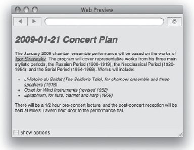
Figure 2-4. Even mere type selectors can be used to great effect to add a little style to our element types.
Universal type selector
We briefly saw this selector earlier when we were discussing user agent style sheets: the universal type selector is an asterisk (*). This selector targets all types of elements, as its name implies. When used by itself, it applies the specified styling to every single element in the document.
Using the universal type selector is distinct from inheritance, where child elements inherit the values of certain properties from their parent or ancestor elements, since in this case you explicitly apply certain styles to each and every element. Let's examine the same code that we used when examining type selectors, but this time we'll outline all of the elements with a one-pixel border using just one rule that takes advantage of the universal type selector:
<style type="text/css" media="screen">

    * { border:1px solid #400080;}

</style>
This one small CSS rule will place that border around every element in our page. Figure 2-5 shows that all our elements are now outlined.

Figure 2-5. Using the universal type selector, we can target every type of element regardless of their names.
Since all CSS rules must be applied to elements in a document's markup, every CSS rule must begin with either a specific type selector or the universal type selector. If an explicit type or universal type selector is omitted from the start of a CSS selector, then the user agent assumes the presence of the universal type selector for the purpose of element selection. In other words, when you use a selector such as .vcard, the browser interprets this as *.vcard.
Attribute selectors
In many markup languages, a lot of information is codified as attributes with particular values. Such information might appear as the URI of an image (<img src="images/viola.gif">), supplemental information in a title attribute (<abbr title="firewood">), or as the destination of a hyperlink (<a href="http://en.wikipedia.org/wiki/Viola">). Using CSS's attribute selectors, we have powerful ways to target elements based on the attributes and attribute values they contain.
You delimit attribute selectors by placing an opening bracket ([) and a corresponding closing bracket (]) on either side of an expression. In the simplest case, the expression is merely the name of the attribute whose presence you'd like to target. For example, an attribute selector like [title] would select any elements that have a title attribute, regardless of its value.
You can also target elements based on an attribute's value using attribute selectors. If you specify [foo=bar], you'll target the elements that have the attribute foo where that attribute's value is exactly bar. For instance, using the selector [title=viola] would target an element like <abbr title="viola">vla</abbr> but not <abbr title="double bass">db</abbr>, despite the fact that both abbreviations have title attributes.
Many attributes can contain more than one individual value. For instance, you can assign multiple class names to a single element by separating each of the element's class names with a space. Another example is a situation wherein an attribute value contains human-readable text, which naturally contains spaces. Using the [foo~=bar] attribute selector syntax, you can target elements that have a foo attribute where at least one of the words in the attribute's value is bar.
With the [foo~=bar] attribute selector, the word can't be part of a longer word, so in this case it can't be “barcamp” or, say, “barbarella.” Typically, this is exactly the behavior that you want in the real world. Another example could be [title~=bass], which would target <abbr title="double bass">db</abbr> but not <abbr title="bassoon">bs</abbr>.
A fourth and final kind of attribute selector defined by CSS2 is [foo|=bar]. This is less commonly used, but can be helpful in internationalization contexts since it targets elements whose foo attributes contain a hyphen-separated list of words and the first word is exactly bar. This sounds confusing at first, so let's take a look at an example.
The Chinese language code7 is zh. Since it has a number of dialects spoken in different countries around the world, it can be suffixed with a hyphen and a country code. Often, however, these regional variances are tertiary to your goal for styling purposes, so using an attribute selector like [lang|="zh"] is sufficient for targeting all of the following paragraph elements: <p lang="zh"> (Chinese), <p lang="zh-cn"> (Chinese/China), <p lang="zh-hk"> (Chinese/Hong Kong), and <p lang="zh-tw"> (Chinese/Taiwan).
__________
7. A language code is simply a standard way of representing human languages with succinct strings. The international community originally standardized language codes as the ISO 639 standard. As it is wont to do, Wikipedia has a detailed and thorough explanation of language codes at http://en.wikipedia.org/wiki/Language_code.
Since attribute selectors are a kind of simple selector, we can chain them in a single CSS rule to target elements whose attributes match all of our criteria. For example, if we wanted to target elements written in Chinese that had been cited from the Wikipedia article on The Art of War, we could use an attribute selector chain such as [lang|=zh][cite="http://en.wikipedia.org/wiki/The_Art_of_War"]. Note that quotations around the attribute value's portion of an attribute selector's syntax are optional, but could be used to improve readability for your fellow human beings.
In addition to these capabilities, CSS3 defines three new attribute selectors, called substring matching attribute selectors, that give us ways to match substrings within attribute values. The [title^=bass] syntax will match elements with a title attribute whose value begins with bass (such as <abbr title="bassoon">bs</abbr> but not <abbr title="double bass">db</abbr> in the earlier example). The attribute selector syntax of [title$=bass] will match elements with a title attribute whose value ends with bass, so this will again only match the double bass and not the bassoon. Finally, the [title*=bass] attribute selector will match elements with a title attribute in which any part of its value contains the string bass, which will match both of the abbreviations for the bassoon and the double bass.8
The substring matching attribute selectors work in many of the mainstream modern browsers today, such as Safari 3, Chrome, Opera, and Firefox. Internet Explorer is, of course, the notable exception.
ID and class selectors
IDs and classes are two attributes that can be used to identify certain chunks of content as well as group them together. Their importance to a document's structure and semantics and to CSS gives them special treatment that simplifies their selection model, making it unique. In XHTML and most other markup languages, the ID attribute is named id and the class attribute is named class, but the other markup languages are not required to stick to this convention.
Consider the following example XHTML document, which uses an attribute selector to target a specific <p> element that has been given a unique ID:
<!DOCTYPE html PUBLIC "-//W3C//DTD XHTML 1.0 Strict//EN"

    "http://www.w3.org/TR/xhtml1/DTD/xhtml1-strict.dtd">

<html xmlns="http://www.w3.org/1999/xhtml">

<head>

<title>Toscanini</title>

<style type="text/css" media="screen">

p[id="conductor"] {

      font: 1.2em Helvetica, sans-serif;

}

</style>

</head>

<body>

<p id="conductor">Arturo Toscanini referred to the orchestra as

"assassins" when he famously disagreed with their performance.</p>

</body>

</html>
__________
8. Astute readers are likely to note that the syntax of these substring matching attribute selectors are based loosely on traditional Perl Compatible Regular Expressions (PCRE)–compatible regular expression syntax.
This CSS rule reads, “Select the <p> element with an id attribute whose value is exactly equal to conductor.” However, since we have an ID attribute, the rule targeting the paragraph here could be written using CSS's ID selector instead:
p#conductor {

    font: 1.2em Helvetica, sans-serif;

}
The octothorpe symbol (#) precedes the value of the ID attribute, and in this case it replaces all that bracket-id-equals-quote-conductor-quote-bracket stuff. This change reads subtly differently than before since it now says, “Select the <p> element with the identifier of conductor.” The difference is that you are no longer selecting the id attribute explicitly, but rather whatever attribute happens to be defined as that markup language's ID attribute.
Since element IDs are required to be unique among all the elements in a document, the ID selector also has higher specificity than attribute selectors. Moreover, for the same reason, you can make the selector even simpler and write the rule without the leading p type selector. This also makes our selector more compact and much more convenient to write:
#conductor {

    font: 1.2em Helvetica, sans-serif;

}
The same pattern follows for classes, with the single syntactic difference that a class selector uses the dot character (.) as its indicator instead of an octothorpe. Classes, in contrast to IDs, may appear multiple times within a document (so they have a lower specificity). Whereas IDs explicitly identify a single element, classes can be used to identify a “kind of” element.
For instance, in the following example we have a set of repeating semantic structures describing conductors, with their name and the orchestra they conduct marked up as children of the conductor “kind of” elements. In our CSS, we specify that the conductor class will outline each conductor's block with a gray border, a little padding inside the block, and a bit of margin below each one to separate them. The beauty of this approach is that defining the style for the conductor class is only necessary once, yet each instance of our conductor “kind of” elements receives the appropriate styling.
Additionally, since we can have as many classes in our markup as we like, we can use this construct to also specify a name class and apply bold type to it. We'll also have an orchestra class and place the orchestra's name in italics. These additions are shown here:
<!DOCTYPE html PUBLIC "-//W3C//DTD XHTML 1.0 Strict//EN"

    "http://www.w3.org/TR/xhtml1/DTD/xhtml1-strict.dtd">

<html xmlns="http://www.w3.org/1999/xhtml" xml:lang="en" lang="en">

<head>

<title>Conductors</title>

<style type="text/css" media="all">

      .conductor {

              border:1px solid #aaa;

              margin-bottom:1em;

              padding:1em;

      }

      .name {
              font-weight:bold;

      }

      .orchestra {

              font-style:italic;

      }

</style>

</head>

<body>

<h1>A few conductors</h1>

<div class="conductor">

<p class="name">Hans Graf</p>

<p class="orchestra">Houston Symphony Orchestra</p>

</div>

<div class="conductor">

<p class="name">Esa-Pekka Salonen</p>

<p class="orchestra">Los Angeles Philharmonic</p>

</div>

<div class="conductor">

<p class="name">Michael Tilson Thomas</p>

<p class="orchestra">San Francisco Symphony</p>

</div>

<div class="conductor">

<p class="name">James Levine</p>

<p class="orchestra">Boston Symphony Orchestra</p>

</div>

</body>

</html>
Pseudo-classes
Like attribute selectors, pseudo-classes are a way to target elements that have a particular characteristic. You use a colon (:) to delimit the beginning of a pseudo-class selector. However, unlike the attribute selectors we've just examined, the characteristics that pseudo-classes target are not necessarily the element's attribute and value pairs.
Pseudo-classes can, in fact, be used to target elements based on any sort of criteria. In some cases, such criteria may even be independent of the document markup itself. The most well known pseudo-classes are those that relate to the styling of links on a page, so let's look at these first.
Hyperlinks: the :link and :visited pseudo-classes
The :link pseudo-class, unsurprisingly, targets any elements that are hyperlinks. In XHTML, that means it targets any <a> element that contains an href attribute, but there's actually some subtlety in this as well. In particular, there is a distinction between anchor elements and hyperlinks.
First, note that <a> elements in XHTML without an href attribute are not targeted by the :link pseudo-class because these anchor elements are not defined as links in the HTML family of languages. Second, note that in many XML documents the :link pseudo-class may apply to elements other than the <a> element because many document languages can create links using different element types.9 The key point is that the :link pseudo-class applies only to whatever combination of characteristics defines a hyperlink in the elements of a particular markup language you are styling.
In practice, this means that for XHTML pages the following two CSS rules are equivalent (albeit with slightly different specificities). The distinction is that if the same style sheet was later paired with a different XML application that didn't use <a> elements to define links, the first selector would no longer target any elements while the second one would. The latter is therefore preferred for reasons of reusability and portability.
a:link { color: blue; }

:link { color: blue; }
The :visited pseudo-class takes this concept one step further and targets hyperlinks that have been visited. More precisely, the :visited pseudo-class targets only the subset of elements that the :link pseudo-class targets and that are in the visited state. What the “visited state” means is up to the user agent to decide, although for web browsers it commonly means “links the user has previously clicked on and are now in the local browser cache.”
These two pseudo-classes illustrate how a pseudo-class can target characteristics that can be any number of things, including element characteristics (links) and things other than the underlying document structure itself (whether or not a link was previously clicked). Other pseudo-classes can be used to target elements based on things like repetitive patterns within the document structure, what document fragment the user navigated to, and even user interaction. Let's look at user interaction next, since these pseudo-classes are also commonly used for styling links.
User interaction: the :hover, :active, and :focus dynamic pseudo-classes
User agents that render “interactive” media types, which include traditional web browsers, can take advantage of a few additional pseudo-classes. These pseudo-classes are collectively called the dynamic pseudo-classes because they apply to elements the user has acted upon in some way. For most of the Web's existence, the only really interactive part of a web page was its hyperlinks, so that's still where you'll still see the dynamic pseudo-classes used most often.
The dynamic pseudo-classes are relatively self-explanatory. The :hover pseudo-class targets rendered elements that that user's cursor is hovering over. This dynamic effect is the cornerstone of all CSS-based rollover techniques.
The :active pseudo-class targets elements that are currently “active,” a state that user agents may interpret as they see fit. Common examples are the moment when a user clicks a hyperlink and has not yet released the mouse button or when the user clicks a button on a form. Another way a user might “activate” an element is by pressing the Return or Enter key on their keyboard while the element has keyboard focus.
Speaking of keyboard focus, you can use the :focus pseudo-class to target the element on a page that has it. Sometimes it makes sense to group the styles you declare for the :hover pseudo-class with the :focus pseudo-class, too. Then there are other times—particularly when designing form interfaces—when styling focused elements independently makes sense.
__________
9. A W3C recommendation called XLink defines a standard XML-based linking language that builds on the hyperlink concept introduced by HTML. In particular, it defines a set of attributes that can be used generically within elements of other XML applications to give those elements hyperlink-like properties.
Since all of the dynamic pseudo-classes are ordinary simple selectors, they can be used on any element you desire. Unfortunately, many older browsers do not apply some of these pseudo-classes to all elements. Frustratingly, Internet Explorer 6 only applies the :hover pseudo-class to <a> elements.
Selecting elements containing text in a particular language: the :lang() pseudo-class
Earlier, we mentioned that the [foo|=bar] attribute selector could be used to select elements based on their lang attribute's value. More commonly, the :lang() pseudo-class is used for this purpose since, like the :link pseudo-class, it targets elements of a particular human language regardless of the technical mechanism used to identify it.10 It's also the first CSS construct we've shown that uses a new kind of syntax, called functional notation.
Functional notation gets its name from formal programming contexts, where function names are traditionally followed by a pair of parentheses that contain the arguments the function is intended to use. In CSS, functional notation is used when a specific number of arguments are required to construct a valid selector. In the case of the :lang() pseudo-class, a language code (such as en for English or zh for Chinese) must be specified; using the pseudo-class without specifying a language results in an invalid CSS rule.
Using the earlier attribute selector example of Chinese excerpts from Sun Tzu's The Art of War, the following two selectors are equivalent when used in XHTML contexts, as both of them will apply to elements whose contents are written in Chinese:
[lang|=zh]

:lang(zh)
Thanks to the document language-specific abstraction that the :lang() pseudo-class provides, it's generally considered good practice to use it in favor of the explicit attribute selector when your intent is to select human languages. You might use this in a generic user style sheet to highlight blocks of content in languages you are trying to pick up, for example, in which case the highlighting effect will work whether you're reading an RSS feed or a web page or any other kind of document. However, if your intent is to specifically target elements with a lang attribute, the first selector is preferred.
Selecting target elements via document fragment URIs: the :target pseudo-class
As mentioned earlier, individual elements within a document can be given a particular ID to uniquely identify them. These elements can then be selected with the CSS ID selector. Earlier, we showed a selector targeting a paragraph with an ID of conductor, and it looked like this:
#conductor {

    font: 1.2em Helvetica, sans-serif;

}
Conveniently, the octothorpe (#) is also the symbol used to specify URI fragments, or a particular element within a document. Therefore, any element that you assign an ID can be accessed directly by appending an octothorpe followed by that element's ID value to the document's URI.
__________
10. It just so happens that in XHTML, the lang attribute is how human languages are declared; however, other applications of XML may have their own mechanism for doing so.
For example, if the previous code were excerpted from the page located at http://example.com/orchestra.html, then to jump to the particular element with information about the conductor, the address in your browser's location bar would be http://example.com/orchestra.html#conductor. Not surprisingly, the end of this URI looks very similar to your ID selector rule. Coincidence? We think not.
When you access a page via a URI with a fragment identifier like this, the element identified by the fragment becomes known as the target element.11 An element that is the designated target of a URI can be selected in a CSS rule using the :target pseudo-class. For instance, we could modify the previous ID selector by chaining the :target pseudo-class to it so that it only targeted the conductor element when accessed via a link with a fragment identifier:
#conductor:target {

    font: 1.2em Helvetica, sans-serif;

}
Being able to target elements in this way provides some interesting possibilities for user interaction. In particular, the :target pseudo-class makes it possible for web designers to provide the user with additional context after they follow a link. Sadly, neither Internet Explorer 6 nor 7 supports this CSS3 pseudo-class, even though other mainstream browsers, including Safari, Opera, and Firefox, all do.
Selecting the first or last element in a series using the :first-child or :last-child pseudo-classes
Using the :first-child or :last-child pseudo-classes, you can select the first or last occurrence of a particular element in a series, which often warrant special styling. One common example is a navigation list, where the first or last list item requires different surrounding whitespace or border widths. Without these pseudo-classes, you might have relied on special class names like “first” or “last” in your markup.
For example, many navigation lists on the Web today are marked up with code similar to this:
<ul id="GlobalNav">

<li class="first"><a href="/">Home</a></li>

<li><a href="/about/">About</a></li>

<li><a href="/contact/">Contact</a></li>

<li class="last"><a href="/register/ ">Register</a></li>

</ul>
Using the :first-child pseudo-class, you no longer need to use a first class name, and using the :last-child pseudo-class, you no longer need to use a last class name. Instead, a CSS selector such as #GlobalNav li:first-child or just #GlobalNav :first-child could be used. Here are some additional selector examples that use these pseudo-classes:
/* match only the first h2 element inside any div */

div h2:first-child

/* match the very last child of the body element */

body > :last-child

/* match all elements that are 1st children of their parents */

:first-child

/* match all the 1st table cells in the last row of any tables */

tr:last-child td:first-child
__________
11. Perhaps it should also be noted that such a target element is distinct from the elements targeted by CSS selectors.
It's worth paying special attention to the fact that only the :first-child pseudo-class is defined as part of CSS2.1, while the :last-child pseudo-class is technically only available as of CSS3. Thankfully, in practice, many of the user agents that support the :first-child pseudo-class support the :last-child pseudo-class as well. The exception is Internet Explorer 7, which only supports the :first-child pseudo-class.
More pseudo-classes
There are even more pseudo-classes to cover, but instead of an exhaustive explanation of them in this chapter we'll examine them in more detail in future chapters where their use is directly relevant. In particular, take a look at Chapter 4 to examine the :left, :right, and :first pseudo-classes for selecting left- or right-hand or cover pages in a printed context.
Pseudo-elements
Pseudo-elements are similar to pseudo-classes in that they extend the capabilities of CSS selectors so styles can be applied to parts of a document with more precision. Unlike pseudo-classes, however, pseudo-elements select fictional elements that don't really exist in the markup. You can think of them as abstractions to target smaller parts of a larger element that would be impossible to style in any other way.
Be careful, four-eyes! There is a subtle but important distinction between the syntax of CSS2 and CSS3's pseudo-elements. In CSS2, pseudo-elements are written in exactly the same way as pseudo-classes, with a single colon followed by the name of the pseudo-class. Currently in CSS3, pseudo-elements are delimited by a double colon prefix (instead of one). As of this writing, the CSS3 Selectors Module is at Last Call stage on the way to standardization and is expected to be ratified with this difference intact. As a CSS developer, you may use either the older single-colon syntax or the newer double-colon syntax for the pseudo-elements present in CSS2.1, but you must use the double-colon syntax for pseudo-elements defined by CSS3.
Selecting the first character in an inline box using the :first-letter pseudo-element
Traditional publishing scenarios often style the first character of a chapter in a book or an article in a magazine differently from the others. Drop caps are one example of this. Unfortunately, there is no way to select only the first letter in a paragraph using CSS selectors that solely rely on the document tree created by the markup unless the document authors explicitly added structural hooks for such styling ahead of time. Of course, coupling markup for the sake of presentation is the problem CSS was invented to resolve.
Therefore, in much the same way that the :first-child pseudo-class obviates the need for an explicit “first” class, CSS's :first-letter pseudo-element obviates the need for such structural markup around the first character in a paragraph. In other words, using the :first-letter pseudo-elements lets you turn markup like this:
<p>

  <span class="first-letter">I</span>t was a long and stormy night.

</p>
<p>It was a long and stormy night.</p>
When conforming user agents encounter the following CSS, they will behave as though the <span> element in the first example exists in the second, even though it doesn't:
p:first-letter { font-size: 1.5em; }
Thanks to its typographic heritage and despite its name, the :first-letter pseudo-element will also select numerals if they are the first character in an inline box. Additionally, punctuation that precedes the first letter or numeral, such as quotation marks, will be also be selected by the :first-letter pseudo-element.
Matching the first inline box inside a block box using the :first-line pseudo-element
The :first-line pseudo-element behaves just like the :first-letter pseudo-element, but instead of selecting only the first character, it selects the entire first line. If the browser window is resized or if the dimensions of the targeted element change, the beginning and end of the :first-line pseudo-element is updated on the fly. Therefore, there is no possible markup equivalent for the :first-line pseudo-element like there is for the :first-letter pseudo-element.
More pseudo-elements
There are two additional pseudo-elements worthy of note: the :before and :after pseudo-elements. However, these pseudo-elements relate to CSS's capability to render “pseudo-content” that doesn't actually exist in a page's XHTML document structure. We cover this feature of CSS in greater detail in Chapter 3.
Additionally, CSS3 adds a ::selection pseudo-element that targets any content currently selected (or highlighted) by the user. As of this writing, the forthcoming CSS3 specification states that only a restricted subset of CSS properties apply to the ::selection pseudo-element, of which only color and background (except background-image) are required. Unfortunately, Opera at versions 9.5 and greater is the only browser as of this writing that supports the ::selection pseudo-element.
Using combinators
In much the same way as simple selectors can be chained to create sequences that increase a selector's specificity and filter the selector's subjects to a more precise set of elements, combinators can be used to chain sequences of simple selectors together with a similar effect. When you combine these sequences of simple selectors with combinators, you're specifying that the subjects of the simple selectors on the right-hand side of the combinator have a particular relationship to the subjects of the simple selectors on the left-hand side. The kind of relationship specified is determined by the kind of combinator that's used to chain the two sequences together.
CSS2.1 defines three kinds of combinators, and CSS3 adds a fourth. In CSS2.1, the combinators available to you are descendant combinators, child combinators, and adjacent sibling combinators. CSS3 adds the general sibling combinator to the bunch. Each of these combinators is named for the relationship between the simple selectors that they specify.
As we discussed in the previous chapter, documents encoded in markup languages have a hierarchical structure known as the document tree (or DOM tree), wherein each element is “nested” within other elements. This gives each element a hierarchical context relative to the other elements in the tree. This is depicted in Figure 2-6, which shows a sample HTML document tree.
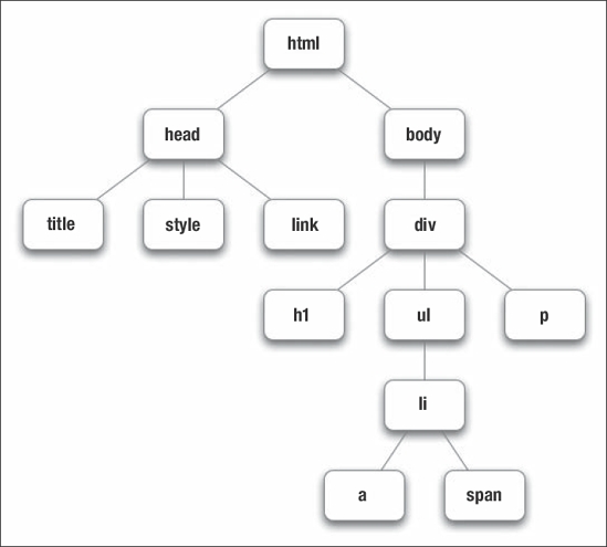
Figure 2-6. A chart depicting the hierarchical structure of HTML elements, known as the document tree, which intentionally looks very much like a family tree
As you can see, the ultimate ancestor of all the elements in the document is the <html> element, which is said to be the root element. Within the <html> element are two elements, <head> and <body>, which are said to be children of the <html> element (their parent element), and are therefore siblings of one another. These elements, in turn, each have additional child elements within them, each with their own children, populating the document with further descendant elements. It's these familiar—and familial—relationships that combinators describe.
Descendant combinator
The descendant combinator selects the elements targeted by the sequence of simple selectors on its right that are descendants of the elements targeted by the sequence of simple selectors on its left. Descendant combinators are written using any amount of whitespace (such as a space or tab character) between two sequences of simple selectors. In the following example, any <p> or <a> element that is nested within any <div> element will get the gray color treatment:
div p, div a { color: #777; }
The first selector in the selector group would select the <p> element in Figure 2-6 because it is descended from a <div>. The same is true of the <a> element inside the unordered list, even though it's not a direct child of the <div> like the <p> element is, so the second selector in the selector group also applies.
Just as you can chain any number of simple selectors into a sequence, so too can you chain any number of sequences of simple selectors with any number of combinators. This CSS rule has the same selector subjects as the previous one, but by explicitly including the body type selector we increase the selector's specificity:
body div p, body div a { color: #777; }
One challenging and instructional exercise you can try is to style all of the elements in your design that you currently select via ID and class selectors with descendant selectors instead. By constraining your available styling hooks to a document's hierarchical structure alone, you force yourself to think long and hard about the structure of your markup. It also instantly exposes areas of structural ambiguity that could possibly be candidates for refactoring.
Child combinator
The child combinator selects the subject on its right if that element is an immediate child (that is, not a grandchild, great-grandchild, or other descendant) of the subject on its left. The child combinator is denoted using a greater-than sign (>) and any optional amount of whitespace. Using the markup structure we've shown in Figure 2-6, this means that the following two CSS rules will have the same effect, since the <p> element is both a descendant and the child of the <div> element:
div p { color: #777; }

div > p { color: #777; }
This makes sense since children are also descendants, of course. However, because they are a specific kind of descendant, the child combinator's precedence is greater than the descendant selector's. Therefore, if our CSS rules had instead conflicted, as shown next, it's the CSS rule with the descendant selector that would override the other, despite its source order:
div > p { color: #F00; }

div p { color: #777; }
Whitespace is optional in all combinators except the descendant combinator you just saw in the previous section, so the selectors div > p, div> p, and div>p will all be interpreted in the same way. As a word of caution, the child combinator will not function in versions of Microsoft Internet Explorer prior to 7. While Internet Explorer 6's market share continues to wane over time, be sure to consider your audience and future usage trends when using the more advanced combinators. Other modern browsers such as Safari, Firefox, and Opera will have no trouble with these combinators.
Adjacent sibling combinator
The adjacent sibling combinator selects the subject on its right if that element is the sibling immediately following the subject on its left. An adjacent sibling combinator is indicated by a plus sign (+) and like the child combinator, the same optional whitespace rules apply. For an illustrative example, let's say that the document tree we've shown in Figure 2-6 is an abbreviated representation of the following XHTML code:
<!DOCTYPE html PUBLIC "-//W3C//DTD XHTML 1.0 Strict//EN"

    "http://www.w3.org/TR/xhtml1/DTD/xhtml1-strict.dtd">

<html xmlns="http://www.w3.org/1999/xhtml" xml:lang="en" lang="en">

<head>

<title>Adjacent Sibling Combinator Example</title>

<style type="text/css">

/* CSS will go here. */

</style>

</head>

<body>

<div>

<h1>Count <em>every</em> measure</h1>

<p>Some orchestral musicians have more to do than others.

Take for instance the difference between the string players

and the percussion sections. While the strings <em>almost

always</em> have to play frequently in every movement of a

given work, the percussion sections often have to sit back

and count measures. Often they <em>won't even have to play a

single note</em> in a given movement, and frequently they

must sit out an entire work during a performance if their

instrument isn't even needed.</p>

<p>Counting measures can be a difficult task. With tempos

changing throughout a work and the thought that really one is

just staring at a long chain of blank measures, it is easy to

get lost or distracted and miss an entrance. Some of these

musicians might be getting paid more to count measures than

to actually produce sound!</p>

<p>Missing an entrance during a performance can be quite an

embarrassing moment for an orchestral performer. Hopefully

this will never happen to you. To keep count, try writing in

musical cues into your parts and writing little reminders.

Practice the entire part along with a recording, being sure

to pay as much attention to the counting during practice as

you would during a performance. This will help you feel more

comfortable about how long you need to count measures and how

your entrance will sound.</p>

<div>2008-10-18@<em>4:43pm</em></div>

</div>

</body>

</html>
This structure gives us a number of sibling elements (an <h1>, several <p>, and a <div>), all children of the outermost <div> element. Using the adjacent sibling selector, we can target the first <p> element, the two <p> elements after it, or the final <div> element. Each of these selectors are shown here:
h1 + p  /* Selects only the first paragraph. */

p + p   /* Selects only the last two paragraphs. */

p + div /* Selects only the inner <div> element. */
Selecting siblings in this manner can be useful, as it provides a way to use a document's source order for styling hooks. It's common, for instance, to use the first paragraph after a top-level heading as a summary or introduction to a given piece. We can therefore use the adjacent sibling selector to present this introductory first paragraph specially, as we do here:
<head>

<title>Adjacent Sibling Combinator Example</title>

<style type="text/css">

   h1 + p { font-style: italic; }

   h1 + p em { font-weight: bold; }

</style>

</head>
In the first CSS rule, we use italics to make the first paragraph stand out. In addition to that, we further chain the adjacent sibling combinator with a descendant combinator in the second CSS rule in order to present the <em> elements within the first paragraph in bold type; otherwise, the emphasis would be missed with the default italic style. The results of these styles are shown in Figure 2-7.

Figure 2-7. Using the adjacent sibling selector, you can present the leading paragraph after a heading as a summary.
General sibling combinator
The general sibling combinator, introduced in CSS3, is similar to the adjacent sibling combinator in that it selects the subject on its right if that element is a sibling that follows the subject on its left. However, whereas the adjacent sibling combinator requires that the subject on the right immediately follow the subject on the left, the general sibling combinator doesn't. The only requirement is that the two elements are siblings of one another and the subject on the left precedes the one on the right.
This combinator is written using a tilde sign (~). Using the same document structure used in the previous examples, this means you could use the general sibling selector to similar but not identical effect, and you have a few more ways you could write the selectors. Instead of targeting only the first <p> element, you would target all of the <p> elements:
h1 ~ p /* Selects all of the paragraphs. */

p ~ p /* Selects only the last two paragraphs. */

p ~ div /* Selects only the inner <div> element. */

h1 ~ div /* Also selects only the inner <div> element. */
Of particular illustrative interest is the last selector, h1 ~ div, which in this instance behaves the same way as p + div does. Note, however, that neither the adjacent sibling combinator nor the general sibling combinator allows you to construct a selector that targets the <h1> element, since that element is the first child of the outermost <div>. You could target it using any of the following selectors instead:
h1

h1:first-child

div h1

div > h1

body > div :first-child
These examples draw on much of the capability of CSS selectors you've learned about in this chapter. Notice how any number of any combinators can be used in conjunction with one another to create CSS rules that are ever more precise. In this way, CSS selectors provide extremely surgical accuracy when targeting elements to style.
However, this flexibility also begs an obvious question: which selector is best in which situation? Interestingly, there is no simple answer to this question because it often falls to the CSS developer to judge each situation appropriately. That said, we'll discuss this and similar issues in Chapter 6. In the meantime, let's continue exploring the fundamental concepts of CSS itself.
Property values and units
As you know, a single CSS declaration contains at most one property (although it may be a shorthand property that expands to more than one simultaneously) and at least one value. Learning which values can go with which properties is part of the process of becoming proficient in CSS. A value is composed of tokens that represent an amount of some unit.
Although a single value can only be described using one kind of unit, values of different units may be used together in the same declaration. Some units can be used in contexts where others cannot, such as temporal (time-based) units in aural style sheets. Moreover, using some units in certain situations can actually cause undesirable, or unintended, consequences despite being perfectly legal.
Broadly speaking, CSS units can be classified either by the type of tokenization they employ (how they're written and what they reference) or their characteristics, such as whether they are computed relative to some other value or used as specified. It's both illustrative of CSS's diverse capabilities as well as instructional to closely examine the different kinds of units that can be used in CSS declarations. These values are, both literally and figuratively, what ultimately give your designs dimension and color.
Keywords and font names
Keywords are extremely prevalent in CSS. These are specific tokens that are known by the user agent and always mean the same thing to that user agent. An example is font-style: italic. The value italic in this declaration is a keyword12 that computes to a specific variation of typeface italicization.
Another place where you'll often see keywords used is in the color property's values, such as blue, yellow, or green. The CSS2.1 specification defines 17 color keywords (aqua, black, blue, fuchsia, gray, green, lime, maroon, navy, olive, orange, purple, red, silver, teal, white, and yellow), although these keywords may not always compute to the exact same color in different user agents. While not valid CSS2.1, all current major web browsers also support extended SVG color keywords (such as darkolivegreen), which are part of the CSS3 draft.
Although not technically a keyword, a font name is similar. To style text in a particular font, you use a declaration such as font-family: Helvetica to provide a comma-separated list of fonts to use. If the first font isn't available, each subsequent value in the list is attempted, defaulting to the standard system font if none are. Some keywords, such as serif, sans-serif, or monospace, can be used to generically refer to a particular class of fonts, allowing the user agent to automatically pick the first one in the class that is available for its use.
CSS3 also returns support for so-called “web fonts” that was removed in CSS2.1. With it, you can reference a downloadable font file as you might a background image and give it a name using the @font-face at-rule. Once you've defined it, you can then reference the font name in a font-family declaration to use it.
An at-rule is a CSS rule that begins with the @ symbol. These are used to include special CSS instructions for a particular subject area or medium. Common uses include @import to import one style sheet into another, @page to define page-specific properties in print media, @media for rules directed at a specific media type, and @font-face for importing and generating fonts. We discuss the use of many of the various at-rules throughout this book, particularly when we discuss styling for print (Chapter 4), mobile (Chapter 5), and font importing (Chapter 11).
Unlike the keywords for color, whose values can differ across implementations, some keywords are like shorthand for a different kind of value. Examples of this can be seen in common declarations like font-weight: bold. Here, the bold value actually references a number, specifically 700, which represents a precise amount of typeface bolding.
__________
12. Incidentally, the property font-style is also, technically, a keyword. Indeed, all property names are keywords to a certain extent.
Numbers
There are many kinds of numbers in computing, and CSS is no exception. CSS defines several categories of number values composed of ordinary numbers versus non-negative numbers and numbers with unit identifiers versus those without unit identifiers. A number can be either an integer like 1 or 5, or a real (that is, decimal) number like .3 or 2.5. Ordinary numbers can be prefixed with either a - or a + to indicate their sign, while non-negative numbers cannot.13
A unit identifier denotes what sort of measurement the number is intended to represent. Unit identifiers reference different types of values, and certain unit identifiers can be used only in certain places. CSS can represent units of lengths, percentages, angles, time, and frequencies.
Lengths
Units that represent length are the most common category of unit identifier. A length in CSS refers to a horizontal or vertical measurement. Length units are used in values for properties like width, height, and the other CSS box model properties.
A length measurement can be one of two possible types: relative lengths or absolute lengths. Relative length units specify measurements based on the computed value of some other length, while absolute lengths reference exact dimensions of the output medium. As such, style sheets that use relative units can scale across different output mediums with more ease than can absolute units.
Relative length units
For all values in which you specify relative units, the user agent needs to arrive at an actual value before the properties they are used in can be rendered. To perform this calculation, the user agent takes the relative value and computes it against some reference value, typically either another element's computed length or some formula defined by the rendering engine itself.
In CSS2.1, there are three relative length units:
- The
emunit denotes lengths in terms of the element's font size, or its parent's font size when an em is being used to compute the element's ownfont-sizevalue. One em (1em) is a typographic unit14 equal to a font's point size. In other words, the width of one em is identical to the width of an em dash (—) as drawn in whatever the current font and font size is. - The
exunit denotes lengths in terms of the element's font's x-height, so termed because it is often equal to the height of a lowercase letter “x.” One x-height (1ex) is more precisely equal to the distance between a typeface's baseline and its mean line. In many instances, this also approximates half of an em (.5em). - The
pxunit denotes lengths in terms of pixels on the viewing device. Although web designers are accustomed to thinking of pixels as absolute units, they are actually defined relative to the resolution of the device. In fact, the CSS specifications explicitly remark that user agents should rescale pixel values if the device's pixel density is dramatically different from typical monitor resolutions.
__________
13. Actually, you can prefix a non-negative number with a + but this is completely redundant as the number's sign is already known. Obviously, you can't prefix a non-negative number with a -.
14. In some typographic texts, an em is more formally known as a quad-width. Interestingly, typographers also refer to a unit known as an en, which is defined as one-half of an em. However, CSS does not specify an en unit.
Pixels are interesting beasts. The word itself is an abbreviation for “picture element.” Traditionally, pixels are understood to be colored dots on a device's display, called device pixels. They are the physical mechanism by which the device creates an image using a collection of pixels. CSS pixels, however, are not the same thing because different devices have different pixel-to-space ratios and, moreover, various display systems have variable screen resolutions.
Large kiosk-style displays may have a very low pixel to space ratio, while some of the newer high-resolution mobile devices such as the iPhone have very tight pixel densities. This pixel density is measured in dots per inch (dpi). At some point, an assumption about what one CSS pixel is going to represent must be made, because trying to control device pixels directly is simply infeasible. Browsers and CSS parsers today all assume a resolution of 96dpi by default. In other words, whatever the browser renders as one inch across is the same as 96 pixels.
Certain browsers (Internet Explorer, we're looking at you) incorrectly treat CSS pixel units as fixed, absolute values. They are not resizable using built-in features to change text sizes.
Though still a W3C Working Draft, the CSS3 Values and Units module is slated to add support for six more:
- The
gdunit denotes lengths in terms of a text layout grid, which is a common typographic layout technique used in East Asian languages. The unit's computed value depends on the value of thelayout-gridproperty, but this property has yet to be fully formed. We don't anticipategdunits to be viable for quite some time. - The
remunit functions similarly to the em unit, except that it always references the computed value of the root element'sfont-sizeproperty instead of the current element'sfont-sizevalue. When used on the root element itself, one of these units (1rem) computes to the same value as themediumkeyword. Usingremunits would be useful when inheritance issues make sizing elements and text withemunits difficult. - The
vwunit denotes lengths as hundredths of the viewport's width. One hundredvwunits (100vw) are equal to the current width of the viewport. This will allow designers to easily scale lengths based on the width of the browser window. - The
vhunit denotes lengths as hundredths of the viewport's height. One hundredvhunits (100vh) are equal to the current height of the viewport. Again, this provides a capability to scale lengths based on the browser window's current size. - The
vmunit denotes lengths as hundredths of the shortest viewport axis (either its height or its width, whichever is smaller). If the viewport is wider than it is high, then one hundredvmunits (100vm) equal its height; otherwise they equal its width. - The
chunit denotes lengths roughly in terms of the average width of the current typeface's characters. Like thegdunit, there are still unanswered questions that surround this unit, and its use is not expected to be viable for some time.
Absolute length units
There are five absolute length units (in both CSS2.1 and CSS3):
- The
inunit denotes lengths in terms of inches. - The
cmunit denotes lengths in terms of centimeters. - The
mmunit denotes lengths in terms of millimeters. - The
ptunit denotes lengths in terms of points. One point (1pt) is exactly 1/72 of an inch. - The
pcunit denotes lengths in terms of picas. One pica (1pc) is exactly 12 points (12pt).
Using absolute units makes a lot of sense when you are designing for physical media, most notably such as when you are using the print media type. On the other hand, if you're styling for screen output, then relative units will typically serve you better than absolute ones. Being able to reformat content for the specified output is a simple and powerful way to make your content more readable and accessible. Although many user agents are capable of translating relative units into absolute sizes, precision is more easily available to you when you use the native unit in the rendering media.
Percentages
Properties that allow percentage values always reference some other value, defined by the property itself. Percentages are defined by CSS as any number followed by a percent sign (%). They're especially useful when you want to denote values in a relative fashion without worrying about the specific measuring unit being used.
For example, an element's width property can take a length value using any of the units described earlier. Therefore, the following two CSS rules specify the same length:
#example { width: 2in;}

#example { width: 144pt; }
If we add a child <div> element to this example and we wish it to be three-fourths the width of its parent, we could use any of the following three CSS rules to accomplish that. Only the one that uses percentage values, however, won't have to be changed if the CSS rule that defines the width of the <div>'s parent does:
#example div { width: 1.75in;}

#example div { width: 108pt; }

#example div { width: 75%; }
Put another way, when you need to alter your design by changing the elements' widths, using the percentage value for the child <div> means you only have to change the parent's CSS rule. In complex designs, taking advantage of opportunities to reduce your edit-per-change ratio like this can be a significant factor in easing maintenance chores.
Time, frequencies, and angles
In aural media, there are some properties that accept units in terms of temporal lengths (time), frequencies, and angles. Both times and frequencies are (sensibly) non-negative numbers. Times can be denoted in either milliseconds, using the ms unit identifier, or full seconds, using the s unit identifier. Frequencies can be denoted either in hertz, using the hz unit identifier, or kilohertz, using the khz unit identifier.
Frequency units make it possible to write aural style sheets with bass and treble control for things such as the speaker's pitch. For instance, a declaration such as voice-pitch: 120hz specifies the pitch for a typical human male voice (200hz is a bass sound, whereas 6khz is treble sound; typical female voices are around 210hz). Time units allow aural style sheets to influence the rhythm of speech15 with properties such as pause-before or pause-after. For instance, a dramatic pause before beginning to quote a speech may be appropriate and could be specified in CSS with a rule such as blockquote.speech { pause-before: 3s; }.
__________
15. In linguistics, the rhythm, stress, and intonation of speech are collectively known as prosody. CSS also provides many keyword values for properties that influence stress and intonation as well as rhythm of speech.
Angles are used in properties such as azimuth that define where the listener is in three-dimensional space. Angle values can be defined in terms of degrees using the deg unit identifier, grads (1/400 of a full circle, or 1/100 of a right angle) using the grad unit identifier, radians using the rad unit identifier, and turns using the turn unit identifier. Negative angles are normalized to a 360° range such that, for example, −90deg is equivalent to 270deg.
Strings
A string value is an arbitrary run of characters denoted by single or double quotation marks. We've already seen string values inside of attribute selectors, but they are also used within property values. The content property, which produces CSS generated content, is one such example:
/* Double-quoted string value in attribute selector. */

blockquote[cite^="http://en.wikipeia.org/wiki/"]::before {

     /* Single-quoted string value in property value. */

     content: 'From Wikipedia: ';

}
We discuss string values and how to escape characters within them (using string escape sequences) in more detail Chapter 3.
Functional notation
In CSS, functional notation is used to specify values for a number of properties. If you have any experience with formal programming languages, you know that a function optionally takes arguments (parameters) and returns values. To use an example from PHP, a call to a function like date("Y-m-d") returns a string from the date function formatted using the argument Y-m-d, which (at the time of this writing) ultimately evaluates to 2009-02-05. PHP syntax is derived from the C programming language, as is the syntax for CSS values that use functional notation.
Values in functional notation look similar: a term (function name) is followed by a pair of matched parentheses, between which arguments may appear in a comma-separated list. The arguments themselves are dependent on the function being called.
URI references: the url() function
The url() function takes one argument, which is—predictably—a URI.16 It is used in CSS rules such as background-image or @import to reference the URI of another resource like an image or different CSS file. The URI may be a relative, or absolute, path, or it may be a fully qualified URI. Relative URIs reference resources relative to the location of the CSS file itself, not the documents that they are linked to. The argument value may be surrounded by quotes or left unquoted. Here are some examples:
/* Unquoted, relative URI. */

div#violas { background-image: url(violas.png); }

/* Single-quoted fully qualified URI. */

@import url('http://natasha.example.com/main.css'),
If a URI value contains whitespace, parentheses, single quotes, or double quotes, those characters should be appropriately escaped. This is done either by preceding them with a backslash () or by using the correct URI-escape sequence. For instance, the following two URIs are equivalent:
/* Whitespace is URI-escaped. */

#logo { background-image: url(Company%20Logo.jpg); }

/* Whitespace is backslash escaped. */

#logo { background-image: url(Company Logo.jpg); }
Color functions: rgb(), rgba(), hsl(), and hsla()
Representing color in CSS2.1 can only be accomplished by mixing values of red, green, and blue (RGB).17 The current draft of CSS3 adds the ability to do so using a combination of hue, saturation, and lightness (HSL) as well. Both methods are widely understood by graphic designers and supported by computer graphics applications.
RGB color values are expressed as a list of three integers or percentages. Integers can range from 0 to 255, while percentages can be any decimal value from 0% to 100%,18 so a numerical value of 255 is equivalent to a percentage value of 100%. Each value in the list represents the color channel for its position. A declaration such as color: rgb(85, 107, 47) specifies 85 as the red value, 107 as the green value, and 47 as the blue, resulting in a sort of olive color.
Any visual element can also be made partially transparent with the use of the opacity property. This property accepts a non-negative number in the range of 0 (completely transparent) to 1 (completely opaque). CSS3 introduces an rgba() function, where the “A” stands for the alpha (transparency) channel. This functions identically to rgb(), but accepts a fourth argument representing an opacity value. As such, the following two CSS rules are equivalent:
__________
16. The url() function recognizes any valid IRI (that is, Internationalized Resource Identifier), not merely URLs. Despite this, for legacy reasons, the function's name is still url() and not iri().
17. This is true even for print media—color cannot be declared as a combination of cyan, magenta, yellow, and black (CMYK) inks. It is up to the user agent to perform an appropriate translation from RGB to CMYK colors, if necessary.
18. Technically, you can specify values outside of this range, but the user agent is expected clip them. In other words, a specified value of −50 is equivalent to 0, and a specified value of 110% is equivalent to 100%.
Representing colors as RGB triples have certain limitations: they imply certain kinds of hardware (such as CRT monitors), and they aren't how humans natively perceive light. To address these concerns, the latest drafts of the CSS3 Color Module add HSL values, which are considered to be more intuitive than RGB values and easier to comprehend. Using the hsl() function, you can declare a color hue as an angle on the color wheel and that color's saturation and lightness as percentages.
A value of 0 or 360 in the first argument represents red, 120 represents green, and 240 represents blue. Full color saturation would be denoted as a value of 100% in the second argument, while a value of 0% would display a shade of gray. Finally, the third argument denotes the lightness (sometimes also called luminosity) value; 100% is white, 0% black, and 50% “normal.” Here are a few examples of the hsl() function:
hsl(0, 100%, 50%) /* Red, equivalent to #F00 or rgb(255, 0, 0). */

hsl(0, 100%, 100%) /* White, or #FFF */

hsl(240, 0%, 100%) /* Also #FFF */

hsl(190, 25%, 50%) /* Blue-ish gray, specifically #5F949F */
There is also an hsla() function in the specification to allow for alpha transparency as a fourth argument identical to the rgba() function. Since the CSS3 specification is still in the works and only Gecko and WebKit currently support hsl() or hsla() values, you needn't concern yourself with these options too much. They are, however, something to keep an eye on and look forward to.
The color property is also unique in accepting a special kind of notation to represent color values called hexadecimal notation.19 Hexadecimal values use hexadecimal digits (0 through F, which is base 16) and look like #FFFFFF, called a hex triple. That value is equivalent to the white keyword and to rgb(100%,100%,100%).
Hex values are really just RGB values in disguise: the first pair of numbers indicate the amount of red, the second pair indicate the amount of green, and the third the amount of blue. For any hex color where the R, G, and B values are doubled, such as #CC33FF, you can use a three-character shorthand: #C3F. Hex values are case insensitive, so #CC33FF is the same as #cc33ff (or #c3f for that matter).
__________
19. Actually, the color property is unique for additional reasons than merely this one, but a full discussion of the color property is beyond the scope of this book. In CSS3, how colors are defined is the topic for an entire module called CSS Color, and it is currently making its way toward standardization as of this writing. The latest working draft of the CSS3 Color module is available online at http://www.w3.org/TR/css3-color/.
Generated content functions: attr() and counter()
The attr() and counter() functions work in tandem with the content property to return the value of an element's attribute or the counter named in its argument, respectively. In CSS2.1, both functions return a string, although in the current draft of CSS3 the attr() function will accept an optional second argument that specifies the type of value to return.
This can often be used to extract additional content from your markup and make it visible as rendered content. For example, given this HTML:
<a href="http://natasha.example.com/"
title"Natasha O’Reilly, Baroque Cellist">My site!</a>
the following CSS declaration can render the value of the href attribute:
content: attr(href); /* Displays "http://natasha.example.com" */
Both the attr() and counter() functions are discussed at much greater length in Chapter 3.
Basic math for computing lengths: the calc() function
The calc()function is part of the CSS3 draft, but is not yet implemented by any of the mainstream browsers. Permitted anywhere length values are, it is intended to be a way to calculate length values dynamically using basic math operators like addition (+), subtraction (-), division (/), and multiplication (*). This would enable expressions that mix relative length units to be specified, but have the actual value of the expression substituted as the resulting value.
One situation where this capability would be useful is where elements have margins specified using relative units but need width values specified by taking into account some amount of fixed units. For instance, here's a CSS rule that would (theoretically) make an element's width exactly 25 pixels wider than half of its parent's width, and will also subtract the width of its margins, whatever that is at any given time:
#example {

    margin-left: 1em;

    margin-right: 1em;

    width: calc((100%/2 + 25px) - (1em*2));

}
Note that grouping parentheses are likely to be allowed in calc() expressions, and that the + and - operators have lower precedence than the / or * operators. Again, we stress that this function is not implemented in any mainstream browser. However, basic math like this has been a desirable feature for quite some time, and we're excited about the possibility of seeing it implemented one day.
Visual rendering and formatting concepts
When it comes to implementing visual designs in CSS, two intrinsic concepts are perhaps the most often overlooked. These two concepts are document flow and the CSS box model, and the two are very closely related. It's these two fundamental concepts that make using CSS radically different than using other tools. Therefore, these fundamentals of how CSS works deserve a closer look.
CSS boxes and document flow
When any element is rendered visually, it occupies a rectangular region of visual space. These rectangles are referred to as CSS boxes. For instance, every visible <p> element on a page creates an invisible rectangle on the screen inside of which the content of that paragraph is displayed, or flows into. All of a paragraph's content, typically text, also render as CSS boxes, albeit boxes of a different kind. The <p> elements create what are known as block-level boxes, whereas the strings of text within them create inline-level boxes. These two different kinds of CSS boxes flow onto the screen in very different ways.
How CSS boxes flow when they are rendered is not determined by chance, but by a precise system that a renderer (such as a web browser's rendering engine) uses called document flow. Being aware of how this system works—and how to manipulate it—is a core part of mastering CSS-based design. Every element on a web page, every headline, every list item, every paragraph, and even every line of text and each individual character within every line of text follows the rules of document flow to determine where they end up on the screen.
Fundamentally, the rules are simple: block-level boxes always flow one on top of another, like bricks in a vertical stack. In contrast, inline boxes flow one after the other horizontally, literally in the same horizontal line as any neighboring inline elements. A user agent's built-in style sheet determines what elements create what kinds of CSS boxes.
For example, paragraphs are initially declared to be block-level boxes, so each time you define a new <p> element (and thereby generate a new block-level CSS box), the browser places that paragraph underneath any block-level boxes that came before it in the document flow. This is why two sibling <p> elements always create two distinct chunks of text, one atop the other, by default. Other elements that create block-level boxes are headlines, <div> elements, and lists (not list items, but the list item's containing elements, <ul>, <ol>, and <dl>).
Runs of text, and indeed each individual character, or glyph, are rendered as inline boxes. If there's not enough horizontal space for an inline box to fit on one line, then the boxes get bumped down to the next line. This is why English text inside of a paragraph begins at the paragraph's top-left corner, flows horizontally across the width of the paragraph, and then ends at the bottom-right corner (known as left-to-right, or “LTR” text flow).
Such runs of text that are inside block-level elements create anonymous inline boxes. They are “anonymous” because a CSS selector can't explicitly target them (without the help of pseudo-elements). However, many elements that can be targeted create inline boxes by default, too. Some examples of such elements are images, links, and emphasized text (the <em> and <strong> elements, for instance).
These rules, where paragraphs are laid out vertically and runs of text start at a content area's top-left corner and flow to their destination at the bottom-right corner is, of course, the normal direction in which content flows when written in the English language. However, this is not the case for all languages. Hebrew is an example of a language that reverses the direction of flow so that it begins from the top-right corner and ends at the bottom-left corner (known as right-to-left, or “RTL” text flow). Arabic, Farsi, and Urdu are also written using right-to-left text flow. Chinese is an example of a language that can be represented by writing ideographs in either direction, so it is said to be bidirectional (or “BiDi” for short).
It's easy enough to see how document flow affects how certain glyphs are rendered. Based on the language specified in the web page's <html> element, the web browser simply places the first character at either the top-left or top-right corner of the paragraph and then places each successive character it sees to the right or left of the one before it. Recall that the root elements in our web pages in this chapter have begun like this:
<html xmlns="http://www.w3.org/1999/xhtml" xml:lang="en" lang="en">
Since you've defined that this web page is written in English by specifying the xml:lang="en" and lang=»en» attributes, the web browser will assume a normal flow for what is expected in English, specifically a direction of left-to-right text. If you're feeling experimental, go ahead and add the dir attribute with a value of rtl (short for right-to-left) to the <html> element, and you'll see that now every headline and paragraph is right-aligned (instead of how it was previously left-aligned) and the punctuation marks are all on the “wrong side” of the words.
CSS boxes interact with one another in particular ways. Inline boxes are always rendered inside a block-level box, known as their containing block. If a CSS box's containing block is sized at unchanging dimensions and the box is too large to fit within it, then it will overflow (become visible outside of) the container. However, this overflow doesn't typically affect the visual positioning of any other CSS boxes inside of different containing blocks, such as text in the next paragraph. The result, of course, is overlapping text. In such a case, each of the two paragraphs' individual inline boxes are said to be in a different flow from the other.
As a designer, you influence the layout of a page by manipulating CSS boxes so that they fall into the document flow the way you want them to, much like a game of Tetris. The value of an element's display property determines what kind of CSS box it will create. Here's an example of what the default CSS rules that web browsers use to make <p> elements block-level and <strong> elements inline-level might look like:
p { display: block; }

strong { display: inline; }
Of course, you can override these default styles and make any element generate any kind of box you want—something that was flat-out impossible before the advent of CSS. For example, you could add a CSS rule that makes <img> elements generate block-level boxes instead of inline-level boxes, as shown by the following CSS rule. Among other things, this obviates the need for explicit line breaks inside the markup of documents that are used for the same effect.
img { display: block; }
Block-level boxes that have no specific width declared extend as wide as they can while still fitting within their containing block. Inline-level boxes, however, grow only as wide as they need to be to make their content fit within them. Inline boxes are like shrink-wrap that surrounds whatever their content is.
The display property can also be given a plethora of other values, each of which relates to a specific formatting context. The two most common formatting contexts are the ones we've just discussed, block and inline, which provide the basis for the behaviors of the others. Another common kind of CSS box that you've no doubt encountered is a list-item box. Not surprisingly, <li> elements are defined with a default CSS rule such as li { display: list-item; }. We discuss list-item boxes in detail in Chapter 3.
A fourth formatting context is one for laying out tables. Of course, the <table> element uses this by default, perhaps initialized in a user agent's default style sheet with a CSS rule such as table { display: table; }. Tables themselves behave like block-level elements, but unlike block CSS boxes, the contents of table CSS boxes can behave like rows (using display: table-row) or columns (using display: table-column).
The point here is that a CSS box is to a CSS developer as a paintbrush is to a fine artist; choosing different brushes will create different effects on a canvas, and choosing which kind of CSS box to render will similarly create different effects in your visual design. Learning to use each of them for their intended purpose can dramatically improve your capabilities. If you “go with the flow,” your CSS code will be more robust, less prone to browser bugs, and more optimized, all without any additional efforts.
CSS positioning schemes
In addition to the display property, other CSS properties also affect how a CSS box is rendered and how it interacts with the rules of document flow. Two of these are position (which accepts a value that's one of static, relative, absolute, or fixed), and float (which can have a value of either left or right.) Together, these two properties render an element using one of three different positioning schemes.
The first of these schemes is the normal document flow that we discussed in the previous section. Another is absolute positioning, in which the absolutely positioned element (and all its descendant elements) is removed from the normal document flow and put into its own context, as though it were the only element being rendered. This makes it possible to position any chunk of content independently from any other chunk, as each chunk is guaranteed not to influence the layout of the other—each chunk is in its own flow.
The third positioning scheme is floated positioning, a sort of middle point between the normal flow and absolute positioning. Floated boxes are “half removed” from the normal document flow, so that they flow somewhat independently of block-level boxes but still affect the flow of inline-level boxes. Let's take a quick look at each of these by examining the position and float properties and their possible values.
Static positioning
By default, all elements are positioned statically, and indeed static is the initial value of the position property. In other words, an element that is “statically positioned,” or “not (specially) positioned,” is simply in the normal document flow. Typically, you'll use the static value to restore a previously positioned element back to the normal document flow.
Using the previous example of two sibling paragraphs, you can say that each is statically positioned and therefore they flow as you would expect, one atop the other. Similarly, other block-level elements such as the <div>s in the following example are also statically positioned:
<div class="strings" id="violins">

</div>

<div class="strings" id="violas">

</div>
Since <div> elements are also block-level elements by default, these will also stack one atop the other as you would expect them to when a position declaration is not in effect. Therefore, lacking other CSS rules, every element is initially positioned statically. This is equivalent to a default style sheet's CSS rule like this:
* { position:static; }
Relative positioning
Using relative positioning, you can change where an element's CSS box is rendered without changing the document flow or influencing the layout of other elements. Therefore, elements that are relatively positioned are still in the “normal” document flow, and their neighbors behave as though they were positioned statically, even though they're not. An example will help to illustrate this, so let's build on our previous example and look at what relative positioning does.
In this document, you have three block-level <div> elements that demarcate the contents of sections of an orchestra. The violin section is first in the markup source, and so it is rendered at the top of the document. The next <div> is for the violas, and it renders underneath the violins, and the final <div> element for the cellos similarly follows suit. Each of the <div> elements is given width and height dimensions, a background-color, and a border to help them stand out for the sake of this illustration.
<!DOCTYPE html PUBLIC "-//W3C//DTD XHTML 1.0 Strict//EN"

    "http://www.w3.org/TR/xhtml1/DTD/xhtml1-strict.dtd">

<html xmlns="http://www.w3.org/1999/xhtml" xml:lang="en" lang="en">

<head>

<title>String Sections</title>

<style type="text/css" media="screen">

    div {

        width:200px;

        height:100px;

        background-color: #B3B3B3;

        border:2px dotted #4C4C4C;

            }

</style>

</head>

<body>

<div id="violins" class="strings">

    The violin section

</div>

<div id="violas" class="strings">

    The viola section

</div>

<div id="cellos" class="strings">

    The cello section

</div>

</body>

</html>
There are no surprises with all the elements statically positioned as they are here. Now let's position the middle <div> (the violas) relatively using the CSS rule shown here. You can see the results in Figure 2-8.
<style type="text/css" media="screen">

div {

     width:200px;

     height:100px;

     background-color: #B3B3B3;

     border:2px dotted #4C4C4C;

}

div#violas {

      position: relative;

      top: −20px;

      left: 25%;

}

</style>
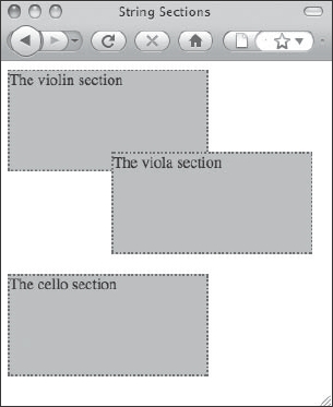
Figure 2-8. Positioning the viola <div> relatively moves the element's CSS box to a new location but doesn't affect the normal document flow.
As you can see, after you declare that the violas <div> will use relative positioning, you use any of the four box offset properties (top, right, bottom, and left) in conjunction with one another to move the CSS box to its new place. This example uses a negative value (−20px) on the top property to move the CSS box “up” by the specified amount, but a positive value on the bottom property (such as bottom: 20px;) would have achieved the same result. The example also uses the left property with a positive percentage value to move the CSS box to the right. Relative positioning can therefore be described as moving the display of a CSS box to a new location by a certain offset as calculated by where it would have been displayed if the element were statically positioned.
Two things are especially noteworthy here. First, notice that there are 20 extra pixels of blank space below the viola <div>. While the display of the relatively positioned <div> has moved, the space it occupies in the document flow has remained the same—the viola <div> is still in the normal document flow, but is relatively positioned within it. In other words, as far as this <div>'s siblings are concerned, it hasn't been moved at all, which is why its CSS box now overlaps the one that came before it and why there is extra “blank” space beneath it.
Second, notice that if you resize the browser window and make it bigger, the <div> will move farther right, while resizing the browser window so that it is smaller will move it farther to the left. What we have here is a situation where the browser automatically computes the appropriate left offset value by dividing the current viewport's width by 4 (that is, by 25%). If the browser viewport is exactly 400 pixels wide, then the left offset value will be computed as 100px.
Using relative units can lead to some interesting results, but when you use them it's very important to know what the unit is being calculated against. The reason 25% references “one fourth of the viewport's width” in this example is because there is no explicit nearest positioned ancestor, and in such a case the root element (that is, the browser viewport) is implicitly given that role. We can change that, however, by adding another element and giving it a position value other than static. Now our markup looks like this:
<div id="violins" class="strings">

    The violin section

</div>

<div id="viola-wrapper">

<div id="violas" class="strings">

        The viola section

</div>

</div>

<div id="cellos" class="strings">

    The cello section

</div>
And our CSS looks like this:
<style type="text/css" media="screen">

div {

    width:200px;

    height:100px;

    background-color: #B3B3B3;

    border: 2px dotted #4C4C4C;

}

div#viola-wrapper { position: relative; }

div#violas {

    position: relative;

    top: −20px;

    left: 25%;

}
Now, the 25% offset in the CSS rule targeting div#violas will always be calculated as 50px because the calculation is being performed against the width of div#viola-wrapper (earlier declared to always be 200px). By positioning the new wrapper <div>, it has become the nearest positioned ancestor for the violas <div>. You can optionally move the wrapper around by declaring offsets for it as well, but that's not necessary for establishing a positioned ancestor like this.
Absolute positioning
A single rendered document must have at least one normal flow, but you can define any number of additional ones by using the absolute positioning scheme. Doing so removes the absolutely positioned element from the first flow and places it into an entirely new flow of its own. The CSS box of the absolutely positioned element becomes the nearest positioned ancestor of that element's descendants, and the descendant elements' CSS boxes all assume a normal flow within their containing block.
All CSS boxes are drawn on a theoretically infinitely sized canvas. A web browser's viewport shows you only a portion of the canvas at any one time (that's why it's called a viewport in the first place), and provides you with scroll bars to position it over the area of the canvas you want to see. The size of the canvas is determined by examining the dimensions of CSS boxes and the current size of the viewport. If the viewport is taller than the height of the longest document flow, then the canvas extends to the bottom of the viewport and no farther. If a document flow is taller than the height of the viewport, then the canvas extends to the end of the tallest document flow.
The absolute positioning scheme takes effect when an element's position property is given either absolute or fixed as its value. Let's position the viola <div> again, but this time you'll use absolute positioning. The result of this change is shown in Figure 2-9.
<style type="text/css" media="screen">

div {

      width: 200px;

      height: 100px;

      background-color: #B3B3B3;

      border: 2px dotted #4C4C4C;

}

div#violas {

      position: absolute;

      top: −20px;

      left: 25%;

}

</style>
As you can see, this simple change has produced a dramatically different visual result. The viola <div> has shifted so far up the screen that it's being cropped at the top of the viewport. Moreover, there is no longer any blank space between the <div>s for the violins and cellos. Instead, they are touching one another, as though they were statically positioned sibling elements in the source code.

Figure 2-9. The viola <div> now uses absolute positioning with the same top and left offsets as before, but the visual result is markedly different than the result of using relative positioning.
By removing the viola <div> from the normal document flow with absolute positioning, the browser's rendering engine lays out the CSS boxes as though the viola section is a completely different visual layer. You now have two flows: one that exists inside the <body> element as normal, and one that exists only within the viola <div>, which no longer participates in the <body> element's flow. As happened before, since the viola <div> doesn't have a nearest positioned ancestor, its CSS box offsets are calculated against its new containing block, which in this context is known as the initial containing block (that is, the root CSS box).
It's trivial to determine when an absolutely positioned box, sometimes more succinctly referred to as an AP box, is being offset from the initial containing block. Using a CSS rule like the following will affix the top-left corner of the viola <div> to the top-left corner of the viewport:
div#violas {

      position: absolute;

      top: 0;

      left: 0;

}
This next CSS rule will affix the top-right corner of the violas <div> to the top-right corner of the viewport:
div#violas {

      position: absolute;

      top: 0;

      right: 0;

}
Ultimately, however, absolutely positioned elements are rendered based on their location in a particular flow of content, which is not necessarily relative to the viewport. As before, if we explicitly add a positioned ancestor element to our document, the CSS box of the nearest positioned ancestor element will be the one from which all box offsets for the absolutely positioned box are calculated. By appropriately structuring your document's markup in this way, you can move CSS boxes around to create arbitrarily complex visual layouts.
Fixed positioning
The other way to position an element with the absolute positioning scheme is to use fixed positioning. Fixed positioning works in the same way as absolute positioning does except that the CSS box offset is always calculated relative to the coordinates of the viewport, not the canvas. This subtle distinction means that the fixed element will remain motionless as the canvas for continuous media is moved underneath the viewport when you scroll. In paged media contexts where you have a page box instead of a viewport, fixed CSS boxes will be repeatedly rendered in the same place on every page.
In the following example, which includes numerous filler paragraphs in order to lengthen the normal document flow beyond the height of our canvas, the violas <div> is fixed in the center of the viewport, as though it were a watermark. As all offset properties and CSS box sizes are calculated relative to the viewport, we use percentage values to fill 50% of the viewport with the contents of the <div>'s CSS box and then center it by placing its top-left corner 25% away from the top-left corner of the viewport's 0,0 coordinate. Figure 2-10 shows the print preview result as rendered by Firefox 3.
div#violas {

      position: fixed;

      top: 25%;

      left: 25%;

      height: 50%;

      width: 50%;

      font-size: xx-large; /* merely for illustrative purposes */

}
Sadly, position: fixed is not supported at all in Internet Explorer 6 and earlier. Additionally, the WebKit rendering engine fails to treat each page box as individual viewport-like objects and instead seems to treat all of the page boxes together as though they were a single, extremely tall one. This results in fixed positioned elements not being repeated, but rather stretched and broken across page boxes. WebKit's print preview rendering of the same code is shown in Figure 2-11, and the print medium is discussed in further detail later in this book.
Figure 2-10. Firefox's Gecko rendering engine correctly repeats the fixed position <div> on each page of the printed output.
Figure 2-11. Safari's WebKit rendering engine incorrectly stretches the fixed position <div> across all pages of the printed output.
Floated CSS boxes
Any CSS box can be rendered using floated positioning by declaring the float property with a value other than none. Floated boxes are always implicitly transformed to block-level boxes, even if display: inline is specified on their elements. Despite this, because they are pulled out of the normal document flow, they size themselves similarly to inline boxes, shrinking their width and height to accommodate their contents unless explicit width or height dimensions are declared.
Floating a box moves it horizontally in the direction specified (either left or right) until its margin edge reaches the content edge of its containing block. Floated boxes are unique because they affect neighboring floated or inline CSS boxes, not other block-level boxes that aren't also floating. In fact, nonfloating block-level boxes behave as though the floated box doesn't even exist.
div#violas {

      float: left;

      width: auto;

      height: auto;

      border-color: yellow;

}
In this example, the violas <div> is floated to the left, its explicit width and height are removed, and it's given a different border-color for illustrative purposes. The result of these CSS rules is shown in Figure 2-12. As you can see, the dimensions of the floated violas <div> have shrunk to fit around its content, and moreover, the surrounding block-level <div> elements have shifted upward and are now touching one another. The only CSS box affected by the floated box is the inline box within the cellos <div>, which has been pushed aside.

Figure 2-12. The floated violas <div> is removed from the normal document flow so block-level boxes ignore it, but inline boxes are still affected by its presence.
Stacking contexts
We're accustomed to thinking of web pages as a two-dimensional plane with an x- and a y-axis, but rendering engines lay out CSS boxes in three dimensions. The canvas can therefore be thought of as having an x-, y-, and z-axis. Depending on a web page's direction of flow, the top-left corner of the document flow (or the top-right corner in right-to-left flows) can be said to be at coordinate 0,0 on this imaginary graph of the canvas. The z-axis determines how near or far a particular CSS box is to the viewer's eyes. Each CSS box on a web page is positioned somewhere along the x-, y-, and z-axes on this imaginary graph.
In CSS, this z-axis is called the stack level. CSS boxes with higher z-axis values are considered “closer” to the viewer than CSS boxes with lower values so, for example, a box at coordinate 0,0,0 is said to be “behind” a box at coordinate 0,0,1. Figure 2-13 shows what such a graph might look like from a web browser's point of view.
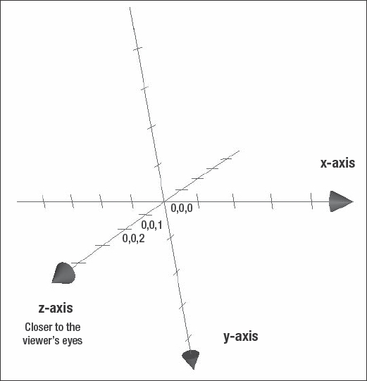
Figure 2-13. A three-dimensional graph has an x-, y-, and z-axis. CSS boxes are positioned somewhere along each of these three axes.
Each CSS box generated within the content area of another CSS box is actually being stacked on top of it, like a collage made with construction paper. As you continue nesting elements, you continue to stack CSS boxes one on top of another in an endless (and often invisible) tower. Among other things, it's for this reason why any background applied to the <body> element always appears to be behind any other element on the web page and why the most deeply nested elements always appear to be in front of all their parent elements.
Moreover, you can control where a CSS box is placed along this z-axis with CSS using the z-index property, which specifies a number that represents a point along this z-axis relative to the other CSS boxes in the same containing block. In other words, one CSS box with a z-index value of 5 is only in front of another CSS box with a z-index value of 1 if they are both rendered inside the same containing CSS box. If they are not, it is the relative z-index values of their containers that determine which element overlaps the other.
To illustrate this, let's first reposition our orchestra's three string <div>s absolutely such that they overlap one another. The results of the following CSS rules are shown in Figure 2-14.
div {

    width:200px;

    height:100px;

    background-color:#B3B3B3;

    border:2px dotted #4C4C4C;

    position: absolute;

}

div#violins {

    top:10px;

    left:30px;

}

div#violas {

    top:80px;

    left:90px;

}

div#cellos {

    top:50px;

    left:210px;

}
With no z-index properties declared explicitly, each element's z-index value is set to the initial (default) value of auto. The effect is the same as setting each element's z-index value to the same number since, when positioned absolutely like this, each box has the same containing block (the initial containing block, in this case). We can see that each box is layered according to its source order. That is, the cellos <div> is positioned “on top of” the previous <div> elements that came before it in the document markup.
Now, let's change the stacking order of these CSS boxes so that the cellos <div> is behind the others. This is achieved simply by giving it a negative z-index value. The effect of this additional declaration is shown in Figure 2-15.

Figure 2-14. Each <div> element is now absolutely positioned so that they overlap one another in predictable ways.

Figure 2-15. Adding z-index declarations changes the stacking order of CSS boxes within the same containing block relative to one another.
Another way to achieve this same effect could have been by giving positive z-index values to the other <div> elements. It also doesn't matter what these z-index values are, as long as they are higher than the one given to the other box. Here, we give the other <div> elements a z-index value of 5.
div#violins {

   top: 10px;

   left: 30px;

   z-index: 5;

}

div#violas {

   top: 80px;

   left: 90px;

   z-index: 2;

}
These CSS rules would position the div#violins element on top of both of the others, with the div#violas directly behind it. However, these values are relative to the others in the same containing block—they're not absolute coordinates. Therefore, if we once again added a wrapper <div> element to the violas <div> element and gave it a higher z-index value than the violins <div> element (say, 10), then the div#violas would once again overlap the div#violins, as before.
div#violins {

    top: 10px;

    left: 30px;

    z-index: 5;

}

div#viola-wrapper {

    position: relative;

    z-index: 10;

    /* Remove extraneous visuals for clarity. */

    background-color: transparent;

    border: none;

}

div#violas {

    top: 80px;

    left: 90px;

    z-index: 2;

}
As you can see, the z-index property therefore allows you to define a sort of layering behavior that mimics the common notion of layers prevalent in many computer graphics programs like Adobe Photoshop. Indeed, for a time, many CSS-capable integrated development environments (IDEs), such as earlier versions of Dreamweaver, referred to “layers” in their user interface.20 What they referred to are typically absolutely positioned boxes with an explicit z-index declaration. Dreamweaver CS3 now refers to “AP Div” objects instead, and has menu options and controls that allow you rearrange them using the z-index property.
CSS box models: content-box model vs. border-box model
Design, and especially visual design, is all about relationships between different elements. A headline only stands out as such because it's bigger, or bolder, than the body text. The content sections in a site's sidebar are visually distinct because they have more whitespace around them than exists within them.
In CSS, each element creates a box of a certain display type and each box has four distinct areas that can be individually manipulated. From inner- to outermost areas, these are a content area, a padding area, a border area, and a margin area. Each of these areas has four sides, which themselves can be individually manipulated. You can use tools such as Firebug or the Web Developer Toolbar add-on for Firefox, or the Web Inspector's Metrics pane in Safari to see the dimensions of CSS boxes, as shown in Figure 2-16.
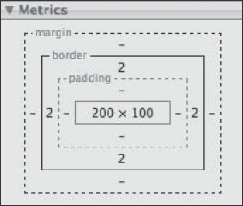
Figure 2-16. The properties of a CSS box, as shown in Safari's Web Inspector. Similar views are available from the Firebug add-on for Firefox.
__________
20. The notion of layers in a web page originally came from Netscape, which supported the proprietary <layer> element.
Currently in CSS2.1, a box's dimensions are calculated by cumulatively adding the sizes of each side of each area. In the example box shown in Figure 2-16, we have a CSS box that is a total of 204 pixels high and 104 pixels wide. This is because the content area's width is 200 pixels wide and 100 pixels high, and the only other area sized with nonzero values is the border area, which is drawn with 2 pixels on all sides. These values might have been set in a CSS rule such as the following:
#example {

    width: 200px;

    height: 100px;

    border-width: 2px;

}
Therefore, the total width of the rendered CSS box is 200 pixels of content area, plus 2 pixels of left border area, plus 2 pixels of right border area, equaling 204 pixels of screen space. A similar calculation is performed to size the box's height. A box sized in this way is said be sized using the content-box model because of the way the content area's dimensions are explicitly specified in the width or height declarations.
In CSS3, a new box-sizing algorithm has been introduced called the border-box model. Using this algorithm, rather than adding to the rendered size of a CSS box when declaring non-content-area lengths (such as margin or padding), the length of those areas are subtracted from the content area's dimensions. If the box shown by Figure 2-16 was sized using the border-box model, then the code to achieve a width of the box at 204 pixels with the same border area as before, we'd have to use CSS code that looks like this:
#example {

  box-sizing: border-box;

  width: 204px;

  height: 104px;

  border-width: 2px;

}
Notice that our width and height declarations have been changed so that they declare the total rendered size of the box, instead of the size of the content area only. As the content-box model is the default box sizing method for all standards-compliant user agents, we also have to explicitly tell the renderer to use the border-box algorithm using the box-sizing property.
Although only experimentally implemented in many mainstream web browsers like Firefox 3 and Safari 3, the border-box model will be useful for elements that use relative units to size non-content areas. For example, using border-box sizing, you can create two equal-width columns within a single container, without additional markup that would otherwise be necessary.
.example-column {

    box-sizing: border-box;

    float: left;

    width: 50%;

    /* total width now includes 2em total border area, set below */

    border: 1em silver ridge;

}
The previous CSS could be applied to simple markup such as this:
<div id="container">

<div class="example-column">This will appear on the left.</div>

<div class="example-column">This will appear on the right.</div>

</div>
These two box models are entirely incompatible with each other, since different width or height values are required to achieve similar results. Nevertheless, for legacy reasons, all current versions of Internet Explorer use the border-box model instead of the standard content-box model to size all CSS boxes when the browser is rendering page in quirksmode. Therefore, it's important to ensure that your page is being rendered in a standards-compliant mode. To do this, always use a valid DOCTYPE at the top of your markup.
Summary
In this chapter, you've looked at a number of fundamental constructs for Cascading Style Sheets, including a user agent's initial styling, how to apply styles to elements, and how author and user style sheets interact. You also explored CSS selectors in detail as well as the many different units CSS makes available for your use. Finally, we discussed the intricacies of CSS's visual rendering models by exploring the critical aspects of document flow and CSS boxes, how the two interact with each other, and how you can manipulate them to achieve your layout objectives.
You learned how the document flow can be altered using a combination of the display, position, and float properties, and how combinations of CSS boxes in the three different positioning schemes interact. You learned that the canvas on which CSS displays content is actually a three-dimensional grid, and you saw how to use the z-index property to stack CSS boxes in a particular order one on top of the other. Finally, you saw how the two CSS box models, the traditional content-box model and the newer border-box model, differed from each other, and where one might be preferable to use over the other.
This is a comprehensive but not an exhaustive reference of the CSS specifications. It is instead a solid foundation in the concepts that you will need to be intimately familiar with in order to take your CSS skills to the next level. There is a lot to digest from this chapter, so rather than spending your time solely rereading it, we encourage you to keep these discussions in mind as you author your next style sheet.