
Chapter 10
Harnessing the Power of Overlays
IN THIS CHAPTER
![]() Using moving averages
Using moving averages
![]() Creating channels for prices to move
Creating channels for prices to move
![]() Checking out horizontal support and resistance
Checking out horizontal support and resistance
As stock prices wiggle up and down, you may find it hard to recognize a trend. Overlays — which are display formats added to stock charts that help you understand price movement — can smooth out that trend to make your reading of the charts easier. Overlays can also help you see when the big picture is getting stronger. More importantly, regardless of the news around you, the overlays can help you see when extremes in price movement are occurring.
Using overlay tools and adjusting the settings to create a method you’re comfortable with make charting more valuable. The overlay tool can help you find better entries and exits by understanding the price patterns in a stock. In this chapter, you find out how to use overlays in three different tasks: tracking moving averages, trying channel investing, and noting support and resistance. (Chapter 3 introduces overlays and other chart settings.)
 It’s critical to keep in mind that buyers for a stock are looking for a good entry. If you don’t have any buyers, you can’t lock in a profit when you’re trying to sell. Overlays help you find areas to maximize profits and still have a solid chance of having a buyer at that level. An exit methodology is an important component of successful investing, and selling near previous highs can be beneficial.
Keeping Track of Moving Averages
Price movement is the only way to track what investors are doing. If the price is continuing to push higher, there are more buyers than sellers. If the price is falling, there are more sellers than buyers. The problem with those two sentences is that price runs up, then pulls back, then runs up, then pulls back — and the cycle continues.
Smoothing out the trend is one of the secrets to staying on the right side of the trend. Most institutional pension fund managers want to be on the right side of the longer trend. Short-term investors want to be nimble and are happy with being involved in a shorter trend.
One of the ways to smooth out the movements of anything is to use an average. Determining your average speed on the highway is one example. You can do the same thing in stock charting by creating an average trend for the stock. In the following sections, you find out how to use overlays to plot a moving average and use multiple moving averages simultaneously. We also cover the various uses and benefits of moving averages in investing.
Moving averages come in many different flavors. Here are a few acronyms that may come in handy as you read the following sections and work with overlays:
- MA: Moving average (such as 200 MA)
- DMA: Daily moving average (“Simple” is the default)
- WMA: Weekly moving average (“Simple” is the default)
- MMA: Monthly moving average (“Simple” is the default)
- EMA: Exponential moving average
- DEMA: Daily exponential moving average
- WEMA: Weekly exponential moving average
- MEMA: Monthly exponential moving average
Plotting a moving average
A 40-week moving average is produced by adding the closing prices for each of the last 40 weeks together and dividing the total by 40. To get the moving average for next week, you drop the oldest information and add the latest Friday close. As you do this week after week, you create a weekly moving average.
Luckily, you don’t have to do this calculation. Moving averages are calculated for you in stock-chart programs, and you can use them by adding this overlay to your charts. Plotting this on top of the price chart compares the moving average with the price.
You can create moving averages on any chart. They can be used by chartists on monthly, weekly, daily, hourly, and one-minute charts. For example, Figure 10-1 shows you a moving average overlay for Apple (AAPL). To plot a moving average overlay using the tools at StockCharts.com, you can type AAPL into the area on the home page where it asks you to enter the company name or symbol. Doing so will bring up a chart. Underneath the chart, there are three main areas. Using the Overlays area, click on the drop-down menu that says none and select Simple Moving Average. It will default to 50, but you can type in any moving average you want. The moving average will be calculated based on the period of the chart. If you are on a daily chart, it will be 50 days. If you are on a weekly chart, it will be 50 weeks. Be sure to click the Update button. (If you’re having trouble working with overlays, review Chapter 3.)

Chart courtesy of StockCharts.com
FIGURE 10-1: 40-week moving average.
Apple has had some huge price swings over the years. Figure 10-1 shows the time frame when Apple launched the iPhone and the iPad between late 2005 and early 2014. On the chart, we have annotated a few key dates around Apple. On top of the price panel, we have a 40-week moving average (WMA) plotted. The 40 WMA is a great place to look for support or resistance on most charts.
You can see that buying Apple when it moves above the 40 WMA is a good idea, and selling or protecting your stock position when price is below the 40 WMA is a simple strategy. Price was falling below the 40 WMA and rising above the 40 WMA during various periods shown in Figure 10-1.
Plotting key pieces of news flow helps explain that investors don’t necessarily follow news. On one of the most visible companies in the world, there are few unknowns in terms of the products or the company for the population at large. But a few shocking ideas appear on the chart:
- The iPhone is the greatest mass-market product ever launched, not only in terms of the number of devices sold (over a billion), but also in terms of rollout speed, customer satisfaction, and broad market awareness. With this great new product, you would expect the stock to soar. Immediately after going on sale in 2007, however, the stock dropped 25 percent in a few weeks. During two long periods in each of the two years following the amazingly successful launch of the iPhone, you could have bought stock in the company at a price at least 20 percent lower than it was on launch day.
- The iPad, launched in 2010, was also a runaway hit. The stock did nothing for six months, and then doubled in six months.
- When Steve Jobs passed away in 2011, the conversation in the media was that the Apple stock would probably never go higher. The stock doubled in one year.
- There were two massive declines in the stock (60 percent in 2008 and 44 percent in 2012–2013) while earnings were improving every month.
Through all the news flow, being aware of where the price was relative to the 40-week moving average would have helped you be defensive when the stock wasn’t behaving well. It also would have helped you stay with the trend as price pulled back and bounced off the 40 WMA.
One of the advantages of the moving average is that a lot of people use it, so it becomes important. Much like a horizontal support/resistance line (we cover this later in this chapter) or a trend line, these moving average lines can also be support. From July 2008 to the end of the chart in Figure 10-1, price was either supported at the 40 WMA or meaningfully far away underneath it to cause anxiety for shareholders.
 Some of the tools on charting websites like
 StockCharts.com allow you to search for companies touching their 40 WMA from above. In the Apple example, this was a very important low-risk place to add to positions. Seeing price approach the 40 WMA is one of the benefits to using charts to help you trade.
Looking at moving averages for different periods
When you change chart periods from daily to weekly (see Chapter 8 for details), you need to convert your moving averages to approximate the same information for a different period. Table 10-1 shows the approximate conversions for switching from a daily to a weekly chart. A 200-day MA on a daily chart, for example, is the equivalent of a 40-week MA on a weekly chart and a 10-month MA on a monthly chart.
TABLE 10-1 Moving Average Conversions
Daily |
Weekly |
Monthly |
8 |
xx |
xx |
20 |
4 |
xx |
40 |
8 |
xx |
50 |
10 |
2 |
65 |
13 |
3 |
100 |
20 |
5 |
150 |
30 |
7 |
170 |
34 |
8 |
200 |
40 |
10 |
250 |
50 |
12 |
325 |
65 |
16 |
In the following sections, we show you how to use a variety of moving averages together in overlays.
Using two moving averages and crossovers
Plotting two moving averages on a chart allows the eye to compare two different trends. In Figure 10-2, we use two different moving averages on a chart of Apple stock. We changed the legend setting to Minimal so the actual values of the moving averages are not the focus. You can choose any two moving averages.
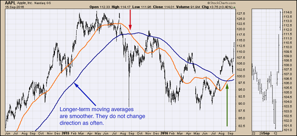
Chart courtesy of StockCharts.com
FIGURE 10-2: Two moving averages.
The short-term moving average (the lighter line) does a good job of showing the short-term trend in the stock price. If you just traded around the short-term trend, you would own the stock above the moving average and sell it when the closing price ended below the moving average. This trading strategy would kick you out of the trade often, though. The worst part is it can reverse shortly after violating the moving average, only to go higher. During the uptrend, almost every time you were to enter the trade because it was back above the moving average, your buying price would be higher than the price you’d just sold at.
If you use the long-term moving average (the darker line), the big uptrend works great. However, the strategy would have false starts (whipsaws) in November 2015 and March 2016 during the downtrend. You would be trying to buy as the price moved above the long-term average, only to fail and drop right back below the moving average. A whipsaw is when you get a signal to buy or sell and immediately the price action reverses right after you place the trade. Whipsaws are the hardest part of investing based on charting signals.
The moving averages crossed over in August 2015 as the short-term moving average went below the long-term moving average. This moving average crossover can be used as a signal. It appears to be a pretty good sell signal as the moving averages did not cross positively until August 2016. (Arrows point out the crossovers in Figure 10-2.)
Closer inspection of the moving average crossovers as a trading plan reveals two major issues:
- Shortly after selling because the moving averages crossed in August 2015, you would have sold around $100. Note that you don’t get to sell at the price of the moving averages; you get to sell at the price the stock is at when they cross. While you wouldn’t be selling at the extreme lows in August, you would be selling after the stock dropped 25 percent from the highs.
- The second part of the trade would have you getting back in after the short-term moving average crossed back up above the long-term moving average in August 2016. The price to get back in would have been around $107.50. This would have been $7 more than your exit price, but at least the trend had changed positively.
There are two other things to note. Immediately after you got the sell signal in August 2015, the price rallied significantly. Conversely, immediately after buying in August 2016, the price fell quickly, making it look like another whipsaw.
The dates selected in Figure 10-2 show the August 2016 trade continued to the upside, but the difficulty is always dealing with price moves against you that seem to happen as soon as you put the trade on. The trading of moving average crossovers using longer-term moving averages has significant moves both ways.
Considering moving average ribbons
A moving average ribbon is visually impressive and draws attention to key points of change on a stock chart. The style does help demonstrate a significant change in trend. A stock in a normal uptrend doesn’t usually collapse. It may lose buying momentum, but it usually takes time for stocks to top out and bottom out. Using moving average ribbons rather than one or two moving averages can be helpful in this regard.
To create a moving average ribbon, change the Overlays panel to have a series of simple moving averages plotted with different periods. You can re-create the ribbon effect using the settings shown in Figure 10-3. (If you’re not sure how to set overlays, review Chapter 3.)

Chart courtesy of StockCharts.com
FIGURE 10-3: Moving average ribbons.
You can see in Figure 10-3 that when the moving averages spread out, the trend is strong and intact, but on the far right, when the moving averages start to compress, the stock price is falling.
A simpler derivation of the moving average ribbon concept is to use three moving averages to create the ribbons — for example, 10 DMA, 20 DMA, and 30 DMA, or 20 DMA, 30 DMA, and 50 DMA. The moving averages on Figure 10-4 demonstrate how the lines cross to create signals.

Chart courtesy of StockCharts.com
FIGURE 10-4: Three moving averages.
Analyzing the left side of the chart, you can see that the signals would be very challenging to profit from because the trends were very short. On the right side, you see two perfect signals: one signal to sell in December (when they cross to a negative alignment) and one to buy in March (when they cross to a positive alignment).
Comparing the simple moving average to the exponential moving average
Two different types of moving averages are commonly used. One is a simple moving average (SMA) that places an equal weight of importance on each bar, which is what we use in the previous sections. The second type is an exponential moving average (EMA), which places more weight on the most recent information and less weight on the oldest information.
On Figure 10-5, the exponential moving average (the dotted line) turns up sooner and down sooner. Both moving averages are smoothing out the trend. If you want to use moving averages for buy and sell signals, the EMA will give you signals earlier.

Chart courtesy of StockCharts.com
FIGURE 10-5: Simple MA versus exponential MA.
Examining the uses and benefits of moving averages
Moving averages help clarify a trend starting and finishing. The direction of the moving average is important as it signals the trend. When a moving average starts to point down, the price has moved below the moving average. This change of direction from up to sideways or down is usually a subtle clue that the trend is changing rather than just being a pullback in an uptrend.
In the following sections, we describe the uses and advantages of tracking moving averages with overlays.
Knowing when to move in and out of a stock
Using the moving average tool to smooth the trend is a simple way to maintain a strategy for the trader who wants to move in and out of a stock and stay in a rising trend during pullbacks. Recognizing a change in the direction of the moving average is a strong clue that what has been working is starting to weaken and may be signaling the end of a trend.
Using two moving averages, as we describe earlier in this chapter, can add additional clues. A short-term moving average crossing below a long-term moving average clearly illustrates a trend change. When both short- and long-term moving averages are pointed in the same direction, the trend is strong.
Because moving averages are commonly used in technical analysis, they can be important as a place where falling stocks bounce after pulling back. When stocks are in a downtrend, the moving average can be a place where a bounce in the stock price stalls and the stock moves lower again.
You can use two moving averages to help you sell, and you can use two completely different moving averages to help you buy. You can accomplish this by having multiple chart styles that enable you to move quickly between them. There is no perfect system, so you need to find one that works for you. We discuss how to customize chart styles in Part 5.
Whatever your trading strategy is for using a single moving average, multiple moving averages, or the signals created by the moving averages crossing over, there will always be times when the trade is moving against you.
Finding entry points
Moving averages are also a major tool for finding nice entry points. When a stock goes above a moving average that you use, this can be used as a buy signal for your time frame. A stock that bounces up off a moving average can also be used as a place to buy an initial position or add to a position that is working.
When the stock fails to hold above a moving average that has supported the stock in the past, it can be a clue that major institutions are no longer buying dips in the stock.
Moving averages are used to help keep a bias toward the stock. When stocks are under a long-term moving average (200 MA), it is usually a good idea to avoid owning them. As an investor, you can choose to own only stocks above the 40 WMA or any other moving average you think prudent. For most investors new to charting, that is a radically new way to think about owning stocks.
The most common moving averages for multiple-month investing would be the 50 DMA and the 200 DMA. For shorter-term investing, the 20 DMA may be more suitable. Traders using 5 DMA and 8 DMA are trading often.
Picking the right moving average for you
If you’re a new investor, look at different moving averages on a chart. If you want to place trades only occasionally, you need to find a moving average time frame that gives you those types of signals. By placing four or five moving averages on your chart, you can establish which time frame is more suitable for you.
For example, active investors who want to trade frequently would use a shorter moving average to match their trading style, such as the 20-day MA. When price moves above the 20 DMA, they buy, and when it moves below, they sell. (You can imagine someone trading on five-minute charts with a 20-period MA is going to make a lot of trades — not recommended.) If your trading style is active and you want to be buying and selling every few days, making trading decisions on a 40 WMA is not going to work for you. It won’t be active enough for your desired trading style.
If the price is crossing the moving average on a chart too often, you need to use longer moving averages. If the price is crossing the moving average on a chart too infrequently, you need to use shorter moving averages. Because there are many styles of investing and many different personalities in trading, you need to find a moving average time period that works for you.
Getting into the Groove with Channel Investing
Channel investing is a completely different way of thinking about the movement of a stock price. The concept of defining a channel for use in a trading strategy employs various styles. Some channels define the extremes of the price movement and use that as a trading frame. Another method for channels is to set the typical range for the stock movement so that the price will usually move outside the channel before reversing.
Channel trading can also be done on sideways consolidation rather than stocks trading higher or lower. As technical analysis has developed over time, various technicians have created different methods to automate the channel width. In channel investing, the width of the channel is the most important parameter to be used successfully. The following sections describe types of channel investing overlays with different widths.
Keltner channels
Keltner channels use the average true range (ATR) to set the width of the channel. The average true range is a two-step process:
- The first step is calculated by measuring the height of each bar. Taking the High minus the Low for each day gives you the daily range. The average true range calculates the average daily range over ten days as a default for the Keltner settings.
- When you have the average true range (ATR), the Keltner channel default setting measures 2 ATR above and below a moving average. For the Keltner channel, the default setting is a 20-period exponential moving average (EMA).
To summarize the default settings on StockCharts.com, do the following (and be sure to click Update after you make these changes to a basic chart):
- Use a 20-period EMA to center the Keltner channel.
- Calculate a ten-period average true range (ATR).
- Draw lines 2 ATR above and below the EMA.
While that sounds complex, it’s not, we promise! Figure 10-6 shows an example of the default Keltner channel on Costco (COST). Figure 10-6 also shows an expanded Keltner channel to explain how these overlay settings can be adjusted. The expanded setting is 3 ATR, shown with a dotted line marking the top and the bottom of the channel.

Chart courtesy of StockCharts.com
FIGURE 10-6: Keltner channel.
With the Keltner channel defined using the default at 2 ATR, the following sections use the default setting to explore the information provided by the Keltner channel.
You don’t need to play with the settings, but it is important to understand how the channel is created. Later in this chapter, we cover Bollinger Bands, which use an entirely different method to calculate the channel.
Keltner uptrends
Figure 10-7 shows a long uptrend for Caterpillar (CAT). Buying near the lower Keltner channel is a high-percentage buying opportunity. Typically, the price stays above the center line during an uptrend. Occasionally the price will drift below the center line, and this creates a potential place to buy. On Caterpillar, the lower Keltner channel has been an excellent place to expect support for the stock.

Chart courtesy of StockCharts.com
FIGURE 10-7: Keltner uptrend.
Keltner downtrends
Keltner channels define downtrends very well. In Figure 10-8, the stock for Cenovus Energy (CVE) broke below support, and for most of the move, the stock was below the center line of the channel. With only three exceptions in six months, the stock continued under the center. You can see these points above the center at the end of February, the end of March, and the end of July in 2017.
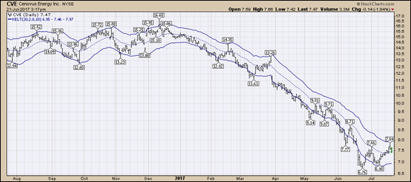
Chart courtesy of StockCharts.com
FIGURE 10-8: Keltner downtrend.
Each time the stock rallies back to the top of the channel is a higher-percentage shorting opportunity. If the stock starts to break back above the top of the Keltner channel, this would be a reason to close the short position. (Short selling is a very risky technique used by traders to take advantage of falling stock prices.)
After it fails at the top of the channel and pulls back to the center line, if the stock starts to stay above the center, that’s also a clue that the downtrend is over. The last price bar on the chart sets up this situation. The center line is the 20 EMA, but notice how it starts to turn up for uptrends. That’s another reason to watch closely.
Keltner sideways channels
In a sideways channel, the price reversals can be very quick, as Exxon Mobil (XOM) shows from March 2017 to July 2017 in Figure 10-9. While it is easy to see looking back, Canadian Natural Resources (CNQ) in the same industry trended up and down for multiple months before reversing.

Chart courtesy of StockCharts.com
FIGURE 10-9: Keltner sideways channels.
 The sideways channel trading strategy can be unpredictable for using Keltner channel extremes. There are other methods to trade these charts, which we discuss later in this chapter, when we talk about horizontal support and resistance.
Bollinger Bands
Bollinger Bands are named after financial analyst John Bollinger. They use a mathematical expression called standard deviation to calculate the upper and lower bands. To get started at the StockCharts.com website, enter a ticker symbol and click Go. Underneath the chart, from the Overlays drop-down menu, select Bollinger Bands and click Update. The lines are formed two standard deviations above and below the 20 MA (not an exponential MA). Plotting the Bollinger Bands with an area setting can help make the expansion and contraction more obvious.
The Bollinger Bands pinch significantly when price trades in small narrow moves, as you can see in Figure 10-10, showing Alphabet Inc. stock (GOOGL). As the price starts to accelerate in either direction, the bands spread out because the price is changing character. The major difference with Bollinger Bands is that they rapidly expand and shrink down compared to other types of channels.

Chart courtesy of StockCharts.com
FIGURE 10-10: Bollinger Bands.
Because they are based on the deviation over the last 20 periods, as price trades sideways, they shrink down. As the price starts to break out of a sideways range, the Bollinger Bands spread apart as the price moves farther out. Two standard deviations each way will harness around 88 percent of the price moves.
It takes a big move to get to the top end of the range. When it gets there, it has already had a significant price move. Some moves are strong enough to continue, but other stocks need to pull back to the center before they start running again.
A price that trades in the lower half of the Bollinger Band and then moves to touch the top band is associated with a potential change in trend, and the stock should be evaluated for a strategy to enter a long trade. Usually the buy signal is associated with some sort of a pullback to the center of the Bollinger Bands.
Moving average envelopes
A type of channel called a moving average envelope is centered with either a 20-period SMA or a 20-period EMA. Then a percentage is used above and below the moving average that “envelopes” the price.
This method is different from the Keltner or Bollinger Band methods that we describe earlier in this chapter. With this channel method, you need to determine the percentage that captures the majority of the price moves, as the moving average channel overlay does not calculate the volatility of the stock.
On the StockCharts.com website, type a ticket symbol into the box at the top and click Go. When you see the chart, select SMA Envelopes or EMA Envelopes from the drop-down menu under Overlays.
On this EMA envelope style, the charting software doesn’t draw in the 20 EMA center line. In Figure 10-11, Wal-Mart (WMT) and Nvidia (NVDA) are both displayed with the same default settings of 2.5 percent above and 2.5 percent below the 20-period exponential moving average. Because the software does not automatically adjust the size, it will fit on some stock prices like WMT to envelope the price, but on others, like NVDA, you have to adjust it so it fits nicely over the price information. In this example, you should adjust the percentage for NVDA to 7.0, so the price touches the lower boundary occasionally.

Chart courtesy of StockCharts.com
FIGURE 10-11: EMA envelope.
Two different styles for displaying the EMA channel are shown in Figure 10-11 to illustrate that style is a variable you can control by adjusting the setting in the overlay panel. While the charts are displayed with a longer time range to see the difference, investors would use a shorter time frame to see the detail of price compared to the EMA envelope on the last few price bars.
Figure 10-12 shows NVDA on both panels: the bottom with a 2.5 percent envelope and the top with a 7 percent envelope. While this seems very detailed, we have almost tripled the setting so that it works for fast-moving stocks. Fast-moving stocks make a lot of money over a short period of time, so it’s worth making a quick adjustment of the default setting to help find better buying entries.

Chart courtesy of StockCharts.com
FIGURE 10-12: Wider EMA envelope.
There is one setting that we think is even more valuable for the channel investing methodology. Rather than setting the EMA envelope to completely wrap the price, this method, shown in Figure 10-13 for Apple stock, sets the envelope narrowly around the moving average. The envelope is a buffer zone used instead of a single line like a moving average. When the price closes above the top of the envelope, it is a buy signal for the next morning. When the price closes below the envelope, it is a sell signal the morning after.
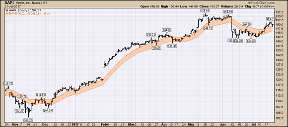
Chart courtesy of StockCharts.com
FIGURE 10-13: A narrow envelope around a moving average.
On the Overlays settings for the EMA envelope, change 2.5 to 1.0. This changes the setting from 2.5 percent to 1.0 percent. Giving the price a little room to move around the moving average creates a buffer zone that allows the price to be a little higher than the moving average for buying and a little lower than the moving average for selling. It helps keep you in strong uptrends but forces you out when they stop working.
Finding Your Sweet Spot between Horizontal Support and Resistance
Channel investing typically creates a top of the channel and a bottom of the channel. Having a strategy for channel investing can also work in sideways channels, but you need to alter a few methods. All the channel strategies relate to solving where price will run out of buying momentum on the topside and where it will run out of selling momentum on the bottom side.
While we have charted price, we have not discussed the underlying reason that these patterns or sideways channels work. When an investor makes a stock purchase, price reaches a peak and pulls back eventually. For the investor who bought just as the momentum faded, this new purchase is in a loss position right away. This investor now just wants price to get back to where he got in to minimize losses so he can sell. Investors who bought near the bottom of the channel have seen profits build in their account, only to fade away as price rolled over, and now their gains are back to zero or less. As the price reaches the maximum profit level again in the account, these investors don’t want to let the gains slip away again. They are motivated to sell near the previous high as well for different reasons.
This cycle gains momentum as more and more people are selling near the upper end of the range. They also notice this stock on their watch list always seems to find lows around a certain price. The next time they buy, they want to buy down there. This behavior creates horizontal channels. Understanding the dynamics behind the price movements can help new investors find a better entry point and where they may want to sell.
Using horizontal support and resistance levels for sideways channel investing is a great way to maximize profits on stocks that have traded in a certain price range before. Figure 10-14, depicting Exxon Mobil stock (XOM), shows how drawing simple horizontal resistance lines and support lines can be a lucrative way to trade the range back and forth. Waiting for the moving average envelopes or Keltner channels may be too detailed, and using these levels of actual price points is more reliable based on investor behavior. (We talk more about how to draw these lines using the annotation tool in Chapter 17.)
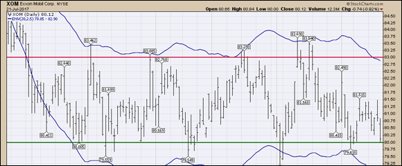
Chart courtesy of StockCharts.com
FIGURE 10-14: Horizontal support and resistance.
Figure 10-15 shows a wide range on a weekly chart. Through 2014–2016, Tesla (TSLA) had a tall sideways channel of $100 and it moved multiple times between the lows and the highs. Making $100/year on Tesla stock is welcome news to most portfolios, but you need a sideways channel strategy. Horizontal support and resistance can be drawn on the price panel using the Horizontal Line tool in the Overlays drop-down menu.

Chart courtesy of StockCharts.com
FIGURE 10-15: Wide range for channel trading.
On the StockCharts.com website, click on the drop-down menu under Overlays and choose Horizontal Line. In the parameter box, enter a value. For Tesla, a price of $180 (enter only numbers, 180) is a good level. The top end of the range is $270, and a line could be added there.