
Chapter 5
Spotting Differences with Bar Charts
IN THIS CHAPTER
![]() Exploring the basics of bar charts
Exploring the basics of bar charts
![]() Creating a bar chart
Creating a bar chart
![]() Using a bar chart
Using a bar chart
Looking at the price movement of a stock and trying to glean information from it can seem overwhelming for first-time users. In this chapter, we explore bar charts, which are one of the simplest forms used to view daily price readings.
Beginning with Bar Chart Basics
A bar chart is a chart type that is used for displaying price. When it is displayed in black, the price bars used today look a lot like the price charts from the business section of the newspaper. The following sections go over the structure of a price bar and different kinds of bar charts.
Price bar components
 A price bar has four main components:
- Open price: The price at which the stock opens (shown on the left)
- High price: The highest price of the day
- Low price: The lowest price of the day
- Close price: The price at which the stock closed for the day (shown on the right)
These four components make up a price bar, shown in Figure 5-1, and the name is abbreviated to a chart style of OHLC Bar (OHLC is an acronym for open-high-low-close).

© John Wiley & Sons, Inc.
FIGURE 5-1: An OHLC bar.
Different types of bar charts
When placed day after day, price bars form a picture but do not have the pronounced look of candlesticks (see Chapter 4). You can see the four components of an OHLC bar chart in Figure 5-2.
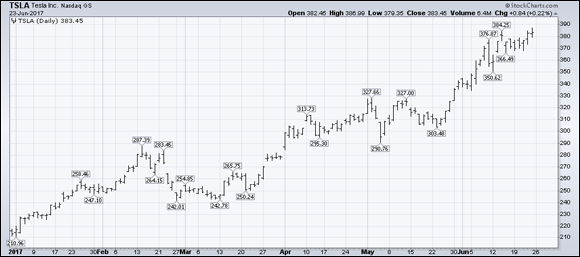
Chart courtesy of StockCharts.com
FIGURE 5-2: An OHLC bar chart.
Because the individual price bars look the same, your attention is not drawn to them, unlike the big down candles found on the candlestick chart type. In the Tesla example shown in Figure 5-2, your eye tends to see the trend more than the individual bars.
Another type of bar chart, which is less common, ignores the open on each bar and just uses the high-low-close (HLC) information. In the construction of the price bar, it places a line across the bar rather than just on the right-hand side. The format for this type of price bar is shown in Figure 5-3.

© John Wiley & Sons, Inc.
FIGURE 5-3: An HLC bar.
The price bar represents the price movement and the closing price without the opening price information. You can see an example of this type of chart in Figure 5-4.

Chart courtesy of StockCharts.com
FIGURE 5-4: An HLC bar chart.
As print clarity has improved, the OHLC chart is more popular than the HLC chart. We have experimented with both but migrate to the OHLC bar chart because we find the additional information of opening price valuable for understanding the daily price action. For this reason, the remaining charts in this chapter are OHLC bar charts.
Building a Bar Chart from the Ground Up
The bar chart is a common type of chart display. Using the settings panel under the chart, users can change the display to show the variation in trading ranges. You can see the settings panel on StockCharts.com in Figure 5-5.

Chart courtesy of StockCharts.com
FIGURE 5-5: Selecting OHLC Bars (thick).
 You can access the tool for setting up charts online at
 stockcharts.com/freecharts/ and click on SharpCharts under Charting Tools. You can then work through the steps online as we describe the process.
Under Chart Attributes, select the OHLC Bars option from the Type drop-down list. You will need to click Update to get the bars on the display. Note: For clarity in the figures in this book, we have used OHLC Bars (thick) so the bars are wider and stand out more.
It is also possible to make the chart in color. Selecting the same color for both up and down movement is one setting. If you use a different color for up (blue) and down (orange), the chart will compare the current price to the previous day’s close, and the color of the bar will be based on your color choice. In Figure 5-5, the type is OHLC Bars (thick); as you move across that line in the settings, you see the size is 1024, the color scheme is Murphy, the Up color is set for blue, and the down color is set for orange. It is easier for the eye to quickly pick out up or down days by using two different colors. (We discuss chart attributes in greater detail in Chapter 3.)
Putting a Bar Chart to Work
OHLC bars are nice to work with. The down price bars still draw attention when colored differently, but they do not have the ominous look of filled candles on a candlestick chart (see Chapter 4). Coauthor Greg uses bar charts for most of his work. He finds they draw his attention to the overall highs and lows, and he can add more days of information without losing clarity. They also draw attention to breaks in the price pattern.
Bar charts are less focused on the intraday price movements but still offer some level of detail for traders looking for intraday movements. Gaps, trading ranges, and market extremes are easy to see on bar charts, as you see in the following sections.
Gaps
The use of the word gap when visually reviewing a chart refers to the difference between the previous day’s close and the morning open. In Figure 5-5, for example, March 1 was a gap up as the price moved from $24.52 to $25.29, while March 20 was a gap down from $24.78 to $24.50.
Gaps are emotional places on the chart. They indicate that a new piece of information has entered the market that causes sudden buying or sudden selling. Every transaction has a buyer and a seller. In the case of a gap up, buyers are clamoring to get the stock. In the case of a gap down, sellers are clamoring to sell the stock. These imbalances from information overnight or over a weekend cause the stock to gap.
Bank of America (BAC), shown in Figure 5-5, has two interesting gaps close together in March. On March 1, BAC gapped up. On March 20, BAC gapped down to below the level from which the gap up started on March 1. This leaves an image of an island, where price looks disconnected from the rest of the chart. Everyone who bought on the flurry of news from the gap up on or after March 1 is now trapped in a losing position.
Almost every day, there is a difference between the open price of the day compared to the close the day before. If the price traded within the range of the previous day, the gap is not obvious. Note that even though the price gapped down on March 22 in Figure 5-5, the trading through the day of March 22 filled the gap. It’s the open gaps between bars that are very noticeable and usually leave investors with some positive or negative emotion attached.
Short bars versus long bars
When a price bar is short, the market price of the stock is relatively stable throughout the day. It may close higher or lower, but the buyers and sellers are not eager to change positions. Long price bars show pressure throughout the day pushing the stock in a particular direction. If a long bar is your down color, you can quickly see downward pressure on the bar. Conversely, if the long bar is your up color, there is upward pressure on price.
Trading ranges, support, resistance, and breakout
Trading ranges can be short-term from a few weeks to a few months or even longer-term for three to four years. The ranges can be huge, making it profitable to buy low and sell high within trading ranges. Bank of America in Figure 5-5 traded between $21.87 and $25.72 throughout the first part of 2017. This is not what we mean by a trading range, however. A trading range is when price oscillates up and down, trading between two price levels.
Early in 2017, the price traded sideways between $22.20 and $23.40, with one exception on January 18. The next morning it went right back up into the range. When chartists see this consolidating type of price action, they focus on where the lows for the stock are and where the highest price is. They look for three key types of signs: support, resistance, and breakout (see Figure 5-6):
- Support: The traded range on BAC during January in Figure 5-6 shows information that has the stock supported at $22.20. We refer to the stock as “supported” because buyers are willing to step in to buy the stock after it had been higher. This pullback to a lower price is common. Institutional buyers that want to add to their positions or start new positions will start buying as the price is going lower. This stops the stock from continuing down and becomes support for the stock.
- Resistance: When the price broke out of the trading range above $23.40, more buyers wanted to own the stock and existing owners didn’t need to sell, so the price kept accelerating upward to fill the demand for the stock. Because the stock had stalled three times in the low $23 level, chartists call this level resistance.
- Breakout: February 14 was the breakout day; you can see the stock accelerate higher above $23.40 with everybody loving the stock on Valentine’s Day. After two huge days, the stock consolidated in a sideways range again for eight days. The new level of support was around $24 as buyers stepped in to own the stock when it dropped down to those levels. Then BAC gapped up on March 1 and consolidated again, which moved the level of support up to $25.

Chart courtesy of StockCharts.com
FIGURE 5-6: Support and resistance.
The stock had three approximate levels of support at $22, $24, and $25 where buyers stepped in when the stock was pulling back. It had three levels of resistance — periods of time when the stock price stops moving up — at $23.50, $24.80, and $25.72.
These support and resistance levels are some of the most important concepts in reading a stock chart. We use this concept throughout this book. Figure 5-6 has black horizontal lines drawn in at $22, $24, and $25 to demonstrate support.
In hindsight, chartists know that the intermediate high for BAC was $25.72. Following the price action, chartists watched to see whether the support levels drawn as solid lines would continue to act as support. March 15 violated support but closed above it. Then on March 17, Bank of America violated the $25 support and closed below it. This left everyone who bought above this level trapped in a losing position and starting to get nervous as they had bought after the stock had made a big move.
Then, on March 20, the stock continued lower after gapping below the March 1 breakout. Now some buyers who bought during the consolidation between $24 and $24.80 were getting uncomfortable with the stock because they had a lot of profit, and now that profit had disappeared. The next day showed the stock accelerating lower as more and more sellers tried to release the stock. It ended up finding support at $22 again after more disgruntled investors sold. Anyone who bought above $22 was not very happy.
Finally, the stock started rallying up from $22 support again, but the stock had trouble getting through $24, which was a previous support area. After April 1, the stock continued to trade between support at $22 and resistance around $24. This is how technical patterns are built from buyer/seller behavior.
In June the price made the lowest low in four months at $22.07 and then made a lower high at $24.11. Downtrends are formed by lower lows and lower highs, which also make investors nervous.
This concept of support and resistance is easy to see in Figure 5-6. The level of $24.80 is close to $25.00, so we would call the area around there a support/resistance area. The level of $24 is also a support/resistance area. $22 is a support area. We have placed a dotted line at $23.25. Even at that level, you can see how price gaps above and below between April and June.
Using lines to demonstrate support and resistance, chartists can see where a stock may have trouble or find support. When support breaks meaningfully, it usually means the stock will travel to the next level down and try to find support there, where interested buyers stepped in before. Resistance is the exact opposite of support. You need to find buyers who are willing to pay a higher price, moving the price above resistance. Those buyers are hard to find without some form of a catalyst.