
Chapter 9
Reading a Price Chart
IN THIS CHAPTER
![]() Knowing uptrends and downtrends when you see them
Knowing uptrends and downtrends when you see them
![]() Recognizing consolidation, bases, and topping patterns
Recognizing consolidation, bases, and topping patterns
![]() Seeing different types of scaling
Seeing different types of scaling
Reading a chart is part art and part science. Charts give you the ability to analyze what investors are doing, which is better than just listening to what financial reporters, who may or may not own the stock, have to say about the stock. Analysts also fall into this camp. They place a buy or sell rating on a stock they don’t own. When they have no money invested in the company, armchair quarterbacks can see whatever they want to see.
A great example of this phenomenon was Enron. The stock made its final high in August 2000. The topping structure was completed in November 2000. It took 11 months after that point for the first fundamental analyst to put a sell rating on the stock. By December 2001, two months after the first fundamental analyst downgrade, the company filed for bankruptcy. Two weeks before the bankruptcy, six fundamental analysts still had a strong buy on the stock and two reduced their strong buy to hold after the stock had fallen 95 percent.
Technical analysts can still make mistakes, but the premise of charting is to give traders a tool for finding new uptrends and recognizing downtrends, so they can exit stocks near the beginning of the fall. Getting those inflection points right every time is impossible, but working to find them can produce meaningful rewards as long as a good portion of them work out. This chapter helps you understand some basics of reading charts: uptrends, downtrends, consolidation, bases, topping patterns, and scaling.
 Reading a chart creates an awareness of how uptrends and downtrends are created. The base is an important part of a price chart. Topping patterns are complex; an investor needs to use the shape of the chart to help define a topping pattern.
Running with Bulls and Sleeping with Bears: Uptrends and Downtrends
Most investors are afraid of losing money on a trade. That’s normal. Using a chart to help you decide when to buy helps you set up levels. If the trade meets your expectations and is working as you expected it to, that’s great. But if your expectations turn out to be wrong, you can minimize your loss, sell, and try again.
As you find out in the following sections, two important things are first, understanding what you want to see on a chart and second, understanding what you don’t want to see on a chart.
 In any chart you create on
 StockCharts.com, little price boxes appear on the chart next to the line by turning on the Price Labels toggle in the Chart Attributes area. These boxes can help new investors or traders see uptrends starting. (Flip to Chapter 3 for the basics on chart settings.)
Recognizing an uptrend
The definition of an uptrend for chartists is a series of higher highs and higher lows. As a chartist, you need to understand what that means, when it starts, and how it ends. When the stock is in an uptrend, the price will be moving higher up to the top right corner of the chart. You can see this movement in Figure 9-1. Price labels marking the highs above the line are at higher levels and price labels marking the lows are at higher levels.

Chart courtesy of StockCharts.com
FIGURE 9-1: Defining an uptrend.
On its way up, the stock for Advanced Micro Devices (AMD) is staying near the top right-hand corner and continuing to push higher. As the stock moves higher, it starts to run out of new buyers for a few days or weeks. To attract new buyers, the price falls to create a small pullback. Then, new buyers who have been interested in the stock find a place where they are willing to buy the stock. As part of the uptrend, new buyers come in to support the stock, purchasing at a higher level than previous support because they want to participate in the rise of the stock and don’t want to miss the pullback in price.
This creates a staggered line where the trend is generally higher, creating an uptrend. Chartists draw a line underneath the rising lows defining the trend. Sometimes it is also possible to create a parallel line on the rising highs, creating a trend channel.
When the price stops rising and starts to drop for a few days or weeks, this is called a pullback within an uptrend. While the stock is moving up in price, everyone who owns the stock is happy to own it, because it keeps rising.
Spotting a downtrend
In a downtrend, the stock price starts to weaken and starts to make lower lows. Using the Price Labels tool on StockCharts.com, you can see a series of labels dropping toward the bottom right corner of the chart (see Figure 9-2). Downtrends are the opposite of uptrends. A downtrend is a series of lower highs and lower lows shown on a chart.

Chart courtesy of StockCharts.com
FIGURE 9-2: Defining a downtrend.
When the stock stops attracting buyers, investors who want to sell must accept a lower price to find new buyers. As other investors see lower lows, they too start to sell to preserve the capital in their portfolio. This works like an avalanche and builds on itself, causing further selling by other investors. Ultimately, this trend will attract people expecting the stock to fall, called short sellers. They borrow the stock from someone to sell it at a high price and then pay the original owner the lower price when they want to close the trade. This strategy works only when the price is falling, so short sellers are typically fast, short-term traders.
Prices seem to fall faster than they rise, so weak stocks can move down fast as the price action does little to attract attention from new investors. When the investors want to sell their stock and there are fewer buyers because of the downtrend, significant downward pressure pushes the stock price lower.
Bear market rallies are rallies that move the price higher in the short term when the primary trend for the stock is down. These can be sudden rallies that usually inspire some hope for investors holding the stock. Because there are people shorting the stock, when it moves up, it goes against their position. When they want to exit their short position, they have to buy the stock to close the trade. This creates buying pressure on the stock, and it rallies up. The counter-trend rally can be very steep but loses buying momentum after a few days or weeks. The stock plummets again and the cycle continues.
If you see a sudden uptrend in the middle of a downtrend, give it a few days before acting because it may just be a short-term rally.
The downtrend creates a situation where investors are less comfortable owning the stock and can be quick to sell if they make any gains during the downtrend. Others sell to minimize losses as the price gets closer to what they paid for it. Short sellers usually want to hold their short position briefly to profit from fast moves. This creates a volatile situation where the price moves in both directions quickly. While a stock is in a primary downtrend, there are fewer long-term institutional investors trying to buy a stock moving down, which causes the stop (the price set for selling the stock) to drop below its support levels.
These conditions make the stock more volatile as the price moves each day are usually larger in major downtrends. You can see this in Figure 9-2, which is the chart for Valeant Pharmaceuticals (VRX). Valeant wiped out the gains from a seven-year climb in 18 months. The scale on the right shows the price losing 95 percent of its value.
Bucking the Trend: When a Stock Isn’t Trending
There are over 180 different industry groups in the U.S. market. At any given time, some of the groups are moving up fast, creating an uptrend, while others are being sold off, creating a downtrend. There are also groups that don’t have momentum and can quietly trade sideways without trending up or down. This type of movement is called consolidation.
Looking at consolidation basics
Investors rotate in the market among the various different industries depending on the economic climate. A sector can gently move sideways or up without a lot of interest from investors who buy stocks for longer periods of time. Companies that tend to trade sideways often pay a dividend to keep their investors interested in owning the stock, but some investors may be frustrated by the stock’s inability to trend higher.
For most investors, a sideways stock is uncomfortable to own. Depending on your buying price, you may be losing money or have a gain in the stock at any given time. As the price stagnates, fewer and fewer investors are interested, so the stock migrates down to the low end of the range. At that point investors see a price level where institutions have bought shares before and may buy more shares. This can create a level of support for the stock. These new investors may buy with an expectation of it going back up to the top of the range and sell it near the top. The cycle starts again.
For example, in 2016, financial stocks rallied hard off major lows in early 2016 after trading sideways for years. In the last quarter of the year, the exchange-traded fund (ETF) in the financial sector, XLF, broke out of the range and shot up 25 percent in a period of five months, topping in March 2017. XLF started to trade down. Four months later, the ETF continued to trade sideways between two levels but back at the top of the range. You can see this consolidation in Figure 9-3.

Chart courtesy of StockCharts.com
FIGURE 9-3: Consolidation.
For XLF, the ETF had spent almost two years in a trading range that started in 2014. The lows of 2016 forced most investors to reduce their exposure or sell all the shares. When the shares rallied from the lows, the expectation of getting back to $20 might have been there, but the extension to $25 would have been a stretch to imagine.
Seeing the ETF move 60 percent from the lows was a huge move in just over a year, from November 2016 to March 2017. If the price were to again tend to consolidate between $22.50 and $25.50, that would start to frustrate investors again.
Recognizing different periods of consolidation on a chart
While consolidation is frustrating, these periods are also hard to spot until you have seen the range establish itself with multiple lows near a specific level and highs at another level. For this reason, chartists focus on previous lows and previous highs to see how price responds. If the price can continue higher, the top of the range will typically become support. If the price trades lower out of the range, there can be a lot of selling pressure as the price returns back to the lower edge of the previous range.
A great example of different types of consolidation can be found in the chart for Shopify (SHOP) in Figure 9-4. The stock came out as an initial public offering in May 2015, so investors had no historical information for the stock price. After a stunning first few days, the stock moved higher for a month with a high around $39. The stock built its first consolidation between $26 and $40.

Chart courtesy of StockCharts.com
FIGURE 9-4: Different types of consolidation.
Shopify opened at $25 on the first day of trading after pricing the offering at $17. After a few months, sellers were unable to find support at the lower boundary of the consolidation, so the price moved down considerably toward the initial IPO price of $17 trying to attract new buyers.
The stock started to find support again and spent two months trading at this level between $18 and $26. After getting back above the lows of the first consolidation range at $26, the stock consolidated again for almost five months between $26 and $32. From there, the stock moved freely up to $42. It consolidated for five months around the previous highs at $40 by oscillating between $38 and $45.
Then the stock broke above this consolidation to fresh new highs. Everyone who owned the stock was profitable and not really interested in selling. The stock moved unencumbered for months, easily surpassing prior highs with very small pullbacks as new investors stepped in to own the stock. The stock proceeded straight to $100. The stock started to consolidate at this new level for two months.
Reading investor behavior during consolidation
The different types of consolidation in Figure 9-4 are great examples of investor behavior:
- In the first consolidation, the price ranged between the opening bid and the top of the first surge, testing both multiple times.
- The second consolidation may have been built when large investors bought the stock from the original traders who were in a losing position on the stock. This is referred to as moving into strong hands.
- The third consolidation was still working against the early investors by trading in the low end of the original range. The investors were starting to wonder whether that was all the stock was worth.
The fourth consolidation moved up to the high end of the original range and teased and tempted investors with higher prices. This level also worked the stock away from investors who just wanted to lock in the profits they had before.
Institutions typically like the sideways consolidation for building larger positions on stocks over a few weeks when they think the stock will go on to new highs. If they buy the stock all at once, they push the price higher. If they buy the stock on down days during consolidations in the price, they can accumulate more before the price accelerates away.
- The final consolidation on the chart shown is where investors were locking in gains of at least 100 percent from the fourth consolidation.
To book profits, you have to sell some of the position to record gains.
Leveling Out: It’s All about the Base
When a stock moves sideways after being in a downtrend, we refer to the price action as building a base. The following sections describe types of bases and how to see the beginning of an uptrend from a base.
Types of bases
There are four different types of bases:
- Double bottom base
- Multiple bottom base
- Rounded bottom base
- V-bottom base
The following sections take a closer look at each.
Double bottom base
Figure 9-4 (shown earlier in this chapter) shows how Shopify (SHOP) built its base before moving higher. Shopify in Figure 9-4 made a double bottom base. In January 2016, SHOP made a singular low at $19.89 and then the price rallied. After the rally exhausted itself, near former support at $25, SHOP went all the way back down and tested the previous low around $19. When that low held, it was potentially a very important technical signal.
In the Shopify example, the price actually made a slightly lower closing low. That is still considered a test of the low because the price immediately bounced after going below the previous low briefly. This comparison of lows is one method of monitoring for support.
Many investors would have expected SHOP to hold at $25. The repeated testing of a level four or five times can be considered a sign of weakness. The more the support level is tested, the more likely it is to fail. A strong base usually has one test of the low, maybe two. When the stock price returns to test the base the third, or fourth, or fifth, or sixth time, each one is actually chipping away at supportive price action, and eventually it fails. This happens because buyers who stepped in at that level have probably spent their capital and it has not worked to support the stock. The price usually moves lower to find new interested buyers.
Multiple bottom base
The Advanced Micro Devices (AMD) chart in Figure 9-5 also built a base before accelerating higher in a large uptrend. AMD was in a big decline with a series of lower lows and lower highs before the stock finally found a level to build a base over a period of time. The final low on the chart is never known at the time it is made. As the price goes lower, more and more value investors start to invest in the stock. This creates the base, but the base takes time to form. Figure 9-5 points out a couple of interesting characteristics of the AMD multiple bottom base.

Chart courtesy of StockCharts.com
FIGURE 9-5: Creating a base.
A base is developed as the stock price stops going lower and starts trading in a sideways consolidation. While the base is under construction, you still don’t know whether it is going to resolve higher or continue down. When you start seeing higher highs and then higher lows, you can start to take some comfort in the assumption that the price is going to move higher.
As the base is built, the stock continues to attract value investors. As the stock starts to move to new highs, the momentum investors who like to buy higher highs start to move into the stock. As the stock starts to outperform other stocks, it attracts relative strength investors, who look to buy stocks that show strong performance. When the stock is moving rapidly, it attracts day traders looking for big percentage moves during the day. The continued improvement in the stock’s price action is what starts to bring these different investing styles together.
Rather than focusing on the day of the extreme low, chartists typically wait for the development of the base and look for the price action to improve.
The multiple bottom base can still have very wide price extremes. As AMD continued to find resistance around the $2.50 level, the stock sold off and continued to test the low-price area around $1.60. The breakout to nine-month highs suggested something was changing in the price behavior. From the lowest price to the highest price in 18 months for AMD, the stock doubled. On the final stab toward the low, the stock bottomed at $1.80, which was a higher low. It was still hard for investors to have the confidence to invest when the stock fell from $3.00 to $1.80. As the stock accelerated back up above $2.50, where there was a major support/resistance level, this helped show that the stock was changing character and trying to go higher after being there recently.
In the AMD example in Figure 9-5, the price made one test of the low within a few months. The first low was $1.62, and $1.66 was a test of that low. The spike down a few months later to $1.80 was not part of the original base, but the January 2016 push down coincided with weakness across the stock market. The monitoring of the base is important on each stock, but broader trends can disrupt the accumulation of stock by investors. In this case it resulted in a wider base with the $1.80 considered as another retest of the lows.
The confirmation of a base is difficult as it is happening, but investors don’t need to catch the exact low to find profits in the market. A little hindsight can be okay.
Rounded bottom base
While almost every base has a slope down and a slope up on the other side, a rounded bottom base gently makes a saucer over time. Where the AMD chart in Figure 9-5 earlier in this chapter showed a double bottom and then came down to create another major low on the right-hand side, some charts are smoother and create a uniform rounded bottom. Chipotle Mexican Grill (CMG) in Figure 9-6 shows a smooth rounded bottom base. This style can be quite common.

Chart courtesy of StockCharts.com
FIGURE 9-6: Rounded bottom base.
A rounded bottom base just indicates that it is taking a longer time for a stock to break out and go back upward.
V-bottom base
Bases can V-bottom. If the base V-bottoms, it probably coincides with overall stock market weakness that finally started to rally. Usually it takes time to develop the change in trend with multiple tests of the low or at least one test down near the previous low. In the case of a V-bottom, you don’t get that luxury of testing a prior low.
While commodity prices and commodity-related stocks can create V-bases, it’s not uncommon to see a commodity-related stock bounce off the lows and then build some sort of a consolidation before going higher. Commodity-related stocks include stocks for agricultural and energy products, such as oil or natural gas.
For chartists, finding support at previous lows is very bullish. When you don’t have a previous benchmark at or near a level and the price just bounces seemingly off thin air and accelerates back up, it’s difficult to decide when to invest capital. An untested low is difficult for chartists in most cases, so chartists have to use other techniques to help establish conditions for a tradeable low. Figure 9-7 shows an example of an untested low for Devon Energy (DVN) stock.

Chart courtesy of StockCharts.com
FIGURE 9-7: V-bottom low.
You can see that the price stayed near the low for a few days and then moved higher. A tested low usually takes a few weeks to a month before the test happens for a better confirmation.
Major long-term basing patterns usually include some sort of major selloff that exhausts the investors’ expectations. We have all been a victim of waiting for a test of the lows that never comes. The market accelerates away from you while you await the test. We don’t usually think of investing capital as easy. Chartists try to put rules around trends, bases, and tops to help protect capital in downtrends and invest based on common setups. Improving your odds by using charts doesn’t mean a sure thing.
The start of an uptrend from a base
When looking for the start of an uptrend from a base, you look for two features:
- The stock stops making new lows. The previous lows hold as support within 1 or 2 percent.
- The stock starts to make a higher high for the first time in a long time.
Then you patiently watch for higher highs and higher lows:
- If the stock makes a higher high but has not made a higher low, then you want to watch the next pullback to see whether the prior low holds as support.
- If the stock keeps finding support at prior lows, then you want to watch for higher highs.
As this happens, a base ends up being created. In Figure 9-5 earlier in this chapter, the first push to fresh three-month highs was a potential clue that things were improving. The second surge to nine-month highs that broke the downtrend and pushed above previous resistance was a confirming clue. Eventually, when a stock starts making new one-year highs, the uptrend is usually underway.
Reaching the Top: Muffins, Spires, or Something Else?
Looking for the end of a trend is one of the most difficult parts of charting the market. The end of the trend is difficult if not impossible to spot on the day of the final high. On the final high, investors love the stock and are happy to own it because it has been very profitable in their portfolio.
Stocks that make new highs can continue to make new highs over and over. Stocks without earnings can move higher quickly with the promise of something great. Stocks with great earnings can get stalled because the investors start to believe the stock’s best days are behind them.
One of the reasons for using charts is to participate in the main runs on a stock and avoid the rest of the time, including the down-cycle moves. While this does not lend itself to listening to what the president of the company wants you to think about, it does lend itself to watching what investors are doing with the stock.
Commodity stocks are notoriously volatile. They don’t treat buy and hold investors very well. While the stock may run up and pull back over and over, the most profitable investors are the ones who get in near the lows and out near the top over and over. The rest of the investors are left with very average to low returns as commodity cycles come and go.
Other stocks have a longer-term thesis. Amazon, for example, has reported little to no earnings relative to its huge revenue base. The management team keeps reinvesting the profits back into the company to increase revenues and attract more users. While the stock may be vulnerable to big swings, Amazon continues to have a road map to larger revenues from new areas in the market. In 2016, its revenues grew $29 billion in one year. Each year, the revenue has continued to accelerate.
While Amazon may be successful, others in the retail space are getting wiped out by the success of online retailing. Various electronics retailers, department stores, and trendy retail boutiques have been forced into bankruptcy, and more seemingly happen every month.
It is this dichotomy within the market that various investors can participate in. Owning what is working and avoiding what is not working is a critical component to achieving investment success. While it is important to ride the trend, it is also important to have an exit strategy to capture profits. Unfortunately, there is no signpost on each stock saying: “This is the top!”
One of the methods that chartists use to find market tops is to use historical price patterns. Using examples of how stocks have historically topped can give you some clues. When you see subtle changes in the same patterns over and over, it gives you an idea of what to watch for. There are multiple ways a stock can top out:
- The rounded top (muffin top)
- The spire
- The parabolic run
- The double top
- The range trading top
The rounded top
The rounded top, also known as the muffin top (see Figure 9-8), is typically one of the most difficult patterns to spot. The stock slowly loses the interest of new investors. As the stock goes from being an aggressive performer to a mild performer, investors assume they just need patience to ride out the consolidation before the next move higher.

Chart courtesy of StockCharts.com
FIGURE 9-8: A rounded top.
In Figure 9-8, which shows the stock for Fastenal (FAST), the investor is clearly in love with the stock heading in 2013. The stock has been on a tremendous run for years and looks set to continue. As the stock approaches the previous high, everything looks great. The upsloping multiyear trend line was breached, but the stock has bounced back above it and is testing the all-time highs. Then the stock fails to break through to new highs. It starts to trade in a range from early 2013 to late 2015. Then it starts oozing lower lows into 2016. It finally starts to climb higher in April 2016 but falls again through October 2016, when it enters another upswing. The highs start to diminish slightly as well in April 2017. Eventually the stock just continues to slowly make slightly lower lows and slightly lower highs, establishing a rounded top over a long period of time.
Years go by, and the stock has not done anything. These stocks are very hard to exit for longer-term investors because of the beautiful run they had and the expectation that the run will resume at some point. The price action does not weaken significantly, but it does not trend higher either.
The spire
The spire is our analogy for a price move that bolts out of nowhere and goes ballistic. Spires are frequently seen on new initial public offerings (IPOs). Shake Shack (SHAK), a burger restaurant, had a soaring IPO in 2015. Figure 9-9 shows the Shake Shack IPO that moved from $21 to $50 to $96 in a few months.

Chart courtesy of StockCharts.com
FIGURE 9-9: A spire.
Typically, these types of moves are exhaustive with no new buyers coming in, and the price collapses as quickly as it moved up. There may be an attempt at a retest of the high, but that usually collapses quickly as well.
These spires are notorious for huge moves intraday. If the price of the stock is moving more than 5 percent per day — and some days 10 percent — the stock may continue to soar, but being ready to exit is usually prudent. Making annual returns in one day does not usually last long.
While the stock may be new, keep your normal chart settings for range on StockCharts.com. They will help you see these ballistic moves a little better. Because charting software changes the vertical scale as the price goes higher, you will need to be aware of the change. The later section “Scaling for Profit: It’s Only Money” explains this in more depth. (Flip to Chapter 3 for an introduction to chart settings.)
While we mention that IPOs can create this spire chart pattern, biotech stocks can have some remarkable results when they get FDA approval. The chart shoots up instantly on the news but runs out of buyers at the price extreme. It usually pulls back to build a base at a higher level, which may take months or years.
The parabolic run
A parabolic run is when a stock starts building momentum over a period of time. As the story spreads about how great the company’s products are, the increased investor attention continues to rise, creating an improving stock chart. The price continues to accelerate, with the price moves gaining in size. On a weekly chart, it looks like an extreme ramp-up. These can be very profitable to own, but are subject to violent corrections.
In Figure 9-10, the price for NVIDIA (NVDA) stock in early June 2017 moved from $140 to $168 to $140 all within two weeks. A 20 percent move is quite shocking, in both directions. That was not even an earnings week, which provided the huge move earlier in May.

Chart courtesy of StockCharts.com
FIGURE 9-10: A parabolic run.
Parabolic runs make it difficult to pick the top. Another company usually copies or subtly changes a great idea to compete with the success of its peer. When another company invents something that starts to affect the sales and revenue, the investors will leave the original stock long before the revenue is affected. A parabolic run can also be a collapse in the industry. A great example is Cisco Systems (CSCO) in 1998–2000. Cisco made fabulous products that helped the world move data. The stock went up 1,500 percent in three years, and once the top was in, the investors stayed away for years. Figure 9-11 shows Cisco’s parabolic run and subsequent collapse.

Chart courtesy of StockCharts.com
FIGURE 9-11: A parabolic run collapse.
Not all parabolic runs end with a single permanent collapse. Apple Inc. has had multiple parabolic pushes, correcting significantly after each one and then surging again. That is what makes the parabolic chart behavior so difficult to manage. Attempting to maximize returns while managing risk and tax implications are all part of the investors’ work. Letting huge gains slip away is also problematic, so you don’t want to stay too long.
The double top
The double top (see Figure 9-12) is a common topping pattern in the market and a considerable hurdle for investors. Trying to find new investors who are willing to pay more for the stock is always difficult. This requires a continued improvement in the company or a newfound optimism in the industry that attracts investment. A double top is always worth watching.

Chart courtesy of StockCharts.com
FIGURE 9-12: Double tops.
In Figure 9-12, we see multiple places where the Canadian National Rail (CNI) stock tested a higher high and could not get through immediately. We also see a major fail in November 2014 while testing the high of September 2014.
When there are new buyers for the stock at higher prices, the uptrend can continue. When the new buyers stop trying to buy the stock at higher prices, the sellers offer a lower price to try and sell the stock. This seesaw battle continues every day. When a chart builds a local high by going up to a price and then back down, this noticeable peak becomes a place of interest when price approaches it again. While it is not uncommon for price to stall briefly when reaching a previous high, close attention should be paid over the coming weeks to see whether it can continue to move higher.
The range trading top
Range trading is an extension of the double top in the preceding section as the stock continues to move up to a high, back to a low, then back up to a high, down to a low, and then retests the high. This oscillation is obvious on the charts (see Figure 9-13 for an example), but the range can be large so investors can make a significant amount of money just moving from the low to the high.

Chart courtesy of StockCharts.com
FIGURE 9-13: A range trading top.
The J.P. Morgan Chase stock (JPM) in Figure 9-13 demonstrates two different types of range trade tops. One has a slight rise, while the other has a flat top. From March 2014 to March 2015, the stock made seven higher highs, but each one pulled back. The net price improvement on the highs was only 4 percent ($2.00) over a one-year period.
Scaling for Profit: It’s Only Money
Earlier in this chapter, we define an uptrend, a downtrend, a base, and a top. However, all bases and tops can be visually altered by the charting software. This is not a negative of charting software, but it is important that you understand the scaling that the computer is doing.
Charting software uses two components to scale the chart, which can create dramatic differences. The software uses these two scaling components:
- The software analyzes the range of the chart, which defines how far back in time to go.
- Then the software analyzes the high and low throughout that range on the stock and adjusts the scale.
The following sections explain different types of scaling and how to set the correct scaling on charting software.
Arithmetic scaling
Figure 9-14 has an arithmetic scale on the right on the top chart for Tesla (TSLA) and on the bottom chart for Total Fina Elf (TOT). Both charts look like they are going up at about the same rate visually.

Chart courtesy of StockCharts.com
FIGURE 9-14: Arithmetic scale.
Because each stock has its own price value, the charting software makes the price display tall enough to fully cover the height of the chart. The way to manage that is by changing the scale on the right. Tesla is moving in $10 increments while Total is moving in $0.50 increments.
Total has moved up $9.90. In percentage terms, Total has moved up 22 percent from the low to the high, while Tesla has moved up 86 percent in the same time period. Each black range on the chart is 10 percent. As Tesla goes higher, you can see that it has to move $30 rather than $20 to move 10 percent. On Total, $4.50 is a 10 percent gain at $44.50. A $4.50 gain on Tesla would be a small percentage gain.
We usually compare stocks by discussing the percentage move. When Tesla was a young company, a $4.50 move would be exciting for the stock. As the company has become a large-cap stock, the $4.50 is a small percentage move. If you want to recognize the percentage size of the move in Tesla’s early days compared with the current percentage moves, you need to use a different chart scale called a logarithmic chart.
Logarithmic scaling
Figure 9-15 is a logarithmic scale showing the same stocks as in Figure 9-14, Tesla and Total Fina Elf. You can plot the scale so that as the price moves higher, the scale keeps a 10 percent move the same height starting at any price point on the chart.
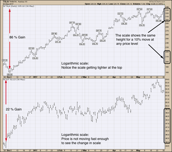
Chart courtesy of StockCharts.com
FIGURE 9-15: Logarithmic scale.
Typically, logarithmic charts are used for long ranges of multiple years when the price is rising quickly. Apple at $2 compared to Apple at $140 can be compared when you can see the huge percentage moves that happened in the early days of the company. When you show them on the logarithmic chart, a 10 percent move back in 2000 looks the same size as a 10 percent move at $140.
Scaling guidelines
Here are some guidelines with regard to scaling:
- Use arithmetic scales on short-term charts (under a year).
- Use logarithmic charts for long time frames.
- Be careful assuming one stock is going up as fast as another because both charts have the same shape. The change in scales can alter this view.
- A parabolic move that happens over a short period of time will look more upright on an arithmetic chart than on a logarithmic chart.
You can access scaling options only when you sign up for the trial membership at StockCharts.com; these options are not available with free charts. You set your scaling option at the time you pick your trend line.