
Chapter 8
Charting Different Time Periods
IN THIS CHAPTER
![]() Changing a variety of charts to different time periods
Changing a variety of charts to different time periods
![]() Looking at hourly, daily, weekly, and monthly charts
Looking at hourly, daily, weekly, and monthly charts
![]() Examining multiple time periods and closing prices
Examining multiple time periods and closing prices
Looking at different time periods on charts is a lot easier with computing power. At a touch of a button, you can change everything. Chartists often look at different time periods to evaluate a stock, and great charting software helps with that analysis.
Using charting software, you can display differences for a selected period. The most common period for StockCharts.com clients is a daily period. (Most traders or investors check their portfolio when they get home from work, which probably makes daily charts the most popular.) When chartists refer to daily candlestick charts (see Chapter 4), each candle provides the information for the opening trade of the day, the high of the day, the low of the day, and the close of the day. Then the computer stacks these candles beside each other to create a chart. The chart may contain a year of candles (called the range), but each candle is showing the price action for one day, so the chart is called a daily chart. The period reflects how much time is in each candle, not the number of candles on the chart. As we discuss in Chapter 5 on bar charts, information can differ depending on the chart you select. Area and line charts (see Chapters 6 and 7) provide more of a summary than the detail you find in candlestick and bar charts.
In this chapter, we show you different chart formats in different time periods, and we provide pointers on when to use each type of time period.
 Charting one-minute candles during the day and putting money into the market based on these candles is particularly stressful trading that requires a precise strategy and discipline. The period is so short that it is called day-trading. This book is not designed for day-trading chart analysis.
Converting Candlestick Charts to Different Periods
You can use a candlestick type of chart (introduced in Chapter 4) to display different periods. In the following sections, we take a look at how the time period of a candlestick chart impacts the visual you will see. We use Amazon (AMZN) for June and early July 2017 to show how the periods you use to make up your chart can impact what you see.
60-minute to daily candle display
Figure 8-1 shows a 60-minute candle chart for the trading of Amazon on June 29 and the same date reflected by a single daily candle. The intraday candle closing levels don’t seem very important when the day is over. Both views show a down day. The intraday candles open and close information isn’t required to build the daily candle (but we still point out the closing price with a dotted line in Figure 8-1). Other than the high and the low of the day, the intraday candle information is dropped in the daily candle. But if you were day-trading, that 60-minute display would help you make entry and exit decisions.

Chart courtesy of StockCharts.com
FIGURE 8-1: Comparing 60-minute candles to one daily candle.
Daily to weekly candle display
The same information can be shown for the days of the week or the whole week. This information starts on the first working day of the week, so it may start on Tuesday if there’s a holiday on Monday. If so, the weekly candle will include only four days. If Friday is a holiday, then the candle will use Monday’s open and Thursday’s close. The chart shows what happened for that week between the two weekends. Figure 8-2 shows the transition of information from a daily chart to a weekly candle for Amazon from June 26 to July 3, 2017; notice that the high and low of the week are included in the weekly display.

Chart courtesy of StockCharts.com
FIGURE 8-2: Comparing five daily candles to one week.
Note: If the week crosses over the month end on a Wednesday, the weekly candle ignores the month-end information. The weekly candle won’t have any information specific to the monthly close.
Daily to monthly candle display
Monthly candles are different from daily and weekly candles. They use the start date of the first trading day of the month and end with the last trading day of the month for each calendar month. It doesn’t matter what day of the week these candles start or finish on.
In Figure 8-3, June starts mid-week. The monthly candle selects the June 1 market open price to start the month. When you compare daily, weekly, and monthly candles, the highest closing price for the day or the week may not show as an important level on the monthly chart. June 5 is the highest daily closing price for Amazon in the month, but the solid monthly candle ignores that information.

Chart courtesy of StockCharts.com
FIGURE 8-3: Comparing daily candles to one month.
 Having the monthly candle miss the highest daily close information may sound like a small difference to be aware of, but it does matter. Depending on the time period you’re looking at, the highest close on a candle in a particular month will probably be different on the daily, weekly, and monthly charts.
Weekly to monthly candle display
It is difficult to compare a weekly chart to a monthly chart. If the start and the end of the month fall mid-week, finding the open, high, low, and close levels for the month on a weekly chart is impossible. Unless the market closed on a Friday for month-end at the highest level in the month, these levels will be different on the weekly and the monthly charts. Figure 8-4 shows why the charts have different values.

Chart courtesy of StockCharts.com
FIGURE 8-4: Comparing weekly to monthly candles.
For one month, comparing the body of the monthly candle to a weekly chart can be confusing because the candles typically start and end on different dates. When every month has the same issue, the charts look different. This discrepancy is due to the computer using different start and endpoint information for the candles.
 If you think you have looked at a chart before but you see a different value for a major high, like the all-time high for the stock, check the three different chart periods. We have found ourselves in similar situations.
Converting Bar Charts to Different Periods
Bar charts (which we introduce in Chapter 5) have traits similar to those of candlestick charts when switching periods. Again, we use Amazon for the month of June and early July 2017 to show you the differences in the following sections.
60-minute to daily bar charts
Figure 8-5 shows a 60-minute bar chart compared to a one-day bar. The intraday chart highlights the previous day’s closing level with a dashed line. The chart conveys the same message as the candle chart in Figure 8-1. The 60-minute bars have a repetitive style, whereas the candle bodies appear to be more unique.

Chart courtesy of StockCharts.com
FIGURE 8-5: Comparing 60-minute bars to one daily bar.
Daily to weekly bar charts
Going from a daily bar chart to a weekly or monthly bar chart can work well. Figure 8-6 compares the daily chart to the weekly chart. Notice that the first day in June is included in the last week of May. Like the candlestick chart, it conveys the information between two weekends.

Chart courtesy of StockCharts.com
FIGURE 8-6: Comparing 24 daily bars to 5 weekly bars.
Be careful about interpreting what the level for the first day of the month is on a weekly chart. It is lined up with the monthly header only if the first trading day of the week was the start of the month.
Weekly to monthly bar charts
The variance between weekly bars and monthly bars is the same as that shown on the candlestick charts in Figure 8-4. Looking at the charts with the same range setting, the weekly chart populates differently from the monthly chart because a month can start mid-week, so this cannot be an apples-to-apples comparison.
- The weekly chart on the left side of Figure 8-7 adds an extra week in the beginning of the chart, even though the dates requested are the same. So you can see that the chart on the left shows a price of 700 as the low, while the chart on the right has 725 as the low. You can see that a red circle highlights 725/700.
- The deep low on the monthly chart that looks all alone is different on the weekly chart as the price move back up happened in the following week.
- The price retracement at the top of the chart in June looks mild on the monthly chart, where price retraced most of May’s push higher and was almost back to the price from the beginning of May. On the weekly chart, the price looks a lot more volatile with lower lows, then higher lows, and a final week of lower lows.

Chart courtesy of StockCharts.com
FIGURE 8-7: Comparing weekly to monthly bars.
Converting Line and Area Charts to Different Periods
Moving to line charts (see Chapter 6) dramatically changes the information view by showing only the closing price. The closing price may be difficult to spot through the detail on the bar and candlestick charts that we discuss earlier in this chapter. You can spend a little time looking at each candle or bar to see the closing level, but the line chart in Figure 8-8 makes that level obvious. As area charts (see Chapter 7) shade the information under the line, the chart highs and lows are the same as those shown on a line chart.

Chart courtesy of StockCharts.com
FIGURE 8-8: Line and area (mountain) charts.
Intraday data disappears as the price labels are based on closing prices only, not intraday prices. By eliminating some of the detailed price information, the chart conveys a similar look. A line chart gives you a different view of weekly and monthly information as it removes the little wiggles from day to day.
Taking It One Day at a Time with Daily Charts
Looking at daily charts — the topic of this section — helps you understand the mood of the market each day. Markets can be affected by news from various sources, but when investors think things are improving generally, they can ignore a lot of bad news. When market participants are worried, the slightest bit of bad news can add angst, and investors may drop their resilience of holding a specific stock through tough markets.
Daily charts are the most helpful charts for seeing detail. Using any chart type, such as candlestick, bar, line, or area charts, can help you see what’s going on. Being able to see the new annual highs or new annual lows is important, so if you’re looking for that information, set the chart for a longer time frame, such as two to five years. Picking the chart type is a personal preference, but for most investors, charts that display daily periods are the best ones to look at in order to understand their investments. With daily charts as a starting point, some of the other periods have strong benefits too, as you find out later in this chapter.
Looking at the daily price movement in context
A daily chart gives you context for the current price and how it compares to recent history. This information is much more valuable than one day of information.
Figure 8-9 shows a one-year chart of Nike (NKE) using the bar chart format. The stock oscillated all year (from July 2016 to June 2017) in a range between $48 and $59. The right side of the chart is at the top end of the range, which makes the stock interesting now for everyone. Will it be able to move to the upside above the previous trading area, or will it fall back down into the range? If you own it, do you want to sell it and lock in your price near the high end of the range? If you don’t own it, do you want to buy it here?

Chart courtesy of StockCharts.com
FIGURE 8-9: Daily chart for one year.
On just about every chart, you will see emotional gaps between bars. These erratic movements are not the daily norm for NKE, but the chart in Figure 8-9 shows these gaps often enough as sudden 5 percent moves that affect your capital. Nike is a Dow 30 stock, which is chosen by the Dow Jones Company as one of 30 companies in the Dow Jones Industrial Average Index. This is a prestigious list of strong U.S. companies that changes infrequently.
It is important to understand that all stocks will move against you at some point in overnight trading and that each gap down should not be considered the end of an uptrend.
Daily charts allow you to see these gaps, whereas the gap has to happen on Monday morning to see it on a weekly chart. This is one key advantage of looking at a daily bar or candlestick chart when you’re looking for critical price moves.
The daily chart shows the price moving between $48 and $59 over the period of one year. This sideways movement encompasses the whole chart. Strong stocks will start in the bottom left and go to the top right. Charts that are consolidating are hard to own because as an owner, you are in a range that is not generating new capital. Recognizing a consolidation range is helpful. If you like the stock for further gains, it gives you a chance to buy it somewhere in the range as the investing community has reached a balance.
The one-year view on the chart in Figure 8-9 makes the price bars compress together when it is formatted for a book. If you select Fill the Chart in the Range setting drop-down menu, it will maximize the clarity and fill the chart with as many candles as possible. As a computer screen is larger than the width of a book, a one-year daily chart may work quite nicely on your screen. (Flip to Chapter 3 for more about general chart settings.)
Using a range of one year (or more) with a daily chart
There are some compelling reasons to look at a range of one year in a daily chart. You can see
- Consolidation ranges of a few months to one year
- Annual highs
- Annual lows
- The price trading range for the last year
- Breakouts to new 52-week highs (one-year highs)
- Breakdowns to new 52-week lows (one-year lows)
When a stock is moving to new one-year highs after not being at one-year highs for a long time, investors take notice that this is a changing point in time. For the first time in a year, investors are willing to pay the most they have for the company stock.
Figure 8-10 shows Nike (NKE) in October 2009 moving to a new high for the first time in a few years. The chart has three years of daily information plotted in a bar chart format. While the price is squished together, you can see the stock move above previous prices. In October 2009, the stock goes to a new one-year high. Four months later in February 2010, the stock moves to new all-time highs. A lot of stocks were still very weak after the financial crisis and not close to new all-time highs. Seeing a stock do very well while other stocks are still recovering suggests strength.

Chart courtesy of StockCharts.com
FIGURE 8-10: Daily chart showing a stock becoming a winner.
If you look at stocks as they move to new highs after moving sideways, you need to consider what the current shareholder is thinking. All the investors within the last year are happy to hold the stock as it starts climbing.
The best thing to see on a stock chart is a stock acting like a winner. The best way to have a winning portfolio is to own winning stocks. A common saying in the investment community is this: If you want to own a winner, buy one!
Owning Nike as it broke out to new highs was beneficial. Then the stock consolidated in the top right corner of Figure 8-10. Figure 8-11 shows what happened to Nike afterward. The stock continued to make new one-year highs for the next six years without making a new one-year low. The stock still had retracements of as much as 25 percent during the six-year run.

Chart courtesy of StockCharts.com
FIGURE 8-11: Daily chart showing a stock staying a winner.
The disadvantage of looking at a long-term chart using daily candles or bars is that you can no longer see the individual price points. Having multiple years on the chart using different time periods (weekly or monthly) enables you to see the information clearly, but you lose specific information like gaps.
Converting to a line chart with daily information can help a little, as you see in Figure 8-12. The price labels for the highs and lows change with this type of presentation. Whereas bar charts and candlestick charts show intraday highs and lows, a line chart shows only the closing price highs and lows. Select Solid Line from the drop-down menu under Type in the Chart Attributes area (see Chapter 3 for details on basic chart settings). This cleans up the chart significantly and still allows you to see the trend.
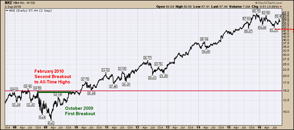
Chart courtesy of StockCharts.com
FIGURE 8-12: A daily chart showing a stock staying a winner in line chart format.
Examining market capitalization with daily charts
You can calculate a company’s market capitalization by multiplying the total number of shares by the current price per share, which is called market cap in most financial reporting. Companies are typically compared based on their market cap. While there is no standard or minimum/maximum in the industry, a few companies that create market indexes have created some rough measures that change over time.
Rough rules of thumb are as follows:
- Large-cap: Greater than $10 billion
- Mid-cap: Between $2 billion and $10 billion
- Small-cap: Typically less than $2 billion
Larger companies have more institutional ownership by pension funds and exchange-traded funds (ETFs), so their stock behaves differently than that of small companies. Small-cap companies can regularly bounce and fall 5 percent a day, whereas large companies don’t have as many of those major swings. New investors would be well advised to resist the temptation to invest in small-cap stocks until they understand the wild price swings associated with these stocks.
When an individual investor has a portfolio of large-cap stocks, the portfolio behaves similarly to the market index. A market index is designed by a company placing a group of stocks bundled together to get an idea of the total price action of the companies within the index. The S&P 500 ($SPX) is a market index of the top 500 large-cap U.S. companies. The Dow Jones Industrial Average ($INDU) is another.
Because markets around the world are different and the United States has the largest market capitalization in the world, these large-cap groups are different sizes depending on the market you trade. Indexes for large-cap stocks are set up around the globe. Some of the most popular to watch include the following:
- United States: S&P 500
- Canada: TSX 60
- London: FTSE 100
- Australia: ASX 100
- India: The Nifty Fifty
These indexes represent the most stable companies. A portfolio of large-cap stocks with diversification across business sectors typically mimics the movement of these indexes.
Some companies have dominant market capitalization. For example, Apple Inc. (AAPL) had a market capitalization in 2017 of over $700 billion. Websites like Google Finance or Yahoo Finance will quickly tell you the real-time market capitalization of a company.
Daily charts look different depending on the company’s market capitalization. Liquidity, the ability to get in and out of the market fast, also is impacted by a stock’s capitalization. The following sections take a look at the differences based on capitalization and liquidity.
Large-cap and high liquidity
Apple Inc. trades around 20 million to 30 million shares a day at $130/share. That means more than $2.6 billion moves every day in Apple shares. With that huge trading volume, the price moves smoothly by pennies each way throughout the day for the most part. Stocks that have high trading volumes are considered highly liquid. This liquidity is very important for large funds when they want to increase or reduce the size of their position by thousands of shares. The shares can still move up or down a lot in a day, but there are active buyers and sellers willing to own or sell at every penny move in each direction. This makes the stock more stable.
Figure 8-13 has the volume traded per day shown on the bottom of the daily chart. The higher the bar is at the bottom, the greater the volume.

Chart courtesy of StockCharts.com
FIGURE 8-13: High liquidity share volume.
Small-cap and low liquidity
If you pick a small-cap company like Handy and Harman (HNH), as shown in Figure 8-14, you see that it broke out to a new high in 2017. HNH trades an average of 17,000 shares a day. It is very difficult for an institution to accumulate enough shares to influence its large portfolio positively. Conversely, when it wants to sell the stock, there are very few buyers for the number of shares it wants to sell.

Chart courtesy of StockCharts.com
FIGURE 8-14: Low liquidity share volume.
While the price of the stock may move to new one-year highs, it is not nearly as liquid as Apple Inc. Large-cap, liquid stocks get large institutional investors buying large positions when they break to new highs. This is rarely true for small-cap companies.
Figure 8-14 shows the daily chart for Handy and Harman with relatively big volume as it moves to new highs, but the actual number of shares is still very small. For the first half of the month of May 2017, the stock traded less than 10,000 shares with no price movement for weeks. In February, it moved from a January 31 intraday high of $29.85 to $21.90. While the stock was dropping about 30 percent in three weeks, there was little to no buying interest.
This is the trademark of no liquidity. You are stuck holding the stock while it plummets. Handy and Harman may be a great company as it is breaking out to new highs later in the year. However, it will be hard to make money on the stock due to the lack of liquidity when you want to sell. If you can own a percentage of the daily float easily, it is probably worth avoiding. This is the type of stock a friend gives you a tip to buy. All stocks are easy to buy; they are harder to sell when you want to.
Charts with low volume are notoriously hard to make money on because someone has to buy the shares from you in order for you to profit. Speaking from experience, this is not where the big money is made in the market, but it can be lost there.
Embracing Short-Term Thinking with 60-Minute Charts
When you’ve made the decision to buy a stock, your next step is to look for the best entry point. Conversely, if you want to sell, you also want to look for the best exit point. Sixty-minute charts can make the decision easier for you. Volume is a key factor in these charts.
Highlighting intraday price action
The majority of the trading volume happens in the first 1.5 hours of the day and the last hour. The two highest-volume time slots for buying and selling during the day are also at the most important time frames for bar and candlestick charts, near the open and the close. The volume is not consistent throughout the day, and this trend is quite obvious on 60-minute charts (like the one in Figure 8-15).

Chart courtesy of StockCharts.com
FIGURE 8-15: Intraday price and volume.
Some other clues can show up on 60-minute charts. While it is not always obvious, the market may open down slightly during strong uptrends but end up closing higher. On a 60-minute chart, the opening would start below the previous close. This typically shakes unfamiliar traders who may be worried they are going to lose their gains. Stocks ebb and flow. They get momentum to go higher, and then they pull back slightly. It is important to understand this give-and-take during uptrends.
Being aware of the time of day and the volume can help investors either buy or sell their stocks when there is more liquidity.
Using 60-minute charts for index watching
News events throughout the day may make stocks wobble on an intraday chart. One display we like to use is a 60-minute chart of a market index or ETF so we can see how the large-cap index has moved over the last two weeks.
Figure 8-16 shows one such chart using the ETF that tracks large-cap stocks, the SPY. Using a range setting of 11 days with 60-minute bars, you can see that the market is making a series of lower highs and lower lows during late June 2017. Seeing where the market is relative to the preceding two weeks is helpful. In Figure 8-16, each time the SPY rallies, it is unable to make a high above the previous high. It is also making lower lows. If the trend starts to change to higher highs and higher lows, like in Figure 8-15, investors can see the price momentum start to improve throughout the trading days.
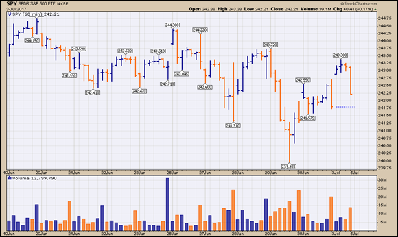
Chart courtesy of StockCharts.com
FIGURE 8-16: Eleven-day, 60-minute chart.
The same principle applies to stocks, indexes, and ETFs. As price ebbs and flows, investors looking to own a stock that has been consolidating can use 60-minute charts to evaluate the change from lower highs and lower lows to higher highs and higher lows.
If you want to be a short-term trader, you need to use short-term charts. A smart practice is to look at the daily chart to see the main short-term trend, and then look at the 60-minute chart to help you with entries into or exits out of the stock. If the daily chart is falling and the 60-minute chart is weak, you may need to wait until the trend on the larger period (daily) is improving. A pullback within an uptrend is the best combination to help on your entry. Trading results on 60-minute charts improve greatly if you’re trading with the main trend on the daily chart.
It is hard to hold a winning stock for months to capture a big gain by looking at short-term 60-minute charts. Short-term charts are helpful only for short trades.
By looking at short-term 60-minute charts, you can get a look at the investor sentiment for a very short-term trend. You can also use this shorter time frame to help expose the change from down to up, or up to down.
Seeing the Big Picture with Weekly Charts
Weekly charts are hidden gems for chartists. Understanding weekly charts is the best way to stay on the right side of longer trends.
Weekly bar charts
The daily chart of Nike (NKE) in Figure 8-10 earlier in this chapter looks a lot cleaner if we convert the daily bars to weekly bars. Figure 8-17 shows the same range setting on the chart with weekly bars instead. The legend in the top left corner highlights the period for the chart. With nine years of information on it, the chart is cleaner because one weekly price bar represents five daily bars. By removing 80 percent of the price bars, the chart is better. However, it is still very compressed.

Chart courtesy of StockCharts.com
FIGURE 8-17: A weekly bar chart.
The breakout above the $15 price line is easy to see on the weekly chart as well. It is not quite as easy to see the detail in price. This chart stops at 2016 to focus on the long historical trend rather than later price action.
When you’re using a bar chart or candlestick chart, set the pixel size that is best for your screen. For example, we use a size setting of 1280 pixels and a range setting of 3 years of data, which is most comfortable to see on our screens. You may find that a different setting works for you. These parameters are set in the Chart Attributes area (see Chapter 3 for details).
Weekly line charts
Switching to a line chart improves the nine-year chart a little bit more. We have used a thick line chart in Figure 8-18. The color coding for up and down is not that valuable on historical chart analysis. Weekly analysis suggests looking at the general trend. Notice that as we drop detail from the chart, the number of meaningful price reversals also drops, as annotated by the price labels.

Chart courtesy of StockCharts.com
FIGURE 8-18: A weekly line chart.
With a line chart as the chart type, a typical pairing for your computer monitor is a chart size of 1280 pixels wide with the range set to five years of data.
The big benefits of weekly analysis
For investors trying to capture a longer trend, the weekly charts keep the big picture in perspective. Daily charts and 60-minute charts (both covered earlier in this chapter) give short-term chart signals that a longer-term investor would prefer to hold through due to a larger uptrend. Each year the market has some sort of a pullback. Investors trying to hold their positions may find weekly charts can help them hold through periods of weakness or consolidation.
Looking at the weekly chart to start with can help establish a directional bias. Knowing the larger trend before looking at the daily chart can provide a strong ballast.
Institutional investment houses use monthly and weekly charts to help stay with long-term trends. If the large institutions are holding through short-term pullbacks, it’s probably wise for you to hold everything, too. By using the weekly charts, there is a major advantage to riding the trends longer with the support of institutions.
One of the difficulties of short-term trading is the constant tax payment on profits, reducing your working capital. If you can keep your money invested longer, like Warren Buffett, the entire amount will continue to build wealth rather than the after-tax portion. This subtle change is quite important.
Broader signals in the market usually show up before major damage is done to a portfolio. These signals can be part of your toolbox. Many of them rely on weekly chart information to understand the momentum of the market. These signals are covered in Part 4.
Knowing When a Monthly Chart Can Come in Handy
Typically, monthly charts are underappreciated. Monthly charts are not usually a key component for individual investors. However, monthly charts are the anchoring charts for institutional investors. For this reason alone, keeping track of the monthly chart is helpful.
Monthly charts with long-range settings can really help investors. Gaining money by seeing a breakout above all-time highs or finding support for stocks that have dropped significantly is a strategy that monthly charts provide cleanly. They also help focus on the big picture rather than the small waves of shorter time periods.
Recognizing major long-term lows and highs
By providing long-term awareness, monthly charts allow you to analyze major historical highs and lows. Figure 8-19 shows a chart of Natural Gas prices reaching monthly long-term lows in 2016 that fell to the same lows back in 1999.

Chart courtesy of StockCharts.com
FIGURE 8-19: Monthly long-term lows.
In 2016 a lot of commodity prices dropped to long-term lows. Long-term investors aware of where each commodity had bottomed before made significant gains in many different commodity-related trades. By seeing where the long-term support was on Natural Gas in Figure 8-19, they started buying Natural Gas futures contracts or Natural Gas–related exploration companies near the lows. The gains in some of the exploration companies were 150 percent from February to December 2016.
Analyzing investor behavior
To continue the story of NKE, by looking through a monthly candlestick chart, you can see that Nike does not have a lot of major down months. That information is hard to capture from the daily or weekly charts. We have extended the Nike monthly chart to July 2017 in Figure 8-20. In July 2017, NKE looks like it is ready to turn higher as it makes new one-year highs.

Chart courtesy of StockCharts.com
FIGURE 8-20: A monthly candlestick chart.
Using stock charts for investing is about improving the timing of investing to participate in major gains. This may not work out on every trade. NKE is a very strong chart, rising from bottom left to top right, and it has built an 18-month consolidation.
With the new one-year highs, the chart is signaling that it is ready to move higher. It could easily ramp up and make a sustained run to significantly higher highs. While it may not work out as a trade, being aware of major setups like this on institutional-size market-cap companies definitely improves your odds for finding strong stocks.
When institutions are trying to buy, they perceive the stock as having the potential to move higher. Institutional volume is usually required to make the stock move significantly higher in price. Looking for stocks that have a tailwind of institutional demand is a major key to investing success.
Picking the Right Chart for the Right Range
If an institutional investor likes the monthly setup and a hedge fund likes the weekly setup, they will both be interested in a stock. Investors trading the daily and intraday time frames are also tuning in and may find some compelling short-term signals. This merging of signals across various types of investors is very helpful. You can use this to your advantage.
Look at multiple periods before placing a trade. First, look at daily, weekly, and monthly charts just to get a feel for the setup. The more investors you see looking at the same trade, the better. Sometimes the stock price is breaking through a down-sloping monthly chart. This is easily spotted on a short range. By understanding what is happening on the other period charts, you get a feel for the importance of the level.
There is a reason to discuss the principle of multiple periods depending on your trading style. Trading strategies are typically more successful in the direction of the next higher time period. If you want to trade based on a specific period chart (for example, daily), it is a good idea to use a complimentary period chart at least five periods higher for trading with the trend. As there are five days in a week, use a weekly chart to analyze the direction of the trend.
Other key multiple periods to watch include the following:
- To trade a 10-minute chart, use a 60-minute chart for confirmation. There are six periods of 10 minutes in a 60-minute chart.
- To trade from 60-minute charts, use a daily chart for perspective. There are 6.5 periods of 60-minutes each in a daily chart (9:30–10 a.m. is 0.5 hours).
- To trade daily charts, use weekly charts for the trend. There are five daily periods in a weekly chart.
- To trade weekly charts, use monthly charts. There are 4.3 weeks per month.
The most important decision you need to make when looking at charts is what time frame you can sleep comfortably with. If you need to move to cash before the market closes every night to sleep well, you’ll have to be a day trader. If you like trades that last a couple of weeks and you want to be very active in the market, you’ll need to trade on daily and 60-minute charts. If you want to keep your trades three weeks to six months, daily and weekly charts will be your best choice. If you want to execute trades a few times a year, you may rely on weekly and monthly charts.
Shifting Your Focus to Closing Prices
Earlier in this chapter, we examine Amazon on different period charts. The information is the same for Amazon’s daily closing highs on all daily charts. The monthly and weekly closing highs are probably different from those shown on the daily charts.
There are a lot of crosscurrents just discussing a new high for different periods. For Amazon in June 2017:
- May 30, 2017, is the highest monthly close at $994.62.
- The June 30 monthly close at $968 is not higher than May’s monthly close, but daily new highs were recorded in June.
- Monday, June 5, shows the highest daily close at $1,011.34
- Friday, June 2, shows the highest weekly close at $1,006.73
- The highest intraday price is the same on all period charts at $1,017.00.
Each chart period has a different closing high. We prefer to use daily closing highs rather than an intraday high. They are all different but correct.
The biggest advantage charts give you is the view from the perspective of buyers and sellers. The most important opinion on the direction of the stock can be seen in the actions taken by buyers and sellers with money invested in the stock. Charts can help you see what the collective group of owners think about the stock relative to what they were thinking a few months ago. If they are bidding up the price daily, they aggressively want to own the stock. If the price has been falling for months, the investor mood of optimism is declining.
A share of stock is worth what the next person is willing to pay for it. The underlying value of the company is based on variables such as growth prospects, stability of cash flow, ability to raise prices, debt, market dominance, new products, earnings growth, industry group, and access to markets, which all affect how different investors view the company. Because the markets have many participants, there is no single right way to value a stock. Here are some signals to look for in your charts:
- The closing price each day is an important price. Whoever owns the stock is willing to hold it overnight. Holding it over a weekend is a bigger commitment. Holding it for years is a solid commitment.
For some reason, stocks seem to drop more often in the morning during an uptrend, and then rally up for the rest of the day. During a downtrend, stocks rally in the morning only to lose investor interest before the close, and the stock sells below the open. While this trend is hard to prove on every stock, you may find it helps you avoid selling into a morning pullback in a strong uptrending market.
Pay attention to the closing price of the day and the week. It is very difficult to get out at the top and very difficult to get in at the bottom. Intraday prices can be very difficult to watch. Sometimes the price will break out to new highs during the day but close the day slightly down. Closing above the breakout level and holding the breakout level for two to three days is an important signal.The concept of watching the price action to understand what is going on with the investors in a stock is more helpful than watching the news about a stock. When we wouldn’t touch a stock because of the news around it, Warren Buffett was buying it. Price speaks louder than words.
By looking at the daily price of the stock, you can see the mood changing over the near term. There are great companies you may have never heard of, but if the price of the stock is steadily rising on a daily chart, the investors are choosing to own the stock. Charting the stock price tells you the sentiment of the investors, not the sentiment of the president of the company.