
Chapter 17
Customizing Candlestick Charts
IN THIS CHAPTER
![]() Choosing your indicators for candlestick charts
Choosing your indicators for candlestick charts
![]() Saving your own personal candlestick ChartStyles
Saving your own personal candlestick ChartStyles
![]() Using your style for trading with candlestick charts
Using your style for trading with candlestick charts
![]() Sharing custom charts with fellow investors
Sharing custom charts with fellow investors
Using stock charts comes down to two key variables. One is matching the chart settings to your personality. The second is finding indicators that help you understand the performance of stocks in your portfolio and watch list. Investors new to charts may find both of those variables overwhelming with so many choices.
Chartists use a wide range of options, and all have different ways to look at the market and use the information they find. There is a rhythm for chartists. Some like to do the analysis while the market is open. They execute open and close orders throughout the day or just before the close. Lots of investors like to analyze the market in the evening after their regular job is finished. Your choices need to match how you like to trade or invest.
In Parts 2, 3, and 4, you explore the components of a stock chart along with different styles and techniques. Now you can take what you’ve discovered and develop your own chart style with indicators you like. Then you can save this as your default chart. Finding out how to save and access multiple personal styles quickly and easily takes charting to a whole new level of information gathering.
In this chapter, we show how to begin developing your style with the help of candlestick charts, introduced in Chapter 4. Among other tasks, you discover how to draw trend lines and add commentary right on your saved charts by using the annotation tool. This can be very valuable and save you time. Sharing your work with friends and colleagues is simple if you know where to look, so we also outline the fastest ways to share your custom charts.
Picking Your Personal Candlestick Indicators
While candlesticks are a great price display tool on their own, using candlestick charts with multiple indicators can improve their value. In the following sections, we focus on setting up indicators for the two most commonly used candlestick chart types: daily charts and weekly charts.
 Understanding what you want the indicators to tell you is important. We show a variety of indictors in this chapter; you can pick and choose the ones you think will mean the most for your style of investing. You can always change your style, so don’t get caught up in trying to pick the perfect style right away.
Daily candlestick charts
The main reasons for using a customized daily candlestick chart are as follows:
- Clarity on viewing each candle is important.
- Each candle has an extreme level of detail.
- It has a near-term view.
- Typically, you get a view for trading in and out.
- It highlights major long or short reference price movements.
- It shows five to ten period references.
Figure 17-1 shows the main characteristics of a daily candlestick chart with some common indicators; this chart focuses on the stock of Louisiana Pacific (LPX). Note: As you become more familiar with other indicators, you can add them to your personal style. You may find that some of the common ones in the following list are not helpful to you personally, so you can drop those and add others as you become more comfortable with charting.
- The moving average convergence divergence indicator (MACD; see Chapter 11) is used to show momentum, which is better when above zero, and best when rising and the lines are spread apart.
- The full stochastics oscillator (see Chapter 11) is a tool for swing traders, who can use a rising stochastic indicator and consider selling on moves back below 80.
- You can use candlestick patterns with six months of history on the chart. Three moving averages (20, 50, and 200; see Chapter 11) illustrate a short-term trend, a medium-term trend, and a long-term trend. Try to trade in the direction of the long-term trend.
- Color volume (see Chapter 3) helps you spot exceptional volume days, either low volume or high volume. You should consider stocks with a minimum volume of 100,000 shares per day. Never own a significant percentage of the daily volume as a trader.
- The ratio tool (see Chapter 12) helps you compare the stock to the industry group (in this case, building materials and fixtures) or the S&P 500 ($SPX). Try to invest when this trend is rising.

Chart courtesy of StockCharts.com
FIGURE 17-1: A daily candlestick chart.
Figure 17-2 shows the chart settings to create Figure 17-1. In the Chart Attributes area, we set the period as daily for seven months with five extra bars to add some white space; the type as candlestick with the size 1024, which fits best on the laptop we have; and the color scheme as yellow with blue for the up color and orange for the down color. We also added three types of moving average overlays and set colors for each, and we included a black horizontal line at a price point of 23.4. The indicators we added include MACD, full stochastics, RSI, and price.

Chart courtesy of StockCharts.com
FIGURE 17-2: Settings for the daily candlestick chart.
Weekly candlestick charts
The main reasons for using a customized weekly candlestick chart are as follows:
- You are not as concerned with daily candles.
- You are looking for longer trends.
- You want to try to ride the trend as much as possible.
- You want to try to outperform the indexes year after year.
Figure 17-3 shows the main characteristics of a weekly candlestick chart with some common indicators. The stock shown is for Career Education (CECO).
- The StockCharts technical ranking (SCTR; see Chapter 12) compares the stock to a peer group. Try to make sure the stock is in the top quartile for performance.
- The ratio tool shows relative strength to the S&P 500 ($SPX). The ratio may start to show weakness before the SCTR for exiting the trade.
- Colored candles are in this price panel. Use colored candlesticks on a three-year chart. Watch for weekly outside candles (see Chapter 16) or more candles that are filled in. Look for change in candle character. Use three moving averages to help define the trend.
- Color-coded volume shows volume extremes. Use a 20-period moving average to compare the volume bars against.
- The MACD shows momentum trend.
- Full stochastics helps you identify entries and exits in conjunction with other indicators.

Chart courtesy of StockCharts.com
FIGURE 17-3: A weekly candlestick chart.
Figure 17-4 shows the chart settings to create Figure 17-3. As you can see in the Chart Attributes area, the period is weekly with five extra bars for some white space. The type chosen is candlestick, which is best for getting full detail of the price movement during the day. We chose sand for the color scheme, blue for the up color, and orange for the down color. We also chose three moving averages for overlays and the following indicators: SCTR line, price, volume, MACD, and full stochastics.

Chart courtesy of StockCharts.com
FIGURE 17-4: Settings for the weekly candlestick chart.
Saving Your Personal Style
Multiple views for the same ticker symbol can be helpful. You may like using the weekly candlestick chart with certain settings and the daily candlestick chart with different settings. Having quick access to switch between different ChartStyles (used on StockCharts.com) helps you work quickly and enables you to enjoy the charting experience.
Creating your default ChartStyle setting
Each chartist has a particular style for looking at the market. One of the big benefits of having an account on a charting website is the ability to save all your favorite styles and access them quickly without having to reset the indicators and overlays each time you go to the charting software.
To create your default ChartStyle setting on the StockCharts.com website, you use the area called ChartStyles at the top of the settings panel above the Chart Attributes area. Figure 17-5 shows the ChartStyles settings area that you see after you sign in.
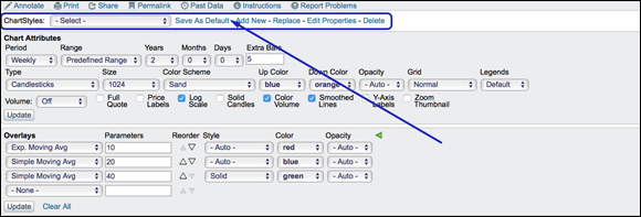
Chart courtesy of StockCharts.com
FIGURE 17-5: Saving ChartStyles.
The drop-down menu shows a default ChartStyle. Make changes to the chart you are looking at by altering the Chart Attributes, Overlays, and Indicators to get the group of settings you like. (If you want to review these options before working on your ChartStyle, review Parts 2 and 3.) Click the Update button to make sure that all of the settings are showing on the chart. To change the default ChartStyle settings to the one you have finished preparing, click the Save As Default link. It will prompt you with a warning; click OK. You can always get back to the StockCharts default chart at any time. The settings that are in the panel are now part of your default ChartStyle.
Saving multiple ChartStyles
Continuing with the ChartStyles tool, you can save additional ChartStyles rather than just one default. Click the Add New link on the ChartStyles line shown in Figure 17-5 and create an exclusive, relatively short name for the new ChartStyle. You are allowed to have up to 50 different ChartStyles as a pro user, so a unique name is important.
 When you click Add New, one of the options in the box that pops up is the Button drop-down menu with 1–9 available. These buttons can be seen on the side of the chart in Figure 17-6. If you add a button number, another rectangular button will show up on the left of the chart where the circle is. Hovering over the button will show the name you associated with that button. You can quickly click on these buttons to change from one ChartStyle to another to look at one stock with different settings.

Chart courtesy of StockCharts.com
FIGURE 17-6: Adding ChartStyle buttons.
Lastly, use the drop-down menu on the ChartStyle line in Figure 17-6 to select from some of the StockCharts contributors’ ChartStyles. You can use this drop-down at any time or save it as one of your own preferred styles. You can also revert back to the StockCharts.com default style.
Trading Using a Candlestick Chart with Your Settings
After lining up all the tools for investing on the basis of stock charts, the next step is to start to test your ideas. It usually works best to write down when you would have bought the stock, and when you would sell the stock. You will find that many times a sudden move will make you want to sell the stock, especially if you have a profit. If you have a loss, you resist selling. You’ll want to at least get back to even and then sell. This dynamic creates support and resistance lines where people sell near where they bought (see Chapter 10).
We use indicators to help you stay in the trade. In the following sections, we discuss trading with your personalized daily and weekly candlestick charts.
Trading a daily candlestick chart with annotations
Looking at the daily candlestick chart in Figure 17-7 (showing the stock of Louisiana Pacific, or LPX), you see that notes have been added for each indicator. Notes can help you remember what you want to focus on for each indicator. These notes are called annotations, and there is a tool that lets you create them.

Chart courtesy of StockCharts.com
FIGURE 17-7: Trading a daily candlestick chart.
Annotations can be placed by clicking the Annotate tool immediately above the ChartStyles drop-down menu. Figure 17-8 shows the link for accessing the Annotate tool.

Chart courtesy of StockCharts.com
FIGURE 17-8: The Annotate tool.
Figure 17-9 shows the annotation tool icons in the top left corner. Click on the line tool on the left, and then select the type of line, the thickness of line, and whether you would like an arrow on the end from the choices across the top. Click the color palette to select the color of the line. This tool is very easy to use. The question mark icon near the bottom left is very helpful. It also changes the keystroke information based on Mac or PC for copying lines or other tasks.

Chart courtesy of StockCharts.com
FIGURE 17-9: Annotation tool icons.
You can go in and play with the annotation tool to gain experience using it. The garbage can icon deletes all your annotations. After 15 minutes working with the tool, you will be able to draw lines and add text. The download icon, two boxes above the garbage can, saves the annotations. Click X in the top right corner to close the annotation tool.
Now that you know how to set those annotations, here are some explanations about how to use them (refer to Figure 17-7 for examples):
- For the MACD (see Chapter 11), which is falling and is just below zero, the note says, “Momentum is making a higher low.” If it were to turn up now, that would be great. As the price may turn up quickly, you want to be ready to put on the trade as it moves higher. If it turned up now, it would be a significantly higher low than the last major low (May 2017) on the chart, which is excellent. The histogram has been improving (getting less negative) for three weeks, suggesting the MACD could start turning up. You’re using an individual candle to generate your trades, so you want the MACD to be near zero so it has room to accelerate up. You don’t want it extended up near the top of the range.
- The stochastics note says, “Stochastics are trying to turn higher.” You can see they have been oscillating back and forth around the 20 range. The stochastics indicator is in a good low position, waiting for a turn back up. If it starts to turn up, you’ll want to buy. It will turn up only if the price goes up. This would be a decision trigger to actually place the order at a certain price. (Flip to Chapter 11 for more about stochastics.)
The price panel has multiple good things going for it. Price is in a short-term downtrend. The third to last bar is a big down bar. The second to last bar is called a bullish harami, which is a small positive bar within the range of the previous big down candle. This signifies the short-term selling momentum has stalled. The final candle confirms the selling exhaustion by testing lower and closing higher. The price is at a horizontal support/resistance level. A black line has been drawn at $23.40 to show this support area.
The long-term moving average (MA) is trending up to support the trade. The 50-period MA is above the 200-period MA, which is a good sign of a strong trend. The 20-period MA is below the 50, so short-term momentum is down. If price continues to improve, you would put on the trade quickly to capture the price gain for a move higher over the next five to ten periods. (Check out Chapter 11 for more on moving averages.)
The predefined scans at StockCharts.comhave bullish harami scans. Look through the scan results to find setups, and then watch how candlestick patterns play out after the signal over the next few days or weeks. Notice you can move back through scans from a few days before in the top right corner. Access the predefined scans from the members page after you sign in.- The volume is improving on up days because the volume panel shows taller price bars on up days. (Chapter 3 introduces volume.)
- The RSI (see Chapter 12) is trying to base around 40 (where the black line is), which is a great place to look for stocks turning back up.
- Lastly, in the panel using the ratio tool (see Chapter 12), the stock is outperforming its industry group because the line is trending up.
In Figure 17-7, if the price of LPX were to drop below $23.40 — the horizontal support/resistance line — you would likely choose to sell because selling momentum is not exhausted, so you would close the trade with a small loss.
This is an example of how to use indicators to support a candlestick-based trade. The goal is to have just a few indicators to help make the trade decisions. Too many will lead to a common syndrome called analysis paralysis. Looking at too many indicators means you’ll never put on a trade. So as you become more familiar with the key indicators that enable you to make the best decisions for your trading style, you may start to drop indicators that you find are not as helpful.
Trading a weekly candlestick chart
Weekly candlestick charts are used by longer-term swing traders. These traders are looking for a multi-week trend that takes the price higher. With less focus on the intraday price movements, weekly candles usually require wider initial stops. If the stock is going to rally significantly, it helps if the early weeks of the rally start outperforming other stocks to attract new investors.
In Figure 17-10, annotations and lines point out the following:
- The StockCharts technical ranking (SCTR; see Chapter 12) has pushed up quickly to show a stock moving quickly.
- The relative strength area chart has also broken the downtrend. This indicator and the SCTR suggest early outperformance for a good start.
On the price panel, the stock had run up from $2.20 to $12.50 with a giant exhaustion move ending the run after breaking to a new high. An exhaustion move is where price makes a big move higher, and then immediately reverses and loses all of the gains. These are typically seen at price highs. The stock consolidated for three months and found its low around the midpoint of the November 2016 reference candle. Reference candles are large candles that move to a new price range for the stock. (You can see the second reference candle at March 2016.) Usually, a stock will hold at the top or the midpoint of the reference candle.
The most recent week shows a marubozu candle. Marubozu candles are tall white candles with no shadows above or below. That candle pushed the stock back above the flat 40-week moving average. With the stock consolidating since the early November burst, this looks set up to continue to run after consolidating. The price made new one-month highs and also pushed above horizontal support and resistance.
- The volume has been expanding over the last five weeks, but was a little soft with this big weekly candle. That is a slight negative.
- The MACD momentum is pointing lower but is very close to breaking the downtrend. The MACD is also near the zero line, which suggests lots of room to move higher.
- The full stochastics have broken back above 20, so there is lots of room to the upside for the indicator.

Chart courtesy of StockCharts.com
FIGURE 17-10: Trading a weekly candlestick chart.
If you owned this stock, you would want to preserve your gains by putting on a stop to indicate the price at which the stock should be sold if it continues to decline. A close stop would be halfway down this week’s big white candle at $9, and a wider stop would be just below the bottom of this candle at $8.50.
There is a strong potential for this stock to trade up to the previous highs around $10.75, and based on the acceleration in 2016, the stock could potentially fire up for another big run.
Sharing Your Customized Charts
After you create custom charts, you can share your charts with friends and fellow investors by social media or email. Figure 17-11 shows the line where the sharing link is found, right above the ChartStyles menu.

Chart courtesy of StockCharts.com
FIGURE 17-11: Sharing your charts with friends.
Figure 17-11 shows the dialog box that appears when you click on the Share link. A box opens up, and you can select the method of delivery. If you want to shorten the link, use the Permalink link to get the actual URL address of the chart. The chart can be sent to a friend, or you can use the short link on Twitter as an example. Both of these options are shown in Figure 17-11. If you want to print your chart, you click Print rather than Permalink.