
Making your point visually is almost always more effective than slapping up a bunch of bullet points or a column full of numbers. That’s why PowerPoint lets you create awesome charts, diagrams, and tables. Many new PowerPointers avoid these tools out of intimidation. That’s a shame, because a good bar chart, Venn diagram, or data table can communicate more information than a dozen slides full of bullet points—with far fewer droopy eyelids.
Microsoft has seriously upgraded PowerPoint 2007’s charting, diagramming, and table-creation tools. There’s a new graphics engine, dozens of new diagram types, and galleries of professionally designed pick-and-click styles. You can even preview the styles live on your charts, diagrams, and tables before applying them. In short, you’ve got no excuse for leaving eye-popping, effective visuals out of your presentation. This chapter gets you making great-looking charts, diagrams, and tables fast.
Tip
PowerPoint’s new tools are really Microsoft Office’s new tools. In other words, the way you create charts, diagrams, and tables in Word and Excel is pretty darn similar to the way you create them in Power-Point, and the result is identical-looking visuals.
You can talk numbers until you’re blue in the face, but when you really want to get your audience’s attention—and get your point across in the shortest time possible—you need a chart.
Sometimes referred to as a graph, a chart is nothing more than a visual representation of a bunch of numbers. The ubiquitous pie chart (Figure 22-1) breaks up a circular area into easy-to-understand, color-coded wedges, each of which represents a numerical quantity. PowerPoint 2007 lets you add punch to your presentations with the same bar charts, line charts, scatter graphs, and so on that PowerPoint 2003 offered. Only now they’re better looking, since Microsoft Excel has replaced PowerPoint 2003’s Microsoft Graph program.
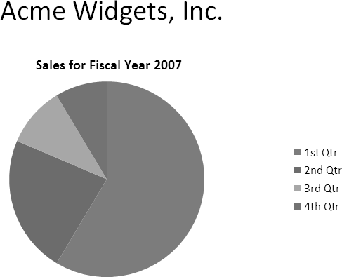
Figure 22-1. Charting is an art unto itself, as all liars and statisticians are well aware. PowerPoint doesn’t care whether the numbers you chart are accurate or whether your chart makes your conclusions dangerously misleading—it leaves those judgments up to you.
Note
You don’t need to have Excel installed on your computer to create charts. If PowerPoint 2007 finds Excel on your PC, it uses Excel. Otherwise, it falls back on the built-in graphics program, Microsoft Graph. See the box on Creating a Chart for the full scoop.
Creating a chart in PowerPoint is a straightforward process. You tell the program which type of chart you want to create (pie chart, bar chart, and so on), you type a few rows of data into an Excel (or Graph) spreadsheet, and then you apply a predesigned Chart Style and Chart Layout. Bingo—instant chart. And if you’ve never seen a chart built with an Office 2007 program, you’ll be amazed how good it looks.
PowerPoint’s charts look great, but they’re not all suited to every type of information. Do you know which one to choose? The chart type you pick affects how PowerPoint interprets your information, which affects your audience’s conclusions. So choose a chart type based on what you’re trying to communicate, not on what PowerPoint lets you do.
Charting is both art and science, and it’s far too complex to tackle in a book about PowerPoint. Consider the following descriptions in deciding which type of chart to create:
Bar chart. One of the most popular types of charts, the bar chart depicts numbers—like dollars, products sold, or the number of times something happened—using big, thick, hard-to-miss rectangles. Bar charts show numbers in the context of time. They can show how many field goals each high school’s football team scored over the last five seasons. Bar charts can be stacked, which means PowerPoint stacks all of the data from all of the categories into one bar per event; or they can be clustered, which means that each data category gets its own bar for each event.
Column chart. A column chart’s the same as a bar chart, but lying on its side (with x- and y-axis labels flipped to match). Fancy types of column charts include cylinder, cone, and pyramid.
Line chart.Line charts show noncumulative data horizontally, over time, so you can track performance. Consider a line chart if, for example, you’re trying to show the progression of your company’s quarter-by-quarter performance over the past fiscal year, compared with your two closest competitors’ performances over that same period of time. Similar to bar charts, line charts track numbers in relation to time. But unlike bar charts, which clump the data for specific events (like field-goal totals for those five football seasons), line charts show a continuous intersection of activity. Thus, if it’s events you’re interested in comparing, then use a bar chart; when it’s a continuous progression of up-and-down movement, use a line chart.
Pie chart. Because pie charts show percentage values as slices of a circle, this type of chart makes sense only if you have a single column of numbers that add up to 100. For example, you can use a pie chart if you’re trying to show how much of every dollar raised for your charity goes to overhead, to individual programs, and so on.
Scatter chart. Use a scatter chart when you’re working with data that neither occurs at regular intervals nor belongs to a series. Sometimes referred to as XY charts or scatter graphs, scatter charts show information as points distributed around an x-y axis—think darts thrown at a dartboard. The dots give a quick visual showing the relationship between the data represented by the x and y axes. You might use a scatter chart to plot the relationship between the prices of ovens and how long the ovens last. Scatter charts are popular with scientists.
Area, bubble, doughnut, stock, surface, and radar charts. Theoretically, you can graph any data you want any way you want, and in this spirit PowerPoint offers the doughnut, stock, radar, and other specialty graphs. For example, a radar graph is useful for comparing the aggregate values of a bunch of data series. Say you want to compare the vitamin levels of three different brands of orange juice. Creating a radar chart lets your audience see at a glance which brand of juice contains the most Vitamin C, Vitamin D, Vitamin A—and which is the most nutritious overall.
Tip
Remember, though, the more complicated a graph is, the harder it is for your audience to understand it—even if you’re there in person to explain it. And complexity totally defeats the purpose of a graph. Most of the time you should stick with the bar, column, line, and pie charts.
Figure 22-2 and Figure 22-3 show you the different configuration your numbers and headings need to work with the different kinds of charts PowerPoint lets you create.

Figure 22-2. The mocked-up data PowerPoint starts you off with would be a lot more useful if the program gave you a clue of how to interpret each cell. Here’s how your data needs to appear for the Bar, Column, and Line charts (the ones that, along with Pie charts, you’re most likely to use).
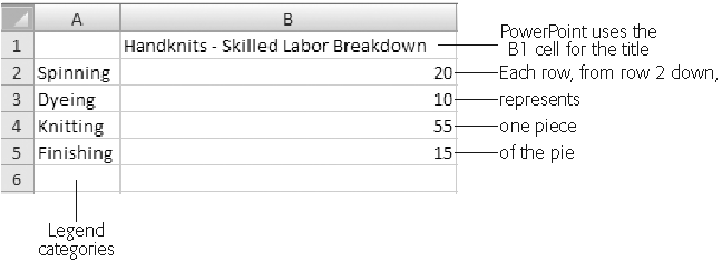
Figure 22-3. Because pie charts can deal with only one category of numbers (in chart-speak, one data series), you need to arrange your figures as shown here for PowerPoint to graph your pie chart correctly. Also double-check your data range as described in the box on Customizing Charts with Prebuilt Layouts and Styles, since PowerPoint doesn’t always extrapolate correctly.
To create a chart, first tell PowerPoint what type of chart you want, and then feed it some data. The steps that follow explain how.
Note
Creating a chart is pretty simple, as you’ll see in the following steps. But if you’re new to Excel or spreadsheets in general, it’s useful to walk through the process visually. A screencast at www.missingmanuals.com shows you how to create a chart in PowerPoint, complete with accompanying narration that explains each step.
Go to Insert → Illustrations → Chart (Figure 22-4).
The Insert Chart dialog box (Figure 22-5) appears.
Figure 22-4. If you’ve applied a Title and Content or Two Content layout to the slide you’re adding your chart to, you’ll see two versions of the Chart icon: one on the Insert ribbon (as shown here) and one in the center of your slide. Clicking the Chart icon in either location displays the Create Chart dialog box shown in Figure 22-5.
Choose the kind of chart you want to add to your slide, and then click OK.
To find one you like, zip to the left side of the Insert Chart dialog box (Figure 22-5) and click a category (such as Bar, Area, or Doughnut), which whisks you straight to the section you’re interested in. Or, if you prefer, you can use the scroll bar to browse leisurely through all the chart options.
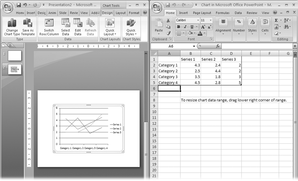
Once you click OK, PowerPoint shrinks to half size and scoots over to make room for Excel, which appears on the right side of your screen complete with placeholder data displayed in an Excel spreadsheet titled “Chart in Microsoft Office PowerPoint.” In PowerPoint, the Chart Tools | Design, Chart Tools | Layout, and Chart Tools | Format tabs appear (Figure 22-6).
Replace the mocked-up data you see in Excel with the real data you want to chart.
To do so, you can:
Click in each cell and type your own numbers and headings.
If you’ve already got a spreadsheet containing the numbers you want to chart, you can copy the cells from that spreadsheet and paste them into the spreadsheet PowerPoint gives you. (For quick tips on pasting from Excel, see the box on Customizing chart titles.)
Figure 22-6. Excel starts you off with a column or two of mocked-up data–one piece of information per spreadsheet cell–so that you can get a feel for what your chart will look like. To expand the tiny chart preview PowerPoint displays on your slide, in PowerPoint either click Zoom a few times or drag the Zoom slider.
As you add, change, and delete data in the Excel spreadsheet, Excel’s data range outline automatically changes to encompass your new data columns and headings, and your PowerPoint chart updates automatically to reflect your changes.
When you’re finished adding data, check to make sure the data range bounding box surrounds your entire data range, including your column and row headings.
If it doesn’t, drag the lower right corner of the data range bounding box so it covers all your cells (but no additional blank rows or columns).
Click anywhere on your PowerPoint slide.
PowerPoint whisks you back to slide-editing mode and updates your chart with the data you just gave it.


PowerPoint 2007 gives you the option of choosing both a canned Chart Layout and a canned Chart Style scheme. You simply pick one of PowerPoint’s professionally designed Chart Layout schemes, some of which show the legend on the side of the chart, some at the bottom, and so on. Then you pick one Chart Style scheme, which sets the colors, data point markers, and a background for your chart.
Since you’re going to be working on your chart’s appearance, give yourself a nice big view. If PowerPoint isn’t maximized on your computer screen, click the Maximize button in the upper-right corner of the window to maximize it. Then follow these steps:
On your slide, click your chart to select it.
Go to Chart Tools | Design tab.
You see tools for formatting your chart’s looks (Figure 22-7).
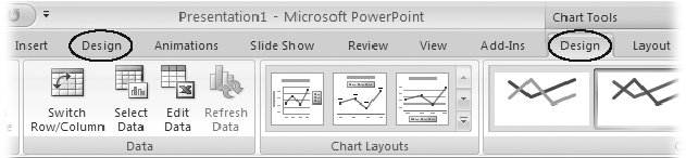
Figure 22-7. Confusingly, when you select a chart, two Design tabs appear: the regular Design tab, and the Chart Tools | Design contextual tab, which appears above the ribbon. PowerPoint also highlights the contextual tab to make it stand out a bit. The Chart Tools | Design tab is specifically for working with your chart.
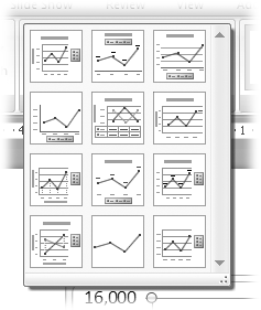
Click the Chart Layout gallery to expand it (Figure 22-8). Then click to choose the layout you want to apply to your chart.
PowerPoint redisplays your chart based on the layout you chose.
The Chart Style schemes that come with PowerPoint give you a quick way to choose the color of your chart’s data elements, as well as your chart’s background. Because all of the colors in the Chart Style schemes are professionally designed to coordinate with each other, your chart looks good no matter which one you choose—and no matter how many data elements you’re charting.
To apply a Chart Style:
On your slide, click your chart to select it. Then go to Chart Tools | Design tab.
Tools for formatting your chart’s appearance show up on the ribbon.
Click to expand the Chart Styles gallery (Figure 22-9). From the Chart Styles gallery, click to choose the style you want to apply to your chart.
PowerPoint redisplays your chart based on the style you chose.
If you customize nothing else about your chart, you need to customize your title. That’s because even though every chart needs a title, PowerPoint doesn’t automatically assign one. You’ll want to decide where to display your title, too.

Figure 22-9. The Chart Styles gallery gives you a super-easy way to apply an attractive color scheme (including background colors and gradients) to your chart—here, a line chart. You can tweak the colors if you like, of course (see Changing Text Color and Background Color).
Microsoft really upped the ante when it comes to using diagrams in your presentations. PowerPoint 2007 lets you create more types of diagrams than earlier versions of the program, they look snazzier, and they’re easier to create and update. In some cases, when you tweak one section of a diagram, PowerPoint automatically redraws the rest of it to match.
In this section, you’ll see two ways to create a diagram: by choosing a diagram type and filling in the text, or by converting an existing text list into a diagram. Then you’ll learn to add a quick, professional-looking style to your diagram.
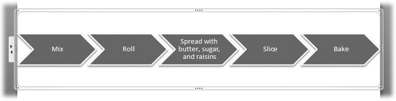
Figure 22-10. This horizontal chevron diagram is just one of dozens of different diagrams that you can add to your PowerPoint slides. Because your audience needs to read your diagrams easily, no matter which diagram type you choose, you’ll want to keep the individual steps to no more than a handful.
Adding a diagram to a slide is simple. All you need to do is select a diagram type and click a button, as the following steps show.
Select the slide to which you want to add a diagram. Go to Insert → Illustrations → SmartArt.
If you used a layout such as Title and Content, Comparison, or Content with Caption, then you can click the Insert SmartArt Graphic icon in the center of your slide. Either way, the Choose a SmartArt Graphic dialog box you see in Figure 22-11 appears.
Click one of the diagram categories you see on the left side of the dialog box.
Diagram types related to that category appear in the middle of the dialog box.
Double-click a diagram type to add it to your slide.
Instead of double-clicking, you can click a diagram type (to see a helpful description) and then, when you’re satisfied you want to add it to your slide, click OK.
PowerPoint displays the SmartArt Tools | Design and Format contextual tabs (Figure 22-12), and the selected chart appears on your slide, complete with a diagram text edit pane (see Figure 22-13 for an example)
On your slide, add text to the diagram shapes by clicking in one of the placeholder text boxes.
PowerPoint highlights the diagram shape you clicked and activates the cursor so that you can begin typing.
Note
You can also click in the diagram’s text edit pane as shown in Figure 22-13. If you’re a fast typist and have several items to type, this method is for you.
Type your text. Repeat for each diagram shape.
Figure 22-12. The SmartArt Tools | Design contextual tab displays different options than the standard Design tab, so try not to confuse the two. How to tell the difference: The SmartArt Tools | Design tab appears only when you’ve selected a diagram, and PowerPoint draws your attention to it with a warm colored glow.
Figure 22-13. When PowerPoint adds a diagram to your slide, it surrounds it with a frame you can click to expand or reposition the diagram. Clicking the [Text] placeholder lets you type your own text for the various shapes that make up your diagram. Or, if you prefer, you can click in the box that PowerPoint displays to the left of the diagram and type your text in there.


![When PowerPoint adds a diagram to your slide, it surrounds it with a frame you can click to expand or reposition the diagram. Clicking the [Text] placeholder lets you type your own text for the various shapes that make up your diagram. Or, if you prefer, you can click in the box that PowerPoint displays to the left of the diagram and type your text in there.](http://imgdetail.ebookreading.net/business/51/9780596514228/9780596514228__office-2007-the__9780596514228__httpatomoreillycomsourceoreillyimages195581.png)
If you find yourself creating a bulleted or numbered list (see Chapter 19) and realize it would be more effective as a diagram, you’re in luck. PowerPoint 2007 lets you convert a list directly to a diagram. With the click of a button, you can even try out different diagram types until you find one that presents your list in the most compelling format.
To convert a list into a diagram:
First, add a bulleted or numbered list on your slide.
You can type right on the slide, or paste in some text from another program.
Right-click the list and then choose “Convert to SmartArt” from the shortcut menu (Figure 22-14).
PowerPoint displays a list of diagram types to choose from.
Click to choose the type of diagram you want to create.
PowerPoint adds the selected diagram to your slide, pre-filled with your list data (Figure 22-15).
Figure 22-15. Click the frame PowerPoint displays around a diagram, and you can resize the diagram as a whole by dragging the sides or corners. Clicking the individual elements lets you modify the shapes independently. To edit diagram text, click either of the arrows on the left side of the frame to display the diagram text edit pane.


Applying a predesigned look-and-feel to your diagram lets you turn out an attractive diagram in no time flat. To counter the accusations of cookie cutter slides lobbed at earlier versions of the program, PowerPoint 2007 offers a wide range of predesigned SmartArt Styles, which you can dress up with an optional color theme. For a couple of clicks, you get a great-looking diagram that’s unlikely to look like the ones Bob in Accounting churns out.
To apply a SmartArt Style and optional color theme to your diagram:
Click to select the diagram you want to format.
The SmartArt Tools contextual tab appears.
Click the SmartArt Tools | Design tab.
The SmartArt Tools/Design tab (flip back to Figure 22-12) appears. Next, you’ll apply a SmartArt Style to your diagram.
Go to SmartArt Tools | Design → SmartArt Styles and click the down-arrow.
The SmartArt Styles gallery appears (Figure 22-16).
Click the SmartArt Style you want to apply to your diagram.
PowerPoint redisplays your diagram based on your selection.
To choose a color theme for your diagram, go to SmartArt Tools | Design → SmartArt Styles → Change Colors.
The Primary Theme Colors gallery appears (Figure 22-17).
Click to select a color theme.
PowerPoint redisplays your diagram based on the color theme you selected.

Figure 22-16. The gallery options you see depend on the diagram type you choose. You can apply these styles, which include cool 3-D options, to a chevron diagram.

Figure 22-17. Even though the color themes PowerPoint suggests all look different, they coordinate with the overall theme you chose for your slideshow (Choosing a Theme for Your Presentation). As you mouse over each theme, PowerPoint shows you a live preview on your slide.
PowerPoint lets you change most elements of your diagram. For example, you can add titles, switch to a different type of diagram, or change the text in an existing diagram. You can also select your diagram to return to the SmartArt Tools contextual tab to adjust its design and color.
Oddly, when you create a diagram, PowerPoint doesn’t start you out with a title placeholder. Instead, you have to insert and position your own text box, which you can see how to do on Adding a New Text Box. (If you’ve added your diagram to a slide that already contains a title, of course, you don’t have to insert a new one.)
If you like, you can experiment with different diagram types to find one that presents your information in the most effective way possible. For example, if you’ve created a Basic Chevron diagram, you might find that switching to a Closed Chevron diagram demonstrates your conceptual point more effectively.
Just make sure the diagram you switch to fits your particular data. For example, a Multidirectional Cycle diagram implies a two-way relationship between diagram elements, while a Continuous Cycle implies a one-way repeating relationship. Because these two different types of diagrams communicate two very different messages, they’re not interchangeable.
To switch to another diagram type:
Click to select the diagram you want to change.
PowerPoint highlights the SmartArt Tools contextual tab.
Go to SmartArt Tools | Design → Layouts and click the More button (the down-arrow).
A gallery of layouts appears.
If what you want doesn’t appear, select More Layouts to show the “Choose a SmartArt Graphic” dialog box, which shows you the complete set of diagrams you can create in PowerPoint.
Click a diagram type to select it, and then click OK.
PowerPoint redisplays your diagram based on the new type you just selected.
As your practice and hone your presentation, you’ll probably find you need to change the text that appears in one or more diagram shapes. You can edit diagram text simply by clicking the text and typing, just as you edit the text in any text box—but there’s an easier way. Displaying the diagram text edit pane (Figure 22-18) lets you see and edit all of the text in your diagram easily, without having to click from shape to shape.
To edit diagram text using the diagram text edit pane:
If a text edit pane similar to the one you see in Figure 22-18 isn’t already visible, right-click your diagram and then, from the context menu that appears, choose Show Text Pane.
The text edit pane appears.
In the text edit pane, click the text you want to edit and begin typing.
PowerPoint automatically redisplays your diagram to reflect your changes.
Figure 22-18. Another way to display the text edit pane is to click one of the two arrows that appear on the left side of the diagram frame (shown back in Figure 22-15). Pressing Enter adds more elements to your diagram. To close the pane, click the X in the upper-right corner.

Since ancient times, people have organized information into tables—rows and columns containing a number or bit of text in each cell. By now, you’d think working with tables would be a no-brainer.
It’s not. Adding a table to your slideshow is easier in PowerPoint 2007 than it was in earlier versions of the program and the results are more impressive looking. But thanks to the overwhelming number of choices PowerPoint 2007 gives you, the process of adding a table can cause more headaches then ever. You start with four ways to create a table, plus you have dozens of ways to tweak every imaginable table element, from the lines that separate your columns to the shading that appears in your rows.
But nothing lets your audience compare figures better than a table. So eventually, you must create one. This section shows you the easiest way to create a table. Then, you’ll see how to add the basics: data, a title, column headings, and so on.
PowerPoint gives you four different ways to create a table: by mousing over a grid, by typing your table dimensions into the Insert Table box, by drawing the table’s outline on a slide, or by inserting an Excel table. Most of the time, you want to use one of the first two options, which are the quickest and easiest. (You can read about the other two methods in the boxes below and on Selecting entire tables.)
Whichever approach you choose, after you’ve created your table, you need to fill it with data and add a title and column headings. The following sections walk you through the entire process.
To create a table, you start by telling PowerPoint how many rows and columns you want your table to have. PowerPoint gives you a gloriously easy way to do so— mousing over a grid to define the size and shape of your table.
Here’s how:
Select the slide where you want to place your table. Go to Insert → Tables → Table.
Up pops a menu similar to the one shown in Figure 22-19.
Figure 22-19. Mousing over a grid, as shown here, is the easiest way to tell PowerPoint how many columns and how many rows you want your table to have. But if you want to create a table that’s larger than 10 columns by 8 rows, or if you’re more comfortable typing than using a mouse, then use one of the three options at the bottom of the menu for creating a table.
Move your mouse over the grid to select your desired configuration of rows and columns.
PowerPoint highlights the cells your cursor passes over, and displays your proposed table dimensions at the top of the menu. In Figure 22-19, for example, the top of the menu reads “4x3 Table,” corresponding to the four-column-by-three-row grid that’s highlighted. On your slide, PowerPoint previews your table, which grows and shrinks as you highlight more and less of the grid. (The table preview shows the rows only, not the columns.)
When your cursor reaches the bottom right cell of the table you want to create, click that cell.
PowerPoint adds a table to your slide containing the number of rows and columns you specified, and displays the Table Tools tab (see Figure 22-20).

Tip
Instead of using your mouse to tell PowerPoint how many columns and rows you want your table to have, you can go to Insert → Tables → Table → Insert Table to display the Insert Table dialog box (Figure 22-21) and type the number of columns and rows you want. When you finish, click OK to dismiss the dialog box and add your newly created table to your slide.

Figure 22-20. Behold the basic table, complete with a header row (the darker-colored row) across the top. Unless you tell it different, PowerPoint lightly tints, or bands, every other row to make it easier for your audience to read your table. You see how to change both of these formatting effects starting on Tweaking Tables.

Before you can add data to a cell or format a cell, row, or column, you first have to select that cell, row, or column. To select a cell, simply click in the cell. To select multiple cells, click in one cell, and then drag your cursor to select additional cells. PowerPoint highlights cells as you mouse over them to let you know which cells you’re selecting.
Tip
Another way to select multiple cells is to click in one cell, and then Shift-click in another. Doing so tells PowerPoint to select all the cells in between.
To select a column or a row:
Mouse above the column you want to select (or to the left of the row you want to select).
Your cursor turns into a thick down-arrow (see Figure 22-22).
Click just above the column (or to the left of the row) you want to select.
You can also click a cell in the column or row you want to select, and then click Table Tools | Layout → Table → Select → Select Column or Table Tools | Layout → Table → Select → Select Row.
PowerPoint tints the column (or row) to let you know you’ve selected it.


PowerPoint makes a distinction between selecting all the cells in a table, and selecting the table itself. You select all the rows and columns in a table if you want to delete or format the contents of all the cells. You select the table itself if you want to resize, reposition, or delete the table, or if you want to change the font of your table text by applying a table style (see Tweaking Tables).
The previous section shows you how to select all the cells in a table. To select the table itself, click any cell in table you want to select. Then choose Table Tools | Layout → Table → Select → Select Table. You can also drag your cursor around your table to select it. (Or, if you prefer, right-click any cell in your table and then, from the context menu that appears, choose Select Table.)
Whichever way you go about it way, after you successfully select a table, Power-Point highlights the table frame and turns your cursor into a four-headed arrow.
Warning
Clicking in a cell highlights the table frame, too, which can mistakenly lead you to think you’ve selected the table. But if you want to, say, delete or apply an effect (such as color) to your table as a whole, then you need to select the table as described above: simply clicking in a cell doesn’t cut it.
After you’ve added a table to your slide, you need to fill the cells with data. To do so, click in any cell and begin typing. To move to the next cell, press Tab or click in the next cell.
PowerPoint doesn’t offer you any special way to add a title to your table. Instead, you simply add a text box, type in the title text you want, and then position the text box over your table. Chapter 17 shows you how to add and position text boxes.
You add a column heading the same way that you add any other bit of data to a table cell—by clicking in the cell and then typing. But because most folks want to draw special attention to column headings, PowerPoint gives you a quick way to highlight them.
Here’s how it works. When you create a table, PowerPoint highlights the first row (Figure 22-22) for you. But if the first row of your table doesn’t appear high-lighted—perhaps your co-workers has been fiddling with your presentation file— you can recover the highlighted effect by going to Table Tools → Design → Table Style Options and, in the Table Style Options group, turning on the Header checkbox.
PowerPoint tints the first row of your table an attractive color based on your table’s style. It also automatically switches the color of the text in the first row to a contrasting color. See Figure 22-22 for an example. (Want to change these row highlights? See the next page.)
Adding a basic table to your slide may be all you need. But once you type more than a couple rows’ data, odds are good you’ll need to insert a row here or resize a column there. Also, once you’ve got your table data typed in the way you want it, you may decide to spice up your table with a bit of formatting. You might want to change the color of your table so that it coordinates with your company’s logo, or draw a big, thick border around a section of your table to draw attention to it.
PowerPoint lets you change virtually every element of your table, from the width of your rows and columns to the background color of each cell. This section shows you the most useful ways to work with table data and modify your table’s appearance.
The basic table you create in PowerPoint is just that—basic. To spice it up with a predefined collection of formatting effects including color, shading, and borders:
Click any cell in your table. Then go to Table Tools | Design → Table Styles. In the Table Styles group, mouse over the style options.
As you mouse over each option, PowerPoint displays a live preview on your slide.
To see a gallery of additional style options, click the down arrow in the Table Styles group.
Click the style option you want to apply to your table.
PowerPoint redisplays your table based on the style you chose.
Say you’re showing your boss or your teacher an important table. You know she’s going to have only a few minutes to examine it, so to emphasize the important numbers, you take a yellow pen and highlight them. PowerPoint lets you do something similar in the tables you add to your slides: you can highlight specific columns or rows (such as the totals row) or tell PowerPoint to lightly tint every other column or row for readability.
If you’ve had a chance to check out Figure 22-22, you’ve already seen how Power-Point applies header rows and banded rows to your table. In addition to tinting the first row of your table and lightly tinting every other row, you can tell PowerPoint to add a totals row, highlight the data in the first or last column, or band columns (instead of rows). Here’s how:
Click any cell in your table to select the table. Then choose your options from the Table Tools | Design tab → Table Style Options group.
You can choose from the following:
Header Row. Tints the first row of the table and adjusts text color accordingly.
Total Row. Draws a thicker line above the last row of data and bolds the last row of data.
Banded Rows. Lightly tints every other row.
First Column. Bolds all the data in the first column.
Last Column. Bolds all the data in the last column.
Banded Columns. Lightly tints every other column.
PowerPoint redisplays your table based on your choice. Figure 22-24 shows you an example.

You’ve typed in twenty cells’ worth of data when you realize you accidentally skipped a row. No sweat: simply insert a new blank row and type the skipped numbers.
To insert a row or a column, right-click one of the cells in your table and then, from the context menu that appears, choose Insert → Insert Above or Insert → Insert Below (to insert a row to the above or below your currently selected cell, respectively) or Insert → Insert Left or Insert → Insert Right (to insert a column to the left or right of your currently selected cell, respectively).
To delete a row or column, right-click any cell in the row or column you want to delete and then, from the context menu that appears, choose Delete Rows or Delete Columns. To delete multiple rows or columns, select them first; then right-click.
Each table that you create begins with standard, consistently sized rows and columns. But depending on the content that you add to your cells, you may want to increase or decrease the width of a row or column. For example, if you type a column heading wider than the column width, PowerPoint assumes you want to break it up into two lines. If you don’t agree, you can widen the column.
To adjust the width of a row or column:
Mouse over the cell border of the row or column you want to adjust.
Your cursor turns into the double-headed arrow cursor shown in Figure 22-25.
Click the cell border and drag to adjust the row (or column) width.
Figure 22-25. Simply drag to adjust the width of a column, as shown here, or a row. You know you’re exactly over a column border when you see the double-headed arrow.
Note
If you’d prefer to type numbers for the width and height of your rows or columns, you can. Just select the rows or columns you want to work with, then choose Table Tools | Layout → Table Size → Width or Table Tools | Layout → Table Size → Height and click the arrows to increase or decrease row (or column) size. As you adjust the numbers, PowerPoint automatically redraws your table.

Unless you tell it otherwise, PowerPoint assumes you want the text and numbers you type into your table cells to be top-and left-aligned. But you’re free to change that to anything else you like. For example, text often looks nice when centered. Numbers are usually easier to read when right aligned.
Because most folks find vertical alignment options (top, center, and bottom) most useful, those are the options easiest to get to. But by using the Cell Text Layout dialog box described below, you can align your data eight ways to Sunday.
To realign data:
Select the cells whose contents you want to realign.
Go to Table Tools | Layout → Alignment and choose Align Top, Center Vertically, or Align Bottom.
PowerPoint redraws your table using the alignment you selected.
If vertical alignment isn’t what you want, click Table Tools | Layout → Alignment → Cell Margins → Custom Margins.
The Cell Text Layout dialog box appears.
In the Cell Text Layout dialog box, click the Internal Margins options to align your text the way you want it to appear.
PowerPoint redraws your table using the alignment options you selected.
To align the text in your data cells horizontally, follow the same steps, but adjust the internal left and right margins.
Depending on the data you’re trying to present, you may want to merge cells (erase the border between cells) or split cells (add a border between cells). Merging cells is especially useful for creating a heading inside your table, as shown in Figure 22-26 (top). You want to consider splitting cells when you find yourself cramming more than one or two words, phrases, or sentences in a single cell (Figure 22-26, bottom).
To merge a cell, select the cells you want to merge and click Table Tools | Layout → Merge → Merge Cells. You can also right-click a selection and choose Merge Cells.
To split a cell, select the cell you want to split and then click Table Tools | Layout → Merge → Split Cells (or right-click the selected cell and choose Split Cells). In the Split Cells dialog box that appears, type in the number of columns and number of rows you want your newly split cell to have. When you finish, click OK.

Figure 22-26. Top: The text in this table is okay, but its placement isn’t particularly stellar. Bottom: Here you see the same table, with two minor adjustments: the two cells in the top row were merged, and the two cells in the right column were each split. The result (after a bit of the cell alignment magic described on Aligning data inside cells) is attractive and professional looking.
PowerPoint gives you two options for resizing your table:
Drag to resize. Dragging is the easiest approach, and it’s the way to go if eyeballing the resulting size of your table is good enough. To resize your table by dragging, mouse over the dots you see on the corners and at the sides of your table frame (Figure 22-26). When your cursor in the right place, it turns into a two-headed arrow. As soon as you see the two-headed arrow, drag to resize your table.
Specify numbers for table width and height. If you need to create a table of a very specific size—you want to match your table to a background image or a table on another slide, for example—you want to go this route. First, go to Table Tools | Layout → Table Size. Then use the Width and Height boxes to increase or decrease the current dimensions. (You can either click the arrows to dial up or down, or type a number in directly.)
You move a table around on your slide similar to the way you move pictures, charts, and other objects—by dragging. Simply mouse over your table’s frame until you see a four-headed arrow, and then drag to reposition your table.
You’ll probably be surprised to learn that you don’t delete a table the way you delete just about everything else in PowerPoint—by right-clicking it and then choosing Home → Delete. (Doing so deletes the slide on which the table appears.)
Instead, you need to select the table (Adding Diagrams to Slides) and then press Delete.
You can also cut the table by selecting it and then choosing Home → Cut. (Technically speaking, cutting isn’t the same things as deleting, but it’s close enough. See Cutting Text for details.)