
11. Drawing and Editing Artwork
When it comes to designing application prototypes, or for creating simple icons, background shapes, panels, and buttons, you’ll find everything you need right here in Flash Catalyst.
If you have a copy of Adobe Photoshop CS5 or Adobe Illustrator CS5 installed, you can also take advantage of the Flash Catalyst integrated round-trip editing features. Select the artwork you want to edit, launch Illustrator or Photoshop, and then return the edited artwork to Flash Catalyst. The artwork maintains its exact location in the application.
In this lesson, you’ll learn how to do the following:
• Use the rulers, guides, and grid
• Draw basic shapes and lines
• Change stroke and fill settings
• Add and modify gradient fills
• Group and position objects
• Apply and remove filters
• Launch and edit using Photoshop CS5 and Illustrator CS5
This lesson will take about 90 minutes to complete. Copy the Lesson11 folder into the lessons folder that you created on your hard drive for these projects (or create it now), if you haven’t already done so. As you work on this lesson, you won’t be preserving the start files; if you need to restore the start files, copy them from the Adobe Flash Catalyst CS5 Classroom in a Book CD.
Flash Catalyst includes a set of tools for creating and modifying basic shapes and text. These tools are typically used for rapid prototyping of applications. Other uses include customizing the built-in wireframe components or quickly adding elements that don’t require the advanced features of a Creative Suite application.
Flash Catalyst drawing tools
The shapes you create with the drawing tools are vector graphics. Text in Flash Catalyst is also a vector, but you’ll be focusing on shapes in this exercise.
Some tools share the same location in the Tools panel. To select a hidden tool, click and hold down the mouse button to open the pop-up menu and then select a tool.

Select (dark arrow): Select, move, and size grouped or ungrouped objects.
Direct Select (light arrow): Select, move, and size objects that are part of a group.
Transform (Rotation): Size and rotate grouped and ungrouped objects.
Text: Dragging creates text that is confined within the box you drew, while clicking to place an insertion point creates text that can grow indefinitely in width as you type.
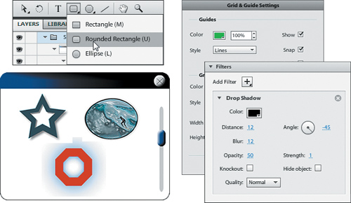
Rectangle: Drag to draw rectangles. Hold down Shift to draw a perfect square.
Rounded Rectangle: Drag to draw a rectangle with rounded corners. Hold down Shift to draw squares with rounded corners.
Ellipse: Drag to draw an ellipse. Hold down Shift to draw a perfect circle.
Triangle: Drag to draw a triangle. Move the mouse to the right or left to rotate the shape as you draw. Hold down Shift to rotate the triangle at 45-degree increments as you draw.
Hexagon: Drag to draw a hexagon. Move the mouse to the right or left to rotate the shape as you draw.
Octagon: Drag to draw an octagon. Move the mouse to the right or left to rotate the shape as you draw.
Star: Drag to draw a five-point star. Move the mouse to the right or left to rotate the shape as you draw.
Line: Drag to draw a straight line. Move the mouse to the right or left to rotate the line as you draw. Hold down Shift to rotate the line at 45-degree increments as you draw.
Hand: Drag to pan the artboard. This is a fast way of scrolling left and right in the artboard.
Zoom: Click in the artboard to zoom in for a closer view. Alt/Option-click to zoom back out. The zoom tool is synchronized with the Zoom Magnification box above the artboard.
Using the rulers, guides, and grid
Flash Catalyst offers four main aids to assist you while drawing. These include the rulers, the custom guides, a visible grid for measuring and aligning artwork, and the Properties panel for positioning and sizing objects down to the exact pixel.
Show and hide rulers
By default, rulers appear above and to the left of the artboard. The rulers help you position artwork, but they’re even more useful when placing custom guides. You can hide the rulers to gain a little extra room in the workspace, but they take up so little space you’ll probably want to leave them turned on all the time.
- Browse to the Lesson11 folder on your hard drive and open the Lesson11_Drawing.fxp file.
Rulers appear above and to the left of the artboard in the Design workspace.

- Choose View > Show Rulers to deselect it and hide the rulers.
The rulers disappear, creating a little more space above and to the left of the artboard.
- Choose View > Show Rulers to turn the rulers back on.
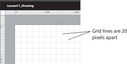
Rulers measure the height and width of the artboard in pixels. At 100% magnification, tick marks appear every 10 pixels and numbers appear at 100-pixel intervals.
- Change the Zoom Magnification to 800%.
As you zoom in or out, the tick marks and numbers in the ruler scale to accommodate the new magnification.
- Return the zoom magnification to 100%.
Edit grid and guide settings
Using the grid is similar to placing a transparent sheet of graph paper over the artboard. The grid includes perfectly spaced vertical and horizontal lines that help you align and draw perfectly measured artwork. You can change the default settings for all grid lines and guides in one location—the Grid & Guide Settings dialog box.
- Open the View menu and point to Grid.
The Grid submenu appears. You can show and hide the grid or turn the Snap To Grid feature on and off. Selecting Snap To Grid causes objects to snap tightly up against the nearest gridline when you position them in the artboard.

- In the View menu, point to Guides.
The Guides submenu appears. You can show and hide the guides, lock the guides in place, turn the Snap To Guides feature on and off, or clear all guides from the application.

- In the View menu, choose Grid & Guide Settings.
The Grid & Guide Settings dialog box appears. You can change the color, opacity, and style (straight dotted lines) for the grid and guides. You can adjust the scale of the grid by changing the Width and Height values. The default is a 20 × 20 pixel grid. You can show or hide the grid and guides or turn snapping on and off. You can also lock and unlock the guide lines.

- In the Guides section, select Show and Snap. Make sure that Lock is deselected.
- In the Grid section of the dialog box, change the opacity to 50%.
Reducing the opacity to 50% makes the grid lines less distracting as you draw new shapes and lines.
- In the Grid section, select Show and Snap.
- Make sure the grid Height and Width are both set to 20px.
- Click OK to confirm the settings and close the dialog box.
The grid appears at 50% opacity in the artboard.
Set guides for precise drawing
Guides are another great tool for aligning and placing one or more objects in the artboard. Unlike the grid, you can place horizontal or vertical guides anywhere you want. Use the ruler for exact placement of your custom guides. The same guides persist across all pages in the application.
Tip
The guides you set for the main pages in the application do not appear when you edit a component in Edit-In-Place mode. When a component is in Edit-In-Place mode, you can place new guides that are unique to that component.
- Move the pointer over the top (horizontal) ruler.
- Drag toward the artboard. You will see a horizontal guide appear. Release the mouse button to place the guide in the artboard.
- Select the Select tool (dark arrow) in the Tools panel.
- Position the pointer over the guide. The pointer changes to a two-headed arrow. Drag the guide so that it’s positioned at exactly 100 pixels from the top of the artboard, as shown in the vertical ruler.

- Move the pointer over the left (vertical) ruler.
- Drag a vertical guide into the artboard and place it at 100 pixels from the left edge, as shown in the top (horizontal) ruler.
- Add two more guides: a vertical guide at 500 pixels and a horizontal guide at 400 pixels.

Using guides, you’ve created boundaries for a 400 × 300 panel that you’re going to draw using basic shapes and lines.

- Choose View > Guides > Lock Guides.
Locking the guides prevents them from being accidentally moved when selecting and positioning objects in the artboard.
Drawing basic shapes and lines
For most designers, using the Flash Catalyst drawing tools is a cinch. For anyone new to vector drawing tools, you’ll find the best way to master them is to practice. A little experimentation, combined with the Undo command, goes a long way.
Preview a drawing example
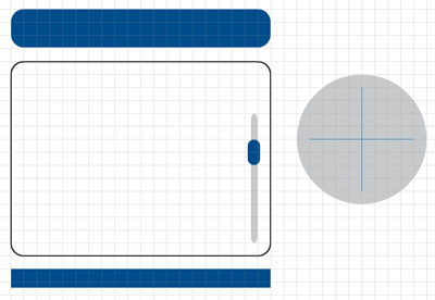
In this exercise, you are going to draw a simple user interface panel. Before you get started, take a look at a sample of the finished panel.
- Make sure Panel is selected in the Pages/States panel.
- In the Layers panel, show the Sample Panel row.
Here is an example of a simple control panel that was created using basic shapes and lines. You are going to create a similar panel using the Flash Catalyst drawing tools.

- Hide the Sample Panel row in the Layers panel.
Draw rectangles
You can draw rectangles with square or rounded corners. There are two ways to create a rounded rectangle. You can use the Rounded Rectangle tool, or you can draw a standard rectangle using the Rectangle tool and then adjust the Corners value in the Properties panel.
- In the Tools panel, select the Rectangle tool.
- Position the pointer at the upper-left corner of the intersecting guides. Drag to the lower-right corner of the intersecting guides to draw a 400 × 300 rectangle.
As you draw, the edges of the shape snap to the guides.
In the Common section of the Properties panel, you see the properties for the rectangle. The width (W) is 400 and the height (H) is 300. If it’s not, then adjust it in the Properties panel.
The guides make it easy to draw, but difficult to see the result in the artboard.

- Choose View > Guides > Show Guides to hide the guides.
- In the Properties panel, change the Corners value to 20.
The Panel Background now has rounded corners.
- In the Layers panel, rename the Rectangle Panel Background.

- Above the first rectangle, draw another one that’s 400 pixels wide and 60 pixels tall. Change the Corners value to 20. Then, in the Layers panel, name the second rectangle Panel Header.

- Below the Panel Background, draw another rectangle that’s exactly 400 pixels wide by 30 pixels high. You can adjust its final size in the Properties panel if needed. Leave the Corners value set to 0.
- In the Layers panel, name the new rectangle Header Overlay. We’ll use this to hide the rounded corners at the bottom of the header.

Now let’s draw a track for the panel scroll bar.
Draw rounded rectangles
OK, so technically you’ve already drawn some rounded rectangles using the Rectangle tool and the Properties panel. But the Rounded Rectangle tool provides a shortcut by adding rounded corners automatically.
- Select the Rounded Rectangle tool.
- Draw a tall rectangle that’s 200 pixels high and about 10 pixels wide (halfway between two grid lines). In the Layers panel, name the rectangle Track.
By default, the corner radius is 10, which is fine for the scroll bar track.
- Using the Select tool (dark arrow) in the Tools panel, drag the Track rectangle to position it along the inside lower-right edge of the larger rectangle.

Next, we’ll draw a thumb for the scroll bar.
- Using the Rounded Rectangle tool, draw a small rounded rectangle that overlaps the track. Make it about 20 pixels wide by 40 pixels high.

- In the Layers panel, name the small rectangle Thumb.
You now have five rectangles that make up the shapes you need to build the panel. You’re going to add some style and position these elements in a moment, but first you’ll create some shapes for the panel close button.

Draw ellipses
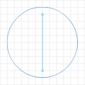
To create a close button for the panel, let’s start by drawing a large circle. We’ll make it big at first and then scale it down later. To draw a perfect circle, use the Ellipse tool with the Shift key modifier.
- Select the Ellipse tool in the Tools panel.
- Hold down Shift and drag to draw a perfect circle that’s 200 × 200 pixels. In the grid, that’s a circle that is 10 rows high and 10 rows wide. You might find that it’s easier to draw the circle and then change its size in the Properties panel.
The ellipse is a perfect circle.

Draw basic lines
The close button should have an X in the middle. Let’s use the grid to draw a perfect plus sign, and then we’ll rotate the entire button to turn the plus sign into an X.
- Select the Line tool in the Tools panel.
- Position the pointer 20 pixels (one grid line) below the top of the circle, in the center. Drag to draw a vertical line that’s 160 pixels high. You can hold down Shift as you draw to make a perfectly vertical line.
- Position the pointer 10 pixels inside the left edge of the circle, in the center. Drag to draw a horizontal line that’s about 160 pixels wide. You can hold down Shift as you draw to make a perfectly horizontal line.
You now have the basic shapes for the panel close button. You’ll rotate this in a moment.

Changing stroke and fill
If drawing basic shapes is like making a coloring book, then changing fill and stroke is the fun part. You get to color in the pictures. Flash Catalyst lets you choose between no fill (transparent), solid fill, and gradients that fade between one or more colors at various angles. Even the stroke (outline) can be a gradient if it has enough weight. Weight refers to the width or thickness of the stroke. All of these changes are made in the Common section of the Properties panel.
Change the fill color
When you first start Flash Catalyst, new shapes are created with a solid white fill. But as soon as you change the fill color of a shape, any new shape that you draw takes on the most recent fill color that you’ve applied.
- Using the Select tool (dark arrow), click the Panel Background rectangle (the largest rectangle) to select it.
The properties for the selected shape appear in the Properties panel. The fill color is solid white.

- Select the Panel Header rectangle.
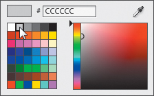
- In the Properties panel, click the Fill color swatch to open the Color Picker.
In the Color Picker, you can select a color in the palette or enter a hexadecimal color value. For additional colors, drag the slider (right-pointing arrow) up or down to select a new color range and then drag in the color field to select a new color. You can also sample a color in the application by using the Eyedropper tool.
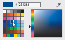
- In the color palette, select blue #2B4381.
- Select the Header Overlay and Thumb rectangles.
Tip
Shift-click to select multiple objects in the artboard, or contiguous rows in the Layers panel. But Ctrl/Command-click to select noncontiguous rows in the Layers panel.
With Header Overlay and Thumb selected, you can apply the same properties to both shapes at the same time.
- In the Properties panel, click the Fill color swatch to open the Color Picker, and select the Eyedropper tool.
- With the Eyedropper tool selected, move the pointer over the blue Panel Header rectangle and click to sample its color.

The Color Picker disappears and the blue color you sampled is applied to the Header Overlay and Thumb shapes.

- Select the Track rectangle and the Ellipse.
- In the Properties panel, click the Fill color swatch and select light gray #CCCCCC.
The scroll bar track and the Ellipse are light gray.

Understanding hexadecimal color values
The colors you see on your computer monitor are produced using various combinations of red, green, and blue (RGB). You may have noticed the numbers in the Color Picker. These are referred to as hexadecimal color codes. Hexadecimal color codes define the amounts of red, green, and blue used to create a color. The levels of red, green, and blue are measured using a numbering system that runs from 0 to 255. For example, the color black is created by mixing 0 red, 0 green, and 0 blue. White is represented by 255 red, 255 green, and 255 blue. Yellow is 255 each of red and green, and 0 blue.
While RGB color values are based on the decimal system (base 10), hexadecimal color values are represented by a hexadecimal numbering system (base 16).
In the decimal system, when you write 43 it means 4 tens and 3 ones. When you write 43 in hexadecimal it means 4 sixteens and 3 ones. 43 in hexadecimal is (4x16) + 3 = 67.
In hexadecimal, A = 10, B = 11, C = 12, and so on to F, which is 15. The highest possible two-digit number in hexadecimal is FF. It means 15 sixteens and 15 ones, which is 255 (the most amount of any color).
Hexadecimal color codes always consist of a number sign (#) followed by a combination of six characters.
• The first two digits determine how much red is in the color.
• The middle two digits determine how much green is in the color.
• The last two digits determine how much blue is in the color.
• The code for black is #000000.
Colors containing RGB values of FF contain the most amount of a color (255 or 100%). For example, the hexadecimal value for white is #FFFFFF, which means it contains the most amount of red, green and blue.
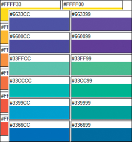
When specifying colors in a web application, you can use hexadecimal values instead of RGB values. An advantage of using hexadecimal codes to choose colors is that you can limit your design’s color palette to colors that are considered safe for viewing on the web. Web-safe colors consist of any three of the pairs 00, 33, 66, 99, CC, or FF in the hexadecimal range. For example, #FF9900 is a web-safe color, whereas #39C6C5 does not appear in the web-safe color palette.
The importance of these safe colors has been reduced dramatically over the years as display monitors have become more capable of displaying many colors.
Change stroke color and weight
Stroke is the line or outline that defines a shape you draw in Flash Catalyst—as in the “stroke of the pen” or “brush strokes.” In Flash Catalyst, you can choose a solid stroke, a gradient stroke, or no stroke at all.
A gradient is when two or more colors gradually blend together. A gradient stroke may seem strange, but if you make the weight of the stroke heavy enough, it becomes almost like an outer shape surrounding an inner shape.

Our panel design doesn’t require any fancy gradient strokes, but we do need to make a few minor modifications, beginning with the panel background.
- Select the Panel Background rectangle (the larger rectangle).
- In the Properties panel, make sure the Solid Stroke property is selected. Click the Stroke color swatch, and change the stroke color to black #000000.
- Change the Weight value to 2.

- Use the Layers panel to select the Ellipse, Thumb, Track, Header Overlay, and Panel Header.

- In the Properties panel, click the No Stroke property to remove the stroke from all five selected shapes.
- Choose Edit > Deselect All so that you can see the change a little better.
Add and modify gradient fills
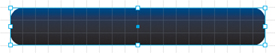
Let’s add a gradient fill to the Panel Header and the Header Overlay. Then, we’ll place the overlay on top of the header to hide the bottom rounded corners.
- Select the Panel Header rectangle.
- In the Properties panel, select the Gradient fill property.
A gradient swatch displays a preview of the gradient from left to right. Beneath the swatch are gradient color stops. They’re called stops because they control where one color stops and the next one begins.

By default, there are two color stops. The first stop is the current shape’s fill color (blue). The last stop is black. The artboard shows a gradient fade from blue to black.
- Click anywhere in the gradient swatch to add another color stop.
A new color stop takes on the color of the stop to its left.
- Click directly on the new stop to open the Color Picker.
You can change the color and the opacity of each color stop.
- Select white in the color palette.
The new stop color is white. In the artboard, the fill color fades from blue to white and then to black.

- Drag the white color stop left and right to see how this affects the gradient fill in the artboard.
You can add more color stops. You can also move the first and last stops to adjust where the fades begin and end.
- Drag the white color stop (and any other extra stops you’ve added) away from the gradient swatch to remove it.
You’re back to where you started, with a blue and black color stop.
- In the Properties panel, change the Fill Rotation value to 80. Make sure you change the Fill Rotation, not the Rotation for the shape.
The gradient fades from blue to black at an angle, making it a little more interesting.

- Select the Header Overlay rectangle.
- In the Properties panel, select the Gradient Fill property and change its Fill Rotation value to 80.
The same blue to black gradient is added to the Header Overlay rectangle.
- Shift-click the Panel Header rectangle to add it to the selection.
- With both parts of the header selected, choose Modify > Align > Bottom. Then choose Modify > Align > Left.
- Choose Edit > Deselect All.
- Choose View > Grid > Show Grid to deselect it and hide the grid.
The combined shapes make a panel header that’s square on the bottom with rounded top corners. The shapes are different sizes so the gradient rotation creates a seam. To hide the seam, you can change the Rotation value for one of the shapes until the gradient patterns line up perfectly.

- Select the Header Overlay rectangle (the smaller of the two rectangles). In the Properties panel, change the Fill Rotation value to 5.
- Choose Edit > Deselect All.
The gradient patterns line up and the seam is gone.

Grouping and transforming
Most artwork is made from a collection of smaller overlapping parts. In fact, some artwork includes hundreds, even thousands, of smaller brush strokes or paths. You can make your life a little easier by grouping the related parts of an object so that you can work with them as a single unit.
The following are a few benefits of grouping objects:
• Grouping protects the integrity of the drawing by keeping its parts in their correct position relative to its other parts.
• Grouping creates a nicely organized Group object in the Layers panel. You can rename the group in the Layers panel for better organization.
Tip
If your drawings include lots of smaller parts or paths, you can group them, select the group, and use the Heads-Up Display (HUD) to create an optimized graphic.
• Grouped objects have their own set of properties in the Properties panel, which makes it easier to size, position, and transform the drawing. For example, you can change its opacity, rotate the drawing, or apply filters.
• You can use the Select tool to select, transform, size, and position the group as a single unit.
• You can always select the parts within a group by using the Direct Select tool, or by selecting their individual rows in the Layers panel.
Group objects
The panel you’re creating includes the rounded Panel Header and Header Overlay rectangles. You’ve already aligned these objects perfectly, so let’s go ahead and group them. That’ll make it easier to position them at the top of the panel. While we’re at it, let’s also group the ellipse and lines used to make the close button. This will make rotating, sizing, and positioning these parts a lot easier too.
- Select the Panel Header and Header Overlay rectangles.
- Choose Modify > Group.
The two gradient rectangles are grouped and share one set of selection handles.
- In the Layers panel, rename the group Panel Header.
- Select the Ellipse shape and the two lines.
- Choose Modify > Group.
- In the Layers panel, rename the group Close.
Transform shapes
Let’s use the Transform tool to rotate the close button and turn the plus sign into an X for “close.”
- In the Layers panel, select the Close group.
- Select the Transform (Rotate) tool in the Tools panel.
Transform handles appear around the group.

- Position the pointer over the selected shapes.
The pointer changes to the Transform tool.
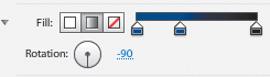
- Drag to rotate the selected shapes by 45 degrees.
The Rotation value changes in the Properties panel.
- In the Properties panel, make sure the Rotation value is exactly 45 or -45 to turn the crossed lines into an X.
Size and position objects
With our shapes grouped, we can move and size them as single drawings. Let’s start by putting the header at the top of the panel, just inside the outline of the panel background. After that, we’ll reduce the size of the close button and place it where it belongs, at the top of the panel.
- Using the Select tool (dark arrow), drag the grouped Panel Header to position it at the top inside the Panel Background rectangle.

- Select the Close group in the Layers panel.
- Hold down the Shift key, then drag a corner selection handle to reduce the size of the Close group. Make it small enough to fit in the upper-right corner of the panel header. It doesn’t need to be exact.
- Position the Close group in the upper-right corner of the panel.

Applying and removing filters
Flash Catalyst includes a nice collection of graphic filters, such as drop shadows, that you can add to your artwork to give it more depth and style. You can add filters to the artwork you place in the Flash Catalyst artboard. For example, you can apply filters to the vector drawings and bitmap images you import to the project, as well as to the vector shapes you create using the Flash Catalyst drawing tools. You can even add filters to text.
You can apply the following filters in the Properties panel: Blur, Drop Shadow, Inner Shadow, Bevel, Glow, and Inner Glow.
After you apply a filter, additional filter settings appear in the Properties panel.
Note
If an object has different filters applied in two states, you cannot animate the change between filters during transitions. The change occurs immediately during the transition.
Add and modify a bevel
A bevel filter creates a raised, or beveled, edge, giving the object the appearance of depth. By adding bevel filters to the close button and the scroll bar thumb, we can create the illusion of three-dimensional objects.
- Zoom the artboard to 200% and pan the artboard so that you can see both the Close group and the scroll bar Thumb shape.
- Select the Close group.
- In the Filters section of the Properties panel, click Add Filter and choose Bevel.
A bevel is applied to the selection. The filter properties appear in the Properties panel.

- Change the Distance value to 4.
- Change the Blur value to 6.
- Change the Angle value to –45.
- Change the Strength value to 1.
- Select the Thumb shape. Apply a bevel with the same properties as the Close group.

- Change the artboard back to 100% magnification.
Add and modify a drop shadow
The most common type of filter is the drop shadow. Using drop shadows adds style and depth and gives a softer look to artwork and text. By adjusting the direction and distance of the shadow, you create the perception of lighting.
Adding a shadow to the Panel Background rectangle will give it the appearance that it’s floating slightly above the main user interface.
- Select the Panel Background rectangle.
- In the Filter section of the Properties panel, click Add Filter and choose Drop Shadow.
A drop shadow is applied to the selection. The filter properties appear in the Properties panel.
- Change the Distance value to 10.
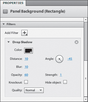
- Change the Blur value to 10.
- Change the Opacity value to 60.
- Change the Angle value to –45.
- Change the Strength value to 1.
Tip
The Knockout Drop Shadow property hides the original object, but it shows only the parts of the filter that would be seen if the object were visible (the filter is masked/knocked out by the object). Hide Object hides the original object and shows the filter, including parts that would have been obscured if the object were visible. This has no effect if Knockout is also selected.
- Choose Edit > Deselect All.
The panel is complete.

Round-trip editing with Adobe Illustrator and Adobe Photoshop
Using the Launch and Edit features of Flash Catalyst, you can modify artwork using the rich editing capabilities of Adobe Illustrator CS5 and Adobe Photoshop CS5. Open the artwork in Illustrator or Photoshop, make changes, and then return to Flash Catalyst.
Take a moment to review the following tips for round-trip editing with Illustrator and Photoshop:
• Use Illustrator to round-trip edit bitmaps and vectors.
• Use Photoshop to round-trip edit bitmaps.
• When you edit a vector (shape or text) in Illustrator and the vector is not part of a component, changes apply only to the state in which you select and edit the vector. If the vector was shared to other states, they are not affected by the edit.
• When you edit an image or component that is stored in the Flash Catalyst library, you are editing the object definition in the library. If you’ve shared the image across states, the changes apply in all states. If the image is used inside a component, the changes are reflected in the component.
• You cannot round-trip edit vectors or bitmaps that you’ve optimized by choosing Optimize Vector Graphics in the HUD.
• You cannot round-trip edit more than one component at a time.
• Make all structural changes to objects in Flash Catalyst. Changing the structure of objects during round-trip editing can break the intended behavior of objects or transitions in which they occur.
• When you round-trip edit a button (or other components), the component states are shown as separate layers in Illustrator and Photoshop. If you round-trip edit a group, its children are shown as separate layers.
• When you round-trip edit an object, the surrounding objects in the artboard are visible (but dimmed) for reference. These objects appear as locked background layers in Illustrator and Photoshop and cannot be edited.
Launch and edit in Adobe Illustrator
Using Illustrator, you can edit drawings, as well as the following components: Button, Checkbox, Radio Button, Horizontal Scrollbar, Vertical Scrollbar, Text Input, Toggle Button, Horizontal Slider, or Vertical Slider. You cannot round-trip edit Custom/Generic components.
To complete this exercise, you must have Adobe Illustrator CS5 installed.
- Select LaunchAI in the Pages/States panel.
This page includes a sample drawing of a wrench that was created using basic shapes. This would look better if the wrench handle tapered inward a little near the head of the wrench. To do this, you need to edit the anchor points of the handle shape, which cannot be done in Flash Catalyst. To make this change, you can launch Adobe Illustrator CS5 and edit the path using the Adobe Illustrator Pen tool. The shapes that make up the wrench are grouped.
- Use the Direct Select tool (light arrow) to select the wrench handle.

- Choose Modify > Edit in Adobe Illustrator CS5.
Adobe Illustrator CS5 starts, and the shape you selected appears in the Illustrator artboard. This is similar to Edit-In-Place mode in Flash Catalyst. Only the selected artwork can be edited. The other artwork appears in the background for reference only.
A message at the top of the Illustrator window tells you that you are editing from Adobe Flash Catalyst.

- Use the Illustrator Direct Select tool to select the shape.
- Click the anchor point at the upper-left side of the shape.
Handles appear. You can modify points on a path in Illustrator.
- Drag the upper-left anchor point to the right slightly to taper the top portion of the wrench handle.

- Drag the upper-right anchor point to the left slightly.
The wrench handle now gets narrower near the top of the wrench.
- Click Done at the top of the application window.
The FXG Options dialog box appears.
- Click OK to close the FXG Options dialog box and return to Flash Catalyst.
The changes you made in Illustrator appear in Flash Catalyst.

Download and install the Adobe FXG extensions for Photoshop
Before you can take advantage of round-trip editing with Adobe Photoshop, you need to download and install the FXG extensions. These include the FXG plug-in and the Simplify Layers For FXG script.
Instructions for downloading and installing the extensions are located at www.adobe.com/go/photoshopfxg.
Launch and edit in Adobe Photoshop
Use Photoshop to edit bitmap images, a selection of multiple images, or a group containing only images.
To complete this exercise, you must have Adobe Photoshop CS5 installed.
- Select LaunchPS in the Pages/States panel.
- Select the bitmap image of the surfer.
- Choose > Modify > Edit In Adobe Photoshop CS5.
A message reminds you that you need to download and install the FXG extensions for Photoshop.

- Click OK to close the message and launch Photoshop.
Adobe Photoshop CS5 starts, and the bitmap image you selected appears in the Photoshop canvas for editing. A message at the top of the canvas reminds you to run the script to simplify layers before returning to Flash Catalyst.

The image appears in its own layer in the Layers panel.

- Select the layer for the image you’re editing in the Photoshop Layers panel.
- Choose Filter > Artistic > Dry Brush (or another filter of your choice).
- Make any adjustments you want to the filter properties and click OK.
- Choose File > Scripts > Simplify Layers For FXG.
- Choose File > Close and click Yes to save changes.
- Return to Flash Catalyst.
The changes you made in Photoshop appear in the Flash Catalyst project.

Review questions
1 What is the difference between the Select tool (dark arrow) and the Direct Select tool (light arrow)?
2 What are two methods for drawing rectangles with rounded corners?
3 When filling a shape with a solid color, how can you ensure that its color is an exact match to the color of another object in the artboard?
4 How do you control the colors used in a gradient fill?
5 What are some advantages of grouping objects?
6 When applying a Drop Shadow filter, what is the difference between the Knockout and Hide Object properties?
7 What are some differences between round-trip editing in Adobe Illustrator compared to round-trip editing in Adobe Photoshop?
Review answers
1 You can use the Select tool to select, move, and size grouped or ungrouped objects. You can use the Direct Select tool to select, move, and size objects that are part of a group.
2 You can draw a rectangle using the Rectangle tool and then add rounded corners by changing the Corners value in the Properties panel. You can draw a rectangle that begins with rounded corners by using the Rounded Rectangle tool.
3 You can use the Eyedropper tool to sample a color from another object in the artboard. Or, you can select the object that has the source color, open the Fill Color Picker, and copy the color’s hexadecimal color value. Then, select the target object, open the Color Picker, and paste the color value. Using the Eyedropper is a lot easier.
4 Begin by adding a gradient fill in the Properties panel. The gradient begins with two colors—usually the fill color fading to black or white. Click a color stop below the gradient swatch to open the Color Picker and change its color. Click in the gradient swatch to add additional color stops. Slide color stops or adjust the Rotation value to stylize the gradient pattern. Drag stops away from the gradient swatch to remove them.
5 Grouping protects the integrity of the drawing by keeping its parts in their correct position relative to its other parts. Grouping creates a nicely organized Group object in the Layers panel. Grouped objects have their own set of properties. You can select, edit, size, and position the group as a single unit. You can add interactions to groups.
6 Knockout hides the original object, but it shows only the parts of the filter that would be seen if the object were visible (the filter is masked/knocked out by the object). Hide Object hides the original object and shows the filter, including parts that would have been obscured if the object were visible. This has no effect if Knockout is also selected.
7 You can use Illustrator to edit vectors and bitmaps. You can use Photoshop to edit bitmaps only. Before you can edit in Photoshop, you must download and install the FXG plug-in and the Simplify Layers For FXG script. After editing in Photoshop, make sure you run the Simplify Layers For FXG script before returning the edited graphic to Flash Catalyst.