
10. Designing with Data
What do you get when you combine Flash Catalyst’s visual interface design functionality with its design-time data feature for building pixel-perfect models of data-centric applications? As a designer, you get the flexibility to rapidly generate data-driven interface components with both style and substance. You also maintain complete control over the look and feel of your final application, even after you hand it off to developers for integration with data servers and services.
In this lesson, you’ll learn how to do the following:
• Design visually interesting interface components for browsing and displaying large collections of data
• Create a Data List component using images and text
• Set data list properties
• Use design-time data to demonstrate the appearance and behavior of a data list
• Add a wireframe Data List component
This lesson will take about 60 minutes to complete. Copy the Lesson10 folder into the lessons folder that you created on your hard drive for these projects (or create it now), if you haven’t already done so. As you work on this lesson, you won’t be preserving the start files; if you need to restore the start files, copy them from the Adobe Flash Catalyst CS5 Classroom in a Book CD.

Collaborate more effectively with developers by providing them with fully designed data-centric user interface components that can be extended using Adobe Flash Builder to add functionality and integration with servers and services.
Flash Catalyst data lists
A data list is a special type of component used to retrieve and display a series of related items. You can design a data list using Flash Catalyst. Typically, you’ll include enough sample records to demonstrate the layout and behavior of the list. Once you finalize the look and feel, a Flex developer can use Adobe Flash Builder to connect your Data List component to a web service that retrieves and displays any number of records when the application runs.
A list is not always a list
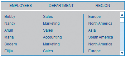
The name data list is a little misleading. Each unique record in a Flash Catalyst data list can include artwork, text, or a combination of both. It doesn’t need to be a list at all. Traditionally, a data list might look something like a spreadsheet or data table.
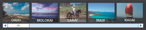
Using Flash Catalyst, you can build a Data List component that displays a tiled wall of images.

A list can be a scrolling filmstrip or series of thumbnails, from which you select and view other content or navigate to new locations in the application. By adding a scroll bar, you can extend the list to include any number of items.
Of course, there’s nothing stopping you from making your data list look like an ordinary list if that’s what you want. In fact, there’s even a built-in wireframe Data List component.
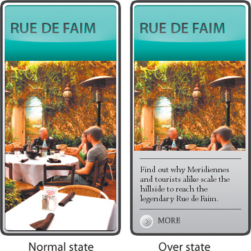
By default, the records in a data list can have different Normal, Over, and Selected states. You can use the Over state to reveal more information about a record when a user rolls over an item.
What is design-time data?
When developing an application that’s used to present large amounts of data, it’s not always possible to see the end result until the application is running and connected to a back-end data source. That is unless you’re using a Flash Catalyst Data List component and design-time data. Design-time data allows you to use dummy content, such as sample database records or bitmap images, without having to actually connect to a back-end system. This gives you, the designer, complete control over the final look and feel of the user experience. This also makes it possible for a developer using Adobe Flash Builder to replace the design-time data with real data from a database or web service while maintaining the interactions and pixel-perfect design from Flash Catalyst.
Preview a data list
Before you dive in and start making a new data list, let’s take a moment to preview how a list appears when it’s put together. Seeing a Data List component in action will help you to understand each of its parts and how they relate to one another in a working application.
- Start Flash Catalyst. Browse to the Lesson10 folder on your hard drive and open the Restaurants_finished.fxp file.
- Run the project in a browser.
When the application starts, it plays a short video and then stops on a horizontal list of restaurants. This is a horizontal data list. If you roll over an item in the list, you see its Over state. Scroll arrows let you move forward and backward through the list.
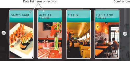
- Click the right scroll arrow to see more restaurants in the data list.
- Click any restaurant.
Clicking an item in the data list takes you to a different page in the application. Each restaurant includes a Reviews button.
- Click Reviews.
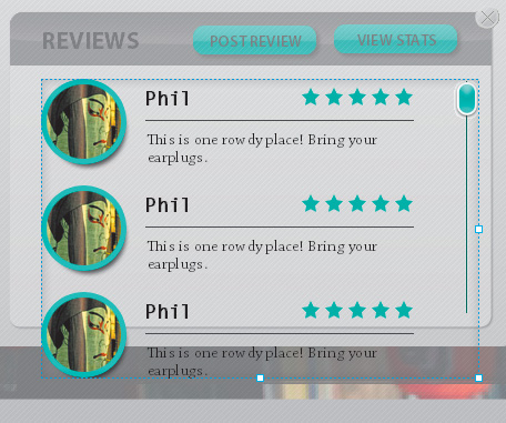
The restaurant reviews are included in a vertical data list. Each item in the list includes an image, the name of the reviewer, a short review, and a star rating.

- Roll over and click a few of the reviews in the list.
The reviews have different Normal, Over, and Selected states. In the next exercise, you are going to re-create this data list.
- Close the browser and return to Flash Catalyst.
- Close the project without saving changes.
Creating a Data List component
There are three main steps to making a Data List component. These are:
• Design a sample item or record in the list. Add a scroll bar if your list will extend beyond the available space in the user interface.
• Convert the sample record (and scroll bar) into a Data List component.
• Define the elements that represent the repeated item (a single record).
Design a sample record
If you think about a traditional data list, there are typically columns and rows of information. Each row represents a unique record in the database. For each record there may be several columns of information. For example, an employee list displays each employee in a different row and includes columns for employee name, number, department, hire date, and so on.
In Flash Catalyst, records can be listed horizontally, vertically, or tiled. Each record can include text, numbers, images, and other artwork. The first step to making a Data List component is to pull together the elements that make up a single record. If your list requires a scroll bar, you can place it relative to the first item in the list.
- Browse to the Lesson10 folder on your hard drive and open the Lesson10_Restaurants.fxp file.
- Select SubPages in the Pages/States panel.
- In the Layers panel, select Sub Pages.

This selects the Sub Pages custom component in the artboard. The restaurant reviews data list will be nested inside the Info state in the Sub Pages custom component. Nesting components is an efficient way to create multiple views without adding additional application pages.
- In the Heads-Up Display (HUD), click Info to edit the Sub Pages custom component in Edit-In-Place mode.
The component opens with the Info state selected. The Info state includes another nested component called Review Popup.
- In the Layers panel, expand the Sub Pages layer folder, expand the Info layer folder, and select Review Popup.
The Review Popup custom component is selected in the artboard.
- In the HUD, click Reviews to edit the Review Popup component in Edit-In-Place mode with the Reviews state selected.
This is where the restaurant reviews belong. This data list will include more reviews than can fit vertically in the Reviews Popup, so you’ll need to add a vertical scroll bar.

- In the Library panel, expand the Components category and select the Review_Popup_VerticalScrollbar component.

- Drag the Review_Popup_VerticalScrollbar from the Library panel to the artboard. Position it along the right side of the empty white space.

Now let’s import the artwork for a sample review that was designed in Adobe Photoshop.
- Choose File > Import > Adobe Photoshop File (.psd). Browse to the Lesson10 folder, select the DataList_art.psd file, and click Open. Click OK to accept the default import fidelity options.
The sample review artwork is imported and selected in the artboard.
- Position the artwork at the top of the reviews panel and to the left of the scroll bar.

You now have one sample record and a scroll bar.
Convert the sample record into a Data List component
With the parts of a data list arranged in the artboard, the next step is to select them and convert the individual parts into a new Data List component. If your data list includes a scroll bar, make sure to include it in the selection.
- Make sure the artwork you imported in the previous task is still selected.
- Hold down Shift and click the scroll bar to add it to the selection.
- In the HUD, convert the artwork to a Data List component.
A message in the HUD informs you that to make the data list work correctly, you need to assign its parts. You need to tell it which parts to use as the repeated item.

Define the repeated item
Every Data List component must include a master item called the repeated item. The repeated item is a template that defines the appearance of every item or record in the list, including its Normal, Over, and Selected states.
Changes applied to the repeated item template are applied to every item in the list automatically at runtime. For example, if you change the opacity of an image in the Over state of the repeated item, this change applies to every record. Keep in mind that your application might display thousands of records. It’s a huge time-saver and guarantees a consistent look across all records.
- In the HUD, click Edit Parts to edit the data list in Edit-In-Place mode.
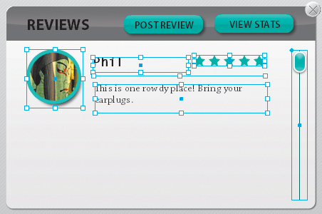
- Select all five parts of the sample review record, including the round image, the line, the stars, and both lines of text. Do not select the scroll bar.
- In the Convert To Data List Part section of the HUD, click Choose Part and select Repeated Item.
The artwork is turned into a repeated item. By default, the repeated item is arranged vertically in the data list. If it doesn’t fit perfectly in the designed space, you can resize it. You’ll do that next.
Setting data list properties
The layout of a Data List component is determined mainly by its repeated item properties—size, position, orientation, spacing, and so on.
You can modify its properties in the artboard and by changing its values in the Properties panel.
Size and position the bounding box
The repeated item bounding box indicates the visible and scrollable area in the data list. You define this space by sizing the bounding box in the artboard or in the Properties panel.
- Make sure the repeated item is still selected.
- In the Common section of the Properties panel, change the height (H:) value to 500.
The bounding box height adjusts. You can now see the five sample records that were added to the list automatically. You can also size the bounding box using its handles.

- Use the handles to resize the bounding box height and width and position it to fit in the space designed for the reviews. The height of the box should be equal to the height of the vertical scroll bar.

Edit the repeated item layout
By default, the repeated item is aligned vertically. There is a small amount of space between each record in the list, and the artwork is positioned right up against the left, right, top, and bottom sides of the bounding box. This is called padding. You can change these settings in the Layout section of the Properties panel. You can also change the appearance of objects in the Normal, Over, and Selected states.
- Make sure the repeated item is still selected.
- Expand the Layout section of the Properties panel.
A repeated item has three possible layouts. These include Vertical, Horizontal, and Tile. The default setting is Vertical, and that’s what you want for the restaurant reviews. You can also change the alignment of the list within the bounding box.

- Change the Spacing value to 10.
Spacing is the distance between each item in the list. Padding refers to the space between the list items and the bounding box.
- Select the Horizontal layout option.
The items align horizontally.
- Select the Tile layout option.
The Tile option is used to arrange a collection of images or text in a tiled mosaic pattern. You can adjust the direction and alignment of the tiles. You can also adjust the spacing between rows and columns in the mosaic.
Tip
A data list has the same properties as every other Flash Catalyst built-in component. For example, you can change its size, opacity, and rotation. You can enable or disable it, add a tooltip, or add a drop shadow.

- Change back to the Vertical layout option.
Edit the repeated item states
Every repeated item begins with slightly different Normal, Over, and Selected states so that a user can see when they are rolling over or selecting an item in the list. You can edit the states of the repeated item template, just like you can with components.
- Double-click the repeated item in the artboard to edit it in Edit-In-Place mode.
The Normal, Over, and Selected states appear in the Pages/States panel.

- Select the Over state in the Pages/States panel and open the Layers panel.
The Over state includes the Item Highlight Rectangle to show when the pointer is over the item in the list.
- Select Item Highlight Rectangle in the Layers panel.

- In the Common section of the Properties panel, change the rectangle’s fill color to pale green.
Notice, the rectangle’s opacity is already set to 30, which makes it semi-transparent.

- Run the project in a browser.
- Click any of the restaurants in the horizontal list, and then click Reviews to see your new data list.
- Use the scroll bar to see all five items in the list.
Right now every item has the same artwork. You are going to change that next using design-time data.
- Roll over and select an item in the list to see the Normal, Over, and Selected states.
- Close the browser and return to Flash Catalyst.
- Click Review_Popup in the Breadcrumbs bar.
This closes the repeated item and the data list. The Review_Popup component is still in Edit-In-Place mode.
Using design-time data
Most data lists are connected to a data source and populated with data dynamically at runtime. A developer can make this connection using Adobe Flash Builder. In Flash Catalyst, you can add placeholder data to display in the Data List component using the Design-Time Data panel. In fact, five sample records are created automatically when you first create the Data List component. Each sample record is a copy of the repeated item in the data list. Using the Design-Time Data panel, you can replace the sample repeated images and text with more realistic examples of the actual data that you want displayed. This dummy data is called design-time data.
Tip
There is nothing stopping you from creating a finished data list using design-time data and images in the project library. You don’t have to connect the application to an external data source. However, if your application is used to display large amounts of data that change over time, binding your list to external data is a better choice.
It’s a good idea to include a representative sample, so that your developer knows exactly how you want the data to appear in the finished application.
Replace design-time images
Replacing the repeated sample data is easy. Open the Design-Time Data panel and swap the images for new ones.
- Select the Data List component in the Layers panel.
The data list is selected in the artboard. Using the Layers panel to select the data list is a good way to make sure you select only the data list and not the image below it.
- Open the Design-Time Data panel and drag the top border of the panel to make it taller.
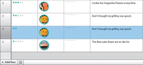
The Design-Time Data panel organizes sample data similarly to a traditional data table. Each record is listed as a separate row, and the information in each record (images and text) is listed in columns. In this list, each item includes three images (stars, a round image, and a line) and two pieces of text (the review and the reviewer’s name). At first, the design-time data includes five copies of the repeated item, numbered from 0 to 4.
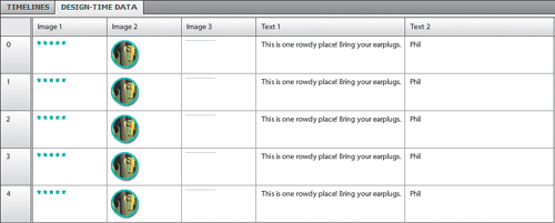
- Click the round image (in the Image 2 column) in row number 1 (the second row). Be sure to select the image in row number 1, not row number 0.
The Select Asset dialog box appears. You can choose an image in the project library or choose Import to add another image.
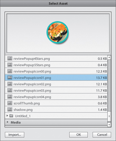
- Select reviewPopupIcon01.png and click OK.
The new image appears in the Design-Time Data panel.
- Click the stars (in the Image 1 column) in row 1.
- In the Select Asset dialog box, select reviewPopup4Stars.png and click OK.
The second review now has a four-star rating.
- Replace the round image in row 2 with reviewPopupIcon02.png.
- Replace the stars in row 2 with reviewPopup3Stars.png.
- Replace the round image in row 3 with reviewPopupIcon03.png.
- Replace the stars in row 3 with reviewPopup2Stars.png.
- Replace the round image in row 4 with reviewPopupIcon04.png.
- Replace the stars in row 4 with reviewPopup1Star.png.
The design-time data for the restaurant reviews data list now includes a more realistic collection of sample images.
Tip
By default, a data list opens with nothing selected. You can set the list to open with a specific record selected. To do this, select a row in the Design-Time Data panel. Then in the Component section of the Properties panel, enter 1 as the value for the Selected Index property. The row you selected will display its Selected state when the application runs.

Edit design-time text
Replacing sample design-time text is even easier than swapping images. Open the Design-Time Data panel, and enter new text for each record.
- In the Design-Time Data panel, click in the Text 1 column for row 1 and type a new review.
- Click in the Text 2 column for row 1 and type a new reviewer name.

- Add new reviews and reviewer names for the design-time data in rows 2, 3, and 4.
- Run the project in a browser.
- Click any of the restaurants in the horizontal list, and then click Reviews to see the updated data list with its new design-time data.
- Close the browser and return to Flash Catalyst.
Add and delete design-time data
By default, the Data List component begins with five sample records. In some cases, this may not be enough to demonstrate the list effectively. For example, a list that will eventually display a large collection of thumbnail images may need a larger sample to activate the scroll bar or to fill out the total area in a tiled set of images.
- In the Design-Time Data panel, click row number 3 in the far-left column to select it. Be sure to click the row number, not one of its image or text columns.
Clicking the row number selects the row without opening the Select Asset dialog box.
- Click Add Row in the Design-Time Data panel.
An exact copy of the selected row is added below it and any rows after that are renumbered. You can swap the images and text, just like you’ve done for the other rows.
- Select the new row you just added (it should be row 4), and click the Delete icon (
 ) in the Design-Time Data panel.
The row is deleted.
- Collapse the Design-Time Data panel so you can see more of the artboard.
Add and remove elements in the repeated item
After creating the data list, you can modify the repeated item template by adding or removing text and images.
- Select the Data List component and click Edit Parts in the HUD to edit the component in Edit-In-Place mode.
- Double-click the repeated item (anywhere in the list of reviews).
- In the Images category in the Library panel, locate the categoryIcon_Japanese.png file.
It’s a little piece of sushi.
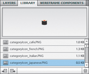
- Drag the categoryIcon_Japanese.png file to the artboard and position it to the left of the stars.
Right now, the sushi graphic is only in the Normal state of the repeated item.

- Choose States > Share To State > All States.
Now the sushi icon appears in the Normal, Over, and Selected states.
- In the Design-Time Data section of the HUD, choose Add Image To Design-Time Data.
- Click Review_Popup in the Breadcrumbs bar.
Every item in the data list now includes the sushi graphic.
- Expand the Design-Time Data panel.
A new column, Image 4, is added to the Design-Time Data panel.
- Click the Image 4 sushi graphic in row 1.
- In the Select Asset dialog box, select categoryIcon_Cafe.png and click OK.
The sushi is now a cup of coffee.
- Collapse the Design-Time Data panel.
The icons are updated in the list.

- Double-click the Data List component to edit it in Edit-In-Place mode.
- Double-click the repeated item (anywhere in the list of reviews) to edit it.
- Select the sushi graphic.

- In the HUD, choose Remove Image From Design-Time Data.
The image is no longer part of the design-time data, but it still appears in the artboard.
- Select the sushi graphic, open the Layers panel, and click the Delete icon () in the Layers panel to remove it from the application.
- Close the project without saving changes and leave Flash Catalyst open.

Using a wireframe data list
For rapid design of a traditional-looking data list, you can use the built-in Data List component in the Wireframe Components panel.
- Open a new blank Flash Catalyst document.
- Open the Wireframe Components panel and drag the Data List component to the artboard.
A wireframe data list appears. It starts with a single column of text, and the Design-Time Data panel opens automatically.
You can use the Design-Time Data panel to change the text and add or remove rows.

- Double-click the wireframe data list to edit it in Edit-In-Place mode.
The wireframe data list includes horizontal and vertical scroll bars. The scroll bars become visible if the list is too long or too wide to display the data in the area defined by the repeated item bounding box.

- Double-click the list to edit the repeated item.
As with all data lists, the repeated item has Normal, Over, and Selected states. You can modify the repeated item as needed. For example, you can add new text and widen the bounding box to create additional columns in the data table.
- Close the project without saving changes.
Review questions
1 What are the two types of elements that can be represented by design-time data?
2 What is the required part that every Data List component must have?
3 What are three layout options for a data list repeated item?
4 Where in the Flash Catalyst Design workspace do you add and replace design-time data?
5 What types of changes can you make to the repeated item template that are reflected in every list item or record at runtime?
6 After creating a data list, is it possible to add or remove images and text in the repeated item?
7 What is the fastest way to add a traditional-looking data list (one that resembles a table or worksheet) to your application?
Review answers
1 Bitmap images and text can be represented by design-time data. The Design-Time Data panel is used to indicate which bitmap images and text to display in each sample record of the data list.
2 Every Data List component must include a master item called the repeated item. The repeated item is a template that defines the appearance of every item or record in the list, including its Normal, Over, and Selected states.
3 Horizontal, Vertical, and Tile are the layout options for a data list.
4 Using the Design-Time Data panel, you can replace the sample repeated images and text with more realistic examples of the actual data that you want displayed. This dummy data is called design-time data.
5 You can change the layout of the repeated item. You can change the appearance of the Normal, Over, and Selected states in the repeated item. You can edit properties for each object in the repeated item.
6 Yes. After creating the data list, you can modify the repeated item template by adding or removing text and images. This is done by editing the repeated item in Edit-In-Place mode, selecting the item you want to add or remove, and then using the HUD or the Modify menu to add or remove the item as design-time data.
7 For rapid design of a traditional-looking data list, use the built-in Data List component in the Wireframe Components panel.