6. Creating Interactive Components
You’ve seen them in just about every computer application—a window that scrolls, options in a dialog box, menus and buttons that take you from one page to the next. These and other interactive elements are the building blocks of applications. In Flash Catalyst they’re called components.
In this lesson, you’ll learn how to do the following:
• Use wireframe components for rapid prototyping
• Convert artwork to built-in components
• Create custom navigation and toggle buttons
• Create custom scroll bars and scrolling panels
• Build custom components and navigation buttons
• Add and format text
• Modify components using Edit-In-Place mode
• Share artwork between component states
• Add and delete Flash Catalyst interactions
This lesson will take about 90 minutes to complete. Copy the Lesson06 folder into the lessons folder that you created on your hard drive for these projects (or create it now), if you haven’t already done so. As you work on this lesson, you won’t be preserving the start files; if you need to restore the start files, copy them from the Adobe Flash Catalyst CS5 Classroom in a Book CD.
Design interactive components, like scroll bars, buttons, and sliders. Begin with ready-to-use wireframe components, or convert your custom artwork to one of several built-in components, and then add interactivity like page navigation, UI controls, and links.
The building blocks of RIAs
The building blocks of rich Internet applications (RIAs) are components and the interactions that bring them to life.
Components
Flash Catalyst provides a collection of components with built-in states and behaviors, such as the up, over, down, and disabled states of a simple button. You can also create a custom component where you define the states and behavior from scratch. You can even create components that include other components. For example, you can have a scroll panel that includes a scroll bar and buttons.
Creating components
There are a few different ways that you can add a Flash Catalyst component to your application. These include:
• Drag wireframe components with a generic appearance from the Wireframe Components panel.
• Convert artwork into one of several built-in components (button, check box, and so on).
• Convert artwork to make a custom component.
Using Edit-In-Place
After adding a component to the artboard, you can edit the component using Edit-In-Place and modify its individual parts. When using Edit-In-Place, you are editing the component’s definition in the project library. The changes apply to every instance of that component in every state of the application. This is different than applying properties. When you select a component and change its properties in the Properties panel, the properties apply only to the current state. To apply the same properties to the component in all other states, you can select the component and choose States > Make Same In All Other States.
Tip
When editing components in Edit-In-Place mode, the Layers panel divides into separate sections for the main application layers and the component layers. You can drag objects from the main application into the component and vice versa.
Interactions
You can add Flash Catalyst interactions that define a desired behavior when a user interacts with a component (or grouped artwork). An interaction is like a set of instructions that tells the program what to do in response to a user event, such as clicking a button.
Using wireframe components
Most likely you’ll want to design custom user interface elements. But for rapid application prototypes or for simple functions like submitting a form, use the Flash Catalyst wireframe components.
The built-in wireframe components are ready-to-use and fully functional user interface elements. They can be used “as is” or quickly modified to your liking.
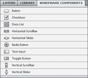
Flash Catalyst includes ten built-in wireframe components with a generic skin or appearance. These include:
• Button
• Checkbox
• Data List
• Horizontal/Vertical Scrollbar
• Horizontal/Vertical Slider
• Radio Button
• Text Input
• Toggle Button
Add and modify wireframe buttons
Adding a wireframe component to your application is easy. Just drag a component from the Wireframe Components panel to the artboard.
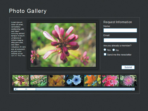
- Start Flash Catalyst. Browse to the Lesson06 folder and open the flower_gallery.fxp file.
This is a prototype for an online photo gallery. It includes some placeholder images and text. The next step is to add some basic interactive components.
- Open the Library panel.
Notice there is no Components category. Right now this project doesn’t include any components.
- Open the Wireframe Components panel.
- Drag a Button component from the Wireframe Components panel to the artboard. Position the button below the Request Information text, just above the thumbnail images.
The button has a default label of Button. You can see the label on the button itself and in the Common category of the Properties panel. In the Properties panel, the current skin for this button is Wireframe. This means that it’s using the generic wireframe artwork for the button. Skin refers to the artwork or set of instructions that defines the graphical representation of the button.

- Open the Library panel again, and notice there is still no Button component in the library.
This is because you added a wireframe component, and there’s no reason to place another copy in the project library. It’s available in the Wireframe Components panel already. For minor customization, you can change its properties in the Properties panel, but if you edit the button it becomes a new skin in the Library panel. This is done to preserve the original wireframe and so that you can reuse your edited button in other parts of the application.
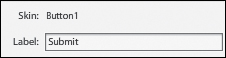
- With the button still selected, double-click the Label field in the Common category of the Properties panel. Type Submit and press Enter/Return.
The label on the button changes to Submit.
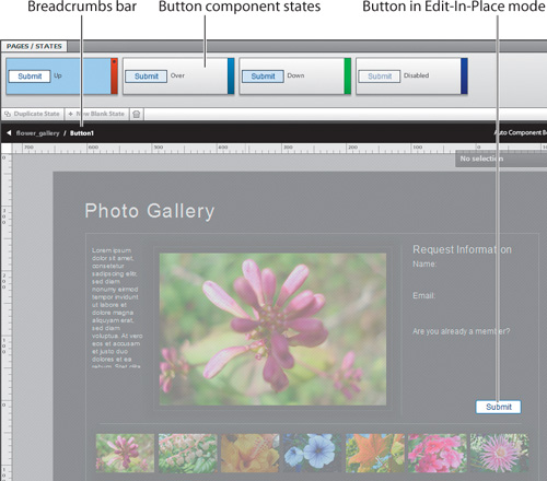
- Double-click the button or click Up in the Heads-Up Display (HUD).
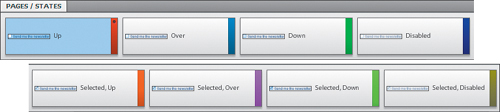
The button is in Edit-In-Place mode. Everything except the button is dimmed in the artboard. The component states appear in the Pages/States panel, and the Breadcrumbs bar shows that you are editing the Button component.
- Open the Layers panel.
When a component is being edited, its layers are added to the Layers panel. The wireframe button includes three objects—a label and two rectangles. In the Up state, only the bottom rectangle is present.

Button components all have Up, Over, Down, and Disabled states. You can tell by looking in the Pages/States panel that you cannot change the states of a Flash Catalyst built-in Button component. The Duplicate State, New Blank State, and Delete buttons are inactive. However, you can modify the objects in each of its existing states.
- In the Pages/States panel, change to the Over state.
- In the artboard or in the Layers panel, select the visible rectangle. Be careful not to select its label.
- In the Common category of the Properties panel, click the Fill Color swatch to open the Color Picker and select a new color from the palette.
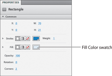
The Over state of the button changes color.
- Press Esc to exit Edit-In-Place mode.
- Open the Library panel again.
This time the Library panel includes a Button component. This is because you edited the wireframe button in Edit-In-Place mode, which creates a new skin (based on the wireframe) automatically.

In the Properties panel, the skin for this button now refers to the name of the new component, Button1, in the Library panel.
Add wireframe text input fields
There are some components that you probably don’t need to customize. A text input field used in a form is a good example.
- Change back to the Wireframe Components panel and drag a Text Input component to the artboard. Position it below the text that reads “Name.”
As long as you haven’t edited a wireframe component, it can be sized using the selection handles or by changing its Height (H) and Width (W) values in the Properties panel.
- In the Common category of the Properties panel, change the Width (W) of the Text Input field to 180. You can type the new value.
Tip
When you place the pointer over a value in the Properties panel, it turns into a two-headed arrow. You can drag across the top of the value to change it. Dragging to the right increases the value. Dragging to the left decreases the value.
- Expand the Text category in the Properties panel.
You can format the text that appears when someone types in the text field. These default settings are fine.
Tip
If you select the Display As Password property in the Properties panel, the text input field’s contents appear as a series of asterisks when someone types in the field. This is used to protect the secrecy of passwords.

- Drag another Text Input component below the text that reads “Email.” Using the selection handles, widen the Email field to match the Name field.

Add wireframe radio buttons
Radio buttons, also known as option buttons, typically present a choice for users. These choices are mutually exclusive and the user must choose only one option. For example, you may have a form that asks a yes or no question, or you may want someone to rate something by selecting from a group of options. When you add radio buttons to the application, each button represents an option. The user can select only one option at a time.
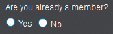
- In the Wireframe Components panel, drag a Radio Button component to the artboard and place it below the text that reads “Are you already a member?”
The blue text is hard to read over the dark background.
- In the Properties panel, change the radio button’s label to Yes and change the color of the text to white.
- Add another Radio Button component next to the first one. Change its label to No and change the text color to white.
Only one radio button within a group of radio buttons can be selected. Radio buttons are in the same group when:
• Their Radio Button Group property is set to the same name in the Properties panel.
• The buttons have been selected and grouped by choosing Modify > Group.
• They are all part of the same component.
• They exist at the main application level (as in this example).
Tip
To present multiple questions and choices using radio buttons, group each set of radio buttons or assign them to a common group using the Radio Button Group property in the Properties panel.
Add a wireframe check box
Check boxes are used when answering a question is optional, or when a user can select more than one option in a list. Each check box is independent of the others. Typically a single check box is used for a single option that the user can turn on or off, opt in, opt out, and so on.
- In the Wireframe Components panel, drag a Checkbox component to the artboard. Position it directly below the two radio buttons.
- In the Properties panel, change its label to Send me the newsletter.
- Double-click the check box to edit it in Edit-In-Place mode.
Notice in the Pages/States panel that a Checkbox component has a different set of Up, Over, Down, and Disabled states for when it’s selected.
- In the artboard, click to select the check box label “Send me the newsletter.”
- In the Common category of the Properties panel, change the text color to white.
- In the HUD, click the Make Same In All Other States option.
The white text property is copied to all states in the component. That’s a huge time-saver.
- In the Pages/States panel, select the Selected, Up state (not the Up state) and change the text color in the Properties panel to bright yellow.
Now the text is white until someone selects the check box, then it turns yellow.
- Press Esc to exit Edit-In-Place mode.
This prototype needs one last wireframe component—a scroll bar for the list of thumbnails.
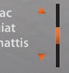
Add wireframe scroll bars
All scroll bars in Flash Catalyst must include a track and a thumb. The track runs the length or height of the scrollable area. The thumb is used to scroll content along the track. Optionally, you can include up and down buttons (vertical scroll bars) or left and right buttons (horizontal scroll bars).
- In the Wireframe Components panel, drag a Horizontal Scrollbar component to the artboard. Position it directly below the thumbnail images.
The default width of the horizontal wireframe scroll bar is 200. As long as you don’t plan to edit the wireframe scroll bar, you can size it using the handles or the Properties panel.
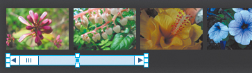
- Using the selection handles or the Properties panel, change the width of the scroll bar to match the width of the thumbnails. In the Properties panel, this is about W:660.

- Choose File > Run Project to run the project and view the new components in a web browser.
- In the web browser, type something in the Name and Email fields. Select a radio button, and select the check box. Roll over and click the Submit button, and test the thumb and scroll arrows of the scroll bar.
When you select the check box, the text turns yellow. The scroll bar is not attached to any content yet, so you won’t see the thumbnails move.
- Close the browser window and return to Flash Catalyst.
- Save and close the flower_gallery.fxp project.
Note
If the Tab To Focus component property is deselected, pressing tab will not give the component keyboard focus. It must be clicked to get focus.
Tip
When you run the project, the focus changes from one component to another as the user presses Tab or clicks to select a component. Focus is indicated by a subtle blue highlight called the focus ring. The focus ring color can be changed in the Appearance section of the Properties panel. You can also change the Tab order of the objects on a page by changing their Tab Index property in the Component section of the Properties panel. Lower numbers place the item earlier in the sequence. The –1 indicates a default order, which is based on the order of objects in the Layers panel.
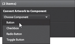
Converting artwork to built-in components
Wireframe components are convenient, but the real magic happens when you begin to transform your well-crafted original artwork into rich interactive user interfaces.
Flash Catalyst provides 11 types of built-in components that you can customize using your own artwork. But if the built-in components don’t fit your needs, you can use the Custom/Generic Component option to design additional components with up to 20 unique states.
The built-in component types include:
• Button
• Checkbox
• Radio Button
• Toggle Button
• Text Input
• Horizontal Slider
• Vertical Slider
• Scroll Panel
• Horizontal Scrollbar
• Vertical Scrollbar
• Data List
• Custom/Generic Component
When you convert artwork to a component, Flash Catalyst stores the new component in the Library panel, creates a new component object in the Layers panel, and replaces your artwork with an instance of the new component in the artboard.
Some components have special requirements and will not function properly until you define their required parts. For example, a Data List component must have a repeating item, and a scroll bar must have a track and a thumb. If the component has special requirements, a message appears in the HUD with instructions on how to complete the component.
Tip
To create a new component based on an existing component, right-click the component in the Library panel and choose Duplicate.
Tip
To rename a component in the Library panel, right-click the component and choose Rename. Type a new name and press Enter/Return.
Convert artwork to buttons
To design buttons with a custom appearance, select the artwork for the Up, Over, and Down states of the button. Then, convert the artwork to a Button component. Edit the component and use the Layers panel to show or hide artwork in each state.
- If necessary, start Flash Catalyst. Browse to the Lesson06 folder and open the Lesson06_Banner.fxp file.
- In the Layers panel, expand the page1:Feature layer, and then expand the Panel Artwork group.
- Use the Layers panel to select the Visit The Feature Article and Triangle objects. You can Ctrl-click/Command-click to select both rows.
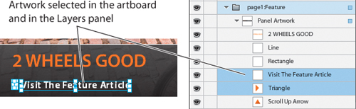
- In the Convert Artwork To Component section of the HUD, click Choose Component, and then select Button.
The selected objects are turned into a single Button component in the Layers panel.

- In the HUD, click Over to edit the button in Edit-In-Place mode.
The Over state is selected in the Pages/States panel. The Layers panel includes the objects used to create the button.
Tip
When creating buttons from small text, add a transparent rectangle to define a larger clickable area. The larger transparent shape makes the button much easier to use. Make sure that Transparency Accepts Mouse is selected in the Properties panel. If it’s not selected, all mouse actions will pass through the transparent areas to the layers below the component.
- In the Layers panel, click to select Visit The Feature Article.
The text is selected in the Layers panel and in the artboard.
- In the Common category of the Properties panel, change the text color to orange.
- Press Esc to exit Edit-In-Place mode.
- Run the project and test the new button.
When you roll over the button, the text turns orange. Later in this lesson, you will use this button to link to another web page.
- Close the browser, return to Flash Catalyst, and lock the page1:Feature layer.
Create a reusable navigation button
Any button can be used for navigation, including wireframe buttons. If your navigation buttons look the same, you can use repeated instances of the same button. For example, in the interactive banner application, the navigation buttons at the top of the window are identical except for their labels. Instead of creating five new buttons, create one button that you can use five times. You can change the label in each instance using the Label property.
- In the Layers panel, unlock and expand the Top Btns layer.
These buttons are placeholders to show you how the final navigation should look. You will use one of these objects to make a reusable navigation button, so you can delete the repeated artwork.
- In the Layers panel, select the Btn 5, Btn 4, Btn 3, and Btn 2 objects. Ctrl-click/Command-click to select multiple rows.
- Click the Delete icon (
 ) in the Layers panel (not the Delete key on the keyboard) to remove these objects from all states.
- In the Layers panel, click the Btn 1 object to select the layer and all of its contents.
The Btn 1 artwork is selected in the artboard. You may want to zoom in on the artboard to see this artwork close-up. About 200% should do it.
- In the Convert Artwork To Component section of the HUD, click Choose Component, and then select Button.
- In the HUD, click Up to edit the button in Edit-In-Place mode.
- In the Layers panel, expand the Btn 1 layer and the group within it.
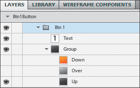
The button includes text and the artwork for each state of the button. You need to convert the Text object into a button label so that you can change the number on each instance of the button.
- Click the Text object in the Layers panel to select the text.
- In the Convert To Button Part section of the HUD, click Choose Part, and then select Label.
In the Layers panel, the text object changes to Label. Next, you need to define the appearance in each state of the button. To do this you will select each state and then show and hide artwork in the Layers panel.
- Make sure the Up state is selected in the Pages/States panel and the Up row is visible in the Layers panel.
- Select the Over state in the Pages/States panel. In the Layers panel, hide the Up row and show the Over row.
- Select the Down state, hide the Up row, and show the Down row.
- Select the Disabled state, hide the Up row, and show the Down (orange) row.
You’re using the orange Down button as the Disabled state so that you can disable a button in any state to make it appear selected (orange). You can disable a button in the Properties panel.
- Press Esc to exit Edit-In-Place mode.
The next step is to add additional instances of the button to the artboard.
- Open the Library panel and use the Preview window to locate the new button in the Components category. It will be called something like Btn1Button.
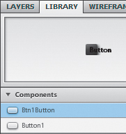
- Drag another instance of the button from the Library panel to the artboard and place it beside the first button.

The label will read “Button” until you define it in the Properties panel for each instance.
- In the Properties panel, enter 2 in the Label field.
- Repeat steps 16 and 17 to add and label buttons 3, 4, and 5.

- Use the alignment options or the arrow keys to fine-tune the position of the buttons.
- In the Pages/States panel, select the Design page.
Notice that you’ve only added the new buttons to the Feature page. That’s OK because you can quickly share the new buttons to every state.
- Change back to the Feature state, then drag to select all five navigation buttons in the artboard.
- With all five buttons selected, choose States > Share To State > All States.
Now all states include the five buttons.
- Choose Edit > Deselect All to deselect the five buttons.
Enable and disable buttons
Here’s a great trick. You’ve seen navigation buttons that appear different than the others when they’re selected. It’s a nice feature because it helps orient the user to where they are in the application.
Flash Catalyst Button components don’t have a “selected” state that indicates which button or page is currently selected. But you can use the Disabled state for this purpose.
- Make sure the Feature page is selected in the Pages/States panel.
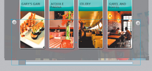
- Select the first navigation button. Then, in the Properties panel, deselect the Enabled property.

The button in the artboard turns orange because this is the look you defined in the Disabled state. Now when someone views page 1 (the Feature page), the button is orange to show them which page they’re on.

- In the Pages/States panel, change to the Design page. Select the second navigation button and use the Properties panel to disable it.
- Change to the Map page, select the third button, and disable it.
- Change to the Restaurants page, select the fourth button, and disable it.
- Change to the Future page, select the fifth button, and disable it.
- In the Layers panel, collapse and lock the Top Btns layer.
- If you zoomed in earlier, then zoom back out to see more of the artboard.
Create next and previous buttons
In the interactive banner application, the positions of the Back and Next buttons change from page to page. Because of this, you’ll need to make large and small versions of each button. The artwork for these buttons is included in the Back/Next Btns layer.
- Make sure you are still viewing the Future page, the last page. Unlock and expand the Back/Next Btns layer. Show the layers for all four Back/Next buttons.
You need to show the buttons so that you can select them.
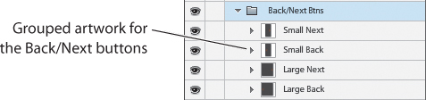
- Select the Small Next layer.
This includes the artwork for the smaller of the two Next buttons.
- In the HUD, convert the selected artwork to a Button component.
- In the HUD, click Up to edit the button in Edit-In-Place mode.
- In the Layers panel, expand the Small Next layer to see the artwork for this button. Hide the Orange layer in the Up state.
The button begins with a semitransparent arrow that turns orange when you roll over it.
- Exit Edit-In-Place mode.
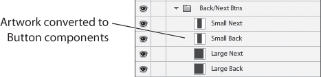
A new button replaces the artwork in the Layers panel.
- In the Layers panel, rename the new button Small Next.
- Repeat steps 2 through 7 for the other Back/Next buttons. After turning them into buttons, rename them Small Back, Large Next, and Large Back.
- In the Future page, use the Layers panel to show the Large Back button and hide the other Back/Next buttons.
The other four pages already have the correct buttons showing and hidden.
- Collapse and lock the Back/Next Btns layer.
Create a custom toggle button
Toggle buttons are typically used to trigger simple on/off functions. For example, you can use a toggle button to turn music on and off or play and stop a video. The interactive banner application requires a toggle button to play and stop the videos that you’ll add later to pages 4 and 5.
- In the Pages/States panel, select the Restaurants page.
- In the Layers panel, show, unlock, and expand the Video Toggle layer.
The artwork for the toggle button includes pause and play symbols and a semitransparent orange circle.
- Click the Video Toggle layer to select all the artwork for the toggle button.

- In the HUD, convert the artwork to a Toggle Button component and then click Up to edit the component in Edit-In-Place mode.
Toggle buttons have eight states that cannot be duplicated, added to, or deleted. There are two sets of Up, Over, Down, and Disabled states—one for when the button is in its initial state, and another for when the button is selected.

- In the Layers panel, expand the Video Toggle layer.
- Hide the Pause symbol in the Up, Over, and Down states.
- In the Disabled state, hide the Toggle Button layer so that the entire button is invisible when disabled.
- Hide the Play symbol in the Selected, Up, Selected, Over, and Selected, Down states.
- In the Selected Disabled state, hide the Video Toggle layer to make it invisible.
- Press Esc to exit Edit-In-Place mode.
The new button is visible on page 4, the Restaurants page.
- Select the Future page, the last page, and show the toggle button.
The toggle button needs to be moved a little to the right on this page. Objects, including components, can have their own unique set of properties in each state (including position), so moving the button here will not affect its position on the previous page.
- Drag the toggle button so that it’s centered in the photograph.
Tip
You can change the position of components in the artboard by using their X and Y coordinates in the Properties panel.

- Lock the Toggle Button row in the Layers panel.
Convert artwork to scroll bars
You can quickly turn your graphics into vertical and horizontal scroll bars of any size. You can use just about any artwork. The only rule is that you have to include a track and a thumb. The up, down, right, and left scroll buttons are optional. The parts of a scroll bar can be positioned anywhere, on or off the artboard.
- In the Pages/States panel, select the Feature page.
- In the Layers panel, unlock and expand the page1:Feature layer and its Panel Artwork group (if they’re not already expanded).
The Panel Artwork group includes the artwork for the lower design panel of this page, including the vertical scroll bar that you’ll use to scroll a block of text.
- In the Layers panel, Ctrl-click/Command-click to select the following four objects: Scroll Up Arrow, Scroll Down Arrow, Thumb, and Scroll Track.

- Use the HUD to convert the selected artwork to a Vertical Scrollbar component.
The Auto Change Warning message appears telling you that selected objects have interactions or effects attached. You’re getting this message because the objects are present in more than one state so Flash Catalyst added some default transitions between states.
- Click OK to continue.
A message in the HUD reminds you that to make the scroll bar work correctly, you need to assign its parts. Flash Catalyst needs to know which artwork to use as the thumb and the track.

- Click Edit Parts in the HUD to edit the scroll bar in Edit-In-Place mode.
- Select the artwork for the Thumb (thin vertical orange rectangle).

- In the Convert To Vertical Scrollbar Part section in the HUD, click Choose Part, and then select Thumb.
- Select the artwork for the Scroll Track (thin vertical black rectangle).
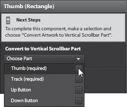
- In the HUD, click Choose Part, and then select Track.
The message in the HUD goes away. You have defined all of the required parts (track and thumb) for a Scrollbar component.
- Select the artwork for the Scroll Up Arrow (top orange triangle). Using the HUD, convert this part to the Up button. Convert the Scroll Down Arrow (bottom orange triangle) to the Down button.
- Drag the Up and Down buttons away from the track and the thumb.
You can position the parts of a Scrollbar component anywhere you want.
- Run the project and test the scroll bar by dragging its thumb and clicking the up and down arrows. Also, try clicking and holding the up and down arrows.
- Close the browser window and return to Flash Catalyst.
- Select the Up and Down buttons (orange triangles). Use the Delete icon in the Layers panel to remove them from all states.
This scroll bar looks better without the Up and Down buttons.
- Press Esc to exit Edit-In-Place mode.
You can set properties to control the distance that content scrolls when using the scroll bar. When a scroll bar is selected, these properties appear in the Properties panel.
Page Size controls how far the thumb moves in a scroll bar when clicking in the track.
Step Size controls how far the thumb moves when clicking the arrows. In a slider, Step Size controls how far the thumb moves when pressing the arrow keys.
Snap Interval forces the thumb in a scroll bar to snap in increments rather than moving smoothly. Page Size and Step Size are always forced to be multiples of the Snap Interval.
Can I make a scroll bar with no track or thumb?
Technically, every Scrollbar component must have a track and a thumb. But suppose you want a pair of buttons (up and down or left and right) that scroll a range of content without the use of a track and a thumb.
Fortunately, you can place the parts of a scroll bar anywhere you want. As long as the scroll bar includes a track and a thumb, it will work.
- Create a scroll bar with a track, a thumb, and buttons (up/down or left/right). Edit the Scrollbar component in Edit-In-Place mode.
- Drag the track and thumb parts below or to the side of the artboard, so they are not visible to the user.
- Position your scroll buttons where you want them in the artboard.
When you run the project, this creates the illusion of a scroll bar with no track and no thumb.
Work with text
Flash Catalyst includes a tool for adding text. This is mainly intended for creating labels or short blocks of text. Flash Catalyst is not the best place to generate large amounts of copy. A better workflow is to write and edit your copy in another application, such as Microsoft Word, and then copy and paste the spell-checked, edited, and approved copy into your Flash Catalyst design.
- Make sure the Feature page is still selected.
- Select the Temporary Text object in the Panel Artwork group of the page1:Feature layer.
This is just placeholder text.

- Use the Delete icon () in the Layers panel to remove the temporary text from all states.
- Select the Text tool in the Tools panel, and drag to create a text box in the empty area to the left of the vertical scroll bar (where you deleted the temporary text). Make it large enough so that it extends below the artboard.
You are extending the text box below the artboard because you’re going to create a scrolling panel of text. The text box needs to be large enough for the scrolling text. It doesn’t have to be exact, because you can resize it later.

- The new text box includes a flashing insertion point. Type some text in the new text box.
As you type, the text is constrained to the text box. The default text properties are a little hard to see over the dark background, but you’ll fix that in a minute.
- Choose File > Save to save your project, and keep it open.
- Minimize or hide the Flash Catalyst window. Open the panel_text.txt file in the Lesson06 folder. You can use any word processor to open the text file.
- Select and copy the block of text that begins with “What do architectural landmarks...” and ends with “...bicycle tour of Meridien.”
- Change back to the Flash Catalyst window.
- Drag to highlight the text you added in the text box. Press Delete to remove the text but not the text box. If you accidentally delete the entire text box, then create a new one.
The flashing insertion point should be in the top-left of the text box.
- Choose Edit > Paste to paste the text you copied from the text document.
When you paste text from another application, any formatting is lost. If there is too much text to fit in the text box you drew, you can resize it. Use the Select tool to drag the text box selection handles.
- Using the Text tool, select the pasted text, and then use the Properties panel to format the text. Make it white and choose any other formatting that you prefer.
The text should still extend below the artboard. In the next exercise, you will create a scrolling panel to display the text.

- In the Layers panel, drag the new Text object into the Panel Artwork group and place it just above the Vertical Scrollbar.

Create a scroll panel from artwork
A common challenge in web design is finding space in the available window to display all the necessary content. One solution is to create scrolling panels. A panel creates a well-defined container for content in the user interface. By adding scrolling content and a scroll bar, you can place a large amount of information in a limited space. To create a scroll panel component in Flash Catalyst, you need:
• An object that will scroll, such as a long block of text or a series of images
• A scroll bar for scrolling the content
• An object to define the panel area, such as a rectangle shape (optional)
Note
You can create a scroll panel without a scroll bar, but it’s useless unless users can scroll to see the hidden content.
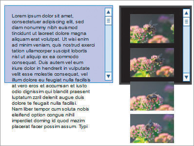
- In the Layers panel, select the Text and Vertical Scrollbar objects.
By selecting the objects in the Layers panel, you are able to select the two parts of the scroll panel without selecting any of the other artwork in the artboard.

- In the HUD, convert the selected artwork to a Scroll Panel component.
The Auto Change Warning message appears telling you that selected objects have interactions or effects attached. You’re getting this message because the objects are present in more than one state so Flash Catalyst added some default transitions between states. If you don’t get the Auto Change Warning message, then you can skip step 3 below.
- Click OK to continue.
A message in the HUD informs you that to make the scroll panel work correctly, you need to assign its required parts.

- In the HUD, click Edit parts.
- Select Text in the Layers panel. In the HUD, click Choose Part, and then select Scrolling Content.
In the artboard, the text block changes to a scrolling content part. The bounding box of the text is sized to match the scroll bar. You can use the selection handles to resize the scrolling text.
- If necessary, size and position the scrolling text box so that it fits within the blank space to the left of the vertical scroll bar.

- Press Esc to exit Edit-In-Place mode and run the project to test the scroll panel. Use the vertical scroll bar to move the text up and down.

- Close the browser and return to Flash Catalyst.
Creating custom components
To create a custom component, you select the objects that you want to appear in the various states, and then choose the Custom/Generic Component option in the HUD. There are no required parts in a custom component, and they can include images, drawings, text, grouped objects, and other components.
Embedding or nesting a component within another component is a good way to create additional views in the same page.
Sometimes, you’ll have components with only one state. By combining several objects into a single component, they can be manipulated as a single element. For example, you can apply global properties such as opacity and rotation, or create a transition that begins with a panel of objects offscreen and then have it slide into view.
- Choose Edit > Deselect All to make sure nothing is selected in the artboard.
- In the Layers panel, make sure the page1:Feature layer is expanded, and click Panel Artwork to select every object in the group.
This group includes all the artwork for the lower design panel on the Feature page. This includes the orange text, Featured Article button, scroll panel, white lines, and semitransparent background.
- In the HUD, convert the selected artwork to a Custom/Generic Component.
In the Layers panel, the Panel Artwork group is now a single component object.
- In the Layers panel, rename the new component Feature Panel.

- In the HUD, click State 1 to edit the new component in Edit-In-Place mode.
The new custom component has only one state, as seen in the Pages/States panel. Custom components begin with all artwork on a single state, but you can duplicate or add up to 20 states, and then modify them as needed.
- Press Esc to exit Edit-In-Place mode.
- In the artboard, drag the Feature Panel component to the space below the artboard.
By making this into a custom component, you can manipulate it as a single object.

- Click Edit > Undo to return the panel to its original position (aligned bottom left).
- Collapse and lock the page1:Feature layer.
Adding interactivity
Interactions are events that occur in response to a user action, such as the click of a button. Flash Catalyst has many built-in interactions that you can quickly add to components or grouped objects. These include:
• Play a transition from one page or component state to another
• Trigger an action sequence, such as playing a sound, moving an object, or playing an animation
• Go to a URL
• Play, pause, or stop a video clip
Events used to trigger an interaction include:
• On Click
• On Mouse Down
• On Mouse Up
• On Roll Out
• On Roll Over
To add interactions you must either create a component or group the artwork. Use groups to hold interactions when you don’t need a reusable component.
Add page navigation
Adding page navigation is easy. First you’ll need an object that will be used to hold the interaction. This can be any component or grouped artwork, but it’s usually a button you’ve designed specifically for navigation. Select the navigation object, and then add interactions that transition from one state to another when an event occurs. Interactions are added in the Interactions panel.
- In the Layers panel, unlock the Top Btns layer.
- In the artboard, click to select the first button, labeled 1.
This button will transition the application to the Feature page.
- In the Interactions panel, click Add Interaction.
On Click and Play Transition To State are already selected.
- Click Choose State, and then select Feature.
This button has the same behavior in every state. Its default setting is When In Any State.
- Click OK.
A new interaction is added to the panel. When the button is clicked, the application will transition to the Feature state.
- In the artboard, click to select the second button, labeled 2.
- Add an On Click interaction that transitions to the Design state.
- Select button 3. Add an On Click interaction that transitions to the Map state.
- Select button 4. Add an On Click interaction that transitions to the Restaurants state.
- Select button 5. Add an On Click interaction that transitions to the Future state.
- Run the project and test the top navigation buttons.
- Close the browser window and return to Flash Catalyst.
- Lock the Top Btns layer.
Create conditional interactions
Conditional interactions are behaviors predicated upon some condition. For example, clicking a Next button takes the user viewing page 1 to page 2, and the user viewing page 2 to page 3. Conditional interactions are added just like any other interaction. The only difference is that you change the conditional setting from When In Any State to something more specific.
- Unlock and expand the Back/Next Btns layer.
- In the Pages/States panel, select the Feature page (the first page).
The Large Next button is visible on this page only and navigates to the Design page.
- Select the Large Next button.
- In the Interactions panel, click Add Interaction.
- Click Choose State, and then select Design.
- Click When In Any State, and then select Feature.
- Click OK.
This is a conditional interaction. When someone clicks the button while in the Feature state, the application transitions to the Design page. This button is only present in the Feature page, so it only needs one interaction.

- Change to the Design page and select the Small Next button.
The Small Next button is visible on the Design, Map, and Restaurants pages. It needs to perform differently in each state.
- Add an On Click interaction that transitions to the Map state when in the Design state.

- With the Small Next button still selected, add another On Click interaction that transitions to the Restaurants state when in the Map state.
- Add a third On Click interaction that transitions to the Future state when in the Restaurants state.
The Small Next button now includes three conditional interactions.
- In the Layers panel, select the Small Back button.
- Add an On Click interaction that transitions to the Feature state when in the Design state.
- Add an On Click interaction that transitions to the Design state when in the Map state.
- Add an On Click interaction that transitions to the Map state when in the Restaurants state.
The Small Back button now includes three conditional interactions.

- Change to the Future page (the last page) and select the Large Back button.
This button is only visible in the Future page.
- Add an On Click interaction that transitions to the Restaurants state when in the Future state.
- Run the project and test the Back/Next buttons on each page.
The same buttons perform differently, depending on which page you’re viewing.
- Close the browser window and return to Flash Catalyst.
- Collapse and lock the Back/Next Btns layer.
You can add conditional interactions to a data list that trigger an action when someone selects a specific item in the list. The list can include images or text. Conditional list interactions are similar to other interactions. The difference is that the conditional setting, When In Any State, becomes When Any Item Is Selected or When A Specific Item Is Selected. If you choose When A Specific Item Is Selected, you enter the number of the item in the list as the condition for the interaction.
Link to external content
Navigation isn’t limited to the current application. You can also add interactions that open external content.
The interactive banner application includes links on each page that point to additional external information, such as an article or an interactive restaurant guide.
- In the Pages/States panel, select the Feature page.
- In the Layers panel, unlock the page1:Feature layer.
- In the artboard, double-click the Feature panel at the bottom of the artboard to edit the custom component in Edit-In-Place mode.
- In the Layers panel, expand the Panel Artwork group and select the Button object.
This selects the button you created earlier.

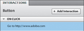
- In the Interactions panel, click Add Interaction.
- Click Play Transition To State to open the menu, and choose Go To URL.
A field appears below the Go To URL interaction. This is where you add the URL.
- Click in the empty field and type www.adobe.com (or a different URL of your choice).
- Click Open In Current Window, and then select Open In New Window.

- Click OK.
This button now links to the URL you entered.
- Press Esc to exit Edit-In-Place mode and run the project.
- In the browser window, test the link by clicking the button.
The URL you entered opens in a new browser window.
- Close the browser and return to Flash Catalyst.
- Save and close the project.
On application start interactions
Not all interactions are initiated by user events such as clicking a button. You can also include interactions that happen automatically when the application starts.
For example, you may want a video or SWF movie to begin playing automatically. Or, you can define a default page state by creating an On Application Start interaction that goes to a specific state when the application opens.

On Application Start interactions are added in the Interactions panel. Make sure nothing is selected in the artboard, and click Add Interaction. When nothing is selected in the artboard, the event is set to On Application Start. It’s the only option available.
Review questions
1 What is the difference between the built-in wireframe components and the built-in component options in the HUD?
2 What happens to a wireframe component after it has been edited in Edit-In-Place mode?
3 What are the required parts in a Flash Catalyst Scrollbar component?
4 What is the best type of component for collecting answers to yes or no questions?
5 How can the Disabled button state and the Enabled button property be used together to help orient users to which page or state is currently selected?
6 What types of objects can be used to trigger an interaction?
Review answers
1 The wireframe components are ready to use “as is” and include a generic skin or appearance. The built-in components in the HUD require that you provide the artwork for the new component.
2 When you edit a wireframe component in Edit-In-Place mode, the component becomes a new skin in the Library panel. The component can no longer be sized using the Properties panel.
3 A Flash Catalyst Scrollbar component must have a track and a thumb. The up, down, left, and right buttons are optional.
4 Radio buttons are best for presenting choices that are mutually exclusive. The user must choose only one option.
5 When a button is used to navigate to a specific state, you can format the button’s Disabled state to appear selected or highlighted, and then disable the button in the target state.
6 Interactions can be added to components or grouped artwork. You can also create On Application Start interactions that occur automatically when someone starts the application.
7 Conditional interactions are behaviors predicated upon some condition. For example, clicking a Next button takes the user viewing page 1 to page 2, and the user viewing page 2 to page 3. Conditional interactions are added just like any other interaction. The only difference is that you change the conditional setting from When In Any State to something more specific.