
11. Adding Interactivity
This lesson will take about 60 minutes to complete. Before beginning, make sure you have copied the files for Lesson 11 to your hard drive as described in the “Getting Started” section at the beginning of the book. If you are starting from scratch in this lesson, use the method described in the “Jumpstart” section of “Getting Started.”
Dreamweaver can create sophisticated interactive effects with behaviors and Accordion panels using Adobe’s Spry framework.
Learning about Dreamweaver behaviors
A Dreamweaver behavior is JavaScript code that performs an action—such as opening a browser window or showing or hiding a page element—when it is triggered by an event, such as a mouse click. Applying a behavior is a three-step process:
1. Create or select the page element that you want to trigger the behavior.
2. Choose the behavior to apply.
3. Specify the settings or parameters of the behavior.
The triggering element often involves a hyperlink applied to a range of text or to an image. In some cases, the behavior is not intended to load a new page, so it will employ a dummy link enabled by the hash (#) sign, similar to ones you used in Lesson 10, “Working with Navigation.” The Spry Swap Image behavior you will use in this lesson does not require a link to function, but keep this in mind when you work with other behaviors.
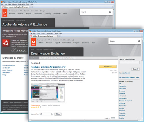
Dreamweaver offers more than 20 built-in behaviors, all accessed from the Tag Inspector panel (Window > Tag Inspector). Hundreds of other useful behaviors can be downloaded from the Internet for free or a small fee. Many are available from the online Dreamweaver Exchange, which you can access by clicking the Add Behavior ( ) icon in the Tag Inspector and choosing Get More Behaviors from the pop-up menu. When the Adobe Marketplace & Exchange site loads in the browser, click the link to Dreamweaver for a full list of plug-ins and behaviors.
Note
To access the Behaviors panel and menu you must have a file open.
The Adobe Marketplace and Exchange offers tons of resources for web designers and developers, including both free and paid add-ons to Dreamweaver and other Creative Suite applications.
The following is some of the functionality available to you using the built-in Dreamweaver behaviors:
• Opening a browser window
• Swapping one image for another to create what is called a rollover effect
• Fading images or page areas in and out
• Growing or shrinking graphics
• Displaying pop-up messages
• Changing the text or other HTML content within a given area
• Showing or hiding sections of the page
• Calling a custom-defined JavaScript function
Not all behaviors are available all the time. Certain behaviors become available only in the presence, and selection, of certain page elements, such as images or links. For example, you can’t use the Swap Image behavior unless an image is present.
Each behavior invokes its own unique dialog box that provides relevant options and specifications. For instance, the dialog box for the Open Browser Window behavior enables you to open a new browser window, set its width, height, and other attributes, and set the URL of the displayed resource. After the behavior is defined, it is listed in the Tag Inspector with its chosen triggering action. As with other behaviors, these specifications can be modified at any time.
Behaviors are extremely flexible, and multiple behaviors can be applied to the same trigger. For example, you could swap one image for another and change the text of the accompanying image caption, and do it all with one click. While effects appear to happen simultaneously, behaviors are actually triggered in sequence. When multiple behaviors are applied, you can choose the order in which the behaviors are processed.
Previewing a completed file
In the first part of the lesson, you’ll create a new page for GreenStart’s travel services. Let’s preview the completed page in the browser.
1 Launch Adobe Dreamweaver CS5.
2 If necessary, press F8 to open the Files panel and choose DW-CIB from the site list.
3 In the Files panel, expand the lesson11 folder. Right-click travel_finished.html, choose Preview In Browser from the context menu, and select your primary browser.
The page includes Dreamweaver behaviors.
4 If Microsoft Internet Explorer is your primary browser, a message may appear above the browser window indicating that JavaScript is prevented from running. If so, click Allow Blocked Content.

5 Position the cursor over the heading Venice: City of Canals. Observe the image to the right of the text.
The existing image swaps for one of Venice.
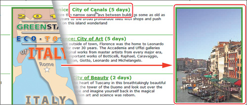
6 Move the pointer to the heading Florence: City of Art. Observe the image to the right of the text.
As the pointer moves off the heading, the image swaps back to the Eco-Tour ad until it hovers over the Florence heading. Then, the ad image swaps for one of Florence.
7 Pass the pointer over each of the headings and observe the image behavior.
The image alternates between the Eco-Tour ad and images of each of the cities. This effect is the Swap Image behavior.
8 When you’re finished, close the browser window and return to Dreamweaver.
In the next exercise, you will learn how to work with Dreamweaver behaviors.
Working with Dreamweaver behaviors
Adding Dreamweaver behaviors to your layout is a simple point-and-click operation. The travel page has not been created yet.
1 Open the Assets panel and click the Template category icon. Right-click mygreen_temp and choose New From Template from the context menu.
Note
Alternative instructions—If you are starting from scratch in this exercise, see the “Jumpstart” instructions in the “Getting Started” section at the beginning of the book. Then, follow the steps in this exercise.
A new document window opens based on the template.
2 Save the new document as travel.html.
3 Double-click the image placeholder in the sidebar. Navigate to the site images folder. Select train.jpg and click OK/Choose.
The train image appears in the sidebar.
4 In the Property inspector Alt field, enter Steam locomotives are not very green and click OK.
Note
The Image Tag Accessibility Attributes dialog box doesn’t appear when you insert an image this way. To add Alt text to this image, use the Alt field in the Property inspector.
5 Open the Files panel and expand the lesson11 > resources folder. Double-click the travel-caption.txt file.
The caption text opens in Dreamweaver.
6 Press Ctrl-A/Cmd-A to select all the text. Press Ctrl-C/Cmd-C to copy the text. Close travel-caption.txt.
7 Select the caption placeholder in the sidebar. Press Ctrl-V/Cmd-V to paste the new caption text.

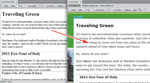
8 In the Files panel, double-click travel-text.html.
The travel-text.html file contains a table and text for the travel page. Note that the text and table are unformatted.
9 In Design view, press Ctrl-A/Cmd-A to select all the text. Press Ctrl-C/Cmd-C to copy the content. Close travel-text.html.
10 Insert the cursor in the main heading placeholder Add main heading here in travel.html. Select the <h1> tag selector. Hold Shift and click at the end of the text Add content here to select all the placeholder text in MainContent. Press Ctrl-V/Cmd-V to paste.
The content from travel-text.html appears. It assumes the default formatting for text and tables applied by the style sheet you created in Lesson 8, “Working with Text, Lists, and Tables.”
Let’s insert the Eco-Tour ad, which will be the base image for the Swap Image behavior.
11 Double-click the image placeholder. Navigate to the site images folder and select ecotour.jpg. Click OK/Choose.
The placeholder is replaced by the Eco-Tour ad. But before you can apply the Swap Image behavior, you have to identify the image you want to swap. You do this by giving the image an ID.

12 If necessary, select ecotour.jpg in the layout. Select the existing ID Travel in the Property inspector. Type ecotour and press Enter/Return.

Tip
Although it takes more time, it’s a good practice to give all your images unique IDs.
13 Save the file.
Next, you will create a Swap Image behavior for ecotour.jpg.
Applying a behavior
As described earlier, many behaviors are context sensitive, based on the elements or structure present. A Swap Image behavior can be applied to any document text element.
1 Choose Window > Behaviors to open the Tag Inspector.
Note
Users of previous versions of Dreamweaver may be looking for the Behaviors panel. It’s now called the Tag Inspector.
2 Insert the cursor in the Venice: City of Canals text and select the <h3> tag selector.
3 Click the Add Behavior icon. Choose Swap Image from the behavior list.
The Swap Image dialog box appears, listing any images on the page that are available for this behavior. This behavior can replace one or more of these images at a time.
4 Select the item image "ecotour.jpg" and click Browse.
5 In the Select Image Source dialog box, select venice.jpg from the site images folder. Click OK/Choose.
6 In the Swap Image dialog box, select the Preload Images option, if necessary, and click OK.

Note
The Preload Images option forces the browser to download all images necessary for the behavior before the page loads. That way, when the user clicks the trigger, the image swap will occur without any lags or glitches.
A Swap Image behavior is added to the Tag panel with an attribute of onMouseOver. Attributes can be changed, if desired, using the Tag Inspector.
7 Click the attribute onMouseOver to open the pop-up menu and examine the options.
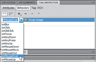
The menu provides a list of trigger events, most of which are self-explanatory.
8 Choose onMouseOver.
9 Save the file and click Live View to test the behavior. Position the cursor over the Venice: City of Canals text.
When the cursor passes over the text, the Eco-Tour ad is replaced by the image of Venice. But there is a small problem. When the cursor moves away from the text, the original image doesn’t return. That’s because you didn’t tell it to. To bring back the original image you have to add another command—Swap Image Restore—to the same element.
Applying a Swap Image Restore behavior
In some instances, a specific action requires more than one behavior. To bring back the Eco-Tour ad once the mouse moves off the trigger, you have to add a restore function.
1 Return to Design view. Insert the cursor in the Venice: City of Canals text and examine the Tag Inspector.
The inspector displays the currently assigned behavior. You don’t need to select the element completely; Dreamweaver assumes you want to modify the entire trigger.
2 Click the Add Behavior icon and choose Swap Image Restore from the pop-up menu. Click OK in the Swap Image Restore dialog box to complete the swap.

The Swap Image Restore behavior appears in the Tag Inspector with an attribute of onMouseOut.

3 Switch to Code view and examine the markup for the Venice: City of Canals text.
The trigger events—onMouseOver and onMouseOut—were added as attributes to the <h3> element. The rest of the JavaScript code was inserted in the document’s <head> section.
4 Save the file and click Live View to test the behavior. Test the text trigger Venice: City of Canals.
When the pointer passes over the text, the Eco-Tour image is replaced by the one of Venice and then reappears when the pointer is withdrawn. The behavior functions as desired, but there’s nothing visibly “different” about the text to indicate that something magical will happen if the user rolls the pointer over the heading. Since most Internet users are familiar with the interactivity provided by hyperlinks, applying a link placeholder on the heading will encourage the visitor to explore the effect.
Removing applied behaviors
Before you can apply a behavior to a hyperlink, you need to remove the current Swap Image and Swap Image Restore behaviors.
1 Open the Tag Inspector, if necessary. Insert the cursor in the Venice: City of Canals text.
The Tag Inspector displays the two applied events. It doesn’t matter which one you delete first.
2 Select the Swap Image event. In the Tag Inspector, click the Remove Event ( ) icon. Select the Swap Image Restore event. In the Tag Inspector, click the Remove Event icon.
Both events are removed. Dreamweaver will also remove any unneeded JavaScript code.
3 Save the file and check the text in Live View again.
The text no longer triggers the Swap Image behavior. To apply behaviors to a link, you first have to add a link or link placeholder to the heading.
Adding behaviors to hyperlinks
Behaviors can be added to hyperlinks, even if they don’t load a new document.
1 Select the Venice: City of Canals text. In the Property inspector Link field, type # and press Enter/Return to create the link placeholder.
2 Insert the cursor in the link. In the Tag Inspector, click the Add Behavior icon and choose Swap Image from the pop-up menu.
As long as the cursor is still inserted anywhere in the link, the behavior will be applied to the entire link markup.
3 In the Swap Image dialog box, select the item image "ecotour.jpg". Browse and select venice.jpg from the site images folder. Click OK/Choose.
4 In the Swap Image dialog box, select the Preload Images and Restore Images onMouseOut options, and click OK.
The Swap Image event appears in the Tag Inspector along with a Swap Image Restore event. Since the behavior was applied all at once, Dreamweaver provides the restore functionality as a productivity enhancement.

5 Select and apply a link (#) placeholder to the Florence: City of Art text.
Apply the Swap Image behavior to the link.
Select the image florence.jpg from the site images folder.
6 Repeat step 5 for the Sienna: City of Beauty text.
Select the image sienna.jpg.
7 Repeat step 5 for the Rome: City of Magic text.
Select the image rome.jpg.
The link appearance doesn’t match the site color scheme. Let’s create a custom CSS rule to format it.
8 Insert the cursor in any of the rollover links. Select the .content h3 rule in the mygreen_styles.css style sheet. In the CSS Styles panel, click the New CSS Rule icon.
9 In the rule Name field, enter .content h3 a.
In the Type category Color field, enter #090.
Click OK.
10 Save the file and test the behaviors in Live View.
The Swap Image behavior works successfully on all links.
11 Close travel.html.
Besides eye-catching effects, Dreamweaver also provides structural components that conserve space and add more interactive flair to your website.
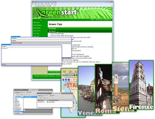
Working with Spry Accordion widgets
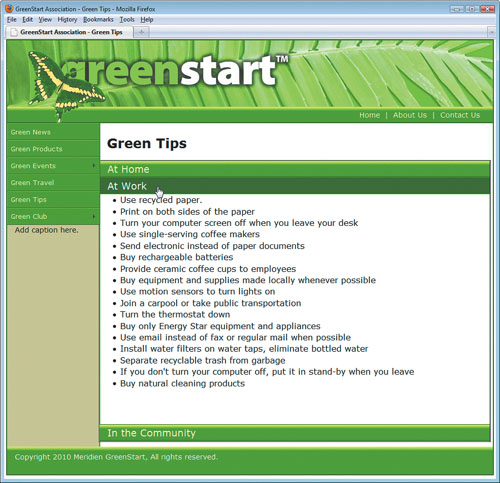
The Spry Accordion widget allows you to organize a lot of content into a compact space. In the Accordion widget, the tabs are stacked and when open, they expand vertically rather than side by side. When you click a tab, the panel slides open with a smooth action. The panels are set to a specific height and if the content is taller or wider than the panel itself, scroll bars appear automatically. Let’s preview the completed layout.
1 In the Files panel, select tips_finished.html from the lesson11 folder and preview it in your primary browser.
The page content is divided among the three panels in the Spry Accordion widget.
2 Click each panel in turn to open and close them.
3 Close your browser and return to Dreamweaver.
Inserting a Spry Accordion widget
In this exercise, you’ll incorporate a Spry Accordion widget into your layout.
1 Open tips.html.
Note
If you are starting from scratch in this exercise, see the “Jumpstart” instructions in the “Getting Started” section at the beginning of the book. Then, follow the steps in this exercise.
2 Insert the cursor into the heading At Home and select the <h2> tag selector.
Press Delete.
3 Insert the cursor in the first bullet Wash clothes in cold water and select the <ul> tag selector. Press Ctrl-X/Cmd-X to cut the whole list.
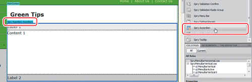
4 Insert the cursor at the end of the heading Green Tips and press Enter/Return to insert a new paragraph.
5 In the Insert panel Spry category, click the Spry Accordion button.
Dreamweaver inserts the Spry Accordion widget element. The initial element is a two-panel Accordion widget that appears with the top panel open. Like the Spry menu bar, a blue tab entitled Spry Accordion: Accordion1 appears above the new object.
6 Select the placeholder text Label 1 and type At Home to replace the text.
7 Select the text Content 1 in the top Accordion widget panel. Press Ctrl-V/Cmd-V to paste the bulleted list.
In Design view, you may see only part of the content you added because scrolling isn’t active in Design view.
8 To see or edit all the content, double-click the panel, or right-click the tab and choose Element View > Full from the context menu.

9 Delete the heading At Work. Select and cut the subsequent <ul> element containing the “Work” tips.
10 Position the cursor over the bar displaying the text Label 2. Click the eye ( ) icon to open panel 2, if necessary.
11 Select the text Label 2 and type At Work.
12 Select the text Content 2 and paste the <ul> element.
Two of the panels are complete, but you need to insert a new panel to complete the Spry Accordion widget.
Adding additional panels
You can add panels or remove panels from the Spry Accordion widget using the Property inspector.
1 Select the blue tab above Accordion1 in the document window.
The Property inspector displays settings for the Accordion widget.
2 In the Property inspector, click the Add Panel icon.
A new panel is added to the Accordion widget.

3 In the document window, delete the heading In the Community. Select and cut the subsequent <ul> element containing the “Community” tips.
4 Change the text Label 3 to read In the Community and paste the bulleted text into the new content area.
5 Save the file and click OK in any additional dialog boxes.
You created a Spry Accordion and added content and additional panels. Although the content added in this exercise was already on the page, you can enter and edit content directly in the Content panels, if desired. You could also copy material from other sources, such as Microsoft Word, TextEdit, and Notepad, among others. In the next exercise, you’ll customize the CSS for the Spry Accordion.
Customizing a Spry Accordion
Like other widgets, Spry Accordion widgets are formatted by their own CSS file. In this exercise, you will modify the component and adapt its color scheme to the website. Let’s track down the rules that format the horizontal tabs.
1 Insert the cursor into the tab label At Home and examine the names and order of the tag selectors.
The tabs are formatted by the .AccordionPanelTab class.
2 In the CSS Styles panel, expand the SpryAccordion.css style sheet.
Double-click .AccordionPanelTab to edit it.
3 In the Type category, in the Font-size field, enter 120%.
In the Color field, enter #FFC.
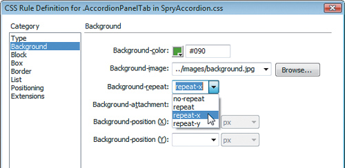
4 In the Background category, change the Background-color to #090.
In the Background-image field, browse and select background.jpg.
In the Background-repeat field, choose repeat-x.
5 In the Box category Left Padding field only, enter 15px.
6 In the Border category, change the Top Border Color to #060.
Change the Bottom Border Color to #090.
Click OK.
7 Save all files and preview the document in Live view. Test and examine the Accordion behavior.
The horizontal tabs display a hover behavior. The text turns gray, which doesn’t look good with the background color.
8 Return to Design view. Examine the Accordion style sheet to find the rule that applies a hover behavior.
Two rules apply a hover effect. One applies when the panel is closed (.AccordionPanelTabHover) and one when it is open (.AccordionPanelOpen .AccordionPanelTabHover).
9 Double-click .AccordionPanelTabHover.
In the Type category, change the Color field to #FFC.
In the Background category, apply a Background-color of #060.
In the Background-image field, choose none.
Click OK.
10 Repeat step 9 with the .AccordionPanelOpen .AccordionPanelTabHover rule.
Note the two rules at the bottom of the Accordion style sheet containing the word focused, which is a hyperlink behavior identical to hover, except that it’s activated when the visitor uses the Tab key or arrow keys instead of the mouse to navigate around the page. These rules may interfere with your hover formatting, so it’s a good idea to give them the same settings, too.
11 Repeat step 9 with the .AccordionFocused .AccordionPanelTab and .AccordionFocused .AccordionPanelOpen .AccordionPanelTab rules.
When open, the panels are not tall enough to display all the bullets at once. You can adjust the height of the panels within the CSS, too.
12 Insert the cursor into the bullet list and examine the names and order of the tag selectors.
The panel content region is formatted by the .AccordionPanelContent class.
13 Select the .AccordionPanelContent rule in the CSS Styles panel. In the panel Property section, change the Height value to 450px.
The new height setting allows most of the content to be visible.
14 Save all files and test the document in the default browser.
You’ve successfully applied formatting for the Accordion widget to match the website color scheme and adjusted the component height to allow more content to display. The Spry components allow you to add large amounts of content in a compact and stylish package.
Review questions
1 What is a benefit of using Dreamweaver behaviors?
2 What three steps must be used to create a Dreamweaver behavior?
3 What’s the purpose of assigning an ID to an image before applying a behavior?
4 What does a Spry Accordion widget do?
5 How do you add new panels to a Spry Accordion widget?
Review answers
1 Dreamweaver behaviors add interactive functionality to a web page quickly and easily.
2 To create a Dreamweaver behavior, you need to create or select a trigger element, select a desired behavior, and specify the parameters.
3 The ID makes it easier to select the specific image during the process of applying a behavior.
4 A Spry Accordion includes two or more collapsible panels that hide and reveal content in a compact area of the page.
5 Select the panel in the document window and click the Add Panel icon in the Spry interface of the Property inspector.