
Lesson 9. Breaking the Application into Components
You have used many components while building the application to its current state. Every time you use an MXML tag, you are using a component. In fact, Flex is considered to be a component-based development model. In this lesson you’ll learn how to create your own components. The custom components you build will either extend functionality of the components that the Flex SDK provides or group functionality of several of those components together.
Up to this point, you did not have a way to divide your application into different files. The application file would continue to get longer and longer and become more difficult to build, debug, and maintain. It would also be very difficult for a team to work on one large application page. Components let you divide the application into modules, which you can develop and maintain separately. With careful planning, these components can become a reusable suite of application functionality.

A simple component
You will learn two things in this lesson. The first is how to build components. You will learn the syntax and rules for creating and using custom components. Second, you will learn why you’d want to do this and how components can affect your overall application architecture. The “Introducing MXML Components” section provides an overview of how to build components. In the tasks throughout this lesson, you will reinforce your component-building skills and continue to learn more and more details about building custom components. You’ll start with a theoretical discussion of why you would want to use components. The rest of the lesson will use an architectural approach to implementing components.
Introducing MXML Components
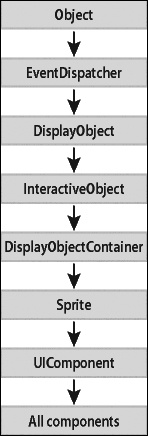
All Flex components and all the components you will build are ActionScript classes. The base class for the visual components you have been using and the MXML components you will build in this lesson is UIComponent. In a hierarchy of components, UIComponent is at the top, and all the other components inherit from it.
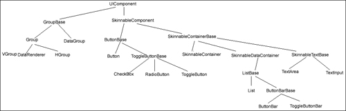
These classes fall into general groupings based on their functionality, such as component, manager, and data service classes. In fact, UIComponent has itself inherited from a set of classes that provide functionality, such as event dispatching, interactivity, containment of other objects, and so on.
Note
You can examine a complete description of the class hierarchy in the Flex ActionScript and MXML API reference, referred to as ASDoc.
Understanding the Basics of How to Create a Custom Component
When you build your own component, you basically want to do one of two things: add functionality to a predefined component, or group numerous components together.
The basic steps to build a component are as follows:
- Create a new file with the filename you want for your component. (You don’t need to actually do this; just follow along with the logic.) Because you’re building a class, the name should start with an uppercase letter. Also, remember that these names will be case sensitive, like Flex in general.
- Make the first line of code the XML document-type definition you have been using for the main application files.
<?xml version="1.0" encoding="utf-8"?>
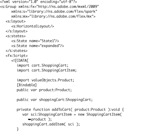
- As the first MXML tag, insert the root tag of your component, which will reflect what you want to do in the component. If it is a container, you most likely want to group several components’ functionality into one easier-to-use component. If it is not a container, you most likely want to extend the functionality of a predefined component or further extend the functionality of a custom component. Either way, you will need to define in your root tag the namespaces that will be used in your component.
<s:Group xmlns:fx="http://ns.adobe.com/mxml/2009"
xmlns:s="library://ns.adobe.com/flex/spark"
xmlns:mx="library://ns.adobe.com/flex/mx" >
</s:Group> - In the body of the component, add the functionality needed. This will vary depending on what functionality you want the component to provide.
- In the file that will instantiate the component, add an XML namespace so you can access the component. It is considered a best practice to group components in subdirectories according to their purpose. For instance, you will create a directory called views. Later in this lesson, you will add a namespace, using the word views as the prefix, to have access to all the custom components in the views directory. The statement will appear as follows:
xmlns:views="views.*"
- Instantiate the component as you would a predefined component. For instance, if you created a file component called UserForm.mxml, you would instantiate that component using the namespace just created, as follows:
<views:UserForm/>
Creating a Custom Component Step by Step
Now that you know the general approach to building a component, here is a simple example of adding functionality to a predefined component. Assume that you want to build a List that will automatically display three grocery categories. Your component will use <s:List> as its root tag. Until now, all the MXML pages you’ve built use the <s:Application> tag as the root tag. Components cannot use the <s:Application> tag as the root tag because it can be used only once per application. Here are six steps for creating a simple component. Of course, using Flash Builder further simplifies the process by presenting a dialog to help you build a template of your component.
- Create a file named MyList.mxml. (You don’t need to actually do this; just follow along with the logic.)
- The first line of the component will be the standard XML document declaration.
<?xml version="1.0" encoding="utf-8"?>
- Because you are extending the functionality of the
<s:List>, you will use it as the root tag. Your skeleton component will appear as follows:
<?xml version="1.0" encoding="utf-8"?>
<s:List xmlns:fx="http://ns.adobe.com/mxml/2009"
xmlns:s="library://ns.adobe.com/flex/spark"
xmlns:mx="library://ns.adobe.com/flex/mx">
<s:layout>
<s:VerticalLayout/>
</s:layout>
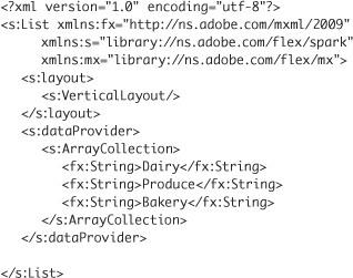
</s:List> - The functionality to add to the body of the component is to display three
<s:String>tags in the<s:List>. You know you use the<s:dataProvider>tag to supply data to an<s:List>, so here is the finished component:
- Assume that a file named CompTest.mxml is created at the root of the project. Also, the component is created in a directory called myComps. Use the word custom as the prefix for the components in this folder. Therefore, the XML namespace to add to the
<s:Application>tag isxmlns:custom="myComps.*". - Finally, instantiate the component in the main application file:

Note
You will see shortly that Flash Builder makes this process of creating the skeleton of the component even easier.
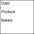
The CompTest.mxml output would appear as shown here.
Using Custom Components in the Application Architecture
You now know the basic mechanics of creating custom components. You might ask yourself, So now what? How does this affect what I have been doing? Why should I use them? How do I use them?
The advantages of components mentioned in the opening pages of this lesson should now be clearer:
• Components make applications easier to build, debug, and maintain.
• Components ease team development.
• With planning, components can lead to a suite of reusable code.
To facilitate using components as reusable code, you should make them independent of other code whenever possible. The components should operate as independent pieces of application logic, with a clear definition of what data must be passed into them and what data will be returned from them. The object-oriented programming term loosely coupled is used to describe this type of architecture.
Suppose you have a component that uses an <s:List> to display some information. You later learn of a new component that offers a better way to display that data. If the custom component is built correctly, you should be able to switch the display component and not need to make any other changes. You change the inner workings of the custom component, but the data going into the component and what comes out will not change, so no changes to the rest of the application are needed.
Now, you need to think about how components fit into the application architecture. Although this book is not meant to be a discourse on Flex application architectures, it would be negligent not to show how components can fit into the bigger picture. In the application you are building in this book, you will implement a primitive form of model-view-controller (MVC) architecture.
MVC is a design pattern or software architecture that separates the application’s data, user interface, and control logic into three distinct groupings. The goal is to implement the logic so changes can be made to one portion of the application with minimal impact to the others. Here are some short definitions of the key terms:
• Model: The data the application uses. The model manages the data elements, responds to queries about its state, and manages instructions to change the data.
• View: The user interface. The view is responsible for presenting model data to the user and gathering information from the user.
• Controller: What responds to events—typically user events, but also system events. The controller interprets the events and invokes changes on the model and view.
Here is the general flow of the MVC architecture:
- The user interacts with the user interface (a view): for example, by clicking a button to add an item to a shopping cart.
- The controller handles the input event.
- The controller accesses the model, maybe by retrieving or altering data, and gives the data to the view.
- The view then uses the model data for appropriate presentation to the user.
Consider the application you are building. Eventually your FlexGrocer.mxml main application page will be part of the controller. There will be views that do the following:
• Display the different grocery item categories
• Display the items in the shopping cart
• Display a detailed view of a particular grocery item
• Display all the grocery items in a particular category
Each of these views will require some logic for interactivity. In a strict MVC architecture this code is usually located in a separate class or classes. In this book, the code will exist alongside the views as our desire is to teach Flex, not strict MVC architecture. The model is provided by the data loaded via HTTPService classes, which will soon be moved to their own classes.
Now the stage is set, and you’re ready to get started building components and enhancing the architecture and functionality of the applications you are building.
Splitting Off the ShoppingView Component
This first exercise will improve the overall architecture of the application, but it will not add any functionality from the user’s point of view. In fact if everything is done properly, you’ll want the application to appear exactly as it did before you started. You will pull the application’s visual elements into a component, a view in terms of MVC architecture. FlexGrocer.mxml will begin to transform into the controller.
- Right-click the src folder in the FlexGrocer project that you used in Lesson 8 and create a package named views.
Alternatively, if you didn’t complete the previous lesson or your code is not functioning properly, you can import the FlexGrocer.fxp project from the Lesson09/start folder. Please refer to Appendix A for complete instructions on importing a project should you ever skip a lesson or if you ever have a code issue you cannot resolve.
It is a best practice to organize your components. In this case, the views folder will contain the views for your applications.
- Right-click the views folder and then choose New > MXML Component. In the New MXML Component dialog box, set the name as ShoppingView and the base component as a Group, and the layout as Horizontal. Remove any width and height values, and then click Finish.

In this case, you are using an
<s:Group>as your root tag and are applying a HorizontalLayout to it, which means the children you insert in this component will be aligned horizontally beside each other. - Insert an
<fx:Script>block just after the closing</s:layout>tag.
You will have an
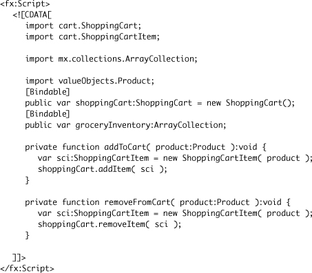
<fx:Script>block in this component. Some of the code you will copy from the FlexGrocer.mxml file, and other code you will write new. - From the FlexGrocer.mxml file, copy the bindable properties named
groceryInventoryandshoppingCartand paste them inside the Script block in the ShoppingView component. Change the scope groceryInventory from a private variable to a public variable.

- Add the imports for the ArrayCollection and ShoppingCart classes. The easiest way to do this is to put your cursor at the end of the class name (for instance, after the final t of cart), and press Ctrl+Spacebar. You won’t be prompted as to which class you want imported while importing the ArrayCollection class, but you will for the ShoppingCart class. This is because the only class that matches ArrayCollection is the ArrayCollection class, but Flash Builder will ask if you mean to use the ShoppingCart or ShoppingCartItem class, both of which start with ShoppingCart.
Pressing Ctrl+Spacebar will force Flash Builder to use its code-completion feature, which in this case will automatically import the classes for you.

When you copied these variables into the component, they became properties of the component. Simply by using the
varstatement and defining the variables to be public, you are creating these as public properties of the components that can have data passed into them.This is no small matter. The basic building blocks of object-oriented programming are objects, properties, and methods. So knowing how to create properties is a very important piece of information.
Later in this lesson, you will add functions to a component. Just as variables in a class are properties, so functions in the class are the methods of your components.
- From the FlexGrocer application, cut the HGroup with the id of bodyGroup and all of its contents, as well as the following VGroup, and paste it into your ShoppingView component, after the end of the
<fx:Declarations>tag pair. In ShoppingView, remove the opening and closing HGroup tags, but leave the contents of this tag pair in place.
You will no longer need the HGroup in place, as your ShoppingView component is set to have a HorizontalLayout.
Lastly, move the VGroup that shows the expanded state so it is defined before the VGroup with the
idofcartGroup. The remaining code should look like this: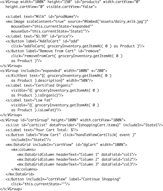
- Cut the states block from the main application, and paste it in the component, between the closing
<fx:Script>tag and the starting<fx:Declarations>tag.
The reality is that the order of where you place the states tag is unimportant, as long as you do not place it as the child of something other than the root node.
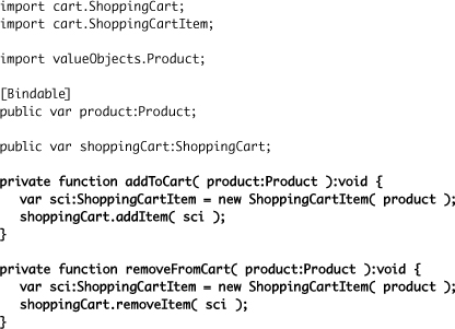
- Cut the
addToCart()andremoveCart()methods from the main application, and paste them into your component in the<fx:Script>block. Use the code-completion feature to import the Product and ShoppingCartItem classes. Remove thetrace ( shoppingCart );statement from youraddToCart()method. It is no longer needed.

At this point, the full Script block should read as:
These methods are called from some of the MXML tags you moved into the ShoppingView class, so they need to be moved into that component.
- Copy the
handleViewCartClick()method from the main application, and paste it into your component’s<fx:Script>block.

At this point, the full Script block should read as follows:
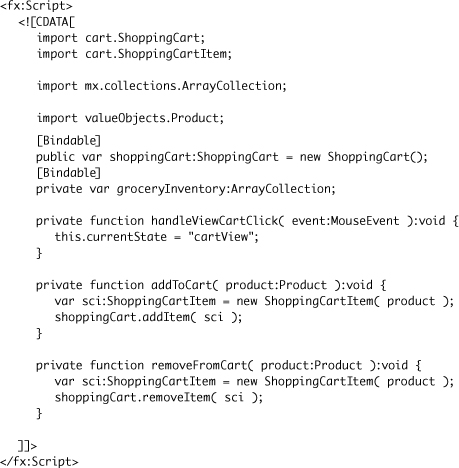
These methods are called from some of the MXML tags you moved into the ShoppingView class, so they need to be moved into that component.
- Save the file.
You have created your first MXML component. Now that the component is built, you will instantiate the new component from the main application.
- Return to the FlexGrocer.mxml file and find the Label that shows the copyright mark. Just after that tag, type in
<Shoppand chooseviews:ShoppingViewfrom the code-hinting menu.

- Give the new tag an
idofbodyGroup, and make it a self-closing tag. Add awidthand aheightof100%to the tag.
<views:ShoppingView id="bodyGroup" width="100%" height="100%" />
The code-hinting feature automatically added to your main application tag the namespace that references the views directory. The Application tag should now read like this:
<s:Application xmlns:fx="http://ns.adobe.com/mxml/2009"
xmlns:s="library://ns.adobe.com/flex/spark"
xmlns:mx="library://ns.adobe.com/flex/mx"
creationComplete="handleCreationComplete( event )" xmlns:views="views.*"> - Change the handler on the btnCartView button from being defined as
click.state1="handleViewCartClicked( event )"toclick="handleViewCartClicked( event )"
The state definitions have all been moved to the ShoppingView class, so the main application no longer has any states other than the base state. For this reason, the
clickevent handler should be defined without the explicit reference to State1.<s:Button id="btnCartView" label="View Cart" right="90" y="10"
click="handleViewCartClick( event )"/> - Still in FlexGrocer.mxml, change the
handleViewCartClick()method so it changes the state of bodyGroup instead of the state of the main application.
private function handleViewCartClick( event:MouseEvent ):void {
bodyGroup.currentState = "cartView";
}As mentioned in the previous step, the main application no longer has states. When the user clicks the View Cart button in the control bar, you need to change the state of the ShoppingView in order to show the cart.
- Save the main application. It should now compile with no errors. However, you have not yet passed the data needed to render the products in the shopping view, so if you run the application, it will not show any products yet. To solve this problem, in the instantiation of the ShoppingView component, add an attribute that binds the
groceryInventoryproperty from the FlexGrocer application into thegroceryInventoryproperty of the ShoppingView component.
<views:ShoppingView id="bodyGroup"
width="100%" height="100%"
groceryInventory="{groceryInventory}" />Now the ShoppingView should have the data it needs to render products as it did before.
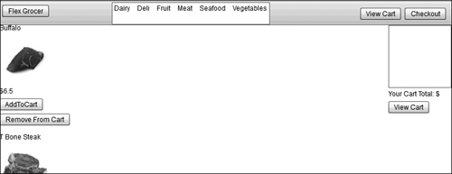
- Run the FlexGrocer.mxml file. You see that creating the component has not changed the functionality. It still renders a product that can be added and removed from the cart.
The purpose of this first exercise was not to add functionality to the application but to refactor it. As the functionality of the application continues to grow, the main application page would have become much too long and complex. Using components gives you the chance to break it up into manageable modules.
Breaking Out a ProductItem Component
Right now, the application continues to behave as it did at the end of the previous lesson; it shows a single product and allows you to add or remove that product from the cart. However, if you wanted to show more than one item at a time, you would need to copy and paste a large block of code multiple times. Instead, you will split the elements specific to viewing a product into a separate class, and you can then create several instances of this one class to show multiple products. The new component you will create is more than just a simple view onto the data. It is intended as a reusable component that can be used anytime you need to display product information for this application. So instead of creating it in the views directory, you will create a new components directory to hold this and other reusable components.
- Right-click the src directory, and choose New Package. Name the new package components.
- Right-click the newly created components package. Choose New > MXML Component. The name should be ProductItem, and the base component should be Group with a Horizontal layout. Remove the width and height values, and then click Finish.

- Add an
<fx:Script>tag pair just after the layout declaration.
Much as with the last component, the Script block will be used to add properties and methods for your new component.
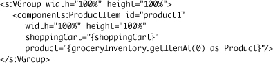
- Add a bindable public property named
product, with a data type of the Product class, to the Script block. Use code-completion to import the Product class, or manually add animportstatement forvalueObjects.Product. Add another public variable, calledshoppingCart, with a data type of ShoppingCart.
This will allow you to pass a specific product to each instance of this component, and pass a reference to the shoppingCart to each instance as well. Remember to either use the code-completion functionality when specifying the ShoppingCart class, or to manually add an
importfor cart.ShoppingCart.
- Cut the
addToCart()andremoveFromCart()methods from the ShoppingView component, and paste them into the Script block of the ProductItem component. You will need to make sure the ShoppingCartItem class is imported as well.
- In ShoppingView.mxml, cut the VGroup with the
idof products, and the one that follows it, which is included in the expanded state, and paste them after the<fx:Declarations>section of ProductItem

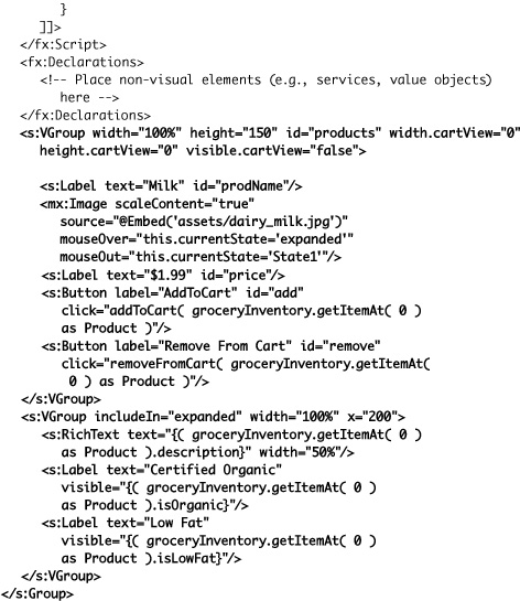
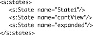
- Copy the states block from ShoppingView.mxml, and paste it into ProductItem.mxml just after the layout tag pair. In ShoppingView, remove the state definition for expanded. In ProductItem, remove the state definition for cartView.
Your ShoppingView states block should read like this:
<s:states>
<s:State name="State1"/>
<s:State name="cartView"/>
</s:states>Your ProductItem states block should read like this:
<s:states>
<s:State name="State1"/>
<s:State name="expanded"/>
</s:states>Now both components have a base state (State1), and each has another state specific for it. ShoppingView has the cartView state, which it can use to show the details of a shopping cart, and ProductItem has an expanded state, which shows expanded product details.
- As ProductItem no longer has a cartView state, you need to remove the attributes of the first VGroup that explicitly set
width,height, andvisibleproperties for the cartView state. While removing the attributes, also remove the normalwidthandheightattributes as well, as those will no longer be needed, either.
- Change the reference for the image source from the current embedded image
"@Embed('assets/dairy_milk.jpg')"and instead dynamically load the image from the assets directory, using the image name of the product.

Your component can now show the appropriate image for any product passed to it, rather than always showing milk.
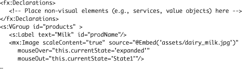
- In the Label just before the image, change the
text="Milk"totext="{product.prodName}"to dynamically display the product name.
<s:Label text="{product.prodName}" id="prodName"/>
Your component can now show the correct name for whichever product it has.
- In the Label just after the image, change the
text="$1.99"totext="${product.listPrice}"to dynamically display the product price.
<s:Label text="${product.listPrice}" id="price"/>
Your component can now show the correct price for whichever product it has.
- In the click handlers for both the Add To Cart and Remove From Cart buttons, change the argument passed to the function from
groceryInventory.getItemAt( 0 ) as Producttoproduct.
<s:Button label="Add To Cart" id="add"
click="addToCart( product )"/>
<s:Button label="Remove From Cart" id="remove"
click="removeFromCart( product )"/>Since your component is no longer dealing with the entire groceryInventory collection, but instead with an individual product, the reference to the product for this component is now greatly simplified. When you create an instance of this component from the ShoppingView component, you will pass just one specific product to each instance.
- For the RichText control and two labels in the VGroup shown in the expanded view, change the reference in the binding from
groceryInventory.getItemAt( 0 ) as Productto justproduct.
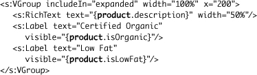
Your final code for the ProductItem component should read like this:

Next, you will need to create one or more instances of this component from the ShoppingView.
- Switch back to ShoppingView.mxml. After the
<fx:Declaration>tag pair, but before the cartGroup VGroup, create a new VGroup with awidthand aheightof100%. Inside this group, create an instance of ProductItem. If you begin typing it and use code-completion, as you did when you created the instance of ShoppingView in the previous lesson, theimportstatement for the components package will be automatically added.

- Give the new ProductItem instance an
id="product1", specify awidthand aheightof100%, bind a reference of the local shoppingCart into theshoppingCartproperty of the new component, and bindgroceryInventory.getItemAt(0) as Productto itsproductproperty.
- Save all the files and run the application.
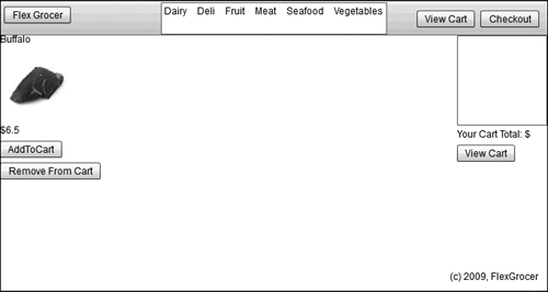
Your application is now displaying the first item from the groceryInventory, which is buffalo meat, rather than the milk you have been used to seeing in the application thus far. But wait, there’s more. Since you now have a component that can easily show individual products, you can show several at once.
- Switch back to ShoppingView.mxml. Copy the tag that creates an instance of ProductItem, and paste it twice more, just below the current one. Change the
idof the new ones to beproduct2andproduct3. Also change the binding to theproductproperty to use item1and item2, while the original is getting item0.

Now, as you save and run the application, you should see several products shown.
Note
In the next lesson, you will learn how to use a DataGroup to create one ProductItem for each Product in the groceryInventory collection.

One bug still needs to be fixed. If you click the View Cart button, the products are still being shown, rather than being hidden. You will fix that in the next step.

- In the VGroup that contains the ProductItems, specify values for the
widthand theheightof the cartView state to be0, and thevisibleproperty to befalse.
<s:VGroup width="100%" height="100%"
width.cartView="0" height.cartView="0"
visible.cartView="false">
The application should now be able to switch between the various states of the ProductItem and ShoppingView components correctly, while now displaying three products instead of just one.
Creating Components to Manage Loading the Data
In the first exercise, you refactored part of the application without adding any functionality. In the second exercise, you added functionality (showing multiple products) while building another component. This exercise is akin to the first, in which you are refactoring the application without adding any visible functionality for the user.
Right now, the main application file is a bit cluttered by the instantiation and event handlers for the two HTTPServices. In this exercise, you are going to create ActionScript classes for these services, which will contain the HTTPService components as well as result and fault event handlers, and will expose the data loaded through public bindable properties. The new class will provide certain types of data to all the applications when they need it. This data manager component will be different from other components you’ve built in this lesson in that it will not have any representation that a user will see. Such a component is referred to as a non-visual component.
- Create a new services package in the FlexGrocer project.
Alternatively, if you didn’t complete the previous exercise or your code is not functioning properly, you can import the FlexGrocer-PreData.fxp project from the Lesson09/intermediate folder. Please refer to Appendix A for complete instructions on importing a project should you ever skip a lesson or if you ever have a code issue you cannot resolve.
Because the new components are neither a value object nor a view, a new package is needed to continue organizing your components by function.
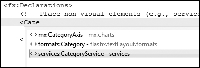
- Right-click the services folder and then choose New ActionScript Class. In the New ActionScript Class dialog box, set the name as CategoryService and set the superclass as a mx.rpc.http.mxml.HTTPService; leave the rest of the defaults, then click Finish.
As you want a class that provides all the functionality of HTTPService, but has some additional methods and properties, HTTPService is the most logical choice for a base class.
- After the line declaring public class CategoryService but before the constructor, add a bindable public variable
categories:XMLListCollection.

This
categoriesproperty will determine how other classes interact with the data loaded by the service. Don’t forget to use the code-hinting feature, or to manually import the XMLListCollection class. - In the constructor, after the call to
super(), set theresultFormatproperty of your class equal toe4xand theurlproperty to http://www.flexgrocer.com/category.xml.
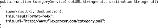
Take a look at the constructor here. The first line inside the function definition (which was automatically added by the new-class wizard), passes the
rootURLanddestinationarguments to the constructor of the superclass. This way, it is not necessary to duplicate the logic found in the superclass’s constructor. The two lines you added are setting theresultFormatandurlproperties of the HTTPService class, as you learned in previous lessons. - Open FlexGrocer.mxml, cut the
handleCategoryResult()method, and paste it into the new CategoryService class, after the constructor.

As with each new class you introduce, make sure the other classes you are using get imported. In CategoryService, you need to ensure that the ResultEvent class gets imported, either by typing in the
importstatement formx.rpc.events.ResultEventmanually, or by using the code-completion feature. This method will populate thecategoriesproperty with the results from the service call. - In the constructor, add an event listener for the
resultevent. SethandleCategoryResultas the handler for that event.
addEventListener(ResultEvent.RESULT, handleCategoryResult);
The
addEventListener()method allows you to specify an event to listen for (in this case it’s the event result and a method that will be used as the event handler). - Save CategoryService. Switch to the FlexGrocer.mxml file.
Your service class is now complete. All that remains is to use it in the application. The completed CategoryService class should read like this:

- In the
<fx:Declarations>block of FlexGrocer.mxml, delete the<s:HTTPService>tag with theidofcategoryService.
- In its place, create an instance of the CategoryService class. Give this new instance an
idofcategoryService.
As with the previous components you instantiate, if you use the code-hinting features, the namespace will be automatically added for you.
<services:CategoryService id="categoryService"/>
You now have your new component being used in place of (and in fact with the same
idas) the previous HTTPService. Since theidis the same, the existing call tocategoryService.send()in thehandleCreationComplete()method does not need to change. - Remove the bindable private
categoriesproperty.
You will no longer need this, as the categories are now available from the categoryService instance directly.
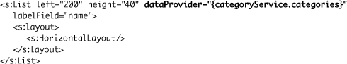
- Find the List class created inside the controlBarContent. Change the dataProvider from
categoriestocategoryService.categories.
The FlexGrocer application is now using your new CategoryService class, instead of having the service properties and handlers all coded into the main application.
- Save all your files and run the FlexGrocer application. It should now behave as it always did, with the categories loaded into the horizontal list.
Next, you will create a service class similar to CategoryService to load and manage the products, and you’ll remove that logic from the main application.
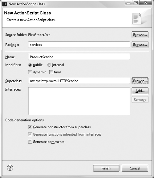
- Close all your open files. Right-click the services folder and then choose New ActionScript Class. In the New ActionScript Class dialog box, set the Name as ProductService and set the Superclass as
mx.rpc.http.mxml.HTTPService; leave the rest of the defaults, then click Finish.
- After the line declaring public class ProductService but before the constructor, add a bindable public variable
products:ArrayCollection.
[Bindable]
public var products:ArrayCollection;This
productsproperty will determine how other classes interact with the data loaded by the service. Don’t forget to use the code-completion feature, or to manually import the ArrayCollection class. - In the constructor, after the call to
super(), set theresultFormatproperty of your class equal toe4xand theurlproperty to http://www.flexgrocer.com/categorizedProducts.xml.
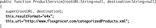
The constructor is just like the one for the CategoryService, with a different url property.
- Open FlexGrocer.mxml, cut the
handleProductResult()method, and paste it into the new ProductService class, after the constructor. Change the final line so that it populates theproductsproperty rather than thegroceryInventoryproperty. Change the localproductsvariable to beproductArray.
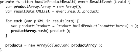
As with each new class you introduce, make sure you import the newly referenced classes (ResultEvent and Product), either by typing in the import, or by using the code-completion feature. This method will parse the results of the service call into Product instances and populate the
productsproperty with them. - In the constructor, add an event listener for the
resultevent. SethandleProductResult()method as the handler for that event.
addEventListener(ResultEvent.RESULT, handleProductResult);
Just as with the CategoryService class, you will want to listen for the
resultevent, and pass the results on to a handler method. The final ProductService class should read like this:
- Save ProductService. Switch to the FlexGrocer.mxml file.
Your service class is now complete. All that remains is to use it in the application.
In the
<fx:Declarations>block of FlexGrocer.mxml, delete the<s:HTTPService>tag with theidofproductService. In its place, create an instance of the ProductService class. Give this new instance anidofproductService.As with the previous components you instantiate, if you use the code-hinting feature, the namespace will be automatically added for you.
<services:ProductService id="productService"/>
Since the
idis the same, the existing call toproductService.send()in thehandleCreationComplete()method does not need to change. - Remove the bindable private
groceryInventoryproperty and the Bindable public shoppingCart property.
You will no longer need these, as the products are now available from the productService instance’s
productsproperty and the ShoppingCart is now defined in the ShoppingView. - With the exception of mx.events.FlexEvent you can now remove all of the imports from this file. They are no longer needed as the functionality has been moved to components.
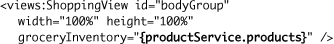
- Find the ShoppingView class. Change
groceryInventory="{groceryInventory}"to begroceryInventory="{productService.products}"
Your refactoring of the FlexGrocer application into components is now complete.
- Save all your files and run the FlexGrocer application. It should now behave as it always did, but now in an easier-to-maintain fashion.
Your refactored FlexGrocer file should now read like this:


What You Have Learned
In this lesson, you have:
• Gained a theoretical understanding of why components should be used and how they fit into a simple implementation of MVC architecture (pages 204–209)
• Built a component that moved the visual elements from a main application page to the component and then instantiated the component in the main application page (pages 210–226)
• Created non-visual components that provide category and product information to the applications (pages 226–235)