
Lesson 12. Using DataGrids and Item Renderers
In Lesson 10, “Using DataGroups and Lists,” you worked with datasets and some controls that can be used to show the data. In this lesson, you will build on that set of base controls and be introduced to the primary MXML component used to display and manipulate large datasets.
In this lesson, you will learn how to use the DataGrid component to display a dataset in an interactive way using rows and columns. Aside from using the DataGrid in its simplest form, you will learn how to override the default behavior of a particular column in the DataGrid by implementing a custom item renderer; do a custom sort of the data in a column; and change the editing controls that manage the underlying data. You will also use the sorting, styling, grouping, and summary data features of the AdvancedDataGrid.
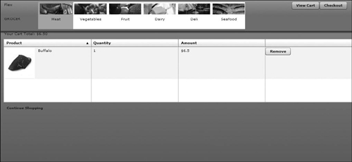
The shopping cart displayed in a DataGrid
Spark and MX
So far in this book we have managed to ignore a fundamental aspect of developing in Flex, which is the use of multiple component sets. Flex 4 is the first version of Flex to have more than one set of components, meaning that there are really two types of Labels, two types of Buttons, and two types of TextInputs, among other controls. These two types are referred to as MX and Spark.
The MX set of controls has been under constant evolution since Flex 1.0. The same basic controls, with the same metaphors, have slowly developed over a number of releases. This set of controls worked primarily through the object-oriented concept of inheritance, meaning that if you wanted a control to behave in a new way, you extended the previous control and changed some portion of its functionality.
Spark is a brand-new set of controls making their first appearance in Flex 4. In the Spark set of controls, components are built through the concept of composition. You have actually been working with this all along. When you wanted a group to be horizontal or vertical, you combined the Group with a HorizontalLayout or VerticalLayout. This is composition.
While Spark is the future of Flex, it is not all-encompassing yet, meaning that the many years of development that went into developing the MX component produced a component set with huge diversity and functionality. Spark has had much less development time, so while it performs extremely well, it does not have breadth of function that MX has today.
Therefore in Flex 4, we combine Spark and MX controls to achieve what we desire. Whenever possible, we embrace Spark components, as they are easier to customize, are often more performant, and will be the focus of continuing improvements. When Spark does not have a feature we need yet (such as the Form, DataGrid, and AdvancedDataGrid), we use the MX versions, which integrate nicely with Spark and allow us to complete our component set.
Introducing DataGrids and Item Renderers
Using a DataGrid as a way to display the data of your application provides the largest possible number of options for your users to interact with the data. At the simplest level, the DataGrid organizes the data in a column-by-row format and presents this to the user. From there, the DataGrid can be configured to allow you to modify the data it contains.
In this lesson, you will make modifications to FlexGrocer, in which the DataGrid will give you a view of the cart and the ability to both update and remove items from the cart.
Tip
Although the DataGrid does provide the most versatile manner of interacting with the data of your application, it does come with additional overhead (performance and size). It is wise to consider what you expect the user to do with the data or controls before you automatically choose to use a DataGrid.
Displaying the ShoppingCart with a DataGrid
When you left off in Lesson 11, “Creating and Dispatching Events,” you had the contents of your cart displayed in a List control with the ability to remove the current item you were viewing via a Remove From Cart button. You will now use a DataGrid to display the contents of the cart. The DataGrid control supports the syntax that allows you to specify the columns explicitly through the DataGridColumn:
<mx:DataGrid ... >
<mx:columns>
<mx:DataGridColumn dataField=""...>
<mx:DataGridColumn...>
<mx:DataGridColumn...>
</mx:columns>
</mx:DataGrid>
The dataField is used to map a property in the dataset to a given column. The order in which the DataGridColumns are listed is the order you will see the columns from left to right in the DataGrid. This is useful when you need to specify a different order of the columns from the one specified in the dataset. Each DataGridColumn supports a large number of attributes that affect the DataGrid’s rendering and interaction with the given column.
- Locate the components package that you used in the previous exercise.
Alternatively, if you didn’t complete the previous lesson or your code is not functioning properly, you can import the FlexGrocer.fxp project from the Lesson12/start folder. Please refer to Appendix A for complete instructions on importing a project should you ever skip a lesson or if you ever have a code issue you cannot resolve.
- Right-click the components package and choose New > MXML Component. In the dialog box, specify the Name to be CartGrid.
- For the “Based on” value, click the Browse button. In the dialog box, begin to type DataGrid until you see DataGrid – mx.controls displayed. Choose the DataGrid entry. Click OK, then Finish.
- In the newly created component’s
<mx:DataGrid>tag, add theeditableproperty and assign it the valuetrue.
You are specifying
editableastruebecause you will allow one of the columns to be changed by the user. If it is set tofalse, the whole DataGrid becomes read-only.<mx:DataGrid xmlns:fx="http://ns.adobe.com/mxml/2009"
xmlns:s="library://ns.adobe.com/flex/spark"
xmlns:mx="library://ns.adobe.com/flex/mx"
editable="true"> - After the
<fx:Declarations>tag set, define an<mx:columns>tag set.
You will be adding DataGridColumn objects in the next steps, and they need to be nested in the columns tag set.
- In the
<mx:columns>tag set, define an<mx:DataGridColumn>for the product name. Set theheaderTexttoProduct,dataFieldtoproduct, andeditabletofalse.
<mx:DataGridColumn headerText="Product" dataField="product" editable="false" />
The
headerTextattribute specifies the text of the DataGridColumn header. If you don’t specify this, it will take the value of thedataFieldattribute.Because the
editableattribute is set totrueon the<mx:DataGrid>tag, you need to set it tofalsefor each column you don’t want to use for editing. - Define an
<mx:DataGridColumn>for displaying the quantity, and place it after the last<mx:DataGridColumn>. SetheaderTexttoQuantityanddataFieldtoquantity.
<mx:DataGridColumn headerText="Quantity" dataField="quantity" />
This column will be used to allow users to change the quantity of a specific product they want to buy.
- Define an
<mx:DataGridColumn>for displaying subtotals for each item and place it after the last<mx:DataGridColumn>. SetheaderTexttoAmount,dataFieldtosubtotal, andeditabletofalse.
<mx:DataGridColumn headerText="Amount" dataField="subtotal" editable="false" />
- Define an
<mx:DataGridColumn>for displaying a Remove button. At this point only seteditabletofalse.
<mx:DataGridColumn editable="false" />
Later you will add functionality so a button will remove the item in a particular DataGrid row.
- At this point, your component should appear as shown here:

- Save CartGrid.mxml.
Using the CartGrid Component
You’ve created the basic component that uses a DataGrid to display data in the shopping cart data structure. Now you will replace the placeholder DataGrid that was inserted earlier with the newly created component.
- Open ShoppingView.mxml from the views package.
- Locate the
<mx:DataGrid>block near the bottom of the file and remove it. - In the same location add the
<components:CartGrid>component. Set theidtodgCart, theincludeIntocartView, and thewidthandheightto100%. - In the CartGrid, bind the
dataProvidertoshoppingCart.items.
<components:CartGrid id="dgCart"
includeIn="cartView"
width="100%" height="100%"
dataProvider="{shoppingCart.items}" /> - Run the FlexGrocer.mxml. Add products to the shopping cart, and then click the View Cart button.
You should see the DataGrid with some data in it. At this point the information is not formatted correctly, but you see that the component is being used and data is being passed to CartGrid. Note the Product column is showing up as text in the DataGrid, even though it is a complex attribute in the dataset. This is because there is a toString() function declared on the Product value object. If this weren’t defined, you would see [Object Product]. You will look at how to better display a complex object later. For now, this is what you should see:

Adding Inline Editing Control for DataGridColumn
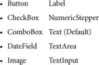
In a DataGrid, you can specify that a column of the data shown can be changed by the user when focus is brought to the cell. This is done by setting the editable attribute to true. The default editing control for the column is a text field. It is possible to specify which editor to use when managing the data via the itemEditor attribute and the editorDataField. The editorDataField specifies the attribute of the editing control used to manage changing the value for the cell, as well as which attribute on that control the dataset should examine to get the changed value. The following are the built-in controls from the MX package that you can specify (full package names are needed unless the controls are imported into the containing page):
As mentioned, in Flex 4 you can use controls from the MX and Spark packages together. The DataGrid is from the MX package and has been designed to easily integrate with other controls from the MX package. When specifying an itemEditor, the DataGrid will automatically work with any of these built-in controls, as they all implement an interface named IDropInListItemRenderer.
Tip
You can also specify your own controls built from pieces of either the MX or Spark packages if you desire. Your new control simply needs to implement the IDropInListItemRenderer interface in its class definition to work.
- Open the CartGrid.mxml file that you created in a previous exercise.
- In the
<mx:DataGridColumn>tag that maps to the quantity, set theitemEditortomx.controls.NumericStepper, seteditorDataFieldtovalue.
<mx:DataGridColumn headerText="Quantity"
dataField="quantity"
itemEditor="mx.controls.NumericStepper"
editorDataField="value" />This now has the Quantity column being edited as an MX NumericStepper. The NumericStepper control lets the user select a number from an ordered set. The underlying value of the column is bound to the
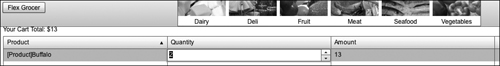
valueattribute of the NumericStepper. - Save CartGrid.mxml. Run the FlexGrocer application, add the Buffalo product to the shopping cart, and click View Cart.
When you click in the Quantity column, you will notice that it doesn’t open as a freeform text field, but rather as a NumericStepper control.
Creating an Item Renderer for Displaying the Product
The default behavior of the DataGrid is to convert every value of the dataset to a string and then display it. However, when you are dealing with a complex object that is stored in the dataset, another alternative is to create a custom item renderer that shows more information about the column. In this case, you are going to create a simple item renderer that shows the product’s name and image.
When working with item renderers, you will find that there is an implicit public variable available to you in the item renderer called data, which represents the data of the row itself. You can use data to bind your controls without having to worry about what column you are working with. When the DataGrid creates a column that has a custom item renderer associated with it, it creates a single instance of the cell renderer per row, so you don’t have to worry which row of data you are working with in a renderer.
You have been using Spark components over MX components whenever possible. Although there is no Spark DataGrid, you will still use Spark components when possible in the item renderers. You will use the <s:MXItemRenderer> as the base tag for your item renderers. This class lets you use the Spark item renderer architecture with MX DataGrid.
- Right-click the components package and choose New > MXML Component. In the New MXML Component dialog box, set the Name to ProductName, the Layout to HorizontalLayout, the base component to an MXItemRenderer; remove any width and height values; and then click Finish.
This MXML file will define the layout of a given cell in the DataGrid. You are creating it in a separate file so that, if needed, it can be used on multiple DataGrid columns and/or multiple DataGrids.
- In the
<s:MXItemRenderer>, set theclipAndEnableScrollingattribute totrue.
<s:MXItemRenderer xmlns:fx="http://ns.adobe.com/mxml/2009"
xmlns:s="library://ns.adobe.com/flex/spark"
xmlns:mx="library://ns.adobe.com/flex/mx"
clipAndEnableScrolling="true">This will ensure that none of the contents of the item renderer extend past the boundaries of the renderer.
- Place an
<mx:Image>tag below the<fx:Declarations>tag set to display the product’s thumbnail image. You need to set thesourceattribute to a hard-coded directory location, but the filename should be bound to theimageNameof the product object. That will make it look like{'assets/' + (data.product as Product).imageName}. Also assign thewidththe value of100.
<mx:Image source="{'assets/' + (data.product as Product).imageName}" width="100"/>
Tip
The image location used is relative to the location where the main application is loaded from, not the location of the file that contains the
<mx:Image>tag.It is worth mentioning here that you could have referred to the image name simply as
data.product.imageName. You might have already noticed the first advantage of casting the object as type Product, and that is the code-completion supplied theimageNameproperty when you were typing the code. This would not have happened if you had not done the casting.The next advantage is even more important if you ever make changes to the Product object. The refactoring tools now available in Flash Builder enable you to change the name of the
imageNameproperty if you should ever want to. The reference is automatically updated because it is a property of the Product object. Again, this will not happen if you do not do the casting. - Place an
<s:Label>tag for the product name below the<mx:Image>tag. Bind thetextattribute to( data.product as Product ).prodName. Set theheightandwidthto100%.
<s:Label text="{( data.product as Product).prodName}" width="100%" height="100%"/>
- Save the ProductName.mxml file.
You cannot test this component at this time because it is not yet assigned to the DataGrid.
- Open the CartGrid.mxml you created in the previous exercise.
- Update the
<mx:DataGridColumn>with adataFieldofproductwith a new attribute,itemRenderer, set tocomponents.ProductName.
<mx:DataGridColumn headerText="Product"
dataField="product"
editable="false"
itemRenderer="components.ProductName" />With the use of the
itemRendererattribute, you are overriding the default TextInput editor. You need to use the fully qualified class name to set your item renderer unless you have imported the class package that it exists in. - Update the
<mx:DataGrid>with a new attributevariableRowHeightset totrue.
<mx:DataGrid xmlns:fx="http://ns.adobe.com/mxml/2009"
xmlns:s="library://ns.adobe.com/flex/spark"
xmlns:mx="library://ns.adobe.com/flex/mx"
editable="true"
variableRowHeight="true">It is necessary for you to set the
variableRowHeighttotrueso that Flex resizes the row’s height to accommodate the thumbnail image. - Save CartGrid.mxml. Run the FlexGrocer application, add the Buffalo product to the shopping cart, and click View Cart.

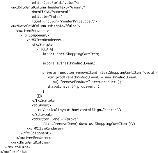
Creating an Inline MXML Item Renderer for Displaying a Remove Button
Another option for creating an item renderer is through the <mx:itemRenderer> tag, which allows you to declare and create the item renderer inline with the DataGridColumns. From a compiler perspective, doing an inline item renderer is the equivalent of building it in an external file (it actually compiles the code of the inline item renderer as a separate file internally). Inside the <mx:itemRenderer> tag, you will place an <mx:Component> tag, which defines the boundaries of the inline item renderer file from the rest of the page. Thus, the inside of the <mx:Component> tag will have its own scope for which you will need to do imports, function declarations, and the like.
Tip
Although building inline item renderers will be very efficient from a coding perspective, it does not allow you to reuse the item renderers for other DataGrids. Good candidates are item renderers that are specific to one DataGrid only, such as action item controls.
Just like the item renderer you created in the previous exercise, this one will have access to the data variable, which will hold the reference to the row. For this example, you will add a Remove button to each row.
- Open the CartGrid.mxml you created in the previous exercise.
- Locate the fourth
<mx:DataGridColumn>and change it to a DataGridColumn tag set by removing the “/>” at the end of the tag and adding just the “>” back on.
<mx:DataGridColumn editable="false">
</mx:DataGridColumn>This is the placeholder column in the DataGrid. We’ll use a start and end
<mx:DataGridColumn>tag because the item renderer definition will be placed inside it. You also do not need to specifydataField, because there is no data you are mapping directly to. - Place an
<mx:itemRenderer>tag set and an<fx:Component>tag set inside the<mx:DataGridColumn>tag.
<mx:DataGridColumn editable="false">
<mx:itemRenderer>
<fx:Component>
</fx:Component>
</mx:itemRenderer>
</mx:DataGridColumn> - Place an
<s:MXItemRenderer>tag inside the<fx:Component>tags to provide a container for the Remove button. In the MXItemRenderer specify a vertical layout with itshorizontalAlignproperty set tocenter.

When creating this inline item renderer, you want to use the vertical layout to help center the button in the DataGrid no matter the size of the cell.
- Place an
<s:Button>tag after the layout but before the end of the MXItemRenderer. Set thelabeltoRemoveand set theclickevent to call aremoveItem()function that you will create momentarily. Passdata as ShoppingCartItemas the parameter to the method. Animportstatement forvalueObjects.ShoppingCartItemshould be added automatically to the inline component. If not, add an<fx:Script>block inside the<s:MXItemRenderer>tag, and include theimportstatement.

You need to add the appropriate import statement, because the import statements made at the top of the file are in a scope different from the inline item renderer.
Reusing the ProductEvent Class
At this point there is no removeItem() method in your renderer. When you create this method you will reuse code created in the previous lesson. In Lesson 11 you created an event subclass to hold a Product value object. Now you will reuse that event subclass to dispatch the Product object you want removed from the shopping cart.
- Inside the
<fx:Script>block, which is inside the MXItemRenderer you created in the last section, create a private function namedremoveItem()that returnsvoidand that accepts one parameter, nameditem, of typeShoppingCartItem.
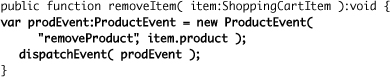
private function removeItem( item:ShoppingCartItem ):void {
} - Inside the
removeItem()method, declare a new local variable namedprodEventof typeProductEvent, and assign it a new instance of the ProductEvent event class. For the type parameter of the ProductEvent constructor, pass the event nameremoveProduct. Then pass theitem.productvalue as the second constructor parameter. Finally, dispatch the event.
If you use code-completion,
events.ProductEventwill be imported for you. If not, be sure to import it manually. This event will now be dispatched from the itemRenderer and will bubble up toward ShoppingView. - Outside the MXItemRenderer, just after the opening DataGrid tag, add an
<fx:MetaData>tag. Inside it, declare that CartGrid.mxml will dispatch an event namedremoveProduct. Indicate that the event will be of typeevents.ProductEvent.

You are now dispatching the Product object you wish removed from the shopping cart. Of course, to actually have it removed you must handle the dispatched event, which you will now do in the next steps.
- Save the file.
- Open ShoppingView.mxml. Locate the instantiation of CartGrid you coded earlier in this lesson.
- Place your cursor in the tag and press Ctrl-Spacebar to bring up code completion. Select the
removeProductevent that you just created in CartGrid. For the event handler call the previously createdremoveProductHandler()method and pass the event object as a parameter.

The extended event is handled in the CartGrid component. The
removeProductHandler()method you built in the previous lesson does the removal of the product from the cart. - Run FlexGrocer and add items to the cart. Click the View Cart button and confirm you can remove items from the cart using the Remove button.
Create a labelFunction to Display the Subtotal
You need to create a labelFunction to display the subtotal in the third column of the DataGrid. Recall that in Lesson 10 you created a labelFunction to display the product name in a List component. The method signature for a labelFunction on a DataGrid is labelFunctionName(item:Object, dataField:DataGridColumn).
- In CartGrid.mxml, create a new
<fx:Script>block. - Inside the
<fx:Script>block, add a private function namedrenderPriceLabelwith the argumentsitemtyped as aShoppingCartItemandcolumnwith the datatypeDataGridColumn. The function itself will return a String.

If you use code-completion,
cart.ShoppingCartItemwill be imported for you. If not, be sure to import it manually.Because the DataGrid has multiple columns that can each have its own
labelFunction, as well as share the samelabelFunction, the second argument is used to distinguish between which DataGridColumn is using thelabelFunction. If you know that your function will be used on just one column, you can ignore the second argument in your code. - As the first line of code in the
renderPriceLabel()function, create a variable local to the function namedsubtotalwith the datatypeNumber, and assign it the particular column’sdataFieldvalue from theitem.
var subtotal:Number = item[ column.dataField ];
If you were not creating this function for use by multiple columns, you could have assigned the variable simply as
item.subtotal. This would have assigned the correct value. But, since you want the function to be reusable, you use the column name to retrieve the correct data, henceitem[ column.dataField ]. - As the last line of code in the function, return the subtotal of the item formatted with a $.
For now, you want to put a simple mask on the price to represent the number as a dollar figure. The signature and functionality of the
labelFunctionis the same on the DataGrid as it is on the List.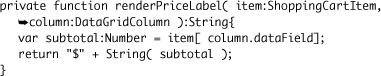
- Update the
<mx:DataGridColumn>with adataFieldofsubtotalwith a new attribute oflabelFunctionset torenderPriceLabel.
<mx:DataGridColumn dataField="subtotal" headerText="Amount"
labelFunction="renderPriceLabel" editable="false"/>This will have the subtotal column use
renderPriceLabelon each of the rows in the DataGrid. - Check the code for the component you have built.
The final code for the CartGrid.mxml should look like the following:

- Save CartGrid.mxml. Run the FlexGrocer.mxml application, add the Buffalo product to the shopping cart, and click View Cart. Notice both the formatting on the Amount column and the Remove button in the shopping cart.

Using the AdvancedDataGrid
The AdvancedDataGrid expands the capabilities of the normal DataGrid. The AdvancedDataGrid control provides added features and greater control of data display, data aggregation, and data formatting. In this section not all features of the AdvancedDataGrid will be used. The less complex features are clearly explained in the Flex user documentation, so the discussion here will cover some of the more conceptually difficult capabilities.
At this point, the shopping application does not have a good-use case for the AdvancedDataGrid, so you’ll practice with some smaller files.
Sorting the AdvancedDataGrid
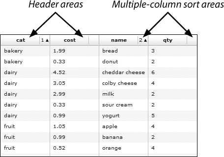
In the AdvancedDataGrid, you can now sort by multiple columns, whereas the DataGrid can sort only one column at a time. This behavior differs according to the Boolean value assigned to the AdvancedDataGrid’s sortExpertMode property. When that property is set to false, clicking the header area of a column makes that the first-priority sort. Clicking in the multiple-column sort area adds more sort criteria. The numbers at the top of the columns indicate the sorting order. If you wish to reset the top-level sort, click the header area of a column and that column becomes the first-priority sort.
- Import the ADGStart.fxp project from the Lesson12/independent folder into Flash Builder. Please refer to Appendix A for complete instructions on importing a project.
You have now imported the project so you can run the applications for AdvancedDataGrid.
- Run the SortingADG.mxml application.
- Click the cat header area to sort by product category, and note that the number 1 appears in the multiple-column sort area.
By clicking in the header area, you set sorting by category to be the first-priority sort, and the 1 that appears confirms this.
- Now click in the multiple-column sort area for the name column to make it the secondary sort.
You see that the names are now sorted within categories and the number 2 that appears in the name column confirms this is the second-level sort.
- Click in the qty header area.
This changes the first-priority sort to be by quantity.
- Click in the multiple-column sort area for the qty header. Note that the direction of the arrow in the area changes.
By clicking in the multiple-column sort area, you toggle the sort from ascending to descending.
- Close the browser, return to Flash Builder, and close the SortingADG.mxml file.
Sorting in Expert Mode
When you set the sortExpertMode property to true, sorting behaviors change, as well as component visuals. You will not see the multiple-column sort areas. To perform a multiple-column sort in this mode, first click in the column header you want for the first-priority sort. Then, Ctrl-click (or Command-click for the Mac) in the header area to add additional sort criteria. The numbers at the top of the columns indicate the sorting order. If you wish to reset the top-level sort, click (not Ctrl-click) the header area of a column, and that column becomes the first-priority sort.

- Open the application SortingExpertADG.mxml and note the
sortExpertModeproperty is set totrue. Run the application.
Note that there are no multiple-column sort areas displayed.
- Click the cat column header to sort the AdvancedDataGrid by product category. Now, Ctrl-click (Command-click) the name column header.
Note that when you Ctrl-clicked the name column header, the names were sorted by name within the category. Also, the number 2 appeared in the column header to indicate the sorting order.
- Ctrl-click again in the name header area.
Ctrl-clicking again in a header that already has a sort applied toggles the sort from ascending to descending.
- Click in the qty column header.
This resets the top-priority sort, in this case to the quantity field.
- Close the browser, return to Flash Builder, and close the SortingExpertADG.mxml file.
Styling the AdvancedDataGrid
There are times when you will want to change the look of the AdvancedDataGrid. For instance, you may wish to draw attention to a particular row, column, or cell. A common example of this is to have negative numbers displayed in red. The AdvancedDataGrid allows you to write and apply styling functions to implement this functionality.
Styling columns
Your first task is to change the default look of the grid by applying a style to an entire column.
- Open the application StyleColumnADG.mxml and run it.
Note that there is no special styling on the grid.
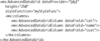
- At the bottom of the Script block, create a new public function named
myStyleFunc()which returns anObject. The function should accept two parameters, the first nameddata, data-typed as Object, and the second namedcol, data-typed as AdvancedDataGridColumn.
Note that the signature of the style function must accept two parameters, the first being an Object and the second an AdvancedDataGridColumn. The first parameter represents the data for a particular row in the AdvancedDataGrid, and the second contains information about the column that the
styleFunctionproperty is associated with.The function must return an Object, which is usually one of two kinds of values. The first is
null, which means you do not want any styling applied. The function can also return an Object composed of one or more style properties and associated values. - In the body of the function, return an Object associating the
colorproperty with the hexadecimal value0xFF0000, and thefontWeightproperty with the string valuebold. Your style function should appear as shown here.
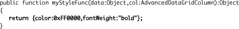
The object returned will be used as a style sheet and applied to part of the AdvancedDataGrid.
- In the
<mx:AdvancedDataGridColumn>tag that displays the category information, add thestyleFunctionproperty and reference the function you just wrote,myStyleFunc.styleFunction="myStyleFunc"
This will apply the style function you just wrote to the column.
- Run the application and note that the category column has red and bold text in it.
- Close the StyleColumnADG.mxml file.
Styling rows
To change the style of a particular row, you also reference a function using the styleFunction property. To change a row, use the styleFunction property with the AdvancedDataGrid tag itself. Then add logic to the function to return the style object only when you want.
- Open the application StyleRowADG.mxml. Note that the signature for the style function is included and returns null, so no error is reported. Run the application.
Note that there is no special styling on the grid.
- Add the
styleFunctionproperty to the<mx:AdvancedDataGrid>tag and have it reference the style function namedmyStyleFunc.
Adding the style function to the AdvancedDataGrid tag itself causes the style function to be called for every row. For this reason you will add logic to the function so not all rows have the style applied.
- In the style function, remove the
returnstatement and add an emptyif-elsestatement.
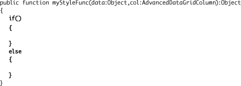
The
if-elsestatement will be used to control which row will be styled. - For the condition of the
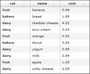
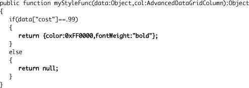
if-elsestatement, check to see if the cost of the data in the current row is .99.
if(data["cost"]==.99)
Remember that the
dataparameter contains all the data of a particular row of the grid. So, theifstatement is checking to see if the cost field for a particular row is .99. - If the condition is true, return the styling object
{color:0xFF0000,fontWeight:"bold"}, and if the condition is false, returnnull.
This is the completed style function.
- Run the application and note the two rows with a cost of .99 are styled.

Note

The style function could be written more concisely, but it may not be as clear. You can take advantage of the fact that an
ifstatement without braces ({}) will execute only the next line of code. Also, once a function returns a value, it does not continue to execute any other code. Using this information, you could rewrite the function to appear as follows:
Brevity is not always your goal when writing code, so use the approach that is clearest to you and your team.
- Close the StyleRowADG.mxml file.
Styling cells
If you wish to style cells, you still use a style function. You move the styleFunction property back to one of the AdvancedDataGridColumn tags and add logic to return a style only when certain criteria are met. For instance, you may wish to style only the cells that contain the value .99, not the whole row as was just shown.
- Open the StyleCellADG.mxml file.
This contains the same code as the starting file used when styling a row.
- Implement the same logic in the style function as you did in the last exercise.

- Add a
styleFunctionproperty to the<mx:AdvancedDataGridColumn>tag that displays the cost and references themyStyleFuncfunction.
<mx:AdvancedDataGridColumn dataField="cost" styleFunction="myStyleFunc"/>
This will apply the function only to the cost column of the grid.
- Run the application and note only the cells containing .99 are styled.

- Close the StyleCellADG.mxml file.
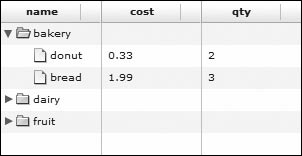
Grouping Data
Grouping data is an often-requested feature of the DataGrid and is now implemented in the AdvancedDataGrid. The grouping feature allows you to select a data field and group data by that field in a Tree control–like manner. This feature lets you create what is sometimes called a Tree DataGrid because the first column contains an expandable tree to determine which rows are visible in the grid, as shown here.

You have two approaches to implement this functionality, either through ActionScript or via tags nested in the AdvancedDataGrid tag itself. Both methods follow the same approach, which is manipulating the dataProvider of the AdvancedDataGrid.
Grouping data with tags
You will first implement grouping using tags.
- Open the application GroupWithTagsADG.mxml and run it. Note that the category column has been removed, because this is the column you will be grouping on.
Notice that all the data are displayed in nongrouped rows.
- Remove the
dataProviderproperty from the<mx:AdvancedDataGrid>tag, and insert an<mx:dataProvider>tag set just below the<mx:AdvancedDataGrid>tag.
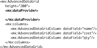
Grouping is implemented by manipulating the dataProvider of the grid.
- In the dataProvider tag set, nest a GroupingCollection2 tag set, and specify an
idproperty ofmyGroup. Bind thesourceproperty to thedpArrayCollection.
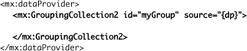
The GroupingCollection2 class permits you to group data. Its properties permit you to specify both the data to be grouped, as well as how it should be grouped and where it is displayed.
- Nest an
<mx:Grouping>tag set inside the GroupingCollection2 block. Inside the Grouping block, use the<mx:GroupingField>tag and set thenameproperty to becat, which specifies the field on which to group the data. The complete<mx:dataProvider>tag block should appear as shown here.
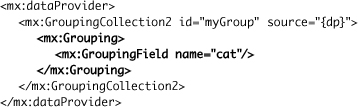
The tag that actually specifies the field to group on is
<mx:GroupingField>. Thenameproperty specifies the field on which to group. - Run the application.
Notice that no grouping has taken place. In fact, the grid is now not showing any data.
- Add a
creationCompleteevent to the AdvancedDataGrid and specifymyGroup.refresh()to be executed.
<mx:AdvancedDataGrid creationComplete="myGroup.refresh()"
height="200">The
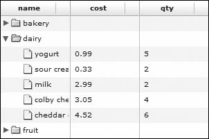
refresh()method of the GroupingCollection2 class actually applies the grouping to the data. - Run the application again, and you will see the data grouped on the category field.
- Close the GroupWithTagsADG.mxml file.
Grouping data with ActionScript
Rather than add tags to the AdvancedDataGrid as you did in the last task, this exercise will now manipulate the dataProvider using ActionScript. The manipulation will take place in a function called initDG, whose skeleton is provided for you. You will later call the function from a creationComplete event on the AdvancedDataGrid.
- Open the application GroupWithActionScriptADG.mxml and run it. Note that the category column has been removed, because this is the column you will be grouping on.
Notice that all the data is displayed in nongrouped rows.
- In the Script block, following the import of the ArrayCollection class, import the classes you used in the last exercise via tags: the GroupingField, Grouping, and GroupingCollection2 classes.
import mx.collections.ArrayCollection;
import mx.collections.GroupingField;
import mx.collections.Grouping;
import mx.collections.GroupingCollection2;You will be working with the same classes you did in the previous exercise when you implemented grouping with tags, so you must import them. You could have also used the classes in code and Flash Builder would have made the appropriate imports automatically.
- Inside the
initDG()function, whose skeleton was provided for you, create a new GroupingCollection2 object namedmyGroupColl.
var myGroupColl:GroupingCollection2=new GroupingCollection2();
The GroupingCollection2 class, and its supporting classes and properties, permits you to implement grouping.
- Now assign the dataProvider of the AdvancedDataGrid, whose instance name is
myADG, to thesourceproperty of the myGroupColl object.
myGroupColl.source=myADG.dataProvider;
Remember that grouping is basically implemented by manipulating the dataProvider of the grid, so this statement assigns the dataProvider of the AdvancedDataGrid to a property of the GroupingCollection2 so it can be manipulated.
- Next, create a new Grouping object named
group.
var group:Grouping=new Grouping();
The Grouping object will act as a holder for a GroupingField object that indicates the grouping specification.
- Define the field on which to group by creating a new GroupingField object named
gf. Pass as a parameter to the constructor thecatfield.
var gf:GroupingField=new GroupingField("cat");
This GroupingField object specifies that the grouping will be implemented on the product category field.
- Now, using array notation, assign the
fieldsproperty of the Grouping object the GroupingField object.
group.fields=[gf];
The
fieldsproperty of a Grouping object contains an array of GroupingField objects that specify the fields used to group the data. In this case, you designated the cat field as the grouping field, so this is what is assigned to the Grouping object’sfieldsproperty. - To complete the creation of the grouping, assign the Grouping object, in this case
group, to the GroupingCollection2 object’sgroupingproperty.
myGroupColl.grouping=group;
The creation of the grouping collection is complete, but the application will not run correctly without two more lines of code.
- As the last two lines of the function, use the
refresh()method to set the grouping on the GroupingCollection2 object, and then assign the GroupingCollection2 object back to the AdvancedDataGrid’s dataProvider.
myGroupColl.refresh();
myADG.dataProvider=myGroupColl;You must refresh the GroupCollection using the
refresh()method, then assign the GroupingCollection2 object to the dataProvider of the AdvancedDataGrid before you will see any results in the application. - Be sure your
initDG()function appears as shown here.

You’ve built the function to implement grouping, but as of yet you have not called the function.
- Add a
creationCompleteevent to the<mx:AdvancedDataGrid>tag and call theinitDG()function.

The function that manipulates the dataProvider will now be called to implement grouping.
- Run the application and confirm that grouping on the product categories is working just as it did when implemented in the previous exercise with tags.
- Close the GroupWithActionScriptADG.mxml file.
To review, here are the steps you just completed to group via ActionScript:
- Create a GroupCollection object.
- Assign to the
sourceproperty of the GroupCollection object the AdvancedDataGrid’s dataProvider. - Create a new Grouping object.
- Create a new GroupingField object that specifies the field on which to group.
- Assign an array of GroupingField objects to the
fieldsproperty of the Group object. - Assign the Grouping object to the
groupingproperty of the GroupingCollection2. - Refresh the GroupingCollection2.
- Assign the GroupingCollection2 to the dataProvider of the AdvancedDataGrid.
Displaying Summary Data
Often when displaying data in a table, you want to display summaries of that data. For instance, when displaying sales data by region, you may want to display summary data for each of the regions. This is now possible with the AdvancedDataGrid. Just as with the grouping of data, you can create summary data with tags or ActionScript. Because you can display summary information for data represented only by the GroupingCollection2 class, you will work with the code you finished in the previous exercises where grouping was correctly implemented.
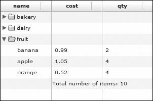
The basic concept of summary data is shown in the following figure:
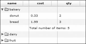
Here the summary shows the number of bakery items purchased is five.
Displaying summary data with tags
In this exercise, you will use the working grouping example and add summary data. You will implement summary information with tags, and in the next exercise, you will implement the same functionality using ActionScript.
- Open the application SummaryWithTagsADG.mxml and run it. You see that grouping is functioning on the category field.
- Add a fourth AdvancedDataGridColumn to display a field called summary, which you will create shortly.
<mx:AdvancedDataGridColumn dataField="summary"/>
This will add a column to contain the summary data. You will create the summary field using tags.
- Change the GroupingField tag into a tag set with opening and closing tags.
<mx:GroupingField name="cat">
</mx:GroupingField>The summary tags must be nested inside the GroupingField tag block.
- Insert an
<mx:summaries>tag set nested in the GroupingField block.
You create summary data about your groups by using the
summariesproperty of the GroupingField class. - Insert an
<mx:SummaryRow>tag set nested in the summaries block. Add to the opening SummaryRow tag asummaryPlacementproperty, set equal tolast.
<mx:GroupingField name="cat">
<mx:summaries>
<mx:SummaryRow summaryPlacement="last">
</mx:SummaryRow>
</mx:summaries>
</mx:GroupingField>The
summaryPlacementproperty specifies where the summary row appears in the AdvancedDataGrid control. Your options are:•
first:Create a summary row as the first row in the group.
•
last:Create a summary row as the last row in the group.
•
group:Add the summary data to the row corresponding to the group.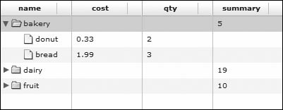
Tip
You can also specify multiple locations by using the property values separated by a space. For instance, you could use the value
last groupto have the summary in two locations, as shown here.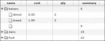
So, by specifying
lastas the option, the summary information will be displayed after all the products in a specific category. - In the SummaryRow block, nest an
<mx:fields>tag pair. In that tag set, nest an<mx:SummaryField2>tag. In the SummaryField2 tag, set the following three properties to the indicated values:
•
dataField:qty•
summaryOperation:SUM•
label:summary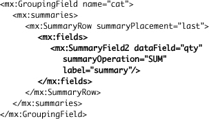
The
fieldsproperty of the SummaryRow class holds one or more SummaryField2 objects. The SummaryField2 objects define how the summary should be created. ThedataFieldproperty defines on which data field the summary will be computed. ThesummaryOperationdefines how the summary data should be computed. Valid values are:• SUM
• MIN
• MAX
• AVG
• COUNT
Tip
If those operations do not perform the calculation you need, you can use a
summaryFunctionproperty to specify a function to compute a custom data summary.The
labelproperty associates the summary value to a property. In this case, the property name issummary, which corresponds to the fourth AdvancedDataGridColumn you added at the start of this exercise. - Check to be sure your AdvancedDataGrid appears as shown here:

- Run the application. You will see that summary data is displaying as the last line of the category group. The sum of the quantities in that group is the summary information displayed.

- Do not close the file at this time.
Changing the display using rendererProviders
You have displayed the summary information, but most likely not in the way in which you would choose. To display the data in a more readable format, you must use rendererProviders. Previously in this lesson, you used item renderers for the normal DataGrid and assigned them to individual columns. In the AdvancedDataGrid, you assign the renderers to the AdvancedDataGrid itself, and then specify where to use the renderers.
The first step is to build a simple renderer.
- Right-click the renderers package and then choose New > MXML Item Renderer. Enter renderers as the Package and SummaryText as the Name, and use the Item renderer for XM AdvancedDataGrid for the template. Click Finish.
This creates the basis for the renderer you will create to display summary information.
- Alter the
textproperty in the Label tag to beTotal number of items: {data.summary}for the property’s value. The entire component should appear as follows:
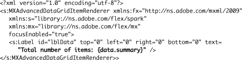
You access the summary information through the
dataproperty. Remember that thedataproperty contains all the data for a particular row in the grid and is automatically passed to the component by Flex. - Return to the SummaryWithTagsADG.mxml file and just above the closing AdvancedDataGrid tag, insert an
<mx:rendererProviders>tag set. In the rendererProviders tag set, insert an<mx:AdvancedDataGridRendererProvider>tag. In the AdvancedDataGridRendererProvider, set the following four properties to the values indicated.
•
dataField: summary•
columnIndex: 1•
columnSpan: 2•
renderer: renderers.SummaryTextYour code should appear as shown here:

In this case, the
rendererProvidersproperty contains only one definition of an AdvancedDataGridRendererProvider, but the property can contain one or more definitions. This particular renderer is tied to thesummaryfield, and thecolumnIndexproperty will cause the renderer to be displayed in the first column, where columns are zero-indexed. ThecolumnSpanproperty will cause the renderer to span two columns. Therendererproperty that indicates the component to use is in the renderers directory and is named SummaryText.Note
You could have placed this block of code anywhere in the AdvancedDataGrid tag block as long as it wasn’t nested in a tag set other than AdvancedDataGrid. For instance, the block of code could have also been placed just below the opening
<mx:AdvancedDataGrid>tag or just above the<mx:columns>tag block. - Remove the column that displays the summary.
You no longer need this column because you specified where the renderer should be displayed. Leaving in this column would cause the summary data to be displayed by both the renderer and the column.
- Run the application to see the renderer in action.

Tip
If you do not like the document icon in front of each product, you can bind the
defaultLeafIcontonullto remove it.<mx:AdvancedDataGrid creationComplete="myGroup.refresh()" defaultLeafIcon="{null}">
- Close the SummaryWithTagsADG.mxml file.
Displaying summary data with ActionScript
Just as you implemented grouping with both tags and ActionScript, so you can implement summaries with both tags and ActionScript. Use as a starting file the code that implemented grouping with ActionScript, plus the AdvancedDataGridRendererProvider you created in the previous exercise.
- Open the SummaryWithActionScriptADG.mxml application.
- In the Script block following the import of the ArrayCollection class and the grouping classes, import the SummaryField2 and SummaryRow classes you used in the last section via tags.
import mx.collections.ArrayCollection;
import mx.collections.GroupingField;
import mx.collections.Grouping;
import mx.collections.GroupingCollection2;
import mx.collections.SummaryField2;
import mx.collections.SummaryRow;You could have also just used these classes in code, and Flash Builder would have imported them for you.
- Inside the
initDG()function, locate where the GroupingCollection2 object, named myGroupColl, invokes therefresh()method. Create a few blank lines just above this code. This is where you must enter the code to create the summary information. In this location, create a SummaryRow instance namedsrand a SummaryField2 instance namedsf.
var sr:SummaryRow=new SummaryRow();
var sf:SummaryField2=new SummaryField2();Both of these objects are needed, just as you needed them when implementing summaries with tags.
- Now, assign the
sfobject the following three properties and associated values:
•
dataField:qty•
summaryOperation:SUM•
label:summarysf.dataField="qty";
sf.summaryOperation="SUM";
sf.label="summary";These values are assigned for the same reasons mentioned when implementing summaries with tags.
- Using array notation, assign the SummaryField2 object to the
fieldsproperty of the SummaryRow object.
sr.fields=[sf];
The
fieldsproperty of a SummaryRow object contains an array of SummaryField2 objects. These objects specify the fields used to compute summary information. - Set the
summaryPlacementproperty of the SummaryRow object to the valuelast.
sr.summaryPlacement="last";
The values for the
summaryPlacementproperty are the same as discussed when implementing summaries with tags. - As the last line of code needed to create a summary, assign the
summariesproperty of the GroupingField object, in this case namedgf, the SummaryRow object, using array notation.
gf.summaries=[sr];
The
summariesproperty contains an array of SummaryRow instances that define the summaries to be created. - Check to be sure your
initDG()method appears as shown here, paying special attention to the code just added to implement summary information.
- Run the application, and you will see the summary information just as it appeared when using tags.

- Close the SummaryWithActionScriptADG.mxml file.

What You Have Learned
In this lesson, you have:
• Displayed a dataset via a DataGrid (pages 289–292)
• Defined the viewable columns of a DataGrid through DataGridColumn (pages 292–293)
• Created an MXML component to be used as an item renderer (pages 293–295)
• Created an inline custom item renderer for a DataGridColumn (pages 296–299)
• Displayed information from a DataGridColumn using a labelFunction and an item renderer (pages 299–302)
• Learned how to raise events from inside an item (page 302)
• Sorted the AdvancedDataGrid in two different ways (pages 302–304)
• Applied custom styling to rows, columns, and cells of the AdvancedDataGrid (pages 304–309)
• Manipulated the dataProvider for an AdvancedDataGrid to group data in an AdvancedDataGrid (pages 309–314)
• Created summary information for data in an AdvancedDataGrid (pages 314–323)